
Lesson 10. Using DataGroups and Lists
In this lesson, you will expand your skill in working with datasets. A dataset is really nothing but several data elements consolidated in a single object, like an Array, XMLList, ArrayCollection, or XMLListCollection. Up to this point, you have learned a few ways to display, manipulate, or loop over these datasets. In this chapter, you will learn about Flex components that automatically create a visual element for each item in a dataset.

A dataset is used with a horizontally laid-out List to display grocery categories and with a DataGroup to display the grocery items from that category.
In this lesson, you will learn about Lists and DataGroups. Both List and DataGroup instances can create a visual element for each item in its dataset (which is set to the DataGroup’s dataProvider property). What is shown for each element will depend on the itemRenderer being used. You will learn about itemRenderers in this lesson as well.
The List class, much like the DataGroup class, has a dataset in its dataProvider and will visually represent each item using its itemRenderer. Lists add another piece of functionality, in that they manage the user’s selection of items from the list and provide an API for determining which item(s) if any, are selected.
In the course of this lesson, you will rework the ShoppingView component. Instead of having a hard-coded set of ProductItems as children, the component uses a DataGroup to dynamically create one ProductItem for each element in the groceryInventory ArrayCollection. In this process, you will rework the ProductItem class to be an itemRenderer. You will also finish building out the functionality of the List displaying categories at the top of the application and will learn how to make the ShoppingView change the contents of its groceryInventory property when the user selects one of the categories.
Using Lists
In the application, you have already used two List instances, one with a horizontal layout to display the categories across the top of the application, and the other to display the items in the shopping cart. From your use of these two Lists, you know that the List class is provided with a dataset via dataProvider property (one list is using a XMLListCollection, and the other an ArrayCollection), and the list will display one item for each element in its dataProvider.
In Lesson 6, “Using Remote XML Data,” you used a list to display the categories in the control bar. In that list, you specified a labelField to indicate which property the list should display. Using the labelField property is a very effective way of specifying which property of an object will be shown for each item of the list; however, it is limited in that it can display only text. If you want to format the data, or concatenate multiple properties, you will need to use a labelFunction.
Using a labelFunction with a List
A labelFunction is a function that is used to determine the text to be rendered for each item in a List. This is done with the labelFunction property. The function will accept an Object as a parameter (if you are using strongly typed objects, you can specify the actual data type instead of the generic). This parameter represents the data to be shown for each item displayed by the List. The following code shows an example of a labelFunction, which displays the category of an item with its name and cost.

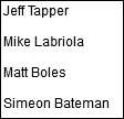
If this application were saved and run, it would appear like this:
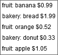
Each object from the dp ArrayCollection is passed into the labelFunction() before it is rendered, and whatever value is returned from that function is what will be shown. In this case, you are displaying the category name, the item’s name, and then its cost.
Note
Although the multiDisplay function accepts parameters (private function multiDisplay(item:Object):String), you only pass a reference to the function to the List’s labelFunction property (labelFunction="multiDisplay"). Flex will automatically call the function with the correct arguments as it renders each item from the dataProvider.
In this next exercise, you will use a labelFunction to format the data rendered in the shopping cart list.
- Open the ShoppingView class.
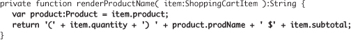
- Create a private function named
renderProductName(), which accepts aShoppingCartItemas a parameter and returns aString.

Make sure you either add the import for ShoppingCartItem manually, or use code-completion to auto-import it.
- As the first line of the function, create a local variable, data typed as a Product, which is equal to the
productproperty of the parameter to the function. Then, construct and return a string that concatenates parentheses around the item.quantity, followed byproduct.prodName, a dollar sign, and then the item’ssubtotal.
Make sure you either add the import for Product manually, or use code-completion to auto-import it.
- Find the list in the
cartGroup, and instruct it to use therenderProductNamelabelFunction.

- Save and run the application. Notice how the items are formatted in the cart as you add products.

Using DataGroups
In previous lessons, you learned that the Flex 4 framework includes a container class named Group, which can be used to contain any arbitrary visual elements as children and apply a layout to them. A DataGroup follows the same concept, but rather than requiring the number of children to be explicitly defined, it allows you to pass a dataset, and it will automatically create one visual child for each item in the dataset. Take a look at this simple example:
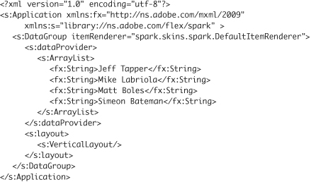
Here, you have a simple Flex application with only one child, a DataGroup container. The DataGroup is instructed to use a class called DefaultItemRenderer to render each item. You will examine the DefaultItemRenderer and alternatives to it shortly.
Next, a dataset is assigned to the DataGroup’s dataProvider property. In this case, the dataset is an ArrayList. In Lesson 8, “Using Data Binding and Collections,” you learned that ArrayCollections not only provide the benefit of data binding but also have a rich set of additional features for sorting, filtering, and finding data quickly. An ArrayList is like an ArrayCollection in that it proxies an Array to provide data binding. Unlike the ArrayCollection, the ArrayList does not provide the additional functionality of sorting, filtering, or searching for items. This is why the ArrayList can be thought of as a lighter-weight version of the ArrayCollection class, concerned only with providing bindability to an underlying Array.
Lastly, the DataGroup has its layout set to be vertical. When this is run, four instances of the DefaultItemRenderer will be created, one for each item in the ArrayList. The renderer will use a Label component to show each item.
Implementing an itemRenderer
As you saw in the previous example, you tell the DataGroup how to display the elements from its dataProvider by specifying a class to be used as its itemRenderer. In the last example, the DefaultItemRenderer class was used, which simply uses a label to display each element. You can easily create your own itemRenderer as well.
When you create your own itemRenderers, your new class can either implement the IDataRenderer interface, or you can subclass a class that already implements that interface, such as the DataRenderer class. The IDataRenderer interface simply dictates that the implementing classes have get and set functions for the data property, which is data-typed generically as an Object. The way the itemRenderer works is that one instance of the renderer will be created for each element in the dataProvider (this isn’t entirely true, but this myth will be exposed later in this lesson, when you learn about virtualization), and the data property of the itemRenderer is set with the data for that element in the dataProvider.
In this exercise, you will create an itemRenderer that implements the IDataRenderer interface and displays the element in a TextInput instead of a Label.
- Import the DataGroup.fxp from the Lesson10/independent directory into Flash Builder. Please refer to Appendix A for complete instructions on importing a project.
In the DataGroup.mxml file in the default package of the src directory, you will find the code base shown in the previous section.
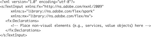
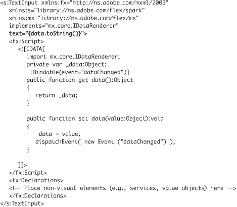
- Right-click the src folder of the DataGroup project, and choose New MXML Component. Leave the package blank. Specify the name as TextInputDataRenderer, and set it to be based on spark.components.TextInput. Click Finish.

This will create an MXML file with the following contents:
- Add an attribute to the
<s:TextInput tag>, setting animplementsattribute equal to the valuemx.core.IDataRenderer.

If you used code completion, a Script block and an import for IDataRenderer will be added for you. If not, add these items manually now.
- Add a private variable in the Script block, called
data, with a data type of Object.
private var data:Object;
- Select the data element, right-click it, and choose Source > Generate Getter/Setter.
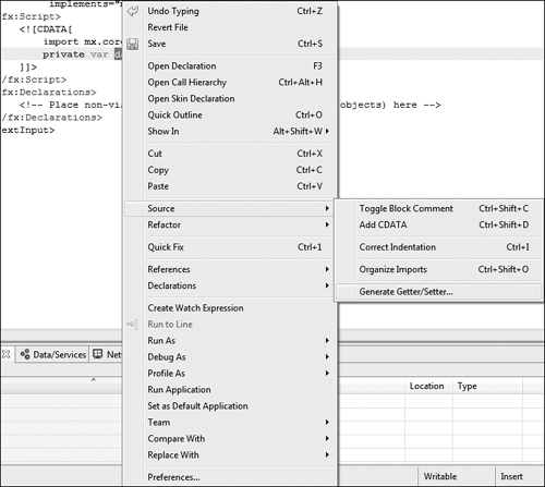
- Leave the default choices in the Generate Getter/Setter wizard and click OK.

This wizard will create the public get and set functions for the
dataproperty and rename the privatedatato_data. The resulting code will look like this: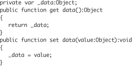
- Add a
[Bindable]metadata tag above theget data()function, and specify an event calleddataChanged.
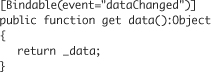
As you learned in Lesson 8, this indicates that any elements bound to this class’s
dataproperty will be automatically updated when this class dispatches an event nameddataChanged. - In the
set data()function, dispatch a new event, nameddataChanged, after you set thevalueto the_dataproperty.

Your renderer will now dispatch a
dataChangedevent each time thedataproperty is set, allowing elements that are bound to it to be updated. - In the root tag, bind the
textproperty to thetoString()method of thedataproperty.
Your renderer is now complete. All that remains is to tell the DataGroup to use it. The complete code for the renderer should look like this:
- Switch back to DataGroup.mxml. Change the itemRenderer of the DataGroup to use your newly created TextInputDataRenderer instead.
<s:DataGroup itemRenderer="TextInputDataRenderer">
- Save and run the application. Notice that this time, the elements are rendered as TextInputs, rather than as Labels.
An alternative to implementing the IDataRenderer class yourself is to use a base class, such as the DataRenderer class, that already implements this class. You will do this in the next exercise as you change ProductItem to be a DataRenderer.
Using a DataGroup in the ShoppingView
In this exercise, you will switch the VGroup that has the ProductItem instances to be a DataGroup that uses ProductItem as a DataRenderer.
- Open the ProductItem.mxml from the FlexGrocer project file that you used earlier in this lesson.
Alternatively, if you didn’t complete the previous lesson or your code is not functioning properly, you can import the FlexGrocer-PreDataRenderer.fxp project from the Lesson10/intermediate folder. Please refer to Appendix A for complete instructions on importing a project should you ever skip a lesson or if you ever have a code issue you cannot resolve.
- In ProductItem.mxml, change the opening and closing tags from Group to be DataRenderer. Add a
width="100%"attribute to the tag.
As mentioned earlier, the DataRenderer class is a subclass of Group that implements the IDataRenderer interface.
<s:DataRenderer xmlns:fx="http://ns.adobe.com/mxml/2009"
xmlns:s="library://ns.adobe.com/flex/spark"
xmlns:mx="library://ns.adobe.com/flex/mx"
width="100%">
...
</s:DataGroup> - In the Script block, override the data setter. In it, set the class’s
productproperty to the value passed to the function. You will need to cast the value as a Product.
public override function set data(value:Object):void{
this.product = value as Product;
}With this small change, your ProductItem class can now function as a DataRenderer. Each time the
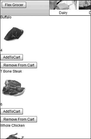
dataproperty is set, it is in turn passed to theproductproperty, which is already bound to the controls. Next you will change the ShoppingView class to use a DataGroup with your new renderer. - Open ShoppingView.mxml. Find the VGroup that contains the three ProductItem instances. Change the opening and closing VGroup tags to be DataGroup tags instead. Remove the three ProductItem instances that are the children.
<s:DataGroup width="100%" height="100%"
width.cartView="0" height.cartView="0"
visible.cartView="false">
</s:DataGroup>Next, you will need to specify the dataProvider and itemRenderer.
- Add an
itemRendererattribute to the opening DataGroup tag, which specifiescomponents.ProductItemas the itemRenderer.
<s:DataGroup width="100%" height="100%"
width.cartView="0" height.cartView="0"
visible.cartView="false"
itemRenderer="components.ProductItem">
</s:DataGroup> - Add a
dataProviderattribute to the DataGroup, which is bound to thegroceryInventoryproperty.
<s:DataGroup x="0" y="0" width="100%" height="100%"
width.cartView="0" height.cartView="0"
visible.cartView="false"
itemRenderer="components.ProductItem"
dataProvider="{groceryInventory}">
</s:DataGroup>If you save the files and run the application, you will see the products are all rendered on top of each other, with the text being unreadable. This is happening because we haven’t specified a layout object for the DataGroup to use.
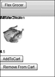
- As a child tag to the DataGroup, specify a VerticalLayout instance as the value of the
layoutproperty.
<s:DataGroup x="0" y="0" width="100%" height="100%"
width.cartView="0" height.cartView="0"
visible.cartView="false"
itemRenderer="views.ProductItem"
dataProvider="{groceryInventory}">
<s:layout><s:VerticalLayout/></s:layout>
</s:DataGroup>
Now as you save and run the application, the products render properly.
Understanding Virtualization
Each visual object takes processor time to create and RAM to store. It is inherently inefficient to create and store visual objects that are not displayed to the user. Virtualization solves this problem by creating visual objects only for the elements that will be seen. If the user needs to scroll to see more elements, they are not created initially; instead, as the user scrolls, the objects that are scrolled off the screen are recycled and reset to display the new elements that are being scrolled on-screen.
With virtualization, if a dataset of 1000 items is set in a DataGroup that has room to show 10 renderers, the application will need to create only 10 instances of the renderers rather than 1000, greatly reducing the impact on the processor and RAM.
To enable virtualization for a DataGroup, you set the useVirtualLayout property of the Layout class to true (it is false by default).
<s:layout>
<s:VerticalLayout useVirtualLayout="true"/>
</s:layout>
As you know, the layout objects are used by many Flex components, not just DataGroups. However, not all of these support virtualization. If you try to specify a layout to use virtualization in a component that does not support virtualization, the component will simply ignore that attribute of the layout object. In other words, even if you tell the layout of a Group to use a virtual layout, it will still create all its children, visible or not, because Groups don’t support virtualization.
Implementing Virtualization
In this exercise, you will take an existing application that has 25 items in a dataProvider of a DataGroup but has room to show only four items at a time, and instruct it to use virtualization.
- Import the Virtualization.fxp from the Lesson10/independent directory.
In the VirtualizedVGroup.mxml file in the default package of the src directory, you will find an application that contains a DataGroup with 25 items in its dataProvider and that uses a variation on the TextInputRenderer you created earlier in this lesson.
- Run the Virtualization application in Debug mode. Notice in the Console that there are 25 trace statements, one from the
creationCompleteevent of each of the itemRenderers.

As you scroll through the items, you will find you can never see more than five items at any one time (and most times see only four items at a time). However, as you can clearly see in the Console, there are far more than five instances of the TextInputDataRenderer created.
- Find the instantiation of the VerticalLayout, and add the attribute
useVirtualLayout="true". Save and debug the application again. Notice this time, there are only five trace statements of the TextInputDataRenderer instantiated.

Now you can see the real power of virtualization. Rather than having to create an instance of the renderer for each item in the dataProvider, which would be 25 total renderers, only five are created, as that is the most that can be seen in the control at any one time. There is no need to create and keep an additional 20 items in memory; instead, the same five renderers will be used to render whichever items need to be seen at any given time.
Virtualization with Lists
With the List class, virtualization is enabled automatically, so you do not need to explicitly tell the layout class to use useVirtualLayout. That much is assumed. In addition to virtualization, Lists also add selectability. Selectability is the idea that the user will be presented with several items and be allowed to choose one or more of them. Lists provide a series of properties, methods, and events surrounding the ideas of selectability. For instance, the selectedIndex and selectedItem properties allow you to specify or retrieve what is currently selected in the list.
In this exercise, you will build a renderer to display the various categories shown in the top navigation of the application and specify the list displaying the categories to use that new renderer.
- Open the FlexGrocer project.
- Right-click the components folder, and create a new MXML component named NavigationItem. Specify the layout to be VerticalLayout, and the base class to be spark.components.supportClasses.ItemRenderer. Remove the height and width values.
ItemRenderer is a subclass of DataRenderer, which additionally implements the methods specified by the itemRenderer interface. These include properties and methods related to displaying which items are and are not selected in a list.
- Add an Image tag, specify a
heightof31and awidthof93. Set thesourceof the image to beassets/nav_{data.name.toLowerCase()}.jpg.
<mx:Image
source="assets/nav_{data.name.toLowerCase()}.jpg"
height="31" width="93"/>If you look in the assets directory, you will find six files, with names such as nav_dairy.jpg, nav_deli.jpg, and so on. You may notice that the six names are very similar to the names of the categories from the category.xml file, with the difference that the names of the categories in the XML start with an uppercase letter, and in the filenames the categories start with a lowercase letter. To compensate for the difference of the upper- to lowercase letters, invoking the String class’s
toLowerCase()method forces the name to be all lowercase, so it can match the case of the file names. After thetoLowerCase()method, the category that has a name of Dairy is lowercased and is concatenated into nav_dairy.jpg. - After the Image, add a Label whose
textis bound to thenameproperty of the data object.
<s:Label text="{data.name}"/>
In addition to the image, the desire is to show the category name below the image.
- Find the VerticalLayout instantiation, and add a
horizontalAlign="center"attribute.
<s:layout>
<s:VerticalLayout horizontalAlign="center"/>
</s:layout>Specifying a
horizontalAlignofcenterwill align the image and label horizontally with each other. You now have a functioning renderer that you can use in a List class to display the various categories. - Switch back to FlexGrocer.mxml.
The List displaying the categories is instantiated in the main application, FlexGrocer.mxml.
- Remove the
labelFieldattribute from the instantiation of the List in the controlBarContent. Replace that attribute with theitemRendererfor this List to be your newly created NavigationItem class. Change theheightproperty of the List to52to compensate for the larger size of the image and text.
<s:List left="200" height="52"
dataProvider="{categoryService.categories}"
itemRenderer="components.NavigationItem">
<s:layout>
<s:HorizontalLayout/>
</s:layout>
</s:List> - Save and run the application. It should now render the images and labels appropriately.

Displaying Grocery Products Based on Category Selection
You just passed a dataset to a List control and had an item display for each object in the dataset. At some point you will also want to filter the collection of products to show only the products matching the selected category.
Displaying Grocery Items Based on Category
The first step will be to create a filter function in the ProductService class, which will accept a category id and filter the collection to show only the matching products.
- Open the ProductService class you created in Lesson 9, “Breaking the Application into Components.”
- Create a private variable named
selectedCategory, with a data type ofNumber, and a default value of1.
private var selectedCategory:Number=1;
- Create a public function named
filterForCategory()that accepts aProductas an argument and returns aBoolean. In the body of the function, return a Boolean indicating whether thecatIDof the argument matches theselectedCategoryproperty.
public function filterForCategory( item:Product ):Boolean{
return item.catID == selectedCategory;
} - In the
handleProductResult()method, after theproductsArrayCollection is instantiated, specify afilterFunction()of theproductsproperty to use your newfilerForCategory()method. Next refresh theproductscollection.
products.filterFunction = filterForCategory;
products.refresh();Now, when the collection is created, the
filterForCategory()method is specified as its filter function, and the collection is refreshed, so the filter function will rerun. - Lastly, create a public function named
filterCollection()that accepts a numeric argument, namedid. Inside the function set theidas the value of theselectedCategoryproperty, and then refresh the collection.
public function filterCollection( id:Number ):void{
selectedCategory = id;
products.refresh();
}
You now have everything you need in place to filter the collection to a specific category. All that remains is to call the filterCollection() method whenever the category changes.
Adding a Change Handler to the Category List
When the user selects an item from a list, a change event is broadcast, indicating that the selected item in the list is no longer the same. In this exercise, you will handle the change event, and pass the id of the selected category to the ProductService to filter the collection so that only matching products are shown.
- Open FlexGrocer.mxml.
- Find the List class in the controlBarContent. Add a change handler to the List. Allow code completion to generate a change handler for you.
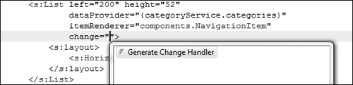
This will create a method named
list1_changeHandler()for you, which accepts an argument namedevent, of typeIndexChangeEvent. This method will automatically be set as the change handler for your list.protected function list1_changeHandler(event:IndexChangeEvent):void
{
// TODO Auto-generated method stub
} - Replace the
// TODOauto-generated method stub of thelist1_changeHandler()with a call to thefilterCollection()method of the productService, passing in theidof the selected item from the list (event.target.selectedItem.categoryID).
protected function list1_changeHandler(event:IndexChangeEvent):void
{
productService.filterCollection( event.target.selectedItem.categoryID );
}
Save and run the application. Now, as you select products from the top category list, the products displayed in ShoppingView are updated accordingly.
Note
The “add to cart” functionality no longer works when you have completed these steps. This is expected. In the next lesson, you will use events to fix this problem.
What You Have Learned
In this lesson, you have:
• Populated a List control with a dataset (pages 238–241)
• Used a DataGroup with a dataset to display information with an itemRenderer (pages 241–242)
• Created an itemRenderer (pages 242–249)
• Used the Generate Getter/Setter wizard (pages 242–249)