

This chapter will teach you how to create dialog boxes using Qt. Dialog boxes present users with options and choices, and allow them to set the options to their preferred values and to make their choices. They are called dialog boxes, or simply “dialogs”, because they provide a means by which users and applications can “talk to” each other.
Most GUI applications consist of a main window with a menu bar and toolbar, along with dozens of dialogs that complement the main window. It is also possible to create dialog applications that respond directly to the user’s choices by performing the appropriate actions (e.g., a calculator application).
We will create our first dialog purely by writing code to show how it is done. Then we will see how to build dialogs using Qt Designer, Qt’s visual design tool. Using Qt Designer is a lot faster than hand-coding and makes it easy to test different designs and to change designs later.
Our first example is a Find dialog written entirely in C++. It is shown in Figure 2.1. We will implement the dialog as a class in its own right. By doing so, we make it an independent, self-contained component, with its own signals and slots.

The source code is spread across two files: finddialog.h and finddialog.cpp. We will start with finddialog.h.
1 #ifndef FINDDIALOG_H
2 #define FINDDIALOG_H

3 #include <QDialog>

4 class QCheckBox;
5 class QLabel;
6 class QLineEdit;
7 class QPushButton;
Lines 1 and 2 (and 27) protect the header file against multiple inclusions.
Line 3 includes the definition of QDialog, the base class for dialogs in Qt. QDialog is derived from QWidget.
Lines 4 to 7 are forward declarations of the Qt classes that we will use to implement the dialog. A forward declaration tells the C++ compiler that a class exists, without giving all the detail that a class definition (usually located in a header file of its own) provides. We will say more about this shortly.
Next, we define FindDialog as a subclass of QDialog:
 8 class FindDialog : public QDialog
 9 {
10     Q_OBJECT

11 public:
12     FindDialog(QWidget *parent = 0);
The Q_OBJECT macro at the beginning of the class definition is necessary for all classes that define signals or slots.
The FindDialog constructor is typical of Qt widget classes. The parent parameter specifies the parent widget. The default is a null pointer, meaning that the dialog has no parent.
13 signals:
14     void findNext(const QString &str, Qt::CaseSensitivity cs);
15     void findPrevious(const QString &str, Qt::CaseSensitivity cs);
The signals section declares two signals that the dialog emits when the user clicks the Find button. If the Search backward option is enabled, the dialog emits findPrevious(); otherwise, it emits findNext().
The signals keyword is actually a macro. The C++ preprocessor converts it into standard C++ before the compiler sees it. Qt::CaseSensitivity is an enum type that can take the values Qt::CaseSensitive and Qt::CaseInsensitive.
16 private slots:
17     void findClicked();
18     void enableFindButton(const QString &text);

19 private:
20     QLabel *label;
21     QLineEdit *lineEdit;
22     QCheckBox *caseCheckBox;
23     QCheckBox *backwardCheckBox;
24     QPushButton *findButton;
25     QPushButton *closeButton;
26 };

27 #endif
In the class’s private section, we declare two slots. To implement the slots, we will need to access most of the dialog’s child widgets, so we keep pointers to them as well. The slots keyword is, like signals, a macro that expands into a construct that the C++ compiler can digest.
For the private variables, we used forward declarations of their classes. This was possible because they are all pointers and we don’t access them in the header file, so the compiler doesn’t need the full class definitions. We could have included the relevant header files (<QCheckBox>, <QLabel>, etc.), but using forward declarations when it is possible makes compiling somewhat faster.
We will now look at finddialog.cpp, which contains the implementation of the FindDialog class.
1 #include <QtGui>

2 #include "finddialog.h"
First, we include <QtGui>, a header file that contains the definition of Qt’s GUI classes. Qt consists of several modules, each of which lives in its own library. The most important modules are QtCore, QtGui, QtNetwork, QtOpenGL, QtScript, QtSql, QtSvg, and QtXml. The <QtGui> header file contains the definition of all the classes that are part of the QtCore and QtGui modules. Including this header saves us the bother of including every class individually.
In finddialog.h, instead of including <QDialog> and using forward declarations for QCheckBox, QLabel, QLineEdit, and QPushButton, we could simply have included <QtGui>. However, it is generally bad style to include such a big header file from another header file, especially in larger applications.
 3 FindDialog::FindDialog(QWidget *parent)
 4     : QDialog(parent)
 5 {
 6     label = new QLabel(tr("Find &what:"));
 7     lineEdit = new QLineEdit;
 8     label->setBuddy(lineEdit);

 9     caseCheckBox = new QCheckBox(tr("Match &case"));
10     backwardCheckBox = new QCheckBox(tr("Search &backward"));

11     findButton = new QPushButton(tr("&Find"));
12     findButton->setDefault(true);
13     findButton->setEnabled(false);

14     closeButton = new QPushButton(tr("Close"));
On line 4, we pass on the parent parameter to the base class constructor. Then we create the child widgets. The tr() function calls around the string literals mark them for translation to other languages. The function is declared in QObject and every subclass that contains the Q_OBJECT macro. It’s a good habit to surround user-visible strings with tr(), even if you don’t have immediate plans for translating your applications to other languages. We cover translating Qt applications in Chapter 18.
In the string literals, we use ampersands (‘&’) to indicate shortcut keys. For example, line 11 creates a Find button, which the user can activate by pressing Alt+F on platforms that support shortcut keys. Ampersands can also be used to control focus: On line 6 we create a label with a shortcut key (Alt+W), and on line 8 we set the label’s buddy to be the line editor. A buddy is a widget that accepts the focus when the label’s shortcut key is pressed. So when the user presses Alt+W (the label’s shortcut), the focus goes to the line editor (the label’s buddy).
On line 12, we make the Find button the dialog’s default button by calling setDefault(true). The default button is the button that is pressed when the user hits Enter. On line 13, we disable the Find button. When a widget is disabled, it is usually shown grayed out and will not respond to user interaction.
15   connect(lineEdit, SIGNAL(textChanged(const QString &)),
16           this, SLOT(enableFindButton(const QString &)));
17   connect(findButton, SIGNAL(clicked()),
18           this, SLOT(findClicked()));
19   connect(closeButton, SIGNAL(clicked()),
20           this, SLOT(close()));
The private slot enableFindButton(const QString &) is called whenever the text in the line editor changes. The private slot findClicked() is called when the user clicks the Find button. The dialog closes itself when the user clicks Close. The close() slot is inherited from QWidget, and its default behavior is to hide the widget from view (without deleting it). We will look at the code for the enableFindButton() and findClicked() slots later on.
Since QObject is one of FindDialog’s ancestors, we can omit the QObject:: prefix in front of the connect() calls.
21    QHBoxLayout *topLeftLayout = new QHBoxLayout;
22    topLeftLayout->addWidget(label);
23    topLeftLayout->addWidget(lineEdit);

24    QVBoxLayout *leftLayout = new QVBoxLayout;
25    leftLayout->addLayout(topLeftLayout);
26    leftLayout->addWidget(caseCheckBox);
27    leftLayout->addWidget(backwardCheckBox);

28    QVBoxLayout *rightLayout = new QVBoxLayout;
29    rightLayout->addWidget(findButton);
30    rightLayout->addWidget(closeButton);
31    rightLayout->addStretch();

32    QHBoxLayout *mainLayout = new QHBoxLayout;
33    mainLayout->addLayout(leftLayout);
34    mainLayout->addLayout(rightLayout);
35    setLayout(mainLayout);
Next, we lay out the child widgets using layout managers. Layouts can contain both widgets and other layouts. By nesting QHBoxLayouts, QVBoxLayouts, and QGridLayouts in various combinations, it is possible to build very sophisticated dialogs.
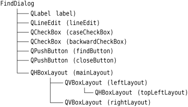
For the Find dialog, we use two QHBoxLayouts and two QVBoxLayouts, as shown in Figure 2.2. The outer layout is the main layout; it is installed on the FindDialog on line 35 and is responsible for the dialog’s entire area. The other three layouts are sub-layouts. The little “spring” at the bottom right of Figure 2.2 is a spacer item (or “stretch”). It uses up the empty space below the Find and Close buttons, ensuring that these buttons occupy the top of their layout.

One subtle aspect of the layout manager classes is that they are not widgets. Instead, they are derived from QLayout, which in turn is derived from QObject. In the figure, widgets are represented by solid outlines and layouts are represented by dashed outlines to highlight the difference between them. In a running application, layouts are invisible.
When the sublayouts are added to the parent layout (lines 25, 33, and 34), the sublayouts are automatically reparented. Then, when the main layout is installed on the dialog (line 35), it becomes a child of the dialog, and all the widgets in the layouts are reparented to become children of the dialog. The resulting parent–child hierarchy is depicted in Figure 2.3.
36    setWindowTitle(tr("Find"));
37    setFixedHeight(sizeHint().height());
38 }
Finally, we set the title to be shown in the dialog’s title bar and we set the window to have a fixed height, since there aren’t any widgets in the dialog that can meaningfully occupy any extra vertical space. The QWidget::sizeHint() function returns a widget’s “ideal” size.
This completes the review of FindDialog’s constructor. Since we used new to create the dialog’s widgets and layouts, it would seem that we need to write a destructor that calls delete on each widget and layout we created. But this isn’t necessary, since Qt automatically deletes child objects when the parent is destroyed, and the child widgets and layouts are all descendants of the FindDialog.
Now we will look at the dialog’s slots:
39 void FindDialog::findClicked()
40 {
41     QString text = lineEdit->text();
42     Qt::CaseSensitivity cs =
43             caseCheckBox->isChecked() ? Qt::CaseSensitive
44                                       : Qt::CaseInsensitive;
45     if (backwardCheckBox->isChecked()) {
46         emit findPrevious(text, cs);
47     } else {
48         emit findNext(text, cs);
49     }
50 }

51 void FindDialog::enableFindButton(const QString &text)
52 {
53     findButton->setEnabled(!text.isEmpty());
54 }
The findClicked() slot is called when the user clicks the Find button. It emits the findPrevious() or the findNext() signal, depending on the Search backward option. The emit keyword is specific to Qt; like other Qt extensions it is converted into standard C++ by the C++ preprocessor.
The enableFindButton() slot is called whenever the user changes the text in the line editor. It enables the button if there is some text in the editor, and disables it otherwise.
These two slots complete the dialog. We can now create a main.cpp file to test our FindDialog widget:
1 #include <QApplication>

2 #include "finddialog.h"

3 int main(int argc, char *argv[])
4 {
5     QApplication app(argc, argv);
6     FindDialog *dialog = new FindDialog;
7     dialog->show();
8     return app.exec();
9 }
To compile the program, run qmake as usual. Since the FindDialog class definition contains the Q_OBJECT macro, the makefile generated by qmake will include special rules to run moc, Qt’s meta-object compiler. (We cover Qt’s meta-object system in the next section.)
For moc to work correctly, we must put the class definition in a header file, separate from the implementation file. The code generated by moc includes this header file and adds some C++ boilerplate code of its own.
Classes that use the Q_OBJECT macro must have moc run on them. This isn’t a problem because qmake automatically adds the necessary rules to the makefile. But if you forget to regenerate your makefile using qmake and moc isn’t run, the linker will complain that some functions are declared but not implemented. The messages can be fairly obscure. GCC produces error messages like this one:
finddialog.o: In function `FindDialog::tr(char const*, char const*)':
/usr/lib/qt/src/corelib/global/qglobal.h:1430: undefined reference to
`FindDialog::staticMetaObject'
Visual C++’s output starts like this:
finddialog.obj : error LNK2001: unresolved external symbol
"public:~virtual int __thiscall MyClass::qt_metacall(enum QMetaObject
::Call,int,void * *)"
If this ever happens to you, run qmake again to update the makefile, then rebuild the application.
Now run the program. If shortcut keys are shown on your platform, verify that the shortcut keys Alt+W, Alt+C, Alt+B, and Alt+F trigger the correct behavior. Press Tab to navigate through the widgets with the keyboard. The default tab order is the order in which the widgets were created. This can be changed using QWidget::setTabOrder().
Providing a sensible tab order and keyboard shortcuts ensures that users who don’t want to (or cannot) use a mouse are able to make full use of the application. Full keyboard control is also appreciated by fast typists.
In Chapter 3, we will use the Find dialog inside a real application, and we will connect the findPrevious() and findNext() signals to some slots.
The signals and slots mechanism is fundamental to Qt programming. It enables the application programmer to bind objects together without the objects knowing anything about each other. We have already connected some signals and slots together, declared our own signals and slots, implemented our own slots, and emitted our own signals. Let’s take a moment to look at the mechanism more closely.
Slots are almost identical to ordinary C++ member functions. They can be virtual; they can be overloaded; they can be public, protected, or private; they can be directly invoked like any other C++ member functions; and their parameters can be of any types. The difference is that a slot can also be connected to a signal, in which case it is automatically called each time the signal is emitted.
The connect() statement looks like this:
connect(sender, SIGNAL(signal), receiver, SLOT(slot));
where sender and receiver are pointers to QObjects and where signal and slot are function signatures without parameter names. The SIGNAL() and SLOT() macros essentially convert their argument to a string.
In the examples we have seen so far, we have always connected different signals to different slots. There are other possibilities to consider.
One signal can be connected to many slots:
connect(slider, SIGNAL(valueChanged(int)),
        spinBox, SLOT(setValue(int)));
connect(slider, SIGNAL(valueChanged(int)),
        this, SLOT(updateStatusBarIndicator(int)));
When the signal is emitted, the slots are called one after the other, in an unspecified order.
Many signals can be connected to the same slot:
connect(lcd, SIGNAL(overflow()),
        this, SLOT(handleMathError()));
connect(calculator, SIGNAL(divisionByZero()),
        this, SLOT(handleMathError()));
When either signal is emitted, the slot is called.
A signal can be connected to another signal:
connect(lineEdit, SIGNAL(textChanged(const QString &)),
        this, SIGNAL(updateRecord(const QString &)));
When the first signal is emitted, the second signal is emitted as well. Apart from that, signal–signal connections are indistinguishable from signal–slot connections.
Connections can be removed:
disconnect(lcd, SIGNAL(overflow()),
           this, SLOT(handleMathError()));
This is rarely needed, because Qt automatically removes all connections involving an object when that object is deleted.
To successfully connect a signal to a slot (or to another signal), they must have the same parameter types in the same order:
connect(ftp, SIGNAL(rawCommandReply(int, const QString &)),
        this, SLOT(processReply(int, const QString &)));
Exceptionally, if a signal has more parameters than the slot it is connected to, the additional parameters are simply ignored:
connect(ftp, SIGNAL(rawCommandReply(int, const QString &)),
        this, SLOT(checkErrorCode(int)));
If the parameter types are incompatible, or if the signal or the slot doesn’t exist, Qt will issue a warning at run-time if the application is built in debug mode. Similarly, Qt will give a warning if parameter names are included in the signal or slot signatures.
So far, we have only used signals and slots with widgets. But the mechanism itself is implemented in QObject and isn’t limited to GUI programming. The mechanism can be used by any QObject subclass:
class Employee : public QObject
{
    Q_OBJECT

public:
    Employee() { mySalary = 0; }

    int salary() const { return mySalary; }

public slots:
    void setSalary(int newSalary);

signals:
    void salaryChanged(int newSalary);

private:
    int mySalary;
};void Employee::setSalary(int newSalary)
{
if (newSalary != mySalary) {
mySalary = newSalary;
emit salaryChanged(mySalary);
}
}Notice how the setSalary() slot is implemented. We emit the salaryChanged() signal only if newSalary != mySalary. This ensures that cyclic connections don’t lead to infinite loops.
Qt is designed to be pleasant and intuitive to hand-code, and it is not unusual for programmers to develop entire Qt applications purely by writing C++ source code. Still, many programmers prefer to use a visual approach for designing forms, because they find it more natural and faster than hand-coding, and they want to be able to experiment with and change designs more quickly and easily than is possible with hand-coded forms.
Qt Designer expands the options available to programmers by providing a visual design capability. Qt Designer can be used to develop all or just some of an application’s forms. Forms that are created using Qt Designer end up as C++ code, so Qt Designer can be used with a conventional tool chain and imposes no special requirements on the compiler.
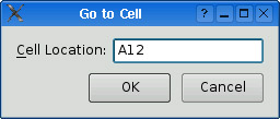
In this section, we will use Qt Designer to create the Go to Cell dialog shown in Figure 2.4. Whether we do it in code or in Qt Designer, creating a dialog always involves the same fundamental steps:
Create and initialize the child widgets.
Put the child widgets in layouts.
Set the tab order.
Establish signal–slot connections.
Implement the dialog’s custom slots.
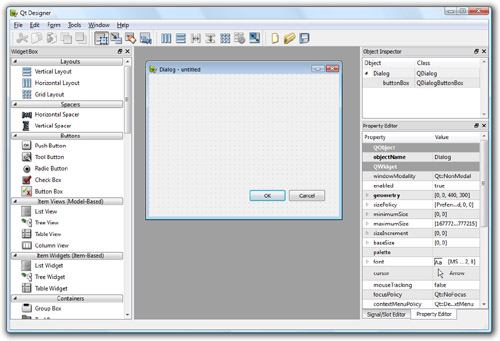
To launch Qt Designer, click Qt by Trolltech v4.x.y|Designer in the Start menu on Windows, type designer on the command line on Unix, or double-click Designer in the Mac OS X Finder. When Qt Designer starts, it will pop up a list of templates. Click the “Widget” template, then click Create. (The “Dialog with Buttons Bottom” template might look tempting, but for this example we will create the OK and Cancel buttons by hand to show how it is done.) You should now have a window called “Untitled”.
By default, Qt Designer’s user interface consists of several top-level windows. If you prefer an MDI-style interface, with one top-level window and several subwindows, as shown in Figure 2.5, click Edit|Preferences and set the user interface mode to Docked Window.
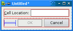
The first step is to create the child widgets and place them on the form. Create one label, one line editor, one horizontal spacer, and two push buttons. For each item, drag its name or icon from Qt Designer’s widget box and drop the item roughly where it should go on the form. The spacer item, which is invisible in the final form, is shown in Qt Designer as a blue spring.
Now drag the bottom of the form up to make it shorter. This should produce a form that is similar to Figure 2.6. Don’t spend too much time positioning the items on the form; Qt’s layout managers will lay them out precisely later on.

Set each widget’s properties using Qt Designer’s property editor:
Click the text label. Make sure that its
objectNameproperty is “label” and set thetextproperty to “&Cell Location:”.Click the line editor. Make sure that the
objectNameproperty is “lineEdit”.Click the first button. Set the
objectNameproperty to “okButton”, theenabledproperty to “false”, thetextproperty to “OK”, and thedefaultproperty to “true”.Click the second button. Set the
objectNameproperty to “cancelButton” and thetextproperty to “Cancel”.Click the form’s background to select the form itself. Set the
objectNameproperty to “GoToCellDialog” and thewindowTitleproperty to “Go to Cell”.
All the widgets look fine now, except the text label, which shows &Cell Location. Click Edit|Edit Buddies to enter a special mode that allows you to set buddies. Next, click the label and drag the red arrow line to the line editor, then release. The label should now appear as Cell Location, as shown in Figure 2.7, and have the line editor as its buddy. Click Edit|Edit Widgets to leave buddy mode.

The next step is to lay out the widgets on the form:
Click the Cell Location label and press Shift as you click the line editor next to it so that they are both selected. Click Form|Lay Out Horizontally.
Click the spacer, then hold Shift as you click the form’s OK and Cancel buttons. Click Form|Lay Out Horizontally.
Click the background of the form to deselect any selected items, then click Form|Lay Out Vertically.
Click Form|Adjust Size to resize the form to its preferred size.
The red lines that appear on the form show the layouts that have been created, as shown in Figure 2.8. They don’t appear when the form is run.
Now click Edit|Edit Tab Order. A number in a blue rectangle will appear next to every widget that can accept focus, as shown in Figure 2.9. Click each widget in turn in the order you want them to accept focus, then click Edit|Edit Widgets to leave tab order mode.

To preview the dialog, click the Form|Preview menu option. Check the tab order by pressing Tab repeatedly. Close the dialog using the close button in the title bar.
Save the dialog as gotocelldialog.ui in a directory called gotocell, and create a main.cpp file in the same directory using a plain text editor:
#include <QApplication>
#include <QDialog>

#include "ui_gotocelldialog.h"

int main(int argc, char *argv[])
{
    QApplication app(argc, argv);

    Ui::GoToCellDialog ui;
    QDialog *dialog = new QDialog;
    ui.setupUi(dialog);
    dialog->show();

    return app.exec();
}
Now run qmake to create a .pro file and a makefile (qmake -project; qmake gotocell.pro). The qmake tool is smart enough to detect the user interface file gotocelldialog.ui and to generate the appropriate makefile rules to invoke uic, Qt’s user interface compiler. The uic tool converts gotocelldialog.ui into C++ and puts the result in ui_gotocelldialog.h.
The generated ui_gotocelldialog.h file contains the definition of the Ui::GoToCellDialog class, which is a C++ equivalent of the gotocelldialog.ui file. The class declares member variables that store the form’s child widgets and layouts, and a setupUi() function that initializes the form. The generated class looks like this:
class Ui::GoToCellDialog
{
public:
    QLabel *label;
    QLineEdit *lineEdit;
    QSpacerItem *spacerItem;
    QPushButton *okButton;
    QPushButton *cancelButton;
    ...

    void setupUi(QWidget *widget) {
        ...
    }
};
The generated class doesn’t have any base class. When we use the form in main.cpp, we create a QDialog and pass it to setupUi().
If you run the program now, the dialog will work, but it doesn’t function exactly as we want:
The OK button is always disabled.
The Cancel button does nothing.
The line editor accepts any text, instead of accepting only valid cell locations.
We can make the dialog function properly by writing some code. The cleanest approach is to create a new class that is derived from both QDialog and Ui::GoToCellDialog and that implements the missing functionality (thus proving the adage that any software problem can be solved simply by adding another layer of indirection). Our naming convention is to give this new class the same name as the uic-generated class but without the Ui:: prefix.
Using a text editor, create a file called gotocelldialog.h that contains the following code:
#ifndef GOTOCELLDIALOG_H
#define GOTOCELLDIALOG_H

#include <QDialog>

#include "ui_gotocelldialog.h"

class GoToCellDialog : public QDialog, public Ui::GoToCellDialog
{
    Q_OBJECT

public:
    GoToCellDialog(QWidget *parent = 0);

private slots:
    void on_lineEdit_textChanged();
};

#endif
Here, we have used public inheritance because we want to access the dialog’s widgets from outside the dialog. The implementation belongs in the gotocelldialog.cpp file:
#include <QtGui>

#include "gotocelldialog.h"

GoToCellDialog::GoToCellDialog(QWidget *parent)
    : QDialog(parent)
{
    setupUi(this);

    QRegExp regExp("[A-Za-z][1-9][0-9]{0,2}");
    lineEdit->setValidator(new QRegExpValidator(regExp, this));

    connect(okButton, SIGNAL(clicked()), this, SLOT(accept()));
    connect(cancelButton, SIGNAL(clicked()), this, SLOT(reject()));
}

void GoToCellDialog::on_lineEdit_textChanged()
{
    okButton->setEnabled(lineEdit->hasAcceptableInput());
}
In the constructor, we call setupUi() to initialize the form. Thanks to multiple inheritance, we can access Ui::GoToCellDialog’s members directly. After creating the user interface, setupUi() will also automatically connect any slots that follow the naming convention on_objectName_signalName() to the corresponding objectName’s signalName() signal. In our example, this means that setupUi() will establish the following signal–slot connection:
connect(lineEdit, SIGNAL(textChanged(const QString &)),
        this, SLOT(on_lineEdit_textChanged()));
Also in the constructor, we set up a validator to restrict the range of the input. Qt provides three built-in validator classes: QIntValidator, QDoubleValidator, and QRegExpValidator. Here we use a QRegExpValidator with the regular expression “[A-Za-z][1-9][0-9]{0,2}”, which means: Allow one uppercase or lowercase letter, followed by one digit in the range 1 to 9, followed by zero, one, or two digits each in the range 0 to 9. (For an introduction to regular expressions, see the QRegExp class documentation.)
By passing this to the QRegExpValidator constructor, we make it a child of the GoToCellDialog object. By doing so, we don’t have to worry about deleting the QRegExpValidator later; it will be deleted automatically when its parent is deleted.
Qt’s parent–child mechanism is implemented in QObject. When we create an object (a widget, validator, or any other kind) with a parent, the parent adds the object to the list of its children. When the parent is deleted, it walks through its list of children and deletes each child. The children themselves then delete all of their children, and so on recursively until none remain. The parent–child mechanism greatly simplifies memory management, reducing the risk of memory leaks. The only objects we must call delete on are the objects we create with new and that have no parent. And if we delete a child object before its parent, Qt will automatically remove that object from the parent’s list of children.
For widgets, the parent has an additional meaning: Child widgets are shown within the parent’s area. When we delete the parent widget, not only does the child vanish from memory, it also vanishes from the screen.
At the end of the constructor, we connect the OK button to QDialog’s accept() slot and the Cancel button to the reject() slot. Both slots close the dialog, but accept() sets the dialog’s result value to QDialog::Accepted (which equals 1), and reject() sets the result to QDialog::Rejected (which equals 0). When we use this dialog, we can use the result to see if the user clicked OK and act accordingly.
The on_lineEdit_textChanged() slot enables or disables the OK button, according to whether the line editor contains a valid cell location. QLineEdit::hasAcceptableInput() uses the validator we set in the constructor.
This completes the dialog. We can now rewrite main.cpp to use it:
#include <QApplication>

#include "gotocelldialog.h"

int main(int argc, char *argv[])
{
    QApplication app(argc, argv);
    GoToCellDialog *dialog = new GoToCellDialog;
    dialog->show();
    return app.exec();
}
Regenerate gotocell.pro using qmake -project (since we have added source files to the project), run qmake gotocell.pro to update the makefile, then build and run the application again. Type “A12” in the line editor, and notice that the OK button becomes enabled. Try typing some random text to see how the validator does its job. Click Cancel to close the dialog.
The dialog works correctly, but for Mac OS X users, the buttons are the wrong way round. We chose to add each button individually, to show how it was done, but really we should have used a QDialogButtonBox, a widget that contains the buttons we specify and that presents them in the correct way for the window system on which the application is being run, as shown in Figure 2.10.

To make the dialog use a QDialogButtonBox, we must change both the design and the code. In Qt Designer, there are just four steps to take:
Click the form (not any of the widgets or layouts) and then click Form|Break Layout.
Click and delete the OK button, the
Cancelbutton, the horizontal spacer, and the (now empty) horizontal layout.Drag a “Button Box” onto the form, below the cell location label and line editor.
Click the form and then click Form|Lay Out Vertically.
If we had just been doing design changes, such as changing the dialog’s layouts and widget properties, we would be able to simply rebuild the application. But here we have removed some widgets and added a new widget, and in these cases we must usually change the code too.
The changes we must make are all in the file gotocelldialog.cpp. Here is the new version of the constructor:
GoToCellDialog::GoToCellDialog(QWidget *parent)
    : QDialog(parent)
{
    setupUi(this);
    buttonBox->button(QDialogButtonBox::Ok)->setEnabled(false);

    QRegExp regExp("[A-Za-z][1-9][0-9]{0,2}");
    lineEdit->setValidator(new QRegExpValidator(regExp, this));

    connect(buttonBox, SIGNAL(accepted()), this, SLOT(accept()));
    connect(buttonBox, SIGNAL(rejected()), this, SLOT(reject()));
}
In the previous version, we initially disabled the OK button in Qt Designer. We cannot do that with a QDialogButtonBox, so we do so in code, immediately after the setupUi() call. The QDialogButtonBox class has an enum of standard buttons, and we can use this to access particular buttons, in this case the OK button.
Very conveniently, Qt Designer’s default name for a QDialogButtonBox is buttonBox. Both connections are made from the button box rather than from the buttons themselves. The accepted() signal is emitted when a button with the AcceptRole is clicked, and similarly the rejected() signal is emitted by a button with the RejectRole. By default, the standard QDialogButtonBox::Ok button has the AcceptRole, and the QDialogButtonBox::Cancel button has the RejectRole.
Only one more change is required, in the on_lineEdit_textChanged() slot:
void GoToCellDialog::on_lineEdit_textChanged()
{
    buttonBox->button(QDialogButtonBox::Ok)->setEnabled(
            lineEdit->hasAcceptableInput());
}
The only thing different from before is that instead of referring to a particular button stored as a member variable, we access the button box’s OK button.
One of the beauties of using Qt Designer is that it allows programmers great freedom to modify their form designs without being forced to change their source code. When you develop a form purely by writing C++ code, changes to the design can be quite time-consuming. With Qt Designer, no time is lost since uic simply regenerates the source code for any forms that have changed. The dialog’s user interface is saved in a .ui file (an XML-based file format), while custom functionality is implemented by subclassing the uic-generated class.
We have seen how to create dialogs that always show the same widgets whenever they are used. In some cases, it is desirable to provide dialogs that can change shape. The two most common kinds of shape-changing dialogs are extension dialogs and multi-page dialogs. Both types of dialog can be implemented in Qt, either purely in code or using Qt Designer.
Extension dialogs usually present a simple appearance but have a toggle button that allows the user to switch between the dialog’s simple and extended appearances. Extension dialogs are commonly used for applications that are trying to cater to both casual and power users, hiding the advanced options unless the user explicitly asks to see them. In this section, we will use Qt Designer to create the extension dialog shown in Figure 2.11.
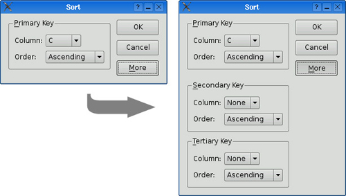
The dialog is a Sort dialog in a spreadsheet application, where the user can select one or several columns on which to sort. The dialog’s simple appearance allows the user to enter a single sort key, and its extended appearance provides for two extra sort keys. A More button lets the user switch between the simple and extended appearances.
We will create the widget with its extended appearance in Qt Designer, and hide the secondary and tertiary keys at run-time as needed. The widget looks complicated, but it’s fairly easy to do in Qt Designer. The trick is to do the primary key part first, then duplicate it twice to obtain the secondary and tertiary keys:
Click File|New Form and choose the “Dialog without Buttons” template.
Create an OK button and drag it to the top right of the form. Change its
objectNameto “okButton” and set itsdefaultproperty to “true”.Create a Cancel button, and drag it below the OK button. Change its
objectNameto “cancelButton”.Create a vertical spacer and drag it below the Cancel button, then create a More button and drag it below the vertical spacer. Change the More button’s
objectNameto “moreButton”, set itstextproperty to “&More”, and itscheckableproperty to “true”.Click the OK button, then Shift+Click the Cancel button, the vertical spacer, and the More button, then click Form|Lay Out Vertically.
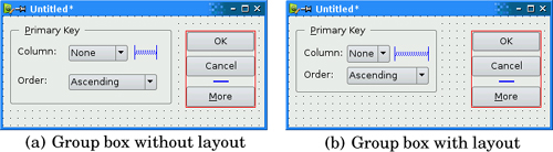
Create a group box, two labels, two comboboxes, and one horizontal spacer, and put them anywhere on the form.
Drag the bottom-right corner of the group box to make it larger. Then move the other widgets into the group box and position them approximately as shown in Figure 2.12 (a).
Drag the right edge of the second combobox to make it about twice as wide as the first combobox.
Set the group box’s
titleproperty to “&Primary Key”, the first label’stextproperty to “Column:”, and the second label’stextproperty to “Order:”.Right-click the first combobox and choose Edit Items from the context menu to pop up Qt Designer’s combobox editor. Create one item with the text “None”.
Right-click the second combobox and choose Edit Items. Create an “Ascending” item and a “Descending” item.
Click the group box, then click Form|Lay Out in a Grid. Click the group box again and click Form|Adjust Size. This will produce the layout shown in Figure 2.12 (b).
If a layout doesn’t turn out quite right or if you make a mistake, you can always click Edit|Undo or Form|Break Layout, then reposition the widgets and try again.
We will now add the Secondary Key and Tertiary Key group boxes:
Make the dialog window tall enough for the extra parts.
Hold down the Ctrl key (Alt on the Mac) and click and drag the Primary Key group box to create a copy of the group box (and its contents) on top of the original. Drag the copy below the original group box, while still pressing Ctrl (or Alt). Repeat this process to create a third group box, dragging it below the second group box.
Change their
titleproperties to “&Secondary Key” and “&Tertiary Key”.Create one vertical spacer and place it between the primary key group box and the secondary key group box.
Arrange the widgets in the grid-like pattern shown in Figure 2.13 (a).
Click the form to deselect any selected widgets, then click Form|Lay Out in a Grid. Now drag the form’s bottom-right corner up and left to make the form as small as it will go. The form should now match Figure 2.13 (b).
Set the two vertical spacer items’
sizeHintproperty to [20, 0].

The resulting grid layout has two columns and four rows, giving a total of eight cells. The Primary Key group box, the leftmost vertical spacer item, the Secondary Key group box, and the Tertiary Key group box each occupy a single cell. The vertical layout that contains the OK, Cancel, and More buttons occupies two cells.
That leaves two empty cells in the bottom right of the dialog. If this isn’t what you have, undo the layout, reposition the widgets, and try again.
Rename the form “SortDialog” and change the window title to “Sort”. Set the names of the child widgets to those shown in Figure 2.14.

Click Edit|Edit Tab Order. Click each combobox in turn from topmost to bottommost, then click the OK, Cancel, and More buttons on the right side. Click Edit|Edit Widgets to leave tab order mode.
Now that the form has been designed, we are ready to make it functional by setting up some signal–slot connections. Qt Designer allows us to establish connections between widgets that are part of the same form. We need to establish two connections.
Click Edit|Edit Signals/Slots to enter Qt Designer’s connection mode. Connections are represented by blue arrows between the form’s widgets, as shown in Figure 2.15, and they are also listed in Qt Designer’s signal/slot editor window. To establish a connection between two widgets, click the sender widget and drag the red arrow line to the receiver widget, then release. This pops up a dialog that allows you to choose the signal and the slot to connect.
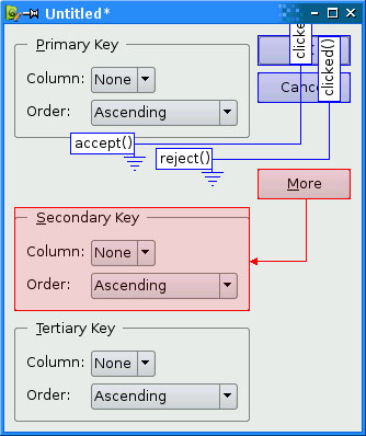
The first connection to be made is between the okButton and the form’s accept() slot. Drag the red arrow line from the okButton to an empty part of the form, then release to pop up the Configure Connection dialog shown in Figure 2.16. Choose clicked() as the signal and accept() as the slot, then click OK.

For the second connection, drag the red arrow line from the cancelButton to an empty part of the form, and in the Configure Connection dialog connect the button’s clicked() signal to the form’s reject() slot.
The third connection to establish is between the moreButton and the secondaryGroupBox. Drag the red arrow line between these two widgets, then choose toggled(bool) as the signal and setVisible(bool) as the slot. By default, Qt De- signer doesn’t list setVisible(bool) in the list of slots, but it will appear if you enable the Show all signals and slots option.
The fourth and last connection is between the moreButton’s toggled(bool) signal and the tertiaryGroupBox’s setVisible(bool) slot. Once the connections have been made, click Edit|Edit Widgets to leave connection mode.
Save the dialog as sortdialog.ui in a directory called sort. To add code to the form, we will use the same multiple inheritance approach that we used for the Go to Cell dialog in the previous section.
First, create a sortdialog.h file with the following contents:
#ifndef SORTDIALOG_H
#define SORTDIALOG_H

#include <QDialog>

#include "ui_sortdialog.h"

class SortDialog : public QDialog, public Ui::SortDialog
{
    Q_OBJECT

public:
    SortDialog(QWidget *parent = 0);

    void setColumnRange(QChar first, QChar last);
};

#endif
Now create sortdialog.cpp:
 1 #include <QtGui>

 2 #include "sortdialog.h"

 3 SortDialog::SortDialog(QWidget *parent)
 4     : QDialog(parent)
 5 {
 6     setupUi(this);

 7     secondaryGroupBox->hide();
 8     tertiaryGroupBox->hide();
 9     layout()->setSizeConstraint(QLayout::SetFixedSize);

10     setColumnRange('A', 'Z'),
11 }

12 void SortDialog::setColumnRange(QChar first, QChar last)
13 {
14     primaryColumnCombo->clear();
15     secondaryColumnCombo->clear();
16     tertiaryColumnCombo->clear();

17     secondaryColumnCombo->addItem(tr("None"));
18     tertiaryColumnCombo->addItem(tr("None"));
19     primaryColumnCombo->setMinimumSize(
20             secondaryColumnCombo->sizeHint());

21     QChar ch = first;
22     while (ch <= last) {
23         primaryColumnCombo->addItem(QString(ch));
24         secondaryColumnCombo->addItem(QString(ch));
25         tertiaryColumnCombo->addItem(QString(ch));
26         ch = ch.unicode() + 1;
27     }
28 }
The constructor hides the secondary and tertiary parts of the dialog. It also sets the sizeConstraint property of the form’s layout to QLayout::SetFixedSize, making the dialog non-resizable by the user. The layout then takes over the responsibility for resizing, and resizes the dialog automatically when child widgets are shown or hidden, ensuring that the dialog is always displayed at its optimal size.
The setColumnRange() slot initializes the contents of the comboboxes based on the selected columns in the spreadsheet. We insert a “None” item in the comboboxes for the (optional) secondary and tertiary keys.
Lines 19 and 20 present a subtle layout idiom. The QWidget::sizeHint() function returns a widget’s “ideal” size, which the layout system tries to honor. This explains why different kinds of widgets, or similar widgets with different contents, may be assigned different sizes by the layout system. For comboboxes, this means that the secondary and tertiary comboboxes, which contain “None”, end up larger than the primary combobox, which contains only single-letter entries. To avoid this inconsistency, we set the primary combobox’s minimum size to the secondary combobox’s ideal size.
Here is a main() test function that sets the range to include columns ‘C’ to ‘F’ and then shows the dialog:
#include <QApplication>

#include "sortdialog.h"

int main(int argc, char *argv[])
{
    QApplication app(argc, argv);
    SortDialog *dialog = new SortDialog;
    dialog->setColumnRange('C', 'F'),
    dialog->show();
    return app.exec();
}
That completes the extension dialog. As the example illustrates, an extension dialog isn’t much more difficult to design than a plain dialog: All we needed was a toggle button, a few extra signal–slot connections, and a non-resizable layout. In production applications, it is quite common for the button that controls the extension to show the text Advanced >>> when only the basic dialog is visible and Advanced <<< when the extension is shown. This is easy to achieve in Qt by calling setText() on the QPushButton whenever it is clicked.
The other common type of shape-changing dialogs, multi-page dialogs, are even easier to create in Qt, either in code or using Qt Designer. Such dialogs can be built in many different ways.
A
QTabWidgetcan be used in its own right. It provides a tab bar that controls a built-inQStackedWidget.A
QListWidgetand aQStackedWidgetcan be used together, with theQListWidget’s current item determining which page theQStackedWidgetshows, by connecting theQListWidget::currentRowChanged()signal to theQStackedWidget::setCurrentIndex()slot.A
QTreeWidgetcan be used with aQStackedWidgetin a similar way to aQListWidget.
We cover the QStackedWidget class in Chapter 6.
Dynamic dialogs are dialogs that are created from Qt Designer .ui files at run-time. Instead of converting the .ui file to C++ code using uic, we can load the file at run-time using the QUiLoader class:
QUiLoader uiLoader;
QFile file("sortdialog.ui");
QWidget *sortDialog = uiLoader.load(&file);
if (sortDialog) {
    ...
}
We can access the form’s child widgets using QObject::findChild<T>():
QComboBox *primaryColumnCombo =
        sortDialog->findChild<QComboBox *>("primaryColumnCombo");
if (primaryColumnCombo) {
    ...
}
The findChild<T>() function is a template member function that returns the child object that matches the given name and type. Because of a compiler limitation, it is not available for MSVC 6. If you need to use the MSVC 6 compiler, call the qFindChild<T>() global function instead, which works in essentially the same way.
The QUiLoader class is located in a separate library. To use QUiLoader from a Qt application, we must add this line to the application’s .pro file:
CONFIG += uitools
Dynamic dialogs make it possible to change the layout of a form without recompiling the application. They can also be used to create thin-client applications, where the executable merely has a front-end form built-in and all other forms are created as required.
Qt provides a complete set of built-in widgets and common dialogs that cater to most situations. In this section, we present screenshots of almost all of them. A few specialized widgets are deferred until later: We cover main window widgets such as QMenuBar, QToolBar, and QStatusBar in Chapter 3, and we cover layout-related widgets such as QSplitter and QScrollArea in Chapter 6. Most of the built-in widgets and dialogs are used in the examples presented in this book. In the screenshots shown in Figures 2.17 to 2.26, all the widgets are shown using the Plastique style.
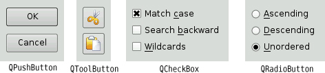


Qt provides four kinds of “buttons”: QPushButton, QToolButton, QCheckBox, and QRadioButton; they are shown in Figure 2.17. QPushButton and QToolButton are most commonly used to initiate an action when they are clicked, but they can also behave like toggle buttons (click to press down, click to restore). QCheckBox can be used for independent on/off options, whereas QRadioButtons are normally mutually exclusive.
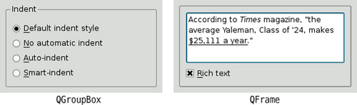
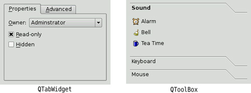
Qt’s container widgets are widgets that contain other widgets. They are shown in Figure 2.18 and Figure 2.19. QFrame can also be used on its own to simply draw lines and serves as the base class for many other widget classes, including QToolBox and QLabel.
QTabWidget and QToolBox are multi-page widgets. Each page is a child widget, and the pages are numbered starting from 0. For QTabWidgets, both the shape and the position of the tabs can be set.
The item views, shown in Figure 2.20, are optimized for handling large amounts of data and often use scroll bars. The scroll bar mechanism is implemented in QAbstractScrollArea, a base class for item views and other kinds of scrollable widgets.
The Qt library includes a rich text engine that can be used for displaying and editing formatted text. The engine supports font specifications, text alignments, lists, tables, images, and hyperlinks. Rich text documents can be created pro-grammatically element by element or supplied as HTML-formatted text. The precise HTML tags and CSS properties that the engine supports are documented at http://doc.trolltech.com/4.3/richtext-html-subset.html.
Qt provides a few widgets that are used purely for displaying information; they are shown in Figure 2.21. QLabel is the most important of these, and it can be used for showing plain text, HTML, and images.
QTextBrowser is a read-only QTextEdit subclass that can display formatted text. This class is used in preference to QLabel for large formatted text documents, because unlike QLabel, it automatically provides scroll bars when necessary, and also provides extensive support for keyboard and mouse navigation. Qt Assistant 4.3 uses QTextBrowser to present documentation to the user.
Qt provides several widgets for data entry, as shown in Figure 2.22. QLineEdit can restrict its input using an input mask, a validator, or both. QTextEdit is a QAbstractScrollArea subclass capable of editing large amounts of text. A QTextEdit can be set to edit plain text or rich text. In the latter case, it is able to display all of the elements that Qt’s rich text engine supports. Both QLineEdit and QTextEdit are fully integrated with the clipboard.
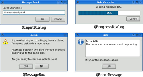
Qt provides a versatile message box and an error dialog that remembers which messages it has shown—these are shown in Figure 2.23. The progress of time-consuming operations can be indicated using QProgressDialog or using the QProgressBar shown in Figure 2.21. QInputDialog is very convenient when a single line of text or a single number is required from the user.
Qt provides the standard set of common dialogs that make it easy to ask the user to select a color, font, or file, or to print a document. These are shown in Figure 2.24 and Figure 2.25.
On Windows and Mac OS X, Qt uses the native dialogs rather than its own common dialogs when possible. Colors can also be chosen using one of the Qt Solutions color selection widgets, and fonts can be chosen using the built-in QFontComboBox.
Finally, QWizard provides a framework for creating wizards (also called assistants on Mac OS X). Wizards are useful for complex or infrequent tasks that users may find difficult to learn. An example of a wizard is shown in Figure 2.26.
A lot of ready-to-use functionality is provided by the built-in widgets and common dialogs. More specialized requirements can often be satisfied by setting widget properties, or by connecting signals to slots and implementing custom behavior in the slots.
If none of the widgets or common dialogs provided with Qt is suitable, one may be available from Qt Solutions, or from a commercial or non-commercial third party. Qt Solutions provides a number of additional widgets, including various color choosers, a thumbwheel control, pie menus, and a property browser, as well as a copy dialog.
In some situations, it may be desirable to create a custom widget from scratch. Qt makes this straightforward, and custom widgets can access all the same platform-independent drawing functionality as Qt’s built-in widgets. Custom widgets can even be integrated with Qt Designer so that they can be used in the same way as Qt’s built-in widgets. Chapter 5 explains how to create custom widgets.