
11. GUI Components: Part 1
Objectives
In this chapter you’ll learn:
• The design principles of graphical user interfaces (GUIs).
• To build GUIs and handle events generated by user interactions with GUIs.
• To understand the packages containing GUI components, event-handling classes and interfaces.
• To create and manipulate buttons, labels, lists, text fields and panels.
• To handle mouse events and keyboard events.
• To use layout managers to arrange GUI components
Do you think I can listen all day to such stuff?
—Lewis Carroll
Even a minor event in the life of a child is an event of that child’s world and thus a world event.
—Gaston Bachelard
You pays your money and you takes your choice.
—Punch
Guess if you can, choose if you dare.
—Pierre Corneille
Outline
11.1 Introduction
11.2 Simple GUI-Based Input/Output with JOptionPane
11.3 Overview of Swing Components
11.4 Displaying Text and Images in a Window
11.5 Text Fields and an Introduction to Event Handling with Nested Classes
11.6 Common GUI Event Types and Listener Interfaces
11.7 How Event Handling Works
11.8 JButton
11.9 Buttons That Maintain State
11.9.1 JCheckBox
11.9.2 JRadioButton
11.10 JComboBox and Using an Anonymous Inner Class for Event Handling
11.11 JList
11.12 Multiple-Selection Lists
11.13 Mouse Event Handling
11.14 Adapter Classes
11.15 JPanel Subclass for Drawing with the Mouse
11.16 Key Event Handling
11.17 Layout Managers
11.17.1 FlowLayout
11.17.2 BorderLayout
11.17.3 GridLayout
11.18 Using Panels to Manage More Complex Layouts
11.19 JTextArea
11.20 Wrap-Up
11.1 Introduction
A graphical user interface (GUI) presents a user-friendly mechanism for interacting with an application. A GUI (pronounced “GOO-ee”) gives an application a distinctive “look” and “feel.” Providing different applications with consistent, intuitive user interface components allows users to be somewhat familiar with an application, so that they can learn it more quickly and use it more productively.
Look-and-Feel Observation 11.1
Consistent user interfaces enable a user to learn new applications faster.
As an example of a GUI, Fig. 11.1 contains an Internet Explorer web-browser window with some of its GUI components labeled. At the top is a title bar that contains the window’s title. Below that is a menu bar containing menus (File, Edit, View, etc.). Below the menu bar is a set of buttons that the user can click to perform tasks in Internet Explorer. Below the buttons is a combo box; the user can type into it the name of a website to visit or can click the down arrow at the right side of the box to select from a list of sites previously visited. The menus, buttons and combo box are part of Internet Explorer’s GUI. They enable you to interact with Internet Explorer.
Fig. 11.1. Window with GUI components.

GUIs are built from GUI components. These are sometimes called controls or widgets—short for window gadgets—in other languages. A GUI component is an object with which the user interacts via the mouse, the keyboard or another form of input, such as voice recognition. In this chapter and Chapter 17, GUI Components: Part 2, you’ll learn about many of Java’s GUI components.
11.2 Simple GUI-Based Input/Output with JOptionPane
The applications in Chapters 2–10 display text at the command window and obtain input from the command window. Most applications you use on a daily basis use windows or dialog boxes (also called dialogs) to interact with the user. For example, e-mail programs allow you to type and read messages in a window provided by the e-mail program. Typically, dialog boxes are windows in which programs display important messages to the user or obtain information from the user. Java’s JOptionPane class (package javax.swing) provides prepackaged dialog boxes for both input and output. These dialogs are displayed by invoking static JOptionPane methods. Figure 11.2 presents a simple addition application that uses two input dialogs to obtain integers from the user and a message dialog to display the sum of the integers the user enters.
Fig. 11.2. Addition program that uses JOptionPane for input and output.
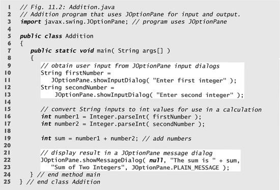
Input dialog displayed by lines 10–11

Input dialog displayed by lines 12–13

Message dialog displayed by lines 22–23

Input Dialogs
Line 3 imports class JOptionPane for use in this application. Lines 10–11 declare the local String variable firstNumber and assign it the result of the call to JOptionPane static method showInputDialog. This method displays an input dialog (see the first screen capture in Fig. 11.2), using the method’s String argument ("Enter first integer") as a prompt.
Look-and-Feel Observation 11.2
The prompt in an input dialog typically uses sentence-style capitalization—only the first letter of the first word is capitalized unless the word is a proper noun (for example, Deitel).
The user types characters in the text field, then clicks the OK button or presses the Enter key to submit the String to the program. Clicking OK also dismisses (hides) the dialog. [Note: If you type in the text field and nothing appears, activate the text field by clicking it with the mouse.] Unlike Scanner, which can be used to input values of several types from the user at the keyboard, an input dialog can input only input Strings. This is typical of most GUI components. Technically, the user can type anything in the input dialog’s text field. Our program assumes that the user enters a valid integer value. If the user clicks the Cancel button, showInputDialog returns null. If the user either types a noninteger value or clicks the Cancel button in the input dialog, a runtime logic error will occur in this program and it will not operate correctly. Chapter 13, Exception Handling, discusses how to handle such errors. Lines 12–13 display another input dialog that prompts the user to enter the second integer.
Converting Strings to int Values
To perform the calculation in this application, we must convert the Strings that the user entered to int values. Recall from Section 7.12 that the Integer class’s static method parseInt converts its String argument to an int value. Lines 16–17 assign the converted values to local variables number1 and number2. Then, line 19 sums these values and assigns the result to local variable sum.
Message Dialogs
Lines 22–23 use JOptionPane static method showMessageDialog to display a message dialog (the last screen capture of Fig. 11.2) containing the sum. The first argument helps the Java application determine where to position the dialog box. The value null indicates that the dialog should appear in the center of the computer screen. The first argument can also be used to specify that the dialog should appear centered over a particular window, which we’ll demonstrate later in Section 11.8. The second argument is the message to display—in this case, the result of concatenating the String "The sum is" and the value of sum. The third argument—"Sum of Two Integers"—represents the string that should appear in the dialog’s title bar at the top of the dialog. The fourth argument—JOptionPane.PLAIN_MESSAGE—is the type of message dialog to display. A PLAIN_MESSAGE dialog does not display an icon to the left of the message. Class JOptionPane provides several overloaded versions of methods showInputDialog and showMessageDialog, as well as methods that display other dialog types. For complete information on class JOptionPane, visit java.sun.com/javase/6/docs/api/javax/swing/JOptionPane.html.
Look-and-Feel Observation 11.3
The title bar of a window typically uses book-title capitalization—a style that capitalizes the first letter of each significant word in the text and does not end with any punctuation (for example, Capitalization in a Book Title).
JOptionPane Message Dialog Constants
The constants that represent the message dialog types are shown in Fig. 11.3. All message dialog types except PLAIN_MESSAGE display an icon to the left of the message. These icons provide a visual indication of the message’s importance to the user. Note that a QUESTION_MESSAGE icon is the default icon for an input dialog box (see Fig. 11.2).
Fig. 11.3. JOptionPane static constants for message dialogs.

11.3 Overview of Swing Components
Though it is possible to perform input and output using the JOptionPane dialogs presented in Section 11.2, most GUI applications require more elaborate, customized user interfaces. The remainder of this chapter discusses many GUI components that enable application developers to create robust GUIs. Figure 11.4 lists several Swing GUI components from package javax.swing that are used to build Java GUIs. Most Swing components are pure Java components—they are written, manipulated and displayed completely in Java. They are part of the Java Foundation Classes (JFC)—Java’s libraries for cross-platform GUI development. Visit java.sun.com/products/jfc for more information on JFC.
Fig. 11.4. Some basic GUI components.

Swing vs. AWT
There are actually two sets of GUI components in Java. Before Swing was introduced in Java SE 1.2, Java GUIs were built with components from the Abstract Window Toolkit (AWT) in package java.awt. When a Java application with an AWT GUI executes on different Java platforms, the application’s GUI components display differently on each platform. Consider an application that displays an object of type Button (package java.awt). On a computer running the Microsoft Windows operating system, the Button will have the same appearance as the buttons in other Windows applications. Similarly, on a computer running the Apple Mac OS X operating system, the Button will have the same look and feel as the buttons in other Macintosh applications. Sometimes, the manner in which a user can interact with a particular AWT component differs between platforms.
Together, the appearance and the way in which the user interacts with the application are known as that application’s look-and-feel. Swing GUI components allow you to specify a uniform look-and-feel for your application across all platforms or to use each platform’s custom look-and-feel. An application can even change the look-and-feel during execution to enable users to choose their own preferred look-and-feel.
Portability Tip 11.1
Swing components are implemented in Java, so they are more portable and flexible than the original Java GUI components from package java.awt, which were based on the GUI components of the underlying platform. For this reason, Swing GUI components are generally preferred.
Lightweight vs. Heavyweight GUI Components
Most Swing components are not tied to actual GUI components supported by the underlying platform on which an application executes. Such GUI components are known as lightweight components. AWT components (many of which parallel the Swing components) are tied to the local platform and are called heavyweight components, because they rely on the local platform’s windowing system to determine their functionality and their look-and-feel.
Several Swing components are heavyweight components. Like AWT components, heavyweight Swing GUI components require direct interaction with the local windowing system, which may restrict their appearance and functionality, making them less flexible than lightweight components.
Look-and-Feel Observation 11.4
The look-and-feel of a GUI defined with heavyweight GUI components from package java.awt may vary across platforms. Because heavyweight components are tied to the local-platform GUI, the look-and-feel varies from platform to platform.
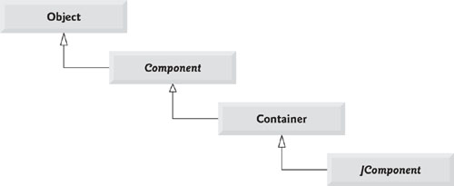
Superclasses of Swing’s Lightweight GUI Components
The UML class diagram of Fig. 11.5 shows an inheritance hierarchy containing classes from which lightweight Swing components inherit their common attributes and behaviors. As discussed in Chapter 9, class Object is the superclass of the Java class hierarchy.
Fig. 11.5. Common superclasses of many of the Swing components.
Software Engineering Observation 11.1
Study the attributes and behaviors of the classes in the class hierarchy of Fig. 11.5. These classes declare the features that are common to most Swing components.
Class Component (package java.awt) is a subclass of Object that declares many of the attributes and behaviors common to the GUI components in packages java.awt and javax.swing. Most GUI components extend class Component directly or indirectly. Visit java.sun.com/javase/6/docs/api/java/awt/Component.html for a complete list of these common features.
Class Container (package java.awt) is a subclass of Component. As you’ll soon see, Components are attached to Containers (such as windows) so the Components can be organized and displayed on the screen. Any object that is a Container can be used to organize other Components in a GUI. Because a Container is a Component, you can attach Containers to other Containers to help organize a GUI. Visit java.sun.com/javase/6/docs/api/java/awt/Container.html for a complete list of the Container features that are common to Swing lightweight components.
Class JComponent (package javax.swing) is a subclass of Container.JComponent is the superclass of all lightweight Swing components and declares their common attributes and behaviors. Because JComponent is a subclass of Container, all lightweight Swing components are also Containers. Some common lightweight component features supported by JComponent include:
1. A pluggable look-and-feel that can be used to customize the appearance of components (e.g., for use on particular platforms). You’ll see an example of this in Section 17.6.
2. Shortcut keys (called mnemonics) for direct access to GUI components through the keyboard. You’ll see an example of this in Section 17.4.
3. Common event-handling capabilities for cases where several GUI components initiate the same actions in an application.
4. Brief descriptions of a GUI component’s purpose (called tool tips) that are displayed when the mouse cursor is positioned over the component for a short time. You’ll see an example of this in the next section.
5. Support for assistive technologies, such as braille screen readers for the visually impaired.
6. Support for user-interface localization—that is, customizing the user interface to display in different languages and use local cultural conventions.
These are just some of the many features of the Swing components. Visit java.sun.com/javase/6/docs/api/javax/swing/JComponent.html for more details of the common lightweight component features.
11.4 Displaying Text and Images in a Window
Our next example introduces a framework for building GUI applications. This framework uses several concepts that you’ll see in many of our GUI applications. This is our first example in which the application appears in its own window. Most windows you’ll create are an instance of class JFrame or a subclass of JFrame. JFrame provides the basic attributes and behaviors of a window—a title bar at the top of the window, and buttons to minimize, maximize and close the window. Since an application’s GUI is typically specific to the application, most of our examples will consist of two classes—a subclass of JFrame that helps us demonstrate new GUI concepts and an application class in which main creates and displays the application’s primary window.
Labeling GUI Components
A typical GUI consists of many components. In a large GUI, it can be difficult to identify the purpose of every component unless the GUI designer provides text instructions or information stating the purpose of each component. Such text is known as a label and is created with class JLabel—a subclass of JComponent. A JLabel displays a single line of read-only text, an image, or both text and an image. Applications rarely change a label’s contents after creating it.
Look-and-Feel Observation 11.5
Text in a JLabel normally uses sentence-style capitalization.
The application of Figs. 11.6–11.7 demonstrates several JLabel features and presents the framework we use in most of our GUI examples. We did not highlight the code in this example, since most of it is new. [Note: There are many more features for each GUI component than we can cover in our examples. To learn the complete details of each GUI component, visit its page in the online documentation. For class JLabel, visit java.sun.com/javase/6/docs/api/javax/swing/JLabel.html.]
Fig. 11.6. JLabels with text and icons.
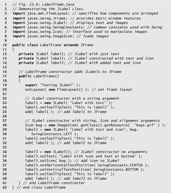
Fig. 11.7. Test class for LabelFrame.

Class LabelFrame (Fig. 11.6) is a subclass of JFrame. We’ll use an instance of class LabelFrame to display a window containing three JLabels. Lines 3–8 import the classes used in class LabelFrame. The class extends JFrame to inherit the features of a window. Lines 12–14 declare the three JLabel instance variables, each of which is instantiated in the LabelFrame constructor (lines 17–41). Typically, the JFrame subclass’s constructor builds the GUI that is displayed in the window when the application executes. Line 19 invokes superclass JFrame’s constructor with the argument "Testing JLabel". JFrame’s constructor uses this String as the text in the window’s title bar.
Specifying the Layout
When building a GUI, each GUI component must be attached to a container, such as a window created with a JFrame. Also, you typically must decide where to position each GUI component. This is known as specifying the layout of the GUI components. As you’ll learn at the end of this chapter and in Chapter 17, GUI Components: Part 2, Java provides several layout managers that can help you position components.
Many integrated development environments provide GUI design tools in which you can specify the exact size and location of a component in a visual manner by using the mouse, then the IDE will generate the GUI code for you. Though such IDEs can greatly simplify GUI creation, they are each different in capability.
To ensure that the code in this book can be used with any IDE, we did not use an IDE to create the GUI code in most of our examples. For this reason, we use Java’s layout managers in our GUI examples. One such layout manager is FlowLayout, in which GUI components are placed on a container from left to right in the order in which the program attaches them to the container. When there is no more room to fit components left to right, components continue to display left to right on the next line. If the container is resized, a FlowLayout reflows (i.e., rearranges) the components to accommodate the new width of the container, possibly with fewer or more rows of GUI components. Line 20 specifies that the layout of the LabelFrame should be a FlowLayout. Method setLayout is inherited into class LabelFrame indirectly from class Container. The argument to the method must be an object of a class that implements the LayoutManager interface (e.g., FlowLayout). Line 20 creates a new FlowLayout object and pass its reference as the argument to setLayout.
Creating and Attaching label1
Now that we have specified the window’s layout, we can begin creating and attaching GUI components to the window. Line 23 creates a JLabel object and passes "Label with text" to the constructor. The JLabel displays this text on the screen as part of the application’s GUI. Line 24 uses method setToolTipText (inherited by JLabel from JComponent) to specify the tool tip that is displayed when the user positions the mouse cursor over the JLabel in the GUI. You can see a sample tool tip in the second screen capture of Fig. 11.7. When you execute this application, try positioning the mouse over each JLabel to see its tool tip. Line 25 attaches label1 to the LabelFrame by passing label1 to the add method, which is inherited indirectly from class Container.
Common Programming Error 11.1
If you do not explicitly add a GUI component to a container, the GUI component will not be displayed when the container appears on the screen.
Look-and-Feel Observation 11.6
Use tool tips to add descriptive text to your GUI components. This text helps the user determine the GUI component’s purpose in the user interface.
Creating and Attaching label2
Icons are a popular way to enhance the look-and-feel of an application and are also commonly used to indicate functionality. For examples, most of today’s VCRs and DVD players use the same icon to play a tape or DVD. Several Swing components can display images. An icon is normally specified with an Icon argument to a constructor or to the component’s setIcon method. An Icon is an object of any class that implements interface Icon (package javax.swing). One such class is ImageIcon (package javax.swing), which supports several image formats, including Graphics Interchange Format (GIF), Portable Network Graphics (PNG) and Joint Photographic Experts Group (JPEG). File names for each of these types end with .gif, .png or .jpg (or .jpeg), respectively.
Line 28 declares an ImageIcon object. The file bug1.gif contains the image to load and store in the ImageIcon object. (This image is included in the directory for this example on the CD that accompanies this book.) The ImageIcon object is assigned to Icon reference bug. Remember, class ImageIcon implements interface Icon; an ImageIcon is an Icon.
In line 28, the expression getClass().getResource( "bug1.gif" ) invokes method getClass (inherited from class Object) to retrieve a reference to the Class object that represents the LabelFrame class declaration. That reference is then used to invoke Class method getResource, which returns the location of the image as a URL. The ImageIcon constructor uses the URL to locate the image, then loads it into memory. As we discussed in Chapter 1, the JVM loads class declarations into memory, using a class loader. The class loader knows where each class it loads is located on disk. Method getResource uses the Class object’s class loader to determine the location of a resource, such as an image file. In this example, the image file is stored in the same location as the LabelFrame.class file. The techniques described here enable an application to load image files from locations that are relative to LabelFrame’s .class file on disk.
A JLabel can display an Icon. Lines 29–30 use another JLabel constructor to create a JLabel that displays the text "Label with text and icon" and the Icon bug created in line 28. The last constructor argument indicates that the label’s contents are left justified, or left aligned (i.e., the icon and text are at the left side of the label’s area on the screen). Interface SwingConstants (package javax.swing) declares a set of common integer constants (such as SwingConstants.LEFT) that are used with many Swing components. By default, the text appears to the right of the image when a label contains both text and an image. Note that the horizontal and vertical alignments of a JLabel can be set with methods setHorizontalAlignment and setVerticalAlignment, respectively. Line 31 specifies the tool-tip text for label2, and line 32 adds label2 to the JFrame.
Creating and Attaching label3
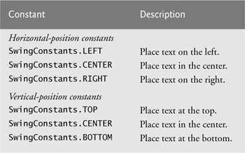
Class JLabel provides many methods to change a label’s appearance after the label has been instantiated. Line 34 creates a JLabel and invokes its no-argument constructor. Such a label initially has no text or Icon. Line 35 uses JLabel method setText to set the text displayed on the label. The corresponding method getText retrieves the current text displayed on a label. Line 36 uses JLabel method setIcon to specify the Icon to display on the label. The corresponding method getIcon retrieves the current Icon displayed on a label. Lines 37–38 use JLabel methods setHorizontalTextPosition and setVerticalTextPosition to specify the text position in the label. In this case, the text will be centered horizontally and will appear at the bottom of the label. Thus, the Icon will appear above the text. The horizontal-position constants in SwingConstants are LEFT, CENTER and RIGHT (Fig. 11.8). The vertical-position constants in SwingConstants are TOP, CENTER and BOTTOM (Fig. 11.8). Line 39 sets the tool-tip text for label3. Line 40 adds label3 to the JFrame.
Fig. 11.8. Some basic GUI components.
Creating and Displaying a LabelFrame Window
Class LabelTest (Fig. 11.7) creates an object of class LabelFrame (line 9), then specifies the default close operation for the window. By default, closing a window simply hides the window. However, when the user closes the LabelFrame window, we would like the application to terminate. Line 10 invokes LabelFrame’s setDefaultCloseOperation method (inherited from class JFrame) with constant JFrame.EXIT_ON_CLOSE as the argument to indicate that the program should terminate when the window is closed by the user. This line is important. Without it the application will not terminate when the user closes the window. Next, line 11 invokes LabelFrame’s setSize method to specify the width and height of the window. Finally, line 12 invokes LabelFrame’s setVisible method with the argument true to display the window on the screen. Try resizing the window to see how the FlowLayout changes the JLabel positions as the window width changes.
11.5 Text Fields and an Introduction to Event Handling with Nested Classes
Normally, a user interacts with an application’s GUI to indicate the tasks that the application should perform. For example, when you write an e-mail in an e-mail application, clicking the Send button tells the application to send the e-mail to the specified e-mail addresses. GUIs are event driven. When the user interacts with a GUI component, the interaction—known as an event—drives the program to perform a task. Some common events (user interactions) that might cause an application to perform a task include clicking a button, typing in a text field, selecting an item from a menu, closing a window and moving the mouse. The code that performs a task in response to an event is called an event handler and the overall process of responding to events is known as event handling.
In this section, we introduce two new GUI components that can generate events—JTextFields and JPasswordFields (package javax.swing). Class JTextField extends class JTextComponent (package javax.swing.text), which provides many features common to Swing’s text-based components. Class JPasswordField extends JTextField and adds several methods that are specific to processing passwords. Each of these components is a single-line area in which the user can enter text via the keyboard. Applications can also display text in a JTextField (see the output of Fig. 11.10). A JPasswordField shows that characters are being typed as the user enters them, but hides the actual characters with an echo character, assuming that they represent a password that should remain known only to the user.
When the user types data into a JTextField or a JPasswordField, then presses Enter, an event occurs. Our next example demonstrates how a program can perform a task in response to that event. The techniques shown here are applicable to all GUI components that generate events.
The application of Figs. 11.9–11.10 uses classes JTextField and JPasswordField to create and manipulate four text fields. When the user types in one of the text fields, then presses Enter, the application displays a message dialog box containing the text the user typed. You can only type in the text field that is “in focus.” A component receives the focus when the user clicks the component. This is important, because the text field with the focus is the one that generates an event when the user presses Enter. In this example, when the user presses Enter in the JPasswordField, the password is revealed. We begin by discussing the setup of the GUI, then discuss the event-handling code.
Fig. 11.9. JTextFields and JPasswordFields.


Fig. 11.10. Test class for TextFieldFrame.


Lines 3–9 import the classes and interfaces we use in this example. Class TextFieldFrame extends JFrame and declares three JTextField variables and a JPasswordField variable (lines 13–16). Each of the corresponding text fields is instantiated and attached to the TextFieldFrame in the constructor (lines 19–47).
Creating the GUI
Line 22 sets the layout of the TextFieldFrame to FlowLayout. Line 25 creates textField1 with 10 columns of text. The width of a text column is determined by the average width of a character in the text field’s current font. When text is displayed in a text field and the text is wider than the text field itself, a portion of the text at the right side is not visible. If you are typing in a text field and the cursor reaches the right edge of the text field, the text at the left edge is pushed off the left side of the text field and will no longer be visible. Users can use the left and right arrow keys to move through the complete text even though the entire text will not be visible at one time. Line 26 adds textField1 to the JFrame.
Line 29 creates textField2 with the initial text "Enter text here" to display in the text field. The width of the text field is determined by the width of the default text specified in the constructor. Line 30 adds textField2 to the JFrame.
Line 33 creates textField3 and calls the JTextField constructor with two arguments—the default text "Uneditable text field" to display and the number of columns (21). The width of the text field is determined by the number of columns specified. Line 34 uses method setEditable (inherited by JTextField from class JTextComponent) to make the text field uneditable—i.e., the user cannot modify the text in the text field. Line 35 adds textField3 to the JFrame.
Line 38 creates passwordField with the text "Hidden text" to display in the text field. The width of the text field is determined by the width of the default text. When you execute the application, notice that the text is displayed as a string of asterisks. Line 39 adds passwordField to the JFrame.
Steps Required to Set Up Event Handling for a GUI Component
This example should display a message dialog containing the text from a text field when the user presses Enter in that text field. Before an application can respond to an event for a particular GUI component, you must perform several coding steps:
1. Create a class that represents the event handler.
2. Implement an appropriate interface, known as an event-listener interface, in the class from Step 1.
3. Indicate that an object of the class from Steps 1 and 2 should be notified when the event occurs. This is known as registering the event handler.
Using a Nested Class to Implement an Event Handler
All the classes discussed so far were so-called top-level classes—that is, the classes were not declared inside another class. Java allows you to declare classes inside other classes—these are called nested classes. Nested classes can be static or non-static. Non-static nested classes are called inner classes and are frequently used for event handling.
Software Engineering Observation 11.2
An inner class is allowed to directly access its top-level class’s variables and methods, even if they are private.
Before an object of an inner class can be created, there must first be an object of the top-level class that contains the inner class. This is required because an inner-class object implicitly has a reference to an object of its top-level class. There is also a special relationship between these objects—the inner-class object is allowed to directly access all the instance variables and methods of the outer class. A nested class that is static does not require an object of its top-level class and does not implicitly have a reference to an object of the top-level class. As you’ll see in Chapter 12, Graphics and Java 2D™, the Java 2D graphics API uses static nested classes extensively.
The event handling in this example is performed by an object of the private inner class TextFieldHandler (lines 50–80). This class is private because it will be used only to create event handlers for the text fields in top-level class TextFieldFrame. As with other members of a class, inner classes can be declared public, protected or private.
GUI components can generate a variety of events in response to user interactions. Each event is represented by a class and can be processed only by the appropriate type of event handler. In most cases, the events a GUI component supports are described in the Java API documentation for that component’s class and its superclasses. When the user presses Enter in a JTextField or JPasswordField, the GUI component generates an ActionEvent (package java.awt.event). Such an event is processed by an object that implements the interface ActionListener (package java.awt.event). The information discussed here is available in the Java API documentation for classes JTextField and ActionEvent. Since JPasswordField is a subclass of JTextField, JPasswordField supports the same events.
To prepare to handle the events in this example, inner class TextFieldHandler implements interface ActionListener and declares the only method in that interface—actionPerformed (lines 53–79). This method specifies the tasks to perform when an ActionEvent occurs. So inner class TextFieldHandler satisfies Steps 1 and 2 listed earlier in this section. We’ll discuss the details of method actionPerformed shortly.
Registering the Event Handler for Each Text Field
In the TextFieldFrame constructor, line 42 creates a TextFieldHandler object and assigns it to variable handler. This object’s actionPerformed method will be called automatically when the user presses Enter in any of the GUI’s text fields. However, before this can occur, the program must register this object as the event handler for each text field. Lines 43–46 are the event-registration statements that specify handler as the event handler for the three JTextFields and the JPasswordField. The application calls JTextField method addActionListener to register the event handler for each component. This method receives as its argument an ActionListener object, which can be an object of any class that implements ActionListener. The object handler is an ActionListener, because class TextFieldHandler implements ActionListener. After lines 43–46 execute, the object handler listens for events. Now, when the user presses Enter in any of these four text fields, method actionPerformed (line 53–79) in class TextFieldHandler is called to handle the event. If an event handler is not registered for a particular text field, the event that occurs when the user presses Enter in that text field is consumed—i.e., it is simply ignored by the application.
Software Engineering Observation 11.3
The event listener for an event must implement the appropriate event-listener interface.
Common Programming Error 11.2
Forgetting to register an event-handler object for a particular GUI component’s event type causes events of that type to be ignored.
Details of Class TextFieldHandler’s actionPerformed Method
In this example, we are using one event-handling object’s actionPerformed method (lines 53–79) to handle the events generated by four text fields. Since we’d like to output the name of each text field’s instance variable for demonstration purposes, we must determine which text field generated the event each time actionPerformed is called. The GUI component with which the user interacts is the event source. In this example, the event source is one of the text fields or the password field. When the user presses Enter while one of these GUI components has the focus, the system creates a unique ActionEvent object that contains information about the event that just occurred, such as the event source and the text in the text field. The system then passes this ActionEvent object in a method call to the event listener’s actionPerformed method. In this example, we display some of that information in a message dialog. Line 55 declares the String that will be displayed. The variable is initialized with the empty string—a string containing no characters. The compiler requires this in case none of the branches of the nested if in lines 58–75 executes.
ActionEvent method getSource (called in lines 58, 63, 68 and 73) returns a reference to the event source. The condition in line 58 asks, “Is the event source textField1?” This condition compares the references on either side of the == operator to determine whether they refer to the same object. If they both refer to textField1, then the program knows that the user pressed Enter in textField1. In this case, lines 59–60 create a String containing the message that line 78 will display in a message dialog. Line 60 uses ActionEvent method getActionCommand to obtain the text the user typed in the text field that generated the event.
If the user interacted with the JPasswordField, lines 74–75 use JPasswordField method getPassword to obtain the password and create the String to display. This method returns the password as an array of type char that is used as an argument to a String constructor to create a string containing the characters in the array.
Class TextFieldTest
Class TextFieldTest (Fig. 11.10) contains the main method that executes this application and displays an object of class TextFieldFrame. When you execute the application, note that even the uneditable JTextField (textField3) can generate an ActionEvent. To test this, click the text field to give it the focus, then press Enter. Also note that the actual text of the password is displayed when you press Enter in the JPasswordField. Of course, you would normally not display the password!
This application used one TextFieldHandler object as the event listener for four text fields. Starting in Section 11.9, you’ll see that it is possible to declare several event-listener objects of the same type and register each individual object for a separate GUI component’s event. This technique enables us to eliminate the if...else logic used in this example’s event handler by providing separate event handlers for each component’s events.
11.6 Common GUI Event Types and Listener Interfaces
In Section 11.5, you learned that information about the event that occurs when the user presses Enter in a text field is stored in an ActionEvent object. Many different types of events can occur when the user interacts with a GUI. The information about any GUI event that occurs is stored in an object of a class that extends AWTEvent. Figure 11.11 illustrates a hierarchy containing many event classes from the package java.awt.event. Some of these are discussed in this chapter and Chapter 17. These event types are used with both AWT and Swing components. Additional event types that are specific to Swing GUI components are declared in package javax.swing.event.
Fig. 11.11. Some event classes of package java.awt.event.

Let’s summarize the three parts to the event-handling mechanism that you saw in Section 11.5—the event source, the event object and the event listener. The event source is the particular GUI component with which the user interacts. The event object encapsulates information about the event that occurred, such as a reference to the event source and any event-specific information that may be required by the event listener for it to handle the event. The event listener is an object that is notified by the event source when an event occurs; in effect, it “listens” for an event, and one of its methods executes in response to the event. A method of the event listener receives an event object when the event listener is notified of the event. The event listener then uses the event object to respond to the event. The event-handling model described here is known as the delegation event model—an event’s processing is delegated to a particular object (the event listener) in the application.
For each event-object type, there is typically a corresponding event-listener interface. An event listener for a GUI event is an object of a class that implements one or more of the event-listener interfaces from packages java.awt.event and javax.swing.event. Many of the event-listener types are common to both Swing and AWT components. Such types are declared in package java.awt.event, and some of them are shown in Fig. 11.12. Additional event-listener types that are specific to Swing components are declared in package javax.swing.event.
Fig. 11.12. Some common event-listener interfaces of package java.awt.event.

Each event-listener interface specifies one or more event-handling methods that must be declared in the class that implements the interface. Recall from Section 10.7 that any class which implements an interface must declare all the abstract methods of that interface; otherwise, the class is an abstract class and cannot be used to create objects.
When an event occurs, the GUI component with which the user interacted notifies its registered listeners by calling each listener’s appropriate event-handling method. For example, when the user presses the Enter key in a JTextField, the registered listener’s actionPerformed method is called. How did the event handler get registered? How does the GUI component know to call actionPerformed rather than another event-handling method? We answer these questions and diagram the interaction in the next section.
11.7 How Event Handling Works
Let us illustrate how the event-handling mechanism works, using textField1 from the example of Fig. 11.9. We have two remaining open questions from Section 11.5:
1. How did the event handler get registered?
2. How does the GUI component know to call actionPerformed rather than some other event-handling method?
The first question is answered by the event registration performed in lines 43–46 of the application. Figure 11.13 diagrams JTextField variable textField1, TextFieldHandler variable handler and the objects to which they refer.
Fig. 11.13. Event registration for JTextField textField1.

Registering Events
Every JComponent has an instance variable called listenerList that refers to an object of class EventListenerList (package javax.swing.event). Each object of a JComponent subclass maintains a references to all its registered listeners in the listenerList. For simplicity, we have diagramed listenerList as an array below the JTextField object in Fig. 11.13.
When line 43 of Fig. 11.9
textField1.addActionListener( handler );
executes, a new entry containing a reference to the TextFieldHandler object is placed in textField1’s listenerList. Although not shown in the diagram, this new entry also includes the listener’s type (in this case, ActionListener). Using this mechanism, each lightweight Swing GUI component maintains its own list of listeners that were registered to handle the component’s events.
Event-Handler Invocation
The event-listener type is important in answering the second question: How does the GUI component know to call actionPerformed rather than another method? Every GUI component supports several event types—mouse events, key events and others. When an event occurs, the event is dispatched to only the event listeners of the appropriate type. Dispatching is the process by which the GUI component calls an event-handling method on each of its listeners that are registered for the particular event type that occurred.
Each event type has one or more corresponding event-listener interfaces. For example, ActionEvents are handled by ActionListeners, MouseEvents are handled by MouseListeners and MouseMotionListeners, and KeyEvents are handled by KeyListeners. When an event occurs, the GUI component receives (from the JVM) a unique event ID specifying the event type. The GUI component uses the event ID to decide the listener type to which the event should be dispatched and to decide which method to call on each listener object. For an ActionEvent, the event is dispatched to every registered ActionListener’s actionPerformed method (the only method in interface ActionListener). For a MouseEvent, the event is dispatched to every registered MouseListener or MouseMotionListener, depending on the mouse event that occurs. The MouseEvent’s event ID determines which of the several mouse event-handling methods are called. All these decisions are handled for you by the GUI components. All you need to do is register an event handler for the particular event type that your application requires, and the GUI component will ensure that the event handler’s appropriate method gets called when the event occurs. [Note: We discuss other event types and event-listener interfaces as they are needed with each new component we introduce.]
11.8 JButton
A button is a component the user clicks to trigger a specific action. A Java application can use several types of buttons, including command buttons, checkboxes, toggle buttons and radio buttons. Figure 11.16 shows the inheritance hierarchy of the Swing buttons we cover in this chapter. As you can see, all the button types are subclasses of AbstractButton (package javax.swing), which declares the common features of Swing buttons. In this section, we concentrate on buttons that are typically used to initiate a command.
Look-and-Feel Observation 11.7
Buttons typically use book-title capitalization.
A command button (see the output of Fig. 11.14) generates an ActionEvent when the user clicks the button. Command buttons are created with class JButton. The text on the face of a JButton is called a button label. A GUI can have many JButtons, but each button label typically should be unique in the portion of the GUI that is currently displayed.
Fig. 11.14. Command buttons and action events.


Look-and-Feel Observation 11.8
Having more than one JButton with the same label makes the JButtons ambiguous to the user. Provide a unique label for each button.
The application of Figs. 11.14 and 11.15 creates two JButtons and demonstrates that JButtons support the display of Icons. Event handling for the buttons is performed by a single instance of inner class ButtonHandler (lines 39–47).
Fig. 11.15. Test class for ButtonFrame.

Lines 14–15 declare JButton variables plainButton and fancyButton. The corresponding objects are instantiated in the constructor. Line 23 creates plainButton with the button label "Plain Button". Line 24 adds the button to the JFrame.
A JButton can display an Icon. To provide the user with an extra level of visual interaction with the GUI, a JButton can also have a rollover Icon—an Icon that is displayed when the user positions the mouse over the button. The icon on the button changes as the mouse moves in and out of the button’s area on the screen. Lines 26–27 create two ImageIcon objects that represent the default Icon and rollover Icon for the JButton created at line 28. Both statements assume that the image files are stored in the same directory as the application (which is commonly the case for applications that use images). These image files have been provided for you.
Line 28 creates fancyButton with the text "Fancy Button" and the icon bug1. By default, the text is displayed to the right of the icon. Line 29 uses setRolloverIcon (inherited from class AbstractButton) to specify the image displayed on the button when the user positions the mouse over it. Line 30 adds the button to the JFrame.
Look-and-Feel Observation 11.9
Because class AbstractButton supports displaying text and images on a button, all subclasses of AbstractButton also support displaying text and images.
Look-and-Feel Observation 11.10
Using rollover icons for JButtons provides users with visual feedback indicating that when they click the mouse while the cursor is positioned over the button, an action will occur.
JButtons, like JTextFields, generate ActionEvents that can be processed by any ActionListener object. Lines 33–35 create an object of private inner class ButtonHandler and register it as the event handler for each JButton. Class ButtonHandler (lines 39–47) declares actionPerformed to display a message dialog box containing the label for the button the user pressed. For a JButton event, ActionEvent method getActionCommand returns the label on the button.
Accessing the this Reference in an Object of a Top-Level Class From an Inner Class
When you execute this application and click one of its buttons, notice that the message dialog that appears is centered over the application’s window. This occurs because the call to JOptionPane method showMessageDialog (lines 44–45 of Fig. 11.14) uses ButtonFrame.this rather than null as the first argument. When this argument is not null, it represents the so-called parent GUI component of the message dialog (in this case the application window is the parent component) and enables the dialog to be centered over that component when the dialog is displayed. ButtonFrame.this represents the this reference of the object of top-level class ButtonFrame.
Software Engineering Observation 11.4
When used in an inner class, keyword this refers to the current inner-class object being manipulated. An inner-class method can use its outer-class object’s this by preceding this with the outer-class name and a dot, as in ButtonFrame.this.
11.9 Buttons That Maintain State
The Swing GUI components contain three types of state buttons—JToggleButton, JCheckBox and JRadioButton—that have on/off or true/false values. Classes JCheckBox and JRadioButton are subclasses of JToggleButton (Fig. 11.16). A JRadioButton is different from a JCheckBox in that normally several JRadioButtons are grouped together, and are mutually exclusive—only one in the group can be selected at any time, just like the buttons on a car radio. We first discuss class JCheckBox. The next two subsections also demonstrate that an inner class can access the members of its top-level class.
Fig. 11.16. Swing button hierarchy.

11.9.1 JCheckBox
The application of Figs. 11.17–11.18 uses two JCheckBox objects to select the desired font style of the text displayed in a JTextField. When selected, one applies a bold style and the other an italic style. If both are selected, the style of the font is bold and italic. When the application initially executes, neither JCheckBox is checked (i.e., they are both false), so the font is plain. Class CheckBoxTest (Fig. 11.18) contains the main method that executes this application.
Fig. 11.17. JCheckBox buttons and item events.
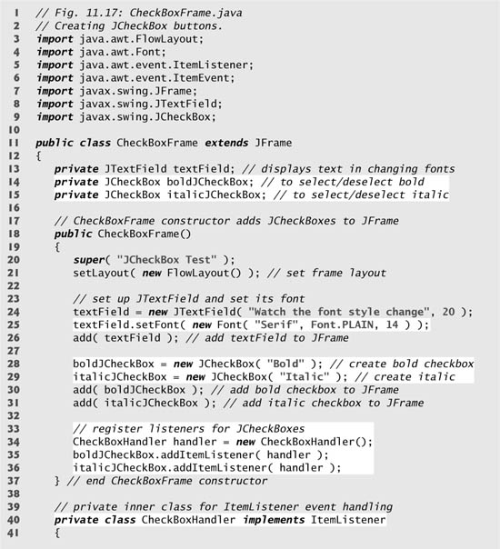
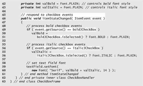
Fig. 11.18. Test class for CheckBoxFrame.


After the JTextField is created and initialized (Fig. 11.17, line 24), line 25 uses method setFont (inherited by JTextField indirectly from class Component) to set the font of the JTextField to a new object of class Font (package java.awt). The new Font is initialized with "Serif" (a generic font name representing a font such as Times and is supported on all Java platforms), Font.PLAIN style and 14-point size. Next, lines 28–29 create two JCheckBox objects. The string passed to the JCheckBox constructor is the checkbox label that appears to the right of the JCheckBox by default.
When the user clicks a JCheckBox, an ItemEvent occurs. This event can be handled by an ItemListener object, which must implement method itemStateChanged. In this example, the event handling is performed by an instance of private inner class CheckBoxHandler (lines 40–62). Lines 34–36 create an instance of class CheckBoxHandler and register it with method addItemListener as the listener for both the JCheckBox objects.
Lines 42–43 declare instance variables for the inner class CheckBoxHandler. Together, these variables represent the font style for the text displayed in the JTextField. Initially both are Font.PLAIN to indicate that the font is not bold and is not italic. Method itemStateChanged (lines 46–61) is called when the user clicks the bold or the italic JCheckBox. The method uses event.getSource() to determine which JCheckBox the user clicked. If it was the boldJCheckBox, line 51 uses JCheckBox method isSelected to determine if the JCheckBox is selected (i.e., it is checked). If the checkbox is selected, local variable valBold is assigned Font.BOLD; otherwise, it is assigned Font.PLAIN. A similar statement executes if the user clicks the italicJCheckBox. If the italicJCheckBox is selected, local variable valItalic is assigned Font.ITALIC; otherwise, it is assigned Font.PLAIN. Lines 59–60 change the font of the JTextField, using the same font name and point size. The sum of valBold and valItalic represents the JTextField’s new font style. Each of the Font constants represents a unique value. Font.PLAIN has the value 0, so if both valBold and valItalic are set to Font.PLAIN, the font will have the plain style. If one of the values is Font.BOLD or Font.ITALIC, the font will be bold or italic accordingly. If one is BOLD and the other is ITALIC, the font will be both bold and italic.
Relationship Between an Inner Class and Its Top-Level Class
Notice that class CheckBoxHandler used variables boldJCheckBox (Fig. 11.17, lines 49 and 51), italicJCheckBox (lines 54 and 56) and textField (line 59) even though they are not declared in the inner class. An inner class has a special relationship with its top-level class—the inner class is allowed to access directly all the instance variables and methods of the top-level class. Method itemStateChanged (line 46–61) of class CheckBoxHandler uses this relationship to determine which JCheckBox is the event source, to determine the state of a JCheckBox and to set the font on the JTextField. Notice that none of the code in inner class CheckBoxHandler requires a reference to the top-level class object.
11.9.2 JRadioButton
Radio buttons (declared with class JRadioButton) are similar to checkboxes in that they have two states—selected and not selected (also called deselected). However, radio buttons normally appear as a group in which only one button can be selected at a time (see the output of Fig. 11.20). Selecting a different radio button forces all others to be deselected. Radio buttons are used to represent mutually exclusive options (i.e., multiple options in the group cannot be selected at the same time). The logical relationship between radio buttons is maintained by a ButtonGroup object (package javax.swing), which itself is not a GUI component. A ButtonGroup object organizes a group of buttons and is not itself displayed in a user interface. Rather, the individual JRadioButton objects from the group are displayed in the GUI.
Common Programming Error 11.3
Adding a ButtonGroup object (or an object of any other class that does not derive from Component) to a container results in a compilation error.
The application of Figs. 11.19–11.20 is similar to that of Figs. 11.17–11.18. The user can alter the font style of a JTextField’s text. The application uses radio buttons that permit only a single font style in the group to be selected at a time. Class RadioButtonTest (Fig. 11.20) contains the main method that executes this application.
Fig. 11.19. JRadioButtons and ButtonGroups.


Fig. 11.20. Test class for RadioButtonFrame.


Lines 35–42 in the constructor (Fig. 11.19) create four JRadioButton objects and add them to the JFrame. Each JRadioButton is created with a constructor call like that in line 35. This constructor specifies the label that appears to the right of the JRadioButton by default and the initial state of the JRadioButton. A true second argument indicates that the JRadioButton should appear selected when it is displayed.
Line 45 instantiates ButtonGroup object radioGroup. This object is the “glue” that forms the logical relationship between the four JRadioButton objects and allows only one of the four to be selected at a time. It is possible that no JRadioButtons in a ButtonGroup are selected, but this can occur only if no preselected JRadioButtons are added to the ButtonGroup and the user has not selected a JRadioButton yet. Lines 46–49 use ButtonGroup method add to associate each of the JRadioButtons with radioGroup. If more than one selected JRadioButton object is added to the group, the selected one that was added first will be selected when the GUI is displayed.
JRadioButtons, like JCheckBoxes, generate ItemEvents when they are clicked. Lines 59–66 create four instances of inner class RadioButtonHandler (declared at lines 70–84). In this example, each event-listener object is registered to handle the ItemEvent generated when the user clicks a particular JRadioButton. Notice that each RadioButtonHandler object is initialized with a particular Font object (created in lines 52–55).
Class RadioButtonHandler (line 70–84) implements interface ItemListener so it can handle ItemEvents generated by the JRadioButtons. The constructor stores the Font object it receives as an argument in the event-listener object’s instance variable font (declared at line 72). When the user clicks a JRadioButton, radioGroup turns off the previously selected JRadioButton and method itemStateChanged (line 80–83) sets the font in the JTextField to the Font stored in the JRadioButton’s corresponding event-listener object. Notice that line 82 of inner class RadioButtonHandler uses the top-level class’s textField instance variable to set the font.
11.10 JComboBox and Using an Anonymous Inner Class for Event Handling
A combo box (sometimes called a drop-down list) provides a list of items (Fig. 11.22) from which the user can make a single selection. Combo boxes are implemented with class JComboBox, which extends class JComponent. JComboBoxes generate ItemEvents like JCheckBoxes and JRadioButtons. This example also demonstrates a special form of inner class that is used frequently in event handling.
The application of Figs. 11.21–11.22 uses a JComboBox to provide a list of four image file names from which the user can select one image to display. When the user selects a name, the application displays the corresponding image as an Icon on a JLabel. Class ComboBoxTest (Fig. 11.22) contains the main method that executes this application. The screen captures for this application show the JComboBox list after the selection was made to illustrate which image file name was selected.
Fig. 11.21. JComboBox that displays a list of image names.
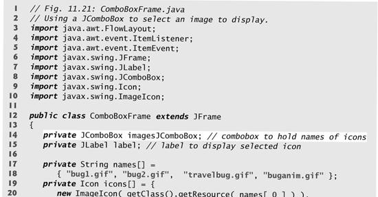
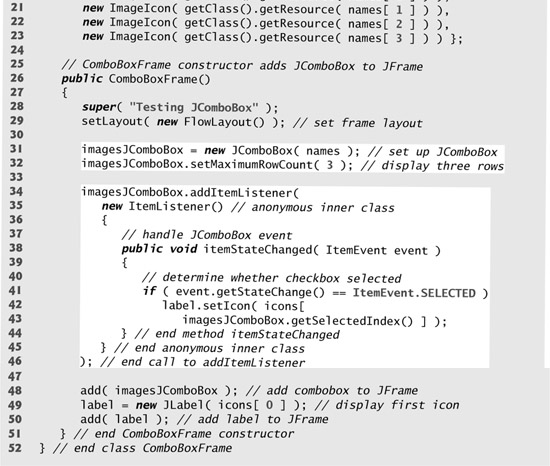
Fig. 11.22. Test class for ComboBoxFrame.


Lines 19–23 (Fig. 11.21) declare and initialize array icons with four new ImageIcon objects. String array names (lines 17–18) contains the names of the four image files that are stored in the same directory as the application.
At line 31, the constructor creates a JComboBox object, using the Strings in array names as the elements in the list. Each item in the list has an index. The first item is added at index 0, the next at index 1 and so forth. The first item added to a JComboBox appears as the currently selected item when the JComboBox is displayed. Other items are selected by clicking the JComboBox, which expands into a list from which the user can make a selection.
Line 32 uses JComboBox method setMaximumRowCount to set the maximum number of elements that are displayed when the user clicks the JComboBox. If there are additional items, the JComboBox provides a scrollbar (see the first screen capture) that allows the user to scroll through all the elements in the list. The user can click the scroll arrows at the top and bottom of the scrollbar to move up and down through the list one element at a time, or else drag the scroll box in the middle of the scrollbar up and down. To drag the scroll box, position the mouse cursor on it, hold the mouse button down and move the mouse.
Look-and-Feel Observation 11.11
Set the maximum row count for a JComboBox to a number of rows that prevents the list from expanding outside the bounds of the window in which it is used. This configuration will ensure that the list displays correctly when it is expanded by the user.
Line 48 attaches the JComboBox to the ComboBoxFrame’s FlowLayout (set in line 29). Line 49 creates the JLabel that displays ImageIcons and initializes it with the first ImageIcon in array icons. Line 50 attaches the JLabel to the ComboBoxFrame’s FlowLayout.
Using an Anonymous Inner Class for Event Handling
Lines 34–46 are one statement that declares the event listener’s class, creates an object of that class and registers that object as the listener for imagesJComboBox’s ItemEvents. In this example, the event-listener object is an instance of an anonymous inner class—an inner class that is declared without a name and typically appears inside a method declaration. As with other inner classes, an anonymous inner class can access its top-level class’s members. However, an anonymous inner class has limited access to the local variables of the method in which it is declared. Since an anonymous inner class has no name, an of the anonymous inner class must be created where the class is declared (starting at line 35).
Software Engineering Observation 11.5
An anonymous inner class declared in a method can access the instance variables and methods of the top-level class object that declared it, as well as the method’s final local variables, but cannot access the method’s non-final local variables.
Lines 34–46 are a call to imagesJComboBox’s addItemListener method. The argument to this method must be an object that is an ItemListener (i.e., any object of a class that implements ItemListener). Lines 35–45 are a class-instance creation expression that declares an anonymous inner class and creates one object of that class. A reference to that object is then passed as the argument to addItemListener. The syntax ItemListener() after new begins the declaration of an anonymous inner class that implements interface ItemListener. This is similar to beginning a class declaration with
public class MyHandler implements ItemListener
The parentheses after ItemListener indicate a call to the default constructor of the anonymous inner class.
The opening left brace ({) at 36 and the closing right brace (}) at line 45 delimit the body of the anonymous inner class. Lines 38–44 declare the ItemListener’s itemStateChanged method. When the user makes a selection from imagesJComboBox, this method sets label’s Icon. The Icon is selected from array icons by determining the index of the selected item in the JComboBox with method getSelectedIndex in line 43. Note that for each item selected from a JComboBox, another item is first deselected—so two ItemEvents occur when an item is selected. We wish to display only the icon for the item the user just selected. For this reason, line 41 determines whether ItemEvent method getStateChange returns ItemEvent.SELECTED. If so, lines 42–43 set label’s icon.
Software Engineering Observation 11.6
Like any other class, when an anonymous inner class implements an interface, the class must implement every method in the interface.
The syntax shown in lines 35–45 for creating an event handler with an anonymous inner class is similar to the code that would be generated by a Java integrated development environment (IDE). Typically, an IDE enables the programmer to design a GUI visually, then the IDE generates code that implements the GUI. The programmer simply inserts statements in the event-handling methods that declare how to handle each event.
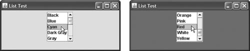
11.11 JList
A list displays a series of items from which the user may select one or more items (see the output of Fig. 11.23). Lists are created with class JList, which directly extends class JComponent. Class JList supports single-selection lists (which allow only one item to be selected at a time) and multiple-selection lists (which allow any number of items to be selected). In this section, we discuss single-selection lists.
Fig. 11.23. JList that displays a list of colors.
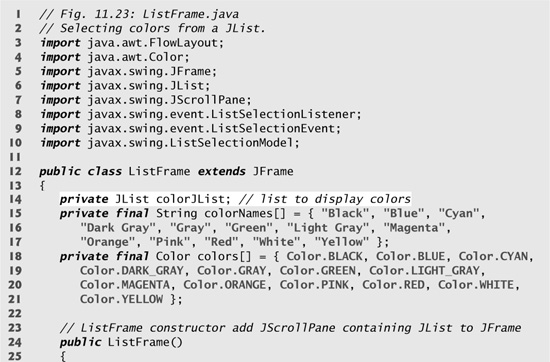

The application of Figs. 11.23–11.24 creates a JList containing 13 color names. When a color name is clicked in the JList, a ListSelectionEvent occurs and the application changes the background color of the application window to the selected color. Class ListTest (Fig. 11.24) contains the main method that executes this application.
Fig. 11.24. Test class for ListFrame.

Line 29 (Fig. 11.23) creates JList object colorList. The JList constructor receives the array of Objects (in this case Strings) to display in the list. Line 30 uses JList method setVisibleRowCount to determine the number of items that are visible in the list.
Line 33 uses JList method setSelectionMode to specify the list’s selection mode. Class ListSelectionModel (of package javax.swing) declares three constants that specify a JList’s selection mode—SINGLE_SELECTION (which allows only one item to be selected at a time), SINGLE_INTERVAL_SELECTION (for a multiple-selection list that allows selection of several contiguous items) and MULTIPLE_INTERVAL_SELECTION (for a multiple-selection list that does not restrict the items that can be selected).
Unlike a JComboBox, a JList does not provide a scrollbar if there are more items in the list than the number of visible rows. In this case, a JScrollPane object is used to provide the scrolling capability. Line 36 adds a new instance of class JScrollPane to the JFrame. The JScrollPane constructor receives as its argument the JComponent that needs scrolling functionality (in this case, colorList). Notice in the screen captures that a scrollbar created by the JScrollPane appears at the right side of the JList. By default, the scrollbar appears only when the number of items in the JList exceeds the number of visible items.
Lines 38–48 use JList method addListSelectionListener to register an object that implements ListSelectionListener (package javax.swing.event) as the listener for the JList’s selection events. Once again, we use an instance of an anonymous inner class (lines 39–47) as the listener. In this example, when the user makes a selection from colorList, method valueChanged (line 42–46) should change the background color of the ListFrame to the selected color. This is accomplished in lines 44–45. Note the use of JFrame method getContentPane in line 44. Each JFrame actually consists of three layers—the background, the content pane and the glass pane. The content pane appears in front of the background and is where the GUI components in the JFrame are displayed. The glass pane is used to display tool tips and other items that should appear in front of the GUI components on the screen. The content pane completely hides the background of the JFrame; thus, to change the background color behind the GUI components, you must change the content pane’s background color. Method getContentPane returns a reference to the JFrame’s content pane (an object of class Container). In line 44, we then use that reference to call method setBackground, which sets the content pane’s background color to an element in the colors array. The color is selected from the array by using the selected item’s index. JList method getSelectedIndex returns the selected item’s index. As with arrays and JComboBoxes, JList indexing is zero based.
11.12 Multiple-Selection Lists
A multiple-selection list enables the user to select many items from a JList (see the output of Fig. 11.26). A SINGLE_INTERVAL_SELECTION list allows selecting a contiguous range of items. To do so, click the first item, then press and hold the Shift key while clicking the last item in the range. A MULTIPLE_INTERVAL_SELECTION list allows continuous range selection as described for a SINGLE_INTERVAL_SELECTION list. Such a list allows miscellaneous items to be selected by pressing and holding the Ctrl key (sometimes called the Control key) while clicking each item to select. To deselect an item, press and hold the Ctrl key while clicking the item a second time.
The application of Figs. 11.25–11.26 uses multiple-selection lists to copy items from one JList to another. One list is a MULTIPLE_INTERVAL_SELECTION list and the other is a SINGLE_INTERVAL_SELECTION list. When you execute the application, try using the selection techniques described previously to select items in both lists.
Fig. 11.25. JList that allows multiple selections.


Fig. 11.26. Test class for MultipleSelectionFrame.


Line 27 of Fig. 11.25 creates JList colorJList and initializes it with the strings in the array colorNames. Line 28 sets the number of visible rows in colorJList to 5. Lines 29–30 specify that colorList is a MULTIPLE_INTERVAL_SELECTION list. Line 31 adds a new JScrollPane containing colorJList to the JFrame. Lines 49–55 perform similar tasks for copyJList, which is declared as a SINGLE_INTERVAL_SELECTION list. Line 51 uses JList method setFixedCellWidth to set copyJList’s width to 100 pixels. Line 52 uses JList method setFixedCellHeight to set the height of each item in the JList to 15 pixels.
There are no events to indicate that a user has made multiple selections in a multiple-selection list. Normally, an event generated by another GUI component (known as an external event) specifies when the multiple selections in a JList should be processed. In this example, the user clicks the JButton called copyJButton to trigger the event that copies the selected items in colorJList to copyJList.
Lines 39–45 declare, create and register an ActionListener for the copyButton. When the user clicks copyJButton, method actionPerformed (lines 39–43) uses JList method setListData to set the items displayed in copyJList. Line 42 calls colorJList’s method getSelectedValues, which returns an array of Objects representing the selected items in colorJList. In this example, the returned array is passed as the argument to copyJList’s setListData method.
You might be wondering why copyJList can be used in line 42 even though the application does not create the object to which it refers until line 49. Remember that method actionPerformed (lines 39–43) does not execute until the user presses the copyJButton, which cannot occur until after the constructor completes execution and the application displays the GUI. At that point in the application’s execution, copyJList is already initialized with a new JList object.
11.13 Mouse Event Handling
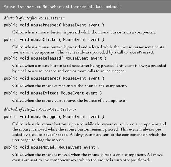
This section presents the MouseListener and MouseMotionListener event-listener interfaces for handling mouse events. Mouse events can be trapped for any GUI component that derives from java.awt.Component. The methods of interfaces MouseListener and MouseMotionListener are summarized in Figure 11.27. Package javax.swing.event contains interface MouseInputListener, which extends interfaces MouseListener and MouseMotionListener to create a single interface containing all the MouseListener and MouseMotionListener methods. The MouseListener and MouseMotionListener methods are called when the mouse interacts with a Component if appropriate event-listener objects are registered for that Component.
Each of the mouse event-handling methods takes a MouseEvent object as its argument. A MouseEvent object contains information about the mouse event that occurred, including the x- and y-coordinates of the location where the event occurred. These coordinates are measured from the upper-left corner of the GUI component on which the event occurred. The x-coordinates start at 0 and increase from left to right. The y-coordinates start at 0 and increase from top to bottom. In addition, the methods and constants of class InputEvent (MouseEvent’s superclass) enable an application to determine which mouse button the user clicked.
Fig. 11.27. MouseListener and MouseMotionListener interface methods.
Look-and-Feel Observation 11.12
Method calls to mouseDragged and mouseReleased are sent to the MouseMotionListener for the Component on which a mouse drag operation started. Similarly, the mouseReleased method call at the end of a drag operation is sent to the MouseListener for the Component on which the drag operation started.
Java also provides interface MouseWheelListener to enable applications to respond to the rotation of a mouse wheel. This interface declares method mouseWheelMoved, which receives a MouseWheelEvent as its argument. Class MouseWheelEvent (a subclass of MouseEvent) contains methods that enable the event handler to obtain information about the amount of wheel rotation.
Tracking Mouse Events on a JPanel
The MouseTracker application (Figs. 11.28–11.29) demonstrates the MouseListener and MouseMotionListener interface methods. The application class implements both interfaces so it can listen for its own mouse events. Note that all seven methods from these two interfaces must be declared by the programmer when a class implements both interfaces. Each mouse event in this example displays a string in the JLabel called statusBar at the bottom of the window.
Fig. 11.28. Mouse event handling.


Fig. 11.29. Test class for MouseTrackerFrame.
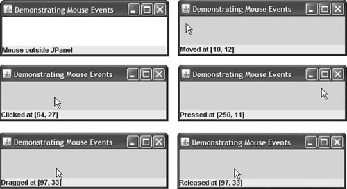
Line 23 in Fig. 11.28 creates JPanel mousePanel. This JPanel’s mouse events will be tracked by the application. Line 24 sets mousePanel’s background color to white. When the user moves the mouse into the mousePanel, the application will change mousePanel’s background color to green. When the user moves the mouse out of the mousePanel, the application will change the background color back to white. Line 25 attaches mousePanel to the JFrame. As you learned in Section 11.4, you typically must specify the layout of the GUI components in a JFrame. In that section, we introduced the layout manager FlowLayout. Here we use the default layout of a JFrame’s content pane—BorderLayout. This layout manager arranges components into five regions: NORTH, SOUTH, EAST, WEST and CENTER. NORTH corresponds to the top of the container. This example uses the CENTER and SOUTH regions. Line 25 uses a two-argument version of method add to place mousePanel in the CENTER region. The BorderLayout automatically sizes the component in the CENTER to use all the space in the JFrame that is not occupied by components in the other regions. Section 11.17.2 discusses BorderLayout in more detail.
Lines 27–28 in the constructor declare JLabel statusBar and attach it to the JFrame’s SOUTH region. This JLabel occupies the width of the JFrame. The region’s height is determined by the JLabel.
Line 31 creates an instance of inner class MouseHandler (lines 36–90) called handler that responds to mouse events. Lines 32–33 register handler as the listener for mousePanel’s mouse events. Methods addMouseListener and addMouseMotionListener are inherited indirectly from class Component and can be used to register MouseListeners and MouseMotionListeners, respectively. A MouseHandler object is both a MouseListener and a MouseMotionListener because the class implements both interfaces. [Note: In this example, we chose to implement both interfaces to demonstrate a class that implements more than one interface. However, we also could have implemented interface MouseInputListener here.]
When the mouse enters and exits mousePanel’s area, methods mouseEntered (lines 62–67) and mouseExited (lines 70–74) are called, respectively. Method mouseEntered displays a message in the statusBar indicating that the mouse entered the JPanel and changes the background color to green. Method mouseExited displays a message in the statusBar indicating that the mouse is outside the JPanel (see the first sample output window) and changes the background color to white.
When any of the other five events occurs, it displays a message in the statusBar that includes a string containing the event and the coordinates at which it occurred. MouseEvent methods getX and getY return the x- and y-coordinates, respectively, of the mouse at the time the event occurred.
11.14 Adapter Classes
Many event-listener interfaces, such as MouseListener and MouseMotionListener, contain multiple methods. It is not always desirable to declare every method in an event-listener interface. For instance, an application may need only the mouseClicked handler from MouseListener or the mouseDragged handler from MouseMotionListener. Interface WindowListener specifies seven window event-handling methods. For many of the listener interfaces that have multiple methods, packages java.awt.event and javax.swing.event provide event-listener adapter classes. An adapter class implements an interface and provides a default implementation (with an empty method body) of each method in the interface. Figure 11.30 shows several java.awt.event adapter classes and the interfaces they implement. You can extend an adapter class to inherit the default implementation of every method and subsequently override only the method(s) you need for event handling.
Fig. 11.30. Event-adapter classes and the interfaces they implement in package java.awt.event.

Software Engineering Observation 11.7
When a class implements an interface, the class has an is-a relationship with that interface. All direct and indirect subclasses of that class inherit this interface. Thus, an object of a class that extends an event-adapter class is an object of the corresponding event-listener type (e.g., an object of a subclass of MouseAdapter is a MouseListener).
Extending MouseAdapter
The application of Figs. 11.31–11.32 demonstrates how to determine the number of mouse clicks (i.e., the click count) and how to distinguish between the different mouse buttons. The event listener in this application is an object of inner class MouseClickHandler (lines 26–46) that extends MouseAdapter, so we can declare just the mouseClicked method we need in this example.
Fig. 11.31. Left, center and right mouse-button clicks.
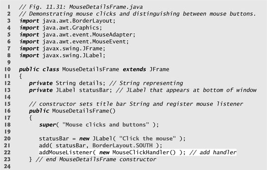

Fig. 11.32. Test class for MouseDetailsFrame.


Common Programming Error 11.4
If you extend an adapter class and misspell the name of the method you are overriding, your method simply becomes another method in the class. This is a logic error that is difficult to detect, since the program will call the empty version of the method inherited from the adapter class.
A user of a Java application may be on a system with a one-, two- or three-button mouse. Java provides a mechanism to distinguish among mouse buttons. Class MouseEvent inherits several methods from class InputEvent that can distinguish among mouse buttons on a multi-button mouse or can mimic a multi-button mouse with a combined keystroke and mouse-button click. Figure 11.33 shows the InputEvent methods used to distinguish among mouse-button clicks. Java assumes that every mouse contains a left mouse button. Thus, it is simple to test for a left-mouse-button click. However, users with a one- or two-button mouse must use a combination of keystrokes and mouse-button clicks at the same time to simulate the missing buttons on the mouse. In the case of a one- or two-button mouse, a Java application assumes that the center mouse button is clicked if the user holds down the Alt key and clicks the left mouse button on a two-button mouse or the only mouse button on a one-button mouse. In the case of a one-button mouse, a Java application assumes that the right mouse button is clicked if the user holds down the Meta key and clicks the mouse button.
Fig. 11.33. InputEvent methods that help distinguish among left-, center- and right-mouse-button clicks.

Line 22 of Fig. 11.31 registers a MouseListener for the MouseDetailsFrame. The event listener is an object of class MouseClickHandler, which extends MouseAdapter. This enables us to declare only method mouseClicked (lines 29–45). This method first captures the coordinates where the event occurred and stores them in local variables xPos and yPos (lines 31–32). Lines 34–35 create a String called details containing the number of mouse clicks, which is returned by MouseEvent method getClickCount at line 35. Lines 37–42 use methods isMetaDown and isAltDown to determine which mouse button the user clicked and append an appropriate String to details in each case. The resulting String is displayed in the statusBar. Class MouseDetails (Fig. 11.32) contains the main method that executes the application. Try clicking with each of your mouse’s buttons repeatedly to see the click count increment.
11.15 JPanel Subclass for Drawing with the Mouse
Section 11.13 showed how to track mouse events in a JPanel. In this section, we use a JPanel as a dedicated drawing area in which the user can draw by dragging the mouse. In addition, this section demonstrates an event listener that extends an adapter class.
Method paintComponent
Lightweight Swing components that extend class JComponent (such as JPanel) contain method paintComponent, which is called when a lightweight Swing component is displayed. By overriding this method, you can specify how to draw shapes using Java’s graphics capabilities. When customizing a JPanel for use as a dedicated drawing area, the subclass should override method paintComponent and call the superclass version of paintComponent as the first statement in the body of the overridden method to ensure that the component displays correctly. The reason for this is that subclasses of JComponent support transparency. To display a component correctly, the program must determine whether the component is transparent. The code that determines this is in superclass JComponent’s paintComponent implementation. When a component is transparent, paintComponent will not clear its background when the program displays the component. When a component is opaque, paintComponent clears the component’s background before the component is displayed. If the superclass version of paintComponent is not called, an opaque GUI component typically will not display correctly on the user interface. Also, if the superclass version is called after performing the customized drawing statements, the results typically will be erased. The transparency of a Swing lightweight component can be set with method setOpaque (a false argument indicates that the component is transparent).
Look-and-Feel Observation 11.13
Most Swing GUI components can be transparent or opaque. If a Swing GUI component is opaque, its background will be cleared when its paintComponent method is called. Only opaque components can display a customized background color. JPanel objects are opaque by default.
Error-Prevention Tip 11.1
In a JComponent subclass’s paintComponent method, the first statement should always call to the superclass’s paintComponent method to ensure that an object of the subclass displays correctly.
Common Programming Error 11.5
If an overridden paintComponent method does not call the superclass’s version, the subclass component may not display properly. If an overridden paintComponent method calls the superclass’s version after other drawing is performed, the drawing will be erased.
Defining the Custom Drawing Area
The Painter application of Figs. 11.34–11.35 demonstrates a customized subclass of JPanel that is used to create a dedicated drawing area. The application uses the mouseDragged event handler to create a simple drawing application. The user can draw pictures by dragging the mouse on the JPanel. This example does not use method mouseMoved, so our event-listener class (the anonymous inner class at lines 22-34) extends MouseMotionAdapter. Since this class already declares both mouseMoved and mouseDragged, we can simply override mouseDragged to provide the event handling this application requires.
Fig. 11.34. Adapter classes used to implement event handlers.

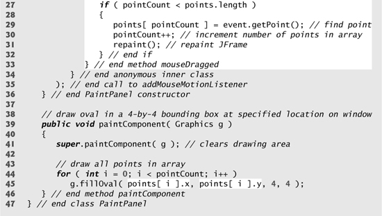
Fig. 11.35. Test class for PaintFrame.


Class PaintPanel (Fig. 11.34) extends JPanel to create the dedicated drawing area. Lines 3–7 import the classes used in class PaintPanel. Class Point (package java.awt) represents an x-y coordinate. We use objects of this class to store the coordinates of each mouse drag event. Class Graphics is used to draw.
In this example, we use an array of 10,000 Points (line 14) to store the location at which each mouse-drag event occurs. As you’ll see, method paintComponent uses these Points to draw. Instance variable pointCount (line 11) maintains the total number of Points captured from mouse drag events so far.
Lines 20–35 register a MouseMotionListener to listen for the PaintPanel’s mouse-motion events. Lines 22–34 create an object of an anonymous inner class that extends the adapter class MouseMotionAdapter. Recall that MouseMotionAdapter implements MouseMotionListener, so the anonymous inner class object is a MouseMotionListener. The anonymous inner class inherits a default implementation of methods mouseMoved and mouseDragged, so it already satisfies the requirement that all methods of the interface must be implemented. However, the default methods do nothing when they are called. So, we override method mouseDragged at lines 25–33 to capture the coordinates of a mouse-dragged event and store them as a Point object. Line 27 ensures that we store the event’s coordinates only if there are still empty elements in the array. If so, line 29 invokes the MouseEvent’s getPoint method to obtain the Point where the event occurred and stores it in the array at index pointCount. Line 30 increments the pointCount, and line 31 calls method repaint (inherited indirectly from class Component) to indicate that the PaintPanel should be refreshed on the screen as soon as possible with a call to the PaintPanel’s paintComponent method.
Method paintComponent (lines 39–46), which receives a Graphics parameter, is called automatically any time the PaintPanel needs to be displayed on the screen (such as when the GUI is first displayed) or refreshed on the screen (such as when method repaint is called or when the GUI component was hidden by another window on the screen and subsequently becomes visible again).
Look-and-Feel Observation 11.14
Calling repaint for a Swing GUI component indicates that the component should be refreshed on the screen as soon as possible. The background of the GUI component is cleared only if the component is opaque. JComponent method setOpaque can be passed a boolean argument indicating whether the component is opaque (true) or transparent (false).
Line 41 invokes the superclass version of paintComponent to clear the PaintPanel’s background (JPanels are opaque by default). Lines 44–45 draw an oval at the location specified by each Point in the array (up to the pointCount). Graphics method fillOval draws a solid oval. The method’s four parameters represent a rectangular area (called the bounding box) in which the oval is displayed. The first two parameters are the upper-left x-coordinate and the upper-left y-coordinate of the rectangular area. The last two coordinates represent the rectangular area’s width and height. Method fillOval draws the oval so it touches the middle of each side of the rectangular area. In line 45, the first two arguments are specified by using class Point’s two public instance variables—x and y. The loop terminates either when a null reference is encountered in the array or when the end of the array is reached. You’ll learn more Graphics features in Chapter 12.
Look-and-Feel Observation 11.15
Drawing on any GUI component is performed with coordinates that are measured from the upper-left corner (0, 0) of that GUI component, not the upper-left corner of the screen.
Using the Custom JPanel in an Application
Class Painter (Fig. 11.35) contains the main method that executes this application. Line 14 creates a PaintPanel object on which the user can drag the mouse to draw. Line 15 attaches the PaintPanel to the JFrame.
11.16 Key Event Handling
This section presents the KeyListener interface for handling key events. Key events are generated when keys on the keyboard are pressed and released. A class that implements KeyListener must provide declarations for methods keyPressed, keyReleased and keyTyped, each of which receives a KeyEvent as its argument. Class KeyEvent is a subclass of InputEvent. Method keyPressed is called in response to pressing any key. Method keyTyped is called in response to pressing any key that is not an action key. (The action keys are any arrow key, Home, End, Page Up, Page Down, any function key, Num Lock, Print Screen, Scroll Lock, Caps Lock and Pause.) Method keyReleased is called when the key is released after any keyPressed or keyTyped event.
The application of Figs. 11.36–11.37 demonstrates the KeyListener methods. Class KeyDemo implements the KeyListener interface, so all three methods are declared in the application.
Fig. 11.36. Key event handling.


Fig. 11.37. Test class for KeyDemoFrame.


The constructor (Fig. 11.36, lines 17–28) registers the application to handle its own key events by using method addKeyListener at line 27. Method addKeyListener is declared in class Component, so every subclass of Component can notify KeyListener objects of key events for that Component.
At line 25, the constructor adds JTextArea textArea (where the application’s output is displayed) to the JFrame. Notice in the screen captures that textArea occupies the entire window. This is due to the JFrame’s default BorderLayout (discussed in Section 11.17.2 and demonstrated in Fig. 11.41). When a single Component is added to a BorderLayout, the Component occupies the entire Container. Note that line 24 uses method setDisabledTextColor to change the color of the text in the textarea to black.
Methods keyPressed (lines 31–36) and keyReleased (lines 39–44) use KeyEvent method getKeyCode to get the virtual key code of the key that was pressed. Class KeyEvent maintains a set of constants—the virtual key-code constants—that represents every key on the keyboard. These constants can be compared with the return value of getKeyCode to test for individual keys on the keyboard. The value returned by getKeyCode is passed to KeyEvent method getKeyText, which returns a string containing the name of the key that was pressed. For a complete list of virtual key constants, see the on-line documentation for class KeyEvent (package java.awt.event). Method keyTyped (lines 47–51) uses KeyEvent method getKeyChar to get the Unicode value of the character typed.
All three event-handling methods finish by calling method setLines2and3 (lines 54–66) and passing it the KeyEvent object. This method uses KeyEvent method isActionKey (line 57) to determine whether the key in the event was an action key. Also, InputEvent method getModifiers is called (line 59) to determine whether any modifier keys (such as Shift, Alt and Ctrl) were pressed when the key event occurred. The result of this method is passed to KeyEvent method getKeyModifiersText, which produces a string containing the names of the pressed modifier keys.
[Note: If you need to test for a specific key on the keyboard, class KeyEvent provides a key constant for every key on the keyboard. These constants can be used from the key event handlers to determine whether a particular key was pressed. Also, to determine whether the Alt, Ctrl, Meta and Shift keys are pressed individually, InputEvent methods isAltDown, isControlDown, isMetaDown and isShiftDown each return a boolean indicating if the particular key was pressed during the key event.]
11.17 Layout Managers
Layout managers are provided to arrange GUI components in a container for presentation purposes. Programmers can use the layout managers for basic layout capabilities instead of determining the exact position and size of every GUI component. This functionality enables the programmer to concentrate on the basic look-and-feel and lets the layout managers process most of the layout details. All layout managers implement the interface LayoutManager (in package java.awt). Class Container’s setLayout method takes an object that implements the LayoutManager interface as an argument. There are basically three ways for you to arrange components in a GUI:
1. Absolute positioning:This provides the greatest level of control over a GUI’s appearance. By setting a Container’s layout to null, you can specify the absolute position of each GUI component with respect to the upper-left corner of the Container. If you do this, you also must specify each GUI component’s size. Programming a GUI with absolute positioning can be tedious, unless you have an integrated development environment (IDE) that can generate the code for you.
2. Layout managers:Using layout managers to position elements can be simpler and faster than creating a GUI with absolute positioning, but you lose some control over the size and the precise positioning of GUI components.
3. Visual programming in an IDE:IDEs provide tools that make it easy to create GUIs. Each IDE typically provides a GUI design tool that allows you to drag and drop GUI components from a tool box onto a design area. You can then position, size and align GUI components as you like. The IDE generates the Java code that creates the GUI. In addition, you can typically add event-handling code for a particular component by double-clicking the component. Some design tools also allow you to use the layout managers described in this chapter and in Chapter 17.
Figure 11.38 summarizes the layout managers presented in this chapter. Other layout managers are discussed in Chapter 17.
Fig. 11.38. Layout managers.

Look-and-Feel Observation 11.16
Most Java programming environments provide GUI design tools that help a programmer graphically design a GUI; the design tools then write the Java code to create the GUI. Such tools often provide greater control over the size, position and alignment of GUI components than do the built-in layout managers.
Look-and-Feel Observation 11.17
It is possible to set a Container’s layout to null, which indicates that no layout manager should be used. In a Container without a layout manager, the programmer must position and size the components in the given container and take care that, on resize events, all components are repositioned as necessary. A component’s resize events can be processed by a ComponentListener.
11.17.1 FlowLayout
FlowLayout is the simplest layout manager. GUI components are placed on a container from left to right in the order in which they are added to the container. When the edge of the container is reached, components continue to display on the next line. Class FlowLayout allows GUI components to be left aligned, centered (the default) and right aligned.
The application of Figs. 11.39–11.40 creates three JButton objects and adds them to the application, using a FlowLayout layout manager. The components are center aligned by default. When the user clicks Left, the alignment for the layout manager is changed to a left-aligned FlowLayout. When the user clicks Right, the alignment for the layout manager is changed to a right-aligned FlowLayout. When the user clicks Center, the alignment for the layout manager is changed to a center-aligned FlowLayout. Each button has its own event handler that is declared with an inner class that implements ActionListener. The sample output windows show each of the FlowLayout alignments. Also, the last sample output window shows the centered alignment after the window has been resized to a smaller width. Notice that the button Right flows onto a new line.
Fig. 11.39. FlowLayout allows components to flow over multiple lines.


Fig. 11.40. Test class for FlowLayoutFrame.


As seen previously, a container’s layout is set with method setLayout of class Container. Line 25 sets the layout manager to the FlowLayout declared at line 23. Normally, the layout is set before any GUI components are added to a container.
Look-and-Feel Observation 11.18
Each container can have only one layout manager. Separate containers in the same application can use different layout managers.
Note in this example that each button’s event handler is specified with a separate anonymous inner-class object (lines 30–43, 48–61 and 66–71, respectively). Each button’s actionPerformed event handler executes two statements. For example, line 37 in method actionPerformed for button left uses FlowLayout method setAlignment to change the alignment for the FlowLayout to a left-aligned (FlowLayout.LEFT) FlowLayout. Line 40 uses LayoutManager interface method layoutContainer (which is inherited by all layout managers) to specify that the JFrame should be rearranged based on the adjusted layout. According to which button was clicked, the actionPerformed method for each button sets the FlowLayout’s alignment to FlowLayout.LEFT (line 37), FlowLayout.CENTER (line 55) or FlowLayout.RIGHT (line 73).
11.17.2 BorderLayout
The BorderLayout layout manager (the default layout manager for a JFrame) arranges components into five regions: NORTH, SOUTH, EAST, WEST and CENTER. NORTH corresponds to the top of the container. Class BorderLayout extends Object and implements interface LayoutManager2 (a subinterface of LayoutManager that adds several methods for enhanced layout processing).
A BorderLayout limits a Container to containing at most five components—one in each region. The component placed in each region can be a container to which other components are attached. The components placed in the NORTH and SOUTH regions extend horizontally to the sides of the container and are as tall as the components placed in those regions. The EAST and WEST regions expand vertically between the NORTH and SOUTH regions and are as wide as the components placed in those regions. The component placed in the CENTER region expands to fill all remaining space in the layout (which is the reason the JTextArea in Fig. 11.36 occupies the entire window). If all five regions are occupied, the entire container’s space is covered by GUI components. If the NORTH or SOUTH region is not occupied, the GUI components in the EAST, CENTER and WEST regions expand vertically to fill the remaining space. If the EAST or WEST region is not occupied, the GUI component in the CENTER region expands horizontally to fill the remaining space. If the CENTER region is not occupied, the area is left empty—the other GUI components do not expand to fill the remaining space. The application of Figs. 11.41–11.42 demonstrates the BorderLayout layout manager by using five JButtons.
Fig. 11.41. BorderLayout containing five buttons.

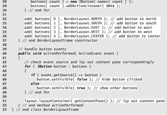
Fig. 11.42. Test class for BorderLayoutFrame.


Line 21 of Fig. 11.41 creates a BorderLayout. The constructor arguments specify the number of pixels between components that are arranged horizontally (horizontal gap space) and between components that are arranged vertically (vertical gap space), respectively. The default is one pixel of gap space horizontally and vertically. Line 22 uses method setLayout to set the content pane’s layout to layout.
We add Components to a BorderLayout with a version of Container method add that takes two arguments—the Component to add and the region in which it should appear. For example, line 32 specifies that buttons[ 0 ] should appear in the NORTH region. The components can be added in any order, but only one component should be added to each region.
Look-and-Feel Observation 11.19
If no region is specified when adding a Component to a BorderLayout, the layout manager assumes that the Component should be added to region BorderLayout.CENTER.
When more than one component is added to a region in a BorderLayout, only the last component added to that region will be displayed. There is no error that indicates this problem.
Note that class BorderLayoutFrame implements ActionListener directly in this example, so the BorderLayoutFrame will handle the events of the JButtons. For this reason, line 29 passes the this reference to the addActionListener method of each JButton. When the user clicks a particular JButton in the layout, method actionPerformed (lines 40–52) executes. The enhanced for statement at lines 43–49 uses an if...else to hide the particular JButton that generated the event. Method setVisible (inherited into JButton from class Component) is called with a false argument (line 46) to hide the JButton. If the current JButton in the array is not the one that generated the event, method setVisible is called with a true argument (line 48) to ensure that the JButton is displayed on the screen. Line 51 uses LayoutManager method layoutContainer to recalculate the layout of the content pane. Notice in the screen captures of Fig. 11.41 that certain regions in the BorderLayout change shape as JButtons are hidden and displayed in other regions. Try resizing the application window to see how the various regions resize based on the window’s width and height. For more complex layouts, group components in JPanels, each with a separate layout manager. Place the JPanels on the JFrame using either the default BorderLayout or some other layout.
11.17.3 GridLayout
The GridLayout layout manager divides the container into a grid so that components can be placed in rows and columns. Class GridLayout inherits directly from class Object and implements interface LayoutManager. Every Component in a GridLayout has the same width and height. Components are added to a GridLayout starting at the top-left cell of the grid and proceeding left to right until the row is full. Then the process continues left to right on the next row of the grid, and so on. The application of Figs. 11.43–11.44 demonstrates the GridLayout layout manager by using six JButtons.
Fig. 11.43. GridLayout containing six buttons.
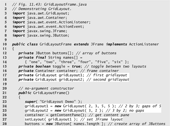

Fig. 11.44. Test class for GridLayoutFrame.


Lines 24–25 create two GridLayout objects. The GridLayout constructor used at line 24 specifies a GridLayout with 2 rows, 3 columns, 5 pixels of horizontal-gap space between Components in the grid and 5 pixels of vertical-gap space between Components in the grid. The GridLayout constructor used at line 25 specifies a GridLayout with 3 rows and 2 columns that uses the default gap space (1 pixel).
The JButton objects in this example initially are arranged using gridLayout1 (set for the content pane at line 27 with method setLayout). The first component is added to the first column of the first row. The next component is added to the second column of the first row, and so on. When a JButton is pressed, method actionPerformed (lines 39–48) is called. Every call to actionPerformed toggles the layout between gridLayout2 and gridLayout1, using boolean variable toggle to determine the next layout to set.
Line 47 shows another way to reformat a container for which the layout has changed. Container method validate recomputes the container’s layout based on the current layout manager for the Container and the current set of displayed GUI components.
11.18 Using Panels to Manage More Complex Layouts
Complex GUIs (like Fig. 11.1) require that each component be placed in an exact location. They often consist of multiple panels, with each panel’s components arranged in a specific layout. Class JPanel extends JComponent and JComponent extends class Container, so every JPanel is a Container. Thus, every JPanel may have components, including other panels, attached to it with Container method add. The application of Figs. 11.45–11.46 demonstrates how a JPanel can be used to create a more complex layout in which several JButtons are placed in the SOUTH region of a BorderLayout.
Fig. 11.45. JPanel with five JButtons in a GridLayout attached to the SOUTH region of a BorderLayout.

Fig. 11.46. Test class for PanelFrame.


After JPanel buttonPanel is declared in line 11 and created at line 19, line 20 sets buttonPanel’s layout to a GridLayout of one row and five columns (there are five JButtons in array buttons). Lines 23–27 add the five JButtons in array buttons to the JPanel in the loop. Line 26 adds the buttons directly to the JPanel—class JPanel does not have a content pane, unlike a JFrame. Line 29 uses the default BorderLayout to add buttonPanel to the SOUTH region. Note that the SOUTH region is as tall as the buttons on buttonPanel. A JPanel is sized to the components it contains. As more components are added, the JPanel grows (according to the restrictions of its layout manager) to accommodate the components. Resize the window to see how the layout manager affects the size of the JButtons.
11.19 JTextArea
A JTextArea provides an area for manipulating multiple lines of text. Like class JTextField, JTextArea is a subclass of JTextComponent, which declares common methods for JTextFields, JTextAreas and several other text-based GUI components.
The application in Figs. 11.47–11.48 demonstrates JTextAreas. One JTextArea displays text that the user can select. The other JTextArea is uneditable and is used to display the text the user selected in the first JTextArea. Unlike JTextFields, JTextAreas do not have action events. As with multiple-selection JLists (Section 11.12), an external event from another GUI component indicates when to process the text in a JTextArea. For example, when typing an e-mail message, you normally click a Send button to send the text of the message to the recipient. Similarly, when editing a document in a word processor, you normally save the file by selecting a Save or Save As... menu item. In this program, the button Copy >>> generates the external event that copies the selected text in the left JTextArea and displays it in the right JTextArea.
Fig. 11.47. Copying selected text from one JTextArea to another.

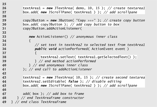
Fig. 11.48. Test class for TextAreaFrame.

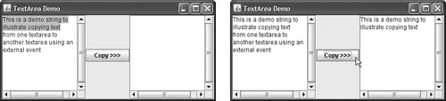
In the constructor (lines 18–48), line 21 creates a Box container (package javax.swing) to organize the GUI components. Box is a subclass of Container that uses a BoxLayout layout manager (discussed in detail in Section 17.9) to arrange the GUI components either horizontally or vertically. Box’s static method createHorizontalBox creates a Box that arranges components from left to right in the order that they are attached.
Lines 26 and 43 create JTextAreas textArea1 and textArea2. Line 26 uses JTextArea’s three-argument constructor, which takes a String representing the initial text and two ints specifying that the JTextArea has 10 rows and 15 columns. Line 43 uses JTextArea’s two-argument constructor, specifying that the JTextArea has 10 rows and 15 columns. Line 26 specifies that demo should be displayed as the default JTextArea content. A JTextArea does not provide scrollbars if it cannot display its complete contents. So, line 27 creates a JScrollPane object, initializes it with textArea1 and attaches it to container box. By default, horizontal and vertical scrollbars will appear as necessary in a JScrollPane.
Lines 29–41 create JButton object copyButton with the label "Copy >>>", add copyButton to container box and register the event handler for copyButton’s ActionEvent. This button provides the external event that determines when the program should copy the selected text in textArea1 to textArea2. When the user clicks copyButton, line 38 in actionPerformed indicates that method getSelectedText (inherited into JTextArea from JTextComponent) should return the selected text from textArea1. The user selects text by dragging the mouse over the desired text to highlight it. Method setText changes the text in textArea2 to the string returned by getSelectedText.
Lines 43–45 create textArea2, set its editable property to false and add it to container box. Line 47 adds box to the JFrame. Recall from Section 11.17 that the default layout of a JFrame is a BorderLayout and that the add method by default attaches its argument to the CENTER of the BorderLayout.
It is sometimes desirable, when text reaches the right side of a JTextArea, to have the text wrap to the next line. This is referred to as line wrapping. By default, JTextArea does not wrap lines.
Look-and-Feel Observation 11.20
To provide line wrapping functionality for a JTextArea, invoke JTextArea method setLineWrap with a true argument.
JScrollPane Scrollbar Policies
This example uses a JScrollPane to provide scrolling for a JTextArea. By default, JScrollPane displays scrollbars only if they are required. You can set the horizontal and vertical scrollbar policies of a JScrollPane when it is constructed. If a program has a reference to a JScrollPane, the program can use JScrollPane methods setHorizontalScrollBarPolicy and setVerticalScrollBarPolicy to change the scrollbar policies at any time. Class JScrollPane declares the constants
JScrollPane.VERTICAL_SCROLLBAR_ALWAYS
JScrollPane.HORIZONTAL_SCROLLBAR_ALWAYS
to indicate that a scrollbar should always appear, constants
JScrollPane.VERTICAL_SCROLLBAR_AS_NEEDED
JScrollPane.HORIZONTAL_SCROLLBAR_AS_NEEDED
to indicate that a scrollbar should appear only if necessary (the defaults) and constants
JScrollPane.VERTICAL_SCROLLBAR_NEVER
JScrollPane.HORIZONTAL_SCROLLBAR_NEVER
to indicate that a scrollbar should never appear. If the horizontal scrollbar policy is set to JScrollPane.HORIZONTAL_SCROLLBAR_NEVER, a JTextArea attached to the JScrollPane will automatically wrap lines.
11.20 Wrap-Up
In this chapter, you learned many GUI components and how to implement event handling. You also learned about nested classes, inner classes and anonymous inner classes. You saw the special relationship between an inner-class object and an object of its top-level class. You learned how to use JOptionPane dialogs to obtain text input from the user and how to display messages to the user. You also learned how to create applications that execute in their own windows. We discussed class JFrame and components that enable a user to interact with an application. We also showed you how to display text and images to the user. You learned how to customize JPanels to create custom drawing areas, which you’ll use extensively in the next chapter. You saw how to organize components on a window using layout managers and how to creating more complex GUIs by using JPanels to organize components. Finally, you learned about the JTextArea component in which a user can enter text and an application can display text. In Chapter 17, GUI Components: Part 2, you’ll learn about more advanced GUI components, such as sliders, menus and more complex layout managers. In the next chapter, you’ll learn how to add graphics to your GUI application. Graphics allow you to draw shapes and text with colors and styles.