
E. GroupLayout
E.1 Introduction
Java SE 6 includes a powerful new layout manager called GroupLayout, which is the default layout manager in the Netbeans 5.5 IDE (www.netbeans.org). In this appendix, we overview GroupLayout, then demonstrate how to use the Netbeans 5.5 IDE’s Matisse GUI designer to create a GUI using GroupLayout to position the components. Netbeans generates the GroupLayout code for you automatically. Though you can write GroupLayout code by hand, in most cases you’ll use a GUI design tool like the one provided by Netbeans to take advantage of GroupLayout's power. For more details on GroupLayout, see the list of web resources at the end of this appendix.
E.2 GroupLayout Basics
Chapters 11 and 17 presented several layout managers that provide basic GUI layout capabilities. We also discussed how to combine layout managers and multiple containers to create more complex layouts. Most layout managers do not give you precise control over the positioning of components. In Chapter 17, we discussed the GridBagLayout, which provides more precise control over the position and size of your GUI components. It allows you to specify the horizontal and vertical position of each component, the number of rows and columns each component occupies in the grid, and how components grow and shrink as the size of the container changes. This is all specified at once with a GridBagConstraints object. Class GroupLayout is the next step in layout management. GroupLayout is more flexible, because you can specify the horizontal and vertical layouts of your components independently.
Sequential and Parallel Arrangements
Components are arranged either sequentially or in parallel. The three JButtons in Fig. E.1 are arranged with sequential horizontal orientation—they appear left to right in sequence. Vertically, the components are arranged in parallel, so, in a sense, they “occupy the same vertical space.” Components can also be arranged sequentially in the vertical direction and in parallel in the horizontal direction, as you’ll see in Section E.3. To prevent overlapping components, components with parallel vertical orientation are normally arranged with sequential horizontal orientation (and vice versa).
Fig. E.1. JButtons arranged sequentially for their horizontal orientation and in parallel for their vertical orientation.

Groups and Alignment
To create more complex user interfaces, GroupLayout allows you to create groups that contain sequential or parallel elements. Within a group you can have GUI components, other groups and gaps. Placing a group within another group is similar to building a GUI using nested containers, such as a JPanel that contains other JPanels, which in turn contain GUI components.
When you create a group, you can specify the alignment of the group’s elements. Class GroupLayout contains four constants for this purpose—LEADING, TRAILING, CENTER and BASELINE. The constant BASELINE applies only to vertical orientations. In horizontal orientation, the constants LEADING, TRAILING and CENTER represent left justified, right justified and centered, respectively. In vertical orientation, LEADING, TRAILING and CENTER align the components at their tops, bottoms or vertical centers, respectively. Aligning components with BASELINE indicates they should be aligned using the baseline of the font for the components’ text. For more information about font baselines, see Section 12.4.
Spacing
GroupLayout by default uses the recommended GUI design guidelines of the underlying platform for spacing between components. The addGap method of GroupLayout nested classes GroupLayout.Group, GroupLayout.SequentialGroup and GroupLayout.ParallelGroup allows you to control the spacing between components.
Sizing Components
By default, GroupLayout uses each component’s getMinimumSize, getMaximumSize and getPreferredSize methods to help determine the component’s size. You can override the default settings.
E.3 Building a ColorChooser
We now present a ColorChooser application to demonstrate the GroupLayout layout manager. The application consists of three JSlider objects, each representing the values from 0 to 255 for specifying the red, green and blue values of a color. The selected values for each JSlider will be used to display a filled rectangle of the specified color. We build the application using Netbeans 5.5. For an more detailed introduction to developing GUI applications in the NetBeans IDE, see www.netbeans.org/kb/trails/matisse.html.
Create a New Project
Begin by opening a new NetBeans project. Select File > New Project.... In the New Project dialog, choose General from the Categories list and Java Application from the Projects list then click Next >. Specify ColorChooser as the project name and uncheck the Create Main Class checkbox. You can also specify the location of your project in the Project Location field. Click Finish to create the project.
Add a New Subclass of JFrame to the Project
In the IDE’s Projects tab just below the File menu and toolbar (Fig. E.2), expand the Source Packages node. Right-click the <default package> node that appears and select New > JFrame Form. In the New JPanel Form dialog, specify ColorChooser as the class name and click Finish. This subclass of JFrame will display the application’s GUI components. The Netbeans window should now appear similar to Fig. E.3 with the ColorChooser class shown in Design view. The Source and Design buttons at the top of the ColorChooser.java window allow you to switch between editing the source code and designing the GUI.
Fig. E.2. Adding a new JFrame Form to the ColorChooser project.

Fig. E.3. Class ColorChooser shown in the Netbeans Design view.

Design view shows only the ColorChooser's client area (i.e., the area that will appear inside the window’s borders). To build a GUI visually, you can drag GUI components from the Palette window onto the client area. You can configure the properties of each component by selecting it, then modifying the property values that appear in the Properties window (Fig. E.3). When you select a component, the Properties window displays three buttons—Properties, Events and Code (see Fig. E.4)—that enable you to configure various aspects of the component.
Fig. E.4. Positioning the first JTextField.

Build the GUI
Drag three JSliders from the Palette onto the JFrame (you may need to scroll through the Palette). As you drag components near the edges of the client area or near other components, Netbeans displays guide lines (Fig. E.4) that show you the recommended distances and alignments between the component you are dragging, the edges of the client area and other components. As you follow the steps to build the GUI, use the guide lines to arrange the components into three rows and three columns as in Fig. E.5. Use the Properties window to rename the JSliders to redJSlider, greenJSlider and blueJSlider. Select the first JSlider, then click the Code button in the Properties window and change the Variable Name property to redSlider. Repeat this process to rename the other two JSliders. Then, select each JSlider and change its maximum property to 255 so that it will produce values in the range 0–255, and change its value property to 0 so the JSlider's thumb will initially be at the left of the JSlider.
Fig. E.5. Layout of the JLabels, JSLiders and JTextFields.

Drag three JLabels from the Palette to the JFrame to label each JSlider with the color it represents. Name the JLabels redJLabel, greenJLabel and blueJLabel, respectively. Each JLabel should be placed to the left of the corresponding JSlider (Fig. E.5). Change each JLabel’s text property either by double clicking the JLabel and typing the new text, or by selecting the JLabel and changing the text property in the Properties window.
Add a JTextField next to each of the JSliders to display the value of the slider. Name the JTextFields redJTextField, greenJTextField and blueJTextField, respectively. Change each JTextField’s text property to 0 using the same techniques as you did for the JLabels. Change each JTextField’s columns property to 4.
Double click the border of the client area to display the Set Form Designer Size dialog and change the first number (which represents the width) to 410, then click OK. This makes the client area wide enough to accommodate the JPanel you’ll add next. Finally, add a JPanel named colorJPanel to the right of this group of components. Use the guide lines as shown in Fig. E.6 to place the JPanel. Change this JPanel’s background color to display the selected color. Finally, drag the bottom border of the client area toward the top of the Design area until you see the snap-to line that shows the recommended height of the client area (based on the components in the client area) as shown in Fig. E.7.
Fig. E.6. Positioning the JPanel.

Fig. E.7. Setting the height of the client area.

Editing the Source Code and Adding Event Handlers
The IDE automatically generated the GUI code, including methods for initializing components and aligning them using the GroupLayout layout manager. We must add the desired functionality to the components’ event handlers. To add an event handler for a component, right click it and position the mouse over the Events option in the pop-up menu. You can then select the category of event you wish to handle and the specific event within that category. For example, to add the JSlider event handlers for this example, right click each JSlider and select Events > Change > stateChanged. When you do this, Netbeans adds a ChangeListener to the JSlider and switches from Design view to Source view where you can place code in the event handler. Use the Design button to return to Design view and repeat the preceding steps to add the event handlers for the other two JSliders. To complete the event handlers, first add the method in Fig. E.8. In each JSlider event handler set the corresponding JTextField to the new value of the JSlider, then call method changeColor. Finally, in the constructor after the call to initComponents, add the line
colorJPanel.setBackground( java.awt.Color.BLACK );
Fig. E.8. Method that changes the colorJPanel’s background color based on the values of the three JSliders.

Figure E.9 shows the completed ColorChooser class exactly as it is generated in Netbeans “in the raw.” More and more software development is done with tools that generate complex code like this, saving you the time and effort of doing it yourself.
Fig. E.9. ColorChooser class that uses GroupLayout for its GUI layout.
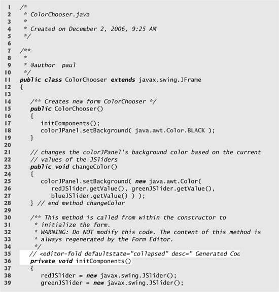


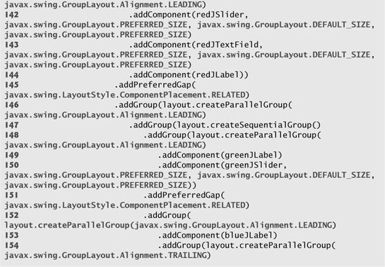


Method initComponents (lines 36–161) was entirely generated by Netbeans based on your interactions with the GUI designer. This method contains the code that creates and formats the GUI. Lines 38–93 construct and initialize the GUI components. Lines 95–161 specify the layout of those components using GroupLayout. Lines 108–133 specify the horizontal group and lines 134–159 specify the vertical group.
We manually added the statement that changes the colorJPanel’s background color in line 18 and the changeColor method in lines 23–28. When the user moves the thumb on one of the JSliders, the JSlider’s event handler sets the text in its corresponding JTextField to the JSlider’s new value (lines 165, 171 and 177), then calls method changeColor (lines 166, 172 and 178) to update the colorJPanel’s background color. Method changeColor gets the current value of each JSlider (lines 26–27) and uses these values as the arguments to the Color constructor to create a new Color.
E.4 GroupLayout Web Resources
weblogs.java.net/blog/tpavek/archive/2006/02/getting_to_know_1.html
Part 1 of Tomas Pavek’s GroupLayout blog post overviews GroupLayout theory.
weblogs.java.net/blog/tpavek/archive/2006/03/getting_to_know.html
Part 2 of Tomas Pavek’s GroupLayout blog post presents a complete GUI implemented with GroupLayout.
java.sun.com/javase/6/docs/api/javax/swing/GroupLayout.html
API documentation for class GroupLayout.