
4. Grouping, Sorting, and Filtering Pivot Data
In This Chapter
Using the PivotTable Fields List
Filtering a Pivot Table: An Overview
Using Filters for Row and Column Fields
Filtering Using the Filters Area
With Excel 2016, Microsoft has added some interesting features for grouping, sorting, and filtering pivot tables. When you add a time or date field to a pivot table, Excel 2016 automatically groups the daily dates up to months and quarters—and possibly years. It was possible to do this manually in Excel 2013, but how to do it was difficult to discover.
A related feature is that pivot charts that include the date hierarchy offer a expand and collapse feature.
This chapter covers grouping, sorting, filtering, data visualizations, and pivot table options.
Automatically Grouping Dates
Say that you have a column in your data set with daily dates that span two years. When you add this Date field to the Columns area of your pivot table, you will see columns for each year instead of hundreds of daily dates (see Figure 4.1).
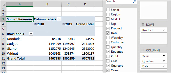
Figure 4.1 Excel 2016 automatically groups two years’ worth of daily dates up to months, quarters, and years.
When you look in the Pivot Table Fields list, you see that the column area automatically includes three fields: Year, Quarter, and Date. All three of these are virtual fields created by grouping the daily dates up to months, quarters, and years.
The three fields are added to either the Rows area or the Columns area. However, only the highest level of the hierarchy will be showing. To see the quarters and years, click one cell that contains a year and then click the Expand button in the Analyze tab of the ribbon. To see months, select a cell containing a quarter and click the Expand button again.
Undoing Automatic Grouping
For the most part, automatic grouping is a welcome addition to Excel 2016. However, if you don’t like the feature, you should click Ctrl+Z to undo immediately after adding the Date field to the pivot table. To disable the Auto Group functionality on both native and data model pivot tables and pivot charts, you can add a new DWORD (32-bit) Value registry key: HKEY_CURRENT_USERSoftwareMicrosoftOffice16.0ExcelOptionsDateAutoGroupingDisabled. After adding the key, edit it to set its value data to “1”.
If you have missed the opportunity to undo by taking some other action, you can ungroup by following these steps:
1. Choose a cell that contains one of the rolled-up dates.
2. On the Analyze tab in the ribbon, choose Ungroup.
Understanding How Excel 2016 Decides What to Group
If you have daily dates that include an entire year or that fall in two or more years, Excel 2016 groups the daily dates to include years, quarters, and months. If you need to report by daily dates, you will have to select any date cell, choose Group Field, and add Days.
If you have daily dates that fall within one calendar year, Excel groups the daily dates to month and includes daily dates.
Caution
If your company is closed on New Year’s Day and you have no sales on January 1, a data set that stretches from January 2 to December 31 will fit the “less than a full year” case and will include months and daily dates.
If your data contains times that do not cross over midnight, you get hours, minutes, and seconds. If the times span more than one day, you get days, hours, minutes, and seconds.
Grouping Date Fields Manually
Sometimes you might prefer to group your dates manually instead of using the automatic grouping that Excel 2016 offers. Excel provides a straightforward way to group date fields. Select any date cell in your pivot table. On the Analyze tab, click Group Field in the Group option.
When your field contains date information, the Grouping dialog appears. By default, the Months option is selected. You have choices to group by Seconds, Minutes, Hours, Days, Months, Quarters, and Years. It is possible—and usually advisable—o select more than one field in the Grouping dialog. In this case, select Months and Years, as shown in Figure 4.2.

There are several interesting points to note about the resulting pivot table. First, notice that the Years field has been added to the PivotTable Fields list. Don’t let this fool you. Your source data is not changed to include the new field. Instead, this field is now part of your pivot cache in memory.
Another interesting point is that, by default, the Years field is automatically added to the same area as the original date field in the pivot table layout, as shown in Figure 4.3. Although this happens automatically, you are free to pivot months and years onto the opposite axis of the report. This is a quick way to create a year-over-year sales report.

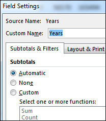
Also, the Years field will be set up to not display subtotals. To add subtotals, select cell A5 in Figure 4.3. Choose Field Settings and change the Subtotals setting from None to Automatic, as shown in Figure 4.4.
Including Years When Grouping by Months
Although this point is not immediately obvious, it is important to understand that if you group a date field by month, you also need to include the year in the grouping. If your data set includes January 2018 and January 2019, selecting only months in the Grouping dialog will result in both January 2018 and January 2019 being combined into a single row called January (see Figure 4.5).
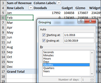
Figure 4.5 If you fail to include the Year field in the grouping, the report mixes sales from January 2018 and January 2019 in the same number.
Grouping Date Fields by Week
The Grouping dialog offers choices to group by second, minute, hour, day, month, quarter, and year. It is also possible to group on a weekly or biweekly basis.
The first step is to find either a paper calendar or an electronic calendar, such as the Calendar feature in Outlook, for the year in question. If your data starts on January 1, 2018, it is helpful to know that January 1 is a Monday that year. You need to decide if weeks should start on Sunday or Monday or any other day. For example, you can check the paper or electronic calendar to learn that the nearest starting Sunday is December 31, 2017.
Select any date heading in your pivot table. Then select Group Field from the Analyze tab. In the Grouping dialog, clear all the By options and select only the Days field. This enables the spin button for Number of Days. To produce a report by week, increase the number of days from 1 to 7.
Next, you need to set up the Starting At date. If you were to accept the default of starting at January 1, 2018, all your weekly periods would run from Monday through Sunday. By checking a calendar before you begin, you know that you want the first group to start on December 31, 2017, to have weeks that run Sunday through Monday. Figure 4.6 shows the settings in the Grouping dialog and the resulting report.

Caution
If you choose to group by week, none of the other grouping options can be selected. You cannot group this or any field by month, quarter, or year. You cannot add calculated items to the pivot table.
Grouping Numeric Fields
The Grouping dialog for numeric fields enables you to group items into equal ranges. This can be useful for creating frequency distributions. The pivot table in Figure 4.7 is quite the opposite of anything you’ve seen so far in this book. The numeric field—Revenue—is in the Rows area. A text field—Customer—is in the Values area. When you put a text field in the Values area, you get a count of how many records match the criteria. In its present state, this pivot table is not that fascinating; it is telling you that exactly one record in the database has a total revenue of $23,990.
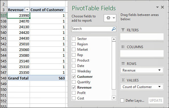
Figure 4.7 Nothing interesting here—just lots of order totals that appear exactly one time in the database.
Select one number in column A of the pivot table. Select Group Field from the Analyze tab of the ribbon. Because this field is not a date field, the Grouping dialog offers fields for Starting At, Ending At, and By. As shown in Figure 4.8, you can choose to show amounts from 0 to 30,000 in groups of 5,000.

After grouping the order size into buckets, you might want to add additional fields, such as Revenue and % of Revenue shown as a percentage of the total.
Case Study: Grouping Text Fields for Redistricting
Say that you get a call from the VP of Sales. The Sales Department is secretly considering a massive reorganization of the sales regions. The VP would like to see a report showing revenue after redistricting. You have been around long enough to know that the proposed regions will change several times before the reorganization happens, so you are not willing to change the Region field in your source data quite yet.
First, build a report showing revenue by market. The VP of Sales is proposing eliminating two regional managers and redistricting the country into three super-regions. While holding down the Ctrl key, highlight the five regions that will make up the new West region. Figure 4.9 shows the pivot table before the first group is created.

From the Analyze tab, click Group Selection. Excel adds a new field called Market2. The five selected regions are arbitrarily rolled up to a new territory called Group1. While holding down the Ctrl key, select the markets for the South region (see Figure 4.10).

Click Group Selection to group the markets in the proposed Southeast region. Repeat to group the remaining regions into the proposed Northeast region. Figure 4.11 shows what it looks like when you have grouped the markets into new regions. Five things need further adjustment: the names of Group1, Group2, Group3, and Market2 and the lack of subtotals for the outer row field.
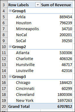
Cleaning up the report takes only a few moments:
1. Select cell A4. Type West to replace the arbitrary name Group1.
2. Select cell A10. Type Southeast to replace the arbitrary name Group2.
3. Select A15. Type Northeast to replace Group3.
4. Select any outer heading in A4, A10, or A15. Click Field Settings on the Analyze tab.
5. In the Field Settings dialog, replace the Custom Name of Market2 with Proposed Region. Also in the Field Settings dialog, change the Subtotals setting from None to Automatic.
Figure 4.12 shows the pivot table that results, which is ready for the VP of Sales.

You can probably predict that the Sales Department needs to shuffle markets to balance the regions. To go back to the original regions, select any Proposed Region cell in A4, A10, or A15 and choose Ungroup. You can then start over, grouping regions in new combinations.
Using the PivotTable Fields List
The entry points for sorting and filtering are spread throughout the Excel interface. It is worth taking a closer look at the row header drop-downs and the PivotTable Fields list before diving in to sorting and filtering.
As you’ve seen in these pages, I rarely use the Compact form for a pivot table. My first step with most pivot tables is to ditch the Compact form and select Tabular layout instead. Although there are many good reasons for this, one is illustrated in Figures 4.13 and 4.14.
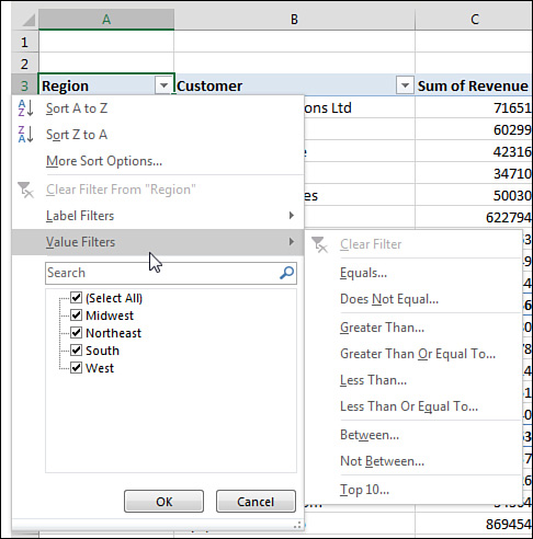

Figure 4.14 In Compact form, one single drop-down tries to control sorting and filtering for all the row fields.
In Figure 4.13, a Region drop-down appears in A3. A Customer drop-down appears in B3. Each of these separate drop-downs offers great settings for sorting and filtering.
When you leave the pivot table in the Compact form, there are not separate headings for Region and Customer. Both fields are crammed into column A, with the silly heading Row Labels. This means the drop-down always offers sorting and filtering options for Region. Every time you go back to the A3 drop-down with hopes of filtering or sorting the Customer field, you have to reselect Customer from a drop-down at the top of the menu. This is an extra click. If you are making five changes to the Customer field, you are reselecting Customer over and over and over and over and over. This should be enough to convince you to abandon the Compact layout.
If you decide to keep the Compact layout and get frustrated with the consolidated Row Labels drop-down, you can directly access the invisible drop-down for the correct field by using the PivotTable Fields list, which contains a visible drop-down for every field in the areas at the bottom. Those visible drop-downs do not contain the sorting and filtering options.
The good drop-downs are actually in the top of the fields list, but you have to hover over the field to see the drop-down appear. After you hover as shown in Figure 4.15, you can directly access the same customer drop-down shown in Figure 4.13.
Figure 4.15 Hover over the field in the top of the fields list to directly access the sorting and filtering settings for that field.
Docking and Undocking the PivotTable Fields List
The PivotTable Fields list starts out docked on the right side of the Excel window. Hover over the green PivotTable Fields heading in the pane, and the mouse pointer changes to a four-headed arrow. Drag to the left to enable the pane to float anywhere in your Excel window.
After you have undocked the PivotTable Fields list, you might find that it is difficult to redock it on either side of the screen. To redock the fields list, you must grab the title bar and drag until at least 85% of the fields list is off the edge of the window. Pretend that you are trying to remove the floating fields list completely from the screen. Eventually, Excel gets the hint and redocks it. Note that you can dock the PivotTable Fields list on either the right side or the left side of the screen.
Rearranging the PivotTable Fields List
As shown in Figure 4.16, a small gear-wheel icon appears near the top of the PivotTable Fields list. Select this drop-down to see its five possible arrangements. Although the default is to have the Fields section at the top of the list and the Areas section at the bottom of the list, four other arrangements are possible. Other options let you control whether the fields in the list appear alphabetically or in the same sequence that they appeared in the original data set.
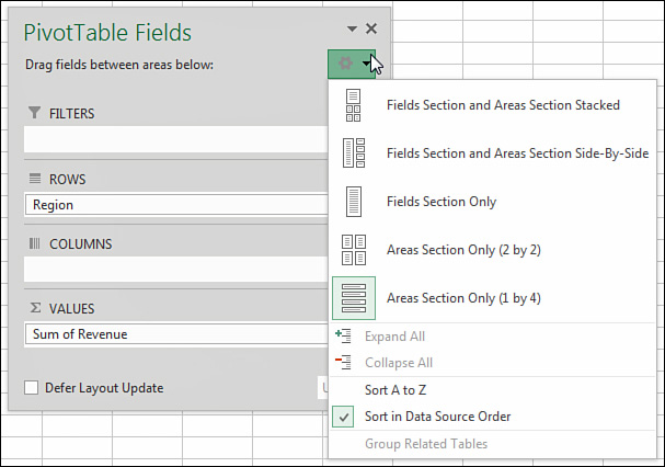
The final three arrangements offered in the drop-down are rather confusing. If someone changes the PivotTable Fields list to show only the Areas section, you cannot see new fields to add to the pivot table.
If you ever encounter a version of the PivotTable Fields list with only the Areas section (see Figure 4.16) or only the Fields section, remember that you can return to a less confusing view of the data by using the arrangement drop-down.
Using the Areas Section Drop-Downs
As shown in Figure 4.17, every field in the Areas section has a visible drop-down arrow. When you select this drop-down arrow, you see four categories of choices:
![]() The first four choices enable you to rearrange the field within the list of fields in that area of the pivot table. You can accomplish this by dragging the field up or down in area.
The first four choices enable you to rearrange the field within the list of fields in that area of the pivot table. You can accomplish this by dragging the field up or down in area.
![]() The next four choices enable you to move the field to a new area. You could also accomplish this by dragging the field to a new area.
The next four choices enable you to move the field to a new area. You could also accomplish this by dragging the field to a new area.
![]() The next choice enables you to remove the field from the pivot table. You can also accomplish this by dragging the field outside the fields list.
The next choice enables you to remove the field from the pivot table. You can also accomplish this by dragging the field outside the fields list.
![]() The final choice displays the Field Settings dialog for the field.
The final choice displays the Field Settings dialog for the field.

Sorting in a Pivot Table
Items in the row area and column area of a pivot table are sorted in ascending order by any custom list first. This allows weekday and month names to sort into Monday, Tuesday, Wednesday,...instead of the alphabetical order Friday, Monday, Saturday,..., Wednesday.
If the items do not appear in a custom list, they will be sorted in ascending order. This is fine, but in many situations, you want the customer with the largest revenue to appear at the top of the list. When you sort in descending order using a pivot table, you are setting up a rule that controls how that field is sorted, even after new fields are added to the pivot table.
Tip
Excel 2016 includes four custom lists by default, but you can add your own custom list to control the sort order of future pivot tables. See the section “Using a Custom List for Sorting,” later in this chapter.
Sorting Customers into High-to-Low Sequence Based on Revenue
Three pivot tables appear in Figure 4.18. The first pivot table shows the default sort for a pivot table: Customers are arranged alphabetically, starting with Adaept, Callelia, and so on.
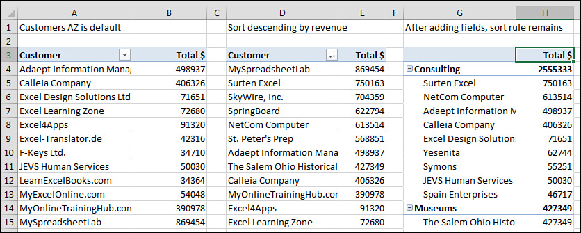
Figure 4.18 When you override the default sort, Excel remembers the sort as additional fields are added.
In the second pivot table, the report is sorted in descending sequence by Total Revenue. This pivot table was sorted by selecting cell E3 and choosing the ZA icon in the Data tab of the ribbon. Although that sounds like a regular sort, it is better. When you sort inside a pivot table, Excel sets up a rule that will be used after you make additional changes to the pivot table.
The pivot table in columns G:H shows what happens after you add Sector as a new outer row field. Within each sector, the pivot table continues to sort the data in descending order by revenue. Within Consulting, Surten Excel appears first, with $750K, followed by NetCom, with $614K.
You could remove Customer from the pivot table, do more adjustments, and then add Customer back to the column area, and Excel would remember that the customers should be presented from high to low.
If you could see the entire pivot table in G3:H35 in Figure 4.18, you would notice that the sectors are sorted alphabetically. It might make more sense, though, to put the largest sectors at the top. The following tricks can be used for sorting an outer row field by revenue:
![]() You can select cell G4 and then use Collapse Field on the Analyze tab to hide the customer detail. When you have only the sectors showing, select H4 and click ZA to sort descending. Excel understands that you want to set up a sort rule for the Sector field.
You can select cell G4 and then use Collapse Field on the Analyze tab to hide the customer detail. When you have only the sectors showing, select H4 and click ZA to sort descending. Excel understands that you want to set up a sort rule for the Sector field.
![]() You can temporarily remove Customer from the pivot table, sort descending by revenue, and then add Customer back.
You can temporarily remove Customer from the pivot table, sort descending by revenue, and then add Customer back.
![]() You can use More Sort Options, as described in the following paragraphs.
You can use More Sort Options, as described in the following paragraphs.
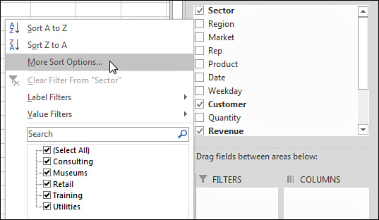
To sort the Sector field, you should open the drop-down menu for the Sector field. Hover over Sector in the top of the PivotTable Fields list, and click the drop-down arrow that appears (see Figure 4.19). Or, if your pivot table is shown in Tabular layout or Outline layout, you can simply open the drop-down arrow in cell G3.
Inside the drop-down menu, choose More Sort Options to open the Sort (Sector) dialog. In this dialog, you can choose to sort the Sector field in Descending order by Total $ (see Figure 4.20).

The Sort (Sector) dialog shown in Figure 4.20 includes a More Options button in the lower left. If you click this button, you arrive at the More Sort Options dialog, in which you can specify a custom list to be used for the first key sort order. You can also specify that the sorting should be based on a column other than Grand Total.
In Figure 4.21, the pivot table includes Product in the column area. If you wanted to sort the customers based on total gadget revenue instead of total revenue, for example, you could do so with the More Sort Options dialog. Here are the steps:
1. Open the Customer heading drop-down in B4.
2. Choose More Sort Options.
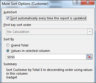
3. In the Sort (Customer) dialog, choose More Options.
4. In the More Sort Options (Customer) dialog, choose the Sort By Values in Selected Column option (see Figure 4.21).
5. Click in the reference box and then click cell D5. Note that you cannot click the Gadget heading in D4; you have to choose one of the Gadget value cells.
6. Click OK twice to return to the pivot table.
If your pivot table has only one field in the Rows area, you can set up the “Sort by Doodads” rule by doing a simple sort using the Data tab. Select any cell in B5:B30 and choose Data, ZA. The pivot table will be sorted with the largest Doodads customers at the top (see Figure 4.22).

Using a Manual Sort Sequence
The Sort dialog offers something called a manual sort. Rather than using the dialog, you can invoke a manual sort in a surprising way.
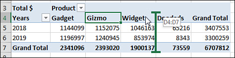
Note that the products in Figure 4.23 are in the following order: Doodads, Gadget, Gizmo, and Widget. It appears that the Doodads product line is a minor product line and probably would not fall first in the product list.

Place the cell pointer in cell E4 and type the word Doodads. When you press Enter, Excel figures out that you want to move the Doodads column to be last. All the values for this product line move from column B to column E. The values for the remaining products shift to the left.
This behavior is completely unintuitive. You should never try this behavior with a regular (non–pivot table) data set in Excel. You would never expect Excel to change the data sequence just by moving the labels. Figure 4.24 shows the pivot table after a new column heading has been typed in cell E4.

If you prefer to use the mouse, you can drag and drop the column heading to a new location. Select a column heading. Hover over the edge of the active cell border until the mouse changes to a four-headed arrow. Drag the cell to a new location, as shown in Figure 4.25. When you release the mouse, all of the value settings move to the new column.
Caution
After you use a manual sort, any new products you add to the data source are automatically added to the end of the list rather than appearing alphabetically.
Using a Custom List for Sorting
Another way to permanently change the order of items along a dimension is to set up a custom list. All future pivot tables created on your computer will automatically respect the order of the items in a custom list.
The pivot table at the top of Figure 4.26 includes weekday names. The weekday names were added to the original data set by using =TEXT(F2,“DDD”) and copying down. Excel automatically puts Sunday first and Saturday last, even though this is not the alphabetical sequence of these words. This happens because Excel ships with four custom lists to control the days of the week, months of the year, and the three-letter abbreviations for both.
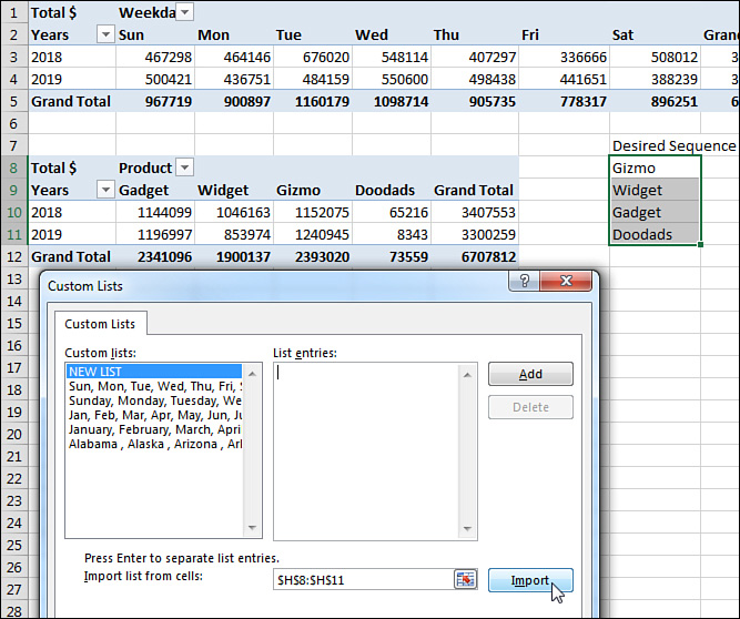
You can define your own custom list to control the sort order of pivot tables. Follow these steps to set up a custom list:
1. In an out-of-the-way section of the worksheet, type the products in their proper sequence. Type one product per cell, going down a column.
2. Select the cells containing the list of regions in the proper sequence.
3. Click the File tab and select Options.
4. Select the Advanced category in the left navigation bar. Scroll down to the General group and click the Edit Custom Lists button. In the Custom Lists dialog, your selection address is entered in the Import text box, as shown in Figure 4.26.
5. Click Import to bring the products in as a new list.
6. Click OK to close the Custom Lists dialog, and then click OK to close the Excel Options dialog.
The custom list is now stored on your computer and is available for all future Excel sessions. All future pivot tables will automatically show the product field in the order specified in the custom list. Figure 4.27 shows a new pivot table created after the custom list was set up.

Figure 4.27 After you define a custom list, all future pivot tables will follow the order in the list.
To sort an existing pivot table by the newly defined custom list, follow these steps:
1. Open the Product header drop-down and choose More Sort Options.
2. In the Sort (Product) dialog, choose More Options.
3. In the More Sort Options (Product) dialog, clear the AutoSort check box.
4. As shown in Figure 4.28, in the More Sort Options (Product) dialog, open the First Key Sort Order drop-down and select the custom list with your product names.

5. Click OK twice.
Filtering a Pivot Table: An Overview
Excel 2016 provides dozens of ways to filter a pivot table. Figure 4.29 shows some of the filters available. These methods, and the best way to use each one, are discussed in the following sections.
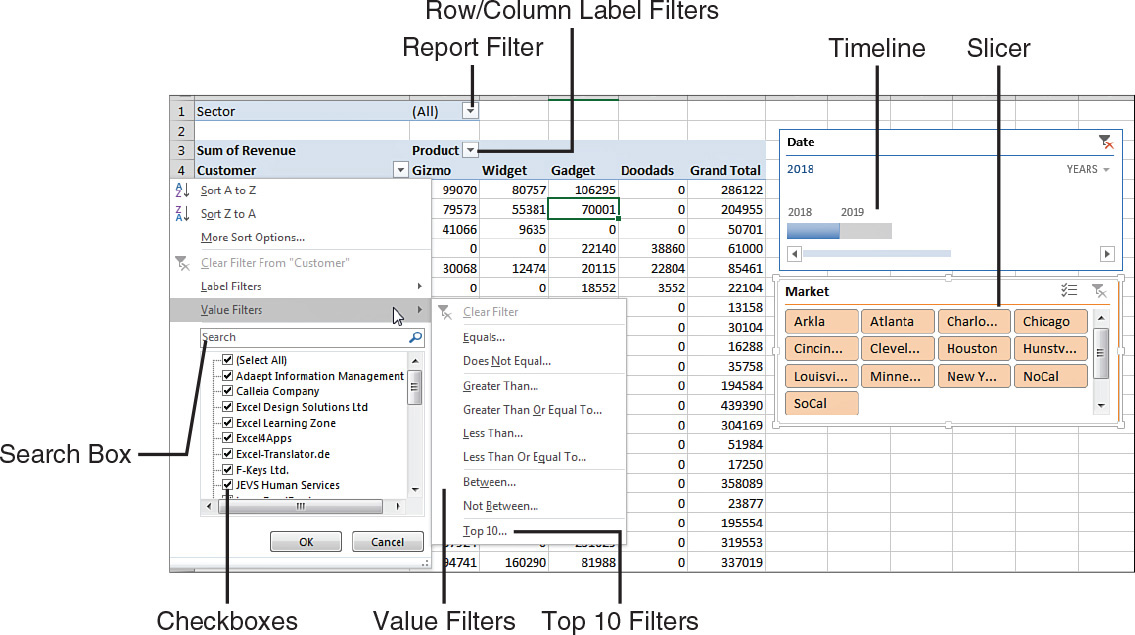
There are four ways to filter a pivot table, as shown in Figure 4.29:
![]() The Date timeline filter in G2:K9 was introduced in Excel 2013.
The Date timeline filter in G2:K9 was introduced in Excel 2013.
![]() The Market filter in G10:K17 is an example of the slicer introduced in Excel 2010.
The Market filter in G10:K17 is an example of the slicer introduced in Excel 2010.
![]() A drop-downs in B1 offers what were known as page filters in Excel 2003, report filters in Excel 2010, and now simply filters.
A drop-downs in B1 offers what were known as page filters in Excel 2003, report filters in Excel 2010, and now simply filters.
![]() Cell G4 offers the top-secret AutoFilter location.
Cell G4 offers the top-secret AutoFilter location.
Drop-downs in A4 and B3 lead to even more filters:
![]() You see the traditional check box filters for each pivot item.
You see the traditional check box filters for each pivot item.
![]() A Search box filter was introduced in Excel 2010.
A Search box filter was introduced in Excel 2010.
![]() A fly-out menu has Label Filters.
A fly-out menu has Label Filters.
![]() Depending on the field type, you might see a Value Filters fly-out menu, including the powerful Top 10 filter, which can do Top 10, Bottom 5, Bottom 3%, Top $8 Million, and more.
Depending on the field type, you might see a Value Filters fly-out menu, including the powerful Top 10 filter, which can do Top 10, Bottom 5, Bottom 3%, Top $8 Million, and more.
![]() Depending on the field type, you might see a Date Filters fly-out menu, with 37 virtual filters such as Next Month, Last Year, and Year to Date.
Depending on the field type, you might see a Date Filters fly-out menu, with 37 virtual filters such as Next Month, Last Year, and Year to Date.
Using Filters for Row and Column Fields
If you have a field (or fields) in the row or column area of a pivot table, a drop-down with filtering choices appears on the header cell for that field. In Figure 4.29, a Customer drop-down appears in A4, and a Product drop-down appears in B3. The pivot table in that figure is using Tabular layout. If your pivot tables use Compact layout, you see a drop-down on the cell with Row Labels or Column Labels.
If you have multiple row fields, it is just as easy to sort using the invisible drop-downs that appear when you hover over a field in the top of the PivotTable Fields list.
Filtering Using the Check Boxes
You might have a few annoying products appear in a pivot table. In the present example, the Doodads product line is a specialty product with very little sales. It might be an old legacy product that is out of line, but it still gets an occasional order from the scrap bin. Every company seems to have these orphan sales that no one really wants to see.
The check box filter provides an easy way to hide these items. Open the Product drop-down and uncheck Doodads. The product is hidden from view (see Figure 4.30).

What if you need to uncheck hundreds of items in order to leave only a few items selected? You can toggle all items off or on by using the Select All check box at the top of the list. You can then select the few items that you want to show in the pivot table.
In Figure 4.31, Select All turned off all customers and then two clicks re-selected Excel4Apps and F-Keys Ltd.

The check boxes work great in this tiny data set with 26 customers. In real life, with 500 customers in the list, it will not be this easy to filter your data set by using the check boxes.
Filtering Using the Search Box
When you have hundreds of customers, the search box can be a great timesaver. In Figure 4.32, the database includes consultants, trainers, and other companies. If you want to narrow the list to companies with Excel or spreadsheet in their name, you can follow these steps:
1. Open the Customer drop-down.
2. Type Excel in the search box (see Figure 4.32).
3. By default, Select All Search Results is selected. Click OK.
4. Open the Customer drop-down again.
5. Type spreadsheet in the search box.
6. Choose Add Current Selection to Filter, as shown in Figure 4.33. Click OK.

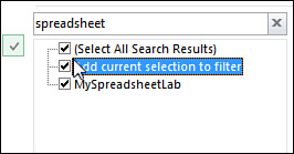
You now have all customers with either Excel or spreadsheet in the name.
Filtering Using the Label Filters Option
The search box isn’t perfect. What if you want to find all the Lotus 1-2-3 consultants and turn those off? There is no Select Everything Except These Results choice. Nor is there a Toggle All Filter Choices choice. However, the Label Filters option enables you to handle queries such as “select all customers that do not contain ‘Lotus.’”
Text fields offer a fly-out menu called Label Filters. To filter out all of the Insurance customers, you can apply a Does Not Contain filter (see Figure 4.34). In the next dialog, you can specify that you want customers that do not contain Excel, Exc, or Exc* (see Figure 4.35).

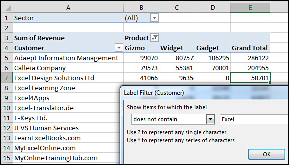
Note that label filters are not additive. You can only apply one label filter at a time. If you take the data in Figure 4.34 and apply a new label filter of between D and Fzz, some Excel customers that were filtered out in Figure 4.35 come back, as shown in Figure 4.36.
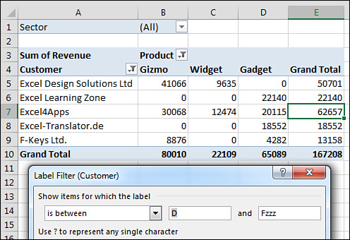
Figure 4.36 Note that a second label filter does not get added to the previous filter. Excel is back in.
Filtering a Label Column Using Information in a Values Column
The Value Filters fly-out menu enables you to filter customers based on information in the Values columns. Perhaps you want to see customers who had between $20,000 and $30,000 of revenue. You can use the Customer heading drop-down to control this. Here’s how:
1. Open the Customer drop-down.
2. Choose Label Filters.
3. Choose Between (see Figure 4.37).

4. Type the values 20000 and 30000, as shown in Figure 4.38.

5. Click OK.
The results are inclusive; if a customer had exactly $20,000 or exactly $30,000, they are returned along with the customers between $20,000 and $30,000.
Creating a Top-Five Report Using the Top 10 Filter
One of the more interesting value filters is the Top 10 filter. If you are sending a report to the VP of Sales, she is not going to want to see hundreds of pages of customers. One short summary with the top customers is almost more than her attention span can handle. Here’s how to create it:
1. Go to the Customer drop-down and choose Value Filters, Top 10.
2. In the Top 10 Filter dialog, which enables you to choose Top or Bottom, leave the setting at the default of Top.
3. In the second field, enter any number of customers: 10, 5, 7, 12, or something else.
4. In the third drop-down on the dialog, select from Items, Percent, and Sum. You could ask for the top 10 items. You could ask for the top 80% of revenue (which the theory says should be 20% of the customers). Or you could ask for enough customers to reach a sum of $5 million (see Figure 4.39).
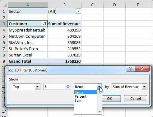
The $1,758,220 total shown in cell B9 in Figure 4.39 is the revenue of only the visible customers. It does not include the revenue for the remaining customers. You might want to show the grand total of all customers at the bottom of the list. You have a few options:
![]() A setting on the Design tab, under the Subtotals drop-down, enables you to include values from filtered items in the totals. This option is available only for OLAP data sets. However, you can make a regular data set into an OLAP data set by running it through Power Pivot.
A setting on the Design tab, under the Subtotals drop-down, enables you to include values from filtered items in the totals. This option is available only for OLAP data sets. However, you can make a regular data set into an OLAP data set by running it through Power Pivot.
Note
See Chapter 10, “Mashing Up Data with Power Pivot,” for more information on working with Power Pivot.
![]() You can remove the grand total from the pivot table in Figure 4.39 and build another one-row pivot table just below this data set. Hide the heading row from the second pivot table, and you will appear to have the true grand total at the bottom of the pivot table.
You can remove the grand total from the pivot table in Figure 4.39 and build another one-row pivot table just below this data set. Hide the heading row from the second pivot table, and you will appear to have the true grand total at the bottom of the pivot table.
![]() If you select the blank cell to the right of the last heading (C3 in Figure 4.39), you can turn on the filter on the Data tab. This filter is not designed for pivot tables and is usually grayed out. After you’ve added the regular filters, open the drop-down in B3. Choose Top 10 Filter and ask for the top six items, as shown in Figure 4.40. This returns the top five customers and the grand total from the data set.
If you select the blank cell to the right of the last heading (C3 in Figure 4.39), you can turn on the filter on the Data tab. This filter is not designed for pivot tables and is usually grayed out. After you’ve added the regular filters, open the drop-down in B3. Choose Top 10 Filter and ask for the top six items, as shown in Figure 4.40. This returns the top five customers and the grand total from the data set.

Figure 4.40 You are taking advantage of a hole in the fabric of Excel to apply a regular AutoFilter to a pivot table.
Caution
Be aware that this method is taking advantage of a bug in Excel. Normally, the Filter found on the Data tab is not allowed in a pivot table. If you use this method and later refresh the pivot table, the Excel team will not update the filter for you. As far as they know, the option to filter is greyed out when you are in a pivot table.
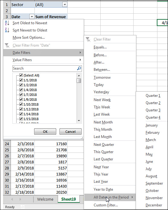
Filtering Using the Date Filters in the Label Drop-down
If your label field contains all dates, Excel replaces the Label Filter fly-out with a Date Filters fly-out. These filters offer many virtual filters, such as Next Week, This Month, Last Quarter, and so on (see Figure 4.41).
If you choose Equals, Before, After, or Between, you can specify a date or a range of dates.
Options for the current, past, or next day, week, month, quarter, or year occupy 15 options. Combined with Year to Date, these options change day after day. You can pivot a list of projects by due date and always see the projects that are due in the next week by using this option. When you open the workbook on another day, the report recalculates.
Tip
A week runs from Sunday through Saturday. If you select Next Week, the report always shows a period from the next Sunday through the following Saturday.
When you select All Dates in the Period, a new fly-out menu offers options such as Each Month and Each Quarter.
Caution
If your date field contains dates and times, the Date Filters might not work as expected. You might ask for dates equal to 4/15/2018, and Excel will say that no records are found. The problem is that 6:00 p.m. on 4/15/2018 is stored internally as 43205.75, with the “.75” representing the 18 hours elapsed in the day between midnight and 6:00 p.m. If you want to return all records that happened at any point on April 15, check the Whole Days box in the Date Filter dialog.
Filtering Using the Filters Area
Pivot table veterans remember the old Page area section of a pivot table. This area has been renamed the Filters area and still operates basically the same as in legacy versions of Excel. Microsoft did add the capability to select multiple items from the Filters area. Although the Filters area is not as showy as slicers, it is still useful when you need to replicate your pivot table for every customer.
Adding Fields to the Filters Area
The pivot table in Figure 4.42 is a perfect ad hoc reporting tool to give to a high-level executive. He can use the drop-downs in B1:B4 and E1:E4 to find revenue quickly for any combination of sector, region, market, rep, customer, product, date, or weekday. This is a typical use of filters.
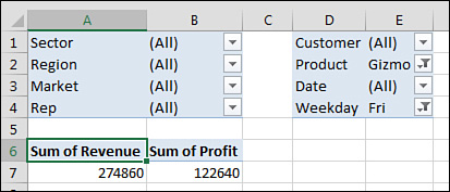
Figure 4.42 With multiple fields in the Filters area, this pivot table can answer many ad hoc queries.
To set up the report, drag Revenue and Cost to the Values area and then drag as many fields as desired to the Filters area.
If you add many fields to the Filters area, you might want to use one of the obscure pivot table options settings. Click Options on the Analyze tab. On the Layout & Format tab of the PivotTable Options dialog, change Report Filter Fields per Column from 0 to a positive number. Excel rearranges the filter fields into multiple columns. Figure 4.42 shows the filters with four fields per column. You can also change Down, Then Over to Over, Then Down to rearrange the sequence of the filter fields.
Choosing One Item from a Filter
To filter the pivot table, click any drop-down in the Filters area of the pivot table. The drop-down always starts with (All) but then lists the complete unique set of items available in that field.
Choosing Multiple Items from a Filter
At the bottom of the Filters drop-down is a check box labeled Select Multiple Items. If you select this box, Excel adds a check box next to each item in the drop-down. This enables you to check multiple items from the list.
In Figure 4.43, the pivot table is filtered to show revenue from multiple sectors, but it is impossible to tell which sectors are included.

Figure 4.43 You can select multiple items, but after the filter drop-down closes, you cannot tell which items were selected.
Tip
Selecting multiple items from the Filter leads to a situation where the person reading the report will not know which items are included. Slicers solve this problem.
Replicating a Pivot Table Report for Each Item in a Filter
Although slicers are now the darlings of the pivot table report, the good old-fashioned report filter can still do one trick that slicers cannot do. Say you have created a report that you would like to share with the industry managers. You have a report showing customers with revenue and profit. You would like each industry manager to see only the customers in their area of responsibility.
Follow these steps to quickly replicate the pivot table:
1. Make sure the formatting in the pivot table looks good before you start. You are about to make several copies of the pivot table, and you don’t want to format each worksheet in the workbook, so double-check the number formatting and headings now.
2. Add the Sector field to the Filters area. Leave the Sector filter set to (All).
3. Select one cell in the pivot table so that you can see the Analyze tab in the ribbon.
4. Find the Options button in the left side of the Analyze tab. Next to the options tab is a drop-down. Don’t click the big Options button. Instead, open the drop-down (see Figure 4.44).
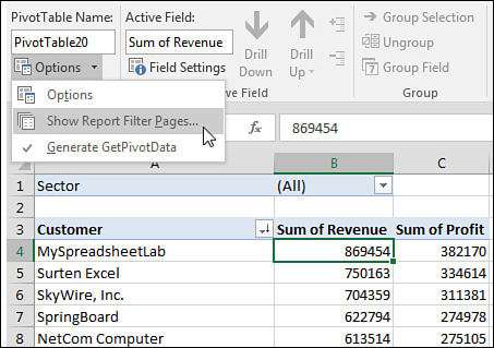
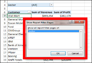
5. Choose Show Report Filter Pages. In the Show Report Filter Pages dialog, you see a list of all the fields in the report area. Because this pivot table has only the Sector field, this is the only choice (see Figure 4.45).
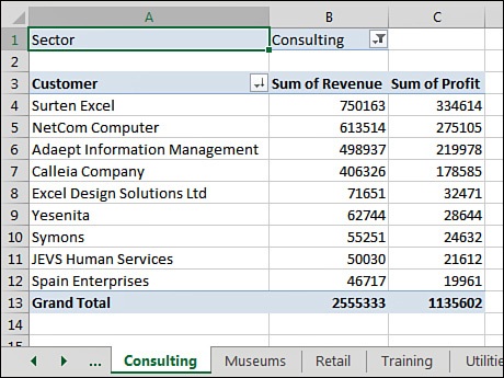
6. Click OK and stand back.
Excel inserts a new worksheet for every item in the Sector field. On the first new worksheet, Excel chooses the first sector as the filter value for that sheet. Excel renames the worksheet to match the sector. Figure 4.46 shows the new Consulting worksheet, with neighboring tabs that contain Museums, Retail, Training, and Utilities.
Tip
If the underlying data changes, you can refresh all of the Sector worksheets by using Refresh on one Sector pivot table. After you refresh the Consulting worksheet, all of the pivot tables refresh.
Filtering Using Slicers and Timelines
Slicers are graphical versions of the Report Filter fields. Rather than hiding the items selected in the filter drop-down behind a heading such as (Multiple Items), the slicer provides a large array of buttons that show at a glance which items are included or excluded.
To add slicers, click the Insert Slicer icon on the Analyze tab. Excel displays the Insert Slicers dialog. Choose all the fields for which you want to create graphical filters, as shown in Figure 4.47.

Initially, Excel chooses one-column slicers of similar color in a tiled arrangement (see Figure 4.48). However, you can change these settings by selecting a slicer and using the Slicer Tools Options tab in the ribbon.
You can add more columns to a slicer. If you have to show 50 two-letter state abbreviations, that will look much better as 5 rows of 10 columns than as 50 rows of 1 column. Click the slicer to get access to the Slicer Tools Analyze tab. Use the Columns spin button to increase the number of columns in the slicer. Use the resize handles in the slicer to make the slicer wider or shorter. To add visual interest, choose a different color from the Slicer Styles gallery for each field.
After formatting the slicers, arrange them in a blank section of the worksheet, as shown in Figure 4.49.

Three colors might appear in a slicer. The dark color indicates items that are selected. White boxes often mean the item has no records because of other slicers. Gray boxes indicate items that are not selected.
Note that you can control the heading for the slicer and the order of items in the slicer by using the Slicer Settings icon on the Slicer Tools Options tab of the ribbon. Just as you can define a new pivot table style, you can also right-click an existing slicer style and choose Duplicate. You can change the font, colors, and so on.
A new icon appears in Excel 2016, in the top bar of the slicer. The icon appears as three check marks. When you select this icon, you can select multiple items from the slicer without having to hold down the Ctrl key.
Using Timelines to Filter by Date
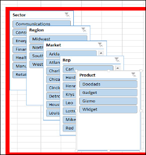
After slicers were introduced in Excel 2010, there was some feedback that using slicers was not an ideal way to deal with date fields. You might end up adding some fields to your original data set to show (perhaps) a decade and then use the group feature for year, quarter, and month. You would end up with a whole bunch of slicers all trying to select a time period, as shown in Figure 4.50.

For Excel 2013, Microsoft introduced a new kind of filter called a Timeline slicer. To use one, select one cell in your pivot table and choose Insert Timeline from the Analyze tab. Timeline slicers can only apply to fields that contain dates. Excel gives you a list of date fields to choose from, although in most cases there is only one date field from which to choose.
Figure 4.51 shows a Timeline slicer. Perhaps the best part of a Timeline slicer is the drop-down that lets you repurpose the timeline for days, months, quarters, or years. This works even if you have not grouped your daily dates up to months, quarters, or years.

Driving Multiple Pivot Tables from One Set of Slicers
Chapter 12, “Enhancing Pivot Tables with Macros,” includes a tiny macro that lets you drive two pivot tables with one set of filters. This has historically been difficult to do unless you used a macro.
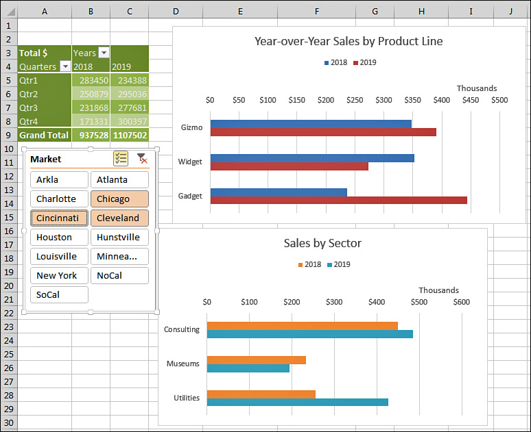
Now, one set of slicers or timelines can be used to drive multiple pivot tables or pivot charts. In Figure 4.52, the Market slicer is driving three elements. It drives the pivot table in the top left with year-over-year sales by quarter. It drives a pivot table behind the top-right chart with sales by product line. It drives the bottom-right chart with sales by sector.

![]() For more information about how to create pivot charts, refer to Chapter 6, “Using Pivot Charts and Other Visualizations.”
For more information about how to create pivot charts, refer to Chapter 6, “Using Pivot Charts and Other Visualizations.”
The following steps show you how to create three pivot tables that are tied to a single slicer:
1. Create your first pivot table.
2. Select the entire pivot table.
3. Copy with Ctrl+C or the Copy command.
4. Select a new blank area of the worksheet.
5. Paste. Excel creates a second pivot table that shares the pivot cache with the first pivot table. In order for one slicer to run multiple pivot tables, they must share the same pivot cache.
6. Change the fields in the second pivot table to show some other interesting analysis.
7. Repeat steps 2–6 to create a third copy of the pivot table.
8. Select a cell in the first pivot table. Choose Insert Slicer. Choose one or more fields to be used as a slicer. Alternatively, insert a Timeline slicer for a date field.
9. Format the slicer with columns and colors. At this point, the slicer is only driving the first pivot table.
10. Click the slicer to select it. When the slicer is selected, the Slicer Tools Design tab of the ribbon appears.
11. Select the Slicer Tools Design tab and choose Report Connections. Excel displays the Report Connections (Market) dialog. Initially, only the first pivot table is selected.
12. As shown in Figure 4.53, choose the other pivot tables in the dialog and click OK.

13. If you created multiple slicers and/or timelines in step 8, repeat steps 11 and 12 for the other slicers.
The result is a dashboard in which all of the pivot tables and pivot charts update in response to selections made in the slicer (see Figure 4.54).
Tip
The worksheet in Figure 4.54 would be a perfect worksheet to publish to SharePoint or to your OneDrive. You can share the workbook with co-workers and allow them to interact with the slicers. They won’t need to worry about the underlying data or enter any numbers; they can just click on the slicer to see the reports update.
Next Steps
In Chapter 5, “Performing Calculations in Pivot Tables,” you’ll learn how to use pivot table formulas to add new virtual fields to a pivot table.