
6. Using Pivot Charts and Other Visualizations
In This Chapter
What Is a Pivot Chart...Really?
Keeping Pivot Chart Rules in Mind
Examining Alternatives to Using Pivot Charts
Using Conditional Formatting with Pivot Tables
Creating Custom Conditional Formatting Rules
What Is a Pivot Chart...Really?
When sharing your analyses with others, you will quickly find that there is no getting around the fact that people want charts. Pivot tables are nice, but they show a lot of pesky numbers that take time to absorb. Charts, on the other hand, enable users to make split-second determinations about what the data is actually revealing. Charts offer instant gratification, allowing users to immediately see relationships, point out differences, and observe trends. The bottom line is that managers today want to absorb data as fast as possible, and nothing delivers that capability faster than a chart. This is where pivot charts come into play. Whereas pivot tables offer the analytical, pivot charts offer the visual.
A common definition of a pivot chart is a graphical representation of the data in a pivot table. Although this definition is technically correct, it somehow misses the mark on what a pivot chart truly does.
When you create a standard chart from data that is not in a pivot table, you feed the chart a range made up of individual cells holding individual pieces of data. Each cell is an individual object with its own piece of data, so your chart treats each cell as an individual data point and thus charts each one separately.
However, the data in a pivot table is part of a larger object. The pieces of data you see inside a pivot table are not individual pieces of data that occupy individual cells. Rather, they are items inside a larger pivot table object that is occupying space on your worksheet.
When you create a chart from a pivot table, you are not feeding it individual pieces of data inside individual cells; you are feeding it the entire pivot table layout. Indeed, a pivot chart is a chart that uses a PivotLayout object to view and control the data in a pivot table.
Using the PivotLayout object allows you to interactively add, remove, filter, and refresh data fields inside a pivot chart just like in a pivot table. The result of all this action is a graphical representation of the data you see in a pivot table.
Creating a Pivot Chart
Based on the rather complicated definition just provided, you might get the impression that creating a pivot chart is difficult. The reality is that it’s quite a simple task, as you’ll see in this section.
The pivot table in Figure 6.1 provides for a simple view of revenue by market. The Business_Segment field in the report filter area lets you parse out revenue by line of business.
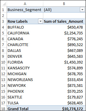
Figure 6.1 This basic pivot table shows revenue by market and allows for filtering by line of business.
Creating a pivot chart from this data would not only allow for an instant view of the performance of each market, but would also permit you to retain the ability to filter by line of business.
To start the process, place your cursor anywhere inside the pivot table and click the Insert tab on the ribbon. On the Insert tab, you can see the Charts group displaying the various types of charts you can create. Here, you can choose the chart type you would like to use for your pivot chart. For this example, click the Column chart icon and select the first 2-D column chart, as shown in Figure 6.2.
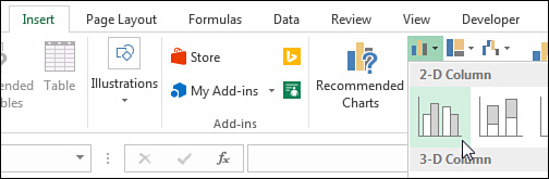
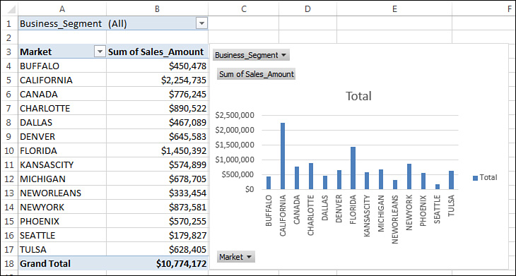
Figure 6.3 shows the chart Excel creates after you choose a chart type.
Tip
Notice that pivot charts are now, by default, placed on the same sheet as the source pivot table. If you long for the days when pivot charts were located on their own chart sheets, you are in luck. All you have to do is place your cursor inside a pivot table and then press F11 to create a pivot chart on its own sheet.
You can easily change the location of a pivot chart by right-clicking the chart (outside the plot area) and selecting Move Chart. This activates the Move Chart dialog, in which you can specify the new location.
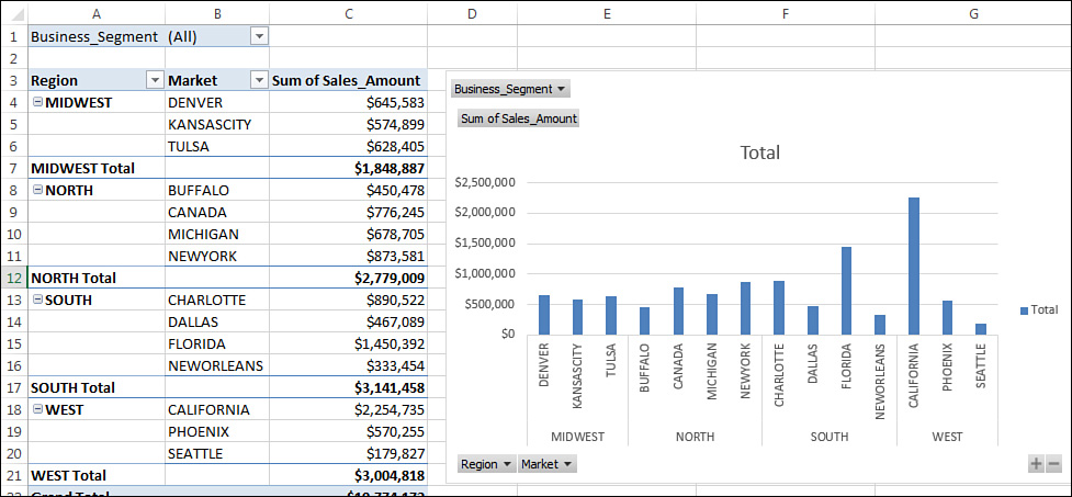
You now have a chart that is a visual representation of your pivot table. More than that, because the pivot chart is tied to the underlying pivot table, changing the pivot table in any way changes the chart. For example, as Figure 6.4 illustrates, adding the Region field to the pivot table adds a region dimension to your chart.
Note
The pivot chart in Figure 6.4 does not display the subtotals shown in the pivot table. When creating a pivot chart, Excel ignores subtotals and grand totals.
In addition, filtering a business segment not only filters the pivot table, but also the pivot chart. All this behavior comes from the fact that pivot charts use the same pivot cache and pivot layout as their corresponding pivot tables. This means that if you add or remove data from the data source and refresh the pivot table, the pivot chart updates to reflect the changes.
Take a moment to think about the possibilities. You can essentially create a fairly robust interactive reporting tool on the power of one pivot table and one pivot chart—no programming necessary.
Understanding Pivot Field Buttons
In Figure 6.4, notice the gray buttons and drop-downs on the pivot chart. These are called pivot field buttons. By using these buttons, you can dynamically rearrange the chart and apply filters to the underlying pivot table.
In Excel 2016, new Expand Entire Field (+) and Collapse Entire Field (−) buttons are automatically added to any pivot chart that contains nested fields. Figure 6.4 shows these buttons in the lower-right corner of the chart.
Clicking Collapse Entire Field (−) on the chart collapses the data series and aggregates the data points. For example, Figure 6.5 shows the same chart collapsed to the Region level. You can click Expand Entire Field (+) to drill back down to the Market level. These new buttons enable customers to interactively drill down or roll up the data shown in pivot charts.
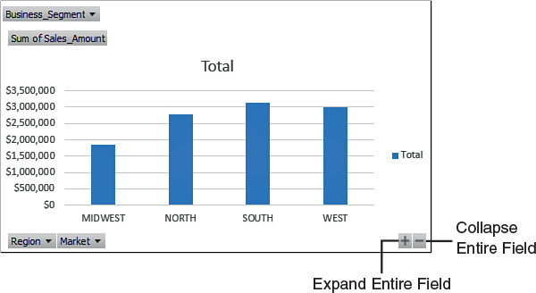
Figure 6.5 The new Expand Entire Field (+) and Collapse Entire Field (−) buttons allow for dynamic drilldown and grouping of chart series.
Tip
Keep in mind that pivot field buttons are visible when you print a pivot table. If you aren’t too keen on showing the pivot field buttons directly on your pivot charts, you can remove them by clicking your chart and then selecting the Analyze tab. On the Analyze tab, you can use the Field Buttons drop-down to hide some or all of the pivot field buttons.
Tip
Did you know you can also use slicers with pivot charts? Simply click a pivot chart, select the Analyze tab, and then click the Insert Slicer icon to take advantage of all the benefits of slicers with your pivot chart!
Note
See “Using Slicers” in Chapter 2, “Creating a Basic Pivot Table,” to get a quick refresher on slicers.
![]() In Chapter 9, “Working with and Analyzing OLAP Data,” you will find out how to create pivot charts that are completely decoupled from any pivot table.
In Chapter 9, “Working with and Analyzing OLAP Data,” you will find out how to create pivot charts that are completely decoupled from any pivot table.
Keeping Pivot Chart Rules in Mind
As with other aspects of pivot table technology, pivot charts come with their own set of rules and limitations. The following sections give you a better understanding of the boundaries and restrictions of pivot charts.
Changes in the Underlying Pivot Table Affect a Pivot Chart
The primary rule you should always be cognizant of is that a pivot chart that is based on a pivot table is merely an extension of the pivot table. If you refresh, move a field, add a field, remove a field, hide a data item, show a data item, or apply a filter, the pivot chart reflects your changes.
Placement of Data Fields in a Pivot Table Might Not Be Best Suited for a Pivot Chart
One common mistake people make when using pivot charts is assuming that Excel places the values in the column area of the pivot table in the x-axis of the pivot chart.
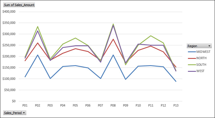
For instance, the pivot table in Figure 6.6 is in a format that is easy to read and comprehend. The structure chosen shows Sales_Period in the column area and Region in the row area. This structure works fine in the pivot table view.
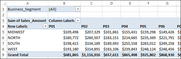
Suppose you decide to create a pivot chart from this pivot table. You would instinctively expect to see fiscal periods across the x-axis and lines of business along the y-axis. However, as you can see in Figure 6.7, the pivot chart comes out with Region on the x-axis and Sales_Period on the y-axis.
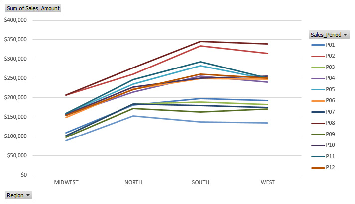
Figure 6.7 Creating a pivot chart from your nicely structured pivot table does not yield the results you were expecting.
So why does the structure in the pivot table not translate to a clean pivot chart? The answer has to do with the way pivot charts handle the different areas of a pivot table.
In a pivot chart, both the x-axis and y-axis correspond to specific areas in your pivot table:
![]() y-axis—Corresponds to the column area in a pivot table and makes up the y-axis of a pivot chart
y-axis—Corresponds to the column area in a pivot table and makes up the y-axis of a pivot chart
![]() x-axis—Corresponds to the row area in a pivot table and makes up the x-axis of a pivot chart
x-axis—Corresponds to the row area in a pivot table and makes up the x-axis of a pivot chart
Given this information, look again at the pivot table in Figure 6.6. This structure says that the Sales_Period field will be treated as the y-axis because it is in the column area. Meanwhile, the Region field will be treated as the x-axis because it is in the row area.
Now suppose you were to rearrange the pivot table to show fiscal periods in the row area and lines of business in the column area, as shown in Figure 6.8.
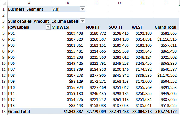
Figure 6.8 This format makes for slightly more difficult reading in a pivot table view but allows a pivot chart to give you the effect you are looking for.
This arrangement generates the pivot chart shown in Figure 6.9.
A Few Formatting Limitations Still Exist in Excel 2016
With versions of Excel prior to Excel 2007, many users avoided using pivot charts because of their many formatting limitations. These limitations included the inability to resize or move key components of the pivot chart, the loss of formatting when underlying pivot tables were changed, and the inability to use certain chart types. Because of these limitations, most users viewed pivot charts as being too clunky and impractical to use.
Over the last few versions of Excel, Microsoft introduced substantial improvements to the pivot chart functionality. Today, the pivot charts in Excel 2016 look and behave very much like standard charts. However, a few limitations persist in this version of Excel that you should keep in mind:
![]() You still cannot use XY (scatter) charts, bubble charts, and stock charts when creating a pivot chart. This includes the new sunburst and waterfall chart types introduced in Excel 2016.
You still cannot use XY (scatter) charts, bubble charts, and stock charts when creating a pivot chart. This includes the new sunburst and waterfall chart types introduced in Excel 2016.
![]() Applied trend lines can be lost when you add or remove fields in the underlying pivot table.
Applied trend lines can be lost when you add or remove fields in the underlying pivot table.
![]() The chart titles in the pivot chart cannot be resized.
The chart titles in the pivot chart cannot be resized.
Tip
Although you cannot resize the chart titles in a pivot chart, you can make the font bigger or smaller to indirectly resize a chart title. Alternatively, you can opt to create your own chart title by simply adding a text box that will serve as the title for your chart. To add a text box, select the Text Box command on the Insert tab and then click on your pivot chart. The resulting text box will be fully customizable to suit your needs.
Case Study: Creating an Interactive Report Showing Revenue by Product and Time Period
You have been asked to provide both region and market managers with an interactive reporting tool that will allow them to easily see revenues across products for a variety of time periods. Your solution needs to give managers the flexibility to filter out a region or market if needed, as well as give managers the ability to dynamically filter the chart for specific periods.
Given the amount of data in your source table and the possibility that this will be a recurring exercise, you decide to use a pivot chart. Start by building the pivot table shown in Figure 6.10.
Next, place your cursor anywhere inside the pivot table and click Insert. On the Insert tab, you can see the Charts menu displaying the various types of charts you can create. Choose the Column chart icon and select the first 2-D column chart. You immediately see a chart like the one in Figure 6.11.
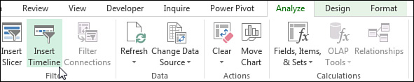
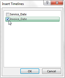
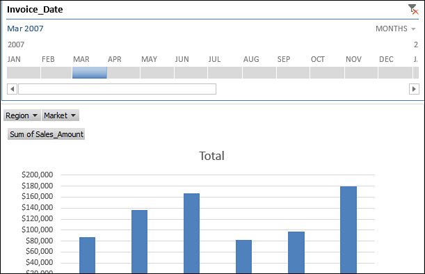
Next, click the newly created chart and select Insert Timeline from the Analyze tab under PivotChart Tools (see Figure 6.12).
Excel opens the Insert Timelines dialog, shown in Figure 6.13, which lists the available date fields in the pivot table. From the list of, select Invoice_Date.
You have created a slicer that aggregates and filters the pivot chart by time-specific periods (see Figure 6.14).
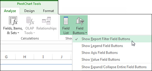
At this point, you can remove any superfluous pivot field buttons from the chart. In this case, the only buttons you need are the Region and Market drop-downs, which give your users an interactive way to filter the pivot chart. The other gray buttons you see on the chart are not necessary.
You can remove superfluous pivot field buttons by clicking the chart and selecting the Analyze tab in the ribbon. You can then use the Field Buttons drop-down to choose the field buttons you want to be visible in the chart. In this case, you want only the Report filter field buttons to be visible, so select only that option (see Figure 6.15).
Your final pivot chart should look like the one in Figure 6.16.
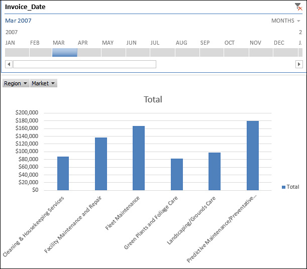
You now have a pivot chart that enables a manager to interactively review revenue by product and time period. This pivot chart also gives anyone using this report the ability to filter by region and market.
Examining Alternatives to Using Pivot Charts
There are generally two reasons you would need an alternative to using pivot charts:
![]() You do not want the overhead that comes with a pivot chart.
You do not want the overhead that comes with a pivot chart.
![]() You want to avoid some of the formatting limitations of pivot charts.
You want to avoid some of the formatting limitations of pivot charts.
In fact, sometimes you might create a pivot table simply to summarize and shape data in preparation for charting. In these situations, you don’t plan on keeping the source data, and you definitely don’t want a pivot cache taking up memory and file space.
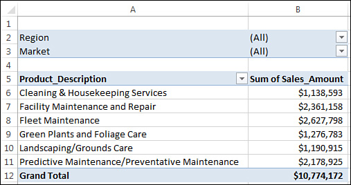
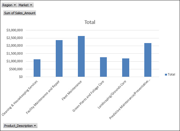
The example in Figure 6.17 shows a pivot table that summarizes revenue by quarter for each product.
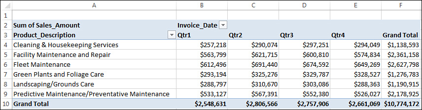
Figure 6.17 This pivot table was created to summarize and chart revenue by quarter for each product.
Keep in mind that you need this pivot table only to summarize and shape data for charting. You don’t want to keep the source data, nor do you want to keep the pivot table, with all its overhead.
Caution
If you try to create a chart using the data in the pivot table, you’ll inevitably create a pivot chart. This effectively means you have all the overhead of the pivot table looming in the background. Of course, this could be problematic if you do not want to share your source data with end users or if you don’t want to inundate them with unnecessarily large files.
The good news is, you can use a few simple techniques to create a chart from a pivot table but not end up with a pivot chart. Any one of the following four methods does the trick:
![]() Turn the pivot table into hard values.
Turn the pivot table into hard values.
![]() Delete the underlying pivot table.
Delete the underlying pivot table.
![]() Distribute a picture of the pivot table.
Distribute a picture of the pivot table.
![]() Use cells linked back to the pivot table as the source data for the chart.
Use cells linked back to the pivot table as the source data for the chart.
Details about how to use each of these methods are discussed in the next sections.
Method 1: Turn the Pivot Table into Hard Values
After you have created and structured a pivot table appropriately, select the entire pivot table and copy it. Then select Paste Values from the Insert tab, as demonstrated in Figure 6.18. This action essentially deletes your pivot table, leaving you with the last values that were displayed in the pivot table. You can subsequently use these values to create a standard chart.
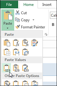
Figure 6.18 The Paste Values functionality is useful when you want to create hard-coded values from pivot tables.
This technique effectively disables the dynamic functionality of your pivot chart. That is, the pivot chart becomes a standard chart that cannot be interactively filtered or refreshed. This is also true with method 2 and method 3, which are outlined in the following sections.
Method 2: Delete the Underlying Pivot Table
If you have already created a pivot chart, you can turn it into a standard chart by simply deleting the underlying pivot table. To do this, select the entire pivot table and press the Delete key on the keyboard. Keep in mind that with this method, unlike with method 1, you are left with none of the values that made up the source data for the chart. In other words, if anyone asks for the data that feeds the chart, you will not have it.
Tip
Here is a handy tip to keep in the back of your mind: If you ever find yourself in a situation where you have a chart but the data source is not available, activate the chart’s data table. The data table lets you see the data values that feed each series in the chart.
Method 3: Distribute a Picture of the Pivot Chart
Now, it might seem strange to distribute pictures of a pivot chart, but this is an entirely viable method of distributing your analysis without a lot of overhead. In addition to very small file sizes, you also get the added benefit of controlling what your clients can see.
To use this method, simply copy a pivot chart by right-clicking the chart itself (outside the plot area) and selecting Copy. Then open a new workbook. Right-click anywhere in the new workbook, select Paste Special, and then select the picture format you prefer. A picture of your pivot chart is placed in the new workbook.
Caution
If you have pivot field buttons on your chart, they will also show up in the copied picture. This will not only be unsightly but might leave your audience confused because the buttons don’t work. Be sure to hide all pivot field buttons before copying a pivot chart as a picture. You can remove them by clicking on your chart and then selecting the Analyze tab. On the Analyze tab, you can use the Field Buttons drop-down to hide all the pivot field buttons.
Method 4: Use Cells Linked Back to the Pivot Table as the Source Data for the Chart
Many Excel users shy away from using pivot charts solely based on the formatting restrictions and issues they encounter when working with them. Often these users give up the functionality of a pivot table to avoid the limitations of pivot charts.
However, if you want to retain key functionality in your pivot table, such as report filters and top 10 ranking, you can link a standard chart to your pivot table without creating a pivot chart.
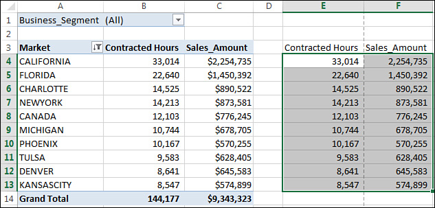
In the example in Figure 6.19, a pivot table shows the top 10 markets by contracted hours, along with their total revenue. Notice that the report filter area allows you to filter by business segment so you can see the top 10 markets segment.
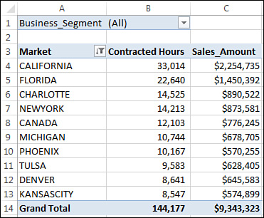
Figure 6.19 This pivot table allows you to filter by business segment to see the top 10 markets by total contracted hours and revenue.
Suppose you want to turn this view into an XY scatter chart to be able to point out the relationship between the contracted hours and revenues.
Well, a pivot chart is definitely out because you can’t build pivot charts with XY scatter charts. The techniques outlined in methods 1, 2, and 3 are also out because those methods disable the interactivity you need.
So what’s the solution? Use the cells around the pivot table to link back to the data you need, and then chart those cells. In other words, you can build a mini data set that feeds your standard chart. This data set links back to the data items in your pivot table, so when your pivot table changes, so does your data set.
Click your cursor in a cell next to your pivot table, as demonstrated in Figure 6.20, and reference the first data item that you need to create the range you will feed to your standard chart.
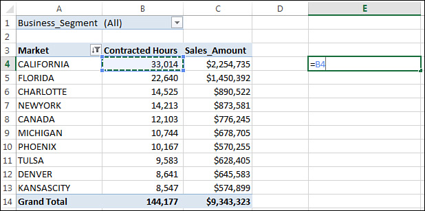
Now copy the formula you just entered, and paste that formula down and across to create your complete data set. At this point, you should have a data set that looks like the one shown in Figure 6.21.
When your linked data set is complete, you can use it to create a standard chart. In this example, you are creating an XY scatter chart with this data. You could never do this with a pivot chart.
Figure 6.22 demonstrates how this solution offers the best of both worlds. You have the ability to filter out a particular business segment using the page field, and you also have all the formatting freedom of a standard chart without any of the issues related to using a pivot chart.
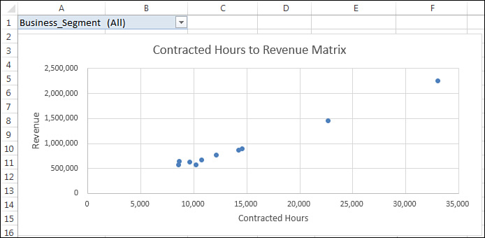
Figure 6.22 This solution allows you to continue using the functionality of your pivot table without any of the formatting limitations you would have with a pivot chart.
Note
Another alternative to using pivot charts is to create a Power View dashboard. See Chapter 11, “Dashboarding with Power View and Power Map.”
Using Conditional Formatting with Pivot Tables
In the next sections, you’ll learn how to leverage the magic combination of pivot tables and conditional formatting to create interactive visualizations that serve as an alternative to pivot charts.
An Example of Using Conditional Formatting
To start the first example, create the pivot table shown in Figure 6.23.
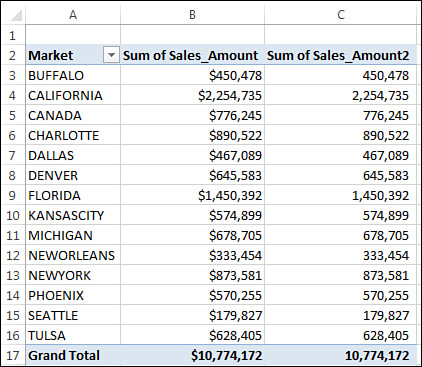
Suppose you want to create a report that enables your managers to see the performance of each sales period graphically. You could build a pivot chart, but you decide to use conditional formatting. In this example, you’ll go the easy route and quickly apply some data bars.
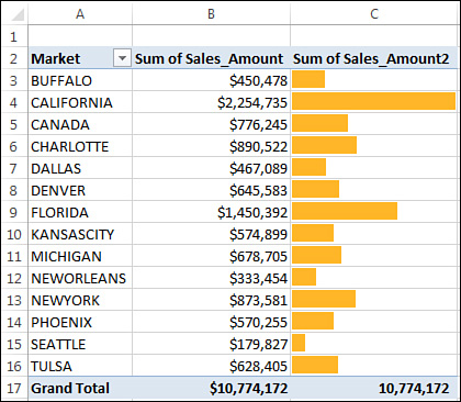
Select all the Sum of Sales_Amount2 values in the values area. After you have highlighted the revenue for each Sales_Period, click the Home tab and select Conditional Formatting in the Styles group. Then select Data Bars and select one of the Solid Fill options, as shown in Figure 6.24.
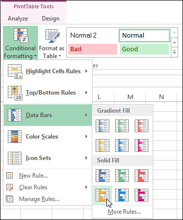
You immediately see data bars in your pivot table, along with the values in the Sum of Sales_Amount2 field. You want to hide the actual value and show only the data bar. To do this, follow these steps:
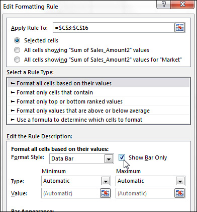
1. Click the Conditional Formatting drop-down on the Home tab, and select Manage Rules.
2. In the Rules Manager dialog, select the data bar rule you just created and select Edit Rule.
3. Place a check next to Show Bar Only (see Figure 6.25).
As you can see in Figure 6.26, you now have a set of bars that correspond to the values in your pivot table. This visualization looks like a sideways chart, doesn’t it? What’s more impressive is that as you filter the markets in the report filter area, the data bars dynamically update to correspond with the data for the selected market.
Preprogrammed Scenarios for Condition Levels
In the previous example, you did not have to trudge through a dialog to define the condition levels. How can that be? Excel 2016 has a handful of preprogrammed scenarios that you can leverage when you want to spend less time configuring your conditional formatting and more time analyzing your data.
For example, to create the data bars you’ve just employed, Excel uses a predefined algorithm that takes the largest and smallest values in the selected range and calculates the condition level for each bar.
Other examples of preprogrammed scenarios include the following:
![]() Top Nth Items
Top Nth Items
![]() Top Nth %
Top Nth %
![]() Bottom Nth Items
Bottom Nth Items
![]() Bottom Nth %
Bottom Nth %
![]() Above Average
Above Average
![]() Below Average
Below Average
As you can see, Excel 2016 makes an effort to offer the conditions that are most commonly used in data analysis.
Note
To remove the applied conditional formatting, place your cursor inside the pivot table, click the Home tab, and select Conditional Formatting in the Styles group. From there, select Clear Rules and then select Clear Rules from This PivotTable.
Creating Custom Conditional Formatting Rules
It’s important to note that you are by no means limited to the preprogrammed scenarios mentioned in the previous section. You can still create your own custom conditions.
To see how this works, you need to begin by creating the pivot table shown in Figure 6.27.
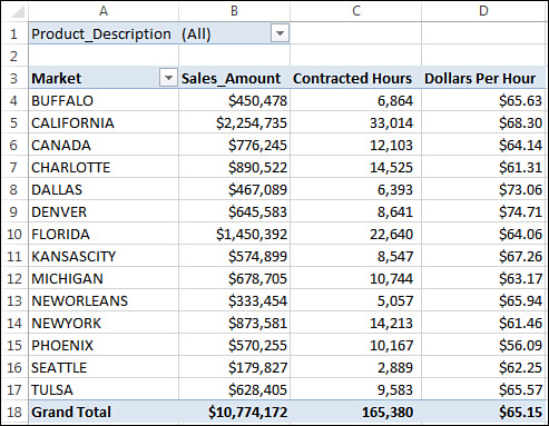
Figure 6.27 This pivot shows Sales_Amount, Contracted_Hours, and a calculated field that calculates Dollars per Hour.
In this scenario, you want to evaluate the relationship between total revenue and dollars per hour. The idea is that some strategically applied conditional formatting helps identify opportunities for improvement.
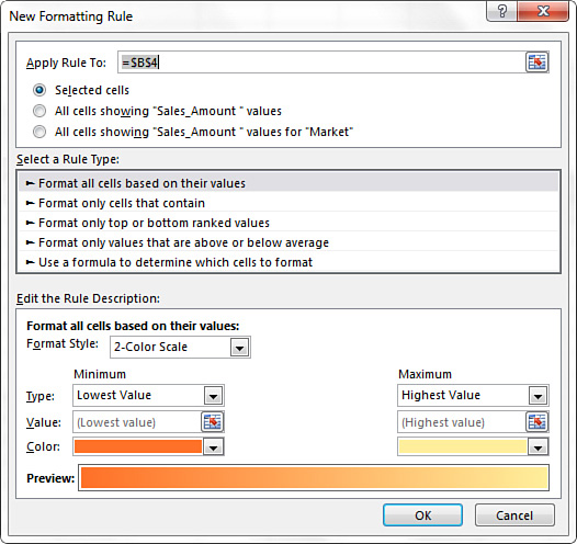
Place your cursor in the Sales_Amount column. Click the Home tab and select Conditional Formatting. Then select New Rule. This activates the New Formatting Rule dialog, shown in Figure 6.28. In this dialog, you need to identify the cells where the conditional formatting will be applied, specify the rule type to use, and define the details of the conditional formatting.
First, you must identify the cells where your conditional formatting will be applied. You have three choices:
![]() Selected Cells—This selection applies conditional formatting to only the selected cells.
Selected Cells—This selection applies conditional formatting to only the selected cells.
![]() All Cells Showing “Sales_Amount” Values—This selection applies conditional formatting to all values in the Sales_Amount column, including all subtotals and grand totals. This selection is ideal for use in analyses using averages, percentages, or other calculations where a single conditional formatting rule makes sense for all levels of analysis.
All Cells Showing “Sales_Amount” Values—This selection applies conditional formatting to all values in the Sales_Amount column, including all subtotals and grand totals. This selection is ideal for use in analyses using averages, percentages, or other calculations where a single conditional formatting rule makes sense for all levels of analysis.
![]() All Cells Showing “Sales_Amount” Values for “Market”—This selection applies conditional formatting to all values in the Sales_Amount column at the Market level only. (It excludes subtotals and grand totals.) This selection is ideal for use in analyses using calculations that make sense only within the context of the level being measured.
All Cells Showing “Sales_Amount” Values for “Market”—This selection applies conditional formatting to all values in the Sales_Amount column at the Market level only. (It excludes subtotals and grand totals.) This selection is ideal for use in analyses using calculations that make sense only within the context of the level being measured.
Note
The words Sales_Amount and Market are not permanent fixtures of the New Formatting Rule dialog. These words change to reflect the fields in your pivot table. Sales_Amount is used here because the cursor is in that column. Market is used because the active data items in the pivot table are in the Market field.
In this example, the third selection (All Cells Showing “Sales_Amount” Values for “Market”) makes the most sense, so click that radio button, as shown in Figure 6.29.

Next, in the Select a Rule Type section, you must specify the rule type you want to use for the conditional format. You can select one of five rule types:
![]() Format All Cells Based on Their Values—This selection enables you to apply conditional formatting based on some comparison of the actual values of the selected range. That is, the values in the selected range are measured against each other. This selection is ideal when you want to identify general anomalies in your data set.
Format All Cells Based on Their Values—This selection enables you to apply conditional formatting based on some comparison of the actual values of the selected range. That is, the values in the selected range are measured against each other. This selection is ideal when you want to identify general anomalies in your data set.
![]() Format Only Cells That Contain—This selection enables you to apply conditional formatting to cells that meet specific criteria you define. Keep in mind that the values in your range are not measured against each other when you use this rule type. This selection is useful when you are comparing your values against a predefined benchmark.
Format Only Cells That Contain—This selection enables you to apply conditional formatting to cells that meet specific criteria you define. Keep in mind that the values in your range are not measured against each other when you use this rule type. This selection is useful when you are comparing your values against a predefined benchmark.
![]() Format Only Top or Bottom Ranked Values—This selection enables you to apply conditional formatting to cells that are ranked in the top or bottom Nth number or percentage of all the values in the range.
Format Only Top or Bottom Ranked Values—This selection enables you to apply conditional formatting to cells that are ranked in the top or bottom Nth number or percentage of all the values in the range.
![]() Format Only Values That Are Above or Below Average—This selection enables you to apply conditional formatting to values that are mathematically above or below the average of all values in the selected range.
Format Only Values That Are Above or Below Average—This selection enables you to apply conditional formatting to values that are mathematically above or below the average of all values in the selected range.
![]() Use a Formula to Determine Which Cells to Format—This selection enables you to specify your own formula and evaluate each value in the selected range against that formula. If the values evaluate to true, the conditional formatting is applied. This selection comes in handy when you are applying conditions based on the results of an advanced formula or mathematical operation.
Use a Formula to Determine Which Cells to Format—This selection enables you to specify your own formula and evaluate each value in the selected range against that formula. If the values evaluate to true, the conditional formatting is applied. This selection comes in handy when you are applying conditions based on the results of an advanced formula or mathematical operation.
Note
You can use data bars, color scales, and icon sets only when the selected cells are formatted based on their values. This means that if you want to use data bars, color scales, and icon sets, you must select the Format All Cells Based on Their Values rule type.
In this scenario, you want to identify problem areas using icon sets; therefore, you want to format the cells based on their values, so select Format All Cells Based on Their Values.
Finally, you need to define the details of the conditional formatting in the Edit the Rule Description section. Again, you want to identify problem areas using the slick icon sets that are offered by Excel 2016. Therefore, select Icon Sets from the Format Style drop-down box.
After selecting Icon Sets, select a style appropriate to your analysis. The style selected in Figure 6.30 is ideal in situations in which your pivot tables cannot always be viewed in color.

With this configuration, Excel applies the sign icons based on the percentile bands >=67, >=33, and <33. Keep in mind that you can change the actual percentile bands based on your needs. In this scenario, the default percentile bands are sufficient.
Click the OK button to apply the conditional formatting. As you can see in Figure 6.31, you now have icons that enable you to quickly determine where each market falls in relation to other markets in terms of revenue.
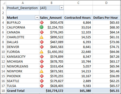
Now apply the same conditional formatting to the Dollars per Hour field. When you are done, your pivot table should look like the one shown in Figure 6.32.

Take a moment to analyze what you have here. With this view, a manager can analyze the relationship between total revenue and dollars per hour. For example, the Dallas market manager can see that he is in the bottom percentile for revenue but in the top percentile for dollars per hour. With this information, he immediately sees that his dollars per hour rates might be too high for his market. Conversely, the New York market manager can see that she is in the top percentile for revenue but in the bottom percentile for dollars per hour. This tells her that her dollars per hour rates might be too low for her market.
Remember that this in an interactive report. Each manager can view the same analysis by product by simply filtering the report filter area!
Next Steps
In Chapter 7, “Analyzing Disparate Data Sources with Pivot Tables,” you will find out how to bring together disparate data sources into one pivot table. You will create a pivot table from multiple data sets and learn the basics of creating pivot tables from other pivot tables.