8. Sharing Pivot Tables with Others
Say that you’ve built an awesome pivot table with slicers. You would like people to be able to interact with the pivot table, but you don’t want them to be able to rearrange the pivot table, nor do you want them to be able to access the underlying data. This is now possible via a couple avenues:
![]() Excel Online and OneDrive let you turn your Excel workbook into an interactive web app with ease. A OneDrive account is free, and this method will accommodate files up to 10MB in size.
Excel Online and OneDrive let you turn your Excel workbook into an interactive web app with ease. A OneDrive account is free, and this method will accommodate files up to 10MB in size.
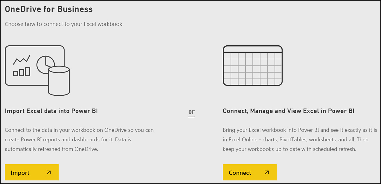
![]() As of July 2015, you can publish a workbook to Power BI. Then you can use the Power BI Desktop to build pivot tables, pivot charts, and slicers. You can share these dashboards with anyone who shares the same business domain.
As of July 2015, you can publish a workbook to Power BI. Then you can use the Power BI Desktop to build pivot tables, pivot charts, and slicers. You can share these dashboards with anyone who shares the same business domain.
Designing a Workbook as an Interactive Web Page
You can use the Excel client to design a workbook for use as a web page. Imagine a set of slicers at the top, then a pivot table and a few pivot charts all on one screen of data. A person who visits your workbook in a browser can interact with the slicers and see the results. And here is the best part: You can protect your intellectual property. You can choose to publish Sheet1 in the browser and not show other worksheets. The pivot tables on Sheet1 reach back to use information on Sheet2, but no one is able to hack in and unhide Sheet2. They can’t see your formulas.
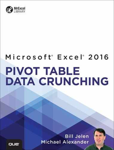
Figure 8.1 shows a top customers report with several slicers. The source data and the source pivot table are located on back worksheets.
Adapting the workbook to create a web page might involve these tasks:
![]() Isolate the visible parts of the report on a single worksheet. Cut anything that does not need to be seen from the first worksheet, and paste it to the hidden worksheet. In this example, you could cut the formula for first-year interest and put it on the hidden worksheet.
Isolate the visible parts of the report on a single worksheet. Cut anything that does not need to be seen from the first worksheet, and paste it to the hidden worksheet. In this example, you could cut the formula for first-year interest and put it on the hidden worksheet.
![]() Consider whether any input cells can be changed to slicers. Slicers are excellent for selecting values in a web page. The How Many Customers to Show slicer in Figure 8.1 is tied to a simple 10-row data set and pivot table on the hidden worksheet. The formulas in F2:F11 pulls the top values from the pivot table. When someone chooses from the slicer, the proper number of top customers are shown.
Consider whether any input cells can be changed to slicers. Slicers are excellent for selecting values in a web page. The How Many Customers to Show slicer in Figure 8.1 is tied to a simple 10-row data set and pivot table on the hidden worksheet. The formulas in F2:F11 pulls the top values from the pivot table. When someone chooses from the slicer, the proper number of top customers are shown.
![]() Take a few steps to make your worksheet not look like Excel: On the View tab, uncheck Formula Bar, Gridlines, and Headings.
Take a few steps to make your worksheet not look like Excel: On the View tab, uncheck Formula Bar, Gridlines, and Headings.
Figure 8.1 shows the workbook in the Excel client. The first worksheet is visible, but most of the data is on the hidden worksheet.
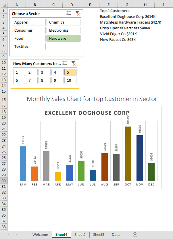
You need to control what is shown in the browser, so choose File, Info, Browser View Options. In the Show tab, open the drop-down and change Entire Workbook to Sheets. You can then uncheck the hidden worksheet (see Figure 8.2).
Save the workbook to your OneDrive account.
Tip
You should test the workbook before sharing it. Make sure that the parameters work and that everything looks correct. When you are signed in to OneDrive and open your own workbook, it might automatically open in Edit mode. Go to the View tab and choose Reading View.
Figure 8.3 shows the workbook in the browser. If you click a slicer, the filters change and the pivot tables and pivot charts update.

If you are reading this book, I bet that you know a lot about Microsoft Excel. You can probably knock out amazing formulas that do all sorts of calculations. Now, with just that knowledge, you can create amazing interactive web pages.
Sharing a Link to a Web Workbook
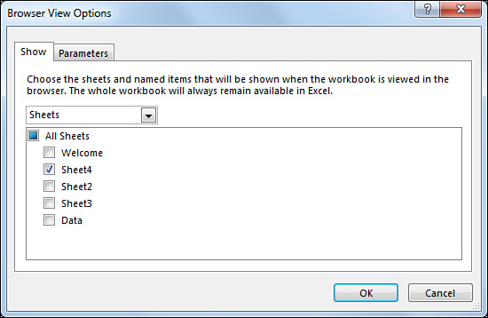
The easiest way to share a web workbook is to use the Share with People command in OneDrive. This enables other people to interact with your workbook, but it also lets them download the whole workbook to their computers.
While you are viewing the workbook, use Share, Share with People, as shown in Figure 8.4.
The Share dialog offers two categories:
![]() You can send an email inviting others to use the workbook.
You can send an email inviting others to use the workbook.
![]() You can get a link that you can distribute.
You can get a link that you can distribute.
When someone receives your URL and follows the link, she arrives at a read-only copy of the application shown previously in Figure 8.3. Any changes that she makes to the slicer or the parameters are not saved to the workbook. The next person gets a fresh copy of the workbook.
Sharing with Power BI
Power BI Desktop is a new authoring tool introduced in July 2015. You can upload your Excel files to Power BI Desktop and use pivot tables and charts to build a dashboard. You can then share the dashboard with other people who are in the same domain as you.
Note
For me, as a consultant, the “with the same domain” limitation is an odd one. I sign in to Power BI with the domain @Jelen.OnMicrosoft.com, so I can only share my dashboards with other people who use @Jelen.OnMicrosoft.com. If I want to design a dashboard for a client, I have to convince them to set up a new email account for me from their domain.
Power BI comes in free and paid versions. With the free version, data can be refreshed once per day, and you are limited to 1GB per person. For $10 per person per month, you get 10GB per person and an hourly refresh.
Preparing Data for Power BI
Before you can use Power BI, you need to prepare the data you want to use in it. To do this, build an Excel workbook and format each data set as a table. Then, using the Power Pivot tab, add each table to the workbook Data Model. Save this workbook to your Office 365 OneDrive or OneDrive for Business account with an .xlsx extension.
Note
When creating an Excel workbook, keep in mind that files with .xlsm extensions are not supported in Power BI.
Importing Data to Power BI
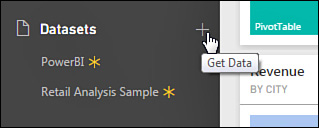
Once your data is properly prepared, you can import it into Power BI. Sign in to PowerBI.Microsoft.com. On the bottom left of the main screen, click the Get Data icon (see Figure 8.5).
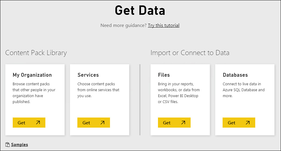
On the Get Data screen, click Get in the third tile, Files, to import a file (see Figure 8.6).
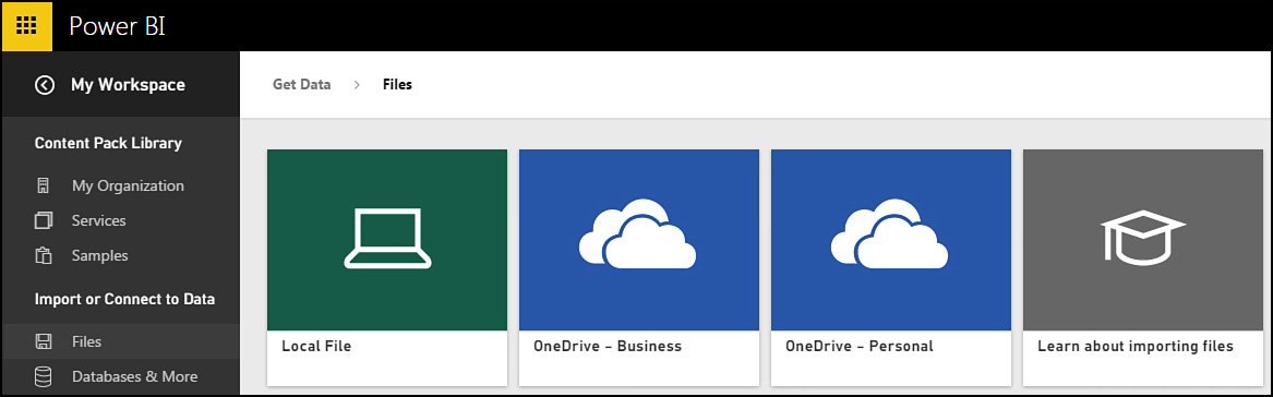
In the next screen, shown in Figure 8.7, choose to import from either OneDrive—Personal or OneDrive—Business, depending on where you saved your data.
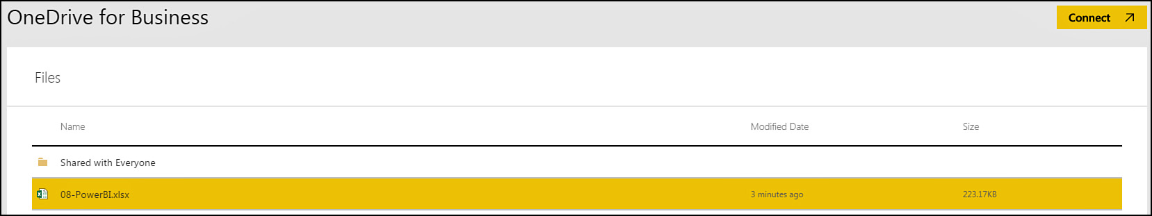
Choose the file to import and then click Connect in the top-right corner (see Figure 8.8).
Note
The next screen, shown in Figure 8.9, offers two choices: Import and Connect. When you choose Import, any changes made in OneDrive are automatically refreshed. When you choose Connect, the data is only imported during the hourly or daily refresh. Choose Import. After this, if you save new data to OneDrive, it will be updated in Power BI.
Building a Report in Power BI
In Figure 8.10, you can see a list of fields on the right and an array of icons representing many visualizations. Power BI makes it easy to start a good-looking report: Just select one of the visualizations.
Note
Power BI allows open source visualizations, so you can add more chart types than you initially see onscreen. For details, see http://microsoft.github.io/PowerBI-visuals/docs/index.html.
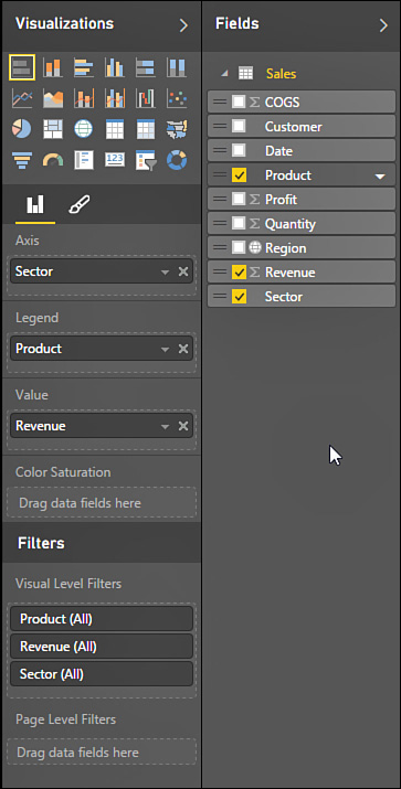
When you choose a chart type, a PivotTable Fields list appears. Drag fields to the appropriate areas and the chart updates, as shown in Figure 8.11.
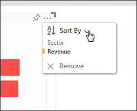
See the ellipsis icon at the top right of the chart? Open it to access additional options, such as sorting, as shown in Figure 8.12.
When you finish the first chart, click in the white space outside the chart and repeat the process to add another visualization.
Save the Report by clicking the Save button. You can combine multiple reports into a dashboard by using the + symbol next to the Dashboard section in the left navigation pane.
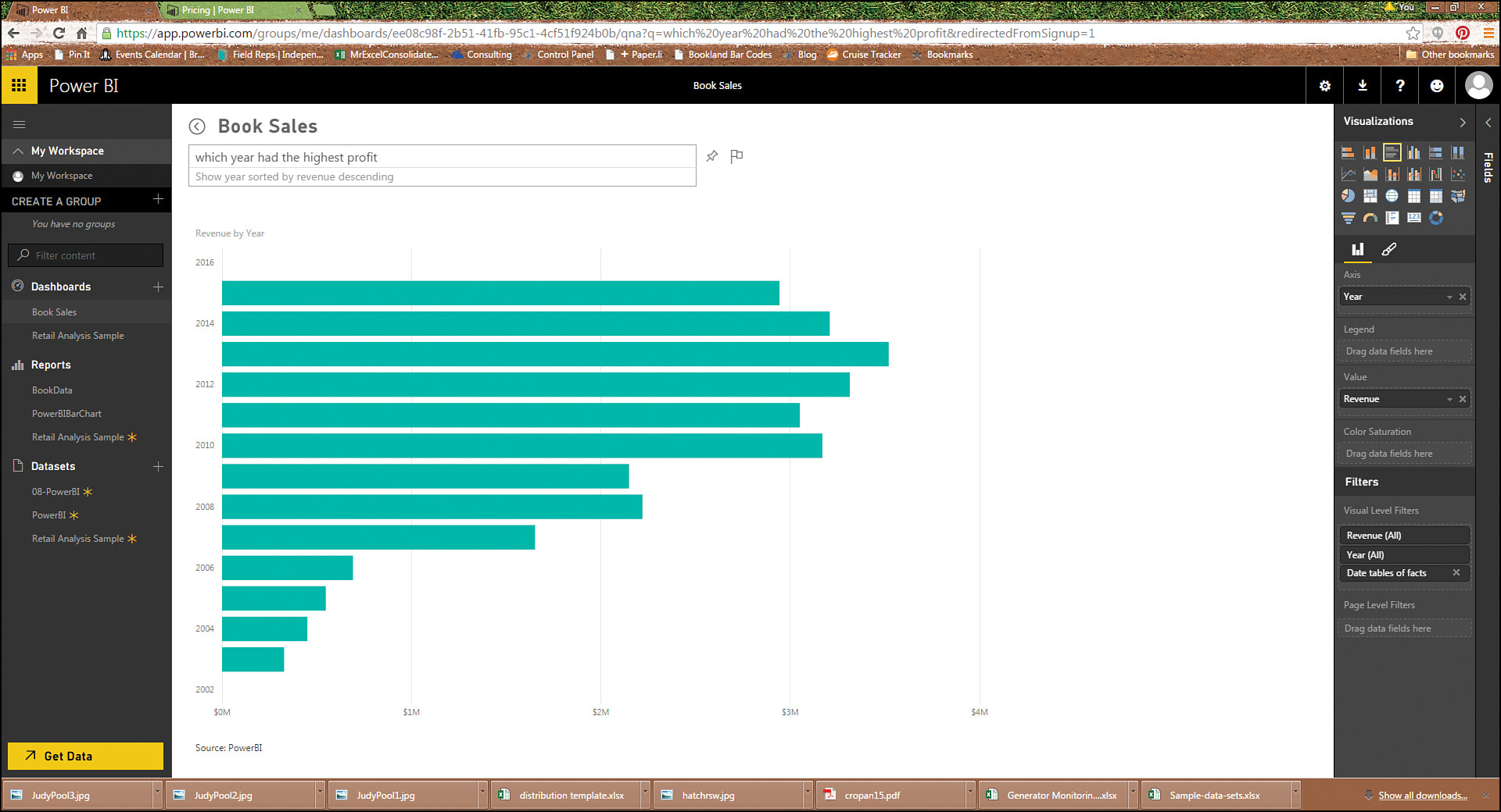
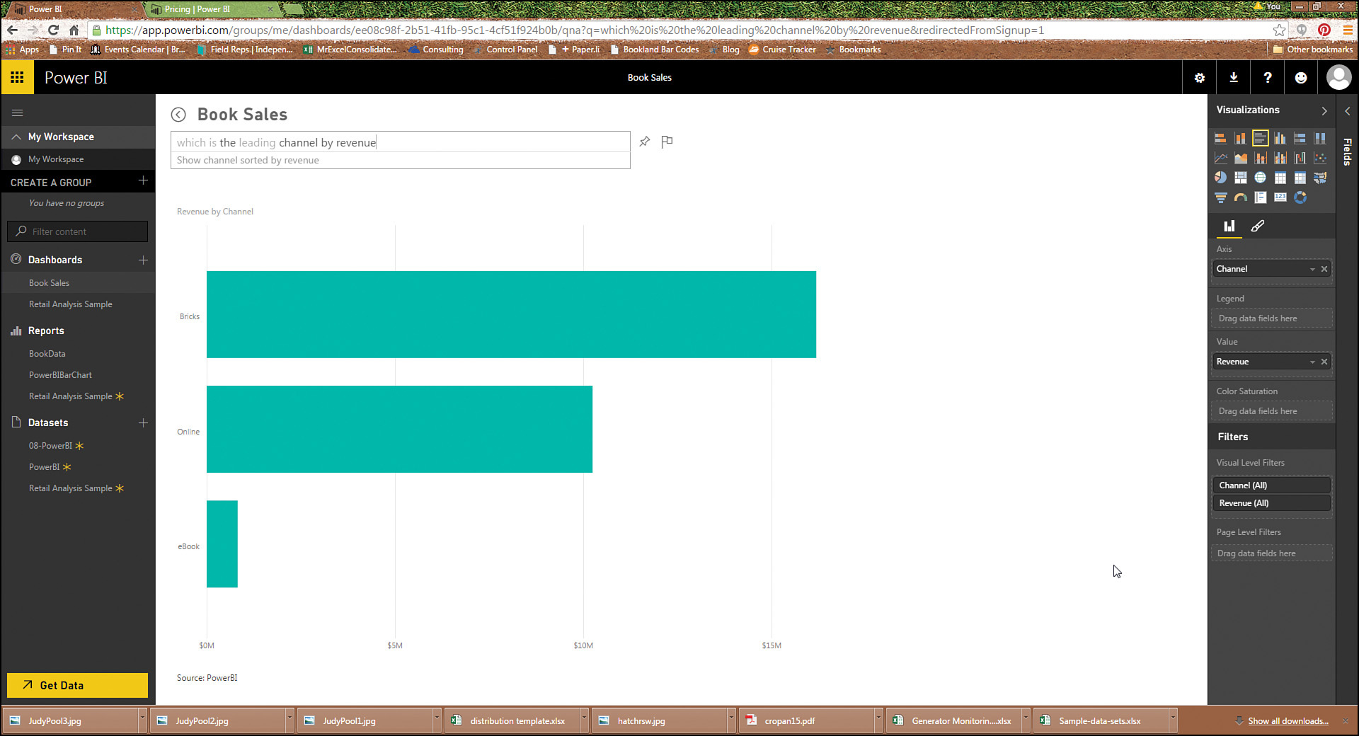
Using Q&A to Query Data
When you view a report, a box at the top allows you to ask questions. As you type, Power BI creates charts or tables on the fly to try to answer your question.
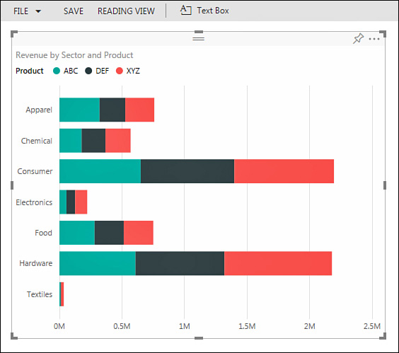
Make sure to include a value field in your question. For example, typing “Top five cities” will give you a list of cities. Typing “Top five cities by revenue” will give you a sorted bar chart of revenue by city, as shown in Figure 8.13.
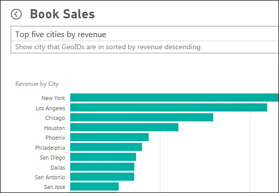
Figure 8.14 and Figure 8.15 show the results from other queries. The algorithm is fairly impressive.
Sharing Your Dashboard
When you have finished creating a dashboard, you can share it with others in your organization. They can use Power BI on a tablet such as an iPad to view reports. Find the Share Dashboard icon at the top of any Dashboard report. Currently, you can only share the workbook with someone who has the same domain as your account.
Next Steps
In Chapter 9, “Working with and Analyzing OLAP Data,” returns to Excel and shows you how you can analyze external data in Excel pivot tables. Check out the section at the end of Chapter 9 on using cube functions to break out of the traditional format of pivot tables.