
7. Image Adjustment Fundamentals
Everything in image editing eventually comes down to tonal manipulation—making some tones lighter and other tones darker. Tonal manipulation is one of the most powerful and far-reaching capabilities in Photoshop, and at first it may seem like magic. But once you understand what’s happening as you adjust the controls, it starts to look less like magic and more like clever technology. Your increased understanding and productivity should more than make up for any loss in your sense of wonder, however.
Tonal manipulation makes the difference between a flat image that lies lifeless on the page and one that pops, drawing you into it. But the role of tonal correction goes far beyond that. When you correct a color image, you’re really manipulating the tone of the individual color channels.
This chapter concentrates on the fundamentals—the basic tonal manipulation tools and their effects on pixels. Much of this chapter is devoted to two tools—Levels and Curves—because until you’ve mastered these, you simply don’t know Photoshop! You’ll also read about the considerable number of other useful commands found on the Image > Adjustments submenu. In Chapter 8, “The Digital Darkroom,” I’ll show you some more esoteric techniques for getting great-looking images.
What Is Image Quality, Anyway?
At the most basic level, image quality comes down to a few simple things:
Optimal Contrast. We perceive images by seeing differences among tones. The more pronounced the differences (the higher the contrast), the easier it is to read an image, but only as long as you don’t push contrast too far. Too much contrast reduces too much of the image to black and white, destroying smooth transitions and tonal details—essentially, you lose image data. You get the best image quality when you’ve found the level of contrast that brings out the tonal details all the way from dark to light and tuned for the specific way you’ll output an image, whether that’s for a press or a monitor.
Contrast control is important not just for an entire image, but also for specific parts of an image. While that can mean adjusting contrast in specific areas of an image (for example, using masks), it can also mean adjusting contrast within specific ranges of tones such as the shadows (for example, using Curves). Either way, manipulating contrast gives you the ability to treat specific areas that you want to clarify, emphasize, or de-emphasize.
Tip
![]()
It’s an ongoing goal (and battle) to preserve as much image quality as possible by losing as few tonal levels as possible. When you get to choose from five ways to make a correction in Photoshop, very often the reason to pick a particular method is because it’s the least destructive.
When contrast is increased only along the edges of shapes in an image, details appear sharper; this type of contrast control is the basis for all digital sharpening. You’ll explore this topic in Chapter 10.
As you move through the next few chapters, you’ll find that the basic reason Photoshop has so many ways to manipulate tones is simply so that you can tailor the contrast of your image in every possible way as those situations come up. Contrast is that fundamental to image quality.
Optimal Color. Good color is balanced and believable—neutral colors appear neutral, skin tones look natural, and colors are neither too weak nor too vivid relative to how they appear in the real world. Once you’ve anchored image to reality, you’re free to tweak image color so that it serves your creative vision. Sounds simple, but there are complications: The appearance of color is affected both by human visual perception and by how the image is output. For these reasons, while many people naturally concentrate on the tools that Photoshop provides to alter color (such as Curves), it’s important to pay an equal amount of attention to the tools Photoshop provides to evaluate color objectively and in context, such as the Info panel and soft-proofing.
Optimal Detail and Sharpness. On the surface, detail and sharpness wouldn’t seem to have anything to do with basic image adjustments such as contrast. You’d run a sharpening filter, right? But because images are formed by contrast, image details are also formed by contrast. Therefore, the decisions you make to optimize contrast contribute to how visible the details of your images will be. As a result, you’ll find that sharpening works a lot better if your basic image corrections were done well in the first place.
With all that in mind, let’s plunge ahead and see how the tools in Photoshop relate to what you need to do to achieve the image quality you want. I started to cover the basics of image editing back in Chapter 5, “Building a Digital Workflow,” where I talked about image-editing basics strictly within the context of Adobe Camera Raw. Now I’ll talk about it in terms of Photoshop in general—how you would handle any photographic image that you’ve opened in Photoshop.
Visualizing Tonal Values with the Histogram
Although most of the images we correct are in color, it’s easier to learn how tones work by leaving color out, so I’ll start with grayscale images and move on to color later. A grayscale image contains nothing but tonal information. When you read about correcting color images later in this chapter, however, you’ll find that color images consist of multiple grayscale channels—so what you learn about grayscale images will apply to color images too.
You can’t necessarily see the distribution of tones in your image just by looking at the image itself, so to help you out Photoshop provides the Histogram panel. A histogram is a simple bar chart that plots the tonal levels from 0 to 255 along the horizontal axis, and the number of pixels at each level along the vertical axis. You’ll see some examples of images and their histograms in Figure 7-1.
Figure 7-1 Histograms for images with different tonal distributions
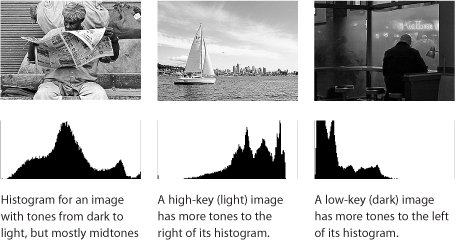
Typical images show a range of tones from end to end across the histogram. Don’t worry about whether the histogram is even across the graph; that doesn’t matter—tones group into different peaks and valleys depending on the content of each image. If an image is intentionally very dark or very light, it’s fine for the histogram to be weighted to one end or the other.
There are just a few things to watch out for. If the graph reaches all the way to the top at either end, the black or white point may be clipped (detail lost). If the graph stops some distance before it reaches either end, the black or white point may be set too far out. And if the histogram displays a few spikes of tones with wide gaps between them, instead of a rather solid graph, check for posterization (also called stair-stepping or banding). However, don’t judge these problems by the histogram alone. Evaluate them by also looking closely at the image and using the clipping indicators in the Levels and Curves adjustments, which you’ll read about soon. A good-looking histogram isn’t necessarily the sign of a good image, and many good-looking images have ugly histograms.
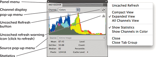
More Histogram Panel Features. The Histogram panel offers several options for viewing image tonal data in more detail (see Figure 7-2):
• Uncached Refresh icon. For performance reasons, the Histogram panel usually shows you values based on a cached anti-aliased screen display of the image instead of evaluating the image at full resolution. This view can hide posterization, giving you an unrealistically rosy picture of your data. Photoshop warns you of this by displaying a warning icon when the histogram is approximating your data. To see what’s really going on, click this icon or the Uncached Refresh button.
Tip
![]()
Fixing the histogram doesn’t mean you’ve fixed the image. If you want a nice-looking histogram, the Gaussian Blur filter with a 100-pixel radius will smooth out the histogram nicely, but there won’t be much left of the image!
• Expanded views. The Histogram panel defaults to a compact size. Choose Expanded View from the Histogram panel menu to make it bigger. Expanded View shows color channels in color and displays statistics under the histogram; if you don’t need to see these, you can turn off Show Statistics in the Histogram panel menu and choose your preferred display mode from the Channel pop-up menu above the histogram. On this pop-up menu, in addition to the color channels, you see the Luminosity option. The difference between Luminosity and the default composite view (such as RGB or CMYK) is that Luminosity displays only the luminance of each pixel, with a value of 255 meaning white. In a composite view, a value of 255 may represent a fully saturated color pixel.
• Channel displays. In Expanded View you can also display each channel in its own histogram (making the Histogram panel very tall); choose All Channels View from the Histogram panel menu. The channel histograms display in black unless you also turn on Show Channels in Color in the Histogram panel menu.
Figure 7-2 The Histogram panel
In this chapter you’ll be making the bulk of your edits using the Levels and Curves adjustments. Both of them display the histogram, so you don’t have to keep the Histogram panel open while you’re using those features.
The Three Basic Tonal Adjustments
The first step to great image quality is setting three specific aspects of the image: the black point, the white point, and the midpoint. Doing so sets the overall dynamic range of the image, ensuring that the range of tones from light to dark in the image takes full advantage of the available tonal range that the file can reproduce. Dynamic range is a primary factor in image contrast, so if you get it right, the contrast adjustments you make later become easier. Another reason to optimize the dynamic range is that it gives you room to optimize contrast—and contrast is the resource you draw upon to preserve and accentuate image detail.
Here’s how the three basic tonal adjustments work: In many unedited photographs, if the darkest and lightest tones are more than a few levels away from black and white, respectively, the image appears relatively flat because it has less contrast than it should (see Figure 7-3). Redefining the darkest available tone in the image as black and redefining the lightest tone as white optimizes the dynamic range of the image, adding contrast, which gives it more life. And the midpoint? That determines the overall brightness of the image by specifying where the 50 percent level really should be. For well-lit, well-exposed photographs, these three adjustments may be all you need.
Figure 7-3 Image before a Levels adjustment lacks contrast, and the clouds are dull gray.

First I’ll make these three basic adjustments using the Levels feature. Later in this chapter you’ll see how to do the same thing in Curves.
Making Adjustments Using Levels
The Levels feature is tailor-made for the three basic edits we want to make. In the Levels dialog or Levels Adjustments panel, the Input Levels sliders include black-point, white-point, and midpoint controls. There’s also a histogram so that you can monitor how your changes affect the tonal distribution. To make the three basic adjustments using Levels, do the following:
1. Choose Image > Adjustments > Levels.
Tip
![]()
If you’re working with an image freshly converted from a digital camera raw file, and the shadows and highlights are already clipping when the black and white triangles are all the way to the ends of the histogram, consider checking the image in Camera Raw to see if you can coax additional dynamic range out of the raw file by using the sliders in the Basic tab (see Chapter 5), and then reconvert the image to Photoshop.
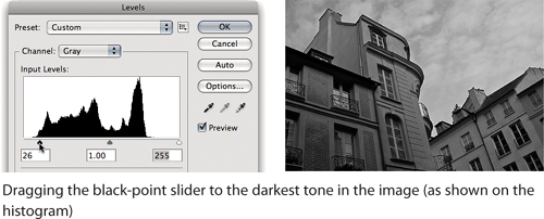
2. Set the black point by dragging the black triangle (under the histogram) to the right until the darkest parts of the image are as dark as you want them (see Figure 7-4). If you notice that details previously visible in the shadows are now gone (shadows have become solid black), you’ve gone too far; back off a bit by dragging the black triangle to the left until the shadow detail comes back. Watching the histogram can help you see when you’re starting to clip too many of the shadow tones.
Figure 7-4 Adjusting the black-point slider
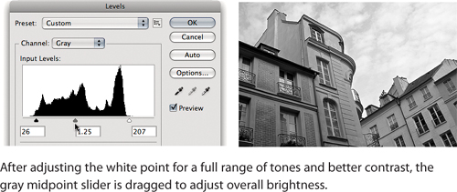
3. In the same way, set the white point by dragging the white triangle under the histogram to the left until the lightest parts of the image are as light as possible without losing detail. If you notice that details in the highlights are gone (highlights have become solid white), back off a bit by dragging the white triangle to the right until the highlight detail comes back.
4. Set the midpoint by dragging the gray triangle under the histogram. Drag to the left to lighten the image or to the right to darken it (see Figure 7-5).
Figure 7-5 Adjusting the white-point and midpoint sliders
5. Check your work by using the Preview check box (press P). Watch carefully what happens to details in the shadows and highlights; if you’ve lost detail at either end, adjust the black and white triangles. If you see an issue with overall brightness, adjust the gray triangle. For more precision, click in any of the three number fields under the sliders and press the up arrow or down arrow key to nudge the values (add the Shift key to nudge the values by 10 times the default increment).
Using the Clipping Display. When dragging the black and white Levels sliders, there’s a technique that helps you more clearly visualize where shadow details are being clipped, because looking at the image and the histogram usually doesn’t tell you precisely enough. Hold down the Option (Mac OS X) or Alt (Windows) key as you drag the black slider—the entire image should become white. As you drag the black triangle to the right, areas of black begin to grow (see Figure 7-6). The black areas are the parts of the image that would be clipped if you let go of the black triangle at that point. If a shadow area doesn’t contain any detail you care about, it may be acceptable to let that area clip, if you gain contrast in the rest of the image. But if there are other shadow areas where detail is important, don’t let them become black when you Option/Alt-drag the black triangle. When you drag the white triangle with Option/Alt pressed, the image appears black and clipped areas appear white. As you Option/Alt-drag the black (or white) slider toward the center, a good way to tell when to stop is when large clumps of pixels go black (or white). Small clumps are acceptable as long as they’re either true black areas or specular highlights—areas truly devoid of detail.
Figure 7-6 Using the black-point clipping display

Tip
![]()
If the histogram already touches the left or right end of the graph, you may not need to move the black- or white-point slider very much, or possibly not at all, because the shadows or highlights may already be clipping. On the other hand, if the histogram doesn’t touch the left or right sides of the graph, you can usually assume that you’ll have to pull in the sliders.
Let’s go over what was really happening as you dragged those sliders.
Tip
![]()
The clipping display works only in the Grayscale, RGB, Duotone, and Multichannel modes.
Black- and White-Point Sliders. Moving the black and white sliders in toward the center expands, or stretches, the dynamic range of the image. When you move the black-point slider, you tell Photoshop to set all the tones at that level and darker to level 0 (black) and to set all the tones to the right of the slider to fill the entire tonal range from 0 to 255. Moving the white-point slider does the same thing to the other end of the tonal range, setting all of the tones at the white-point slider and lighter to level 255 (white), and setting the levels to the left of the slider to fill the tonal range from 0 to 255 (see Figure 7-7).
Figure 7-7 How Input Levels adjustments affect an image’s dynamic range

Gray Slider. The gray (middle) slider lets you alter the midtones without changing the black and white points. When you move the gray slider, you’re telling Photoshop which tone should become the midtone gray value (50 percent gray, or level 128). If you move the slider to the left, the image gets lighter because you’re choosing a value that’s darker than 128 and making it 128. As you do so, the shadows stretch to fill up that part of the tonal range and the highlights squeeze together. Conversely, if you move the slider to the right the image gets darker because you’re telling Photoshop that a lighter value should darken down to level 128, stretching the highlights and squeezing the shadow values. You can think of this as grabbing a rubber band on both ends and in the middle, and pulling the middle to the left or right; one side is stretched out and the other gets bunched up.
The value in the slider’s number field is a gamma value—for you math types, that’s the exponent of a power curve equation. Values greater than 1 lighten the midtone, values less than 1 darken it, and a value of 1 leaves it unchanged. If you adjust only the midtone slider, you really are applying a pure gamma correction to the image.
Tip
![]()
If you want a more detailed mathematical understanding of gamma encoding and gamma correction, a good place to start is http://chriscox.org/gamma/, written by Photoshop engineer Chris Cox.
Reality Checks. If you set the black point and white point too far out, the image can seem flat, lacking contrast—contributing to an absence of what photographers call pop. If you set them too far in, you’ll clip important shadow or highlight detail out of the image, causing shadows to appear solid black (plugged) and highlights to appear solid white (blown out).
If the image will be displayed onscreen, you can set the black point and white point rather tightly. But if the image will be printed, you may want to leave a little room at the ends. For example, many printers have trouble reproducing very dark shadow details that you can see onscreen, so you may not want to push those details too close to black by dragging the black slider too far up. You may be working with a printing company that recommends specific Levels adjustments for their equipment; in that case you can simply apply their recommendations.
Adjusting Levels for Color Images
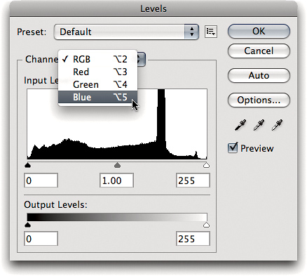
A color image consists of multiple channels, each of which stores grayscale information. When you use Levels to correct a color image, it’s similar to the grayscale corrections you just saw, except that you’re doing it for each color channel. For this reason, you can select the channel you want to edit from the Channel pop-up menu (see Figure 7-8). In addition, you can edit the composite view (all channels at once).
Figure 7-8 Choosing an individual channel view in the Levels dialog
When you work in the composite (RGB, CMYK, or Lab) view, Levels works in much the same way as it does on grayscale images. It makes the same adjustment to all the color channels, so it affects only tone—in theory. In practice, it may introduce some color shifts when you make big corrections, so I tend to use Curves more than Levels on color images. But Levels is useful on color images in at least two ways:
• As an image-evaluation tool, using the histograms and clipping display
• When you have a color image that has no problems with color balance but needs a small midtone adjustment using the gray slider
Manipulating channels individually can be a chore, so to quickly make major initial corrections you can manually guide the Auto Color feature in Levels and Curves (see the next section, “Controlling Auto Corrections”).
How Levels and Clipping Work on Color Images. As the composite histogram implies, when you make an edit in the composite channel view, it’s as if you made the same edit to each channel individually. However, since the contents of the individual channels are quite different, applying the same value changes to each channel can sometimes have unexpected results. This causes a potential problem with the black and white Input Levels sliders.
The white slider clips the highlights in each channel to level 255. This brightens the image overall, and neutral colors stay neutral. But it can have an undesirable effect on non-neutral colors, ranging from oversaturation to pronounced color shifts. The same applies to the black Input Levels slider, although the effects are usually less obvious. The black slider clips the values in each channel to level 0, so when you apply it to a non-neutral color, you can end up removing all trace of one primary from the color, which also increases its saturation.
Tip
![]()
The techniques for displaying clipping apply whether you’re working in Levels or Curves as a dialog or Adjustments panel.
Because of this behavior, use the black and white Input Levels sliders primarily as image-evaluation tools in conjunction with the Option/Alt-key clipping display (see Figure 7-9). They let you see exactly where your saturated colors are in relation to your neutral highlights and shadows. If the image is free of dangerously saturated colors, you can make small moves with the black and white Input Levels sliders, but be careful of unintentional clipping, and keep a close eye on what’s happening to the saturation—it’s particularly easy to create out-of-gamut saturated colors in the shadows.
Figure 7-9 Viewing the clipping display for a color image by Option/Alt-dragging the black-point and white-point sliders

The Composite and Luminosity Histograms. Labeled RGB, CMYK, or Lab, depending on the image’s color space, the composite histogram is the same as the default Colors histogram in the Histogram panel but different from the Histogram panel’s Luminosity histogram. In the Luminosity histogram, a level of 255 represents a white pixel. In the RGB and CMYK histograms in Levels, however, a level of 255 may represent a white pixel, but it could also represent a fully saturated color pixel—the histogram simply shows the maximum of all the individual color channels. Fortunately, the Levels clipping display makes this clear (see Figure 7-9).
Saturation clipping isn’t necessarily a problem, but it is a sign that you should check the values in the unclipped channels to make sure that things are headed in the right direction. If you’re trying to clip to white and the unclipped channel is up around 250, or you’re trying to clip to black and the unclipped channel is under 10, you don’t really have a problem. But if the values in the unclipped channels are far away from white or black clipping, you may actually be creating very saturated colors that you didn’t want.
Adjusting Each Channel Individually. In Figure 7-9 I adjusted levels by dragging just the composite sliders. But if the image needs a color tweak, you can adjust the input levels for each channel individually (see Figure 7-8) to change the color balance. You can adjust the color balance of the shadows by adjusting the black-point value in each channel, and similarly adjust the color balance of the highlights and midtones by adjusting those values in each channel. But dragging the sliders yourself is not always the best way to adjust channels individually. Start by customizing the powerful Auto Color Correction feature, which can do a great first pass at setting initial levels for individual color channels (see the next section, “Controlling Auto Corrections”), and then fine-tune the color with Curves.
Tip
![]()
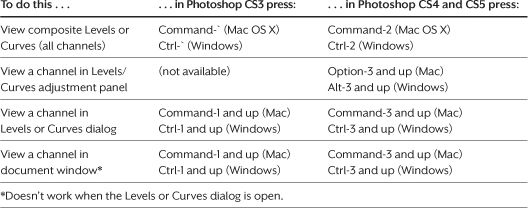
The changes to the keyboard shortcuts for channels can trip up long-time Photoshop users. If this affects you, train yourself to use the Option/Alt key to display channel curves, the Command/Ctrl key to display channels, and the 2 key as the composite channel key.
Channel-Viewing Shortcut Changes. Back in Photoshop CS4, Adobe finally implemented long-popular feature requests to use the standard Command-` shortcut for cycling document windows in Mac OS X and the Command/Ctrl-1 shortcut for the 100 percent window magnification used by many applications in Mac OS X and Windows. As a result, the long-established Photoshop shortcuts for displaying the composite and first channels had to change. Adobe simply moved them down two keys on the top row of the keyboard (see Table 7-1). For example, where you used to press Command-1, -2, and -3 to respectively view the R, G, and B channels in Mac OS X, you now press Command-3, -4, and -5.
Table 7-1 Viewing image channels in Photoshop CS4 and later.
Tip
![]()
Making Curves available as a nonmodal panel meant that the old and new shortcuts for viewing curves and channels would conflict (they both used the Command/Ctrl key), so in Photoshop CS4 and later you view channels with the Command/Ctrl key and channel curves with the Option/Alt key.
If you’ve used older versions of Photoshop so long that your muscle memory is too ingrained for you to adapt, there is an easy way out: To switch back to the old shortcuts, choose Edit > Keyboard Shortcuts and turn on the Use Legacy Channel Shortcuts check box.
Controlling Auto Corrections
There’s a certain amount of distrust of the automatic (Auto) color correction features in Photoshop, and it is well-founded. But if you keep a few tips in mind, the Auto commands can be useful. The worst way to use the Auto corrections is to apply them blindly, so let’s start by looking at how they work.
Auto Tone. Expands the dynamic range of all image channels as much as possible. This seems fine mathematically, but visually this option stands the highest chance of wrecking an image, because it adjusts each channel separately by an arbitrary amount, without any reference to image content.
Tip
![]()
Auto corrections work best with images in which endpoint clipping hasn’t already been applied, because once those highlights and shadows are gone, you can’t get them back.
Auto Contrast. Maximizes contrast like Auto Tone, except that it tries to prevent color shifts by applying the same amount of adjustment to all channels. However, the adjustment is still arbitrary.
Auto Color. Similar to Auto Tone, except that it also tries to identify the midtone value to make it neutral so that any color cast is removed; this works correctly only if the midtone really is supposed to be neutral.
Auto Corrections Appear in Different Forms. The Auto corrections just described are also options in the Auto Color Correction Options dialog that you’ll soon see. Auto Tone is the same as Enhance Per Channel Contrast, Auto Contrast is the same as Enhance Monochromatic Contrast, and Auto Color is like Find Dark & Light Colors with Snap Neutral Midtones turned on. And in the Levels and Curves adjustments, the Auto button is an alternate way to apply Auto Tone.
Tip
![]()
When setting Auto Color options, stay slightly on the conservative side and leave the fine-tuning to Curves. Never over-clip the ends of the tonal range.
Auto Color Works Best When You Take Over. You can control how the Auto corrections are applied if you use the Auto Color Correction Options dialog. If you take charge of Auto Color, it can be useful for making major initial corrections, particularly on scans of color negatives or on images that need major adjustments in color balance and contrast.
Tip
![]()
Because the Auto button in Levels and Curves is another way of applying Auto Tone, it’s best to click Auto only after you’ve customized the Auto Color Correction Options defaults and are certain that they’re appropriate for the current image.
Here’s how to alter Auto Color settings to get a result you actually want:
1. Open the Levels or Curves Adjustments panel and choose Auto Options from the Levels panel menu. If you’re using the Levels or Curves dialog, click the Options button.
2. Turn on Find Dark & Light Colors (see Figure 7-10).
Figure 7-10 Controlling Auto Color correction
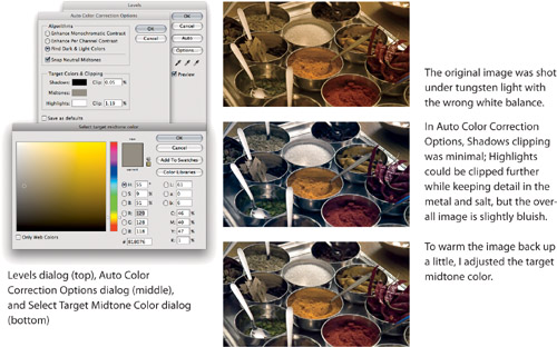
3. Turn on the Snap Neutral Midtones check box.
4. Adjust the clipping percentages from the rather high default value of 0.10 percent to a much lower value, typically in the range of 0.00 to 0.05 percent, depending on the image content.
Tip
![]()
If nothing happens when you adjust the Midtones target color, make sure Snap Neutral Midtones is on.
5. When necessary (that is, more often than not), click the Midtones swatch to open the Color Picker and adjust the target value. You can do this by changing the numbers in the Color Picker or by dragging the target indicator in the color swatch. They’re equally effective—use the method you find more convenient.
6. Click OK to close the Midtones Color Picker, and click OK to close the Auto Color Correction Options dialog.
If you view different channels in Levels or Curves at this point, you’ll find that the Input Levels sliders have been adjusted for you.
Setting Useful Auto Color Correction Defaults. If you’ll be working with many images that are consistent in tonal character, come up with Auto Color Correction settings that provide a good, time-saving initial correction for them and then turn on the “Save as defaults” check box. When you create relevant default settings, the Auto commands on the Image menu and the Auto button in Levels and Curves may actually be somewhat useful to you, because they’ll apply the defaults you set.
Tip
![]()
You don’t have to aim for perfection with Auto Color. The goal is to get the image into the ballpark quickly, and fine-tune the results using Curves.
The Info Panel
Like the Histogram panel, the Info panel is purely an informational display. But where the Histogram panel shows a general picture of the entire file, the Info panel lets you analyze specific pixels in the image. When you move the cursor across the image, the Info panel displays the values of the pixel under the cursor. More important, when you are using tone- or color-correction features (such as Levels or Curves), the Info panel displays the values for the pixel before and after the correction (see Figure 7-11).
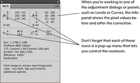
As with other evaluative tools, you shouldn’t use the Info panel alone. But using it together with the histogram and the clipping display on a calibrated monitor gives you a more complete picture of the corrections you need to make and the effects of pending corrections. The Info panel can show you small differences that may be difficult to see using monitor feedback alone.
Tip
![]()
For more precision with high-bit images, change the Info panel units to 16-bit or 32-bit.
You can control the information that the Info panel displays; you saw this in “Info Panel Tips” and “Workspace Tips” in Chapter 6. Actual Color displays the color model of the image you’re viewing, so if you change the color mode, the Actual Color readout follows suit. Because the Workspace feature captures Info panel settings in addition to the panel locations, you can use workspaces to load different customized Info panel setups as needed.
Info Panel Setup. I use the same Info panel setup most of the time. For grayscale, duotone, or multichannel images, I generally set the first color readout to RGB Color and the second color readout to Actual Color. For color images, I set the first color readout to RGB, the second color readout to CMYK or my Proof Setup (such as a photo lab printer profile).
Setting Eyedropper Options. You can set the size of the sample area from the Sample Size pop-up menu in the Options bar, or by Control-clicking (Mac) or right-clicking an image with the eyedropper. You can sample as little as a single pixel (Point Sample) or as much as 101 by 101 pixels. 3-by-3 Average is a decent compromise between precision and sampling an area so small it isn’t truly representative of the local color. If you leave the eyedropper set to Point Sample, zoom in to make sure you don’t sample a noise pixel by mistake.
Tip
![]()
You can use the Info panel to hunt down hidden detail, particularly in deep shadows and bright highlights, where it can be hard to see on the monitor. If the numbers change as you move the cursor over an area of the image, tonal differences are lurking—it may be detail waiting to be exploited or it may be noise that you’ll need to suppress.
Precision of the CMYK Readout. If you’re preparing a job for a press, the Info panel can show you the approximate CMYK values that you’ll get when you do a mode change to CMYK. I say approximate because if you examine the CMYK values for an RGB file, then convert to CMYK and examine the values again, they may differ by a percentage point in one channel (which is a closer match than many production processes can consistently hold).
Output Levels
The Output Levels controls (see Figure 7-12) let you compress the tonal range of the image into less than the full range of levels. You can use this feature to produce the graphic design effect of ghosted background images. And if you find yourself dealing with old-style legacy CMYK or grayscale workflows that use a single dot-gain value, you can still use the output sliders to make sure that you don’t force highlight or shadow dots into a range that the output process can’t print.
Figure 7-12 Adjusting the Output Levels sliders for the image from Figure 7-5
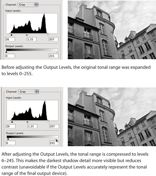
Black Output Levels. When this slider is at its default setting of 0, pixels in the image at level 0 will remain at level 0. As you move the slider to the right, it limits the darkest pixels in the image to the level at which it’s set, compressing the entire tonal range.
White Output Levels. This control behaves like the black Output Levels slider, except that it limits the lightest pixels in the image rather than the darkest ones. For example, setting this slider to level 245 will put all the pixels that were at level 255 at 245 (see Figure 7-12).
Output Levels for Non-Color-Managed Grayscale Output. Even though grayscale is a first-class citizen in good color-management standing in Photoshop, very few other applications recognize grayscale profiles. When using grayscale images in a non-color-managed workflow, Output Levels can be used to make sure that highlights don’t blow out and shadows don’t plug up on press—the sliders let you limit black to a value higher than 0 and white to a value lower than 255. Good ICC profiles tend to make this practice unnecessary, since they take the minimum and maximum printable dot into account. When grayscale images have no specular highlights (the very bright reflections one sees on polished metal or water), you can still use the output sliders in Levels to limit the highlight dot and—in images with very critical shadow detail—the shadow dot. To avoid making specular highlights gray in images that contain them, you can use Curves instead.
Leave Room When Setting Limits. Always leave yourself some room to move when you set input and output limits, particularly in the highlights. If you move the white input slider so that your highlight detail starts at level 254, with your specular highlights at level 255, you run into two problems:
• When you compress the tonal range for final optimization, your specular highlights go gray.
• When you sharpen, some of the highlight detail blows out to white.
To avoid these problems, try to keep your significant highlight detail below level 250. Shadow clipping is less critical, but keeping the unoptimized shadow detail in the 5 to 10 range is a safe way to go.
Likewise, unless your image has no true whites or blacks, leave some headroom when you set the output limits. For example, if your press can’t hold a dot smaller than 10 percent, don’t set the output limit to level 230. If you’re optimizing with the output sliders in Levels, set it to 232 or 233 so you get true whites in the printed piece. If you’ll be optimizing later with the eyedroppers or Curves, set it somewhere around 237 or 240. This lets you fine-tune specular highlights using the eyedroppers or Curves, but it also brings the image’s tonal range into the range that the press can handle.
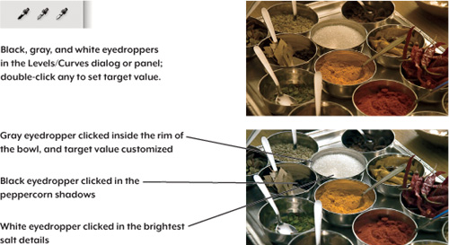
Eyedroppers in Levels and Curves
When using Levels and Curves, you’ll find black, white, and gray eyedropper tools. They’re basically another way to set your input and output levels. Instead of dragging sliders in a dialog or panel, you work visually, clicking parts of the image that you’d like to take on your desired shadow, highlight, or midtone values. For example, if you select the white eyedropper and click a light pixel, that pixel becomes the target value you set (pure white by default) and the rest of the tonal range shifts accordingly. I haven’t talked about the Levels/Curves eyedroppers until now because customizing the Auto Color Correction values (covered earlier) is a newer, faster way to set input levels, and ICC profiles are a newer, faster, and more accurate way to set output levels. But that doesn’t mean the Levels/Curves eyedroppers are useless. They’re sometimes still useful for:
• Grayscale images
• Non-color-managed CMYK workflows with single dot-gain values instead of dot-gain curves
• RGB for non-color-managed, standard-definition television display (set highlights to 235 and shadows to 15)
Tip
![]()
What can make the eyedroppers frustrating to use is that if you aim for a color and you happen to click a pixel of a slightly different color, the image may not be corrected as you were expecting. Try right-clicking the image with an eyedropper to enlarge the sample size, or instead try using the Auto Color Correction Options dialog, as described earlier in this chapter.
The rest of the time, you can let the profile handle the minimum dot (though when highlight detail is critical, check the Info panel numbers).
Setting the Black Point and White Point. There are a couple of ways to use the eyedroppers to set tonal endpoints, and the distinction is important. If you simply select each eyedropper and click it without customizing its target value, it’s like dragging the Input Levels sliders. Because it affects only the input levels, it’s an alternative to dragging sliders manually or customizing the Auto Color Correction settings.
The other method is to first double-click the black or white Levels/Curves eyedropper and set its target value before clicking the image. Setting a target value also changes the Output Levels sliders, and that’s why it’s now useful primarily within a non-color-managed prepress workflow.
Killing Color Casts. You can use the eyedroppers to eliminate color casts quickly (see Figure 7-13). If a shadow is blue and you click it with the black eyedropper set to a neutral target value, the shadow becomes neutral.
Figure 7-13 Using the Levels/Curves eyedroppers
However, this behavior can cause some confusion. While the eyedroppers appear in two nonlinear editing tools—Levels and Curves—their effect is a linear adjustment. So if you labor mightily in Levels or Curves and then apply the black or white eyedroppers to the image, they promptly wipe out any adjustments you’d already made. Because of this behavior, you may want to use the eyedroppers only when there’s a heavy cast near the shadows or highlights and you haven’t applied any fine-tuning corrections yet.
The Gray Eyedropper. The gray eyedropper behaves quite differently from the black and white ones. It forces the clicked pixel to the target hue while attempting to preserve brightness. By default, the target is set to RGB 128 gray, because the tool was designed for gray balancing. Unlike its black and white counterparts, it doesn’t undo other edits you’ve made in Levels or Curves, though it may change their effects. You can use the gray eyedropper for gray-balancing, but these days the Midtones swatch in the Auto Color Correction Options dialog is more predictable.
At the top of Figure 7-13 is the same starting image as in Figure 7-10, so that you can compare the process to customizing the Auto Color Correction settings. In Levels, I set the black and white points by clicking the black eyedropper on the shadows of the black peppercorns, and clicked the white eyedropper in the lightest area of the salt. I didn’t alter the default target values of those eyedroppers. I clicked the gray eyedropper inside the rim of the salt bowl, but the result was too cool, so I double-clicked the gray eyedropper to warm its target value and clicked again. This took more time than Auto Color because I had to click each eyedropper more than once to identify the most representative black, white, and neutral pixels.
Setting Minimum and Maximum Dots. Unlike the Output Levels sliders in Levels, which simply compress the entire tonal range to minimum and maximum values, the eyedroppers let you set a specific value for minimum highlight and maximum shadow dots. To preserve specular highlights, set the white eyedropper to the minimum printable dot value, then click on a diffuse highlight. This pins the diffuse highlight to the minimum dot while allowing the brighter specular highlights to blow out to paper white. As you might guess, when you click a pixel with the black eyedropper, the clicked pixel is set to the target value and all darker pixels clip to solid black.
Preserving Quality as You Edit
As with most things in digital imaging, editing tone and color involves trade-offs. As you stretch and squeeze various parts of an image’s tonal range, every edit you apply causes some loss of image data... sometimes a little, sometimes a lot. The ideal image correction is one where you get it done in as few moves as possible, which is why I like to call this process image golf. The fewer attempts it takes for you to finish, the better you do. In golf this results in a better score, while in Photoshop this results in the least amount of data loss, preserving image quality—a major goal of this book.
The Details Are in the Differences
Why is it important to preserve image data? To preserve detail. Image detail is formed by adjacent pixels with different tone or color values. When you bring out the details in an image, whether through tonal adjustments or a sharpening filter, what you’re really doing at a basic level is accentuating those differences in tonal levels between adjacent pixels.
Tip
![]()
Details may exist in image data even if they’re hard to see, which is why looking at images should not be the only way to evaluate them. Use the histogram and the Info panel to observe pixel value differences that are too slight to see.
For instance, when you stretch the shadow values apart to bring out shadow detail, highlight values are squeezed together, as you saw in Figure 7-7. Once you merge two different pixel values into one, as in the highlights I just talked about, you can’t re-create the original difference later—that detail is gone forever. That’s what I mean when I say that information is lost.
Complicating matters somewhat is that some differences don’t represent image detail. They’re differences that aren’t supposed to be there, and they obscure the details you want. Here are two kinds of unwanted differences:
Noise. Low-cost scanners and high ISO ratings on digital cameras introduce random signals that create differences between pixels that don’t represent any image detail in the image. That’s noise, a well-known enemy of detail. Good tonal and color corrections accentuate detail while minimizing noise. When an image contains a noticeable amount of noise, it’s often a good idea to apply noise reduction (see Chapter 10) before making further edits, so that your edits can emphasize image detail more than noise.
Posterization. When you see stair-stepping of tonal or color levels in distinct, visible jumps or bands rather than smooth gradations, you’ve got posterization. Posterization manifests in two ways. When you start making dark pixels more different, you eventually make them so different that the image looks splotchy—covered with patches of distinctly different pixels rather than smooth transitions. In addition to wiping out detail, posterization can turn smooth gradations into flat blobs.
How Editing Can Lose Image Data
Let’s try an experiment with an image that’s technically similar to those edited thousands of times a day in Photoshop. It’s made up of an 8-bit channel in which each pixel is represented by a value from 0 (black) to 255 (white). Eight-bit grayscale images have one such channel, while 8-bit color images have three (RGB or Lab) or four (CMYK).
Although you might be working with higher-quality images, many images edited in Photoshop are 8 bits per channel, such as scans or digital camera images shot in JPEG mode. Image edits drop more information from 8 bit/channel files than in files using more bits per channel, simply because you have much less data to start with. Here’s a worst-case scenario that you can try yourself (see Figure 7-14).
1. In Photoshop, choose File > New, and choose Default Photoshop Size from the Preset menu. Choose Grayscale from the Color Mode pop-up menu, and click OK.
2. Press D to set the default black foreground and white background colors. Using the Gradient tool (press G to select it), Shift-drag to create a horizontal gradient across the entire width of the image.
3. Choose Image > Adjust > Levels (press Command-L in Mac OS X and Ctrl-L in Windows), change the gray (middle) Input Levels slider to 3.00, and click OK. In addition to the midtones becoming lighter, you may already be able to see some banding in the shadows.
Tip
![]()
While using adjustment layers is normally a good idea, don’t use them for this exercise.
4. Open the Levels dialog again, and change the gray slider value to 0.325. The midtones are back almost to where you started, but you should be able to see that, instead of a smooth gradation, you have distinct bands, or posterization, in the gradient.
Figure 7-14 Data loss with just two tonal edits
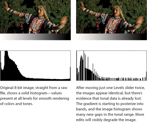
What happened? With the first midtone adjustment, you lightened the midtones—stretching the shadows and compressing the highlights. With the second midtone adjustment, you darkened the midtones—stretching the highlights and compressing the shadows.
With just two moves, many tonal levels were lost. Instead of a smooth blend with pixels using every value from 0 to 255, the histogram shows that some of those levels became unpopulated as the tones stretched out again.
If you repeat the pair of midtone adjustments, you’ll see that each time you make an adjustment, the banding becomes more obvious as you lose more and more tonal information. Repeating the midtone adjustments half a dozen times produces a file that contains only 55 gray levels instead of 256. And once you’ve lost that information, there’s no way to bring it back. But don’t get too alarmed about image data loss just yet.
Repeat the experiment, but this time, in the New dialog choose “16 bit” from the menu to the right of the Color Mode pop-up menu. The two moves should not visibly change the image or the gradient, and the histogram should retain most of its integrity. You are losing levels, but because a 16-bit channel contains thousands of levels compared to the 256 levels in an 8-bit channel, you can lose many more levels in a 16 bit/channel image before your image visibly degrades. That’s a primary advantage of working with high-bit files. And I’ve got more ways for you to avoid image data loss.
Guidelines for Preserving Image Quality
Given what’s been covered so far, here are some guidelines you can employ to minimize the tones and colors that you lose when editing images.
Get Good Data to Begin With. When you shoot digital camera images or scan images, fit the entire tonal range into the histogram when possible. When that isn’t possible, decide whether you’re going to preserve highlight or shadow detail and expose for that. Avoid exposure-related problems that can’t be reversed after you create the image file, such as the following:
• Clipped highlights. If an image contains important highlight detail and you overexpose it with your digital camera or scanner, the highlights become completely white—they contain no detail. It’s especially important to avoid overexposing the tones and colors of skin in portraits, because it just looks ugly.
• Underexposed images. When you severely underexpose an image, too much detail gets pushed into the shadows. Due to the linear nature of digital image sensors, most of the available digital levels are used to record the brightest f-stop of data, and very few levels are available to record the darkest. When you underexpose an image, tones are pushed down where fewer levels record them, so that future edits run a higher risk of creating posterization and making noise more visible. With digital camera images, making a dark image lighter always looks worse than making a light image darker, as long as highlights weren’t clipped.
Note
![]()
You gain nothing by capturing at a lower bit depth and converting to a higher one, such as capturing in 8-bit mode and editing in 16-bit mode. Converting to a higher bit depth just takes up more disk space and processing power.
Capture High-Bit Data When Possible. Most digital cameras and scanners sold today can capture at least 12 bits per channel. When you shoot in raw mode, a digital camera saves all of the bits it shot, but in JPEG mode a camera must convert images to 8-bit files before saving them on the card.
When you set your digital camera or scanner to its highest bit depth, you are, in effect, telling it to “just give me all the data you can capture” so that you can have the most flexibility in Photoshop. In the 16 bit/channel space, you have more editing headroom before you run into posterization. Photoshop opens a file of any bit depth between 8 and 16 bits as a 16-bit image.
Don’t Overdo It. There are two ways to overdo tonal changes: big moves and repeated moves. Fewer, smaller tonal moves preserve image quality the most. The more you want to change an image, the more compromises you’ll have to make to avoid obvious posterization, artifacts due to noise, and loss of highlight and shadow detail. When you properly expose an image in the camera, your risk of data loss is lower once you get to Photoshop, and you can spend less time on tonal edits.
Repeated moves are bad because data loss is cumulative. If you go back to the exercise at the beginning of the previous section and repeat steps 3 and 4 ten times, the gradient will be thoroughly trashed. If you’re trying to decide between one correction or another, never do a before-and-after comparison by repeatedly applying one correction and then another that counteracts it. Instead, perform comparisons by taking advantage of Undo/Redo, History panel states, layer visibility, and layer comps.
Use Adjustment Layers. You can avoid most of the penalties incurred by successive corrections by using an adjustment layer instead of applying the changes directly to the image. Adjustment layers use more RAM and create bigger files, but the increased flexibility makes the trade-off worthwhile—especially when you find yourself needing to back off from previous edits. Because the tools offered in adjustment layers operate identically to the way they work on flat files, I started this chapter by discussing how the features (Curves, Levels, Hue/Saturation, and so on) work as dialogs. For a detailed discussion of adjustment layers, see Chapter 8.
Tip
![]()
With an adjustment layer you can make any number of successive edits to an image, and the net amount of data loss will be as if you made just one edit. If you add an adjustment layer and later remove it, there is no data loss at all.
Cover Yourself. Since the data you lose is irretrievable, leave yourself a way out by working on a copy of the file, by saving your tonal adjustments in progress separately (via adjustment layers), or by using any combination of the above. Or you can use the History panel to leave yourself an escape route—just remember that History remembers only as many states as you specify in the Preferences dialog, it’s only retained until you close the file, and it can consume mind-boggling amounts of scratch disk space.
Data Loss in Perspective
Even before the digital age, photography was about throwing away everything that couldn’t be reproduced in the photograph. You start with all the tone and color of the real world, with scene contrast ratios that are easily in the 100,000:1 range. You reduce that to the contrast ratio you can capture on film or silicon, which—if you’re exceptionally lucky—may approach 10,000:1. By the time you get to reproducing the image in print, you have perhaps a 500:1 contrast ratio to play with. This means you have to throw out some data just to get your job done. It’s only a matter of degree. What’s important is that the goal isn’t to eliminate data loss (since that’s impossible) but to make sure that you did your best to keep the most important image data and throw out the least important data. Once good image-editing habits become ingrained, you can worry less about data loss and concentrate more on enhancing image quality.
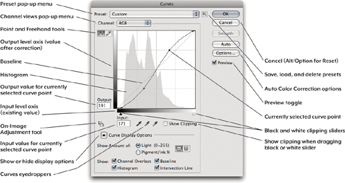
Making Adjustments Using Curves
The Curves feature displays a graph that plots the relationship between input (unaltered) level and output (altered) level. Input levels run along the bottom, and output levels run along the side. When you first choose the Curves command, the graph displays a straight 45-degree line (or baseline), meaning that for each input level, the output level is unchanged (see Figure 7-15). As you add points to alter the output levels, a curve forms. Think of Levels as like an automatic transmission (easy and effective), and Curves as a manual transmission (more effort to master, but much more control).
Figure 7-15 The Curves dialog (compare to the Curves Adjustments panel below).
Tip
![]()
If you’re trying to make the transition from the Curves features of Photoshop CS3 or earlier to Photoshop CS5, you can get oriented by using Figures 7-15 and 7-16 together with Tables 7-1 and 7-2.
Figure 7-16 The Curves Adjustments panel

Table 7-2 Shortcuts for the Curves dialog and Curves Adjustments panel.

You can perform the three basic input levels adjustments in Curves, letting you skip Levels if you want. It might be overkill to use Curves to make only those three adjustments, but the point is that if you were trained (using earlier versions of Photoshop) to set Levels before fine-tuning in Curves, you can now do it all using Curves alone. Once you make the three basic adjustments, you can stay in Curves to execute finer contrast control over different tonal ranges within the image—more than you could ever do in Levels.
You’ll find that the black-point and white-point sliders are similar to those in Levels—they’re at the bottom of the Curves graph/histogram, and you can see the clipping display by Option/Alt-dragging those sliders (or turn on the Show Clipping option). But where’s the midtone slider? There isn’t one; you click the exact center of the curve to add a new curve point, and then you drag that new point straight up to lighten the image or straight down to darken the image.
As you’ll see in the next section, the Curves feature works somewhat differently as a dialog than it does in the Adjustments panel. (Levels works pretty much the same either way.)
Tip
![]()
As in other panels and dialogs, you can apply presets using the Preset pop-up menu at the top and you can load and save your own custom presets using the button menu to the right of the Preset pop-up menu. It’s worth taking a look in the Preset menu to see if any of the built-in presets are useful to you.
Customizing the Curves Display Options
You can edit Curves using a dialog (see Figure 7-15) or in the nonmodal Adjustments panel (see Figure 7-16), a more direct front end to the adjustment layers discussed in Chapter 8. In the Curves dialog, the display options appear in the Curve Display Options section of the dialog, while in the Adjustments panel you get to them through the Adjustments panel menu. Figure 7-17 shows more Curves display options.
Figure 7-17 More Curves dialog display options

Tip
![]()
I usually leave Show Clipping off, preferring to see the temporary clipping display shown when you Option/Alt-drag the black-point or white-point slider.
Show Clipping. Turn this on to see the pixels that are currently being clipped by the black- or white-point slider at the bottom of the graph area. Show Clipping can show either black clipping or white clipping, but not both at the same time. The clipping you see is for the last slider you touched, or for black if you haven’t touched either slider since opening the dialog. Show Clipping works only when Show Amount Of is set to Light.
Show Amount Of. This option sets the units and graph orientation used to display values on the graph. Those who work with Web, video, and other RGB-based media are used to thinking of tone in terms of levels from 0 to 255. Those accustomed to working with ink on press will want to work with dot percentages. You can flip the graph display by selecting Light or Pigment/Ink. When you select Light, the 0,0 shadow point is at bottom left and the 255,255 highlight point is at top right. When you select Pigment/Ink %, the 0,0 highlight point is at the bottom left and the 100,100 shadow point is at the top-right corner. RGB and Lab mode images default to Light; CMYK and Grayscale mode images default to Pigment/Ink %.
Change Grid Increments. The two grid icons let you change the Curves graph gridlines. The left icon (the default) displays gridlines in 25 percent increments, and the right icon displays them in 10 percent increments. The 25 percent grid lets prepress folks think in terms of shadow, three-quarter-tone, midtone, quarter-tone, and highlight, while the 10 percent grid provides photographers with a reasonable simulation of the Zone System.
Tip
![]()
Another way to toggle the grid increments is to Option-click (Mac) or Alt-click (Windows) the graph area.
Show Channel Overlays. When you view the composite view (for example, choosing RGB from the Channel pop-up menu), the Curves dialog can display the curves of each channel in that channel’s color. However, you can’t edit the overlay curves—to do that, choose the name of the channel you want to edit from the Channel pop-up menu.
Show Histogram. The histogram is as useful here as it is in the Levels dialog, so you can leave this on.
Show Baseline. This diagonal gray line reminds you of the shape of the unedited state of a curve. It would be better if it showed you the shape of the curve at the time you opened the Curves dialog, before you started editing. Maybe in the future it will!
Show Intersection Line. This feature appears only as you drag a curve point. Intersection Line actually consists of two lines that lead from the cursor to all sides of the graph, so that you can see exactly where the curve point values cross the Input and Output axes.
Creating and Editing Curves
The power of the Curves command comes from being able to place up to 16 curve points so that can you change the shape of the curve and the angle of curve segments. Remember, steepness is contrast—the steeper the curve segment, the more definition you create between the values of adjacent pixels.
Tip
![]()
Dragging curve points with the mouse is often the least efficient way to edit a curve. The fastest way is using a click-to-add shortcut and adjusting points using the arrow keys, or you can also use the On-Image Adjustment tool.
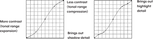
For example, an S-shaped curve (see Figure 7-18) increases contrast in the midtones without blowing out highlights or plugging up shadows, though it sacrifices highlight and shadow detail by compressing those regions. It’s common to use a small bump on the highlight end of the curve to stretch highlights, or on the shadow end of the curve to open up extreme shadows.
Photoshop CS4 Shortcut Changes. Back in Photoshop CS4, the introduction of the Adjustments panel changed the Curves shortcut workflow significantly, particularly for Photoshop veterans with long-ingrained shortcut habits. There are now two sets of shortcuts for editing curves—one for the Curves dialog and the other for the Curves Adjustments panel. This really should not be much of a problem, because if you use the Curves Adjustments panel (which is recommended) instead of the Curves dialog, you need to know only one set: the Curves Adjustments panel shortcuts listed in Table 7-2. (You’ll also need to switch to the current channel-viewing shortcuts covered in Table 7-1, earlier in this chapter.)
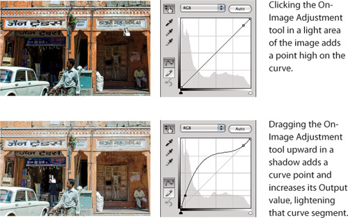
The On-Image Adjustment tool. This is a great time-saver: adding and adjusting a curve point in a single intuitive, visual step. With the On-Image Adjustment tool selected, position the cursor over a tone or color you want to change in the image (not in the graph) and drag (see Figure 7-19). Photoshop adds a point to the curve at that level in the graph; drag up to increase the Output value, and drag down to decrease it. This works in both the Curves dialog and the Adjustments panel. If you’ve used the Targeted Adjustment Tool in Adobe Lightroom, it’s the same idea.
Figure 7-19 The On-Image Adjustment tool
Tip
![]()
If you’re going to be working in the Adjustments panel for a while, it’s worth it to turn on the On-Image Adjustment tool. And if you’re used to the old Curves dialog shortcuts, turning on the On-Image Adjustment tool is the only way to make sense of the Curves Adjustments panel.
The On-Image Adjustment tool also overcomes a major obstacle Adobe faced in its worthy quest to make Curves nonmodal in Photoshop CS4. When Curves is in a dialog, the cursor lets you sample values from the image (see “The Eyedropper Sampler” later in this section), and that’s easy because the cursor can’t do anything else to the image while the dialog is open. But when Curves is in the nonmodal Adjustments panel, the cursor would normally be whatever tool is selected in the Tools panel, preventing you from using the cursor to sample color values directly from the image. The On-Image Adjustment tool solves this problem by forcing the cursor to serve the Adjustments panel only. When the On-Image Adjustment tool is enabled, you can perform the sampling and point-editing functions that were taken for granted in the Curves dialog, as you’ll see in Table 7-2. For Photoshop veterans, the On-Image Adjustment tool makes it possible for you to use many of the old Curves dialog shortcuts; in some cases the new shortcut is simpler than the old one.
Tip
![]()
You can assign a keyboard shortcut to the On-Image Adjustment tool. Choose Edit > Keyboard Shortcuts, choose Tools from the Shortcuts For pop-up menu, and scroll down until you find Targeted Adjustment Tool near the bottom of the list. That’s right, it doesn’t say On-Image Adjustment Tool. The reason there is no shortcut already assigned is that all 26 letters of the English alphabet are already in use; you’ll have to decide which tool shortcut to give up to get this one.
More Ways to Add Curve Points. When you’re in the Curves dialog (not the Curves Adjustments panel), you can add a new point to a curve by Command-clicking (Mac OS X) or Ctrl-clicking (Windows) in the image. Of course, you can also add a point to a curve by clicking directly on the curve itself. For example, if you place the cursor in the graph at Input 128, Output 102 and click, the curve changes its shape to pass through that point, all the pixels that were at level 128 change to level 102, and the rest of the midtones are darkened correspondingly. I summarize these shortcuts in Table 7-2, including a one-click shortcut for adding a point at a pixel’s color value on the curves in all of the color channels of a color image—a big time-saver for removing color casts.
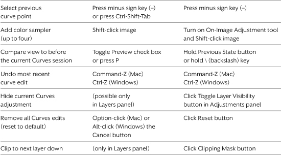
Selecting a Curve Point. The most obvious way to select a curve point is to click one with the mouse. You can also select a point with the keyboard; press the plus sign key (+) to cycle through the points on the curve, selecting the next one with each press, or reverse direction by pressing the minus sign key (−). This is a change from Photoshop CS3 (see Table 7-2).
Curves as a Dialog or as a Panel? In most cases you’ll want to work with Curves from the Adjustments panel because it applies the changes as a nondestructive adjustment layer instead of altering pixels permanently. You may want to assign a shortcut of your choice to the Layer > New Adjustment Layer > Curves command (choose Edit > Keyboard Shortcuts). Choosing that command does the same thing as clicking the Curves icon in the Adjustments panel. The Curves dialog is still useful for certain cases when Curves is simply not available as an adjustment layer, such as when you want to use a curve to edit a mask or alpha channel.
Tip
![]()
You can customize the sample size of the eyedropper by Control-clicking (Mac) or right-clicking (Windows) it on an image, even if a dialog is open.
The Eyedropper Sampler. Separate from the three eyedropper icons in Curves is an eyedropper sampler that appears when you move the cursor over the image while the Curves dialog is open, or when the Curves Adjustments panel is open and the On-Image Adjustment tool is selected. A circle shows the location of that point on the curve. For sampler shortcuts, see Table 7-2.
Note
![]()
In Windows, if you want to go to the next point on the curve and a Curves number field is active, you may need to add Shift to the plus sign shortcut.
Tip
![]()
In the Curves Adjustments panel, the Edit > Step Forward and Edit > Step Backward shortcuts work, giving you multiple undos (compared to the single undo you get in the Curves dialog).
Input/Output Level Readouts. When you move the cursor into the Curves graph, the Input and Output levels show the tonal levels on the graph (see Figure 7-20). You can follow the shape of the curve with the cursor and watch the readout to see exactly what’s happening at each level.
Figure 7-20 Input/Output levels become editable when you select a point or drag a slider.
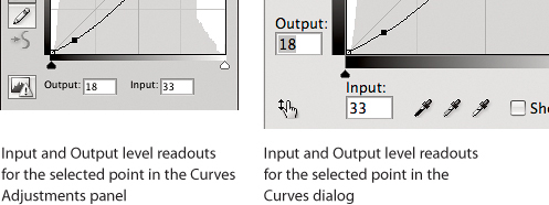
The readouts become editable when you add or select a curve point. In the Curves dialog you can press Tab to highlight the Input or Output field as needed, but in the Adjustments panel you’ll usually have to click a field with the mouse; because the Tab key hides all panels, it usually doesn’t navigate fields in the Adjustments panel unless a panel field is already active.
More-Accessible Curves Presets. Although adjustment presets have been part of Photoshop for a while, they’ve always been buried in some menu. In the Adjustments panel, just click the triangle next to the Curves pop-up menu and click a preset name to apply one. A preset makes a great starting point for pros as well as novices, because you can fully edit the Curves adjustment layer that a preset produces. Keep in mind that every time you click a preset, Photoshop adds another adjustment layer—keep an eye out for redundant layers added to the Layers panel.
Other Curves Goodies. In the bottom half of Table 7-2 are extra conveniences built into the Curves dialog and Adjustments panel, including the valuable abilities to toggle a before-and-after view of the current edit and to reset Curves to the state before the current edit. Again, veteran Curves jockeys will want to adapt to the newer shortcuts for these features.
Drawing Curves with the Freehand Tool
I’d be remiss if I didn’t mention the Freehand (pencil) tool in the Curves dialog, which lets you draw freehand curves rather than bending the curve by placing points. You can use the Freehand tool to handle specular highlights on printing processes where the minimum highlight dot is relatively large, such as laser printer or newsprint output. For the rare times when you might need to do this, nothing else does the job.
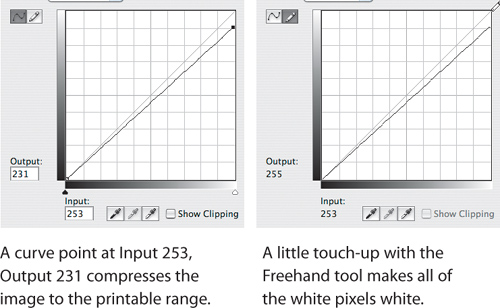
Trouble in the Transition Zone. If you’re dealing with newsprint or low-quality printing, the transition zone—that ambiguous area between white paper and the minimum reliable dot—can make your specular highlights messy. Some may drop out, while others may print with a visible dot. The solution is to make a curve that sets your brightest highlight detail to the minimum highlight dot value and then blows everything brighter than that directly out to white. This is a two-step process (see Figure 7-21).
1. Select the highlight point, then use the numeric fields to set the Input to a value corresponding to your brightest real detail, and the Output to a value corresponding to your minimum printable dot. Figure 7-21 shows a point that sets the Input value at 253 and the Output value at 231, corresponding to a 10 percent dot. This sets all the pixels with a value of 253 to 231. But it also sets pixels with values of 253 through 255 to 231, which isn’t what you want. You want them to be white.
2. Select the Freehand (pencil) tool, and very carefully position it at the top edge of the curve graph until the Input value reads 253 and the Output value reads 255, then click the mouse button. This keeps pixels with an Input value of 252 set to an Output value of 231, but blows out pixels with a value of 253 through 255 to paper white. Your highlight detail will print with a reliable dot, and your specular highlights will definitely blow out. Don’t click the Smooth button, because it will smooth the curve—which in this case is not what you want.
Figure 7-21 Blowing out the specular highlights
If this is something you have to do often, choose Save Preset from the Adjustments panel menu to save the curve. You can load the saved curve whenever you need it, or even create an action that you run as a batch to process multiple images.
Hands-On Curves
Now that you’re armed with all the preceding information, let’s look at some practical examples of working with Curves. Let’s look at several different scenarios, because you have two different reasons for editing images, as you’ll see in the upcoming sidebar, “What’s Your Motivation?”
The classic order for preparing images is as follows:
• Retouching and removing spots, dust, and scratches
• Overall tonal correction (black point, white point, midtone, contrast)
• Overall color correction (remove color casts, add vibrance/saturation)
• Selective tonal and/or color correction
• Output-specific optimizations (resizing, sharpening, handling out-of-gamut colors, compressing tonal range, converting to other color spaces)
I loosely adhere to this sequence, but a great deal depends on the image and on the quality of the image capture. For instance, you often have to apply some basic tonal correction to a scanned image before you can even consider removing dust and scratches. And because changes to the color balance can affect tonal values, it can sometimes be impossible to separate tonal correction from color correction. When that happens, you may need to go back and forth between tonal and color corrections.
Evaluating Images for Correction
Before editing an image, spend a few moments to see what needs to be done and to spot potential pitfalls. Check the Histogram panel to get a sense of the image’s dynamic range: If shadows or highlights are clipped, you can’t bring back any detail, but you may still be able to make the image look good. If all the data is clumped in the middle, with no true blacks or whites, you’ll probably want to expand the tonal range.
Tip
![]()
If I’m working with a scan of film or a print, the first thing I do is zoom to 100 percent (Actual Pixels) or higher and look at every pixel using the Home, Page Up, Page Down, and End keys. (To scroll sideways, press Page Up or Page Down along with the Command key in Mac OS X or the Ctrl key in Windows.) I check for dust, scratches, and noise (especially in the blue channel).
Check the values in the bright highlights and dark shadows on the Info panel, in case there’s detail lurking there that you can exploit. Even if you’re good at identifying color casts by eye on a calibrated monitor, it’s still a good idea to check the Info panel—a magenta cast and a red cast, for example, appear fairly similar, but the prescription for fixing each is quite different.
Fix the Biggest Problem First. You often have to fix the biggest problem before you can even see what the other problems are. It’s also the most effective approach, requiring the least work and minimizing image degradation.
Leave Yourself an Escape Route. History is a great feature, but eventually it starts dropping the oldest history states, so don’t consume them unnecessarily. If a move doesn’t work, just undo (Command-Z in Mac OS X, or Ctrl-Z in Windows). You can reapply any of the Image > Adjustments submenu commands with their last-used settings by holding down the Option key (Mac) or Alt key (Windows) while selecting them, either from the menu or with a keyboard shortcut. If a series of moves led you down a blind alley, back up in the History panel or choose File > Revert.
Before you apply a move using Levels, Curves, or Hue/Saturation, save the image first. That way, you can always retrace your steps up to the point where things started to go wrong.
Adjustment layers let you avoid many potential pitfalls. You don’t need to get your edits right the first time, because you can go back and change them at will without damaging the underlying pixels. You automatically leave yourself an escape route because your edits float above the original image rather than being burned into it. For a much deeper discussion of adjustment layers, see Chapter 8.
Tip
![]()
Adjustment layers have their own buttons and shortcuts (such as before/after comparisons and undo/revert) that you can use as you make edits inside the Adjustments panel. See Table 7-2.
Evaluation Examples
In Figures 7-22 and 7-23 you see two unedited images along with a plan for what improvements they need in terms of image quality. The evaluation process takes only a few seconds, and it’s time well spent.
Figure 7-22 A scanned negative that just needs a good tone curve
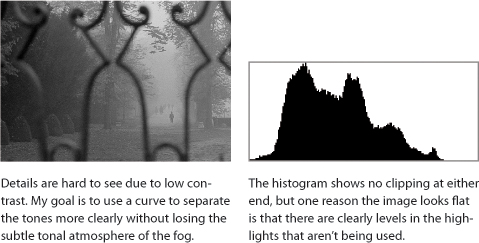
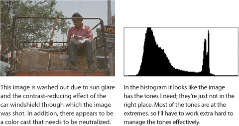
Figure 7-23 An image captured under challenging conditions
Earlier in this chapter, you saw Levels and Curves as dialogs, for simplicity as I first introduced them. From now on, however, I’m going to stick with the Adjustments panel—not only because using adjustment layers has always been the recommended workflow in terms of preserving image quality, but also because Adobe worked hard to make the Adjustments panel the front-line image correction workflow back in Photoshop CS4.
Tip
![]()
Take advantage of the Image > Duplicate command when you want to experiment with potential solutions without accidentally saving unwanted changes to the original file.
Tonal Refinements. Figure 7-22 shows an image scanned from black-and-white negative film using a film scanner. I deliberately scan with the black point and white point set with a few unused tones at the ends, because I can set the endpoints more accurately in Photoshop than in the scanning software. To minimize image degradation during editing, I scan the image as a 16 bit/channel grayscale TIFF file. In Photoshop I choose Image > Invert to make it a positive image. Because it was old film, I removed dust and scratches (see Chapter 11, “Essential Image Techniques”). After that was done, I evaluated the image in terms of tonal quality.
A Shot Through a Car Window. Figure 7-23 was shot using a digital SLR, and it poses several challenges. It was shot in traffic through a car windshield, which added glare and reflections and also a color cast. It was also a sunny day, so the image involves a much wider dynamic range than the previous image—I’ll have to make harder choices.
Correcting the Black-and-White Image
In the Adjustments panel, I click the Curves button (see Figure 7-24) so that I’ve got a new Curves adjustment layer to work with.
Figure 7-24 Adding a new Curves adjustment layer

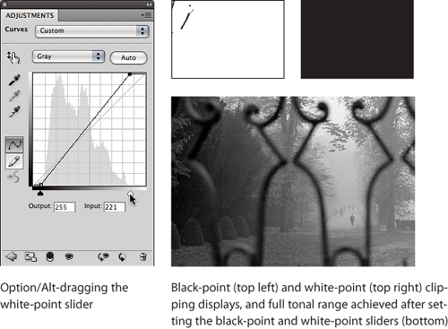
The first task with the image is to refine the black point and white point. I want to use the interactive clipping display, as I did in Levels, so under the Curves graph I Option-drag (Mac OS X) or Alt-drag (Windows) the black-point slider and then the white-point slider (see Figure 7-25). For the black point I let a few of the pixels in the iron gate go black; for the white point I don’t clip any pixels because I want to preserve the fog as well as leave a little headroom for sharpening (since sharpening adds contrast along edges, driving some of those pixels toward levels 255 and 0).
Figure 7-25 Using Curves to set the black point and white point
Tip
![]()
If the black- and white-point sliders do nothing, try deselecting all of the curve points. To do this, press Command-D (Mac OS X) or Ctrl-D (Windows).
After setting the endpoints, it’s easier to see the row of hedges at the left and the people in the distance on the right. Now I just need to set any necessary points in between. However, I notice one thing: There’s posterization, but in just some of the parts of the tonal range. When the tonal distribution is inconsistent, it’s a clue that the tonal range hasn’t been made linear. This makes sense, because no changes were made to the tone curve since scanning the negative—I’ve set only the endpoints. Because the posterization is most visible in the shadows, I place my first curve point there and adjust it until the tones even out (see Figure 7-26). The result may resemble how the image would have printed in a darkroom enlarger. It’s also a reminder that you can stretch tones only so far before they break apart and posterize, and that posterization will happen faster in images like this high-speed film negative, where there may not be that many tones to work with in the first place.
Figure 7-26 My first curve point tries to restore the tonal curve of the film.

I don’t think I need a second major linearization adjustment, so the rest of the curve points I add are for a different purpose: to emphasize individual areas of interest. The dark and light areas are distinctive enough, but it would be nice to separate the midtones a little more, so I grab the On-Image Adjustment tool and drag a midtone in the image up and down until I like what I see. I add another curve point at a near-highlight value, trying to separate tones without killing the fog effect. It’s always a balancing act, because increasing contrast in one part of the tonal range inevitably decreases it somewhere else. The only way around that is to make corrections that you limit to specific areas; I cover that in Chapter 8.
Due to that balancing act, always keep an eye on both the Curves graph and all of the tones in the image to make sure nothing you care about is getting trashed by one of your other moves. Also, I constantly fine-tune curve points I’ve already laid down. The On-Image Adjustment tool is sometimes a little coarse for tiny adjustments; I often prefer to ride up and down the curve from point to point using the plus sign key (+) and minus sign key (−) until I select a point I want to adjust, and then I press any of the arrow keys to nudge the selected point until I get what I’m after.
Tip
![]()
By default, the gray curve displays from white (0% ink) on the left to black (100% ink) on the right. I’ve gotten used to a dark-to-light display, so for these examples I chose Curves Display Options from the Adjustments panel menu and selected Light (0-255) to flip the Curves graph.
If I’m not sure whether I’ve improved the image, I do a before-and-after comparison by holding down the backslash key (). This displays the image without the changes made since displaying Curves in the Adjustments panel. It’s a shortcut for holding down the View Previous State button (see Figure 7-16). For Photoshop veterans, this replaces the old Curves method of pressing P or toggling the Preview check box.
Tip
![]()
When you use the backslash key for a before-and-after view, don’t tap the key, hold it down. Tapping displays a layer mask instead.
The final curve is shown in Figure 7-27. It linearizes the tones, adds depth, and makes it easier to distinguish the different trees and the foliage as they fade into the fog in the distance.
Figure 7-27 My final curve and image

Correcting the Color Image
Again, I start by using the Adjustments panel to add a Curves adjustment layer to the image, and I check and set the endpoints in the same way I did in Figures 7-9 and 7-25. For the black point, I stop as soon as channels start clipping, I make a decision to let the white point clip part of the brightest part of the paper that the man is holding, in order to give more levels to other parts of the image. I don’t let the sky clip. See Figure 7-28 for my endpoints and the image so far.
Figure 7-28 Setting endpoints for the color image

Tip
![]()
If you come up with a successful curve and you’re going to process many more similar images (like a big batch of scans from the same film), save your curve as a preset so you can quickly apply it to any other image from the Curves panel.
Now on to the curve itself. My evaluation noted low contrast, which was partially addressed by the endpoints but still needs work with a curve. I’ll also try to lighten the front of the backlit man, and I’ll need to identify an odd color cast and remove it, all with Curves.
I select the On-Image Adjustment tool, position it over the man’s face, and drag up. This brightens the entire image, starting from the man’s face, which helps to overcome the backlighting (see Figure 7-29).
Figure 7-29 Lightening the dark foreground
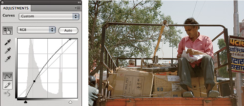
This weakens the shadows a bit too much, so I position the On-Image Adjustment tool inside the cuff of the pant leg on the man’s right and drag down, which adds a point near the bottom of the curve. By now the formerly blue sky has gone almost white, so I drag the On-Image Adjustment tool downward in the sky to give it some density again. Originally I pulled down the sky quite a bit, but that amount killed the highlights in the rest of the image, so I backed off. I then decided to click the curve graph itself to add two more points on either side of the point added by the On-Image Adjustment tool, so I could more precisely manage the contrast from the midtones to the sky. The curve and image so far are shown in Figure 7-30. The point selected on the curve is the sky point I added with the On-Image Adjustment tool; I added the two points above and below that by clicking directly on the curve.
Figure 7-30 Fine-tuning the curve
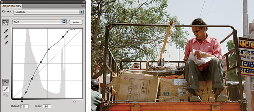
By managing contrast with the curve, I’ve largely overcome the glare from the sun and the windshield. The last item on my to-do list is the color cast. I’m not sure exactly what the cast is, but there’s a way to find out if I can identify something in the image that should be a neutral color. I decide that the utility pole on the right is a good candidate.
I need to get a color value sample from the pole. When the On-Image Adjustment tool is selected, it functions as a color sampler, so I position it over the utility pole and look at the Info panel. It reads highest in red and lowest in blue. I decide to see what happens if I neutralize that. But first, so that I can keep monitoring the Info panel, I Shift-click the On-Image Adjustment tool on the utility pole to leave behind a color sampler, which adds its own persistent readout to the Info panel (see Figure 7-31).
Figure 7-31 Dropping a color sampler
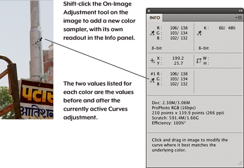
With the sampler in place, I’m ready to neutralize the cast. I suspect that it will take a correction in more than one channel, so I want to add points to the red, green, and blue channels. I can add a point to all channels at once using a shortcut. With the On-Image Adjustment tool selected, I Command-Shift-click (Mac OS X) or Ctrl-Shift-click (Windows) the utility pole where I dropped the color sampler. This works as long as you’re viewing the composite curves, and it saves you the time and trouble of figuring out where to add points in each channel to correct a color in the image.
Tip
![]()
If you still see a color cast in another tonal range, such as the highlights or shadows, just add another set of points to all channels and edit those.
Now it’s just a matter of adjusting the points until the color sampler reads neutral in the Info panel. I use the middle value (green channel) as the baseline, so I view the red channel in the Curves panel, select the point I added with the shortcut, and nudge it down until its value matches the green channel in the Info panel (see Figure 7-32). I then switch to the blue channel and do the same thing. I use keyboard shortcuts to view the red, green, and blue channels, respectively: Option-3, Option-4, and Option-5 (Mac OS X) or Alt-3, Alt-4, and Alt-5 (Windows).
Figure 7-32 Points added to all channels at once and then edited individually; the Info panel shows color neutralized in the post-correction value.

I think the last correction was the right decision (see Figure 7-33)—the previous version now seems too warm. I controlled contrast and removed a color cast by editing several channel curves in one Curves adjustment.
Using Color Samplers
You can use the Eyedropper tool in the Tools panel to check pixel values in the Info panel. But when you’re comparing or tracking the pixel values of two or more areas in an image, it’s not really possible to keep moving the mouse back to the exact same position every time. Fortunately, you can drop up to four color samplers on the image. Each sampler stays in place and continuously reports the underlying color values in the Info panel, as I did back in Figure 7-31.
You can select the Color Sampler tool in the Tools panel, but you may not have to. If you’re using the Eyedropper tool, temporarily enable the Color Sampler tool by holding down Shift; for example, Shift-clicking adds a color sampler. If you’re using a painting tool you can temporarily enable the Color Sampler by pressing Option-Shift (Mac) or Alt-Shift (Windows).
Tip
![]()
When the Color Sampler tool is selected, the Options bar lets you customize the size of the area the tool samples, and also provides a Clear button to remove all color samplers.
You can’t get to the Color Sampler tool in the Tools panel when an adjustment dialog is open (such as Levels or Curves), but, as you saw in the color example, the eyedropper appears when the On-Image Adjustment tool is enabled in the Curves Adjustments panel (or when you’re in a Levels or Curves dialog) and you move the mouse outside an open adjustment dialog. Table 7-3 summarizes the ways you can use the Color Sampler tool.
Table 7-3 Using color samplers.

You can click an eyedropper on any open Photoshop document, not just the one you’re working on. When a dialog is open and you see the eyedropper when you position the cursor outside the dialog, that means you can sample that color (from the Swatches panel, for example). To sample a color from another application, start dragging the eyedropper from inside a Photoshop document window and release the mouse button over the color you want to sample outside Photoshop.
Using Shadows/Highlights
Tip
![]()
In Adobe Camera Raw, the Recovery and Fill Light commands are similar to the Shadows/Highlights feature in Photoshop. But because Recovery and Fill Light have access to the raw camera sensor data, they can potentially do more to save an image than Shadows/Highlights.
The Shadows/Highlights command is unlike all the other commands on the Image > Adjust submenu. The other commands compare a pixel on the adjustment layer to the corresponding pixel on underlying layers, while Shadows/Highlights evaluates and adjusts each pixel differently depending on the values of neighboring pixels on the same layer. Shadows/Highlights lets you recover detail from nearly blown-out highlights and nearly plugged shadows in a way that Curves and Levels can’t. Where Levels and Curves shift the value of all layer pixels uniformly, Shadows/Highlights can vary the amount of adjustment to achieve the local contrast settings you’ve established. That’s a lot of what Shadows/Highlights is about: local contrast.
In its default form, the Shadows/Highlights dialog is very simple—frankly, too simple to be of real use. Turn on the More Options check box to reveal the full capabilities of this command (see Figure 7-34).
Figure 7-34 Comparing Shadows/Highlights to Curves. The Shadows/Highlights settings are below.

When expanded, Shadows/Highlights offers Amount, Tonal Width, and Radius sliders for Shadows and for Highlights; a Color Correction slider (on grayscale images, it’s replaced by a Brightness slider); a Midtone Contrast slider; and clipping percentage fields for black and white. The interactions between the controls are fairly complex, so let’s look at them in turn.
Figure 7-34 shows a Shadows/Highlights correction of an image with a long tonal scale, compared with a correction attempt in Curves. The Shadows/Highlights version cannot be achieved through Curves except by applying multiple curves to different areas masked by hand.
Amount. These options control the strength of the correction—they’re the volume knobs. Be careful; as you approach and pass 50 percent, keep an eye on the entire image for unintended consequences.
Tonal Width. These sliders dictate how far up the tonal range from black the Shadow correction applies, and how far down the tonal range from white the Highlight correction applies. They let you constrain the correction to the tonal range that needs it.
Radius. These sliders set how far out Shadows/Highlights looks around each pixel to analyze and then alter local contrast. Tune the Radius value for the size of the features you’re trying to emphasize. If the Radius value is too large or too small, you may lose detail instead of emphasizing it.
Tip
![]()
An alternative to Shadows/Highlights is choosing Image > Adjustments > HDR Toning and using the Local Adaptation method set to low values.
Color Correction. This is a saturation control that operates only on the corrected colors, not on colors that are unchanged by the correction, to compensate in case your Shadows/Highlights settings reduce color saturation as a side effect. I generally find that the default value of +20 is about right, but don’t be afraid to experiment.
Brightness. On grayscale images, the Brightness slider replaces the Color Correction slider. It lightens or darkens the image, and unlike the Color Correction slider, it affects the entire image, not just the pixels that are affected by the Shadows and Highlights adjustments.
Tip
![]()
Use care when using the Shadows Amount slider with underexposed or noisy images. Such images withstand less of a shadow boost before noise emerges from the shadows.
Midtone Contrast. The Midtone Contrast slider adjusts contrast—negative values decrease contrast and positive ones increase it. While its effect is most pronounced on the midtones, it applies to the entire image, so use it carefully. If you push it too far, you might just end up undoing the effects of your Shadows and Highlights adjustments.
Black Clip/White Clip. The clipping percentages dictate how many of the corrected pixels are mapped to black (0) and white (255), so these controls let you adjust the contrast of the pixels that are close to black and white. Note that unlike the clipping percentage fields in Levels, these use three decimal places. Use them to fine-tune the contrast near the endpoints—when they’re set too low, the image can turn muddy.
Shadows/Highlights isn’t available as an adjustment layer. It has to calculate the value for each pixel based on surrounding pixels on the same layer, while adjustment layers compare a pixel only with the same pixel on layers behind it. The additional calculations required by Shadows/Highlights would make it agonizingly slower as an adjustment layer. In Photoshop CS3 and later, you can use Shadows/Highlights as a Smart Filter, where you have control over when the lengthy recalculations take place.
Hue, Saturation, and Lightness
While you can make skin tones less red or skies less purple with Curves, it’s often easier to achieve with the Hue/Saturation feature. Hue/Saturation is best used for specific color adjustments instead of overall adjustments, and once you’ve mastered it, you’ll find it indispensable.
Tip
![]()
Colorize is great for CMYK or RGB output, but if you’re trying to make a true multitone image and not simply an RGB or process-color simulation of one, choose Image > Duotone instead of applying Colorize.
Colorize. This check box can be used for simple simulations of sepia tones, cyanotypes, selenotypes, bromide prints, and such. Hue/Saturation presets for these effects are in the Adjustments panel. When Colorize is turned on, the Hue slider sets the dominant hue (the number is the hue angle, the same as the Hue field in the Color Picker); the Saturation slider sets the saturation on a scale from 0 to 100, with 0 being grayscale (completely unsaturated) and 100 being fully saturated; and the Lightness slider lets you darken or lighten the image on a scale of −100 to 100, with the default center point at 0. If you experiment, you’ll find that the same settings produce different results depending on both the color mode (RGB, CMYK, or Lab), and the specific RGB or CMYK color space.
Master Pane Controls
In the default Hue/Saturation view, changing a value changes the entire image, so you can call it the Master pane.
Hue. The Hue slider shifts all the colors in the image by the specified hue angle. The top color bar shows the original color, and the bottom color bar shifts to show the resulting color. Small shifts are sometimes useful, but shifting hue by more than 5 degrees or so usually produces effects that can charitably be described as creative (see Figure 7-35). For this reason I rarely use the Master Hue slider—instead, I adjust the hue of specific color ranges (see the next section, “Color Pane Controls”).
Figure 7-35 The Master Hue slider
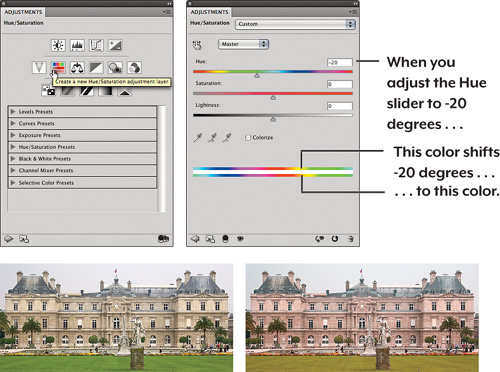
Saturation. Like the Master Hue slider, the Master Saturation slider is more chainsaw than scalpel. Boosting the Master Saturation value in small doses can work, but it’s easy to drive your color into cheap-postcard territory (which is fine if you’re in the cheap-postcard business). I actually reach for the Vibrance adjustment (covered later in this chapter) first, because where Saturation adjusts all colors equally, Vibrance tries to limit saturation boosts for flesh tones and colors that are almost clipping. Either that or I’ll adjust the hue and saturation of individual color ranges separately, because with the Master pane sliders, when I get one color right, I’ve typically pushed another too far, and yet another not far enough.
Tip
![]()
Like the Curves shortcuts, if you’re upgrading from Photoshop CS3 or earlier you’ll find the Color selection shortcuts are different now: Option-2 (Mac) or Alt-2 (Windows) for the Master view, and Option-3 and up (Mac) and Alt-3 and up (Windows) for other colors.
Lightness. The Master pane’s Lightness slider simply shifts all the values, usually clipping either highlights or shadows. Better to use Curves or Levels. I do use the Lightness slider for individual colors, as you’ll read about next.
Color Pane Controls
The power of Hue/Saturation is in the individual color views. You can choose Reds, Yellows, Greens, Cyans, Blues, or Magentas. At first glance, the controls offered in the individual color panes may seem identical to those in the Master pane—there’s a Hue slider, a Saturation slider, and a Lightness slider. The difference? They affect only the color selected in the pop-up menu. What’s less obvious is that the named color ranges are simply starting points that you can adjust to affect exactly the color range you want. For example, you can affect a specific red or a wide range of them.
Between the two color bars at the bottom of the pane are two inner vertical sliders and two outer triangular sliders. These define the range of color affected by the sliders (see Figure 7-36). For additional feedback, the numbers above the color bar show you the hue angles of the four slider positions. You can adjust the color that will be fully affected by dragging the dark gray bar between the inner sliders, or by adjusting the inner sliders individually, and you can adjust the feather—the range of colors that will be partially affected—by dragging the outer sliders.
Figure 7-36 Color-range controls in the color panels
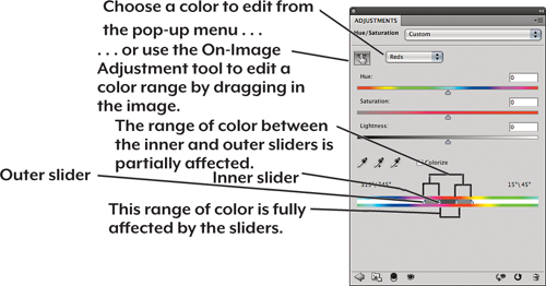
You can also adjust the range by selecting the three eyedropper tools located above the color bars and clicking them in the image. The left eyedropper centers the range of fully affected colors on the hue of the pixel on which you click; the center eyedropper (with the plus sign) extends the range of fully selected colors to include the hue of the pixel on which you clicked; and the right eyedropper (with the minus sign) excludes the hue of the pixel on which you clicked from the fully affected range of colors. The size of the feather doesn’t change with the eyedroppers, but it moves as the fully affected color range expands and contracts. Essentially, the controls provide a color-range selection with a controllable feather.
The preset color ranges are simply arbitrary labels. There’s nothing to prevent you from tweaking six different ranges of reds, greens, or yellows, though you’ll rarely need more than three ranges.
On-Image Adjustment Tool. Like Curves, Hue/Saturation includes the On-Image Adjustment tool. It’s an intuitive way to select and edit a color range in one step. Position it over the color you want to edit, and drag horizontally. By default it adjusts saturation; to adjust hue, Command-drag (Mac OS X) or Ctrl-drag (Windows) the tool.
Skin Tone Adjustments. Hue/Saturation is invaluable for adjusting skin tones. It’s a great deal easier to adjust the red-yellow balance of Caucasian skin with the Hue slider than it is to do so with Curves—in Curves you usually have to adjust all three color curves to obtain the correct hue, whereas the Hue slider lets you get it right in a single move.
Tip
![]()
The color-range controls don’t provide additional visual feedback as to which colors are affected, which can make subtle changes hard to follow. Here’s a simple trick: Move the Hue slider all the way to the right or left before you start adjusting the color-range sliders, then set it back to 0 once you’ve adjusted the range. You’ll see me do this a couple of times in Figure 7-37.
Figure 7-37 Using Hue/Saturation to fix skin tones
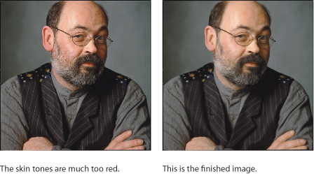

Figure 7-37 shows an image of friend and colleague Bruce Fraser, shot by Jeff Schewe. As with many digital captures, the skin tones are a bit too red. Let’s use Hue/Saturation to make his complexion a little less florid.
Making these kinds of adjustments with Curves is akin to medieval torture! In RGB, you’d have to manipulate at least two curves, but more likely all three color curves plus the composite, and you’d probably have to bounce back and forth between the individual curves several times, since each move affects the others. In CMYK, a curve edit is even more complex, since you have four color channels plus the composite rather than three.
Hue/Saturation is useful in both RGB and CMYK, but it lends itself to much finer adjustments in CMYK than in RGB. In RGB, it manipulates light, while in CMYK it manipulates ink percentages.
When preparing images for a CMYK destination, I always try to get as close as possible to the desired result in RGB with the help of soft-proofing, especially on Hue/Saturation adjustments. But even with good output profiles and a well-calibrated display, I’m likely to make small adjustments after conversion to CMYK.
Tip
![]()
Converting RGB blues into CMYK can be a challenge because of the very limited range of blues in CMYK. If blues are giving you a problem during such a conversion, first try using Hue/Saturation to desaturate the blue, but if the result isn’t pleasing, a Lightness shift can save the day.
Matching Hues. Another common task for which Hue/Saturation is well suited is matching hues across images. The light may change during an event, or you may simply have to force two disparate images to match. Although Photoshop does offer an Image > Adjustment > Match Colors command, it often doesn’t work well. Hue/Saturation is quick and controllable. You may find it useful to change one of the Info panel color readouts to Lab Color, especially if you are matching documents in different color spaces, because you can use Lab values as a universal translator across color spaces.
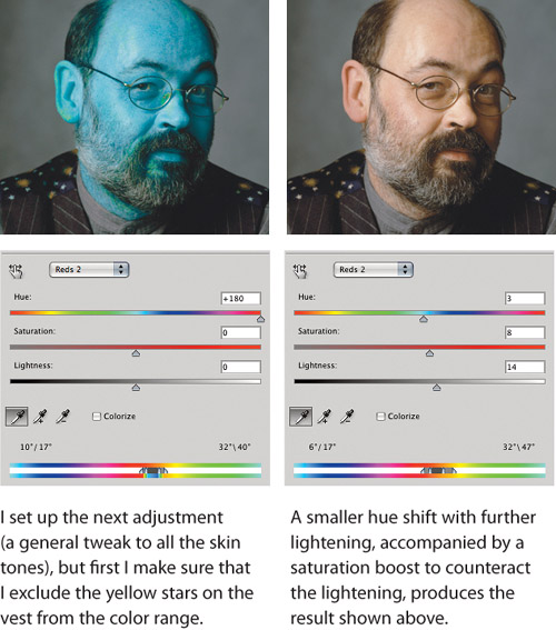
Gamut Mapping. One further task for Hue/Saturation is gamut mapping—controlling the rendering of colors present in the source image that are outside the gamut of the output process. In theory, perceptual rendering is supposed to take care of this for you; in practice it sometimes fails. All profile-creation tools make assumptions, almost invariably undocumented, about the source space they attempt to map into the gamut of the device being profiled, and when the source space doesn’t match the undocumented assumption, you can wind up with solid blobs of saturated color.
Sometimes the fix is as simple as just desaturating the color while looking at a soft-proofed version of the image. In other cases, you may be able to improve the rendering by adjusting hue and/or lightness too. You have to make the fix before converting to the output space, because after the conversion is done, all you can do is make the blobs more or less saturated—you can’t recover the differences that represented detail.
The Color Picker’s Gamut Warning. The View > Gamut Warning command (press Command-Shift-Y in Mac OS X or Ctrl-Shift-Y in Windows) isn’t something that’s very useful. It shows you which RGB or Lab colors are outside the gamut of the CMYK working space, but it doesn’t show how far out of gamut they are, nor does it show the nearest in-gamut colors. However, if you turn on the Gamut Warning command while you’re in the Color Picker, you can see exactly where the gamut boundary lies at different hue angles and lightness levels—see Figure 7-38.
Figure 7-38 The Gamut Warning in the Color Picker
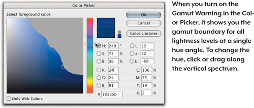
Vibrance
Vibrance is available in the Adjustments panel, which means you can take advantage of Vibrance in any image Photoshop can open, not just the file types you can open in Camera Raw. The value of Vibrance is that it’s carefully engineered to boost dull colors the most while limiting saturation increases for flesh tones and colors that are already highly saturated. Because Vibrance also exists in the Basic tab in Adobe Camera Raw, you can see an example of it in Chapter 5. In the Adjustments panel, Vibrance includes a Saturation slider for those occasional times when a uniform color boost is warranted. When you want more vivid color and you don’t need to make the finer adjustments you just saw, try Vibrance before Saturation.
Choosing a Color Mode for Editing
RGB is the color mode in which most images start (when scanned or created with a digital camera) and end (when displayed on the Web, included in an onscreen presentation, used in a digital video project, or sent to an inkjet printer or photo-printing service). It might not even occur to you to work in a color mode other than RGB.
But those other color modes on the Image > Mode menu exist for a reason, and features like Curves and Levels work in more than one of those modes. In particular, CMYK is a natural choice when you are preparing images for press output, and some professionals who spend all day perfecting images for a press may not recommend anything but CMYK. But don’t change modes on a whim; each change involves some data loss (see Chapter 3), although the amount depends on the quality and bit depth of the image.
Another penalty for changing modes is that some layer features can’t be carried across modes. For example, if you create curves in an RGB adjustment layer and then convert to Lab mode, the RGB curves can’t be translated channel to channel and still look the same, because the channels are completely different. Blending modes work similarly. This is why, when you switch color modes, Photoshop asks you if you want to flatten a document.
A simple rule: Don’t change color modes unless or until you have to, and do as much of your correction as possible in the image’s original color mode. The ideal number of color-mode conversions is none, but in the real world one mode change is quite acceptable as long as it’s done properly.
When to Edit in RGB
If your image comes from an RGB source, such as a desktop scanner or a digital camera, you should do as much of your work as possible in RGB. You’ll have the entire tonal range and color gamut of the original at your disposal, particularly if you’re working with the raw camera data, allowing you to take full advantage of the small differences between pixels that you want to emphasize in the image. Compared to CMYK, RGB images are also much easier to repurpose for different kinds of output, and using three channels instead of four keeps file sizes down. RGB has less-obvious advantages as well. A number of Photoshop features, such as the clipping display in Levels, are available only in RGB, not in CMYK or Lab. It’s likely that a photographer will stay in RGB mode for the entire workflow.
When to Edit in CMYK
If you received your images in CMYK form (such as images from a traditional drum scanner or from an older edition of that job), it makes no sense to convert them to RGB for correction if they are going to press—instead, stay in CMYK. If you find that you have to make major corrections, though, you’ll almost certainly get better results by rescanning the image as RGB instead of fixing it in Photoshop. In high-end prepress shops, it’s not unusual to scan an image three times before the client signs off on it.
Tip
![]()
If you order a scan from a color house and you plan to manipulate the image yourself in Photoshop or use the image for different kinds of output, ask the shop to save the image in RGB format. Of course, if your job will ultimately require converting the image to CMYK, you’ll be responsible for performing the final conversion.
Certain kinds of fine-tuning, such as black-plate editing, can only be done on the separated CMYK file. But if you’re a photographer, you’ll never do that—it’s the job of a prepress technician. If you find you need to make large Hue/Saturation edits in CMYK after a mode change, it’s time to look at your CMYK settings in Color Settings, because the problem probably lies there—a wrong profile, incorrect settings in Custom CMYK, or color management policies that weren’t set the way you thought they were (see Chapter 4). In that case, go back to the RGB original and reseparate it using new settings that get you closer to the desired result.
CMYK and Inkjet Printers. There’s a myth that because inkjet printers use CMYK inks, jobs sent to them should be converted to CMYK. There are two problems with that: First, the inks used in inkjets are not the same as press CMYK inks, and many of today’s inkjet printers use more than four inks anyway. Second, inkjet driver software typically expects to receive RGB data and convert it to the specific formulation of inks used by the inkjet printer. If you’re printing fine-art photographs on a large-format inkjet, staying in RGB mode should result in optimal quality. On the other hand, if you’re working with a job already edited in CMYK for press output and you’re using an inkjet to proof it, don’t convert that job to RGB.
Don’t Convert to CMYK Too Early
You may encounter people who maintain that if your work is destined for a press, you should work exclusively in CMYK. These people may have excellent traditional prepress skills and a deep understanding of process-color printing, but they probably are not comfortable working in RGB, and they may not realize how much image information Photoshop loses during the conversion from RGB to CMYK. When you prematurely convert to CMYK, you restrict yourself in several ways:
• You lose a great deal of image information, making quality tonal and color correction much more difficult.
• You lock the image into a particular set of press conditions (paper, press, inks, and so on). If press conditions change, or you just want to print under different conditions, you’re in a hole that’s hard to climb out of.
• You increase file size by one-third, which slows down operations.
• You lose the valuable Photoshop features that work only in RGB.
Tip
![]()
One of the great advantages to doing major corrections in RGB for prepress is that you have a built-in safeguard: It’s impossible to violate the ink limits specified by your CMYK profile or Custom CMYK settings, because they’ll always be imposed at the time you convert to CMYK.
It’s best to work in RGB for as long as possible and convert your image to CMYK only after you’re finished with your other corrections and you know the printing conditions. It’s useful to keep an eye on the CMYK dot percentages while you work, but you don’t need to work in CMYK mode to do that, since the Info panel can display CMYK values for an image in any color mode. Using the View > Proof Setup > Custom command (see Chapter 8) with your CMYK output profile can also help you visually preview the CMYK results of your RGB edits.
Converting CMYK to RGB
In general, you should treat RGB to CMYK as a one-way trip. However, there are reasons to convert a CMYK image to RGB: You need an image for the Web or multimedia and a CMYK version is all you have, or you need to repurpose a CMYK image for a larger-gamut output process. In either case, you need to expand the tonal range and color gamut. If you just do a mode change from CMYK to RGB, you’ll get a flat, lifeless image with washed-out color because the tonal range and color gamut of the original were compressed in the initial RGB-to-CMYK conversion. Instead, use the Convert to Profile command, using Perceptual intent and with Black Point Compensation and Dither turned on. Then open Levels and click Auto. If this makes the image too saturated, back off the black- and white-point sliders a few levels. This works surprisingly well but is definitely a last resort. Work on a copy of the file, and watch for color shifts and posterization.
When to Edit in Lab
The somewhat obscure Lab color mode is used far less often than RGB or CMYK, but many prefer to edit in Lab mode due to the special advantages it offers. Lab mode separates luminance (its L channel) from color (its A and B channels), making it far easier to apply tonal corrections and filters (such as sharpening) without introducing hue shifts. This concept appeals to those who tweak the black plate in CMYK. The way that Lab mode puts opposing colors on its two A and B axes also makes it easy to remove color casts or enhance color contrast without wrecking the image or its tonality.
Going to Lab mode always adds a conversion step (since original image files are either RGB or CMYK), and it’s good to keep those conversions to a minimum. Also, Lab mode encompasses such a wide color gamut that editing in Lab is usually best with images having at least 16 bits per channel, to keep posterization at bay. Changing color modes often flattens adjustment layers and blending modes, and some Photoshop features that are available in RGB mode do not work in Lab mode. If you’re able to perform most of your layered editing in Lab mode, and you don’t need to convert your layered working file to another mode, only saving flattened RGB and CMYK copies for final output, mode conversion issues may not come up at all.
Because Lab can be so helpful in situations such as rescuing difficult images, there are times when it is certainly worth the side trip. If you want to explore the challenging yet powerful world of Lab, look for books by Dan Margulis—a good place to start is Photoshop Lab Color (Peachpit Press). Dan’s eye-opening techniques have transformed Lab mode from a color scientist’s exercise into a surprisingly valuable color-correction tool.
Quick Lab Mode Fixes
In the last few versions of Photoshop and Camera Raw, the color tools have improved so much that you can fix more kinds of problems that used to require a trip into Lab mode. But converting to Lab mode can still enable a more direct way to make certain types of corrections:
• You want to make major changes in tonality without introducing a color cast or any changes to the color relationships. In this case you can edit just the L channel. (However, you can achieve similar results in RGB mode by editing the master curve or a Curves adjustment layer and applying the Luminosity blending mode to it.)
• You’re having trouble getting rid of a color cast in RGB using the Auto Color Correction settings or Curves.
• You want to create more contrast between magenta and green, or between blue and yellow.
In Figure 7-39, I have a sample image that can benefit from a Lab tweak. It’s a 16-bit image of trees along a lake, and I’d like to boost the contrast a bit. The trees are one mass of similar color, but I think I can create more color contrast there by using Lab mode to enhance the complementary colors in the image.
Figure 7-39 Editing in Lab mode
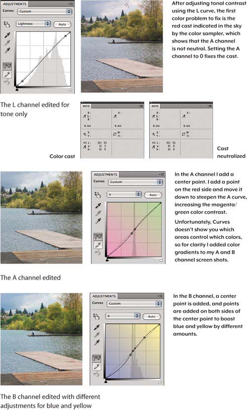
I also think the sky might be too red, and the Info panel confirms this. I Shift-click a color sampler on the sky so I can track its values later.
Editing the L Channel. After clicking the Curves button in the Adjustments panel, the first move is to edit the L (luminosity) channel, which in Lab mode contains all tonal information. Changes you make to the other two channels don’t affect tones at all. Edit the L curve as you would the RGB composite curve (or the K curve when editing in CMYK). This change boosts tonal contrast, but the colors are still a bit weak.
Editing the A Channel. When I open the A channel curve, the first thing I do is add a point and set it to Input 0, Output 0. This locks the color balance in that channel, because (as I mentioned in Chapter 2, “Image Essentials”) the A channel of Lab mode has magenta on one end and green on the other end. At the center—Input 0, Output 0—the A channel is neutral.
The Info readout for the color sampler says L 93, A 3, B 0. I’m not concerned with L (luminosity); I’m focused on the A and B numbers. A is slightly red and B is neutral. I press the plus sign key to select the 0,0 midpoint I added, and keeping an eye on the Info panel, I press the right arrow key to nudge the point until the A channel “after” readout (after the slash) reads 0. Now that the Info panel reads 0 for both the A and B channels, I know that point is perfectly neutral.
Tip
![]()
If you need an eye-dropper sample bigger than 5 by 5 pixels, make a marquee selection of the required size, choose Filter > Blur > Average, and read the result from the Info panel. Just don’t forget to undo the filter once you’ve read the values! (Or use a Smart Filter.)
Now I’ll do what I came here for: bump up the color contrast. In Curves I use the On-Image Adjustment tool to click a green area of a tree to add a curve point and then press the down arrow and right arrow keys to nudge the point away from the center, making the curve steeper (pivoting it around the neutral center point) and boosting the contrast between green and magenta. Not only does this create more variation in the foliage, it boosts magenta in the wooden pier, setting it off against the green.
It’s normal for the A and B channel histograms to be narrow and centered—most of the action happens close to the center in Lab, where moderately saturated colors live in the real world. The gamut of Lab mode is so wide that you don’t have to get very far from the center to oversaturate your colors. Don’t steepen the curve so far that your colors go neon on you. (In the A and B channels, drawing a flat horizontal line across the center would desaturate the colors completely.)
Editing the B Channel. Next I perform the same procedure on the B channel: I add a center pivot point and steepen the curve. However, I also add a point on the yellow side for more control. When I steepen the curve to boost the blue in the water, the yellow in the trees becomes too vivid, so I use the curve point on the yellow side to pull that side of the curve back in, closer to the baseline.
Lab is worth a try when you need to make large moves, quickly correct a color cast, or set complementary colors against each other, but you may find it easier to make subtle color changes in RGB mode (or for a raw file, use the HSL tab in Camera Raw to isolate a color).
Photo Filter
The Photo Filter command (choose Image > Adjustments > Photo Filter) is designed to simulate traditional over-the-lens warming and cooling filters (see Figure 7-40), though it actually lets you choose custom colors in addition to the presets. Its effect is similar to a solid color layer set to Color Blend mode. The default 25 percent intensity may be about twice what you need, and you may want to disable the Preserve Luminosity check box because it tends to exaggerate the effect in the highlights.
Figure 7-40 Photo Filter simulates traditional lens filters
Photo Filter is particularly effective at low intensity settings. Try densities in the 3 percent to 12 percent range. You can also achieve many different creative effects by either using the stronger preset colors or creating your own filter color—just double-click the color swatch to open the Color Picker.
Replace Color
Replace Color (choose Image > Adjustments > Replace Color) is really a shortcut for making a color range selection (see “Color Range” in Chapter 9, “Making Selections”) and then performing a Hue/Saturation tweak.
Replace Color doesn’t let you do anything you couldn’t do with Hue/Saturation, but if you need to adjust only a single color, it’s sometimes more convenient.
Selective Color
Selective Color (choose Image > Adjustments > Selective Color) mimics the system color or color-in-color controls found in most traditional prepress drum scanners. Use Selective Color as a fine-tuning tool on images that have already been converted to CMYK. For RGB images there really isn’t any advantage over using Hue/Saturation. Selective Color lets you increase or decrease the percentage of Cyan, Magenta, Yellow, and Black in the nine preset color ranges that appear on the Colors menu (see Figure 7-41). These color ranges are hard-wired—you can’t change them.
Figure 7-41 Selective Color is useful only on CMYK images.
Absolute and Relative Methods. If you’re using a well-tuned color management system and are creating direct-to-plate output, stick with Relative. (Absolute was more useful in non-color-managed prepress workflows, when film was once exposed to make plates.) With Relative selected, Selective Color looks at how much of the specified ink is present in each pixel in the color range, how close it is to the center of the named color range, and how saturated the color is, so the effect is gentler than Absolute on everything except the fully saturated colors corresponding to the named color ranges.
When you select Absolute, Selective Color adds or subtracts the specified percentages of each ink from colors in the center of the color range. For example, if you ask for −20 percent magenta from reds, a 100M 100Y red becomes an 80M 100Y red and an 80M 80 Y red becomes 64M 80Y. As you move away from the pure-red axis, the percentage by which magenta is reduced lessens in proportion to how far off the red axis the color lies.
Channel Mixer
The Channel Mixer (choose Image > Adjustments > Channel Mixer) does what it says—you can mix the channels, combining content from one or more channels and feeding it into another. For maximum flexibility, the Channel Mixer is typically applied as an adjustment layer. It’s a useful color-correction tool, but not as a global correction tool on RGB images. You can use it to make local corrections, typically to bring out highlight or shadow detail that’s present in only one channel. On CMYK files, it’s useful for tweaking the black plate in specific color ranges, as you can see in Figure 7-42.
Figure 7-42 Using the Channel Mixer to remove black from skin tones in CMYK mode

In Figure 7-42, the original separation setup added black into the skin tones, making them muddy. It’s better to go back to the RGB original and reseparate the image, but that’s not always possible. Lightening the black plate in Levels or Curves would destroy the contrast—you want to change only the skin tones. The Channel Mixer provides an easy means of doing this, with better feedback and finer control than Selective Color. Set the Output Channel to black, subtract some of the magenta and yellow channels from the black, and boost the black to preserve the black values in the shadows.
Tip
![]()
The Channel Mixer has been a popular way to convert color images to black-and-white images, but starting in Photoshop CS3 it’s much better and easier to use the Black & White adjustment (see “The Color of Grayscale” in Chapter 11).
Tools of Limited Usefulness
I’ve covered most of the tools on the Adjustments submenu, but left out a few of them because I never use them for corrections, though they can be useful for creative effects. Don’t take my word as gospel; if one of these features solves a problem for you then it’s justified its existence. That said, here are the tools I don’t use and the reasons for avoiding them.
Color Balance. The Color Balance command lets you make separate adjustments for red/cyan, green/magenta, and blue/yellow to three arbitrary tonal ranges labeled Highlights, Midtones, and Shadows. The problem is that these ranges overlap and are never quite where they’re needed. When there are color balance problems that Auto Color can’t fix, the required corrections are usually selective rather than global. It’s easier to tweak the color balance of different tonal ranges using Curves.
Brightness/Contrast. While Brightness/Contrast performs acceptably now that Adobe has updated the feature to avoid highlight and shadow clipping by default, it’s still kind of a blunt instrument compared to Levels or Curves, which do the same thing as Brightness/Contrast but with more control. If you actually have a reason to make adjustments that push levels off either end of the histogram, you can use Brightness/Contrast with the Use Legacy check box turned on.
Match Color. Matching one image’s color to another sounds like a great idea, but it isn’t that reliable. Matching colors often works better and more quickly by using either Hue/Saturation or Replace Color.
Gradient Map. This is useful for making custom grayscale conversions and for creating truly wacky color effects. It’s low on the list of grayscale conversion methods because it takes a lot of work—you have to edit the gradient to get the results you want, then use Gradient Map to actually get them.
Exposure. The Exposure command is really designed for working with HDR (High Dynamic Range) images. On those, it’s pretty useful—see “Creating HDR Images” in Chapter 11—but on 8-bit or 16-bit/channel images, it doesn’t do anything useful that you can’t do just as easily with the gray input slider in Levels. The Exposure and Offset sliders basically replicate the behavior of the Brightness slider in Brightness/Contrast (when Use Legacy is on).
Equalize, Threshold, and Posterize. These commands are more useful for image analysis or special effects than they are for straight image editing. Equalize redistributes tonal values so that the brightest pixels are white, the darkest pixels are black, and intermediate values are evenly distributed across the tonal range. Threshold is useful for turning images into 1-bit black-and-white bitmaps. Posterize does something we struggle to avoid!
Tip
![]()
Threshold can be a useful way to inspect what pixels exist at any tonal level in the image.
Variations. This is a nice tool for learning to distinguish color casts, but it’s a very blunt instrument indeed for correcting them, and it’s limited to 8 bit/channel images. It doesn’t do anything that can’t be done with a great deal more control and precision using Hue/Saturation, and as of this writing it isn’t yet compatible with 64-bit Photoshop.