
4. Color Settings
Color management is one of those subjects that can quickly make anyone feel stupid. If you’re under the delusion that you can use Adobe Photoshop without using color management, this chapter is a must-read. Without understanding how Photoshop handles color behind the scenes, there’s no way to get great color (or black-and-white) images out of this program.
Although the color management system in Photoshop uses mathematics that approach rocket science, using the tools that control the system is fairly simple. You just need to understand a few key concepts, learn where the buttons are, and use common sense in deciding when to push them.
The last chapter described the unfortunate truth that RGB and CMYK are very ambiguous ways of specifying color, since the actual color you get will vary from device to device. This chapter looks at the features Photoshop offers to make what you see on the screen at least resemble, if not actually match, what you get in your printed output.
Writing just a chapter about color management doesn’t do justice to the subject. If you read this chapter and find that you need more detailed information, pick up the book Real World Color Management, 2nd Edition (Peachpit Press), by color management guru Bruce Fraser, Chris Murphy, and Fred Bunting.
What Is Color Management Anyway?
With such a dry name, color management is often perceived by photographers as a brain-twisting technical chore to be avoided whenever possible. But hardware and software vendors have devoted a great deal of time and resources to working color management into every nook and cranny of digital photography, so it must be important, right? Right. Color management exists because it solves a problem. But what problem does it solve?
You’ve probably noticed that colors don’t look the same from camera to display to printer for all kinds of reasons, from simple production variations to the fact that some devices (like displays) use additive color and others (like printers) use subtractive color. This is the problem color management tries to solve, and it does so by creating a common foundation that color hardware and software can use to make color more consistent.
Ultimately, color management is about reconciling color differences. You can try doing this manually by fiddling with your monitor and printer controls, but it means that your files display and print properly only with the specific hardware and software you currently have in front of you. If you upgrade any of your equipment or send the file to someone else, the file won’t look the same until you tweak it for the new equipment.
A color management system is a much better solution because it uses standardized profiles that describe how your hardware and software reproduce color. When you want to display or print image colors properly on a system with different hardware or software, as long as you have profiles that describe the hardware and software being used, the color management system can make the adjustments necessary to reproduce the image colors consistently. If you think of a display and a printer as using different color “languages,” you can think of a color management system as a sort of translation layer between your image and the system it’s on, and profiles as language phrase books used to translate colors from one device to another.
Yes, color management can be a challenge to understand, but the effort is well worth it. Even understanding just the basic ideas of color management can give you skills that save you time and frustration when trying to get colors to reproduce consistently in many environments.
Color Management Is About Answering Simple Questions
To simplify the way you think of color management, it helps to remember that ultimately, what you’re trying to do is answer a few questions about the image in front of you:
• How is this image supposed to look?
• Where did this image come from? (Under what viewing conditions was this image edited?)
• Where is this image going? (What are the editing or output conditions where the image is going next? How should the colors be preserved under those conditions?)
These questions may seem random now, but you’ll soon see that if you keep them in mind when you try to decide which button to push in a cryptic color management dialog, you’ll find it much easier to think through your answer.
Color Management Is About Relationships
Those new to color management sometimes become fixated on the individual pieces of the system, such as a monitor or a printer. But focusing on an individual piece misses the point. Because the goal is to keep colors consistent among different parts of a workflow, what you really want to pay attention to are the relationships between those parts. The three questions I just posed help you find out about relationships within a workflow.
Profiles are a way of recording and communicating those relationships. For example, when you calibrate a monitor to specific viewing conditions, such as a color temperature of 6500 Kelvins (K) at gamma 2.2, a monitor typically can’t achieve that standard exactly. The monitor profile fills the gap, telling the system how much to alter the display signal so that the image on the monitor does meet the standard. This means that the profile has recorded the relationship (the difference) between the monitor’s performance and the desired standard and has communicated it to the system. The system can then make up (compensate for) the difference. As a result, you see a consistent representation of the colors in the image.
Color Management Systems Explained
A color management system (CMS) is software that does its best to maintain the appearance of colors when reproduced on different devices. The word appearance is not chosen lightly—it’s simply impossible to reproduce many of the colors found in the world in print, or even on a color monitor.
Color management often gets dressed up in much fancier clothing, but it really does only two key things:
• It lets you assign a specific color appearance to RGB or CMYK numbers that would otherwise be ambiguous.
• It maintains that color appearance as consistently as possible as you send images to different displays and output devices.
No matter how complicated color management options might appear, when you examine them more closely, they always serve those two purposes.
Parts of a Color Management System
All color management systems employ three basic components:
• The color-matching engine (sometimes known as the color-matching method) is the software that converts color meanings between different device-specific color spaces, like a universal translator between your color devices. You can choose a different color-matching engine than the very good Adobe Color Engine (ACE), but you probably won’t ever need to. The only real reason for using a different engine is if you absolutely must obtain exactly the same conversions from non-Adobe products.
• The reference color space (also known as the profile connection space, or PCS) is a device-independent, perceptually based color space. Most current CMSs use a CIE-defined color space, such as CIE Lab or CIE XYZ. You never have to work directly with the reference color space; it’s the theory behind how the software works. Think of it as the common ground for all color devices—a space that can represent any color.
• A profile describes the behavior of a device like a scanner, monitor, or printer. For instance, a profile can tell the CMS, “This is the reddest red that this device can output.” A profile can also define a virtual color space that’s unrelated to any particular device (the Adobe RGB space is an example of this; you’ll see how it’s useful later on). Profiles are the key to color management. Without a profile, 100 percent red has no specific meaning; with a profile, the color management system can say, “Oh, this color is supposed to be red in the specific way that red appears on that printer.” Profiles conform to the standard International Color Consortium (ICC) specification that lets them work with all CMSs on all platforms. ColorSync profiles on the Mac and .icm or .icc profiles in Windows both follow the ICC spec and work on both platforms.
Fortunately, you have to work only with the last of the three components: profiles. You’ll run into profiles if your images come from many sources or go to many different types of output media, while the color-matching engine and reference color space may never need to be changed and are usually invisible to you.
Conveying Color Meaning with Profiles
The key concept in using a CMS is conveying color meaning—making those ambiguous RGB and CMYK values unambiguous. If a CMS knows what RGB values a scanner produces when it scans specific colors, and it knows what colors a display produces when it receives specific RGB numbers, it can calculate the new RGB numbers it needs to send to the display to make it reproduce the colors represented by the scanner’s RGB numbers.
Profile Embedding. When you embed a profile in an image, you aren’t changing the image itself, and you’re not changing the color values. All you’re doing is including extra information that tells color-management-savvy applications how to reproduce the colors you saw using the color values in the file. This is possible because a profile designates a specific color appearance for the RGB or CMYK numbers. With a profile, color values are no longer ambiguous—they gain a context to refer to.
Tip
![]()
Embedded and tagged mean the same thing: A color profile is included in a file. When Photoshop says that an image is untagged, it means no profile is embedded.
Source and Destination Profiles. When you ask the color management system to make a conversion—to change the numbers in the file—the CMS needs to know where the RGB or CMYK color values came from and where you want to send them. You can give the CMS this information by specifying a source profile and a destination profile.
For example, imagine that a color management system works with words rather than colors. The purpose of the CMS would be to translate words from one language to another. If you just feed it a bunch of words, it can’t do anything. But if you give it the words and tell it that they were written by a French person (the source), it can suddenly understand what the words are saying. If you then tell it that you speak German (the destination), it can translate the meaning faithfully for you.
The Process. When you scan artwork, you get RGB data. For Photoshop to know what specific colors those RGB values should represent, Photoshop needs to read the profile that describes how the scanner (the source) saw the colors. If the scanning software embeds a profile describing its colors, all you have to do is open the image; Photoshop will just read the profile that’s already in the image. You can then start editing the file, or you can first convert it from the scanner’s color space to a more standard color space like sRGB or Adobe RGB, which you would set as the destination color space.
Tip
![]()
When a profile is embedded in an image and you start to convert the image colors to a different profile, Photoshop automatically recognizes the embedded profile as the default source profile. You have to specify only the destination profile, which would typically represent your final output.
When you print the image, the CMS converts the image’s colors into a form the printer driver can accept. This color conversion happens whether or not you’re aware of it. If you don’t take control of the color conversion, the standard color handoff from Photoshop to the printer driver software may result in mediocre printed colors. If you do take control over the conversion, the Print dialog in Photoshop lets you choose a printer (destination) profile that describes exactly what colors are possible using that specific printer, paper, and ink. Photoshop performs that color conversion on the way to the printer without permanently altering the image file, which remains in its current color space. This more manual approach to printing gives you printed colors that are as consistent as possible with what you saw onscreen. For more information, see “Converting Colors When You Print” later in this chapter.
This is really the only thing CMSs do. They convert color data from one color space (one “language”) to another, using profiles to preserve the intended appearance of the colors throughout the workflow. Pretty much everything you do with a CMS involves asking it to make the colors in a source as consistent as possible with those in the destination, and this two-step process is integral to the way Photoshop handles color.
There’s one more wrinkle, in that the source and destination typically aren’t very similar in size or in shape. In addition, when you print, it’s just about guaranteed that the destination will not be able to reproduce as many colors as the source. (A printer using CMYK inks simply can’t reproduce anywhere near the number of colors that a computer monitor can reproduce.) When this is true, a lot of colors will have nowhere to go—they can’t be reproduced by the destination device. To deal with these mismatches, CMSs provide for rendering intents, which I cover later in this chapter.
Identifying a Document’s Color Profile
Photoshop makes it easy to tell which profile an image uses. The tools that do this aren’t visible by default, but before you read any more of this book, you might want to turn on some of these readouts (see Figure 4-1):
Status Bar. To display the document profile in the Status bar, click the black triangle next to the Status bar at the bottom of a document window. If you have multiple floating document windows, each window’s Status bar will show the profile for the document, which is especially useful if you’ve opened copies of the same document that have different document profiles.
Tip
![]()
If you see a number sign (#) at the end of a window’s title bar, that indicates an untagged document. An asterisk (*) at the end of the title bar indicates a document tagged with a profile different from the current working space. If neither character appears, the document is tagged with the working space profile.
Info Panel. Click the options menu icon in the top-left corner of the Info panel, choose Panel Options, turn on Document Profile, and click OK. Now the document profile will appear in the Info panel. The Info panel shows the profile only for the active window or tab.
Figure 4-1 You can display a document’s profile in the Info panel, as well as in the Status bar at the bottom of a document window.

Comparing Color Spaces
There are a couple of ways to observe the kinds of discrepancies a color management system must deal with to maintain consistent color. You can look at 3D plots that tell you how big each color space is, and you can preview how an image will look in another color space.
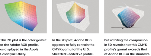
You might have come across two-dimensional plots of color gamuts (see Figure 4-2). But 2D plots can be misleading. A color space is actually three-dimensional, because it isn’t just about the range of colors. It’s also about the range of tones from light to dark, as in the HSB color cylinder you saw back in Figure 3-3. In other words, brightness is the third dimension. For this reason, 3D plots are much more informative (see Figure 4-2). For example, you’ll find that while RGB devices can generally reproduce more colors than CMYK devices, especially at brighter luminance levels, CMYK devices can often reproduce more dark colors than RGB devices can. If you bear in mind that you increase RGB saturation by adding light and you increase print saturation by adding ink, this makes perfect sense.
Figure 4-2 2D gamut plots can be misleading; to get the complete picture, rotate the plots in 3D.
Tip
![]()
To overlay a second profile’s gamut plot over an existing one, in the Apple ColorSync Utility, right-click or Control-click the first profile’s plot, choose Hold for Comparison, and then select the second profile that you want to overlay.
Another way to compare color spaces is to preview how an image looks in the destination color space. This is called soft-proofing. For example, you can open an image embedded with an sRGB document profile and preview how it will look in a specific CMYK press profile, without actually altering the image. You can also soft-proof how that image would look in any other color space for which you have a profile, such as a different printer or display standard. For example, you can view a Mac image under default Windows display conditions. For information about setting up and using soft-proofing, see “Soft-Proofing Other Color Spaces” later in this chapter.
Document, Device, and Working Spaces
The idea of a color space is easy to understand, since it’s essentially the range of colors you get. What’s more challenging is the idea of multiple color spaces, particularly within a single color mode. Let’s look at some of the questions behind the various color spaces.
What’s the Difference Between Document, Device, and Working Spaces? These are all color spaces that are simply used in different ways. One way to think about this is that they go from general to specific:
• The working space that you set in the Edit > Color Settings dialog is the default color space you set in Photoshop. If you start a new document or open a document that doesn’t have a profile, the working space is the profile that will be associated with the image. It also means that as long as you open images that already contain an appropriate profile, the working space is not a concern. You’ll notice that there are four working spaces in the Color Settings dialog—that’s because each color mode gets its own default. RGB has its own working space, CMYK has its own, and so on. When picking an RGB working space, it’s usually best to choose one that’s built into Photoshop; for more information see “About the Built-In RGB Working Spaces” later in this chapter.
Tip
![]()
The working space is most important when you open untagged images, because the working space is essentially a default color space for documents that aren’t already tagged with a profile. If you usually work with tagged images, the working space may not come into play often.
• The document color space is just another way of saying “the profile that’s embedded inside an image.” If there is no profile embedded in an image, you can either let your Photoshop default working space take over, manually assign a profile to it, or tell Photoshop to leave it untagged (that is, don’t color-manage the document). Photoshop handles document profiles very intelligently: If you have five documents open and each has its own correct but very different profile, there won’t be any need to apply the working space to any of them, and in addition, Photoshop will maintain each document’s profile separately. Photoshop won’t let one document’s profile affect another document.
• A device color space represents the range of color produced by a device you use to create or output images. On the creation side, it could be a digital camera or scanner. On the output side, it could be a printer. As discussed earlier, device color spaces are valuable for precisely describing the colors of the device that an image came from or is going to, but they are not good for editing, so you’ll usually run into device color spaces (device profiles) when you first create or finally output an image.
Tip
![]()
The one device profile Photoshop uses all the time is the display profile describing your monitor. That’s why it’s so important to calibrate your monitor and generate a profile for it.
In a typical image-processing workflow among color spaces, an image begins its life using a device-specific source profile and gets converted to a standard, perceptually uniform workspace (such as Adobe RGB or sRGB) for editing and archival storage. Media-specific copies of the image are then converted to the color spaces for the media where they’ll be used (the Web, print, video, and so on).
Why Do We Need More Than One Kind of RGB or CMYK? Different devices reproduce different ranges of color, so if you used an RGB space that was relatively small, like sRGB, it wouldn’t be big enough to preserve the colors from a higher-quality source, such as a professional camera. In that case, you might consider using a larger color space to archive the original.
So Why Not Just Use One Color Space Big Enough to Contain All of the Others? The only problem with using very large color spaces, such as ProPhoto RGB, is that most people still edit 8 bit/channel images. Eight bits isn’t quite enough to stretch across the wide-gamut color spaces, so when you edit an 8 bit/channel image in ProPhoto RGB, instead of smooth color transitions you might see banding or steps. Editing in very large color spaces is more practical if you edit images that have 16 or more bits per channel. That’s kind of an advanced technique, though, because you have to be comfortable with how to convert both to 8 bits per channel and to the color spaces that your final images need.
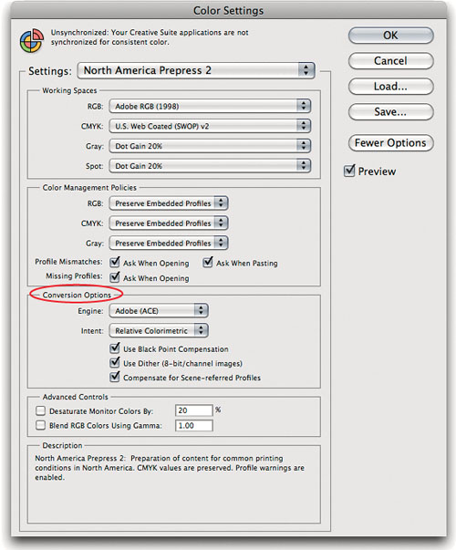
Choosing Your Working Spaces
You set up your working spaces in the Color Settings dialog (Edit > Color Settings; see Figure 4-3). The simplest way to use Color Settings is to choose a preset from the Settings pop-up menu. Because the choices in that pop-up menu are presets, when you choose one it changes many options in the dialog. If one works for you as it is, just choose it and you’re done. Or you can choose a preset as a good starting point, and then fine-tune it.
Figure 4-3 The Color Settings dialog

For RGB, remember that working spaces are just defaults, affecting only images that aren’t tagged. If most of the images you open already have correct profiles embedded in them, you won’t have to obsess over getting the working spaces exactly right. That said, it’s best to pick one for each color mode that matches your primary workflow, such as prepress or Web design. For CMYK, there are still workflows that don’t require profiles to be embedded in images, and in those workflows it’s important that the CMYK working space be set to the profile for your press conditions.
Choosing an RGB Working Space
If you’re doing prepress or other high-quality printing, Adobe RGB is the one working space that’s big enough not to clip U.S. Sheetfed Coated v2 (a typical CMYK color space) very much, and yet it is also constrained enough to work well as an editing space for 8 bit/channel images. If your work is aimed primarily at Web or video, sRGB is the natural choice. If you print to printers with larger gamuts than a CMYK press has, and you’re comfortable with 16 bit/channel editing and handling color-space conversions, ProPhoto RGB is a definite option for you.
Tip
![]()
Some Mac users naturally gravitate to using Apple RGB as a working space because it has the word Apple in it. This is wrong. Apple RGB is based on the early 13-inch Apple RGB High-Resolution monitor (640 by 480 pixels), which hasn’t been produced in more than 15 years. Any of the default RGB working spaces is better. ColorMatch RGB also represents a long-dead brand of CRT monitor.
Some people like to keep things simple and use Adobe RGB virtually all of the time. I use different working spaces depending on the project. It isn’t absolutely necessary to load these as working spaces in Color Settings—you can always use the Assign Profile command (see “Assign Profile” later in this chapter) to assign a profile other than the working space to an image—but if you’re going to be working with a bunch of images in the same space, it makes life slightly easier to load that space as the working space.
Choosing a CMYK Working Space
Unlike RGB working spaces, which may be entirely abstract and not based on any real device, CMYK working spaces always reflect some real combination of ink (or toner or dye) and paper. The ideal situation is to have a custom ICC profile for the specific CMYK process to which you’re printing. In the real world, however, some shops are ahead of others in achieving this workflow. If you do have a custom ICC profile for your CMYK print process or for an industry-standard proofing system such as Kodak Approval or Creo Spectrum, click the More Options button and load that profile into the CMYK pop-up menu in the Color Settings dialog.
By default, your choices of CMYK working space are limited to the press profiles that are installed by Photoshop, plus Custom CMYK, which users of ancient versions of Photoshop may recognize as the old Built-in panel of the CMYK Setup. Mac users also get the option to choose ColorSync CMYK, which (since Mac OS X 10.4) is hardwired to Generic CMYK, a profile that represents no known printing condition and so is best ignored.
If you’re using an accurate CMYK profile, either as a working space or as a profile in tagged CMYK images, you shouldn’t have to worry about dot gain, gray component replacement (GCR), and so on. Because a properly created profile represents the output conditions, all output characteristics should already be accounted for by the profile. Choose Load Custom CMYK from the CMYK working space pop-up menu to select your CMYK profile.
Tip
![]()
When you build your own CMYK profiles for a press or proofer, it’s always a good idea to build a family of profiles with different black generations. Some profiling tools will even let you take an existing profile and regenerate it with new black generation settings.
If you’re still working with a printer who is more comfortable with the old-style Photoshop CMYK setups, you’ll be glad to know that they’re still available. Choosing Custom CMYK from the CMYK pop-up menu opens the Custom CMYK dialog; the settings for that dialog should be supplied by your printer. Today’s profiling technologies are far superior to the old manual methods, so use a CMYK profile when available.
Choosing a Gray Working Space
Grayscale profiles are independent of RGB or CMYK. However, note that grayscale profiles contain only tone reproduction information; they have no information about the color of the black ink or of the paper.
When Color Settings is displayed with Fewer Options, you can choose among grayscale dot gains of 10 percent, 15 percent, 20 percent, 25 percent, or 30 percent, depending on your printing conditions. You can also choose either gamma 1.8 or 2.2, which are good choices for grayscale images destined for the screen or for unknown printing conditions. Of course, there’s nothing to prevent you from using these gamma values for print images, or the dot-gain curves for onscreen use, but generally speaking, gammas are designed for onscreen use and dot-gain curves are designed for print.
When to Reveal the Hidden Options
Photoshop presents a short list of options in the Color Settings dialog by default, to keep from overwhelming you with choices. If you click More Options, not only will you see the dialog expand with additional features, but you’ll find more profiles listed in the Working Space pop-up menus. Some of them are holdovers from previous versions of Photoshop, included only to support old images you might open. The rest are all the profiles you’ve installed on your computer, such as profiles for your desktop printer.
For RGB, most people are best served by using one of the working spaces on the “short list” in the shorter Color Settings dialog. The need to use or define a custom RGB working space should be rare.
As discussed earlier, for CMYK, you do want to have a custom CMYK profile for your printing conditions. You don’t need to click More Options to see your custom CMYK profile, since you can select the profile straight from your disk by choosing Load CMYK.
Custom Gray and Spot Color Spaces
As with Custom CMYK, you can choose Custom Dot Gain (see Figure 4-4) from the Gray pop-up menu in the Working Spaces section of the Color Settings dialog. Typically, you use this dialog if you’re doing grayscale work and don’t have a grayscale profile. Two reasons to edit a custom gray working space are to enter custom dot-gain values or to load the black channel from your CMYK profile so that you can use it for grayscale images. To save your gray settings as a grayscale profile, choose Save Gray from the Gray working spaces pop-up menu.
Figure 4-4 To build a custom dot gain curve, enter the measured dot area for a swatch. You can enter a single value for the 50 percent dot or take more measurements to increase accuracy.

Tip
![]()
The Custom Gamma command (next to the Custom Dot Gain command) is rarely used. If you have to manually edit your gray working space, chances are, you’ll be using the Custom Dot Gain command.
The Custom Dot Gain command in the Spot working spaces pop-up menu is essentially the same as the grayscale option of the same name, and you can use it if you want a dot-gain curve other than the many already available in that pop-up menu. As with grayscale settings, spot color settings know nothing about the actual color of the ink and paper, and they contain no information about the way the spot ink interacts with other inks.
Handling Color-Space Conversions
Now that you’ve been introduced to the parts that make up a color management system, you’re ready to think through the color-space conversions that will come up as you move documents through your workflow. The tools you’ll use are the Color Settings dialog, which sets your defaults for color conversions, the profile alerts when opening a document, the Convert to Profile and Assign Profile commands for converting colors at any time, and the Print dialog when you’re sending output directly to a printer.
Setting Up Conversion Defaults (Policies)
You can set color conversion defaults for each color mode and control how the documents you open relate to your working spaces. Adobe has given these the bureaucratic-sounding name color management policies. Don’t let the name intimidate you; to set them up, just answer these questions:
• What do you want Photoshop to do when you open or import an image that’s missing a profile?
• What do you want Photoshop to do when you open an image that has a different profile than the working space you chose?
• Do you want Photoshop to let you know when a profile is missing or doesn’t match your working space?
Let’s take a look at how the pop-up menus and check boxes in the Color Management Policies section (see Figure 4-5) answer those questions.
Figure 4-5 Color Management Policies let you tell Photoshop how documents you open should relate to your working space.

Handling Existing Profiles. The three pop-up menus all do the same thing: They tell Photoshop what to do if the incoming image already has an embedded profile. When you have no doubt that incoming images are embedded with the correct profiles, Preserve Embedded Profiles is the safest choice, especially in a color-managed workflow. Consider choosing Convert to Working RGB/CMYK/Gray when you expect to receive many images with different profiles and you’d like to standardize them to your working space by converting their colors as you open them. In today’s color-managed workflows, you typically do not want to choose Off unless you have a very good reason for deleting the profiles of all incoming images. When this option is set to Off, Photoshop also does not embed profiles by default when you choose the New (document) or Save As commands.
Tip
![]()
If you’re working with images from many sources, it’s a good idea to turn on the profile displays in the Status bar and Info panel. Then keep an eye out for documents that open up in unexpected color spaces. This is especially useful if you’ve turned off the mismatch warnings.
Getting Notified. The check boxes in the Color Management Policies section are concerned with one thing: Do you want Photoshop to ask you what to do when an incoming image doesn’t match your color settings? If the answer is yes, check the boxes, and you’ll get to approve every potential conversion. Although this lets you maintain control, if you work with many images, the alert may appear with annoying frequency. If the answer is no, leave the boxes unchecked, and when there’s a mismatch or missing profile, Photoshop will simply execute the default handling you set up with the pop-up menus above the check boxes. Unchecking the boxes works best if you trust that incoming images should always do what the pop-up menus say in the event of a mismatch, because Photoshop is going to do that every time, without asking you.
Let’s walk through an example. Suppose you turn off the check boxes, your RGB working space is Adobe RGB, and you set the RGB policy to Convert to Working RGB. Now let’s say you open an sRGB image. The profile mismatch with your RGB working space causes Photoshop to implement your policy. Because you told Photoshop to convert images with mismatched profiles to your RGB working space, and you turned off the check boxes, Photoshop will go ahead and convert the sRGB image colors to Adobe RGB without telling you. If you had turned on the check boxes, Photoshop would have asked you before performing the conversion.
Tip
![]()
Clicking the More Options button reveals additional controls; see “The Obscure Color Settings Options” later in this chapter.
Handling Color When Opening an Image
If you checked the Ask When Opening check boxes in the Color Settings dialog, you’ll get to confirm the color management policy you set for the working space of an image you’re opening; if you didn’t check the boxes, Photoshop silently executes the policy (for example, converting image colors into your working space). If you turned on Ask When Pasting, you can control the conversion of images you paste or drag into a Photoshop document.
Responding to Warning Dialogs. If you turned on the Missing Profiles or Profile Mismatch check boxes in Color Management Policies, you’ll see an alert dialog whenever you open or import a document that has no profile or a different profile than your working space.
• Embedded Profile Mismatch means the incoming image has a different profile than your working space (see Figure 4-6). That doesn’t necessarily mean anything’s wrong. A profile is already embedded in the image, so the only question is whether you have a reason to change it. If you don’t have a good reason to change it, select “Use the embedded profile” and move on. If your project requires that all images be saved in a specific color space, such as sRGB for digital video or a specific CMYK press profile, and you’ve already set your working space to that profile, select “Convert document colors to the working space.” The last option, “Discard the embedded profile,” may be used in prepress workflows where profiles aren’t used. Otherwise, avoid that option in color-managed workflows, except when you’re opening a printer profiling target. If you’re not sure, click “Use the embedded profile,” click OK to go ahead and open it, and then see “When You Have No Idea What to Do” later in this chapter to work out how to handle the image.
Figure 4-6 The Embedded Profile Mismatch warning offers three choices for handling an image where the embedded profile differs from the working space.

Tip
![]()
If you’re working with a consistent set of images and yet you always run into the same mismatch or missing profile alerts, and you always answer them the same way, that’s a clue that you might want to edit your color management policies to handle those profiles automatically and turn off the warnings.
• Missing Profile means what it says: The incoming file doesn’t have an embedded profile (see Figure 4-7). If you are using a traditional non-color-managed CMYK workflow where profiles are not used, you’ll probably choose “Leave as is.” If you want to start color-managing the file, you get to assign a profile—either the current working space, or any profile on your computer—by choosing one from the “Assign profile” pop-up menu. If you need more help figuring out the right answer to a missing profile warning, click “Leave as is,” click OK, and then see “When You Have No Idea What to Do” later in this chapter.
Figure 4-7 The Missing Profile warning offers three choices for handling images that don’t contain an embedded profile.

“And then convert document to working space” is a check box in the Missing Profile dialog. It’s useful when an image was previously edited in a color space that didn’t match your working space. It lets you first assign the previous color space of the image so that the colors look normal. Then, by checking the box, you can convert the image into your working space. If you know that the image with the missing profile was previously edited in your working space, you don’t need this check box, because you can simply select “Assign working space.”
Be aware that if you choose “Discard the embedded profile” or “Leave as is,” not only will the document be opened without a profile, but Photoshop will not embed a profile into the document when you save it. If you want a profile to be embedded without converting the colors, choose “Use the embedded profile” or an “Assign profile” option, depending on the alert.
• Paste Profile Mismatch may appear if you paste from a document that uses a different color space from the one you’re pasting into (see Figure 4-8). Because it’s coming from the Clipboard and not from a saved file, assigning isn’t possible; the only option is whether or not to convert. In a color-managed workflow, you typically want to click Convert so that the appearance of the pasted data doesn’t change.
Figure 4-8 The Paste Profile Mismatch warning lets you choose whether to paste the numeric values or the perceived colors that those values represent.

Converting Colors for Output
When you print, the Print dialog uses the document space as the starting point and gives you the opportunity to convert to a print profile or any other profile. This is covered more specifically in “Converting Colors When You Print” later in this chapter.
There may be times when you need to convert colors for a Photoshop document for someone else to print. Since you’re not going through the Print dialog yourself, you’d use the Convert to Profile command instead (see “Convert to Profile” later in this chapter). For example, you might be sending an image to a publication that requires that images be converted to their CMYK printer profile, while the document space of your images is Adobe RGB. To take care of this, you’d duplicate the original document and convert the copy’s colors to the printer’s CMYK profile.
Tip
![]()
Colors in images you edit in Photoshop may look different in applications that don’t support color management. For those applications, you may need to use the Convert to Profile command to convert images to a more common color space. For example, all images published on Web pages should be converted to sRGB.
When you use the Save for Web and Devices command, a Convert to sRGB check box in that dialog lets you convert colors to sRGB, so that you don’t have to remember to use Convert to Profile in advance.
Rendering Intents
Each device has a fixed range of color that it can reproduce, dictated by the laws of physics. Your monitor can’t reproduce a more saturated red than the red produced by the color filter or phosphor that a monitor uses to produce red. Your printer can’t reproduce a cyan more saturated than the printer’s cyan ink, or a white brighter than the white of the paper. The range of color a device can reproduce is called the color gamut. Colors present in the source space that aren’t reproducible in the destination space are called out-of-gamut colors. Since you can’t reproduce those colors in the destination space, you have to replace them with some other colors.
The ICC profile specification includes four methods of handling out-of-gamut colors, called rendering intents. (You might see them referred to in Photoshop simply as “intents.”) The four rendering intents are as follows:
• Perceptual. This fits the gamut of the source space into the gamut of the destination space so that the overall color relationships and, hence, the overall image appearance are preserved, even though all the colors in the image may change somewhat in lightness and saturation. It’s a good choice for images that contain significant out-of-gamut colors.
Tip
![]()
For photographic images, the two most commonly used intents are Relative Colorimetric and Perceptual. On a critical image, it’s best to see how it looks both ways to find out which intent works better for that image.
• Saturation. This maps fully saturated colors in the source to fully saturated colors in the destination without concerning itself with hue or lightness. It’s mostly good for pie charts and such, where you just want vivid colors. You can also try it as an alternative method of perceptual rendering. It may be worth previewing a conversion using Saturation rendering to see if it does something useful. For more information on doing that, see “Soft-Proofing Other Color Spaces,” later in this chapter.
• Relative Colorimetric. This maps white in the source to white in the destination, so that white on your output is the white of the paper rather than the white of the source space, which may be different. It then reproduces all the in-gamut colors exactly, clipping out-of-gamut colors to the closest reproducible hue. For images that don’t contain significant out-of-gamut colors, it’s often a better choice than Perceptual because it preserves more of the original colors. But if an image has many out-of-gamut colors, they’re simply clipped, so Perceptual might be a better choice for those types of images.
• Absolute Colorimetric. The Absolute Colorimetric intent is the same as Relative Colorimetric, except that it doesn’t scale source white to destination white. If your source space has a bluish white and your output is on a yellowish-white paper, Absolute Colorimetric rendering makes the printer lay down some cyan ink in the white areas to simulate the white of the original. It’s generally used only for proofing (see “Soft-Proofing Other Color Spaces” later in this chapter).
Embedding Profiles
Embedding a profile simply means you’re including it in a document when you save it. In the Save As dialog (see Figure 4-9), the Embed Color Profile check box embeds the profile. When you create a Web image, the File > Save for Web & Devices dialog contains an Embed Color Profile check box. If you save or export a file and the profile option is unavailable, it means you’ve selected a format (such as GIF or BMP) that can’t embed a profile.
Figure 4-9 To include a profile as you save a document, turn on the Embed Color Profile check box near the bottom of the Save As dialog. Photoshop always tells you which profile will be embedded.

When Not to Embed Profiles
I’ve advocated embedded profiles so much that you might think I always do it. Well, mostly, but there are a few cases in which I don’t.
For example, I didn’t embed profiles in any of the CMYK images used in this book, because they were all going to the same printing condition, and I set InDesign’s CMYK working space to the profile that describes that printing condition. The CMYK profile for this book is about 2.8 MB, so by not embedding it in every image, I saved a significant amount of disk space and FTP transmission time. The CMYK numbers are unambiguous, because they’re governed by the working space profile for the InDesign document.
For Web images, I typically don’t embed profiles. Instead, I convert the images to sRGB and leave it at that. Most of the few Web browsers that use ICC profiles have that feature turned off by default, and when fast page loading is a priority, including profiles works against that goal by increasing the file size of images. This is changing, though; as more browsers support profiles by default it may become more practical to include profiles in Web images. For now, I include profiles only if I know that the primary audience of the Web page uses a browser that’s color-managed by default (such as Safari), or if the image is so large that including a profile would be a relatively small part of its file size.
When working with profiling targets, the whole point of the exercise is to find out what colors the device in question produces when it’s fed the color numbers in the target, so there’s no point in making any assumptions about the appearance represented by the numbers. Therefore, no profile.
Last but not least, if you’re working in a closed-loop CMYK workflow, where you just don’t want the CMYK numbers to change when sent to your printing process, there’s no point in embedding a profile.
In all other situations, embedding profiles in your images is strongly recommended. This conveys your color intentions clearly to all the devices and all the people in your workflow. If you don’t, the people downstream have to guess your intentions, causing extra work and frustration for all concerned.
Using Color Settings Presets
In the Settings pop-up menu at the top of the Color Settings dialog, you can choose a single preset that sets working spaces, policies, and warnings for you all at once (see Figure 4-10). The real power of the Settings pop-up menu isn’t in the settings Photoshop provides, which is why you haven’t read about it here until now. Instead, it’s in the ability it gives you to save your own settings to disk and then recall them quickly later. Even better, although you can always load a Color Settings preset from anywhere on your hard drive (using the Load button), if you save your settings in the right place, they become available from the Settings pop-up menu. (In Mac OS X, the “right place” is inside the LibraryApplication SupportAdobeColorSettings folder; in Windows 7, it’s inside Users[username]AppDataRoamingAdobeColorSettings.)
Figure 4-10 In the Color Settings dialog, clicking the More Options button extends the dialog and the choices in the pop-up menus.
Saving presets that appear in the Settings menu offers an easy way to configure Photoshop for an entire workgroup. And if you own the entire Creative Suite, you can even synchronize the color settings to the same preset across all the Creative Suite applications: In Bridge, choose Edit > Creative Suite Color Settings, and click Synchronize Color Settings.
The presets that Adobe offers fall into two broad categories: those that ignore color management and those that use it.
General Purpose 2. The three General Purpose 2 presets (North America, Europe, and Japan) set the RGB working space to sRGB; they set the CMYK working space to U.S. Web Coated (SWOP) v2 (North America), Euroscale Coated v2 (Europe), or Japan Color 2001 Coated (Japan); they set the Gray working space to Dot Gain 20%; and they set all the policies to Preserve Embedded Profiles while disabling the profile warnings.
Tip
![]()
If you want a Color Settings preset to appear in the short version of the Settings pop-up menu, move it into the Recommended folder inside the Settings folder (at the location described in “Using Color Settings Presets”). If you don’t want to see a preset, remove it from the Settings folder or the Recommended folder.
What’s the “2” all about? These presets are an improvement over the General Purpose Default settings that first appeared in Photoshop CS. The version 2 settings preserve embedded profiles for all color modes (which means the image is displayed in the same way it was when it was last saved), and they no longer use a different default rendering intent than all the other presets. The default rendering intent for all Photoshop CS4 presets is Relative Colorimetric with black-point compensation.
North American Newspaper. This preset, new in Photoshop CS5, uses the US Newsprint (SNAP 2007) profile as the CMYK working space. To more closely match newsprint characteristics, the Gray and Spot dot gain values are higher than in the Prepress 2 presets, and the default Intent for color conversions is set to Perceptual to scale colors down to the color gamut of newsprint, which is so small compared to higher-quality paper stocks.
Prepress 2. The three prepress settings—Europe, Japan, and North America Prepress 2—tell Photoshop to use color management wherever possible and to turn on all the alerts for missing and mismatched profiles. They differ only in their choice of CMYK profiles and the dot gain for grayscale and spot colors (20 percent in the United States and 15 percent in Europe and Japan). If your work is destined for a printing press and you don’t have a custom profile for your printing or proofing conditions, one of these choices may be a good starting point.
Tip
![]()
If you are working with a printer who provides a Color Settings preset that’s already optimized for his prepress workflow, install the printer’s preset and choose it in the Color Settings dialog.
The North America and Japan Prepress 2 presets are identical to the prepress defaults that shipped with Photoshop CS. The Europe Prepress 2 preset uses the Europe ISO Coated FOGRA27 CMYK profile as the CMYK working space instead of the older Euroscale Coated v2. The older profile didn’t really match a standardized printing condition, so version 2 is an improvement.
Monitor Color. As its name suggests, Monitor Color loads your monitor profile as the RGB working space and tells Photoshop not to use color management, setting all policies to Off. It treats all your documents as though they are in the working space for that color mode, ignoring any embedded profiles. For some inexplicable reason, though, it turns on the Profile Mismatches: Ask When Opening warning, which makes no sense, since the profile will be ignored anyway.
Web/Internet. If you prepare images exclusively for the World Wide Web, the new Web/Internet presets (one each for North America, Europe, and Japan) may be quite useful. The Web is, of course, the same in Japan as it is in North America or Europe: The only difference between the three presets is the CMYK working space, which is U.S. Web Coated (SWOP) v2 for North America, Japan Color 2001 Coated for Japan, and Europe ISO Coated FOGRA27 for Europe.
The dangerous aspect of the Web/Internet presets is that they set the policy for RGB to Convert to Working RGB. That’s probably OK if all your work is destined for the Web, but since it automatically converts every RGB file to sRGB, you’ll be unhappy when larger-gamut RGB images destined for print get squashed into sRGB! At least the profile mismatch warnings are turned on for this preset; pay attention when they appear.
The Obscure Color Settings Options
When you click the More Options button in the Color Settings dialog, you gain access to the Conversion Options and Advanced Controls, as well as to a wider range of profiles, which were discussed earlier in this chapter. The Conversion Options can be useful in typical workflows, but the Advanced Controls are a grab bag of options that may be useful to a very small number of serious players and are dangerous for almost everyone else.
Conversion Options and Advanced Controls
The Conversion Options section of the dialog lets you control useful things like the default rendering intent in Photoshop and the color management module (CMM)—things you may never need to change (see Figure 4-11).
Figure 4-11 The Conversion Options let you fine-tune how Photoshop performs color conversions.
Engine. The Engine pop-up menu lets you select the CMM that Photoshop uses for all its color-space calculations. The options that appear on the menu depend on which CMMs are installed on your system. Unless you have really pressing reasons to use a different CMM, stick with the Adobe Color Engine (ACE). When the engines work correctly, there is only a tiny change in pixel values among the different engines with no noticeable visual difference. Mac users will see separate entries for the Apple CMM and Apple ColorSync; Apple CMM means that the Apple CMM will always be used.
Tip
![]()
The terms color management module (CMM) and color management engine mean the same thing.
Intent. The Intent pop-up menu lets you choose the default rendering intent that Photoshop uses when you convert colors as you open a document or change the color mode on the Image > Mode submenu (such as when you convert from RGB to CMYK). It also affects Photoshop’s calculation of color value readouts for color modes other than the document’s, such as in the Info panel and the Color Picker.
While it’s nice to be able to set the default rendering intent, intent is best treated as an image-specific and conversion-specific decision. In many places in Photoshop, you can preview and change the rendering intent to suit the needs of the image at hand.
Use Black Point Compensation. The Use Black Point Compensation option maps the black of the source profile to the black of the destination profile, ensuring that the entire dynamic range of the output device is used. It’s generally a good idea to leave Use Black Point Compensation turned on unless you have a good reason to turn it off. Depending on the contents of the profiles involved, in many cases you’ll find no difference whether this setting is turned on or off. Changing this setting can be one thing to try when shadow areas seem off or don’t convert as you expected.
Use Dither (8 Bit/Channel Images). All color-space conversions in Photoshop are performed in a high-bit space. When Use Dither is turned on, Photoshop adds a small amount of noise when the 8-bit channels are converted into the high-bit space, making banding or posterization much less likely to occur (that’s a good thing). But if your final output will be JPEG, this tiny dithering may cause a larger file size (because it adds discrete colors into the image). If you’re using Photoshop for scientific work, where you need to perform quantitative analysis on colors, you should turn Use Dither off, as dithering will introduce noise in your data; otherwise, leave it on.
Compensate for Scene-Referred Profiles. If you use Photoshop to create documents for the Adobe After Effects motion-graphics application and After Effects is set to its default color management settings, you’ll want to turn this option on. For everyone else, it doesn’t matter how you set it.
Tip
![]()
If you use Desaturate Monitor Colors By, always remember to turn it off before you return to normal work. Otherwise, you’ll find yourself producing unexpectedly colorful images!
The Advanced options are named Advanced for a reason; most users should not need to touch them.
Desaturate Monitor Colors By. Unless you’re working with a very large space, like ProPhoto RGB, avoid touching this option. Monitor display is always Relative Colorimetric, so any working space colors that are outside the monitor’s gamut must be clipped to the nearest equivalent that the monitor can display. This option scales down the saturation of display colors to try to get around the problem, but it isn’t commonly used—the problem it tries to work around is not as bad as theory would lead one to expect. If you do want to try it, a setting in the 12 percent to 15 percent range seems somewhat useful for the ProPhoto RGB color space.
Blend RGB Colors Using Gamma. To see the effect of this option, paint a bright green stroke on a red background with the check box turned off, and then again with the check box turned on and the value set to a gamma of 1.0. With the check box turned off, the edges of the stroke have a brownish hue, as they would if you were painting with paint. With it turned on, the edges are yellowish, as they would be if you were painting with light. You can think of the behavior with the check box off as artistically correct, and with it turned on as colorimetrically correct.
Photoshop and Your Monitor
Photoshop displays everything through your monitor profile. If your monitor profile doesn’t accurately describe the actual behavior of your monitor, your judgments about your images won’t be accurate, which means your corrections will also be inaccurate. Which is probably not what you want.
Tip
![]()
To see which monitor profile Photoshop is using, choose Edit > Color Settings, click the RGB pop-up menu, and look at the Monitor RGB command. Photoshop always uses the monitor profile used by the operating system. In Mac OS X, this is in the Displays preference; in Windows it’s in the Display Properties control panel.
Photoshop uses the monitor’s profile to transform color data on the fly as it gets sent to the video card so that the monitor displays the color correctly. The great benefit of this approach is that it makes it possible for people using very different monitors on different platforms to view the same image as consistently as possible. This makes monitor calibration a mission-critical necessity! (The only time this behavior doesn’t happen is if you set the working space to Monitor RGB, which is not recommended.)
To make this magic happen for you, you need an accurate profile for each monitor. To display color accurately, Photoshop needs to know how your monitor behaves—what color white it produces, what sort of tonal response it has, and what actual colors it produces when it’s fed pure R, G, or B. Photoshop gets this information from the display profile. Although a default display profile is assigned to your monitor by your operating system, you’ll get the best results from a profile customized for your specific monitor.
You also have to maintain your monitor profile. Monitors drift over time, and though LCDs tend to drift much more slowly than CRTs, a profile that was accurate when it was created may not be accurate a week or a month later. Professionals whose jobs depend on accurate color may decide to update their monitor profile every week or two; some people go for a month or more before updating the profile.
There are two distinct ways to compensate for monitor drift.
• You can adjust the monitor hardware itself to bring its behavior into agreement with a specific standard, a process called calibration.
• You can create a profile that describes the behavior of the monitor, a process technically known as profiling or characterization. A profile basically describes the difference between the standard and what the hardware can actually achieve, so that the color management system can make up the difference when sending the image to the video card.
In practice, most monitor profiling tools do both, and they make no clear distinction between the two. (This is why many people refer to the entire process as “calibrating your monitor,” even though that’s really only the first part of the process.) The practical distinction boils down to the aim points you choose, and how much of each you end up doing depends on the adjustments offered by the monitor.
Calibration Parameters
Monitor profiling packages typically ask for the following parameters:
• White luminance: The brightness of pure white on the monitor, specified in candelas per square meter (cd/m2) or foot-lamberts.
• White point: The color of the monitor’s white, specified either in Kelvins or as a daylight temperature such as D50 or D65 (see the sidebar “How White Are Your Whites?” later in this chapter). For practical monitor calibration purposes, you can treat 5000 K and D50, or 6500 K and D65, as interchangeable.
• The tone response curve, usually specified as a gamma value.
Some packages also let you set a separate black luminance value, but only for CRT displays. LCD displays have a fixed contrast ratio, so the black luminance depends entirely on the white luminance.
Display Adjustments
The ability to calibrate a display depends on the controls that can affect its behavior. You can calibrate any display by changing the lookup tables in the video card that drives it, but the weakness in this approach is that most video card lookup tables (LUTs) use 8 bits per channel. Just as with image editing, making adjustments always results in fewer levels than when you started, so when you only have 8 bits per channel, you need to preserve levels by putting the 8 bits per channel through as few adjustments as possible.
General LCD Monitors. Most professional LCD monitors have no physical adjustments other than the brightness of the backlight. With this type of display, it makes the most sense to profile its native, unadjusted behavior and let the color management system—which typically uses 20 bits per channel instead of the video card LUT’s 8 bits—do the work of correcting the displayed colors. You’ll find guidance on setting the backlight level in “Setting Aim Points,” later in this chapter.
Some LCD monitors have additional color controls like those found on CRTs, which let you adjust options such as white point, contrast, and individual RGB levels. Don’t use them! They’re only there to pad out the feature list and provide the same convenience as CRT monitors, but in a color-critical workflow they’ll probably degrade image quality, not enhance it. This is because those controls typically add an 8-bit adjustment step to your calibration and profiling routine, and you don’t want to add more conversions. Even if you did, you wouldn’t want them happening at only 8 bits per channel. Just leave such a monitor at its native settings, adjust only the backlight, and let your calibration and profiling package do the rest.
High-End LCD Monitors. Some high-end LCD monitors—notably the EIZO FlexScan and ColorEdge series—contain their own lookup tables, independent of the video card, with 10, 12, or even 14 bits of precision. Having those extra bits doesn’t automatically mean the monitor displays more colors because Photoshop, the operating system, the video card, and the video port all need to carry more than 8 bits per channel of video data to the display. As long as any link in that chain supports just 8 bits per channel, you’ve still got an 8-bit pipeline. However, the monitor’s extra bits do let you calibrate the display to a specific white point and gamma without the losses you get with the much more common 8-bit video card LUT. For these displays, a white point of D65, native gamma if it’s an option, and gamma 2.2 if it isn’t.
Note
![]()
As this book went to press, it was still not possible to build a 10 bits/channel or better pipeline all the way from Photoshop to the display; too many components remain limited to 8 bits per channel. Hopefully, this will change before the next edition!
LED-Backlit Monitors. These monitors use arrays of LEDs for the backlight instead of a fluorescent tube. Some LED backlights use white LEDs, but better models use separate arrays of red, green, and blue LEDs, which are capable of much larger gamuts than fluorescent-backlit displays. If your LCD has a white-LED backlight, expect to calibrate it like a fluorescent-backlit LCD—you’ll probably be able to calibrate only the display brightness, leaving everything else up to the profiling step. With the superior RGB-array LED backlights, you should be able to adjust the white point by varying the strength of the red, green, and blue LEDs. RGB-array LEDs are found in desktop monitors, while notebooks and other compact displays use white LEDs because they are smaller and lighter, though less adjustable.
CRT Monitors. High-end CRT displays are essentially no longer made, but there are still CRTs in good working order out in the field. For CRT displays which allow separate control over the RGB guns, it’s best to adjust the three RGB gains to achieve the desired white point and destination luminance. The gamma value, however, can be achieved only by adjusting the video card LUT during the profiling stage. If the profiling package offers native gamma as an option, use it. Otherwise, choose gamma 2.2 because it’s closer to the native gamma of CRT displays than any of the other likely choices and involves smaller tweaks to the video card LUT than other gamma settings.
Profiling Tools
If you’re serious about working visually with Photoshop (rather than just going by the numbers), you’ll get the best results if you use a profiling package that includes a hardware measurement device. Various eyeball-based profiling utilities (such as Apple Display Calibrator software) are available, but they have two major drawbacks:
• Most are designed for CRT displays and don’t do a good job of estimating the tonal response of LCDs.
• They use your eyeballs as the measurement device. Our eyes are highly adaptable, which is great for a mammal living on planet Earth but distinctly suboptimal when the goal is to set the monitor to a known state. Human eyes involuntarily and uncontrollably adapt as ambient lighting conditions change, so they aren’t accurate enough for consistent color.
Tip
![]()
Adobe Gamma was an eyeball-based calibrator included with earlier versions of Photoshop. If you still have it, don’t use it on LCDs. Adobe Gamma was designed for CRT monitors, and the mechanism it uses for estimating gamma doesn’t work well on LCD monitors.
Colorimeters and spectrophotometers have none of the eye’s wonderful adaptability, so they always produce the same answer when fed the same stimulus. For monitor calibration and profiling, that’s a big advantage! If you must use eyeball-based tools, these guidelines may help improve the results:
• Minimize your eyes’ adaptability by profiling under the same lighting conditions each time you make a profile. Ideally, the monitor should be the brightest thing in your field of view. (This is always true, but it’s particularly critical during profiling—see the sidebar “Creating a Consistent Viewing Environment.”)
• Warm up the display for at least a half an hour before profiling.
• Many eyeball-based profiling tools take an existing profile as their starting point. Often, if you take an existing display profile built with the eyeball-based tool as your starting point, the end result is very bad indeed. Start with a known good profile.
Many people are reluctant to spend money on display profiling hardware and software. Unless you’ve trained yourself to color-correct by reading the Info panel, trying to save money by doing calibration and profiling by eye is a classic example of being penny wise and pound foolish. As with most things, when it comes to monitor-profiling tools, you tend to get what you pay for—but even the least expensive instrumented package will return more accurate and more consistent results than any of the visual tools.
Tip
![]()
How do you know when your monitor is worn out? One measure is when it no longer reaches the target white luminance value of your profiling package. If you aren’t using a hardware calibrator, another less precise way to tell is if the monitor doesn’t seem bright enough when you turn up the contrast all the way.
Setting Aim Points
Use the capabilities of your monitor as a guide in setting aim points for calibration and profiling. The goal is to change the video card LUT as little as possible so that you get the full 256 shades per channel that the operating system allows you to send to the monitor.
Aim Points and the Working Space. Some beginners think they need to calibrate and profile a monitor to the same specs as the working space. That’s a mistake; the white point and gamma of your display are entirely independent of the white point and gamma of your working space. The color management system translates working space white point and gamma seamlessly to those of your display. The goal in setting white point and gamma for the display is simply to make the display behave as well as it can.
Monitor Brightness (White Luminance). How bright should your monitor be? Here are some factors that will help you set the appropriate level:
• The monitor should be bright enough to provide comfortable viewing. Reasonable starting points are around 80 to 95 cd/m2 for CRT and around 120 cd/m2 for LCDs.
Tip
![]()
if your prints are always dark compared to your monitor, your monitor brightness may be set too high relative to the real-world brightness of the paper you’re using. Try regenerating the monitor profile at a lower monitor brightness level.
• For an LCD monitor, you probably won’t be turning the monitor brightness up all the way. For one thing, changing the brightness level typically changes the black level as well. Today’s LCD monitors are capable of such high brightness that some less expensive monitors can’t be made dark enough for a good black level. And anyway, full brightness wears out the backlight more quickly.
• Don’t aim for a brightness lower than 75 cd/m2 or you’ll affect the accurate reproduction of highlights. If a monitor can’t achieve at least 75 cd/m2 after profiling, it’s a candidate for replacement.
White Point. On the few high-end displays with genuinely adjustable white points, adjust the display to a D65/6500 K white point. For more information, see the sidebar “How White Are Your Whites?” later in this chapter. If the white point isn’t adjustable in the display itself, as is the case with most LCDs, profile at the native white point—it’s usually very close to D65 anyway.
Gamma. Use native gamma as the aim point. If native gamma isn’t an option, use gamma 2.2, which is close to the native response of most monitors. (Actually, the tonal response curve of an LCD monitor doesn’t really match a gamma curve, but if gamma is the only option, gamma 2.2 is still the best alternative.)
Perhaps in recognition of the fact that LCDs don’t really follow a gamma curve, some profiling packages now offer more exotic tone response curves. With “standard” LCDs that don’t have their own internal LUTs, native gamma is still the best option if available. If not, or if you’re using a display with internal LUTs that the profiling software can address, investigate options such as the L* curve in Integrated Color Corporation ColorEyes, and with the DICOM curve in NEC’s SpectraView II.
If You Just Want to Go by the Numbers. It’s possible to do good work with Photoshop using an uncalibrated, unprofiled monitor. But to do this, you can’t trust monitor colors at all. Instead go by the numbers, reading RGB levels and the CMYK dot percentages in the Info panel. Even with a calibrated monitor, it’s a good idea to keep an eye on those numbers.
To set up your monitor for this old workflow, open the Color Settings dialog, select the RGB pop-up menu in the Working Spaces section, and choose Monitor RGB. This isn’t recommended, but it’s possible to get away with it, particularly if you’re working in a closed-loop environment where you always go to the same output conditions. Of course, if you do this, you may as well ignore the rest of this chapter.
Assign Profile and Convert to Profile
Earlier you read about how the settings in the Color Settings dialog control color conversion as you open or import a document. In a document that’s already open, you apply profiles and color conversions using the Assign Profile and Convert to Profile commands on the Edit menu.
If you aren’t sure when you should assign and when you should convert, you’re not alone. What it comes down to is this:
• Do you need to tag the image with a specific profile without altering the color values at all? If so, you want to use the Assign Profile command.
• Do you need to change the image’s color values into another color space (such as converting RGB to CMYK, or Adobe RGB to sRGB) while keeping the image appearance as consistent as possible with the way it currently looks? If so, you want to use the Convert to Profile command.
Assigning profiles is like attaching labels, whereas converting is a fundamental change. If you’re still having trouble with the concept, try this analogy: Wearing a police uniform is like assigning a profile. Just putting on the uniform doesn’t turn a person into a police officer, but it does make it possible for others to recognize a police officer. A police officer is a police officer even when not wearing a uniform, but without the uniform (when the profile is missing), nobody can see that the person is a police officer. In contrast, when someone walks into a police academy and trains to become a police officer, that’s conversion—the person started as a civilian and is now a police officer. If the officer always wears a uniform in public, that’s like embedding a profile; the uniform is with the officer wherever he goes, enabling instant identification and avoiding ambiguity.
Assign Profile
Assign Profile lets you tag an image with a specified profile or untag an image by removing its profile. It doesn’t do any conversions; it simply attaches a description (an interpretation, as it were) to the numbers in the image, or removes one (see Figure 4-12).
Figure 4-12 The Assign Profile dialog
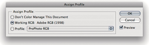
Assign Profile is mainly useful when you’re trying to decide what profile should be attached to an untagged document. Unlike the profile assignment in the Missing Profile dialog, Assign Profile lets you preview the results of applying various profiles. This gives you the opportunity to make an educated guess rather than a blind one.
The Assign Profile dialog offers three options, which are identical to the first three options in the Missing Profile warning (see “Handling Color When Opening an Image” earlier in this chapter).
• Don’t Color Manage This Document. This option tells Photoshop to treat it as an untagged document. The numbers in the file are preserved and are interpreted according to the current working space, and the embedded profile is stripped out. If you’re delivering final CMYK to shops that are scared of or confused by color management, or if you’ve inadvertently embedded a profile in a calibration target, you can use this option to strip out the profile.
• Working RGB or Working CMYK. This option tags the document with the profile of the current working space. As with the previous option, the numbers in the file are preserved but reinterpreted according to the current working space. The difference is that the document is treated as tagged, so it keeps that profile if you later change the working space. If you’ve opened an untagged document and decided that it really does belong in the working space, use this option to make sure that it stays in the working space.
• Profile. Profile lets you tag the document with a profile other than the default working space profile. Again, the numbers in the image are preserved, but in this case they’re interpreted according to the profile you assigned. For example, if you scan an image using software that doesn’t embed a profile, but you have a profile for your scanner, you can use this option to assign color meaning to the image you’ve just scanned. You’ll then probably want to use Convert to Profile (coming up next) to move the image into a more reasonable editing space, like AdobeRGB.
Tip
![]()
Turn on the time-saving Preview check box in the Assign Profile and Convert to Profile dialogs, so that you don’t have to close the dialog just to see the results.
Convert to Profile
Convert to Profile, as its name suggests, lets you convert a document from its profile space (or, in the case of an untagged document, the current working space) to any other profiled space, with full control over how the conversion is done (see Figure 4-13).
Figure 4-13 The Convert to Profile dialog gives you full control over color conversions. You can choose the destination space, engine, and rendering intent.

The Convert to Profile dialog displays the source profile and lets you specify a destination profile and other options. It includes the Preview check box so that you can see the effects of the conversion before you actually do it.
The engine, rendering intent, black-point compensation, and dithering options all work identically to those in the Color Settings dialog (see “Conversion Options and Advanced Controls,” earlier in this chapter).
The Flatten Image to Preserve Appearance option is there as a convenience, for when you want to produce a final flat file for output. When using Convert to Profile, it’s a good idea to duplicate the layered file first (choose Image > Duplicate) and then run Convert to Profile on the duplicate, with Flatten Image turned on—that way, you keep your layered master file intact.
Clicking the Advanced button reveals additional options for the Destination Space. Instead of seeing all your profiles in one list that can become rather long, available profiles are divided into categories. Also, you can now convert to Multichannel, Device Link, and other profile categories that don’t correspond to standard RGB or CMYK channels. Device Link profiles let you convert directly from one device profile to another, such as between two press profiles; this can preserve image quality because it bypasses the intermediate conversion to Lab color that usually happens when Photoshop converts between color modes. In Mac OS X, Abstract profiles are about special effects, not image quality; these options are provided by Apple ColorSync, and chances are, you’d rather create these effects in Photoshop itself.
For most conversions, choosing Convert to Profile is usually a better idea than choosing an Image > Mode command (whether converting RGB to CMYK, cross-rendering CMYK to CMYK, or whatever), because it offers more control, and especially because you can preview different rendering intents. Rendering intents know only about the color gamut of the source color space—they don’t know anything about how much of that gamut is actually used by the source image—so applying perceptual rendering to an image that contains no significant out-of-gamut colors compresses the gamut unnecessarily. With Convert to Profile, you can see how the different rendering intents will affect a particular image and choose accordingly.
Soft-Proofing Other Color Spaces
If you’re sane, you probably want to get some sense of what your images are going to look like before you commit to a $50,000 print run. There are three ways to proof your pictures: traditional (print film negatives and create a laminated proof such as a Matchprint), on a color printer (such as one of the new breed of inkjet printers), or onscreen. Proofing images onscreen is called soft-proofing, and Photoshop offers soft-proofing capabilities limited only by the accuracy of the profiles involved.
One of the hardest yet most valuable tasks in Photoshop is proofing your final output on your screen or on a color printer. Photoshop gives you very fine control over both. You’ll read about this in more detail in “Soft-Proofing an Image for Print” in Chapter 8, “The Digital Darkroom,” but here’s the quick version:
• The Proof Setup command (View > Proof Setup) gives you full control over onscreen proofing simulations. You can simultaneously view the same file with different simulations in different windows.
• You can view how different rendering intents will convert an image to a destination space before actually making the conversion.
• You can see how an image prepared for one output process will behave when sent to another output process without adjustment: This is particularly useful when you’re faced with the prospect of repurposing CMYK files made for one printing condition to work with another.
• You can work inside an accurate output simulation to optimize your image for a particular output process.
For this to work, you must calibrate and profile your monitor, and it’s highly recommended that you also control your viewing environment (see the sidebar “Creating a Consistent Viewing Environment” earlier in this chapter).
In Photoshop, soft-proofing has its own set of controls separate from the Color Settings dialog. These controls allow you to preview your output accurately, whether it’s RGB or CMYK. This is a huge advantage for those who print to RGB devices such as film recorders or to photorealistic inkjet printers that pretend to be RGB devices. Soft-proofing is also a big improvement for those who print CMYK. You can soft-proof different conversions to CMYK while still working in RGB; Photoshop can accurately depict your conversion options onscreen. For example, you can simultaneously see how the same image would look on newsprint and in your glossy brochure.
Tip
![]()
You can open several windows for the same image (by choosing Window > Arrange > New Window) and then apply different soft-proofing settings to each window. This lets you see how the image will appear under different output scenarios. In this way you can adjust the original image while watching the effect on multiple soft-proofed views of the same image.
The View > Proof Colors command lets you turn soft-proofing on and off. Soft-proofing changes only the onscreen display for the current document window, without altering other windows or saved image data. By default, Proof Colors works as follows:
• It first simulates the conversion from the document’s space to working CMYK, using the rendering intent and black-point compensation settings specified in Color Settings.
• It renders that simulation to the monitor, using relative colorimetric rendering. If Use Black Point Compensation is turned on in Color Settings, it’s applied to the rendering from the proof space to the monitor.
The default Proof Setup settings probably don’t represent the output you’re trying to preview, so to really benefit from soft-proofing, you need to be more specific. Your first stop is the Proof Setup submenu (see Figure 4-14), which governs exactly what Proof Colors shows you. If your actual output conditions are represented by one of the menu items, choose it so that Proof Setup will use those conditions when it shows you the soft-proof.
Figure 4-14 The Proof Setup submenu lets you choose a wide variety of soft-proofing options, including your own custom settings.

However, chances are, the output conditions listed by default on the Proof Setup submenu aren’t specific enough to represent your output conditions. To unleash the power of soft-proofing, you need to use the Customize Proof Condition dialog, which gives you the tools you need to nail your soft-proofs precisely and list them on the Proof Setup submenu.
Customize Proof Condition Dialog
The Customize Proof Condition dialog lets you independently control the rendering from the document’s space to the proof space, and from the proof space to the screen. It allows you to preview accurately just about any conceivable kind of output for which you have a profile. You can open the Customize Proof Condition dialog (see Figure 4-15) by choosing View > Proof Setup > Custom.
Figure 4-15 In the Customize Proof Condition dialog, you control color conversions from the document space to the proofing space and from the proofing space to the monitor.
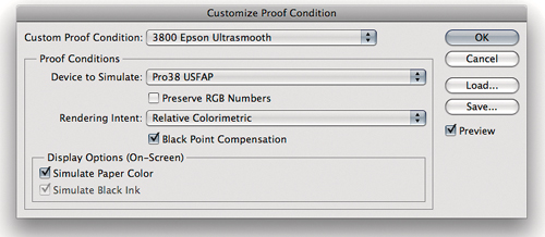
Custom Proof Condition. The Custom Proof Condition pop-up menu lets you recall setups that you’ve saved in the special Proofing folder. (On Mac OS X, this folder is in LibraryApplication SupportAdobeColorProofing. In Windows 7, it’s in the folder Users[username]AppDataRoamingAdobeColorProofing.) You can save proof setups anywhere on your hard disk by clicking Save, and load them by clicking the Load button, but the setups you save in the Proofing folder appear on the list automatically. Even better, they also appear at the bottom of the Proof Setup submenu where you can choose them directly.
Device to Simulate. The Device to Simulate pop-up menu lets you specify the proofing space you want to simulate. You can choose any profile, but if you choose an input profile (for a scanner or digital camera), the Preserve Numbers check box becomes checked and dimmed, and all the other controls become unavailable. Generally, you’ll want to choose an RGB, CMYK, or grayscale output profile.
Preserve RGB/CMYK/Gray Numbers. The Preserve Numbers check box tells Photoshop to show you what your file would look like if you sent it to the output device without performing a color-space conversion. It’s available only when the image is in the same color mode as the selected profile (such as when both are in RGB); when you turn it on, the Rendering Intent pop-up menu becomes unavailable, since no conversion is requested.
This feature is particularly useful when you have a CMYK file that was prepared for some other printing process. It shows you how the CMYK data will work on your output, which can help you decide whether you need to edit the image, convert it to a different CMYK space, or just send it as is. It’s also useful for seeing just how crummy your image will look if you send it to your desktop inkjet printer without converting it to the proper profile (see “Converting Colors When You Print,” later in this chapter).
Rendering Intent. The Rendering Intent pop-up menu lets you specify the rendering intent you want to use in the conversion from the document’s space to the proof space. Since the correct intent depends on individual images, it’s good to be able to test it. It defaults to the rendering intent specified in the Color Settings dialog. If you change it, it remembers your change. Saving a new proof condition also saves your selected rendering intent, so if you’re continually being tripped up by the wrong intent, you can just save a proof setup with your preferred rendering intent and make sure to use it.
Black Point Compensation. When turned on, this option applies black-point compensation when converting from the document’s space to the proof space. Keep this option turned on; the only exceptions are some obscure printing workflows that will tell you when it should be turned off.
Display Options (Onscreen). The check boxes in the Display Options section—Simulate Paper Color and Simulate Black Ink—control the rendering of the image from the proofing space to the monitor. When both Simulate Paper Color and Simulate Black Ink are turned off, Photoshop does a relative colorimetric rendering (with black-point compensation if that option is turned on in Color Settings). This rendering maps paper white to monitor white and ink black to monitor black using the entire dynamic range of the monitor. If you’re using a generic monitor profile, this is probably as good as you’ll get. (Of course, with a canned monitor profile, you can’t trust anything you see onscreen anyway.) With a good monitor profile, though, you should check out the alternatives.
• When you turn on Simulate Black Ink, Photoshop turns off black-point compensation when rendering from the proofing space to the monitor, so the black you see on the monitor is the actual black you’ll get on output (within limits). If you’re printing to a low-dynamic-range process, such as newsprint or inkjet on uncoated paper, Simulate Black Ink will give you a much better idea of the actual blacks you’ll get in print.
Tip
![]()
Most monitor profiles have a “black hole” black point. The black ink simulation will be off by the amount that the monitor’s actual black differs from the monitor profile’s black point. On a well-calibrated monitor, the inaccuracy is very slight.
• Turning on the Simulate Paper Color check box makes Photoshop do an absolute colorimetric rendering from the proof space to the display. (Simulate Black Ink becomes checked and dimmed, since black-point compensation is always disabled in absolute colorimetric conversions.) In theory at least, turning on Simulate Paper Color should give you the most accurate soft proof possible.
In practice, the most obvious effect of selecting Simulate Paper Color isn’t that it simulates the color of the paper, but rather that you see the compressed dynamic range of print. If you look at the image while turning on Simulate Paper Color, the effect is dramatic—it’s a good idea to look away from the monitor when turning on this option, and then wait a few seconds before looking at the image, to allow your eyes to adapt to the new white point.
Tip
![]()
When you soft-proof, any white user-interface (UI) elements will prevent your eyes from adapting to the simulation, so it’s a good idea to hide tools and panels by pressing the Tab key and use full-screen mode (press F) to hide the operating system UI.
Obviously, the quality of the soft-proofing simulation depends on the accuracy of your monitor calibration and the quality of your profiles. But the relationship between the image on the screen and the final printed output is, like all proofing relationships, one that you must learn. No proofing system, short of an actual press proof, really matches the final printed piece—laminated film proofs, for example, often show greater contrast than the press sheet and may have a slight color cast, too, but most people in the print industry have learned to account for the slight differences between proof and finished piece.
It’s also worth bearing in mind the limitations of the color science on which the whole ICC color management effort is based. We still have a great deal to learn about color perception, and while the current state of the art works surprisingly well in many situations, it’s only a model. The bottom line is that each of the different soft-proofing renderings to the monitor can tell you something about your printed images. Experiment with the settings and learn what works for you and what doesn’t.
Proof Setup Submenu
The Proof Setup submenu (under the View menu) contains several other useful commands. For instance, when you’re viewing an RGB or grayscale image, you can view the individual CMYK plates (or the CMY progressive) that you’d get if you converted to CMYK via the Image > Mode command. You can also use these commands to view the individual plates in CMYK files, but it’s much faster and easier to either use the keyboard shortcuts to display individual channels or click on the eyeball icon in the Channels panel.
The next set of commands—Macintosh RGB, Windows RGB, and Monitor RGB—is available only for RGB, grayscale, and indexed color images, not for CMYK or Lab. They show you how your image would appear on a “typical” Mac monitor (as defined by the Apple RGB profile), on a “typical” Windows monitor (as defined by the sRGB profile), and on your personal monitor (as defined by your monitor profile) if you displayed it on these monitors with no color management. These commands might be useful when producing Web graphics, for instance. The rest of the menu lists custom proof setups saved in the Proofing folder.
The soft-proofing features let you see how your image will actually appear in the output, so you can optimize the image for the best possible rendition in the selected output space. They also help you see if the same master file can produce acceptable results in all the output conditions to which you plan on sending it, relying on color management to handle the various conversions. So whether you’re a driven artist seeking perfection or a lowly production grunt doing the impossible on a daily basis, the soft-proofing tools in Photoshop will become invaluable additions to your toolbox.
Converting Colors When You Print
In the Print dialog, Photoshop can convert colors as it sends an image to a printer. The Photoshop conversion is usually superior to letting the printer driver do the conversion. You can convert either from the document space to a selected printer profile using a selected rendering intent or from the document space to a selected Proof Setup space using the rendering intent specified in Proof Setup, and then to the printer profile. The second method lets you print an RGB file to a composite printer and make the printer simulate the CMYK output you’ve been soft-proofing—that is, it gives you a hard copy of your soft-proofed image without your having to first convert the image to final output CMYK.
The Print Dialog in Photoshop
Most of the Print dialog is covered in Chapter 12, “Image Storage and Output”; however, I’ll cover the color management aspects of the dialog here.
To use the color management features in the Print dialog (File > Print), choose Color Management from the unnamed pop-up menu that appears at the top of the options group on the right (see Figure 4-16). The Color Management options let you control the data that’s sent to the printer and choose whether to let Photoshop do the conversion to the printer space.
Figure 4-16 The Print dialog supports print preview and soft-proofing.

Color-Space Buttons. The first two buttons let you choose the Document space (to reproduce the image as well as your printer can) or the Proof space (to produce a hard copy of your soft-proof simulation). If the image window from which you’re printing has a custom proof setup, it will appear as the Proof option; otherwise, the choice reads Profile N/A. This is slightly misleading, because if you click the Proof radio button, it actually enables the Proof Setup Preset menu in Options, described later in this section.
Color Handling. The Color Handling pop-up menu (see Figure 4-17) determines what options are available in the rest of the Options section.
• Printer Manages Colors sends unconverted source data, letting the printer driver convert colors to the printer space. Color-managing CMYK images on PostScript printers requires PostScript 3—on a PostScript Level 2 printer, choose Lab Color instead. PostScript color management varies enormously. This setting isn’t recommended because Photoshop converts colors better than most printer drivers.
• Photoshop Manages Colors enables the Printer Profile menu. Photoshop converts the data sent to the printer to the profile space described by the profile chosen from the Printer Profile menu, using the rendering intent specified in the Rendering Intent pop-up menu.
• Separations is available only for CMYK documents. It sends the individual plates to the printer, unmodified, as four separate pages. If you choose Separations, you may want to choose Output from the pop-up menu at the top right of the Print dialog, so you can specify options such as crop and registration marks.
Figure 4-17 The Color Handling pop-up menu
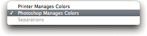
Printer Profile. The Printer Profile menu is enabled only when you choose Photoshop Manages Colors from the Color Handling pop-up menu. Choose the profile that describes the printer to which you’re printing and the paper and ink the printer is using.
Tip
![]()
The Match Print Colors and Show Paper White check boxes in the Print dialog don’t affect the color conversion to the printer. All they do is apply the Printer Profile you selected in the Print dialog to the proxy image, so that the Print dialog can display a more accurate preview of the colors that will print. Match Print Colors and Gamut Warning also base their display on the selected Printer Profile.
Rendering Intent. The Rendering Intent menu is enabled when you choose either Printer Manages Colors or Photoshop Manages Colors from the Color Handling menu, but it typically behaves reliably only in the former case. Choose the rendering intent that works best for the image by previewing the print using Proof Setup. (The Black Point Compensation check box is enabled only when Photoshop Manages Colors is selected in the Color Handling menu. As previously noted, it’s typically best to leave it turned on.)
Proof Setup. The Proof Setup menu is available with all Color Handling pop-up menu choices except Separations and is enabled when you click the Proof radio button. Photoshop executes the conversion specified in the selected Proof Setup preset before sending the data to the printer using the options controlled by the Color Handling menu.
It also disables the Rendering Intent menu. The rendering of the simulated proof space to the printer space is controlled instead by the Simulate Paper Color and Simulate Black Ink check boxes. When both are unselected, Photoshop converts the simulated proof data to the printer space using relative colorimetric rendering with black-point compensation. Checking Simulate Black Ink turns off the black-point compensation, while checking Simulate Paper Color makes Photoshop use absolute colorimetric rendering instead, forcing the printer to reproduce the actual “paper white” and actual “ink black” of the simulated proof.
This feature works well when Photoshop Manages Colors is selected in the Color Handling menu, but it can produce random results when any of the other alternatives is selected.
The Printer Driver’s Print Dialog
Photoshop applies all of the Print dialog Color Management options to the data it sends to the printer driver. You won’t see any trace of the Photoshop options in the printer driver’s Print dialog, which appears when you click the Print Settings button. If you use the Photoshop Print dialog to convert image colors, make sure you don’t have another conversion specified in the printer driver’s Print dialog, or you’ll get a double correction and a nasty print. In the printer driver, look for a color management option such as Off, None, or No Color Adjustment, and choose it to make sure that the driver doesn’t sabotage you with an unwanted extra conversion.
Printing to Desktop Printers
The way Photoshop prints to a desktop printer depends on the color mode in which it expects to receive data. Photographic printers are true RGB devices—they expose photosensitive paper using red, green, and blue lasers or LEDs—so the CMYK color mode simply doesn’t apply. Inkjet printers use cyan, magenta, yellow, and black inks (plus additional inks to extend gamut and detail), which, in theory at least, makes them CMYK devices. But in practice, unless you’re printing through a PostScript raster image processor (RIP), desktop inkjet printer drivers are built to receive only RGB data. This is because, traditionally, operating-system-level graphics languages have not been able to send CMYK to printers. Photoshop itself can send CMYK to these printers, but the printer driver will immediately convert it to RGB before doing anything else with it.
Tip
![]()
On professional desktop printers such as the Epson Stylus Pro line, use Photoshop-managed color output, described in “Converting Colors When You Print” earlier in this chapter: In the Print dialog in Photoshop, choose Photoshop Manages Colors; then choose the right printer profile, and turn off color management in the printer driver options in the Print dialog.
A PostScript RIP may seem to allow more control over the printing process by letting you control the individual inks, but that usually isn’t the case. PostScript RIPs that use the printer’s native screening algorithms usually send RGB to that part of the print process; those that truly provide ink-level control use their own screening, which may not look better than the printer’s native screening. A PostScript RIP makes sense from a workflow standpoint if you’re using a desktop printer as a proofer for prepress, but if your desktop print is your final output, use your printer’s own RGB driver or a specialized RIP designed for photo output, such as Colorbyte’s ImagePrint.
RGB Output. If you’re printing RGB, you can skip the entire CMYK section in this chapter. You should, however, carefully read the sections “Choosing an RGB Working Space,” “Soft-Proofing Other Color Spaces,” and “Converting Colors When You Print.” For best results, use ICC profiles that represent the specific ink and paper you’re using. If you print using the printer vendor’s inks and papers, the profiles that come with the printer may work well. If you’re using third-party inks and papers, though, a custom profile will improve your output immensely. Inexpensive scanner-based profiling packages such as the PANTONE huey can work well with inkjet printers and can pay for themselves in savings on ink and paper. Don’t use your RGB printer profile as an RGB working space, because RGB printer spaces aren’t gray-balanced or perceptually uniform, making editing difficult. Instead, use a working space such as ProPhoto RGB, and fine-tune your image for output using Proof Setup to create a simulation of the printed output.
CMYK Output. If you’re printing CMYK through a PostScript RIP, what this chapter says about press CMYK applies to desktop printers.
Troubleshoot by Isolating Variables
All color management operations depend on a minimum of two profiles. Simply viewing a document requires a profile that describes the document and one that describes the current display. Other operations involve three or even more profiles. If you run into issues that don’t appear to be a result of operator error, it’s likely that one or more of the profiles involved is a weak link. Use a process of elimination to troubleshoot problems. Test each profile in isolation and change one thing at a time. You’re likely to find the culprit much quicker than you would by flailing around and changing multiple parameters willy-nilly.
Color management isn’t a panacea, and it doesn’t remove the need for intelligent human color correction. It’s just a useful tool that provides a solid floor for you to stand on when you make your (hopefully intelligent, certainly human) corrections.