
Chapter 4. Delivery and Format
One of a digitally based portfolio’s conveniences is its flexibility. The same content can be packaged in a delightful variety of ways, depending on your needs, knowledge, and time constraints. You can begin simply with a selection of work collected in a PDF, design a slideshow presentation for a client pitch, or move to an interactive website or DVD. A well-organized digital file lets you shift elements around for multiple formats almost as easily as you might slide a brochure into and out of a binder. Even nicer, the work you collect in one fairly simple format can become the basis for a more comprehensive and sophisticated portfolio as your technical knowledge and body of work increase.
There is no “right” portfolio solution. Nonetheless, there are preferred media and delivery methods in different creative fields. And there are a few wrong choices—decisions that are inappropriate for your specific market.
Although the options for portfolio format and venue continue to expand, they boil down to one of three delivery categories: portable, email, or online.
Portable media
If you want to make your digital portfolio part of your in-person presentation or need to send a high-resolution presentation to prospective clients or employers, you will need some physical medium to hold it.
CDs and DVDs
Standard-sized discs are familiar, easy to integrate into a traditional portfolio, and fairly sturdy. CDs are an inexpensive way of delivering a variety of types of relatively small files (PDFs and player files, for example). DVDs are the best choice for moving images.
People feel strongly—pro and con—about receiving a disc portfolio. The people who dislike them don’t necessarily dislike discs per se, but groan because so many people do a bad job of creating them. Typical complaints range from bad organization to unreadable file formats. Unlike a website, which can be revised as you learn from your mistakes, a badly conceived or executed CD will simply be tossed—or tossed around a shop as an example of “portfolio fail”—Chapter 5, “Organizing Your Work,” Chapter 9, “Structure and Concept,” and Chapter 13, “Presenting Your Portfolio,” address these issues, and will help you create a disc portfolio that won’t frustrate an art director.
Although discs are usually welcome in 3D and moving-image disciplines, they are less attractive in 2D specializations, where there are more concise alternatives for delivering a body of work. Graphic design professionals, for example, tend to prefer receiving work via email: PDF attachments or a URL link. A disc is a commitment. Unless someone has thoughtfully provided a table of contents, you don’t know how much it contains or how long it will take to look at it. And then there’s the problem of where to store it if it’s worth keeping.
WWW.TOADSTORM.COM
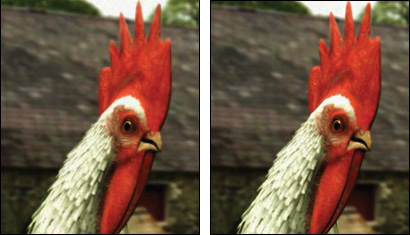
These are enlarged details from two versions, at different resolutions, of animator Henry Foster’s portfolio reel. The lower resolution (360×243) on the left is fine for a quick view, but the higher resolution (720×486) version shows the realistic modeling details of the chicken’s eye and the plumage around it.
In contrast, people with positive disc experiences swear by, not at, them. Unlike a website, where you have to consider bandwidth and window size, a disc can be viewed anywhere, anytime, even without wireless access. The disc can hold work at a much higher resolution, so typographic or rendering details become accessible. Plus, if you author a DVD (with iDVD or some other application) rather than simply drag data onto it, the result will work in a standard DVD player, not just on a computer. That consideration is particularly important if you are sending a DVD to a large company where your work is likely to be viewed by people who aren’t technically savvy, or who don’t have the latest version of your software player on the computer they’re using.
In addition, discs have a physicality that can keep your work alive. Websites are great, but they aren’t always top of mind. Will someone who is inundated with portfolios and reels recall your name and remember to bookmark your website? Or if they did bookmark it, will they remember why a month later? A disc full of good work, attractively packaged, can and will imprint itself on a visual person’s mind. Rather than archive it in a box or file, the disc may find its way to a prominent place on a desk—ready to work its magic when the right position opens up.
One last thing: if you decide to put your portfolio on a disc for distribution, use some type of -R versus -RW disc. Not only are these formats generally cheaper, but you would rather not have someone treat your portfolio as a free storage space.
Laptop
Besides being an elegant way of transporting large volumes of work, the laptop gives you ultimate control of your presentation. You’re less likely to be plagued by technical gremlins because you’ve tested your environment. You never have to worry about platform issues or care if the people you are presenting to can tell the difference between a DVD and a coaster. There are no surprises in type size or player speed. You can show your work in an intimate setting or hook the computer to a projection system and present it to a filled room. For all these reasons, laptops are a great way to present to a client or prospective employer.
On the downside, walking in with a laptop also requires that you be ready to use it to present under any circumstances. Your VGA adapter becomes a crucial tool if a one-on-one interview suddenly turns into a department-wide command performance. Equally important may be an alternative presentation layout if the projector has a lower resolution than you use as a standard for presentation design. Color shifts between your laptop and the projector can create awkward moments if they affect the audience’s ability to see crucial details.
If you present without attaching your laptop to a projector, you’ll have different challenges. You may have to dance between watching the screen and connecting with your interviewer or client. The only way around that is to have rehearsed your presentation so frequently that it’s practically memorized—not a bad move in any case. You also have to take the flat panel display’s limitations into consideration. If your audience is sitting at an angle from the screen they may not see the presentation well.

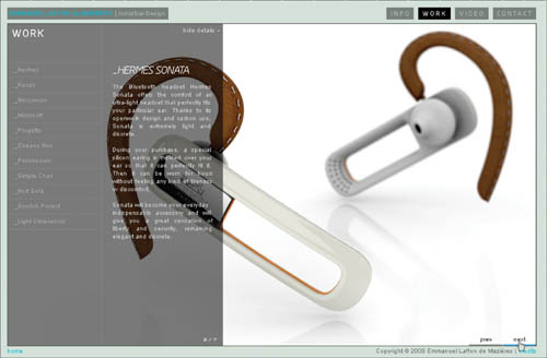
On Emmanuel Laffon’s website (www.emmanuel-laffon.com), he concentrates on completed, modeled projects that can speak for themselves with little context. His laptop presentation, however, contains abundant sketches: process work that allows him to discuss how he arrives at and develops his ideas.
If you plan to do regular laptop presentations, make sure that your entire computer is backed up regularly. Keep a copy of the presentation and any files it requires on a portable external drive that you carry with you in case Murphy’s Law comes crashing down on your keyboard. And remember that a laptop presentation means maintaining at least one other form of portfolio as well, since you won’t be dropping your MacBook Pro as a leave-behind.
There are two ways to use email to distribute your portfolio. The first is as an advertising conduit: providing a URL where your work can be downloaded or viewed online. The second, the email attachment, is more like a traditional direct mail sample. With it, you can target prospects individually with a fairly small outlay of time and energy. Because you don’t have to design and build an interface to deliver your work, almost anyone can send a portfolio attachment.
There are very few negatives to attachments, but they are worth considering nonetheless. First, you need to keep their purpose in mind. Attachments should be little teasers. If successful, they should lead to a presentation, either in person with a physical portfolio or laptop, or as a high-resolution movie player download. They should not constitute your only foray into the portfolio world. They are also an awful move for anyone who is applying for web-based design work and should obviously have provided a URL.

WWW.JASONRING.COM
Designer Jason Ring uses the concept of the T-shaped person—a person with a deep principal skill and a native curiousity about things outside it—coined by IDEO’s Tim Brown, as his lead-off and framing device for the PDF portfolio he sends to prospective clients. It creates the perfect teaser for his portfolio presentation—clever, well-designed, memorable—and smaller than 3MB, even though it’s 25 pages long.
Second, standards for email attachments have risen now that most people can receive large attached files. For 2D images the expected format is a PDF file. PDFs are familiar to everyone, Adobe Reader is ubiquitous, and a PDF can be locked to prevent unauthorized appropriation of your work (see Chapter 12, “Copyright and Portfolio”). All of these good points, however, require that you own an application that generates PDF files (like Adobe applications InDesign, Illustrator, or Acrobat Professional). Designers (industrial, graphic, or architectural) and illustrators should have no problem with this. They should also be well-positioned to make their PDF a coherent design project as well (see Chapter 7, “Repurposing and Optimizing,” for some PDF format guidelines).
What if you don’t have strong design experience? You could still enlist a design friend or partner to set up a template file that you can update easily when you want to just add text or new images. If that’s not possible, you can move images into Microsoft PowerPoint or Apple Keynote and provide a slide show player. Slideshows can be a great solution for a photographer, artist, or illustrator, as long as the size of the finished file stays within a mailable size (see Chapter 9 for more on this option).
A last possibility is an FTP (file transfer protocol) site—owned by you or, most likely, provided as a service—where you can upload your work. Dropbox (www.getdropbox.com) is one service that has an enthusiastic and growing group of users. By grouping your material thoughtfully, you can offer access to different work examples based on who you have contacted. Some FTP services provide security that allows invited guests to view, but not download or change, the content. Most, however, do not, and once you have issued an invitation, it can be shared by the invitees until you remove them or shut the access down. On the other hand, it could be a great way to share a high-resolution movie file without having to maintain a personal website or other online presence.
Online
Online portfolios are like profiles on a dating service site. They enable the potentially interested client or employer to taste-test you and your work anonymously. If they like what they see, you may hear from them. If it’s not their style, both you and they are spared a painful face-to-face experience.
An online portfolio is any collection of your work that people can view from inside a browser. Once you recognize that a portfolio can be defined as any venue or medium where you display your work, you may discover that you have some kind of online portfolio already. Depending on where you post and why, there are a variety of distinct sites that provide a range of levels of exposure and can make different statements about you.
Personal website
As a presentation form, a personal website is somewhere between a mailing and an in-person visit. It is unquestionably the single most valuable portfolio form you can create—even more than a physical portfolio. In fact, for many creatives, not just web designers, it is the only portfolio they maintain.
Pushed to its highest form, a personal website creates an avenue for creative expression, and a marvelous opportunity to highlight your skills, taste, and unique world view. Through linking from the other portfolio venues discussed below, it can bring contacts to you that you would be hard-pressed to reach and impress otherwise. And unlike every other online venue, your work doesn’t have to compete with other posters while they are visiting it.
Personal websites are not yet a perfect medium. They are a one-way street. You can’t watch how someone is responding to your work and adjust your tone, emphasis, and pacing the way you can easily do face to face. They also demand up-front design work, a host of visual and content decisions, and much more significant time in their creation and upkeep than other online options, or PDFs.
It is possible to mitigate some of the burden of creating a personal website from scratch (see “Partnering” in Chapter 1). Some people also elect to purchase and then customize an HTML or Flash portfolio template.
Self-publishing site
Self-publishing sites, from YouTube to Flickr, have pushed out most of the free, non-curated sourcebook sites that were prevalent a few years ago. Those that remain tend to be the repository of mediocre talents and part-time artists. Since most also have very limited storage space and a utilitarian interface, it’s not surprising that they have been overwhelmed by the Web 2.0 self-publishing site.
The self-publishing site is a great step forward in portfolio maintenance. Although not a substitute for a personal website, it is an excellent second outlet, particularly for people whose work can be compiled into one large, well-designed package or batched by theme, subject, or style. These sites offer tremendous browse appeal, and can bring your work to the attention of people who would never find your personal portfolio site otherwise.
Most self-publishing sites are defined by their primary medium, and are organized in a way that makes them more useful to some creatives than others. For example, although Flickr posts many videos and illustrations, it mostly comes to mind as a site for sharing photographs. YouTube’s obvious raison d’etre is moving image, which not only covers the digital videos it’s known for, but also 2D and 3D animation reels, architectural walkthroughs, and portfolios full of 3D models made by industrial designers and computer artists.
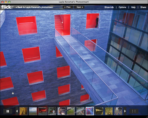
WWW.FLICKR.COM/PHOTOS/LAYLAK/
Designer Layla Keramat keeps her extensive collection of photographic works on Flickr to distinguish it from her professional design work.
Other sites serve their own niches. Issuu (issuu.com) is a publishing outlet for everything from magazines to comic books, but it has an impressive collection of books of personal art as well as online versions of printed portfolios. Best of all, it adds the feeling of a real publication to each PDF document by using software to provide shadows and highlights to what looks like photos of a bound book. This makes it a powerful option for graphic designers as well as architectural and industrial designers who are required to own a formal printed portfolio as students. The downside of such a big site is that your work could get lost on it. Issuu, like others in its category, makes money by offering a premium publishing level that features you prominently and eliminates their advertising and logo from your work.
Creative services portfolio site
Like discounters where you can sometimes find a designer gem, free-for-all self-publishing sites can be exciting and entertaining addresses. However, they encompass enormous ranges in quality. And even with a superior search function, they offer a daunting number of results in any category. You have no control over the context of your work, and there is no curator to exercise quality control. If a search turns up twenty results and the first five are mediocre, the searcher might not bother to look at number six—aka you.

ISSUU.COM/GRACEFULSPOON/DOCS/080206_ARCH_PORTFOLIO
Issuu provides three viewing options for your work: as a flat PDF file, as a presentation, and this version, magazine format, which mimics the look and shadow effects of a bound book.
Paid and invitation-only sites, on the other hand, are a more upscale version of the concept. With a barrier to entry, they’re more likely to contain professionals rather than hobbyists. As with self-publishing sites, friends, members of circles, and casual viewers leave comments about the work. What’s most telling is that in a professional site, those comments go beyond the “way cool” level. Most are informed, some are critical, and the people behind them often carry the weight of reputation. A portfolio that surfaces to the top in a professional site can easily lead to contacts and a career.
Among the well-established portfolio sites for professionals, are the AIGA members-only portfolio site (www.aiga.org), and Communication Arts’ Creative Hotlist (www.creativehotlist.com), which offers an inexpensive six-month subscription that allows you to post a PDF and a small online portfolio.
The relative newcomer, with an unusual combination of social network publishing and exclusive access is Behance (www.behance.net). It doesn’t charge a fee, but you can only join if you are invited by another member, or if you petition the site editors with a detailed description of your creative work or involvement in the professional creative process. There is no way to buy yourself into a featured position. Works that make it to the front page get there through a combination of member comments and site curators. Almost all members have personal websites as well, and a featured position in Behance almost always leads to substantially more personal website traffic.
Some sites encompass all creative professionals equally. Others draw one category more than others. For example, LiveBooks (www.livebooks.com) is becoming the professional photographer’s Flickr. Although it is not free—you buy a monthly subscription—it takes all of the worry out of portfolio creation. Your site is built on a template and attractively customized by an in-house designer. Once that’s done, you control updates, sequence, and content.
The pluses of this approach are that it is fast and affordable, particularly if you compare it with the price of a designer creating a site from scratch for you. A templated portfolio can be the best way to get your work online when you are unexpectedly let go from a full-time spot. The templates are attractive and take care of visual decisions like layout and fonts, as well as shielding you from having to learn a new application, like Adobe Dreamweaver.

WWW.BEHANCE.NET/WILL_SCOBIE
Illustrator Will Scobie displays a selection of his recent work on Behance. His display emphasizes the wide range of projects to which his distinctive style can be applied.
Hosted gallery presentations
Many fine artists want a web presence but are intimidated by the technology or lack the resources to hire someone to create and maintain their site. For those who are established in their field, a gallery site can be a substitute for a personal site—a way of establishing a foothold in the virtual world. There are both fine art and commercial gallery sites. In both cases, the site is the product of an individual’s personal vision—the curator in a fine art gallery, the artist representative in the commercial site. An artist has to come to the curator’s attention, and the curator has to want to represent that artist. Assuming the chemistry is right, the artist gains an immediate increase in visibility, as well as a personal advocate.
Social networking site
There are a variety of social networking sites that provide a way for you to share short notes about your work and display images or videos. Facebook has edged out MySpace as the major website for this purpose. Companies, design studios, and working professionals are now using it as both a personal space and a marketing tool.
Any prime destination is an irresistible magnet for posting your work. Plus, a social network not only enlarges the number of people who know about you, it can provide that special sense of personality that bridges the gap between a formal portfolio and the person behind it. However, indiscriminate friending offers casual contacts access to not just your own personal quirks, but those of your irrepressible friends and family.
Key to using Facebook as a portfolio adjunct are its Privacy settings, which you can use to limit access to some elements on your page. Next you need to customize the Search section. You might want to block most people from seeing the pages you have become a fan of or from seeing your list of friends. And you must maintain these settings as you add new friends to your list.
All of this takes a lot of effort, and Facebook, like other social networking sites, is a place with a friendly, no-stress vibe. In short, if you’re not committed to massaging your contacts, it may not be a worthwhile choice when there are other, more focused outlets.
Blogs
An adjunct to a personal portfolio, although not a substitute for it, is the personal or studio blog. It offers an opportunity to talk about your work in a conversational way, without weighing your formal portfolio down with opinions and insights that can seem overdone or even pretentious when visitors are concentrating on your work itself. Here is the place to talk about your creative process, and how successfully you met your client’s constraints. It also provides a place to roll out experimental work, or material in a new medium.
The potential negative of the blog format is that it comes with the assumption that people not only might comment, but probably will, and perhaps at more length and with less approbation than you think you deserve. Although you don’t have to publish any of these less-than-glowing comments, you’ll still need to be prepared to receive them.
Portfolio strategies
One format or venue is unlikely to serve all your needs. Most creatives plan on some combination of the previously mentioned media and online options. But what should you put where, and how do you end up with a coherent personal story? There are several ways to approach the multiple portfolio problem: duplicating, dispersing, dividing, doubling, and developing.
Duplicating
When you duplicate, you have a single body of work in many formats. You develop your portfolio themes, choose the best pieces to illustrate them, and create one portfolio version—the easiest to create or the one you need immediately—first. After this portfolio has been tested, presented, and, if necessary, refined, you duplicate it in other media. The plus of this approach is that it’s very fast. Updates happen in tandem, and you never have to remember who saw which version of your work.
There are two minuses. First, you may be showing some work in a medium that compromises its effectiveness. More important, you have no second act. Anyone who was interested in your first portfolio will want to see more and different material elsewhere. It is particularly important that you have something extra that you can show in person.
Dividing
The divided portfolio demands more thought and preparation than simple duplication. The first stage of dividing can be relatively straightforward. Material that doesn’t look right onscreen and can’t be zoomed into or manipulated remains in a traditional portfolio, which you use only in personal presentations. Anything that is effective onscreen stays there. The few pieces that sparkle both digitally and traditionally remain in both versions but may be highlighted differently onscreen and off.
But once you’ve determined on- versus off-screen material, you may need to divide further, or differently. What if you don’t need a traditional portfolio, but you have some work that doesn’t feel like it belongs on your personal website? Do you have alternative concepts, or process work? These belong someplace where they can tell a story about how you think. Here’s material that could be divided out and posted on a blog. Other times, you feel the work needs a narrator. It might work as part of a traditional portfolio, or even better as part of a laptop presentation you prepare for people who have seen and liked your website.

WWW.LUKELUKELUKE.COM
Designer Luke Williams’ thesis project was a photographic essay. Although he posts a sampling in the photo section of his portfolio, he uses the division concept to display the images in a more appropriate venue, directing interested viewers to his Flickr site.
Dispersing
Dispersing is a variation on dividing. You create a core group of work that exists as a coherent prime portfolio. A couple of the best individual pieces, or a subset reel, can be posted on one of the self-publishing sites to build traffic.
Then you look at the pieces that you didn’t include in this collection. After eliminating the ones that are really not your best efforts, you’ll probably find additional pieces from a series of projects, project work, concept sketches for ideas that are still in germination, or secondary artwork (illustrations, photos, 3D art) that you are proud of but that are not your primary focus. These pieces, by themselves or joined with related pieces from the main portfolio, can be salted into other venues. Are you a designer, but consider yourself a good photographer? Maybe some of your photo work belongs on Flickr, with some commentary on how you use it to develop your design ideas. Have a good poster that you’ve weeded from your main site to make room for new work? It may be perfect in a blog with a discussion of your typographic decisions.
Doubling
Doubling—maintaining two completely different portfolios—is not just useful, it’s required if you do more than one thing well and the two things speak to radically different audiences. Fine artists who actively solicit commercial illustration, designers who also photograph, or illustrators who design are often best served by keeping these specialized skills separate.
It is possible to create distinct areas on a single website, but think twice before you try. This tactic can work brilliantly if you are really a double- or triple-threat, or if your secondary creative outlet illuminates some aspect of your primary expertise. If the second element is only a tag-on, it weakens your overall presentation.
Developing
When you develop, you are planning on a radical break with your past, rather than an expansion or transition. A small selection of older material may combine with newly invented work—revisions of older projects or brand-new ideas—explicitly created for one new portfolio that will take the place of all existing ones.
You use the developing strategy when you are in the process of reinventing yourself, but still need to maintain a professional presence for current employment. If, for example, you want to move into a new specialty within your profession—like a photographer moving from product to editorial shots—developing may be the only way to do it. The same is true if you have been an exhibit designer but you are now studying interactive design or architecture.
The negative points of developing come down to two little words with big impact: money and time. Developing from scratch is by far the hardest strategy—short term. But it’s often best to take the long view with your portfolio. Everyone has periods of feast and famine, even during good economic times. The quiet periods are ideal for developing new material, which will hopefully help to minimize downtimes in the future.
Portfolio Highlight: Emmanuel Laffon de Mazières | Form and function
Every year at graduation time, thousands of new product designers, like flocks of migrating birds, head for Core 77, Coroflot, or Behance. There they build an online portfolio nest and devour the extensive job lists. Many seldom venture away from their new home. If their portfolio is featured there, they’re front and center for the prospective employers who visit these sites. But then what? The next week, a new group is featured, and they move down to the next page and join the ranks in their category.
There’s nothing necessarily wrong with sticking with this instinctive scenario, unless you count the lost opportunities. Emmanuel Laffon de Mazières, recent transplant from France to California, certainly did. Using a dividing strategy, he fields a range of portfolios in different venues, each for a different audience.
Laffon’s projects work hard. A group of stills appears on Coroflot. A video on YouTube, scored to the music of Django Reinhardt, smoothly supports his 3D flyarounds, and when results are sorted by times viewed, it still appears as the first industrial design (ID) portfolio after the content featured for pay. His laptop presentation shows a full range of projects as well as process work. Most important, his prime projects are showcased in luxuriant close-ups on his personal website, to which all his other portfolio versions are linked.
Navigation
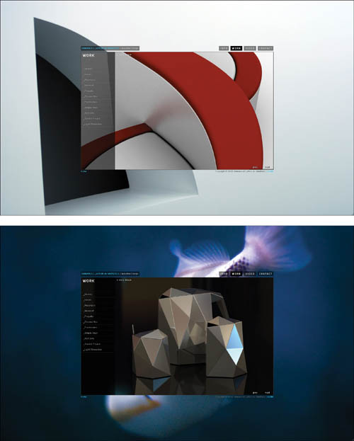
The site was designed to immediately capture the viewer’s attention. The opening backgrounds, the work of a professional-photographer friend, were chosen for both beauty and visual simplicity so they would not overwhelm the portfolio itself. Once the portfolio window is engaged, your perception of them quickly changes from seeing them as content to experiencing them as color mattes around the work.
If there is one thing that should be evident in an ID portfolio, it’s concern for user experience. The study of human factors and the study of product design are tightly connected, and many of the most influential thinkers in usability began as industrial designers and engineers. So it’s a disappointment when ID websites are bleakly utilitarian or so dependent on Flash-based effects that a smooth experience is impossible.

The site fills the browser window with a startlingly rich background image behind the translucent window of the actual portfolio space. The opening images remain onscreen for each visit but appear on a cycle, so each visit to the site offers a fresh visual perspective.
The navigation cues are subtle but clear. When you click on a menu link, the type highlights and its background becomes opaque. Hover on a link and it changes under your cursor in the same way but more slowly, so you will notice the process.

Roll over an item in the Work or Video menus, and both the type and the rectangular space around it brighten, but fade back again as the project brief window appears.
![]()
A blue accent is used sparingly, as the indication of another page. It appears in the link to open or close the project brief, and to move back and forth through the pages of a project.
Nothing could be further from Laffon’s design. Despite its lushly cinematic first impression, it provides clear and intuitive visual cues that concisely map the portfolio space.
In particular, he uses translucency not only as a setting for his portfolio frame, but to aid in navigation and as a way to keep visual focus firmly on his work. Navigation elements react by appearing to change their amount of transparency. Project briefs never obscure the work, and are easily dismissed without any distracting motion on the page itself.
Information about the design floats above each view of the project, which continues to be visible beneath the text. The information is easily dismissed by clicking “hide details.”
Laffon initially hoped to create an HTML-based site, because most of the sites he admired as examples of clear navigation avoided the Flash temptation. As he says, “I finally decided to go with Flash because it allows me to be more creative in terms of layout and the translucency. But there are so many things you can do in Flash that can distract you from your original intent. You constantly have to limit yourself because it is so easy to overdo it.”
Content
Exhibit, product, industrial, and architectural designers run up against an obvious limitation with their first professional portfolio. Few of their ideas have been built. In decades past, concept designs were obvious as such. In some portfolios, they-still are. Emmanuel’s work is so clean, crisp, and detailed that many of his concept pieces can be easily mistaken for photos, a fact that was brought home by the many people who contacted him wanting to buy his “huit sofa”—a loveseat concept based on the figure 8. Many of these people found the project through blog articles—a natural result of having so many possible points of entry to an intriguing project.
As it’s difficult to get the sense of a 3D object with one photo, Laffon presents his images from multiple views, and distances, at a size that makes their materials and scale apparent. Objects whose size might not be obvious are put in photographic context. In addition, Laffon’s site contains his video walkthrough, which is available in three resolutions—two viewable online, one downloadable in high resolution.
Laffon’s website concentrates on finished, modeled projects that can speak for themselves with little context. His laptop presentation, however, contains process work that allows him to discuss how he arrives at and develops his ideas.
Future plans
Laffon is particularly interested in consumer electronics and furniture, two areas that do not have much overlap. A few years down the road, he’ll probably have to make a choice, but for now he continues to add examples of both when he updates his site. He also goes back and reworks older designs as he sees better, more workable ways to build them, while weeding out older projects to make room. However, he intends to maintain his basic portfolio design for the foreseeable future because it works so well for him. Changing the background images to refresh his content and allowing the backgrounds to interact with his projects has kept his ideas fresh.
Laffon has chosen his best work, but he has also carefully selected the views that work optimally with his website design.