Chapter 4
The World of Image
Images are no longer just representations or interpreters of human actions. They have become central to every action that connects humans to each other... as much reference points for information and knowledge as visualizations of human creativity.
Ron Burnett
Design educator and author; from How Images Think;
The MIT Press: Cambridge, MA, 1993.
Real, Unreal, and Otherwise
Media and Methods
Presentation Options
Content and Concept
What Images Are Image making is perhaps one of the most complex and ecstatically human activities. An image is a powerful experience that is far from being inert—a simple depictor of objects or places or people. It is a symbolic, emotional space that replaces physical experience (or the memory of it) in the viewer’s mind during the time it’s being seen. This is true of images that are strictly representative of a real place, people, or objects, as well as of images that are artificial—either contrived representations or abstract configurations of shapes. In the hands of a designer who knows how to command composition on a purely visual level, and who can conceptually select and manipulate content, an image is by far the most profound communication tool available. ![]() In graphic design, there are myriad image possibilities—symbols and photomontage, drawing and painting, and even type—that perform different functions. Images provide a visual counterpoint to text, helping to engage the audience. Images also offer a visceral connection to experiences described by written language. They can help clarify very complex information—especially conceptual, abstract, or process-oriented information—by displaying it concisely: “at-a-glance.” They can add interpretive overlay in juxtaposition with literal text or images.
In graphic design, there are myriad image possibilities—symbols and photomontage, drawing and painting, and even type—that perform different functions. Images provide a visual counterpoint to text, helping to engage the audience. Images also offer a visceral connection to experiences described by written language. They can help clarify very complex information—especially conceptual, abstract, or process-oriented information—by displaying it concisely: “at-a-glance.” They can add interpretive overlay in juxtaposition with literal text or images. ![]() It’s foolish to think that simply picking a photograph of a particular object will alone solve a communication problem in its entirety. The relevance of an image to a design solution isn’t simply wrapped up in its subject matter. An image becomes relevant when its composition and production technique, as well as its subject matter, are working in concert with other material to create an integrated message.
It’s foolish to think that simply picking a photograph of a particular object will alone solve a communication problem in its entirety. The relevance of an image to a design solution isn’t simply wrapped up in its subject matter. An image becomes relevant when its composition and production technique, as well as its subject matter, are working in concert with other material to create an integrated message.
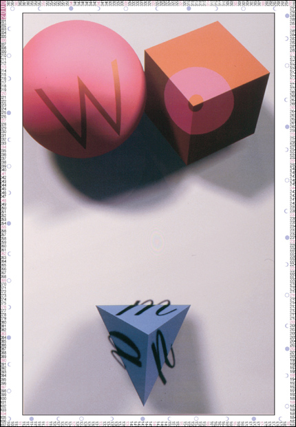
Abstraction and Representation An image might be mostly representational or mostly abstract, but it always will be a mixture of the two. Purely visual, abstract images (as we have seen) communicate ideas that are grounded in the human experience. In the right context, a yellow circle becomes a sun. A composition of lines in dynamic rhythms might communicate a subtler message about movement or energy, not necessarily referring to some literal object or experience. Even a photograph that purports to represent something real is an abstraction on some level—it depicts a state of activity that is no longer happening and flattens it into a two-dimensional form. Portions of it might not even be real, but instead, contrivances set up by the photographer or by the designer directing the creation of the photograph. ![]() Using the intrinsic messaging of abstract form described in Chapter 1 to influence a photograph’s composition will enhance its messaging potential. Similarly, suggesting concrete, literal experience within an abstract composition will help ground the message in reality for a viewer, making it more accessible without sacrificing the abstraction’s simplicity and visceral evocative power.
Using the intrinsic messaging of abstract form described in Chapter 1 to influence a photograph’s composition will enhance its messaging potential. Similarly, suggesting concrete, literal experience within an abstract composition will help ground the message in reality for a viewer, making it more accessible without sacrificing the abstraction’s simplicity and visceral evocative power.
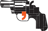
CLEVER USE OF LETTERPRESS elements and punctuation to create the gun icon evokes potential conceptual ideas about language and violence.
Sagmeister United States
Real, Unreal, and Otherwise
Media and Methods
Presentation Options
Content and Concept

CRYSTAL-CLEAR PHOTOGRAPHY is documentary and credible, considered “real” by the average viewer. These qualities are both appropriate and highly desirable when displaying products.
Rule29 United States
SIMPLIFIED representational forms exaggerate the abstract qualities of shape and space; with less naturalistic detail for the viewer to consider, the interplay of diagonals, mass, and contour dominate the image.
Munda Graphics Australia
The presentation of images falls on a spectrum defined at one end by representation and at the other by abstraction. Images that lie closer to the representational end of the continuum are more literal; images that approach abstraction are more interpretive.
A LIVELY DIALOGUE between abstract gestural mark and figural representation lends humanity and depth to the illustration.
VCU Qatar Qatar

A STYLIZED TRANSLATION of an eye approaches the iconic end of the image spectrum; added graphic elements bring symbolic meaning to the form.
Troy Abel Iowa State University, United States

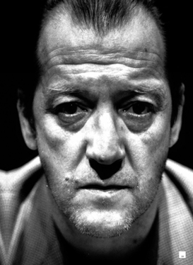
OUR BRAINS ARE hypersensitive to forms that create images of humanity. Note how little information is needed for this image to clearly represent a human face.
TenDoTen Japan
THE ABSTRACT FORMS in this book spread are grounded by the concrete quality of the letterforms, whose style begins to skew the reading of the abstraction toward an environment that might be urban and gritty in character.
Andreas Ortag Austria
![]()
Regardless of an image’s degree of literal representation or abstraction, a designer might choose to represent an idea by using photographs, illustrations (drawings or paintings), or a hybrid: manipulated photographs or drawn images in combination. How a designer decides to involve image results from evaluating the content and its conceptual functions. The images must provide informational clarity, but they must do so in a way that resonates and delivers secondary and tertiary messages—associational or branded messages—as well. ![]() The form of an image’s representation is called its “mode,” and this includes not only its degree of simplicity and abstraction but also its medium. A designer must consider a number of things in choosing the right image mode, or modalities, to use. Among these are the evocative, emotional qualities of the project’s content; the number of different modes needed to differentiate specific messages; the expectations of the viewing audience for certain image experiences over others, because of their demographic makeup or the social and historical context of the project’s content; and production issues, including such technicalities as budget, lead time, and fabrication concerns. How far from its “natural” state the image gets (how much the “pure” depiction of the subject gets altered by the designer) is described as how “mediated” it is.
The form of an image’s representation is called its “mode,” and this includes not only its degree of simplicity and abstraction but also its medium. A designer must consider a number of things in choosing the right image mode, or modalities, to use. Among these are the evocative, emotional qualities of the project’s content; the number of different modes needed to differentiate specific messages; the expectations of the viewing audience for certain image experiences over others, because of their demographic makeup or the social and historical context of the project’s content; and production issues, including such technicalities as budget, lead time, and fabrication concerns. How far from its “natural” state the image gets (how much the “pure” depiction of the subject gets altered by the designer) is described as how “mediated” it is. ![]() The level of an image’s mediation can be evaluated in a couple of ways. First, it can be considered in terms of its physical expression, or how it’s made; for example, a realistic drawing shows a greater level of mediation than a photograph of the same subject. Second, an image’s level of mediation can be considered in how complex the messaging in the image is—a somewhat literal drawing of an image is less mediated than a highly contrived photograph or collage.
The level of an image’s mediation can be evaluated in a couple of ways. First, it can be considered in terms of its physical expression, or how it’s made; for example, a realistic drawing shows a greater level of mediation than a photograph of the same subject. Second, an image’s level of mediation can be considered in how complex the messaging in the image is—a somewhat literal drawing of an image is less mediated than a highly contrived photograph or collage. ![]() The way an image refers to its subject is also an aspect of its form that must be considered by the designer, who might choose to represent, or signify, particular subjects by using images that are realistic or representational but not pictures of the subject itself. This kind of image is called an “index” and refers to its subject through association; an image of an egg, for example, “indexes” a bird.
The way an image refers to its subject is also an aspect of its form that must be considered by the designer, who might choose to represent, or signify, particular subjects by using images that are realistic or representational but not pictures of the subject itself. This kind of image is called an “index” and refers to its subject through association; an image of an egg, for example, “indexes” a bird.
SYMBOLS ARE highly mediated forms of image, drawing on common understanding and cultural contexts that elevate them beyond mere representation. Consider these two sets of symbols, used as signage to indicate which restroom to use.
Art: Tecaji Slovenia
Real, Unreal, and Otherwise
Media and Methods
Presentation Options
Content and Concept
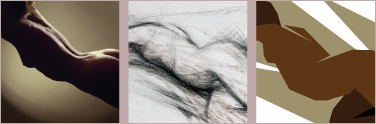
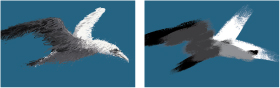
All these images depict the same subject—a figure—but using different modes. The modes range between literal and stylized, and each mode intrinsically mediates the image to varying degrees. The “pure” photograph is the least mediated in this study. The two drawn images are inherently more mediated than the photographic image—the designer has invented his or her own depiction of the subject—but between the two, the naturalistic drawing is less mediated than the other.
THE CHOICE OF IMAGE used for one of several wall panels in a French cultural center—Guignol, a puppet character from a child’s story—is symbolic of French culture. Its historical stature is altered through mediation: representing the image in a digital pixel pattern that makes it contemporary.
Apeloig Design France
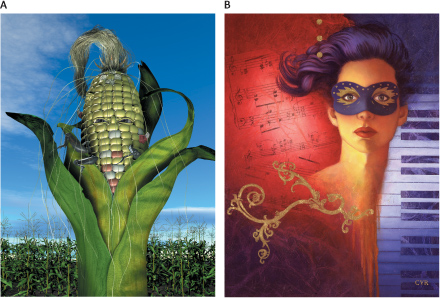
THE QUESTION OF MEDIATION and credibility comes to the fore in comparing these two illustrations. Both are fabrications—but which one seems more real? If you decided that the corncob person does, you’re probably not alone. Despite the impossibility of this subject matter, it has been rendered in a photographic style that makes it seem more believable as “real” than the abstract, invented space and painterly texture of the drawn image on the right.
A Christopher Short United States
B Cyr Studio United States
![]()
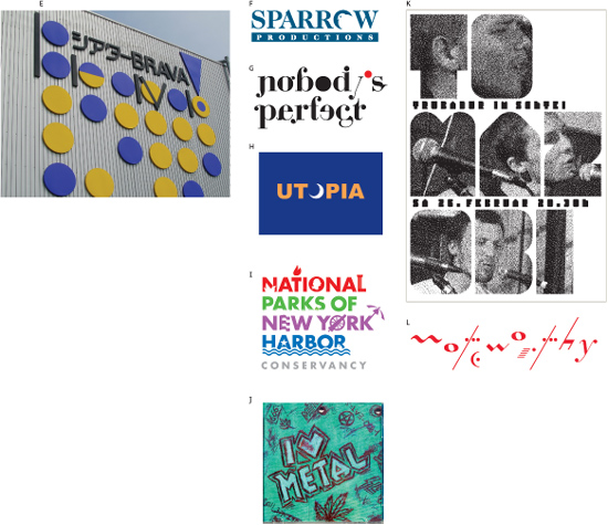
Semiology and Stylization A designer might often need to represent ideas in a stylized way, selecting the most important elements from a subject and arranging them in as concise and simplified a message as possible. The most common occurrence of this kind of image is a logo—an image that is used to identify an organization and differentiate it from competing groups. The purpose of such a distilled, elemental form is quick recognition and easy recall; the more information that can be packed into the shape of the mark, the better. Stylizing an image emphasizes its nature as a “sign”—a visual representation of an idea. ![]() The study of relationships between signs and what they represent or “signify” is called “semiology,” a branch of anthropology developed in the 1800s. In selecting the details of the idea or subject to be represented, the designer looks for elements that are the most universally recognizable—for example, the fundamental shapes and qualities of a cat (ears, tail, a common posture, whiskers, paws, and so on)—rather than those that are specific—particular ear shapes, markings, or short or long hair. In arranging the elements, even for that of a recognizable object, the designer’s goal is to invent a specific graphic language—an internal logic of positive and negative relationships, an emphasis on curved or angular forms, and an integration of line and mass—that will make the mark live as its own, unified image, rather than simply reproducing the likeness of the object. In one sense, the distilled, stylized mark is neutral because it seeks to communicate on an objective, universal level; simultaneously, however, it must have its own identity as a form.
The study of relationships between signs and what they represent or “signify” is called “semiology,” a branch of anthropology developed in the 1800s. In selecting the details of the idea or subject to be represented, the designer looks for elements that are the most universally recognizable—for example, the fundamental shapes and qualities of a cat (ears, tail, a common posture, whiskers, paws, and so on)—rather than those that are specific—particular ear shapes, markings, or short or long hair. In arranging the elements, even for that of a recognizable object, the designer’s goal is to invent a specific graphic language—an internal logic of positive and negative relationships, an emphasis on curved or angular forms, and an integration of line and mass—that will make the mark live as its own, unified image, rather than simply reproducing the likeness of the object. In one sense, the distilled, stylized mark is neutral because it seeks to communicate on an objective, universal level; simultaneously, however, it must have its own identity as a form. ![]() In giving the form its own identity, the designer is selectively interpreting particular aspects of the message and skewing the communication in one direction or another. Following the cat example above, the designer might emphasize a crouching position, possibly communicating readiness for action, or might emphasize the cat’s claws, a message that might mean power or aggression. The angularity of the drawing, or how weight is distributed, might add interpretation, such as restful and contemplative, or quick and agile, qualities. The universality of a mark, along with its particular degree of invented stylization, will place the image at different points along the continuum of representation and abstraction. Further, the very selection of the image’s subject might involve overlays of meaning that involve conceptual, cultural, or emotional issues.
In giving the form its own identity, the designer is selectively interpreting particular aspects of the message and skewing the communication in one direction or another. Following the cat example above, the designer might emphasize a crouching position, possibly communicating readiness for action, or might emphasize the cat’s claws, a message that might mean power or aggression. The angularity of the drawing, or how weight is distributed, might add interpretation, such as restful and contemplative, or quick and agile, qualities. The universality of a mark, along with its particular degree of invented stylization, will place the image at different points along the continuum of representation and abstraction. Further, the very selection of the image’s subject might involve overlays of meaning that involve conceptual, cultural, or emotional issues.
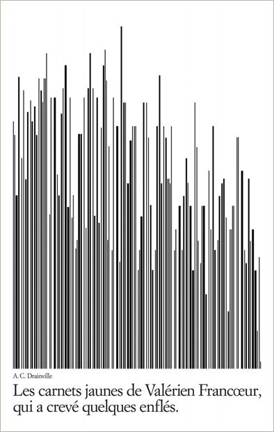
A RHYTHM OF LINES abstracts a bar code into a graph.
Thomas Csano Canada
Real, Unreal, and Otherwise
Media and Methods
Presentation Options
Content and Concept
CAREFUL POSITIONING of geometric elements and letter-forms creates a concrete anatomical image out of pure form.
Studio International Croatia
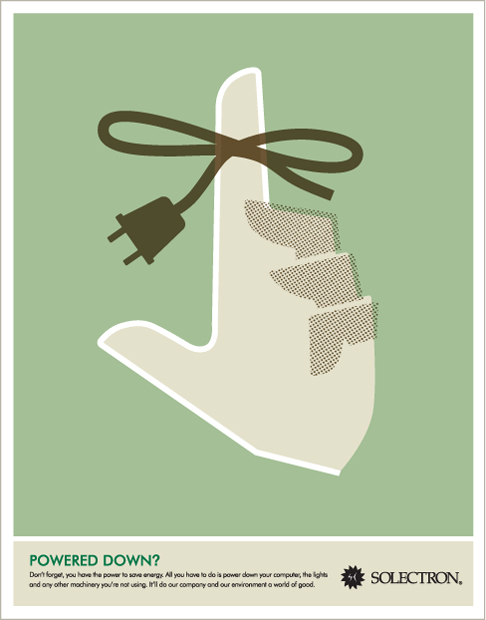
AN ICON OF A HAND becomes doubly symbolic as the string around the finger—a symbol for remembering something—is transformed into a power cord.
Templin Brink Design United States

HIGHLY RESOLVED integration of car and bicycle icons begins to suggest some relationship between them; the addition of the cautionary yellow striping evolves the message further.
Thomas Csano Canada

SOME IMAGES ARE complex, visual signs with several layers of meaning; these are called supersigns. The elegant W and M lockup, while still clearly letters, has also formed an iconic representation of wires. In turn, this representation takes on the quality of a symbol when qualified by the client’s descriptive title.
Raidy Printing Group Lebanon
![]()
THIS SUPERSIGN uses a letter-form as a base, altered only by the addition of two small dots to create added meaning.
LSD Spain

Icon A visual sign that shares a structural similarity with the object it signifies is called an icon. Usually, icons are devoid of detail and are literal representations of their signified object. In these examples, note which elements have been selected and which have been edited out.
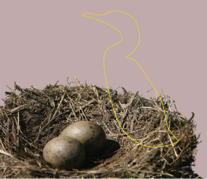
Indexical Sign This kind of visual sign points to its signified object indirectly, or “indexes” it—for example, a nest indexes a bird.


Symbol A representational or abstract image whose form is physically unrelated to its signified object or idea is a symbol; it derives its power from the arbitrary agreement of the culture that uses the symbol. A dove, for example, is a symbol of peace in Western culture. The context in which a symbol appears might alter its symbolic meaning: consider the difference in meaning between the same symbol element in these three environments.


Supersign This is a complex sign that superimposes more than one sign (and often more than one type of sign) in a single, gestalt combination in which all the signs included are visible and accessible immediately; a logo is a good example. A supersign might involve an icon, symbol, index, word, and representation in any combination. The more complicated the supersign, the less effective it is. These three examples show how a particular component might combine with others and thereby take on different functions and meanings.

THE DRAWING OF the house using simple lines becomes symbolic by transforming the lines into circuits.
Drotz Design United States
THE VISUAL QUALITY of linear, drawn imagery corresponds closely to the linear quality of typography, especially in this case where the type has been outlined as well.
Finest Magma Germany
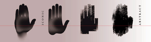
In this study, the same subject is presented in varying degrees of realism and stylization. Toward the realistic end of the spectrum, the subject’s literal meaning takes on more importance; as it becomes more stylized, its literal meaning becomes less important, while the gesture, the quality of the marks, and associations or symbolic messaging that these impart become more important.
Real, Unreal, and Otherwise
Media and Methods
Presentation Options
Content and Concept
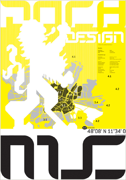
ILLUSTRATION ALLOWS FOR varying degrees of abstraction and complex, invented spatial arrangements. The flat, hard-edged style of the illustrated elements creates a modern, industrial feel appropriate to the city, while using a map and coat of arms figure adds historical messaging.
Dochdesign Germany
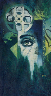
AGAIN, ILLUSTRATION doesn’t limit the designer in terms of inventing space and combining disparate elements that would otherwise be empirically impossible. In contrast to the Munich poster (left), the style is painterly and representational, but the space is no less abstract.
Cyr Studio United States
![]()
Illustration The choice of illustration over photography opens up tremendous possibility for transmitting information. The designer is not only unencumbered by the limitations of real-world objects and environment but also given the potential to introduce conceptual overlay, increased selectivity of detail, and the personal, interpretive aspect of the designer’s visualization—through choice of medium, composition, and gestural qualities. ![]() As with all types of images, an illustration can be concrete, objective, or realistic in how it presents its subject, or it can become abstracted and symbolic; the designer can add details that normally would not exist in a real scene or can exaggerate movement, texture, arrangement, space, and lighting. Choosing illustration for image presentation, however, means potentially sacrificing a kind of credibility or real-world connection for the viewer. Despite the fact that most audiences realize that a photograph might just as easily be manipulated and therefore made misleading, the audiences will still instinctively respond to a photograph as though it were “reality.”
As with all types of images, an illustration can be concrete, objective, or realistic in how it presents its subject, or it can become abstracted and symbolic; the designer can add details that normally would not exist in a real scene or can exaggerate movement, texture, arrangement, space, and lighting. Choosing illustration for image presentation, however, means potentially sacrificing a kind of credibility or real-world connection for the viewer. Despite the fact that most audiences realize that a photograph might just as easily be manipulated and therefore made misleading, the audiences will still instinctively respond to a photograph as though it were “reality.”![]() The power of illustration over photography, however, is to communicate with a visual sensitivity that is emotional, poetic, organic, and innately human. An illustration can also integrate with other visual material, such as type, abstract graphic elements, and even the paper stock or other finishing techniques, on a textural level that is impossible with a conventional photograph. The designer must weigh these aspects carefully and select which mode of representation will best suit the communication.
The power of illustration over photography, however, is to communicate with a visual sensitivity that is emotional, poetic, organic, and innately human. An illustration can also integrate with other visual material, such as type, abstract graphic elements, and even the paper stock or other finishing techniques, on a textural level that is impossible with a conventional photograph. The designer must weigh these aspects carefully and select which mode of representation will best suit the communication.
Drawing and Painting The directness of hand-generated images is universally appealing. Through a drawn or painted image, the designer taps into a viewer’s own sense of creativity and connects on an extremely personal level—there is a genuine, honest, and warm quality to an illustration that might be lacking in the slick and seamless realism of a photograph. An illustration’s success lies in the appropriateness of its style to the subject matter at hand. The majority of illustration is contracted from specialists, who cultivate a particular style to find a niche in the market, but this doesn’t preclude designers themselves from taking on the role of illustrator. A designer wanting to illustrate will be intimate with the subject matter of the project and other relevant graphic elements—including type and finishing techniques. As a result, the designer might be able to build images that are even more appropriate and integrated with other elements than would be likely if working through an outside source.
Realism and Beyond An illustration might be a concrete depiction that calls upon the traditions of classical drawing and painting—its goal being to reproduce the empirical world in a way that responds to actual conditions of light, form, and perspective. Alternatively, an illustration might be a graphically stylized image that approaches abstraction, referring to the real world as a grounding point but favoring the expressive qualities of gesture, ambiguous space, and the process of making the image. Between these two extremes lie the possibilities of mixing elements of each state.
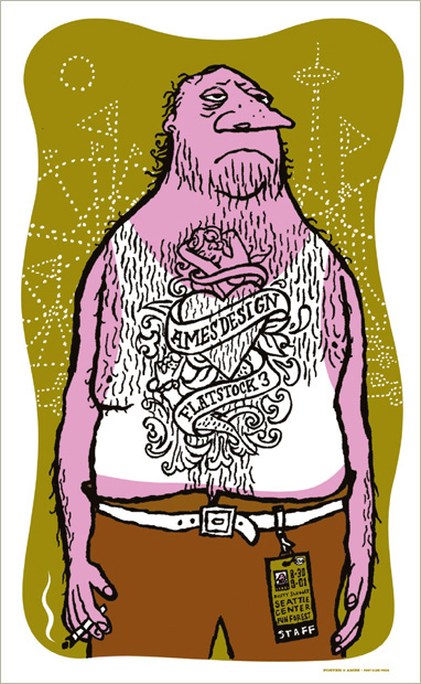
THE SCRAGGLY OUTLINE and cartoonish forms of this illustration mix humor and pathos.
Ames Bros. United States
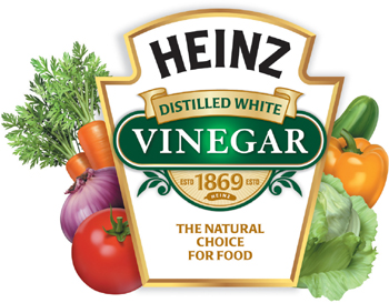
THE DECISION to illustrate the vegetables on this label, rather than to photograph them, ensures their absolute perfection and freshness.
Wallace Church United States
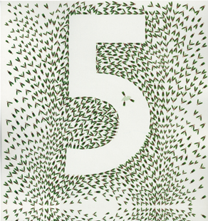
A TEXTURE OF ILLUSTRATED insects reveals a numeral 5 in this panel from a parking garage signage system. Illustrating the insects gives the designer control over their visual presentation, rather than relying on finding or photographing images of real insects.
Studio Works United States
Media and Methods
Presentation Options
Content and Concept
THE RICH, ALMOST collagelike mixture of tools used to create this image—airbrush, pen, digital images, flat ink—contributes textural contrast and multiple layers of meaning to consider.
Maciej Hajnrich Poland
SCRATCHY, ALMOST DISTRAUGHT cross-hatching, produced with pen and ink, enhances the mysterious and slightly sinister quality of the image.
Ames Bros. United States
![]()
The Medium Is a Message A line is a line is a line . . . or not. Every drawing and painting tool makes characteristic marks and affords a designer a specific kind of visual language. The language of the tool has a powerful effect on an illustration’s communicative value, not just on its visual qualities relative to other elements in a design solution. Above and beyond the fundamental selection of subject matter components, composition, and degree of stylization, the medium a designer chooses with which to create the illustration carries meaning—in terms of feeling (softness, hardness, fluidity, and stiffness) and, sometimes, conceptually (for example, using a drawing tool native to a certain region or historical period for a project related to that region or period).
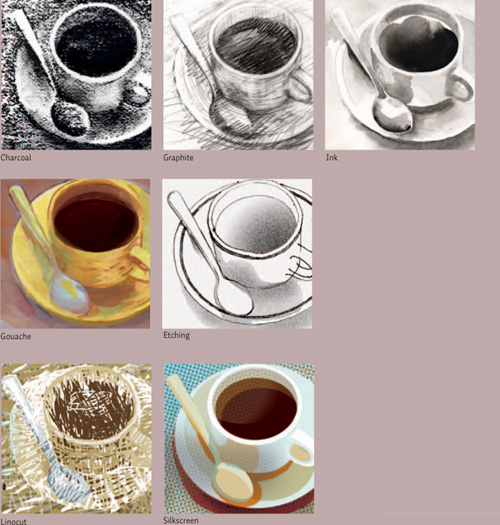
Experimenting with the mark-making possibilities intrinsic to different tools shows the endless possibilities of, as well as the opportunities for controlling, the expression of an illustrated image. Here, the same subject is illustrated using different tools to show how powerful the effect of the medium is on communication.
THE SLICK, DIGITAL quality of the linear drawing, gradations in color, and sharply defined silhouetted hands impart a contemporary, technological feel to this poster.
344 Design United States
![]()
Graphic Translation One particular kind of stylized illustration—known as graphic translation—evolved from the poster tradition of Switzerland and Germany in the early part of the twentieth century. Graphic translation combines some attributes of both icon and symbol. It depicts subjects in a literal way, like an icon, but also in a self-consciously abstract way that takes on symbolic qualities. A translation attempts to convey the concrete, fundamental “truth” of a subject, without details that are specific to that one particular instance of it; for example, a translation of a cat strives to be about the idea “cat,” but not about a specific cat; that is, how long its hair is or the markings of its particular breed. ![]() Unlike an icon, however, which is strictly about shape, the textural and volumetric qualities of the subject are important considerations in finding an appropriate language with which to translate it: the cat translation must indicate that cats, in general, are soft or furred, that they are slinky and athletic, and so on. A translation might be simple and stylized, or it might be relatively naturalistic, taking on characteristics such as surface detail or effects of light.
Unlike an icon, however, which is strictly about shape, the textural and volumetric qualities of the subject are important considerations in finding an appropriate language with which to translate it: the cat translation must indicate that cats, in general, are soft or furred, that they are slinky and athletic, and so on. A translation might be simple and stylized, or it might be relatively naturalistic, taking on characteristics such as surface detail or effects of light. ![]() Graphic translation differs from conventional illustration in that its visual language, or “form language”—the marks used to make the drawing—is reduced to the point that there’s nothing extra, only the shapes and marks needed to describe the subject.
Graphic translation differs from conventional illustration in that its visual language, or “form language”—the marks used to make the drawing—is reduced to the point that there’s nothing extra, only the shapes and marks needed to describe the subject. ![]() The medium used for the drawing is important only if its characteristic marks help describe the subject’s form or feeling. A scratchy texture made by charcoal, for example, might be appropriate in describing the fragility or dryness of an autumn leaf, but the texture does not exist for its own sake.
The medium used for the drawing is important only if its characteristic marks help describe the subject’s form or feeling. A scratchy texture made by charcoal, for example, might be appropriate in describing the fragility or dryness of an autumn leaf, but the texture does not exist for its own sake. ![]() Most often, a translation is developed simultaneously with other visual material in a layout—the designer chooses translation as the illustrative option in advance—so that its shape, details, and textural qualities are dynamically integrated with photographs, typeface selection, abstract elements, and their positioning, in combination with the qualities of the translation.
Most often, a translation is developed simultaneously with other visual material in a layout—the designer chooses translation as the illustrative option in advance—so that its shape, details, and textural qualities are dynamically integrated with photographs, typeface selection, abstract elements, and their positioning, in combination with the qualities of the translation.

THE GEOMETRIC form language chosen to translate the unicorn’s head not only creates the animal’s mane but also emphasizes the powerful thrust of the horn.
Sang-Duck Seo Iowa State University, United States
Real, Unreal, and Otherwise
Media and Methods
Presentation Options
Content and Concept
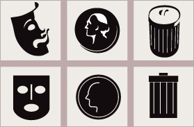
Compare the graphic translations (top) of three different objects presented here with examples of the same objects in the form of icons (bottom). Note the differences in construction, formal complexity, and conceptual overlay between the translation and its respective icon.

THE TRANSLATION LANGUAGE used to portray U.S. President Abraham Lincoln uses the interaction of light and shadow but renders these shapes with texture that suggests this image is a statue of Lincoln, further enhancing his status as a historical and cultural icon.
Metropolitan Group United States

THE REPETITION of concentric black arcs used to describe the butterfly’s wings alludes to their movement.
Sohyun Kim Iowa State University, United States
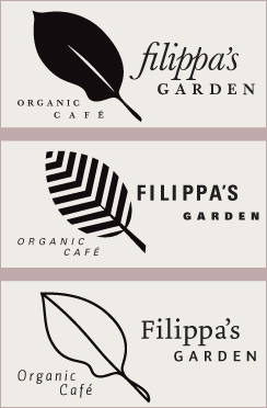
These leaf translations all share an overall quality of recognition—the selection of details communicates the idea “leaf” in its simplest, distilled entirety—but the language of the translation is changed in each, affording knowledge of different aspects of the idea “leaf” as well as specifically integrating a given translation with the formal qualities of different typographic options.
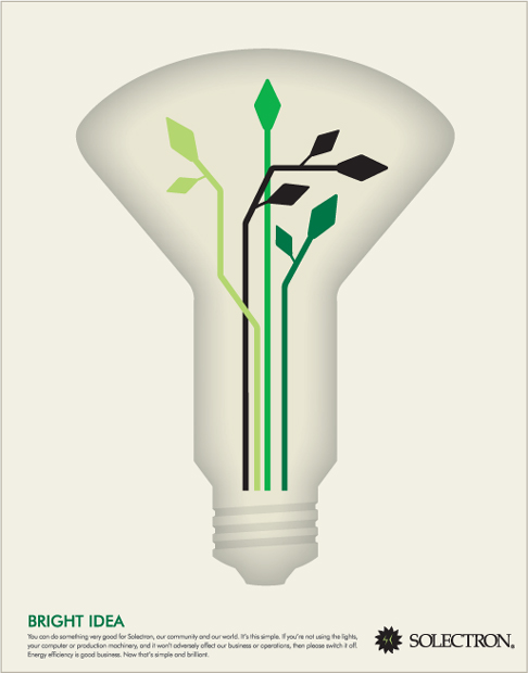
THE ICONIC OUTER FORM of the lightbulb is elevated to translation status by virtue of its indistinct, sparkling inner contour—a formal adjustment that suggests the bulb’s function. The filament is made symbolic through translation into circuits that also appear to represent leafy branches.
Templin Brink Design United States
IN A NOD TO illustration styles of the mid-twentieth century, this translation focuses on a simplified breakdown of light and shadow to clarify the form, while specific details—the bright buttons and the shine of the boot—add information.
Research Studios United Kingdom
![]()
Collage: Old and New Assembling graphic elements in a free pictorial composition, called “collage,” is a relatively recent development in illustration. It derives from the evolution of representation in fine art from depicting a strictly singular viewpoint through the construction of multiple viewpoints, or cubism, into incorporating multiple viewpoints of several, possibly physically unrelated, scenes or references. Collage was initially used to add two-dimensional printed or found material—labels, fabric, bits of newspaper, flat pieces of wood, and so on—into paintings, but, with the rise of photography as a medium, it quickly incorporated photographic images. Collaging photographic images, rather than illustrative images, is usually called “photomontage” and has been a popular method of illustration since the 1920s. ![]() Collage is a highly intuitive illustrative approach that takes into account not only the possibility of disparate subjects appearing in one space but also the nature of the combined elements—meaning how exactly they were made. Drawn and painted components can coexist with cut or torn pieces of textured paper, cropped images, scraps of fabric, parts of actual objects, and other drawn, painted, or printed material. Given that the pictorial space in a collage is abstract because of its fragmented construction, the designer must resolve compositional issues similar to those in any other image; but he or she must also address each item’s internal visual qualities—overall visual activity, flatness of color relative to texture, and recognizability of the source material (such as printed words or croppings of image).
Collage is a highly intuitive illustrative approach that takes into account not only the possibility of disparate subjects appearing in one space but also the nature of the combined elements—meaning how exactly they were made. Drawn and painted components can coexist with cut or torn pieces of textured paper, cropped images, scraps of fabric, parts of actual objects, and other drawn, painted, or printed material. Given that the pictorial space in a collage is abstract because of its fragmented construction, the designer must resolve compositional issues similar to those in any other image; but he or she must also address each item’s internal visual qualities—overall visual activity, flatness of color relative to texture, and recognizability of the source material (such as printed words or croppings of image). ![]() In particular, because the source components of a collage might be recognizable, the conceptual relationship between abstract and representational elements is extremely important. Integrating recognizable imagery, with its own subjects and messages, helps direct the message and adds degrees of meaning.
In particular, because the source components of a collage might be recognizable, the conceptual relationship between abstract and representational elements is extremely important. Integrating recognizable imagery, with its own subjects and messages, helps direct the message and adds degrees of meaning. ![]() Collage is still a common approach to illustration and page layout in the digital environment, where not only scanned images of found or hand-generated material can be combined with photographic material, but also where photographic effects such as transparency, multiple exposure, blurring, and silhouetting—techniques made possible only by the computer—can be investigated.
Collage is still a common approach to illustration and page layout in the digital environment, where not only scanned images of found or hand-generated material can be combined with photographic material, but also where photographic effects such as transparency, multiple exposure, blurring, and silhouetting—techniques made possible only by the computer—can be investigated.
COLLAGE OFFERS the designer of this book tremendous variety in formal qualities that add contrast and vitality to simple shapes. Typography, found engraving, paint marks, transparent overlays, and crinkled texture all combine to resolve the movement and spatial interaction of the composition.
Andreas Ortag Austria
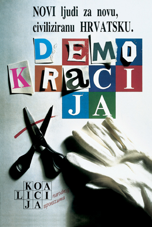
THE CUTOUT LETTERS of the word “democracy” hint at the political dialogue inherent in that social system. The addition of the scissors and the work gloves gives evidence to demo-cracy’s constructive nature and creates ambiguous scale and spatial relationships.
Studio International Croatia
Real, Unreal, and Otherwise
Media and Methods
Presentation Options
Content and Concept
Examples of collage show the varied possibilities in combining material: cut and torn paper; found text and images; three-dimensional material. Digital collage allows for photographic effects—transparency, blending, blurring, intricate silhouetting, and masking not possible with conventional, cut-and-paste techniques.
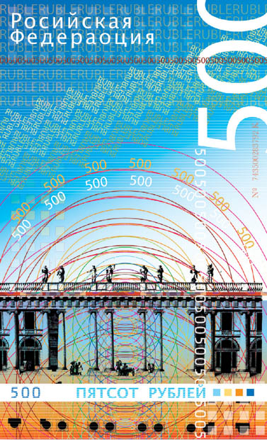
THIS PROPOSAL FOR a currency design digitally collages complex linear, textural, and typographic material, exploiting the computer’s ability to integrate complex color and transparency into the collage process.
Benjamin Myers Laguna College of Art and Design, United States
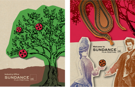
THE MEANING OF the elements brought together in a collage is important—and not just what the images portray but their medium of creation as well. In these two posters for a film festival, the film reel is iconic and modern and both times portrayed as an apple whose symbolic meaning is one of knowledge. The engraved images connote a connection to history, and the photographic transparencies and gradation changes suggest the element of light.
AdamsMorioka United States
In this study, the message changes as the content of the collage’s components are changed. As the content becomes more recognizable, the collage transmits a more literal—and, therefore, more specific—message.
![]()
Photography The “pure” photographic image has become the preeminent form of illustration in recent years. One reason for this might be the speed at which photographs transmit information—their realism and directness allow a viewer to enter the image and process it very quickly, rather than get distracted by abstract pictorial issues such as texture, medium, and composition. Access speed in imagery has become important because the flood of visual messages encountered by the average viewer requires images to compete robustly for attention. ![]() While composition plays an important role in the quality of the photographic image and its messaging potential, its presence as a mediating phenomenon is much harder to recognize and, therefore, is often overlooked on a conscious level by the viewer. This suggests another reason for the primacy of photographs as communicators: the fact of the image’s mediation (or manipulation)—through composition, selective focus, lighting, cropping, and other techniques—is secondary to the acceptance of photographic images as “real.” This provides the designer with an upper hand in persuasion, on behalf of a client, because the work of convincing a viewer that he or she can believe or trust the image is already well on its way to being achieved: “I saw it with my own eyes.”
While composition plays an important role in the quality of the photographic image and its messaging potential, its presence as a mediating phenomenon is much harder to recognize and, therefore, is often overlooked on a conscious level by the viewer. This suggests another reason for the primacy of photographs as communicators: the fact of the image’s mediation (or manipulation)—through composition, selective focus, lighting, cropping, and other techniques—is secondary to the acceptance of photographic images as “real.” This provides the designer with an upper hand in persuasion, on behalf of a client, because the work of convincing a viewer that he or she can believe or trust the image is already well on its way to being achieved: “I saw it with my own eyes.”![]() Today’s average viewer, although much more sophisticated and attuned to the deceptive potential of photography than viewers in previous generations—who were unfamiliar with photography’s use to disguise, manipulate, or enhance—is still much more likely to accept the content of a photograph as truth than that of an illustration, simply because the illustration is obviously contrived; the contrivance possible in a photograph is not so readily appreciated.
Today’s average viewer, although much more sophisticated and attuned to the deceptive potential of photography than viewers in previous generations—who were unfamiliar with photography’s use to disguise, manipulate, or enhance—is still much more likely to accept the content of a photograph as truth than that of an illustration, simply because the illustration is obviously contrived; the contrivance possible in a photograph is not so readily appreciated.
Real, Unreal, and Otherwise
Media and Methods
Presentation Options
Content and Concept
Because photographic images are so readily perceived as depictions of reality, the designer has incredible leeway in manipulating them without sacrificing believability. Despite the surreal situation depicted in the top image (A), for example, viewers will find it easy to accept the scene as credible. Further, this automatic assumption about the veracity of a photograph permits designers to evoke sensory experiences through their manipulation. Presenting a graphically exaggerated photograph of an object, as seen in the lower example (B), trades on its believability and the corrollary common understanding of its function to create an immediately recognizable aural experience.
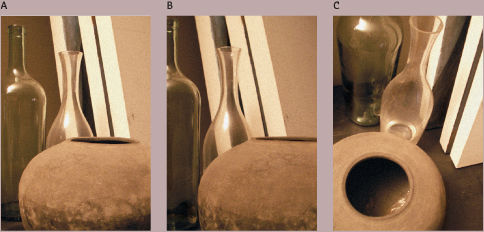
As with any other imagery, photographic content must be decisively composed. The photographer has two opportunities to control the image’s composition, however: first, within the frame of the camera’s viewfinder; and second, during the printing process in the darkroom (or in cropping a digital photograph using software). In this study, a minor shift in camera angle produces a variation on an already decisive composition of elements (B). Radically changing the viewpoint (C) creates a very different composition while retaining the identity of the content.
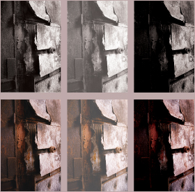
In photography, tonal range—the number and depth of gray values—is of particular concern. Traditionally, a “good-quality” photograph includes a clean, bright white; deep black; detail present within shadow areas; and a fluid range of grays in between. This same range, from darkest shadow to brightest highlight, also is desirable in color photographs. Pushing the tonal range toward generally brighter values decreases the contrast in the image and, to some degree, flattens it out; pushing the tonal range toward the shadow end also tends to flatten the image but increases contrast and causes highlight areas to become brighter and more pronounced. These effects of tonality shift are shown in the accompanying images, in both black-and-white and color. Note the contrast differences between corresponding images.
A PHOTOGRAPH IS considered well-shot and compelling when it exhibits a strong and varied tonal range—from deep shadow areas, into rich middle tones, and into bright highlights.
Martin Oostra Netherlands
A Pictorialization
LSD Spain
B Pictorialization
Jelena Drobac Serbia
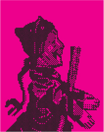
C Illustrative pictorialization
Sagmeister United States
D Ornamentation
Finest Magma Germany
Real, Unreal, and Otherwise
Media and Methods
Presentation Options
Content and Concept
Pictorialization When type becomes a representation of a real-world object, or takes on the qualities of something from actual experience, it has been pictorialized. In illustrative pictorialization, forms are drawn to appear to be made out of a recognizable material or to form part of a recognizable object.
Pictorial Inclusion Illustrative elements brought into the type forms so that they interact with its strokes or counterforms are said to be included. The type retains its essential form, but the pictorial matter is integrated by reversing out of the type or by replacing the counterforms within or between the letters.

Form Substitution Replacing a type form with a recognizable object or another symbol is referred to as a substitution. Many real-world objects share visual structure with letters. Circular objects are often substituted for a letter O, for example. Images aren’t the only elements that may be substituted for a type form—replacing a letter with another character is also a common strategy for substitution.

Form Alteration Changing the structural characteristics of type elements to communicate a non-literal idea is another strategy. Distorting letter shapes or proportions in an adjective, for example, can change the quality of its description. Such alteration may have a syntactic quality as well; setting the word “exaggerated” with distorted, oversized Gs exploits their sound and the word’s meaning.
![]()
Type as Image When a letter or word takes on pictorial qualities beyond those that define their form, they become images in their own right, and their semantic potential is enormous. Words that are also pictures fuse several kinds of understanding together: they are supersigns. As their meaning is assimilated through each perceptual filter—visual, emotional, intellectual—they assume the evocative stature of a symbol. Understanding on each level is immediate, and a viewer’s capacity to recall images makes such word-pictures highly effective in recalling the verbal content associated with them. ![]() As is true with so many aspects of strong typographic design, making type into an image means defining a simple relationship between the intrinsic form of the letters and some other visual idea. It is easy to get lost in the endless possibilities of type manipulation and obscure the visual message or dilute it. A viewer is likely to perceive and easily remember one strong message over five weaker ones—complexity is desirable, whereas complication is not.
As is true with so many aspects of strong typographic design, making type into an image means defining a simple relationship between the intrinsic form of the letters and some other visual idea. It is easy to get lost in the endless possibilities of type manipulation and obscure the visual message or dilute it. A viewer is likely to perceive and easily remember one strong message over five weaker ones—complexity is desirable, whereas complication is not. ![]() Type can be transformed into an image by using a variety of approaches. Each provides a different avenue of exploration, and several might be appropriate both to the desired communication and to the formal aspects of the type itself.
Type can be transformed into an image by using a variety of approaches. Each provides a different avenue of exploration, and several might be appropriate both to the desired communication and to the formal aspects of the type itself.

Ornamentation Typography can be transformed with ornaments—borders, dingbats, dots, lines, and geometric shapes—either structural or purely decorative. If the ornaments are symbolic in nature, they might take on the aspect of an inclusion and therefore be more strongly connected to the meaning of the word. An ornament’s style might affect the viewer’s sense of the historical context of the type; for example, a flourish or antique dingbat from a particular period.
Syntactic Deconstruction Changing the visual relationships between the parts of a word or a phrase is a deconstruction—the inherent structure of the word is called out or changed by being deformed—and the fact that it is related to the nature of meaning makes it a syntactic deconstruction. The cadence of the spoken word, the word’s syllables, the prefix, the suffix, and individual letters are all sources for deconstruction.
E Form alteration
Shinnoske, Inc. Japan
F Pictorial inclusion
MV Design United States
G Form deconstruction
Leonardo Sonnoli Italy
H Form substitution
Raidy Printing Group Lebanon
I Pictorial inclusions with form substitution
C+G Partners United States
J Illustrative pictorialization
Stereotype Design United States
K Form alteration
Mixer Switzerland
L Form alteration and substitution
Paone Design Associates United States
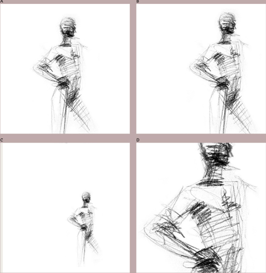
The meaning and emotionally evocative aspects of the subject change as a result of the variations’ respective compositions. When the figure is presented full-on and positioned with relatively even space around it (A), it is somewhat neutral, or more descriptive; the viewer is looking at the figure. Positioning the figure off center (B), so that the space around it is more dynamic, creates a sense of movement, but also anxiety. Composing the figure as an extremely small element within the format (C) isolates it, increases the viewer’s anxiety, and evokes a sense of alienation. Re-cropping the figure (D) so that it extends beyond all sides of the format makes it feel confrontational.
Real, Unreal, and Otherwise
Media and Methods
Presentation Options
Content and Concept
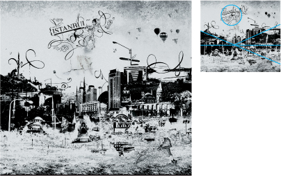
MASSING THE COLLAGED elements along a horizon lends concrete spatial realism to the scene despite its textural and abstract surface qualities. The massing of dark areas also forces a sense of perspective that draws the viewer inward; this triangulated movement is counteracted by the circular title cluster at the top.
2Fresh Turkey
![]()
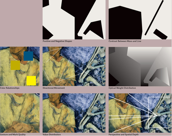
Strategies for Composition Composition in an illustrated image is of great concern. In creating a drawn image—especially one that is naturalistic—designers sometimes forget that they are not bound by the realities of arrangement imposed by the scene they are rendering. Using the formal relationships of figure and ground (see Chapter 1, page 37) on an abstract level—particularly within a realistic representation—contributes to the illustration’s power to communicate beyond the literal as well as helps engage the viewer and direct the eye. To simply place the subject in the central area of the illustration, without regard to the subject’s outer contour, tension, and contrast of negative space, and so on, prevents the illustration from being resolved and creates a static presentation. ![]() Just as cropping, position, relative sizes of elements, and contrast between linearity, mass, angles, and curves are intrinsic to the decisive layout of graphic elements and typography in a page environment, so too is their refinement within an illustrated image of utmost importance—and such considerations apply equally to photographed images.
Just as cropping, position, relative sizes of elements, and contrast between linearity, mass, angles, and curves are intrinsic to the decisive layout of graphic elements and typography in a page environment, so too is their refinement within an illustrated image of utmost importance—and such considerations apply equally to photographed images.
A representational image is deconstructed here to show the various compositional strategies—beyond the selection of subject and drawing medium—that the designer has considered in creating a well-resolved image. Each aspect of the composition reinforces the others.
![]()
Mixing Image Styles As with all compositional strategies, creating contrast among visual elements is key to surprising, refreshing, and enlivening layouts—and this is no less true for imagery. Aside from the big-picture contrasts afforded by changing sizes, shapes, color, and spatial arrangement, combining different modes of image offers an important and highly effective method for introducing contrast. Very textural, linear illustration, for instance, will contrast richly with photography—which tends to be continuous in tone—as well as with flat, solid graphic elements. ![]() It’s important that, while the different styles being combined contrast with each other decisively, they also share some visual qualities. Similar to how these other decisions radically affect communication (as well as compositional quality), the decisions a designer makes regarding image types—icon, symbol, textural drawing, lush photograph—affect communication as well. Each kind of image brings certain associations with it. Photographs are associated with documentation or assumed to represent reality. They are concrete, pure, environmental, and reliable. Illustrations are perceived as “created” and personal, readily showing their method of creation; they evoke fantasy, display impossible or ideal situations, and portray their content in a subjective way—even if they are naturalistic. Icons, symbols, and translations distill and simplify complicated, abstract ideas; they are most often associated with diagrams, navigation, and identification.
It’s important that, while the different styles being combined contrast with each other decisively, they also share some visual qualities. Similar to how these other decisions radically affect communication (as well as compositional quality), the decisions a designer makes regarding image types—icon, symbol, textural drawing, lush photograph—affect communication as well. Each kind of image brings certain associations with it. Photographs are associated with documentation or assumed to represent reality. They are concrete, pure, environmental, and reliable. Illustrations are perceived as “created” and personal, readily showing their method of creation; they evoke fantasy, display impossible or ideal situations, and portray their content in a subjective way—even if they are naturalistic. Icons, symbols, and translations distill and simplify complicated, abstract ideas; they are most often associated with diagrams, navigation, and identification. ![]() The designer must combine image styles selectively to support a given purpose, using the qualities of each to appropriately convey intended messages and interact with each other in a unified visual language that assimilates their differences as part of their logic.
The designer must combine image styles selectively to support a given purpose, using the qualities of each to appropriately convey intended messages and interact with each other in a unified visual language that assimilates their differences as part of their logic.
This concise (yet by no means comprehensive) table compares the same pair of subjects presented in various combinations of image mode. Evaluate each pairing for similarities, as well as disparities, in visual form; which combinations produce the most unified visual relationships, and which have the most contrast? Then consider which combinations might also be the most useful for comparing related concepts, and which offer the richest interplay of concept.
Real, Unreal, and Otherwise
Media and Methods
Presentation Options
Content and Concept
THE DECISION TO present the background image in illustrative form stems from the need to solve two problems. First, the designer wanted to avoid visual conflict between two photographs; the flatness of the illustration style visually separates it from the photograph and causes it to recede into the background. Second, the illustration enhances the temporal metaphor created by the two images—one showing a historical stage in cultural development, the other showing a developmental stage in education.
STIM Visual Communication United States
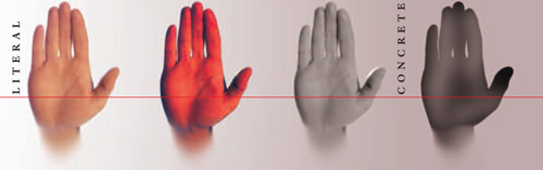
IMAGERY THAT LIES between the abstract and the concrete offers the viewer multiple levels of intrigue. Which is the real image in this poster detail; which is the abstraction? One kind of image, an icon or abstraction of sound waves as seen digitally, is used to create the lights and darks of a larger image: a face.
Mixer Switzerland
![]()
Selecting and Manipulating Content
A picture, as the saying goes, is worth a thousand words. Which words those are, however, is influenced by the designer and the photographer. The choice of the pictorial elements contained or not within a photograph, regardless of subject matter, has tremendous implications for meaning. Product catalogs—clothing catalogs, for example—often use imagery as a primary means of conveying concepts about lifestyle by showing people wearing the clothes in particular locations or situations. These images serve two purposes: they demonstrate the look of the clothes on real people, and they position the clothes relative to a lifestyle. Similarly, leaving certain facts out of a photograph might be just as influential as choosing what to include.
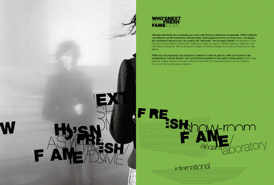
BY FOCUSING ON the indistinct reflection of the figure—and selectively cropping most of the solid figure’s back—the designer intensifies the mystery surrounding who will be the next famous designer.
Research Studios United Kingdom
Real, Unreal, and Otherwise
Media and Methods
Presentation Options
Content and Concept
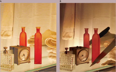
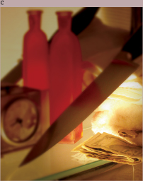
In this study of an image for a mystery novel’s cover, the information conveyed by the image is altered—sometimes subtly, and sometimes dramatically—as a result of changes in content and composition. In the first version of the image (A), the content and lighting provide neutral facts: the viewer is in a bathroom, probably at a hotel. In version (B), this content is clarified by the addition of a hotel key—but altered through the addition of the knife and money, signifying foul play. The dramatic change in lighting, from even to more extreme, as well as the unusual direction of the light, enhances the sinister mood and further hints that something is wrong: why is the light on the floor? In the final version (C), a closer viewpoint helps create a feeling of paranoia—what’s happening beyond the frame is unknown—and focuses attention on specific details: the time on the clock, the point of the knife, the money, and the hotel key. The manipulation of the light, as well as selective focus, helps draw attention to elements that may be relevant to the story.
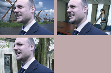
The same figure is shown here photographed from the same viewpoint in different environments. Although the figure is the focus of the message, the environment affects the tone of the message, adds secondary meaning, and positions the figure in different relationships to the viewer.
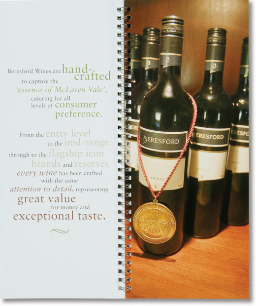
THE ARTIFICE of hanging an award medal around the neck of the bottle dramatizes the quality of the wine and personifies the bottle.
Voice Australia

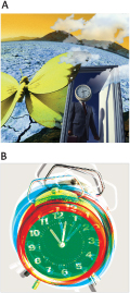
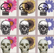
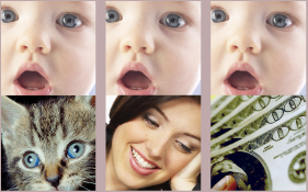
In addition to whatever semantic content an image offers, viewers will project meaning on the image themselves, based on personal, as well as cultural, experience. In the current American cultural context, viewers are likely to project meaning related to “illegal drug use,” even though the image doesn’t offer any explicit reason for doing so.
The same image changes semantically—in varying degrees—each time it’s paired with an image carrying its own semantic meaning. In the first pair, the semantic gap is quite small and the resulting narrative subtle. In the second pair, the semantic gap creates the same narrative but dramatically alters some assumptions about the meaning of the base image. The third pair offers a semantic gap that forces the narrative in a completely unrelated—and unexpected—direction.
Real, Unreal, and Otherwise
Media and Methods
Presentation Options
Content and Concept
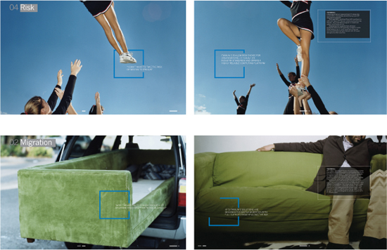
SEQUENCING RELATED IMAGES from one spread to the next creates distinct narratives in each set of two page spreads shown at left. In both sequences, the repetition of recognizable, remembered subject components—the cheerleader, the couch—creates narrative momentum: the viewer recognizes a kind of cause and effect because the same object appears in each step of the narrative. In the cheerleader sequence, the semantic or narrative gap is relatively small: the cheerleader is in flight and then is caught and is assumed safe. The gap in the couch sequence is more extreme: we don’t see the couch move from one location to the next, but it exists in a very different state in the second spread. We assume that it has been moved and now is being put to use.
Loewy United Kingdom
![]()
Narrative Interplay A single photograph delivers a powerful punch of “semantic” content—conceptual, verbal, and emotional meaning that likely includes messages that are not literally represented in its subject. Putting photographs together increases their semantic power and creates narrative, or storytelling; the instant two images can be compared, whether juxtaposed or arranged in sequence, a viewer will try to establish meaningful connections between them. ![]() Every photograph will influence any others around it, changing their individual meanings and contributing to a progression in narrative as a result. For example, a viewer might see an image of a biker and a second image of a man in a hospital bed and construct a story about a biking accident. Neither image represents this idea; the narrative occurs in the viewer’s mind. Even concluding that the man in the hospital bed is the same biker is an assumption the viewer creates. This distance between what is shown in two images and what the viewer makes happen internally is a kind of “semantic gap.” Substituting the hospital image for one that shows a biker at the finish line of a race changes the narrative. The semantic gap is smaller and therefore a more literal progression, but the gap exists because the viewer still assumes the two bikers are the same person.
Every photograph will influence any others around it, changing their individual meanings and contributing to a progression in narrative as a result. For example, a viewer might see an image of a biker and a second image of a man in a hospital bed and construct a story about a biking accident. Neither image represents this idea; the narrative occurs in the viewer’s mind. Even concluding that the man in the hospital bed is the same biker is an assumption the viewer creates. This distance between what is shown in two images and what the viewer makes happen internally is a kind of “semantic gap.” Substituting the hospital image for one that shows a biker at the finish line of a race changes the narrative. The semantic gap is smaller and therefore a more literal progression, but the gap exists because the viewer still assumes the two bikers are the same person. ![]() As more images are juxtaposed or added in sequence, their narrative reinforces itself based on the increasingly compounded assumptions initially made by viewers. By the time viewers have seen three or four images in a sequence, their capacity to avoid making assumptions decreases and they begin to look for meaning that completes the narrative they have constructed.
As more images are juxtaposed or added in sequence, their narrative reinforces itself based on the increasingly compounded assumptions initially made by viewers. By the time viewers have seen three or four images in a sequence, their capacity to avoid making assumptions decreases and they begin to look for meaning that completes the narrative they have constructed. ![]() This “narrative momentum” increases exponentially to the point that viewers will assume the semantic content of any image appearing later in the sequence must be related to that delivered earlier, even if details in the later image empirically contradict those of the first images.
This “narrative momentum” increases exponentially to the point that viewers will assume the semantic content of any image appearing later in the sequence must be related to that delivered earlier, even if details in the later image empirically contradict those of the first images.
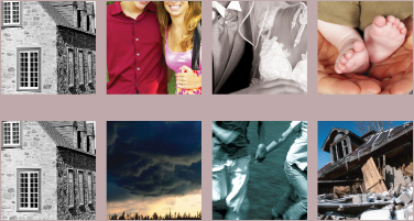
In this comparison of two sequences beginning with the same base image, the narratives are wildly different, but the narrative momentum of each concludes with assumptions that you, the viewer, has made that aren’t necessarily true. The rubble in the last image of the lower sequence is not, empirically, that of the building shown earlier in the sequence. What assumptions have been made about the information in the other sequence that cannot be proven true?
![]()
Word and Image: Brainwashing the Narrative Pictures greatly influence each others’ meaning . . . and words, even more so. As soon as words—concrete, accessible, seductive—appear next to an image, the image’s meaning is altered forever. Just as there is a semantic gap between images that are juxtaposed, so too is there such a gap between words and pictures. The gap might be relatively small, created by a direct, literal relationship between the two players. Or, the gap may be enormous, allowing the viewer to construct a narrative that is not readily apparent in the image when it appears by itself. The word “death,” placed next to an image of a skull, for example, produces a relatively small semantic gap—although not as small a gap as the word “skull” would produce. Consider, however, the same skull image adjacent to the word “love;” the tremendous distance between what is shown and what is told, in this case, presents a world of narrative possibility. ![]() Every image is susceptible to change when words appear next to it—so much so that a designer can easily alter the meaning of the same image over and over again by replacing the words that accompany it. In a sequential arrangement in which the same image is repeated in subsequent page spreads but is accompanied each time by a new word or phrase, new experience and knowledge about the image are introduced to the viewer. Once this knowledge is introduced, the viewer will no longer be able to consider the image in its original context. The meaning of the image, as far as the viewer is concerned, will be the composite meaning that includes all the information acquired through the sequence.
Every image is susceptible to change when words appear next to it—so much so that a designer can easily alter the meaning of the same image over and over again by replacing the words that accompany it. In a sequential arrangement in which the same image is repeated in subsequent page spreads but is accompanied each time by a new word or phrase, new experience and knowledge about the image are introduced to the viewer. Once this knowledge is introduced, the viewer will no longer be able to consider the image in its original context. The meaning of the image, as far as the viewer is concerned, will be the composite meaning that includes all the information acquired through the sequence. ![]() Not surprisingly, the ability of images to change the meanings of words is equally profound. This mutual brainwashing effected by words and images depends a great deal on the simultaneity of their presentation—that is, whether the two are shown together, at once, or in succession. If seen simultaneously, word and image will create a single message in which each reciprocally advances the message and neither is truly changed in the viewer’s mind—the message is a gestalt. However, if one is seen first and the other second, the viewer has a chance to construct meaning before being influenced. In such cases, the semantic gap is greatly widened and the impact of the change is more dramatic: the viewer, in the short time given to assimilate and become comfortable with the meaning of the first word or image he or she has seen, must give up his or her assumptions and alter his or her mindset.
Not surprisingly, the ability of images to change the meanings of words is equally profound. This mutual brainwashing effected by words and images depends a great deal on the simultaneity of their presentation—that is, whether the two are shown together, at once, or in succession. If seen simultaneously, word and image will create a single message in which each reciprocally advances the message and neither is truly changed in the viewer’s mind—the message is a gestalt. However, if one is seen first and the other second, the viewer has a chance to construct meaning before being influenced. In such cases, the semantic gap is greatly widened and the impact of the change is more dramatic: the viewer, in the short time given to assimilate and become comfortable with the meaning of the first word or image he or she has seen, must give up his or her assumptions and alter his or her mindset.
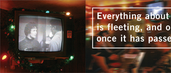
ALTHOUGH THE DIFFERENCE between the sharp photograph of the television and the blurred image that follows it creates a sense that the blurred image is a televised image, the juxta-position of the words creates a different—yet possibly related—meaning for the viewer.
Brett Yasko United States
Real, Unreal, and Otherwise
Media and Methods
Presentation Options
Content and Concept
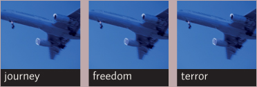
The same image is shown paired with different words. The semantic gap between word and image—the weird, nebulous area wherein the viewer can construct a narrative relationship between the two—is closer in the first pair, wider in the second, and extremely wide in the third.
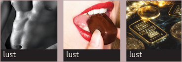
The brainwashing effect works in reverse. Here, the same word is paired with different images, and the change in semantic gap, as well as in the word’s meaning, becomes more pronounced.
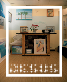
THE WORD AND the white frame focus attention on the grouping of furniture in the image, transforming it into an altar.
Finest Magma Germany
THE WORD AND THE IMAGE not only mutually enhance each other’s meaning, each depends on the other to communicate appropriately in context.
Paone Design Associates United States
TWO IMAGES OF the same person, juxtaposed with two different headlines, create a double identity for the man as teacher and companion.
Cobra Norway
![]()
Ever Metaphor? In writing and speech, a metaphor is an expression—a word or phrase—that refers to an unrelated idea, creating additional meaning. Images can be used in much the same way: a designer may present an image that means something else entirely, refers to a much broader concept, or combines concepts to evoke a third concept that is not explicit in either of the combinants. ![]() A symbol is a simple example (see page 171), but such “visual metaphors” may be very complex in their associations. One option for creating a visual metaphor is to use an object to define the form of something else—for example, laying out an invitation to a travel-themed fundraising event to look like an airline ticket, using the type styles, colors, and other visual details of such tickets as a source. Another option is to depict one thing behaving, pictorially, like another—presenting products in an urban cosmetics brochure, for instance, configured as a city skyline. Yet another possibility is to combine two or more seemingly unrelated images to suggest another form with its own meaning, implying some narrative connection between ideas—showing a corn cob with wheels to suggest the idea of plant-based auto fuel. A designer may also consider altering one image by having another act upon it—chopping the first image up, mixing it into a texture, pushing it out of the way, making it vibrate, and so on.
A symbol is a simple example (see page 171), but such “visual metaphors” may be very complex in their associations. One option for creating a visual metaphor is to use an object to define the form of something else—for example, laying out an invitation to a travel-themed fundraising event to look like an airline ticket, using the type styles, colors, and other visual details of such tickets as a source. Another option is to depict one thing behaving, pictorially, like another—presenting products in an urban cosmetics brochure, for instance, configured as a city skyline. Yet another possibility is to combine two or more seemingly unrelated images to suggest another form with its own meaning, implying some narrative connection between ideas—showing a corn cob with wheels to suggest the idea of plant-based auto fuel. A designer may also consider altering one image by having another act upon it—chopping the first image up, mixing it into a texture, pushing it out of the way, making it vibrate, and so on. ![]() There are as many ways to create metaphors as there are ideas and images—in short, an endless array limited only by imagination. While the literal content of images provides a baseline communication, a thoughtful designer can use images to evoke higher-level concepts above and beyond what they merely show. The result is a richer, more inventive, and more memorable and meaningful experience for the audience.
There are as many ways to create metaphors as there are ideas and images—in short, an endless array limited only by imagination. While the literal content of images provides a baseline communication, a thoughtful designer can use images to evoke higher-level concepts above and beyond what they merely show. The result is a richer, more inventive, and more memorable and meaningful experience for the audience.
THE TYPOGRAPHY of this card is a metaphor for the client’s area of practice.
Maris Bellack United States
PRESENTING THE NUMERALS as large architectural elements is a kind of photographic pictorialization that metaphorically supports the subject matter of the poster but also transforms the text—verbal ideas—into concrete constructions.
Studio International Croatia
Real, Unreal, and Otherwise
Media and Methods
Presentation Options
Content and Concept
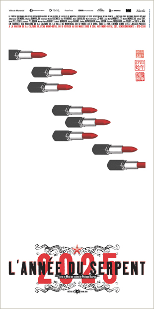
TRANSFORMING lipsticks into bullets creates a metaphorical dialogue about the nature of gender relations and aggression.
Thomas Csano Canada
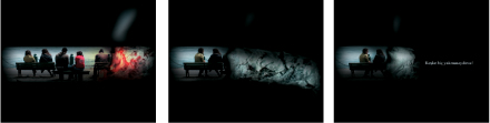
THE GRAPHIC SHAPE of the cigarette creates a focus of attention, letterboxing the action in this sequence of frames from a public service commercial. It also confines and traps the people, and then metaphorically burns them to ash.
2Fresh Turkey
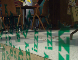
THE PLACEMENT of the repeated, green logotype at floor level along the glass wall creates a grassy environment, bringing the outdoors inside and vice versa.
BBK Studio United States
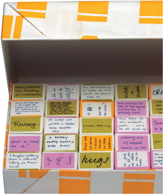
IN THIS CONCEPTUAL promotional piece, small cubes of sugar are wrapped in typography that expresses ideas about “sweetness” from a survey and packages them together.
Coma Netherlands