Twenty Rules for Making Good Design
When people talk about “good” or “bad” design, they’re referring to notions of quality that they’ve picked up from education and experience, and often from the experience of thousands of designers and critics before them. Sometimes these notions are aesthetic—“asymmetry is more beautiful than symmetry,” for example, or “a neutral typeface is all you need”—and sometimes strictly functional—for example, “don’t reverse a serif typeface from a solid background if it’s less than 10 points in size, because it’ll fill in.” Both kinds of observation are helpful in avoiding pitfalls and striving to achieve design solutions that aren’t hampered by irritating difficulties—to make every design be all that it can be. ![]() Every time an attempt is made to cite rules governing what constitutes quality, however, people are bound to get their underwear in a knot: “That’s so limiting!” To those people, I’ll say this: get over it.
Every time an attempt is made to cite rules governing what constitutes quality, however, people are bound to get their underwear in a knot: “That’s so limiting!” To those people, I’ll say this: get over it. ![]() Rules exist—especially the ones set forth here—as guidelines, based on accumulated experience from many sources. As such, rules always come with exceptions and can be broken at any time, but not without a consequence. The consequence of breaking one rule might mean reinforcing another, and it might mean true innovation, in the right context—a context in which a revelation occurs that, oddly enough, will establish yet another rule. This is how human creativity works.
Rules exist—especially the ones set forth here—as guidelines, based on accumulated experience from many sources. As such, rules always come with exceptions and can be broken at any time, but not without a consequence. The consequence of breaking one rule might mean reinforcing another, and it might mean true innovation, in the right context—a context in which a revelation occurs that, oddly enough, will establish yet another rule. This is how human creativity works. ![]() The importance of knowing which rules are considered important (at least historically), and why, is understanding the possible consequence of breaking them so that something unfortunate doesn’t happen out of ignorance. In addition, rules act as guides in helping to build a communal discussion about interpreting and evaluating creative work. If everything is “good,” then nothing really can be. Relativism is great, to a point, and then it just gets in the way of honest judgment; the result is a celebration of ubiquitous mediocrity.
The importance of knowing which rules are considered important (at least historically), and why, is understanding the possible consequence of breaking them so that something unfortunate doesn’t happen out of ignorance. In addition, rules act as guides in helping to build a communal discussion about interpreting and evaluating creative work. If everything is “good,” then nothing really can be. Relativism is great, to a point, and then it just gets in the way of honest judgment; the result is a celebration of ubiquitous mediocrity. ![]() By no means should any rule, including those that follow, be taken as Cosmic Law. If you’re unconvinced, simply turn to page 248, where breaking every rule in this book is advocated wholeheartedly. But these rules are a starting point, an excellent list of issues to consider while you work. In the end, you will decide how and when to apply the rules, or not, as well as understand the results of either course of action.
By no means should any rule, including those that follow, be taken as Cosmic Law. If you’re unconvinced, simply turn to page 248, where breaking every rule in this book is advocated wholeheartedly. But these rules are a starting point, an excellent list of issues to consider while you work. In the end, you will decide how and when to apply the rules, or not, as well as understand the results of either course of action.
1 Have a concept.
If there’s no message, no story, no idea, no narrative, or no useful experience to be had, it’s not graphic design. It doesn’t matter how amazing the thing is to look at; without a clear message, it’s an empty, although beautiful, shell. That’s about as complicated as this rule can get. Let’s move on.

A restrained layout presents high-end flatware products in lushly styled and photographed environments to help convey their quality. Materials in the photographs—in this case, a spiral of espresso beans—are subtly repeated in the typography of the copy.
Jelena Drobac Serbia

Zippered plastic bags with evidence stickers package the books in a series of detective novels. The books themselves become artifacts of the crime novels.
Thomas Csano Canada

As rich and decorative as this postcard is, every detail included communicates the upcoming experience at a fund-raiser whose theme is fantasy literature: the watch suggests urgency; the child on the rabbit is a nod to children’s stories; and the engravings and type texture create a mysterious space where participants’ memories come alive.
Lexicon Graphix and STIM Visual Communication United States
2 Communicate—don’t decorate.
Oooh . . . Neat! But what exactly is it? Somewhat related to Rule No. 1, this rule is about how you support the all-important concept. Form carries meaning, no matter how simple or abstract, and form that’s not right for a given message will communicate messages that you don’t intend—including the message that you don’t know how to choose forms that are meaningful for your audience or that you don’t care what’s meaningful for them. It’s all well and good to experiment with shapes and details and cool effects, but if you simply spackle them all over without considering what they mean and how they support or take away from the message, you end up with a jumbled mass of junk that no longer qualifies as design.

In this brochure, color and geometry provide the only visual forms to support a message about efficient business practice. The circular elements, though abstract, convey the meaning in the large quotation through their arrangement, size relationships, and color alone; no extras are needed.
And Partners United States
3 Speak with one visual voice.
Make all the parts talk to each other . . . in the same language. Take a look at everything, from the big picture down to the tiniest detail, and ask yourself: “Does everything relate harmoniously to everything else?” Good design assumes that the visual language of the piece—its internal logic—is resolved to address all its parts so that they reinforce, restate, and reference each other, not only in shape or weight or placement, but conceptually as well. As soon as one element seems out of place, or just a leftover that hasn’t been given any thought, it disconnects from the others, and the message is weakened.

Consistent use of color, typography, and application of the client’s logo across branded print communications create a unified presence for a business entity that will be identified easily among its competitors.
Templin Brink Design United States
4 Use two typeface families maximum. OK, maybe three.
Choose typefaces for specific purposes. In doing that, you’ll need to define what the purposes are, and you’re likely to find that there are only two or three purposes for text in a project. Because a change in type family usually signals a change in meaning or function—restrain yourself! A single type family with a variety of weights and italics should be enough all by itself; adding a second is nice for texture, but don’t overdo it. Too many typefaces are distracting and self-conscious and might confuse or tire the viewer.

This brochure for an orchestra balances exuberant abstract marks with quiet typography. Sans-serif text and notation provide ease of use while a stately serif adds warmth and contrast that visually complements the imagery.
Voice Australia


One type family alone can be used to great effect, as seen in this annual report. Employing only changes in size and color, the designer is able to present a clearly distinguished range of information with accessible, elegant restraint.
C. Harvey Graphic Design United States

Viewers are likely to see this theater poster’s title treatment from thirty strides away, followed by the theater’s name and, in a sequence of decreasing contrast, weight, and size, the rest of the information. These type treatments, along with the movement created by the title and the supporting shapes, help move the viewer’s eyes from most important item to least important.
Design Rudi Meyer France
5 Use the one-two punch!
Focus viewers’ attention on one important thing first, and then lead them through the rest. Once you capture the audience with a big shape, a startling image, a dramatic type treatment, or a daring color, steadily decrease the activity of each less important item in a logical way to help them get through it. This is establishing a “hierarchy”—the order in which you want them to look at the material—and it is essential for accessibility and ease of use. You’re designing the thing to grab the audience’s attention, to get them the information they need, and to help them remember it afterward. If there’s no clear focus to start with, you’ve already lost the battle.
6 Pick colors on purpose.
Don’t just grab some colors from out of the air. Know what the colors will do when you combine them and, more important, what they might mean to the audience. Color carries an abundance of psychological and emotional meaning, and this meaning can vary tremendously between cultural groups and even individuals. Color affects visual hierarchy, the legibility of type, and how people make connections between disparate items—sometimes called color coding—so choose wisely. Never assume that a certain color, or a combination of colors, is right for a particular job because of convention either. Blue for financial services, for example, is the standout color cliché of the past fifty years. Choose colors that are right, not those that are expected.

The muted rose tones in this fragrance packaging are feminine without being girlish; a slight shift toward brown in the typography creates a subtle, yet rich interaction. The complementary green-gold—almost a direct complement, but again, slightly off—presents rich contrast and hints at complexity and allure.
A10 Design Brazil
7 If you can do it with less, then do it.
This is a riff on an adage left over from Modernism, sometimes known as the “less is more” theory. It’s not so much an aesthetic dogma now as it is a bit of common sense: the more stuff jammed into a given space, the harder it is for the average bear to see what they’re supposed to be seeing. Plus, it’s trashy; anybody can load a bunch of stuff onto a dull message and pretend it’s a complex work of art, but there’s a big difference between “complicated” and “complex,” a state that often comes about in a simple context.
True art lies in the harmonic convergence of thoughtfulness and creativity applied to very little. If the concept and the form are truly beautiful, there can be very, very little of it to look at—without sacrificing a rich experience. Think about how much visual garbage gets thrown at someone walking down the street every day, and ask yourself: “Wouldn’t it make more sense to delete some of that mush in favor of something sleek, clear, and noticeable?” Make more meaning out of what’s there; don’t gunk it up. If the idea is clear without adding, putting more stuff in is just “gilding the lily;” if the idea isn’t there and it’s not visually interesting, adding to it is simply trying to make “a silk purse from a sow’s ear.”
Exquisite, decisive control of the minimal elements, alignments, and the spaces around and between them creates a dynamic, almost architectural space that is active and three-dimensional. . . which is all you really need for a brochure for a contemporary architecture firm.
LSD Spain
8 Negative space is magical—create it, don’t just fill it up!
It’s often said that negative space—sometimes called white space (even though there might not be any white around)—is more important than the stuff that’s in it. For the most part, this is true. Space calls attention to content, separates it from unrelated content around it, and gives the eyes a resting place. Negative space is just as much a shape that you have to deal with in a composition as positive shapes, whether pictures or type. When you don’t deal with it at all, negative space feels dead and disconnected from the visual material it surrounds. If the space gets filled up, the result is an oppressive presentation that no one will want to deal with. A lack of negative space overwhelms and confuses the audience, which is likely to get turned off.

From within a confined space enclosed by the visual angles created by headline and body text, hands stretch outward to release a symbolic butterfly; the image’s message is restated subtly by the compositional space with which it interacts.
Loewy United Kingdom
9 Treat the type as image, as though it’s just as important.
A sad commentary on typography today is that most of it fails in this regard: it’s either unimaginatively separated from photography in the notorious “headline/ picture/body-copy” strategy seen in countless ad campaigns during the past sixty years or insensitively slapped across images, in quirky typefaces, under the assumption that if it’s big and on top of the photo, it’s integrated. Time for a reality check! Type is visual material—made up of lines and dots and shapes and textures—that needs to relate compositionally to everything else included in the design, no matter how different they seem to be.

Both the style—bold, all upper-case, sans serif—and placement of the type help complete the composition of this poster. The title does double duty as landing strip and identifier; the logo itself appears as an airplane (with the bowl of the numeral 5 creating its propeller); the angular quality of the numerals is placed in direct contrast with the curves of the cloud forms; and the small text at the top draws the diagonal motion of the other elements upward and activates the space at the top of the poster.
C+G Partners United States
10 Type is only type when it’s friendly.
Make it legible, readable, or whatever you want to call it. It should go without saying that type that can’t be read has no purpose, but, unfortunately, it bears repeating. Yes, typography can be expressive; yes, typography can be manipulated for inventive interconnection of structural elements within language; and yes, typography can resonate with its subcultural audience and reference this or that pop-cultural zeitgeist. Whatever! It must still transmit information. Back when typography was treated very rigidly and always in good taste, Beatrice Ward, an English type critic, likened it to a crystal wine goblet—a transparent vessel designed for utmost clarity, not for looks. Beatrice might be dead and her crystal goblet might have been replaced by the far less stuffy jelly jar, but the jelly jar still lets you see what kind of wine you’re drinking.


Dramatic changes in type size, color blocking, and attention to details such as syllabic breaks and open leading make the type in these brochure spreads not only interesting but also easily read and easy to follow. Bars of color and bold weights help call out important information.
Cobra Norway
11 Be universal; remember that it’s not about you.
Talking to oneself is the domain of the fine artist. Being universal is the domain of the designer. A very large audience, not a few people who are “in the know,” has to know what you mean with those shapes, that color, and that image you chose. Graphic design comes with an agenda—sometimes a small agenda, such as getting people to come to a film festival, and sometimes a big agenda, such as helping people find their way out of a burning building. The instant you forget—or shamelessly ignore—this little fact, you jeopardize the clarity of the message. It’s not likely someone will die as a result, so let’s put this in perspective. The worst that could happen is that millions of people will think your poster was really cool—although they can’t remember what it was about, and your film festival clients won’t hire you to achieve self-fulfillment on their dime again. But consider if you had been working on a way-finding system, and the neat inks you insisted on didn’t have enough contrast in a smoky environment. As a result, twelve people asphyxiated trying to get out of the building.

One of the reasons you like this poster so much is that it speaks to our common knowledge so clearly; it feels almost as if it hasn’t been designed. A hot-colored circle floating over a cool blue horizon and punctuated by a refreshing yellow field pretty much explains itself.
AdamsMorioka United States
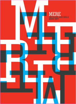
12 Squish and separate.
Create contrasts in density and rhythm by pulling some material closer together and pushing other material further apart. Be rhythmic about it. Give the spaces between things a pulse by making some tighter and some looser unless, of course, you’re trying to make something dull, lifeless, and uninteresting. In that case, everything should be about the same size, weight, color, and distance from everything else. Nothing kills a great idea like a dull layout that has no tension. “Without contrast,” Paul Rand once said, “you’re dead.”

Every space in this poster is a different size; every element has a unique relationship with every other. Some material is dense and linear while other areas are open and round. Angles are juxtaposed tensely with curves, large masses with small. The result is a sequence of visual contrasts that engage the eyes by pushing and pulling at each other.
Frost Design Australia
13 Distribute light and dark like firecrackers and the rising sun.
Take a suggestion from the world of photography: make sure there’s a wide range of tonal value. Renowned landscape photographer Ansel Adams advocated a nine-zone system of tonal value, suggesting that any photograph without all nine zones didn’t have enough, and therefore didn’t live up to its potential. Furthermore, don’t spread out the tonal range all over the place. Concentrate areas of extreme dark and light in separate places; create explosions of luminosity and deep undercurrents of darkness. Counter these with subtler transitions between related values. Above all, make distinctions between light and dark noticeable and clear.

Soft, rippling transitions from deep black to luminous blue provide a sensuous backdrop for the bright, sparkling typography in this poster. By changing the sizes of type clusters, as well as the spaces between them, the designer also is able to introduce transitions in value that correspond to similar transitions in the image.
Paone Design Associates United States
14 Be decisive. Do it on purpose—or don’t do it at all.
Make a thing appear one way or another. A great deal of the process of understanding visual material is the ability to distinguish the difference between things. It’s a strategy left over from millennia of surviving in the bush by knowing that the big object in front of us is a large rock and not an attacking predator. Place visual material with confidence, and make clear decisions about size, arrangement, distance from other material, and so on. Decisiveness makes a viewer more likely to believe that the message means what it says; weakness or insecurity in the composition opens up all kinds of nasty thoughts in the viewer, even if he or she is intellectually unaware of the source—something feels off, unresolved, or not quite right. Suddenly, the viewer is trying to figure out what the issue is and not paying attention to the message itself. And that we just can’t have.

Every attribute of the relatively simple material in this poster has been clearly and confidently resolved. The differences in the type sizes are unmistakable, as are the differences in their color, and the type’s positioning aligns with strong vertical and horizontal structures in the image. The resulting negative spaces are visually dynamic.
StressDesign United States
15 Measure with your eyes: design is visual.
A thing is what it looks like—make it look the way it’s supposed to look. The eyes are funny things; they’re often fooled by visual stimuli, the notorious optical illusion. Oddly, optical illusions account for ninety percent of the visual logic of composition. Horizontal lines, for example, appear to drop in space and have to be adjusted upward to appear centered from top to bottom. Circular forms always look smaller than square forms that are mathematically the same height, so they must be faked a little larger than the square forms to appear the same size. Make decisions on behalf of your audience: Are the two elements the same size or not? Is the form touching the edge of the format or not? Are two elements aligning or not? If you intend one element to align with another, do it by eye—don’t measure. If the viewer perceives the two items as aligning, it will assume they actually do. If you align two items by measuring and they don’t look like they do, it doesn’t matter that they’re really lined up. The viewer will see two items that look like they should have aligned and will remember that some sloppy designer forgot to make sure that they did.

The rough, visceral quality of this page spread belies the purposeful placement of forms. The designer has very objectively perceived the visual presence—weight, texture, movement, angularity, transparency, contour—of each element and has brought them into alignment and relationships that are harmonious and resolved.
Andreas Ortag Austria
16 Create images—don’t scavenge.
Make what you need, and make it the best you can—or pay someone else to do it for you. Nothing is more banal or meaningless than a commonly used instance of stock photography that shows up everywhere. Try not to rely on what already exists, even though it might be cheaper or easier. Sometimes a simpler and more meaningful solution is no further away than a couple of dots and lines, or a personalized scribble that—while not slick, glossy, and full color (and lesser in meaning for your project because it was seen last week in a shopping-mall’s newspaper ad, a billboard for used cars, or male enhancement product pack-aging)—might connect powerfully with the audience. Plus, you can say, quite proudly, that you did it all yourself.

Commissioning illustration allows a designer to completely customize the imagery for a project. Plus, illustration—whether conventional drawing and painting or digital—need not be bound by the laws of nature.
Cyr Studio United States

All it takes to make an image new and original—even a bad one provided by a client—is a little manipulation. Whatever the source of this portrait, it’s been given a new, specific life with a color change and a little texture.
Mutabor Germany

No photography or illustration available? Can’t draw? No sweat. A designer with a strong understanding of how abstract form communicates—and what simple means (here, drawing software and a blur filter)—can transform uncomplicated visual elements into strikingly original and conceptually appropriate images.
Clemens Théobert Schedler Austria
17 Ignore fashion. Seriously.
Granted, this can be a tricky rule to follow because your job is to communicate to your audience who, unless time travel is now available to the public, exists today and only today, in the present. These people in the present have particular tastes and expectations about how they like their communications to look. Other designers around you are getting significant attention because their work is so now and cool and with it. Forget that. Look at it this way: if you design the project and style it around the meaning, not the audience’s expectations of current stylistic conceits, several good things will come out of it. First, it’s likely to mean more to the audience and be useful a lot longer, so it won’t end up in a landfill as quickly, polluting the ecosystem. Second, it might even have the staying power to qualify for the history books. Nobody looks at the Pantheon, designed almost two thousand years ago, for example, and says, “Ewww, that’s like, so First Century.”

This poster defies nearly all trends currently in vogue: it’s neither photographic nor illustrative; it’s not flashy or glamorous; it’s not technically complex; it doesn’t look digital; and it’s very nearly symmetrical. But it conveys energy and movement, and optically it’s very powerful.
Apeloig Design France

Although illustration is enjoying a rise in popularity, this particular illustration is not what’s popular: flat, posterized, clearly digital images with complex texture and detail. This image, in honor of its subject, is nearly handmade in appearance and harks back to an earlier time.
Ames Brothers United States
18 Move it! Static equals dull.
People make a weird assumption about two-dimensional visual stuff, and that is—it’s flat and lifeless! Go figure. This is why painters and designers have been working like dogs for 1,000 years to create the illusion of three-dimensional movement on a flat surface: to fool the viewer into having a moving experience! If a layout is clearly flat and fails to offer a sense of movement or spatial interaction, a state that is relatively easy to achieve, the viewer’s brain is likely to be uninterested enough to hang out and see what the message is. Static compositions say, “You’ve figured me out . . . so walk away, nothing to see here.”
The extremely large type and texture in the background appear to pull to the left against the edge of the page while the white block appears to move to the right. The left alignment of the text block creates a vertical movement . . . never mind the ambiguous foreground and background state.
Coma Netherlands
By positioning the letters at staggered intervals around the format and then rotating the formation in the background, the designer creates not only a dynamic set of positive and negative intervals but also optical motion and a perception of shifting between background and foreground.
Stereotype Design United States
19 Look to history, but don’t repeat it.
The design of the past has its place. It’s inspiring and important for a designer to consider how communication strategies and aesthetics have changed over time, and to understand how his or her own work fits into the continuum of thought and practice. Even more useful is the realization that somewhere along the way, another designer faced a similar problem... and solved it. To slavishly reproduce a particular period style because it’s really cool—or worse, because the clients think that their “Circus Party” invitation should look like an 1846 wood-type poster—is just unacceptable. Learn from the work of others, but do your own work.

By appropriating the coarse, slightly washed-out imagery of Communist propaganda posters, but adjusting the cropping and adding other kinds of elements, this book cover creates something new while drawing on the power of history to help communicate the magnitude of the subject.
Red Canoe United States

This cover for a reissued version of a significant art-movement text represents the energy and irreverence of the period and its style without mimicking it; instead of repetition and overlap, hallmarks of the style, this type is distorted and deformed.
Marek Okon Canada
20 Symmetry is the ultimate evil.
It’s true that symmetry occurs in nature—just look at our bodies—but that doesn’t mean it’s a good strategy for designing. Symmetrical visual arrangements are generally static and offer little movement (see Rule No. 18). Worse, symmetrical arrangements make integrating asymmetrical image material awkward, and limit a designer’s flexibility in pacing and dealing with content that doesn’t quite want to fit into the symmetrical mold. Last, but certainly not least: symmetry shouts very loudly that the designer is lazy and likes to let the format do the designing. The format has a center axis, and clearly everyone can see that. Why let the format tell you what to do? You tell the format who’s boss.

Every letter has its own shape, and, at such a tremendous size in this poster, those shapes are all exaggerated; as a result, the repeated three-letter structure becomes intricate and asymmetrical as the viewer is able to appreciate the varied contours of black space around the forms. A dynamically irregular spatter of red dots introduces random movement and a sense of unexpected violence.
Studio International Croatia

Although the black figure essentially is centered in the format, it participates in an asymmetrical arrangement of forms—both positive and negative—that moves compositional elements in a diagonal breaking of space from upper left to lower right. The line of type at the lower left enhances the asymmetrical quality of the arrangement.
Dochdesign Germany