Chapter 5
Putting it All Together
Visual Logic
Structuring the Page
Intuitive Arrangement
Integrating Type and Image
Layout Systems
There is no recipe for a good layout. What must be maintained is a feeling of change and contrast.
Alexey Brodovitch
Graphic designer and art director
Lana Rigsby
Principal, Rigsby Design
Visual Logic
Structuring the Page
Intuitive Arrangement
Integrating Type and Image
Layout Systems
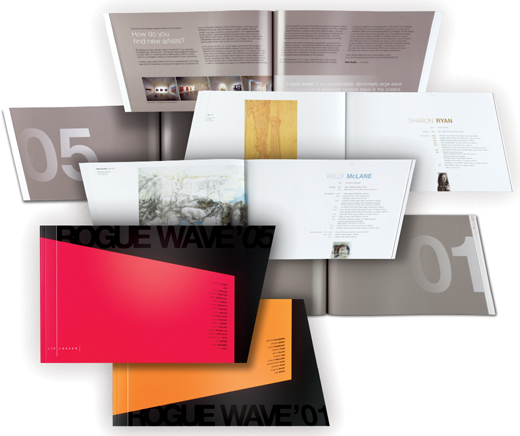
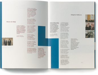
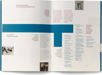
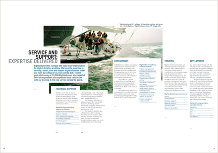
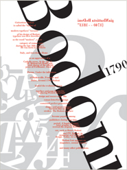
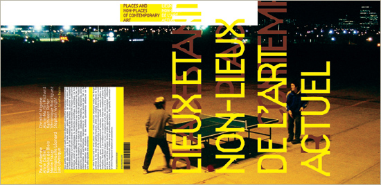
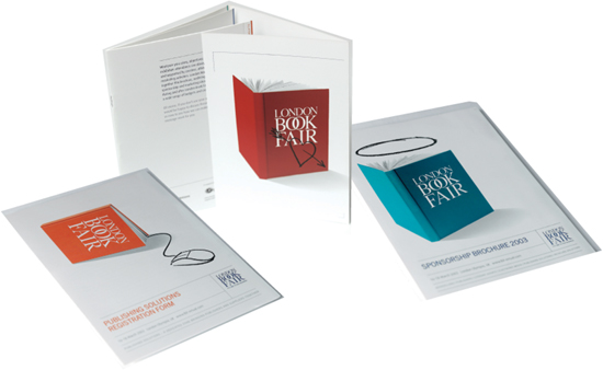
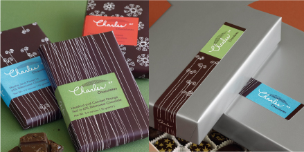
EVERY ASPECT OF THIS branded literature system consistently reinforces a language of movement and shape while maintaining contrast and flexibility: the angled die-cuts of brochure pages and folder covers; the slanted alignment of text columns; the use of large-scale numerals and titling in varnish; the selection of type styles; and the austere color palette of black, silver, magenta, and orange.
344 Design United States
Visual Logic: How Everything Talks to Each Other Design solutions really come together when all the components are clearly interrelated. First off, a format’s proportions should begin to evoke appropriate feelings in the viewer—intimate, expansive, or confrontational—right from the moment they come in contact with the work. Content organization should respond to the format, as well as the requirements of the information presented; the selection of images and type styles should support each other stylistically, reciprocally reinforcing mood and concept. The arrangement of type and images should respond to each other visually, and their composition within the format space should again augment the emotions or associations that are more literally apparent in the content of both images and writing.  Furthermore, the pacing and sequencing of the content should respond to emphases within the content and create visual highs and lows—alternations of sequences that are dramatic and sedate—to continually refresh the viewer. Thoughtful consideration of typographic and abstract details should be apparent in the way they refer to large-scale compositional elements or spatial interaction.
Last, the physical, experiential quality of the work should be considered in the context of its production medium, whether electronic or printed and bound. When a designer sees the project through in all these aspects, the result is a powerful totality of experience: one that is evocative, emotional, useful, enjoyable, and memorable.
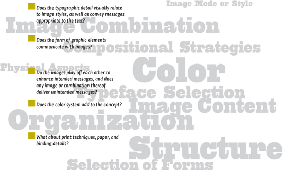
A Visual Logic Checklist It’s important to consider the big picture of a design solution—the concept and overall layout—in light of its internal components to ensure all of its aspects are interrelated in supporting that concept. At each stage of development, evaluate each aspect in combination.
Organizational Strategies: Structure and Intuition Figuring out what goes where, in what order, and how it should be arranged from a compositional standpoint demands a lot from a designer. A client might supply some content in a particular order, but the designer really has to understand the content and, potentially, reorder it when necessary to improve its clarity or enhance its conceptual aspects. On a visual level, how much appears at any given time and the actual arrangement are decisions a designer alone must make. As the sequence and pacing of the content is being planned, the designer must also address the specific visual relationships of text and image. How structured, neutral, or documentary does the presentation need to be? What happens if the material is organized in a less structured way? How are the images and the text visually related, and how do they interact within the format? Answering these questions might involve both analytical and intuitive study of the content to see how different methods help or hinder the presentation. A designer must often switch between these two extremes—messing around with the material to see what’s possible, analyzing the visual and conceptual clarity of the results, and then returning to freer exploration to test whether the analysis is accurate or useful. Some basic organizational methods have become common in graphic design practice, especially in regard to typography; some are structurally based, and others respond more intuitively to conceptual and tactile qualities.
Visual Logic
Structuring the Page
Intuitive Arrangement
Integrating Type and Image
Layout Systems
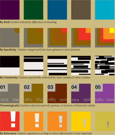
Strategies for organizing content involve sorting the material into manageable parts that are related to each other: by kind; by part to whole; by frequency; by complexity; chronologically; and by relevance. Some strategies are often applied to particular kinds of publications because of convention—usually driven by the expectations of the audience. Newspapers, for example, exhibit an organizational strategy of part to whole based on local relevance; packaging divides information among its sides based on complexity.
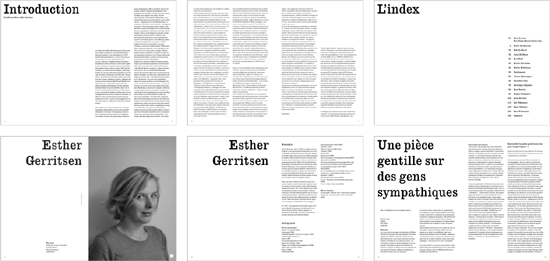
STRUCTURED ON A two-column grid, these sample pages from a catalog presenting Dutch playwrights organize the content into sections whose internal structure repeats. The introduction and index of writers follow a similar text-based scheme, with a bold heading used to introduce each section. Within each given writer’s section, the bold headline strategy is maintained, and the section is broken down into parts: an image spread of the writer; a biography spread; and then consecutive spreads as needed for a sample of that writer’s work.
Martin Oostra Netherlands
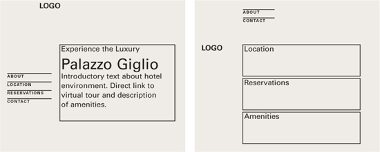
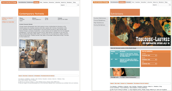
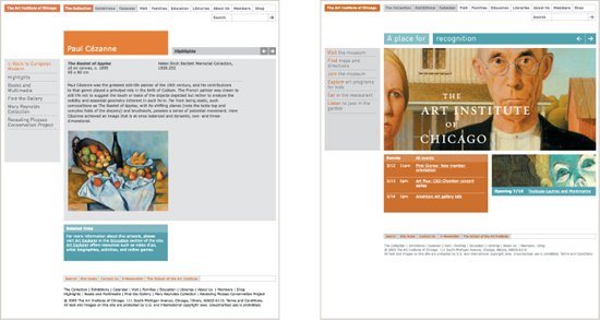
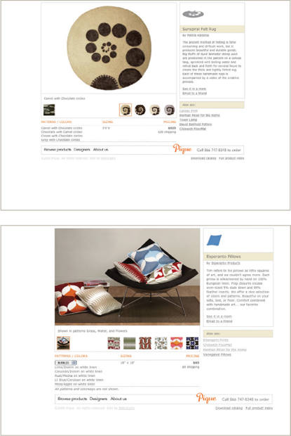
Sorting the same content in different ways might call attention to specific parts over others and thereby affect the emphasis of these specific parts. Whether the content is a website or a printed brochure or book, convention generally dictates that material that comes first should be assumed to have greater significance. Adjusting the order to create a narrative flow that enhances focus on specific content changes the experience, as seen here in these hypothetical examples: alternate options for a hotel’s website navigation, shown as wireframe models for the home page.
Structure: The Grid System All design work involves problem solving on both visual and organizational levels. Pictures, fields of text, headlines, and tabular data: all these pieces must come together to communicate. A grid is simply one approach to achieving this goal. Grids can be loose and organic, or they can be rigorous and mechanical. To some designers, the grid represents an inherent part of the craft of designing, the same way joinery in furniture making is a part of that particular craft. The history of the grid has been part of an evolution in how graphic designers think about designing, as well as a response to specific communication and production problems that needed to be solved. Among other things, a grid is suited to helping solve communication problems of great complexity. The benefits of working with a grid are simple: clarity, efficiency, economy, and continuity. Before anything else, a grid introduces systematic order to a layout, helps distinguish between various types of information, and eases a user’s navigation through them. Using a grid permits a designer to lay out enormous amounts of information in substantially less time because many design considerations have been addressed in building the grid’s structure. The grid also allows many individuals to collaborate on the same project or on a series of related projects over time, without compromising established visual qualities from one instance to the next.
Visual Logic
Structuring the Page
Intuitive Arrangement
Integrating Type and Image
Layout Systems
THE TYPOGRAPHY, IMAGES, AND GRAPHIC ELEMENTS are arranged across a structure of four columns. The grid structure creates unity and flexibility among the material, helping to accommodate various amounts or mixtures of content and allowing the designer to lay out the content in variations so that the sequence of pages won’t become monotonous. The resulting negative spaces, as well as the type, appear interrelated because they all are based on the same proportions.
LSD Spain
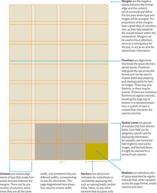
Grid Anatomy A grid consists of a distinct set of alignment-based relationships that serve as guides for distributing elements across a format. Every grid contains the same basic parts, no matter how complex the grid becomes. These parts can be combined as needed or omitted from the overall structure at the designer’s discretion, and the proportions of the parts is similarly dependent on the designer’s needs. This book, for example, is structured on a 17-column grid to address several issues: an optimal column width for running text and captions; a static navigation system at the far left; consistent proportions between diagrams and caption text-widths; and flexibility to size and arrange contributor design projects. While text-and diagram widths necessitate a greater number of columns left-to-right, the need for flexibility in positioning dictates that no flowlines be established top-to-bottom.
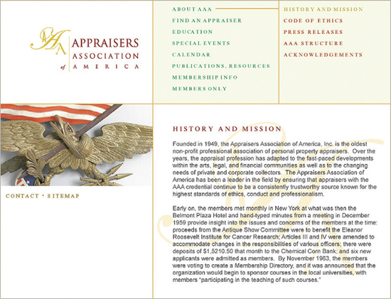
THE THREE-COLUMN GRID in this website portions out content in a clear hierarchy that users can navigate easily. The left column is reserved for branding and imagery; the upper portions of columns two and three define a spatial zone that contains major A-Level navigation and supporting B-Level navigation, respectively. Color changes in the text highlight the user’s location in the navigation hierarchy. The bottom portions of columns two and three define a second spatial zone, combined for primary text content.
C. Harvey Graphic Design United States
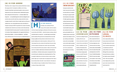
Column Grid Information that is discontinuous benefits from being organized into an arrangement of vertical columns. Because the columns can be dependent on each other for running text, independent for small blocks of text, or crossed over to make wider columns, the column grid is very flexible. For example, some columns might be reserved for running text and large images, while captions might be placed in an adjacent column. This arrangement clearly separates the captions from the primary material but maintains them in a direct relationship. The width of the columns depends, as noted, on the size of the running text type. If the column is too narrow, excessive hyphenation is likely, and a uniform rag will be difficult to achieve. At the other extreme, a column that is too wide will make it difficult for the reader to find the beginnings of sequential lines. By studying the effects of changing the type size, leading, and spacing, the designer will be able to find a comfortable column width. Traditionally, the gutter between columns is given a measure, x, and the margins are usually assigned a width of twice the gutter measure, or 2x. Margins wider than the column gutters focus the eye inward, easing tension between the column edge and the edge of the format. This is simply a guide, however, and designers are free to adjust the column-to-margin ratio as they see fit. In a column grid, there is also a subordinate structure. These are the flow-lines: vertical intervals that allow the designer to accommodate unusual breaks in text or images on the page and create horizontal bands across the format. The hangline is one kind of flowline: it defines the vertical distance from the top of the format at which column text will always start. A flowline near the top of the page might establish a position for running headers, pagination, or section dividers. Additional flowlines might designate areas for images (specifically) or different kinds of concurrent running text, such as a timeline, a sidebar, or a callout.
Visual Logic
Structuring the Page
Intuitive Arrangement
Integrating Type and Image
Layout Systems
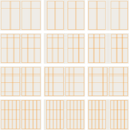
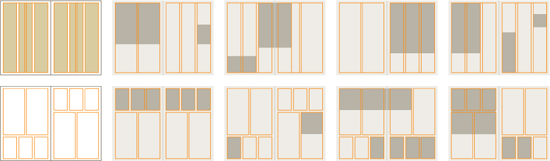
Any number of columns can be used, depending on the format size and the complexity of the content. Flowlines define horizontal alignments in increments from the top of the page. Within a column grid, a designer has a great deal of flexibility for arranging type and image material. Two- and three-column grids, among the most common used in designing publications, provide great potential for varying typographic width across the columns, integrating images, and differentiating columns with color. Regardless of the number of columns, the body and margins may be related asymmetrically or symmetrically (mirrored), as seen in the fourth column of examples.
A THREE-COLUMN GRID is used to separate hierarchic components, based on the requirements of the text, relative to each kind of text’s importance and optimal reading comfort.
Robert Rytter & Associates United States
THE DESIGNER USES a four-column grid in different ways from page to page. On the left-hand page, longer, more involved text is spread across two-column widths. On the right-hand page, shorter text occupies individual columns, but images might occupy single or multiple column widths.
Barbara Ferguson United States
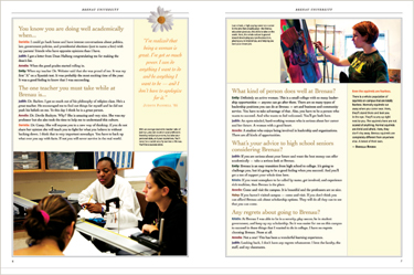
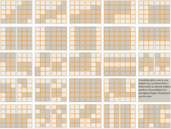
Modular Grid Extremely complex projects require even more precise control, and, in this situation, a modular grid might be the most useful choice. A modular grid is essentially a column grid with a large number of horizontal flowlines that subdivide the columns into rows, creating a matrix of cells called modules. Each module defines a small chunk of informational space. Grouped together, these modules define areas called spatial zones to which specific roles can be assigned. The degree of control within the grid depends on the size of the modules. Smaller modules provide more flexibility and greater precision, but too many subdivisions can become confusing or redundant. A modular grid also lends itself to the design of tabular information. The rigorous repetition of the module helps to standardize tables or forms and integrate them with the text and image material. Aside from its practical uses, the modular grid accords a conceptual aesthetic. Between the 1950s and 1980s, the modular grid became associated with ideal social or political order. These ideals have their roots in the rationalist thinking of both the Bauhaus and Swiss International Style, which celebrates objectivity, order, and clarity. Designers who embrace these ideals sometimes use modular grids to convey this additional meaning. How does a designer determine the module’s proportions? The module could be the width and depth of one average paragraph of the primary text at a given size. Modules can be vertical or horizontal in proportion, and this decision can be related to the kinds of images being organized or to the desired stress the designer feels is appropriate. The margin proportions must be considered simultaneously in relation to the modules and the gutters that separate them. Modular grids are often used to coordinate extensive publication systems. If the designer has the opportunity to consider all the materials that are to be produced within a system, the formats can become an outgrowth of the module or vice versa. By regulating the proportions of the formats and the module in relation to each other, the designer might simultaneously be able to harmonize the formats and ensure they are produced most economically.
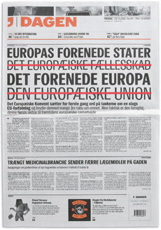
MOST NEWSPAPERS, including this one from Denmark, are constructed on a precise modular grid, which allows for rapid and varied changes in content layout. The text is often situated across multiple column widths, depending on the size and importance of the story; the underlying column width can be found in the negative space at the bottom of the page, between the left-hand paragraph and the square inset image. The depth of the module is defined by the height of the masthead. Note how this proportion repeats in various instances farther down the page.
E-Types Denmark
Visual Logic
Structuring the Page
Intuitive Arrangement
Integrating Type and Image
Layout Systems
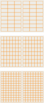
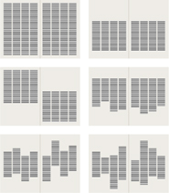
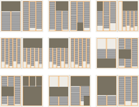
Here, a variety of modular grid structures shows a range of proportions and precision. The greater the number of modules, the more precise the layout might be; but too many increments become redundant. Variations on the number and stress of the module achieve different kinds of presence for the typographic and image content.
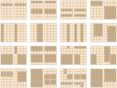
The increased potential for arranging and proportioning content in a modular grid is seen here. Combining modules into zones for images (the gray areas) ensures variety as well as a unified relationship with text.
A SIX-COLUMN MODULAR GRID helps integrate text and images of various sizes to provide contrast and variation but without sacrificing the harmonic proportional unity of the panels.
Clemens Théobert Schedler Austria
Structuring the Page
Intuitive Arrangement
Integrating Type and Image
Layout Systems
TWO OPPOSING GRIDS are combined in this book to create conflict between text and image areas. The overlap of text and the pushing and pulling of image proportions create a collage-like atmosphere that is edgy and intuitive in feeling.
Coma Netherlands
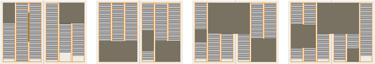
Depending on the complexity of the publication, a designer might find that multiple grids are needed to organize the content, within sections or even a single page spread. Working with several grids together can take several directions. First, a grid with a large number of precise intervals might be developed as a basis for a variety of grids used for particular information. For example, a grid with twenty columns to a page might be used to order a five-column, four-column, two-column, and three-column grid with a larger margin for captions in a specific section. In this kind of approach, all the column widths will share a proportional relationship that will also be noticeable in how images relate to text set in these various widths. Another option is simply to use two, three, or more different grids that share outer margins, allowing them to be relatively arbitrary in their relationship to each other. In this approach, the alternation of the grids will be pronounced, since their internal proportions are unrelated; the resulting differences in visual logic between layouts using different grids can make very clear distinctions between sections or types of content. A third option is to combine grids on a single page but to separate them into different areas. For example, primary text or images might occupy a three-column grid in the upper two-thirds of the page, but a five-column grid might hold captions or other secondary content in the lower third of the page.
Using a compound grid builds a certain rhythm into a publication. As the grid changes to accommodate different information, the rhythm of each grid’s occurrence becomes an integral part of the pacing and style of the work. Shown here are a two/three column (top) alternating from spread to spread, and a two/three, single-page compound grid in which the two column structures alternate top to bottom between spreads. The gray areas indicate possible image locations in response to each grid’s structure.
THIS WEBSITE COMBINES multiple column grids, each used in specific areas to organize specific content and navigation, rather than attempting to accommodate all the material on one overly complex grid.
Studio Blue United States
Grid Development Building an appropriate grid for a publication involves assessing the shape and volume of the content, rather than trying to assign grid spaces arbitrarily. The shape of the content, whether text or image, is particularly important—its proportions become the source for defining the grid spaces. When considering text as the essential building block, the designer must look at variations in the text setting. Considering image as a source for the grid spaces is another option. If the publication is driven by its image content, this might be a more appropriate direction. The proportions of the images, if they are known, can be used to determine the proportions of columns and modules. The result of both approaches is that the structure of the page develops naturally from the needs of the content, presenting an overall organic, unified sense of space. Grid by Image A grid might be defined by image content through comparison of its proportions. Beginning with a universal height or depth for the images, and a consistent alignment among them, will allow the designer to assess how varied they are in format—squares, verticals, and horizontals. The designer must then decide how the images are to be displayed in terms of their size relationship to each other: will the images be shown in sizes that are relative to each other, or will they be allowed to appear at any size? If all the images hang from a particular flowline, their depth varying, the designer will need to address the images with both the shortest and deepest depths to determine what is possible for text or other elements below these variations. From these major divisions in space and the logic that the designer uses to govern them, a series of intervals might be structured for the images and for text areas surrounding them. It is also possible to structure the grid based on how images will be sized in succession. Perhaps the designer envisions sequencing the images in a particular way: first bleeding full off one page, then a half-page vertical, then inset, and then a three-quarter bleed. In this case, the proportions of the images as they relate to the format will define a series of intervals.
Visual Logic
Structuring the Page
Intuitive Arrangement
Integrating Type and Image
Layout Systems
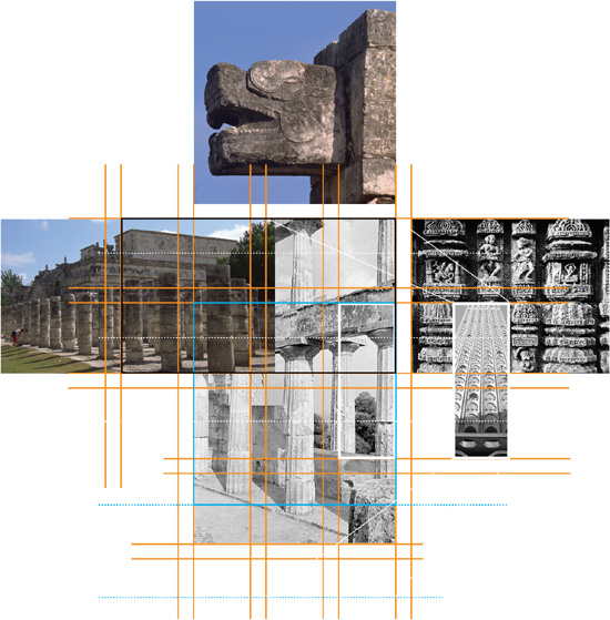
In this hypothetical study, several source images, each with different proportions, are positioned relative to each other to help determine where their depths and widths might correspond. Shifting the images around each other creates a number of possibilities for distilling a grid that will accommodate them all without having to crop them—a hypothetical “client request.”
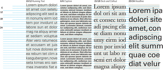
The leading of the body text, decks, callouts, and captions might have some proportional relationship based on their sizes. For example, the body text might be 10 points, set on a leading of 12; captions might be 6 points, set solid on a leading of 6; decks might be 15 points, set on a leading of 18. The numeric relationship between these leading measurements is 6 points; a certain number of lines of each text component will, at some depth interval, share the same top and lower baseline, and this depth interval might very well indicate the depth of a module. This is the method used here: 10 lines, or a leading of 60 points, defines the depth of the module; the gutter measure between rows reflects a hard return between caption paragraphs. The column is defined by the caption’s optimal width.
Visual Logic
Structuring the Page
Intuitive Arrangement
Integrating Type and Image
Layout Systems
Grid by Text Alternatively, the designer might approach the grid from the perspective of the text shape and volume. The sheer amount of text that the publication must accommodate is an important consideration; if each page spread must carry a particular word count to fit a prescribed number of pages, the designer will have some sense of how many lines of type must appear on each page. This variable might eventually affect the column width or depth, but the optimal setting is a good starting point. Achieving an optimal setting for text at a given size and in a given face will indicate a width for columns, and, from there, the designer can explore how many columns will fit side by side on a single page. Adjusting the size of the text, its internal spacing, and the gutters between columns will allow the designer to create a preliminary structure that ensures optimal text setting throughout. From this point, the designer must evaluate the resulting margins—head, sides, and foot—and determine whether there is enough space surrounding the body to keep it away from the edges of the format. Since optimal width can vary a little with the same text setting, the designer has some leeway in forcing the columns to be wider or more narrow, closer or further away from each other, until the structure sits comfortably on the page.
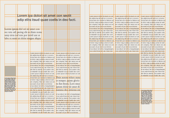
THE GRID IN THIS BROCHURE was developed based on the proportions of the type sizes given to each level of information in the hierarchy and the resulting mathematical relationship between the baselines of their leading. Comparing the baselines of larger text elements with those of smaller text elements reveals that they correspond on a regular basis, hinting that the grid is modular as well as columnar.
Loewy United Kingdom
Column Logic and Rhythm on a Grid
The way in which columns of text interact with negative space is an important aspect of how a grid is articulated. The spaces above and below columns play an active part in giving the columns a rhythm as they relate to each other across pages and spreads. The options available to a designer are endless but can be described as fitting into three basic categories: columns that justify top and bottom; columns that align vertically at top or bottom and rag at the other end; and columns that rag top and bottom. Each kind of logic has a dramatic impact on the overall rhythm of the pages within a publication, ranging from austere and geometric to wildly organic in feeling—all the while ordered by the underlying grid. Changing the column logic from section to section provides yet another method of differentiating informational areas. The designer, however, must carefully consider the rhythm of that change.
TEXT COLUMNS IN THIS sequence of brochure spreads are allowed to move up and down and be different depths as needed to create rhythmic interplay with the photographs. Note the similarity in hangline drop between the columns in the first spread (A), the hangline of the rightmost column, as well as the space between paragraphs in spread (B). The columns appear to hang from the tops of modules. This assumption is further supported in the last spread (C) by the alignment of the numeral 6 with the numeral 2 in (A) and the location of the numeral 8 relative to the end of the first column in spread (B).
Frost Design Australia
Visual Logic
Structuring the Page
Intuitive Arrangement
Integrating Type and Image
Layout Systems
Columns justified to the head and foot margins, or to a specific module depth, create a rigidly geometric band of text. Hanging columns provide a measure of consistency, balanced by their changing depth. Columns that change hangline and depth offer the most organic (and flexible) option for arranging text, especially in terms of integrating images.
The differences in interval between column beginnings and endings must be decisive and considered for their rhythm. The heads and feet of the columns might be decided spontaneously or determined by the existence of flowlines or modules in the columns.
Some regularity or system must clearly exist in the alternation of column logic to be meaningful; otherwise, the audience simply recognizes the change but not its significance. When columns begin to separate vertically, shifting up and down past one another—or dropping to different depths while adhering to a single hangline above—consider the relationship between lines of text across the gutter separating the columns. In a grouping of columns set justified, with no line breaks (or a hard return of the same leading) between paragraphs, the baselines between columns will align. Any other situation, and the baselines between columns will not align. In hanging columns, text will align between columns until a paragraph change. Because the depth of the hanging columns changes, this might feel appropriate. A problem will occur in a page spread set with columns justifying top and bottom, however, if the paragraph space introduces an uneven line: the lines of text at the foot margin will be noticeably off.
Articulating material across several column structures, but using similar logic throughout, creates tremendous difference in the overall rhythm of the layouts while retaining a certain unity.
Variation and Violation A grid is truly successful only if, after all the problems have been solved, the designer rises above the uniformity implied by its structure and uses it to create a dynamic visual narrative of parts that will sustain interest page after page. The greatest danger in using a grid is to succumb to its regularity. Remember that the grid is an invisible guide existing on the bottommost level of the layout; the content happens on the surface, either constrained or sometimes free. Grids do not make dull layouts—designers do. Once a grid is in place, it is a good idea to sort all the project’s material spread by spread to see how much will be appearing in each. A storyboard of thumb-nails for each spread in the publication can be very helpful. Here, the designer can test layout variations on the grid and see the result in terms of pacing—the rhythm of the layouts. Can there be a visual logic to how elements interact with the grid from page to page? Do pictorial elements alternate in position from one spread to another? Perhaps the sizes of the images change from spread to spread, or the ratio of text to image changes sequentially. Even simply placing images toward the top of the pages in one spread and then toward the bottom of the pages in the next achieves a powerful sense of difference while still ensuring overall visual unity. Violating the grid is a necessity of designing, sometimes because circumstance dictates it—content that must occupy a specific spread won’t quite fit—or because it is visually necessary to call attention to some feature of the content, or to create some surprise for the reader. Within a rigorous grid structure, violations must be relatively infrequent or relatively small, or they begin to undermine the reader’s sense of the grid’s consistency. Any specific item or general layout that violates the grid will be very dramatic. Disturbing the regularity of a column of text by allowing an element to jut out past the alignment not only will be instantly noticeable but also will cause the wayward element to shift to the top of the hierarchy; it becomes the most important item in the layout because it is clearly the only thing out of order. Designing a two-page spread that ignores the grid established for the remaining pages of a publication ensures that spread will be memorable. The problem facing the designer in making such a dramatic decision is that of integrating the layout into the publication’s overall visual logic: what defines this spread as belonging to the same publication? Usually, using the same typefaces as are used elsewhere will do so, as will application of similar colors as on other pages; but these alone will not unify the altered spread with the others that clearly follow an established structure. The designer must create some reference to the established structure even as he or she violates it—perhaps a typographic element from the previous spread continues onto the unique spread. In addition, the designer must consider the transition back into the grid-structured pages following the violation; if the pages following this particular spread are a continuation of its content, the designer might add smaller violating elements that recall the major violation while restating the regular structure.
A simple trick to achieving layout variation is to arbitrarily cluster images toward the top of a spread and then toward the bottom on the spread following. Sometimes forcing a small, medium, and large image onto a spread—and then using the same sizes but placed in different locations on the next spread—will quickly create movement across the grid.

Occasionally ignoring a rigorous grid has a dramatic effect on pacing and hierarchy. In this study, just such an instance stands out among a series of layouts that are heavily structured. The resulting surprise breathes life into the pacing among pages and highlights the content that is off the grid.
Visual Logic
Structuring the Page
Intuitive Arrangement
Integrating Type and Image
Layout Systems
COMPARE THE LOCATION of spatial breaks from left to right across this page spread with the grid diagram; although the majority of typographic and image content responds to the column structure, several items noticeably shift off the structure to introduce visual surprise and focus attention.
Cobra Norway
THESE PAGES, selected from several related brochures, use a relatively tight column structure as a means of radically altering margin, image, and text proportions from page to page. The greater number of columns means that simple blocks of content can shift around dramatically, but the proportions of the negative spaces and content objects remain unified in feeling.
BBK Studio United States
Exploring Other Options: Nonstructural Design Approaches Grid structure in typography and design has become part of the status quo of designing, but, as recent history has shown, there are numerous ways to organize information and images. The decision whether to use a grid always comes down to the nature of the content in a given project. Sometimes that content has its own internal structure that a grid won’t necessarily clarify; sometimes the content needs to ignore structure altogether to create specific kinds of emotional reactions in the intended audience; and sometimes a designer simply envisions a more complex intellectual involvement on the part of the audience as part of their experience of the piece. Our ability to apprehend and digest information has become more sophisticated over time as well; constant bombardment of information from sources such as television, film, and interactive digital media has created a certain kind of expectation for information to behave in particular ways. One has only to look at television news broadcasting or reality-based programming, where several kinds of presentation—oral delivery, video, still images and icons, and moving typography—overlap or succeed each other in rapid succession to understand that people have become accustomed to more complex, designed experiences. In an effort to create a meaningful impression that competes with—and distinguishes itself within—this visual environment, designers have pursued various new ways of organizing visual experience.
Visual Logic
Structuring the Page
Intuitive Arrangement
Integrating Type and Image
Layout Systems
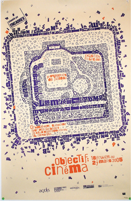
THE MATERIAL IN THIS POSTER is organized intuitively and spontaneously in an almost collage-like or painterly fashion, considering the visual qualities of the components in a more organic way.
Niklaus Troxler Switzerland
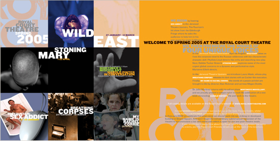
THESE TWO SPREADS from a theatrical season brochure respond to a 3 x 3 module structure as a base—seen in the opening contents spread—but the module alignments appear to shift, forcing the type into new alignments. This approach is called a deconstruction; it takes a structure and then deforms it.
Research Studios United Kingdom
Grid Deconstruction The first option is splitting apart a conventional grid, even a very simple one. A structure can be altered in any number of ways. A designer might “cut apart” major zones and shift them horizontally or vertically. It’s important to watch what happens when information that would normally appear in an expected place—marking a structural juncture in the grid—is moved to another place, perhaps aligned with some other kind of information in a way that creates a new verbal connection that didn’t exist before. The shifted information might end up behind or on top of some other information if a change in size or density accompanies the shift in placement. The optical confusion this causes might be perceived as a surreal kind of space where foreground and background swap places. A conventional grid structure repeated in different orientations could be used to explore a more dynamic architectural space by creating different axes of alignment. Similarly, overlapping grids with modules of different proportions, or which run at different angles in relation to each other, can introduce a kind of order to the spatial and directional ambiguity that layering creates, especially if some elements are oriented on both layers simultaneously.
Visual Logic
Structuring the Page
Intuitive Arrangement
Integrating Type and Image
Layout Systems
SHIFTING columns and exaggerated textural qualities harmonize the type with the images.
Hyosook Kang School of Visual Arts, United States
SLIGHT OVERLAPS IN columns, changing column widths, and column rotation create movement and geometric spaces reminiscent of the design work and historical context of the poster’s subject without copying his style or showing any of his own projects.
Leonardo Sonnoli Italy
Shifting or breaking apart grid modules or columns so that they begin to overlap, even while they carry sequential information (like running text), can create a perception of layers within the compositional space. The textures of different columns interacting as they run over each other can create a sense of transparency in which the viewer perceives the columns of text, or other elements, to be floating in front of each other.
THE CHANGING WIDTHS and spatial intervals, as well as changing interline space within the text and proportions of the image, deconstruct a conventional column grid to create tension, discomfort, and spatial conflict that evoke the feeling of uncertainty in a particular historical period.
Travis Simon School of Visual Arts, United States
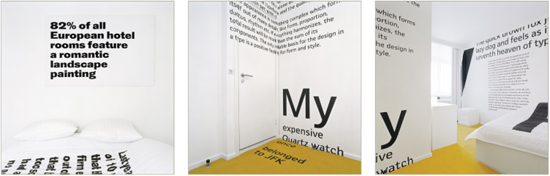
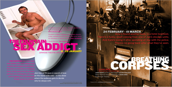
IN A REMARKABLY funny twist, typographic elements are deconstructed off the “grid” of the walls in hotel rooms to create an amusing spatial environment for guests.
E-Types Denmark
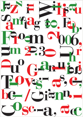
CUT-AND-PASTE typographic texture is distributed in both spontaneous and ordered ways in this poster.
SubCommunication Canada
Visual Logic
Structuring the Page
Intuitive Arrangement
Integrating Type and Image
Layout Systems
THIS POSTER ORGANIZES typographic material loosely and organically, showing evidence of the designer’s attention to tension and contrast relationships in proximity, clustering, overlap, edge-to-format spacing, and angular versus curvilinear logic.
Cally Keo The Art Institute, Orange County, United States
Spontaneous Optical Composition
Far from being random, this compositional method can be described as purposeful intuitive placement of material based on its formal aspects: seeing the inherent visual relationships and contrasts within the material and making connections for the viewer based on those relationships. Sometimes designers will use this method as a step in the process of building a grid, but its use as an organizational idea on its own is just as valid. This approach starts fast and loose: the designer works with the material much like a painter does, making quick decisions as the material is put together and the relationships are first seen. As the different optical qualities of the elements begin to interact, the designer can determine which qualities are affected by those initial decisions and make adjustments to enhance or negate the qualities in whatever way is most appropriate for the communication. The method’s inherent liveliness has an affinity with collage; its sense of immediacy and directness can be inviting to viewers, providing them with a simple and gratifying experience that is very accessible. The result is a structure that is dependent on the optical tensions of the composition and their connection to the information hierarchy within the space.
THE DESIGNER HAS CREATED a shifting maze of positive and negative shapes to contain, as well as work around, the text elements. The shapes take on the attributes of road signs and architecture but appear to move about, as heavy masses, open spaces, and texture collide and separate.
I Just Might United States
EXTREME SCALE CHANGES, contrast in weight among the strokes of the large title, and the textural qualities of the diagonally aligned paragraph and background elements create dynamic foreground and background relationships and a very colorful set of contrasts.
Ko-Hsing Wang The Art Institute, Orange County, United States
Conceptual or Pictorial Allusion Another interesting way of creating compositions is to derive a visual idea from the content and impose it on the page format as a kind of arbitrary structure. The structure can be an illusory representation of a subject, like waves or the surface of water, or can be based on a concept, like a childhood memory, a historical event, or a diagram. Whatever the source of the idea, the designer can organize material to refer to it. For example, text and images might sink underwater or float around like objects caught in a flood. Even though no grid is present, sequential compositions are given a kind of unity because of the governing idea. Margins, intervals between images and text, and relative depth on the page might constantly change, but this change has recognizable features that relate to the overall idea; these might even be called allusive structures. In projects of a sequential nature, like books or walls in an exhibit, visual elements relate to each other in time, as though in frames of a film. Images might move across a format or otherwise be changed from page to page, affecting other images or text that appear later. A simple example of this visual kinesis might be a sequence of pages where text appears to advance forward in space because its scale changes incrementally every time the page is turned. Using sensory experiences of space and time as organizing principles can be a powerful tool for evoking a visceral, emotional response from viewers.
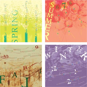
THE DESIGNER OF these seasonal calendar panels expresses the feeling and energy of each season through abstract images. The typography responds not just formally but conceptually, alluding in different instances to falling rain, leaves, and snow.
Hae Jin Lee School of Visual Arts, United States
Visual Logic
Structuring the Page
Intuitive Arrangement
Integrating Type and Image
Layout Systems
LITTLE EXPLANATION is needed to clarify the image that is being created by the configuration of justified text blocks in this foldout brochure.
LSD Spain
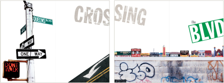
BOTH TYPEFACE STYLE AND POSITIONING allude to a specific urban environment, creating a narrative of travel and experience.
EarSay/W.W. Norton United States
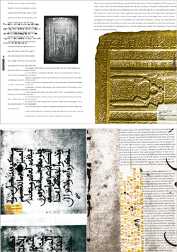
VEILS OF COLORED TEXTURE and transparent type—running in two directions—evoke the veil of Arabic culture and reference that language’s reading direction in contrast to that of Western reading.
Leonardo Sonnoli Italy
Visual Relationships Between Words and Pictures Getting type to interact with imagery poses a serious problem for many designers. The results of poorly integrated type and image fall into two categories. The first category includes type that has nothing in common with the images around it or is completely separated from the image areas. The second category includes typography that has been so aggressively integrated with image that it becomes an illegible mass of shape and texture. Images are composed of lights and darks, linear motion and volume, contours, and open or closed spaces, arranged in a particular order. Type shares these same attributes. It is composed of lights and darks, linear and volumetric forms, and contours and rhythms of open and closed spaces, also arranged in a particular order. The task is finding where the specific attributes of both come together.
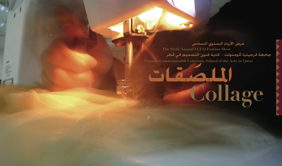
THE STAGGERED MOVEMENT and size change of the type correspond to the vertical movement of the sewing machine needle—contrasting it with horizontal motion—and the flow of fabric through the sewing machine.
VCU Qatar Qatar
Visual Logic
Structuring the Page
Intuitive Arrangement
Integrating Type and Image
Layout Systems
Placing the type directly onto the image permits a quick comparison of the shapes within both elements. In these examples, the type responds to the scale changes, directional movement, and the tonal variations found in the images.
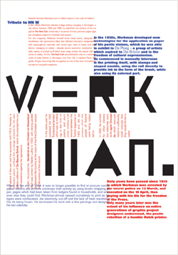
THE IMAGE OF the spiral staircase, symbolizing career evolution, is visually similar to the spiraling geometric shapes in the logo.
C. Harvey Graphic Design United States
Laying type into or across an image is a quick way of finding visual relationships. Their immediate juxtaposition will reveal similarities in the shape or size of elements in each. The rag of a short paragraph might have a similar shape as a background element in a photograph. An image of a landscape with trees has a horizon line that might correspond to a horizontal line of type, and the rhythm and location of trees on the horizon might share some qualities with the type’s ascenders. At the opposite end of the spectrum, the image and the typographic forms might be completely unrelated—in opposition to each other. Opposition is a form of contrast that can be an equally viable strategy for integrating the two materials. A textural and moody image with great variation in tone, but no linear qualities, might work well with typography that is exceptionally linear, light, and rhythmically spaced. The contrast in presentation helps enhance the distinct qualities of each.
THE DIRECTIONAL MOVEMENT of the delicate, curving feather form is supported by the back-and-forth shifting of the poster’s title while its vertical structure is restated by the rotated type elements. Careful attention has been paid to the locations of visual stress and openness within the image in considering the placement of the type elements to interact with it.
Paone Design Associates United States
ALTERNATING DARK AND LIGHT typographic elements in the upper portion of this brochure cover repeat the dark and light value breaks in the landscape image.
Andreas Ortag Austria
THE TEXTURAL COLLAGE of changing typefaces and sizes echoes the graffiti on the wall in the photograph.
Barbara Ferguson United States
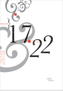
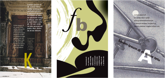
Formal Congruence Similarities between type elements and pictorial elements make a strong connection between the two. Every image portrays clear relationships between figure and ground, light and dark, and has movement within it. Objects depicted in photographs have a scale relationship with each other and proportional relationships with the edge of the image. When typographic configurations display similar attributes to an adjacent image, or expand on those attributes, the type and the image are said to be formally congruent. There are an unlimited number of ways for type to become congruent with an image. The selection of a particular face for the type might relate to tonal or textural qualities in the image. Instances in which type extrapolates the formal qualities in an image create powerful emotional and intellectual responses in the viewer. Type that is adjacent to an image also can be formally congruent in terms of its position relative to the image. In this kind of formal congruence, the image exerts an influence on the composition of the page as a whole. Even if the type retains its natural architecture, it may still react to the compositional architecture within the image. All three elements—image, format, and type—appear to share the same physical space. Formal Opposition Relating typographic elements to images by contrasting their visual characteristics is also a viable way of integrating them. Although seemingly counterintuitive, creating formal opposition between the two kinds of material actually can help clarify their individual characteristics. Contrast is one of the most powerful qualities that a designer can use to integrate material—by their very difference, two opposing visual elements become more clearly identified and understood. Within a letterform combination of an M and an O, for example, the fact of the M’s angularity is reinforced by the curved strokes of the O. The movement within each form is made more pronounced, and the two elements essentially fight for dominance. The caveat is that some congruence between the elements must also exist so that the opposing characteristics are brought clearly into focus. In the same way that a hierarchy is destroyed if all the elements are completely different, the strength of the contrast in opposing forms is weakened if all their characteristics are completely different.
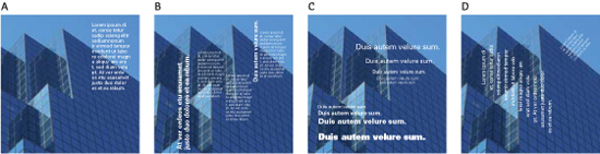
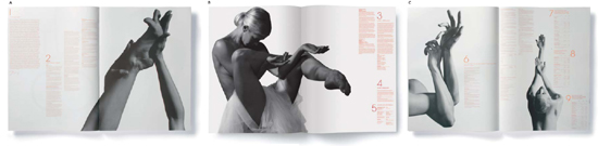
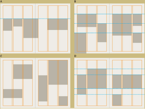
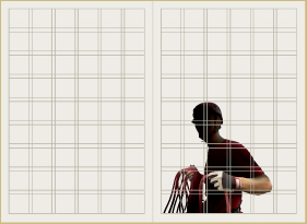
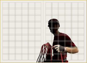
The type in this series of studies is related to the image alternately through: position (A); repetition of linear movement and alternation of weights (B); mimicry of depth and perspective (C); and the angle of its alignment (D).
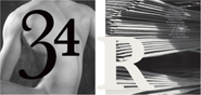
The numerals and the figure have similar shapes and movement. Note how the position of the numeral 3 highlights the mass of the shoulder and the curve of the torso. The light and dark areas of the image show similarity to the locations, shapes, sizes, and tonality of the type forms.
Visual Logic
Structuring the Page
Intuitive Arrangement
Integrating Type and Image
Layout Systems
THE DESIGNER USES typographic texture in the background—and its color—to correspond formally with the chain in the silhouetted image but uses the violet type to formally oppose the image. This violet type, however, shares a formal quality—contrast in stroke weights—with the light, textural script.
Finest Magma Germany
In these three examples, the visual relationship between type and image is one of opposition, but the choice of type style and treatment in each example shares some formal relationship with the image.
1: A soft-focus photograph with muted detail and light tonal values overall is contrasted by a bold-weight sans serif typeface, but the subdued color of the type shares a tonal and color relationship with the image.
2: A regular-weight modern serif face with a great deal of contrast in the strokes—the opposite of the photo-graph’s lack of contrast. The geometric quality of the typeface responds to shapes apparent in the image.
3: A lightweight text with very active details; the type’s stylized quality counteracts the passive, neutral character of the image, but its arrangement within the image responds to areas of light and dark.
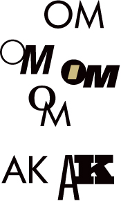
A study of letterform combinations reveals both congruence and opposition. The inherent differences between the O and M are made more pronounced by changing the posture, weights, styles, and positions of the letters, yet the combinations in which they share one—or two—aspects seem richer. The inherent similarities of the A and K allow for more dramatic opposition because their structural similarity is so powerfully congruent.
Positioning Strategies Consider the location of the type relative to the image and the attributes of the image’s outer shape in relation to the format. An image cropped into a rectangle presents three options: the type might be enclosed within the image; the type might be outside, or adjacent to the image; or the type might cross the image and connect the space around it to its interior. Type that is placed within the field of a rectangular image becomes part of it. Type adjacent to a rectangular image remains a separate entity. Its relationship to the image depends on its positioning and any correspondence between its compositional elements and those in the image. The type might align with the top edge of the image rectangle, or it might rest elsewhere, perhaps in line with a division between light and dark inside the rectangle. Type that crosses over an image and into the format space becomes both part of the image in the rectangle and part of the elements on the page. Its location in space becomes ambiguous.
THE VERTICAL, OVERLAPPED TITLE—as well as the geometric blocks of white and yellow—appears to float in front of and over the image on an invisible foreground plane, thanks to their enormous scale and tremendous value contrast with the image. Oddly, the subtitle occupies a space inside the white bar at the top.
Thomas Csano Canada
Visual Logic
Structuring the Page
Intuitive Arrangement
Integrating Type and Image
Layout Systems
BECAUSE OF ITS LINEARITY, transparency, and low value contrast, the typography on this page layout seems to become part of the sky space within the image.
Finest Magma Germany
Type will appear to change spatial relationships when placed on, in, or next to a cropped image. This spatial ambiguity might also involve the space around the cropped image, creating a connection between the field, image, and type that brings them together in space. The type at top left is part of the image. In the layout at upper right, the type leaves the image; it enters the format space and moves into the foreground. The type crossing the image, lower left, joins image and space by crossing the image. At lower right, the type responds to the rectangular shape of the image, relating it to the format shape.
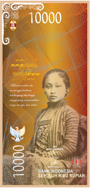
COMBINING VERTICAL and horizontal positioning of type elements helps integrate the linear movement of both type and image, as well as permits the currency’s denomination to be read when the bill is held at either angle.
Marcia Lisanto Laguna College of Art and Design, United States
FOR ALL APPEARANCES, the chapter title on this book spread is situated on the gallery wall at the back of the image.
Finest Magma Germany
Visual Logic
Structuring the Page
Intuitive Arrangement
Integrating Type and Image
Layout Systems
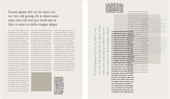
Strategies for integrating images on a simple column grid revolve around the relationship of the images to flowlines—whether the images hang from one (A); hang from several (B); appear anywhere vertically, conforming only to the column widths (C); or stretch between flowlines in a more rigid approach (D).
Integrating Images with a Grid Using a grid structure to organize pictures and text means bringing them in line with the natural horizontal and vertical axes created by columns and blocks of text. By organizing images into a grid that repeats these attributes, a designer chooses to deemphasize their internal visual qualities in favor of the structural proportions of the page. A designer may use either a column grid without modules, or a modular column grid, to provide locations and proportions for images. As images increase in size, based on the widths of columns or modules, their internal visual qualities become more pronounced, and the structural quality of the type begins to contrast the image. As images shrink relative to the grid, their internal visual qualities become less pronounced, and their shapes as geometric objects within the text structure become more important. This fluctuation is another compositional attribute imparted by the grid. Even though using a grid to organize images might seem to stifle their visual potential, remember that a grid has a kind of built-in, organic flexibility to it. A simple column grid has consistent width intervals that pictures can traverse—the more columns, the more possible widths for images—but it also allows a variety of depths for the images. Images might be allowed to meet a system of flowlines if they are established as part of the column grid. Modular grids, which at first appear to limit possibilities for images, actually provide enormous flexibility for how images might interact on a page. Each module can contain an image, and groupings of modules in any combination may also contain images—2 x 3, 1 x 6, 3 x 5, and so on, all the way up to full-bleed images and large divisions of the overall spread.
THE GRID USED TO structure this layout defines the scale and orientation of the images and affects their presence related to type. A smaller image relates visually to the module, and hence to the overall page structure; the larger the image becomes, the more its internal visual qualities dominate, creating contrast with the structure and surrounding type.
Studio Works United States
Even within a single-format piece, such as a poster, a grid is a useful strategy for organizing material, whether pictorial or typographic. In this poster, for example, the various elements are arranged on a hierarchic grid based on a proportion derived from the inset images. All the spatial intervals between text components, as well as between text and major formal elements—such as the dot grid—adhere to this internal proportional system. The grid-based intervals are hierarchic in that their sizes relative to each other are determined by the relative importance of the material they govern.
Silhouetted images contrast sharply with rigid grid structures by virtue of their irregular outer contours. Still, the designer must position silhouetted images with respect to the grid so that they don’t seem out of place but, rather, flow smoothly into the geometry surrounding them. Although such images are irregular in shape, the designer must ensure that they “feel” as though they’re proportioned and situated like grid-structured images, yet retain their inherent organic quality without feeling stiff or awkward.
In the first version of the spread (left), the size of the silhouetted image, along with its strict adherence to the margins and column guides, causes it to seem small, weak, and somewhat stiff. Resizing the image—and adjusting its orientation so that it opticallly relates with other grid-structured images—not only makes it seem more at home in the structure with the surrounding elements, but also enhances its irregularity with regard to creating contrast to the structure’s clear geometry.
Visual Logic
Structuring the Page
Intuitive Arrangement
Integrating Type and Image
Layout Systems
THE SILHOUETTED IMAGE is a welcome break from the geometric regularity of the text columns and tinted blocks.
Martin Oostra Netherlands
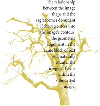
Integrating Silhouettes Silhouetted images—whose contours are free from enclosure in a rectangle—share a visual relationship with the rags of paragraphs or columns but also share an opposing relationship with their alignments. Type adjacent to a silhouetted image offers more or less contrast, depending on its location relative to the image. If the rag leads into the image contours, the two elements flow together, and the type might seem to share the spatial context of the image. Bringing the vertical alignment of a column into proximity with an image’s irregular contour produces the opposite effect: the type advances in space and disconnects itself from the spatial context of the image. The strong contrast between the aligned edge of the type and the contour of the image might then be countered by the irregular contour of the column’s rag.
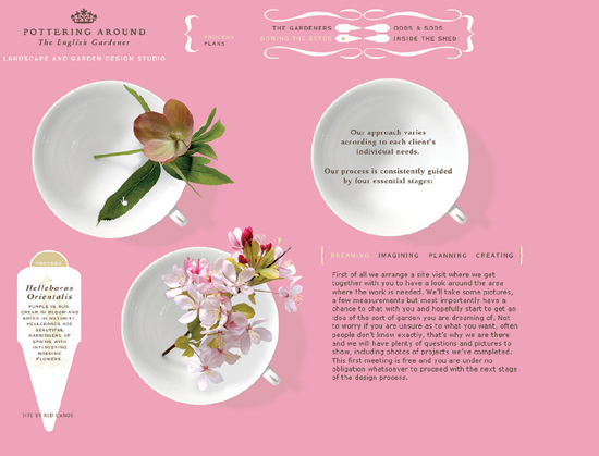
GEOMETRIC SILHOUETTES— the circular teacups and the triangular potting marker—are contrasted by the irrgular silhouettes of the flowers and leaves. Both types of silhouettes contrast the angular and linear aspects of the type structure.
Red Canoe United States
Design as a System The vast majority of designed works—printed, interactive, and environmental—are systematic in nature; the existence of a single-format, one-off design piece is exceedingly rare. A web-site, for example, consists of multiple pages that interact; consider, too, the pages of a book in sequence, all of which must relate to each other, as well as to the exterior of the book as an object itself. Most publications are produced serially—meaning that new issues are produced periodically, as with magazines or newsletters—or sequentially—meaning that they are either a family of separate, but related, items that are produced all together, or that they are individual publications whose information is augmented or supported at different times, such as families or series of brochures. Advertising campaigns, too, are systematic: a single format might be used serially, placed in sequential issues of a magazine, or the ads within a campaign might appear simultaneously in multiple publications, but in different formats—single page, double-page spread, half-page vertical or horizontal, and so on. Even environmental design work is systematic in that it addresses the integration of information and visual experience among multiple spaces, for example, the exterior and entry lobby of a building, a set of exhibit spaces, or public areas such as restaurants, shopping centers, or mass transit stations. Because of this aspect, a designer’s understanding of the visual language he or she is creating for such work is terribly important. It not only ensures the user’s or viewer’s unity of experience from one space to another but also helps direct them through changing levels of information and provides flexibility in visual presentation appropriate to whatever such changes may be. Being able to control variations within the system also prevents the experience from becoming monotonous for the audience.
Consistency and Flexibility Establishing tension between repeated, recognizable visual qualities and the lively, unexpected, or clever manipulation—even violation—of those qualities in a system-oriented work is a difficult task. At one extreme, designers risk disintegrating the visual coherence that makes for a unified and memorable experience by constantly altering the project’s visual language in his or her effort to continually refresh the viewer. At the other extreme, treating material too consistently will kill the project’s energy. In some instances, it might also do the material a disservice by constraining all elements into a strangled mold that decreases the clarity of either the concept or informational relationships by not allowing these to flex as they must. The renowned designer, Massimo Vignelli—known chiefly for his rigorous use of grid structures—put it this way: “A [structure] is like a cage with a lion in it, and the designer is the lion-tamer; playing with the lion is entertaining and safe for the viewer because of the cage, but there’s always a danger that something will go wrong . . . and the lion-tamer has to know when to get out so he doesn’t get eaten.”
TYPOGRAPHIC STYLE, use of white space, and consistent application of colors and grid structure mark these branded collateral materials as coming from the same source. The neutrality of the structure is flexible and will be useful in streamlining production for complex publications, as well as allow designers to accommodate new kinds of materials without having to reinvent the wheel.
Grapefruit Romania
Visual Logic
Structuring the Page
Intuitive Arrangement
Integrating Type and Image
Layout Systems
USING PORTIONS OF the client’s logotype at tremendous scale in a retail environment creates a simple system that can easily adapt to changing store layouts.
A10 Design Brazil
SYSTEMATIC THINKING most often is associated with branding and corporate identity-focused communications, the hallmark of which is consistency. In the case of this logo, the form remains consistent, but a variable color scheme allows for flexibility in relating the logo to accompanying imagery, reinforcing itself yet refreshing itself every time it is seen.
Research Studios United Kingdom
SYSTEMATIC USE of a grid structure in this website allows different combinations of content—and content of varying widths and complexity—to be updated quickly and without sacrificing the overall unity of the pages.
BBK Studio United States
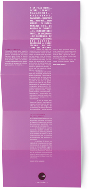
SIMILAR PHOTOGRAPHS and a specific color palette create unity among a series of print collateral applications, but each image is varied with a different illustrative detail.
Loewy United Kingdom
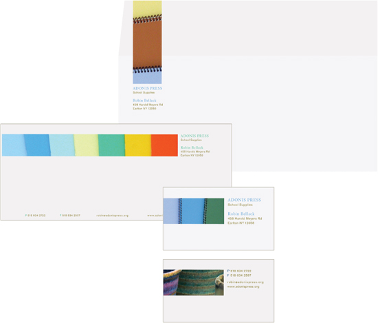
THE DESIGNER CREATES flexibility in this simple stationery system by altering the orientation and proportion of image components as well as the application of color to the typography—whose style and treatment remain consistent throughout.
Maris Bellack United States
Visual Logic
Structuring the Page
Intuitive Arrangement
Integrating Type and Image
Layout Systems
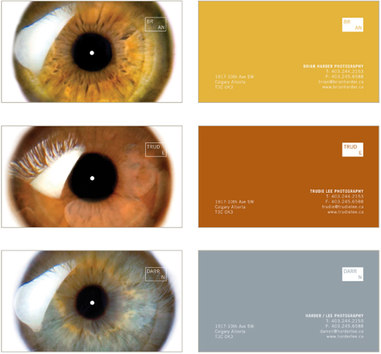
A SIMILAR STRATEGY is employed in this series of business cards. The size and position of elements, both on the front and the back of each card, remain the same, but the color palette changes.
Fishten Canada
In-depth study of the potential formal variation possible for even one aspect of a project’s visual logic can be time-consuming, but the results of even an hour or two of experimentation can open up a wild range of possible solutions (as well as solutions for other projects with which the designer is struggling). “Serious study” means looking for a range between extremes within a particular variable—very light versus very dark, for example—and taking into account off-shoots of logic that potentially could lead to a truly original solution. Even if the study isn’t rigorously organized or the actual composition of the studies isn’t totally resolved, just seeing the possible permutations can be invaluable. A rough composition study for a poster series yields a multitude of possibilities for a consistent, yet flexible, visual language. In each set of examples, one aspect of the visual language has been called out for variation without disturbing any of the other aspects. In the first, scale change is the variation that is exploited for flexibility; in the second study, the shape of the organic forms changes, but their essential identities remain recognizable; in the third, position of elements is the only variation.
Finding Flexibility There are two fundamental variables in any project that a designer can investigate while looking for strategies to keep the work visually consistent as well as flexible. The first variable has to do with the way material is presented, what its actual form and colors are. Within a given project, there may already be a range of possibilities that the designer has established—the options within a selected color palette presents one possibility of changing the presentation of material; the kinds of images the designer chooses to use might also offer a range of options. The second variable is pacing—altering the frequency of different page components in some kind of pattern so that the kinds of images or shapes, the number of images, and the amount of specific colors from within the palette are constantly changing.
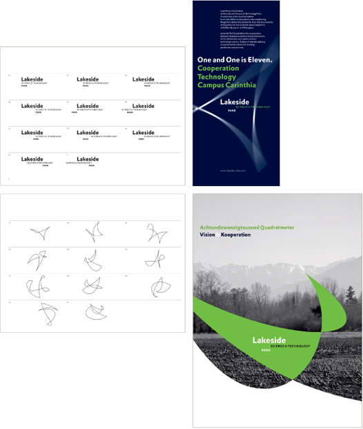
A GRID STRUCTURE provides harmonic and consistent relationships in text and image proportions, and the individual treatment of text components—typeface selection, size, and weight—is also rigorously applied. However, the locations of the elements as well as their organizational complexity change dramatically.
Loewy United Kingdom
Formal Variation As noted earlier, a designer’s understanding of the internal logic of the visual language he or she is creating is paramount; one variable a designer can look at to create flexibility is variation in the visual language’s internal logic. The first step is to consider what the components of that visual logic are, and, if necessary, make a written list of them. Asking simple questions of oneself is a great way to begin the evaluation process—and answering such questions as simply as possible is equally important. “What are the visual components of this project?” “What kind of images am I using?” “Is geometry important in the shapes or relationship?” “Is there spatial depth, and, if so, what creates it—transparency, scale change, overlap?” “Do I sense movement, and, if so, is it lateral, vertical, frenzied, calm and repeated?” Once the designer has answers to these questions, focusing on one or two of the variables—scale change and color family, for example, or texture, organic shapes, and overlapping—might lead to establishing rules for how these variables might be altered without changing their fundamental character.
ALTHOUGH THE TYPOGRAPHY throughout this identity program is rigidly styled on a consistent grid, the designer has introduced flexibility in form at every level: variations in the visual shape of the logotype lockup; a series of abstract linear illustrations that can be used in a number of ways; and a strong color palette of analogous hues with varying levels of intensity.
Clemens Théobert Schedler Austria
Visual Logic
Structuring the Page
Intuitive Arrangement
Integrating Type and Image
Layout Systems
TO CREATE FLEXIBILITY in this packaging system, the design team varies the form language of the linear illustrations and the color coding of each item.
Templin Brink Design United States
Visual Logic
Structuring the Page
Intuitive Arrangement
Integrating Type and Image
Layout Systems
Structural Variation Changing How Content Is Arranged

Overall Progressive Sequencing This strategy articulates image and text on a grid beginning with one type of logic and progressively changing the logic spread by spread. The result is a continuous transition in the pacing over the course of the entire project.

Overall Syncopated Sequences In this approach, content is articulated on a grid using one type of logic for a particular sequence of page spreads; altering the logic for a second sequence of spreads; and then returning to the previous logic. This strategy can become more complicated—instead of the A·B·A rhythm described, a rhythm of A·B·A·C·A might be used, or A·B·C·B·C·D·C·D·E, for example.

Continuous Variation This is an approach in which the articulation of content continuously changes from spread to spread. The change might focus on the relative position of elements or on the proportions of spatial zones given to specific informational components.

Section Variation The same grid is articulated using a specific logic in one sequence of page spreads, another logic in the following sequence, and another logic in the sequence after, without repetition. Or, completely different grids might be used in each section.
Content Presentation Changing the Content’s Visual Attributes

Color Progression or Syncopation In this visual strategy, page sequences exhibit a distinct color scheme, either varying completely between sequences or tied together by a color or two that are universal. The color schemes might progress—from cool to warm, or neutral to vibrant—or they may alternate in a particular rhythm—cool, warm, cool, warm.

Scale Progression or Syncopation Similar to color progressions, this variation focuses on scale change from spread to spread or from sequence to sequence. Images might grow in scale over a sequence of pages; or their scales might alternate between page spreads or sequential sections. Scale-based pacing might or might not be influenced by grid variation.
Text Versus Image The relationship between the amount of text and the amount of image material changes, either progressively or in a distinct rhythm.

Image Treatment Progressions or Syncopation This approach presents changes in image treatment or mode between spreads or sequences; for example, progressing from representational to abstract, or alternating between photographs and graphic icons. The complexity of the material may be reflected as a progression—for example, simple to complex—or as a syncopation—simple/complex/ simple/complex.
Since every project is different, the ways in which a designer might address pacing in a specific project are unlimited. However, most pacing strategies can be distilled into two basic overall approaches.
Structural Variation Regardless of the content’s treatment in terms of color, imagery, or typography, the structure of a publication can be articulated in a variety of ways.
Content Presentation Aside from varying structure, the designer might exploit formal variation and opposition within the content to create pacing changes: its color, scale, photographic or illustrative treatment, and its complexity. Sometimes such pacing changes coincide with structural variation; for example, changing the scale of images over a page sequence might reflect a change in grid logic. At other times, changes to content treatment for pacing might be independent of any structural variations.
Pacing and Sequencing Building off the idea of variation, the order in which a designer delivers content—or, the order in which the formal variation occurs—can be a powerful method for creating variation without disturbing the essential logic of the visual language. The sequence of a multipart project creates a particular rhythm, or pacing. Pacing can be understood as a kind of cadence or “timing” the reader will apprehend from part to part—whether from homepage to subpage within a website, or between page spreads in a magazine, or between brochures in a literature system—almost like a film. By varying this rhythm from slow to fast, or from quiet to dynamic, for example, the designer can accomplish several goals. One result achieved is strictly visual: each turn of a page engages the reader in a new way by varying the presentation. Another result might be that the reader is cued to a significant content change; the informational function is clarified by the pacing. Periodic publications, such as magazines, present specific concerns regarding pacing. Much of a publication’s flow will be determined by its overall structure. Magazines, for example, are often divided into sections: a series of “department” pages that recur in the same order every issue and a sequence of feature stories that changes every issue. Within each section, too, the designer must establish visual variation so that the reader, while recognizing a consistent structure, doesn’t become bored. On a conceptual level, the pacing and sequencing contribute a tremendously to the message delivered by content. Indeed, such organization may be an intrinsic part of the concept that governs the visual presentation of the content. Sometimes, content organization derives directly from the designer’s common-sense understanding of the content’s structure, or from generally accepted (even legally required) conventions as to how particular content ought to be delivered. In the first instance, for example, the general public assumes that the upper levels of a Web site’s content will be more general, each directing them toward more specific content as they delve further into the site. Conventions abound for publications such as books or periodicals, where the average reader assumes a certain kind of introductory sequence, followed by sections or chapters that group related or sequential content. In the second instance, an annual report is legally required to present brand-related content separately from financial date, and the date must appear in a specific order. Most projects, however, benefit from evaluating the expected method of delivery and finding whether it will best serve the content as defined, or if a better sequence is more appropriate. Designers must always investigate this aspect of a project—the fundamental relationship of all the content’s parts—on a case by case basis, and in association with their conceptual goals and their client’s communication goals.
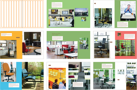
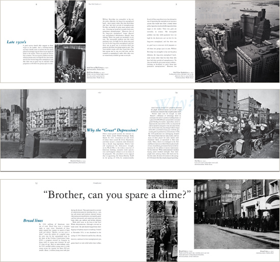
THIS NEWSLETTER employs a clear, simple strategy to create rhythmic pacing from spread to spread: changes in the sizes, proportions, and placement of photographs. Using tinted blocks to call out specific portions of text also introduces constant change in the presence of the type.
Martin Oostra Netherlands
Structuring the Page
Intuitive Arrangement
Integrating Type and Image
Layout Systems
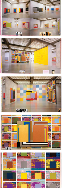
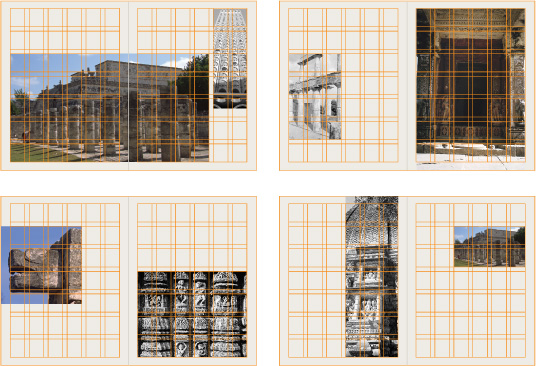
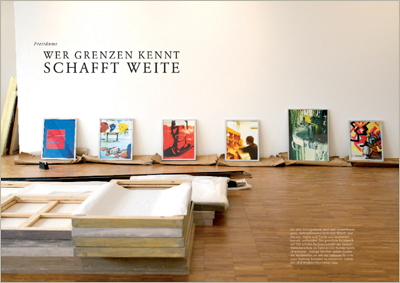
FULL-BLEED PHOTOGRAPHS of a gallery environment lead viewers experientially thorugh an exhibit, moving them from room to room and then close-up to artworks on individual walls. Content travelling horizontally through a spatial zone at the bottoms of the pages provides commentary on the exhibit and organizational strategies used by the artist in his work.
Coma Netherlands
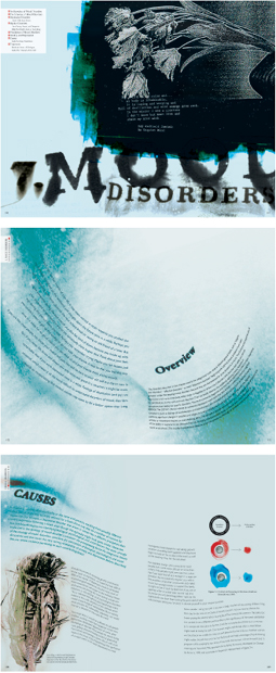
THE SPREADS IN each chapter of this book on abnormal psychology progress from arrangements of image and type that communicate the quality of a given disorder to a state of grid-based resolution that describes various treatment options and successful case studies.
Hae Jin Lee School of Visual Arts, United States