Chapter 1
Form and Space
Seeing Form and Space
Categories of Form
Putting Stuff Into Space
Compositional Strategies
A Foundation for Meaning
I am convinced that abstract form, imagery, color, texture, and material convey meaning equal to or greater than words.
Katherine McCoy
Graphic designer and former director,
Cranbrook School of Design
There is no longer agreement anywhere about art itself, and under these circumstances we must go back to the beginning, to concern ourselves with dots and lines and circles and all the rest of it.
Armin Hoffmann
Graphic designer and former director,
Basel School of Design: 1946–1986

Form is stuff—including all kinds of imagery and type.

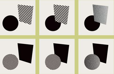
Every form, no matter how abstract it appears, is meaningful. A circle, for example, is a continuous line, and its roundness is a very specific trait. A circle is therefore endless, organic, rotational, cellular, and a totality. A square, conversely, has angles and sides that are equal in measure, and is static. A square is therefore analytical, mathematical, unnatural, and finite.


The idea of formal beauty is highly subjective. Both these images can be considered beautiful, despite the fact that one is sensuous and “clean” and that the other is aggressive and “dirty.”
Seeing Form and Space
Categories of Form
Putting Stuff Into Space
Compositional Strategies
A Foundation for Meaning
![]()
First Things First All graphic design—all image making, regardless of medium or intent—centers on manipulating form. It’s a question of making stuff to look at and organizing it so that it looks good and helps people understand not just what they’re seeing, but what seeing it means for them. “Form” is that stuff: shapes, lines, textures, words, and pictures. The form that is chosen or made, for whatever purpose, should be considered as carefully as possible, because every form, no matter how abstract or seemingly simple, carries meaning. Our brains use the forms of things to identify them; the form is a message. When we see a circle, for example, our minds try to identify it: Sun? Moon? Earth? Coin? Pearl? No one form is any better at communicating than any other, but the choice of form is critical if it’s to communicate the right message. ![]() In addition, making that form as beautiful as possible is what elevates designing above just plopping stuff in front of an audience and letting them pick through it, like hyenas mulling over a dismembered carcass. The term “beautiful” has a host of meanings, depending on context; here, we’re not talking about beauty to mean “pretty” or “serene and delicate” or even “sensuous” in an academic, Beaux-Arts, home-furnishings-catalog way. Aggressive, ripped, collaged illustrations are beautiful; chunky woodcut type is beautiful; all kinds of rough images can be called beautiful. Here, “beautiful” as a descriptor might be better replaced by the term “resolved,”—meaning that the form’s parts are all related to each other and no part of it seems unconsidered or alien to any other part—and the term “decisive”—meaning that the form feels confident, credible, and on purpose. That’s a lot to consider up front, so more attention will be given to these latter ideas shortly.
In addition, making that form as beautiful as possible is what elevates designing above just plopping stuff in front of an audience and letting them pick through it, like hyenas mulling over a dismembered carcass. The term “beautiful” has a host of meanings, depending on context; here, we’re not talking about beauty to mean “pretty” or “serene and delicate” or even “sensuous” in an academic, Beaux-Arts, home-furnishings-catalog way. Aggressive, ripped, collaged illustrations are beautiful; chunky woodcut type is beautiful; all kinds of rough images can be called beautiful. Here, “beautiful” as a descriptor might be better replaced by the term “resolved,”—meaning that the form’s parts are all related to each other and no part of it seems unconsidered or alien to any other part—and the term “decisive”—meaning that the form feels confident, credible, and on purpose. That’s a lot to consider up front, so more attention will be given to these latter ideas shortly. ![]() Form does what it does somewhere, and that somewhere is called, simply, “space.” This term, which describes something three-dimensional, applies to something that is, most often, a two-dimensional surface. That surface can be a business card, a poster, a Web page, a television screen, the side of a box, or a plate-glass window in front of a store. Regardless of what the surface is, it is a two-dimensional space that will be acted upon, with form, to become an apparent three-dimensional space.
Form does what it does somewhere, and that somewhere is called, simply, “space.” This term, which describes something three-dimensional, applies to something that is, most often, a two-dimensional surface. That surface can be a business card, a poster, a Web page, a television screen, the side of a box, or a plate-glass window in front of a store. Regardless of what the surface is, it is a two-dimensional space that will be acted upon, with form, to become an apparent three-dimensional space.
In painting, this space is called the “picture plane,” which painters have historically imagined as a strange, membrane-like “window” between the physical world and the illusory depth of the painted environment. Coincidentally, this sense of illusory depth behind or below the picture plane applies consistently to both figurative and abstract imagery.

PEOPLE OFTEN OVERLOOK the potential of abstract form—or, for that matter, the abstract visual qualities of images such as photographs. This form study uses paper to investigate that very idea in a highly abstract way. What could this be? Who cares? It’s about curl in relation to angle, negative space to positive strip. To understand how form works, the form must first be seen.
JRoss Design United States

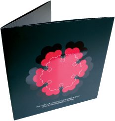
LINE, MASS, AND TEXTURE communicate before words or a recognizable image. On this invitation for a calligraphy exhibit, the sense of pen gesture, flowing of marks, and the desertlike environment of high-contrast shadow and texture are all evident in a highly abstract composition.
VCU Qatar Qatar

INVENTIVE USE OF a die-cut in this poster creates a surprising, inventive message about structure and organic design. The spiraling strip that carries green type becomes a plant tendril and a structural object in support of the poster’s message. The dimensional spiral, along with its shadows, shares a linear quality with the printed type, but contrasts its horizontal and diagonal flatness.
Studio Works United States

THE HORIZONTAL SHAPE of this book’s format echoes the horizon that is prevalent in the photographs of the urban landscape that it documents. The horizontal frame becomes the camera eye, and it is relatively restful and contemplative.
Brett Yasko United States

THE VERTICAL FORMAT of this annual report intensifies the human element as well as the vertical movement of flowers upward; the sense of growth is shown literally by the image, but expressed viscerally by the upward thrust of the format.
Cobra Norway
Seeing Form and Space
Categories of Form
Putting Stuff Into Space
Compositional Strategies
A Foundation for Meaning

The shape of a space produces overall visual effects that will have a profound impact on the perception of form interaction within it. A square format is neutral in emphasis—no side exerts any more influence than any other. A vertical format is confrontational, creating an upward and a downward thrust. A horizontal format produces a calmer, lateral movement that is relatively inert compared to that of a vertical format.
![]()
The Shape of Space Also called the “format,” the proportional dimensions of the space where form is going to do its thing is something to think about. The size of the format space, compared to the form within it, will change the perceived presence of the form. A smaller form within a larger spatial format—which will have a relatively restrained presence—will be perceived differently from a large form in the same format—which will be perceived as confrontational. The perception of this difference in presence is, intrinsically, a message to be controlled. The shape of the format is also an important consideration. A square format is neutral; because all its sides are of equal length, there’s no thrust or emphasis in any one direction, and a viewer will be able to concentrate on the interaction of forms without having to pay attention to the format at all. A vertical format, however, is highly confrontational.
Its shape produces a simultaneously upward and downward thrust that a viewer will optically traverse over and over again, as though sizing it up; somewhere in the dim, ancient hardwiring of the brain, a vertical object is catalogued as potentially being another person—its verticality mirrors that of the upright body. Horizontal formats are generally passive; they produce a calming sensation and imply lateral motion, deriving from an equally ancient perception that they are related to the horizon. If you need convincing, note the root of the word itself.

THE SQUARE CD-ROM CASE is an appropriately neutral—and modular—format, considering the subject matter, pioneering Modernist architect Ludwig Mies van der Rohe. The circular CD-ROM obscures portions of the image in the tray but also adds its own layer.
Thomas Csano Canada

A small format enhances the presence, or apparent mass, of an element; a larger format decreases the presence of an element with the same physical size.

DYNAMIC, ANGULAR negative spaces contrast with the solidity of the letterforms’ strokes and enhance the sharpness of the narrow channels of space that join them together.
Research Studios United Kingdom

THE BLACK, LIGHTWEIGHT letter P in this logo, a positive form, encloses a negative space around a smaller version of itself; but that smaller version becomes the counterspace of a white, outlined P. Note the solid white “stem” in between the two.
Apeloig Design France

A positive (black) form on a negative (white) ground, and the reverse, retains its identity as positive if there is no other form or spatial break to define it as anything else. Note also how the white form on the black background appears larger than its same-sized black counterpart on the white field.

As a black (positive) form becomes larger within a negative (white) field, the leftover negative spaces become smaller and, eventually, might appear to be positive (white forms) in the context of a black field.
Seeing Form and Space
Categories of Form
Putting Stuff Into Space
Compositional Strategies
A Foundation for Meaning

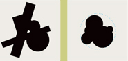
VARIED CONTRASTS IN positive and negative areas—such as those between the angular, linear beak; the round dot; the curved shoulders; and the sharp claws in this griffon image—spark interest and engage the viewer’s mind.
Vicki Li Iowa State University, United States
![]()
Positive and Negative Form is considered a positive element, a solid thing or object. Space is considered negative—not in a bad way, but as the absence, or opposite, of form. Space is the “ground” in which form becomes a “figure.” The relationship between form and space, or figure and ground, is complementary and mutually dependent; it’s impossible to alter one and not the other. The confrontation between figure and ground defines the kind of visual activity, movement, and sense of three-dimensionality perceived by the viewer. All these qualities are inherently communicative—resolving the relationships between figure and ground is the first step in creating a simple, overarching message about the content of the designed work, before the viewer registers the identity of an image or the content of any text that is present. Organizing figure—the positive—in relation to the ground—or negative—is therefore one of the most important visual aspects of design because it affects so many other aspects, from general emotional response to informational hierarchy. ![]() The figure/ground relationship must be understandable and present some kind of logic to the viewer; it must also be composed in such a way that the feeling this compositional, or visual, logic generates is perceived as appropriate to the message the designer is trying to convey. The logic of composition—the visual order and relationships of the figure and ground—is entirely abstract, but depends greatly on how the brain interprets the information that the viewer sees. Visual logic, all by itself, can also carry meaning. An extremely active relationship between figure and ground might be appropriate for one kind of communication, conveying energy, growth, and aggression; a static relationship, communicating messages such as quietness, restraint, or contemplation, might be equally appropriate in another context.
The figure/ground relationship must be understandable and present some kind of logic to the viewer; it must also be composed in such a way that the feeling this compositional, or visual, logic generates is perceived as appropriate to the message the designer is trying to convey. The logic of composition—the visual order and relationships of the figure and ground—is entirely abstract, but depends greatly on how the brain interprets the information that the viewer sees. Visual logic, all by itself, can also carry meaning. An extremely active relationship between figure and ground might be appropriate for one kind of communication, conveying energy, growth, and aggression; a static relationship, communicating messages such as quietness, restraint, or contemplation, might be equally appropriate in another context. ![]() The degree of activity might depend on how many forms are interacting in a given space, the size of the forms relative to the space, or how intricate the alternation between positive and negative appears to be. However, a composition might have relatively simple structural qualities—meaning only one or two forms in a relatively restrained interaction—but unusual relationships that appear more active or more complex, despite the composition’s apparent simplicity.
The degree of activity might depend on how many forms are interacting in a given space, the size of the forms relative to the space, or how intricate the alternation between positive and negative appears to be. However, a composition might have relatively simple structural qualities—meaning only one or two forms in a relatively restrained interaction—but unusual relationships that appear more active or more complex, despite the composition’s apparent simplicity. ![]() In some compositions, the figure/ground relationship can become quite complex, to the extent that each might appear optically to be the other at the same time. This effect, in which what appears positive one minute appears negative the next, is called “figure/ground reversal.” This rich visual experience is extremely engaging; the brain gets to play a little game, and, as a result, the viewer is enticed to stay within the composition a little longer and investigate other aspects to see what other fun he or she can find. If you can recall one of artist M.C. Escher’s drawings—in which white birds, flying in a pattern, reveal black birds made up of the spaces between them as they get closer together—you’re looking at a classic example of figure/ground reversal in action. The apparent reversal of foreground and background is also a complex visual effect that might be delivered through very simple figure/ground relationships, by overlapping two forms of different sizes, for example, or allowing a negative element to cross in front of a positive element unexpectedly.
In some compositions, the figure/ground relationship can become quite complex, to the extent that each might appear optically to be the other at the same time. This effect, in which what appears positive one minute appears negative the next, is called “figure/ground reversal.” This rich visual experience is extremely engaging; the brain gets to play a little game, and, as a result, the viewer is enticed to stay within the composition a little longer and investigate other aspects to see what other fun he or she can find. If you can recall one of artist M.C. Escher’s drawings—in which white birds, flying in a pattern, reveal black birds made up of the spaces between them as they get closer together—you’re looking at a classic example of figure/ground reversal in action. The apparent reversal of foreground and background is also a complex visual effect that might be delivered through very simple figure/ground relationships, by overlapping two forms of different sizes, for example, or allowing a negative element to cross in front of a positive element unexpectedly.

DARKER AND LIGHTER FIELDS of color are used interchangeably for light and shadow to define a three-dimensional space.
LSD Spain

AS THE LINES OF this graphic form cross each other, the distinction between what is positive and what is negative becomes ambiguous. Some areas that appear to be negative at one glance become positive in the next.
Clemens Théobert Schedler Austria

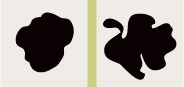
THE TWO MUSHROOM SHAPES appear to be positive elements, but they are actually the negative counterspaces of a lumpy letter M, which, incidentally, bears a resemblance to a mound of dirt.
Frost Design Australia
Seeing Form and Space
Categories of Form
Putting Stuff Into Space
Compositional Strategies
A Foundation for Meaning

DESPITE THE FACT THAT most of the elements in this symbol are linear—and appear to occupy the same, flat spatial plane—the small figures toward the bottom appear to be in the foreground because one of them connects to the negative space outside the mark, and the line contours around these figures are heavier than those of the larger, crowned figure.
Sunyoung Park Iowa State University, United States

THE NEGATIVE ARROWS become positive against the large angled form.
John Jensen Iowa State University; United States
POSITIVE AND NEGATIVE space, as they relate to type and ink, are used in an interesting repetition to create more ambiguous space in this poster. The red bar becomes flat against the photographs, but the reversed-out type seems to come forward, as does its positive repetition below. Although the photographs seem flat toward the top, they seem to drop into a deeper space down below, as they contrast the flat, linear quality of the script type.
Brett Yasko United States
Comparison of an active figure/ ground relationship (left) with an inactive figure/ground relationship (right) hints at the potential for meaning to be perceived even in such a fundamentally simple, abstract environment. Compare these pairs of simple, opposing ideas between the two examples: loud/quiet; aggressive/passive; nervous/sedate; complex/simple; energetic/weak; and living/dead.

As shown earlier, cropping large forms within a smaller space may generate the perception of new forms that become positive, a simple example of figure/ ground reversal.

The intrusion of a small shape of exterior negative space, relative to the positive form, causes the negative space to take on the quality of a positive white form while still allowing the eye to perceive the black form as positive overall. This complex figure/ ground reversal presents rich optical possibilities in composition, even among relatively simple, or relatively few, form elements.

CONSIDER EACH ELEMENT in this abstract page spread. Which form is descending? Which form is most in the background? Which form descends from right to left? Which form counteracts that movement? Which form moves from top to bottom? Which angles align and which do not? What effect does texture appear to have on the relative flatness or depth of the overall background color? Being able to describe what forms appear to be doing is crucial to understanding how they do it—and how to make them do it when you want to.
Andreas Ortag Austria
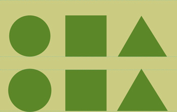
It is what it appears to be. Make decisions about forms based on their appearance rather than on intended effect or, worse, measurements. Form is optically deceptive and so must be judged according to what it looks like; this is all the viewer will have to go on as well. In this example, the three shapes—circle, square, and triangle—are first shown being mathematically the same height (top). You’ll notice that the square appears larger than both the circle and the triangle. So, for all intents and purposes, it is. This optical illusion is a function of how our brains interpret rounded, angular, and square images relative to each other (see Geometric Form, page 54). If the goal here is to make all three shapes appear to be the same size, the circle and the triangle must be adjusted in size until they do (bottom). Only when all three shapes appear to be the same size are they really the same size—as far as the viewer is concerned.
Seeing Form and Space
Categories of Form
Putting Stuff Into Space
Compositional Strategies
A Foundation for Meaning
![]()
Clarity and Decisiveness Resolved and refined compositions create clear, accessible visual messages. Resolving and refining a composition means understanding what kind of message is being carried by a given form, what it does in space, and what effect the combination of these aspects has on the viewer. ![]() First, some more definitions. To say that a composition is “resolved” means that the reasons for where everything is, how big the things are, and what they’re doing with each other in and around space—the visual logic—is clear, and that all the parts seem considered relative to each other. “Refined” is a quirky term when used to describe form or composition; in this context, it means that the form or composition has been made to be more like itself—more clearly, more simply, more indisputably communicating one specific kind of quality. Like the term “beautiful,” the quality of “refinement” can apply to rough, organic, and aggressive forms, as well as sensuous, elegant, and clean ones. It’s not a term of value so much as an indicator of whether the form is as clear as possible.
First, some more definitions. To say that a composition is “resolved” means that the reasons for where everything is, how big the things are, and what they’re doing with each other in and around space—the visual logic—is clear, and that all the parts seem considered relative to each other. “Refined” is a quirky term when used to describe form or composition; in this context, it means that the form or composition has been made to be more like itself—more clearly, more simply, more indisputably communicating one specific kind of quality. Like the term “beautiful,” the quality of “refinement” can apply to rough, organic, and aggressive forms, as well as sensuous, elegant, and clean ones. It’s not a term of value so much as an indicator of whether the form is as clear as possible. ![]() This, of course, brings up the issue of “clarity,” which has to do with whether a composition and the forms within it are readily understandable. Some of this understandability depends on the refinement of the forms, and some of it depends on the resolution of the relationships between form and space and whether these are “decisive,” appearing to be on purpose and indisputable. A form or a spatial relationship can be called decisive if it is clearly one thing and not the other: for example, is one form larger or smaller than the one next to it, or are they both the same size? If the answer to this question is quick and nobody can argue with it—“The thing on the left is larger” or “Both things are the same size”—then the formal or spatial relationship is decisive. Being decisive with the visual qualities of a layout is important in design because the credibility of the message being conveyed depends on the confidence with which the forms and composition have been resolved. A weak composition, one that is indecisive, evokes uneasiness in a viewer, not just boredom. Uneasiness is not a good platform on which to build a complicated message that might involve persuasion.
This, of course, brings up the issue of “clarity,” which has to do with whether a composition and the forms within it are readily understandable. Some of this understandability depends on the refinement of the forms, and some of it depends on the resolution of the relationships between form and space and whether these are “decisive,” appearing to be on purpose and indisputable. A form or a spatial relationship can be called decisive if it is clearly one thing and not the other: for example, is one form larger or smaller than the one next to it, or are they both the same size? If the answer to this question is quick and nobody can argue with it—“The thing on the left is larger” or “Both things are the same size”—then the formal or spatial relationship is decisive. Being decisive with the visual qualities of a layout is important in design because the credibility of the message being conveyed depends on the confidence with which the forms and composition have been resolved. A weak composition, one that is indecisive, evokes uneasiness in a viewer, not just boredom. Uneasiness is not a good platform on which to build a complicated message that might involve persuasion.

An image’s degree of refinement refers to how much it is like itself, how clear and undisturbed by distracting or conflicting elements—rather than how “clean” or “finished” it might appear. Shown here, first, is a form that is not yet refined; its internal relationships are unclear, somewhat awkward or unresolved. Slight adjustments refine its inherent characteristics so that they are more pronounced. An overlay of the original (gray) and refined forms provides a detailed comparison of these alterations.

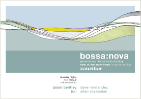
THE LOGO’S ABSTRACTION is expanded into a clearly branded graphic environment whose wave-like forms allude to the protective, organic, enveloping quality of health care. The lines created by the typography contrast the liquid plane forms, but respond to their lateral movement across the format.
Monigle Associates United States
Seeing Form and Space
Categories of Form
Putting Stuff Into Space
Compositional Strategies
A Foundation for Meaning

THE DOT PATTERN EMBODIES ideas related to financial investing, given context by the typography: graph-like organization, growth, merging and separating, networking, and so on.
UNA (Amsterdam) Designers Netherlands

LINE CONTRASTS with texture, organic cluster contrasts with geometric text, and large elements contrast with small in this promotional poster.
Munda Graphics Australia
![]()
Each of These Things Is Unlike the Other There are several kinds of basic form, and each does something different. Rather, the eye and the brain perceive each kind of form as doing something different, as having its own kind of identity. The perception of these differences and how they affect the form’s interaction with space and other forms around it, of differing identities, is what constitutes their perceived meaning. The context in which a given form appears—the space or ground it occupies and its relationship to adjacent forms—will change its perceived meaning, but its intrinsic identity and optical effect always remains an underlying truth. The most basic types of form are the dot, the line, and the plane. Of these, the line and the plane also can be categorized as geometric or organic; the plane can be either flat, textured, or appear to have three-dimensional volume or mass.

IT’S TRUE THAT THIS BOOK spread is a photograph of what appears to be a desktop. But it’s actually a composition of dots, lines, rectangles, and negative spaces—all of different sizes and orientation, relative to each other.
Finest Magma Germany

ALTHOUGH THE JAZZ FIGURES are recognizable images, they behave nonetheless as a system of angled lines, interacting with a secondary system of hard- and soft-edged planes. In addition to considering the back-and-forth rhythm created by the geometry of all these angles, the designer has also carefully considered the forms’ alternation between positive and negative to enhance their rhythmic quality and create a sense of changing position from foreground to background.
Niklaus Troxler Switzerland

MOST OF THE VISUAL elements in this brochure are dots; some are more clearly dots, such as the circular blobs and splotches, and some are less so, such as the letterforms and the little logo at the top. Despite not physically being dots, these elements exert the same kind of focused or radiating quality that dots do, and they react to each other in space like dots. In terms of a message, these dots are about gesture, primal thumping, and spontaneity. . . and, more concretely, about music.
Voice Australia
Seeing Form and Space
Categories of Form
Putting Stuff Into Space
Compositional Strategies
A Foundation for Meaning

![]()
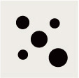
The Dot The identity of a dot is that of a point of focused attention; the dot simultaneously contracts inward and radiates outward. A dot anchors itself in any space into which it is introduced and provides a reference point for the eye relative to other forms surrounding it, including other dots, and its proximity to the edges of a format’s space. As seemingly simple a form as it might appear, however, a dot is a complex object, the fundamental building block of all other forms. As a dot increases in size to cover a larger area, and its outer contour becomes noticeable, even differentiated, it still remains a dot. Every shape or mass with a recognizable center—a square, a trapezoid, a triangle, a blob—is a dot, no matter how big it is. True, such a shape’s outer contour will interact with space around it more dramatically when it becomes bigger, but the shape is still essentially a dot. Even replacing a “flat” graphic shape with a photographic object, such as a silhouetted picture of a clock, will not change its fundamental identity as a dot. Recognizing this essential quality of the dot form, regardless of what other characteristics it takes on incidentally in specific occurrences, is crucial to understanding its visual effect in space and its relationship to adjacent forms.

When a dot enters a space, it establishes an immediate relationship with the space; the proportion of the dot to its surrounding area is the most important consideration; second is its relative position to the edges of the space. The dot breaks the space in a neutral way, being weightless and internally balanced, but it might already create noticeable differences in spatial areas if it is placed off center. The centrally located dot is settled, comfortable, and static, but it dominates the space around it; as it moves from the center, there is a shift in dominance—the background asserts itself and tension arises.

Introducing a second dot shifts attention away from the relationship of the space to the interaction of the two dots. They refer to each other and imply a structure—an invisible, connecting path that splits space apart. As dots approach each other, the tension between them increases. If the space between dots is just about zero, its presence assumes more importance than the dots themselves, and even more importance relative to any other spatial interval. If the dots overlap, especially if they are different sizes, the tension created by their closeness is somewhat relieved. However, a new tension arises—the dichotomy of flat, graphic form and the appearance of three-dimensional depth as one dot seemingly inhabits a foreground, and the other, a background position.

The closer the dots are to each other, the more powerful the sense of their unique identity as objects; the further apart, the more pronounced the sense of structure, induced by the invisible path between them. Additional dots in close proximity to the pair, however, reduce the focus on identity and increase attention to their reciprocal relationship and thus, a sense of structure or meaning. How far are the dots from each other? Is each dot the same distance from its counterparts? What is their configuration, and what outer shape does it make? What does this shape signify?

The flat dot and photographic images are all still dots.

Seeing Form and Space
Categories of Form
Putting Stuff Into Space
Compositional Strategies
A Foundation for Meaning

Working together, dots create an endless variety of arrangements and increasing complexity—a single vertical or horizontal row, rotated rows, an isolated dot in contrast to a group, progressions in interval, ordered rows in a grid structure, angles and geometric patterns, curves, and so on.
NOT ALL DOTS ARE CIRCULAR! Barring a few elements that are clearly lines, many of the dots on the gatefold pages of this brochure are something other than circular. However, they are still treated as dots for the purpose of composition, judging size change, proximity, tension, and negative spaces between as though they were flat, black, abstract dots. Note how the type’s linear quality contrasts with the dots on the pages.
C+G Partners United States
The negative dot is created in reverse from the convergence of other forms. Clustering dots of different sizes creates a more varied contour, but overall the cluster retains its identity as a dot.

The perception of spatial depth occurs among dots that are different sizes; a larger dot advances in front of a smaller one. Changing the relative tonal values of the dots, however, can create an ambiguous spatial tension among the dots, even though their relative sizes remain the same.

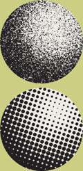
A tremendous number of small dots create (A) a regularized pattern or (B) a randomized texture. The darkness or lightness of these dots depends on density—how close the dots are to each other.

THE CLUSTER OF DOTS creates a kind of undulating mass. The outer contour of the cluster is very active, with differing proximity and tension to the format edges. The initial “b” offers a complement to the cluster and contrast in scale. The compositional logic is clear and decisive.
Leonardo Sonnoli Italy
![]()
The Line A line’s essential character is one of connection; it unites areas within a composition. This connection may be invisible, defined by the pulling effect on space between two dots, or it may take on visible form as a concrete object, traveling back and forth between a starting point and an ending point. ![]() Unlike a dot, therefore, the quality of linearity is one of movement and direction; a line is inherently dynamic, rather than static. The line might appear to start somewhere and continue indefinitely, or it might travel a finite distance. While dots create points of focus, lines perform other functions; they may separate spaces, join spaces or objects, create protective barriers, enclose or constrain, or intersect. Changing the size—the thickness—of a line relative to its length has a much greater impact on its quality as a line than does changing the size of a dot. As a line becomes thicker or heavier in weight, it gradually becomes perceived as a plane surface or mass; to maintain the line’s identity, it must be proportionally lengthened.
Unlike a dot, therefore, the quality of linearity is one of movement and direction; a line is inherently dynamic, rather than static. The line might appear to start somewhere and continue indefinitely, or it might travel a finite distance. While dots create points of focus, lines perform other functions; they may separate spaces, join spaces or objects, create protective barriers, enclose or constrain, or intersect. Changing the size—the thickness—of a line relative to its length has a much greater impact on its quality as a line than does changing the size of a dot. As a line becomes thicker or heavier in weight, it gradually becomes perceived as a plane surface or mass; to maintain the line’s identity, it must be proportionally lengthened.

LINES PLAY A DUAL ROLE on this CD-ROM cover. First, they create movement around the perimeter of the format, in contrast to the rectangular photograph. Other lines are more pictorial, and represent musical scoring and circuitry.
JRoss Design United States
Seeing Form and Space
Categories of Form
Putting Stuff Into Space
Compositional Strategies
A Foundation for Meaning

AS LINES IN SEQUENCE change weight (thickness) and get closer and further apart, they create rhythms. On this cover, the rhythm is more open and expansive toward the bottom, tightens or quickens in the middle, opens slightly, wavers, and then tightens again. The rhythm between lines is made more complex by the color change from black to hot pink. Note that the typography participates in the composition; there’s a reason why designers refer to “lines” of type.
Not From Here United States
THREE STATIC LINES with minimal color difference form a backdrop to a fluctuating formation of wave-like lines; stasis and activity contrast with each other. The typography picks up on this movement in the flip of alignment from left to right.
344 Design United States

A line traveling around a fixed, invisible point at an unchanging distance becomes a circle. Note that a circle is a line, not a dot. If the line’s weight is increased dramatically, a dot appears in the center of the circle, and eventually the form is perceived as a white (negative) dot on top of a larger, positive dot.

A thin, single line has no center and no mass, expressing only direction and an effect on the space surrounding it.
Breaking the line increases its surface activity without distracting from its movement and direction.
Several thin lines together create a texture, similar to that created by a dense grouping of similar-sized dots.
Separating the lines increases attention to their individual identities. It also calls attention to the intervals between them and what, if any, variation there might be.

A change in weight among a group of lines, as well as a change in the intervals between them, creates the illusion of spatial depth. Lines that are closer together exert tension on each other and advance in space, while those further apart recede. If any of the lines are rotated to cross their counterparts, the perception of spatial depth is enhanced—and even more so if their weights also are differentiated.
Although a thin line generally will appear to recede against a thicker line, the mind is capable of being convinced that the thin line is crossing in front of the thick line.
Two heavy lines that are very close together create a third—negative—line between them. The optical effect of the negative white line is that of a positive element on top of a single black element, even if the negative line joins open spaces at either end.
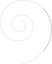
A spiraling line appears to move simultaneously inward and outward, re-creating the visual forces inherent in a single dot.

Two lines joining create an angle. The joint between two lines becomes a starting point for two directional movements; multiple joints between lines create a sense of altered direction in one movement. An extremely acute angle might also be perceived as a rapid movement from one direction to another.

Lines that both enter and leave a format reinforce the sense of their movement along the direction in which they do so. If the beginning or ending points of the lines are contained within the format, their directional movement is changed from continuous to specific; the result is that their tension with surrounding space or forms is increased greatly as the eye is able to focus on the point at which they start or stop.

White (negative) lines crossing in front of (and behind) black (positive) lines create increasingly complex spatial relationships.

Lines together produce rhythm. Equally spaced, a set of lines produces an even, relatively static tempo; differences in space produce a dynamic, syncopated tempo. The kind of spatial difference introduced between lines affects the perceived rhythm, and might create meaning: progression, sequence, repetition, or system. Such rhythmic changes in interval create directional movement; the more complex the changes, and the more variation in line weights, the more complex the rhythm and movement become.
Seeing Form and Space
Categories of Form
Putting Stuff Into Space
Compositional Strategies
A Foundation for Meaning

ON THIS PAGE SPREAD from a concert program, lines of different weights are used to separate horizontal channels of information. Varying the weights of the lines, along with the degree to which their values contrast with the background, not only adds visual interest but also enhances the informational hierarchy.
E-Types Denmark

ON THIS BROCHURE SPREAD, less-distinct blue lines form a channel around images at the left while sharper yellow lines draw attention to the text at the right and help to join the two pages into one composition. The staggered lines created by the text at the lower left, as well as the thin vertical lines used as dividers in the headline, bring type and image together with corresponding visual language.
C. Harvey Graphic Design United States


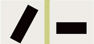
Lines might break or join spaces within a format. In breaking or joining these spaces, lines might perform additional functions relative to other forms within the same format. (A) The line protects the circular form. (B) The white line joins both forms across a barrier. (C) The line offers contrast to the form, but supports it. (D) The line joins two spaces.

BECAUSE LINES ARE rhythmic, they can be used to create or enhance meaning in images or compositions. Here, the idea of movement is imparted to the abstract bird by the progression of line weights from “tail” end to front.
Studio International Croatia
![]()
Plane and Mass A plane is simply just a big dot whose outer contour—the sense of its shape—becomes an important attribute: for example, that it may be angular, rather than round. Its dotlike quality becomes secondary the larger the plane object becomes. This change depends on the size of the plane relative to the space in which it exists; in a large poster, even a relatively large plane object—a square or a triangle, for example—will still act as a dot if the volume of space surrounding it is much larger than the plane object itself. At the point where a plane object enlarges within a format so that its actual shape begins to affect the shapes of the negative space around it, the character of its outer contour, as well as its surface texture, come into question. ![]() All such shapes appear first as flat surfaces; their external contour must be defined by the mind to identify it as being one kind of shape or another and, subsequently, what meaning that shape might have. The more active the plane’s contour—and more so if the contour becomes concave, allowing surrounding negative space to enter into the dimensional surface defined by the shape—the more dynamic the shape will appear, and the less it will radiate and focus in the way a dot, with a simple, undifferentiated contour, does.
All such shapes appear first as flat surfaces; their external contour must be defined by the mind to identify it as being one kind of shape or another and, subsequently, what meaning that shape might have. The more active the plane’s contour—and more so if the contour becomes concave, allowing surrounding negative space to enter into the dimensional surface defined by the shape—the more dynamic the shape will appear, and the less it will radiate and focus in the way a dot, with a simple, undifferentiated contour, does. ![]() The relative size and simplicity of the shape has an impact on its perceived mass, or weight. A large form with a simple contour retains its dot-like quality and presents a heavy optical weight; a form with a complex contour, and a great deal of interaction between internal and external positive and negative areas, becomes weaker, more line-like, and exhibits a lighter mass. As soon as texture appears on the surface of a plane, its mass decreases and it becomes flatter—unless the texture emulates the effect of light and shade, creating a perceived three-dimensionality, or volume. Even though apparently three-dimensional, the plane or volume still retains its original identity as a dot.
The relative size and simplicity of the shape has an impact on its perceived mass, or weight. A large form with a simple contour retains its dot-like quality and presents a heavy optical weight; a form with a complex contour, and a great deal of interaction between internal and external positive and negative areas, becomes weaker, more line-like, and exhibits a lighter mass. As soon as texture appears on the surface of a plane, its mass decreases and it becomes flatter—unless the texture emulates the effect of light and shade, creating a perceived three-dimensionality, or volume. Even though apparently three-dimensional, the plane or volume still retains its original identity as a dot.

As a dot increases in size, its outer contour becomes noticeable as an important aspect of its form; eventually, appreciation of this contour supercedes that of its dot-like focal power, and it becomes a shape or plane. Compare the sequences of forms, each increasing in size from left to right. At what point does each form become less a dot and more a plane?
Seeing Form and Space
Categories of Form
Putting Stuff Into Space
Compositional Strategies
A Foundation for Meaning

ROTATING RECTANGULAR PLANES create movement—and mass as their densities build up toward the bottom—and an asymmetrical arrangement on this media kit folder. The planes in this case reflect a specific shape in the brand mark as well as refer to the idea of a screen.
Form United Kingdom
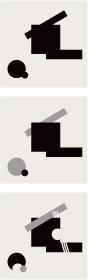
A plane surface will be more or less definable as a dot, depending on the volume of space surrounding it. The plane’s angular shape in the first example is unimportant because its shape is overwhelmed by the larger space and thus remains a dot.

In the second example, the format’s decrease in size, relative to the plane, causes its shape to become more important and thus is no longer simply a dot.

A plane with a simple contour (A) appears heavier (has more mass) than a plane with a complicated contour (B). Both planes appear even lighter when they take on surface texture. The simple plane with texture (C) appears lighter than the solid, more complicated plane; the textured, complicated plane (D) appears lighter still.
A plane whose mass is lightened by a consistent texture seems more active but appears flatter than an adjacent solid plane. The solid plane appears to advance, however, because of its perceived greater weight. Overlapping the solid plane with the textured plane creates an ambiguous tension between foreground and background. A plane whose texture emulates the effect of light and shade appears to have volume.

THE VARIOUS CONTENT AREAS of this website can be considered as a set of flat, rectangular planes in space. The images above and below the horizontal strip of navigation are two planes; the logo at the left is another; the navigation flyouts are additional planes; and the content area at the lower right is another. Color and textural changes help establish foreground and background presence, and affect the hierarchy of the page.
Made In Space, Inc. United States
![]()
Geometric Form As they do with all kinds of form, our brains try to establish meaning by identifying a shape’s outer contour. There are two general categories of shape, each with its own formal and communicative characteristics that have an immediate effect on messaging: geometric form and organic form. A shape is considered geometric in nature if its contour is regularized—if its external measurements are mathematically similar in multiple directions—and, very generally, if it appears angular or hard-edged. It is essentially an ancient, ingrained expectation that anything irregular, soft, or textured is akin to things experienced in nature. Similarly, our expectation of geometry as unnatural is the result of learning that humans create it; hence, geometry must not be organic. The weird exception to this idea is the circle or dot, which, because of its elemental quality, might be recognized as either geometric or natural: earth, sun, moon, or pearl. Lines, too, might have a geometric or organic quality, depending on their specific qualities. Geometric forms might be arranged in extremely organic ways, creating tension between their mathematical qualities and the irregularity of movement. Although geometric shapes and relationships clearly occur in nature, the message a geometric shape conveys is that of something artificial, contrived, or synthetic.

THE PINK AREA printed on this die-cut cover creates the sense of two trapezoidal planes intersecting within an ambiguous space in this brochure cover.
344 Design United States
Seeing Form and Space
Categories of Form
Putting Stuff Into Space
Compositional Strategies
A Foundation for Meaning

There are three essential types of geometric form: circle, polygon, and line. For polygons, the simplest are the square and the triangle, having four sides and three sides, respectively. The square is the most stable and presents the most mass; the triangle is the least stable polygon and induces a great deal of optical movement around its contour. The circle is nearly as stable as the square although its continuous curve hints at rotation; its curvy quality is completely opposite to that of the square. Lines that are straight, stepped, or configured as angles are also geometric.

Arrangements of geometric forms in geometric, or mathematical, spatial relationships (A1 and A2) are contrasted by the irregular, organic quality of their arrangements in irregular relationships (B1 and B2).

THE BLOCKS ON THIS poster are purely geometric. The lighting that is used to change their color also affects their apparent dimensionality; the blue areas at the upper left sometimes appear to be flat.
Studio International Croatia

BASIC GEOMETRIC FORMS— the rectangular plane of the photographs, the circle of the teacup, and the triangle of the potting marker—provide a simple counterpoint to the organic leaves and the scenes in the photographs themselves.
Red Canoe United States


THE IRREGULAR, UNSTUDIED, constantly changing outer contour of flowers is a hallmark of organic form. These qualities contrast dynamically with the linear elements—including type, both sans serif and script—and create striking negative forms.
Pamela Rouzer Laguna College of Art, United States
Seeing Form and Space
Categories of Form
Putting Stuff Into Space
Compositional Strategies
A Foundation for Meaning

SOME LINES ARE ORGANIC rather than geometric. The linear brush drawing of this logo exaggerates the spontaneous motion of potting and alludes to its humanity and organic nature.
StressDesign United States


THE DRAWINGS AND TEXTURES that support the images of the dresses in this fashion catalog create a sense of the handmade, the delicate, and the personal.
Sagmeister United States
![]()
Organic Form Shapes that are irregular, complex, and highly differentiated are considered organic—this is what our brains tell us after millennia of seeing organic forms all around us in nature. As noted earlier, geometry exists in nature, but its occurrence happens in such a subtle way that it is generally overshadowed by our perception of overall irregularity. The structure of most branching plants, for example, is triangular and symmetric. In the context of the whole plant, whose branches may grow at different rates and at irregular intervals, this intrinsic geometry is obscured. Conveying an “organic” message, therefore, means reinforcing these irregular aspects in a form, despite the underlying truth of geometry that actually might exist. Nature presents itself in terms of variation on essential structure, so a shape might appear organic if its outer contour is varied along a simple logic—many changing varieties of curve, for example. Nature also appears highly irregular or unexpected (again, the plant analogy is useful) so irregularity in measurement or interval similarly conveys an organic identity. Nature is unrefined, unstudied, textural, and complicated. Thus shapes that exhibit these traits will also carry an organic message.

A CURLING, ORGANIC wave form integrates with the curved, yet geometric, letterform in this logo.
LSD Spain

Soft, textured forms appear organic compared to similar forms with hard edges, as do forms that are gestural, mostly curvilinear, or whose contours are constantly changing in rhythm, direction, and proportion.
The shapes shown here—one, with a relatively simple contour (left), and the other, with a highly differentiated contour—are organic, but to lesser and greater degrees. The first shape, despite changes in contour, retains an intrinsically circular or dot-like—and therefore, more geometric—identity; the shape adjacent, with a complex contour that is ever-changing in measurement and directional movement, is dramatically more organic.


Geometry exists as a building block of natural, organic forms. In the photograph of the leaf, above, lines and dots—the leaf’s veins and holes from insect activity or fungal degradation—are clearly apparent. The outer contour of the leaf also presents a symmetrical structure. Distilled and stylized (A), this form retains its pictorial identity but loses its organic quality. Enforcing differentiated measurements between internal components (B) enhances its organic quality, while retaining its stylization.

Variation is an inherent aspect of organic form in nature. All these essentially similar shapes are varied slightly relative to each other and transmit an overall organic message, despite their structural similarity.
![]()
Surface Activity The quality of surface activity helps in differentiating forms from each other, just as the identifiable contours of form itself does. Again, the dot is the building block of this formal quality. Groupings of dots, of varying sizes, shapes, and densities, create the perception of surface activity. There are two basic categories of surface activity: texture and pattern. ![]() The term “texture” applies to surfaces having irregular activity without apparent repetition. The sizes of the elements creating surface activity might change; the distance between the components might change; the relative number of components might change from one part of the surface to another. Because of this inherent randomness, texture generally is perceived as organic or natural. Clusters and overlaps of lines—dots in specific alignments—are also textural, but only if they are relatively random, that is, they are not running parallel, or appearing with varying intervals between, or in random, crisscrossing directions.
The term “texture” applies to surfaces having irregular activity without apparent repetition. The sizes of the elements creating surface activity might change; the distance between the components might change; the relative number of components might change from one part of the surface to another. Because of this inherent randomness, texture generally is perceived as organic or natural. Clusters and overlaps of lines—dots in specific alignments—are also textural, but only if they are relatively random, that is, they are not running parallel, or appearing with varying intervals between, or in random, crisscrossing directions. ![]() “Pattern,” however, has a geometric quality—it is a specific kind of texture in which the components are arranged on a recognizable and repeated structure—for example, a grid of dots. The existence of a planned structure within patterns means they are understood to be something that is not organic: they are something synthetic, mechanical, mathematical, or mass produced.
“Pattern,” however, has a geometric quality—it is a specific kind of texture in which the components are arranged on a recognizable and repeated structure—for example, a grid of dots. The existence of a planned structure within patterns means they are understood to be something that is not organic: they are something synthetic, mechanical, mathematical, or mass produced. ![]() When considering texture, it’s important to not overlook the selection and manipulation of paper stock—this, too, creates surface activity in a layout. A coated paper might be glossy and reflective, or matte and relatively non-reflective. Coated stocks are excellent for reproducing color and detail because ink sits up on their surfaces, rather than being partly absorbed by the fibers of the paper. The relative slickness of coated sheets, however, might come across as cold or impersonal but also as refined, luxurious, or modern. Uncoated stocks, on the other hand, show a range of textural qualities, from relatively smooth to very rough. Sometimes, flecks of other materials, such as wood chips, threads, or other fibers, are included for added effect. Uncoated stocks tend to feel organic, more personal or hand-made, and warmer. The weight or transparency of a paper also will influence the overall feel of a project.
When considering texture, it’s important to not overlook the selection and manipulation of paper stock—this, too, creates surface activity in a layout. A coated paper might be glossy and reflective, or matte and relatively non-reflective. Coated stocks are excellent for reproducing color and detail because ink sits up on their surfaces, rather than being partly absorbed by the fibers of the paper. The relative slickness of coated sheets, however, might come across as cold or impersonal but also as refined, luxurious, or modern. Uncoated stocks, on the other hand, show a range of textural qualities, from relatively smooth to very rough. Sometimes, flecks of other materials, such as wood chips, threads, or other fibers, are included for added effect. Uncoated stocks tend to feel organic, more personal or hand-made, and warmer. The weight or transparency of a paper also will influence the overall feel of a project. ![]() Exploiting a paper’s physical properties through folding, cutting, short-sheeting, embossing, and tearing creates surface activity in a three dimensional way. Special printing techniques, such as varnishes, metallic and opaque inks, or foil stamping, increase surface activity by changing the tactile qualities of a paper stock’s surface. Opaque inks, for example, will appear matte and viscous on a gloss-coated stock, creating surface contrast between printed and unprinted areas. Metallic ink printed on a rough, uncoated stock will add an appreciable amount of sheen, but not as much as would occur if printed on a smooth stock. Foil stamping, available in matte, metallic, pearlescent, and iridescent patterns, produces a slick surface whether used on coated or uncoated stock and has a slightly raised texture.
Exploiting a paper’s physical properties through folding, cutting, short-sheeting, embossing, and tearing creates surface activity in a three dimensional way. Special printing techniques, such as varnishes, metallic and opaque inks, or foil stamping, increase surface activity by changing the tactile qualities of a paper stock’s surface. Opaque inks, for example, will appear matte and viscous on a gloss-coated stock, creating surface contrast between printed and unprinted areas. Metallic ink printed on a rough, uncoated stock will add an appreciable amount of sheen, but not as much as would occur if printed on a smooth stock. Foil stamping, available in matte, metallic, pearlescent, and iridescent patterns, produces a slick surface whether used on coated or uncoated stock and has a slightly raised texture.
Seeing Form and Space
Categories of Form
Putting Stuff Into Space
Compositional Strategies
A Foundation for Meaning

Visual activity on a plane surface is categorized as a texture if it appears random or if it changes in quality from one location to another. While most often organic in source (top), such textures may also be created from dot-based or linear form (bottom).

The more constantly irregular a texture’s density is within a given area, the less overall contrast and, therefore, the flatter, or more two dimensional, the surface will appear—and the less organic or natural. Conversely, strong contrast in a texture’s density within a given area, along with a certain randomness of distribution, increases the texture’s dimensional quality as well as its inherent organic quality. An evenly continuous transition from lighter to darker within a given area will often be perceived as the play of light across a volume.

UPON CLOSER INSPECTION, the irregular texture around the numeral is revealed to be a flock of hummingbirds. Oddly enough, their apparently random placement is carefully studied to control the change in density.
Studio Works United States

WARPING THE PROPORTIONS of a dot grid creates a dramatically three-dimensional pattern. This quality refers to the activity of the client, a medical imaging and networking organization.
LSD Spain

Visual activity on a plane surface should be categorized as pattern if it exhibits some repeated, consistent relationship, such as a grid structure, between its component elements. Shown clockwise from upper left are an engraving, a grid of square dots, pattern created by photographing architecture, and a simple herringbone.

Increasing the density of a pattern’s components creates a change in darkness, or value. Changes in pattern density, or value, may be stepped, as in the example above (A), or continuous, as in the grid of dots, right (B). While the continous transition from lighter to darker values in the dot grid is smooth, and less geometric in appearance, the pattern still retains its mechanical quality in contrast to texture.
In a patterned surface, creating the perception of three dimensionality and the play of light is also possible, but the geometric quality of the pattern presents a highly stylized version of volu-metric appearance. Compare the patterned volume at top with the textured volume at bottom.
PATTERN IS CONSIDERED decorative and man-made, and too much usually is a bad thing. In the case of this book on a trend in design called Maximalism however, its use as an allover background treatment enhances the communication of excess.
Loewy United Kingdom

PRINTING THIS POSTER ON a translucent, handmade paper stock presents unusual textural potential for the typography and adds a distinctly organic quality to the piece.
Made In Space, Inc. United States
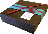
A LEATHER-BOUND BOX contrasts texture and subdued, neutral color with vibrant, saturated hues and smooth surfaces in this promotional item from a design studio.
Roycroft Design United States
Seeing Form and Space
Categories of Form
Putting Stuff Into Space
Compositional Strategies
A Foundation for Meaning
THE DELICATE GLOSS VARNISH on the surface of this invitation creates just enough surface activity to be appreciated by the viewer, and its slight enlargement over the original insignia image creates a sense of expansion.
There Australia

DIE-CUTS ARE a popular way of engaging the paper stock in the design of a printed piece. Die-cut holes can reveal color or surprise images, or they can be used to orchestrate complex pop-ups that add dimensionality.
A C+G Partners United States
B Voice Australia
C, D Thomas Csano Canada

THIS SET OF INVITATIONS exploits the tactile surface quality of foil stamping and the interaction of colored ink. The foil stamp is pearlescent and somewhat transparent; its refractory effect changes in color depending on the color of the surface onto which it is stamped.
Form United Kingdom

EMBOSSING ADDS subtle visual activity and tactile quality to this cover while colored stickers, applied to the surface, introduce random variation to the layout of each copy, at the same time alluding to the subject matter.
Mutabor Germany
![]()
Breaking Space Space—the ground or field of a composition—is neutral and inactive until it is broken by form. But how does the designer break the space, and what happens as a result? Thoughtfully considering these fundamental questions gives the designer a powerful opportunity not only to engage a viewer but also to begin transmitting important messages, both literal and conceptual, before the viewer even gets the chance to assimilate the content. ![]() Space is defined and given meaning the instant a form appears within it, no matter how simple. The resulting breach of emptiness creates new space—the areas surrounding the form. Each element brought into the space adds complexity but also decreases the literal amount of space—even as it creates new kinds of space, forcing it into distinct shapes that fit around the forms like the pieces of a puzzle. These spaces shouldn’t be considered “empty” or “leftover;” they are integral to achieving flow around the form elements, as well as a sense of order and unity throughout the composition. When the shapes, sizes, proportions, and directional thrusts of these spaces exhibit clear relationships with the form elements they surround, they become resolved with the form and with the composition as a whole.
Space is defined and given meaning the instant a form appears within it, no matter how simple. The resulting breach of emptiness creates new space—the areas surrounding the form. Each element brought into the space adds complexity but also decreases the literal amount of space—even as it creates new kinds of space, forcing it into distinct shapes that fit around the forms like the pieces of a puzzle. These spaces shouldn’t be considered “empty” or “leftover;” they are integral to achieving flow around the form elements, as well as a sense of order and unity throughout the composition. When the shapes, sizes, proportions, and directional thrusts of these spaces exhibit clear relationships with the form elements they surround, they become resolved with the form and with the composition as a whole.
Static and Dynamic The proportions of positive and negative might be generally static or generally dynamic. Because the picture plane is already a flat environment where movement and depth must be created as an illusion, fighting the tendency of two-dimensional form to feel static is important. The spaces within a composition will generally appear static—in a state of rest or inertia—when they are optically equal to each other. Spaces need not be physically the same shape to appear equal in presence or “weight.” The surest way of avoiding a static composition is to force the proportions of the spaces between forms (as well as between forms and the format edges) to be as different as possible.

As soon as a form enters a given space, the space is changed and structure appears—simple as this might be. There are now two spaces created by the form’s location in the center of the format—each similar in quality, shape, and volume.

Without changing the form—except for a minor repositioning—the volumes, shapes, and qualities inherent in the spaces surrounding the form are made different from each other.
Seeing Form and Space
Categories of Form
Putting Stuff Into Space
Compositional Strategies
A Foundation for Meaning

THE FORMS ON THIS poster break the space decisively—meaning that the proportions of negative space have clear relationships to each other—and the locations of elements help to connect them optically across those spaces. The accompanying diagram notes these important aspects of the layout.
Leonardo Sonnoli Italy


Changing any aspect of a form in space—its relative size, its shape, its orientation to horizontal or vertical—or adding an additional form, creates differentiated spaces with new, more complex relationships to each other.

Multiple forms situated around similar spatial intervals create static interaction. This composition—the arrangement of forms within space—seems restful, comfortable, and quiet, and exhibits a kind of stasis despite the irregularity and rotation of the forms. Altering the intervals between form elements, or between elements and format edges, creates a dynamic composition. The movement of the eye is enhanced as these intervals exhibit more contrast with each other. Note the areas where the negative spaces become compressed or exhibit a directional thrust.

DECISIVELY BROKEN SPACE can be restrained yet still have a visual richness to it. The placement of the type element and the dotted line create four horizontal channels of space and two vertical channels of space.
AdamsMorioka United States
![]()
Arranging Form Within a compositional format, a designer can apply several basic strategies to organizing forms. Each strategy a designer employs will create distinctly different relationships among the forms themselves and between the forms and the surrounding space. Just as the identities of selected forms begin to generate messages for the viewer, their relative positions within the format, the spaces created between them, and their relationships to each other all will contribute additional messages. Forms that are clustered together, for example, will suggest that they are related to each other, as will forms that appear to align with one another. Forms separated by different spatial intervals will imply a distinction in meaning. Near and Far In addition to side-by-side, or lateral, arrangements at the picture plane, a designer may also organize form in illusory dimensional space—that is, by defining elements as existing in the foreground, in the background, or somewhere in between. Usually, the field or ground is considered to be a background space and forms automatically appear in the foreground. Overlapping forms, however, optically positions them nearer or further away from the viewer. The designer may increase this sense of depth by changing the relative values of the forms by making them transparent and increasing the differences in their sizes. Placing forms that are reversed—made negative, or the same value as the field or format space—on top of positive forms, will similarly exaggerate the sense of spatial depth, as well as potentially create interesting reversals of figure and ground. The seeming nearness or distance of each form will also contribute to the viewer’s sense of its importance and, therefore, its meaning relative to other forms presented within the same space. Movement Overlapping and bleeding, as well as the rotation of elements compared to others, may induce a feeling of kinetic movement. Elements perceived to occupy dimensional space often appear to be moving in one direction or another—receding or advancing. Juxtaposing a static form, such as a horizontal line, with a more active counterpart, such as a diagonal line, invites comparison and, oddly, the assumption that one is standing still while the other is moving. Changing the intervals between elements also invites comparison and, again, the odd conclusion that the changing spaces mean the forms are moving in relation to each other. The degree of motion created by such overlapping, bleeding, and rhythmic spatial separation will evoke varying degrees of energy or restfulness; the designer must control these messages as he or she does any other.
Seeing Form and Space
Categories of Form
Putting Stuff Into Space
Compositional Strategies
A Foundation for Meaning

Distinguishing Forcing clear separation between individual formal elements—whether they have similar or different identities—enhances the sense of difference between them. Despite such distinction, forms that have similar identities will retain the sense that they are related. One result of distinguishing through spatial separation, however, is that intervals of negative space may become more regularized and, therefore, potentially static. Rotating elements to create directional movement will alleviate this quality somewhat.

Clustering Grouping form elements together may simplify a composition overall as well as create a sense of relationship between clustered elements—and of difference between a cluster and a separate element or between several clusters. As a result of clustering, where the forms do not necessarily overlap but come into close proximity, a contrast arises between the smaller, intricate spaces among the clustered forms, and larger, simpler contours around the outer contour of the cluster. The greater the proportional changes in the outer contour of the cluster, the more dynamic it will appear, along with the spaces around the cluster.

Aligning Creating edge relationships between form elements—aligning them to each other from top to bottom, left to right, making them parallel, and so on—might create geometric superstructures and rhythmic repetitions or systems.
Overlapping Allowing one form to cross in front of another, even if both are the same color, will create the illusion of foreground and background. Introducing size changes among forms that overlap, as well as changes in their relative values—or, for that matter, placing negative forms on top of positive—will greatly enhance the illusion that the forms exist within three dimensional space.

TYPE, GRID PATTERNS, and geometric blocks—some white—exhibit mostly clustering, aligning, and overlapping strategies.
STIM Visual Communication United States

Layering The use of transparency in a cluster enhances the illusion of their apparent existence in three dimensional space. Carefully considering which elements appear solidly positive or negative—and which appear transparent—can result in startling conflicts in apparent spatial position.

Bleeding When forms within the compositional space appear to leave the format—that is, are cropped off by the edge of the format—they imply a much bigger composition extending outward into the “real” world.

Kinetic Sequencing Any element that is rotated away from orthogonal—horizontal and vertical—orientation will be perceived as moving, or kinetic, especially if it can be compared to any orthogonally-oriented forms. Introducing changes in size, rotation, and interval among elements, whether the same kind or not—and more so if such changes appear progressive from element to element—will create the impression of movement and progression—a kinetic sequence—among these particular elements.

THIS POSTER PLAYS a dangerous game with symmetry. Without the dynamic optical “buzzing” and movement generated by the diagonal lines and their color relationships, the arrangement of the type would be quite static, and the proportions of all the spaces would be the same in all four directions.
Apeloig Design France

CONTENT IS ALWAYS different and always changing, and an asymmetrical approach allows a designer to be flexible, to address the spatial needs of the content, and to create visual relationships between different items based on their spatial qualities. The horizon line in the room, the vertical column, the red headline, the text on the page, and the smaller inset photograph all respond to each other’s sizes, color, and location; the negative spaces around them all talk to each other.
ThinkStudio United States
Seeing Form and Space
Categories of Form
Putting Stuff Into Space
Compositional Strategies
A Foundation for Meaning
![]()
Symmetry and Asymmetry The result of making all the proportions between and around form elements in a composition different is that the possibility of symmetry is minimized. Symmetry is a compositional state in which the arrangement of forms responds to the central axis of the format (either the horizontal axis or the vertical axis); the forms might also be arranged in relation to each other’s central axes. Symmetrical arrangements mean that some set of spaces around the forms—or the contours of the forms around the axis—will be equal, which means that they are also static, or restful. The restfulness inherent in symmetry can be problematic relative to the goals of designed communication. Without differences in proportion to compare, the viewer is likely to gloss over material and come to an intellectual rest quickly, rather than investigate a work more intently. If the viewer loses interest because the visual presentation of the design isn’t challenging enough, the viewer’s attention might shift elsewhere before he or she has acquired the content of the message. ![]() A lack of visual, and thus cognitive, investigation is also likely to not make much of an impression on the viewer and, unfortunately, become difficult to recall later on. Asymmetrical arrangements provoke more rigorous involvement—they require the brain to assess differences in space and stimulate the eye to greater movement. From the standpoint of communication, asymmetrical arrangements might improve the ability to differentiate, catalog, and recall content because the viewer’s investigation of spatial difference becomes tied to the ordering, or cognition, of the content itself.
A lack of visual, and thus cognitive, investigation is also likely to not make much of an impression on the viewer and, unfortunately, become difficult to recall later on. Asymmetrical arrangements provoke more rigorous involvement—they require the brain to assess differences in space and stimulate the eye to greater movement. From the standpoint of communication, asymmetrical arrangements might improve the ability to differentiate, catalog, and recall content because the viewer’s investigation of spatial difference becomes tied to the ordering, or cognition, of the content itself.

Symmetrical spatial intervals are inherently static, and their static quality is greater the smaller (or fewer in number) the elements that separate them.

Form elements and spatial intervals that share a similar presence in volume or weight produce the most static configuration possible.
As the relative size or number of elements within a symmetrical arrangement increases, the static quality decreases but remains present.

When symmetrically organized forms become so large that they are clearly bigger than the remaining symmetrical spaces, their confrontation with the format becomes very tense, and their static quality is greatly reduced.

ASYMMETRY IS INHERENTLY dynamic. The movement of the type, created by its repetition and rotation, creates strong diagonals and wildly varied triangular negative shapes. The movement is enhanced greatly by the rhythmic linearity of the ultra-condensed sans serif type.
Stereotype Design United States
![]()
Activating Space During the process of composing form within a given space, portions of space might become disconnected from other portions. A section might be separated physically or blocked off by a larger element that crosses from one edge of the format to the other; or, it might be optically separated because of a set of forms aligning in such a way that the eye is discouraged from traveling past the alignment and entering into the space beyond. Focusing the majority of visual activity into one area of a composition—for example, by clustering—is an excellent way of creating emphasis and a contrasting area for rest. But this strategy might also result in spaces that feel empty or isolated from this activity. In all such cases, the space can be called “inert,” or “inactive.” An inert or inactive space will call attention to itself for this very reason: it doesn’t communicate with the other spaces in the composition. To activate these spaces means to cause them to enter back into their dialogue with the other spaces in the composition.
Seeing Form and Space
Categories of Form
Putting Stuff Into Space
Compositional Strategies
A Foundation for Meaning

The diagonal line in the upper composition separates a triangular space from the remainder of the format; this space disconnects from the composition and is deactivated. By ending the line short of the format edge, even minimally, the eye is encouraged to travel optically around its ending point and join the two spaces together, activating and relating them to each other.

In this example, a line once again intersects the format, but, because there is an overlap of shape connecting the spaces on either side of the line, both spaces are activated.

Because the arrangement of these forms creates an optical alignment that, while open to the space at the top of the composition, stops the movement of the eye begun in the lower part, this same space now appears inert. In contrast, a simple shift of one element beyond this invisible alignment invigorates the formerly inactive space.

The degree of spatial activation in various parts of this composition differs because of the changing proximity and tension between forms. . . as well as from differences in how the various forms confront each other—some overlapping and decreasing tension, some aggressively opposing each other in direction or contrasting curve and angle.

ON THE TEXT SIDE of this business card, the spaces are all activated with content. On the “image” side, the light, transparent blue wave shape activates the space above the purple wave; the line of white type activates the spaces within the purple wave area.
Monigle Associates United States

ALTHOUGH THE GIGANTIC pink exclamation point—created by the line and the letter K—is strong, it is surrounded by relatively static spaces of the same interval, value, and color. This static quality is broken by the brass ball, a dot, which very decisively is not centered and activates the space defined by the floor.
Mutabor Germany

AS THE LINES OF TYPE in the foreground shift left and right, they create movement, but they also create a separation of dead horizontal spaces above and below. The irregular contour of the background letterforms, however, breaks past the outer lines of type, activating both the upper and lower spaces.
C. Harvey Graphic Design United States

In this composition, the edge relationships offer one kind of tension within the space, some more aggressive and others less so. At the same time, the edge relationships of angular forms create tension relative to the open, sweeping forms of the curved elements; a similar change in tension occurs between the line elements—which are themselves angular, but in the foreground—and the angular plane surface—which appears as a background element. Both angled plane and lines contrast with each other in identity and apparent spatial position, but complement each other’s sharp, geometric qualities. This attribute is yet another type of tension.
Seeing Form and Space
Categories of Form
Putting Stuff Into Space
Compositional Strategies
A Foundation for Meaning

A BLACK LINE dividing the spread contrasts with the loose texture of the type; the white type in the line creates spatial tension as one word breaks out of the line and another appears to recede into it. The two photographs have very different edge relationships to the format.
Cheng Design United States
![]()
Compositional Contrast Creating areas of differing presence or quality—areas that contrast with each other—is inherent in designing a well-resolved, dynamic composition. While the term “contrast” applies to specific relationships (light versus dark, curve versus angle, and dynamic versus static), it also applies to the quality of difference in relationships among forms and spaces interacting within a format together. The confluence of varied states of contrast is sometimes referred to as “tension.” A composition with strong contrast between round and sharp, angular forms in one area, opposed by another area where all the forms are similarly angular, could exhibit a tension in angularity; a composition that contrasts areas of dense, active line rhythms with areas that are generally more open and regular might be characterized as creating tension in rhythm. ![]() The term tension can be substituted for contrast when describing individual forms or areas that focus on particular kinds of contrast—for example, in a situation in which the corner of an angular plane comes into close contact with a format edge at one location, but is relatively free of the edge in another; the first location could exhibit more tension than that of the second location.
The term tension can be substituted for contrast when describing individual forms or areas that focus on particular kinds of contrast—for example, in a situation in which the corner of an angular plane comes into close contact with a format edge at one location, but is relatively free of the edge in another; the first location could exhibit more tension than that of the second location.

NEARLY DEVOID OF people and activity, these three photographic ads rely on compositional contrast (OK, and a little mystery!) to generate interest.
CHK Design United Kingdom

DRAMATIC SCALE CHANGE is instantly engaging because the optical effect is one of perceiving deep space; the brain wants to know why one item is so small and the other so large. In this particular ad, the foreground-to-background tension is intensified by making the figure and the chicken bleed out of the format.
BBK Studio United States
Proportional Systems Controlling the eye’s movement through, and creating harmonic relationships among, form elements—whether pictorial or typographic (see page 202, Structure: The Grid System)—might be facilitated by creating a system of recognizable, repeated intervals to which both positive and negative elements adhere. A designer might approach developing these proportions in an intuitive way—moving material around within the space of the format or changing their relative sizes—to see at what point the spaces between elements and their widths or heights suddenly correspond or refer to each other. After this discovery, analyzing the proportions might yield a system of repeated intervals that the designer can apply as needed. ![]() Alternatively, the designer might begin with a mathematical, intellectualized approach that forces the material into particularly desirable relationships. The danger in this approach lies in the potential for some material to not fit so well—making it appear indecisive or disconnected from the remainder of the compositional logic—or, worse, creating static, rigid intervals between positive and negative that are too restful, stiff, awkward, or confining.
Alternatively, the designer might begin with a mathematical, intellectualized approach that forces the material into particularly desirable relationships. The danger in this approach lies in the potential for some material to not fit so well—making it appear indecisive or disconnected from the remainder of the compositional logic—or, worse, creating static, rigid intervals between positive and negative that are too restful, stiff, awkward, or confining.

THE BOTTOM LINE of the colored type occurs at the lower third of the format in this ad. The white tag line, at the bottom, occurs at the lower third of that third.
BBK Studio United States

PATTERNED TEXTILES create a system of mathematical proportions on this brochure spread.
Voice Australia
Seeing Form and Space
Categories of Form
Putting Stuff Into Space
Compositional Strategies
A Foundation for Meaning

THE BREAK BETWEEN the photograph and colored field at the right defines the right-hand third, but the first two thirds are a square, indicating that the Golden Section might be playing a role in defining the proportions.
AdamsMorioka United States

The Law of Thirds A simplified mathematical approach divides any format into thirds—left to right and top to bottom—under the assumption that the intersection of these axes will be points of focus by the brain. As a format’s horizontal and vertical measurements become more exaggerated relative to each other, the thirds that are produced become more exaggerated themselves but still present an overall proportional unity that a designer can use to map out major compositional arrangements. While dividing a format into thirds presents an intrinsically symmetrical relationship between the three spaces that are defined, the two axes that define these equal intervals also provide a very asymmetrical proportional system of one-third relative to two-thirds.

Musical Logic The intervals between musical notes or chords—the octave established by the seven unique tonal pitches in Western music—might also lend themselves to creating proportionally related spatial breaks. Since the late Middle Ages, in fact, book designers have been using these proportions to create relationships between page margins and blocks of text. Similarly to pitch intervals, the rhythmic or thematic structure attributed to structure musical compositions can be applied to the distances between elements in a layout: ABA, for example, or ABAC, in which “A” is one measurement, “B” another, and so on.

Mathematical Logic Creating intervals based on mathematical systems is another proportional strategy. Any numeric progression or fractional relationship can be a starting point—odd-number ratios (1:3:5:7), for example, or perhaps a system of halves (1:2:4:8:16). The first example shows this latter matehmatical system as the basis for its spatial breaks. The grid system shown in the second example is a system based on repeated mathematical intervals with a common prime number, 3. A thirteenth-century Italian mathematician, Leonardo Fibonacci, discovered a natural progression of numbers in which each number is the sum of the preceding two—for example, 1 :1 :2 :3 :5:8 :13 :21, and so on. Coincidentally, this same proportional relationship is what drives the Golden Section.

The Golden Section A proportional system first implemented in a design context by the Greek sculptors and architects Phidias and Ictinus, the Golden Section focuses on the relationship of a square and a rectangle. Drawing a diagonal line from the square’s upper left corner to the midpoint of the bottom side—and then swinging it upward so that it is in line with that side—determines the width of a rectangle that is built off the square as a base. Oddly enough, dividing this new rectangular area by the width of its short side creates a new square and rectangle in the same proportions as the original square and rectangle. Dividing each new rectangle in the same way produces the same relationship over and over again in decreasing size. By connecting the corners of the squares with circular arcs, the spiral that is present in the formation of nautilus shells is magically revealed.
![]()
Seeing Is Believing What is the result of all this form and space interacting? At this most fundamental level, the result is meaning. Abstract forms carry meaning because they are recognizably different from each other—whether line, dot, or plane (and, specifically, what kind of plane). As a beginning point in trying to understand what it’s seeing, the mind makes comparisons between forms to see how they are different and whether this is important. Forms with similar shapes or sizes are linked by the mind as being related; if one form among a group is different, it must be unrelated, and the mind takes note.

Distance Isolation
Progressive Separation Breaking out or leaving
Reordering Disharmony or disorder
Size Change Increased importance; implied relationship

Progressive size change Increased importance; growth
Direction Movement or energy
Differentiated Shape Specificity
Contour complexity Aggression or complication

Value Change Confrontation
Movement Inward, Overlap Interference; assembly
Interval change Enclosure or protection
Interval change Unity and opposition
By differentiating elements from others within an overall grouping, a designer creates a focus for consideration, allowing the viewer to identify one set of elements and compare them to another. This comparison elicits several questions: “What is the nature of each grouping? How are they different? What does this difference signify? Does the difference make one grouping clearly more important than the other? Shown here are a number of potential strategies for visually distinguishing groups and, therefore, creating meaning.
Seeing Form and Space
Categories of Form
Putting Stuff Into Space
Compositional Strategies
A Foundation for Meaning
Identity and Difference There are numerous strategies for creating comparisons between groupings of form or among parts within a group. The degree of difference between elements can be subtle or dramatic, and the designer can imply different degrees of meaning by isolating one group or part more subtly, while exaggerating the difference between others.
Because tiny adjustments in form are easily perceived, the difference between each group can be very precisely controlled. Of course, which strategy to employ will depend heavily on the kind of message the designer must convey as a result of such distinction; he or she will trigger very different perceptions of meaning by separating components spatially, as opposed to creating a sense of movement in components by rotating them or changing their size. In the first instance, the difference may be perceived as a message about isolation and may introduce anxiety; in the second instance, the change may be perceived as an indication of growth, a change in energy, or a focusing of strength.

THIS LOGOTYPE USES color to distinguish the company name from within a cluster of letterforms (coincidentally arranged in a grid pattern). Within a grouping of varied elements, any elements that are made similar in even one aspect will separate optically from the others.
Monigle Associates United States

THE LINEAR, DIAGONAL, and multidirectional type forms create a kind of dance back and forth across the format of this theater poster. There are three groupings of line elements: the vertical logo band; the large, three-dimensional season type, and the three lines of smaller informational type. Each is differentiated from the other by direction, foreground-background relationship, and planar quality versus linear.
Design Rudi Meyer France

THE GROUPING OF four square dots creates a white cross element from the negative space between them, while the differentiation of one dot—as a punctuation element—evokes the idea of language in this medical newsletter logo.
LSD Spain


THIS BROCHURE USES very simple spatial and color interaction among dots and lines to communicate simple, but abstract, concepts expressed in large-size quotations. The first spread is about “delivering;” the concentric dots create a target, and their colors act to enhance the feeling that the blue dot at the center is further back in space than the others (see Color: Form and Space on page 102). The second spread is concerned with persuasion, and so the dots overlap to share a common spatial area. In the third spread, the issue is planning; the green dot is “captured” by the horizontal line and appears to be pulled from right to left.
And Partners United States

COMBINING LINES WITH DOTS offers a powerful visual contrast and, in this logo, creates meaning.
LSD Spain
Seeing Form and Space
Categories of Form
Putting Stuff Into Space
Compositional Strategies
A Foundation for Meaning

THE REPETITION OF linear hand forms, rotated around the circular element, creates the sense of movement in DJ scratching. The pattern in the background seems to vibrate.
Thomas Csano Canada
![]()
Interplay Makes a Message Forms acquire new meanings when they participate in spatial relationships; when they share or oppose each other’s mass or textural characteristics; and when they have relationships because of their rotation, singularity or repetition, alignment, clustering, or separation from each other. Each state tells the viewer something new about the forms, adding to the meaning that they already might have established. Forms that appear to be moving, or energetic, because of the way they are rotated or overlapped, for example, mean something very different from forms that are staggered in a static space. ![]() The simplicity of abstraction belies its profound capacity to transmit messages on a perceptual level that is very rarely acknowledged by viewers intellectually—flying below their radar—but which they feel and understand nonetheless. Manipulating such base perceptions—in concert with whatever representational or pictorial content might be included—offers the designer a powerful medium for communication.
The simplicity of abstraction belies its profound capacity to transmit messages on a perceptual level that is very rarely acknowledged by viewers intellectually—flying below their radar—but which they feel and understand nonetheless. Manipulating such base perceptions—in concert with whatever representational or pictorial content might be included—offers the designer a powerful medium for communication.


THE ARCING STROKE of the Euro character, as it crosses the linear boundary created by the horizontal stroke of the character, seems to shoot into the future.
Studio International Croatia

LINE ELEMENTS clustered in an orthogonal configuration, with emphasis along a horizon, allude to the idea of architecture, while their lateral rhythm and the blurring of particular components creates a sense of energy and movement.
Made in Space, Inc. United States
Seeing Form and Space
Categories of Form
Putting Stuff Into Space
Compositional Strategies
A Foundation for Meaning
REPEATED PATTERNS of lines create vibration and the illusion of three-dimensional planes which may be interpreted as printed surfaces, video texture, and ideas related to transmission associated with communication design.
Research Studios United Kingdom

PLANAR AND SPATIAL relationships between the images on this brochure cover create a rhythmic movement upward that helps convey the idea of achievement or personal improvement.
Metropolitan Group United States

NOT ONLY DO THE neon lines in this poster communicate the idea of industrial design and the British flag, but their extreme perspective also creates a sense of energy and expansion.
Form United Kingdom
![]()
ANGLED GEOMETRIC elements create a relatively literal representation of stairs; the progression in interval between the shapes expands, moves upward, and overall can be interpreted as the feathers on a wing.
Drotz Design United States