Understanding how Blender handles materials
Taking advantage of Vertex painting
As you work on your models in Blender, you're eventually going to get tired of that plastic gray material that all Blender objects have by default. Nothing against neutral colors – or plastic, for that matter – but we live in a vibrantly colorful world and you may occasionally want to use these colors in your 3D scenes. To do this, you use materials and textures. Blender's way of adding materials and textures to an object is in some ways one of the most confusing parts of the program, and it can be a pretty big challenge to wrap your brain around the full functionality of it.
This chapter is intended to give you the skills to know enough to be dangerous with Blender's materials. Hopefully, with a little practice, you can become lethal. Well, lethal might be the wrong word: I don't think I've ever heard of anyone killed by excessively sharp specular highlights. (Don't worry if you don't get the joke right now. After you finish this chapter, you'll realize how horrible a pun this is.)
The easiest way to change the look of an object is to adjust its material. The controls for this are in the Shading buttons (F5). The Shading buttons actually have five subcontexts, accessible by the buttons in its header, as shown by Figure 7-1. For now, I'm most interested in the Material button, which is accessed with the second subcontext button: the one with a red sphere as its icon.
Figure 7-1. The subcontext buttons for the Shading buttons: Lamp, Material, Texture, Radiosity, and World.
By default, all newly added objects in Blender share a gray, plastic-like material. The settings for this gray material on the default cube objects is shown in Figure 7-2. There are five blocks of panels visible:
Preview: The Preview panel displays an image of the material on a variety of preset objects: a plane, a sphere, a cube, Suzanne's head, hair strands, and a sphere on a sky background.
Links and Pipeline: This panel creates new material datablocks and controls how they link to objects in the scene. This panel also dictates how the material is noticed by Blender's internal renderer.
Material: Set in this panel are broad, high-level controls for the active material, including color, transparency, and some basic rendering properties, that affect the material colors.
Shaders: The Shaders panel has a little bit finer-grained control over the material than the Material panel does, dictating the specific ways that colors appear and react to light on the objects in the scene.
Texture: Materials are not limited to solid, flat colors on objects. You can get finer control by using textures. This panel ties up to 10 textures to a given material.

Of these panels, the Links and Pipeline panel gives you the most high level control over the material, defining which material gets assigned to the selected object and how the renderer recognizes the material. On the first line of buttons are datablock control buttons that link your material to the current selection. It functions the same as the datablock control buttons in the Link and Materials panel of the Editing buttons (F9), as explained in Chapter 4. From left to right, here is a description of what each button does:
The up/down button on the left gives you the ability to add a new material or load an existing one that you've already created.
The Datablock Name field allows you to give your material a custom name. To do this, left-click in the field and type the name you want to use.
If your material is linked to more than one object, it has a numbered button next to it, representing the number of objects using this material. Left-clicking this button creates a copy of the material that is used only by the current active object.
The X button disconnects the material datablock from the active object.
The button with the icon that looks like a little car automatically creates a name for the material when you left-click it. The name is based on the current color of the material. Using a car icon may seem odd here, but if you don't think of it as a car, but an auto mobile, it begins to make sense. (Yes, it's kind of a goofy pun, but that's what it means.)
The F button creates a "fake user" for the material datablock so it won't be deleted even though it may have no links to any objects in your scene.
Tip
To the right of the datablock control buttons is a Nodes button. This activates the advanced node-based material editor. Because that's a more advanced topic, look to Blender's online documentation for more information.
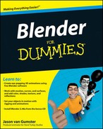
The next line of buttons is a pretty unique set of controls. Using them requires recalling information about how .blend files are structured. This is detailed in Chapter 4, but basically Blender objects are separate from the low level mesh, curve, surface, and so on, data. The objects link to this data. Now, here's how this relates to materials. By default, Blender's materials link to the low level datablock. You can verify this by noticing that the ME button in the Links and Pipeline panel is enabled. The left image in Figure 7-3 shows a screenshot from the Oops Schematic that illustrates this relationship. However, you also have the option of linking the material to the object as well, as shown in the right-hand screenshot of Figure 7-3. In fact, the middle image shows that the material can actually link to both the mesh as well as the object.

Figure 7-3. The Oops Schematic showing a material linked to a mesh, both a mesh and its object, and just an object.
Why is having the ability to link a material to either the mesh or the object a useful option? Well, say you have bunch of objects that are linked duplicates, sharing the same mesh information. If the material is linked to the mesh, all of your linked duplicates have the exact same material. If you want to have different a material for each duplicate, this structure won't work. However, if you link the material to the object datablock rather than the mesh datablock, things work the way you want. Figure 7-4 shows a set of linked duplicate Suzanne heads, each with a different material thanks to the ability to change where the material datablock links to.
Note
The quickest and easiest way to customize the material on your object is to change its color. This is done at the bottom of the Material panel. There are three different types of colors you can set:
Diffuse: The first color block, labeled Col. This is the main color of the object, or the primary hue that the material reflects to the camera.
Specular: One of the cool things about working in computer graphics is that you have a say over things that you don't normally control in the real world. The Specular color, or Spec, is one of those things. By adjusting this color, you actually control the color of the highlights on the material.
Mirror: Another material type of color that computer graphics gives you the ability to control is the Mirror color. If you turn on reflections for a material, the reflections in the object are tinted with the color you set here.
"Great, great, great ... so how do I actually change the color?" I'm glad you asked. The simplest way to do this is to left-click on the color block next to the type of color you want to set. When you do this, Blender's color picker pops up. Figure 7-5 shows what the color picker looks like.

The color picker is similar to what you might find in other graphics applications. Left-click anywhere in the large gradient square to choose the color you wish to use. By default, this square is all in the red hue. To change which hue you want to work in, left-click in the color spectrum below this large gradient to the color you want. The color picker also gives you the chance to use and set color presets with the set of swatches to the left of the gradient square. Left-clicking any one of these swatches automatically changes to that color. If you have a custom color that you would like to store, you can Ctrl+left-click a swatch to set it there. That color is saved in the swatch until you shut down Blender.
Another cool feature that the color picker gives you is a sampler. Left-click the Sample button in the upper right corner of the color picker and your mouse pointer changes to a color dropper. The next place you left-click is sampled for color, making it your selected color. The cool thing is that you can sample any color in Blender's interface, including the buttons and icons, if you want to.
Tip
When it comes to setting colors for materials, more often than not, I keep my spec and Mirror colors set to white. For the Mirror color, this can be particularly helpful if you want to have non-tinted reflections. The only exception to this is that, on occasion, it makes more sense to set the specular color to a value that is slightly lighter than the diffuse color. No hard-and-fast rule tells you when to go one way and when to go another in terms of the specular color. It's really a matter of experience and changing to what looks right in your final render.
Ah, computer graphics: You have nearly complete control over how your materials look. Part of this control is how the diffuse and specular colors are dispersed across the surface of the object. You control both of these attributes independently with shader types. A shader type is a computer algorithm that defines how the color reacts in the material, and it's usually named after the computer scientist or mathematician who came up with it. So although the names may seem weird or arbitrary, the good news is that they're pretty universal from one piece of 3D software to another.
As you might guess, your shaders are set and controlled in the Shaders panel of the Material buttons (F5). To change your diffuse shader type, left-click the drop-down button at the upper left of the panel. By default, it's set to the Lambert shader, but you have the following options:
Lambert: This is a good general purpose shader. The only adjustable setting for this shader is Ref, or reflection. This controls how much light the material reflects. The default setting of 0.8 means that the material reflects 80% of the light and absorbs 20%.
Oren-Nayar: The Oren-Nayar shader is similar to the Lambert shader, although it has an additional roughness setting that takes into account the imperfections that the surface of an object may have. This gives you a material that reacts to light in a slightly more realistic way.
Toon: In sharp contrast to the previous two shaders, the Toon shader does not aim to be realistic. Instead, it tries to reproduce the hard-edged cel shading that's often seen in traditional hand-drawn animation. By adjusting the Size and Smooth settings in addition to the Ref, you can control the number of discrete colors that the shader uses.
Minnaert: This shader is pretty slick. By default, it's set up to behave just like the standard Lambert shader. However, if you adjust its Dark value to a number less than one, the edges of the object with this material get lighter. Setting Dark to values greater than one darkens the parts of the object that point to the viewer. This is a great way fake a backlight on an object or give it a somewhat velvety look. I also like to use this shader for shiny metals.
Fresnel: Pronounced "FRAY-nel", this shader is also a nice one to use for metals and glassy materials. It's like the Minnaert shader, except instead of working relative to the viewer, it works relative to the light source. Higher Fresnel values darken parts that point toward the light source and this multiplies by the Fac, or factor value.
Figure 7-6 shows Suzanne shaded with each of the different diffuse shaders. For simplicity, the specular value has been reduced to zero in this figure.

With the control of the diffuse shader, you also have control over the way the specular highlight appears on your materials. You change this by left-clicking the drop-down menu below the Diffuse Shader button. All specular shaders share a Spec value that controls the intensity of the specular highlights. Higher values make the highlights brighter; lower values make them dimmer and can reduce the specularity altogether. As with the diffuse shaders, you have a choice of algorithms that control how the specular highlight appears. These choices are listed below:
CookTorr (Cook-Torrance): The Cook-Torrance shader is Blender's default specular shader. In addition to the spec value, it also has a setting to control hardness. Higher hardness values make the highlight smaller and more compact, whereas lower values spread the highlight over more of the object's surface. This shader is good for shiny plastic materials.
Phong: This shader is nearly identical to the Cook-Torrance shader, although not quite as optimized. The edge of the specular highlight with this shader is a bit softer, making it a bit nicer for less shiny plastics and organic materials.
Blinn: The Blinn shader is a more refined shader that is generally more accurate than the Cook-Torrance or Phong shaders. In addition to the Spec and Hard values, this shader also has a Refr, or refraction setting. Now, this refraction isn't quite like you might expect. What you really need to remember is that the Refr value controls the softness of the highlight. It's sort of a finer intensity control that Spec can give you. This shader works well with the Oren-Nayar diffuse shader for getting physically accurate materials that behave more like materials in the real world.
Toon: Like the Toon diffuse shader, the Toon specular shader breaks the specular highlight into discrete bands of lightness to recreate the look of traditional cartoon coloring.
WardIso: I like to use the WardIso, short for "Ward Isotropic" shader along with the Minnaert and Fresnel diffuse shaders for metallic or shiny plastic materials. The rms, or root-mean-square, value is a mathematic variable in the shader algorithm which controls the sharpness of the highlight's edge. Lower values are sharper and higher values are more dispersed.
Figure 7-7 shows Suzanne with the default Lambert diffuse shader and each of the different specular shaders.

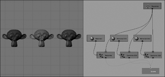
In the "Changing colors," section earlier in this chapter, I wrote about the Mirror color setting. If you tried adjusting that color there, you might have noticed that not much changed. This is because you did not have any sort of reflection enabled to provide the mirroring. In order to enable mirroring, you need to go to the Mirror Transp panel in the Material buttons (F5), as shown in Figure 7-8. All of the Mirror settings are in the left column of this panel. Activate reflections by left-clicking the Ray Mirror button and increase the RayMir value using the slider directly beneath it.

An important thing to know about doing reflections this way is that it uses something called raytracing. In order to create accurate reflections, Blender's renderer follows, or traces, a ray of light as it bounces off of objects and into the camera. And to make sure it's accurate, the renderer follows thousands of these rays. This accuracy, of course, comes at the expense of using more processing power from your computer and may lengthen the rendering process. Figure 7-9 shows an example image with high reflectivity.
Note
In order to properly see any raytraced results in your render, make sure that the Ray button is enabled in the Render panel of the Scene buttons (F10).
Ray Mirror is also one of those exceptions to the "light only bounces once" rule. In order to get a reflection, it has to have at least two bounces. The light comes from the light source, bounces off of one object, and then off of your reflective object before it reaches the camera. You can actually define how many bounces the renderer recognizes by adjusting the Depth value in the Ray Mirror column. Of course, the higher the Depth value, the more bounces that Blender has to trace and therefore the longer your renders might take.
In addition to reflectivity, you can also control an object's transparency. Like with 2D computer graphics, the main control for a 3D material's transparency is its alpha value. The alpha value in Blender runs on a scale from zero, for completely transparent, to one, for completely opaque. You adjust this value with the slider at the bottom of the Material panel, labeled "A". Now, you might notice that when you reduce the alpha value to make your material more transparent, the preview panel does not show the result that you might expect. Rather than showing the checkerboard pattern that's behind the preview object, a white-to-blue gradient shows up. What this means is that as you reduce the alpha value, the more your object's material is replaced with your scene's sky color. The sky color is set in the World buttons (F8). Chapter 9 covers setting the sky color and other World settings in greater detail.
Now, getting the object's material to show the sky color rather than what's actually behind it doesn't initially seem useful, but it's actually a really quick way to create a material that can make an object behave as a three-dimensional mask. Of course, you may not want a mask and instead you want to see the actual 3D environment through your object. The quickest and easiest way to get this to happen is to enable the ZTransp button in the Links and Pipeline panel. Doing so instantly makes the checkerboard background in the preview panel show up through the preview object.
Note
Z-transparency is a quick way to get the rest of your scene's environment to show up through your object, but if you're trying to re-create glass, you might realize that things don't look quite right. With real glass, the transparent material actually bends the light, warping what you see through it. This is how a magnifying glass works. Regular Z-transparency cannot easily recreate this effect. In order to get that, you should use raytraced transparency instead.
You can activate raytraced transparency by left-clicking the Ray Transp button in the Mirror Transp panel. When you enable this button, notice two things. First, note that doing so automatically disables the ZTransp button. You can't have both of these settings active at the same time. The other thing to notice is that initially, it doesn't look like much changed by enabling Ray Transp. This is because the index of refraction, or IOR, value is set to 1.00. The index of refraction is the degree that the material bends light. A value of 1.00 means that the material has the same IOR as the air around it and therefore doesn't bend light as it passes through it. However, increasing the IOR warps the checkerboard pattern seen through the object. Now, the cool thing about the IOR value is that it actually matches the physical IOR values of real-world materials. This means you could look up the IOR value of a specific material, like glass or jade, on a table online or in a physics book and use it to get an accurately transparent material. Figure 7-10 shows the difference in results that you get with straight alpha transparency, Z-transparency, and raytraced transparency.

Figure 7-10. From left to right, alpha transparency, z-transparency, and raytraced transparency with an alpha value of 0.5.
When it comes to the raytracing settings, both Ray Mirror and Ray Transp have a few values in common. The first ones you might notice are the Fresnel and Fac (for factor) sliders. The Fresnel setting adjusts an effect that's similar to the Fresnel diffuse shader, but with a specific influence on reflectivity and transparency. For reflectivity, rather than decreasing the material's color value in the direction of the light source like the Fresnel diffuse shader, increasing this value reduces the reflectivity relative to the camera.
For transparency, it's a bit different. It's also relative to the camera view, but rather than clouding out the transparency in that direction, it actually increases the transparency, reducing the color in the direction of the camera. Another interesting thing about the Fresnel setting for raytraced transparency is that it actually works on Z-transparency also. Keeping this in mind means you can take advantage of the Fresnel effect without having to fake it with color ramps.
Another common setting between these raytraced effects is the Gloss value. The default value of 1.00 makes the material perfectly reflective and transparent. Reducing this value on either side blurs the reflection or makes the material more translucent than transparent. When changing the glossiness, you might notice that the blurry reflection looks dirty or pixelated. This is because of the way glossiness is done in Blender. The glossiness is approximated based on the Samples value, which is located beneath the Gloss slider for both raytraced reflection and raytraced transparency. Increasing the number of samples makes the glossiness appear more accurate, at the expense of longer render times. Figure 7-11 shows some of the cool effects you can get by varying the Gloss value.

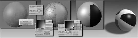
Using the same material across an entire object is great for objects that are the same uniform material, but what if you wanted to have multiple different materials on the same object? For that sort of situation, you want to use material indices. Basically, you create a material index by defining a set of object subcomponents — faces in meshes, individual characters in text, and control points in curves and surfaces — and assigning them to a material. You create material indices in the Link and Materials panel of the Editing buttons (F9). To get a good idea of how this works, assume you want to model a beach ball and give it the classic primary-colored panels. Use the following steps:
Add a UV sphere mesh (Spacebar

Use 12 segments, 12 rings, and a radius of 1.00. You may also add a Subsurf modifier (Alt+1) and set the faces to render as smooth (F9
Tab into Edit mode and switch to Face Select mode (Tab
Add a new material index (F9
Make sure the New button that you left-click is in the right column under the button that says "0 Mat 0." Left-clicking New adds a swatch next to this button and changes it to say "1 Mat 1," meaning your object has one material and you are on the first.
Change the color to white by left-clicking the newly added swatch and choosing white with the color picker.
This makes the entire ball white. All of the faces are currently assigned to this material index.
Use face loop select to select two adjacent vertical face loops (Alt+right-click and Shift+Alt+right-click).
Add another new material index (F9
This changes the material index value to "2 Mat 2," meaning that there are two material indices and you are working on the second one. Left-clicking on the left arrow in this button sends you back to "2 Mat 1," or the first material index of two. Left-clicking the right arrow takes you back to the second index.
Change the color to blue by left-clicking the swatch and choosing blue with the color picker.
After you change the color of this swatch, you might expect the faces that you have selected to automatically change to match this color. That's not quite how it works: Even though you have these faces selected, they're still assigned to the first material index. Use the next step to remedy that situation.
Assign the selected faces to the current material index (F9
The moment you left-click the Assign button, the selected faces should all change to the blue color you picked in the last step.
Using the process in steps 5 through 8, work your way around the sphere, creating and assigning colors for the other panels.
If you create a beach ball like the one in Figure 7-12, you should end up with four material indices, one for each color on the ball.
Material indices aren't limited to be used only by meshes. You can also use them on curves, surfaces, and text objects. The process is similar to meshes, with one main exception. Meshes, as shown in the previous example, allow you to assign individual faces to different material indices. This is not the case with curves, surfaces, and text objects, which assign material indices to discrete closed entities. So individual text characters and curves can be assigned to a material index. However, you can't set the material index of an individual control point or a portion of a text character. Figure 7-13 shows material indices working on a curve, surface, and text object.

One of the downsides to material indices is the fact that although they make it easy to define multiple colors and materials on a single mesh, there's a very distinct line between materials. The color of one material does not smoothly transition into the next. For instance, if you want to create a car with a paint job that's light blue near the ground that smoothly transitions to a bright yellow on its roof and hood, you could not effectively do this with material indices. However, with vertex colors, it's completely doable. This technique only works on mesh objects, but it's also a very effective way of quickly coloring a mesh without the hard-edged lines that material indices give you.
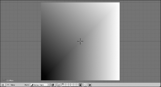
The way it works is pretty simple. You assign each vertex in your mesh a specific color. If the vertices that form a face have different colors, there's a gradient going from each vertex to the others, where the color is most intense at the vertex and more blended with other colors the farther away it gets. Figure 7-14 shows an example with a plane using black for the bottom left vertex, gray for the upper left vertex, and white for both of the vertices on the right hand side. Notice how the color tries to smoothly blend in the face created by the vertices.
Of course, trying to go in and explicitly set the color for each and every vertex in a mesh can get really tedious on complex meshes. To alleviate this problem, Blender has a Vertex Paint mode. You activate Vertex Paint mode by selecting (right-clicking) the mesh object that you would like to paint in the 3D View and then pressing V. Your mouse cursor changes to look like a paint brush and a new panel appears in the Editing buttons (F9) called Paint. The Paint panel is shown in Figure 7-15.

The largest function of the Paint panel is setting the color you want to use and controlling how that color is applied to the selected object. You can choose the color you want by adjusting the RGB sliders or left-clicking the color swatch and choosing the color you want with the color picker that pops up. Also, if you have the Transform Properties floating panel (N) visible in the 3D View when you switch to Vertex Paint mode, you may notice that it changes to a floating color picker panel. This is pretty helpful for quickly switching colors without going back down to the Buttons window. Figure 7-16 shows the Paint Properties floating panel in the 3D view, which has this color picker.

Tip
Another cool little shortcut is that while you're in Vertex Paint mode, right-clicking automatically samples the color under your mouse cursor and sets the paint color to that value. This is a pretty slick feature when you're painting with a set of defined colors on your mesh. No need to go to the color picker or the Paint panel, just right-click over the color that you've used before and get back to painting.
After you pick the color you want to use, left-click and drag your mouse over vertices in the 3D View, and those vertices take on the color you've defined. To get an idea of where the vertices that you're painting actually exist on your mesh, you may want to have Blender overlay the object's wireframe in the 3D view. To do this, navigate to the Draw panel in the Object buttons (F7) and left-click the Wire button in the block of buttons under the Draw Extra heading. When you do this, Blender adds the wireframe over the surface of the object, making it much clearer where each of the vertices of the mesh lie.
By default, the base vertex color for an object is a flat white. If you would rather start with a different base color, left-click the SetVCol button in the Paint panel. Doing that sets all the vertices in your mesh to have the color you have defined in the swatch above the button.
The column of buttons along the right side of the Paint panel controls how the paint color is applied to the vertices. The default setting of Mix simply blends the defined color with the color that the vertex already has assigned, according to whatever value is set by the Opacity slider. Enabling the Add, Sub, or Mul buttons takes the current color respectively and adds, subtracts, or multiplies that with the current vertex color under the brush in the 3D view. The Blur button is the only paint setting that doesn't use the selected color. It uses the vertices that are within the radius defined by the Size slider and attempts to mix their colors, effectively blurring them. The Lighter and Darker buttons take the value of the color you've chosen and use that to control how much influence it has on the already existing colors. So if you have your color set to full white, painting with Darker enabled won't change the vertex colors at all. But using that color to paint with Lighter enabled makes it appear everywhere you work.
If you're familiar with Sculpt mode, as discussed in Chapter 5, you may be tempted to try to adjust the size of your brush by using the F hotkey. Unfortunately, this is a bit of an inconsistency between Blender's painting modes and Sculpt mode. In the painting modes like Vertex Paint, Texture Paint (Chapter 8), and Weight Paint (Chapter 11), pressing F enables a subcontext in the paint mode that allows you to define a painting mask with the faces of the mesh. The other way to enable the painting mask is to left-click the button in the 3D view's header with an icon of a triangle overlaying a square, as shown in Figure 7-17.
When you enable the painting mask, you can select faces of your mesh by right-clicking. After you do that, these faces are the only ones that are affected by your painting. This is an excellent way of isolating a portion of your mesh for custom painting without changing the color of the faces around that area. By using a painting mask, you can actually get the hard-edged color changes that you get with material indices, should you want such a thing.
One of the downsides of vertex colors is that the amount of detail you can paint is limited to the number of vertices in your mesh. So it used to be that if you want to have more detail with vertex painting, you have to subdivide the mesh multiple times to create more vertices to be painted. Using the Subsurf modifier wouldn't be enough simply because the additional vertices created by that modifier are implicit and there's no direct access to them. However, with the advent of multi-resolution meshes, as covered in Chapter 5, the situation is different. You can use the multi-resolution workflow outlined in that chapter to get more vertices and therefore greater detail in your vertex painting. Figure 7-18 shows a version of Suzanne and a ball, both colored and painted using vertex colors and multi-resolution meshes.

Note
In order to have your vertex colors appear in your render, you need to enable the VCol Paint button in the Material panel of the Material buttons. Refer back to Figure 7-2 if you need a refresher on where this button is located.