
Chapter 17
Variability and Quality Control in Photography

"Bee on Flower" by K.T Evans, Advertising Photography student, Rochester Institute of Technology.
Introduction to the Concept of Variability
Photographers are by necessity experimenters. Although they are not thought of as scientists operating in a research atmosphere, they certainly are experimenters. Every time an exposure is made and the negative is processed or a digital image created, an experiment has taken place. There is no way the photographer can precisely predict the outcome of such an experiment in advance of doing the work. The objectives of the experiment derive from the purpose of the assignment, and the procedures come from the photographer's technical abilities. The success of the experiment will be determined by evaluating the results. Finally, conclusions are reached after interpreting the results, which will shape the performance for the next assignment/experiment. It is the last step, the interpretation of test results and the conclusions reached, that we are concerned with in this section.
A great deal of what is written about the practice of photography consists of opinions. When someone states that “black-and-white photographs are more artistic than color photographs" or that “digital cameras are better than film cameras," it represents an expression of personal judgment. Such statements are referred to as subjective because they are based on personal opinions. Opinions are statements of personal feelings and can be neither right nor wrong and therefore are always valid. The problem with subjective opinions is they lead to conclusions that are not easily tested and analyzed. Therefore, when one relies solely on personal opinion, the possibilities for obtaining new insights into the photographic process become very limited.
No two things or events are ever exactly alike.
Subjective opinions have the potential to be ambiguous; therefore, it is often preferable to use numerical expressions that have been derived from measurements. Such numbers can be considered objective, as they are generated outside of personal attitudes and opinions. For example, the blackness of a photographic image can be measured with a densitometer and the result stated as a density value. A density value used to describe the blackness of a photograph can be obtained by independent workers and therefore verified. Although there may be many subjective opinions about the blackness of the image, there can be only one objective statement based on the measurements. Consequently, a goal of anyone who is experimenting is to test opinions with facts that usually are derived from measurements.
When an experiment is completed and a result obtained, there is a great temptation to form a conclusion. For example, a new digital camera is tried and the noise level in the image is considered unacceptable; most photographers would not want to purchase it. On the other hand, if the image were taken at an ISO setting of 1000, many would assume that the same noise would not be present at an ISO setting of 100. Such conclusions should be resisted because of a fundamental fact of nature: No two things or events are ever exactly alike. No two persons, not even identical twins, are exactly alike and no two snowflakes are ever identical. Photographically speaking, two rolls of the same brand of film are not exactly alike, nor are the digital sensors of two cameras of the same make and model. If two samples are inspected closely enough, differences will always be found. Stated more directly, variability always exists.
Variation in a repetitive process can be attributed to change, an assignable cause, or both.
In addition to these differences, time creates variations in the properties of an object. The photographic speed of a roll of film is not now what it was yesterday, nor will it be the same in a few months. Using this point of view, an object, say a roll of film, is really a set of events that are unique and will never be duplicated. As the Greek philosopher Heraclitus long ago said, "You cannot step in the same river twice."
Knowing that variability is a fact of life it is an essential task for a photographer/experimenter to determine the amount of variability affecting the materials and processes being used. This will require that at least two separate measurements be made before reaching a conclusion about the characteristics of an object or process. A photographer who ignores variability will form erroneous conclusions about photographic materials and processes, and will likely be plagued by inconsistent results.
Sources of Variation
In an imaginary gambling situation in which a perfect roulette wheel is operated with perfect fairness, the outcome of any particular spin of the wheel is completely unpredictable. It can be said that, under these ideal circumstances, the behavior of the ball is determined by random or chance causes. These terms mean that there are countless factors influencing the behavior of the wheel, each of which is so small that it could not be identified as a significant factor. Consequently, these numerous small factors are grouped together and identified as chance effects and their result is termed chance-caused variability. In addition to being present in games of chance, chance-caused variation occurs in all forms of natural and human undertakings.
Consider, on the other hand, a rigged roulette wheel, arranged so that the operator has complete control over the path of the ball. Under these circumstances, there would be a reason (the decision of the operator) for the fall of the ball into any particular slot. With this condition it is said that there is an assignable cause for the behavior of the ball.
The distinction between these types of effects—chance and assignable cause—is important, because it will influence the actions taken. For example, your desire to play the roulette wheel would likely disappear if you believed the operator was influencing the results. A similar dilemma arises when, for example, an electronic flash fails to fire. A second photograph is taken and again the flash fails. If this procedure is continued, it would be based upon the assumption that it was only a chance-caused problem. On the other hand, if the equipment were examined for defects, the photographer would be taking action with the belief that there was an assignable cause for the failure of the flash, such as depleted batteries or a broken bulb.
In other words, when it is believed that chance alone is determining the outcome of an event, the resulting variation is accepted as being natural to the system and likely no action will be taken. However, if it is believed that variability is due to an assignable cause, definite steps are taken to identify the problem so that it can be remedied and the system returned to a natural (chance-governed) condition. Therefore, it is very important to be able to distinguish chance-caused from assignable-caused results.
Patterns of Variation
Although there is no possibility of predicting the outcome of a single turn of a fair roulette wheel, there is an underlying pattern of variation for its long-term performance. If the ball has the same likelihood of dropping into each of the slots, then over a large series of plays each of the numbers should occur as frequently as any other. Thus, the expected pattern of variability for the long-term performance of the roulette wheel could be described by a graph as shown in Figure 17-1. This is called a frequency distribution graph because it displays the expected frequency of occurrence for each of the possible outcomes. In this case, it is termed a rectangular distribution, which arises any time there is an equal probability of occurrence for every outcome. Every one of the 38 slots has an equal chance of receiving the ball.
The expected pattern of variation with repeated spinning of an honest roulette wheel is unlikely to occur in practice.
Suppose now that the roulette wheel is spun many times so that the actual pattern of variation can be compared to the expected distribution. If the wheel is actually operated 380 times, it is highly unlikely that each number will occur exactly ten times. Instead, a pattern similar to that shown in Figure 17-2 will probably arise, indicating that the actual distribution only approximates that of the expected (or theoretical) results. It would likely be concluded from these results that the wheel is honest. However, if the actual distribution of 380 trials appeared as shown in Figure 17-3, there would be good cause to suspect something abnormal was happening. The distribution in Figure 17-3 show a tendency for the numbers 1 through 15 to occur more frequently than 16 through 38.
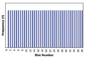
Figure 17-1 Rectangular pattern of variability from the expected long-term performance of a perfect roulette wheel. Each number has an equal chance of occurring.
Assignable-cause variability can be corrected; random-cause variability cannot.

Figure 17-2 Pattern of variability from the actual performance of a roulette wheel indicating that only chance differences are occurring. Although theoretically each number has an equal chance of occurrence, some numbers occur more frequently over the short run.

Figure 17-3 Pattern of variability from the actual performance of a roulette wheel indicating assignable-cause influence. The lower numbers are occurring more frequently that the higher numbers.
Thus, a basic method for judging the nature of variation in a system is to collect enough data to construct a frequency distribution (also referred to as a frequency histogram) and compare its shape to what is expected for the process. If the shapes are similar, the process is behaving properly. A significant difference indicates an abnormal condition that should be identified and corrected.
In the game of dice, if a single die is thrown repeatedly in a random manner, a rectangular distribution is also to be expected. Why? Each of the six numbers on the die is equally likely to occur on every roll. If two dice are used, a different pattern is expected since the probability of rolling a seven is greater than for any other number. In other words, there are more combinations that total seven than any other number (1 + 6, 2 + 5, 3 + 4, 4 + 3, 5 + 2, 6 + 1). The expected pattern is referred to as triangular distribution and is shown in Figure 17-4.
If this concept is extended to the totals of three dice, five dice, etc., the expected distributions begin to look like the symmetrical bell-shaped curve shown in Figure 17-5. This frequency pattern is called the normal distribution. It is of exceptional importance because whenever there are many outcomes with many factors affecting each occurrence, which is the case with almost all real-life events, this is the pattern suggested by chance. Consequently, when evaluating the results of tests and experiments using photographic materials, the normal distribution of data is the expected condition. If the results are something other than this bellshaped pattern, it is an indication of assignable-cause problems and appropriate action should be taken.

Figure 17-4 Triangular pattern of variability from the expected long-term performance of two randomly thrown dice.
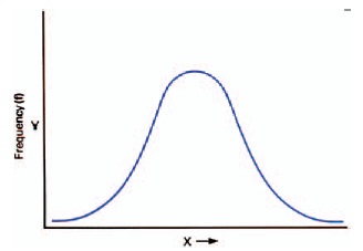
Figure 17-5 Expected pattern of variation when there is a multiplicity of outcomes with chance governing the process. This bell-shaped curve is called the normal distribution.
Notice that to obtain a useful picture of the pattern of variation, more than a few samples must be collected. Statistical theory suggests that at least 30 samples should be used to construct the distribution before making any inferences, because the pattern that develops as additional samples are taken tends to stabilize at 30. For example, a slow film was tested and five samples gave speeds of 10, 12, 10, 14, and 14, producing the histogram shown in Figure 17-6. Although the resulting pattern is not a bell-shaped curve, there are too few samples to draw a valid conclusion. An additional 25 samples added to the first five could give the distribution illustrated in Figure 17-7. Here the pattern approximates the normal distribution, indicating that the differences in film speeds are only the result of chance-caused effects.

Figure 17-6 Frequency histogram of film speeds (5 samples).

Figure 17-7 Frequency histogram of film speeds (30 samples).
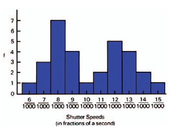
Figure 17-8 Frequency histogram of 40 different shutters tested at the same marked shutter speed of 1/125 (8/1000) second.
Suppose the results of testing 40 different shutters at the same marked shutter speed gave a set of data distributed as shown in Figure 17-8. The pattern exhibited differs markedly from the normal distribution; thus it is inferred that something unusual is occurring. The two peaks in the histogram suggest the presence of two sources or populations of data, such as two different types of shutters.
The normal-distribution curve represents the expected pattern of random-cause variability with a large amount of data.
Consider the histogram shown in Figure 17-9, which is the result of testing the same meter 35 times against a standard light source. Notice that the distribution is asymmetrical—the left-hand “tail" is longer than that on the right. Again, it should be concluded that there is an assignable cause in the system. Perhaps because of a mechanical problem the needle is unable to go above a given position, hence the lack of data on the high side. In both of these instances, because the bell-shaped distribution did not occur, a search for the assignable cause is necessary.
The Normal Distribution
The values of the mean, the median, and the mode will be the same for a set of data only when the data conform to a normal distribution.
After a histogram has been inspected and found to approximate the normal distribution, two numbers can be computed that will completely describe the important characteristics of the process.

Figure 17-9 Frequency histogram from testing the same meter against a standard source 35 times.
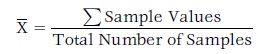
The first of these is the arithmetical average or mean. The mean is obtained by adding all of the sample data values together and dividing by the number of samples taken. The resulting number or mean is the value around which the rest of the data tend to cluster. The mean is a measure of the central tendency of the distribution. See Eq. 17-1.
(Eq. 17-1)
There are two other measures of central tendency that are sometimes used to describe a set of data. The mode, which is defined as the most frequently occurring value in a data set, is located at the peak of the histogram. The median is that value that divides the data set into two equal halves. Of all three measures of central tendency, the average is by far the most often used.
It is sometimes useful to represent variability with the simpler concept of the relationship between the smallest value and the largest value in a set of data. For data that are measured with interval scales, such as temperature, length, and weight, the difference between the largest and smallest values is identified as a range (see Eq. 17-2). For data that are measured with ratio scales, such as the contrast of a scene, the largest value divided by the smallest value is identified as a ratio (see Eq. 17-3). Thus the contrast of a certain scene might be expressed as having a luminance ratio of 128:1.

Figure 17-10 Theoretical normal distribution illustrating the relationship between the mean and the standard deviation.
The second number of interest is called the standard deviation and represents a measure of the variability of the system. To calculate the standard deviation, each individual sample value is compared to the average (or mean) and the average difference or deviation for all of the data is determined. This value is a measure of the width of the normal distribution. If the normal distribution is very narrow, the variation is small; if it is very wide, the variation is large. Thus, the standard deviation is a direct measure of the amount of variability in a normal distribution.
Figure 17-10 illustrates the relationship between the average and the standard deviation for a hypothetical normal distribution. Notice that if the distribution should shift left or right, this would be reflected in a change of the as that the central position of the system has changed. If the width of the distribution were to become narrower or wider, the standard deviation would change because the amount of variability in the system would be changing. Taken together, these two values can provide a useful set of numbers for describing the characteristics of any system tested.
Populations vs. Samples
Before continuing it is necessary to distinguish between populations and samples. If, for example, a new brand of inkjet paper were being marketed, one would want to test it prior to use. To obtain a crude estimate of the variability affecting this product, at least two samples should be tested. If it is desired to determine the pattern of variation, at least 30 should be tested. Even if 30 tests were performed (which would be quite a task), countless more boxes of paper would not be tested. Thus the term population refers to all possible members of a set of objects or events. Additional examples of populations are the ages of all U.S. citizens, the birth weights of all newborns, the ISO/ASA speeds of all sheets of Brand X film, the temperatures at all possible points in a tank of developer, and the accuracy of a shutter over its entire lifetime.
In each case, an extremely large number of measurements would have to be made to discover the population characteristics. Seldom, if ever, are all members of a population examined, primarily because in most cases it is usually impossible to do so. Further, by examining a properly selected group of samples from the population, almost as much insight can be obtained as if all members had been evaluated. Herein lies the value of understanding some basic statistical methods. By obtaining a relatively small number of representative samples, inferences can be made about the characteristics of the population. Such is the basis of much scientific investigation, as well as political polls.
Samples used to calculate the mean and the standard deviation must be selected on a random basis.
If the sample is to be truly representative, it must be selected from the population with great care. The principle to be followed is this: Every member of the population must have an equal chance of being selected. When taking sample density readings from a roll of film after processing, for example, it is dangerous to obtain the data always from both ends and the middle. It is also dangerous never to obtain data from the ends and the middle. The samples must be selected so that in the long term data are obtained from all parts of the roll with no area being consistently skipped or sampled.
Although this principle appears simple enough, the method for carrying it out is not. The most common approach for ensuring that all members of the population have been given an equal opportunity is to use a random sampling method. Random means “without systematic pattern" or “without bias." Human beings do not behave in random ways but are strongly biased by time patterns and past experiences. Consequently, special techniques must be employed to avoid the non-random selection of samples. Techniques such as drawing numbered tags from a box, using playing cards, tossing coins, etc. can be used to minimize bias in obtaining samples. Tables of random numbers are also very useful in more complex situations.
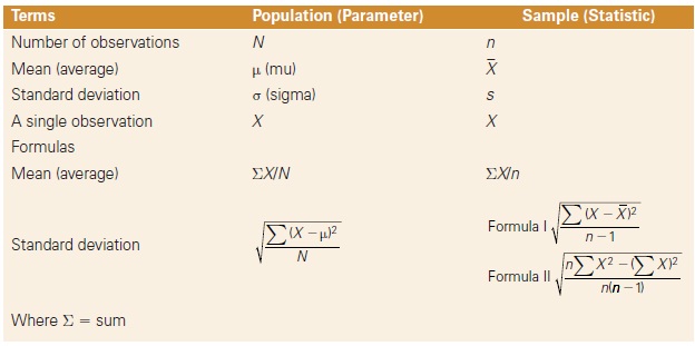
Table 17-1 Statistical symbols
It should be obvious that there is a distinction between the average of the population and the average of the sample data. The symbol µ (Greek letter mu) is used to refer to the population average, while the symbol X (bar) is used for the sample average. Likewise, there is a difference between the standard deviation of the population and that of the sample data. The symbol ct (Greek letter sigma) is employed for the standard deviation of the population, and the symbol s identifies the sample standard deviation. If the sample data are representative of that in the population, X and s will approximate µ and ct, respectively. Also, as the number of samples taken increases, the conclusions reached become more reliable. Table 17-1 displays the symbols and formulas employed.
Description of the Normal Distribution
The graph of the normal distribution model is a bell-shaped curve that extends indefinitely in both directions. Although it may not be apparent from looking at Figure 17-11, the curve comes closer and closer to the horizontal axis without ever reaching it, no matter how far it is extended in either direction away from the average.

Figure 17-11 The normal distribution illustrating areas contained under the curve for ±1, 2, and 3 standard deviations.
An important feature of the normal distribution to note is that it is symmetrical around its mean. If Figure 17-11 were folded along the line labeled µ, the two halves of the curve would be identical. Therefore, the mean (µ) is the number that divides the population into two equal halves. Additionally, it can be seen that µ identifies the maximum point of the distribution. Consequently, the mean (µ) represents the best measure of the central tendency of the population.
When describing the spread of the normal distribution, the standard deviation (σ) is most useful. The standard deviation (σ) locates the point of inflection on the normal curve. This is the point where the line stops curving downward and begins to curve outward away from the mean. Since the curve is symmetrical, this position will be located at equal distances on both sides of the mean (µ). The total area contained under the curve would include all members of the population and is therefore equal to 100%. The standard deviation (σ) can be used to describe various portions of the population in conjunction with µ as follows:
- The inflection points lie at ± 1σ from the mean (µ). Between the inflection points are found approximately 68% of all members of the population. About 32% will be located beyond these points with 16% on the left and 16% on the right.
- Approximately 95% of the population occurs between ±2σ of the mean. About 5% will be located beyond these points equally distributed on both sides.
- Nearly 99.7% of the population will be between ±3σ of the mean. Only 0.3% will lie outside of these points.
- As the distances on either side of the mean become greater, the percentage of the population contained therein likewise increases. However, it will never reach 100% because the curve never touches the horizontal axis.
Thus, a normal curve is completely specified by the two numbers, or parameters, µ and σ. In effect, µ locates the position of the curve along the X-axis, and σ specifies the spread of the curve. If the sample data obtained approximate the shape of the normal curve, and the sample size is large enough, the calculated values of X and s for the sample can be used the same way µ and σ are used for the population.
Standard deviation is a single number that represents an average deviation from the mean for all of the individual numbers in a set of data.
For example, suppose the repeated testing of a light meter against a standard source produced a set of data that approximated the normal distribution, and X is found to be 15.0 and s is equal to 1.0. With this information, it can be inferred that 68% of the readings will be between 14.0 and 16.0 caused by chance, 95% of the readings will be between 13.0 and 17.0 caused by chance, 99.7% of the readings will be between 12.0 and 18.0 caused by chance, while only 0.3% will be less than 12.0 and greater than 18.0 caused by chance.
It can be extremely useful to learn if meaningful relationships exist between objective measurements and subjective perceptions.
If the meter were to be checked again and gave a reading of 13.5 (1.5 standard deviations from the mean of 15.0), the decision most probably would be that the meter was operating normally. In other words, the amount of variation in the reading is not greater than that suggested by chance. However, if the meter gave a reading of 18.5 (3.5 standard deviations from the mean), this would be viewed as an unusual occurrence and one that would call for a careful study of the equipment. This is because the difference is now greater than that suggested by chance, since only 0.3% of the readings will exceed ±3s caused by chance.
This method of describing the characteristics of the materials and processes of photography minimizes guesswork and allows decisions to be made from facts.
Measurement Methods and Subjective Evaluations
All the concepts addressed so far have dealt with data resulting from objective measurements. Variables such as density, temperature, weight, and shutter speed are evaluated by using measuring instruments, and the results are expressed in relation to scales of numbers. These numbers are assigned on the basis of standardized units such as degrees Fahrenheit, centimeters, grams, etc. These types of measurements are referred to as objective measurements because they are derived from an external source (the measuring instrument) and are verifiable by other people using similar instruments.
Although objective measurements are commonly used to describe the physical properties of photographic materials and processes, they cannot be used to give information about the human perceptions of such properties. For example, when considering the tonal quality of a black-and-white print, reflection density measurements can be used to describe the print densities and contrast. However, these data give little insight into the way a person will perceive the tonal quality of the print, as that is a subjective experience. Obviously, the subjective quality of the photographic image is the final test of most photographic endeavors; thus it can be extremely useful to learn the meaningful relationships between objective measurements and subjective perceptions—especially the averages of the perceptions of samples of qualified individual observers.
When working with subjective concepts, it is the perception of the physical event that is being considered rather than the physical event itself. Nevertheless, numbers may be assigned to these perceptions to allow for their scaling and evaluation. Measurement, in the broadest sense, can be defined as the assignment of numbers to objects, events, or perceptions according to rules. The fact that numbers can be assigned under different rules leads to the use of different kinds of scales. All measurement scales can be classified as one of the following.
Nominal Scale
Nominal scales are essentially categories that are labeled with names, as when photographs are placed into categories such as portrait, landscape, indoor scene, outdoor scene, etc. A nominal scale would also be obtained by assigning jersey numbers to baseball players since the number serves as a name. This is the most primitive of measurement scales, and therefore these data are not very descriptive.
Ordinal Scale
Ordinal scales have categories that are ordered along some variable and use numbers to represent the relative position of each category. When the results of a horse race are given as first, second, and third, an ordinal scale is being used. If photographs were rated according to their acceptability, the following ordinal scale could be used: (1) excellent, (2) acceptable, and (3) unacceptable. Notice there is no attempt to indicate how much better or worse the images are, just as there is no distance differentiation made between the winner of a horse race and the runner-up. All that is expressed is the order of finish. This approach is often referred to as rank-order or, more simply, “ranking" and is frequently used for scaling subjective responses. The graininess categories—extremely fine, very fine, fine, medium, moderately coarse, and coarse—constitute an ordinal scale.
Interval Scale
An interval scale is a refinement of the ordinal scale in which the numbers given to categories represent both the order of the categories and the magnitude of the differences between categories. Arithmetically equal differences on an interval scale represent equal differences in the property being measured. Such scales can be thought of as linear since they possess a simple, direct relationship to the object being measured. The Fahrenheit and Celsius temperature scales are excellent examples of interval scales; thus, a temperature of 80° F is midway between temperatures of 70 and 90° F. The interval scale is truly a quantitative scale.
Ratio Scale
Numbers on ratio scales increase by a constant multiple rather than by a constant difference as with interval scales. Thus, with the ratio scale of numbers 1-2-4-8-16, etc., the multiplying factor is 2. Incident-light exposure meters that measure directly in lux or foot-candles, and reflected-light exposure meters that measure directly in candelas per square meter or candelas per square foot, typically have ratio scales where each higher number represents a doubling of the light being measured. Some exposure meters use arbitrary numbers rather than actual light units on the measuring scale. If the arbitrary numbers are 1-2-3-4-5, etc., the scale is an interval scale.
Rulers and thermometers use interval scales.
F-numbers and shutter-speed numbers on cameras represent ratio scales.
Logarithms make it possible to avoid large numbers by converting ratio scales to interval scales.
The type of scale is determined entirely by the progression of the numbers, and not by what the numbers represent. A meter could even have two sets of numbers on the same calibrated scale, one a ratio scale of light units and the other an interval scale of arbitrary numbers. Other examples of ratio scales used in photography are shutter speeds (1-1/21/4-1/8-1/16, etc.) where the factor is 2, L-numbers (ƒ/2-2.8-4-5.6-8, etc.) where the factor is the square root of 2 or approximately 1.4, and ISO film speeds (100-124-160-200-250, etc.) where the factor is the cube root of 2 or approximately 1.26.
2 plus 2 can equal 8 if the numbers represent exponents to the base 2.
Interval scales of numbers are somewhat easier to work with than ratio scales, especially when the ratio-scale sequence is extended and the numbers become very large (for example, 64-128-256-512-1,024, etc.) or very small (but never reaching zero). Converting the numbers in a ratio scale to logarithms changes the ratio scale to an interval scale. For example, the ratio scale 10-100-100010,000 converted to logarithms becomes the interval scale 1-2-3-4. This simplification is a major reason why logarithms are used so commonly in photography, where density (log opacity) is used in preference to opacity, and log exposure is used instead of exposure in constructing characteristic (D-log H) curves. DIN film speeds are logarithmic and form an interval scale compared to ratio-scale ISO speeds. The ISO speed system, which was adopted in 1987, uses dual scales (for example, ISO 100/21°) where the first number is based on an arithmetic scale and the second is based on a logarithmic scale. The APEX exposure system is also based on logarithms to produce simple interval scales (1-2-34-5, etc.) for shutter speed, lens aperture, film speed, light, and exposure values.
When determining possible differences between two similar photographs, using a paired-comparison test can eliminate the effects of guessing.
The human visual system is most precise when making side-by-side comparisons.
Exponential Scale
In addition to the four types of scales discussed above—nominal, ordinal, interval, and ratio—which cover all of the normal subjective measurement requirements related to visual perception and most of the objective measurements used in photography, there is another type of scale. Squaring each number to obtain the next extends the sequence of numbers 2-4-16-256, etc. This is called an exponential scale because each number is raised to the second power or has the exponent of 2.
Table 17-2 relates many types of photographic data to the appropriate measurement scale.
Paired Comparisons
One of the most basic techniques for evaluating subjective judgments is to present an observer with two objects (for example, two photographic images) and request the observer to make a choice based on a specific characteristic. The two alternatives may be presented simultaneously or successively, and no ties are permitted.
The simplest application of this method is the comparison of two samples, but it can be applied in experiments designed to make many comparisons between many samples. The results are expressed as the number of times each sample was preferred for all observers. If one of the two samples is selected a significantly greater percentage of the time, the assumption may be made that sample is superior relative to the characteristic being evaluated. How many times a sample must be selected to be considered superior is determined through statistical tables.
For example, consider the challenge of evaluating two black-and-white films for their graininess. Since graininess is a subjective concept, a test must be performed using visual judgment. The two films are exposed to the same test object and processed to give the same contrast. Enlargements are made from each negative to the same magnification on the same grade of paper. The two images are presented side by side and each observer is asked to choose the image with the finer grain. A minimum of 20 observers is usually needed to provide sufficient reliability for this type of experiment.
If the results of such an experiment were 10 to 10, the conclusion would be that there is no difference between the two samples. But if the results are 20 to 0, it can be concluded that one of the images actually had finer grain. A problem arises with a score such as 12 to 8 because such a score could be the result of chance differences only. The purpose of this test is to distinguish between differences due only to chance and those resulting from a true difference.
Table 17-2 Types of measurement scales
| Type of Scale | Examples of Photographic Data |
| Nominal |
|
| Ordinal |
|
| Interval |
|
| Ratio |
|
| Exponential* |
|
*Although these represent exponential relationships, numbers are not normally presented in exponential scales due to the difficulty of interpolating.
The conclusions from these tests must be based upon the probabilities of chance differences. Table 17-3 may serve as a guide for making such decisions. Column n refers to the number of observers. The columns titled Confidence Level identify the degree of confidence indicated when the conclusion is that a true difference exists. The numbers in the body of the table give the maximum allowable number of times that the less frequent score may occur. Therefore, in this example where 20 observers were used, the less frequently selected photograph may be chosen only five times if 95% confidence is desired in concluding that a difference exists. If a higher level of confidence is desired, say 99%, then the less frequently selected photograph can be chosen only three times. Notice that a score of 12 to 8 would lead to the conclusion that there was no significant difference between the two images even at the lower 90% confidence level. The price that is paid to obtain greater confidence in the decision is that a greater difference must be shown between the two samples. If the number of observers were increased to 50, then only a 32-18 vote.
Table 17-3 Maximum allowable number of wins for the less-frequently chosen object in a paired comparison test (or approximately a 2:1 ratio) would be needed. The increase in sample size provides greater sensitivity, which allows for better discrimination
| Number of Observers |
Confidence Level | ||
| n | 90% | 95% | 99% |
| 8 | 1 | 0 | 0 |
| 9 | 1 | 1 | 0 |
| 10 | 1 | 1 | 0 |
| 12 | 2 | 2 | 1 |
| 14 | 3 | 2 | 1 |
| 16 | 4 | 3 | 2 |
| 18 | 5 | 4 | 3 |
| 20 | 5 | 5 | 3 |
| 25 | 7 | 7 | 5 |
| 30 | 10 | 9 | 7 |
| 40 | 14 | 13 | 11 |
| 50 | 18 | 17 | 15 |
| 75 | 29 | 28 | 25 |
| 100 | 41 | 39 | 36 |
The paired-comparison approach may be extended to include more than two samples or objects. If three or more objects are to be compared, the observer must be presented with all possible pairings. Again, a choice must be made each time. Such a method produces a rank order for the objects judged. This technique leads to the use of an ordinal scale of measurement.
Table 17-4 Results from preference test
| Pair | Preference | |
| 1 | A vs. B | B |
| 2 | A vs. C | C |
| 3 | A vs. D | A |
| 4 | B vs. C | B |
| 5 | B vs. D | B |
| 6 | C vs. D | C |
Consider, for example, the same negative printed on four different brands of black-and-white paper with the goal to determine which print looks best. The letters A, B, C, and D identify the prints. The observer is presented with all possible pairings and each time is asked to state a preference. With four prints there is a total of six possible pairings. The results of such a test are shown in Table 17-4.
Before the rankings can be determined it is necessary to find out if the observer's judgments were consistent. Inconsistency is shown by the presence of one or more triads in the results. These triads (or inconsistencies) can be located by arranging the letters in a triangle and connecting them with short straight lines as shown in Figure 17-12. In example A, when prints A and B were compared, B was preferred so an arrow is drawn toward B. When prints A and C were compared, C was preferred so an arrow is drawn toward C. Likewise, for prints B and C, B was chosen and the arrow points toward it. The resulting pattern illustrates a consistent set of judgments. If, however, the three arrows move in a clockwise or counterclockwise direction as seen in Figures 17-12(B) and (C), an inconsistency has been located. In Figure 17-12(C), for example, when prints A and C were compared, A was preferred; thus A is better than C. When prints A and D were compared, D was preferred; thus D is better than A. However, when prints C and D were compared, C was selected as being better, which is inconsistent with the earlier decisions.

Figure 17-12 Location of triads (inconsistencies).
Once an observer has been shown to be consistent, the rank order of preference can be determined. This is achieved simply by determining the number of times each print was selected. The data for this example are summarized in Table 17-5. The prints also may be located along a scale based upon their number of wins. In this example, print B was judged to be the best as it has the highest rank. Prints C, A, and D were the runners-up in that order. Thus simple statements of preference have been transformed into a rank order along an ordinal scale. In this example, only one observer was used—however, it would be possible to have many observers and average the results. Practically any subjective characteristic can be evaluated in this fashion.
Test Conditions
When performing subjective evaluations, perhaps the single greatest problem to overcome is the influence of the experimental conditions. It is critical that an observer's judgments be based only upon the properties of the objects being evaluated and not some outside factor such as a natural bias. For example, it is known that observers tend to prefer images placed on the left-hand side to images on the right. Also, images located above tend to be preferred over images placed below. In addition, there is a learning effect that occurs as a test continues. Consequently, images presented later in a test will be judged differently from those seen earlier, since the observer will be more experienced. The most common method for avoiding these difficulties is the randomizing of items; that is, the item to be judged must not be viewed consistently in the same position in space or time. If true randomization is achieved, each item will have an equal chance of being chosen, and the choice will be primarily the result of the observer's opinion of the item's inherent qualities.
Table 17-5 Number of wins and rank order of preference test results

Quality Control
Variability also occurs in production processes, such as in commercial photography labs. All manufacturers of goods are concerned with producing a high-quality product. That is what makes return customers. Just as you would not return to a restaurant where you received a poor quality meal, you are not likely to continue to purchase a brand of film or print paper or return to a commercial lab that does not create consistent and repeatable results. For example, if you purchase two boxes of Brand X inkjet printer paper and the first prints with a magenta cast, the second with a cyan cast, you are not likely to try a third box.
All manufacturers of goods use some type of quality control procedure to ensure they are producing a quality product. A quality control process does not only monitor and test the finished product; it also involves monitoring the process that creates the product. Let us use the example of a monitor in a commercial custom lab used color correct digital images prior to sending them to a printer. There are many factors to track in this situation. A monitor will change with age, both in brightness and color balance, which will affect the final product. The visual judgments made on the monitor are also affected by the ambient lighting in the room. Just as the monitor changes with time, so does the color temperature and the brightness of the room lighting. All these factors need to be monitored and controlled to continue to produce a high-quality product.
In a commercial lab, a monitor used for custom color correction will be calibrated to some standard, both for brightness and color balance. The brightness of the monitor can be measured with a photometer and the color balance or spectral response with a spectrophotometer. We will concentrate on the brightness measurement only for our example, which will be measured at some set interval of time.

Figure 17-13 Quality-control chart example
To begin a quality-control process, the factors that are going to be monitored and tracked must first be determined. Data must be collected to determine what the “normal" operating parameters are. When the operating parameters are as expected, the process is considered to be in control or stable. All parameters are going to have fluctuations because of change-cause variability. It is when the fluctuations are caused by cause-assignable variability that action must be taken to correct them.
A common method to track these factors is to set up a quality-control chart. An example of such a chart is provided in Figure 17-13. As can be seen in the example, there are several parts to a quality-control chart: the mean, the upper-control limit (UCL), and the lower-control limit (LCL). To determine these values, data is collected to establish the values for a stable process For this example we will use the brightness value measured from a monitor in units of Cd/m2. Measurements will be taken twice each day. Each day is referred to as a group. The sub-group in this sample has two observations. The size of the sub-group is important in the calculation of the LCL and UCL.
The ISO Standard Viewing Conditions for Graphic Technology and Photography" (otherwise known as ISO 3664:2000) states that a digital picture that is to be edited on a display when there is no comparison made to hardcopy print, the white point luminance should be between 75 and 100 Cd/m2. In this example, the luminance value was calibrated to be 85 Cd/m2.
To being new quality-control process a minimum of 30 data points are collected to determine if the process is stable so that monitoring can begin. Two types of control charts can then be constructed: a mean chart and a range chart. There are benefits to both. The range chart provides a crude estimate of variation in the process. The range of each subgroup is determined and tracked and provides information about short-term variability. The mean chart uses the mean of each subgroup. In a stable process, this will follow the normal distribution and provides information about long-term variability.
The construction of the mean control chart begins with the calculation of each subgroup mean. In the example here, this is the mean reading for each day. The mean of the means is then determined and used as the mean for the control chart. Next the UCL and the LCL are determined and added to the chart. Table 17-6 provides example data and the equations used to calculate the averages, UCL and LCL. Each subgroup mean is then plotted on the mean control chart as a function of time. When that is complete the chart is examined for one of four conditions that would indicate that the process is not in control, they are (1) an out of control point, (2) a run in the data, (3) a trend in the data or, (4) cycling of the data point. See Figure 17-14 for an example of each.
An out-of-control point is any data point that falls above the UCL or below the LCL. A point that is out of control is more than three standard deviations away from the mean and is unlikely to have been caused by chance. A run in the data is any five consecutive data points that fall either above or below the mean. A trend is five consecutive points that rise or fall. These points can cross the mean line simultaneously. The randomness expected in any process indicates that either a run or a trend would not be expected and may be caused by a problem with the process. Cycling occurs when five consecutive points alternately fall above and below the mean. Here again this pattern does not appear to be random and would require careful examination of the process.

Figure 17-14 Sample of observations most likely not caused by chance
When a system displays out-ofcontrol behavior, the source causing the behavior must be located and corrected. For the example here, the case may be that the measurement was made incorrectly, that this is operator error. The monitor settings may have been altered on the monitor, for example, the contrast may have been adjusted inadvertently. The calibration may need to be redone occasionally as the monitor ages, or perhaps the monitor has reached the end of its life span and needs replacing.
Figure 17-14 provides an example of all the calculations involved in creating quality-control cards. Although the sample provided here is quite simple, the process of quality control is not. There is a cost involved in implementing a control system. It takes equipment and manpower to do properly. When an employee's time is diverted to this process they are not generating revenue for the company. However, not providing a quality product generates no revenue for the company. A balance must be found.
Table 17-6 Example calculations for control chart construction
| Day | X1 | X2 | X | R |
| 1 | 85 | 83.5 | 84.25 | 1.50 |
| 2 | 85 | 84 | 84.50 | 1.00 |
| 3 | 86 | 84 | 85.00 | 2.00 |
| 4 | 87 | 86 | 86.50 | 1.00 |
| 5 | 86 | 86.5 | 86.25 | 0.50 |
| 6 | 85 | 84 | 84.50 | 1.00 |
| 7 | 84 | 84 | 84.00 | 0.00 |
| 8 | 83 | 84 | 83.50 | 1.00 |
| 9 | 84 | 84 | 84.00 | 0.00 |
| 10 | 85 | 85 | 85.00 | 0.00 |
| 11 | 86 | 85.5 | 85.75 | 0.50 |
| 12 | 87 | 86 | 86.50 | 1.00 |
| 13 | 87.5 | 86 | 86.75 | 1.50 |
| 14 | 87 | 86 | 86.50 | 1.00 |
| 15 | 86 | 85 | 85.50 | 1.00 |
| 16 | 85 | 85 | 85.00 | 0.00 |
| 17 | 84 | 84 | 84.00 | 0.00 |
| 18 | 84 | 84 | 84.00 | 0.00 |
| 19 | 83 | 85 | 84.00 | 2.00 |
| 20 | 84 | 84 | 84.00 | 0.00 |
| 21 | 85 | 85 | 85.00 | 0.00 |
| 22 | 86 | 86 | 86.00 | 0.00 |
| 23 | 87 | 85.5 | 86.25 | 1.50 |
| 24 | 87 | 86 | 86.50 | 1.00 |
| 25 | 86 | 86 | 86.00 | 0.00 |
| 26 | 85 | 85 | 85.00 | 0.00 |
| 27 | 84 | 84.5 | 84.25 | 0.50 |
| 28 | 83 | 84 | 83.50 | 1.00 |
| 29 | 85 | 85 | 85.00 | 0.00 |
| 30 | 85 | 85 | 85.00 | 0.00 |

REVIEW QUESTIONS
- The difference in contrast between grade 2 and grade 3 of the same printing paper would be identified as …
- chance-cause variability
- assignable-cause variability
- number-cause variability
- Throwing two dice repeatedly and adding the numbers for each throw would be expected to produce a distribution pattern that is …
- rectangular
- basically rectangular, but with random variations
- triangular
- bell-shaped
- We expect to find a normal distribution of data …
- always, when we have enough data
- when only human error is involved
- when only machine error is involved
- when chance is causing the variation
- when we made very precise measurements
- A term that is not a measure of central tendency for a set of data is …
- average
- median
- range
- mean
- mode
- If two normal distribution curves differ only in the widths of the curves, they would have different …
- means
- frequencies
- standard deviations
- inclinations
- The minimum sample size that is recommended for a serious study of variability is …
- 1
- 2
- 30
- 100
- 1000
- The selection of a sample from a population of data should be on the basis of …
- taking half from the beginning and half from the end
- taking all from the center
- a biased selection process
- a random selection process
- The proportion of the total data included between one standard deviation above the mean and one standard deviation below the mean is
- 50%
- 68%
- 86%
- 95%
- 99.7%
- The series of /-numbers for whole stops on camera lenses represents …
- a nominal scale
- an ordinal scale
- an interval scale
- a ratio scale
- an exponential scale
- In a paired comparison in which observers are asked to compare the graininess of three prints, viewed two at a time in all three combinations, one person selects A over B, B over C, and C over A. That person's choices were …
- consistent
- inconsistent