
Lesson 18. Creating Custom ActionScript Components
In Lesson 9, “Breaking the Application into Components,” you learned how to build custom components using MXML. There are times when you will need even more flexibility than MXML can offer. For these occasions, you can create components directly in ActionScript 3.0.
In this lesson, you will create a new component called ShoppingList, which will be an extensive refactoring of the existing List instance that shows your shopping cart items. It will include a new skin and new functionality, and will allow you to make a single component out of several separate pieces.
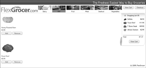
The FlexGrocer application with the new ShoppingList component
Introducing Components with ActionScript 3.0
In an earlier lesson, you learned that any code written in MXML is translated into ActionScript by the Flex compiler before being compiled into a SWF file. In reality, every Flex component is an ActionScript class, regardless of whether it’s a UI control, a container, or some other type of component. Anything you might create in MXML can also be created in ActionScript, and there are things you can do with ActionScript that are not available purely from MXML.
The core Flex components you have used throughout this book—Label, DataGrid, and Button—are written in ActionScript. In general, components that are written for a single project or even quick prototypes of more advanced components are handled in MXML. However, if you want to build a very reusable and skinnable component, you will eventually need to embrace ActionScript as your primary method.
The steps you will take when creating an ActionScript 3.0 component are similar to the steps for building any ActionScript 3.0 class. First, determine what (if any) superclass your new class will extend. Then, determine what properties you need to declare for your class. Next, determine any new methods you might need to implement. You will also need to declare any events your component will dispatch.
If your component is a visual class, as it will be in this lesson, you will likely need to consider how your class will interact with a skin to allow you and others to change the visual appearance of your new component.
Building Components Can Be Complex
A word of warning: This lesson is the culmination of much of what you have learned in this book. Flex is intended to allow you to build applications quickly by assembling premade components. Flex can look easy, but it does so only because a component developer somewhere embraced the real complexity that lies just beneath the surface and wrestled it into submission.
When you develop Flex components, you become that individual, meaning that it is your job to make it look easy to the outside world by dealing with the complexity inside this little black box we call a component.
To create a well-developed component, you must balance the needs of your component’s end user (sometimes you, sometimes your team or company, or at the most extreme, an unknown audience who will purchase and use it), with an understanding of Flash Player and the Flex framework. While this lesson will not be able to provide all of that understanding, it will touch on several areas of building a component.
Understanding Flex Components
As first discussed in Lesson 12, “Using DataGrids and Item Renderers,” there are two sets of components in the Flex framework: MX and Spark. We are going to ignore that fact for now and concentrate on the Spark architecture as it provides more flexibility and choices when developing new components.
There are two types of components in the Flex framework: those that have a skinnable display and those that do not. Classes such as Group, DataGroup, and many others are not skinnable. That means you cannot apply the techniques learned in the previous lesson to change their appearance. These types of components are lighter weight and generally descend from a class named UIComponent.

UIComponent is the base class for components in Flex and defines a lot of the functionality you have already become familiar with, such as automatic sizing and properties such as left, top, right, and bottom. Components that descend from UIComponent directly tend to be more self-contained with regard to their visual experience. In other words, they do not have a separate skin class that controls the way they appear on the screen.
Conversely, components may descend from SkinnableComponent. SkinnableComponent also descends from UIComponent, but it adds a key piece of additional functionality. It allows for the separation of all functionality related to the way the component appears to be defined in a separate class. Put simply, components that in some way descend from SkinnableComponent can have a skin.
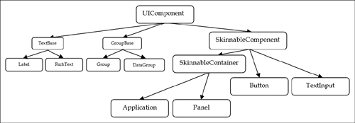
Why does this all matter? It changes the definition of the word component. When using nonskinnable components such as Label, the component is mostly self-contained. Any intended visuals of the component must be contained within the class.
However, exactly the opposite is true of skinnable components. When creating a skinnable component, nothing about the way the component appears on the screen is defined inside the component itself; it is all defined in the skin. You can think of a skinnable component as existing of two halves that must work together to create a whole.

Effectively, this is a separation of form and function. Skins are purely visual; they contain no logic for interactivity. Skinnable components do not have a visual representation without a skin; they are purely the functional aspects of a class.
Why Make Components?
Examining this image, you will see your current shopping cart item view from your Flex Grocer application.

Right now this image does not represent a single component in your code: it is three separate components. This code from ShoppingView shows these declarations:

Ignoring any visual changes for the moment, why might you want to make this into a single component as opposed to leaving it as is? The answer to that question comes down to interface, encapsulation, and reuse.
To provide this display on the screen correctly right now, you need to remember to do the following:
• Set the includeIn property correctly on a couple of different instances.
• Pass the shopping cart’s items, not the entire shopping cart, to the List instance.
• Define a CurrencyFormatter on this page.
• Pass the total from the shopping cart into the format() function before passing it to the Label’s text property.
• Include functions to handle dragging and dropping.
While all those things are fine if you are the author of this code and only intend to duplicate this block once, consider it from another perspective. If you were going to instruct someone on how to add a listing of their shopping cart items to their page, would you want to explain each of those things? Suppose this component needed to be added in several different places in the application: would copying all those pieces each time make sense? And lastly, in the abstract, all this code is currently in a class called ShoppingView. ShoppingView’s main job is to present a list of products and a view of the shopping cart to the user. Does code that understands how drag and drop works inside the List class really belong in ShoppingView?
The answer is no. When you create classes in an object-oriented language, you want to have a clear sense of what the resultant object will do. Ideally, it should have as singular a purpose as possible to keep the code maintainable and understandable. Right now ShoppingView does a variety of things and, from an object-oriented perspective, knows too much about the relationship of these objects to allow these pieces to be reusable. To solve that problem, you are going to take this one function that displays and handles the items in a user’s shopping cart and refactor it into a new object with this purpose. Along the way, you will gain the ability to skin this object and simplify its use—all because you have made the commitment to create a component from this functionality.
Defining a Component
You cannot create a component without knowing its intended purpose, so let’s examine the current list and related controls alongside a new intended look and feel for this component.

Reexamining the code for the current implementation will give you an initial set of the requirements. You want to be able to replace this code and the associated functions in the ShoppingView with one component. Therefore, it must be able to do the same things.

Looking at this code, you should be able to gather a few important points. The component needs to:
• Display the contents of the shoppingCart’s items collection, which is just a collection of ShoppingCartItem instances
• Accept drag-and-drop operations as a way of adding items
• Display the shopping cart’s total
• Format the shopping cart’s total
• Facilitate switching to the cartView state
This code uses generic Flex components: List, Label, and Button. Generic components are fantastic building blocks, but they force your application code, the code contained within files like ShoppingView, to do more work.
For example, you simply can’t tell a generic component to display your ShoppingCart object. Instead, any person using this code has to provide the List with the items collection, the Label with the formatted total, and so on.
Generic Flex components aren’t designed to understand concepts specific to your application. However, when you create your own custom components, you can tailor them to understand the objects that are important to your application and therefore reduce the pain in using them.
Defining the Interface
If you were to close your eyes and envision the perfect interface for your ShoppingList, what might that be? Perhaps instead of passing in items to a List and totals to a Label, you would just pass the entire shoppingCart and the component would know what to do with it. Perhaps instead of bothering you when someone dragged something onto the component or dropped it, the component would just tell you that there is a new product to add to the cart. This is an important exercise. When creating a new component one of the most critical things to get right is the interface—in other words, how the rest of the world will use your component in code. Here is the proposed interface for the new ShoppingList component:
<components:ShoppingList
shoppingCart="{shoppingCart}"
addProduct="addProductHandler(event)"
viewCart="currentState='cartView'"/>
The new component will accept a ShoppingCart instance as a property. It will let you know when a user attempts to add a product or clicks the view cart button via events that are easily handled. It will hide all the messy details internally, making it much easier to use—and reuse.
Choosing a Base Class
The last step before you begin creating your custom component is to choose a base class. That is the class you will extend as your starting point. Choosing the base class for your new component is a critical decision and one you cannot make without a thorough understanding of the problem, so let’s start there.
Reexamining the image from earlier, you will see your current shopping cart item view on the left and the proposed shopping cart item view on the right. They look quite a bit different, but there are functional differences as well.

When you are deciding on a base class, you are trying to determine if there is another class that already does most of the needed work on your behalf. For instance, earlier you created ProductList. You did so by extending the DataGroup and changing a few things to make ProductList a viable component for your needs.
In this case, you are making a component that has an area to display a list of items. It also has an area to display the number of items in the cart, an area to display a total, and a View Cart button. Unlike ProductList, this component doesn’t exactly mirror the functionality of any one Flex component. Instead, it is a composite of many different components interacting in a specific way.
As there isn’t a component in Flex that provides you with the needed functionality, it will be up to you to build it all. While doing so, you are also going to allow for others in the future to change the way your component looks via skinning. Therefore, you will use SkinnableComponent as your base class.
Creating the Class
You will begin building the component to replace the shopping cart items list currently in ShoppingView. Start by creating a new ActionScript class.
- Open the FlexGrocer project that you used in the previous lessons.
Alternatively, if you didn’t complete the previous lesson or your code is not functioning properly, you can import the FlexGrocer.fxp project from the Lesson18/start folder. Please refer to Appendix A for complete instructions on importing a project should you ever skip a lesson or if you ever have a code issue you cannot resolve.
- Right-click the components package in the Package Explorer. Choose New > ActionScript Class.
- Specify ShoppingList as the Name of the new class and SkinnableComponent as the superclass.

- Click Finish.
Now that you have a class, you need to define the interface explained earlier in code. The steps in this section rely heavily on Flash Builder. Learn to use these tools well, and you will save immense amounts of time.
- Above the constructor for the ShoppingList class, create a new private variable named
shoppingCartof typeShoppingCart.
private var shoppingCart:ShoppingCart;
Be sure to use code completion when typing so that Flash Builder imports cart.ShoppingCart on your behalf.
- Right-click
shoppingCartin the line of code you just wrote. From the pop-up menu, choose Source > Generate Getter/Setter. - The Generate Getter/Setter dialog box opens. Ensure your options look the same as those in the following image:

This dialog box will generate a new getter and setter function on your behalf, saving you typing and typos.
- Click OK. You should now have a getter and setter function for a
shoppingCartproperty, and your original variable will be renamed with an underscore.

This property was the first of three things that made up the ShoppingList interface. The remaining two are both events, which you will add next.
- Move to just above the ShoppingList class definition and add event metadata for an event named
addProductthat will dispatch aneventof typeevents.ProductEvent.
[Event(name="addProduct",type="events.ProductEvent")]
- Add another piece of event metadata just below the last for an event named
viewCart, which will dispatch an event of typeflash.events.Event.
[Event(name="viewCart",type="flash.events.Event")]
- Manually import the two event classes at the top of your file.
import events.ProductEvent;
import flash.events.Event; - Save this file.
Your public interface is now complete, and you can change your MXML to use your new component.
Using Your Custom Class
Although your new component does not yet have any functionality useful to the user, its public interface is complete. This means you can replace your existing code with this new component.
This is a great way to check your design and ensure you met all the requirements before continuing with implementation. If your component can be dropped into the place where it is eventually needed, you likely have the basics covered.
- Open the ShoppingView from the views package.
- Find the VGroup named cartGroup that contains the components responsible for showing the cart’s contents in different views.
- Delete the List control, the Label that displays the cart total, and the Button that is responsible for switching to the cartView state. Your code for this VGroup should look like this:

- Next, add your ShoppingList component just above the
dgCartbut still insidecartGroupand pass it a reference to theshoppingCart. Previously, the List was only included in State1, so also add that logic to this tag.
<components:ShoppingList
includeIn="State1"
shoppingCart="{shoppingCart}"/> - Now handle the
addProductevent by calling theaddProductHandlerevent listener, which is already defined in this view.
<components:ShoppingList
includeIn="State1"
shoppingCart="{shoppingCart}"
addProduct="addProductHandler(event)" />Technically this component already has a reference to the
shoppingCart, which means you could manually add a new product anytime you wanted without dispatching and handling this event. However, there are two good reasons not to do so. First, there is already logic on this view to handle the Add Product button click from the ProductList. Reusing this logic means less duplication, but more importantly it means if this logic needs to change, it changes in only one place.Further, while you are making this component more specific, it is still best to separate the logic that your application performs from the way it is displayed. This component is about displaying items in a specific way and interacting with the user. You really don’t want it to also have the responsibility of understanding how products are added to the cart or you’re back to having components that know too much—part of what we’re correcting by moving some of this code out of ShoppingView.
- Handle the
viewCartevent by settingcurrentStatetocartView. The final tag should look like this:
<components:ShoppingList
includeIn="State1"
shoppingCart="{shoppingCart}"
addProduct="addProductHandler(event)"
viewCart="currentState='cartView'"/>Your new component is now taking the place of the older pieces, but there is now extraneous code in ShoppingView that can be eliminated—the functionality will be moved into the ShoppingList component.
- Delete the
renderProductName(),cartList_dragEnterHandler(), andcartList_dragDropHandler()methods from ShoppingView. You may also delete the following imports, which were only used by these methods.
import mx.core.IUIComponent;
import mx.events.DragEvent;
import mx.managers.DragManager;The functionality of these methods belongs to the ShoppingList now and will no longer be needed in ShoppingView.
- Save all your files. You shouldn’t see any compilation errors, but if you were to run this code now you’d receive an error at run time.
You presently have function with no form. You’ve learned that components based on SkinnableControl are really two halves, one side representing the function and the other the form. Flex can’t figure out what you want displayed on the screen. You will deal with that issue next.
Creating the Visuals
You created the stub for your new custom component in the previous section, but now you want to define its visual appearance and then link the two together. Defining the requirements for these two components to talk and establishing the visual display will be the focus of this section.
Specifying the Skin Requirements
Components that support skinning in Flex are composed of two pieces. This separation provides enormous capability but also some complexity. The two halves need to communicate and they need to set requirements for each other. The functional side of the component in your case will be responsible for displaying the total. Therefore, it needs to know that there will be a label created by the visual side allowing that to happen.
These requirements are set via three metadata tags that collectively help tame the madness of this dynamic component model. You learned about these tags briefly in Lesson 17, “Customizing a Flex Application with Skins”; however, you will now use them to define your component.
The first metadata tag is called SkinPart. The SkinPart metadata is responsible for defining what pieces are required of the skin to be considered legitimate. Using your component as an example, the ShoppingList will need to indicate that it needs some place to put the total, the quantity, and the items. The Flash Builder environment will not allow someone to assign a skin to your component that does not implement all these required parts.
The SkinPart metadata is used inside the class and above a property. In this example:
[SkinPart(required="true")]
public var myLabel:Label;
a component is indicating that the skin must have a Label named myLabel to be considered a valid skin. If required is set to false, it is optional for the skin to implement.
The next piece of metadata is called SkinState. The SkinState metadata tag is responsible for indicating what states are required of the skin. The simplest example of this is the normal and disabled state. In Flex you can set the enabled property for any UIComponent to false. Doing so should prevent interaction with the component and often changes the component visually to ensure the user perceives the reason for the lack of interaction.
[SkinState("normal")]
[SkinState("disabled")]
When this metadata is added above the class declaration for a component, it means that any skin for this component must have these two states defined. It does not prescribe what the skin does during a state change. For instance, it is completely your choice if the skin blinks or does nothing in a disabled state, but it must be able to handle this state change in whatever way you see fit.
The final piece of metadata important to skinning resides in the skin itself. This piece of metadata is called HostComponent.
[HostComponent("components.MyList")]
The HostComponent tag is used to associate a skin with its component. In other words, it is used to indicate which halves make the whole. This is extremely important as it allows Flash Builder to do compile-time checking on your behalf. If you create a new skin and specify it is for a particular component, Flash Builder can check the SkinState and SkinPart metadata of the named component and verify that your skin meets those requirements. That way, you know at compile time, instead of run time, if there is a problem.
- Open the ShoppingList.as file that you used in the previous exercise.
Alternatively, if you didn’t complete the previous lesson or your code is not functioning properly, you can import the FlexGrocer-PreSkin.fxp project from the Lesson18/intermediate folder. Please refer to Appendix A for complete instructions on importing a project should you ever skip a lesson or if you ever have a code issue you cannot resolve.
- Directly below the event metadata and before the class definition, add two SkinState metadata tags defining states named normal and disabled.
[SkinState("normal")]
[SkinState("disabled")]You are specifying that anyone making a skin for your component must be able to handle these two states or it is not to be considered a valid skin.
- Inside the class definition, just below the variable declaration for the
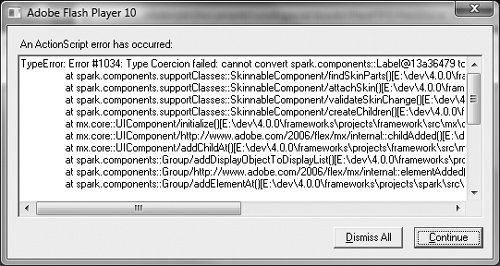
_shoppingCartproperty, add a public variable namedtotalLabelof typeLabel. Be sure to use code completion, but also be sure that you specifyspark.components.Label.
Caution!

While working in ActionScript in Flex 4, you must be extremely careful about class names. Because MX and Spark components both have a Label, Button, and other similar classes, it is extremely easy to import the wrong one. Remember when skinning, that you almost always want the Spark versions. The following error is typical of choosing the wrong Label when creating a skin.
- Directly above the
totalLabelproperty, add the SkinPart metadata, indicating that this particular part is required. Your code should look like this:
[SkinPart(required="true")]
public var totalLabel:Label; - Add a new required SkinPart for
dataGroupof typeDataGroup.
[SkinPart(required="true")]
public var dataGroup:DataGroup; - Add another new required SkinPart for
quantityLabelof typeLabel.
[SkinPart(required="true")]
public var quantityLabel:Label; - Finally, add an optional SkinPart for
viewCartBtnof typeButton.
[SkinPart(required="false")]
public var viewCartBtn:Button;In all cases, be sure that you used code completion and that you choose the Spark versions of these components. You can double-check by ensuring that there are no imports in this file that start with
mx.controls. - Save this class.
It should compile successfully without any errors or warnings.
Creating the Skin
You now have a component waiting to be skinned. It has the required skin parts and the skin states defined. In this section, you will create a skin for the new component and apply it so that you can run the application and see some initial results.
- Right-click the skins folder and choose New > MXML Skin from the pop-up menu.
- Name the new skin ShoppingListSkin. Click Browse next to the Host component field and select your ShoppingList component.
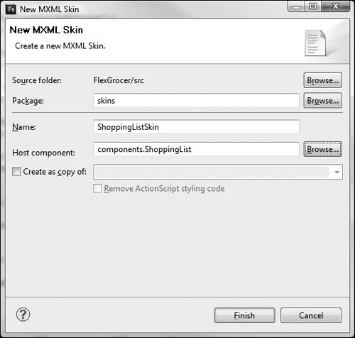
- Click Finish and a new skin is created for you.

Note that the HostComponent metadata was entered on your behalf, the required skin states were created based on the SkinState metadata in your ShoppingList class, and Flash wrote a comment in the code reminding you of the SkinParts you must have to be considered valid.
- Just below the comment for the SkinParts, add an
<mx:Image/>tag with a source ofassets/receipt.png.
<mx:Image source="assets/receipt.png"/>
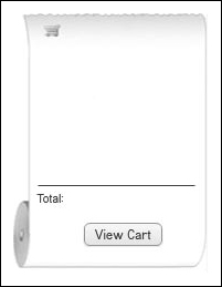
This will load the background image for your new component. Here is a quick reminder of the skin you are about to build:

- Below the Image, add an
<s:Label/>tag with anidofquantityLabel. Set theleftproperty to50and thetopproperty to10.
<s:Label id="quantityLabel" left="50" top="10"/>
Note that the
idofquantityLabelis being used. Thisidis the same as the property marked with the SkinPart metadata in the ShoppingList. For every required SkinPart in the ShoppingList, you will have a matching component here with thatid. - Below the
quantityLabel, add a tag pair for<s:Scroller></s:Scroller>. Set theleftproperty to22, thetopproperty to30, thewidthto149, and theheightto115. You will also set a property calledhorizontalScrollPolicytooff.
<s:Scroller left="22" top="30" height="115"
horizontalScrollPolicy="off">
</s:Scroller>In Flex 4, not every object knows how to scroll its own content. Instead, you wrap these instances inside a Scroller to handle any scrolling needs. In this case you are setting the size and position of the area you wish to scroll. By default the Scroller scrolls horizontally and vertically. In this case, you only want vertical scrolling so
horizontalScrollPolicyhas been turnedoff. - Inside the
<s:Scroller></s:Scroller>tag pair, add an<s:DataGroup></s:DataGroup>tag pair. Set theidof this DataGroup todataGroup, one of your required skin parts. Set theitemRendererproperty tospark.skins.spark.DefaultItemRenderer.
<s:Scroller left="22" top="30" height="115"
horizontalScrollPolicy="off">
<s:DataGroup id="dataGroup"
itemRenderer="spark.skins.spark.DefaultItemRenderer">
</s:DataGroup>
</s:Scroller>This DataGroup will be responsible for displaying the items in your ShoppingCart. For now, you are using the DefaultItemRenderer, which displays the text from your
toString()method of your ShoppingCartItem. You will customize this later. - Inside the
<s:DataGroup></s:DataGroup>tag pair, set thelayoutproperty to an instance of the VerticalLayout class, setting thegapto0. Your code for the Scroller should look like this:
<s:Scroller left="22" top="30" height="115"
horizontalScrollPolicy="off">
<s:DataGroup id="dataGroup"
itemRenderer="spark.skins.spark.DefaultItemRenderer">
<s:layout>
<s:VerticalLayout gap="0"/>
</s:layout>
</s:DataGroup>
</s:Scroller> - Below the Scroller, draw a simple dividing line using MXML. Specify an
<s:Line>tag pair with anidofdivider. Set theleftproperty to22, therightproperty to10, and thetopto155. Inside the tag pair, set thestrokeproperty to an instance of the SolidColorStroke with acolorof#535353and aweightof1.
<s:Line id="divider" left="22" right="10" top="155">
<s:stroke>
<s:SolidColorStroke color="#545454" weight="1"/>
</s:stroke>
</s:Line>This code does nothing more than draw a dividing line before the total. You only have two labels and a button left until your skin is complete.
- Add an
<s:Label/>below the line with thetextset toTotal:,leftset to22,topto162,colorto#0000FF, andfontSizeto11.
<s:Label text="Total:" left="22" top="162" color="#0000FF" fontSize="11"/>
- Add another
<s:Label/>with theidset tototalLabel,rightset to12,topto162,colorto#0000FF, andfontSizeto11.
<s:Label id="totalLabel" right="12" top="162" color="#0000FF" fontSize="11"/>
This label will hold the actual formatted total on the shopping cart.
- Finally, add an
<s:Button/>with theidset toviewCartBtn,labelset toView Cart,horizontalCenterto12, andbottomto20.
<s:Button id="viewCartBtn" label="View Cart" horizontalCenter="12" bottom="20"/>
This completes your skin for the moment. The code you added should look like the following snippet:

- Open ShoppingView.mxml and find the ShoppingList tag.
- Add a property to this tag named
skinClassand set it equal toskins.ShoppingListSkin.
<components:ShoppingList
skinClass="skins.ShoppingListSkin"
includeIn="State1"
shoppingCart="{shoppingCart}"
addProduct="addProductHandler(event)"
viewCart="currentState='cartView'"/> - Save all your open files and ensure you do not have any errors or warnings. Run the FlexGrocer application and you should see the beginnings of your custom component displayed.
Adding Functionality to the Component
You created the stub for your new custom component and defined its visual appearance. Now it is time to add the final functionality so that both halves of the component work together. This is also the time when you will need to understand just a bit about how Flash Player works internally as well as how to manage the internally asynchronous nature of components.
Handling Asynchronous for All
Flash Player is a single-threaded virtual machine. In the simplest sense, that means it does one thing at a time and regardless of how long it might take, it will never, ever interrupt code that is running. It always allows one task to finish before moving on to something else.
The problem with this philosophy is that if something takes a long time to do, it can cause Flash Player to stop updating the screen and mouse movements at a reasonable rate, creating a negative user experience.
To combat that issue, the Flex framework is event based and has an asynchronous component model. This means that certain aspects of what happens inside components happen at predetermined times when Flash Player is most optimally able to deal with changes. It also means that as a developer, you cannot make assumptions about when something is ready, complete, or otherwise available.
The Flex framework has prescribed ways to deal with this complexity. As a developer, if you embrace these concepts, things will go your way. If you try to do your own thing, the framework will find a way to punish you. Things may work seemingly well on your development machine but differently in production. Components may work in one circumstance but not another. Because all these issues have to do with timing that can change from machine to machine, it is imperative that you follow the rules.
- Open the ShoppingList.as file that you used in the previous exercise.
Alternatively, if you didn’t complete the previous lesson or your code is not functioning properly, you can import the FlexGrocer-PreFunction.fxp project from the Lesson18/intermediate folder. Please refer to Appendix A for complete instructions on importing a project should you ever skip a lesson or if you ever have a code issue you cannot resolve.
- Just below the
private _shoppingCartproperty, create a new private variable namedshoppingCartChangedtyped as aBoolean. Set it to a default value offalse.
private var shoppingCartChanged:Boolean = false;
This is known as a change flag as its only purpose is to indicate the state of something. Internally this will be used to let your component know when it has a new ShoppingCart that must be displayed to the user.
- Create two more private variables named
quantityChangedandtotalChanged, both typed asBooleanand with default values offalse.
private var shoppingCartChanged:Boolean = false;
private var quantityChanged:Boolean = false;
private var totalChanged:Boolean = false;These other change flags will be used for tracking when either the quantity or total need updating.
- Inside the public setter for the
shoppingCartproperty, immediately after_shoppingCartis set tovalue, set theshoppingCartChangedflag totrue.

- Call the
invalidateProperties()method that your class has due to inheritance.

Everything that descends from UIComponent in Flex has this method available. This is one of several methods designed to help you deal with the asynchronous way Flex creates components. In Flex, skins can be added to and removed from components at run time, so you cannot assume that all the parts of the skin are waiting and ready for your commands.
When you call
invalidateProperties(), you are effectively asking the Flex framework to schedule a call to another special method namedcommitProperties()at a more opportune time. Flex manages the complexity of all the components that may want to do some work at any given time and calls them in the order most appropriate for performance. - Below the
shoppingCartproperty setter, override a protected method namedcommitProperties(). This method takes no arguments. Immediately inside the method, callsuper.commitProperties();.
override protected function commitProperties():void {
super.commitProperties();
}This method is eventually called whenever you or any other code calls
invalidateProperties(). Flex calls this method at an optimized time for your component to do the work it needs. In addition to the call you made toinvalidateProperties(), other parts of the Flex framework also call this method. It will be called automatically whenever a new skin is added or removed. - Below the call to
super.commitProperties(), write anifstatement that checks if yourshoppingCartChangedflag istrueand if thedataGrouphas already been created:
The code inside this
ifstatement will now only execute if your flag istrueand if Flex has already created the dataGroup. - Inside the
ifstatement, set theshoppingCartChangedflag tofalse. Then set thedataProviderof thedataGrouptoshoppingCart.items.

All this code is mandatory. If you tried to access the
dataProviderproperty of dataGroup before dataGroup existed, your application would crash. Memorize this pattern. Whenever a Flex component sets a property from outside the component (like yourshoppingCartproperty) to another visual child component (like something in the skin), thecommitProperties()method is used to ensure that the component will not crash due to timing issues. - Save your code and run the application. Items added to the cart via the Add and Remove buttons of the Products will appear in the cart list.
This is a great first step, but you have a lot more work to do.
- Return to the
shoppingCartsetter. After theshoppingCartChangedflag is set totruebut beforeinvalidateProperties()is called, you need to write anifstatement that checks if the shopping cart just passed to the function exists.

It is always possible that a user working with your component passed in a
nullvalue. This check makes sure your code won’t break when it tries to access the data. When developing components for reuse, you must code defensively. - Inside the
ifstatement, add a new event listener to theitemsproperty of the_shoppingCart. You will listen for aCollectionChange.COLLECTION_CHANGEevent and call a method namehandleItemChanged()if this occurs.
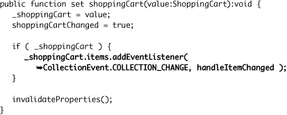
This is the same code you wrote inside the ShoppingCart class so that the ShoppingCart would monitor changes in the ShoppingCartItems. This will serve a similar purpose here.
- Create a new private method named
handleItemChanged(). It will accept one parameter, aneventof typeCollectionEvent, and return nothing. Inside the method, set thetotalChangedflag totrueand thequantityChangedflag totrue, and then call theinvalidateProperties()method.

This method will be called anytime you add, remove, or update any of the ShoppingCartItem instances. It sets these two changed flags to
trueand asks the Flex framework to callcommitProperties()when it has the opportunity. - Create a new private variable named
currencyof typeCurrencyFormatternear the top of this class just between thetotalChangedflag and thetotalLabelSkinPart declaration.
private var currency:CurrencyFormatter;
This component is now going to take care of formatting the total before displaying it to the user.
- Find the ShoppingList class’s constructor, and after the call to
super()assign a new CurrencyFormatter class instance to thecurrencyproperty. Then set theprecisionproperty of the instance to2.
public function ShoppingList() {
super();
currency = new CurrencyFormatter();
currency.precision = 2;
}Previously you created instances of the CurrencyFormatter through MXML. Here you are simply generating the ActionScript code that Flex would normally write on your behalf.
- Return to the
commitProperties()method. Below your otherifstatement, add a newifstatement that checks if thetotalChangedistrueand iftotalLabelexists. If it does, set thetotalChangedflag tofalse.
if ( totalChanged && totalLabel ) {
totalChanged = false;
} - Still inside the
ifstatement but just below the code that setstotalChangedtofalse, set thetextproperty of thetotalLabelto the result of calling thecurrency.format()method, passing it theshoppingCart.totalas an argument.
if ( totalChanged && totalLabel ) {
totalChanged = false;
totalLabel.text = currency.format( shoppingCart.total );
}Now each time the items in the ShoppingCart change, the shopping cart’s total will be reformatted and the label in the skin will be updated.
- Just after this
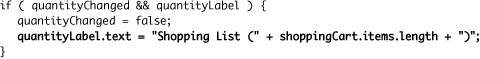
ifblock, add one finalifstatement. Check if thequantityChangedflag istrueand if thequantityLabelexists. If it does, set thequantityChangedflag tofalse.
if ( quantityChanged && quantityLabel ) {
quantityChanged = false;
} - Still inside the
ifstatement but just below the line of code that setsquantityChangedtofalse, set thetextproperty of thequantityLabelto the result of concatenating the String"ShoppingCart (" +with the length of the shopping cart’s items collection and a final")".
Now each time the items in the ShoppingCart change, the shopping cart’s quantity will be reformatted and the label in the skin will be updated.
- Save and run the application. You can now add items to the shopping cart view using the Product Add and Remove buttons and see the DataGroup, Quantity, and Total update.
In the next section, you will deal with drag and drop as well as the View Cart button.

Communicating with Events
Your component now updates and reflects data changes in the ShoppingCart instance. However, you still can’t drag an item into the new ShoppingList, and you can’t click the View Cart button. Those are your next tasks.
To do so, you need to learn about another method available for override in SkinnableComponent descendants. That method is named partAdded(), and there is a corresponding method named partRemoved(). The partAdded() method will be called each time a new part of your skin is created and ready to access. The partRemoved() method is called when that skin part is removed and no longer part of the component.
- Open the ShoppingList.as file that you used in the previous exercise.
Alternatively, if you didn’t complete the previous lesson or your code is not functioning properly, you can import the FlexGrocer-PreDrag.fxp project from the Lesson18/intermediate folder. Please refer to Appendix A for complete instructions on importing a project should you ever skip a lesson or if you ever have a code issue you cannot resolve.
- Just above the
commitProperties()method, override the protected method namedpartAdded. This method accepts two parameters: the first is calledpartNameof typeStringand the second is calledinstanceof typeObject. The method returnsvoid. Immediately inside the method, call thesuper.partAdded, passing along the required arguments:

This method will be called each time a new skin part is built and ready for you to access. The
partNamewill be the name of the skinPart (dataGroup,totalLabel, and so on). The instance will be a reference to the newly created object. - Just below the call to the super class, create an
ifstatement that checks if thepartNamewasdataGroup. Then create anelseblock that checks if it wasviewCartBtn.
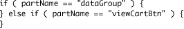
- Inside the
ifstatement for the dataGroup, add an event listener to the dataGroup instance forDragEvent.DRAG_ENTERand specifyhandleDragEnteras the listener. Add a second event listener to the dataGroup forDragEvent.DRAG_DROPand specifyhandleDragDropas the listener for this event.
This is just the ActionScript version of add event listeners to
dragEnteranddragDropin MXML.Tip

When the
partAdded()method is called by the Flex framework, it passes thepartName, such asdataGroup, as well as an instance of typeObject. Instead of adding your listener todataGroupdirectly, you could have used(instance as DataGroup).addEventListener(). Those two statements would yield identical results in this case; however, the latter is more useful when dealing with more dynamic skin parts. - Create a new private function named
handleDragEnter()that accepts aneventparameter of typeDragEventand returnsvoid.
private function handleDragEnter( event:DragEvent ):void {
} - Inside this method call the
event.dragSource.hasFormat()method and pass it the stringcartFormat. If this method returnstrue, callDragManager.acceptDragDrop(), passing it theevent.targettyped as anIUIComponent.

This method should look familiar. This is nearly the same method you wrote for the
dragEnterhandler previously in ShoppingView. Now you are just handling everything in ActionScript. - Create a new private function named
handleDragDrop()that accepts aneventparameter of typeDragEventand returnsvoid.
private function handleDragDrop( event:DragEvent ):void {
} - Inside this method create a new local variable named
productof typeProduct, assign its initial value to the result of theevent.dragSource.dataForFormat()method, passing it the stringcartFormat. Cast the result as a Product object.

This method should also look familiar. It is again nearly the same method you wrote for the
dragDrophandler earlier in ShoppingView. - Just after getting the Product instance from the
dragevent, create a new local variable namedprodEventof typeProductEvent. Assign its value to a new instance of the ProductEvent, passing the stringaddProductto the first parameter and theProductobject to the second.
var prodEvent:ProductEvent = new ProductEvent( "addProduct", product );
In the very beginning of this exercise, you told the Flex compiler you would dispatch a product event. You are about to fulfill that promise.
- As the last line of this method, dispatch the
prodEventevent.

On a successful drag-and-drop operation, your code now dispatches an event indicating that the product should be added to the cart.
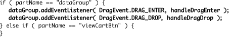
- Return to the
partAdded()method. In theelseclause for the viewCartBtn part, add an event listener to the viewCartBtn instance for theMouseEvent.CLICKevent, passinghandleViewCartClickas the listener. Here is the finalpartAdded()method.

- Create a new private function named
handleViewCartClick()that accepts an event parameter of typeMouseEventand returnsvoid.
private function handleViewCartClick( event:MouseEvent ):void {
} - Inside this method create a new local variable named
viewEventof typeEvent. Assign it to a new instance of the Event class, passing the stringviewCart. Finally, dispatch the event.

This will dispatch the
viewCartevent that you defined long ago at the beginning of this component. - Save and test your application. You should now be able to add items to the shopping list by dragging them, and the View Cart button should switch to the datagrid version of the view.
Cleaning Up After Yourself
Your component now works quite well, but there is a problem. Skins in Flex can be changed at run time. You are adding event listeners to a number of components in the skin but not cleaning up after yourself.
The same is true of the data passed to the shoppingCart. Right now you add an event listener; however, if someone provided a new ShoppingCart instance, you would be listening to two collections for changes instead of just the most recent.
- Open the ShoppingList.as file that you used in the previous exercise.
- Copy the
partAdded()method in its entirety. Paste it just below the existing method. Change the name of the function topartRemovedand change the call to the super class topartRemovedas well.

You should have just changed
partAddedtopartRemovedin two places. If you changed it a different number of times, recheck before proceeding. - Inside the
partRemoved()method, change all the calls toaddEventListener()toremoveEventListener(). Keep the parameters the same.
You should have just changed
addEventListenertoremoveEventListenerin three places. If you changed it a different number of times, recheck before proceeding. Now each time a part is removed, it removes the accompanying event listeners. - Find the
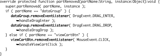
shoppingCartsetter function.
Currently this function adds an event listener each time it is called. You will now also remove the old event listener.
- Copy the
ifblock that checks if the_shoppingCartproperty exists and adds an event listener. Paste it as the first line of this method.

This method now adds two event listeners, which is worse than before.
- Change the first call to
_shoppingCart.items.addEventListener()toremoveEventListener()instead.
This code now checks to see if there was already a
shoppingCartwith an event listener. If so, it removes it before adding a listener to a new one. - Save and run your application. Make sure it performs as it did before.
The ShoppingList is finished. All that is left is to customize the way the DataGroup instance in the skin displays data.
Creating a Renderer for the Skin
The last step to finish up the presentation of this component is to create a custom renderer and apply it to the DataGroup that the ShoppingListSkin will use to render its data. This will complete the desired look of the component.
As you may remember from Lesson 10, “Using DataGroups and Lists,” extending DataRenderer is a fast and easy way to create a custom renderer for a DataGroup.
- Open the FlexGrocer project that you used in the previous exercise.
Alternatively, if you didn’t complete the previous lesson or your code is not functioning properly, you can import the FlexGrocer-PreRenderer.fxp project from the Lesson18/intermediate folder. Please refer to Appendix A for complete instructions on importing a project should you ever skip a lesson or if you ever have a code issue you cannot resolve.
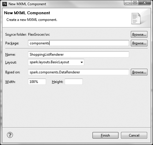
- In the Package Explorer, right-click the components package and choose New MXML Component. Name the component ShoppingListRenderer, choose BasicLayout for the Layout, and specify DataRenderer for the Based on value. Set the Width to 100% and remove the value for the Height.
- Beneath the declarations tag, create an
<fx:Script>tag pair. Inside the Script block, create a new bindable private variable nameditemof typeShoppingCartItem.

- Still inside the Script block, override the public setter for
data. Set theitemproperty you just created to the value typed as aShoppingCartItem.
override public function set data(value:Object):void{
this.item = value as ShoppingCartItem;
} - Inside the declarations block, create a new
<mx:CurrencyFormatter/>tag with anidofcurrencyand aprecisionof2.
<mx:CurrencyFormatter id="currency" precision="2"/>
- Below the Script block in MXML, create a new
<mx:Image/>tag. Set itssourceequal toassets/{item.product.imageName}. Then set itswidthto25andheightto25.
<mx:Image source="assets/{item.product.imageName}" height="25"/>
- Below the image, create a new
<s:Label/>tag. Set itsleftto30,topto5,rightto30, andtextto{item.product.prodName}.
<s:Label left="30" top="5" right="30" text="{item.product.prodName}"/>
- Below the label, create another new
<s:Label/>tag. Set itsrightto1,topto5, andtextto{currency.format(item.subtotal)}.
<s:Label right="1" top="5" text="{currency.format(item.subtotal)}"/>
- Open the ShoppingListSkin.mxml file from the skins package.
- Find the itemRenderer of the DataGroup tag, which is currently set to
spark.skins.spark.DefaultItemRenderer, and set it instead tocomponents.ShoppingListRenderer. - Save and run your application.
You should now have a completely styled custom component.
What You Have Learned
In this lesson, you have:
• Learned the concepts of custom ActionScript components (pages 426–432)
• Performed an extensive refactor (pages 432–444)
• Created an ActionScript skinnable component (pages 432–440, 444–455)
• Created your own skin (pages 440–444)
• Used the Scroller class (page 442)
• Learned to manage skin parts and life cycle (pages 444–457)