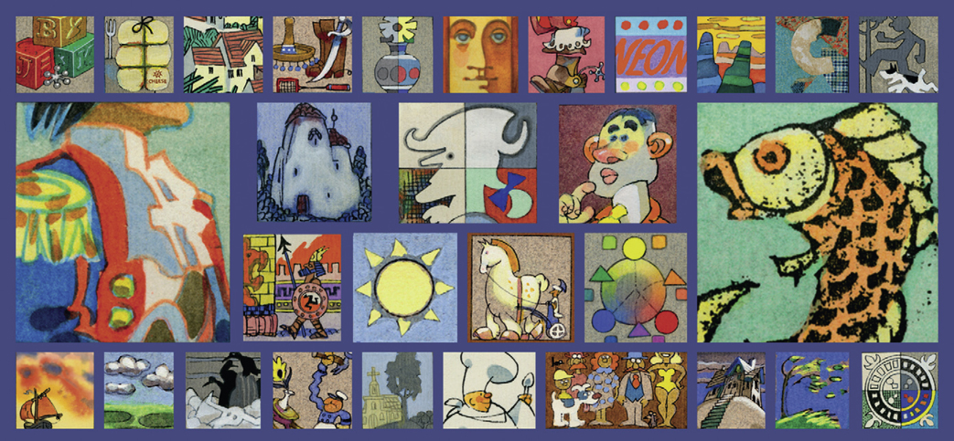
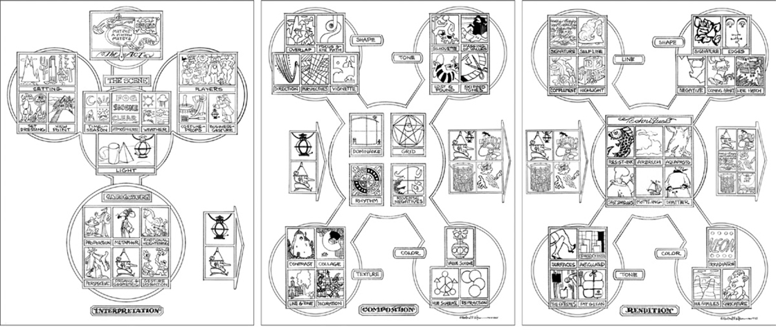
The Flow Charts: Interpretation, Composition and Rendition
Intention: The picture is not the event. It is a telling of the event by an artist who was there. It should always look like his drawing and never the real event. The story is a system within a system.
A compatriot said it is as difficult to be a work-for-hire artist as a fine artist. You don’t have the luxury of selecting your subject. Anything under the sun and beyond it can and will be thrown at you. However complicated, unpalatable, outlandish or indescribable it is—your job is to make it believable and beautiful and to sell it. “Sell” can also be used in the sense of pitching an idea or submitting a character design for animation.
The challenge becomes how best to organize the array of elements that go into creating a picture. Many artists when asked to name their favorite painting say, “The one I’m working on.” It’s so new and exciting that it is tempting to thoughtlessly jump into the finish (and essentially waste a lot of time repeating earlier mistakes). Taking on a new assignment can be confusing when you have to consolidate the ideas of one or more art directors regarding various products, characters, settings, typography, and logos. In addition to content are the considerations of color, composition, continuity and style. There is almost always a deadline. Although each illustration, cartoon, animation or game seems unique, it’s important not to waste time solving the same problem over and over again. No matter what the genre, certain aspects of image-making are universal.
Efficiency is the key: a logical sequence of steps to avoid backtracking. It is disconcerting to paint something perfectly and then discover a drawing mistake. The goal is to solve each aspect before going on to the next.
The animation industry developed a very efficient method that departmentalized each stage of the film. It begins with solving as much as possible before going into production. Concept, story and character design will all be worked out before moving along to layout, animation, color model, background and others.
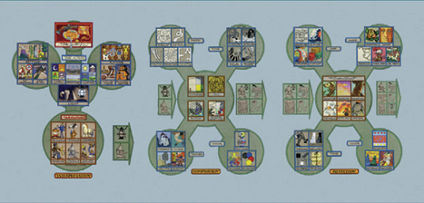
Here is a system that combines the organization of animated film production with the concept of computer flow charts. The object was to devise a methodical approach that could be applied to any art genre. The first stage, Interpretation, is about conceptual ideas and design considerations. The next, Composition, covers the arrangements of space, shapes, values, and line on page or screen. Finally is Rendition, the actual finishing of the art in digital or real media. Most often it’s the part you want to do first but it is only all the more exciting and successful when all the steps leading up to it have been resolved.
CHART 1—INTERPRETATION
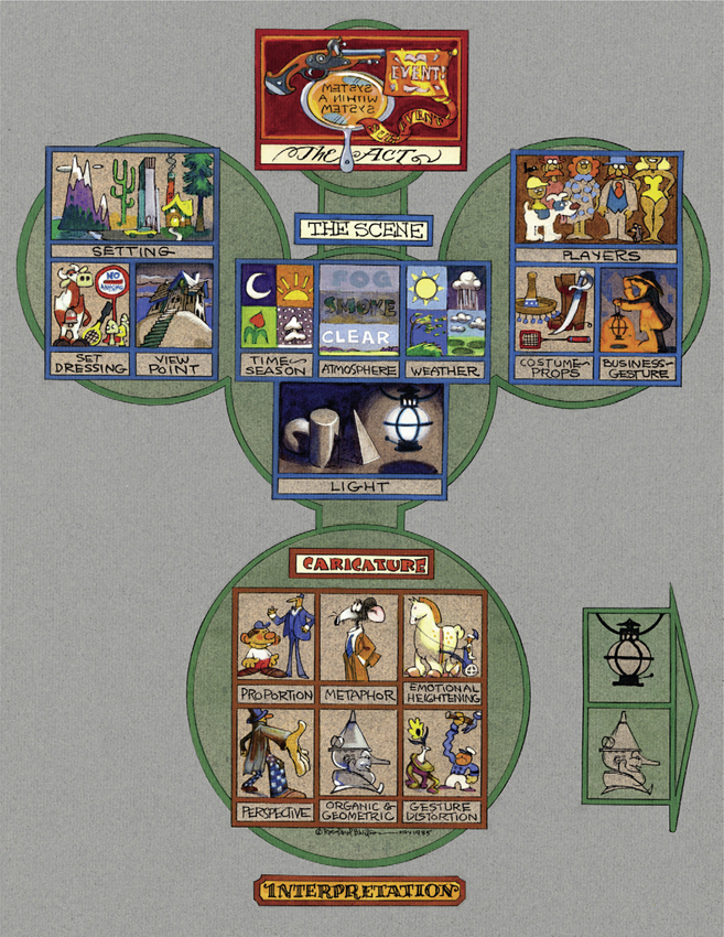
Interpretation
It has been said that everyone wants to direct. When you begin your work, whether it is an animation, a graphic novel, a concept design, an illustration, a four-color cartoon or any visual rendition, consider your role as the Director. You may also be the Playwright, Author, Composer or Impresario if it is your own original material. You are in charge of each and every aspect of the piece. As you move through the process of creating it, you assume varying roles. For example, faced with a Script, which is essentially the Idea, you become the Concept Artist, perhaps using thumbnail sketches to get thinking down on paper. Next, you “wear the hat” of the Art Director and break down your script into panels and pictorials. Sequentially you may wear many other different hats in your creative journey, as an Editor, Writer, Graphic Designer, Character Designer, Costume Designer, Choreographer, Stylist, Set and Lighting Designer, Renderer, Letterer and many more.
We will briefly touch on the elements of each stage and discuss them at greater length in the chapters that follow.
The Act
Start with a fanfare!
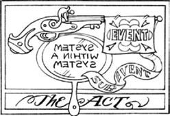
Essentially one works from invention—through interpretation, composition and rendition—to final realization. This is the phase of thinking, brainstorming, sketching and initial drawing. Thumbnail sketches are the mainstay of this process: get as many ideas as possible down without investing a lot of technique and detail.
The Act symbolizes the starting point. It could be anything from an idea to a finished script to an animated film (short or feature length) to a graphic novel. It is the nucleus of your project from which you derive inspiration and envision a completed work. In a film or story it often starts with what is called an inciting incident. You will want to design it so as to capture attention right at the outset. The sub-event is related but subordinate material that contributes substance and variety. Sometimes it gives contrast, such as comic relief, to strengthen the original premise.
A system-within-a-system is a time-honored device to suggest that art is reality by inserting artifice within the piece. Some examples are the enactment of Pyramus and Thisbe in the midst of William Shakespeare’s A Midsummer Night’s Dream, or the painting on the easel in Jan Vermeer’s Allegory of Painting. To extend the concept further, think of it purely visually. How do you express that you are working with both a flat surface and an illusion of three-dimensional reality? We will talk about systems such as reverse negatives and compound notan, which give dynamism to the picture.
The Scene
Setting, Set Dressing and Viewpoint
The setting, just as the stage set in a play, sets the tone for the entire act. Sometimes in an operatic production, the audience will applaud the set even before the players come onstage. Just like the setting for a precious gem, it is important to have it reflect your main concept. Think about what props are necessary and be sure they are designed in a consistent style. Having constructed the elements of the scene is just the beginning. What point of view will you take to create the greatest drama?
Time and Season, Atmosphere and Weather
In screenplay writing there is back story, a whole raft of information that may never find its way into the actual play. It serves to amplify the work by providing history and insights that lend credence to characters and their actions. In the same way, there are “behind-the-scenes” forces that set the tone of the picture. Each particular time of day and each particular season have a “personality.” How will it contribute to the drama of the scene? What is the visibility? Consider the atmosphere of softness and mystery conveyed by mist compared to the sharp delineation of bright sunlight.
Light
Lighting could be the subject of an entire book. In fact many have been written on the subject. Light affects everything we have talked about before. Don’t allow it to “just happen.” Use light in the service of your story. Before you begin, have an idea of how light will work to create reality, drama and consistency.
Players, Costume and Props, Business and Gesture
When you design your characters, give thought to more than just the facial features. If they represent a human quality, such as integrity, beauty or nerdiness, think about how the outside matches the inside. Can you emphasize their personality through physical exaggeration? How can you express how different they are from others? What makes them adorable or repulsive?
Perhaps an article of clothing or prop can be used as a trademark. If “clothes make the man,” how can you create a costume that expresses personality?
Business and gesture define the players even as much as their physical appearance. “Business” refers to a typical action or behavior of a character. A good example is the commedia dell’arte, an enduring art form where the characters are known for their antics perhaps more than their looks.
A person’s characteristic gesture makes them recognizable even at a distance. For example, their attitude may cause them to habitually take a certain stance.
Caricature
Proportion, Metaphor and Emotional Heightening
Caricature is a larger category than you might expect at first. One thinks of distorted noses and political cartoons but everything in your picture can be caricatured. Part of creativity is taking liberties with reality. You might want to emphasize proportions for effect. Think of how much you can distort them but still retain the effect you want. How can you make them more humorous?
Metaphor is the application of a characteristic to something that belongs to or is associated with another thing. Metaphors can be illustrated. Consider “That man is a real rat!”
Emotions can be heightened by how you choose to stylize an item, event, person or landscape. You can create drama through your visual interpretation, such as something that “looms large.”
Perspelyive, Organic and Geometric and Gesture Distortion
Perspective in caricature doesn’t have to be “correct.” (Hooray!) Knowledge of how it works is vital though, as you need to understand the structure in order to control the effect. Foreshortening an object close to you and diminishing it in the distance can add dramatic and even hilarious dimension.
Organic and geometric caricature can work together to create new forms. The tin man is part real and part mechanical. This provides two different aspects to play off against each other.
Besides distorting objects, you can distort gestures. It is a classic practice in animation. The “squash and stretch” technique can be very effective.
We have only briefly referred to various ingredients of your interpretive adventure. It is the “thinking” and preparation component of your work. It is a good time to consider the overview of what you are attempting to communicate. What worldview does it encompass? What research can you do to enhance your knowledge of the subject? What mood will dominate? What invisible trappings will make themselves felt? (Not just wind, sounds, smell, temperature, but also emotions such as rage, love and fear. Is there an undercurrent of danger, chaos or impending doom?) Are you going to apply a distinctive style?
When these aspects are solved, proceed to the next area: Composition.
A story is like a jigsaw puzzle.
First you need a large surface to dump the pieces out. (TIME)
Then you need to turn all the pieces face up. (RESEARCH)
Then you put together the border. (STORY SKELETON)
Then you fill in like-areas. (SEQUENCE BUILDING)
CHART 2—COMPOSITION
Composition
If it looks good on a postage stamp, it will look good on a billboard.
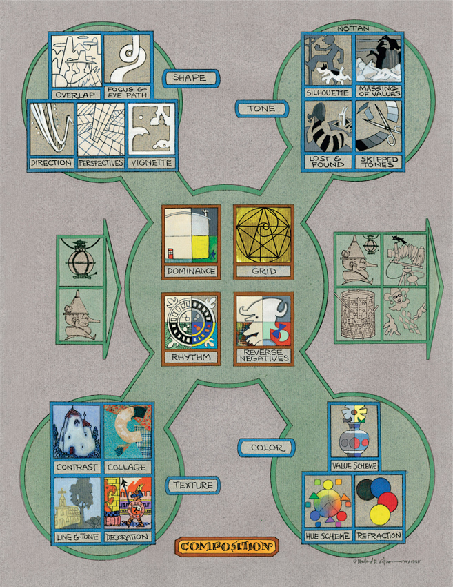
Composition is the architecture of art. Every masterwork of the Great Masters can be studied for its compositional structure. It is the aspect that will make the difference between a simple rendering and a masterpiece. If you are serious about creating successful art you will want to acquire and refer to a number of the excellent books dedicated exclusively to the subject. Make it a lifetime study and you will continue to improve.
The word “composing” is often associated with music but it applies equally to visual endeavors. Just as the musician depends upon a scale of notes, there are visual scales of tones, grids for structure, rhythms established and broken, silence between notes, and transitions of color.
Composition corresponds to the layout procedure in animation.
Dominance, Grid, Rhythm and Reverse Negatives
Traditionally the rectangle is the preferred configuration for most pictures. The vital thing is how everything inside this space is arranged. Good compositions will usually have one major shape or mass dominating the picture space. This helps give importance to the subject you want to emphasize.
A grid is one of the best friends an artist can have. Renaissance artists devised their compositions around specific systems. Divine Proportion is based upon a mathematical scale. The Golden Rectangle is also mathematically based. By subdividing it with diagonals you will arrive at shapes that are harmonious.
As mentioned, rhythm is familiar to us from music. The same principle applies to the elements of your picture. For example, repeating shapes will automatically create harmony. Consider setting up such a rhythm and then varying it. Try changing the “tempo,” adding jazz rhythms or introducing syncopation.
Always be aware of all the space in your picture, even if is not occupied by your subject. The background is equally important. A dynamic effect can be created by turning the visual tables and accenting the negative areas. Although the viewer knows intellectually that they recede into the distance, they appear to come forward and tension is created. Reverse negatives can give life to your composition.
Shape
Some artists claim that a painting is nothing more than an arrangement of shapes upon a canvas. As you build your composition consider the individual shape of each element as well as its relationship to the whole.
Overlap, Focus and Eye Path, Direction, Perspectives and Vignette
Placing one object in front of another creates a feeling of depth. It also tends to form interesting and unexpected shapes. Overlapping is a good way to combine multiple elements into one picture.
Usually you will want to design with a focal point in mind. Consider where you want to lead the viewer’s eye and concentrate your dramatic or contrasting shapes there. Use other shapes in the picture to lead up to it.
Control the direction of the image through shapes. It can appear that an object is moving through space. A shape can be like an “arrow.”
Perspectives can be used to create dramatic space. Think of how the planes of buildings and landscape interact.
A vignette can be a picture without a border, either isolated or faded at the edges. Although it may be considered a fragment, it is important to consider what shape the vignette makes on the page. It is a wonderful opportunity to design an interesting shape other than the usual rectangle.
Cropping is another useful tool. Focusing in on one section or cutting off a part of an image can add dynamism and produce more exciting negative spaces.
Tone
Tone, sometimes referred to as value, is more than just how light or dark or what shade of gray something happens to be. It is a valuable system you can learn to master in order to greatly strengthen your compositions.
Notan, Silhouette, Massing of Values, Lost and Found, Skipped Tones
Notan addresses the mystery of dark versus light. It concerns the interaction between positive and negative space. Although the concept seems simple, it is looked upon as the basis of composition.
The use of silhouette makes the content of your image instantly recognizable, even from a distance. It can almost become a shorthand for the character, prop or landscape. Using a distinctive tone for the silhouette makes it stand out.
Massing of values allows you to group together similar tones so that they read as a more unified compositional shape. Most often a simplified tonal scheme works best. The small desert scene above “reads” more dramatically when organized into large simple areas: the animal skull, dunes and rocks; the vultures and the outcropping; and the sky and clouds.
We have discussed making everything more readable and simple but we also want to add interest. Lost-and-found tones engage the viewer by presenting a visual puzzle. It’s something like the reversed negative. For example, it is understood intellectually that the stripes are part of a woman’s dress, yet in the pictorial space they blend into the background.
Skipped tones strengthen your value pattern. If tones are too close together the eye does not easily distinguish them. It’s helpful to use a tone scale divided into ten values from white to black with equal grades in between. Further dividing the scale—for example, limiting the grays to light, middle and dark—gives clarity.
Texture
Texture is an important aspect in contributing richness to your composition. It is more than, for example, a pattern on a fabric or a sandy surface. Other visual aspects lend texture.
Contrast, Collage, Line and Tone and Decoration
Contrast in surfaces is innate in the subject matter. Flesh, clothing, land, seashore, sky, and vegetation—all provide variation. Be sure to exploit the differences to play tactile qualities off each other.
Collage does not have to mean a literal collage, where you paste varying objects onto your page. It indicates an awareness of the abundance of texture available. The challenge is to integrate seemingly disparate elements into a unified whole.
We have discussed line and tone separately but they also contribute to the textural effect. Notice the difference between a shape filled in with line work compared to one filled in with a flat tone.
Decoration adds opulence and variety. The balancing act consists of keeping it from overwhelming more important elements.
Color
Color is a truly exciting element in your composition. It is fun to experiment with it intuitively. We will also see that there are systems to apply that will give remarkable results. Color is wonderful to use for setting a mood, creating harmony, and adding liveliness.
The three properties of color are hue, value and intensity. It is important to understand how each contributes to the final effect.
Value Scheme, Hue Scheme and Refraction
Deciding on a value scheme even before you add color can make a difference in your painting. Colors are attractive so it is easy to ignore how light or dark they are. Each pure hue of color has a specific value. The intensity can throw our perceptions off. For example, if you want to paint a full deep red in a light area, it may have to be lightened to a pale pink that weakens the effect.
A hue scheme is also important to consider ahead of time. A hue is the specific shade of a particular color. You can create a far more harmonious color range by mixing pure colors together than is possible by adding only black and white to make lighter or darker variations.
Refraction is the bending of a light ray as it passes at an angle. The appearance of color can be altered by this process. Knowledge of the interaction of light and color can be valuable in your process of composing the picture.
Composition is probably the most vital aspect of picture-making. We have seen the roles played by dominance, the use of a grid, rhythm and reverse negatives in planning out your work. Additionally the categories of shape, tone, texture and color, along with their subcategories, are stressed. It can be an enjoyable part of the process and will definitely make the next step go more smoothly.
When these aspects have been resolved, continue to the next section: Rendition.

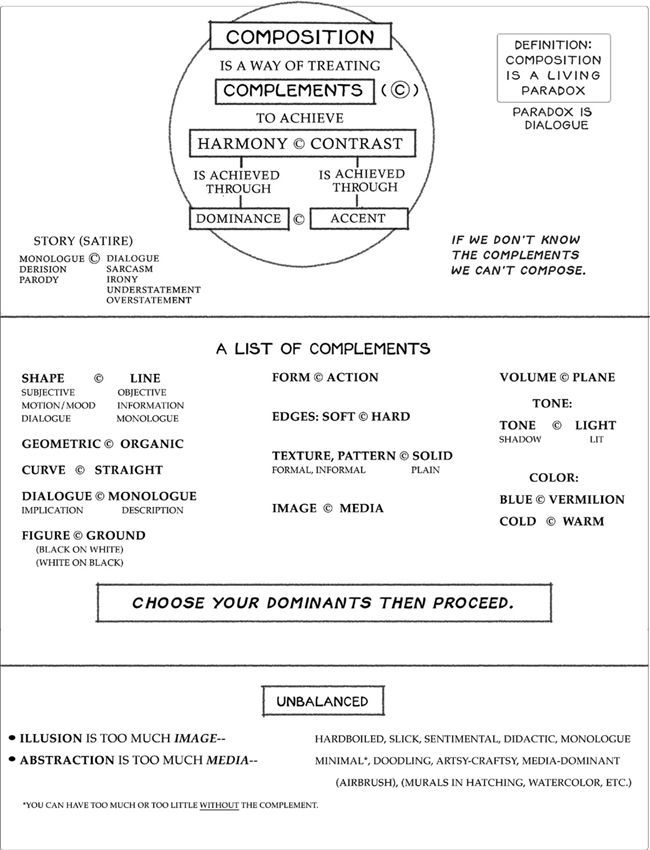
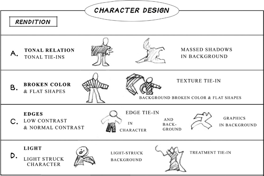
CHART 3—RENDITION

Rendition
There’s an express train to mediocrity but to get to excellence you have to take a local.
Rendition is your final rendering, finishing, or you could say “performance.” At last we have come to the moment of putting it all together—the time to shine! Having solved the major elements it should be enjoyable and creative to bring it to a conclusion.
Rendition is the completion of the project in real media, digital output, film, print or other manner. It is the application of all the thought put into previous systems.
Techniques dominate in this step, but we will also meet with our friends Line, Shape, Tone and Color with a different emphasis. We will address them more with the idea of executing them in our own particular style.
Techniques
This is an area where it can be fun to add your own favorite techniques. Every artist has a natural affinity for certain media but it is also important to experiment.
Resist-Ink, Airbrush, Aquapasto, Spot Shadows, Mottling and Spatter
These are all paint-handling techniques but they can be simulated with digital painting. Even if you paint on computer it’s a great experience to experiment with real media to get a feel for the finished look.
Resist-ink creates a woodcut effect by the application of ink over gouache. The ink adheres to the unpainted areas giving a bold linear quality.
Airbrush is known for smooth modeling. It produces even gradations and is very effective for a finished look.
Aquapasto is a product added to watercolor. It gives more body to the paint and imparts an impasto effect.
To achieve the spot shadows look, allow the paint to create a shape of its own as it is dotted into the shadow area. This can be more interesting than the default effect of shading.
To create the mottled effect, wet down the watercolor paper and drop paint into it. This is an excellent technique for skies.
Spattering, which gives an all-over texture, is done by various methods, such as striking the brush against a dowel or brush handle. It can liven up large flat areas.
There are numerous other ways of rendering covered in another chapter. Sometimes the above handling techniques can be reserved to accent an area.
Line
Lines are the very basis, the “veins” of art, and we encounter them in every phase. In the rendering section we will be talking about the treatment of line in various media.
Signature, Self-Line, Complement and Highlight
Signature denotes the innate personal quality of your style, something like a fingerprint. It will come through anyway but this is to remind you to honor it and create art that contains your own personal stamp.
Self-line produces a different look than black outlines. Where harsh delineation isolates and flattens an object, more depth is created when an area is outlined in its own local color.
As a variation, the outlines can be drawn in the complementary color. This produces a more vibrating effect.
Accenting the highlight can create an interesting linear pattern. The edges of the planes are brought out with linework.
Shape
We have seen the designing of shapes as a vital aspect of composition. The rendering of them is the finishing touch.
Signature, Edges, Negative, Coming Apart and Line Hatch
If there is a signature quality to line, there is also one to the rendition of shapes. Do they tend to be rounded, attenuated, geometric, bulky, compressed? Discover their special properties and emphasize them. Exploit this effect to enhance the originality of your style.
The treatment of edges makes a difference. Think of how a razor-sharp edge defines an object compared to a soft disappearing shadow. Consider each edge in your picture and the effect you want it to produce.
We looked at negative shapes in composition. You can further support their dynamic effect by shading up to the edge of the positive shape.
When the shapes appear to be “coming apart,” it melds the character with the background. This contributes to the lost-and-found effect.
Individual shapes can be separated by adding a texture within them. In crosshatching you draw parallel or intersecting lines across the shape. Following the direction of the form often works best although sometimes diagonal lines are used to give a shadow effect.
Tone
The articulation of tones or values will “pay off” the planning you did in the composition phase. Be sure to retain your tone scheme by being mindful of the native tones of color hues.
Surfaces, Articulated, the Extremes, Fat and Lean
Learning to modulate tone is helpful for visually describing surfaces and giving dimension to forms. Again, the value scales are a wonderful reference.
Articulated tones work similarly to the value scale. Here you move backward or forward through the values in increments to create harmonious transitions.
Make use of the extremes—make your darkest dark the purest black your medium allows. Paint your highlights or lightest areas the purest white. Nail those tones!
Tones make the difference between a fat or a lean effect. Use your modeling to really emphasize the roundness of an object. Conversely use contrasting tones to bring out something with flat hard surfaces.
Color
When you come to your final rendering, color will almost always be playing a large part. We have discussed color schemes previously. In your finished art you will want to make sure the color is crisp and clear. This is partly accomplished through technique, for example learning how to “charge” the brush with the proper amount of paint and understanding how much water you need to add for graded washes of color. You will also make the color “sing” by being aware of how colors interact when placed next to one another.
Irradiation, Hue Families and Caricature

Irradiation is defined as the visual effect by which a brightly lit thing appears larger against a dark background. By working with the properties of color it is possible to create a neon effect.
Harmony can be achieved through hue families. Each color has variations within it as it moves toward neutral or as it becomes lighter or darker.
Look for opportunities to caricature color. Think of a clown with a big red nose, rainbow hair and a zany vivid costume. The intensity of each color is exaggerated.
We have covered a lot of ground before even beginning our work of art. Each aspect has its importance but there are also the elements of spontaneity and creativity. Art is a paradox that cannot be thought into existence but ultimately occurs in a moment when the “muses” are with us. Remember to be fully aware when you are in the process of creating. Be sure to honor the experience as it unfolds and give leeway to serendipitous discoveries. Having fully considered all the steps of Interpretation, Composition, and Rendition, proceed to “The Finish.”
Congratulations!
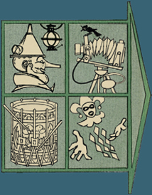
About the Logos
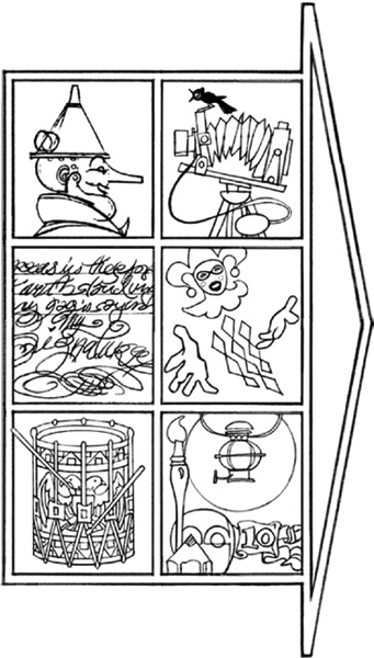
Top Left: A “Tin Man” represents both the geometric and the organic. There is a contrast of solid basic forms and articulated compound forms, the man-made and the natural. This mechanical man reminds you to blend the stylized and the real into a new combination. He also symbolizes caricature and subjective distortion.
Top Right: The Camera stands for the metamorphosis of the three-dimensional into the two-dimensional. It encapsulates all aspects of film and story—direction, scenes, set-ups and design elements. It also represents reversed negatives.
Middle Left: The Calligraphy shows consistency of design. It represents personal expression. “Signature” is the psychologically and personality-specific style that each artist produces. It is as original as handwriting. Be sure to “be yourself” and allow this uniqueness to shine through.
Middle Right: The Harlequin is designed to stand out in a crowd or on the stage. The hands and face are accented so your eye is attracted to them. He stands for the tonal aspects of composition: notan, lighting, silhouette, posterization and value patterns.
Bottom Left: The Drum signifies the rhythm in your composition. It includes texture, color, line, decoration, repetition, design, and dynamic tension.
Bottom Right: This logo depicts the tools of Rendition. Think about the lighting, forms, techniques, tools, and materials when you are rendering your art. Consider paint handling, edges, brushwork, and modeling—all aspects of final treatment. Let your art be media expressive.
The Lantern appears alone and in combination with the other logos. It represents light, atmosphere, dominance and viewpoint. Remember that many aspects of picture-making overlap.

EXAMPLE OF A WORKFLOW PROCEDURE FOR A CARTOON OR ILLUSTRATION
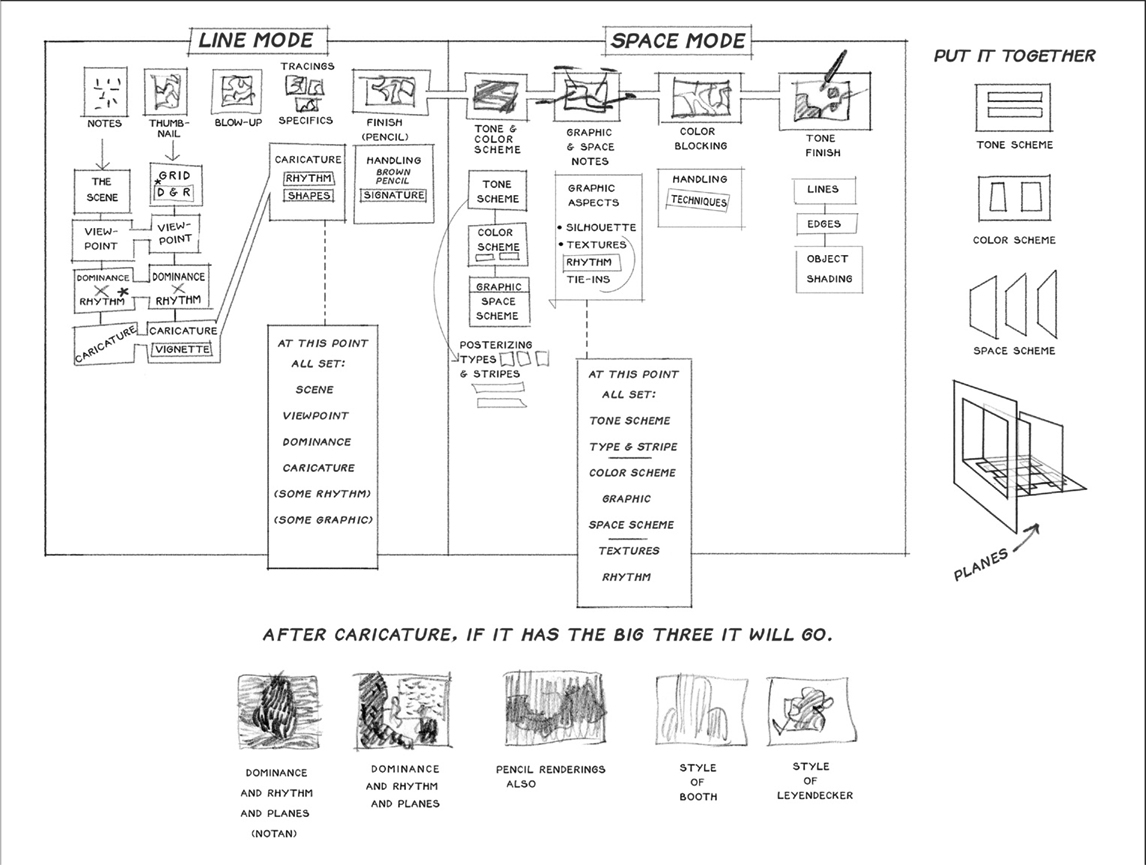
Brief Outline
![]()
1. Theme—All the Elements of The Scene
A. Mood
B. Atmosphere
C. Setting
D. Props
E. Light
F. Denizens
G. Systems within Systems
H. The Invisible:
i. Wind
ii. Sound
iii. Smell
iv. Temperature
![]()
2. The Layout—All the Elements of Composition
A. Perspective Viewpoint(s)
B. Angle vs. Angle
C. Frame
D. Tone Scheme
i. By Light
ii. By Mood
iii. By Graphic
iv. Compound Shape
E. The Graphic
A. Caricature
B. Pattern
C. The Graphic
D. Texture Ideas
![]()
4. The Painting—Rendition
