HOW DOES THE CREATIVE MAN CREATE?
1. He sees: He lifts the beaded curtain of accumulated values, accepted by the generality, and looks at nature naked. He sees the construct of the natural universe, the construct of society, the construct of man’s mind and the construct of his own creativity (his godliness). He sees the eye he sees with. This is his talent.
2. He organizes: He unscrambles the multitude of images he sees and puts them in categories. This makes them accessible and useful and keeps them from getting lost, and conserves his precious time. This is his knowledge. His library.
3. He synthesizes: He takes the images he wants to blend out of his library and puts them in the tumbler of his unconscious where they turn over and over until the positive and negative jigsaw-parts snap together. If they don’t, he tries another combination until they do. These are his ideas.
4. He works: He takes the idea and gives it physical form, adjusting the idea to the material and the material to the idea, keeping the intention always in mind. As he does this he continues seeing, organizing and synthesizing allalong the way, to the end. This is his craft.
5. He finishes: He becomes a critic. He brings the work out with polishing, sharpening, subduing till it takes on its own identity. If it doesn’t, he goes back into the steps again. This is his integrity.
 WORKING NOTES FROM THE STUDIO

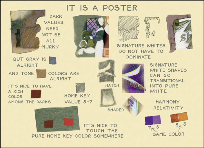
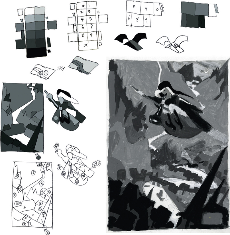
• COLOR—Look at Art Nouveau, then Art Deco. List all the colors that are nowadays avoided or dismissed—the sullied yellows and the “muddy” colors in combination. Tints, tones and shades of bright colors always seen pure: vermilion, cobalt blue, orange. Find a range of grays and “blacks” and “whites.” Use them in combination with pure earth colors: siennas, umbers, and bistre olives. Find new brights for accent colors: lightened Prussian, German poster blue, red neither yellowish nor purplish, tube greens, rose. Find new glazing combinations, not just blue and umber. Use analogous glazes, tertiary glazes. Try to find a way to use the “distasteful” glazes (blue over orange) by modifying the purity of one or the other (yellow over blue), (red over green) or by juxtaposing them in the right place or by using them as accents.*
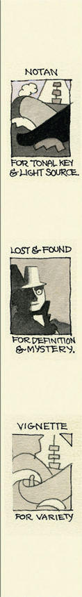
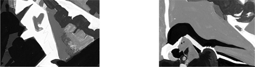
• VALUE—Compose the value scheme as an overall silhouette pattern—so it could almost be reduced to pure black-and-white shapes. Plan the extremes with colors from the opposite ends of the value scale: 1, 2, 3 for white; 7, 8, 9, X for black. Middle values 4, 5, 6 can be used if surrounded by either high key or low key. Midtones look like darks enclosed in low keys. Strong silhouette gestalt allows the use of value harmony in colors, the most versatile and satisfying form of harmony, much better than chroma or intensity harmonies.*
All sorts of simultaneous contrast and “irradiation” (influence and vibration) become possible with close value colors.
• PATTERN—Use pattern to define form. You can express a form without the limiting requirements of chiaroscuro. Not necessarily in the very obvious black-and-white polka-dot robes of Maxfield Parrish but with close-valued pattern.
Use textures and pattern to contradict the strong figure/ground statement of a powerful notan. Light lines create pattern more than dark ones.
• TECHNIQUE—(Plate finish paper.) Kid finish paper is much easier to lay on controlled exact-value washes and smooth transitions than is plate paper. If that is part of the compositional scheme then choose it. Otherwise the dark edges puddling and textured glazing is much more effective on plate paper. Add aquapasto to your glazes. Glazes of gouache and aquapasto give a delightful velvety look. A color can be stepped up from a dark by either adding white (cools it), adding water (maintains its chroma) or by running it up the color wheel toward yellow (warms it). A glaze looks good on just about everything. Plan it.
• COMPOSITION—It is very difficult to create a strong gestalt composition that cuts across figure and ground; that is not predicated on figure and ground. Grouping of objects is an obvious way but try to break the gestalt across the group: compound notan. A large object can be made to shade into a transitional change from dark to light. It takes a lot of planning to keep the paradox and not just make it too confusing.
Moving a light object from Value 1 to Value 5 helps. Do this with either transitional shading or steps of value. But it is not a true compound notan; the object still remains a “light object.”
Compound notan suggests some sort of lighting effect: cast shadows, reflection. Think in those terms.
“ORDER OF BATTLE”
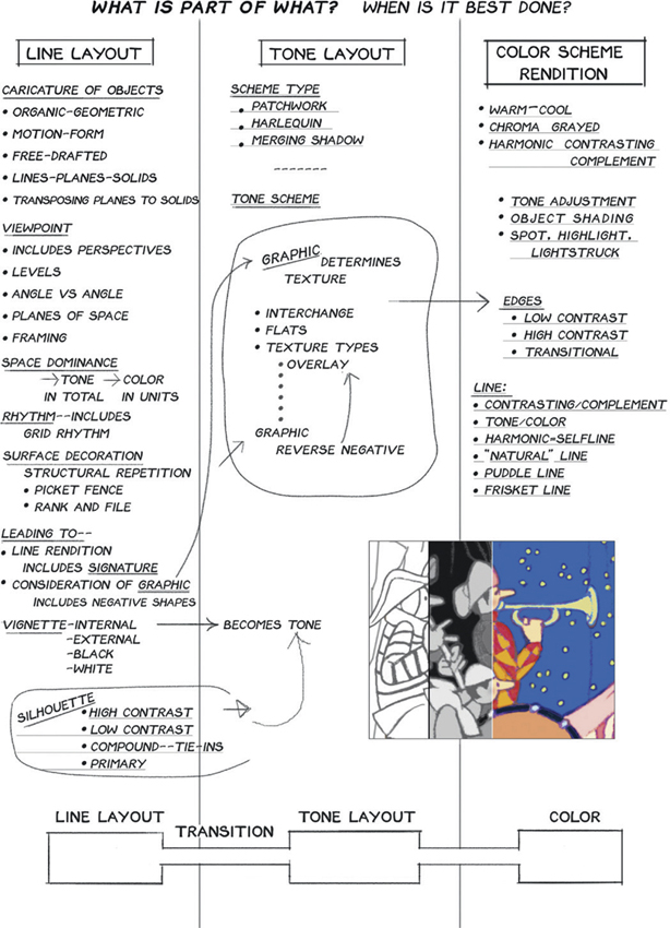
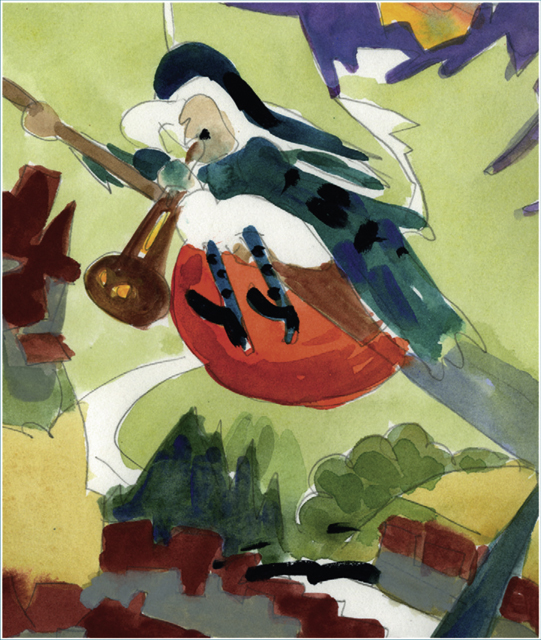
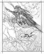
LESSONS FROM “THE PAISLEY WHALE”
Please see full cartoon in Chapter 11 Gallery, page 299: “Does it have to be white, Captain? Would you consider something in a paisley?”
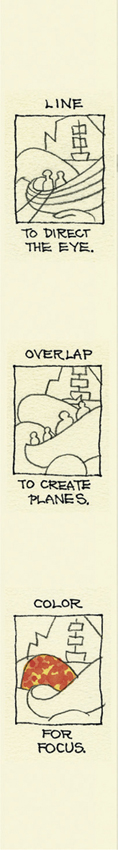
1. DESIGN IN SPACE—Shapes progress from large in foreground to smaller in background to create depth. Curves and angles lead the eye to the center of interest.
OVERLAP
2. METHOD—Pencil and watercolor, beginning with complete line drawing. Paint thick white for frisket and thin white to enhance lifting and emphasize edges. The paint naturally gravitates toward the edge of the shape as it dries.
EDGES

3. COLOR—Characters in shadows in flat (subdued) local colors. Characters in light designed for light and dark pattern. Can be in both. Skin tone in shadow—Burnt Umber plus Ultramarine Blue. Complements and different intensities of analogous colors vibrate when they are the same values.
Burnt Umber plus Ultramarine Blue

Color scheme tertiary—Prussian Blue, Yellow Ochre, Indian Red

Other possibilities: Alizarin Crimson, Lemon Yellow, Grayed Cobalt Blue

Ultramarine Blue, Cadmium Yellow, Indian Red

4. TONES—Tones conceived as mosaics of various sizes and shapes. Some of them fused with others in places.
Great variety is possible inside a given tone, for example the clouds or the rowers.
Complements are best for contrast in close tones. A pure color can be used inside shadow if it corresponds to type of light in shadow (blue and red, etc.).
Light shining through may reverse tone. Bottom tones the same.

Try using three tone magic markers to solve tonal problems.
5. LINES—Lines or “No Lines” could be conceived as loose fits and tight fits.
WORKING NOTES FOR CARTOONS, ILLUSTRATIONS AND ANIMATION
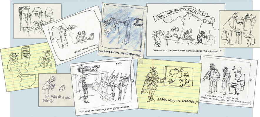
Article about athletes loading up on carbohydrates. Please see Gallery Chapter 11, page 287.

Value study, color sketch and drawing for a cartoon
Ideas and rules for cartoons

Development sketches for setting, characters, color and values

Cartoon concepts begin with thumbnail sketches.
Again, the discovery that a picture you can’t paint is one that is drawn incorrectly.
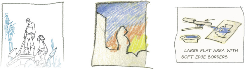
Second, the difficulty of a strong secondary area that competes with the primary interest and threatens to split the interest of the picture.
The use of a colored wash (in this case, yellow) over an area to unify it. The unifying wash need not be white, although white works when a cooling effect or chalky effect is desired.
A white wash is risky in reproduction if it is too opaque.
Problem: a large light blue area in the sky had to be absolutely flat to contrast with the central figure’s texture. Also it had to blend off at top and bottom. The area was too big for chalks—the chalk color was too limited and wouldn’t cover. Solution: Gouache spritzed on with a toothbrush, with frisket mask on characters, etc.
Notes From Farm and Woods Background for Animation
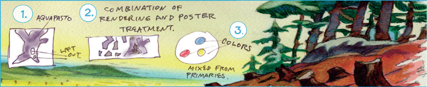
1. Aquapasto well mixed with loose dark tone:
Makes light easier to lift out.
Avoids the coolness of white underpainting.
Extra darks can still be added.
2. Combination of Rendering and Poster Treatment: Poster treatment in far objects mostly. Rendering in near objects. But not necessarily.
3. Colors in Neutral Area (night scene) mixed from the primaries: Neutrals mixed out of primaries (Prussian Blue, Purple Lake and Cadmium Yellow Deep) are mixed to the appropriate amounts of warm or cool or yellowish or whatever, regardless of resulting hue. Greenness, redness, blueness become irrelevant. Local color is irrelevant. Pure blues in night scene glow because they are contrasted with neutrals. The contrasting warm dark is a mixture of Blue and Vermilion, with Vermilion dominant.
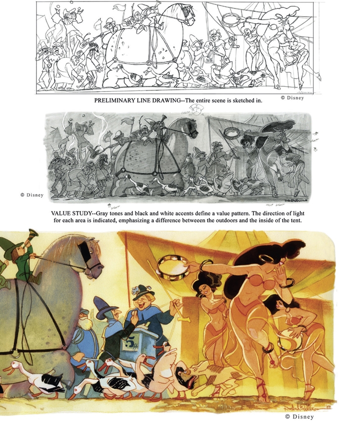
CONCEPT ART FOR WALT DISNEY’S “THE HUNCHBACK OF NOTRE DAME”
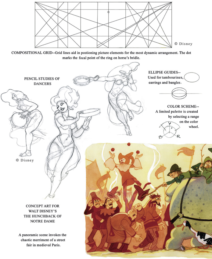
CONCEPT ART FOR WALT DISNEY’S “THE HUNCHBACK OF NOTRE DAME”
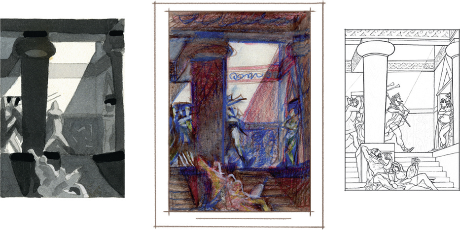
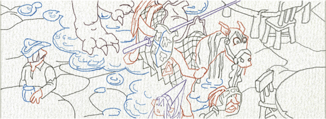
WALT DISNEY’S ATLANTIS—DEVELOPMENT NOTES FOR BATTLE OF ATLANTIS 1
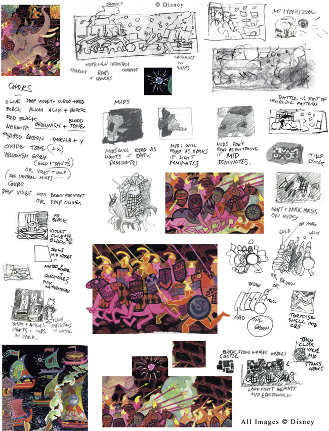
WALT DISNEY’S ATLANTIS—DEVELOPMENT NOTES FOR BATTLE OF ATLANTIS 2
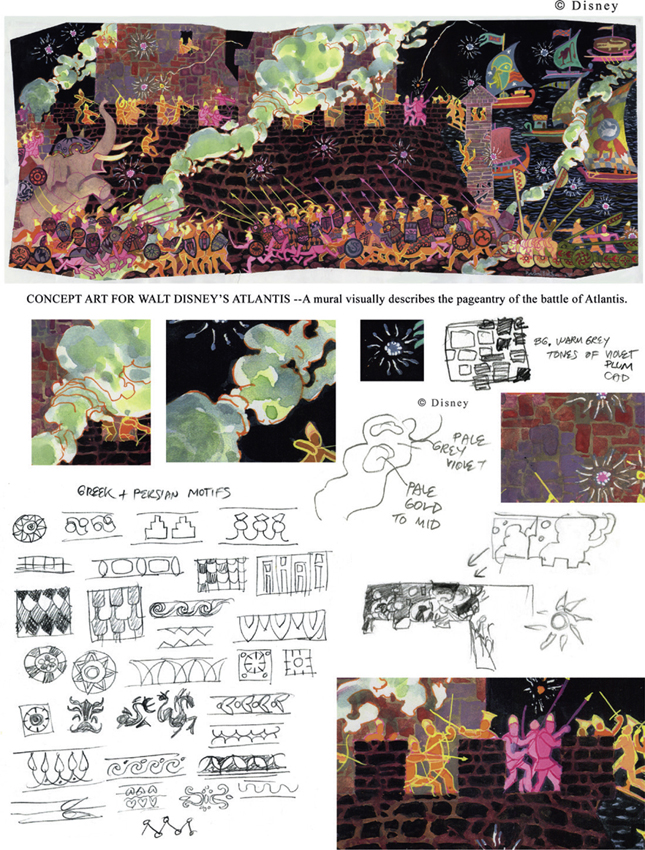
© Disney
DEVELOPMENT ART FOR AN ANIMATED COMMERCIAL—PHIL KIMMELMAN AND ASSOCIATES
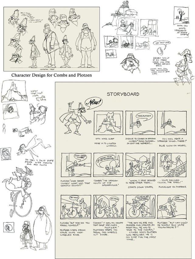
DEVELOPMENT ART FOR AN ANIMATED COMMERCIAL—PHIL KIMMELMAN AND ASSOCIATES
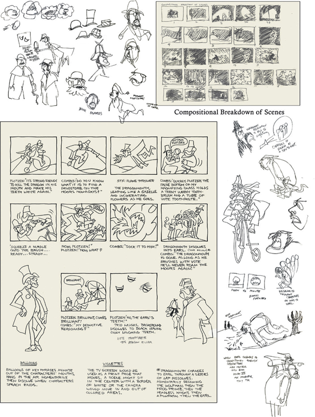
STEP BY STEP THROUGH THE FLOWCHART SYSTEM
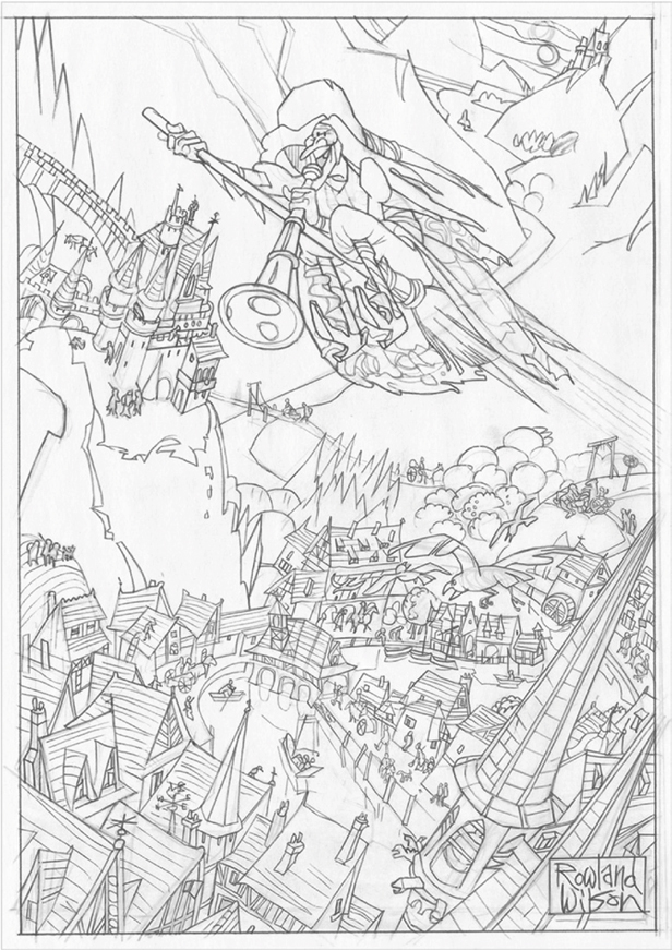
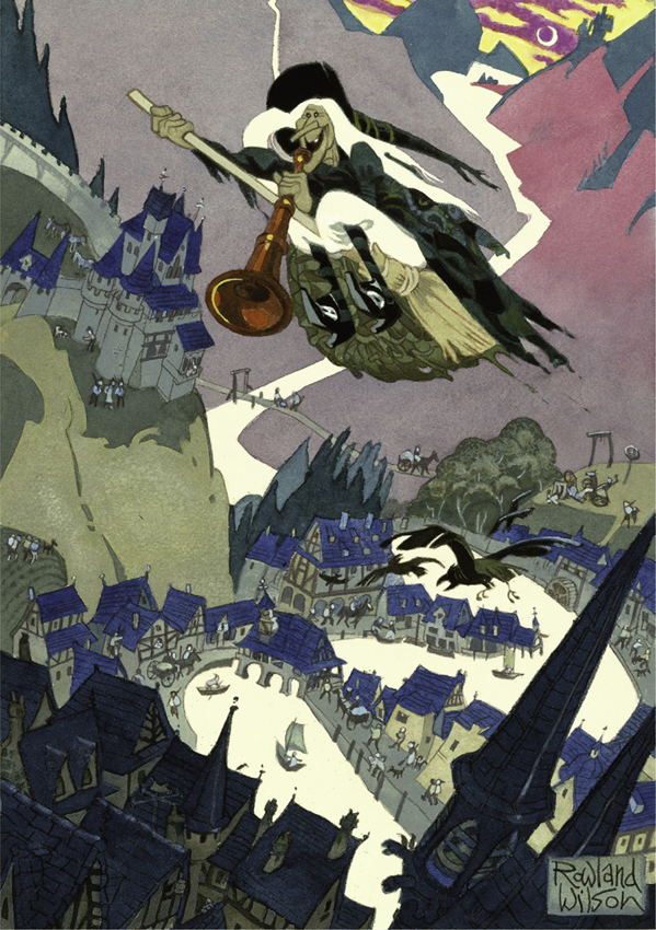
The Traffic Witch—A Full-color Cartoon
 THE ACT
In the case of a cartoon the entire act is contained in the caption. This is the “script” and contains the who, what and where of the story. It’s almost like a one-act play.
Much of the information needed for the pictorial elements is incorporated into the gag line. There is still a lot of room for imagination.
Making small thumbnail sketches is a good way to explore the content and experiment with a unique interpretation.
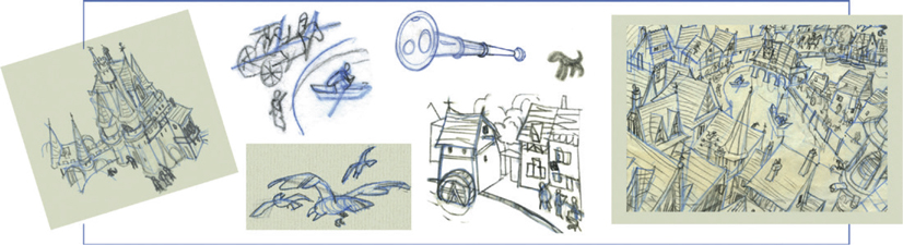
THE SCENE
In this step, the stage is set. As we have seen, many elements are considered, including the setting, viewpoint, time, season, atmosphere and lighting. Here “The Fairy Tale Period,” a generic storybook “timeless” time, was chosen. It provided the opportunity to depict villages, castles and townspeople from an imaginary era. Research was done and preliminary drawings made to create the scenery, architecture, props, and characters.
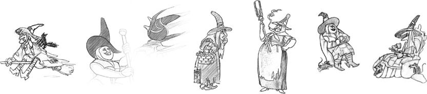
CARICATURE
All witches are not created equal. Characters can have variety. It’s possible to create a “repertory company” of stock characters and choose the type that fits the current situation.
 VALUES
A value study is done even before color is decided in order to place the emphasis where you want it in the picture. This is important to draw the eye to your subject, to “pay off” the gag line in a cartoon or to add punch to a storyboard. It doesn’t have to be “realistic”—in fact, reserving black and white to highlight your center of interest can be useful.
REVERSE NEGATIVES
The river and the witch’s hair are designed to be white so that dynamic shapes are formed where foreground objects intersect.
 PRELIMIINARY COLOR STUDIES
COLOR SKETCHES help to avoid clichés by previewing different color schemes. Instead of the usual dark night and orange moon, other colors can suggest a different time of day when the interesting landscape details are visible. Hints about the color can be derived from the gag line.
The cartoon plays on the idea of reporters who broadcast traffic conditions from a helicopter. Since they are active during commuting times, such as early evening, a sunset view with a bright sky and deep shadows could create a novel effect.
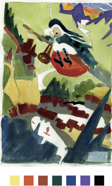
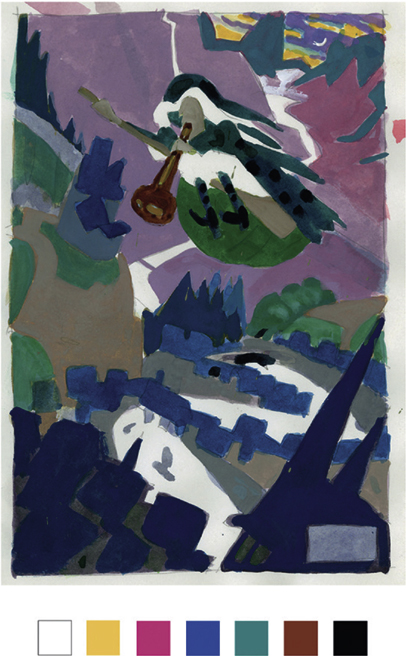
Muted colors based on a tertiary color scheme set the mood for “the twilight rush is shaping up about as usual”. Intermixing colors creates a soft harmonious atmosphere.
![]()
Finally a drawing containing everything is made as a basis for the finished painting. It is done with pencil on tracing paper in order to be visible when placed on a light box to be transferred to watercolor paper.
When redrawing the final image, the key is to instill “signature,” your individual style, rather than simply tracing. Everything is solved so now it can be drawn with a confidence, verve and energy that will reflect through to the final piece.
Even after the watercolor is added, the pencil drawing remains a visual element in the finished art and should be approached as such. For example “self-line,” using a color pencil outline similar to the final color, creates a different effect than a black or graphite outline. It serves to unify the object within its own local color range.
Final Pencil Rendering on Tracing Paper
Example of “self line” drawn onto watercolor paper. Transparent watercolor washes are then painted directly over the line work.
![]()
WATERCOLOR TECHNIQUES USED IN THE TRAFFIC WITCH
Frisket—A masking fluid or film is applied to the paper so that a wash can be painted over it without destroying the integrity of the shape. When it is removed the watercolor paper shows.
Flat Wash—The paint is applied in overlapping horizontal strokes from the top down to create an even tone.
Transitional Wash—The entire surface is wet down first and sufficient paint colors mixed. Technique is the same but colors are changed at transition point. It helps to work very quickly on a tilted board.
Self-Line—Object to be painted is drawn with a color pencil similar to local color. Pencil Line—Line work from original drawing shows through to describe details.
Transparent Watercolor—The traditional technique of glazing with individual washes of color.
Lift Technique—Paint is blotted with a tissue to give effect of foliage or variation in texture.
Opaque Accent—After paint is dry, opaque watercolor (gouache) can be used to highlight light-struck areas. A small amount of pigment can be added to suggest warm or cool light.

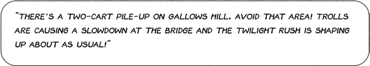
“There’s a two-cart pile-up on Gallows Hill, avoid that area! Trolls are causing a slowdown on the bridge and the Twilight Rush is shaping up about as usual!”
Reproduced by Special Permission of Playboy magazine. Copyright © 1987 by Playboy.
GOING THROUGH THE FLOW CHARTS
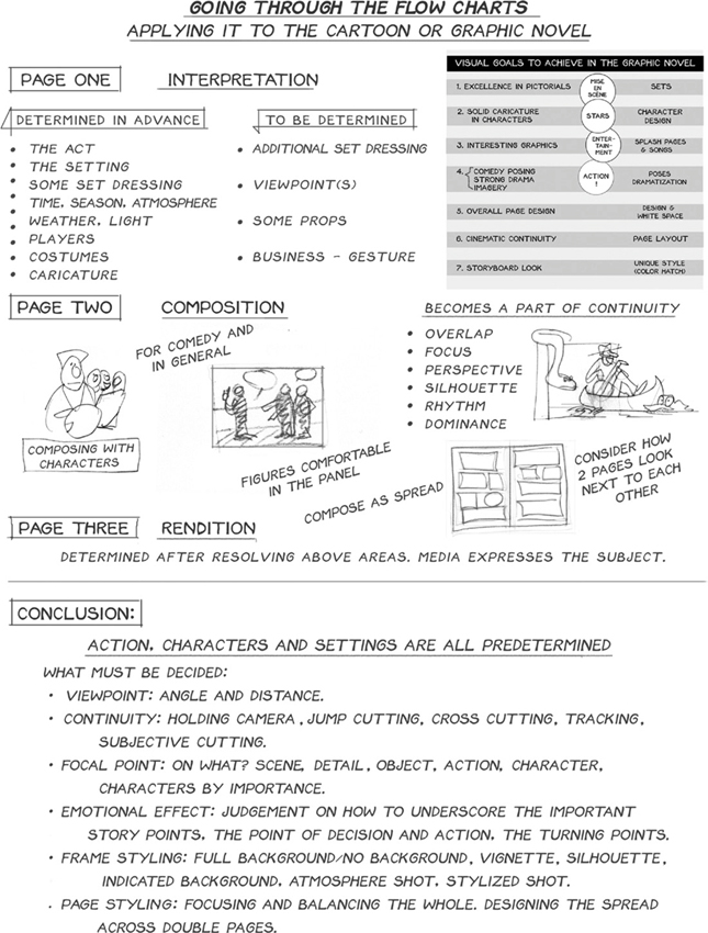
OPUS CHECKLIST
□ 1. Does the composition have open space; white space?
□ 2. Does the composition have a clearly dominant area?
□ 3. Does the tone scheme contain both black and white?
□ 4. Does the composition have rhythm?
□ 5. Does the subjective-distortion have an organic as well as a geometric form?
□ 6. Does the lighting define an atmosphere?
□ 7. Are the proportions right?
□ 8. Does the composition have a clear movement?
□ 9. Does the drawing have consistent resolution?
□ 10. Does the composition have an ambiguous area? Subject to the dialogue of interpretation? Enough “lost” in the lost and found?
□ 11. Does the composition have principality? One object, one quality, one light dominating?
□ 12. Is there contrast of hard and soft?
□ 13. Have you left out as much as possible?
□ 14. Is the picture seen from the standpoint of a witness? Is it “what the witness saw”?
□ 15. Are there obscured details? Does it avoid the “arranged” look?
□ 16. Is the lighting as stylized as the drawing? Is the rendering stylized, not realistic?
□ 17. Is everything caricatured: anatomy, proportions, surroundings, expression, and treatment?
□ 18. Is the color subjective?
□ 19. Are the negatives reversed? Is the pictorial space composed of flat layers of shapes?
□ 20. Are the edges working?
□ 21. Are the composition’s tones grouped/bunched together?
□ 22. Do the silhouette groups contain several various shapes?
□ 23. Is at least one tone value skipped as a separator?
□ 24. Is the texture adequate (such as scratchy contrasted with smooth)? 111
□ 25. Is the texture in the right place tonally?
□ 26. Does it express its media?
□ 27. Does it refer to non-visual realities? (Wind. Smell. Sound. Taste. Feelings.)
□ 28. Does it contain a system within a system?
□ 29. At the finish, are all the tones properly adjusted?
□ 30. Does the subjective distortion have “Art Brut” as well as “Art Élégant”?
□ 31. Does the focal point of contrast have a feeling of crescendo? (Dark, darker, darkest. Light, lighter, lightest.)
□ 32. Does it demonstrate Artistic Self-Determination? It must be allowed that each work can break the rules to its own purpose.
* COLOR & VALUE—There is a theory that the complement of a color is not just its hue but also its intensity and value. In other words: A pure orange, full intensity, value 3 would have its complement, not full intensity blue but a low intensity blue of value 6 or 7—a bright light orange versus a dull dark blue.