
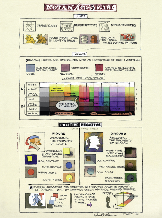
ELEMENTS OF NOTAN/GESTALT 1
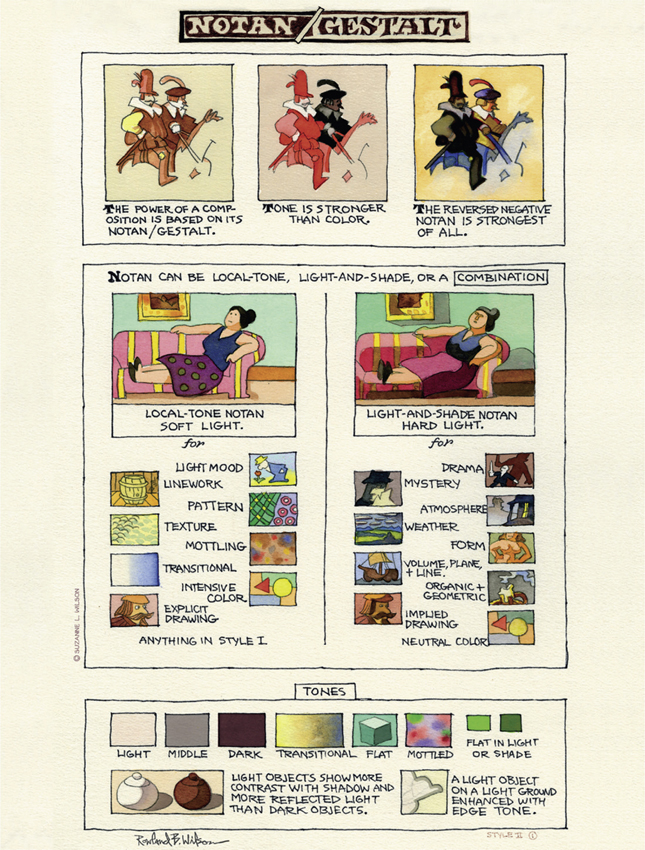
ELEMENTS OF NOTAN/GESTALT 2
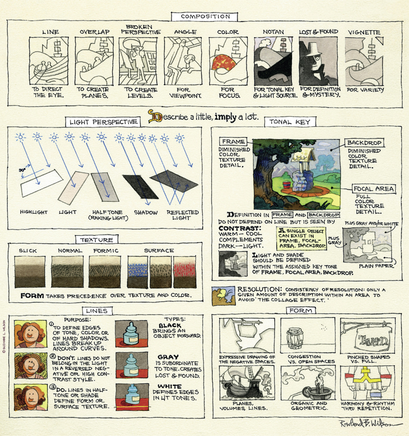
COMPOSITION: PICTORIAL ELEMENTS
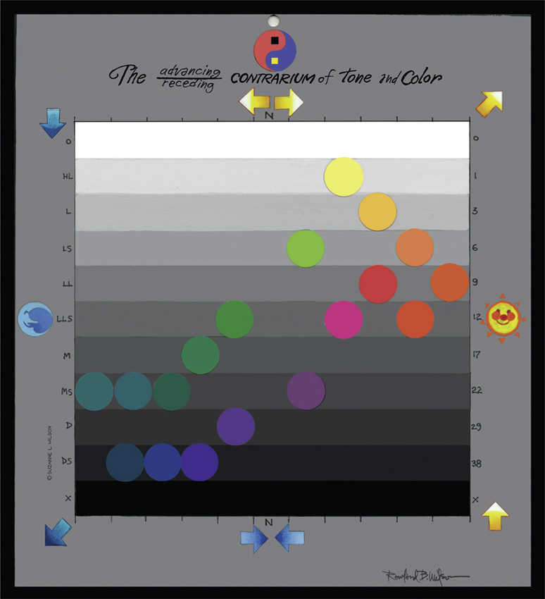
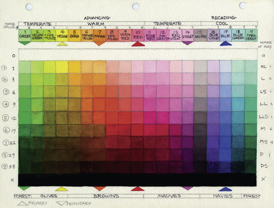
THE ADVANCING/RECEDING CONTRARIUM OF TONE AND COLOR
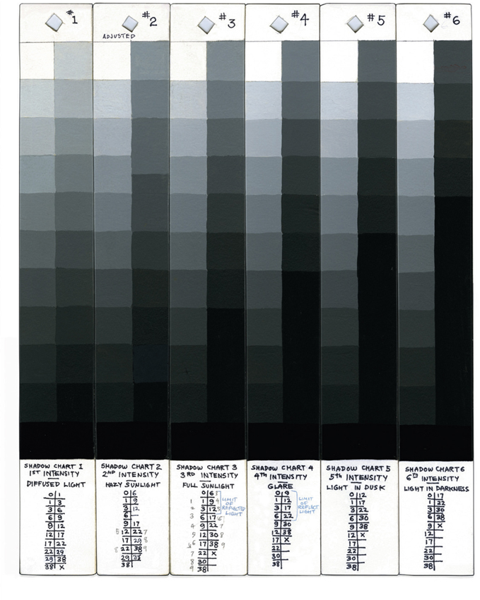
SHADOW CHARTS RANGING IN INTENSITY FROM DIFFUSED LIGHT TO LIGHT IN DARKNESS
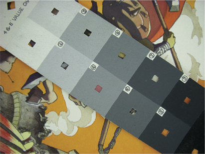
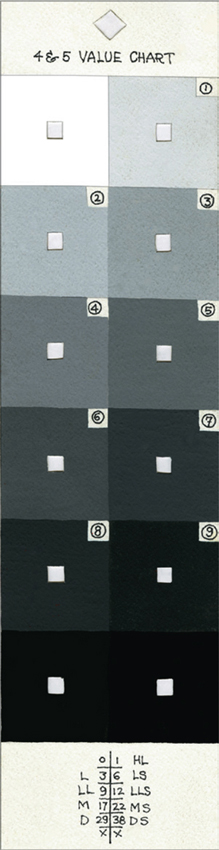
Holes cut in the centers of the squares make it possible to assess the value of a color in the image.
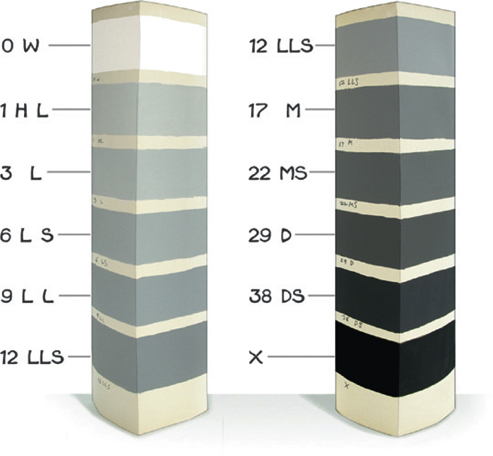
5 & 6 Value Chart and 3 & 2 Value Chart

Charts painted on heavy folded paper
Many published value charts group the grays too close together at the beginning and end of the scale. The object is to create a discernible difference between each step. The 4 & 5 Value Chart shows two steps between each grade. These were made with animation cel paint and the numbers indicate their numerical listing.
VALUE CHARTS
4 & 5 Value Chart
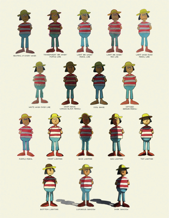
VARIOUS TECHNIQUES AND LIGHTING EFFECTS 1
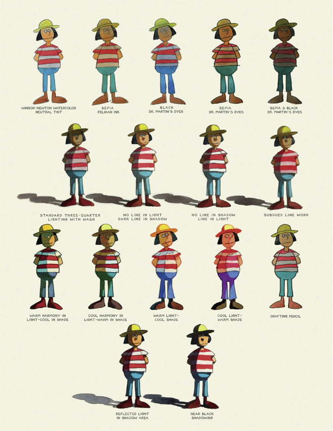
VARIOUS TECHNIQUES AND LIGHTING EFFECTS 2
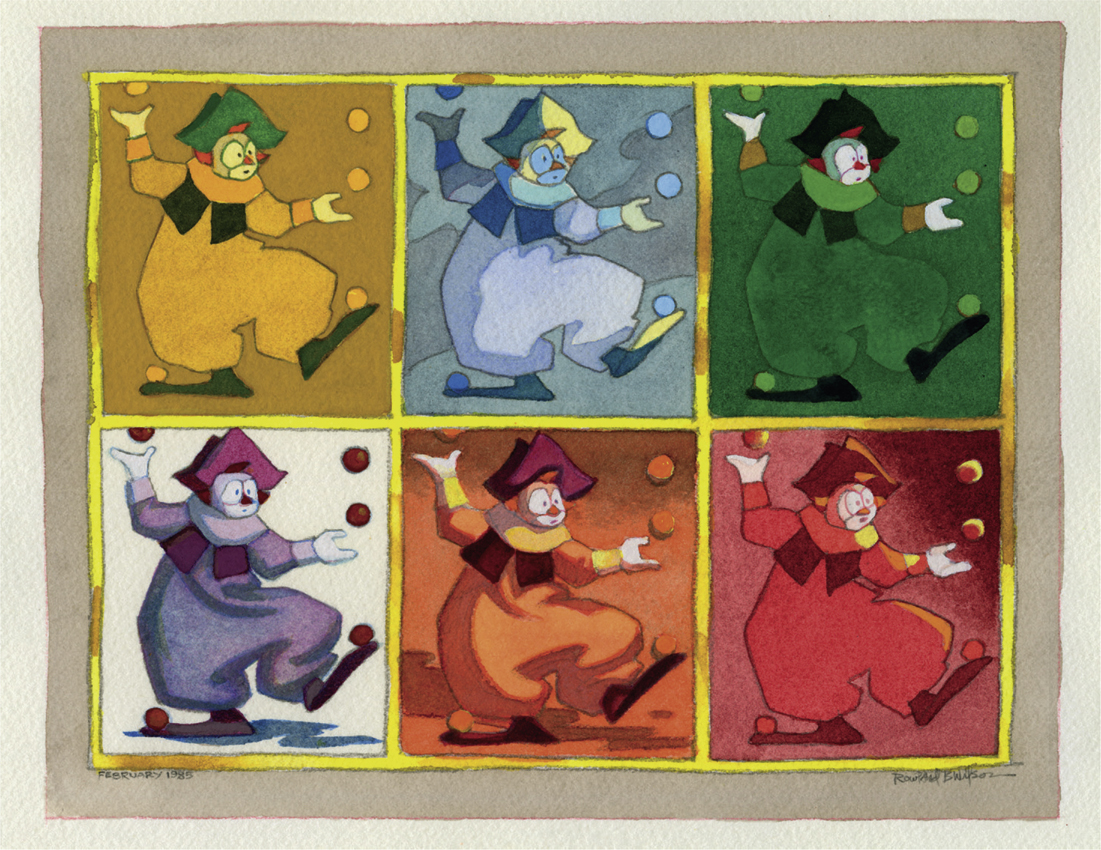
THE SIX JUGGLERS
1. Local Tone
2. Patchwork
3. Harlequin
4. Soft Light
5. Hard Light
6. Light-Struck
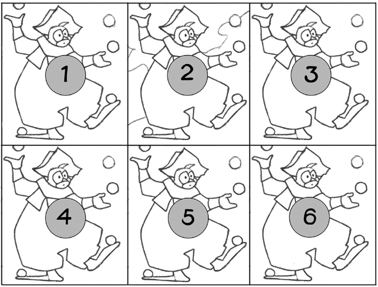
1. Local tone is easy and common. It is the starting place.
2., 3., 6. Patchwork, Harlequin and Light-Struck promise the highest returns for their use. They can all be used in combinations with local tone.
4., 5. Soft and Hard Light is used sparingly.
Soft Light and Hard Light are the least appropriate schemes for stylized characters. The emphasis they put on the third dimension is contrary to surface décor.
5. Hard Light is the toughest to do. Intense color is virtually ruled out in it.
Shadows need to be as continuous as possible. Tone contrast between local tones is minimized in shadow and cut back in light. Shadows need to be neutralized with complements or black.
To get any intensity in lighted tones the major background and other tones must be neutralized.
Pure Color and Hard Light Chiaroscuro is a contrarium.
A lit dark object against a shadowed light object creates a problem. Vermeer makes the shadow darker than the lit dark object.
1., 2., 3., 4., 5., 6. Because of the many close tones required in a Tone-Scheme approach, gouache is indicated to give another dimension of contrast: opaque/transparent and warm/cool (plus use of white).
Merging shadow with light tie-ins is 3 (Harlequin) and 6 (Light-Struck) together and pushed into a (compound-form) Compound-Notan Patchwork.
THE SIX JUGGLERS—TONE-SCHEME APPROACH
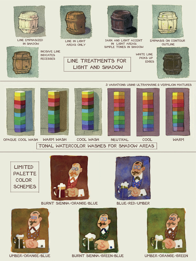
THE TAVERN
The Tavern paintings illustrate a number of techniques such as color hatching, paint texture, opaque accents, mottling, and various watercolor washes. They also demonstrate color ideas and reversed negative shapes.
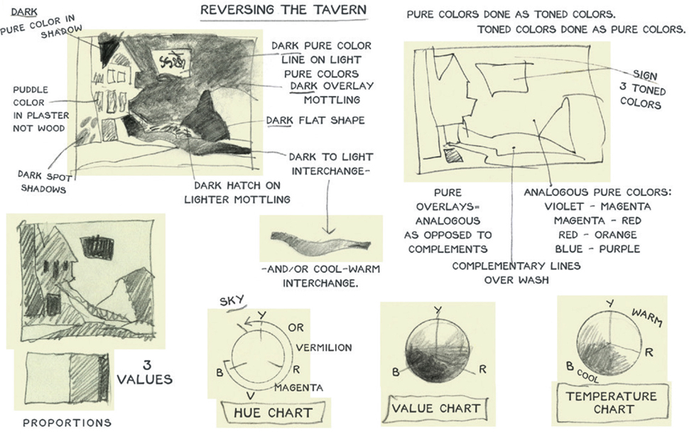
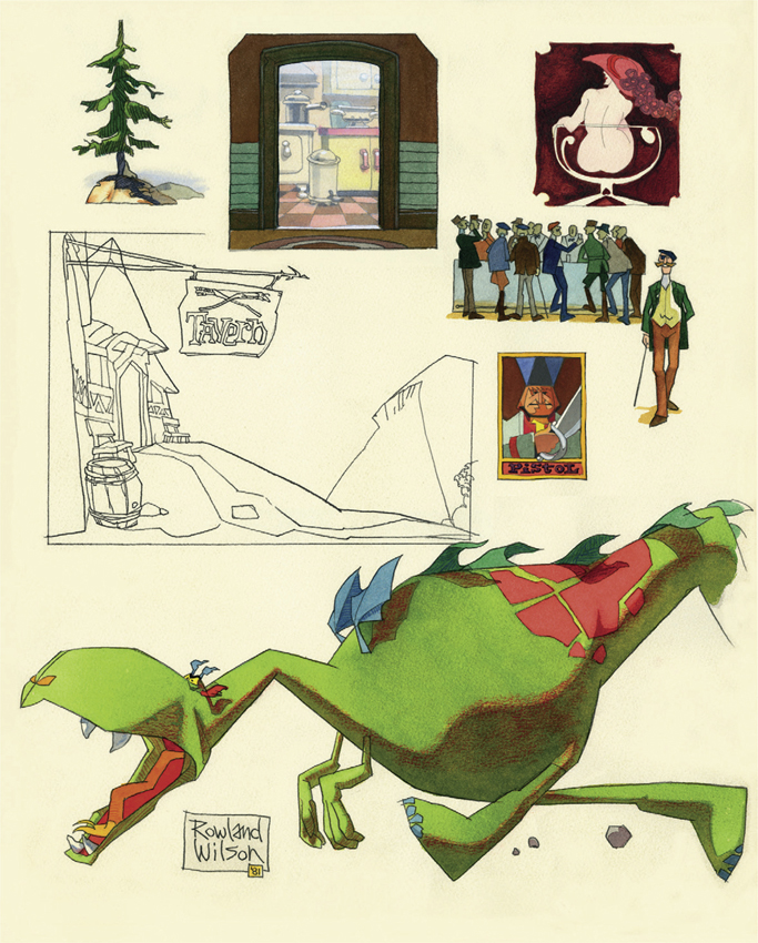
Another interpretation of the Tavern

THE TAVERN—A STUDY IN TECHNIQUES, COLOR AND NEGATIVE SHAPES

SAMPLES OF LIGHTING AND COLOR
VISUAL REMINDERS OF GESTALT, VALUES, NEGATIVE SHAPES, REVERSE NEGATIVES, COMPLEMENTARY COLORS AND CARICATURE
VALUE CHART OF POPULAR WATERCOLORS
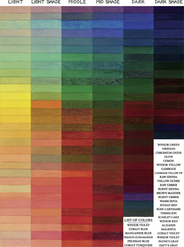
DIAGRAM OF COLOR TEMPERATURE
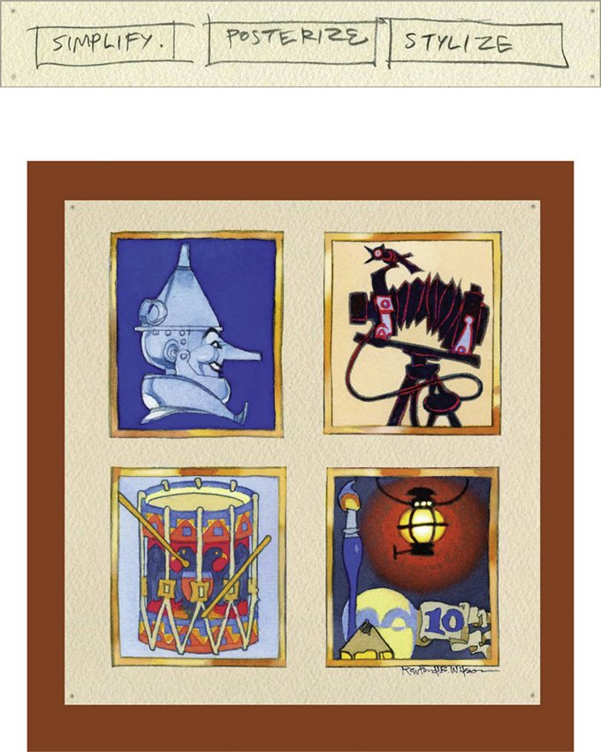
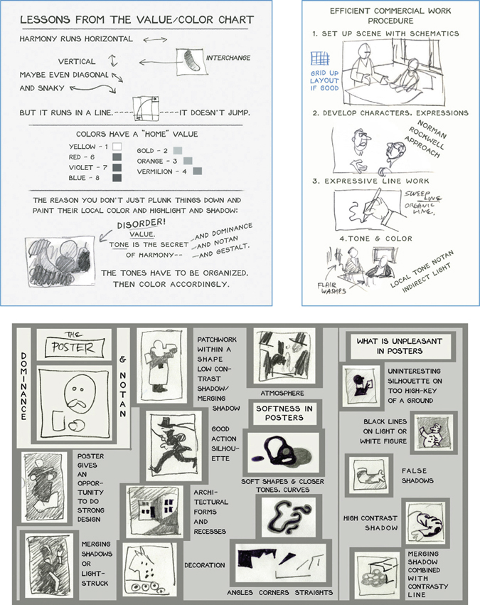
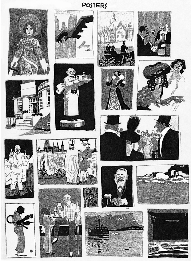
ABOUT POSTERS
STUDIES FROM POSTERS DEMONSTRATING STRONG VALUE PATTERNS
LOGO DESIGNS FROM THE FLOW CHARTS