2. Constructing a Publication

Guidelines for Specifying Colors
Using a Color Management System
Image Size, Interpolation, and Resampling
Compensating for Register Error
Screen Frequency, Resolution, and Gray Levels
Linked Graphics, Package, and Prepare for Output
Tips for Working with Page-Layout Files

The way you create your publication isn’t only critical to the success of your design—it also affects the way your publication prints. This chapter covers the issues involved in creating a publication for commercial printing, such as creating page layouts that avoid typical printing pitfalls, choosing the best file formats, and compensating for register error using overprinting or trapping. When properly assembled, a publication will print correctly and require less rework for you and your vendors.
Guidelines for Specifying Colors
You can specify colors either by referring to a printed color swatch book or by using a calibrated computer display and selecting colors onscreen.
When you use an illustration program to create art that will later be used in your page layout, be sure to use the same color names in both applications. For example, if you use Pantone 228 C in your Adobe Illustrator document, the color will be named the same when the art is placed in your Adobe InDesign layout and will have the same display characteristics. It’s wise to double-check the color palette in your page layout application to be sure that spot colors aren’t duplicated. If they are, be sure to consolidate them by deleting one of the duplicates and assigning all items that use that color to the other similarly named color.
Whether you use spot colors, process colors, or a combination of both in your publication depends on your budget, the purpose of the publication, the type of page elements you use, and how your design will be reproduced. Use the following guidelines to determine what colors are suitable for your publication.
Use spot colors when:
• You need one or two colors, and you won’t be reproducing full-color photographs.
• You want the effect of special inks, such as metallic, fluorescent, or corporate color inks. These are often colors that can’t be reproduced with combinations of the process colors.
• You want to print logos or other graphics elements that require precise color matching, or you’re printing large areas of color throughout a publication and you want to ensure color consistency.
Use process colors when:
• You need more than two colors in your publication. Printing with process color inks (CMYK) costs less than printing with three or more spot inks. (Printers usually print with process colors; to print in spot colors requires a different press setup, which takes time and costs money.)
• You want to reproduce full-color photographs or color artwork that can only be reproduced with process colors.
Use spot and process colors together when:
• Your requirements extend beyond process color printing. This could involve corporate colors, as already explained, or extending the range of process color by using a bump plate—a spot color plate that serves to intensify one of the process colors. Remember that printing with more than four inks can be expensive because of the extra plates and press work.

Specifying spot colors and varnishes
Specifying a spot color means that any page element assigned that color or any screened tint of that color will appear on its own printing plate. Name spot colors consistently across all the applications you’re using, including illustration, photo-editing, and page-layout programs.
Remember that when you’re printing with spot colors, the name you assign to a color doesn’t determine what ink will be used on press. But naming colors consistently helps ensure that your artwork will separate correctly and reduces the chance of confusion between you and your printer. You specify which spot inks should be used when you submit your files to the printer.
If your artwork contains both spot and process colors, you can convert spot colors to their process-color equivalents; doing so lets you print with four process colors and thereby save money. When you convert a spot color into a process color, be aware that most spot colors can’t be reproduced accurately with process inks. When you convert spot colors to their process color equivalents in computer applications, consider the components of the resulting colors, and look for opportunities to simplify them.
For example, specifying Pantone 406 C (a light gray) and then converting that gray into process colors creates a combination of 1 percent cyan, 5 percent magenta, 6 percent yellow, and 16 percent black. It isn’t a good idea to have a 1 percent cyan value in a critical color, because that color can be lost in platemaking or can cause color balance and register problems on-press. It’s better to eliminate the cyan component of the color.
Varnishes are used to protect a page, to create a visual effect, or to emphasize photographs or other elements of a publication. Varnish can be applied to whole pages of the publication or applied only to specific areas. As an alternative to a printed varnish, some presses have the option of applying an aqueous coating that covers the whole press sheet, creating a handsome gloss veneer.
Specify a spot varnish just as you would a spot color. If you want to print varnish over photographs, you must create a duplicate of your page layout document, delete the photos from their frames, and then set the frames to be filled with the varnish color. The printer will generate a separate printing plate from the duplicate document for the varnish panels that overprint the photos. Varnish used elsewhere in a document should be included in the layout and separated with the varnish used over the photos. If varnish is used in a layout, it’s generally set to overprint.


Specifying process colors
To achieve predictable printed results, it’s a good idea to select colors from one of the commercial process-color swatch books available. Remember that paper surface affects the character of ink and thus the color reproduced by process colors. So, printed colors may not look exactly the way they do in the swatch book.
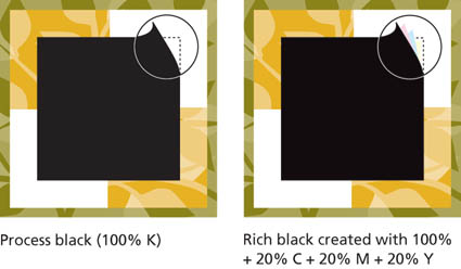
Because process black is transparent, the addition of another process color to black is often beneficial. A rich black ink combines process black ink with one or more of the other process inks to achieve a more intense black. Use a rich black in areas where objects could show through process black and cause it to appear inconsistent or not dense enough.
Use a single, solid ink (such as 100 percent black or a dark spot color) to print hairline rules and small text. Fine elements printed with two or more colors are difficult to print in register.
Avoid creating process colors with high total ink coverage (the sum of the percentages of the four process colors). Most paper and press conditions require a maximum ink coverage of 250–320 percent. Higher total ink coverage may prevent the ink from drying correctly and can cause set-off, where the ink from one sheet of paper is transferred to the next sheet in the pile. Your printer will know the total ink coverage limit for their press and paper combinations.


Using a Color Management System
A color management system is used to achieve color consistency between different devices. Ideally, this means the colors on your computer display accurately represent both the colors in the digital image and the colors you’ll see in your publication when it’s printed. If a system-wide color management system is in use, you can achieve accurate color matching through all stages of the production process and in multiple contexts, including Web publications, composite color proofs, and final printed products.
Color management relies on an industry standard color profile format developed by the International Color Consortium (ICC). With color management, a software application saves color files with embedded ICC color profiles. The application also reads ICC profiles when it opens a color file. Adobe Photoshop, Illustrator, InDesign, and QuarkXPress all support color management to help ensure consistent color as files move between these applications and various proofing and printing devices.
For color management to work effectively, all applications you use to process a color file must support color management, and ICC profiles must be available for all output devices you use. If you plan to choose colors on your computer display, the computer display must be calibrated and have an ICC profile set.


If your prepress service provider uses color management, be sure to discuss the best way to ensure your project is produced effectively. Depending on your printer’s preferred workflow, it may be possible for your layout to contain images and illustrations in a variety of color spaces—RGB, CMYK, or grayscale—and have the conversion to output color done by the printer at the time of output. The benefit of this procedure is that one master page layout can be created without regard for the output process or medium. The output is optimized according to the process used.
Commercial printing companies that have adopted color management usually have ICC profiles available for their printing processes. They will provide these profiles to you on request, and the profile appropriate to your project can be used to make an onscreen preview of the printing.
Photoshop embeds its color working space profile into images as they are saved in most file formats. This color space is an ICC profile that defines the gamut of colors inside of which the image exists. Most consumer digital cameras—and all professional digital cameras—also embed a color profile into images as they are saved to memory cards.
Color-managed workflows acknowledge these color profiles when processing images and can convert the colors in the image more accurately to destination color spaces—like CMYK—when these profiles are present. Some experts refer to embedded ICC profiles as the pedigree of images, helping to define their character as they are processed for printing.
If your printer prefers that all color in a document be converted to CMYK in advance of printing, then it’s important to get a CMYK press profile from the printer to use in converting to their color requirements. If the printer doesn’t provide a process-specific profile, ask for their recommendation of a CMYK profile that is acceptable to them. The Adobe Creative Suite ships with a number of CMYK profiles that are useful for converting color to CMYK for web-fed and sheet-fed processes.
The “Digital Age” has empowered designers to create their own images, set their own type, and even make their own traps. It also makes us more liable for potential printing errors than ever before. Knowing your tools and how to use them has never been more essential.
—Clifford Stoltze, Stoltze Design, Boston, MA

Correcting Color
It may be necessary to correct the color in an image that’s scanned or that comes from a digital camera. The original photograph may have a color cast caused by using incorrect film or lighting. Or, the scan may have been imperfect—some scanners introduce color casts in images. Or perhaps the colors in your original art are out of gamut for the printing process, and you want to modify a color in the original to make it printable.
If you’re using professionally scanned images, you can often avoid the need to correct the color if you discuss your requirements with the scanner operator. A skilled scanner operator who knows what you want can eliminate color cast in the original.
Photoshop includes numerous color-correction tools and many techniques for making images perfect for print.
Choice of color mode
Color can be corrected in either RGB or CMYK mode. For a variety of reasons, it’s advisable to do most retouching and color correction work in RGB. The number of tools, filters, and functions available in Photoshop is greatest when you’re working in this mode. Even Selective Color, a CMYK-based color correction tool, works in RGB mode.
Working in RGB color
All digital photographs and most scanned images are in RGB color. And as just mentioned, most experts believe it’s best to do corrections and editing in RGB mode. It’s best to leave images in their original color space and perform editing and color correction on the images in that space.
RGB gives you greater flexibility in how you use images. For example, an image may appear in a newspaper ad, a high-quality brochure, a poster printed using European-standard inks, or on the Web. By comparison, color images in CMYK mode are device specific; once you’ve converted to CMYK, you’re locked into using a particular printing process and substrate.
Converting from one color mode to another can be harmful to an image, and it’s best not to convert more than once. Using embedded ICC profiles allows images to remain in RGB color and then be converted to printing color (CMYK or other) at print time, leaving the color in the original unchanged. Such workflows provide the greatest amount of flexibility.
Working in CMYK color
A CMYK image is process-specific—it’s optimized for output to a particular printing device, ink set, and substrate. This means that colors and the tonal range have been changed (or limited) to fit those of the printing device.
As mentioned in the previous section, you should avoid switching color modes. If you’re starting with a professional scan delivered in CMYK, it’s best to stay in that mode all the way through production. If you start with an RGB scan and perform the major part of the job in RGB, you still have the option of doing fine-tuning with Photoshop’s CMYK color-correction tools.
Working in CMYK has some advantages: You can specify and measure definite CMYK color values as percentages, and they don’t change. If you want 100 percent cyan, for example, you can be sure of getting that value.
Using levels and curves
Photoshop provides a histogram (Image > Adjustments > Levels) for image editing. A histogram shows the number of pixels at each brightness level in the image. A broad histogram is usually desirable; a narrow histogram indicates that the image has a narrow tonal range. A histogram that is concentrated at either the dark end or the light end can indicate a number of problems—underexposure, poor contrast, or poor original lighting.
You can make changes in the image by adjusting the sliders below the histogram. The left end represents the darkest areas of an image, and the right end represents the lightest areas. The slider in the middle lets you adjust the image’s contrast and saturation.

Many professionals use the histogram to analyze their images and adjust the end points (black and white). They then use a different control—Curves—to make additional adjustments for brightness and contrast. Curves has the advantage of allowing control over more tonal points in the image.
Both Levels (showing the histogram) and Curves can control the entire image or individual color channels. You can use these controls to modify the color in an image. Practicing with a number of images will help you develop the color-correction skills to fix nearly any image.
CMYK preview
Even when you’re working with RGB or Lab color images, Photoshop lets you preview images in CMYK, according to its current Color Settings (and additional custom settings). If you want to see the impact of conversion to CMYK, without the commitment to convert, use Preview.

Color-correction in Photoshop
Each time you adjust color in Photoshop, the data in your file is permanently altered. Thus, your goal during correction and editing should be to perform as few adjustments as you need to achieve the results you want. Over-editing and overcorrection may result in a degradation of image quality.
By contrast, layer effects in Photoshop are nondestructive and can be cancelled or changed at any time. Most imaging professionals use these layer effects to experiment and change images with the confidence that their changes can be removed if they wish.
Photoshop has a number of color-correction tools, including a series of color palettes based on lighting conditions. Fixing digital photos taken under incorrect lighting conditions is the most common correction—and one of the easiest—to perform. And if you have a digital camera that can deliver an image in raw format, you can correct the image’s color for color temperature down to the degree as it’s opened in Photoshop.

One of the simplest methods for color-correcting images in Photoshop is the Color Balance palette. This palette presents a series of three sliders that control shadows, midtones, and highlights separately, each for a color complement pair. With a calibrated computer display—a critical requirement for editorial color adjustment—the corrections you see onscreen will be made to the image.
The operation of the Color Balance control is relatively simple. If the image appears to have a green color cast in the shadows, you first select Shadows and then push the slider away from Green until the image looks better. If the cast extends into the midtones, you repeat the process with the Midtones button selected. This palette works on images in any color space.
For images where a single color appears to be wrong (and the remainder of the image is fine), the Selective Color palette is a good choice for correction. This palette uses CMYK terminology but works on images in any color space. You select the target color and then adjust the “inks” that affect that color. Other colors in the image remain untouched.

Photoshop’s Selective Color palette, which operates with CMYK value sliders, works with RGB color images.
Other methods of color correction abound. Some use the Levels palette; others use the Curves palette. Others involve layers, layer masks, and combinations of the two. Consult Real World Photoshop from Peachpit Press or other Photoshop-specific books for more information on color correction. For more on color management, check out Real World Color Management from Peachpit Press.

This digital photo shows a very slight magenta cast, a result of the lighting in the studio being a little warmer than the tungsten setting on the camera. Using the Color Balance controls in Photoshop, the midtones were reduced slightly in magenta (toward green), and the highlights were reduced to a lesser degree.
The resulting image is better balanced and reflects the image qualities applied in the Color Balance palette. Most color casts are a result of the lighting in a scene being different than the camera’s settings or slightly different than normal for the selected source.
Steps for preparing photos for print
- Be sure your computer display is calibrated and your Color Settings (controlled in Adobe Bridge under Suite Color Settings) are set for your printing environment.
- Open the image in Photoshop. If the image has an embedded color profile, use it. If it doesn’t, Photoshop will ask you to assign a working space profile.
If you know the image came from a consumer digital camera, you’re safe to assign the sRGB working space.
If the image came from a scanner or a professional digital camera, it may have a larger potential color space. Try Adobe RGB (1998) first; if the image looks good, it’s OK to continue. If the image has a red or pink color cast, close the image and reopen it using the sRGB or Apple RGB working space. These smaller color spaces won’t distort the color of the image by extending its red, green and blue aim points.

This image was made on a professional digital camera whose color space setting was set in-camera to Adobe RGB (1998). Opening it into that same working space in Photoshop causes the image to have normal color qualities.
- Using the Levels control, look at the histogram and notice overall features of the tonal range. Is the range too narrow? Is the image missing black or white components? If so, move the end-point sliders in Levels to adjust the end points of the image.
When you make these adjustments, be careful not to distort the effect the photographer wanted when taking the photo—many images are intentionally light or dark. If the photo is intentionally dark, the histogram will display this characteristic (little or no highlight).
- You may choose to alter the image by using the Curves control in Photoshop to adjust tonality. Curves affords better control over tonal control than Levels does, because it gives you multiple control points and subtle control over different ranges of tone in the image.
- Apply correction as needed. Useful tools for color correction include Color Balance, Curves (with individual channels selected), and Levels.
- If appropriate, sharpen the image using the Unsharp Mask controls. Unsharp Mask creates enhanced tonal edges by creating new tones in an image at various thresholds you set in the control palette.
Smaller images need less Unsharp Mask than larger images do. Photos of people require less sharpening than product photos do. Experiment with Unsharp Masking to develop settings that are comfortable for you and appropriate for the process you use to reproduce your images.
- Always save your files with the color profile embedded. Doing so allows prepress workers downstream to know the boundaries of color in which you handled and edited your images. Color-managed workflows require embedded profiles to perform color conversions with the greatest color fidelity.
If an image with a large color space is imported into Photoshop with too small a working space, the colors are truncated and shift slightly toward green.
If the image is imported into Photoshop into too large a working space, the colors are again modified, this time toward red and magenta. The best practice is to open all images into a working space that is matched and appropriate to the image.

Color Terms
Additive color Color in our natural world is comprised of three primary colors: red, green, and blue. These colors behave additively, with any two creating a third, and all three creating white.
CMYK The usual abbreviation for cyan, magenta, yellow, and black: the inks used in color process printing.
Color filter A sheet of colored glass, plastic, or gelatin with biased transparency. A red filter, for example, allows only red light to pass through, while it absorbs light of other wavelengths. Filters are basic to color scanning and color-separation photography.
Color management Color management is the process of measuring the actual performance of a device, comparing that to a set of known color values, and making adjustments to overcome the differences. Color management is an integral part of publishing systems.
Color-matching system A system of color samples that allows a designer to specify exact colors by number or letter.
Color profile A component of a color management system, the profile describes the color behavior of a device such as a computer display, a scanner, a proof printer, or a press.
Color separation Separating a multicolor image into four monochrome components, one for each of the process colors.
Color sequence The order in which process colors are printed. A common color sequence is black-cyan-magenta-yellow. Printer’s ink is formulated for a specific sequence.
Color space The color environment in which an image exists. Common color spaces include RGB (red, green, blue), CMYK (cyan, magenta, yellow, black), Lab (based on one channel for luminance and two color channels), and grayscale.
Color value The tonal value of a color, analogous to gray level on a scale from dark to light.
Duotone A duotone is a photograph printed with two colors of ink. Usually the two inks are assigned to different tonal ranges of the image.
Gray-component replacement (GCR) A method for replacing neutral grays made up of combinations of cyan, magenta, and yellow with a similar value of black ink. GCR improves the printability of a job by making neutral grays easier to balance on press.
High-fidelity color Any project that is printed with more than the traditional four process colors can be said to be high fidelity color. Most commonly this is CMYK, plus orange and green, the system developed by Pantone, Inc., called Hexachrome.
ICC The International Color Consortium, a group who establishes methods and standards for color management systems, color profiling, and the application of color in graphic arts.
JPEG An acronym for the Joint Photographic Experts Group, and a format for compressing still images by image analysis and modification. JPEG is a lossy method of compression, in that color or detail can be discarded in order to make the file smaller.
Monotone An image made with one color of ink.
Primary colors There are two systems of color that affect the graphic arts. Additive color is the color of light, made-up of red, green, and blue primaries, and subtractive color is the system of inks where primaries of cyan, magenta, and yellow ink filter white light to impart color to it.
Process color Multicolor printing that simulates full-color imagery. Typical systems for printing process color include cyan, magenta, yellow and black (CMYK) and Hexachrome (CMYK plus green and orange).
Quadtone An image that uses four inks.
Raster Image An image recorded by specifying the color at each cell of a grid. An individual cell in the grid is called a pixel (short for “picture element”) and the grid of pixels is called a raster. Digital cameras and scanners produce raster image files, and image-editing software supports on-screen display and modification of raster images.
Raw Raw files are images from digital cameras where information recorded by the image sensor is saved without loss or in-camera adjustments.
Secondary color Secondary colors are combinations of primary colors. Mixing yellow and cyan, for example, creates green, a secondary color in the subtractive color system.
Spot color Refers to a method of specifying and printing colors in which each color is printed with its own ink rather than by a combination of the four process colors (CMYK). The purpose of spot colors can be to simplify a color match or to expand the range of colors available in a printed project.
Subtractive color The system of color used to produce printing with layers of transparent ink. Subtractive color primaries are cyan, magenta, and yellow. When combined in pairs, they produce red, green, and blue, but when all combined, they produce a muddy-brown rather than a true black, so we supplement with a fourth color, black, to compensate for this shortcoming.
SWOP The acronym for Specifications [for] Web Offset Publications, a set of printing specifications for web-fed offset printing.
Tritone An image that uses three inks.
UCR—Undercolor Removal When color separations are made, the combination of colors might exceed the Total Ink Coverage value for a certain press and paper, so the ink will not dry. UCR compensates for the excess by removing small percentages of ink. UCR describes a typical color separation, where GCR describes a more sophisticated separation process where neutral colors are modified and substituted by black ink (see GCR).
Vector graphics Digital images determined by specified points and mathematical functions. A benefit of vector graphic over raster, or bitmapped, graphics is a smaller file size.
Working space As defined by Photoshop, the color space in which an image resides while it is open in the image-editing application. Various color spaces are available, each with its own qualities. The objective is to choose one that is large enough to accommodate any color you might want in an image.
Scanning Tips
Scanning film or prints can result in great digital images, but it must be done correctly. Use the following guidelines to ensure the best scan possible:
• Calculate the required scan resolution in advance. Anticipate future needs for enlargement, which will require a higher resolution scan.
• Sharpening or correcting color during the scan can create an irreversible path. You can usually make adjustments more effectively later by using an image-editing program that lets you see the effect of your changes before you commit to them.
• Identify the key elements, or selling points, of your image. If possible, tailor the scan so those areas reproduce optimally. For instance, if the scan is for a clothing catalog, get the clothing right even if it means compromising other aspects of the image.
• If you employ a color management system, use a scanner that embeds its ICC profile in your images to record the color space used by the scanner.
• Don’t scan text or previously printed graphics unless it’s your only option. The results will be better if you re-create the text in your page layout application.
• When you’re scanning, keep in mind that file size grows twice as fast as scan resolution. Doubling the scan resolution means there are twice as many pixels both horizontally and vertically and thus four times as many overall.
• Numerous scanners on the market offer impressive image restoration features. Called Digital ICE, these features remove dust and scratches, restore faded emulsions, and can improve the tonality of images that appear to be unusable. Using these features can save hours of retouching and restoration work on some images.
Don’t trust your monitor for correcting scans. Take an extra five minutes to compare your screen color values with the same values in a CMYK swatch book.
—Andrew Faulkner, San Francisco
Choosing a scan resolution
Use the following guidelines to choose your scan resolution:
• Because black lines on a plain background tend to show jagged edges easily, line art should be scanned at high resolution. Most experts agree that you need more than 1,000 ppi in the scan to make line art appear convincing in reproduction. A resolution of 1,200 is effective for most logos and similar artwork. To scan such artwork successfully, scan it as grayscale, and then use Photoshop’s Threshold control to get the best possible image.
• If you plan to use normal halftone screening for images that will print at their original size, you can conservatively calculate scanning resolution by doubling the screen ruling you plan to use. For example, if the screen ruling will be 150 lpi, the desired scan resolution is 300 ppi. Keep in mind, however, that images scanned at high resolution require more disk storage space than images scanned at lower resolution. See the section “Oversampling” for more information.
• If you plan to resize the image, allow for this in your scanning resolution. Measure the original image, decide on the size of the final printed image, and calculate the enlargement ratio of final size to original size. Factor in the anticipated enlargement ratio so that you scan at a proportionally higher resolution. Most scanner software will make these calculations for you as you work: Enter the screen frequency and the enlargement as a percentage (or the final dimensions), and the scanner will deliver a file appropriate to the image use and size.

For images that will be resized, calculate the scaling factor and multiply it by twice the screen ruling.

75 ppi

150 ppi

200 ppi

300 ppi
Different scanned resolutions printed with a screen ruling of 175 lpi show that you need an adequate scan to prevent visible pixels in the final printing.
Oversampling (or overscanning)
Many images can be scanned at resolutions less than twice the output screen ruling. Images that don’t contain geometric patterns, sharp edges, or straight lines can be scanned from 1.5 to 2 times the screen ruling. Fuzzy texture, foliage, and many portraits can often be scanned at even lower resolutions. In this example, even though one image has a larger file size and higher scanning resolution, the printed quality of the two images is about the same. Scanning at a higher resolution produced a larger file without improving the quality of the final image very much. The image scanned at the lower resolution requires less disk space and takes slightly less time to process while printing.
Tips for working with scanned images
• Save your scanned image in Photoshop .psd format if you work on both the Macintosh and Windows platforms and work with Adobe Creative Suite applications. InDesign and the most recent version of QuarkXPress both allow images in Photoshop format to be placed and printed directly. This eliminates the need to make an additional copy of your images for the printed publication.
• If you’re using professionally scanned images, make sure you discuss your expectations with the vendor before the scanning is done. Most flaws in originals can be eliminated by a skilled scanner operator who knows what you want. Explain which images need to be especially sharp or scanned to match the original.
• To ensure good color reproduction early in the production process, you may wish to check color proofs of individual images before they are placed in a page-layout program.
• If you and your printer have determined that your images must be converted to CMYK prior to production, do that last. Smart production artists make a copy of all the images in a project and convert the images to CMYK using an appropriate ICC profile and a Photoshop Action to automate the process. Be sure to obtain a CMYK profile (or the recommendation for one) from your printer before making CMYK conversions, because these conversions are process- and paper-specific.

Scan resolution: 250 ppi File size: 465K Screen ruling: 150 lpi

Scan resolution: 400 ppi File size: 1165K Screen ruling: 150 lpi
An image oversampled to a great degree prints exactly the same as an image at the correct sampling value. It takes longer to process and image in the platesetter.
Tips for working with digital camera images
• Digital photos from professional cameras contain an embedded ICC profile. Always use that profile when Photoshop asks for instructions on how to handle a profile mismatch.
• Images from nearly all consumer digital cameras are in the sRGB color space. They may not have an embedded ICC profile when you open them. If you assign this profile while opening digital camera images in Photoshop, you’ll almost always see pleasing—and reasonably accurate—color.
• Digital camera images have a fixed resolution that’s set in the camera (or defined by the camera’s image sensor). Amateur photographers often lower the resolution of their camera to fit more photos on their memory card. When you open these files, you may discover that they can’t be reproduced at adequate size. To check or set the resolution of any digital image, use Photoshop’s Image > Image Size palette. With the Resample Image checkbox not selected, you can enter resolution values needed for print and see the impact of resolution on reproduction size.
• Most digital cameras are good at defining the white balance of an image at the time it’s exposed. If the image doesn’t look good, however, it’s reasonably easy to correct for white balance problems. Use the Photoshop Image > Adjustments > Photo Filter palette, where you can assign common filters to correct for simple lighting errors.
• When you’re working with professional digital cameras, it’s always smart to use the raw file format (built into the camera) and then open those images with the Camera Raw plug-in in Photoshop. Raw conversions allow for image interpolation, subsampling (increasing and decreasing the image resolution), and color correction, among other controls, at the time the image is opened.

When you’re presented with the Embedded Profile Mismatch dialog in Photoshop, it’s best to use the embedded profile (if present); it represents a measure of the image as the photographer created it.

You can manipulate raw images using Photoshop’s Camera Raw plug-in. There are controls for resolution, color temperature, tint, sharpness, and more. This palette only works on images saved by cameras in their raw format.
Multitone printing
A single plate on a printing press can reproduce a nice tonal range, but the density of the ink seldom makes a print that rivals a real photograph. Multitone printing with gray or other inks has been used for years to enrich the tonal range when printing black-and-white photographs.
Duotones, tritones, and quadtones are grayscale images printed with two, three, or four inks, respectively. The process is similar to process color separation printing, but the plates deliver one or more spot color inks instead of—or in addition to—the process colors. Duotone, tritone, and quadtone printing can dramatically improve the overall appearance of images.
You can create duotones, tritones, and quadtones in Photoshop (Image > Mode > Duotone). Doing so lets you decide how tonal levels in the original should be translated into percentages of the separate inks in print. To create a duotone in Photoshop, you specify tonal curves (one for each ink) that control how gray levels in the original are to be converted into halftone dot size. Some duotone settings are provided in Photoshop, but you can also create curves for colors other than those provided.

This monochrome image, produced with a single color of ink, looks good, but adding a second or third color can enhance it even more. With cyan, magenta, and yellow at your disposal, you can create duotones from monochromatic images so they take on the tint of the desired color ink or just enrich the tonality of the image. The possibilities are endless. To the right are three examples of simple duotone modifications you can easily make to an image.

By adding cyan, magenta, or yellow ink to the grayscale image and favoring the added color in the duotone curves, the image assumes a tint and has greater density. Subtle variations in the curves can make the color relationship change considerably.
Duotone images printed in a publication with just two colors of ink can look as rich as full-color photographs if the curves are set to emphasize the qualities of the images and the spot colors chosen.
As a general rule, one color (typically the darker) is used to render the full tonality of the image, often with the midtones reduced in intensity to allow the second color to show. The second color is then used to tint the midtones through the shadows. If you shape the curves appropriately, the additional colors enrich the image. Adjust the curves until the characteristics of color are pleasing. Try to keep the highlights in the image untinted by the second color; doing so keeps highlights in the image convincingly light.
An alternative in duotone creation is to use the two colors in near-equal amounts that more simply tint the photo with the second color. Doing so doubles the density of ink printed and makes the image look richer in print. The tint of the second color is less evident using this technique.
You can create handsome sepia-tone images from monochrome images printed with three or four colors of ink. These duotones can be used to make grayscale images look antique, and the result is much nicer than printing the same images with black only.
There is no reason that duotones must use spot color inks; they can just as easily be constructed from any of the four process color inks with great results.
When you’ve created a duotone setting that you like, you can save it from the Duotone palette and apply it to other images. You can also convert duotones into RGB images or CMYK images (Image > Mode > RGB) to take advantage of a tonal property you’ve created in the duotone environment.

The Photoshop Duotone Curve dialog box allows you to specify the distribution of each ink by specifying a dot percentage for each color on a curve. In this example, a cyan-black duotone has been created. The black carries the entire image with midtones reduced in tonality, whereas the cyan color is allowed to tint the image significantly.

Image Size, Interpolation, and Resampling
A digital image contains a fixed number of pixels, and the dimensions at which it will be printed define its resolution (or vice versa). Existing digital images can be resampled to new sizes (larger or smaller) using the Image > Image Size palette in Photoshop.
Resampling occurs when you change the number of pixels in a digital image. Resampling alters the file resolution and thus its reproduction size. Resampling up or down is accomplished in software by projecting an image on a new array with a different number of pixels, known as scaling. When an image is scaled, interpolation is used to construct color levels for the pixels in the new array.

Continuous-tone image

2X enlarged section using Bicubic interpolation

2X enlarged section using Nearest Neighbor interpolation

Grayscale image (converted using Channel Mixer in Photoshop)

2X enlarged section using Bicubic interpolation

2X enlarged section using Nearest Neighbor interpolation
![]()
The image as it would appear if scanned at a low resolution or interpolated too much. When pixels or patterns of pixels become visible, the image has been enlarged too much for the current viewing distance and printing process.
Subsampling—reducing the resolution—is occasionally done to cause the image to go through a prepress system more efficiently.
Here are some things to remember about scaling and resampling digital images:
• In general, it’s best to scan an image at the scale and resolution you need it, to avoid having either to resample or to resize the image later. With images from professional digital cameras, it’s easy to open them at one of a variety of sizes using the Camera Raw palette.
• You can increase the resolution of a digital image by fitting it into a smaller space. Doing that doesn’t involve any change in the size of the file and doesn’t require resampling. The result may be an image that has higher resolution, but it doesn’t appear any better in print.
• Subsampling works best if you divide the original resolution by a whole number factor. For instance, if your original image is 600 ppi, resample to make the new resolution a simple fraction of 600 ppi such as 300, 150, or 75 ppi.
• You can increase an image’s resolution using Photoshop’s Image Size palette. Experimentation with this tool will reveal the extremes to which an image can be modified without visible harm to its detail. Some imaging experts assert that it’s best to interpolate images to higher resolutions by even factors—doubling the size exactly, for example. Others claim the best results when they make several steps upward—such as 20 percent increments applied several times.
• Using the Unsharp Mask filter in Photoshop can compensate for some of the blurring introduced by resampling.
• Once an image is resampled, the original information can’t be recovered except by rescanning it or reopening it from the digital camera (although you can step backward in the History palette if the file is still open).

200-ppi scan resolution; 869K file size. No sharpening has been applied.

100-ppi scan resolution; 386K file size. Unsharp Mask has been applied, proving that with some images, a smaller file size combined with a bit of sharpening makes the image reproducible.
Graphic File Formats
The file format you choose for your graphics depends on your workflow and final output.
Both InDesign and QuarkXPress now support native Photoshop documents, complete with image layers and effects. InDesign also lets you place native Illustrator files into a page layout document. To reduce the number of document versions, and to see the best quality image onscreen, use native Photoshop files in either page layout application. Use Illustrator files in InDesign and Illustrator EPS files in the latest versions of QuarkXPress.
For duotones (and tritones and quadtones), use the EPS format. But don’t use EPS for other raster images (photographs). The EPS format doesn’t support some of the embedded information needed by the latest versions of InDesign and QuarkXPress.
The TIFF file format is useful for grayscale or color images. TIFF supports layers, clipping paths, and most color spaces. It also allows ICC color profiles to be embedded, which makes this file format a good choice for page layouts.
Desktop Color Separation (DCS) files are EPS files that combine a low-resolution display image with high-resolution data for color separations. DCS supports additional colors beyond CMYK. Up to 24 channels can be saved in a DCS file, those colors created in Photoshop’s Multichannel mode. In the page layout application, each color in a DCS image is treated as a spot color.
Photo CD files contain raster images in several resolutions and are stored on a special CD in a format called YCC. Photo CD files can store images from 35mm, 70mm, 120mm, and 4-by-5-inch film. Although it’s possible to get film scanned and stored on Photo CD discs, such discs aren’t common today.

Open Prepress Interface
Open Prepress Interface (OPI) is a method of using low-resolution images in a page layout and then substituting high-resolution images at the time of printing. The process is sometimes known by the term Automatic Picture Replacement (APR); both terms are trademarks of the companies that developed them.
When you use an application that supports OPI, your service provider can scan your artwork, keep the high-resolution images, and give you low-resolution placeholder images to use in design and layout. You don’t need the large storage capacity or fast processing speed required to store high-resolution images.
After you create your publication using a page-layout program that supports OPI, you or your service provider can generate a PostScript file containing OPI comments that specify the page, placement, size, and cropping of any TIFF images. Your prepress service provider uses a prepress application that automatically substitutes the high-resolution versions of the images while imaging.
If you intend to edit your images, you must use the high-resolution images; low-resolution images are for position, scaling, and cropping only.

Special Techniques
Bleeds
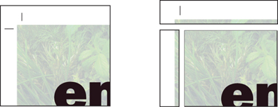
Printing an object to the edge of the final printed piece requires creating a bleed. A bleed extends objects off the print area to ensure that when the paper is trimmed during the finishing process, the ink coverage extends to the edge of the paper.
The convention for bleeds is to extend the image .125 inch off the sheet. It’s important to remember that the image will be trimmed: Don’t put any important information at the edge that is needed in the image at or close to the bleed line.
Bleeds extend to the edge of the paper.
Trim marks indicate where the page will be cut.

Avoid aligning objects exactly with the edge of the page.

Adjust the design so trimming looks intentional.

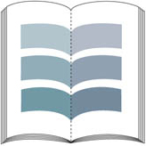
Crossovers
A crossover is a printed object that extends from one page to the next. Because a single object is printed on two sheets of paper (or on two sides of the same sheet of paper), the pages must be carefully aligned in the final printed piece.
Binding methods affect crossover position and alignment. An object that spans the gutter may seem to disappear when the pages are bound, so you need to adjust the design accordingly. Also, when pages are gathered together for binding, some of the pages can be pushed out slightly. This phenomenon, called creep, can cause gaps or misalignment between the two parts of the crossover.
Follow these guidelines when creating a crossover:
• Avoid printing important text across two pages, because part of it will be lost in the binding. Some designers add a small amount of space to headlines that pass through the fold of a crossover so the text will be legible.
• Diagonal artwork in crossovers can exaggerate misalignment in folding and binding. Consider how an image will look if part of it is removed in the binding process. Adding an artificial extension in the artwork can partially compensate for the effects of binding.
• Color can print differently on opposite sides of the paper. This may be due to the paper surface’s qualities or to printing conditions. A crossover can often fall between different sides or different sheets of paper, and this can exaggerate color differences in two-page spreads.
To reduce the impact of differences in the appearance of color in crossovers, consider printing with a spot color those colors which are significant in the design and which must cross over from front to back of the sheet, or from one sheet to another.

Crossovers extend from one page to another.

Before binding
After binding
Color shifts can occur when crossovers print on different forms.

Thicker rules help conceal misalignment.
Overprinting and preview
Overprinting can be used to create additional colors and special effects. Normally, when you produce a document with overlapping objects, the top object replaces, or knocks out, the colors beneath it. Overprinting prints the colors on top of each other.
Overprinting colors with different inks combines the ink values in the overprinted color. For example, if a background color contains 50% C and the overprinted color has 60% M, the overprinted area consists of 50% C and 60% M.
When you overprint colors with components of the same ink, the combined color assumes the percentage value of the topmost item (and never more than 100% of any color). For example, if a background color contains 50% C, and the overprinted color contains 20% C and 60% M, the printed color where the colors overlap contains 20% C and 60% M.
Overprinting can also be used to specify varnishes in some graphic elements. Specifying a varnish as a spot color and then declaring that spot color to overprint causes the plate for the spot color to have an image of the overprint. Though this technique works with text and some graphics, it doesn’t work with placed images.
Overprinting can cause problems on the press; be sure to talk with your commercial printer about their limits for total ink coverage, and be sure not to exceed the value they recommend (typically 250–320%) in any combination of overprinted inks.
Also, never use the color registration on any artwork or text in your project. The registration color—defined as 100% of every color printed—is only for printer’s marks used to control register on press.

Overprinting can create a new color.

Overprinting can change the look of a color unexpectedly.

Overprinting objects without common inks combines the ink values where the objects overlap.

Overprinting objects with common inks reveals the topmost of the overprinted ink colors of the common colors. Different colors overprint as a combination of the values of the colors.
Compensating for Register Error
When you examine printed work, you’ll often notice register problems in areas where colors meet. These are usually caused by the paper stretching or shifting slightly on the printing press. Where inks print out of register, gaps or color shifts appear between the objects. Gaps are especially likely when adjacent objects share no common color and when objects knock out rather than overprint. Overprinting is often used as a way to reduce the effects of press register error. Another way of hiding flaws in register involves expanding one region into another by adding a border stroke called a trap.
Trapping
Some prepress systems provide automated trapping of artwork as a process step in file preparation for platesetting. This method of trapping is by far the best because the trap elements, their color, and their values are determined by sophisticated software algorithms. If trapping is available from your prepress provider, take advantage of that service.
Manual trapping requires a thorough knowledge of color and design and of when trapping is likely to be necessary. A publication designed with several interacting spot colors requires trapping because the colors don’t share a common ink. A publication containing several process colors without common colors may also require trapping.
On the other hand, not all printing requires trapping. Designs that contain isolated areas of solid color don’t need to be trapped because there are no adjacent colors that could show gaps if register errors occur. Designs composed of process colors where adjacent areas share sufficient percentages of component inks don’t require trapping, because misregister would reveal the common inks instead of leaving a gap. Photographs don’t need to be trapped because the distribution of colors in a typical scene provides enough randomness to prevent large areas of a single color from existing adjacent to large areas of a different color.
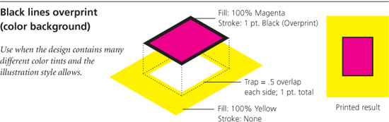
An effective trap should compensate for misregister without distorting the shapes of the objects on the page. If trapping results in visible distortion, it may be preferable to protect against register error by overprinting all or part of an object. Overprinting black lines and black text can help to avoid the problem, even when these objects appear on a colored background. Illustrations that make extensive use of black outlines, such as cartoons or certain highly stylized art, require little or no trapping.

Page designed to avoid trapping

Page requiring trapping
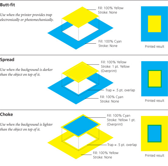
Chokes and spreads
A spread traps a light foreground object to a dark background. A choke traps a light background to a dark foreground object. Because the darker of two adjacent colors defines the visible edge of the object or text, spreading the lighter color slightly into the darker color maintains the visual edge of the artwork.
A solid color object that overlaps both a lighter and darker background requires both spreads and chokes to be applied for effective trapping.
Trapping process colors
Process colors that share sufficient percentages of component inks don’t require trapping because misregister reveals a color that has a component of each of the adjacent colors. In the example shown here, the first two colors share sufficient percentages of common inks that misregister reveals a color that isn’t distracting. However, the second two colors require trapping because they contain ink percentages that differ enough to reveal a third color when the colors are printed out of register. When adjacent colors don’t have inks in common, a trap is required.
Items reversed-out of a rich black (black plus a percentage of one or more other colors) require a trapping technique called a keep-away trap. When you trap such items, the under-printed colors are made slightly smaller than the black area so that press register error doesn’t result in a tiny fringe of color. Should the press go out of register, the under-printing colors are covered by the black area.

Spread

Choke

These colors share sufficient percentages of component inks that poor press register reveals common inks.

These colors don’t share sufficient percentages of component inks, so poor register reveals a noticeable third color.

The nonblack color of a rich black is pulled away from the edge…

so that when register error occurs, the under-printing color won’t show.
Overprinting to cover register error
In some situations, overprinting text and objects can be preferable to trapping as a way to hide register error. For example, small text and hairlines are distorted by trapping (the trapping strokes that are added fatten the thin lines). Overprinting preserves the shape of the object and the legibility of the text.
Before you overprint fine text or thin lines, evaluate whether misregister will be more noticeable than a possible variation in the line or text color. Keep in mind that your solution should provide the least distraction between text (or line) and background, should a register error occur. Ask these questions to evaluate your situation:
• If gaps appear due to register error, will they be noticeable?
• Will the text change to an undesirable color if it’s overprinted on the background?
• Will trapping distort the text characters?
Printing black trapping lines around images is a common use of overprinting to prevent register error from showing. This is the technique used for decades to print comic book art. All drawing elements are surrounded by a black outline that is set to overprint. The overprinted line can hide most register error. The line thickness is typically set to one-half the halftone screen frequency (.003 inch for a 150 lines per inch [lpi] project). This technique doesn’t lend itself to many styles of illustration artwork, but it works well when it’s used appropriately.


Overprinted trap line

Black text set to knock out, out of register

Black text set to overprint, out of register
Trapping methods


Screen Frequency, Resolution, and Gray Levels
Screen frequency, also called screen ruling or halftone frequency, refers to the number of lines per inch (lpi) of halftone dots in the finished printing. The relationship between the platesetter resolution (dpi) and the screen ruling (lpi) determines the halftone quality of the printed output. The same two factors also affect the number of gray levels or color tones available, measures of the tonal depth in the halftone image.
The screen ruling used for a job depends on the resolution of the platesetter as well as the paper stock and type of press used to print the publication. Common screen frequencies are used for most printing processes; these are defined in part by industry quality standards and traditions.
Full-color newspapers are commonly printed using a screen ruling of 100 lpi because newsprint absorbs a great deal of ink and the presses operate at high speed. A higher screen frequency would oversaturate the newsprint and make the images look muddy. Full-color magazines on coated paper are usually printed with a screen ruling of 133 lpi, whereas sheet-fed and commercial printing is typically done at 150 lpi. Garment printing created with the screen-printing process generally uses a halftone frequency of 50–65 lpi.
Halftone screen frequency also determines the size of a halftone cell, which in turn dictates the minimum size of a halftone dot (highest frequency). The halftone dot is made up of printer dots (measured in dpi); printer (imagesetter or platesetter) resolution determines the number of dots available to create the halftone dot. The relationship between screen ruling and printer resolution determines the number of gray steps that can be simulated. As the screen ruling increases, the size of the halftone cell decreases; fewer printer dots are available to create the halftone dot, so fewer gradations can be represented and the image may lose depth.
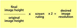
To calculate how many levels of gray are available at a particular screen ruling and output resolution, use the formula shown in the accompanying chart. Most output devices produce 256 gray steps (for photographic images). This is a process limitation of PostScript. PostScript platesetters draw algorithmic gradations (those created in Illustrator, for example) using a different process and aren’t limited to 256 steps.
Every platesetter available today (and most film imagesetters) have adequate machine resolution to generate 150 lpi halftones—or finer—without tonal degradation.


High-resolution imaging devices, such as computer-to-plate (CTP) systems, have enough machine resolution to draw halftone dots with full tonality. Low-resolution devices, such as laser printers, don’t have the resolution to draw halftone images with as many gray steps between black and white.
(machine resolution ÷ screen ruling)2 + 1 = potential shades of gray
Laser printer: (600 dpi ÷ 60 lpi)2 + 1 = 101 shades of gray
The laser printer can print black and white, but it doesn’t have adequate machine resolution to draw many steps of gray in between (the problem is exaggerated for this illustration).
Platesetter: (3600 dpi ÷ 175 lpi)2 + 1 = 577 shades of gray

The platesetter has enough resolution to draw full tonality at most common screen rulings. PostScript has a 256-tone limit for photographic grayscales, so the image would be limited to 256 gray values despite the theoretical 577 shown here.
Dot Gain
Continuous-tone images are reproduced with halftone dots of different sizes—large dots reproduce dark tones and small dots reproduce light tones. During the reproduction process, the dots change in size, becoming larger. This phenomenon is called dot gain.
There are several sources of dot gain, all of which are highly predictable. Dot gain occurs when the plate cylinder transfers its image to the blanket cylinder on press. Additional gain occurs when the dot is transferred to the paper—the pressure of the press forces some ink into the paper, which causes the inked halftone dots to spread very slightly. Uncoated papers cause more gain than coated papers do.
The amount of dot gain for a particular press and paper depends on the printing environment and the halftone frequency (higher line screens cause greater dot gain). Individual dot gain depends primarily on the size of the dot. The midtone (50 percent) dot has the greatest circumference, so it increases the most. Small highlight dots and shadow dots show little gain (they are actually small white dots in the center of black halftone cells). The accompanying graph shows the typical dot gain from file to press-sheet stage plotted against the percentage dot value (representing tone) in the original. The curve peaks at the 50 percent tonal value and approaches zero at both ends.
Halftone-dot percentages are measured with a densitometer—an instrument used for measuring the density of ink on printed substrates. A dot-gain value refers to what happens to midtone dots as a percentage of change in area. A 20 percent dot gain (typical for offset printing on gloss papers) means that the 50 percent dot will print on paper at 70 percent.

Typical dot gain for sheet-fed offset printing on coated paper at 150 lpi. Uncoated papers show significantly greater amounts of gain.
Normal tonal reproduction of an image results in predictable dot gain.

Excessive dot gain makes the midtones in an image appear dark and makes the image muddy. Photoshop displays images with standard dot gain to simulate the appearance of the image as it will print. Printing color images with ICC profile conversions also compensates for measured dot gain.
Paper quality and dot gain
Papers and coatings come in a large variety of types and are intended for many different purposes:
• Newsprint. A coarser paper made mostly from wood pulp and that is highly porous. It’s manufactured almost exclusively for printing newspapers. The dot gain for newsprint is typically 30 percent or more. Common halftone screen frequencies used for newspaper printing are 85 lpi and 100 lpi.
• Uncoated paper. Any number of different types of paper that aren’t coated with a gloss surface treatment. Dot gain for uncoated paper is roughly 25 percent. On web-fed offset presses, uncoated papers are usually printed at 133 lpi; sheet-fed presses use 150–175 lpi.
• Coated paper. Paper that has been given a shiny coating in manufacture, helping to seal the paper and reduce dot gain. On a sheet-fed press, the dot gain on coated stock can be as low as 15 percent, although 20 percent is more typical. High-quality grayscale and four-color images are usually printed on coated papers because such papers reflect more light and have a greater measured and visible gamut of colors available.

• Calendered paper. Paper that has had a normal finishing step applied that involves heat and pressure. Calendering freshly made paper is analogous to ironing cloth. Calendering is used on some papers in order to get a smoother, less porous surface. Calendered stock has dot gain that is slightly better than that of uncoated stock, typically between 20 to 25 percent, compared to 25 to 30 percent for uncoated stock.
When you’re using a color-managed workflow, the ICC color profiles applied to images and documents as they are processed compensate for dot gain.

Linked Graphics, Package, and Prepare for Output
When you place a photo or illustration in a page layout, the application creates a reduced-resolution preview of that image for the page and a link back to the source of the original.
InDesign, QuarkXPress, and Illustrator identify linked files using their filenames and locations. Both InDesign and QuarkXPress have link management palettes that help you keep track of all pieces of artwork and their location.
When it’s time to prepare your page layout for output, use the Package command (InDesign) or Prepare For Output (QuarkXPress) to assemble all the linked images and illustrations. These tools copy all the necessary files—including type fonts—into one folder so you can easily prepare a disc to send to your prepress provider.
InDesign also prepares an interactive preflight report that lists missing fonts or graphics, identifies incorrect color spaces (RGB in a CMYK document, for example), and allows you to repair your layout before committing to send your files to print.
Adobe Illustrator doesn’t have a Package command; if you use Illustrator as your page-layout application, you must check all links and then carefully assemble all parts of your document to send for output.
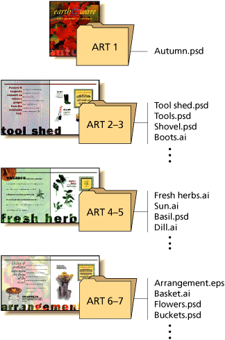
Organize your files as you construct your publication by setting up folders for art. Doing so will help you create a well-organized project. When you package your files for output, InDesign creates two folders: one for pictures and one for fonts. All contributing files are put into the correct folder.
Using Type
In the world of electronic publishing, type should look good onscreen and print flawlessly from output devices such as laser printers and platesetters. Unlike type that is cast in metal or imaged photographically, digital type gives you the means to control every aspect of typesetting.
Setting good-looking type
A sculpture’s success depends not only on its shape and material but also on the space around it. Typography is no different—to communicate ideas, type must be readable as well as legible. Legibility refers to the ability to distinguish between letters; readability refers to ease of comprehension and reader comfort. Making type more readable involves the manipulation of type sizes and the space around letters, words, and lines of text.
The shapes of individual letters influence kerning. For instance, two letters with either curved or diagonal strokes that are set together require the least amount of space between them; combinations of straight vertical lines need the most space; and a curved or diagonal stroke next to a straight line needs a medium amount of space. The latest Adobe applications have both table-based kerning adjustments and optical kerning methods.
Adding or removing an equal amount of space between characters, usually in paragraphs of text, to achieve overall tighter or looser letterspacing is known as tracking. Type smaller than 10 points may require added space (positive tracking), whereas larger type sizes—over 18 points—may need less (negative tracking). Most page-layout programs include tracking capabilities; the way you perform this function varies by application, so refer to your user guide for details.
Reverse type—white type on a black background—might also require more space between letters. In this case, use positive tracking to improve legibility.
Your printing environment may also require adjustment of the overall tracking. If you’re printing on absorbent paper, for instance, you may need to increase tracking to allow for ink spread that occurs during printing.
The amount of space between letters depends on the shapes of the letter strokes. Use automatic kerning functions in your page-layout application to overcome unsightly kerning pairs in text.
![]()
Warnock Pro 14 pt. (OpenType) Tracked –12 units
![]()
Warnock Pro 14 pt. (OpenType) Tracked +12 units
![]()
–20 Tracking Warnock Pro Light Italic Display (OpenType)
![]()
–40 Tracking Warnock Pro Light Italic Display (OpenType)
Word spacing
Words need to be far enough apart to be distinguished from one another but not so far that they separate into individual, unrelated units. That is, the spaces between words must be large enough to see individual word shapes, but the reader must also be able to group three or four words at a time for quick comprehension. The proper word spacing for unjustified text (in which the right margin is uneven or ragged) depends primarily on type size and line length.
If headlines are set in a large-size type—24 points, for example—little space is required between words; the space used by a 24-point lowercase i is a good gauge. In typical 12-point body text of ten words per line, however, more space between words is required. Most page-layout programs use the default word spacing provided in each typeface (which usually works well without adjustment in typical text settings); some allow you to adjust this spacing. Very short lines of text require tighter word spacing than the default.
![]()
Unkerned character pairs
![]()
Kerned character pairs
![]()
Before kerning
![]()
After kerning
![]()
Before manual kerning: uneven fit
![]()
After manual kerning and tracking: more balanced spacing
![]()
Headline word spacing
How PostScript printers use fonts
When you send a document to a PostScript printer, the printer uses the fonts it finds according to the following priorities:
- Fonts that have been manually downloaded to the printer.
- Fonts stored in the printer’s read-only memory (ROM).
- Fonts stored on a hard disk in or attached to the printer.
- Fonts stored in the Mac OS or Windows system (these are downloaded by the printer driver when the job is sent to the printer).
If the printer can’t find the font in any of these other locations, it usually substitutes the font Courier.
If you’re going to use ugly typefaces at all, then use them with mucho gusto! Be brave! Make a statement!
—Robin Williams, Santa Fe, NM
Font Formats
As discussed earlier, OpenType fonts are the new industry standard for imaging to any PostScript output device. OpenType fonts are PostScript language-based outlines—object-oriented vector graphics—that can be scaled to any size and still remain sharp and smooth on any platform or output device.
Earlier font formats included Adobe Type 1 fonts, which are made up of two software components: the screen font and the outline font (these occasionally are called by different names: bitmap font and printer font). Type 1 fonts are limited to about 250 characters per font, but otherwise they deliver superb quality at any size. They are platform specific.
TrueType fonts are found on all Macintosh and Windows computers. They are usually shipped with the operating system, and they also produce excellent output on PostScript printers and platesetters. Like Type 1 fonts, the TrueType font has a character set of about 250 characters.
You can use OpenType, PostScript Type 1, and TrueType fonts interchangeably in page layouts. The advantages of OpenType are its large library of glyphs and alternate characters. In every other respect, the three font types should produce equal results and should print properly on all modern PostScript RIPs.

Fonts from different foundries may not have the same width and letterspacing characteristics—even if they share the same font name.
Create close relationships with knowledgeable and experienced production people, print brokers, and service bureaus. You can benefit from the combined expertise.
—Lori Barra, Sausalito, CA

Typographic Terms
When older typesetting methods gave way to electronic publishing, certain traditional terms got carried along. Today we use a mix of old and new terminology to describe typography.
Alignment The positioning of text within margins. Text flush with the margins on both sides is referred to as justified. Text is often aligned with only one margin, either the left or right and is then described as right- or left-justified, ragged left or -right, or flush-left or -right.
Ascender The stem of lowercase letters (such as k, b, and d) that ascends above the x-height of the other lowercase letters in a typeface.
Backslant A typeface with a backwards slant, the opposite of italic.
Baseline The imaginary line on which the majority of the characters in a typeface rest.
Body copy The main text of a document, as distinct from titles and headings.
Boldface A typeface rendered in darker, thicker strokes so that it will stand out.
Bullet A dot or other special character used to indicate items in a list.
Cap height The height from the baseline to the top of the uppercase letters in a font. This may or may not be the same as the height of ascenders.
Centered text Text placed at an equal distance from the left and right margins. Headlines are often centered.
Character In typography, a single element such as a letter, numeral, or mark of punctuation. The emerging term to describe these typographic elements is glyph, which is more descriptive when discussing non-Roman alphabet characters.
Character encoding An encoding is a table that maps character codes to the glyphs of a font. There are 32,768 possible typographic codes in the latest font technology, OpenType, designed to accommodate nearly any alphabet system known.
Condensed font A narrower version of a font that is used to get more characters into a given space.
Copyfitting A typographic process of adjusting the size and spacing of type to make it fit within a defined area or on a definite number of printed pages. Can be done by calculation, or by successive adjustments at the computer until a fit is reached.
Descender The part of a lowercase letter (such as y, p, and q) that descends below the baseline. In many typefaces, the uppercase J and Q also descend below the baseline.
Dingbats Non-alphanumeric glyphs. Dingbat fonts consisting entirely of these characters are a source of graphic symbols—such as arrows, bullets, and dividers—and other graphic ornaments.
Display type Type larger than that of the body text, used for headlines and display.
Drop cap A document style in which the first capital letter of a paragraph is set in a larger point size and aligned with the top of the first line. Used to indicate the start of a new section of text, such as a chapter.
Ellipsis A punctuation character consisting of three dots, or periods, in a row. It indicates that a word or phrase has been omitted.
Em, em space, em quad A common unit of measurement in typography. The em is the width of the point size. For example, in 12-point type, one em has a width of 12 points.
Em dash A dash the length of an em used to indicate a break in a sentence.
En, en space, en quad A common unit of measurement in typography. The en is typically half the width of the point size. It is half the width of an em space.
En dash A dash the length of an en is used to indicate a range of values. Some typographers prefer it to the longer em-dash to indicate a break in a sentence.
Flush-left ragged-right Text that is aligned on the left margin is said to be flush-left. If the text is unaligned on the right, so that it has a ragged edge, it is said to be flush-left ragged right. The term ragged-right is sometimes used alone to mean the same thing.
Flush-right ragged-left Text that is aligned on the right margin is said to be flush right and, if unaligned on the left, is said to be set flush-right ragged-left. The term ragged-left is sometimes used alone to mean the same thing.
Font One style, weight, and width of a typeface. An example is Times Bold Extended. Times is a typeface family, Roman is a style, Bold is a weight, Extended is a width. The terms font and typeface tend to be used interchangeably.
In hand-set type, the term font described a single point size of a particular typeface design. Because digital-typesetting technology enables scalable fonts, the size defining a font is no longer applicable.
Font contrast Font contrast refers to the range of thickness of the strokes used to draw a font’s characters. Helvetica has low contrast, for example, because the letters are drawn with strokes of uniform thickness. Bodoni, on the other hand, has high contrast.
Font family Also called a typeface family. A collection of similar fonts designed to be used together. The Garamond family, for example, includes roman and italic styles, several weights (regular, semibold, and bold), and several widths (extended and compressed).
Galley proof A proof that is close enough to final copy to permit proofreading. The traditional galley was a small unit of machine-set type, which was checked before being merged into a frame with other galleys. The galley proof—also called a reader’s proof—was used to check for errors in typesetting.
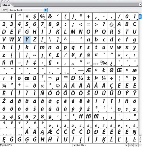
Glyph The basic building block in typesetting is a glyph—a letter, numeral, or symbol; groups of glyphs together are called fonts. One or more fonts sharing particular design features make up a family; Adobe Myriad Pro, for example, is the name of a type family. Myriad Pro Regular is an individual font within that family. The Pro in the name indicates that the font is an OpenType font.
New Glyphs palettes in InDesign, Illustrator and QuarkXPress allow for the selection of alternate characters from a palette showing all available alternate characters. Adobe now ships all of its fonts in OpenType format, and other type foundries are offering their fonts in this format in addition to the older Type 1 and TrueType font formats.
Greeking Gibberish used to take the place of real text for layout purposes.
Hanging indent A document style in which the first line of a paragraph is aligned with the left margin, and the remaining lines are all indented an equal amount. An effective style for displaying lists of information, sometimes referred to as outdenting.
Italic A slanting or script-like version of a face. The upright faces are often referred to as Roman.
Justified In typography, text is justified if it is flush on both the left and right margins. Text that is flush-right or flush-left, in other words aligned on only one margin, is sometimes described as being right-justified or left-justified.
Kerning The adjustment of horizontal space between pairs of characters to create a perception of uniformity; critical where large typefaces are used, as in headlines. The letters Ty would require kerning to tuck the y under the wing of the T.
Keyboard layout, keyboard mapping A keyboard layout or mapping is the table governing which character is generated when a particular key or combination of keys is pressed.
Letterspacing Letterspacing adjustments are applied to a block of text as a whole, and are sometimes referred to as tracking. This is distinct from kerning, which adjusts space between pairs of letters. Letterspacing is used to improve legibility and to fit more or less text into the given space.
Ligature Two or more letters drawn as a unit. In some typefaces, certain pairs of letters overlap in unsightly ways if printed side by side. Substituting a ligature improves the appearance in these cases. Examples include the fi, and fl pairs.
Oblique A slanting version of a face. Oblique is similar to italic but without the script quality of a true italic.
OpenType OpenType solves the problems of previous font technologies. OpenType fonts are cross-platform and can contain character sets of tens of thousands of glyphs, allowing for typography in almost any language. Special characters, such as small caps and old-style numerals are included in OpenType fonts rather than being found in a separate font. In addition to scalable OpenType fonts, Adobe offers Opticals, series of OpenType fonts that are designed for setting in a narrow range of point sizes.
![]()
Paragraph rules Graphic lines that separate blocks of text and isolate graphics on a page.
Pi characters Special typographic characters, such as mathematical symbols, not included in ordinary fonts.
Pica A unit of measure that is approximately one-sixth of an inch. A pica is equal to 12 points. The traditional British and American pica is 0.166 inch. In PostScript devices, a pica is exactly 1/6 inch.
Point A unit of measure in typography. The original ANSI point was 72.27 to the inch, but the PostScript era ushered-in a new point that is exactly 72 to the inch.
Point size The common way to describe the size of a font. A font’s point size is the distance in points from the top of the highest ascender to the bottom of the lowest descender plus a tiny gap for legibility.
Quad A typesetting term for a specified space size. For example, an em quad is the width of the point size, and an en quad is half that width.
Raised cap A design style in which the first capital letter of a paragraph is set in a large point size and aligned with the baseline of the first line of text. Compare to a drop cap.
Reverse type, reverse text Type that is printed white on black, or light-colored against a dark background.
Roman The upright style of a typeface, as contrasted with its italic version.
Sans-serif font A typeface without serifs, the tiny ornaments that are found on the tips of letter parts. Helvetica is an example of a sans-serif font.
Serif In typeface design, a small, decorative stroke appearing at the ends of the main strokes that define a letter.
Strike-through Text that has a line drawn through every letter, essentially showing cancellation. The technique is used when editing a document, and in legal printing, where the original text is shown, with strike-through, and the replacement text is printed nearby.
Style One of the variations, such as italic and bold, that comprise a typeface family.
Symbol font A font consisting primarily of mathematical symbols rather than ordinary letters and numbers. See pi characters.
Tabular figures Numerals that all have the same width. This makes it easier to set tables of data. Also called lining numerals.
Tracking The average space between characters in a block of text. Sometimes also referred to as letterspacing.
TrueType A scalable type technology.
Type 1 A standard format for digital type. Originally developed by Adobe, Type 1 was, until recently, the most commonly available digital type format. Type 1 has been replaced by OpenType fonts, which offer many more characters, multiple-language support, and stretchable elements for setting music and text in languages with such elements.
Typeface A design for the letters, numbers, and symbols comprising a font, often part of a family of coordinated designs. Individual typefaces are usually identified by a family name and some additional terms indicating style, weight, and width.
Typeface family See font family.
Typeface styles Within a typeface family, variants such as Roman and Italic.
Typeface weights Variants within a single typeface family, including thin, light, bold, extra-bold, and black.
Typeface widths Width variants within a single typeface family, including extended, condensed, and normal width.
Typographic “color” The consistency of a block of text. This depends on the thickness of the strokes that make up the characters, as well as the point size and leading used for setting the text block. When seasoned typographers refer to “color,” they are talking about textual consistency, the lack of rivers of white space in composed text, and evenness.
Widow A single word or part of a word ending a paragraph of type.
Word-spacing Adjusting the average distance between words to improve legibility or to fit a block of text into a given amount of space.
X-height Traditionally, x-height is the height of the lowercase letter x. As a general rule, it is the height of the body of lowercase letters in a font, excluding the ascenders and descenders. Some lowercase letters may extend a little bit above or below the x-height as part of their design, even without ascenders and descenders. The x-height can vary considerably among typefaces with the same point size, which is based on the width of certain uppercase letters.
Tips for Working with Page-Layout Files
Generally speaking, these suggestions apply to creating documents in any page-layout program. Some may also be applicable if you’re designing individual pages in an illustrator program.
Create a project folder. Before you begin a project, create a folder in which to store your publication and its linked files, such as images and fonts. Meticulous organization of files can prevent trouble at the last minute.
Maintain a backup copy. System errors can happen unexpectedly. To prevent losing your work if an error occurs while you’re in a publication, always create a backup copy of the publication and update it frequently.
Save your publication frequently. Save your publication immediately after you create it. Then, save it again each time you make changes that would be difficult or time-consuming to re-create. In the event of a power failure or system error, saving your publication frequently ensures you won’t lose many changes.
Choose the correct graphic format. Most software applications support a variety of graphic file formats. Make sure the format you’re using is compatible with the system doing the final imaging. Recent changes in the world of graphic arts preparation on computers favor files in their native format over generic files. Adobe InDesign and the recent release of QuarkXPress both support native Adobe Photoshop files; InDesign works better with native Illustrator files than it does with the more conventional .eps variety.
If you’re working with digital images from cameras or scanners, you should work with either Photoshop native files (.psd) or TIFF files, because these are the most flexible formats.
Always place graphics and text rather than pasting them. Using graphics that are linked to the layout rather than pasted in ensures that the graphics will be printed at full resolution and that all editing capabilities will be available. For example, an image placed into an InDesign layout can be edited directly from InDesign; the edited image is updated automatically. Placed text is filtered by the page-layout application, and typographic details—like correct quotation marks and apostrophes—are substituted automatically as the text is brought into the page.
Run a preflight test prior to printing. To ensure that your publication prints correctly, verify that all your links are intact by running a preflight test. Adobe InDesign and QuarkXPress both offer windows that indicate whether a linked file is current, available, and ready for output.
