
Chapter 4: Bootstrap 5 Global Options and Colors
In this chapter, we will start customizing Bootstrap 5. After some important information about the code examples, we will learn how we can change the global options, and then how we can customize the colors.
Changing global options and customizing colors will have an effect on many elements of Bootstrap 5, so it’s useful to know these kinds of customizations since they can save you a lot of time.
In this chapter, we’re going to cover the following topics:
- Importing the Bootstrap 5 files individually
- Changing the global options
- Customizing the colors
Technical requirements
- To preview the examples, you will need a code editor and a browser.
- You will also need a Sass compiler to compile the Sass files to CSS. Please see Chapter 2, Using and Compiling Sass for different ways to do this.
You can find the code files of the chapter on GitHub at https://github.com/PacktPublishing/The-Missing-Bootstrap-5-Guide.
About the code examples
Throughout this chapter, I will provide code examples taken from the Bootstrap 5 Sass files. I will include the filename and the line number so it will be easier for you to find the specific code.
I have made the following changes to the code from Bootstrap 5 to give you a better overview:
- Comments in the original Bootstrap 5 source code have been left out
- Excess spaces in between variable names and their values have been deleted in some cases, but not all, to accommodate the layout of this book and keep most of them on one line
Empty lines have been kept, so it’s easier to find the code examples in the Bootstrap 5 source code.
Importing the Bootstrap 5 files individually
In the previous chapter, we saw how to import the default Bootstrap 5. This way of importing Bootstrap 5 is sufficient when changing the global options or overriding any default variables (and not needing any of the functions). However, to have more granular control and be able to customize Bootstrap 5 in more advanced ways, we need to import the Bootstrap 5 partials individually (some of them in the correct order) and our customization code at the appropriate places in between the Bootstrap 5 partials.
The full list of the individual Bootstrap 5 partials together with comments for where to place our own customization code is as follows:
style.scss
// Required
@import "../../../../../bootstrap/scss/functions";
// Default variable overrides
// Required
@import "../../../../../bootstrap/scss/variables";
// Variable value using existing variable
// Required
@import "../../../../../bootstrap/scss/maps";
@import "../../../../../bootstrap/scss/mixins";
@import "../../../../../bootstrap/scss/root";
// Optional Bootstrap CSS
@import "../../../../../bootstrap/scss/reboot";
@import "../../../../../bootstrap/scss/type";
@import "../../../../../bootstrap/scss/images";
@import "../../../../../bootstrap/scss/containers";
@import "../../../../../bootstrap/scss/grid";
@import "../../../../../bootstrap/scss/tables";
@import "../../../../../bootstrap/scss/forms";
@import "../../../../../bootstrap/scss/buttons";
@import "../../../../../bootstrap/scss/transitions";
@import "../../../../../bootstrap/scss/dropdown";
@import "../../../../../bootstrap/scss/button-group";
@import "../../../../../bootstrap/scss/nav";
@import "../../../../../bootstrap/scss/navbar";
@import "../../../../../bootstrap/scss/card";
@import "../../../../../bootstrap/scss/accordion";
@import "../../../../../bootstrap/scss/breadcrumb";
@import "../../../../../bootstrap/scss/pagination";
@import "../../../../../bootstrap/scss/badge";
@import "../../../../../bootstrap/scss/alert";
@import "../../../../../bootstrap/scss/progress";
@import "../../../../../bootstrap/scss/list-group";
@import "../../../../../bootstrap/scss/close";
@import "../../../../../bootstrap/scss/toasts";
@import "../../../../../bootstrap/scss/modal";
@import "../../../../../bootstrap/scss/tooltip";
@import "../../../../../bootstrap/scss/popover";
@import "../../../../../bootstrap/scss/carousel";
@import "../../../../../bootstrap/scss/spinners";
@import "../../../../../bootstrap/scss/offcanvas";
@import "../../../../../bootstrap/scss/placeholders";
// Helpers
@import "../../../../../bootstrap/scss/helpers";
// Utilities
@import "../../../../../bootstrap/scss/utilities";
// Utilities API
@import "../../../../../bootstrap/scss/utilities/api";
The utility API and own custom styles
The preceding list will be extended a bit when we want to use the utility API and include our own custom styles. We will see exactly how to do that in Chapter 6, Understanding and Using the Bootstrap 5 Utility API, and Chapter 8, Customizing the Website Using Bootstrap 5 Variables, Utility API and Sass, respectively.
In those customization examples that require us to import the Bootstrap 5 partials individually, I have reduced the long list of Bootstrap 5 imports grouped under the // Optional Bootstrap CSS comment. This is done so that the code examples won’t take up too much space. Here’s what the shortened list looks like:
style.scss
// Optional Bootstrap CSS
@import "../../../../../bootstrap/scss/reboot";
@import "../../../../../bootstrap/scss/type";
@import "../../../../../bootstrap/scss/images";
// The long list of imports have been reduced here.
Later in this book, we will also see how we can optimize our CSS code by only including the exact Bootstrap 5 Sass partial files that we need.
Now that we are aware of these changes to the code examples, we will start customizing Bootstrap 5.
Changing the global options
Bootstrap 5 comes with a set of variables to enable or disable different global options for styles and behavior. Most of these variables can be found grouped together in the _variables.scss file, on lines 337-352, except for the $spacer variable, which can be found on line 374.
Here’s an overview of the different available options. They are listed here in the same order as they appear in the _variables.scss file:
- Caret
- Rounded (border-radius)
- Shadows (box-shadow)
- Gradients
- Transitions
- Reduced motion
- Smooth scroll
- Grid classes
- Container classes
- CSS grid
- Button pointers
- Responsive Font Sizes (RFS)
- Validation icons
- Negative margins
- Deprecation messages
- Important utilities
- Spacer
We will now run through each of the options and see their variable name, their default value, where they are defined, what they look like or do, and how they can be changed. For each option, there will be a code example in the part-1/chapter-4/options/ folder and the content of each example’s Sass file is shown in the following section.
Caret
Variable name: $enable-caret
Default value: true
Defined: _variables.scss, line 337
This option enables a caret placed in a pseudo element on the toggle button for the dropdown component.
Here you can see an example of what enabling or disabling this option will look like:
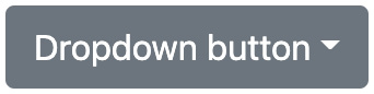
Figure 4.1 – Dropdown button with the caret option enabled (default)

Figure 4.2 – Dropdown button with the caret option disabled (changed)
To disable the caret option, use the following Sass code:
part-1/chapter-4/options/caret/scss/style.scss
$enable-caret: false;
@import "../../../../../bootstrap/scss/bootstrap.scss";
Rounded
Variable name: $enable-rounded
Default value: true
Defined: _variables.scss, line 338
This option enables predefined border-radius styles on various components.
Here you can see a few different examples of what enabling or disabling this option will look like:

Figure 4.3 – Button with the rounded option enabled (default)

Figure 4.4 – Button with the rounded option disabled (changed)
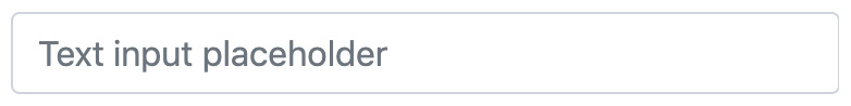
Figure 4.5 – Text input with the rounded option enabled (default)

Figure 4.6 – Text input with the rounded option disabled (changed)
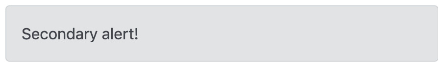
Figure 4.7 – Alert component with the rounded option enabled (default)

Figure 4.8 – Alert component with the rounded option disabled (changed)
To disable the rounded option, use the following Sass code:
part-1/chapter-4/options/rounded/scss/style.scss
$enable-rounded: false;
@import "../../../../../bootstrap/scss/bootstrap.scss";
Shadows
Variable name: $enable-shadows
Default value: false
Defined: _variables.scss, line 339
This option enables predefined decorative box-shadow styles on various components.
Here you can see a few different examples of what enabling or disabling this option will look like:

Figure 4.9 – Image thumbnail with the shadows option disabled (default)

Figure 4.10 – Image thumbnail with the shadows option enabled (changed)

Figure 4.11 – Select with the shadows option disabled (default)

Figure 4.12 – Select with the shadows option enabled (changed)

Figure 4.13 – Progress component with the shadows option disabled (default)

Figure 4.14 – Progress component with the shadows option enabled (changed)
To enable the shadows option, use the following Sass code:
part-1/chapter-4/options/shadows/scss/style.scss
$enable-shadows: true;
@import "../../../../../bootstrap/scss/bootstrap.scss";
Gradients
Variable name: $enable-gradients
Default value: false
Defined: _variables.scss, line 340
This option enables predefined gradients via background-image styles on various components. This visual effect is very subtle and might be hard to see. However, the following CSS will be used on most of the compatible components to create the gradient effect on top of the background color:
background-image: linear-gradient(180deg,
  rgba(255,255,255,0.15), rgba(255,255,255,0));
On the carousel component, the following CSS will be used instead:
.carousel-control-prev {
  background-image: linear-gradient(90deg,
    rgba(0,0,0,0.25), rgba(0,0,0,0.001));
}
.carousel-control-next {
  background-image: linear-gradient(270deg,
    rgba(0,0,0,0.25), rgba(0,0,0,0.001));
}
Here you can see a few different examples of what enabling or disabling this option will look like:

Figure 4.15 – Alert component with the gradients option disabled (default)

Figure 4.16 – Alert component with the gradients option enabled (changed)

Figure 4.17 – Button with the gradients option disabled (default)

Figure 4.18 – Button with the gradients option enabled (changed)

Figure 4.19 – Carousel component with the gradients option disabled (default)

Figure 4.20 – Carousel component with the gradients option enabled (changed)
To enable the gradients option, use the following Sass code:
part-1/chapter-4/options/gradients/scss/style.scss
$enable-gradients: true;
@import "../../../../../bootstrap/scss/bootstrap.scss";
Transitions
Variable name: $enable-transitions
Default value: true
Defined: _variables.scss, line 341
This option enables predefined transitions on various components.
No examples can be shown here in print, but the transitions are applied to accordions, carousels, modals, progress bars, floating labels, and more.
To disable the transitions option, use the following Sass code:
part-1/chapter-4/options/transitions/scss/style.scss
$enable-transitions: false;
@import "../../../../../bootstrap/scss/bootstrap.scss";
Reduced motion
Variable name: $enable-reduced-motion
Default value: true
Defined: _variables.scss, line 342
This option enables a prefers-reduced-motion media query, which will remove or change certain animations and transitions based on users’ preferences.
This option applies to the progress and spinner components, and to see the effect, you need to change some settings on your computer.
To disable the reduced motion option, use the following Sass code:
part-1/chapter-4/options/reduced-motion/scss/style.scss
$enable-reduced-motion: false;
@import "../../../../../bootstrap/scss/bootstrap.scss";
Smooth scroll
Variable name: $enable-smooth-scroll
Default value: true
Defined: _variables.scss, line 343
This option enables smooth scroll behavior globally, except for users who prefer reduced motion.
To disable the smooth scroll option, use the following Sass code:
part-1/chapter-4/options/smooth-scroll/scss/style.scss
$enable-smooth-scroll: false;
@import "../../../../../bootstrap/scss/bootstrap.scss";
Grid classes
Variable name: $enable-grid-classes
Default value: true
Defined: _variables.scss, line 344
This option enables the generation of CSS classes used for the grid system. This includes .row, .col, and other related classes.
To disable the grid classes option, use the following Sass code:
part-1/chapter-4/options/grid-classes/scss/style.scss
$enable-grid-classes: false;
@import "../../../../../bootstrap/scss/bootstrap.scss";
Container classes
Variable name: $enable-container-classes
Default value: true
Defined: _variables.scss, line 345
This option enables the generation of CSS classes used for layout containers. This includes .container, .container-fluid, and other related classes.
To disable the container classes option, use the following Sass code:
part-1/chapter-4/options/container-classes/scss/style.scss
$enable-container-classes: false;
@import "../../../../../bootstrap/scss/bootstrap.scss";
CSS grid
Variable name: $enable-cssgrid
Default value: false
Defined: _variables.scss, line 346
This option is used to enable a separate grid system that’s built on a CSS grid.
If you want to enable this, you should disable the default grid system using the grid classes option mentioned earlier.
To enable the CSS grid option, use the following Sass code:
part-1/chapter-4/options/css-grid/scss/style.scss
$enable-grid-classes: false;
$enable-cssgrid: true;
@import "../../../../../bootstrap/scss/bootstrap.scss";
Button pointers
Variable name: $enable-button-pointers
Default value: true
Defined: _variables.scss, line 347
This option adds a pointer cursor to non-disabled button elements and button components (with the .btn class).
Here you can see an example of what enabling or disabling this option will look like:

Figure 4.21 – Button with the button pointers option enabled (default)

Figure 4.22 – Button with the button pointers option disabled (changed)
To disable the button pointers option, use the following Sass code:
part-1/chapter-4/options/button-pointers/scss/style.scss
$enable-button-pointers: false;
@import "../../../../../bootstrap/scss/bootstrap.scss";
Responsive Font Sizes
Variable name: $enable-rfs
Default value: true
Defined: _variables.scss, line 348
This option enables RFS globally. You will learn more about RFS and how to use it in Chapter 10, Using Bootstrap 5 with Advanced Sass and CSS Features.
To disable the RFS option, use the following Sass code:
part-1/chapter-4/options/responsive-font-sizes/scss/style.scss
$enable-rfs: false;
@import "../../../../../bootstrap/scss/bootstrap.scss";
Validation icons
Variable name: $enable-validation-icons
Default value: true
Defined: _variables.scss line 349
This option enables background-image icons within textual inputs and some custom forms for validation states.
Here you can see an example of what enabling or disabling this option will look like:

Figure 4.23 – Valid text input with the validation icons option enabled (default)
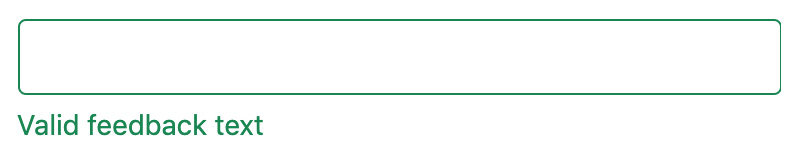
Figure 4.24 – Valid text input with the validation icons option disabled (changed)

Figure 4.25 – Invalid text input with the validation icons option enabled (default)

Figure 4.26 – Invalid text input with the validation icons option disabled (changed)
To disable the validation icons option, use the following Sass code:
part-1/chapter-4/options/validation-icons/scss/style.scss
$enable-validation-icons: false;
@import "../../../../../bootstrap/scss/bootstrap.scss";
Negative margins
Variable name: $enable-negative-margins
Default value: false
Defined: _variables.scss, line 350
This option enables the generation of negative margin utilities.
To enable the negative margins option, use the following Sass code:
part-1/chapter-4/options/negative-margins/scss/style.scss
$enable-negative-margins: true;
@import "../../../../../bootstrap/scss/bootstrap.scss";
Deprecation messages
Variable name: $enable-deprecation-messages
Default value: true
Defined: _variables.scss, line 351
This option enables Sass warning messages for deprecated mixins or functions. Currently, no mixins or functions have been deprecated, so you won’t encounter this warning message with this version of Bootstrap 5.
To disable the deprecation messages option, use the following Sass code:
part-1/chapter-4/options/deprecation-messages/scss/style.scss
$enable-deprecation-messages: false;
@import "../../../../../bootstrap/scss/bootstrap.scss";
The code example for this option has an HTML file without any content since this option will only show Sass warning messages for any future deprecated mixins or functions.
Important utilities
Variable name: $enable-important-utilities
Default value: true
Defined: _variables.scss, line 352
This option enables the !important suffix in utility classes. So, this option controls whether the value of the CSS declaration for utility classes will have !important added at the end and thus override all previous styling for an element.
Here’s an example that shows the difference:
// Important utilities enabled
.text-center {
  text-align: text-center !important;
}
// Important utilities disabled
.text-center {
  text-align: text-center;
}
To disable the important utilities option, use the following Sass code:
part-1/chapter-4/options/important-utilities/scss/style.scss
$enable-important-utilities: false;
@import "../../../../../bootstrap/scss/bootstrap.scss";
Spacer
Variable name: $spacer
Default value: 1rem
Defined: _variables.scss, line 374
This variable specifies the default spacer value used by many other component variables in the _variables.scss file (as well as a few other places). It’s also used to programmatically generate the spacer utilities.
Here you can see an example of what changing this variable to 2rem will look like:

Figure 4.27 – Alert component with spacer set to 1rem (default)

Figure 4.28 – Alert component with spacer set to 2rem (changed)

Figure 4.29 – Card component with spacer set to 1rem (default)
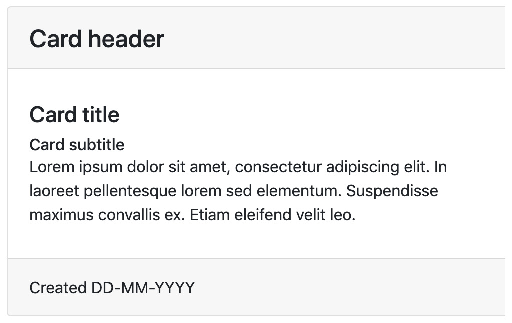
Figure 4.30 – Card component with spacer set to 2rem (changed)

Figure 4.31 – Spacing utilities with spacer set to 1rem (default)
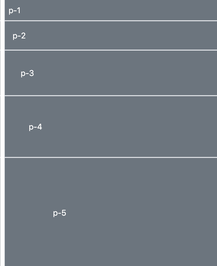
Figure 4.32 – Spacing utilities with spacer set to 2rem (changed)
To change the value of this variable to 2rem, use the following Sass code:
part-1/chapter-4/options/spacer/scss/style.scss
$spacer: 2rem;
@import "../../../../../bootstrap/scss/bootstrap.scss";
Now that we have learned all about how to change the global options of Bootstrap 5, we will move on to learn about customizing the colors.
Customizing the colors
Bootstrap 5 has an advanced color system that provides the correct styling for all elements. This color system is based on color variables, which can be customized in different ways to match your brand or design.
In this section, we’re going to cover the following topics:
- Overview of the color variables
- Generating color classes
- Adding color to theme colors
- Removing color from theme colors
Overview of the color variables
The first of many variables in the _variables.scss file are color variables. They can be found on lines 9-321.
The color system is ordered and grouped in the following way:
- Grays
- Regular colors
- Tints and shades of colors
- Theme colors
In each of these groups, the individual colors are first assigned to different variables, and these variables are then assigned to keys in a Sass map, grouping these related colors together. The Sass maps are used to easily loop over a list of colors. You can add, remove, or modify values in the Sass maps, which will be reflected in many of the components. We will see some examples of this later in this section.
But first, we will go through the different groups of colors listed previously and learn more about their color values, the variables, and the Sass maps.
Grays
First, we have nine tints and shades of gray, plus white and black. The line numbers, variable names, and default values are as follows:
bootstrap/scss/_variables.scss
 9 $white:    #fff !default;
10 $gray-100: #f8f9fa !default;
11 $gray-200: #e9ecef !default;
12 $gray-300: #dee2e6 !default;
13 $gray-400: #ced4da !default;
14 $gray-500: #adb5bd !default;
15 $gray-600: #6c757d !default;
16 $gray-700: #495057 !default;
17 $gray-800: #343a40 !default;
18 $gray-900: #212529 !default;
19 $black:    #000 !default;
These color values represent the following actual colors:

Figure 4.33 – Gray colors plus white and black
These variables (excluding $white and $black) are then grouped into the $grays Sass map:
bootstrap/scss/_variables.scss
24 $grays: (
25   "100": $gray-100,
26   "200": $gray-200,
27   "300": $gray-300,
28   "400": $gray-400,
29   "500": $gray-500,
30   "600": $gray-600,
31   "700": $gray-700,
32   "800": $gray-800,
33   "900": $gray-900
34 ) !default;
Regular colors
Then, we have 10 different regular colors. The line numbers, variable names, and default values are as follows:
bootstrap/scss/_variables.scss
39 $blue:    #0d6efd !default;
40 $indigo:  #6610f2 !default;
41 $purple:  #6f42c1 !default;
42 $pink:    #d63384 !default;
43 $red:     #dc3545 !default;
44 $orange:  #fd7e14 !default;
45 $yellow:  #ffc107 !default;
46 $green:   #198754 !default;
47 $teal:    #20c997 !default;
48 $cyan:    #0dcaf0 !default;
These color values represent the following actual colors:

Figure 4.34 – Regular colors
These 10 regular color variables plus $black, $white, $gray-600, and $gray-800 are then grouped into the $colors Sass map:
bootstrap/scss/_variables.scss
52 $colors: (
53   "blue":       $blue,
54   "indigo":     $indigo,
55   "purple":     $purple,
56   "pink":       $pink,
57   "red":        $red,
58   "orange":     $orange,
59   "yellow":     $yellow,
60   "green":      $green,
61   "teal":       $teal,
62   "cyan":       $cyan,
63   "black":      $black,
64   "white":      $white,
65   "gray":       $gray-600,
66   "gray-dark":  $gray-800
67 ) !default;
Tints and shades of colors
After the regular colors, we have a long list of individual color variables for all tints and shades of the regular colors, followed by a list of Sass maps that group all these together.
The individual tints and shades of a regular color are generated using custom color functions to either tint (lighten) or shade (darken) a color (see the next source code). These custom color functions that are built into Bootstrap 5 use the mix() color function of Sass to create the desired colors.
As an example, we will look at the tints and shades of the blue color. The line numbers, variable names, and default values are as follows:
bootstrap/scss/_variables.scss
79 $blue-100: tint-color($blue, 80%) !default;
80 $blue-200: tint-color($blue, 60%) !default;
81 $blue-300: tint-color($blue, 40%) !default;
82 $blue-400: tint-color($blue, 20%) !default;
83 $blue-500: $blue !default;
84 $blue-600: shade-color($blue, 20%) !default;
85 $blue-700: shade-color($blue, 40%) !default;
86 $blue-800: shade-color($blue, 60%) !default;
87 $blue-900: shade-color($blue, 80%) !default;
In the preceding code, you can see that the middle value, $blue-500, is assigned to the $blue color. The lighter values above that are then tinted, and the darker values below that are shaded using the custom color functions.
This list is followed by similar lists for the other colors (indigo, purple, pink, red, orange, yellow, green, teal, and cyan), and starting at line 179, we have the Sass maps for these colors. In case of the blue color, the Sass map looks like this:
bootstrap/scss/_variables.scss
179 $blues: (
180   "blue-100": $blue-100,
181   "blue-200": $blue-200,
182   "blue-300": $blue-300,
183   "blue-400": $blue-400,
184   "blue-500": $blue-500,
185   "blue-600": $blue-600,
186   "blue-700": $blue-700,
187   "blue-800": $blue-800,
188   "blue-900": $blue-900
189 ) !default;
Theme colors
Finally, we have selected colors from the groups of grays and regular colors, which are now assigned to eight different theme color variables. These are often also referred to as contextual colors. The line numbers, variable names, and default values are as follows:
bootstrap/scss/_variables.scss
301 $primary:       $blue !default;
302 $secondary:     $gray-600 !default;
303 $success:       $green !default;
304 $info:          $cyan !default;
305 $warning:       $yellow !default;
306 $danger:        $red !default;
307 $light:         $gray-100 !default;
308 $dark:          $gray-900 !default;
These color values represent the following actual colors:
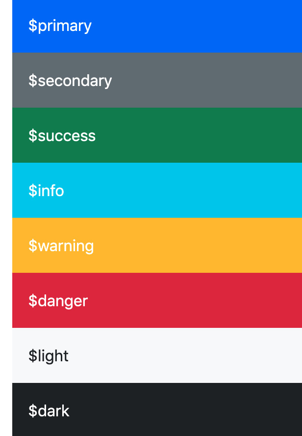
Figure 4.35 – Theme colors
These colors are then grouped into the $theme-colors Sass map:
bootstrap/scss/_variables.scss
312 $theme-colors: (
313   "primary":    $primary,
314   "secondary":  $secondary,
315   "success":    $success,
316   "info":       $info,
317   "warning":    $warning,
318   "danger":     $danger,
319   "light":      $light,
320   "dark":       $dark
321 ) !default;
Notice that the $theme-colors Sass map contains the specific theme color variables. Nothing more, nothing less. The $grays Sass map didn’t contain the $white and $black color variables, while the $colors Sass map did also include the $black, $white, $gray-600, and $gray-800 color variables. This is just to tell you that this difference exists.
We are now finished with the overview of all the available color variables and Sass maps. Let’s now see how we can use these for different purposes.
Generating color classes
If you need it, you can easily generate more color classes by using the @each rule built into Sass. You can then iterate over key/value pairs in a Sass map and define which class prefix to use.
Here’s the syntax for the @each rule iterating over a Sass map:
@each $key, $value in $map {
  .class-prefix-#{$key} {
    css-property: $value;
  }
}
As you can see, the key is assigned to the first variable name in the @each expression, and the value is assigned to the second. $key is then used together with a chosen class prefix, and $value is used to set the value of the CSS property.
We will now see how the @each rule can be used to generate different groups of color classes.
Custom Sass code placed after importing the required files
In most of the remaining code examples, our custom Sass code is placed after importing the required files (including the _variables.scss file) and before importing the optional Bootstrap files. This is necessary when we want to use an existing variable as a value for another variable, which is the case when we want to generate color classes based on existing color variables.
Grays
To generate background color classes from the $grays Sass map, you will need to use the following Sass code:
part-1/chapter-4/colors/grays/scss/style.scss
// Required
@import "../../../../../bootstrap/scss/functions";
@import "../../../../../bootstrap/scss/variables";
// Create background color classes from the "$grays" color map
@each $color, $value in $grays {
  .bg-gray-#{$color} {
    background-color: $value;
  }
}
// Required
@import "../../../../../bootstrap/scss/maps";
@import "../../../../../bootstrap/scss/mixins";
@import "../../../../../bootstrap/scss/root";
// Optional Bootstrap CSS
@import "../../../../../bootstrap/scss/reboot";
@import "../../../../../bootstrap/scss/type";
@import "../../../../../bootstrap/scss/images";
// The long list of imports have been reduced here.
// Helpers
@import "../../../../../bootstrap/scss/helpers";
// Utilities
@import "../../../../../bootstrap/scss/utilities";
// Utilities API
@import "../../../../../bootstrap/scss/utilities/api";
When you compile this, you will get the regular Bootstrap CSS as well as the following background color classes:
part-1/chapter-4/colors/grays/css/style.css
.bg-gray-100 { background-color: #f8f9fa; }
.bg-gray-200 { background-color: #e9ecef; }
.bg-gray-300 { background-color: #dee2e6; }
.bg-gray-400 { background-color: #ced4da; }
.bg-gray-500 { background-color: #adb5bd; }
.bg-gray-600 { background-color: #6c757d; }
.bg-gray-700 { background-color: #495057; }
.bg-gray-800 { background-color: #343a40; }
.bg-gray-900 { background-color: #212529; }
This code can be tested using the following HTML:
part-1/chapter-4/colors/grays/index.html
<div class="bg-gray-100">.bg-gray-100</div>
<div class="bg-gray-200">.bg-gray-200</div>
<div class="bg-gray-300">.bg-gray-300</div>
<div class="bg-gray-400">.bg-gray-400</div>
<div class="bg-gray-500">.bg-gray-500</div>
<div class="bg-gray-600">.bg-gray-600</div>
<div class="bg-gray-700">.bg-gray-700</div>
<div class="bg-gray-800">.bg-gray-800</div>
<div class="bg-gray-900">.bg-gray-900</div>
Regular colors
To generate background color classes from the $colors Sass map, you will need to use the following Sass code:
part-1/chapter-4/colors/regular-colors/scss/style.scss
// Required
@import "../../../../../bootstrap/scss/functions";
@import "../../../../../bootstrap/scss/variables";
// Create background color classes from the "$grays" color map
@each $color, $value in $colors {
  .bg-#{$color} {
    background-color: $value;
  }
}
// Required
@import "../../../../../bootstrap/scss/maps";
@import "../../../../../bootstrap/scss/mixins";
@import "../../../../../bootstrap/scss/root";
// Optional Bootstrap CSS
@import "../../../../../bootstrap/scss/reboot";
@import "../../../../../bootstrap/scss/type";
@import "../../../../../bootstrap/scss/images";
// The long list of imports have been reduced here.
// Helpers
@import "../../../../../bootstrap/scss/helpers";
// Utilities
@import "../../../../../bootstrap/scss/utilities";
// Utilities API
@import "../../../../../bootstrap/scss/utilities/api";
When you compile this, you will get the regular Bootstrap CSS as well as the following background color classes:
part-1/chapter-4/colors/regular-colors/css/style.css
.bg-blue { background-color: #0d6efd; }
.bg-indigo { background-color: #6610f2; }
.bg-purple { background-color: #6f42c1; }
.bg-pink { background-color: #d63384; }
.bg-red { background-color: #dc3545; }
.bg-orange { background-color: #fd7e14; }
.bg-yellow { background-color: #ffc107; }
.bg-green { background-color: #198754; }
.bg-teal { background-color: #20c997; }
.bg-cyan { background-color: #0dcaf0; }
.bg-dark { background-color: #000; }
.bg-white { background-color: #fff; }
.bg-gray { background-color: #6c757d; }
.bg-gray-dark { background-color: #343a40; }
This code can be tested using the following HTML:
part-1/chapter-4/colors/regular-colors/index.html
<div class="bg-blue">.bg-blue</div>
<div class="bg-indigo">.bg-indigo</div>
<div class="bg-purple">.bg-purple</div>
<div class="bg-pink">.bg-pink</div>
<div class="bg-red">.bg-red</div>
<div class="bg-orange">.bg-orange</div>
<div class="bg-yellow">.bg-yellow</div>
<div class="bg-green">.bg-green</div>
<div class="bg-teal">.bg-teal</div>
<div class="bg-cyan">.bg-cyan</div>
<div class="bg-dark">.bg-dark</div>
<div class="bg-white">.bg-white</div>
<div class="bg-gray">.bg-gray</div>
<div class="bg-gray-dark">.bg-gray-dark</div>
Tints and shades of blue
To generate background color classes from the $blues Sass map, you will need to use the following Sass code:
part-1/chapter-4/colors/tints-and-shades/scss/style.scss
// Required
@import "../../../../../bootstrap/scss/functions";
@import "../../../../../bootstrap/scss/variables";
// Create background color classes from the "$grays" color
// map
@each $color, $value in $blues {
  .bg-#{$color} {
    background-color: $value;
  }
}
// Required
@import "../../../../../bootstrap/scss/maps";
@import "../../../../../bootstrap/scss/mixins";
@import "../../../../../bootstrap/scss/root";
// Optional Bootstrap CSS
@import "../../../../../bootstrap/scss/reboot";
@import "../../../../../bootstrap/scss/type";
@import "../../../../../bootstrap/scss/images";
// The long list of imports have been reduced here.
// Helpers
@import "../../../../../bootstrap/scss/helpers";
// Utilities
@import "../../../../../bootstrap/scss/utilities";
// Utilities API
@import "../../../../../bootstrap/scss/utilities/api";
When you compile this, you will get the regular Bootstrap CSS as well as the following background color classes:
part-1/chapter-4/colors/tints-and-shades/css/style.css
.bg-blue-100 { background-color: #cfe2ff; }
.bg-blue-200 { background-color: #9ec5fe; }
.bg-blue-300 { background-color: #6ea8fe; }
.bg-blue-400 { background-color: #3d8bfd; }
.bg-blue-500 { background-color: #0d6efd; }
.bg-blue-600 { background-color: #0a58ca; }
.bg-blue-700 { background-color: #084298; }
.bg-blue-800 { background-color: #052c65; }
.bg-blue-900 { background-color: #031633; }
This code can be tested using the following HTML:
part-1/chapter-4/colors/tints-and-shades/index.html
<div class="bg-blue-100">.bg-blue-100</div>
<div class="bg-blue-200">.bg-blue-200</div>
<div class="bg-blue-300">.bg-blue-300</div>
<div class="bg-blue-400">.bg-blue-400</div>
<div class="bg-blue-500">.bg-blue-500</div>
<div class="bg-blue-600">.bg-blue-600</div>
<div class="bg-blue-700">.bg-blue-700</div>
<div class="bg-blue-800">.bg-blue-800</div>
<div class="bg-blue-900">.bg-blue-900</div>
Mixed colors
You can also create a new custom Sass map with mixed colors specified as color variables or other valid color values and generate color classes based on this using the following Sass code:
part-1/chapter-4/colors/mixed-colors/scss/style.scss
// Required
@import "../../../../../bootstrap/scss/functions";
@import "../../../../../bootstrap/scss/variables";
// Create a new "$mixed-colors" map
$mixed-colors: (
  "blue": $blue,
  "green": green,
  "red": #f00,
  "primary": $primary
);
// Create color classes from the "$mixed-colors" map
@each $color, $value in $mixed-colors {
  .bg-#{$color} {
    background-color: $value;
  }
}
// Required
@import "../../../../../bootstrap/scss/maps";
@import "../../../../../bootstrap/scss/mixins";
@import "../../../../../bootstrap/scss/root";
// Optional Bootstrap CSS
@import "../../../../../bootstrap/scss/reboot";
@import "../../../../../bootstrap/scss/type";
@import "../../../../../bootstrap/scss/images";
// The long list of imports have been reduced here.
// Helpers
@import "../../../../../bootstrap/scss/helpers";
// Utilities
@import "../../../../../bootstrap/scss/utilities";
// Utilities API
@import "../../../../../bootstrap/scss/utilities/api";
When you compile this, you will get the regular Bootstrap CSS as well as the following background color classes:
part-1/chapter-4/colors/mixed-colors/css/style.css
.bg-blue { background-color: #0d6efd; }
.bg-green { background-color: green; }
.bg-red { background-color: #f00; }
.bg-primary { background-color: #0d6efd; }
This code can be tested using the following HTML:
part-1/chapter-4/colors/mixed-colors/index.html
<div class="bg-blue">.bg-blue</div>
<div class="bg-green">.bg-green</div>
<div class="bg-red">.bg-red</div>
<div class="bg-primary">.bg-primary</div>
Adding color to theme colors
Bootstrap 5 has eight theme colors, which are used for component variations, helpers, utilities, and more. You can add more colors to the $theme-colors Sass map, which is used to generate these different variations. To do this, we will first create a new Sass map with new names for our keys and corresponding values (which can be existing color variables or any other valid color value):
// Create your own color map
$custom-colors: (
  "tertiary": $indigo,
  "quaternary": $purple,
  "quinary": $pink,
  "senary": $orange,
  "septenary": $teal
);
We will then merge this $custom-colors Sass map with the existing $theme-colors Sass map using the map-merge() function built into the sass:map module of Sass. We pass in the two maps that we want to merge as arguments, and the returned value will be stored in the $theme-colors variable. This will then overwrite the default $theme-colors variable, which contains the default theme colors, and as a result, increase our list of available theme colors. The code to merge these two maps is as follows:
// Merge "$theme-colors" map and "$custom-colors" map
$theme-colors: map-merge($theme-colors, $custom-colors);
The complete Sass code to use for this scenario is as follows:
part-1/chapter-4/colors/add-to-theme-colors/scss/style.scss
// Required
@import "../../../../../bootstrap/scss/functions";
@import "../../../../../bootstrap/scss/variables";
// Create your own color map
$custom-colors: (
  "tertiary": $indigo,
  "quaternary": $purple,
  "quinary": $pink,
  "senary": $orange,
  "septenary": $teal
);
// Merge "$theme-colors" map and "$custom-colors" map
$theme-colors: map-merge($theme-colors, $custom-colors);
// Required
@import "../../../../../bootstrap/scss/maps";
@import "../../../../../bootstrap/scss/mixins";
@import "../../../../../bootstrap/scss/root";
// Optional Bootstrap CSS
@import "../../../../../bootstrap/scss/reboot";
@import "../../../../../bootstrap/scss/type";
@import "../../../../../bootstrap/scss/images";
// The long list of imports have been reduced here.
// Helpers
@import "../../../../../bootstrap/scss/helpers";
// Utilities
@import "../../../../../bootstrap/scss/utilities";
// Utilities API
@import "../../../../../bootstrap/scss/utilities/api";
We will now see what all these theme colors look like and some examples of how the new theme colors will come into effect in various components and utilities:
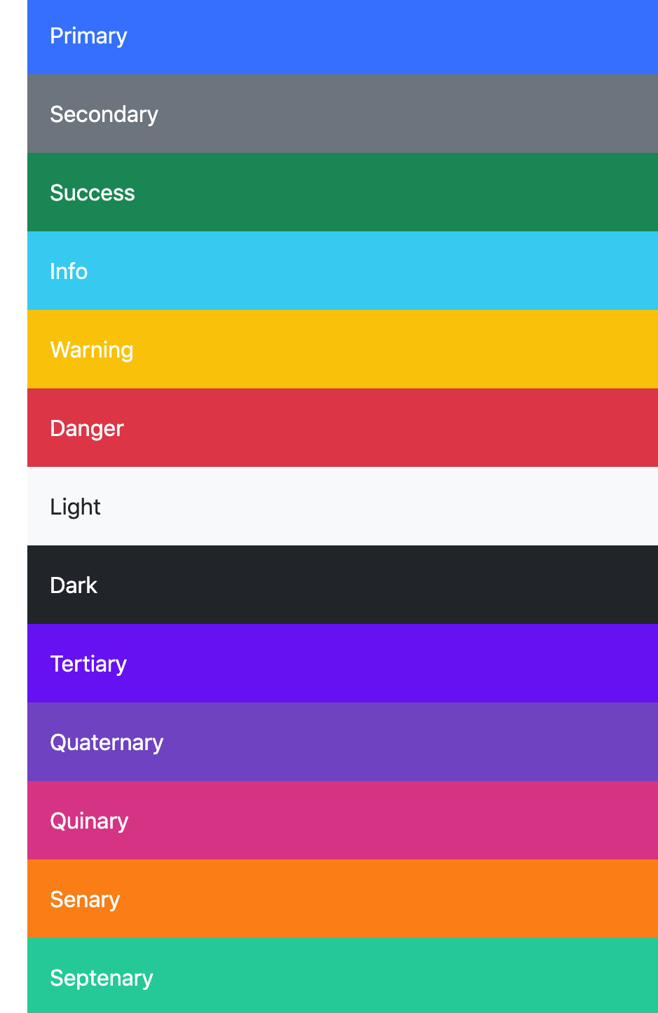
Figure 4.36 – All the colors displayed as background color utilities

Figure 4.37 – All the colors displayed as text color utilities

Figure 4.38 – An alert component with the new tertiary color

Figure 4.39 – A button component with the new quaternary color

Figure 4.40 – A list group component with the new quinary color
Figure 4.41 – A stretched link helper class with the new senary color

Figure 4.42 – A border utility class with the new septenary color
The full code for this example can be found in the part-1/chapter-4/colors/add-to-theme-colors folder.
Removing color from theme colors
To remove a color from the theme colors, we can use the map-remove() function built into the sass:map module of Sass. As arguments to this function, we pass in the map that we want to remove key/value pairs from, followed by the keys of those key/value pairs we want to remove. The returned value will be stored in the $theme-colors variable. This will then overwrite the default $theme-colors variable, which contains the default theme colors, and as a result, decrease our list of available theme colors.
The code to remove theme colors from the $theme-colors map is as follows:
part-1/chapter-4/colors/remove-from-theme-colors/scss/style.scss
// Required
@import "../../../../../bootstrap/scss/functions";
@import "../../../../../bootstrap/scss/variables";
// Remove from "$theme-colors" map
$theme-colors: map-remove($theme-colors, "info", "light",
                          "dark");
// Required
@import "../../../../../bootstrap/scss/maps";
@import "../../../../../bootstrap/scss/mixins";
@import "../../../../../bootstrap/scss/root";
// Optional Bootstrap CSS
@import "../../../../../bootstrap/scss/reboot";
@import "../../../../../bootstrap/scss/type";
@import "../../../../../bootstrap/scss/images";
// The long list of imports have been reduced here.
// Helpers
@import "../../../../../bootstrap/scss/helpers";
// Utilities
@import "../../../../../bootstrap/scss/utilities";
// Utilities API
@import "../../../../../bootstrap/scss/utilities/api";
After compiling this, we won’t be able to use the info, light, and dark colors for any component variations, helpers, or utilities.
The full code for this example can be found in the part-1/chapter-4/colors/remove-from-theme-colors folder.
Defining a custom color palette
To finish this section about colors in Bootstrap 5, we will learn how we can define a custom color palette. This is quite simple. First, we define our custom color values for the theme color variables that we want to change, then we import the Bootstrap 5 required files, and finally, we remove any unneeded theme color from the $theme-colors map. It’s important to do it in this order since we first want to define our own color values for the color variables, and then want to modify the $theme-colors map, which is located in the _variables.scss file.
In our example, we want to change the color values for the $primary, $success, $info, $warning, and $danger theme color variables and remove the $secondary theme color.
Required theme color keys
Some theme color keys are required and can’t be removed without causing errors, as they are being used by the Sass code of other components. This includes the primary, success, and danger keys. You can replace the values of those keys, but not remove the keys themselves. The secondary key is not required and can therefore be removed without causing any errors down the line.
Next, you will see the code needed to achieve this. Notice that we must specify our custom values for the theme color variables before importing the Bootstrap 5 required files:
part-1/chapter-4/colors/custom-color-palette/scss/style.scss
// Required
@import "../../../../../bootstrap/scss/functions";
// Define color palette
$primary:       #264653;
$success:       #2A9D8F;
$info:          #E9C46A;
$warning:       #F4A261;
$danger:        #E76F51;
// Required
@import "../../../../../bootstrap/scss/variables";
// Remove "secondary" from "$theme-colors" map
$theme-colors: map-remove($theme-colors, "secondary");
// Required
@import "../../../../../bootstrap/scss/maps";
@import "../../../../../bootstrap/scss/mixins";
@import "../../../../../bootstrap/scss/root";
// Optional Bootstrap CSS
@import "../../../../../bootstrap/scss/reboot";
@import "../../../../../bootstrap/scss/type";
@import "../../../../../bootstrap/scss/images";
// The long list of imports have been reduced here.
// Helpers
@import "../../../../../bootstrap/scss/helpers";
// Utilities
@import "../../../../../bootstrap/scss/utilities";
// Utilities API
@import "../../../../../bootstrap/scss/utilities/api";
After compiling this, Bootstrap 5 will now be using the following color palette:

Figure 4.43 – Our custom color palette displayed as background color utilities

Figure 4.44 – Our custom color palette displayed as text color utilities
The full code for this example can be found in the part-1/chapter-4/colors/custom-color-palette folder.
Summary
In this chapter, we have learned all about the global options of Bootstrap 5 and how to change them. We have also learned how to customize the colors of Bootstrap 5, including how to generate color classes and how to add and remove colors used as theme colors.
In the next chapter, we will learn how to customize various elements of Bootstrap 5.