Chapter 7: Creating the Website Using Default Bootstrap 5 Elements
In this chapter, we will first take a closer look at what kind of website we will create. Then, there’s a quick introduction to Bootstrap Icons, which is being used heavily throughout the website to make it more user-friendly and visually appealing. After that follows a description of the page setup, then a description with screenshots of a few global modules that are used across the website, and finally, a description with screenshots of each of the page types being used.
In this chapter, we’re going to cover the following main topics:
- About the website
- Bootstrap Icons
- Page setup
- The different global modules of the website
- The different page types of the website
Technical requirements
To preview the examples, you will need a code editor and a browser. There won’t be many code examples in this chapter, since the whole website has been created using only default Bootstrap 5 elements. However, the source code for the complete website can be found here:
https://github.com/PacktPublishing/The-Missing-Bootstrap-5-Guide.
About the website
The website is an online store with shopping-related pages for a product overview, product details, wishlist, shopping cart, and checkout flow, as well as more content-related pages for various information. It has a total of 12 pages with eight of them being unique in structure and layout, and the remaining four using the same structure and layout.
The website has been designed and developed using only default Bootstrap 5 elements and the content consists of placeholder text and images. Because of this, the website has a wireframe-like appearance. However, if you substitute all text and images, the website will look more real.
As you probably are aware, Bootstrap 5 only contains code for the frontend of a website. Because of this, all the advanced features of the website that require communication with a backend have not been implemented. This includes the search functionality, filters, sorting, form submission, and more. In Chapter 9, Improving the Website with Interactive Features Using JavaScript, we will extend the basic functionality with some custom JavaScript to make the website more interactive and user-friendly.
Sitemap
Here’s an overview of the pages making up the website and their mutual relationship. A description of all the pages follows later in this chapter:
- Home
- Shop => Product
- About
- Contact
- Wishlist
- Cart
- Frequently Asked Questions
- Shipping
- Returns
- Terms of Service
- Privacy Policy
As you can see, only the Shop and Product pages have a parent-child relationship. All the other pages exist at the top level.
Bootstrap Icons
Bootstrap Icons is a free, high-quality, open source library created by the Bootstrap team. It can be used with or without Bootstrap, and as SVGs, SVG sprites, or web fonts. The first alpha version of this library was released on November 26, 2019. The latest version, v1.8.3, was released on May 25, 2022, and it now contains more than 1,600 icons to choose from.
Bootstrap Icons can be visited at the following URL: https://icons.getbootstrap.com/.
From there, you can download and install it in different ways. I have chosen to use the web fonts implementation, which makes it very quick to add icons directly to your HTML code. To add an icon, you simply use the following code:
<i class="bi-[Icon name]"></i>
Here, [Icon name] refers to the name of an icon, for example, alarm, so it becomes the following:
<i class="bi-alarm"></i>
This will show the following icon on the page:

Figure 7.1 – Alarm icon
When using icons as a web font, the color and size can be set in the same way as for text, for example, using Bootstrap 5 utility classes.
In the next section, you can see how the Bootstrap Icons CSS file is linked up in the <head> tag of each page.
Page setup
The basic setup of most pages looks like the following code:
<!DOCTYPE html>
<html>
  <head>
    <meta charset="utf-8">
    <meta name="viewport" content="width=device-width,
      initial-scale=1">
    <title>[Page title]</title>
    <link rel="stylesheet" href="../../../
      bootstrap/dist/css/bootstrap.min.css">
    <link rel="stylesheet" href="../../../
      bootstrap-icons/font/bootstrap-icons.css">
  </head>
  <body>
    <header>[Header]</header>
    <div>[Page title]</div>
    <div class="container">
      <!-- Various sections -->
      <section></section>
      <section></section>
      <section></section>
    </div>
    <footer>[Footer]</footer>
    <script src="../../../bootstrap/dist/js/
      bootstrap.bundle.min.js"></script>
  </body>
</html>
This is a very basic implementation of Bootstrap 5. Inside the <head> tag, we first see the <meta> tag defining the character set, and then the responsive meta tag:
<meta name="viewport" content="width=device-width, initial-scale=1">
Then follows a page title in the <title> tag and links to the minified Bootstrap 5 CSS file, as well as the Bootstrap Icons CSS file.
Inside the <body> tag, we see the basic page structure for most pages with the header module first, then the page title module, various sections inside .container, and then the footer module. Finally, just before the closing </body> tag, we see a <script> tag, with src being the bundled and minified Bootstrap 5 JavaScript file.
Global modules
Before we go through all the different page types, we will see which global modules are used across more than one page type.
In the descriptions that follow, any Bootstrap 5 components being used are highlighted like this: Component name. The term module refers to a part of a page and has nothing to do with Bootstrap 5.
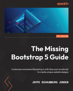
Header
This global module is used on all page types. It’s located at the top of each page and is being used for primary navigation. It’s been created using a Navbar component and will collapse with most of its content being hidden for breakpoints below lg.
Here are three screenshots of the module, as seen on a mobile, tablet, and desktop device:

Figure 7.2 – Header module with a closed menu on a mobile device
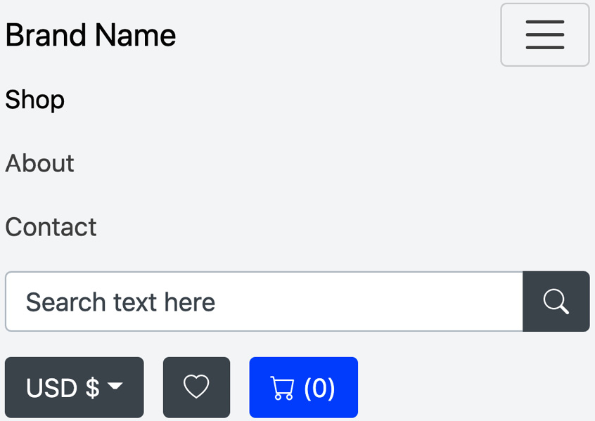
Figure 7.3 – Header module with a closed menu on a mobile device

Figure 7.4 – Header module on a tablet device
Figure 7.5 – Header module on a desktop device
The left side of the module contains two elements. First, the brand name with a link wrapped around it, and then the main menu with links to the most important pages. The active page will be highlighted in the menu.
The right side of the module contains three elements. First, a search field created as a simple form with an Input group component. It’s intended to be used as a global search for all the content and products of the website. Then, a currency selector to change the currency used by the shop. It’s created with a Dropdown component. Finally, a call-to-action section with two links styled as buttons for the wishlist and the cart, respectively.
Footer
This global module is used on all page types. It’s located at the bottom of each page and is mainly being used for secondary navigation. It has all the links from the header module as Quick links, as well as links for the various information pages, social media networks, and contact information. The module is using a four-column responsive grid, with all columns being stacked initially and then turned into a two-column grid for the sm breakpoint and a four-column grid for the lg breakpoint.
In the following figure, you will see three screenshots of the module as seen on mobile, tablet, and desktop devices:

Figure 7.6 – Footer module on a mobile device

Figure 7.7 – Footer module on a tablet device

Figure 7.8 – Footer module on a desktop device
The first three columns consist of a heading followed by an unstyled unordered list of links, and in the third column, the link text is prepended with an icon. The last column contains basic contact information inside an <address> element. At the very bottom of this module is a centered copyright notice.
Page title
This global module is used on all page types except for the Home page and Product page. It’s used right after the header module and is simply a display heading centered on a light gray background.
The only responsive behavior of this module is the responsive font size, which is a default feature of Bootstrap 5.
Here are three screenshots of the module as seen on mobile, tablet, and desktop devices:

Figure 7.9 – Page title module on a mobile device

Figure 7.10 – Page title module on a tablet device

Figure 7.11 – Page title module on a desktop device
We have now seen what the Page title global module looks like, and next up, we will take a look at the Product card global module.
Product card
This global module is being used inside a responsive grid system on the Home page, Shop page, Product page, and Wishlist page. It’s a Card component containing a product image, a Badge component for the tag, product name, brand name, description, stock status, pricing information, and call-to-action buttons.
The only responsive behavior of this module is the responsive font size, which is a default feature of Bootstrap 5.
Here is a screenshot of the module as seen on mobile devices:
Figure 7.12 – Product card module on a mobile device
On the Wishlist page, the Add to wishlist button is replaced by a Remove from wishlist button.
Page types
Here’s a description of all the different page types. There are nine different page types used to create the 12 different pages. Eight of them are being used once, and the last one, the Article page, is being used four times.
Home (index.html)
This is the home page for the online store. On this page, the user can see a hero section, learn about the benefits, explore the collections, view popular products, and sign up for the newsletter.
Here is a screenshot of the full page as seen on a desktop device:
.jpg)
.png)
Figure 7.13 – Home page on a desktop device
The overall code structure in the <body> tag for this page can be seen next. The different modules have been replaced with [Name of the module] and they will be further described afterward (except for Header and Footer, which were described in the previous section):
part-2/chapter-7/website/index.html
<body>
  [Header]
  [Hero]
  <div class="container">
    [Benefits]
    [Collections]
    [Popular products]
  </div>
  [Newsletter]
  [Footer]
  [Modal]
  <script src="../../../bootstrap/dist/js/
    bootstrap.bundle.min.js"></script>
</body>
Hero
This module is a short introduction to the online store, and it consists of an image, a display heading, a lead paragraph, and two call-to-action buttons. The elements in this layout stack initially and then turn into a two-column grid for the lg breakpoint and up.
Benefits
This module consists of an image, a heading, and a paragraph. The layout is created using a responsive nested grid where everything stacks initially. On the sm breakpoint, the inner grid changes to two columns, and on the lg breakpoint, the outer grid changes to two columns.
Collections
This module displays different collections using a Carousel component with a link, image, and caption for each slide.
Popular products
This module shows three products in a responsive three-column grid. Each product is created using the Product card module described in the previous section.
Newsletter
This module consists of a heading, a form in a three-column grid layout, and a link in the label for the checkbox that triggers a modal.
Modal
This module consists of a Modal component that is triggered from a link in the Newsletter module as described previously. The content of the modal is for information regarding the newsletter.
Shop (shop.html)
This is the Shop page for the online store. On this page, the user can see a sidebar with filters and the products listed in a responsive grid layout. Above this, we have a breadcrumb, a control for changing the sorting, and buttons for switching the layout of the products from a grid layout to a list layout. For this website, though, only the grid layout of the Shop page has been created. Below the products overview, we have pagination to navigate between the various pages containing the products.
On breakpoints smaller than lg, the filters are contained in an Offcanvas module triggered by a button above the breadcrumb.
Here is a screenshot of the full page as seen on a desktop device:
.jpg)
.jpg)
Figure 7.14 – Shop page on a desktop device
The overall code structure in the <body> tag for this page can be seen next. The different modules have been replaced with [Name of the module] and they will be further described afterward (except for Header and Footer, which were described in the previous section):
part-2/chapter-7/website/shop.html
<body>
  [Header]
  [Page title]
  <div class="container">
    [Offcanvas]
    [Sorting and layout]
    [Breadcrumb and search result]
    <div class="row">
      <div class="col-lg-4 col-xxl-3 d-none d-lg-block">
        <aside class="sticky-top pt-lg-3 pb-lg-5">
          [Filters]
        </aside>
      </div>
      <div class="col-lg-8 col-xxl-9 pt-lg-3 mb-5">
        [Products overview]
        [Pagination]
      </div>
    </div>
  </div>
  [Footer]
  <script src="../../../bootstrap/dist/js/
    bootstrap.bundle.min.js"></script>
</body>
Offcanvas
This module is created using the Offcanvas component and it contains the same filter options as found in the Filter module. It can be opened by a button in the Sorting and layout module. The button is hidden on the lg breakpoint and up.
Sorting and layout
This module is for sorting the product overview and changing the layout. It’s created using a <select> element for changing the sorting and a Button group component for switching the layout. The module also contains a button to open the Offcanvas module on breakpoints smaller than lg.
Breadcrumb and search result
This module has breadcrumb navigation to the left and search results to the right. The breadcrumb navigation is created using the Breadcrumb component.
Filters
This module contains various filter options for the product overview. All the filters are contained inside of a Card component, and the individual filters are created using various form elements, such as Switch, checkboxes, and Input groups.
Product overview
This module shows a responsive grid of products using the Product cart module. Initially, all columns are stacked and then turned into a two-column grid on the md breakpoint and a three-column grid on the xxl breakpoint.
Pagination
This module uses the Pagination component to let the user navigate between multiple pages of a search result.
Product (product.html)
This page shows a breadcrumb for shop navigation, a gallery, details and description of the product, as well as related products and reviews. No Bootstrap 5 components are used for this page, except for the Breadcrumb component and the Badge component. Instead, lots of utility classes are used together with various typography, form elements, image thumbnails, and blockquotes.
Here is a screenshot of the full page as seen on a desktop device:
.jpg)
.jpg)
Figure 7.15 – Product page on a desktop device
The overall code structure in the <body> tag for this page can be seen next. The different modules have been replaced with [Name of the module] and they will be further described afterward (except for Header and Footer, which were described in the previous section):
part-2/chapter-7/website/product.html
<body>
  [Header]
  <div class="container mt-3 mb-5">
    <section class="border-bottom border-2 border-light
      mb-4 pb-4">
      [Breadcrumb]
      <div class="row">
        <div class="col-lg-6">
          [Gallery]
        </div>
        <div class="col-lg-6">
          [Details and description]
        </div>
      </div>
    </section>
    [Related products]
    [Review]
  </div>
  [Footer]
  <script src="../../../bootstrap/dist/js/
    bootstrap.bundle.min.js"></script>
</body>
Breadcrumb
This module contains a breadcrumb navigation used to navigate the shop. It’s created with the Breadcrumb component.
Gallery
This module contains a large product image with caption structured using the <figure> element. Below that is a three-column grid with six image thumbnails.
Details and description
This module consists of various details about the product. It has the same content as in a Product card module, different kinds of form controls for selecting a color and a size, a long description, and two call-to-action buttons.
Related products
This module shows related products. It contains a heading followed by a three-column responsive grid with Product card modules inside the columns.
Reviews
This module shows three blocks of reviews with image, name, date, rating, and the review itself. The default Blockquote element of Bootstrap 5 has been enhanced by adding a Bootstrap Icons quote icon in the upper-left corner with the use of 11 utility classes (text, float, spacing, and border utilities).
About (about.html)
This page shows various information about the online store with text and images.
Here is a screenshot of the full page as seen on a desktop device:
.jpg)
.jpg)
Figure 7.16 – About page on a desktop device
The overall code structure in the <body> tag for this page can be seen next. The different modules have been replaced with [Name of the module] and they will be further described afterward (except for Header and Footer, which were described in the previous section):
part-2/chapter-7/website/about.html
<body>
  [Header]
  [Page title]
  <div class="container">
    [Story]
    [Office]
    [Brands]
  </div>
  [Footer]
  <script src="../../../bootstrap/dist/js/
    bootstrap.bundle.min.js"></script>
</body>
Story
This module contains a heading and three paragraphs about the story of the online store.
Office
This module contains a two-column responsive grid to show images of the office. Each column has <figure> wrapping around an image and a figure caption.
Brands
This module shows a responsive grid with brand logos of the products in the online store. Initially, the layout is a two-column grid, which turns into a three-column grid on the sm breakpoint and a six-column grid on the lg breakpoint.
Contact (contact.html)
This page shows an overview of the team, the location on a map, and a contact form.
Here is a screenshot of the full page as seen on a desktop device:
.jpg)
.jpg)
Figure 7.17 – Contact page on a desktop device
The overall code structure in the <body> tag for this page can be seen next. The different modules have been replaced with [Name of the module] and they will be further described afterward (except for Header and Footer, which were described in the previous section):
part-2/chapter-7/website/contact.html
<body>
  [Header]
  [Page title]
  <div class="container">
    [Team]
    [Location]
    [Contact form]
  </div>
  [Footer]
  <script src="../../../bootstrap/dist/js/
    bootstrap.bundle.min.js"></script>
</body>
Team
This module contains a heading, a paragraph, and a responsive grid presenting the team members with images, links to social media networks, names, and job titles. Initially, the layout is a two-column grid, which turns into a three-column grid on the md breakpoint and a six-column grid on the xl breakpoint.
Location
This module contains an embedded map from Google Maps in an <iframe> element. The ratio helper is used to maintain the aspect ratio of the map at 21 by 9.
Contact form
This module contains a heading and a contact form. The layout of the contact form is created using a responsive nested grid where everything stacks initially. On the md breakpoint, the inner grid changes to two columns, and on the xl breakpoint, the outer grid changes to two columns.
Wishlist (wishlist.html)
This page shows the products added to a user’s wishlist. In the sidebar to the left, the user can change the wishlist, create a new wishlist, or add all products to the cart at once. In the main area, there’s a responsive grid system with Product cards showing all the products on the current wishlist.
Here is a screenshot of the full page as seen on a desktop device:
.jpg)
.jpg)
Figure 7.18 – Wishlist page on a desktop device
The overall code structure in the <body> tag for this page can be seen next. The different modules have been replaced with [Name of the module] and they will be further described afterward (except for Header and Footer, which were described in the previous section):
part-2/chapter-7/website/wishlist.html
<body>
  [Header]
  [Page title]
  <div class="container">
    <div class="row">
      <div class="col-lg-4 col-xxl-3 mb-3 mb-lg-0">
        [Sidebar]
      </div>
      <div class="col-lg-8 col-xxl-9 pt-lg-3 mb-5">
        [Products overview]
      </div>
    </div>
  </div>
  [Footer]
  [Modal]
  <script src="../../../bootstrap/dist/js/
    bootstrap.bundle.min.js"></script>
</body>
Sidebar
The sidebar module is using the Card component to wrap around a List group component showing the user’s wishlists and a button to create a new wishlist. When clicking that button, a modal module (described shortly) will become visible. Below the card, there’s a primary button to add all products to the cart at once.
Products overview
This is a responsive grid system created with the use of the Product card module to show the products on the current wishlist. The user can add a product to the cart, but the Add to wishlist action has been replaced by a Remove from wishlist button.
Modal
A Modal component is triggered when the user clicks the button to create a new wishlist in the sidebar. This modal contains a modal title, a close button, a paragraph, and a simple form with an input group.
Cart (cart.html)
This page shows the cart initially, and the checkout flow hidden behind tab panes. Above the navigation tabs, there’s also a progress bar to show the current progress of the checkout flow.
The first tab pane shows the shopping cart, with a list of the products on the left side and a summary showing the total amount on the right side.
The second pane shows the shipping details, with a form for personal details, buttons to select the shipping method, and an info alert. On the right side, there’s an expanded summary with a product list and the total amount.
The third pane shows the payment options, with a form for credit card details and a PayPal option on the left side and the expanded summary with a product list and the total amount on the right side.
Here are three screenshots of the full page as seen on a desktop device, with the three tab panes shown one at a time:

Figure 7.19 – Cart page (tab 1 visible) on a desktop device

Figure 7.20 – Cart page (tab 2 visible) on a desktop device

Figure 7.21 – Cart page (tab 3 visible) on a desktop device
The overall code structure in the <body> tag for this page can be seen next. The different modules have been replaced with [Name of the module] and they will be further described afterward (except for Header and Footer, which were described in the previous section):
part-2/chapter-7/website/cart.html
<body>
  [Header]
  [Page title]
  <div class="container">
    [Progress bar]
    [Tab navigation]
    <div class="tab-content">
      <div id="cartTabs-pane-1" class="tab-pane fade show
        active" role="tabpanel" aria-labelledby=
        "cartTabs-1">
        <div class="row mb-5">
          <div class="col-xl-8 mb-5 mb-xl-0">
            [Shopping cart]
          </div>
          <div class="col-xl-4">
            [Summary]
          </div>
        </div>
      </div>
      <div id="cartTabs-pane-2" class="tab-pane fade"
        role="tabpanel" aria-labelledby="cartTabs-2">
        <div class="row mb-5">
          <div class="col-xl-8 mb-5 mb-xl-0">
            [Shipping details]
          </div>
          <div class="col-xl-4">
            [Summary]
          </div>
        </div>
      </div>
      <div id="cartTabs-pane-3" class="tab-pane fade"
        role="tabpanel" aria-labelledby="cartTabs-3">
        <div class="row mb-5">
          <div class="col-xl-8 mb-5 mb-xl-0">
            [Payment options]
          </div>
          <div class="col-xl-4">
            [Summary]
          </div>
        </div>
      </div>
    </div>
  </div>
  [Footer]
  <script src="../../../bootstrap/dist/js/
    bootstrap.bundle.min.js"></script>
</body>
Progress bar
This module shows the current progress of the checkout flow. It is created with the Progress component, and its current value (and width) is set to 0. When that is changed to a positive number from 1-100, the progress bar will become visible with the primary color and be striped and animated.
Tab navigation
This module shows the three steps of the checkout flow with a number and heading in each tab. The tabs can be used to change the visible pane. The module is created using the Nav component with the .nav-pills variation to change the navigation tabs from tabs to pills.
Shopping cart
This module is placed on the left side of the first tab pane and shows the shopping cart with a list of the products. The amount of each product can be changed with an Input group component and the product can also be removed from the cart. At the very bottom, the user can advance to the next tab or cancel.
Shipping details
This module is placed on the left side of the second pane and shows the shipping details. First, there’s a form for personal details laid out with a responsive grid system and then follows a Button group component with radio buttons to toggle between two different shipping methods. Below that, there’s an info alert about free shipping created with the Alert component. At the very bottom, the user can advance to the next tab or cancel.
Payment options
This module is placed on the left side of the third pane and shows the payment options. The user can, with the use of two radio buttons, choose between two payment options. First, there’s a form for credit card details laid out with a responsive grid system and below, a PayPal option. At the very bottom, the user can pay or cancel.
Summary
This module is used in all three panes. In the first pane, it only contains information about the total amount, and in the second and third pane, it also contains the list of products in the cart.
Frequently Asked Questions (faq.html)
This page shows three sections, each with a heading followed by an accordion with frequently asked questions and their answers.
Here is a screenshot of the full page as seen on a desktop device:

Figure 7.22 – Frequently Asked Questions page on a desktop device
The overall code structure in the <body> tag for this page can be seen next. The different modules have been replaced with [Name of the module] and they will be further described afterward (except for Header and Footer, which were described in the previous section):
part-2/chapter-7/website/faq.html
<body>
  [Header]
  [Page title]
  <div class="container">
    [Accordion]
    [Accordion]
    [Accordion]
  </div>
  [Footer]
  <script src="../../../bootstrap/dist/js/
    bootstrap.bundle.min.js"></script>
</body>
Accordion
This module consists of a heading and an Accordion component. Each accordion item contains a frequently asked question in the accordion header and the corresponding answer in the accordion body. Only one accordion item can be expanded at a time.
Article page (shipping.html, returns.html, terms-of-service.html, and privacy-policy.html)
This page shows general information presented as an article. It has a sticky sidebar with page navigation on the left side, and the main area with an article containing various typography elements, images, and a table.
Here is a screenshot of the full page as seen on a desktop device:
.jpg)
.jpg)
Figure 7.23 – Article page on a desktop device
The overall code structure in the <body> tag for this page can be seen next. The different modules have been replaced with [Name of the module] and they will be further described afterward (except for Header and Footer, which were described in the previous section):
part-2/chapter-7/website/shipping.html
part-2/chapter-7/website/returns.html
part-2/chapter-7/website/terms-of-service.html
part-2/chapter-7/website/privacy-policy.html
<body>
  [Header]
  [Page title]
  <div class="container">
    <div class="row">
      <div class="col-lg-3 mb-3 mb-lg-0">
        [Page navigation]
      </div>
      <div class="col-lg-9 pt-lg-3">
        [Article]
      </div>
    </div>
  </div>
  [Footer]
  <script src="../../../bootstrap/dist/js/
    bootstrap.bundle.min.js"></script>
</body>
Page navigation
The page navigation is created using a Card component with a List group component inside. It’s made sticky using a position helper. It also uses the Scrollspy component to highlight the section that’s currently being scrolled within.
Article
The article contains various typography elements: a lead paragraph, different headings, regular paragraphs, a link, an unordered list, an ordered list, images, and a table.
Summary
In this chapter, we first got a short introduction to the website project created for this book, including an overview of the sitemap. Then, we learned how Bootstrap Icons are used to make the website more user-friendly and visually appealing.
The rest of this chapter was dedicated to getting an overview of the different global modules and page types being used, including a description of all the different modules being used on each page and how they were created using only default Bootstrap 5 components. This was supplemented with screenshots of all pages as seen on a desktop device.
In the next chapter, we will customize the visual style of our website with Sass.