
Chapter 5: Customizing Various Bootstrap 5 Elements
In this chapter, we will learn how to customize the visual style of all the Bootstrap elements that use the Bootstrap 5 variables for styling. We will learn about changes to the layout and content that affects the whole design of your website as well as changes to specific elements that don’t have any global effect.
It’s useful to know both how to change the general layout and content of your website and how to customize specific elements when you want to change the details of your user interface.
In this chapter, we’re going to cover the following topics:
- Customizing the layout
- Customizing content
- Customizing forms
- Customizing components
- Customizing helpers
- Customizing utilities
Technical requirements
- To preview the examples, you will need a code editor and a browser.
- You will need a Sass compiler to compile the Sass files to CSS. Please see Chapter 2, Using and Compiling Sass, for different ways to do this.
You can find the code files of the chapter on GitHub at https://github.com/PacktPublishing/The-Missing-Bootstrap-5-Guide
Customizing the layout
Here, we will learn how to customize the breakpoints, containers, and grid system to create exactly the responsiveness and general layout that you want for all your content.
Breakpoints
The breakpoints define the minimum widths for when the layout will change and adapt to different screen sizes. These minimum widths are used in media queries.
The line numbers, variable name, and default values for the breakpoints are as follows:
bootstrap/scss/_variables.scss
431 $grid-breakpoints: (
432   xs: 0,
433   sm: 576px,
434   md: 768px,
435   lg: 992px,
436   xl: 1200px,
437   xxl: 1400px
438 ) !default;
We will now change the minimum widths for all screen sizes using the following Sass code:
part-1/chapter-5/layout/breakpoints/scss/style.scss
// Specify the breakpoint sizes
$grid-breakpoints: (
  xs: 0,
  sm: 300px,
  md: 600px,
  lg: 900px,
  xl: 1200px,
  xxl: 1500px
);
@import "../../../../../bootstrap/scss/bootstrap.scss";
We can now create a simple grid with the following HTML:
part-1/chapter-5/layout/breakpoints/index.html
<div class="row">
  <div class="col-12 col-sm-10 col-md-8 col-lg-6 col-xl-4
    col-xxl-2">
  <div class="bg-secondary text-white p-3">Column</div>
  </div>
</div>
To see the effect of the changed breakpoints, you should open the example in a browser and resize the window.
Containers
It’s possible to define the maximum widths of containers (.container) for different screen sizes in the same way as we saw it with breakpoint sizes. These maximum widths are also used in media queries.
The line numbers, variable name, and default values for the maximum widths of containers are as follows:
bootstrap/scss/_variables.scss
450 $container-max-widths: (
451   sm: 540px,
452   md: 720px,
453   lg: 960px,
454   xl: 1140px,
455   xxl: 1320px,
456 ) !default;
Notice that there’s no maximum width for the extra small breakpoint (xs).
We will now change the maximum widths of containers for all screen sizes using the following Sass code:
part-1/chapter-5/layout/containers/scss/style.scss
// Specify the container maximum widths
$container-max-widths: (
  sm: 300px,
  md: 500px,
  lg: 700px,
  xl: 900px,
  xxl: 1100px
);
@import "../../../../../bootstrap/scss/bootstrap.scss";
We can now create a simple container with the following HTML:
part-1/chapter-5/layout/containers/index.html
<div class="container">
  <div class="bg-secondary text-white p-3">Content</div>
</div>
To see the effect of the changed maximum widths of containers, you should open the example in a browser and resize the window.
Grids
The default number of columns in a grid is 12 and the default gutter width is 1.5rem. This can be changed if you want another number of columns in your grid or another gutter width.
The line numbers, variable name, and default values for the maximum widths of containers are as follows:
bootstrap/scss/_variables.scss
466 $grid-columns: 12 !default;
467 $grid-gutter-width: 1.5rem !default;
468 $grid-row-columns: 6 !default;
We will now change the number of columns in a grid and the default gutter width using the following Sass code:
part-1/chapter-5/layout/grids/scss/style.scss
// Specify the number of grid columns and the gutter width
$grid-columns: 16;
$grid-gutter-width: 1rem;
@import "../../../../../bootstrap/scss/bootstrap.scss";
We can now create a simple grid system with the following HTML:
index.html
<div class="row">
  <div class="col-16 col-md-8 col-lg-4">
    <div class="bg-secondary text-white p-3">Content</div>
  </div>
  <div class="col-16 col-md-8 col-lg-4">
    <div class="bg-secondary text-white p-3">Content</div>
  </div>
  <div class="col-8 col-lg-4">
    <div class="bg-secondary text-white p-3">Content</div>
  </div>
  <div class="col-8 col-lg-4">
    <div class="bg-secondary text-white p-3">Content</div>
  </div>
</div>
To see the effect of the changed number of columns and gutter width for grids, you should open the example in a browser.
We will now move on to learn how to customize the various content of our website.
Customizing content
The styling of content (typography, images, tables, and figures) can be customized using variables found in the _variables.scss file, on lines 543–651 and lines 1500–1513.
We will now see how we can customize different kinds of content.
Typography
There are a lot of variables used to define the overall typography of Bootstrap 5. In fact, there are more than 50 different variables. The variable names are self-explanatory in most cases, so let’s take a deep dive and see the full list. The line number, variable name, and default value for all of these elements of typography are as follows:
bootstrap/scss/_variables.scss
543 $font-family-sans-serif: system-ui, -apple-system,
    "Segoe UI", Roboto, "Helvetica Neue", Arial,
    "Noto Sans", "Liberation Sans", sans-serif,
    "Apple Color Emoji", "Segoe UI Emoji",
    "Segoe UI Symbol", "Noto Color Emoji" !default;
544 $font-family-monospace: SFMono-Regular, Menlo, Monaco,
    Consolas, "Liberation Mono", "Courier New", monospace
    !default;
545
546 $font-family-base: var(--#{$variable-prefix}
    font-sans-serif) !default;
547 $font-family-code: var(--#{$variable-prefix}
    font-monospace) !default;
548
549
550
551 $font-size-root: null !default;
552 $font-size-base: 1rem !default;
553 $font-size-sm: $font-size-base * .875 !default;
554 $font-size-lg: $font-size-base * 1.25 !default;
555
556 $font-weight-lighter: lighter !default;
557 $font-weight-light: 300 !default;
558 $font-weight-normal: 400 !default;
559 $font-weight-semibold: 600 !default;
560 $font-weight-bold: 700 !default;
561 $font-weight-bolder: bolder !default;
562
563 $font-weight-base: $font-weight-normal !default;
564
565 $line-height-base: 1.5 !default;
566 $line-height-sm: 1.25 !default;
567 $line-height-lg: 2 !default;
568
569 $h1-font-size: $font-size-base * 2.5 !default;
570 $h2-font-size: $font-size-base * 2 !default;
571 $h3-font-size: $font-size-base * 1.75 !default;
572 $h4-font-size: $font-size-base * 1.5 !default;
573 $h5-font-size: $font-size-base * 1.25 !default;
574 $h6-font-size: $font-size-base !default;
575
576
577
578 $font-sizes: (
579   1: $h1-font-size,
580   2: $h2-font-size,
581   3: $h3-font-size,
582   4: $h4-font-size,
583   5: $h5-font-size,
584   6: $h6-font-size
585 ) !default;
586
587
588
589 $headings-margin-bottom:      $spacer * .5 !default;
590 $headings-font-family:        null !default;
591 $headings-font-style:         null !default;
592 $headings-font-weight:        500 !default;
593 $headings-line-height:        1.2 !default;
594 $headings-color:              null !default;
595
596
597
598 $display-font-sizes: (
599   1: 5rem,
600   2: 4.5rem,
601   3: 4rem,
602   4: 3.5rem,
603   5: 3rem,
604   6: 2.5rem
605 ) !default;
606
607 $display-font-family: null !default;
608 $display-font-style:  null !default;
609 $display-font-weight: 300 !default;
610 $display-line-height: $headings-line-height !default;
611
612
613
614 $lead-font-size: $font-size-base * 1.25 !default;
615 $lead-font-weight: 300 !default;
616
617 $small-font-size: .875em !default;
618
619 $sub-sup-font-size: .75em !default;
620
621 $text-muted: $gray-600 !default;
622
623 $initialism-font-size: $small-font-size !default;
624
625 $blockquote-margin-y: $spacer !default;
626 $blockquote-font-size: $font-size-base * 1.25 !default;
627 $blockquote-footer-color: $gray-600 !default;
628 $blockquote-footer-font-size: $small-font-size !default;
629
630 $hr-margin-y: $spacer !default;
631 $hr-color: inherit !default;
632
633
634 $hr-bg-color: null !default;
635 $hr-height: $border-width !default;
636
637
638 $hr-border-color: null !default;
639 $hr-border-width: $border-width !default;
640 $hr-opacity: .25 !default;
641
642 $legend-margin-bottom: .5rem !default;
643 $legend-font-size: 1.5rem !default;
644 $legend-font-weight: null !default;
645
646 $dt-font-weight: $font-weight-bold !default;
647
648 $list-inline-padding: .5rem !default;
649
650 $mark-padding: .2em !default;
651 $mark-bg: $yellow-100 !default;
We will now see an example of how we can change some global styles for text color, background color, font family, font size, line height, and links, as well as more specific styles for regular headings, display headings, and lead paragraphs.
Here’s the HTML with these typographic elements:
part-1/chapter-5/content/typography/index.html
<h2 class="text-muted my-3">Headings</h2> <h1><h1> heading</h1> <h2><h2> heading</h2> <h3><h3> heading</h3> <h4><h4> heading</h4> <h5><h5> heading</h5> <h6><h6> heading</h6> <h2 class="text-muted my-3">Display headings</h2> <h1 class="display-1">Display heading 1</h1> <h1 class="display-2">Display heading 2</h1> <h1 class="display-3">Display heading 3</h1> <h1 class="display-4">Display heading 4</h1> <h1 class="display-5">Display heading 5</h1> <h1 class="display-6">Display heading 6</h1> <h2 class="text-muted my-3">Lead paragraph</h2> <p class="lead">Lorem ipsum dolor sit amet, consectetur adipiscing elit. In laoreet pellentesque lorem sed elementum. Suspendisse maximus convallis ex. <a href="#">Etiam eleifend velit leo</a>. </p> <h2 class="text-muted my-3">Paragraph</h2> <p>Lorem ipsum dolor sit amet, consectetur adipiscing elit. In laoreet pellentesque lorem sed elementum. Suspendisse maximus convallis ex. <a href="#">Etiam eleifend velit leo</a>. </p>
And this is what it looks like when using the default Bootstrap 5 styles:

Figure 5.1 – Typographic elements with default Bootstrap 5 styles
To change the global style for text color and background color, we will use two additional variables. The line number, variable name, and default value for these elements of typography are as follows:
bootstrap/scss/_variables.scss
401 $body-bg:                   $white !default;
402 $body-color:                $gray-900 !default;
And to change the font family from a system font to a custom one, we will be using Google Fonts. We will use the Roboto font and import it into our HTML file with just two lines of code. This code should be placed in the <head> tag just after our <link> tag for our Bootstrap 5 CSS file:
part-1/chapter-5/content/typography/index.html
<link rel="preconnect" href="https://fonts.gstatic.com">
<link href="https://fonts.googleapis.com/css2?family=Roboto:wght@300;400;700&display=swap" rel="stylesheet">
After updating our HTML file, we will now need to define several different variables for typography using the following Sass code:
part-1/chapter-5/content/typography/scss/style.scss
// Required
@import "../../../../../bootstrap/scss/functions";
@import "../../../../../bootstrap/scss/variables";
// Body styles
$body-bg: $gray-100;
$body-color: $gray-700;
// Basic typography styles
$font-family-base: 'Roboto', sans-serif;
$font-size-base: 1.5rem;
$line-height-base: 1.3;
$line-height-sm: 1;
// Link styles
$link-color: $info;
$link-decoration: none;
$link-hover-color: shift-color($link-color,
                               $link-shade-percentage);
$link-hover-decoration: underline;
// Heading styles
$h1-font-size: $font-size-base * 3.5;
$h2-font-size: $font-size-base * 3;
$h3-font-size: $font-size-base * 2.5;
$h4-font-size: $font-size-base * 2;
$h5-font-size: $font-size-base * 1.5;
$h6-font-size: $font-size-base;
$headings-font-weight: $font-weight-bold;
$headings-line-height: $line-height-sm;
$headings-margin-bottom: $spacer;
// Display styles
$display-font-sizes: (
  1: $h1-font-size * 1.5,
  2: $h2-font-size * 1.5,
  3: $h3-font-size * 1.5,
  4: $h4-font-size * 1.5,
  5: $h5-font-size * 1.5,
  6: $h6-font-size * 1.5
);
$display-font-weight: $font-weight-light;
$display-line-height: $headings-line-height;
// Lead styles
$lead-font-size: $font-size-base * 1.25;
$lead-font-weight: $font-weight-light;
// Required
@import "../../../../../bootstrap/scss/maps";
@import "../../../../../bootstrap/scss/mixins";
@import "../../../../../bootstrap/scss/root";

// Optional Bootstrap CSS
@import "../../../../../bootstrap/scss/reboot";
@import "../../../../../bootstrap/scss/type";
@import "../../../../../bootstrap/scss/images";
// The long list of imports have been reduced here.
// Helpers
@import "../../../../../bootstrap/scss/helpers";
// Utilities
@import "../../../../../bootstrap/scss/utilities";
// Utilities API
@import "../../../../../bootstrap/scss/utilities/api";
After compiling the Sass code, the typographic elements will now look like this:
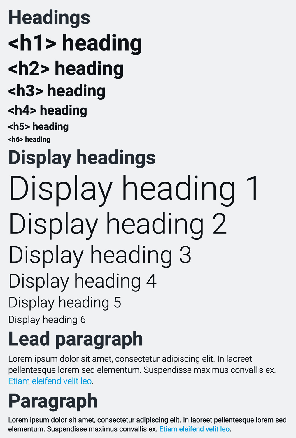
Figure 5.2 – Typographic elements after applying the customizations
Images
You can’t customize the look or behavior of images on their own. But you can customize the look of image thumbnails, which will add some styling around an image, but not change the image itself. Here’s what a default image thumbnail looks like:
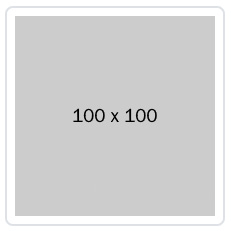
Figure 5.3 – Default image thumbnail
We will now change the padding, background color, border color, and border radius. The line number, variable name, and default value for these properties of an image thumbnail are as follows:
bootstrap/scss/_variables.scss
1500: $thumbnail-padding: .25rem;
1501: $thumbnail-bg: $body-bg;
1503: $thumbnail-border-color: $gray-300;
1504: $thumbnail-border-radius: $border-radius;
We will change these variables using the following Sass code:
part-1/chapter-5/content/images/scss/style.scss
// Required
@import "../../../../../bootstrap/scss/functions";
@import "../../../../../bootstrap/scss/variables";
// Specify variables
$thumbnail-padding: .5rem;
$thumbnail-bg: $gray-200;
$thumbnail-border-color: $gray-500;
$thumbnail-border-radius: 0;
// Required
@import "../../../../../bootstrap/scss/maps";
@import "../../../../../bootstrap/scss/mixins";
@import "../../../../../bootstrap/scss/root";
// Optional Bootstrap CSS
@import "../../../../../bootstrap/scss/reboot";
@import "../../../../../bootstrap/scss/type";
@import "../../../../../bootstrap/scss/images";
// The long list of imports have been reduced here.
// Helpers
@import "../../../../../bootstrap/scss/helpers";
// Utilities
@import "../../../../../bootstrap/scss/utilities";
// Utilities API
@import "../../../../../bootstrap/scss/utilities/api";
We can now create a simple image thumbnail with the following HTML:
part-1/chapter-5/content/images/index.html
<img src="img/100x100.png" alt="Image thumbnail"
  class="img-thumbnail">
After compiling the Sass code, the image thumbnail will now look like this:
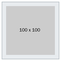
Figure 5.4 – Image thumbnail with padding, background color, border color, and border radius changed
Figures
Here’s what a default figure looks like:

Figure 5.5 – Default figure
We will now change the font size and color of the figure caption. The line number, variable name, and default value for these properties of a figure are as follows:
bootstrap/scss/_variables.scss
1512 $figure-caption-font-size: $small-font-size;
1513 $figure-caption-color: $gray-600;
We will change these variables using the following Sass code:
part-1/chapter-5/content/figures/scss/style.scss
// Required
@import "../../../../../bootstrap/scss/functions";
@import "../../../../../bootstrap/scss/variables";
// Specify variables
$figure-caption-font-size: $font-size-lg;
$figure-caption-color: $body-color;
// Required
@import "../../../../../bootstrap/scss/maps";
@import "../../../../../bootstrap/scss/mixins";
@import "../../../../../bootstrap/scss/root";
// Optional Bootstrap CSS
@import "../../../../../bootstrap/scss/reboot";
@import "../../../../../bootstrap/scss/type";
@import "../../../../../bootstrap/scss/images";
// The long list of imports have been reduced here.
// Helpers
@import "../../../../../bootstrap/scss/helpers";
// Utilities
@import "../../../../../bootstrap/scss/utilities";
// Utilities API
@import "../../../../../bootstrap/scss/utilities/api";
We can now create a simple figure with the following HTML:
part-1/chapter-5/content/figures/index.html
<figure class="figure">
  <img src="img/600x400.png" class="figure-img img-fluid"
    alt="Figure image">
  <figcaption class="figure-caption">
    Caption for the figure.</figcaption>
</figure>
After compiling the Sass code, a figure will now look like this:

Figure 5.6 – Figure with font size and color for the figure caption changed
Now that we have learned how to customize the various kinds of content, we will now move on to learn about how to customize forms.
Customizing forms
Form elements can be customized using the form variables found in the _variables.scss file on lines 796–1034 and lines 1313–1318. With these variables, you can change things such as form text, form labels, regular inputs, checkboxes and radio buttons, switches, input groups, select elements, range inputs, file inputs, floating labels, and form validation.
As an example, we will customize a range input.
Range
First, let’s see what a default range input looks like:

Figure 5.7 – Default range input
We will now change the track height, thumb width, and thumb border radius for the range input. The line number, variable name, and default value for these three properties of the range input are as follows:
bootstrap/scss/_variables.scss
972 $form-range-track-height: .5rem;
978 $form-range-thumb-width: 1rem;
982 $form-range-thumb-border-radius: 1rem;
We will make the range input twice as big by doubling these values. To do this, use the following Sass code:
part-1/chapter-5/forms/range/scss/style.scss
// Specify variables
$form-range-track-height: 1rem;
$form-range-thumb-width: 2rem;
$form-range-thumb-border-radius: 2rem;
@import "bootstrap/scss/bootstrap";
We can now create a simple range input with the following HTML:
part-1/chapter-5/forms/range/index.html
<input type="range" class="form-range">
After compiling the Sass code, the range input will now look like this:

Figure 5.8 – Range input with track height, thumb width, and thumb border radius changed
Now that we have seen an example of how to customize a form element, we will continue with how to customize components.
Customizing components
The various components of Bootstrap 5 can be customized using variables found in the _variables.scss file. The variables for each component are grouped together, but the groups are not in alphabetical order. I suggest that you simply search for the component name to find the group of related variables or refer to this list:
- Accordions: lines 1258 – 1288
- Alerts: lines 1439 – 1448
- Badges: lines 1379 – 1384
- Breadcrumbs: lines 1520 – 1530
- Buttons and button groups: lines 747 – 789
- Cards: lines 1236 – 1252
- Carousels: lines 1536 – 1566
- Close buttons: lines 1588 – 1599
- Collapse: no variables or CSS code for this component, only JavaScript
- Dropdowns: lines 1132 – 1179
- List groups: lines 1470 – 1493
- Modals: lines 1391 – 1430
- Navs and tabs: lines 1059 – 1078
- Navbars: lines 1085 – 1123
- Offcanvas: lines 1606 – 1618
- Pagination: lines 1186 – 1222
- Placeholders: lines 1229 – 1230
- Popovers: lines 1325 – 1351
- Progress: lines 1455 – 1463
- Scrollspy: no variables or CSS code for this component, only JavaScript
- Spinners: lines 1573 – 1581
- Toasts: lines 1358 – 1372
- Tooltips: lines 1294 – 1307
We will now see how we can customize some of these components.
Breadcrumbs
Here’s what a default breadcrumb component looks like:

Figure 5.9 – Default breadcrumb component
This component is composed with the help of 11 different variables. The line numbers, variable names, and default values for these are as follows:
bootstrap/scss/_variables.scss
1520 $breadcrumb-font-size: null !default;
1521 $breadcrumb-padding-y: 0 !default;
1522 $breadcrumb-padding-x: 0 !default;
1523 $breadcrumb-item-padding-x: .5rem !default;
1524 $breadcrumb-margin-bottom: 1rem !default;
1525 $breadcrumb-bg: null !default;
1526 $breadcrumb-divider-color: $gray-600 !default;
1527 $breadcrumb-active-color: $gray-600 !default;
1528 $breadcrumb-divider: quote("/") !default;
1529 $breadcrumb-divider-flipped:
         $breadcrumb-divider !default;
1530 $breadcrumb-border-radius: null !default;
We will now change the symbol used for the breadcrumb divider from a slash symbol (/) to a greater-than symbol (>). We will change the breadcrumb divider symbol by using the following Sass code:
part-1/chapter-5/components/breadcrumbs/scss/style.scss
// Specify variables
$breadcrumb-divider: quote(">");
@import "../../../../../bootstrap/scss/bootstrap.scss";
We can now create a breadcrumb component with the following HTML:
part-1/chapter-5/components/breadcrumbs/index.html
<nav aria-label="Breadcrumb">
  <ol class="breadcrumb">
    <li class="breadcrumb-item"><a href="#">Home</a></li>
    <li class="breadcrumb-item"><a href="#">Sports</a></li>
    <li class="breadcrumb-item"><a href="#">Ball games</a>
    </li>
    <li class="breadcrumb-item active"
      aria-current="page">Baseball</li>
  </ol>
</nav>
After compiling the Sass code, the breadcrumb component will now look like this:

Figure 5.10 – Breadcrumb component with the divider symbol changed
Cards
Here’s what a grid of card components looks like:
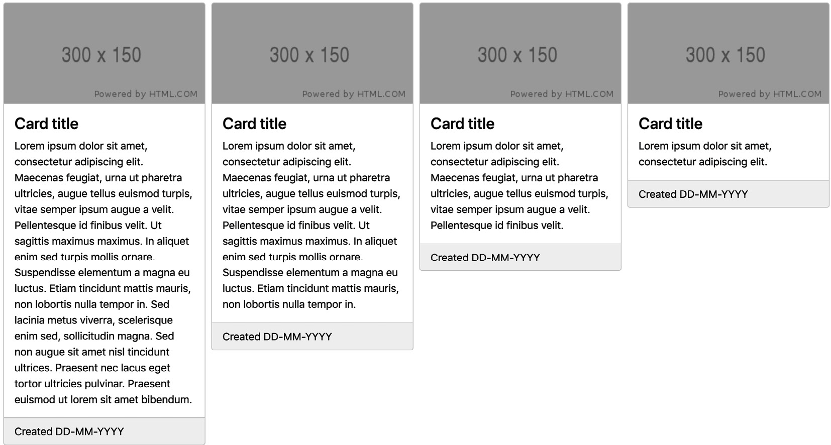
Figure 5.11 – Default grid of card components
The card component is composed with the help of 17 different variables. The line numbers, variable names, and default values for these are as follows:
bootstrap/scss/_variables.scss
1236 $card-spacer-y: $spacer !default;
1237 $card-spacer-x: $spacer !default;
1238 $card-title-spacer-y: $spacer * .5 !default;
1239 $card-border-width: $border-width !default;
1240 $card-border-color: rgba($black, .125) !default;
1241 $card-border-radius: $border-radius !default;
1242 $card-box-shadow: null !default;
1243 $card-inner-border-radius: subtract(
         $card-border-radius, $card-border-width) !default;
1244 $card-cap-padding-y: $card-spacer-y * .5 !default;
1245 $card-cap-padding-x: $card-spacer-x !default;
1246 $card-cap-bg: rgba($black, .03) !default;
1247 $card-cap-color: null !default;
1248 $card-height: null !default;
1249 $card-color: null !default;
1250 $card-bg: $white !default;
1251 $card-img-overlay-padding: $spacer !default;
1252 $card-group-margin: $grid-gutter-width * .5 !default;
As a default, a card will have its height based on the content inside of it. We can change the card height so the cards in a grid will have equal height by default by using the following Sass code:
part-1/chapter-5/components/cards/scss/style.scss
$card-height: 100%;
@import "../../../../../bootstrap/scss/bootstrap.scss";
We can now create a grid of card components with the following HTML:
part-1/chapter-5/components/cards/index.html
<div class="row row-cols-1 row-cols-md-2 row-cols-xl-3
  row-cols-xxl-4 g-4 mb-4">
  <div class="col">
    <div class="card">
      <img class="card-img-top" src="img/300x150.png"
        alt="Card image">
      <div class="card-body">
        <h4 class="card-title">Card title</h4>
        <p class="card-text">Lorem ipsum dolor sit amet,
          consectetur adipiscing elit. Maecenas feugiat,
          urna ut pharetra ultricies, augue tellus euismod
          turpis, vitae semper ipsum augue a velit.
          Pellentesque id finibus velit. Ut sagittis
          maximus maximus. In aliquet enim sed turpis
          mollis ornare. Suspendisse elementum a magna eu
          luctus. Etiam tincidunt mattis mauris, non
          lobortis nulla tempor in. Sed lacinia metus
          viverra, scelerisque enim sed, sollicitudin
          magna. Sed non augue sit amet nisl tincidunt
          ultrices. Praesent nec lacus eget tortor
          ultricies pulvinar. Praesent euismod ut lorem sit
          amet bibendum.</p>
      </div>
      <div class="card-footer">Created DD-MM-YYYY</div>
    </div>
  </div>
  <!-- Three more card components with different text
    content placed here -->
</div>
After compiling the Sass code, a grid of card components will now look like this:

Figure 5.12 – A grid of card components with the card height changed
We have now seen how we can customize components, and next up is a section on how to customize helpers.
Customizing helpers
The only helper that can be customized through the use of variables found in the _variables.scss file is the ratio helper. It has a Sass map with default values that can be modified as you like. Some of the other helpers use theme colors, variables from other elements, or only have non-visual aspects to customize. That’s why we’re focusing on the ratio helper here.
In this example, we will add more aspect ratios to the map mentioned before, which will then be available to us as additional helper classes. The line numbers, variable name, and default values for the aspect ratios map are as follows:
bootstrap/scss/_variables.scss
528 $aspect-ratios: (
529  "1x1": 100%,
530  "4x3": calc(3 / 4 * 100%),
531  "16x9": calc(9 / 16 * 100%),
532  "21x9": calc(9 / 21 * 100%)
533 ) !default;
We will now first create our own Sass ratio map with these new values and then merge it with the existing $aspect-ratios map. You will learn more about working with Sass maps in the next chapter.
To make these changes, we will need to write the following Sass code:
part-1/chapter-5/helpers/ratio/scss/style.scss
// Required
@import "../../../../../bootstrap/scss/functions";
@import "../../../../../bootstrap/scss/variables";
// Create your own ratio map
$custom-ratios: (
  "1x2": calc(1 / 2 * 100%),
  "2x3": calc(2 / 3 * 100%),
  "3x4": calc(3 / 4 * 100%),
  "4x5": calc(4 / 5 * 100%)
);
// Merge with "$aspect-ratios" map
$aspect-ratios: map-merge($aspect-ratios, $custom-ratios);
// Required
@import "../../../../../bootstrap/scss/maps";
@import "../../../../../bootstrap/scss/mixins";
@import "../../../../../bootstrap/scss/root";
// Optional Bootstrap CSS
@import "../../../../../bootstrap/scss/reboot";
@import "../../../../../bootstrap/scss/type";
@import "../../../../../bootstrap/scss/images";
// The long list of imports have been reduced here.
// Helpers
@import "../../../../../bootstrap/scss/helpers";
// Utilities
@import "../../../../../bootstrap/scss/utilities";
// Utilities API
@import "../../../../../bootstrap/scss/utilities/api";
We can now create a simple example with four <div> elements with these new different aspect ratios using the following HTML:
part-1/chapter-5/helpers/ratio/index.html
<div class="d-flex align-items-start">
  <div class="ratio ratio-1x1">
    <p class="d-flex justify-content-center
      align-items-center border">1x1</p>
  </div>
  <div class="ratio ratio-4x3">
    <p class="d-flex justify-content-center
      align-items-center border">4x3</p>
  </div>
  <div class="ratio ratio-16x9">
    <p class="d-flex justify-content-center
      align-items-center border">16x9</p>
  </div>
  <div class="ratio ratio-21x9">
    <p class="d-flex justify-content-center
      align-items-center border">21x9</p>
  </div>
</div>
After compiling the Sass code, we now have the aspect ratios 1x2, 2x3, 3x4, and 4x5 available to use as specific helper classes. These new aspect ratios look like this:

Figure 5.13 – New aspect ratio values for the ratio helper class
We have now seen how we can customize the ratio helper, and in this final section of the chapter, we will see how we can customize utilities.
Customizing utilities
All of the utilities are generated using the utility API and most are declared in the _utilities.scss file, except for the background, borders, colors, position, shadows, and spacing utilities, which have variables and maps defined in the _variables.scss file. We have already learned how to customize text colors and background colors in the previous chapter, and you can learn about the utility API in the next chapter.
Now, we will take a look at some of those utilities that are generated using values from the _variables.scss file.
Borders
The border utilities are generated from variables found in the _variables.scss file on lines 480–500. We will see how we can change the values used to generate the utilities for border width.
The values for border widths are stored in a Sass map, and the line numbers, variable name, and default values are as follows:
bootstrap/scss/_variables.scss
481 $border-widths: (
482   1: 1px,
483   2: 2px,
484   3: 3px,
485   4: 4px,
486   5: 5px
487 ) !default;
The default border width utilities look like this:
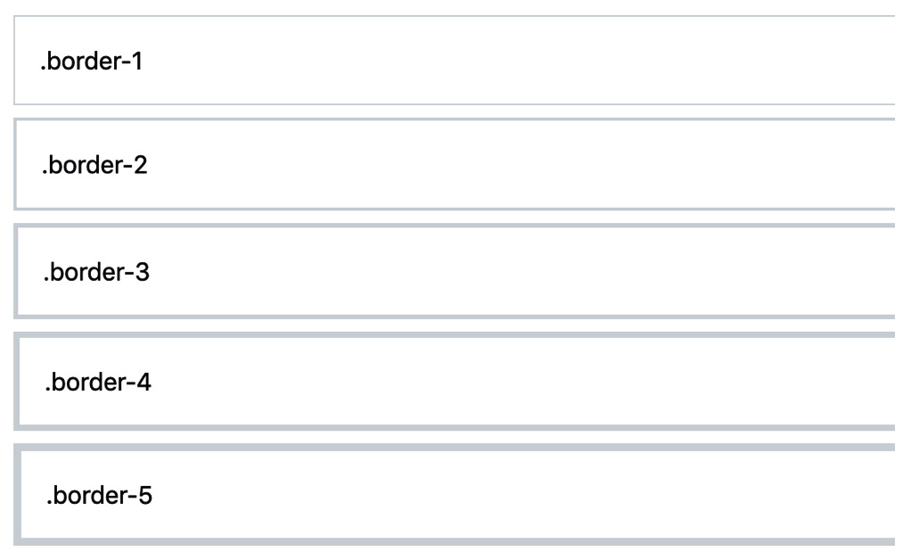
Figure 5.14 – The default sizes for the border width utilities
We will now double the size of the five border width utilities. To change the values for the border width utilities, we will specify the $border-widths Sass map ourselves and thus overwrite the default $border-widths Sass map and its values. To achieve this, we need to write the following Sass code:
part-1/chapter-5/utilities/borders/scss/style.scss
// Required
@import "../../../../../bootstrap/scss/functions";
@import "../../../../../bootstrap/scss/variables";
// Specify widths for border utility
$border-widths: (
  1: 2px,
  2: 4px,
  3: 6px,
  4: 8px,
  5: 10px
);
// Required
@import "../../../../../bootstrap/scss/maps";
@import "../../../../../bootstrap/scss/mixins";
@import "../../../../../bootstrap/scss/root";
// Optional Bootstrap CSS
@import "../../../../../bootstrap/scss/reboot";
@import "../../../../../bootstrap/scss/type";
@import "../../../../../bootstrap/scss/images";
// The long list of imports have been reduced here.
// Helpers
@import "../../../../../bootstrap/scss/helpers";
// Utilities
@import "../../../../../bootstrap/scss/utilities";
// Utilities API
@import "../../../../../bootstrap/scss/utilities/api";
We can now create a simple example with five <div> elements with these new thicker border widths using the following HTML:
part-1/chapter-5/utilities/borders/index.html
<div class="border border-1 mb-2">.border-1</div>
<div class="border border-2 mb-2">.border-2</div>
<div class="border border-3 mb-2">.border-3</div>
<div class="border border-4 mb-2">.border-4</div>
<div class="border border-5">.border-5</div>
After compiling the Sass code, we now have the new border widths available to use as specific border width utility classes. The new border width utilities look like this:
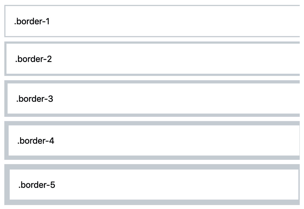
Figure 5.15 – The new sizes for the border width utilities
Spacing
The spacing utilities are generated from a single variable found in the _variables.scss file. The variable is storing a Sass map, and the values of that map are based on the global $spacer variable. We will see how we can change the values in that Sass map, while still using the $spacer variable.
The line numbers, variable name, and default values are as follows:
bootstrap/scss/_variables.scss
375 $spacers: (
376   0: 0,
377   1: $spacer * .25,
378   2: $spacer * .5,
379   3: $spacer,
380   4: $spacer * 1.5,
381   5: $spacer * 3,
382 ) !default;
The default spacing utilities for padding look like this:
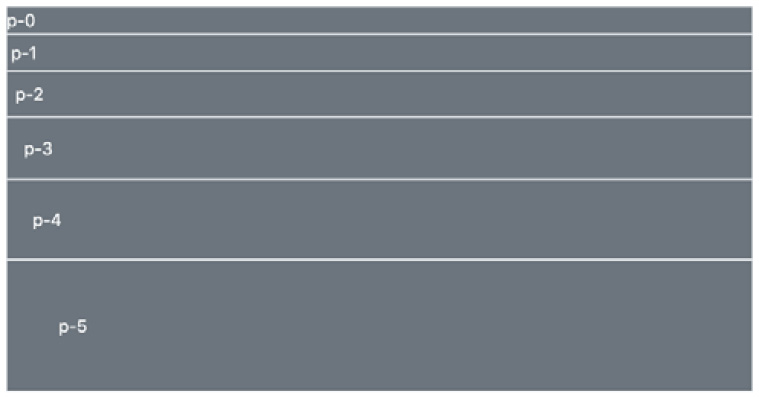
Figure 5.16 – The default spacing utilities for padding
We will now change the default spacing values and add two more. The new ones will get a letter as their class name suffix instead of a number: q for a quarter of the $spacer value and h for half of the $spacer value. To achieve this, we will specify the $spacers Sass map ourselves and thus overwrite the default $spacers Sass map and its values. We need to write the following Sass code:
part-1/chapter-5/utilities/spacing/scss/style.scss
// Required
@import "../../../../../bootstrap/scss/functions";
@import "../../../../../bootstrap/scss/variables";
// Specify spacer sizes
$spacers: (
  0: 0,
  q: $spacer / 4,
  h: $spacer / 2,
  1: $spacer,
  2: $spacer * 2,
  3: $spacer * 3,
  4: $spacer * 4,
  5: $spacer * 5
);
// Required
@import "../../../../../bootstrap/scss/maps";
@import "../../../../../bootstrap/scss/mixins";
@import "../../../../../bootstrap/scss/root";
// Optional Bootstrap CSS
@import "../../../../../bootstrap/scss/reboot";
@import "../../../../../bootstrap/scss/type";
@import "../../../../../bootstrap/scss/images";
// The long list of imports have been reduced here.
// Helpers
@import "../../../../../bootstrap/scss/helpers";
// Utilities
@import "../../../../../bootstrap/scss/utilities";
// Utilities API
@import "../../../../../bootstrap/scss/utilities/api";
After compiling the Sass, we now have the new spacing utilities available to use as specific spacing utility classes. We can then create a simple example with eight <div> elements with various padding utilities representing these updated spacing values using the following HTML:
part-1/chapter-5/utilities/spacing/index.html
<div class="bg-secondary text-white p-0">p-0</div>
<div class="bg-secondary text-white p-q">p-q - "quarter"
  (1/4) of p-1</div>
<div class="bg-secondary text-white p-h">p-h - "half" (1/2)
  of p-1</div>
<div class="bg-secondary text-white p-1">p-1</div>
<div class="bg-secondary text-white p-2">p-2</div>
<div class="bg-secondary text-white p-3">p-3</div>
<div class="bg-secondary text-white p-4">p-4</div>
<div class="bg-secondary text-white p-5">p-5</div>
The new spacing utilities for padding look like this:
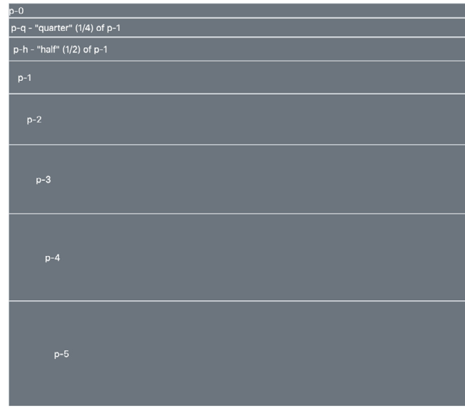
Figure 5.17 – The changed spacing utilities for padding
Summary
In this chapter, we have learned how to customize the various elements of Bootstrap 5, including the layout, content, forms, components, helpers, and utilities. In the next chapter, we will learn all about the utility API.