
Chapter 1: Why and How to Customize Bootstrap
Bootstrap is an open source, frontend framework used to quickly design, develop, and customize responsive, mobile-first websites. It has a flexible grid system, a great variety of prebuilt accessible and interactive components, and many useful helpers and utilities.
Bootstrap comes with predefined CSS styles for all its components. These styles cover everything from typography and colors to sizes and spacing, as well as breakpoints, options for the grid system, and more. Bootstrap 5 can be used with the default styles out of the box, but it is also possible to customize this in different ways.
In this chapter, you will learn when you would want to customize Bootstrap, what can be customized (and what the most important parts to customize are), and how it is done. Learning about this is important before you start customizing Bootstrap without any prior knowledge, since you will be better prepared to customize the right elements and pick the right method for customization.
In this chapter, we’re going to cover the following main topics:
- When we should customize Bootstrap
- What elements can be customized?
- How we can customize Bootstrap 5
- Examples of a component customized with three different methods
- Examples of user interfaces with a customized version of Bootstrap 5
Bootstrap Versions
This book is written with the latest version of Bootstrap in mind: v5.2.0, generally referred to as Bootstrap 5 throughout the book. Some of the features and techniques described in this book might also work with Bootstrap 4 but probably not Bootstrap 3.
Technical requirements
- A code editor and browser to preview the examples
You can find the code files of the chapter on GitHub at https://github.com/PacktPublishing/The-Missing-Bootstrap-5-Guide
When we should customize Bootstrap
When Bootstrap is used with a precompiled style sheet, it has all the default colors, typography, spacing, and more that people associate with Bootstrap. When using these styles for your own project, it will inevitably look like Bootstrap unless you change these styles. This might not be a problem if you are creating a personal project or one for internal use. But if you have specific brand guidelines that your customers or users recognize you by, you will likely need to change these styles to match the style of your brand. Since Bootstrap is so immensely popular and widespread across the internet, some people might recognize the default Bootstrap styles unless you change them. That might have a bad impact on user experience, so for professional use cases, it is highly recommended to customize the default Bootstrap styles.
What elements can be customized?
Bootstrap 5 is easily customizable in many ways. You can customize various options for typography, color, spacing, sizing, border radius, box shadow, and more across all components, as well as customize all the different components individually. You can also customize the helpers and utilities in many different ways. The most important elements to customize are, without doubt, the color palette and typography so that they will match that of your brand. The other aspects can then be further customized to align with your current brand guidelines or just to differentiate your user interface from all the websites that make use of the default Bootstrap styles.
JavaScript Behavior Can Be Customized Too
You generally want to customize the styles of Bootstrap, as described previously; however, the behavior of JavaScript-enabled components can also be changed from the default values. While this is not that important for the perception of your brand, it might be something to consider changing as well.
How we can customize Bootstrap 5
Bootstrap 5 can be customized using three different methods:
- Editing the compiled Bootstrap CSS directly
- Overwriting the Bootstrap CSS with your own custom styles
- Customizing the default styles using Sass
We will now see a short description of each of these methods.
What Is Sass?
Syntactically Awesome Style Sheets (Sass) is a preprocessor scripting language that is interpreted and compiled into Cascading Style Sheets (CSS). Sass extends the default capabilities of CSS with variables, nesting, partials, functions, and more. We will learn more about Sass in Chapter 2, Using and Compiling Sass.
Method 1 – editing the compiled Bootstrap CSS directly
It is possible to simply edit the compiled Bootstrap CSS directly to achieve the styles you want. This can be rather complex, depending on what you want to change, but most importantly, this will make it hard to update Bootstrap, since you will need to make all your changes again if you want to update to a newer version of it. This approach is not recommended.
Method 2 – overwriting the Bootstrap CSS with your own custom styles
You may choose to simply override the Bootstrap CSS with your own custom styles, but it will increase the size of the total CSS code and might take a lot of work if you want to change many aspects of the default styles. When updating to a newer version of Bootstrap 5, it is easier to maintain than the aforementioned first approach, but if new components or utilities are added to Bootstrap 5, these will have to be overridden manually according to your design needs. This approach might work for you if you simply need to change the color palette or – for some reason – cannot use a Sass compiler to work with the original source code of Bootstrap. For this book, though, we will learn how to customize Bootstrap 5 using Sass.
Method 3 – customizing the default styles using Sass
If you want maximum control and possibilities, you should customize Bootstrap using Sass. This requires a Sass compiler, some knowledge of the Sass language, and knowledge of the Bootstrap Sass files. All of this will be explained and demonstrated in the next two chapters.
Some of the advantages of using Sass are that you can change global settings, modify the used color palette and typography in only one place, and easily customize components. It is also a lot easier and quicker to work with, and on top of that, the compiled file size can be optimized to reflect the actual elements and features being used. For these reasons, this is the recommended approach to customize Bootstrap 5.
Now that we have looked at the various ways in which we can customize Bootstrap, let’s look at an example component, customized using each of the three different methods mentioned previously.
Examples of a component customized with the three different methods
In this section, we will see how we can get the same visual style using the three different methods explained in the previous section. We will customize the default Breadcrumb component from Bootstrap that looks like this:
Figure 1.1 – The default Breadcrumb component
We will add a gray background color, a border radius on all corners, and padding on all sides. We will also increase the horizontal padding on the breadcrumb items and change the divider. The customized version of the Breadcrumb component will then look like this:

Figure 1.2 – The customized Breadcrumb component
The HTML for this component is mostly the same, irrespective of the methods you use to customize the style. The HTML is as follows:
<nav aria-label="Breadcrumb">
  <ol class="breadcrumb">
    <li class="breadcrumb-item"><a href="#">Home</a></li>
    <li class="breadcrumb-item"><a href="#">Sports</a></li>
    <li class="breadcrumb-item"><a href="#">Ball games</a>
    </li>
    <li class="breadcrumb-item active"
      aria-current="page">Baseball</li>
  </ol>
</nav>
The first two methods use plain CSS and should not require any further explanation. The last example is based on Sass and might not make much sense to you if you are not familiar with Sass. It is, however, included in this chapter to show you the difference in terms of what code is required to achieve the same style using each of these three methods. In the next chapter, I will give a general introduction to Sass and how it is used by Bootstrap.
Method 1 – editing the compiled Bootstrap CSS directly
In the following, we see a slightly edited version of the CSS for the Breadcrumb component found in the compiled and un-minified Bootstrap CSS file (bootstrap.css – line 4494-4525). The changes we need to make to that code to get the specific style that we want are highlighted with a + symbol for new properties and * for changes to a property:
part-1/chapter-1/customization-methods/editing-css/css/bootstrap.css
.breadcrumb {
  --bs-breadcrumb-padding-x: 0;
  --bs-breadcrumb-padding-y: 0;
  --bs-breadcrumb-margin-bottom: 1rem;
  --bs-breadcrumb-bg: ;
  --bs-breadcrumb-border-radius: ;
  --bs-breadcrumb-divider-color: #6c757d;
  --bs-breadcrumb-item-padding-x: 0.5rem;
  --bs-breadcrumb-item-active-color: #6c757d;
  display: flex;
  flex-wrap: wrap;
  padding: var(--bs-breadcrumb-padding-y)
           var(--bs-breadcrumb-padding-x);
  margin-bottom: var(--bs-breadcrumb-margin-bottom);
  font-size: var(--bs-breadcrumb-font-size);
  list-style: none;
* background-color: var(--bs-gray-300);
* border-radius: 1rem;
+ padding: 1rem;
}
.breadcrumb-item + .breadcrumb-item {
* padding-left: 1rem;
}
.breadcrumb-item + .breadcrumb-item::before {
  float: left;
* padding-right: 1rem;
  color: var(--bs-breadcrumb-divider-color);
* content: var(--bs-breadcrumb-divider, "·");
}
.breadcrumb-item.active {
  color: var(--bs-breadcrumb-item-active-color);
}
The divider for the Breadcrumb component is added with the ::before pseudo-element and the content property, as seen in the preceding. We will change the fallback value that comes after the --bs-breadcrumb-divider CSS custom property, since this is not defined by Bootstrap. Alternatively, we could have changed the divider by defining the CSS custom property in the HTML, like so:
<nav aria-label="Breadcrumb"
  style="--bs-breadcrumb-divider: '·';">
It’s also possible to simply add our new divider directly as the value of the content property, like so:
content: '·';
We will learn more about how to use CSS custom properties in Chapter 10, Using Bootstrap 5 with Advanced Sass and CSS Features.
Method 2 – overwriting the Bootstrap CSS with your own custom styles
Here, we see the custom CSS that we would need to add to our page after the Bootstrap CSS to overwrite the same property values shown in the previous example:
part-1/chapter-1/customization-methods/overwriting-css/css/style.css
.breadcrumb {
  background-color: var(--bs-gray-300);
  border-radius: 1rem;
  padding: 1rem;
}
.breadcrumb-item + .breadcrumb-item {
  padding-left: 1rem;
}
.breadcrumb-item + .breadcrumb-item::before {
  padding-right: 1rem;
  content: '·';
}
If you compare this example with the previous example, you will see that we are adding/overwriting the exact same properties/values as we added/changed before.
For this to work, remember to reference your own style sheet after the Bootstrap style sheet in your <head> of the HTML file, like this:
part-1/chapter-1/customization-methods/overwriting-css/index.html
<link rel="stylesheet" href="../../../../bootstrap/dist/css/bootstrap.min.css">
<link rel="stylesheet" href="css/style.css">
Method 3 – customizing the default styles using Sass
Now, we will see the recommended approach to customizing Bootstrap, where we compile the Sass styles with new values for certain Bootstrap variables. This will then give us the visual output we want.
We are first importing some configuration files so that we can use the $spacer variable as a value for the other variables, which we will set right after.
After setting these variables, we will import some other necessary Bootstrap files in the default order, and finally, we will import the Breadcrumb component. We will not be able to use other Bootstrap components, utilities, and so on with the generated style sheet, since we are just focusing on the absolutely necessary files to include for this example:
part-1/chapter-1/customization-methods/using-sass/scss/bootstrap.scss
// Required
@import "../../../../../bootstrap/scss/functions";
@import "../../../../../bootstrap/scss/variables";
@import "../../../../../bootstrap/scss/maps";
@import "../../../../../bootstrap/scss/mixins";
@import "../../../../../bootstrap/scss/root";
// Modified variables
$breadcrumb-bg: $gray-300;
$breadcrumb-border-radius: $spacer;
$breadcrumb-padding-y: $spacer;
$breadcrumb-padding-x: $spacer;
$breadcrumb-item-padding-x: $spacer;
$breadcrumb-divider: quote("·");
// Optional Bootstrap CSS
@import "../../../../../bootstrap/scss/reboot";
@import "../../../../../bootstrap/scss/breadcrumb";
This Sass needs to be compiled by a preprocessor, and we will learn how to do this in the next chapter.
If we compare the code for the three different methods, we can see that method 3 is the most simple and easiest to understand. We are simply declaring the values for some easy-to-understand variables and do not have to use any CSS selectors to do this. This can be used for future versions of Bootstrap as well. Method 1 requires you to edit the compiled Bootstrap CSS again every time you want to use a newer version of Bootstrap 5, while with method 2, the code might need to be changed for future versions of Bootstrap if the class names or HTML structure are changed.
Examples of user interfaces with a customized version of Bootstrap 5
In this section, we will see four examples of user interfaces using a customized version of Bootstrap 5. For each example, we will first see a screenshot of the user interface using the default Bootstrap 5 styles and then a screenshot of the user interface using a customized version of Bootstrap 5. This will then be followed by a list of what has been customized. We will start with a simple example of one UI element, where we can better see the actual changes, and then have a look at three different full-page examples. All screenshots, as well as the complete customized examples, can be found in the accompanying code for this book in the following folder: part-1/chapter-1/example-user-interfaces/. I recommend that you look at those while going through these examples and the lists of what has been customized to have a better understanding of the actual changes.
The card component
The following is the first example, which is a Bootstrap 5 card component. Inside of the component, we’re using the nav and list group components as well:
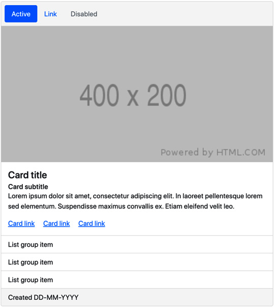
Figure 1.3 – The card component using the default Bootstrap 5 styles

Figure 1.4 – The card component using a customized version of Bootstrap 5
In this example, the following Bootstrap 5 customizations have been made:
- Changed the global settings for the primary color, base font size, headings, and font weight
- Changed the color, background color, font size, padding, margin, border width, and border radius for the card component
- Changed the padding for the nav component
- Changed the color, background color, and padding for the list group component
Forum
The following is the second example, which is a common forum UI taken from an online forum template. It’s created with the use of tables and various Bootstrap 5 components, including buttons, a breadcrumb, badges, dropdowns, and pagination.
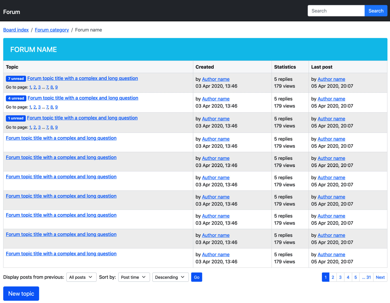
Figure 1.5 – A forum UI using the default Bootstrap 5 styles
Figure 1.6 – A forum UI using a customized version of Bootstrap 5
In this example, the following Bootstrap 5 customizations have been made:
- Changed global settings for primary, info, and body background colors
- Removed the underline from links
- Removed all border radiuses
- Changed the background color of input elements
- Changed the color, padding, and borders of tables
- Changed the horizontal padding for buttons
- Changed the horizontal padding for paginations
- Changed the padding for and added text-transform to badges
The contact page
The following is the third example, which is a contact page taken from a Small Business Website template. It features various Bootstrap 5 form elements, including input groups, text inputs, dropdowns, textarea, and buttons. It also uses the ratio helper class to embed a Google Maps map with the right aspect ratio.

Figure 1.7 – The contact page UI using the default Bootstrap 5 styles

Figure 1.8 – The contact page UI using a customized version of Bootstrap 5
In this example, the following Bootstrap 5 customizations have been made:
- Changed global settings for primary and body text colors
- Removed the border radius on buttons, dropdowns, select elements, and input elements
- Changed the color for input group addons
- Changed the “4x3” ratio helper to “3x2”
- Changed the font weight and margin for headings
Portfolio
The following is the fourth and final example, which is a portfolio item page taken from a Portfolio template. It features a carousel, image thumbnails, and various kinds of typography.

Figure 1.9 – A portfolio item UI using the default Bootstrap 5 styles
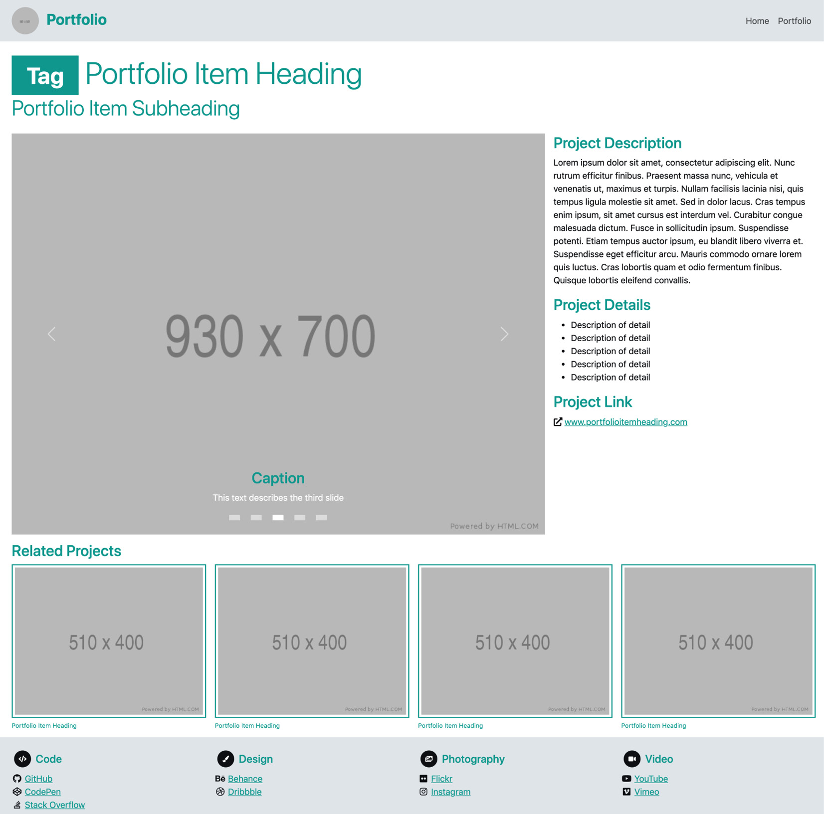
Figure 1.10 – A portfolio item UI using a customized version of Bootstrap 5
In this example, the following Bootstrap 5 customizations have been made:
- Changed global settings for primary and light colors
- Generated a darker variant of the primary color using a Bootstrap 5 color function
- Disabled the border radius on all elements using the global option
- Increased the container maximum width for the xxl breakpoint
- Decreased the grid gutter width
- Changed the colors of headings and muted text
- Changed the font size used for small text
- Changed the color and font size of the navbar
- Changed the indicators of the carousel
- Changed the image thumbnail borders
- Changed the color and font size of the figure caption
Further customizations in this book
The four preceding examples only showed the visual impact of different customizations and a brief description of the changes. In Chapter 3, Downloading and Exploring the Bootstrap 5 Sass Files, we will learn about the code needed to make similar changes. Later, in Part 2 of this book, we will create a fully customized example of a complete website project.
Summary
In this chapter, we have learned when we should consider customizing Bootstrap, what elements we can customize, and ways in which this can be done. We have also seen four different examples of Bootstrap 5 customization. We are now better prepared to customize the right elements and pick the right method for customization.
In the next chapter, you will learn about Sass. You will learn about its features and benefits, how to use it, and last but not least, how to compile it into regular CSS that can be parsed by the browser.