
Chapter 6
Measures of Central Tendency and Dispersion: Data Distributions
There are three related, but quite different, uses of statistics. The first of these uses is descriptive. In a descriptive context, statistics are used to characterize either a total population or a sample from that population, but they go no further than characterization. The second use of statistics is inferential. In an inferential context, statistics from a sample are used to make inferences about the populations from which the samples were drawn. The third use of statistics is in hypothesis testing. Here, statistics are used to assign a probability to the likelihood that a particular statistical value could have come from some specifiable population, that two (or more) sample (or population) groups are different from one another, or that a measure taken from a sample (or from a population) is of a particular value. This chapter deals with the first of these uses of statistics: description. Subsequent chapters cover in detail both inferential statistics and hypothesis testing.
6.1 Measures of Central Tendency and Dispersion
This chapter is about data distributions. Two ways of characterizing any data distribution are by the central values around which the data cluster, measures of central tendency, and by the extent to which the data are variable, measures of dispersion.
Central Tendency: Mean, Median, Mode
One of the most important ways of characterizing either populations or samples is to provide information about what is called the central tendency of the data. There are three commonly employed measures of central tendency: the mean, the median, and the mode. These three measures can be illustrated with the data shown in Figure 6.1. This figure shows the amount of time—in one-minute intervals—that a physician may spend with patients who come to his office for treatment. Patient 1 received two minutes of the physician's time, patient 2 received eight minutes, and so on.

Figure 6.1 Time spent by physician with patients
Central tendency is the degree of clustering of values in a statistical distribution and is usually measured by arithmetic mean, median, or mode.
Mean or Average
In statistical applications, the average is almost always called the mean and is defined formally for a sample as:

where ![]() (pronounced x bar) designates the sample mean and ∑ (pronounced sigma) indicates a summation of all values xi from i = 1 to i = n, with n being the sample size.
(pronounced x bar) designates the sample mean and ∑ (pronounced sigma) indicates a summation of all values xi from i = 1 to i = n, with n being the sample size.
For the data shown in Figure 6.1, Equation 6.1 would be executed as (2 + 8 + 11 + ⋯ + 14)/12 (the three dots mean to continue adding the numbers), and the result would be the mean, which is approximately 8.92. In this example, the median is 8 and the mean is 8.92. The mean and the median are frequently different. For example, a large number of people stay in the hospital for short periods of time and incur relatively small charges, whereas a small number of people have relatively long hospital stays and incur high charges. Therefore, for hospital days and cost per admission, the mean is higher than the median, and the distribution of both is skewed to the right. If the mean of a data set is lower than the median, the data are skewed to the left.
“Mean” is also referred to as simple average.
Median
“Median” refers to the middle value in an ordered set of values, or, if there is an even number of values, it refers to the average of the two middle values. If we look at the data from Figure 6.1, as reordered in Figure 6.2, we can see that the sixth and seventh observations (out of 12, an even number) are both 8. The average of two values of 8 is also 8, so that the median for this set of data is 8. Typically, it is more likely that the median will be used to describe a set of data than the mode will be used. It is not uncommon to see the median referenced as the measure of central tendency in such examples as median family income, median age, and median inpatient days. It can be said that half the values of a data set lie above the median and half of the values lie below the median.

Figure 6.2 Ordered time spent by physician with patients
“Median” refers to the middle of the data set.
Mode
“Mode” refers to the most commonly appearing value in a set of data. In this case, eight minutes is the most commonly appearing value and is the mode, or modal value. The physician spent eight minutes with each of three patients. Data sets can be bi- or multimodal if more than one value is represented an equal number of times. If, for example, patient 5 had received seven minutes of the physician's time, both eight minutes and seven minutes would have been modal values. In general, although the mode is usually listed as one of the three measures of central tendency, it rarely figures into any further statistical applications.
Mode is the most commonly appearing value in a data set.
The mode provides a measure of central tendency that uses only the most commonly appearing value. The median essentially provides a measure of central tendency that uses only the middle value (for an odd number of observations) or the two middle values (for an even number of observations) in an ordered array. The mean uses all the information in the data set to provide a measure of central tendency. The mean should be a familiar concept to most readers. It is the average. Few people taking their first statistics course are unfamiliar with how to obtain an average for a set of numbers; you just add them and divide by the total number of numbers.
Excel Functions for Central Tendency
Microsoft Excel provides a function for each of the three measures of central tendency. These are =MODE(), =MEDIAN(), and =AVERAGE() (not =MEAN()). The =MEDIAN() and =AVERAGE() functions work just as one would expect, producing the correct value. The =MODE() function will produce the correct value if the data set has only one mode. If it has more than one mode, it will produce a result that indicates only one of the modal values—the value that appears earliest in the data set.
Most of the work we do in this book with measures of central tendency will be done with the mean. The presentation in Equation 6.1 refers specifically to the mean of a sample of observations from some larger population. In the case of the data shown in Figure 6.1 or Figure 6.2, the population would presumably be all patients who ever did or ever will come to the office of the particular physician in question. If we were to consider the mean as a measure of central tendency for the entire population of patients who ever did or ever will visit this physician, it would be designated by slightly different symbols. The mean for a population is defined as shown in Equation 6.2. In Equation 6.2, the sample designation ![]() has been replaced by the population designation μ and the sample designation for all the observations in the sample, n, has been replaced by the population designation for all possible observations in the population, N.
has been replaced by the population designation μ and the sample designation for all the observations in the sample, n, has been replaced by the population designation for all possible observations in the population, N.

where μ (the small Greek letter μ, pronounced mu) designates the population mean and N represents all patients who ever have or ever will visit the physician. The value of xi is summed from i = 1 to N.
The point of using the formula in Equation 6.1 to calculate the mean of the sample is that it is what is known as an unbiased estimator of the true population mean defined in Equation 6.2. An unbiased estimator is a sample estimator of a population parameter for which the mean value from all possible samples will be exactly equal to the population value. Thus, since ![]() is an unbiased estimator of μ, the mean of the values of
is an unbiased estimator of μ, the mean of the values of ![]() from all possible samples taken from the population will be exactly equal to μ. More is said of this in the next section.
from all possible samples taken from the population will be exactly equal to μ. More is said of this in the next section.
Dispersion
A measure of central tendency, whether it be the mode, median, or mean, can be produced for virtually any data set. Similarly, a measure of dispersion or variation in the data can also be produced for any data set. Dispersion describes how far values in the data set are from the measure of central tendency. Larger values of dispersion characterize data sets that are spread out (i.e., the data contain higher highs and/or lower lows than the mean). Smaller values of dispersion characterize data sets that have more values clustered closely together (i.e., the values in the data set tend to be clustered close to the mean). Range, variance, and standard deviation are all measures of dispersion.
Range, variance, and standard deviation are all measures of dispersion. Dispersion describes how far values in the data set are from the measure of central tendency.
Range
A simple measure of dispersion is the range. The range is the difference between the largest and smallest values in the data set. There are also a number of modifications on the range, such as the range within which are found the lowest 25 percent of cases, the highest 25 percent of cases, the middle 50 percent of cases, and so on. The range is a measure of dispersion that is similar in concept to the median as a measure of central tendency. It uses only a limited amount of the data. Except for some descriptive purposes, the range is rarely used in statistical analysis applications and is therefore not discussed further in this book.
Variance and Standard Deviation
The measure of dispersion that, like the mean, uses all the information in the data is the variance, or its square root, the standard deviation. Both the variance and standard deviation are used extensively in statistical applications and are, in fact, the basis upon which much of statistics is constructed. The variance for a sample is defined mathematically as shown in Equation 6.3.

where s2 designates the variance and ∑ indicates a summation of all values of (x − ![]() )2 from i = 1 to i = n.
)2 from i = 1 to i = n.
The standard deviation for a sample is calculated as shown in Equation 6.4.

Calculating Variance and Standard Deviation with =VAR() and =STDEV()
Basically, the variance is a measure of the extent to which each observation differs from the mean of all observations. For the data shown in Figure 6.1, the variance calculation is shown in Figure 6.3, a spreadsheet representation of the calculation. In Figure 6.3, the patient number is shown in cells A3 to A14, and the minutes spent with the physician are shown in cells B3 to B14. Cells C3 to C14 show the calculation of the numerator portion of Equation 6.3. The mean value for the data (shown in cell B15) is subtracted from each cell B3 to B14, and the result is then squared (the Excel formula for cell C3, for example, is =(B3-$B$15)ˆ2). The title in cell C2 is a convenient way to show this operation in Excel, because it is difficult to put bars above letters or to create superscripts to show the square process. The ˆ2 is the Excel convention for raising a value to a power. Cell C15 is the sum of the squared differences (=SUM(C3:C14)), and cell C16 is the actual variance as calculated by the formula in Equation 6.3 and Figure 6.3 (=C15/11). The number in cell C17, which is identical to cell C16, is the variance as calculated using the =VAR() function. This function can be seen in the formula bar above the spreadsheet, because cell C17 was the highlighted cell when this image was captured. It is relatively easy to confirm the results shown in Figure 6.3. All that is required is to enter the data in column B into a spreadsheet and follow the formula given in Equation 6.3. Table 6.1 shows the formulas for Figure 6.3.

Figure 6.3 Calculation of variance
Table 6.1 Formulas for Figure 6.3
| Cell | Formula |
| B15 | =AVERAGE(B3:B14) |
| C3 | Cell C3 is copied down to cell C14 |
| C15 | =SUM(C3:C14) |
| C16 | =C15/11 |
| C17 | =VAR(C3:C14) |
The variance is a measure of dispersion calculated on the basis of squared differences between each observation and the mean of all observations. This produces a measure of dispersion that is not on the same scale as the measure of central tendency (the mean). The variance actually corresponds more closely to the square of the mean than to the mean itself. To get the measure of dispersion back to the same scale as the mean, the measure of dispersion that is typically used is the standard deviation, shown in Equation 6.4.
The value of the standard deviation for the data shown in Figure 6.3 is approximately 3.48. You can confirm this by using the =STDEV() function, which Excel provides for calculating the standard deviation on the data shown in Figure 6.3. You can also confirm that the =STDEV() function actually produces the square root of the variance by using the =SQRT() function to calculate the square root of the variance given in the same figure. You should find that the results of the two methods are the same.
The formulas in Equations 6.3 and 6.4 provide the variance and standard deviation for samples from a larger population. If we wished to calculate the variance and standard deviation for the entire population of patients who ever had or ever would attend the clinic in question, we would use the formula shown in Equation 6.5. The equation for the standard deviation of the population, designated σ2, is just the square root of the value in Equation 6.5.

where σ2 designates the variance and N indicates that the summation of (xi − μ)2 is over all observations in the entire population.
Why Is the Sample Variance Divided by n − 1?
In the calculation of the most frequently used measure of central tendency—the mean—the formulas for the sample estimate of the population parameter (Equation 6.1) and the population parameter itself (Equation 6.2) are calculated essentially the same way. All the values are summed and divided by the number of separate values. For the variance, however, and similarly for the standard deviation, the population value and the sample values are not calculated in the same way. The population variance as shown in Equation 6.5 is, logically, the sum of all the squared differences between actual values and the overall mean divided by the total number of observations; but the sample variance (Equation 6.3) is divided, instead, by the total number of observations less one. On the face of it, this does not seem logical. Why should it be so?
Interestingly, the answer to this question has to do, again, with unbiased estimators. As was mentioned earlier, the sample formula for the mean shown in Equation 6.1 is an unbiased estimator of the population value of the mean shown in Equation 6.2. Similarly, under the sampling with replacement assumption, the sample formula for the variance shown in Equation 6.3 will be an unbiased estimator of the population value of the variance calculated, as shown in Equation 6.5. In other words, if we took all possible samples from a population using the technique of sampling with replacement, the average variance for all possible samples calculated, as given in Equation 6.3, would be exactly equal to the population variance calculated, as given in Equation 6.5. This relationship has been proved mathematically, and the proof is given, for example, in Freund and Walpole ([1987]). Such a proof is beyond the scope of this book. But what this book does do is use the capabilities of Excel to demonstrate that the sample variance calculated, as given in Equation 6.3, is an unbiased estimate of the population variance calculated, as given in Equation 6.5. This holds true for a very small population as well as for a very small sample. Such a demonstration does not guarantee that it will work for any population or for any sample, but it at least demonstrates that it is reasonable.
An Example of Sampling with Replacement: In Other Words, Why n − 1?
Let us imagine a very small population that consists of only four observations. These four observations take on the following four values: 2, 4, 5, and 7. If this is the entire population, it is relatively easy to confirm that the mean, μ, for this population is 4.50, using the formula in Equation 6.2, and the variance σ2 is 3.25, using the formula in Equation 6.5. To examine the effect of taking all possible samples, we can limit ourselves to all the possible samples of a given size. Whatever the outcome for a sample of any size, the outcome for all samples of other sizes will be the same.
First, what is sampling with replacement? Suppose we want a sample of size two, and we randomly select one observation from our very small population, which turns out to be 5. Now we will draw a second observation from the population to complete the sample of two. In sampling with replacement, we return the observation 5 to the population so that it has an equal chance, along with all other observations, of being drawn in the second selection. If we were sampling without replacement and drew the observation with the value of 5 on the first draw, that observation would not be available for the second draw, which would be limited to the observations with values of 2, 4, and 7.
If we are taking samples with replacement, there are Nn different samples of size n that can be taken from a population of size N. If we are sampling without replacement, there are different samples of size n that can be taken from a population of size N. This is a substantially smaller number than Nn. This is discussed in more detail later, but you should recognize this as being part of the binomial distribution formula. In the case of our population of four observations, there are 42, or 16, different samples of size two that can be taken from the population with replacement. These samples are shown in Figure 6.4.

Figure 6.4 All samples of two from a population of four
Using Excel to Demonstrate Why n − 1 Is Used
Cells B2:B5 in Figure 6.4 are the values taken on by each of the four members of the population. The value in cell B8 is the mean of the population calculated with the =AVERAGE(B2:B5) function. The value in cell B9 is the variance of the population calculated with the =VARP(B2:B5) function, which calculates the population variance as given in Equation 6.5. The cells C2:C17 just number the 16 different samples of size two that can be taken from the population of four with replacement. Cells D2:D17 show the first observation in each sample, and cells E2:E17 show the second. Cells F2:F17 represent the means of each sample calculated, using =AVERAGE() for each of the corresponding two cells in D and E. For example, cell F2 is calculated as =AVERAGE(D2:E2). Cell F19 is calculated as =AVERAGE(F2:F17). It can be seen that it matches the value in B8. Similarly, cells G2:G17 are calculated by the =VAR() function, with the appropriate references in columns D and E. Note that the =VAR() function divides by n − 1 rather than by n. The number in cell G19 is calculated as =AVERAGE(G2:G17) and is the average of all the sample variances. It is equal to the number in cell B9. If, instead of using =VAR() to calculate the sample variances in G2:G17, we had used =VARP(), the average of all sample variances (cell G19) would have been not 3.25 but, rather, 1.625—a value much smaller than the true population variance.
This is a demonstration of the appropriateness of using the formulation in Equation 6.3 as the sample variance. This ensures that we obtain a measure that will be an unbiased estimate of the population variance as calculated in Equation 6.5. But two things should be remembered. First, although it is a demonstration (and it works every time), it is not a proof. Also, this relationship between Equation 6.3 and Equation 6.5 holds only for samples taken with replacement. In most cases, samples are not taken with replacement. If you drew a sample of people for interviews, you would not want to interview the same person twice if it happened by chance that he got into the sample twice. When one is sampling without replacement, the formulation in Equation 6.3 is not an unbiased estimate of the population variance. But, in general, the size of a sample relative to the size of a population makes it highly unlikely that any single population item will be selected more than once, so that sampling with replacement might be assumed. Interestingly, when one is sampling without replacement, the average of all sample variances calculated by Equation 6.3 turns out to be numerically equal to the variance of the population calculated by replacing N in Equation 6.5 with N − 1.
One other point should be made in regard to unbiased estimates of dispersion. The typical measure of dispersion used is the standard deviation or the square root of the variance. The average value of the standard deviation of all possible samples from any population will not be equal to the standard deviation of the total population, calculated by any means. This is because, in general:
Why Is the Measure of Dispersion So Complicated?
Why is it necessary to use something so complicated? Could there not be a simpler measure of dispersion that did not involve the complicated problem of squaring and taking square roots? For example, could we simply use the difference between each value and the mean or the absolute value of the difference between each value and the mean?
Cumulative Differences
One such possibility might be the sum of the differences between each value and the mean of all values, which could be shown as given in Equation 6.6.
Unfortunately, this strategy does not work well. Because the mean is the numerical midpoint of the distribution, the sum of all the negative numbers will always equal the sum of all the positive numbers derived from the operation given in Equation 6.6. In turn, the result of this operation is always zero for every data set. Because of this, Equation 6.6 cannot serve as a useful measure of dispersion.
Absolute Differences
But what if a measure of dispersion were the absolute value of the difference between each observation and the mean of all observations? Such a possibility would be expressed as Equation 6.7.
Unfortunately, this criterion also does not work well for a measure of dispersion if our measure of central tendency is the mean. One assumption we are making is that any measure of dispersion we ultimately choose should be centered on the mean. This assumption is true for both Equations 6.6 and 6.7.
Measures of Dispersion and Being Centered at the Mean
To understand the notion of centered in the context of Equation 6.7, consider Figure 6.5. This table shows a column (cells A16:A22) of seven data points that take on the values 1 through 7, respectively. It is easy to confirm that the mean of these seven items is 4. Cells B15:H15 contain seven possible constants that may be substituted for the mean in Equation 6.7, including the true mean of 4. The formula line in Figure 6.5 shows that the value in cell B16 is the absolute difference between those in cells A16 and B15. Cell B17 is the absolute difference between cells A17 and B15. The remaining values are calculated in the same way. The sums of the absolute differences in each column are given in cells B23:H23. The value 12 in cell E23, which corresponds to the mean, is the smallest of the sum of absolute differences. In this sense, the result of Equation 6.7 is centered on the mean in this data set. If any number other than the mean is used as the constant subtractor, the result of the sum of absolute differences will be greater than the value when the mean is employed. In general, a working assumption is that whatever measure of dispersion is chosen, it should be centered on the mean. By being centered at the mean, the measure of dispersion then produces a minimum sum of differences at, and only at, the mean.

Figure 6.5 Sum of absolute differences
But Equation 6.7 does not always produce the minimum value at the mean. In fact, it turns out that Equation 6.7 always produces a minimum value at the median. To see an illustration of this, consider the data shown in Figure 6.6. This table again shows seven observations (cells A30:A36). In this case, it is not difficult to confirm that the mean of the data elements is 4, whereas the median is 2. Again, the values in cells B30:H36 are the absolute differences between each data point and the constant values listed in cells B29:H29. Now it can be seen that the minimum value of the absolute differences (16 in column C) is centered not on the mean of 4 but, rather, on the median of 2. This is the primary reason that the absolute differences between each value and the mean are not generally used as a measure of dispersion when the mean is the measure of central tendency. (It can also be shown that for data sets that have even numbers of cases, the absolute difference is centered in the sense discussed here on both values that define the median and on all possible numerical values between them.)

Figure 6.6 Sum of absolute differences, second example
Now what of the sum of squared differences (Equation 6.3) as a measure of dispersion? Does it provide a measure that is centered on the mean? Consider Figure 6.7, which shows the sum of squared differences for the data displayed in Figure 6.6. Now, the minimum value of the sum of differences (squared) is at the mean of 4, so the sum of squared differences is centered at the mean. The reader might wish to confirm that for the data in Figure 6.5, the sum of squared differences is a minimum at the mean. It will turn out that for any data set, the sum of squared differences has the desirable property that it is centered at the mean in the sense that the sum of squared differences between the data elements and any constant will be a minimum when the true mean is the constant.

Figure 6.7 Sum of squared differences
6.2 The Distribution of Frequencies
The measures of central tendency and dispersion discussed in Section 6.1 represent one way to characterize a set of data. A second way to characterize a data set is by the manner in which it is distributed over its range of values, commonly known as a frequency distribution. The frequency distribution was discussed in some detail in Chapter 4. In that discussion, the frequencies generated with the =FREQUENCY() function were based on BIN ranges. The BIN ranges are developed by dividing the range from highest to lowest data values by some arbitrary number, such as six, to create six frequency intervals. This section discusses the frequency distribution further, basing the BIN ranges on standard deviations of the data.
Frequency Distributions and Standard Deviations
A frequency distribution can be based on arbitrary BIN ranges (e.g., six equal-size ranges, from the smallest to the largest value in the data set). But they can also incorporate information about the mean and standard deviation of the data to help in the understanding of those data. The example considered here will use the Human Development Index (HDI) for the countries of the world, as given by the United Nations Development Program (UNDP) for 1999 (http://www.undp.org/hdro/statistics/downloadtables.html). The HDI is developed from measures of life expectancy, literacy, and gross domestics product (GNP) per capita for each country. The entire data set used in developing the HDI and the HDI for each country for which UNDP gives an HDI value for 1999 are contained in the Excel file Chpt 6-1.xls.
The HDI is given in column J in the Excel file Chpt 6-1.xls. To create a frequency distribution incorporating information about the mean and standard deviation, it is first necessary to calculate those values for the HDI. This can be done using the =AVERAGE() and =STDEVP() functions. (Because this data set represents virtually all countries of the world for which the requisite data are available, it is being treated as a population rather than as a sample.) The actual mean of the HDI is 0.684, and the standard deviation is 0.181.
Using the Mean and Standard Deviation to Create a Frequency Distribution
The use of the mean and standard deviation in creating a frequency distribution is shown in Figure 6.8. In Figure 6.8, column B contains the countries of the world ranked by HDI number. There are actually 162 countries ranked in column B, but only the first 13 are shown in the figure. Column C contains the HDI score for the top 13 countries. The maximum score (for Norway) is 0.939. The minimum score (which is not shown and is for Sierra Leone) is 0.258. The mean of the HDI score across countries is shown in cell E2 as 0.684, and the standard deviation is shown in cell E3 as 0.181. Beginning in cell E6 is the sequence of numbers −3, −2, …3. This sequence represents a distance from the mean in numbers of standard deviations ranging from 23 to 3. These distances are actually calculated in cells F6:F12. The equation that is used to calculate the distances is shown for F6 in the formula line as =$E$21E6*$E$3. This formula notation means that when the formula is copied from cell F6 to cells F7 through F12, the formula will refer to the relevant consecutive cells from E7 to E12 but will always refer to cell E2 (the mean) and cell E3 (the standard deviation).

Figure 6.8 Frequency distribution with mean and standard deviation, HDI data
Table 6.2 shows the formulas for Figure 6.8.
Table 6.2 Formulas for Figure 6.8
| Cell | Formula |
| E2 | =AVERAGE(C2:C163) |
| E3 | =STDEVP(C2:C163) |
| F6 | =$E$21E6*$E$3Cell F6 is copied down to cell F12. |
| G6 | =FREQUENCY(C2:C163,F6:F12)Note: Remember to use Ctrl+Shift+Enter. |
| G13 | =SUM(G6:G12) |
Creating a Frequency Distribution Using the =FREQUENCY() Function
The frequency distribution is shown in G6:G12; it was calculated using the =FREQUENCY(C2:C163,F6:F12) function. You will recall that it is always necessary to use Ctrl+Shift+Enter to get the =FREQUENCY() function to work correctly because it is one of the functions that compute a value for more than one cell at a time. Two things might be noted about the frequency distribution. First, the sum of the frequency distribution given in cell G15 as 162 (=SUM(G6:G14)) confirms that all of the countries are included in the frequency distribution. Second, the HDI value for every country is contained in the range from 3 standard deviations below the mean to 2 standard deviations above the mean. (Remember that the Bin value refers to the top of a particular range so that 22 contains all countries with HDI scores between 0.140 and 0.321.)
The histogram created by this frequency distribution of the HDI data is also of interest; it is shown in Figure 6.9. Several things might be mentioned in regard to this figure. First, the histogram includes data only for the range from −3 to +3 standard deviations. Typically, most of the observations in almost any data set will be in the ±3 standard deviation range. A second point of interest is that column I contains Bin labels that were not used in the calculations in any way but were used to label the horizontal dimension of the graph. This was discussed in Chapter 4 in the section on construction of graphs. It should be remembered that the Bin values actually used in the =FREQUENCY() formula represent the top of the BIN range. For example, the −2 in cell E7, which is associated with the value 0.321 in cell F7, actually refers to the range from −3 to −2 standard deviations. Column H represents the percentage of countries in each BIN range.
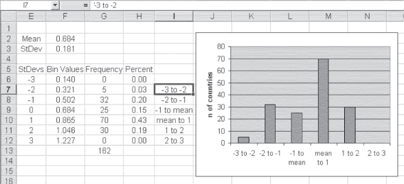
Figure 6.9 Histogram (graph) of HDI values
The histogram itself shows a distribution of the frequencies that is not atypical for many distributions. The observations tend to cluster near the mean and be fewer further from the mean. Ninety-five of the 162 countries (58 percent) have HDI scores within 1 standard deviation of the mean. When one counts the number of countries within 2 standard deviations of the mean, there are 157 of the 162 (97 percent). This type of distribution of individual cases around the mean is typical of many distributions found in the real world. In many cases, data are distributed approximately in what is known as a normal distribution. The normal distribution was introduced in Chapter 5. There, it was indicated that the normal distribution is symmetrical with an equal number of observations above and below the mean. A second characteristic of the normal distribution is that approximately 68 percent of the observations are within ±1 standard deviation of the mean and 95 percent of the observations are within ±2 standard deviations. The distribution in Figure 6.9 is not actually symmetrical (70 countries are in the range of 1 standard deviation above the mean, whereas only 25 are within the range of 1 standard deviation below). Still, the percentages of 58 percent at ±1 standard deviation and 97 percent at ±2 standard deviations are not far from the normal distribution percentages of 68 percent and 95 percent.
The Normal Distribution
The normal distribution was introduced in Chapter 5 and discussed briefly in the previous section. This section provides additional detail on the normal distribution and the importance of the mean and standard deviation in the normal distribution.
A normal distribution is one that is symmetrical and that has approximately 68 percent of its observations within ±1 standard deviation of the mean and 95 percent within ±2 standard deviations. In addition, a normal distribution has about 99 percent of its observations within ±3 standard deviations of the mean. Excel provides a number of options for constructing and visualizing a normal distribution. Figure 6.10 shows a normal distribution generated by Excel, one that shows the classic form of normal distribution. The distribution is symmetrical and takes on what has been called the “bell-shaped” curve because it looks somewhat like the side view of a bell.

Figure 6.10 Normal distribution
Constructing a Normal Distribution: The =NORMDIST() Function
The way in which the normal distribution in Figure 6.10 was constructed in Excel tells us a lot about the kinds of information that can be obtained from Excel. Figure 6.11 shows a portion of the spreadsheet that was used to produce the normal distribution shown in Figure 6.10. Column A, labeled StDev, represents the distance from the mean in standard deviation units. Cell A2 is shown as −4, which means that the cell represents 4 standard deviation units below the mean. Cell A3, with the value −3.9, represents 3.9 units below the mean, and so on. The values in column A increase to 4 in cell A82 (not visible in the figure). Column B is labeled Normal Dist. The value in cell B2 is produced by the =NORMDIST() function and represents the proportion of the normal distribution that falls at the point represented by −4. The proportion of the normal distribution falling at any single point is given in Equation 6.8. The values in column C, labeled Normal Dist2, represent the normal distribution values calculated by the formula shown in Equation 6.8. The way in which the formula is expressed in Excel is shown in the formula line in Figure 6.11.


Figure 6.11 Calculations for normal distribution
The syntax of =NORMDIST(), which is not shown in Figure 6.11, is =NORMDIST(Cell Ref,0,1,0). The =NORMDIST() function takes four arguments: (1) the cell reference (Cell Ref) for which the point proportion of the normal distribution is desired (e.g., 24, 23.9, etc.), (2) the mean of the distribution (in this case, 0), (3) the standard deviation of the distribution (here given as 1), and (4) a value of 0, indicating that the distribution desired is the normal probability density function and not the cumulative normal distribution. The cumulative normal distribution will be discussed later.
Characteristics of the Normal Distribution
Looking at Figure 6.10, it should be recognized that there is a very small proportion of the observations in a normally distributed data set that lies outside the range −3 to +3 standard deviations. In fact, a normal distribution has about 99 percent of its observations in the −3 to +3 range on either side of the mean. However, some proportion of a normal distribution (albeit a very small proportion) is out beyond 4 standard deviations, 5 standard deviations, and even 20 standard deviations. The probability of its being out at those extremes is finite, but very, very small. Although it is not obvious from Figure 6.10, about 68 percent of the observations lie in the range from −1 to +1 standard deviations and about 95 percent lie in the range from −2 to +2 standard deviations.
It is basically correct to say that 68 percent of all observations in a normal distribution are within 1 standard deviation on either side of the mean value. It is also true that approximately 95 percent of all observations are within ±2 standard deviations of the mean. In addition, around 99.7 percent of all observations lie within ±3 standard deviations of the mean. But an interesting characteristic of normal distributions is that they are based on scales that are continuous rather than discrete. For example, if one were measuring the height of U.S. adult men, the recorded measurement would be limited by the measuring device itself. A standard ruler probably has no units smaller than quarters of an inch. Therefore, one could measure a person's height to the nearest quarter inch only.
For a normal distribution it can be said that around:
- 68 percent of all observations are within +1/−1 standard deviation of the mean.
- 95 percent of all observations are within +2/−2 standard deviations of the mean.
- 99.7 percent of all observations are within +3/−3 standard deviations of the mean.
However, a more sophisticated measuring technique might make it possible to measure with more precision. In fact, it might be discovered that someone who was measured as being 5 feet, 10 and 1/2 inches tall might actually be 5 feet, 10 and 7/16th inches tall. A still more sophisticated measurement tool might measure that person as actually 5 feet, 10 and 455/1,000th inches tall.
By continuing to increase the precision of the measurement, we are able to measure things on what might be considered a true scale of infinite possibilities A consequence of this theoretical ability is that the probability of any given observation at any one specific spot in the normal distribution (e.g., exactly 1 standard deviation above the mean) is actually zero. We then have a finite number of objects distributed over an infinite number of sites (points in the scale). In turn, the probability that any one object will fall on any specific site will be the number of observations divided by infinity, which will always come out to zero. The consequence of this is that the actual proportion of observations between two points in a normal distribution (say, 2 standard deviations below to 2 standard deviations above the mean) cannot be calculated from the formula in Equation 6.8. Instead, the actual proportion of observations within any interval in the normal distribution must be taken from the cumulative normal distribution. This distribution is discussed in detail in the following subsection.
Cumulative Normal Distributions and Excel
The cumulative normal distribution sums all the probabilities of the normal distribution up to a given specific value. For example, suppose the mean weight of newborns is 3,600 grams (about eight pounds) and the standard deviation is 850 grams. If the weight of newborns is normally distributed, the cumulative normal distribution, then, using Excel, could tell us that we would expect that just under 10 percent of all newborns should be under 2,500 grams, the cutoff for low birth weight. This could be calculated with the =NORMDIST() function as =NORMDIST(2500,3600,850,1). In the function, 2,500 equals the low birth-weight level, 3,600 is the mean weight in grams, 850 is the standard deviation, and 1 indicates that the cumulative distribution is desired.
The value of the cumulative normal distribution is that it allows the determination of the exact probability of any observation when a normal distribution is assumed. Figure 6.12 shows a graph of the cumulative normal distribution based on standard deviations from the mean. The figure shows that the cumulative normal distribution starts at zero in the range to the left of 3 standard deviations below the mean. It increases (because it accumulates all previous percentages) to a maximum approaching one (100 percent) in the range to the right of 3 standard deviations above the mean.

Figure 6.12 Cumulative normal distribution
The actual value of any point on the cumulative normal distribution can be found by using the =NORMDIST() function, with the first argument being the value of the point of interest, the second being the mean of the distribution, the third being the standard deviation, and the fourth being the value 1, to denote that the cumulative normal distribution is being requested. The values of the cumulative normal distribution represent the area under a normal curve to the left of any number. We can also estimate the probability of being greater than or less than a certain value. For example, by subtracting =NORMDIST(5000,3600,850,1) from 1, we can predict that only about 5 percent of all newborns will weigh more than 5,000 grams (about 11 pounds).
Approximating the Area under a Normal Curve
The actual value we obtain is the integral of the area under the curve from −∞ to the number in question, but it can be approximated using one of several methods. The formula in Equation 6.9 is the way the area under the cumulative normal distribution is calculated by Excel, and it duplicates the result of the Excel =NORMDIST(x,mean, stdev,1) function. This formula is an approximation, rather than an exact solution, but its results are far more readily obtained than any exact solution.
where


Equation 6.9 works for values of x greater than 0. If the value of x is less than 0, it is necessary to subtract p(x) from 1 in order to get the probability from ∞ to the value of x less than 0. For example, to obtain the cumulative proportion at −1, as shown in Figure 6.12 (approximately 15 percent, by the graph), it would be necessary to find the cumulative proportion at the value of 1, as shown in Figure 6.12, and subtract that value from 1 to get the cumulative proportion at −1.
There is no particular reason why you, as a user of this book, will need to know the formulas in Equation 6.8 or those in Equation 6.9. But we are always interested in how things happen. If Excel provides a value for the cumulative normal distribution, we like to know, if possible, where Excel got the value. Thus the equations are given. You may use them as you wish.
Understanding the Cumulative Normal Distribution in Excel
Figure 6.13 shows the values generated by a cumulative normal distribution based on the assumption that U.S. newborns average 3,600 grams and that the distribution of the weight of newborns has a standard deviation of 850 grams. Column A shows 0.5 standard deviation unit from the mean of 3,600. Column B shows the weight in grams that corresponds to each standard deviation unit from the mean, assuming a mean of 3,600 grams and a standard deviation of 850 grams. Column C is the probability that was obtained, as the formula line indicates, with the =NORMDIST() function. The first argument is the weight given in column B, the second is fixed as the mean given in cell E3, the third is the standard deviation given in cell E4, and the final argument is the 1 denoting cumulative distribution.

Figure 6.13 Cumulative normal probabilities for the weight of newborns
To understand the logic and use of the cumulative normal distribution, suppose there is an interest in knowing what proportion of newborns will weigh less than 2,000 grams (2 standard deviations below the mean). To determine this, given the assumption that the average is 3,600 grams and the standard deviation is 850 grams, it is necessary only to look at the probability given in cell C6 in Figure 6.13. According to that cell, fewer than 3 percent of newborns would weigh as little as 2,000 grams. What if the interest were in knowing what proportion of newborns would weigh more than some amount at birth—say, 4,875 grams? Still, assuming a mean of 3,600 and a standard deviation of 850, it is possible to see that the probability associated with 4,875 grams (cell C13) is approximately 0.93. But this is the proportion of newborns who will weigh 4,875 or less. To get the proportion that will weigh 4,875 or more, it is necessary to subtract the proportion at 4,875 from 1; so, the actual proportion who will weigh more than 4,875 grams at birth is 1 − 0.93, or approximately 0.07.
Finding the probability of any occurrence that can be described by a normal distribution with a known mean and standard deviation can be accomplished with the use of the =NORMDIST() function. Suppose the weight of 13-year-old girls is normally distributed with a mean of 100 pounds and a standard deviation of 15 pounds. What is the likelihood of finding a 13-year-old girl who weighs less than 70 pounds? The answer can be found in Excel with =NORMDIST(70,100,15,1), which returns the result of about 0.02. Suppose the body temperature of healthy adults is normally distributed with a mean of 98.6 degrees Fahrenheit and a standard deviation of 0.5 degrees. What is the probability of observing a healthy adult with a temperature of 101 degrees Fahrenheit or more? The answer can be found using Excel's =NORMDIST(101,98.6,0.5,1) function, which produces 0.9999 to four decimals. We do not want to know the probability of finding a healthy adult with a temperature below 101. Rather, we want the probability of finding a healthy adult with a temperature of 101 or above. That would be found as 1 − 0.9999, or 0.0001 at four decimal places. Because the probability of finding a healthy adult with a temperature of 101 is so small, we would typically conclude that such a person could not be healthy.
6.3 The Sampling Distribution of the Mean
The previous subsection discussed the variance and the standard deviation as measures of dispersion that apply both to populations and to samples taken from populations. The discussion was concerned with the dispersion of the individual entities that make up the population or sample. So, for example, when waiting time for patients was discussed, it was the dispersion of the waiting times for individual patients that was the subject of the variance or standard deviation calculation. In this section we take up a somewhat different concept—the sampling distribution of the mean.
The Standard Error with a Known Variance
Consider a population made up of all discharges from a hospital for the past year. The hospital has 200 beds and an average LOS of 5.2 days. The total number of hospital discharges over the year is approximately 12,000. The standard deviation calculated for all stays is 4.12 days (the formula used is that in Equation 6.5, because this is the population of all discharges for the year). These 12,000 discharges are distributed as shown in Figure 6.14. As the figure shows, the length of stay for the 12,000 discharges is skewed to the right, as would be expected, because the length of stay can never be less than zero days, and the standard deviation is large, relative to the mean length of stay. If the distribution were not skewed, approximately 47.5 percent of a normally distributed variable would be within 2 standard deviations below the mean. So, although the standard deviation can be readily calculated for these hospital discharges, it must be remembered that the meaning of standard deviation is not what it would be if the length of stay were actually normally distributed.

Figure 6.14 Length of stay for one year of discharges from a 200-bed hospital
We know the actual mean length of stay of the population of discharges. It is 5.2 days. But suppose we did not know the mean length of stay, and the only way we could get an estimate of it was to draw successive samples from all discharges. To keep the discussion relatively simple, we will say that it is possible to draw only samples of size 100. So we will be drawing successive samples of 100 discharges in order to estimate the true mean. Suppose we draw a first sample of 100 discharges and the mean for the sample is 5.76 days. This is an estimate of the true population mean, but, clearly, it is not the true mean. But we do not know this, because all we have at this point is the one sample estimate. So we draw a second sample of 100 to estimate the true mean. This time we get a value of 5.17 as an estimate of the mean of the total population. We continue to draw samples of size 100 from the discharges until we have 250 separate samples.
Calculating and Interpreting the Means of the Samples
Because we now have 250 sample means, we decide that the value we will accept for the true mean of the population will be the mean value of the 250 samples. When we calculate the mean of the 250 sample means, we discover that it is 5.22. So 5.22 becomes the estimate to represent the true mean of the population. But that is not the end of the story. Clearly, the mean values from our 250 samples have a distribution of their own. What can we say about that distribution? To look at that distribution, we are going to graph it in standard deviation units from the mean. But we are not going to use population, or even sample standard deviation units. We are going to use the standard deviation units of the sample means.
The standard deviation of the sample means is 0.402. The largest sample mean in the set of 250 was 6.45, and the smallest was 4.29. Given the standard deviation of 0.402, we would expect that about 95 percent of the sample means would be between 4.42 and 6.02, which is 2 standard deviations on either side of the mean of the samples, if the 250 means are normally distributed. The distribution of the 250 sample means is shown in Figure 6.15.

Figure 6.15 Distribution of 250 sample means
Figure 6.15 shows a very different picture when compared with Figure 6.14. Although the actual discharges as shown in Figure 6.14 are heavily skewed to the right, the means of 250 samples selected from that original data, shown in Figure 6.15, are almost normal in their distribution. It is not totally obvious from Figure 6.15, but about 70 percent of all sample means are within one standard error of the mean of all samples (the normal distribution has 68 percent). Also, about 97 percent of the mean values are within 2 standard deviations of the mean of all samples (the normal distribution has 95 percent). So the distribution shown in Figure 6.15 is seen to be a fairly close approximation of a normal distribution.
This finding that the means of 250 samples approximate a normal distribution reveals an interesting characteristic of sampling—or, rather, the means of samples. When the sample size is relatively large (30 or more in the sample is usually considered relatively large), the distribution of sample means tends to be normal, regardless of the nature of the distribution of the actual values. This characteristic of the distribution of sample means will be very useful when the notion of confidence limits is examined in Chapter 7.
The Concept of Standard Error
In an examination of the distribution of sample means, a relatively new notion was introduced. This is the standard deviation of the sample means. Up until this time, the discussion of standard deviations has focused on the individual observations. When the standard deviation of actual lengths of stay was calculated for the hospital data, it was 4.12 days. But when the standard deviation of the 250 sample means was calculated, it turned out to be only 0.402 days. A question that might now be asked is whether there is any defined relationship between the standard deviation of the individual observations and the standard deviation of the sample means. This leads to the introduction of the concept of the standard error. The standard error is the standard deviation of the sample means for samples of a given size.
The standard error is the standard deviation of the sample means for samples of a given size.
If the true population variance is available, the standard error is given as shown in Equation 6.10. This shows that there is a very specific relationship between the standard deviation of the population and the standard error of the means of samples drawn from the population. This relationship is precisely that the standard error of the means is the standard deviation of the individual observations divided by the square root of the sample size.
The formula in Equation 6.10 provides an interesting comparison. However, let's go back for a moment to variance rather than the standard deviation. From Figure 6.4 it can be seen that the mean of the variance of all possible samples of size two from a population of four will be exactly equal to the variance of the four actual observations. Similarly, the standard deviation of all four observations divided by the square root of the sample size of two will be exactly the same as the standard deviation of the means from all possible samples of size two taken from the population of four. This is demonstrated in Figure 6.16, which is the same as Figure 6.4. However, Figure 6.16 now shows the population standard deviation divided by the square root of the sample size (cell B10) and the standard deviation of the means of all samples of size two (cell F20). These two values are exactly the same. (It should be noted that the standard deviation of the means of all samples is calculated using the population standard deviation function =STDEVP(). This is appropriate, because this set of means is the population of all mean values.)

Figure 6.16 Comparison of the population variance divided by two and the variance of the mean of all samples of size two
Now let us return to our 250 samples of size 100. The standard error of the mean for samples of size 100 using Equation 6.10 is 4.12 divided by the square root of 100, or 0.412. This is close to the standard deviation of the means that was calculated from the 250 samples we selected (0.402) but is not identical. Why the difference? It is simply because we do not have all the possible samples of size 100 that could be selected from the 12,000 discharges. If we sampled with replacement, there would be 12,000100 such samples—a very large number indeed. However, if we did have the means of all those samples, they would be equal to the standard error as calculated in Equation 6.10, or exactly 0.412.
The Standard Error with an Estimated Variance
Equation 6.10 is fine if the population variance is known. In general, however, the population variance is not known. Typically, unlike the example previously discussed, we would have only one sample—with one sample mean and one sample standard deviation. How, then, would we be able to determine the standard error (the standard deviation of the sampling distribution of the means of all samples)? The best estimate of the standard deviation of the population when we have only one sample is the standard deviation of the sample values. So the standard error is typically estimated as given in Equation 6.11. More about the importance of the standard deviation of individual samples in calculating the standard error of the mean is provided in Chapter 7.
The Standard Error When Sample Size Is Large, Relative to Population Size
Virtually all populations that we may have any interest in are finite; that is, they have a countable number of elements. The number of all hospital admissions for a year is a finite population. The infant mortality rate for all the countries of the world represents the infant mortality rate of a finite population. All the health departments in a state represent a finite population. But in some cases, a sample is large relative to a finite population, and in some cases it is not. A sample of 20 health departments from all those in a state is a large sample relative to the population if there are only 65 health departments in the entire state. A sample of 200 hospital discharges from all discharges for a year is not large relative to the population if the hospital has 15,000 discharges per year. However, in the former case, it is appropriate to reduce the standard error calculated by Equation 6.11 by multiplying times a value that is commonly called the finite population correction, or fpc.
The fpc is given by the formula in Equation 6.12. As the equation shows, the fpc is the square root of the population size minus the sample size divided by the population size minus 1. With a population of 15,000 discharges and a sample of 200, it is easy to confirm that the value of the fpc would be about 0.99, and probably not worth bothering with. However, for a sample of 20 health departments from a population of 65, the fpc would be about 0.84 and probably small enough to make a useful difference in the standard error.
If the finite population is to be used in the calculation of a standard error, the entire formula would be as shown in Equation 6.13.

Drawing Multiple Samples of Any Size: Random Number Generation
The random number generation add-in that is part of the Data Analysis package in Excel provides a way to draw multiple random samples from a population. Although this would never be done in a real research project, it is useful as a learning device, particularly in regard to understanding the way in which the means of a large number of samples are distributed.
To see how Excel can be used to draw a large number of separate samples from a defined population, suppose we have a population of women who have come for prenatal visits. We will assume that this is a very large population. The distribution of the visits and the probability of their making a specific number of visits are shown in Figure 6.17. As the figure shows, there is about a 6 percent chance of their making one visit, an 11 percent chance of their making two visits, a 17 percent chance of their making three visits, and so forth. No woman made more than 15 prenatal visits.

Figure 6.17 Probabilities of prenatal visits
Drawing Samples Using Excel's Data Analysis Add-In
We will draw a large number of samples of size 30 from this population using the Data Analysis add-in. The Data Analysis add-in is found in the Data ribbon in the Analysis tab. Selecting the Data Analysis menu in the Analysis tab will invoke the Data Analysis dialog box shown in Figure 6.18. In the Data Analysis dialog box we select Random Number Generation.

Figure 6.18 Data Analysis dialog box
Selecting Random Number Generation will invoke the Random Number Generation dialog box, shown in Figure 6.19. This dialog box (shown along with the part of the spreadsheet that contains prenatal visits and the proportion of women making those visits) contains several items. The first category of information that needs to be supplied is the number of samples desired, here labeled Number of Variables. We are going to generate 100 separate random samples, so we enter 100 in the Number of Variables field. Each sample we generate will include 30 observations, so we enter 30 in the Number of Random Numbers field. Figure 6.19 shows a dotted line from cell A2 to cell B16, the range that is put into the value and probability input range. Column A represents the discrete visits (from 1 to 15), and column B represents the probability of any woman making each number of visits during her pregnancy. In the Random Seed field we enter 3,275, which was generated using the =RAND() function, dropping the decimal point and taking only the first four digits. The last piece of information required by the Random Number Generation dialog box is where the output will go. We want it on a new sheet, so we click the New Worksheet Ply radio button.

Figure 6.19 Random Number Generation dialog box
Calculating the Measures of Central Tendency and Dispersion for the Sample
When we click OK in the Random Number Generation dialog box, Excel generates 100 samples of prenatal visits of size 30, based on the probabilities given in column B. The result of the generation of these 100 samples is shown in Figure 6.20. This figure shows only a portion of the spreadsheet in which the random numbers have been generated. Each column in the spreadsheet shown in Figure 6.20 represents a separate sample. The numbers in each column represent the number of visits made by the women selected to be part of each sample of 30. The first woman selected as part of the first sample (cell A1) made three visits to the clinic. The second woman selected for the first sample made four visits to the clinic, and so on. Because there are 30 observations in each sample, the numbers in each column actually run to row 30. Because there are 100 samples, the numbers in the columns run to column CV.

Figure 6.20 Random samples of visits
Given these 100 samples of size 30, we can calculate the mean, standard deviation, and standard error of each sample, as shown in Figure 6.21. In this figure, a first column has been added to the spreadsheet to provide a place to put the labels for mean, standard deviation, and standard error. This figure shows the last six numbers selected in the first six samples, and row 32 displays the mean of the number of visits for the 30 women in each sample. Row 33 shows the standard deviation as estimated by this sample, and row 34 shows the standard error. The calculation for the standard error for column B—the first sample—is shown in the formula bar.

Figure 6.21 Example of calculations of means, standard deviations, and standard errors for 100 samples
Let us now look at the distribution of means from a large number of samples. Figure 6.22 shows the distribution of sample means from 250 samples of size 100 taken from the population of women who have come for prenatal visits. The x-axis represents standard deviation units from the mean. The designation −2 shows those samples with mean values from −3 to −2 standard deviations from the mean. The designation −1 shows those samples with mean values from −2 to −1 standard deviations from the mean, and so on. It is clear from this figure that sample means from relatively large samples approximate a normal distribution, even though the original data may not.

Figure 6.22 Distribution of means from 250 samples of size 100
This section discusses the use of Excel to generate a large number of samples with given attributes. It is important to remember, however, that, in general, one never draws more than one sample. The discussion here is presented solely for the purpose of helping the reader understand the use of the discrete sampling option in the random number generation add-in. This example is referred to again in Chapter 7, which discusses the calculation of confidence limits.
6.4 Mean and Standard Deviation of a Discrete Numerical Variable
The introduction of the prenatal visits shown in Figure 6.17 gives an opportunity to briefly discuss the mean and standard deviation of a discrete numerical variable. Discrete numerical variables can take on only whole number values. With a variable that takes on only whole number values, it is possible to introduce a different definition of the mean and standard deviation. These definitions are given in Equations 6.14 and 6.15.

and

where k designates each separate value of x, T represents the total of all different values of x, and p represents the probability associated with each value of x.
What the formulas in Equations 6.14 and 6.15 say is that the population mean of a discrete numerical variable is given as the sum of all values that the variable takes on, multiplied by the probability of any one of those values. The population standard deviation is the square root of the sum of the difference between each value that the variable takes on and the population mean multiplied by the probability of any one of the values.
Calculating Mean and Standard Deviation of a Discrete Variable
A demonstration of the calculation of both the mean and standard deviation of a discrete numerical variable is shown in Figure 6.23. Columns A and B represent the number of visits made by women and the proportion of women making each number of visits, respectively, as originally shown in Figure 6.17. These columns have been renamed to indicate that they represent the variable x (column A) and the probability of the value of x, p(x) (column B). Column C represents the multiplication of each value of x by the probability of x. The sum of column C is given in cell C18, with the formula =SUM(C2:C16). This is the population mean. Column D represents the square of the difference between each value of x and the mean of x (in cell C18), multiplied by the probability of x. The sum of values in column D is given in cell D18 with the formula =SUM(D2:D16). This is the population variance. The standard deviation—the square root of the variance—is given in cell D19, or with the formula =SQRT(D18).

Figure 6.23 Calculation of the mean and standard deviation of a discrete numerical variable
It should be recognized that the results obtained by the formulas in Equations 6.14 and 6.15 produce exactly the same results as the formulas in Equations 6.1 and 6.5. The difference lies in the fact that the latter formulas treat each observation individually, whereas the former deals with the values of the variable and the proportion of times the values appear in the data set.
6.5 The Distribution of a Proportion
The binomial distribution, discussed in Chapter 5, is the distribution that describes the way in which a sequence of events, all independent of one another and each having two possible outcomes, will be distributed. One example that introduced the binomial distribution was the probability of arrival at an emergency clinic of any given number of emergencies out of 43 arrivals. When the number of observations is relatively large (say, 30 or more) and when the probability associated with either outcome of the observations is in the range 0.2 to 0.8, the binomial distribution can be relatively effectively approximated by the normal distribution.
Calculating Population Proportions
Recall from Chapter 1 the home health agency that wanted to estimate the proportion of correctly completed Medicare forms. It wanted a proportion estimate for all 800 clients from a sample of 80 forms taken at random. If fewer than 85 percent of the sample forms were filled out correctly, this would signal the need for relatively costly training to ensure that the forms were henceforward filled out correctly. The sample of 80 forms showed that only 60 (or 75 percent) had been filled out correctly. The immediate result of this would probably be to alert the agency to the need to initiate this costly remedial training. But before it proceeds, it might be interested in the probability that the true population proportion could be 85 percent. To determine this probability, the agency can treat the distribution of the proportion as if it is normal with a mean at 0.75 and a standard error as given in Equation 6.16.
The value of Equation 6.16 would be exactly the same if =STDEVP()/SQRT(n) were applied to a series of ones and zeros in which 75 percent were ones (or zeros). This idea is demonstrated in Figure 6.24. The figure shows a determination of whether the Medicare forms were filled out correctly for the first nine forms (cells A5:A13). There are actually 80 forms represented in column A (cell A3 is provided by =COUNT(A5:A84)). The 0.75 in cell A1 represents the average for all 80 forms, which is the same as the proportion. The standard error of the distribution is given in cell A2 as calculated using =STDEVP() divided by the square root of 80. Notice that in calculating this standard error, it is assumed that the sample actually represents the entire population, thus the =STDEVP(). If this were not done, the standard error calculated using Equation 6.16 would not equal the result using the actual observations. The standard error calculated using Equation 6.16 is shown in cell B2.

Figure 6.24 Portion of correctly and incorrectly completed forms
Calculating Population Proportions via the =NORMDIST() Function
Now the probability that the true population proportion of correct forms could be 0.85, given that the sample yielded a proportion of 0.75, can be calculated using the =NORMDIST() function. Recall that in Chapter 5 this probability was calculated using the actual binomial distribution as either 2.2 percent or 1.3 percent, depending on whether the distribution around 0.75 or around 0.85 was considered. Figure 6.25 shows the result of the use of the =NORMDIST() function to determine this same probability. It turns out to be quite similar: 1.9 percent. The difference from the other two values is due to the fact that the binomial distribution is not exactly symmetrical.

Figure 6.25 Calculation of probability of 85 percent correct
Suppose, now, that the home health agency was concerned that if the true population value were 70 percent or less correct, a training event would not be sufficient. In turn, the entire process of keeping the home health records would have to be wholly reorganized. How might the agency determine the probability that the true proportion was 70 percent or less, given a sample value of 75 percent? Again, the agency would use the =NORMDIST() function, as shown in Figure 6.26. As this figure shows, the probability that the true population value could be as low as 70 percent or less, given a sample value of 75 percent, is 0.15. On the basis of this result, it is unlikely that the home health agency will decide to restructure its entire process of record keeping.

Figure 6.26 Probability of 70 percent or less
Why Subtract the Normal Distribution from 1.0?
In determining the probability of being at 0.85 or higher, we subtracted the =NORMDIST() function from 1 (0.019433 in Figure 6.25). In determining the probability of being at 0.7 or lower, we did not subtract the =NORMDIST() function from 1. How was that decision made? In general, it is important to realize what the magnitude of a desired probability is likely to be. If we realize that the distribution around 0.75 is essentially normal, we know that the further from 0.75 we go, the smaller will be the likelihood of our finding the true mean value there. If we are interested in the probability of being away from 0.75 on either side, either higher or lower, we must expect that the probability will be less than 0.5. If we did not subtract the =NORMDIST() function from 1 in Figure 6.25, the probability would have been about 0.98. Clearly that is not less than 0.5, and therefore it must be incorrect. Conversely, when we look at the calculation as being below 0.7, we see that it is away from 0.75 on the other side. Again, the result must be less than 0.5, and so =NORMDIST() alone is the appropriate function. Let's say we had been interested in knowing the probability that the true mean of the population would have been 0.85 or less, given a sample value of 0.75. Once again we would have used the =NORMDIST() function alone, which would have yielded about 98 percent. Because we are now interested in a range that actually includes the sample proportion, we can see that the probability must be more than 0.5—which it is.
Rule of Thumb: When to Subtract the Normal Distribution from 1.0
But if you are interested in a foolproof way of knowing whether to subtract the =NORMDIST() function from 1, here is a general rule: If you wish to know the probability that the true population value is above proportion p1, given a sample proportion ps, subtract the =NORMDIST() function from 1. This is regardless of whether the hypothesized true population value is above or below the sample value. If you wish to know the probability that the true population value is below proportion p2, given a sample proportion ps, do not subtract the =NORMDIST() function from 1. This is demonstrated in Figure 6.27. As the figure shows, when the inequality sign points to the right, one subtracts =NORMDIST() from 1. When the inequality sign points to the left, one does not subtract the =NORMDIST() function from 1.

Figure 6.27 Use of the =NORMDIST() function
It was said earlier that the normal distribution when used with a proportion is an approximation of the binomial distribution, which actually applies to a proportion, because a proportion is inevitably a dichotomous outcome. We have seen, in comparing the discussion of the correct forms in Chapter 5 with the discussion here, that the binomial distribution and normal distribution produce similar values but not exactly equal values. Why, then, would we use the normal distribution to find the binomial probabilities?
The reason resides primarily in the difficulty of finding the result. Until the advent of computer programs like Excel, figuring the actual binomial distribution for a probability was much more difficult than obtaining the normal distribution probabilities. Even now, with the use of Excel, it is not possible to obtain binomial distribution probabilities for more than 1,029 observations. This is because the factorial calculations that are involved in the binomial distribution formula result in numbers too large for Excel to handle. In consequence, it is often impossible to use exact binomial probabilities to determine the likelihood of binomial events.
6.6 The t Distribution
The normal distribution has been the subject of several sections in this chapter. The normal distribution is a distribution that is based on the notion of an infinite number of observations. Thus far, whenever the normal distribution has been discussed in this book, it has been stated that a distribution tends to be normal—or that the data are approximately normally distributed. This, in part, has been because the normal distribution assumes an infinite number of observations. An important distribution for statistics is a distribution that approximates the normal distribution but does not assume infinite observations. This distribution is called the t distribution.
What Is the t Distribution?
Whereas the normal distribution assumes an infinite number of observations, the t distribution assumes a finite number of observations. Because the normal distribution assumes an infinite number of observations, there is a single normal distribution. Because the t distribution depends on the number of observations in question, there is a whole family of t distributions. Each t distribution corresponds to a separate number of observations—or, more precisely, to a separate degree of freedom.
The t distribution assumes a finite number of observations, whereas the normal distribution assumes an infinite number of observations.
Degrees of Freedom
The concept of degrees of freedom will arise a number of times in our discussion of statistics. The discussion of degrees of freedom is central to the probability of an outcome. Before discussing the t distribution in more detail, it is desirable to clarify what the concept of degrees of freedom means. Suppose we have a set of four numbers that we know will add to 10. We are going to select those four numbers any way we choose, but at the end they have to add to 10. If we think about the first number, it could be anywhere on the number scale, from −∞ to +∞. For our example, let's say that the first number we choose is 4. We can now select the second number, and it, too, is limited only by +∞ to −∞. But let us say that the second number is 25. Now the third number can be selected, again with no limitations—but imagine that we select 8 as the number. What happens now?
The scenario so far is shown in Figure 6.28. We have selected the numbers 4, −5, and 8 as the first three numbers, and we now wish to select the fourth number. But the total must be 10. For this to be true, we have no choice for the fourth number. It must be 3. Because we wished to choose four numbers that all added to 10, we had three degrees of freedom. We could choose any numbers we wished for the first three numbers (thus the degrees of freedom), but we were constrained to pick the only number that would make the four numbers add to 10 as the fourth number. Here we have seen that the degrees of freedom are the number of values under consideration less 1. In a very large number of statistical applications, the degrees of freedom will be the number of observations less 1, or as it is often given, n − 1.
Figure 6.28 Degrees of freedom
The t Distribution Approximates the Normal Distribution
Let us go back now to the t statistic. The t distribution, which approximates the normal distribution, depends on the degrees of freedom. A t distribution with 100 degrees of freedom (a sample of size 101) will be more nearly normal in shape than a distribution with 4 degrees of freedom (a sample of size 5). Figure 6.29 shows two different t distributions. The white distribution is the t distribution for degrees of freedom equal to 100. The dark gray distribution is the distribution for degrees of freedom equal to four. The horizontal axis shows standard deviations from the mean.

Figure 6.29 Two t distributions
The distribution for 100 degrees of freedom is nearly normal. The proportion of cases within 1 standard deviation on either side of the mean is 0.68, and the proportion within 2 standard deviations is 0.95. The distribution for degrees of freedom equal to four appears approximately normal (and it is), but as can be seen from the figure, there are fewer observations in the middle of the distribution and more at the extremes. With the distribution for four degrees of freedom, only about 63 percent of the distribution is within 1 standard deviation of the mean and about 88 percent is within ±2 standard deviations.
Finding the Exact Percentage of Observations at Any Point on the t Distribution
At many times in the course of a statistical analysis, it will be important to know what proportion of a t distribution is beyond, for example, 2 standard deviations from the mean, or 3 standard deviations from the mean. One of the capabilities provided by Excel is that of finding the exact probability associated with any portion of a t distribution, given the degrees of freedom. In the past, before the widespread availability of computer programs that would do statistics, and particularly before the advent of Excel, the only way to determine this probability was from a table of probabilities of the t distribution. Most statistics books, even today, have such tables. The use of the tables is generally described along with the tables themselves at some point in the body of the book.
Using the =TDIST Function
Excel eliminates the need for such tables. Take a look at the two distributions shown in Figure 6.29. We wish to know the exact probability of being outside the range of 2 standard deviations from the mean with 100 degrees of freedom (the white distribution) and with 4 degrees of freedom (the dark gray distribution). The answer can be found with the =TDIST() function. Figure 6.30 shows the exact probability of being outside one, two, and three standard deviations of the mean for 100 degrees of freedom and for 4 degrees of freedom. The formula bar shows the =TDIST() function, which takes three arguments. The first is the number of standard deviations from the mean (column A). The second argument is the number of degrees of freedom (given in B2 and C2). The third argument is the number of tails to consider in the distribution. The number of tails can be 1 if the exact probability of being either above or below a particular standard deviation number is desired (i.e., in only one tail of the distribution). The number of tails will be two if the exact probability of being both above or below a certain number of standard deviations is desired (i.e., in both tails of the distribution). Rows 4, 5, and 6 show the two-tail probabilities, whereas rows 8, 9, and 10 show the one-tail probabilities. As Figure 6.30 demonstrates, for example, only about 5 percent of the distribution with 100 degrees of freedom is beyond 2 standard deviations (two-tail), whereas nearly 12 percent of the distribution is beyond 2 standard deviations (two-tail) with 4 degrees of freedom.

Figure 6.30 Exact probabilities of t distributions
Using the =TINV Function
Excel also provides another useful function related to the t distribution, the =TINV() function. The =TINV() function will return the exact value of t (i.e., the number of standard deviations from the mean) for any probability. So, for example, if one wishes to know the number of standard deviations, it is necessary to go out from the mean in order to include 95 percent of all observations in a t distribution with 100 degrees of freedom; that number can be found with =TINV(0.05,100). The result of the =TINV() function, written as in the last sentence, will be 1.98. This means that it is necessary to go out 1.98 standard deviations on either side of the mean to find the interval within which 95 percent of the observations will fall.
One important point about the =TINV() function is that it always returns the two-tail distance from the mean in standard deviation for any probability. For example, if one wanted the one-tail probability distance for a probability of 0.05 and degrees of freedom equal to 100, it would be necessary to use the function =TINV(0.1,100).