Chapter 4
Data Display: Descriptive Presentation, Excel Graphing Capability
One of the most important aspects of statistical analysis is to be able to present your results in a way that is easily accessible to your audience. Microsoft Excel provides several useful tools to create accessible presentations. These include, in particular, the Excel frequency function, the Excel pivot table report capabilities, and the Excel graphing capability.
4.1 Creating, Displaying, and Understanding Frequency Distributions
One recurring need in statistical analysis is the need to be able to summarize quickly and efficiently the data that are under analysis. Later sections of the book, particularly Chapter 6, discuss measures of central tendency and dispersion (the mean and the standard deviation). Mean and standard deviation are useful devices for summarizing numerical data. This section discusses the Excel =FREQUENCY() function that was introduced in Chapter 2.
Recall the data file that was imported to Excel in Chapter 3. When the import process was finished, that file contained an ID number for each record and nine variables. The variables were Sex (as indicated by “F” and “M”), Sex (the Sex variable recoded to 1 and 0), Age, LOS (length of hospital stay), MS-DRG, Charges, Medicare (payments), Diag (number of diagnoses), and ICD-9 (the admitting ICD-9 code). Although the file consisted of only 100 records selected from a much larger set, it was still impossible in the original presentation of the data import discussion to show more than a few of the records in the figures that were presented. Those figures gave some indication of what the data were like. For example, Age tended to be above the average age of the general population; this is not surprising, given that this is a Medicare-eligible population. Charges—for the records that were visible in the tables—were in the thousands of dollars. Length of stay ranged from 2 days to more than 10 days. But viewing the small portion of the records shown in the tables does not provide a very good idea of what the data actually look like.
Of course, if one has access to the Excel data file, it is possible to view all 100 observations to get a better idea of the nature of the data. But an alternative to viewing all the data as 100 separate observations is to use the =FREQUENCY() function to summarize the data. To see the use of the =FREQUENCY() function for summarizing data, consider the variable Age, for which we are going to generate a frequency distribution. The frequency distribution groups the ages into a small number of categories that include all the ages in the 100 observations. The first step in creating the frequency distribution is to determine the minimum and maximum ages represented in the data. To do this, we use the Excel =MIN() and =MAX() functions. For example, Figure 4.1 displays the minimum and maximum of the data set while actually showing the =MIN() function.

Figure 4.1 =MIN() and =MAX() functions
The =MIN() and =MAX() Functions
The =MIN() and =MAX() functions are a way of determining the minimum and maximum values in any set of data. In Figure 4.1, it can be seen that the minimum age is 39 (cell C2) and the maximum age is 96 (cell C3). The way in which the =MIN() and =MAX() functions are written is shown for =MIN() in the formula line. Basically, the =MIN() and =MAX() functions each take a single argument, but this argument represents a data range. In Excel, data ranges are indicated by the two cell references that define the range separated by a colon (e.g., cell C2 is =MIN(B2:B101)).
In developing a frequency distribution, it is important to have the proper amount of categories. You wish to ensure that there will be enough categories but not too many. In general, having five to eight categories is probably useful in developing a frequency distribution. Fewer than five will not give enough categories to show a meaningful picture of the data, and many more than eight is difficult to conceptualize at a single glance. Having determined that the minimum age in the 100 records is 39 and the maximum age is 96, it is necessary to decide how many categories the frequency distribution will contain. In this case, we will develop a frequency distribution with six categories—in general, one category for each 10-year age group (e.g., 40, 50, 60, 70, 80, and 90).
Defining Bins for the Frequency Distribution
Figure 4.2 shows the completed frequency distribution with six categories. The individual cells contain the following information. Cell C4 contains the difference between 96 and 39. This age separation (57 years) will be divided into six categories for the frequency distribution. Cell C5 is 57 divided by 6. Each category for the frequency distribution will include 9.5 years of age. Column D represents what Excel refers to as Bins. Bins are the categories that define the frequency distributions. The first Bin value is the minimum age (cell C2) plus the size of the first frequency category (9.5 years in cell C5) or =C2+C5. Each observation with an age of 48.5 years or less (actually, 48 years, because the years are given in whole numbers only) will be recorded in cell E2 to represent that it is in that age category.

Figure 4.2 Frequency distribution of age
Cell D2 is simply cell C2 plus cell C5. The additional Bin values make use of the F4 function key and the dollar sign ($) convention. This convention is employed so that the formula for these Bins need be written only once (in cell D3). The formula can then be copied into the remaining four cells by dragging or double-clicking the lower right corner of cell D3. Figure 4.3 shows the formulas that have been used to create the frequency distribution shown in Figure 4.2. Essentially, the BIN range (9.5 years) has been added successively to each of the previous Bin values.

Figure 4.3 Formulas for frequency distribution of age
The Structure and Use of the =FREQUENCY() Function
When the =FREQUENCY() function is invoked, Excel looks at each data value and compares it with each Bin value. If the data value is equal to or less than any Bin value but larger than any other Bin value, Excel adds 1 to the total for that Bin. It is important to remember that the value of a Bin that appears on the spreadsheet is the largest value that will be recorded in any specific Bin. The =FREQUENCY() function is shown in the formula line of Figure 4.2 and in cells E2 to E7 of Figure 4.3. The format of the =FREQUENCY() function can be seen in either view. The function takes two arguments, the first being the DATA range (in this case, B2:B101, representing the Age data) and the second being the BIN range (in this case, D2:D7). In the formula line of Figure 4.2, the two curly braces that surround the =FREQUENCY() function indicate that it is an Excel function you invoke by pressing Ctrl+Shift and then Enter.
The formulas view of the spreadsheet is available in Excel at any time by clicking the Formula ribbon ⇨ Formula Auditing tab ⇨ Show Formulas menu (icon in top right). The same process can be accomplished by clicking the File tab and then clicking the Excel Options button ⇨ Advanced option ⇨ Display options for this worksheet ⇨ Show formulas in the cells instead of their calculated results.
Using the Histogram Tool to Graph a Frequency Distribution
Given the spreadsheet in Figure 4.2, use the following steps to create a frequency distribution with Excel's Histogram tool.
- On the Data ribbon select the Data Analysis menu from the Analysis tab to display the Data Analysis dialog box (see Figure 4.4). In this dialog box, select Histogram and click OK. The Histogram dialog box will appear, and you now need to input your data (see Figure 4.5).
- Click in the text box to the right of the Input Range label, and enter the range for the data, including the label, by typing B1:B101 or by clicking on cell B1 and dragging to cell B101.
- Click in the text box to the right of the Bin Range label, and enter the range for the Bin Ranges, including the label, by typing D1:D7 or by clicking cell D1 and dragging to cell D7.
- Click the Labels checkbox to select it. This informs the Histogram tool that you have included labels with your data entries.
- In the Output Options area, click the radio button corresponding to the appropriate output option. Generally, the best option is to select New Worksheet Ply. This option cuts down on the clutter of your main data sheet.
- In the area at the bottom of the dialog box, click the checkboxes to select Cumulative Percentage and Chart Output.
- Click OK to dismiss the dialog box, and Excel will compute and display output resembling that in Figure 4.6.

Figure 4.4 Data Analysis dialog box

Figure 4.5 Histogram dialog box

Figure 4.6 Final output for histogram example
Figure 4.6 shows a histogram overlaid with a cumulative percentage diagram. The scale on the left depicts the frequency, and the scale on the right depicts the cumulative percentile. The data table in the upper left of the spreadsheet displays the Bin and frequency data (refer to Figure 4.6). This type of graph can also be created using the Charts function in Excel and is presented next.
Using the Chart Function to Graph a Frequency Distribution
The frequency distribution shown in cells E2:E7 of Figure 4.2 displays a distribution that has only a few observations in the lower ages and many more in the upper ages. This type of distribution is said to be skewed to the left because it seems to tail off to the left. This tailing off can be seen in Figure 4.7 as the bars on the left of the chart are smaller in height than the bars on the right of the chart. The fact that most people in the data set are in the older ages is not surprising because, as noted earlier, this is a Medicare-eligible population. But seeing the actual numbers in a frequency distribution is only one way of picturing (and hence understanding) the data. An additional valuable tool for viewing a frequency distribution is the Charts function or graphing capability of Excel, which was also discussed in Chapter 2. Click the Insert tab to construct a column chart of the data in cells E2:E7, as shown in Figure 4.7.

Figure 4.7 Chart of the age frequency distribution
Creating a Column Chart
The y-axis in the chart—labeled Observations—was supplied automatically by Excel from the number of observations in each age group. The two labels Age Categories and Observations were entered in the Excel sheet in cells D1 and E1. The numbers on the x-axis represent the Bin values in cells D2:D7. We included these in the chart by selecting cells D1 through E7 and clicking the Column icon on the Insert ribbon. A two-dimensional column chart is then chosen, and an initial column chart is created. However, the initial column chart needs to be formatted to look like the one in Figure 4.7. Right-click the column chart and choose the Select Data option, and the Select Data Source dialog box will appear (see Figure 2.18). Within this dialog box select Age Categories in the Legend Entries area and click the Remove button. Also, in the Horizontal (Category) Axis Labels area click Edit; when the Axis labels range box appears, highlight cells D2 through D7 and click OK. This deletes the Age Categories as data to be graphed and adds the proper x-axis scale. The titles Graph of Age, Observations, and Age Categories can be modified by using any of the style buttons on the Design ribbon (e.g., adding a title for the y-axis).
In any chart, such as the one shown in Figure 4.4, the y-axis is always considered to be the vertical axis on the left and the x-axis is always considered to be the horizontal axis on the bottom.
The view of the data in Figure 4.7 clearly shows the tail to the left that makes these data skewed to the left. It also shows that the largest single category is the age group with the x-axis value of 77.0. It should be remembered that the x-axis designation 77.0 actually refers to all observations with ages between 67.5 years and 77.0 years. This characteristic of Excel, to use the largest value in a frequency as the Bin value, can be confusing when displayed in a chart such as that shown in Figure 4.7. Because the x-axis values are supplied by the creator of the chart, the x-axis labels can be made more descriptive.
Figure 4.8 shows part of the spreadsheet for the Age frequency distribution. The figure includes the graph of the frequency distribution with new x-axis designations. You put these into the chart by first entering them as a set of categories in cells E9: E14. Change the x-axis in the chart by right-clicking the column chart and choosing the Select Data option. The Select Data Source dialog box will appear (see Figure 2.18). Within this dialog box select the Horizontal (Category) Axis Labels area and click Edit; when the Axis labels range box appears, highlight cells E9 through E14 and click OK. This makes the x-axis labels much more descriptive of what is actually in those categories and what the bars in the graph actually represent. It is worth mentioning that the chart shown in Figure 4.8 is the same chart (in the original spreadsheet) as that shown in Figure 4.7. This demonstrates an extremely useful and important characteristic of the Charts function: When you change the data or labels that make up the chart, the corresponding changes appear in the Excel chart. This applies whether different data or labels are selected or when changes to the actual data or labels are made.

Figure 4.8 Chart of age showing BIN ranges
It is important to mention that the categories shown in Figure 4.8 are still not exactly right. The range 48.5 to 58.0, for example, is actually any age greater than 48.5 to 58.0, because if there were an age recorded as 48.5, it would be in the <=48.5 category. This is true in every other Age category as well.
Various Charting Types within Excel
Data can be displayed in a number of other ways using the Charts function. In fact, Excel offers 14 standard types of graphs and 20 of what Excel calls custom types. All of the standard types have a number of subtypes. For most of the work in this book, the simple column chart (frequently called a histogram) is all that will be used. However, it is also useful to look at four other of the charts that Excel can produce.
Creating a Line Chart
The first alternative chart type is the line chart, a column chart in which the presentation is made with a single line rather than with a number of columns. The data charted in Figure 4.9 are the same as those charted in Figures 4.7 and 4.8, but the columns have been changed to a single line. This is done by selecting the chart in Figure 4.8, selecting the Change Chart Type icon in the Type group on the Design ribbon, and then choosing the Line chart option. It is not uncommon to make the addition to the line chart by dropping the line to the x-axis at each end. This was done by inserting a zero cell at both ends of the frequency distribution and a blank cell at each end of the Age categories that form the x-axis values. Then, both the zero values and the blank cells were included as part of the chart. The result is the data depiction in Figure 4.9.

Figure 4.9 Line chart depiction of age frequencies
Creating a Bar Chart
A second chart of interest is the bar chart, as shown in Figure 4.10. The bar chart shows exactly the same information as that shown in the column chart, but it shows it in a different orientation. To put the data into this chart, it was necessary only to select the chart in Figure 4.8, choose the Change Chart Type icon in the Type group on the Design ribbon, and then choose the Bar chart option. Notice that with the bar chart the smallest charted value is always at the lower end of the vertical column.

Figure 4.10 Bar chart depiction of age frequencies
Creating a Pie Chart
A third chart that is useful to consider is the pie chart. The pie chart presents data as the pieces of a pie, each piece representing its proportional part of the whole. The notion that each piece represents its proportional part of the whole is a significant factor in the use of a pie chart. The pie chart assumes that the material depicted represents the entire set of information and, furthermore, that all the pieces accumulate to the total. This is true with the Age data. Each frequency category represents a part of the entire frequency distribution, and all taken together add to all 100 observations. The pie chart can be created from the original chart shown in Figure 4.8 by selecting the chart again, choosing the Change Chart Type icon in the Type group on the Design ribbon, and then choosing the Pie chart option. The result, after some manipulation of labels and axes, is shown in Figure 4.11.

Figure 4.11 Pie chart depiction of age frequencies
It is important to reiterate that the pie chart, by its very nature, implies that 100 percent of observations of any type are being included in the graph. This is further depicted by the percentages that are shown in the chart in Figure 4.11, which add to 100 percent. A pie chart should never be used to depict a total amount and its subcomponents together, or part of a total amount.
Creating an XY(Scatter) Chart
To this point, the discussion has focused on looking at the frequency distribution of a single variable at a time. Excel offers an entirely different type of chart that can be very useful in examining the relationship between two separate variables at the same time. This is what Excel calls the XY(Scatter) chart. The XY chart requires two separate variables. The XY chart of Age and LOS (length of stay) is shown in Figure 4.12. Several points about this chart should be mentioned. First, this chart is not based on frequencies in categories, as the other charts discussed here have been, but on the actual values of the two variables. The horizontal axis, or x-axis, represents the values of the variable Age. The lowest value of Age in the data set is 39 and the highest value of Age is 99. The vertical axis, or y-axis, represents the values of the variable LOS (length of stay). LOS ranges from the shortest length of stay of 1 day to the longest stay of 16 days.

Figure 4.12 XY(Scatter) chart of age and LOS
Excel always treats the left-most variable in the spreadsheet as the x-axis variable when constructing an XY chart and the right-most variable as the y-axis variable. The variables do not have to be in contiguous columns to construct the XY chart, but the data must begin in the same row in order to successfully construct an XY chart. Each diamond in the XY chart represents one observation. For example, the left-most diamond in the chart represents the single person who was 39 years of age and had a hospital stay of one day. The only diamond above the line marked 15 on the vertical axis is the single person who had a 16-day hospital stay. The person staying 16 days appears to have been 83 years old. The person's age is read from the horizontal axis. Each of the other points in the chart is interpreted in the same way, although one would not count on the chart to know the actual values. The chart works more to provide a general view of what the entire data distribution looks like. This information is valuable, particularly in deciding whether regression analysis (discussed in Chapters 11 to 13) will be appropriate to the data.
Cumulative Frequencies and Percentage Distributions
Obtaining a frequency distribution of a numerical variable is one way to understand the nature of the data. It is often useful to look also at the cumulative frequency distribution, the percentage distributions, and cumulative percentage distributions. This section considers these three distributions.
Creating a Cumulative Frequency Distribution
A cumulative frequency distribution begins with the smallest Bin value. It then accumulates observations so that the first category contains only the observations in that Bin, the second category contains observations in both the first and second Bins, the third contains observations in the first three Bins, and so on. Figure 4.13 shows a cumulative frequency distribution for the variable Age in cells F2:F7. The cumulative frequency was calculated by making cell F2 equal to cell E2 and then adding each successive cell in column E to the current total in column F. For example, cell F3 is =F2+E3 and cell F4 is =F3+E4.

Figure 4.13 Cumulative frequency and percentage distributions
The formulas used to construct the cumulative frequency are shown in the formula view of Figure 4.13, which is given in Figure 4.14. Cell F2 in this view shows that it is simply equal to E2. Cell F3 shows that the number in that cell was developed with the formula =F2+E3. Once =F2+E3 has been entered into cell F3, the remainder of the cells in column F can be entered by copying cell F3 down. This can be accomplished by placing the cursor in the lower right corner of cell F3 and either dragging the cell references down to cell F7 or double-clicking the lower right corner of cell F3. As the formula moves down each cell, it becomes the correct formula for that cell by virtue of relative cell referencing. It is extremely important to remember that, in general, you need enter any formula into Excel only once. You are doing way too much work if you enter the formulas for cells F3:F7 separately in each cell.

Figure 4.14 Formula view of Figure 4.13
Creating a Percentage and Cumulative Percentage Distribution
Cells G2:G7 and H2:H7 in Figures 4.13 and 4.14 show the percentage distribution and the cumulative percentage distribution for the Age frequency data. Because the original data involved exactly 100 observations, the percentage values are the same as the actual frequencies. In general, this will not be the case. In any event, the formulas for the percentage distribution are clearly different from the formulas for the actual frequencies (cells E2:E7), which rely on the =FREQUENCY() function. The formulas for the percentage distribution (column G) rely on the dollar sign ($) convention (cycle through with function key F4) to fix cell F7 as the cell by which each value in column E is divided. Again, it is necessary only to enter the formula =E2/$F$7 (F7 is the cumulative total value) into cell G2. Then the formula can be copied into each of the other five cells in column G. The relative reference to each cell in E in the numerator changes as the formula is copied down column G, but because of the dollar signs before the F and before the 7 in the denominator, that reference does not change.
The formulas for the cumulative percentage distribution (H2:H7) are the same as the formulas for the cumulative frequency distribution. Because of this, it is necessary only to copy the range F2:F7 and then paste the copy into cell H2. That will enter all the values for the cumulative percentage distribution in H2:H7. It should be mentioned that the actual values that will appear in both G2:G7 and H2:H7 will be decimal values until they are reformatted to percentages. This can be done by highlighting G2:H7 and from the Home ribbon choosing the Cells tab ⇨ Format menu ⇨ Format Cells menu and choosing Percentage on the Number tab, or by highlighting G2:H7 and clicking the % icon on the Number tab in the Home ribbon.
It may be useful to look at a graph that includes both the actual frequency and the cumulative frequency. Figure 4.15 shows such a graph. The actual frequency is in light gray, and the cumulative frequency is shown in dark gray. It should be mentioned that a number of things were done to this graph to make it look as it does (and almost all graphs need some modifications to make them look good when they are first created).

Figure 4.15 Graph of age showing actual and cumulative values
Modifying a Chart
When a graph is first generated, it frequently is too narrow vertically to provide a very good view of the comparative length of the columns, so this graph was stretched out both vertically and horizontally. (After clicking on the chart, grab one of the black squares on the chart border to resize it.) The data labels, Freq and Cum Freq, were initially given as Series 1 and Series 2. These were modified by changing and/or including the cell references for the names in the data series. This is accomplished using the Select Data Source dialog box. Once the name has been changed, the new name will appear in the Series window. Series 2 was renamed Cum Freq in the same way.
The Age categories shown in Figure 4.15 were originally given in too large a font to be displayed entirely in the graph. They were also displayed at an angle because of their larger size. To put them into the form in which they now appear, it was first necessary to right-click anywhere in the set of numbers that appeared as the Age categories (the horizontal scale) to invoke a pop-up menu that allows you to access areas such as Font or the Format Axis dialog box. After that Font option was selected, the font size was changed to 9 from 12. Then the Format Axis dialog box was chosen, the Alignment tab was selected, and the cursor was used to move the diamond on that tab from the horizontal and back again. That produced the Age category format, as shown in the figure.
The initial graph, before reformatting, also had a vertical scale that went to 120. As there are only 100 total observations, and in order to indicate that the last dark gray column represented all of the observations, the vertical scale was changed so that it would go only to 100. This was done by right-clicking anywhere in the numbers on the vertical scale to invoke the Format Axis dialog box for the vertical axis. After left-clicking that menu, select the Axis Options tab and change the maximum to 100. The graph as it appears in Figure 4.15 is the result of all these operations.
The total number of changes and modifications that can be made to a graph to serve the purposes desired is extremely large—far beyond what can be described in this text. The plot area itself can be reformatted in a number of ways, the colors of the columns can be changed, and many other modifications can be made. The only way to get a good notion of the modifications that can be made in an Excel graph is to create a graph and experiment with the various options. Sooner or later, you will hit on a series of style changes that will best serve your purposes.
Types of Distributions
Frequency distributions can take on many different shapes, but four different distribution configurations deserve mention. These are skewed left, skewed right, normal, and uniform distributions, examples of which are shown in Figure 4.16. The distribution that is skewed left appears to have a tail that moves off to the left side of the distribution while the bulk of the observations are to the right. The distribution that is skewed right appears to have a tail to the right while the bulk of the observations are to the left. The distribution that is generally referred to as normal will be discussed in detail in Chapters 5 and 6, but it essentially has tails of equal length, and the bulk of the observations are in the center of the distribution. The uniform distribution (sometimes called a flat distribution) has equal numbers of observations at each point in the distribution.

Figure 4.16 Four distribution types
Skewed Distributions
The graph of Age shown in Figure 4.7, as well as subsequent graphs, is skewed to the left because the distribution shows the characteristic tail on the left side of the distribution. Data distributions may also be skewed to the right. In the data file under discussion thus far in this chapter, LOS (length of stay), Charges (total hospital charges), and Medicare (Medicare payments) are all skewed to the right.
Figure 4.17 shows the distribution of Medicare payments in six categories. It is clear that this distribution has a tail that moves off to the right, thus making it right-skewed. In general, it is more common to encounter distributions that are right-skewed than distributions that are left-skewed. Costs of health services (office visits, hospital stays, emergency room visits, or any other categories of cost) are likely to be skewed to the right. This is because most costs will be more or less similar, but there will be a few encounters with very high costs. This produces a distribution that is skewed to the right. Disease or morbidity patterns are similar.

Figure 4.17 Graph of Medicare payments
The State of the World's Children 2001 ([2000]) provides one example of a distribution that is skewed to the right. UNICEF reports data on infant mortality for countries of the world at www.unicef.org/sowc01/tables/#. According to UNICEF, infant mortality for 149 countries of the world with more than 1 million inhabitants ranged in 1999 from a high of 182 deaths per 1,000 live births (Sierra Leone) to a low of 3 deaths per 1,000 live births (Sweden and Switzerland). But the distribution of infant mortality by countries of the world is skewed to the right, as demonstrated in Figure 4.18.

Figure 4.18 Infant mortality for 149 countries of the world
As Figure 4.18 shows, more than 70 countries of the world have infant mortality rates of 33 or less. The number of countries with infant mortality rates in each of the higher categories decreases monotonically to the 153-to-183 deaths category. There are exactly five countries in this category. This distribution is decidedly skewed to the right.
Normal Distributions
The normal distribution is one that is skewed neither to the right nor to the left but, rather, has tails of approximately equal length. Exact characteristics of normal distributions will be discussed in Chapters 5 and 6. But for the current presentation, the notion that the normal distribution is skewed in neither direction is sufficient. Approximately normal distributions are found in many health care–related types of data. The body temperature of healthy human beings, for example, is probably normally distributed around 98.6 degrees. Not every person's body temperature is exactly 98.6 degrees; body temperature varies from that normal temperature by a fraction of a degree or more. This variance is probably as likely to be below 98.6 as it is likely to be above 98.6. Average height of adults is another example of data that are generally normally distributed with a more or less equal number of persons on each side of the distribution.
Data on infant mortality for the world are skewed to the right. But data on infant mortality for the United States by state more closely approximate a normal distribution. Infant mortality in the United States ranged in 1998 from a low of 4.4 deaths per 1,000 live births (New Hampshire) to 10.2 deaths per 1,000 live births (Alabama) (U.S. Census Bureau, [2001], p. 89).
The graph of infant mortality by state in the United States is shown in Figure 4.19. This graph clearly shows that the bulk of states have infant mortality rates in the center of the distribution rather than at the left side. The number of states that have infant mortality rates at each end of the continuum is, while not exactly equal, certainly in the same order of magnitude. The infant mortality rate by state in the United States is much closer to normal than that for the same measure by countries of the world.
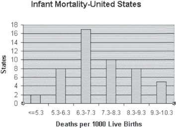
Figure 4.19 Infant mortality for states of the United States
Uniform Distributions
Although uniform distributions are not often found in health statistics, it is still useful for comparative purposes to show an example of one. A uniform distribution is one that has approximately equal numbers at each interval. To give an example of a uniform distribution, the random number generation selection in the Data Analysis add-in was used and the Uniform distribution option was selected. This option allows one to generate a random number between any upper and lower limits. One hundred random numbers were generated in the range zero to six. The random number generation add-in produces numbers to nine decimal places. Then the =FREQUENCY() function is used to put these numbers into the six categories—1, 2, 3, 4, 5, and 6. This is a reasonable simulation of the roll of a fair die 100 times. The result is shown in Figure 4.20. An actual uniform distribution (or a simulated one as in Figure 4.20) will not look exactly like the example in the lower right quadrant of Figure 4.16, but it will look approximately like that example.

Figure 4.20 Simulation of the roll of a fair die 100 times
4.2 Using the Pivot Table to Generate Frequencies of Categorical Variables
Thus far, the data discussed in this chapter have been numerical data. We are going to turn now to the discussion of frequency distributions for categorical data. There are actually three categorical variables in the data on hospital charges that have been discussed thus far in this chapter. These are Sex, MS-DRG, and ICD-9. In the original data, Sex was given as F or M and was later converted to 1 and 0. But MS-DRG and the ICD-9 code were given as numbers. But despite the fact that they are given as numbers, MS-DRG and ICD-9 remain categorical variables. The numbers simply represent a category rather than having meaning as a number.
Using the categorical variable Sex1 in the data set to create a frequency distribution is fairly easy with the =FREQUENCY() function. Because that variable is coded 0 and 1, it is necessary only to create two Bin values—0 and 1—and use the =FREQUENCY() function to accumulate all 100 observations into these two Bins. But categorical data are not always that easy to work with. If the data were left with the sex variable coded only “F” and “M,” the =FREQUENCY() function could not be used.
Access and Setup of the Pivot Table
The alternative, for most categorical data, would be to use what Excel calls the pivot table. The interface for pivot tables in Excel has changed since the introduction of Microsoft Office. The following sections will detail only pivot tables using Excel 2013.
Using Excel 2013 to Generate Pivot Tables with One Variable
The pivot table function in Excel produces the same output as the pivot table function in earlier versions of Excel. However, the steps and the look of the screens in getting to that output differ. The following are the steps to generate one-variable pivot tables. Another example is given that corresponds to two-variable pivot tables.
- Highlight your data range.
- On the Insert ribbon, click the PivotTable icon on the far left side in the Tables group.
- The Create PivotTable dialog box (Figure 4.21) appears. Because your data were highlighted, the Select a table or range radio button is selected and the Table/Range field is filled in. Also, the New Worksheet radio button is selected, signifying where the pivot table will be placed. Click OK.
- A display resembling Figure 4.22 will appear. This is the pivot table layout screen.
- In the new worksheet created, you will see that the fields from our source spreadsheet were carried over to the PivotTable Field List on the right.
- Drag an item, such as Sex, from the PivotTable Field List down to the Rows quadrant. The left side of your Excel spreadsheet should show a row for each Sex value. You should also see a check mark appear next to Sex.
- To see the count for each Sex, drag the same field to the Values quadrant (see Figure 4.23).
- In this case, Excel has determined that we wanted a Count of Sex. However, if you click the entry Count of Sex, and then the Value Field Settings option, the Value Field Settings dialog box (Figure 4.24) will appear. Here you can choose another value field from the Summarize value field by scroll menu.

Figure 4.21 Create PivotTable dialog box

Figure 4.22 Pivot table layout screen

Figure 4.23 Finished pivot table for Sex category

Figure 4.24 Value Field Settings dialog box
4.3 A Logical Extension of the Pivot Table: Two Variables
The last topic to consider in this chapter is the logical extension of the pivot table to two variables. A frequency distribution of Sex categories is interesting, but it might also be interesting to know how males and females compare on MS-DRG categories. Of course, certain categories, such as Female reproductive and Male reproductive, will be limited to one sex only. But how are the admissions in the other categories distributed? The pivot table can provide this information.
When the pivot table is created, the variable Sex will produce a table with two columns instead of the one column that was created in Figure 4.23. A pivot table with two variables when referred to in statistical parlance is more likely to be called a contingency table or a cross-tab (short for cross-tabulation).
An important point should be made about the two-variable pivot table that is to be created. There is a reason that Sex is the column heading rather than the row heading, and it goes beyond the fact that MS-DRG was the row heading in the original frequency distribution. This reason has to do with the notion of causality. In general, if one variable may be the cause of the level of another variable, the variable that may be a cause is typically used to define the columns. The other variable is typically used to define the rows.
What is meant by the idea that one variable may be the cause of the level of another variable? In the case of the MS-DRG category and Sex, there is every reason to expect that Sex has some causal relation to who is characterized in which MS-DRG category. Female reproductive disorders, for example, can be relevant only to women. But the pivot table will also show that there are many more women than men with heart and circulatory disorders (there are also twice as many women as men in the sample). On the other hand, there are more men in the respiratory disorder category. These differences can be attributed to Sex. However, it would be unreasonable to imagine the contrary. Only in rare instances would the MS-DRG category a person falls into somehow determine the person's sex. The next section details the steps to create a two-variable pivot table in Excel.
Using Excel 2013 to Generate Pivot Tables with Two Variables
The following example is the logical extension of the pivot table example in Section 4.2. The two-variable pivot table considering MS-DRG category and Sex from Section 4.2 is illustrated here using Excel 2013. These are the steps for obtaining the pivot table output.
- Highlight your data range after you open the Excel spreadsheet.
- On the Insert ribbon, click the PivotTable icon on the far left side in the Tables group.
- The Create PivotTable dialog box appears (refer to Figure 4.21). Because your data were highlighted, the Select a table or range radio button is selected and the Table/Range field is filled in. Also, the New Worksheet button has been selected, signifying where the pivot table will be placed. Click OK.
- A display resembling Figure 4.25 will appear. This is the pivot table layout screen.
- In the new worksheet created, you will see that the fields from our source spreadsheet were carried over to the PivotTable Field List on the right.
- Drag the item DRG Categ from the PivotTable Field List down to the Rows quadrant. In addition, drag the item Sex from the PivotTable Field List down to the Columns quadrant. The left side of your Excel spreadsheet should show a row for each DRG category and a column for each Sex value. You should also see check marks appear next to DRG Categ and Sex.
- To see the count for each DRG and Sex combination, drag the DRG Categ field to the Values quadrant. Figure 4.26 illustrates what the finished two-variable pivot table looks like.

Figure 4.25 Pivot table layout screen

Figure 4.26 Two-variable pivot table for DRG category and Sex
Working with Pivot Tables: Creating a Pareto Chart
Although pivot tables provide an important means to organize and subsequently analyze data, one other chart that may be interesting to look at is what is known as a Pareto chart. A Pareto chart is a way of looking at both the individual frequencies and the cumulative frequencies at the same time, and it is typically confined to categorical data. The Pareto chart is often used in quality assurance efforts to see where the major problems in some process may lie. However, it can also be used to look at major classes of hospital admission, for example. A Pareto chart combines the actual frequency distribution with the cumulative frequency distribution, as was the case in Figure 4.15. But with a Pareto chart, the categorical data are always arranged in order, from the most frequent to the least frequent, and the cumulative frequency is always shown as a line graph (refer to Figure 4.27 as an example of a Pareto chart for DRG categories).

Figure 4.27 A Pareto chart for DRG categories
The easiest way to construct a Pareto chart from a pivot table is as follows:
- Copy the pivot table, and paste it somewhere else on the spreadsheet, using Edit ⇨ Paste Special ⇨ Values. This eliminates the interactive nature of the pivot table and allows the inclusion of the cumulative line.
- Calculate a set of cumulative frequency values, as was done in Figures 4.13 and 4.14.
- Select both the actual and the cumulative frequencies, and click the Column chart icon on the Insert tab of the Excel ribbon to create a new chart. This new chart will be created in the same spreadsheet as the data.
- Right-click the cumulative frequency data, and select the Change Series Chart Type option.
- From the Change Chart Type menu, which appears when the data is right-clicked, select the type of chart you wish the cumulative frequency data to resemble. In this case, choose the Line option.
- Format the x- and y-axes to produce the chart shown in Figure 4.27.
A Pareto chart is typically used in situations where it is useful to be able to see the major problems easily and quickly at the left side of the chart. Of course, with hospital admissions, it is not surprising to see that the major problems are heart/circulatory and respiratory disorders. In other cases, the major problems may not be so obvious until the chart is constructed. The cumulative line indicates that all observations are included in the chart, and, as there are 100 observations, the cumulative line ends at 100.