
Hour 23. Formatting Content in Mobile Pages
What You’ll Learn in This Hour:
 Organizing data into listviews
Adding dialogs and pop-up menus
Creating panels for auxiliary information
Implementing mobile friendly tables
Applying collapsible content to mobile pages
One of the most important parts of mobile pages is content formatting. Many mobile devices have very limited screen space, so it is critical to get things formatted correctly. jQuery Mobile provides several good tools that allow you to format the mobile content to fit the goals you are trying to achieve.
In this hour, you learn the basic framework provided to lay out mobile content. You see how to implement grids, lists, collapsible elements, pop-ups, dialogs, panels, and tables to present data in a variety of ways.
Adding Basic HTML
The jQuery Mobile content <div> supports the basic HTML elements styled for the most part exactly as they appear on web pages. You can add the content in the standard way that you are very familiar with. You can use lists, tables, headings, paragraphs, <div>, <span>, and other elements just as you normally would.
The data in the content <div> is styled using the data-content-theme="c" attribute, which defaults to theme swatch "c"; however, you can set the theme by adding the data-content-theme attribute to the <div data-role="page"> element.
In addition to the standard HTML elements, you can add the same CSS styling that you would normally apply to your HTML pages. To illustrate this, look at the following code:
HTML:
<div data-role="page" id="pageOne" data-content-theme="c">
<div data-role="header"><h1>Page 1</h1></div>
<div data-role="content">
<h1>Heading 1</h1>
<img src="../images/flower.jpg" />
<h2>Heading 2</h2>
<ul><li>jQuery</li><li>jQuery UI</li><li>jQuery Mobile</li></ul>
<p>This is some simple text.</p>
<p><b>Bold</b> and <em>ephasized</em> and <a>Linked</a>.</p>
<table border="1">
<tr><th>Heading 1</th><th>Heading 2</th></tr>
<tr><td>Data 1</td><td>Data 2</td></tr>
</table>
</div>
</div>
CSS:
h1, h2 { background-color:blue; color:white; border-radius:5px; padding:2px; margin:3px;}
img { width:50px; }
ul {border: 3px ridge blue; margin:5px; list-style-type: none;padding:3px; }
li {border:1px dotted; margin-left:0px; text-align:center; }
p {font:italic 16px arial; }
td { border:5px inset red; }
Figure 23.1 shows the basic HTML elements stylized with theme "a", then "c", and then with the CSS styling applied. The elements appear pretty much as they would appear in a browser.

Creating a Grid Layout
One of the basic layouts provided by jQuery Mobile is the grid layout. The idea behind the grid layout is to split the page into equal-sized blocks, similar to an HTML table. Content can then be placed in those blocks and will automatically be laid out correctly.
To add a grid layout, you need to add a <div class="ui-grid-#"> where # specifies the number of columns to include. The values are a (2 columns), b (3 columns), c (4 columns), and so on. For example, the following defines a three-column grid:
<div class="ui-grid-b"> </div>
Items are added to the grid by using a <div ui-block-#> where # is the column letter, a (first), b (second), and so on. The first time a column letter is specified, the item will be placed in row 1 of the grid in that column position. The second time it will be placed in row 2. For example, to create a 2 by 2 grid you would use the following code:
<div class="ui-grid-a">
<div class="ui-block-a">Row 1 Column 1</div>
<div class="ui-block-b">Row 1 Column 2</div>
<div class="ui-block-a">Row 2 Column 1</div>
<div class="ui-block-b">Row 2 Column 2</div>
</div>
You can also create a single column grid using <div class="ui-grid-solo">. For example:
<div class="ui-grid-solo">
<div class="ui-block-a"><p id="number"></p></div>
</div>
Try it Yourself: Adding a Grid Layout to a Mobile Page
1. In Aptana, create the hour23, hour23/css, and hour23/js folders, and add the hour23/hour2301.html, hour23/hour2301.css, and hour23/hour2301.js files. Then copy the hour23/js/initmobile.js file into the hour23/js folder.
2. Add the code shown in Listing 23.1-css to the CSS file.
3. Add the code shown in Listing 23.1-js to the JS file. There are two click event handlers: one attached to the <p> elements appends the number or operator to the #number element, and the second is for <span> elements that will either clear #number or evaluate the contents.
3 $("p").on("click", function(){ $("#number").append($(this).html()); });
4 $("span").on("click", function(){
5 if ($(this).html() === "="){
6 $("#number").html(eval($("#number").html()));
7 } else {$("#number").html(""); };
8 });
4. Open the hour2301.html file and add the code shown in Listing 23.1-html. The code defines a basic page and adds three grid layouts in the following lines. The first grid is a single column defined by "ui-grid-solo", the second is a three-column grid defined by "ui-grid-b", and the third is a five-column grid defined by "ui-grid-d":
19 <div class="ui-grid-solo">
...
22 <div class="ui-grid-b">
...
36 <div class="ui-grid-d" id="logic">
5. The code inside the grid layout <div> elements are all <div "ui-block-#"> elements. Notice that the letters a, b, and c are used to define each row of the three-column grid cycle a,b,c,a,b,c,a,b... Each cycle begins a new row.
23 <div class="ui-block-a"><p>1</p></div>
24 <div class="ui-block-b"><p>2</p></div>
25 <div class="ui-block-c"><p>3</p></div>
26 <div class="ui-block-a"><p>4</p></div>
27 <div class="ui-block-b"><p>5</p></div>>
6. Save all the files and then open the HTML code in a browser on your mobile device. The web pages should look similar to Figure 23.2. The calculator should accept click input and evaluate when the = button is pressed.

LISTING 23.1-html HTML Code That Builds the Grids for the Calculator Controls
01 <!DOCTYPE html>
02 <html>
03 <head>
04 <title>Hour 23-1</title>
05 <meta charset="utf-8" />
06 <meta name="viewport" content="width=device-width, initial-scale=1">
07 <script type="text/javascript" src="../js/jquery.min.js"></script>
08 <script type="text/javascript" src="js/initmobile.js"></script>
09 <script type="text/javascript" src="../js/jquery.mobile-custom.min.js"></script>
10 <script type="text/javascript" src="js/hour2301.js"></script>
11 <link rel="stylesheet" href="../js/css/jquery.mobile-custom.min.css" />
12 <link rel="stylesheet" href="css/hour2301.css" />
13 </head>
14 <body>
15 <div id="border"><div id="frame">
16 <div data-role="page" id="pageOne">
17 <div data-role="header"><h1>Grid Page</h1></div>
18 <div data-role="content">
19 <div class="ui-grid-solo">
20 <div class="ui-block-a"><p id="number"></p></div>
21 </div>
22 <div class="ui-grid-b">
23 <div class="ui-block-a"><p>1</p></div>
24 <div class="ui-block-b"><p>2</p></div>
25 <div class="ui-block-c"><p>3</p></div>
26 <div class="ui-block-a"><p>4</p></div>
27 <div class="ui-block-b"><p>5</p></div>
28 <div class="ui-block-c"><p>6</p></div>
29 <div class="ui-block-a"><p>7</p></div>
30 <div class="ui-block-b"><p>8</p></div>
31 <div class="ui-block-c"><p>9</p></div>
32 <div class="ui-block-a"><span>C</span></div>
33 <div class="ui-block-b"><p>0</p></div>
34 <div class="ui-block-c"><span>CE</span></div>
35 </div>
36 <div class="ui-grid-d" id="logic">
37 <div class="ui-block-a"><p>+</p></div>
38 <div class="ui-block-b"><p>-</p></div>
39 <div class="ui-block-c"><p>*</p></div>
40 <div class="ui-block-d"><p>/</p></div>
41 <div class="ui-block-e"><span>=</span></div>
42 </div>
43 </div>
44 </div></div>
45 </body>
46 </html>
LISTING 23.1-js jQuery Mobile Code That Handles Clicks
1 $(document).ready(function() {
2 checkForMobile();
3 $("p").on("click", function(){ $("#number").append($(this).html()); });
4 $("span").on("click", function(){
5 if ($(this).html() === "="){
6 $("#number").html(eval($("#number").html()));
7 } else {$("#number").html(""); };
8 });
9 });
LISTING 23.1-css CSS Code That Styles the Mobile Page
1 p, span { margin:2px; border-radius:15px; background-color:#888888; color:white;}
2 p, span { font:bold 30px/50px arial; text-align:center; border:3px ridge blue;}
3 #number {background-color:black; min-height:50px; text-align:right; padding-right:5px;}
4 span { background-color:#555555; display:block; }
5 #logic span { background-color:#B10000; }
6 #logic p { background-color:#0066AA; }
Implementing Listviews
One of the most common ways to organize mobile content is with listviews. Listviews organize the content into scrollable, linkable lists that are easy to view and navigate. jQuery UI does a great job providing a framework to easily implement listviews in your code.
The application of listviews varies a lot depending on the amount and type of data that is being placed in them. To handle this, jQuery provides an array of different types of lists. The following sections cover the most commonly used.
Caution
If you dynamically add items to lists, tables, and the like in jQuery code, you will need to call the refresh() action on that element to refresh the contents with jQuery Mobile.
Understanding Basic Lists
Lists are created by adding the data-role="listview" to a <ul> or <ol> element. jQuery automatically handles formatting the <li> elements into a list form. For <ol> elements, the formatted listview contains the numbering for each line item.
For example:
<ul data-role="listview">
<li><a href="#nested">Nested</a></li>
<li><a href="#split">Split List</a></li>
<li><a href="#divided">Divided List</a></li>
<li><a href="#search">Searchable List</a></li>
<li>Non Linkable Item</li>
</ul>
Nested Lists
Nested lists are created by nesting additional <ul> elements inside the list view. jQuery Mobile automatically detects this and builds up linkable pages to the sublists. The following shows an example of implementing nested lists, as shown in Figure 23.3:
<ul data-role="listview" >
<li>Hobbits<ul><li>Frodo</li><li>Sam</li><li>Bilbo</li></ul></li>
<li>Elves<ul><li>Legolas</li><li>Elrond</li><li>Galadriel</li></ul></li>
<li>Men<ul><li>Aragorn</li><li>Boromir</li><li>Theoden</li></ul></li>
</ul>

Split-Button Lists
Split-button lists are lists that include multiple options on each line. This can be useful in a variety of ways. A common use might be when listing products for sale, the main part might link to more details and the secondary link adds the item to the cart. The following code shows an example of implementing a split-button list, as shown in Figure 23.3:
<ul data-role="listview">
<li><a href="#">Jeep</a><a href="#" data-icon="star">Like</a></li>
<li><a href="#">Ford</a><a href="#" data-icon="star">Like</a></li>
<li><a href="#">Chevy</a><a href="#" data-icon="star">Like</a></li>
</ul>
Adding Dividers to Lists
A divided list is one where elements of the list are divided from each other by a simple bar. The idea is to make it easier for the user to see the list items by splitting up the view.
Divided lists can be created manually by injecting your own dividers by adding a data-role="list-divider" to one of the <li> elements. For example:
<ul data-role="listview" >
<li data-role="list-divider">Numbers</li>
<li>1</li><li>2</li><li>3</li>
<li data-role="list-divider">Letters</li>
<li>A</li><li>B</li><li>C</li>
</ul>
You can also automatically add dividers by adding data-autodividers="true" to the <ul> element. This splits the elements every time the first character changes and then creates a divider for that letter. For example, the following code adds an autodivider, as shown in Figure 23.3:
<ul data-role="listview" data-autodividers="true">
<li>Alex</li><li>Alice</li><li>Brad</li><li>DaNae</li><li>David</li>
<li>Isaac</li><li>Jordan</li><li>Nancy</li>
</ul>
Implementing Searchable List
Another very useful feature is the searchable list. jQuery Mobile has a nice search feature built in that allows you to search the current list. The search feature adds a text input at the top of the list and will filter the items as you type text into the list. Only the items that match the filter text will be displayed.
Searchable lists are created by adding data-filter="true" to the <ul> element containing the list. For example, the following code adds a searchable list, as shown in Figure 23.3:
<ul data-role="listview" data-filter="true">
<li>Rome</li><li>Milan</li><li>Florence</li><li>Genoa</li><li>Venice</li>
<li>Naple</li><li>Balonga</li><li>Bari</li><li>Turin</li><li>Palermo</li>
</ul>
Using Collapsible Blocks and Sets
Another useful way to represent content is by dividing it into collapsible elements. A header is presented that the user can see, but the content the header represents is hidden until the header is clicked.
This enables you to show and hide the content inline, rather than linking to another page. Collapsible elements can be represented as a standalone block or as a set of connected blocks.
To create a collapsible item, you add the data-role="collapsible" to a div element. The <div> element needs to have a header as well to display in a bar when collapsed. To group items together, you add multiple <div data-role="collapsible"> elements inside a <div data-role="collapsible-set"> element.
The code in Listing 23.3 shows an example of a single collapsible element followed by a set of collapsible elements, illustrated in Figure 23.4.
LISTING 23.3 HTML Code That Builds the Listviews
19 <div data-role="collapsible" data-collapsed="false"
20 data-theme="b" data-content-theme="c">
21 <h3>Photo Information</h3>
22 <p>These photos were taken by Brad Dayley in Arches National Park, Utah.</p>
23 </div>
24 <div data-role="collapsible-set" data-theme="b" data-content-theme="a">
25 <div data-role="collapsible">
26 <h3>Delicate Arch</h3><img src="../images/arch.jpg" /></div>
27 <div data-role="collapsible" >
28 <h3>Double Arch</h3><img src="../images/double.jpg" /></div>
29 <div data-role="collapsible">
30 <h3>Morning View</h3><img src="../images/sunstar.jpg" /></div>
31 </div>

FIGURE 23.4 Collapsible content allows you to provide more information to users inline by allowing them to expand only what they want to see.
To force an item to be expanded, you add the data-collapsed="false". This sets the initial state to expanded, although you can still collapse and expand it by clicking the header.
You also can control the themes used to render the collapsible sets, using data-theme to define the header and data-content-theme to define the collapsed content.
The full code for this example can be found on the book’s website in code/hour23/hour2303.html.
Adding Auxiliary Content to Panels
A useful way to present data that is not necessarily part of the page but relevant is by using panels. A panel is similar to the page, but sits off to the left or right side. When opened, the panel transitions into revealing the additional information.
Panels are defined using data-role="page" and must be siblings to the header, content, and footer elements inside a mobile page. Panels are opened by linking to the id value, similar to opening a new page. When the link is clicked, the panel is displayed using one of the following three display modes:
data-display="overlay"—Panel elements overlay the existing page with a transparent background.
data-display="push"—Panel content “pushes” the existing page as it is exposed.
data-display="reveal"—Panel is under the current page and is revealed as the current page slides away.
The panel is positioned using data-position="right" or data-position="left". When opened, it will scroll with the page. You can force a fixed position using data-position-fixed="true", in which case the panel contents will appear relative to the screen and not scroll position.
To close the panel, add a link button with the <a data-rel="closed"> attribute set to the panel page. You can also close a panel from jQuery code using the following:
$( "#panelId" ).panel( "close" );
The code in Listing 23.4 shows an example of a basic panel. The panel is opened by a button on the main page, as shown in Figure 23.5. The full code for the example is on the book’s website at code/hour23/hour2304.html.
LISTING 23.4 jQuery Mobile Panel Page with Configuration Options
17 <div data-role="header"><h1>Page</h1></div>
18 <div data-role="content">
19 <a data-role="button" href="#config" data-icon="bars">Configuration</a>
20 </div>
21 <div data-role="panel" id="config" data-position="right" data-display="reveal">
22 <div data-role="header" data-theme="a"><h3>Panel</h3></div>
23 <h3>Settings</h3>
24 <label for="Option1">Option 1</label>
25 <input type="checkbox" id="Option1"></input>
26 <label for="Option2">Option 2</label>
27 <input type="checkbox" id="Option2"></input>
28 <a data-role="button" data-icon="delete" data-rel="close" data>Close Config</a>
29 </div>
30 </div>

Working with Pop-ups
One of your best friends when implementing mobile page content is the pop-up. A pop-up is different from a panel in that it can be displayed anywhere on the page currently being viewed. This allows you to add additional bits of information that the user can easily click and see.
Pop-ups are defined using data-role="popup" and can be placed anywhere inside the content of a mobile page. Pop-ups are also opened by linking to the id value of the <div data-role="popup"> tag. However, you must add a data-rel="popup" to the <a> tag that links to the pop-up. You can also manually open a pop-up using the following from jQuery code:
$("#popupId").popup();
The pop-up is positioned using a data-position-to attribute that can be set to window, origin, or the #id of an element. jQuery Mobile will try to center the pop-up over that element.
To close the pop-up, click the page somewhere other than the pop-up. You also can add a close button to the pop-up <div> by adding an data-role="button" attribute with a data-rel="back" attribute. For example, following is a close button with the delete icon and notext specified:
<a href="#" data-rel="back" data-role="button" data-theme="a"
data-icon="delete" data-iconpos="notext" class="ui-btn-right">Close</a>
The code in Listing 23.5 shows an example of three pop-ups: a simple text pop-up, an image pop-up, and a menu pop-up, illustrated in Figure 23.6. Note that the image pop-up has a class="photopopup"; this provides class settings to style the image pop-up container. The full code for the example is on the book’s website at code/hour23/hour2305.html.
LISTING 23.5 HTML Implementing jQuery Mobile Pop-ups
25 <a data-role="button" href="#simple" data-rel="popup" id="simpleLink">Simple Popup</a>
26 <div data-role="popup" id="simple" data-position-to="#simpleLink">
27 <p>Simple text popup.<p>
28 <p>Put whatever text you want here.</p>
29 </div>
30 <a data-role="button" href="#photo" data-rel="popup" id="imageLink">Image Popup</a>
31 <div data-role="popup" id="photo" data-position-to="#imageLink" class="photopopup">
32 <a href="#" data-rel="back" data-role="button" data-theme="a" data-icon="delete" data-iconpos="notext" class="ui-btn-right">Close</a>
33 <img src="../images/falls.jpg" />
34 </div>
35 <a data-role="button" href="#menu" data-rel="popup" id="menuLink">Popup Menu</a>
36 <div data-role="popup" id="menu" data-position-to="#menuLink">
37 <ul data-role="listview">
38 <li><a>Setting A</a></li><li><a>Setting B</a></li>
39 <li><a>Setting C</a></li><li><a>Setting D</a></li>
40 </ul>
41 </div>

Building Mobile-Friendly Tables
jQuery Mobile adds a few very useful features for implementing tables in mobile pages. Tables are a tough sell for mobile pages because they typically take up too much room. That is why jQuery Mobile has come up with a couple of nice solutions by adding a data-mode attribute to the <table> tag.
The first solution is to add a reflow mode that allows the cells in the table to be repositioned so that they flow with the rest of the page. In reflow mode, when the table is too wide, the columns get broken up into individual cells stacked on top of each other. Then the headers in the column get added as labels to the cells so that each cell contains the column header to the left to identify the value. This is illustrated in Figure 23.7.
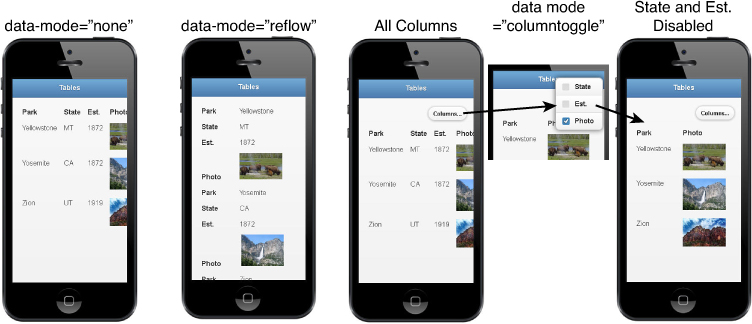
FIGURE 23.7 The reflow mode allows the table to stack each row’s columns into groups with labels; the columntoggle mode allows the user to disable columns.
The second solution is to add a columntoggle mode that provides a button with a pop-up menu allowing the user to enable/disable columns to display. This allows users to keep the table formatting, but see only the columns they want to look at. This is also illustrated in Figure 23.7.
The columns that can be enabled/disabled in columntoggle mode are designated by adding a data-priority=# attribute to the <th> items in the first line of <thead>. Columns without the data-priority cannot be disabled. The # value of data-priority ranges from 1 (highest) to 6 (lowest).
Listing 23.6 shows a table that is set up for jQuery Mobile’s table modes. The <table> tag includes the data-role="table" attribute and the required data-mode and id attributes. Figure 23.7 shows how setting the different values to data-mode changes the look on the mobile device. The full code for this example can be found on the book’s website at code/hour2306.html.
LISTING 23.6 HTML Implementing jQuery Mobile Table Modes
21 <table data-role="table" data-mode="columntoggle" id="parkTable">
22 <thead><tr><th>Park</th><th data-priority="1">State</th>
23 <th data-priority="2">Est.</th><th data-priority="3">Photo</th></tr>
24 </thead>
25 <tbody>
26 <tr><td>Yellowstone</th><td>MT</td><td>1872</td>
27 <td><img src="../images/bison.jpg" width="100" /></tr>
28 <tr><td>Yosemite</th><td>CA</td><td>1872</td><td>
29 <img src="../images/falls.jpg" width="100" /></tr>
30 <tr><td>Zion</th><td>UT</td><td>1919</td><td>
31 <img src="../images/peak.jpg" width="100" /></tr>
32 </tbody>
33 </table>
Summary
This hour covered all the basics in implementing content in mobile web pages. There are several types of containers for content, and each of them has a different look and feel and can be used for different purposes. For example, listviews are great for displaying lists of items, menu choices, and even cascading data, whereas pop-ups and panels are good for providing users access to auxiliary data on demand, without having it encumber the page.
You saw how to make tables mobile friendly using the reflow and columntoggle modes. You also implemented some dialogs that can be used for a variety of purposes.
Q&A
Q. Does jQuery Mobile support responsive media queries and responsive web design?
A. Yes. Mobile elements such as tables and grids are meant to support responsive web design to support and adapt the layout for different screen sizes.
Q. How do you turn the corners on and off on buttons, collapsible sets, and the like?
A. Corners can be turned off on many elements by adding the data-corners="false" attribute.
Workshop
The workshop consists of a set of questions and answers designed to solidify your understanding of the material covered in this hour. Try to answer the questions before looking at the answers.
Quiz
1. How many columns are there in <div class="ui-grid-a"?
2. True or False: It is not possible to nest a listview inside another listview.
3. How do you make a collapsible item default to an expanded state?
4. What data attribute does a link need to open a pop-up?
5. How do you make a column available to be toggled on or off?
Quiz Answers
1. Three.
2. False.
3. data-collapsed="false"
4. data-rel="popup"
5. Add a data-priority attribute to the <th> element in the <thead>.
Exercises
1. Extend the code in Listing 23.5. Add another pop-up that has an expandable set of items. This is another common type of pop-up.
2. Extend the code in Listing 23.4 to include a second panel, the new one on the left.