
Hour 4. Adding CSS/CSS3 Styles to Allow Dynamic Design and Layout
What You’ll Learn in This Hour:
 Adding CSS to HTML documents
How to use CSS selectors to apply styles to specific HTML elements
How to apply color, images, and backgrounds to HTML elements
Creating cool borders around HTML elements
Using CSS to define the look and layout of web pages
Designing CSS to be used by your jQuery and JavaScript code
One of the most important aspects of dynamic web pages is their capability to dynamically adjust the design and layout of elements as users interact with the page. This hour focuses on adding CSS styles to your HTML documents. CSS provides a way to very easily apply style changes to HTML elements on the web page.
It is important to add an initially good design that can be easily altered in your jQuery and JavaScript code. With a good design, simple style changes through jQuery and JavaScript can dramatically alter the appearance and behavior of the HTML components, providing a rich user experience.
The following sections cover CSS syntax and using CSS to modify the look of HTML elements and the layout of the web page.
Adding CSS Styles to the Web Page
You can add CSS styles to web pages in a number of ways. You can add them as a separate file, in the HTML <head> element, in the HTML <body> element, inline inside of a specific HTML element, or even dynamically from jQuery and JavaScript.
You can apply as many styles in as many different ways as you would like. However, you need to keep in mind that the styles are applied in order, with the latest style overriding the values of previous styles. Styles are loaded in the following order:
1. <link> or <style> elements from the header. The lower elements override the ones above them.
2. <style> elements in the web page body. The lower elements override the ones above them.
Caution
If you define different CSS definitions for the same element(s) in two different CSS files or <style> sections, the ones that are loaded last will overwrite the previous ones. This is very useful; however, it can be a pain if it is not intended. For example, if you have a selector that changes several properties for <p> elements and then a subsequent selector that directly references the ID of a specific <p> element, you would likely want to place the general definition before the specific so that you retain the specific property values.
3. Styles applied to HTML elements directly via the style attribute of the element.
4. Styles applied dynamically via jQuery or JavaScript. These are dynamically applied when the JavaScript is executed.
The following sections discuss how to add styles using each of the different options and when to use them.
Loading CSS Styles from a File
Typically, the best method of loading CSS styles is from a separate file, which means you create a file with a .css extension and then add it to your website. This provides several advantages:
You can link several HTML documents to the same CSS file.
Your HTML files remain much cleaner because there is not a lot of extra CSS code encumbering them.
It is easy to re-skin your website by changing out the CSS file for another.
To load CSS styles from a separate file, you need to add the .css file to your website and then add a <link> element to the HTML <head> element. When the web page is loaded, the browser parses the <link> element, requests the .css file from the web server, and applies the styles when rendering the HTML elements.
The following is an example of the syntax used in the <link> element. Notice that the rel attribute is set to stylesheet, the type to text/css, and the href points to the location of the .css file on the web server.
<link rel="stylesheet" type="text/css" href="css/test.css">
Adding CSS Styles to the Header
You can also add CSS styles directly to a web page in the <head> element using the <style> tag. All the text inside the <style> tab will be treated as CSS, read into the browser, and applied to the elements as they are rendered.
Applying CSS styles in the header does have some advantages, including the following:
It is easy to apply them to the header to test out the web page without needing to manage an additional .css file.
You can override global styles loaded from a .css file with some that apply specifically to that page.
The following is an example of a <head> element that includes a <style> element with CSS. Notice that the type attribute is set to text/css; this is not required, but it is good practice for a time when other style types are supported by browsers.
<html>
<head>
<meta charset="UTF-8">
<style type="text/css">
p{
background-color:#C0C0C0;
padding: 3px;
}
span{
font-weight:bold;
}
</style>
</head>
...
Using CSS Styles in the HTML Body
You can also use the <script> tag to add CSS style settings directly inside the HTML <body> element. This is not a good practice, because it can make the web page styles very difficult to change and fix. You should limit your use of this method to times when you want to quickly add a style for testing purposes. After testing, you should always move them to the <head> or a separate file.
Defining CSS Styles in HTML Elements
HTML elements provide a style attribute that allows you to directly set the CSS style inside the HTML statement. This provides advantages, but one huge disadvantage.
The advantage is that you can override the CSS styles that are applied globally to the website or web page. This makes it possible to customize the look and feel of a specific element without the need to include a special rule in another location.
The disadvantage is that if you do this very much, it makes it really difficult to update the style of your website when you decide on a different web design or branding.
The following line of code shows an example of adding a CSS style directly inside of a <span> element:
<span style="background-color:blue; color:white font-weight:bold">Styled Text </span>
Adding CSS Styles to HTML Elements
You have already seen some brief examples of CSS being applied in previous examples in this book. Now it is time to introduce you to the syntax and properties that you can apply to HTML elements via CSS. This section is by no means comprehensive; however, it will give you an understanding of what can be done to HTML elements via CSS.
As you read through and try out the examples, keep in mind that you will have access to the CSS properties via jQuery and JavaScript and can therefore set them dynamically as the user interacts with the web page.
Understanding the Basic CSS Syntax
CSS is composed of a set of one or more rules that define values of properties that the web browser uses when rendering the HTML element. Each rule is started by a selector that defines which HTML element(s) to apply the style change to. Then inside the {} brackets are specific property settings. The property values are set using the property:value syntax. Each property setting is separated by a semicolon.
The following listing shows an example of a simple CSS rule that sets the font style, background color, and width of a <p> element:
p {
font-style:italic;
background-color:#DDDDDD;
width:250px;
}
You should use a separate line for each of the elements to make the file more readable and clean. You can combine multiple elements on the same line as long as they are enclosed in the {} brackets. For example:
p { font-style:italic; background-color:#DDDDDD; width:250px; }
Several of the CSS properties support multiple settings for a single property. This helps keep your CSS files a bit more concise and yet maintains the readability. For example, the following single CSS property setting sets the font to bold, italic, 12 pixels, and Times New Roman. The multiple settings are separated by spaces. There are two typefaces specified, Times New Roman and serif, so if the browser can’t find the first, it will use the second. Notice that because Times New Roman includes spaces, it must be encapsulated in double or single quotes. Also notice that the two typefaces are separated by a comma indicating they are still part of the same setting value.
font:italic bold 12px "Times New Roman",serif;
Figure 4.1 shows the basic CSS to apply background and color changes to a <p> element and a <span> element. Notice that there are two rules—one for each element type. The property values listed in each rule are applied only to the element specified by the selector.
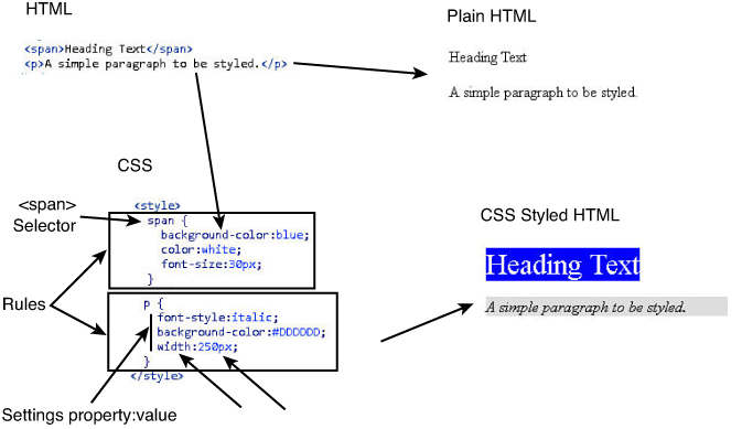
FIGURE 4.1 CSS rules are composed of a selector, followed by a list of property values to be applied to HTML elements.
Note
Some of the CSS properties are supported only in specific types of browsers. CSS has a naming convention that allows for the browser engine to be prepended onto the property name to identify the browser that the property setting is intended for. This provides a couple of benefits: one is that you can specify different CSS property values for different browsers; the second is that it allows you to set the CSS property only for browsers that support the functionality. The prefixes are -ms- for Internet Explorer, -moz- for Firefox, -webkit- for Safari and Chrome, and o- for Opera. The following shows an example of using the prefixes to set the rotate property value:
-ms-transform:rotate(5deg); /* IE 9 */
-moz-transform:rotate(5deg); /* Firefox */
-webkit-transform:rotate(5deg); /* Safari and Chrome */
-o-transform:rotate(5deg); /* Opera */
Using CSS Selectors to Style HTML Elements
One of the most important pieces of styling HTML elements is the CSS selector. The CSS selector is used to define which HTML elements the CSS rule applies to. CSS selectors can seem a bit daunting at first; however, when you understand the basic concepts in some examples, the syntax falls into place.
The following series of examples will help you understand selectors:
To apply a CSS rule to all <div> elements, use the following (HTML elements are referred to by tag name):
div {...
To apply a CSS rule to a specific HTML element with the id attribute equal to myDiv, use the following (in CSS, the id attribute is designated using #):
#myDiv {...
To apply a CSS rule to a group of HTML elements all with the class attribute equal to container, use the following (in CSS, the id attribute is designated using .):
.container {...
To apply a CSS rule to <span> elements when the mouse is hovering over them, use the following (in CSS, states are designated by :state):
span:hover {...
To apply a CSS rule to <a> elements that have the target attribute set to _blank, use the following (in CSS, attributes are designated by [] brackets):
a[target=_blank]
You can also chain multiple selectors together using commas. For example, to apply a CSS rule to all <div>, <span>, <p>, and elements with class="menu", you could use the following:
div, span, p, .menu {...
Also keep in mind that CSS stands for Cascading Style Sheets. You may have different selectors that apply to several groups of objects that overlap. For example, consider the following selectors. The first applies to all <div> elements, the second applies only to “menu” class elements—some of which are <div> elements—and the final applies only to “menu” class elements that are currently under the mouse cursor. Property settings in the .menu and .menu:hover rules will override settings made in the div rule:
div {...
.menu {...
.menu:hover{...
Table 4.1 provides a list of several types of selectors; it shows an example and describes how the selector works. You can do much more with selectors than what is shown in the preceding examples and in Table 4.1, but these should give you an idea of how we are using selectors in the rest of the exercises in this book.


Using CSS Design Properties
Most of the CSS properties are aimed at altering the appearance of the HTML items. Unfortunately, the out-of-the-box HTML elements look pretty bland. However, by adding color, borders, backgrounds, images, and other design properties, you can dramatically change the appearance of your HTML elements with only a little bit of CSS code.
The following sections cover the CSS properties that alter the look of HTML components.
CSS Colors
One of the most frequently used settings applied via CSS is the color property. Most elements have a color property that defines the color the browser uses to render them—for example, a table border, a list bullet, or text characters in a paragraph.
You can use several methods for setting the exact color to support the different backgrounds and situations of people who are defining the color. The color value can be specified via one of the following methods:
Name—The CSS color name, such a red, blue, green, or yellow. There are 147 predefined color names, such as aqua, crimson, silver. You can find a list of color names at www.w3.org/TR/css3-color/#svg-color.
Hex—You can specify a hex number that represents the amount of red, green, and blue to include in the color. The syntax is #RRGGBB. A value of 00 represents none of that color, and a value of FF represents all of that color. For example, red is #FF0000, green is #00FF00, and blue-green is #00FFFF.
RGB—Similar to Hex, except that you can specify values between 0 and 255. For example, blue-green is rgb(0, 255, 255).
RGBA—Same as RGB; however, you can also specify an alpha parameter that controls the opaqueness, with 0.0 being fully transparent and 1.0 being opaque. For example: rgba(0, 255, 255, 0.5) is blue-green that is 50% opaque.
HSL—Enables you to specify the color based on the Hue/Saturation/Lightness color scheme. For example, a color with a hue of 100, saturation of 45%, and a lightness of 75% would be hsl(100, 45%, 75%).
HSLA—Same as HSL, except you can also specify an alpha parameter that controls the opaqueness, with 0.0 being fully transparent and 1.0 being opaque. For example, an 80% transparent color would be hsla(100, 45%, 75%, .20).
For example, the following CSS rules all define the text color of a <p> element as blue and are completely interchangeable:
p {color:blue;}
p {color:#0000FF;}
p {color:rgb(0,0,255);}
p {color:rgba(0,0,255,1.0);}
p {color:hsl(240,100%,50%);}
p {color:hsl(240,100%,50%,1.0);}
Try it Yourself: Applying Text Styles via CSS
color—Allows you to set the color and transparency of the text.
font—Allows you to set the various properties of the font used to render the text. The properties that you can set are font-style, font-variant, font-weight, font-size, and font-family. The font property allows these to be set on a single line or as a series of separate properties. For example, the following lines are equivalent and produce the output shown in Figure 4.2:
#roman{font: italic bold 30px "Times New Roman", serif}
#roman{
font-family:"Times New Roman", serif;
font-style:italic;
font-weight:bold;
font-size: 30px;
}
Note
Font families are applied in the order specified in the font-family property. The first font found is used. It is a good idea to always provide one of the common fonts, such as serif, as a backup in case the font you specify doesn’t exist on the browser’s system.
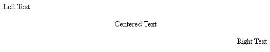
text-align—Allows you to set the text alignment to right, left, or centered. For example, the following CSS settings render the output shown in Figure 4.3:
#align-left{text-align:left}
#align-center{text-align:center}
#align-right{text-align:right}
letter-spacing—Allows you to specify an amount of spacing between the letters in the words. This value can be either positive or negative and can be specified as px/pt/cm. Figure 4.4 shows an example of using the following CSS setting to tighten the letter spacing by 1 pixel:
#tight{letter-spacing:-1px}
word-spacing—Enables you to specify an amount of spacing between the letters in the words. This value can be either positive or negative and can be specified as px/pt/cm.
line-height—Enables you to control the amount of space between lines. You can specify the value as a number that is multiplied by the height of the text, a size amount using a number with an em/px/pt/cm suffix, or a % for percentage of the height of the line. Figure 4.5 shows an example of using the following CSS setting to tighten the line spacing to only 50% the normal height:
#half-height{line-height:50%}
text-decoration—Enables you to add a line below, above, or through the text using the overline, underline, or line-through values. You can also specify blink as the value to have the text blink in the browser. The following lines of CSS cause the element to render an underline and strikethrough, as shown in Figure 4.6:
#underline{text-decoration:underline;}
#strike-through{text-decoration:line-through;}

text-indent—Enables you to specify an amount to indent the first line of the text either by a specific value, such as 20px, or as a percentage of the width of the element, such as 20%.
text-transform—Enables you to change the capitalization of the text using capitalize to capitalize the first character in each word, uppercase to make the text all caps, or lowercase to remove all capital letters.
text-overflow—Allows you to define what happens when the text is wider than the size allowed by the element. The options are clip to just cut the text off, ellipsis to add a ... representing the clipped text, or a string that will be added to replace the clipped text. For example, the following line of CSS will clip text if it is too long and append the string "(more)" at the end:
#overflow{text-overflow:" (more)";}
1. From Aptana create a folder named Hour04.
2. Add a subfolder to Hour04 called css.
3. Right-click the Hour04 folder and create a new HTML document named hour0401.html; then add the following basic HTML elements:
01 <!DOCTYPE html>
02 <html>
03 <head>
04 <title>Hour 4 - Example 1</title>
05 <meta charset="UTF-8">
...
07 </head>
08 <body>
...
23 </body>
24 </html>
4. Now add the following <p> elements that you will format using CSS. Notice that each has a different id property that you can use in the CSS selector to isolate just that element.
09 <p id="plain">Plain Text</p>
10 <p id="blue">Blue Text</p>
11 <p id="tight">Tight Text</p>
12 <p id="half-height">Close Text Line 1<br>
13 Close Text Line 2</p>
14 <p id="align-center">Centered Text</p>
15 <p id="align-right">Right Text</p>
16 <p id="indent">Indented Text</p>
17 <p id="underline">Underlined Text</p>
18 <p id="strike-through">Strike Through Text</p>
19 <p id="first-cap">capitalize the first letter</p>
20 <p id="uppercase">change to upper case</p>
21 <p id="blackadder">Some BlackAdder Text</p>
22 <p id="roman">Some Times New Roman Text</p>
5. Right-click the new css folder and add a new CSS file named hour0401.css.
6. Add the following CSS rules to the new file to define different property settings for the different textual elements created in step 4:
01 #blue{color:blue;}
02 #tight{letter-spacing:-1px}
03 #half-height{line-height:50%}
04 #align-center{text-align:center}
05 #align-right{text-align:right}
06 #indent{text-indent:50px;}
07 #underline{text-decoration:underline;}
08 #strike-through{text-decoration:line-through;}
09 #first-cap{text-transform:capitalize;}
10 #uppercase{text-transform:uppercase;}
7. Add the following <link> element to the header of hour0401.html to link to the new CSS document:
06 <link rel="stylesheet" type="text/css" href="css/hour0401.css">
8. Save both files and open the following location in a browser. You should see output similar to Figure 4.7 with the various looks of each of the paragraphs altered.
http://localhost/code/hour04/hour0401.html

FIGURE 4.7 Applying CSS styles to paragraph elements enables you to completely change their look and behavior.
LISTING 4.1-html HTML Code with Several Paragraph Elements to Be Stylized
01 <!DOCTYPE html>
02 <html>
03 <head>
04 <title>Hour 4 - Example 1</title>
05 <meta charset="UTF-8">
06 <link rel="stylesheet" type="text/css" href="css/hour0401.css">
07 </head>
08 <body>
09 <p id="plain">Plain Text</p>
10 <p id="blue">Blue Text</p>
11 <p id="tight">Tight Text</p>
12 <p id="half-height">Close Text Line 1<br>
13 Close Text Line 2</p>
14 <p id="align-center">Centered Text</p>
15 <p id="align-right">Right Text</p>
16 <p id="indent">Indented Text</p>
17 <p id="underline">Underlined Text</p>
18 <p id="strike-through">Strike Through Text</p>
19 <p id="first-cap">capitalize the first letter</p>
20 <p id="uppercase">change to upper case</p>
21 <p id="blackadder">Some BlackAdder Text</p>
22 <p id="roman">Some Times New Roman Text</p>
23 </body>
24 </html>
LISTING 4.1-css CSS Code That Stylizes the Various Textual Elements by Adjusting the Color, Alignments, Adding Lines, and Adjusting the Spacing
01 #blue{color:blue;}
02 #tight{letter-spacing:-1px}
03 #half-height{line-height:50%}
04 #align-center{text-align:center}
05 #align-right{text-align:right}
06 #indent{text-indent:50px;}
07 #underline{text-decoration:underline;}
08 #strike-through{text-decoration:line-through;}
09 #first-cap{text-transform:capitalize;}
10 #uppercase{text-transform:uppercase;}
11 #roman{font: italic bold 30px "Times New Roman", serif}
12 #blackadder{
13 font-family:"blackadder itc";
14 font-size: 25px;
15 font-weight:bold;
16 }
Try it Yourself: Adding Backgrounds via CSS
background-attachment—Can be set to scroll or fixed, which will scroll the background with the rest of the page or leave it as fixed.
background-color—Enables you to define the color of the background using the normal color commands; for example:
#top-left {background-color:rgb(255,255,0);}
background-size—Enables you to specify the size of the background of the element. The values can be a width/height set in pixels or percentages, cover which will scale the background to fill the area of the element, or contain which will scale the image so that the entire image fits in the element. Keep in mind that with cover, some parts of the image may not be displayed in the element if the dimension ratios are different. Some examples that follow set the size to 200 pixels wide by 100 pixels high, 20% the width of the element by 200% the height, and contained fully within the size of the element.
#top-left {background-size:200px 100px;}
#top-left {background-position:20% 100%;}
#top-left {background-position:contain;}
background-position—This sets the location the background is placed in the element, such as top left, bottom center, and so on. You can also specify a position coordinate of width and height in pixels or percentages for the top-left corner of the background image. For example, the following code places the background image in the middle, 10% to the right 50% down, and 100px to the right 20px down:
#top-left {background-position:center center;}
#top-left {background-position:10% 50%;}
#top-left {background-position:100px 20px;}
background-image (url)—Enables you to specify the url to an image that will be applied as a background. For example:
#rocs{background-image:url("images/rocks.png");}
background-image (gradient)—In CSS3, you can also specify a gradient that will fill the background with transitions to different colors. When specifying the gradient, you can set the position, size, and colors. Each of the browsers has its own specific property name.
Following is an example of CSS that defines a horizontal linear gradient. Figure 4.8 shows how the gradient is applied. Notice that the position is set to top. It starts with the color blue at the top, goes to white at 70%, and then to green at 100%, or the bottom:
background-image: -moz-linear-gradient(top, blue 0%, white 70%, green 100%);

The following line of CSS defines the radial gradient shown in Figure 4.9. The center of the radiant is set to 50% from the left and 50% from the top; circle ensures that it isn’t skewed into an ellipse, and contain scales it down to the right size. The color starts at white at the center, moves to blue at 75% and then back to transparent white on the outside, using the rgba() color setting.
background-image: -moz-radial-gradient(50% 50%, circle contain,white,blue 75%,rgba(255,255,255,0));

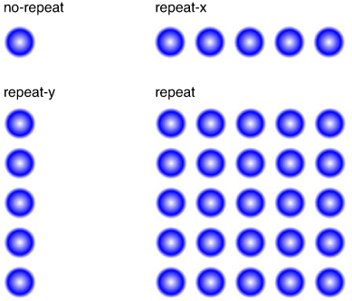
background-repeat—You can use this option to repeat the background image multiple times. The values are repeat to repeat in all directions, repeat-y to repeat in the vertical direction, and repeat-x to repeat in the horizontal direction. You can also specify no-repeat to display the image only once. Repeating images are used for borders and as a design element for bars and buttons. Figure 4.10 shows the results for the different background-repeat values in the following code:
body{
background-size:50px 50px;
margin:5px;
background-image: -moz-radial-gradient(20px 20px, circle contain,white,blue 75%,white);
background-repeat:repeat;
}
Use the following steps to create an HTML document and add CSS styles to text elements. These are the basics with a few <div> and <span> elements. The full versions of the files you will be creating are in Listing 4.2:
1. Create a new HTML document named hour0402.html in the hour04 folder in Aptana.
2. Add the following basic HTML elements:
01 <!DOCTYPE html>
02 <html>
03 <head>
04 <title>Hour 4 - Example 1</title>
05 <meta charset="UTF-8">
06 <style>
...
30 </style>
31 </head>
32 <body>
33 <div id="heading">jQuery Rocks</div>
34 <div id="content">
35 <div id="menu">
36 <span>Home</span>
37 <span>Info</span>
38 <span>Examples</span>
39 </div>
40 <p>Page Content</p>
41 </div>
42 </body>
43 </html>
3. Save the file and open it in your browser using the localhost address. Notice that the text is very plain. All that is about to change with just a little bit of CSS.
4. Create a folder under the hour04 folder called images.
5. Copy a 200-pixel wide image file into that folder. You can use the file /code/hour04/images/rocks.png from the website if you like.
6. Add the following CSS rule to the <style> element in the header of the HTML file. This adds the image you just copied into the images folder to the web page. It repeats the image vertically.
07 body {
08 margin:0px;
09 background-image:url("images/rocks.png");
10 background-repeat:repeat-y;
11 }
7. Then add the following rule to style the text for the heading element and add a horizontal linear gradient as the background:
12 #heading {
13 background-image: -moz-linear-gradient(left, #0055ff 0%, #AACCFF 100%);
14 height:200px;
15 font:150px bold;
16 text-align: center;
17 color:rgba(255,255,255,.4);
18 }
8. The vertical repeating image we added to the body is 200 pixels wide, so change the left margin for the content container to 200px using the following rule so that the content will be to the right of the image:
19 #content {
20 margin-left:200px;
21 }
9. Style the menu by changing the background color to #555555 and adding a vertically linear gradient to the <span> elements that make up the options.
22 #menu{
23 padding:3px;
24 background-color:#555555;
25 }
26 span {
27 padding:3px;
28 background-image: -moz-linear-gradient(top, #0022ff 0%, #AACCFF 85%, #0022ff 100%);
29 font:20px bold;
30 color:white;
31 }
10. Save the file and refresh the web page in your browser, as shown in Figure 4.11. Notice the difference that adding some background elements can have to some otherwise very plain HTML.

LISTING 4.2 HTML and CSS Code That Add Different Types of Background Styles to Elements
01 <!DOCTYPE html>
02 <html>
03 <head>
04 <title>Hour 4 - Example 1</title>
05 <meta charset="UTF-8">
06 <style>
07 body {
08 margin:0px;
09 background-image:url("images/rocks.png");
10 background-repeat:repeat-y;
11 }
12 #heading {
13 background-image: -moz-linear-gradient(left, #0055ff 0%, #AACCFF 100%);
14 height:200px;
15 font:150px bold;
16 text-align:center;
17 color:rgba(255,255,255,.4);
18 }
19 #content {
20 margin-left:200px;
21 }
22 #menu{
23 padding:3px;
24 background-color:#555555;
25 }
26 span {
27 padding:3px;
28 background-image: -moz-linear-gradient(top, #0022ff 0%, #AACCFF 85%, #0022ff 100%);
29 font:20px bold;
30 color:white;
31 }
32 </style>
33 </head>
34 <body>
35 <div id="heading">jQuery Rocks</div>
36 <div id="content">
37 <div id="menu">
38 <span>Home</span>
39 <span>Info</span>
40 <span>Examples</span>
41 </div>
42 <p>Page Content</p>
43 </div>
44 </body>
45 </html>
Try it Yourself: Adding Borders to HTML Elements

property: top right bottom left;
border-width: 1px 2px 1px 2px;
border-color: red blue red blue;
border-top: 1px solid black;
border-left-color: blue;
border-left-style: solid;
border-left-width: 2px;
1. Create a new HTML document named hour0403.html in the hour04 folder in Aptana.
2. Add the code shown in Listing 4.3-html. The code links to an external style sheet named css/hour0403.css and then defines a series of <div> elements.
3. Create a new CSS document named hour0403.css in the hour04/css folder in Aptana.
4. Add the following line to the new CSS file to set basic spacing and size for the <div> elements:
01 div { width:200px; margin:5px; padding:2px; text-align:center}
5. Add the lines of code 2–8 from Listing 4.3-css to define several border styles that apply to the different <div> elements.
6. Add the following CSS rules to create rounded borders on two of the <div> elements:
09 #round { border: 1px solid; border-radius:5px;}
10 #veryround { border: 1px solid; border-radius:50%;}
7. Add lines 11–20 from Listing 4.3-css. These lines of code create shadows on the <div> element. The first is an outset shadow and the second included the inset value that defines it as an inner shadow.
8. Add the following lines of code that create a mixed border. This is included to show you that you have a great deal of control on each side of the border. The top is solid, with a radius on the right side; the left is dotted, and the bottom is a ridge with a radius on the right side.
21 #mixed {
22 border-top: 1px solid;
23 border-top-left-radius: 5px;
24 border-left: 1px dotted;
25 border-bottom: 5px ridge;
26 border-bottom-right-radius: 10px;
27 }
9. Add the following code that uses only the border with a large radius and a background color to create a good-looking button:
28 #button {
29 width:150px;
30 background-color: #2233FF;
31 color: white;
32 border:5px outset blue;
33 border-radius:50%;
34 }
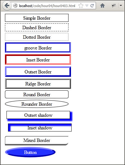
10. Save the files and open the HTML file in a web browser. You should see results similar to what is shown in Figure 4.12. Notice the different styles of borders applied with only a few CSS styling statements.
LISTING 4.3-html HTML That Creates a Series of <div> Elements That Are Styled by Listing 4.3-css
01 <html>
02 <head>
03 <meta charset="UTF-8">
04 <link rel="stylesheet" type="text/css" href="css/hour0403.css">
05 </head>
06 <body>
07 <div id="simple">Simple Border</div>
08 <div id="dashed">Dashed Border</div>
09 <div id="dotted">Dotted Border</div>
10 <div id="groove">Groove Border</div>
11 <div id="inset">Inset Border</div>
12 <div id="outset">Outset Border</div>
13 <div id="ridge">Ridge Border</div>
14 <div id="round">Round Border</div>
15 <div id="veryround">Rounder Border</div>
16 <div id="shadow">Outset shadow</div>
17 <div id="ishadow">Inset shadow</div>
18 <div id="mixed">Mixed Border</div>
19 <div id="button">Button</div>
20 </body>
21 </html>
LISTING 4.3-css CSS Rules That Define Several Border Styles
01 div { width:200px; margin:5px; padding:2px; text-align:center}
02 #simple { border:1px solid black; }
03 #dashed { border:1px dashed black; }
04 #dotted { border:1px dotted gray; }
05 #groove { border:5px groove blue; }
06 #inset { border:5px inset red; }
07 #outset { border:5px outset blue; }
08 #ridge { border:5px ridge black; }
09 #round { border: 1px solid; border-radius:5px;}
10 #veryround { border: 1px solid; border-radius:50%;}
11 #shadow {
12 margin:10px;
13 border:1px solid black;
14 box-shadow: 5px 5px 3px 2px blue;
15 }
16 #ishadow {
17 margin:15px;
18 border:1px solid black;
19 box-shadow: 5px 5px 3px 2px blue inset;
20 }
21 #mixed {
22 border-top: 1px solid;
23 border-top-left-radius:5px;
24 border-left: 1px dotted;
25 border-bottom: 5px ridge;
26 border-bottom-right-radius: 10px;
27 }
28 #button {
29 width:150px;
30 background-color: #2233FF;
31 color: white;
32 border:5px outset blue;
33 border-radius:50%;
34 }
Cursor
An important part of browser interaction with users is the mouse cursor. You can let the user know the purpose or behavior of an HTML element just by changing the way the cursor looks when the mouse is over it.
The cursor CSS property enables you to define what cursor should be used when the mouse is over a specific element. The following shows an example of setting the cursor to a pointer:
div { cursor:pointer; }
You can choose from several cursor values. Figure 4.13 shows an example of some of the cursor values that are available via the cursor CSS property.

Opacity
The opacity CSS property enables you to set the transparency of an HTML element as well as all elements contained within. The opacity is specified as a decimal value between 0 and 1, where 0 is transparent and 1 is opaque.
Changing the opacity is a great way to let users know that an HTML element is inactive. For example, the following CSS and HTML define two button definitions. The definition for button2 includes an opacity of .4 to make it partially transparent. The results are shown in Figure 4.14.
CSS rules:
#button, #button2 {
margin: 5px; padding:3px;
text-align: center;
background-color: #2233FF;
color: white;
border:5px outset blue;
border-radius:50%;
}
#button2 { opacity:.4; }
HTML elements:
<span id="button">Active</span>
<span id="button2">Inactive</span>
Visibility
Another useful CSS property is visibility. You can set visibility to hidden, and the HTML element and all elements contained will not be rendered to the browser. Then setting it to visible again will display it in the browser window. This capability is very useful in jQuery and JavaScript to enable you to show and hide page elements dynamically.
Applying CSS Layout Properties
One of the biggest challenges with creating HTML web pages is that HTML does not lend itself to creating attractive-looking layouts very easily. That is why many of the CSS properties are aimed at altering the size, position, and relation to other HTML elements.
Using the CSS Layout properties, you will be able to position items correctly on your web page, and with JavaScript and jQuery you can alter those positions efficiently to provide more of an application experience for your users, rather than a simple point-and-click web page. The following sections cover the CSS properties that alter the layout of HTML components.
Understanding the Box Model
HTML elements are rendered to the browser window using the box model. In the box model, the content of the HTML element is made up of the following four parts shown in Figure 14.15:
Content—The HTML component content itself
Padding—Space between the component and the border
Border—Border surrounding the HTML element
Margin—Space between the HTML element and other elements around it

The amount of space that each of these takes in the web browser can be set using CSS.
Setting the Content Size
The content is set by specifying a size value of the height and width CSS properties. The size value can be specified as px, cm, auto, %, and so on. You can also specify a maximum and minimum height and width using max-height, max-width, min-height, and min-width properties.
The following shows an example of setting the height and width properties of <p> element:
p {height:100px; width: 50px;}
Adding Padding Around HTML Content
Padding is an important part of element layout, especially if you are using borders. Padding keeps the content inside the HTML element from touching the border.
Padding can be added to all sides of the HTML element by specifying a padding value, such as
padding:3px;
You can also specify the padding for each side of the element, for example:
padding:1px 2px 1px 2px;
Adding Margins Around HTML Elements
Margins work similar to padding, except they are outside the border of the element and keep other HTML elements from touching the border. A margin can be added to all sides of the HTML element by specifying a margin value, such as
margin:3px;
You can also specify the margin for each side of the element, for example:
margin:1px 2px 1px 2px;
The margin property also supports the value of auto. Using auto splits the margin values equally, based on the size constraints that are placed in the HTML element.
Modifying HTML Element Flow
Unless you specify otherwise, HTML elements flow to the top-left corner of the browser window.
As you learned in the previous hour, some HTML elements are block elements and some are inline elements. The block elements take up the full width, and so items after them flow down to the next line. Inline elements take up only the amount necessary for the content.
Using the display CSS property, you can set elements to be block or inline. Another value of the display attribute worthy of mention is inline-block. inline-block allows the element to be displayed inline; however, unlike inline elements, you can still set the block properties, such as height and width as well as margin. For example:
span {
height: 200px; width:200px;
display:inline-block;
}
Another way to modify the HTML element flow is to use the float property. The float property allows an element to float either to the left or right of the containing element. Other elements that are not floating will be displayed next to the floating element on the side away from the edge of the containing element.
When using the float attribute, you need to use the clear property to define which sides of the floating element other elements are not allowed to flow around. To illustrate this, consider the following CSS and HTML code. Notice that in Figure 4.16, the paragraph element that does not include the clear:both attribute is rendered next to the image that is floating to the left.
CSS rules:
#image1 {float:left;}
#image2 {float:right;}
#cleared {clear:both;}

FIGURE 4.16 Floating an element to the left or right modifies the flow. However, you need to clear property that you do not want to flow next to them.
<img id="image1" src="images/hour0302.jpg" width="100" />
<img id="image2" src="images/hour0303.jpg" width="100" />
<p id="uncleared">Uncleared Line of Text</p>
<p id="cleared">Cleared Line of Text</p>
Positioning HTML Elements from CSS
The position property enables you to define how an element is positioned by the browser. By default, elements are static and simply flow with the other elements in the document. However, by changing the value of the position property, you can change that behavior.
The following list describes each of the different nonstatic position values:
fixed—Positions the element relative to the browser window.
absolute—Positions the element relative to the first nonstatic container element. At least one of the element’s containers must already be defined in a nonstatic position.
relative—Positions the element relative to the normal position it would have been in.
After you change the position property to a nonstatic value, you can use the top, left, bottom, and right properties to set the positioning. For example, to set the top-left corner of an element to 50 pixels from the top and 100 pixels from the top-left edge of the browser window, you would use the following CSS code:
position:fixed;
top:50px;
left:100px;
z-index
When you begin positioning HTML elements using nonstatic positioning, you may find a situation where one element overlaps another. The z-index property allows you to specify which element should be in front. Elements with a higher z-index number are in front of elements with lower z-index values. The following CSS <div> elements would be in front of <p> paragraph elements.
div { z-index:2; }
p { z-index:1; }
Overflow
The overflow CSS property is provided to solve the problem of trying to display an item that is too large for the area in the web page you have designed. The overflow property can be set to the following:
visible—Default behavior.
hidden—Will hide the element if the content is too big.
scroll—Adds scrollbars on the bottom and right. If the content exceeds the size constraint, the scrollbars become active so you can view the full contents of the container without affecting the flow of the rest of the page.
auto—Will add the scrollbars, if necessary, to keep the element to the size constraints you place on it.
Figure 4.17 shows an example of a list that gets constrained inside of a <ul> element that has the following CSS rule with the overflow property:
ul{
border:1px solid;
height:150px; width:300px;
overflow:auto;
}
li{ width:800px; }

FIGURE 4.17 Adding the overflow property to a <ul> element results in the list being constrained within scrollbars.
Try it Yourself: Using CSS to Lay Out Web Page Components
1. Create a new HTML document named hour0404.html in the hour04 folder in Aptana.
2. Add the code shown in Listing 4.4-html. The code links to an external style sheet named css/hour0404.css and then defines two <div> elements: one that contains a set of images and the second that contains <p> elements to display song info.
3. Copy the image files listed in Listing 4.4-html from the book’s website under code/hour04/images to the hour04/images folder in your Aptana project.
4. Create a new CSS document named hour0404.css in the hour04/css folder in Aptana.
5. Add the following lines to the new CSS file to set basic spacing and size for the <img> elements. The margin property gives them space around each other and in the div element. The float property allows them to float to the left of their container.
01 img{
02 width:48;height:48px;
03 margin:5px;
04 float:left;
05 }
6. Add the following lines of code to define the look and feel of both <div> elements. The position is set to fixed, but no positioning is specified yet. We also add padding to give the items inside the <div> room away from the border.
06 #buttons, #songInfo{
07 position:fixed;
08 background-color: black;
09 padding:5px;
10 display:inline-block;
11 border:8px ridge blue;
12 border-radius:5px;
13 }
7. Add the following CSS rules to position each of the <div> elements individually. Remember that they keep all the values from the previous step. Notice that you set the elements’ position by specifying the top and left positions in the browser window. Also notice that you give the buttons a higher z-index number to ensure that it will always be on top of the songInfo.
14 #songInfo{
15 top:70px;
16 left:100px;
17 height:150px;width:300px;
18 z-index:1;
19 }
20 #buttons{
21 top:200px;
22 left:140px;
23 z-index:2;
24 }
8. Add lines 25–44, which define the formatting for the text elements in the songInfo container. Following is the rule for one of the rules. Notice that you set the position to relative so that you can position them relative to where they would normally flow inside of the <div> container. Then when you set the top and left values, they are relative to the <p> items’ normal position. By specifying a negative number, you can move the item up toward the top.
32 #artist{
33 color:cyan;
34 font-size:20px;
35 position:relative;
36 left:30px;
37 top:-50px;
9. Save the files and open the HTML file in a web browser. You should see results similar to what is shown in Figure 4.18. Notice that the CSS layout styles have positioned the elements in specific positions in the browser.

FIGURE 4.18 Adding CSS layout properties allows you to position elements at specific locations in the browser.
LISTING 4.4-html HTML That Creates a Pair of <div> Elements That Are Styled by Listing 4.4-css to Be Song Info and a Set of Playback Controls
01 <html>
02 <head>
03 <meta charset="UTF-8">
04 <link rel="stylesheet" type="text/css" href="css/hour0404.css">
05 </head>
06 <body>
07 <div id="buttons">
08 <img src="images/skipBack.png" />
09 <img src="images/seekBack.png" />
10 <img src="images/play.png" />
11 <img src="images/stop.png" />
12 <img src="images/seekForward.png" />
13 <img src="images/skipForward.png" />
14 </div>
15 <div id="songInfo">
16 <p id="title">Canon in D major</p>
17 <p id="artist">Johann Pachelbel</p>
18 <p id="album">London Symphony Performances</p>
19 </div>
20 <h1>Song Controls</h1>
21 </body>
22 </html>
LISTING 4.4-css CSS Code Used to Apply a Page Layout That Places Elements in Fixed Positions
01 img{
02 width:48;height:48px;
03 margin:5px;
04 float:left;
05 }
06 #buttons, #songInfo{
07 position:fixed;
08 background-color: black;
09 padding:5px;
10 display:inline-block;
11 border:8px ridge blue;
12 border-radius:5px;
13 }
14 #songInfo{
15 top:70px;
16 left:100px;
17 height:150px;width:300px;
18 z-index:1;
19 }
20 #buttons{
21 top:200px;
22 left:140px;
23 z-index:2;
24 }
25 #title{
26 color:lime;
27 font-weight:bold;
28 font-size:30px;
29 position:relative;
30 top:-20px;
31 }
32 #artist{
33 color:cyan;
34 font-size:20px;
35 position:relative;
36 left:30px;
37 top:-50px;
38 }
39 #album{
40 color:yellow;
41 position:relative;
42 left:60px;
43 top:-70px;
44 }
Preparing CSS Styles for Dynamic Design
One of the coolest features of jQuery and JavaScript is the capability to adjust CSS styles dynamically. A little bit later in the book you learn how to do just that to create some cool effects. In this section, you are introduced to the concept of preparing for dynamic styles while CSS is still fresh in your mind.
As you define your CSS styling rules, keep in mind that there are a few methods to applying styles dynamically. That way you can design the CSS in such a way that the dynamic code will be much simpler to implement. The following sections describe some of the methods that you will learn later.
Preparing to Add Classes to HTML Elements Dynamically
The simplest way to dynamically adjust the style of an HTML element is to change which CSS rules are associated with the element. The easiest way to change CSS rules is to use class selectors for the different rules that you want to use. That way, from jQuery and JavaScript, you can add a class to apply a style or remove a class to remove the style.
This provides two main advantages. First, dynamic code is much simpler because it is easy to add and remove classes. The second is that it is easy to make adjustments to the CSS styles that will be applied, because they will be done inside a .css file or a <style> tag.
Using dynamic class rules requires that the rules for the class selectors be completely defined somewhere in the CSS code loaded with the web page. It also requires some thinking about how to implement each CSS rule.
For example, think about adding dynamic interaction with a <span> element that is styled to be used as a button. You want the button to be able to have four different states of up, down, inactive, and state changing. You can create a different CSS rule with a selector for the class of those button states. When the button is up, the class attribute assigned to the <span> would be up; when the user clicks the button, you could change the class to state changing, and then when the mouse is released, change the class to down.
Preparing to Directly Adjust CSS Properties
You can also directly access and modify specific CSS properties of an element or a set of elements via jQuery and JavaScript. This provides the advantage of being able to create static CSS definitions in .css files or <style> tags and then dynamically change a subset of the property values.
A great example of using JavaScript with CSS property values is moving items around the web page. For instance, suppose you were to define an HTML image element for a scrolling banner that was supposed to scroll horizontally across the screen. You would define the static CSS style that styles the banner as a fixed position in the browser window. Then, because the CSS already defines all the necessary properties to render the banner fixed, all you need to do from jQuery and JavaScript is to adjust the CSS position properties to scroll the banner.
Summary
This hour discussed using CSS to quickly and easily alter the look and feel of your web pages. Understanding these concepts is critical to implementing JavaScript and jQuery to create dynamic web pages and rich Internet applications.
You learned how the CSS rules are structured and how to define selectors that will apply a CSS rule to a specific set of HTML elements. You were introduced to some of the common design and layout styles of CSS.
You learned how to style text, apply color and background images, and create cool borders around HTML elements. You also learned how to understand and control the flow of the HTML elements on the page as well as applying fixed positioning.
Q&A
Q. Is it better to use a fixed size and position for HTML elements, or should I try to use more of the HTML flow based on the content size?
A. That is a tough question. For most web pages, consider using more of a flow with relative positioning within elements as much as possible. The reason for that is because of the wide range of displays that may be looking at the web pages. If you need to support mobile displays up to 36-inch monitors, the flow allows for the content to more easily match the browser size. However, if you are designing a dynamic web page as more of a web application, use more fixed sizes that support an average size monitor and then implement a mobile version using the jQuery Mobile techniques you learn later in this book.
Q. Why bother with CSS—can’t I just apply the CSS styles directly from jQuery and JavaScript?
A. Sure, everything that you can do with CSS can be applied from JavaScript. However, it is more difficult to maintain the changes, especially when more than one person is involved in the design. Often, some of the best web page designers won’t know any jQuery or JavaScript. Also, think about how easy it is to keep multiple versions of a CSS file and tweak them to apply different skins to the web page.
Workshop
The workshop consists of a set of questions and answers designed to solidify your understanding of the material covered in this hour. Try to answer the questions before looking at the answers.
Quiz
1. What selector would you use to apply a CSS rule to all <div> elements?
2. What CSS property allows an element to float past other elements either to the right or to the left?
3. How would you apply a border with rounded corners around a <div> element?
4. True or False: You cannot specify exact coordinates in the browser to position an HTML element.
5. What selector would you use to apply a CSS rule only to an HTML element with the class attribute set to “myClass” and the id set to “mainContainer"?
Quiz Answers
1. div {...
2. float:right or float:left
3. border:1px solid;border-radius:5px;
4. False. You can set the display:fixed property and then set the top, left, bottom, or right pixel offset to place the HTML element, regardless of where other elements are on the page.
5. #mainContainer {...
Exercises
1. Modify the code that you applied in Listing 4.2 to include the following CSS rule that will apply to the span you defined as buttons. The rule should change the style of the HTML element and consequently the look of the menu item when the mouse hovers over it:
span:hover {
width:150px;
background-color: #2233FF;
color: white;
border:5px outset blue;
border-radius:50%;
}
2. Modify the code in Listing 4.4-html and Listing 4.4-css to wrap the heading in its own border and position it above the other <div> elements. You will need to change the position of the existing <div> elements to do so.