
The Java class library includes a set of packages called Swing that enable Java programs to offer graphical user interfaces and collect user input with the mouse, keyboard, and other input devices.
Today, you will use Swing to create applications that feature each of these graphical user interface components:
Frames—. Windows that can include a title bar; menu bar; and Maximize, Minimize, and Close buttons
Containers—. Interface elements that can hold other components
Buttons—. Clickable regions with text or graphics indicating their purpose
Labels—. Text or graphics that provide information
Text fields and text areas—. Windows that accept keyboard input and allow text to be edited
Drop-down lists—. Groups of related items that can be selected from drop-down menus or scrolling windows
Check boxes and radio buttons—. Small squares or circles that can be selected or deselected
Swing enables you to create a Java program with an interface that uses the style of the native operating system, such as Windows or Solaris, or two styles, Ocean and Metal, that are unique to Java. Each of these styles is called a look and feel because it describes both the appearance of the interface and how its components function when they are used.
Swing components are part of the javax.swing package, a standard part of the Java class library. To use a Swing class, you must make it available with an import statement or use a catchall statement such as the following:
import javax.swing.*;
Two other packages used with graphical user interface programming are java.awt, the Abstract Windowing Toolkit (AWT), and java.awt.event, event-handling classes that handle user input.
When you use a Swing component, you work with objects of that component’s class. You create the component by calling its constructor and then calling methods of the component as needed for proper setup.
All Swing components are subclasses of the abstract class JComponent, which includes methods to set the size of a component, change the background color, define the font used for any displayed text, and set up ToolTips—explanatory text that appears when you hover your mouse over the component for a few seconds.
Caution
Swing classes inherit from many of the same superclasses as the Abstract Windowing Toolkit, so it is possible to use Swing and AWT components together in the same interface. However, in some cases the two types of components will not be rendered correctly in a container. To avoid these problems, it’s best to always use Swing components—there’s one for every AWT component.
Before components can be displayed in a user interface, they must be added to a container, a component that can hold other components. Swing containers, which often can be placed in other containers, are subclasses of java.awt.Container. This class includes methods to add and remove components from a container, arrange components using an object called a layout manager, and set up borders around the edges of a container.
The first step in creating a Swing application is to create a class that represents the graphical user interface. An object of this class serves as a container that holds all the other components to be displayed.
In many projects, the main interface object is either a simple window (the JWindow class) or a more specialized window called a frame (the JFrame class).
A window is a container that can be displayed on a user’s desktop. A simple window does not have a title bar; Maximize, Minimize, or Close buttons; or other features you see on most windows that open in a graphical operating system. In Swing, windows that do have these features are called frames.
In a graphical environment such as Windows or Mac OS, users expect to have the ability to move, resize, and close the windows of programs that they run. The main place a simple window, rather than a frame, turns up is when programs are loading—there is sometimes a title screen with the program’s name, logo, and other information.
One way to create a graphical Swing application is to make the interface a subclass of JFrame, as in the following class declaration:
public class FeedReader extends JFrame {
    // ...
}
The constructor of the class should handle the following tasks:
Call a superclass constructor to give the frame a title and handle other setup procedures.
Set the size of the frame’s window, either by specifying the width and height in pixels or by letting Swing choose the right size.
Decide what to do if a user closes the window.
Display the frame.
The JFrame class has two constructors: JFrame() and JFrame(String). One sets the frame’s title bar to the specified text, and the other leaves the title bar empty. You also can set the title by calling the frame’s setTitle(String) method.
The size of a frame can be established by calling the setSize(int, int) method with the width and height as arguments. The size of a frame is indicated in pixels, so if you called setSize(650, 550), the frame would take up most of a screen at 800×600 resolution.
Note
You also can call the method setSize(Dimension) to set up a frame’s size. Dimension is a class in the java.awt package that represents the width and height of a user interface component. Calling the Dimension(int,int) constructor creates a Dimension object representing the width and height specified as arguments.
Another way to set the size of a frame is to fill the frame with the components it will contain and then call the frame’s pack() method. This resizes the frame based on the size of the components inside it. If the size of the frame is bigger than it needs to be, pack() shrinks it to the minimum size required to display the components. If the frame is too small (or the size has not been set at all), pack() expands it to the required size.
Frames are invisible when they are created. You can make them visible by calling the frame’s setVisible(boolean) method with the literal true as an argument.
If you want a frame to be displayed when it is created, call one of these methods in the constructor. You also can leave the frame invisible, requiring any class that uses the frame to make it visible by calling setVisible(true). (To hide a frame, call setVisible(false).)
When a frame is displayed, the default behavior is for it to be positioned in the upper-left corner of the computer’s desktop. You can specify a different location by calling the setBounds(int, int, int, int) method. The first two arguments to this method are the (x,y) position of the frame’s upper-left corner on the desktop. The last two arguments set the width and height of the frame.
The following class represents a 300×100 frame with “Edit Payroll” in the title bar:
public class Payroll extends javax.swing.JFrame {
    public Payroll() {
        super("Edit Payroll");
        setSize(300, 100);
        setVisible(true);
    }
}
Every frame has Maximize, Minimize, and Close buttons on the title bar at the user’s control—the same controls present in the interface of other software running on your system.
The normal behavior when a frame is closed is for the application to keep running. When a frame serves as a program’s main graphical user interface, this leaves a user with no way to stop the program.
To change this, you must call a frame’s setDefaultCloseOperation() method with one of four static variables of the JFrame class as an argument:
EXIT_ON_CLOSE—. Exit the application when the frame is closed.DISPOSE_ON_CLOSE—. Close the frame, remove the frame object from memory, and keep running the application.DO_NOTHING_ON_CLOSE—. Keep the frame open and continue running.HIDE_ON_CLOSE—. Close the frame and continue running.
To prevent a user from closing a frame at all, add the following statement to the frame’s constructor method:
setDefaultCloseOperation(JFrame.DO_NOTHING_ON_CLOSE);
If you are creating a frame to serve as an application’s main user interface, the expected behavior is probably EXIT_ON_CLOSE, which shuts down the application along with the frame.
Listing 9.1 contains a simple application that displays a frame 300×100 pixels in size. This class can serve as a framework—pun unavoidable—for any applications you create that use a graphical user interface.
Example 9.1. The Full Text of SimpleFrame.java
 1: import javax.swing.JFrame;
 2:
 3: public class SimpleFrame extends JFrame {
 4:     public SimpleFrame() {
 5:         super("Frame Title");
 6:         setSize(300, 100);
 7:         setDefaultCloseOperation(JFrame.EXIT_ON_CLOSE);
 8:         setVisible(true);
 9:     }
10:
11:     public static void main(String[] arguments) {
12:         SimpleFrame sf = new SimpleFrame();
13:     }
14: }
When you compile and run the application, you should see the frame displayed in Figure 9.1.
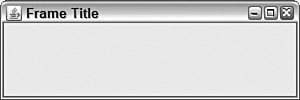
The SimpleFrame application isn’t much to look at—the graphical user interface contains no components, aside from the standard Minimize, Maximize, and Close (X) buttons on the title bar shown in Figure 9.1. You will add components later today.
In the application, a SimpleFrame object is created in the main() method in lines 11–13. If you had not displayed the frame when it was constructed, you could call sf.setVisible(true) in the main() method to display the frame.
The work involved in creating the frame’s user interface takes place in the SimpleFrame() constructor. Components could be created and added to the frame within this constructor.
Creating a window using JWindow is similar to working with frames in Swing, but you can’t provide a title or close a window.
Listing 9.2 contains an application that creates and opens a window, changing its size from 0×0 to 400×400 before your eyes.
Example 9.2. The Full Text of SimpleWindow.java
 1: import javax.swing.JWindow;
 2:
 3: public class SimpleWindow extends JWindow {
 4:     public SimpleWindow() {
 5:         super();
 6:         setBounds(400, 300, 10, 10);
 7:         setVisible(true);
 8:     }
 9:
10:     public static void main(String[] arguments) {
11:         SimpleWindow sw = new SimpleWindow();
12:         for (int i = 10; i < 400; i++) {
13:             sw.setBounds(400 - (i/2), 300 - (i/2), i, i);
14:         }
15:     }
16: }
In the application, the call to setBounds(400, 300, 10, 10) in line 6 of Listing 9.2 sets the window to be 10×10 in size and displayed with its upper-left corner at the (x,y) position 400, 300.
The for loop in lines 12–14 changes the size of the window and moves its upper-left corner with each iteration. The window grows from 10×10 in size to 400×400 as the loop progresses. You can close the window and application by pressing Ctrl+C on your keyboard.
The lack of adornment on a JWindow component makes it suitable for use as a splash page, a graphic or text that displays as an application loads.
Java 6 adds a better, faster way to do this by defining a graphic that functions as an application’s splash. The graphic loads even before the Java interpreter and disappears when the application begins running.
The graphic can be specified with the -splash attribute when the class is run at a command line. Here’s how to do it with the SimpleWindow class:
java -splash:lighthouse.jpg SimpleWindow
Note
If you need a graphic to test this capability, download lighthouse.jpg, a photograph of a Norwegian lighthouse taken by Steve Cadman, from the Day 9 page of this book’s website at http://www.java21days.com.
Another technique to define a splash graphic is covered on Day 14, “Developing Swing Applications.”
Creating a graphical user interface is a great way to get experience working with objects in Java because each interface component is represented by its own class.
To use an interface component in Java, you create an object of that component’s class. You already have worked with the container classes JFrame and JWindow.
One of the simplest components to employ is JButton, the class that represents clickable buttons.
In most programs, buttons trigger an action—click Install to begin installing software, click a smiley button to begin a new game of Minesweeper, click the Minimize button to prevent your boss from seeing Minesweeper running, and so on.
A Swing button can feature a text label, a graphical icon, or a combination of both.
Constructors you can use for buttons include the following:
JButton(String)—. A button labeled with the specified textJButton(Icon)—. A button that displays the specified graphical iconJButton(String,Icon)—. A button with the specified text and graphical icon
The following statements create three buttons with text labels:
JButton play = new JButton("Play");
JButton stop = new JButton("Stop");
JButton rewind = new JButton("Rewind");
Graphical buttons are covered later today.
Before you can display a user interface component such as a button in a Java program, you must add it to a container and display that container.
To add a component to a container, call the container’s add(Component) method with the component as the argument (all user interface components in Swing inherit from java.awt.Component).
The simplest Swing container is a panel (the JPanel class). The following example creates a button and adds it to a panel:
JButton quit = new JButton("Quit");
JPanel panel = new JPanel();
panel.add(quit);
Use the same technique to add components to frames and windows.
Note
In previous versions of Java, components could not be added directly to frames. Instead, they were placed in the container’s content pane. Though this technique is no longer necessary, you’re likely to encounter it in code.
Complex containers are divided into panes, a kind of container within a container, and components are added to the container’s content pane.
You can use a panel to represent a frame’s content pane, adding components to it with the panel’s add(Component) method. After the panel has been filled, call the frame’s setContentPane(Container) method with the panel as the argument. This makes it the frame’s content pane, which also can be done with windows.
The program in Listing 9.3 uses the application framework created earlier in this lesson. A panel is created, three buttons are added to the panel, and then it is added to a frame.
Example 9.3. The Full Text of ButtonFrame.java
 1: import javax.swing.*;
 2:
 3: public class ButtonFrame extends JFrame {
 4:     JButton load = new JButton("Load");
 5:     JButton save = new JButton("Save");
 6:     JButton unsubscribe = new JButton("Unsubscribe");
 7:
 8:     public ButtonFrame() {
 9:         super("Button Frame");
10:         setSize(140, 170);
11:         setDefaultCloseOperation(JFrame.EXIT_ON_CLOSE);
12:         JPanel pane = new JPanel();
13:         pane.add(load);
14:         pane.add(save);
15:         pane.add(unsubscribe);
16:         add(pane);
17:         setVisible(true);
18: }
19:
20:     public static void main(String[] arguments) {
21:         ButtonFrame bf = new ButtonFrame();
22:     }
23: }
When you run the application, a small frame opens that contains the three buttons (see Figure 9.2).

The ButtonFrame class has three instance variables: the load, save, and unsubscribe JButton objects.
In lines 12–15, a new JPanel object is created, and the three buttons are added to the panel by calls to its add() method. When the panel contains all the buttons, the frame’s add() method is called in line 16 with the panel as an argument, adding it to the frame.
Note
If you click the buttons, absolutely nothing happens. Doing something in response to a button click is covered on Day 12, “Responding to User Input.”
Swing offers more than two dozen different user interface components in addition to the buttons and containers you have used so far. You will work with many of these components for the rest of today and on Day 10, “Building a Swing Interface.”
All Swing components share a common superclass, javax.swing.JComponent, from which they inherit several methods you will find useful in your own programs.
The setEnabled(boolean) method determines whether a component can receive user input (an argument of true) or is inactive and cannot receive input (false). Components are enabled by default. Many components change in appearance to indicate when they are not presently usable—for instance, a disabled JButton has light gray borders and gray text. If you want to check whether a component is enabled, you can call the isEnabled() method, which returns a boolean value.
The setVisible(boolean) method works for all components the way it does for containers. Use true to display a component and false to hide it. There also is a boolean isVisible() method.
The setSize(int, int) method resizes the component to the width and height specified as arguments, and setSize(Dimension) uses a Dimension object to accomplish the same thing. For most components, you don’t need to set a size—the default is usually acceptable. To find out the size of a component, call its getSize() method, which returns a Dimension object with the dimensions in height and width instance variables.
As you will see, similar Swing components also have other methods in common, such as setText() and getText() for text components and setValue() and getValue() for components that store a numeric value.
Caution
When you begin working with Swing components, a common source of mistakes is to set up aspects of a component after it has been added to a container. Make sure to set up all aspects of a component before placing it in a panel or any other container.
Swing supports the use of graphical ImageIcon objects on buttons and other components in which a label can be provided. An icon is a small graphic that can be placed on a button, label, or other user interface element to identify it—such as a garbage can or recycling bin icon for deleting files, folder icons for opening and storing files, and the like.
An ImageIcon object can be created by specifying the filename of a graphic as the only argument to the constructor. The following example loads an icon from the graphics file subscribe.gif and creates a JButton with the icon as its label:
ImageIcon subscribe = new ImageIcon("subscribe.gif");
JButton button = new JButton(subscribe);
JPanel pane = new JPanel();
pane.add(button);
add(pane);
setVisible(true);
Listing 9.4 contains a Java application that creates four image icons with text labels, adds them to a panel, and then adds the panel to a frame.
Example 9.4. The Full Text of IconFrame.java
 1: import javax.swing.*;
 2:
 3: public class IconFrame extends JFrame {
 4:     JButton load, save, subscribe, unsubscribe;
 5:
 6:     public IconFrame() {
 7:         super("Icon Frame");
 8:         setDefaultCloseOperation(JFrame.EXIT_ON_CLOSE);
 9:         JPanel panel = new JPanel();
10:         // create icons
11:         ImageIcon loadIcon = new ImageIcon("load.gif");
12:         ImageIcon saveIcon = new ImageIcon("save.gif");
13:         ImageIcon subscribeIcon = new ImageIcon("subscribe.gif");
14:         ImageIcon unsubscribeIcon = new ImageIcon("unsubscribe.gif");
15:         // create buttons
16:         load = new JButton("Load", loadIcon);
17:         save = new JButton("Save", saveIcon);
18:         subscribe = new JButton("Subscribe", subscribeIcon);
19:         unsubscribe = new JButton("Unsubscribe", unsubscribeIcon);
20:         // add buttons to panel
21:         panel.add(load);
22:         panel.add(save);
23:         panel.add(subscribe);
24:         panel.add(unsubscribe);
25:         // add the panel to a frame
26:         add(panel);
27:         pack();
28:         setVisible(true);
29:     }
30:
31:     public static void main(String[] arguments) {
32:         IconFrame ike = new IconFrame();
33:     }
34: }
Figure 9.3 shows the result.

The icons’ graphics referred to in lines 11–14 can be found on this book’s official website at http://www.java21days.com on the Day 9 page.
The IconFrame application does not set the size of the frame in pixels. Instead, the pack() method is called in line 27 to expand the frame to the minimum size required to present the four buttons next to each other.
If the frame were set to be tall rather than wide—for instance, by calling setSize(100, 400) in the constructor—the buttons would be stacked vertically.
Note
Some of the project’s graphics are from Sun’s Java Look and Feel Graphics Repository, a collection of icons suitable for use in your own programs. If you’re looking for icons to experiment with in Swing applications, you can find the icons at the following address:
http://java.sun.com/developer/techDocs/hi/repository
A label is a user component that holds text, an icon, or both. Labels, which are created from the JLabel class, often are used to identify the purpose of other components on an interface. They cannot be directly edited by a user.
To create a label, you can use the following constructors:
JLabel(String)—. A label with the specified textJLabel(String,int)—. A label with the specified text and alignmentJLabel(String,Icon,int)—. A label with the specified text, icon, and alignment
The alignment of a label determines how its text or icon is aligned in relation to the area taken up by the window. Three static class variables of the SwingConstants interface are used to specify alignment: LEFT, CENTER, and RIGHT.
The contents of a label can be set with setText(String) or setIcon(Icon) methods. You also can retrieve these things with getText() and getIcon() methods.
The following statements create three labels with left, center, and right alignment, respectively:
JLabel feedsLabel = new JLabel("Feeds", SwingConstants.LEFT);
JLabel urlLabel = new JLabel("URL: ", SwingConstants.CENTER);
JLabel dateLabel = new JLabel("Date: ", SwingConstants.RIGHT);A text field is a location on an interface where a user can enter and modify text using the keyboard. Text fields are represented by the JTextField class, and each can handle one line of input. Later in this section, you will see a similar component called a text area that can handle multiple lines.
Constructors for text fields include the following:
JTextField()—. An empty text fieldJTextField(int)—. A text field with the specified widthJTextField(String,int)—. A text field with the specified text and width
A text field’s width attribute has relevance only if the interface is organized in a manner that does not resize components. You will get more experience with this when you work with layout managers on Day 11, “Arranging Components on a User Interface.”
The following statements create an empty text field that has enough space for roughly 60 characters and a text field of the same size with the starting text “Enter RSS feed URL here”:
JTextField rssUrl = new JTextField(60);
JTextField rssUrl2 = new JTextField(
    "Enter RSS feed URL here", 60);
Text fields and text areas both inherit from the superclass JTextComponent and share many common methods.
The setEditable(boolean) method determines whether a text component can be edited (true) or not (false). There’s also an isEditable() method that returns a corresponding boolean value.
The setText(String) method changes the text to the specified string, and the getText() method returns the component’s current text as a string. Another method retrieves only the text that a user has highlighted in the getSelectedText() component.
Password fields are text fields that hide the characters a user is typing into the field. They are represented by the JPasswordField class, a subclass of JTextField. The JPasswordField constructor methods take the same arguments as those of its parent class.
After you have created a password field, call its setEchoChar(char) method to obscure input by replacing each input character with the specified character.
The following statements create a password field and set its echo character to “#”:
JPasswordField codePhrase = new JPasswordField(20);
codePhrase.setEchoChar('#'),
Text areas, editable text fields that can handle more than one line of input, are implemented with the JTextArea class.
JTextArea includes the following constructors:
JTextArea(int,int)—. A text area with the specified number of rows and columnsJTextArea(String,int,int)—. A text area with the specified text, rows, and columns
You can use the getText(), getSelectedText(), and setText(String) methods with text areas as you would text fields. Also, an append(String) method adds the specified text at the end of the current text, and an insert(String, int) method inserts the specified text at the indicated position.
The setLineWrap(boolean) method determines whether text will wrap to the next line when it reaches the right edge of the component. Call setLineWrap(true) to cause line wrapping to occur.
The setWrapStyleWord(boolean) method determines what wraps to the next line—either the current word (true) or the current character (false).
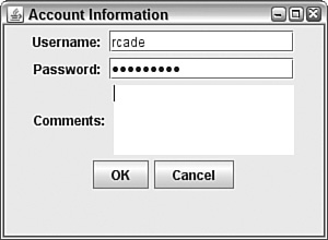
The next project you will create, the Authenticator application in Listing 9.5, uses several Swing components to collect user input: a text field, a password field, and a text area. Labels also are used to indicate the purpose of each text component.
Example 9.5. The Full Text of Authenticator.java
 1: import javax.swing.*;
 2:
 3: public class Authenticator extends javax.swing.JFrame {
 4:     JTextField username = new JTextField(15);
 5:     JPasswordField password = new JPasswordField(15);
 6:     JTextArea comments = new JTextArea(4, 15);
 7:     JButton ok = new JButton("OK");
 8:     JButton cancel = new JButton("Cancel");
 9:
10:     public Authenticator() {
11:         super("Account Information");
12:         setSize(300, 220);
13:         setDefaultCloseOperation(JFrame.EXIT_ON_CLOSE);
14:
15:         JPanel pane = new JPanel();
16:         JLabel usernameLabel = new JLabel("Username: ");
17:         JLabel passwordLabel = new JLabel("Password: ");
18:         JLabel commentsLabel = new JLabel("Comments: ");
19:         comments.setLineWrap(true);
20:         comments.setWrapStyleWord(true);
21:         pane.add(usernameLabel);
22:         pane.add(username);
23:         pane.add(passwordLabel);
24:         pane.add(password);
25:         pane.add(commentsLabel);
26:         pane.add(comments);
27:         pane.add(ok);
28:         pane.add(cancel);
29:         add(pane);
30:         setVisible(true);
31:     }
32:
33:     public static void main(String[] arguments) {
34:         Authenticator auth = new Authenticator();
35:     }
36: }
Figure 9.4 shows the application in use. The password is obscured with asterisk characters (“*”), which is the default when no other echo character is designated by calling the field’s setEchoChar(char) method.
The text area in this application behaves in a manner that you might not expect. When you reach the bottom of the field and continue entering text, the component grows to make more room for input. The next section describes how to add scrollbars to prevent the area from changing in. size.
Text areas in Swing do not include horizontal or vertical scrollbars, and there’s no way to add them using this component alone.
Swing supports scrollbars through a new container that can be used to hold any component that can be scrolled: JScrollPane.
A scrolling pane is associated with a component in the pane’s constructor. You can use either of the following constructors:
JScrollPane(Component)—. A scrolling pane that contains the specified componentJScrollPane(Component,int,int)—. A scrolling pane with the specified component, vertical scrollbar configuration, and horizontal scrollbar configuration Scrollbars are configured using static class variables of theScrollPaneConstantsinterface. You can use each of the following for vertical scrollbars:VERTICAL_SCROLLBAR_ALWAYSVERTICAL_SCROLLBAR_AS_NEEDEDVERTICAL_SCROLLBAR_NEVER
There also are three similarly named variables for horizontal scrollbars.
After you create a scrolling pane containing a component, the pane should be added to containers in place of that component.
The following example creates a text area with a vertical scrollbar and no horizontal scrollbar and then adds it to a content pane:
JPanel pane = new JPanel();
JTextArea comments = new JTextArea(4, 15);
JScrollPane scroll = new JScrollPane(comments,
    ScrollPaneConstants.VERTICAL_SCROLLBAR_ALWAYS,
    ScrollPaneConstants.HORIZONTAL_SCROLLBAR_NEVER);
pane.add(scroll);
setContentPane(pane);
Note
A full application that makes use of this code, Authenticator2, can be viewed on this book’s website. Visit http://www.java21days.com and open the Day 9 page. Look for the link to Authenticator2.java.
The next two components you will learn about, check boxes and radio buttons, hold only two possible values: selected or not selected.
Check boxes are used to make a simple choice in an interface, such as yes-no or on-off. Radio buttons are grouped together so that only one button can be selected at any time.
Check boxes (the JCheckBox class) appear as labeled or unlabeled boxes that contain a check mark when they are selected and nothing otherwise. Radio buttons (the JRadioButton class) appear as circles that contain a dot when selected and are also empty otherwise.
Both the JCheckBox and JRadioButton classes have several useful methods inherited from a common superclass:
setSelected(boolean)—. Select the component if the argument istrueand deselect it otherwise.isSelected()—. Return abooleanindicating whether the component is currently selected.
The following constructors are available for the JCheckBox class:
JCheckBox(String)—. A check box with the specified text labelJCheckBox(String,boolean)—. A check box with the specified text label that is selected if the second argument istrueJCheckBox(Icon)—. A check box with the specified graphical iconJCheckBox(Icon,boolean)—. A check box with the specified graphical icon that is selected if the second argument istrueJCheckBox(String,Icon)—. A check box with the specified text label and graphical iconJCheckBox(String,Icon,boolean)—. A check box with the specified text label and graphical icon that is selected if the third argument istrue
The JRadioButton class has constructors with the same arguments and functionality.
Check boxes and radio buttons by themselves are nonexclusive, meaning that if you have five check boxes in a container, all five can be checked or unchecked at the same time. To make them exclusive, as radio buttons should be, you must organize related components into groups.
To organize several radio buttons into a group, allowing only one to be selected at a time, create a ButtonGroup class object, as demonstrated in the following statement:
ButtonGroup choice = new ButtonGroup();
The ButtonGroup object keeps track of all radio buttons in its group. Call the group’s add(Component) method to add the specified component to the group.
The following example creates a group and two radio buttons that belong to it:
ButtonGroup saveFormat = new ButtonGroup();
JRadioButton s1 = new JRadioButton("OPML", false);
saveFormat.add(s1);
JRadioButton s2 = new JRadioButton("XML", true);
saveFormat.add(s2);
The saveFormat object is used to group together the s1 and s2 radio buttons. The s2 object, which has the label "XML", is selected. Only one member of the group can be selected at a time—if one component is selected, the ButtonGroup object makes sure that all others in the group are deselected.
Listing 9.6 contains an application with four radio buttons in a group.
Example 9.6. The Full Text of FormatFrame.java
1: import javax.swing.*;
2:
3: public class FormatFrame extends JFrame {
4: JRadioButton[] teams = new JRadioButton[4];
5:
6: public FormatFrame() {
7: super("Choose an Output Format");
8: setSize(320, 120);
9: setDefaultCloseOperation(JFrame.EXIT_ON_CLOSE);
10: teams[0] = new JRadioButton("Atom");
11: teams[1] = new JRadioButton("RSS 0.92");
12: teams[2] = new JRadioButton("RSS 1.0");
13: teams[3] = new JRadioButton("RSS 2.0", true);
14: JPanel panel = new JPanel();
15: JLabel chooseLabel = new JLabel(
16: "Choose an output format for syndicated news items.");
17: panel.add(chooseLabel);
18: ButtonGroup group = new ButtonGroup();
19: for (int i = 0; i < teams.length; i++) {
20: group.add(teams[i]);
21: panel.add(teams[i]);
22: }
23: add(panel);
24: setVisible(true);
25: }
26:
27: public static void main(String[] arguments) {
28: FormatFrame ff = new FormatFrame();
29: }
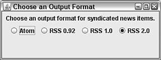
30: }Figure 9.5 shows the application running. The four JRadioButton objects are stored in an array, and in the for loop in lines 19–22 each element is first added to a button group and then added to a panel. After the loop ends, the panel is used for the application’s content pane.
Choosing one of the radio buttons causes the existing choice to be deselected.
The Swing class JComboBox can be used to create combo boxes, components that present a drop-down menu from which a single value can be selected. By hiding the menu when the component is not being used, it takes up less space in a graphical user interface.
The following steps show how a combo box can be created:
The
JComboBox()constructor is used with no arguments.The combo box’s
addItem(Object)method adds items to the list.
In a combo box, users will be able to select only one of the items in the drop-down menu. If the component’s setEditable() method is called with true as an argument, it also supports the entry of text. This feature gives combo boxes their name—a component configured in this manner serves as both a drop-down menu and a text field.
The JComboBox class has several methods that can be used to control a drop-down list or combo box:
getItemAt(int)—. Return the text of the list item at the index position specified by the integer argument. As with arrays, the first item of a choice list is at index position 0, the second at position 1, and so on.getItemCount()—. Return the number of items in the list.getSelectedIndex()—. Return the index position of the currently selected item in the list.getSelectedItem()—. Return the text of the currently selected item.setSelectedIndex(int)—. Select the item at the indicated index position.setSelectedIndex(Object)—. Select the specified object in the list.
The FormatFrame2 application in Listing 9.7 contains an application that rewrites the preceding radio button example. The program uses an uneditable combo box to choose one of four options.
Example 9.7. The Full Text of FormatFrame2.java
1: import javax.swing.*;
2:
3: public class FormatFrame2 extends JFrame {
4: String[] formats = { "Atom", "RSS 0.92", "RSS 1.0", "RSS 2.0" };
5: JComboBox formatBox = new JComboBox();
6:
7: public FormatFrame2() {
8: super("Choose a Format");
9: setSize(220, 150);
10: setDefaultCloseOperation(JFrame.EXIT_ON_CLOSE);
11: JPanel pane = new JPanel();
12: JLabel formatLabel = new JLabel("Output formats:");
13: pane.add(formatLabel);
14: for (int i = 0; i < formats.length; i++)
15: formatBox.addItem(formats[i]);
16: pane.add(formatBox);
17: add(pane);
18: setVisible(true);
19: }
20:
21: public static void main(String[] arguments) {
22: FormatFrame2 ff = new FormatFrame2();
23: }
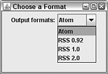
24: }Figure 9.6 shows the application as the combo box is expanded so that a value can be selected.
The last Swing component to be introduced today is similar to combo boxes. Lists, which are represented by the JList class, enable one or more values to be selected from a list.
Lists can be created and filled with the contents of an array or a vector. The following constructors are available:
JList()—. Create an empty list.JList(Object[])—. Create a list that contains an array of the specified class (such asString).JList(Vector)—. Create a list that contains the specifiedjava.util.Vectorobject.
An empty list can be filled by calling its setListData() method with either an array or vector as the only argument.
Unlike combo boxes, lists display more than one of their rows when they are presented in a user interface. The default is to display eight items. To change this, call setVisibleRowCount(int) with the number of items to display.
The getSelectedValues() method returns an array of objects containing all the items selected in the list.
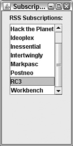
The Subscriptions application in Listing 9.8 displays eight items from an array of strings.
Example 9.8. The Full Text of Subscriptions.java
 1: import javax.swing.*;
 2:
 3: public class Subscriptions extends JFrame {
 4:     String[] subs = { "0xDECAFBAD", "Cafe au Lait",
 5:         "Hack the Planet", "Ideoplex", "Inessential", "Intertwingly",
 6:         "Markpasc", "Postneo", "RC3", "Workbench" };
 7:     JList subList = new JList(subs);
 8:
 9:     public Subscriptions() {
10:         super("Subscriptions");
11:         setSize(150, 300);
12:         setDefaultCloseOperation(JFrame.EXIT_ON_CLOSE);
13:         JPanel panel = new JPanel();
14:         JLabel subLabel = new JLabel("RSS Subscriptions:");
15:         panel.add(subLabel);
16:         subList.setVisibleRowCount(8);
17:         JScrollPane scroller = new JScrollPane(subList);
18:         panel.add(scroller);
19:         add(panel);
20:         setVisible(true);
21:     }
22:
23:     public static void main(String[] arguments) {
24:         Subscriptions app = new Subscriptions();
25:     }
26: }
The application is shown in Figure 9.7. The Subscriptions application has an interface with a label atop a list displaying eight items. A scrollpane is used in lines 17–18 to enable the list to be scrolled to see items 9 and 10.
Today, you began working with Swing, the package of classes that enables you to offer a graphical user interface in your Java programs.
You used more than a dozen classes today, creating interface components such as buttons, labels, and text fields. You put each of these into containers: components that include panels, frames, and windows.
Programming of this kind can be complex, and Swing represents the largest package of classes that a new Java programmer must deal with in learning the language.
However, as you have experienced with components such as text areas and text fields, Swing components have many superclasses in common. This makes it easier to extend your knowledge into new components and containers, as well as the other aspects of Swing programming you will explore over the next three days.
Is there a way to change the font of text that appears on a button and other components? | |
The | |
How can I find out what components are available in Swing and how to use them? | |
This is the first of two days spent introducing user interface components, so you will learn more about them tomorrow. If you have web access, you can find out what classes are in the Swing package by visiting Sun’s online documentation for Java at the web address http://java.sun.com/javase/6/docs/api. | |
The last version of Java used the Metal look and feel. How can I continue using this instead of Ocean? | |
You’ll learn how to do this in a Java class on Day 10. There’s also a system property you can specify, java-Dswing.metalTheme=steel Authenticator Running this command causes the Authenticator application to be displayed in the Metal look and feel. |
Review today’s material by taking this three-question quiz.
The following question is the kind of thing you could expect to be asked on a Java programming certification test. Answer it without looking at today’s material or using the Java compiler to test the code.
Given:
import javax.swing.*;

public class Display extends JFrame {
    public Display() {
        super("Display");
        // answer goes here
        JLabel hello = new JLabel("Hello");
        JPanel pane = new JPanel();
        pane.add(hello);
        setContentPane(pane);
        pack();
        setVisible(true);
    }

    public static void main(String[] arguments) {
        Display ds = new Display();
    }
}The answer is available on the book’s website at http://www.java21days.com. Visit the Day 9 page and click the Certification Practice link.
To extend your knowledge of the subjects covered today, try the following exercises:
Create an application with a frame that includes several VCR controls as individual components: play, stop/eject, rewind, fast forward, and pause. Choose a size for the window that enables all the components to be displayed on a single row.
Create a frame that opens a smaller frame with fields asking for a username and password.
Where applicable, exercise solutions are offered on the book’s website at http://www.java21days.com.