
Although computers can be operated in a command-line environment such as MS-DOS or a Linux shell, most computer users expect software to feature a graphical user interface and receive input with a mouse and keyboard.
Windowing software can be one of the more challenging tasks for a novice programmer, but as you learned yesterday, Java has simplified the process with Swing, a set of classes for the creation and use of graphical user interfaces.
Swing offers the following features:
Common user interface components—. Buttons, text fields, text areas, labels, check boxes, radio buttons, scrollbars, lists, menu items, sliders, and more
Containers, interface components that can be used to hold other components, including containers—. Frames, panels, windows, menus, menu bars, and tabbed panes
Adjustable look and feel—. The ability to change the style of an entire interface to resemble Windows, Mac OS, or other distinctive designs
Most of the components and containers you learned about yesterday were Swing versions of classes that were part of the Abstract Windowing Toolkit, the original Java package for graphical user interface programming.
Swing offers many additional features that are completely new, including a definable look and feel, keyboard mnemonics, ToolTips, and standard dialog boxes.
One of the more unusual features in Swing is the ability to define the look and feel of components—the way that the buttons, labels, and other elements of a graphical user interface are rendered onscreen.
Management of look and feel is handled by UIManager, a user interface manager class in the javax.swing package. The choices for look and feel vary depending on the Java development environment you’re using. The following are available with Java on a Windows XP platform:
A Windows look and feel
A Windows Classic look and feel
A Motif X Window system look and feel
Swing’s cross-platform Java look and feel, Metal
Figures 10.1, 10.2, and 10.3 show the same graphical user interface under several different look and feel designs: Metal, Windows Classic, and Motif.


Note
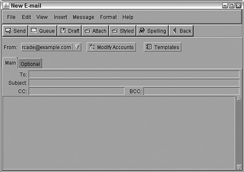
The graphical user interface shown in Figures 10.1 through 10.3 was created using techniques described this week (including some that haven’t been covered yet). The source code for a class used to create this interface can be viewed on the book’s website. Go to http://www.java21days.com, open the Day 10 page, and then look for the file NewMail.java.
The UIManager class has a setLookAndFeel(LookAndFeel) method that is used to choose a program’s look and feel. To get a LookAndFeel object that you can use with this method, call one of the following class methods of UIManager:
getCrossPlatformLookAndFeelClassName()—. This method returns an object representing Java’s cross-platform Ocean look and feel.getSystemLookAndFeelClassName()—. This method returns an object representing your system’s look and feel.
The setLookAndFeel() method throws an UnsupportedLookAndFeelException if it can’t set the look and feel.
After you call this method, you must tell every component in an interface to update its appearance with the new look and feel. Call the SwingUtilities class method updateComponentTreeUI(Component) with the main interface component (such as a JFrame object) as the argument.
Under most circumstances, you only should call setLookAndFeel() after every component has been added to your graphical user interface (in other words, right before you make the interface visible).
The following statements set up a component to employ the Java look and feel:
try {
    UIManager.setLookAndFeel(
        UIManager.getCrossPlatformLookAndFeelClassName());
    SwingUtilities.updateComponentTreeUI(this);
    } catch (Exception e) {
        System.out.println("Can't set look and feel: ""
            + e.getMessage());
        e.printStackTrace();
}
The this keyword refers to the class that contains these statements. If you used the preceding code at the end of the constructor method of a JFrame, every component on that frame would be displayed with the Java look and feel.
To select your system’s look and feel, use getSystemLookAndFeelClassName(), which is inside the call to setLookAndFeel() in the preceding example. This produces different results on different operating systems. A Windows user would get that platform’s look and feel by using getSystemLookAndFeelClassName(). A UNIX user would get the Motif look and feel, and a Mac OS X user would get the Aqua look and feel.
If you’re not sure which look and feel designs are available on your operating system, you can list them with the following statements:
UIManager.LookAndFeelInfo[] laf = UIManager.getInstalledLookAndFeels();
for (int i = 0; i < laf.length; i++) {
    System.out.println("Class name: " + laf[i].getClassName());
    System.out.println("Name: " + laf[i].getName() + "
");
}
On a Windows system, these statements produce the following output:
Name: Metal
Class name: javax.swing.plaf.metal.MetalLookAndFeel

Name: CDE/Motif
Class name: com.sun.java.swing.plaf.motif.MotifLookAndFeel

Name: Windows
Class name: com.sun.java.swing.plaf.windows.WindowsLookAndFeel

Name: Windows Classic
Class name: com.sun.java.swing.plaf.windows.WindowsClassicLookAndFeel).
The JOptionPane class offers several methods that can be used to create standard dialog boxes: small windows that ask a question, warn a user, or provide a brief, important message. Figure 10.4 shows an example.

Figure 10.4 and the remaining examples today use the Metal look and feel, the cross-platform design that is the default appearance of Java software.
You have doubtlessly seen dialog boxes like the one shown in Figure 10.4. When your system crashes, a dialog box opens and breaks the bad news. When you delete files, a dialog box might pop up to make sure that you really want to do that.
These windows are an effective way to communicate with a user without the overhead of creating a new class to represent the window, adding components to it, and writing event-handling methods to take input. All these things are handled automatically when one of the standard dialog boxes offered by JOptionPane is used.
The four standard dialog boxes are as follows:
ConfirmDialog—. Asks a question, with buttons for Yes, No, and Cancel responsesInputDialog—. Prompts for text inputMessageDialog—. Displays a messageOptionDialog—. Comprises all three of the other dialog box types
Each of these dialog boxes has its own show method in the JOptionPane class.
If you are setting up a look and feel to use with any of these dialog boxes, it must be established before you open the box.
The easiest way to create a Yes/No/Cancel dialog box is by calling the showConfirmDialog(Component, Object) method. The Component argument specifies the container that should be considered to be the parent of the dialog box, and this information is used to determine where the dialog window should be displayed. If null is used instead of a container, or if the container is not a JFrame object, the dialog box will be centered onscreen.
The second argument, Object, can be a string, a component, or an Icon object. If it’s a string, that text will be displayed in the dialog box. If it’s a component or an Icon, that object will be displayed in place of a text message.
This method returns one of three possible integer values, each a class constant of JOptionPane: YES_OPTION, NO_OPTION, and CANCEL_OPTION.
The following example uses a confirm dialog box with a text message and stores the response in the response variable:
int response = JOptionPane.showConfirmDialog(null,
    "Should I delete all of your irreplaceable personal files?");
Figure 10.5 shows this dialog box.

Another method offers more options for the dialog box: showConfirmDialog(Component, Object, String, int, int). The first two arguments are the same as those in other showConfirmDialog() methods. The last three arguments are the following:
A string that will be displayed in the dialog box’s title bar.
An integer that indicates which option buttons will be shown; it should be equal to one of the class constants:
YES_NO_CANCEL_OPTIONorYES_NO_OPTION.An integer that describes the kind of dialog box it is, using the class constants
ERROR_MESSAGE,INFORMATION_MESSAGE,PLAIN_MESSAGE,QUESTION_MESSAGE, orWARNING_MESSAGE. (This argument is used to determine which icon to draw in the dialog box along with the message.)
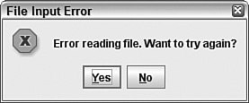
For example:
int response = JOptionPane.showConfirmDialog(null,
    "Error reading file. Want to try again?",
    "File Input Error",
    JOptionPane.YES_NO_OPTION,
    JOptionPane.ERROR_MESSAGE);
Figure 10.6 shows the resulting dialog box.
An input dialog box asks a question and uses a text field to store the response. Figure 10.7 shows an example.
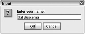
The easiest way to create an input dialog box is with a call to the showInputDialog(Component, Object) method. The arguments are the parent component and the string, component, or icon to display in the box.
The input dialog box method call returns a string that represents the user’s response. The following statement creates the input dialog box shown in Figure 10.7:
String response = JOptionPane.showInputDialog(null,
    "Enter your name:");
You also can create an input dialog box with the showInputDialog(Component, Object, String, int) method. The first two arguments are the same as the shorter method call, and the last two are the following:
The title to display in the dialog box title bar
One of five class constants describing the type of dialog box:
ERROR_MESSAGE,INFORMATION_MESSAGE,PLAIN_MESSAGE,QUESTION_MESSAGE, orWARNING_MESSAGE
The following statement uses this method to create an input dialog box:
String response = JOptionPane.showInputDialog(null,
    "What is your ZIP code?",
    "Enter ZIP Code",
JOptionPane.QUESTION_MESSAGE);A message dialog box is a simple window that displays information, as shown in Figure 10.8.

A message dialog box can be created with a call to the showMessageDialog(Component, Object) method. As with other dialog boxes, the arguments are the parent component and the string, component, or icon to display.
Unlike the other dialog boxes, message dialog boxes do not return any kind of response value. The following statement creates the message dialog box shown in Figure 10.8:
JOptionPane.showMessageDialog(null,
    "The program has been uninstalled.");
You also can create a message input dialog box by calling the showMessageDialog(Component, Object, String, int) method. The use is identical to the showInputDialog() method, with the same arguments, except that showMessageDialog() does not return a value.
The following statement creates a message dialog box using this method:
JOptionPane.showMessageDialog(null,
    "An asteroid has destroyed the Earth.",
    "Asteroid Destruction Alert",
JOptionPane.WARNING_MESSAGE);The most complex of the dialog boxes is the option dialog box, which combines the features of all the other dialog boxes. It can be created with the showOptionDialog(Component, Object, String, int, int, Icon, Object[", Object) method.
The arguments to this method are as follows:
The parent component of the dialog box
The text, icon, or component to display
A string to display in the title bar
The type of box, using the class constants
YES_NO_OPTIONorYES_NO_CANCEL_OPTION, or the literal0if other buttons will be used insteadThe icon to display, using the class constants
ERROR_MESSAGE,INFORMATION_MESSAGE,PLAIN_MESSAGE,QUESTION_MESSAGE, orWARNING_MESSAGE, or the literal0if none of these should be usedAn
Iconobject to display instead of one of the icons in the preceding argumentAn array of objects holding the objects that represent the choices in the dialog box, if
YES_NO_OPTIONandYES_NO_CANCEL_OPTIONare not being usedThe object representing the default selection if
YES_NO_OPTIONandYES_NO_CANCELoption are not being used
The final two arguments offer a wide range of possibilities for the dialog box. You can create an array of strings that holds the text of each button to display on the dialog box. These components are displayed using the flow layout manager.
The following example creates an option dialog box that uses an array of String objects for the options in the box and the gender[2] element as the default selection:
String[] gender = { "Male", "Female",
    "None of Your Business" };
int response = JOptionPane.showOptionDialog(null,
    "What is your gender?",
    "Gender",
    0,
    JOptionPane.INFORMATION_MESSAGE,
    null,
    gender,
    gender[2]);
Figure 10.9 shows the resulting dialog box.

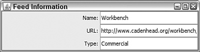
The next project shows a series of dialog boxes in a working program. The FeedInfo application uses dialog boxes to get information from the user; that information is then placed into text fields in the application’s main window.
Enter Listing 10.1 and compile the result.
Example 10.1. The Full Text of FeedInfo.java
 1: import java.awt.GridLayout;
 2: import java.awt.event.*;
 3: import javax.swing.*;
 4:
 5: public class FeedInfo extends JFrame {
 6:     private JLabel nameLabel = new JLabel("Name: ",
 7:         SwingConstants.RIGHT);
 8:     private JTextField name;
 9:     private JLabel urlLabel = new JLabel("URL: ",
10:         SwingConstants.RIGHT);
11:     private JTextField url;
12:     private JLabel typeLabel = new JLabel("Type: ",
13:         SwingConstants.RIGHT);
14:     private JTextField type;
15:
16:     public FeedInfo() {
17:         super("Feed Information");
18:         setSize(400, 105);
19:         setDefaultCloseOperation(JFrame.EXIT_ON_CLOSE);
20:         setLookAndFeel();
21:         // Site name
22:         String response1 = JOptionPane.showInputDialog(null,
23:             "Enter the site name:");
24:         name = new JTextField(response1, 20);
25:
26:         // Site address
27:         String response2 = JOptionPane.showInputDialog(null,
28:             "Enter the site address:");
29:         url = new JTextField(response2, 20);
30:
31:         // Site type
32:         String[] choices = { "Personal", "Commercial", "Unknown" };
33:         int response3 = JOptionPane.showOptionDialog(null,
34:             "What type of site is it?",
35:             "Site Type",
36:             0,
37:             JOptionPane.QUESTION_MESSAGE,
38:             null,
39:             choices,
40:             choices[0]);
41:         type = new JTextField(choices[response3], 20);
42:
43:         setLayout(new GridLayout(3, 2));
44:         add(nameLabel);
45:         add(name);
46:         add(urlLabel);
47:         add(url);
48:         add(typeLabel);
49:         add(type);
50:         setLookAndFeel();
51:         setVisible(true);
52:     }
53:
54:     private void setLookAndFeel() {
55:         try {
56:             UIManager.setLookAndFeel(
57:                 UIManager.getSystemLookAndFeelClassName());
58:              SwingUtilities.updateComponentTreeUI(this);
59:         } catch (Exception e) {
60:             System.err.println("Couldn't use the system "
61:                 + "look and feel: " + e);
62:         }
63:      }
64:
65:     public static void main(String[] arguments) {
66:         FeedInfo frame = new FeedInfo();
67:      }
68: }
After you fill in the fields in each dialog box, you will see the application’s main window, which is displayed in Figure 10.10 with the Windows look and feel. Three text fields have values supplied by dialog boxes.
Much of this application is boilerplate code that can be used with any Swing application. The following lines relate to the dialog boxes:
In lines 22–24, an input dialog box asks the user to enter a site name. This name is used in the constructor for a
JTextFieldobject, placing it in the text field.In lines 27–29, a similar input dialog box asks for a site address, which is used in the constructor for another
JTextFieldobject.In line 32, an array of
Stringobjects calledchoicesis created, and three elements are given values.In lines 33–40, an option dialog box asks for the site type. The
choicesarray is the seventh argument, which sets up three buttons on the dialog box labeled with the strings in the array:"Personal","Commercial", and"Unknown". The last argument,choices[0], designates the first array element as the default selection in the dialog box.In line 41, the response to the option dialog box, an integer identifying the array element that was selected, is stored in a
JTextFieldcomponent calledtype.
The look and feel, which is established in the setLookAndFeel() method in lines 54–63, is called at the beginning and end of the frame’s constructor method. Because you’re opening several dialog boxes in the constructor, you must set up the look and feel before opening them.
Sliders, which are implemented in Swing with the JSlider class, enable the user to set a number by sliding a control within the range of a minimum and maximum value. In many cases, a slider can be used for numeric input instead of a text field, and it has the advantage of restricting input to a range of acceptable values.
Figure 10.11 shows an example of a JSlider component.

Sliders are horizontal by default. The orientation can be explicitly set using two class constants of the SwingConstants interface: HORIZONTAL or VERTICAL.
You can use the following constructor methods:
JSlider(int,int)—. A slider with the specified minimum value and maximum valueJSlider(int,int, int)—. A slider with the specified minimum value, maximum value, and starting valueJSlider(int, int, int, int)—. A slider with the specified orientation, minimum value, maximum value, and starting value
Slider components have an optional label that can be used to indicate the minimum value, maximum value, and two different sets of tick marks ranging between the values. The default values are a minimum of 0, maximum of 100, starting value of 50, and horizontal orientation.
The elements of this label are established by calling several methods of JSlider:
setMajorTickSpacing(int)—. This method separates major tick marks by the specified distance. The distance is not in pixels, but in values between the minimum and maximum values represented by the slider.setMinorTickSpacing(int). —This method separates minor tick marks by the specified distance. Minor ticks are displayed as half the height of major ticks.setPaintTicks(boolean)—. This method determines whether the tick marks should be displayed (atrueargument) or not (afalseargument).setPaintLabels(boolean)—. This method determines whether the numeric label of the slider should be displayed (true) or not (false).
These methods should be called on the slider before it is added to a container.
Listing 10.2 contains the Slider.java source code; the application was shown in Figure 10.11.
Example 10.2. The Full Text of Slider.java
 1: import java.awt.event.*;
 2: import javax.swing.*;
 3:
 4: public class Slider extends JFrame {
 5:
 6:     public Slider() {
 7:         super("Slider");
 8:         setDefaultCloseOperation(JFrame.EXIT_ON_CLOSE);
 9:         JSlider pickNum = new JSlider(JSlider.HORIZONTAL, 0, 30, 5);
10:         pickNum.setMajorTickSpacing(10);
11:         pickNum.setMinorTickSpacing(1);
12:         pickNum.setPaintTicks(true);
13:         pickNum.setPaintLabels(true);
14:         add(pickNum);
15:     }
16:
17:     public static void main(String[] args) {
18:         Slider frame = new Slider();
19:         frame.pack();
20:         frame.setVisible(true);
21:     }
22: }
Lines 9–14 contain the code that’s used to create a JSlider component, set up its tick marks to be displayed, and add the component to a container. The rest of the program is a basic framework for an application that consists of a main JFrame container with no menus.
In lines 18–20, a new Slider object is created, a call to the object’s pack() method sets its size to the preferred size of its components, and the object is made visible.
As you learned in yesterday’s lesson, in early versions of Java, some components (such as text areas) had a built-in scrollbar. The bar could be used when the text in the component took up more space than the component could display. Scrollbars could be used in either the vertical or horizontal direction to scroll through the text.
One of the most common examples of scrolling is in a web browser, where a scrollbar can be used on any page bigger than the browser’s display area.
Swing changes the rules for scrollbars to the following:
For a component to be able to scroll, it must be added to a
JScrollPanecontainer.This
JScrollPanecontainer is added to a container in place of the scrollable component.
Scroll panes can be created using the ScrollPane(Object) constructor, where Object represents the component that can be scrolled.
The following example creates a text area in a scroll pane and adds the scroll pane, scroller, to a container called mainPane:
textBox = new JTextArea(7, 30);
JScrollPane scroller = new JScrollPane(textBox);
mainPane.add(scroller);
As you’re working with scroll panes, it can often be useful to indicate the size you want it to occupy on the interface. This is done by calling the setPreferredSize(Dimension) method of the scroll pane before it is added to a container. The Dimension object represents the width and height of the preferred size, represented in pixels.
The following code builds on the previous example by setting the preferred size of scroller:
Dimension pref = new Dimension(350, 100);
scroller.setPreferredSize(pref);
This should be handled before scroller is added to a container.
Caution
This is one of many situations in Swing where you must do something in the proper order for it to work correctly. For most components, the order is the following: Create the component, set up the component fully, and then add the component to a container.
By default, a scroll pane does not display scrollbars unless they are needed. If the component inside the pane is no larger than the pane itself, the bars won’t appear. In the case of components such as text areas, where the component size might increase as the program is used, the bars automatically appear when they’re needed and disappear when they are not.
To override this behavior, you can set a policy for a JScrollBar component when you create it. You set the policy by using one of several ScrollPaneConstants class constants:
HORIZONTAL_SCROLLBAR_ALWAYSHORIZONTAL_SCROLLBAR_AS_NEEDEDHORIZONTAL_SCROLLBAR_NEVERVERTICAL_SCROLLBAR_ALWAYSVERTICAL_SCROLLBAR_AS_NEEDEDVERTICAL_SCROLLBAR_NEVER
These class constants are used with the JScrollPane(Object, int, int) constructor, which specifies the component in the pane, the vertical scrollbar policy, and the horizontal scrollbar policy.
Note
Any Swing component that requires scrolling can be placed within a scroll pane. If you’re scrolling a text area and need to jump to the bottom of the pane whenever new text is added, call the text area component’s setCaretPosition(getDocument().getLength()) method. The argument to setCaretPosition() indicates how much text the area currently holds.
A toolbar, created in Swing with the JToolBar class, is a container that groups several components into a row or column. These components are most often buttons.
Toolbars are rows or columns of components that group the most commonly used program options together. Toolbars often contain buttons and lists and can be used as an alternative to using pull-down menus or shortcut keys.
Toolbars are horizontal by default, but the orientation can be explicitly set with the HORIZONTAL or VERTICAL class variables of the SwingConstants interface.
Constructor methods include the following:
JToolBar()—. Creates a new toolbarJToolBar(int)—. Creates a new toolbar with the specified orientation
After you have created a toolbar, you can add components to it by using the toolbar’s add(Object) method, where Object represents the component to place on the toolbar.
Many programs that use toolbars enable the user to move the bars. These are called dockable toolbars because you can dock them along an edge of the screen, similar to docking a boat to a pier. Swing toolbars also can be docked into a new window, separate from the original.
For best results, a dockable JToolBar component should be arranged in a container using the BorderLayout manager. A border layout divides a container into five areas: north, south, east, west, and center. Each of the directional components takes up whatever space it needs, and the rest are allocated to the center.
The toolbar should be placed in one of the directional areas of the border layout. The only other area of the layout that can be filled is the center. (You’ll learn more about layout managers such as border layout during tomorrow’s lesson, Day 11, “Arranging Components on a User Interface.”)
Figure 10.12 shows a dockable toolbar occupying the north area of a border layout. A text area has been placed in the center.

Listing 10.3 contains the source code used to produce this application.
Example 10.3. The Full Text of FeedBar.java
 1: import java.awt.*;
 2: import java.awt.event.*;
 3: import javax.swing.*;
 4:
 5: public class FeedBar extends JFrame {
 6:
 7:     public FeedBar() {
 8:         super("FeedBar");
 9:         setDefaultCloseOperation(JFrame.EXIT_ON_CLOSE);
10:         // create icons
11:         ImageIcon loadIcon = new ImageIcon("load.gif");
12:         ImageIcon saveIcon = new ImageIcon("save.gif");
13:         ImageIcon subscribeIcon = new ImageIcon("subscribe.gif");
14:         ImageIcon unsubscribeIcon = new ImageIcon("unsubscribe.gif");
15:         // create buttons
16:         JButton load = new JButton("Load", loadIcon);
17:         JButton save = new JButton("Save", saveIcon);
18:         JButton subscribe = new JButton("Subscribe", subscribeIcon);
19:         JButton unsubscribe = new JButton("Unsubscribe", unsubscribeIcon);
20:         // add buttons to toolbar
21:         JToolBar bar = new JToolBar();
22:         bar.add(load);
23:         bar.add(save);
24:         bar.add(subscribe);
25:         bar.add(unsubscribe);
26:         // prepare user interface
27:         JTextArea edit = new JTextArea(8, 40);
28:         JScrollPane scroll = new JScrollPane(edit);
29:         BorderLayout bord = new BorderLayout();
30:         setLayout(bord);
31:         add("North", bar);
32:         add("Center", scroll);
33:         pack();
34:         setVisible(true);
35:     }
36:
37:     public static void main(String[] arguments) {
38:         FeedBar frame = new FeedBar();
39:     }
40: }
This application uses four images to represent the graphics on the buttons—the same graphics used in the IconFrame project yesterday. If you haven’t downloaded them yet, they are available on the book’s official website at http://www.java21days.com on the Day 10 page. You also can use graphics from your own system, although they must be in GIF format and reasonably small.
The toolbar in this application can be grabbed by its handle—the area immediately to the left of the “Load” button in Figure 10.12. If you drag it within the window, you can dock it along different edges of the application window. When you release the toolbar, the application is rearranged using the border layout manager. You also can drag the toolbar out of the application window entirely.
Although toolbars are most commonly used with graphical buttons, they can contain textual buttons, combo boxes, and other }components.
Progress bars are components used to show how much time is left before a task is complete.
Progress bars are implemented in Swing through the JProgressBar class. A sample Java program that uses this component is shown in Figure 10.13.
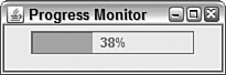
Progress bars are used to track the progress of a task that can be represented numerically. They are created by specifying a minimum and a maximum value that represent the points at which the task is beginning and ending.
A software installation that consists of 335 different files is a good example of a task that can be numerically quantified. The number of files transferred can be used to monitor the progress of the task. The minimum value is 0, and the maximum value is 335.
Constructor methods include the following:
JProgressBar()—. Creates a new progress barJProgressBar(int,int)—. Creates a new progress bar with the specified minimum value and maximum valueJProgressBar(int,int,int)—. Creates a new progress bar with the specified orientation, minimum value, and maximum value
The orientation of a progress bar can be established with the SwingConstants.VERTICAL and SwingConstants.HORIZONTAL class constants. Progress bars are horizontal by default.
The minimum and maximum values also can be set up by calling the progress bar’s setMinimum(int) and setMaximum(int) values with the indicated values.
To update a progress bar, you call its setValue(int) method with a value indicating how far along the task is at that moment. This value should be somewhere between the minimum and maximum values established for the bar. The following example tells the install progress bar in the previous example of a software installation how many files have been uploaded thus far:
int filesDone = getNumberOfFiles();
install.setValue(filesDone);
In this example, the getNumberOfFiles() method represents some code that would be used to keep track of how many files have been copied so far during the installation. When this value is passed to the progress bar by the setValue() method, the bar is immediately updated to represent the percentage of the task that has been completed.
Progress bars often include a text label in addition to the graphic of an empty box filling up. This label displays the percentage of the task that has become completed, and you can set it up for a bar by calling the setStringPainted(boolean) method with a value of true. A false argument turns off this label.
Listing 10.4 contains ProgressMonitor, the application shown at the beginning of this section in Figure 10.13.
Example 10.4. The Full Text of ProgressMonitor.java
 1: import java.awt.*;
 2: import java.awt.event.*;
 3: import javax.swing.*;
 4:
 5: public class ProgressMonitor extends JFrame {
 6:
 7:     JProgressBar current;
 8:     JTextArea out;
 9:     JButton find;
10:     Thread runner;
11:     int num = 0;
12:
13:     public ProgressMonitor() {
14:         super("Progress Monitor");
15:
16:         setDefaultCloseOperation(JFrame.EXIT_ON_CLOSE);
17:         setSize(205, 68);
18:         setLayout(new FlowLayout());
19:         current = new JProgressBar(0, 2000);
20:         current.setValue(0);
21:         current.setStringPainted(true);
22:         add(current);
23:     }
24:
25:
26:     public void iterate() {
27:         while (num < 2000) {
28:             current.setValue(num);
29:             try {
30:                 Thread.sleep(1000);
31:             } catch (InterruptedException e) { }
32:             num += 95;
33:         }
34:     }
35:
36:     public static void main(String[] arguments) {
37:         ProgressMonitor frame = new ProgressMonitor();
38:         frame.setVisible(true);
39:         frame.iterate();
40:    }
41: } are
The ProgressMonitor application uses a progress bar to track the value of the num variable. The progress bar is created in line 18 with a minimum value of 0 and a maximum value of 2000.
The iterate() method in lines 26–34 loops while num is less than 2000 and increases num by 95 each iteration. The progress bar’s setValue() method is called in line 27 of the loop with num as an argument, causing the bar to use that value when charting progress.
Using a progress bar is a way to make a program more user friendly when it is going to be busy for more than a few seconds. Software users like progress bars because they indicate an approximation of how much more time something’s going to take.
Progress bars also provide another essential piece of information: proof that the program is still running and has not crashed.
One way you can enhance are the usability of a frame is to give it a menu bar—a series of pull-down menus used to perform tasks. Menus often duplicate the same tasks you could accomplish by using buttons and other user interface components, giving someone using your program two ways to get work done.
Menus in Java are supported by three components that work in conjunction with each other:
JMenuItem—. An item on a menuJMenu—. A drop-down menu that contains one or moreJMenuItemcomponents, other interface components, and separators, lines displayed between itemsJMenuBar—. A container that holds one or moreJMenucomponents and displays their names
A JMenuItem component is like a button and can be set up using the same constructor methods as a JButton component. Call it with JMenuItem(String) for a text item, JMenuItem(Icon) for an item that displays a graphics file, or JMenuItem(String, Icon) for both.
The following statements create seven menu items:
JMenuItem j1 = new JMenuItem("Open");
JMenuItem j2 = new JMenuItem("Save");
JMenuItem j3 = new JMenuItem("Save as Template");
JMenuItem j4 = new JMenuItem("Page Setup");
JMenuItem j5 = new JMenuItem("Print");
JMenuItem j6 = new JMenuItem("Use as Default Message Style");
JMenuItem j7 = new JMenuItem("Close");
A JMenu container holds all the menu items for a drop-down menu. To create it, call the JMenu(String) constructor with the name of the menu as an argument. This name appears on the menu bar.
After you have created a JMenu container, call its add(JMenuItem) to add a menu item to it. New items are placed at the end of the menu.
The item you put on a menu doesn’t have to be a menu item. Call the add(Component) method with a user interface component as the argument. One that often appears on a menu is a check box (the JCheckBox class in Java).
To add a line separator to the end of the menu, call the addSeparator() method. Separators are often used to visually group several related items on a menu.
You also can add text to a menu that serves as a label of some kind. Call the add(String) method with the text as an argument.
Using the seven menu items from the preceding example, the following statements create a menu and fill it with all those items and three separators:
JMenu m1 = new JMenu("File");
m1.add(j1);
m1.add(j2);
m1.add(j3);
m1.addSeparator();
m1.add(j4);
m1.add(j5);
m1.addSeparator();
m1.add(j6);
m1.addSeparator();
m1.add(j7);
A JMenuBar container holds one or more JMenu containers and displays each of their names. The most common place to see a menu bar is directly below an application’s title bar.
To create a menu bar, call the JMenuBar() constructor method with no arguments. Add menus to the end of a bar by calling its add(JMenu) method.
After you have created all your items, added them to menus, and added the menus to a bar, you’re ready to add them to a frame. Call the frame’s setJMenuBar(JMenuBar) method.
The following statement finishes off the current example by creating a menu bar, adding a menu to it, and then placing the bar on a frame called gui:
JMenuBar bar = new JMenuBar();
bar.add(m7);
gui.setJMenuBar(bar);
Figure 10.14 shows what this menu looks like on an otherwise empty menu bar.

Although you can open and close a menu and select items, nothing happens in response. You’ll learn how to receive user input for this component and others during Day 12, “Responding to User Input.”
Listing 10.5 contains an expanded version of the FeedBar project, adding a menu bar that holds one menu and four individual items. This application is shown in Figure 10.14.
Example 10.5. The Full Text of FeedBar2.java
 1: import java.awt.*;
 2: import java.awt.event.*;
 3: import javax.swing.*;
 4:
 5: public class FeedBar2 extends JFrame {
 6:
 7:     public FeedBar2() {
 8:         super("FeedBar 2");
 9:         setDefaultCloseOperation(JFrame.EXIT_ON_CLOSE);
10:         // create icons
11:         ImageIcon loadIcon = new ImageIcon("load.gif");
12:         ImageIcon saveIcon = new ImageIcon("save.gif");
13:         ImageIcon subscribeIcon = new ImageIcon("subscribe.gif");
14:         ImageIcon unsubscribeIcon = new ImageIcon("unsubscribe.gif");
15:         // create buttons
16:         JButton load = new JButton("Load", loadIcon);
17:         JButton save = new JButton("Save", saveIcon);
18:         JButton subscribe = new JButton("Subscribe", subscribeIcon);
19:         JButton unsubscribe = new JButton("Unsubscribe", unsubscribeIcon);
20:         // add buttons to toolbar
21:         JToolBar bar = new JToolBar();
22:         bar.add(load);
23:         bar.add(save);
24:         bar.add(subscribe);
25:         bar.add(unsubscribe);
26:         // create menu
27:         JMenuItem j1 = new JMenuItem("Load");
28:         JMenuItem j2 = new JMenuItem("Save");
29:         JMenuItem j3 = new JMenuItem("Subscribe");
30:         JMenuItem j4 = new JMenuItem("Unsubscribe");
31:         JMenuBar menubar = new JMenuBar();
32:         JMenu menu = new JMenu("Feeds");
33:         menu.add(j1);
34:         menu.add(j2);
35:         menu.addSeparator();
36:         menu.add(j3);
37:         menu.add(j4);
38:         menubar.add(menu);
39:         // prepare user interface
40:         JTextArea edit = new JTextArea(8, 40);
41:         JScrollPane scroll = new JScrollPane(edit);
42:         BorderLayout bord = new BorderLayout();
43:         setLayout(bord);
44:         add("North", bar);
45:         add("Center", scroll);
46:         setJMenuBar(menubar);
47:         pack();
48:         setVisible(true);
49:     }
50:
51:     public static void main(String[] arguments) {
52:         FeedBar2 frame = new FeedBar2();
53:     }
54: }
Tabbed panes, a group of stacked panels in which only one panel can be viewed at a time, are implemented in Swing by the JTabbedPane class.
To view a panel, you click the tab that contains its name. Tabs can be arranged horizontally across the top or bottom of the component or vertically along the left or right side.
Tabbed panes are created with the following three constructor methods:
JTabbedPane()—. Creates a vertical tabbed pane along the top that does not scrollJTabbedPane(int)—. Creates a tabbed pane that does not scroll and has the specified placementJTabbedPane(int,int)—. Creates a tabbed pane with the specified placement (first argument) and scrolling policy (second argument)
The placement of a tabbed pane is the position where its tabs are displayed in relation to the panels. Use one of four class variables as the argument to the constructor: JTabbedPane.TOP, JTabbedPane.BOTTOM, JTabbedPane.LEFT, or JTabbedPane.RIGHT.
The scrolling policy determines how tabs will be displayed when there are more tabs than the interface can hold. A tabbed pane that does not scroll displays extra tabs on their own line, which can be set up using the JTabbedPane.WRAP_TAB_LAYOUT class variable. A tabbed pane that scrolls displays scrolling arrows beside the tabs. This can be set up with JTabbedPane.SCROLL_TAB_LAYOUT.
After you create a tabbed pane, you can add components to it by calling the pane’s addTab(String, Component) method. The String argument will be used as the label of the tab. The second argument is the component that will make up one of the tabs on the pane. It’s common to use a JPanel object for this purpose, but not required.
The following statements create five empty panels and add them to a tabbed pane:
JPanel mainSettings = new JPanel();
JPanel advancedSettings = new JPanel();
JPanel privacySettings = new JPanel();
JPanel emailSettings = new JPanel();
JPanel securitySettings = new JPanel();
JTabbedPane tabs = new JTabbedPane();
tabs.addTab("Main", mainSettings);
tabs.addTab("Advanced", advancedSettings);
tabs.addTab("Privacy", privacySettings);
tabs.addTab("E-mail", emailSettings);
tabs.addTab("Security", securitySettings);
After adding all the panels and other components to a tabbed pane, the pane can be added to another container. Figure 10.15 shows what the example looks like when added to a frame.

You now know how to paint a user interface onto a Java application window using the components of the Swing package.
Swing includes classes for many of the buttons, bars, lists, and fields you would expect to see on a program, along with more advanced components, such as sliders, dialog boxes, progress bars, and menu bars. Interface components are implemented by creating an instance of their class and adding it to a container such as a frame using the container’s add() method or a similar method specific to the container, such as the tabbed pane’s addTab() method.
Today, you developed components and added them to an interface. During the next two days, you will learn about two things required to make a graphical interface usable: how to arrange components together to form a whole interface and how to receive input from a user through these components.
Can an application be created without Swing? | |
Certainly. Swing is just an expansion on the Abstract Windowing Toolkit, and if you are developing an applet for older versions of Java, you could use only AWT classes to design your interface and receive input from a user. However, there’s no comparison between Swing’s capabilities and those offered by the AWT. With Swing, you can use many more components, control them in more sophisticated ways, and count on better performance and more reliability. Other user interface libraries also extend or compete with Swing. One of the most popular is the Standard Widget Toolkit (SWT), an open source graphical user interface library created by the Eclipse project. The SWT offers components that appear and behave like the interface components offered by each operating system. For more information, visit the website http://www.eclipse.org/swt. | |
In the | |
Every interface component has a preferred size, although this is often disregarded by the layout manager used to arrange the component within a container. Calling a frame or window’s | |
When I try to create a tabbed pane, all that displays are the tabs—the panels themselves are not visible. What can I do to correct this? | |
Tabbed panes won’t work correctly until the contents of those panes have been fully set up. If a tab’s panes are empty, nothing will be displayed below or beside the tabs. Make sure that the panels you are putting into the tabs are displaying all their components. |
Review today’s material by taking this three-question quiz.
The following question is the kind of thing you could expect to be asked on a Java programming certification test. Answer it without looking at today’s material or using the Java compiler to test the code.
Given:
import java.awt.*;
import javax.swing.*;

public class AskFrame extends JFrame {
    public AskFrame() {
        setDefaultCloseOperation(JFrame.EXIT_ON_CLOSE);
        JSlider value = new JSlider(0, 255, 100);
        add(value);
        setSize(450, 150);
        setVisible(true);
        super();
    }

    public static void main(String[] arguments) {
        AskFrame af = new AskFrame();
    }
}
What will happen when you attempt to compile and run this source code?
The answer is available on the book’s website at http://www.java21days.com. Visit the Day 10 page and click the Certification Practice link. |
To extend your knowledge of the subjects covered today, try the following exercises:
Create an input dialog box that can be used to set the title of the frame that loaded the dialog box.
Create a modified version of the
Progressapplication that also displays the value of thenumvariable in a text field.
Where applicable, exercise solutions are offered on the book’s website at http://www.java21days.com.