
If designing a graphical user interface were comparable to painting, you could currently produce only one kind of art: abstract expressionism. You can put components onto an interface, but you don’t have control over where they go.
To arrange the components of a user interface in Java, you must use a set of classes called layout managers.
Today, you learn how to use layout managers to arrange components into an interface. You take advantage of the flexibility of Swing, which was designed to be presentable on the many different platforms that support the language.
You also learn how to put several different layout managers to work on the same interface, an approach for the many times when one layout manager doesn’t suit everything you have in mind for a program.
As you learned yesterday, a graphical user interface designed with Swing is a fluid thing. Resizing a window can wreak havoc on your interface, as components move to places on a container that you might not have intended.
This fluidity is a necessary part of Java’s support for different platforms where there are subtle differences in the way each platform displays things such as buttons, scrollbars, and so on.
With programming languages such as Microsoft Visual Basic, a component’s location on a window is precisely defined by its x,y coordinate. Some Java development tools allow similar control over an interface through the use of their own windowing classes (and there’s a way to do that in Java).
When using Swing, a programmer gains more control over the layout of an interface by using layout managers.
A layout manager determines how components will be arranged when they are added to a container.
The default layout manager for panels is the FlowLayout class. This class lets components flow from left to right in the order that they are added to a container. When there’s no more room, a new row of components begins immediately below the first, and the left-to-right order continues.
Java includes a bunch of general-purpose layout managers: BorderLayout, BoxLayout, CardLayout, FlowLayout, GridBagLayout, and GridLayout. To create a layout manager for a container, first call its constructor to create an instance of the class, as in this example:
FlowLayout flo = new FlowLayout();
After you create a layout manager, you make it the layout manager for a container by using the container’s setLayout() method. The layout manager must be established before any components are added to the container. If no layout manager is specified, its default layout will be used—FlowLayout for panels and BorderLayout for frames and windows.
The following statements represent the starting point for a frame that uses a layout manager to control the arrangement of all the components that will be added to the frame:
import java.awt.*;

public class Starter extends javax.swing.JFrame {

    public Starter() {
        FlowLayout lm = new FlowLayout();
        setLayout(lm);
        // add components here
    }
}
After the layout manager is set, you can start adding components to the container that it manages. For some of the layout managers, such as FlowLayout, the order in which components are added is significant. You’ll see this as you work with each of the managers.
The FlowLayout class in the java.awt package is the simplest layout manager. It lays out components in rows in a manner similar to the way words are laid out on a page—from left to right until there’s no more room at the right edge and then on to the leftmost point on the next row.
By default, the components on each row will be centered when you use the FlowLayout () constructor with no arguments. If you want the components to be aligned along the left or right edge of the container, the FlowLayout.LEFT or FlowLayout.RIGHT class variable can be used as the constructor’s only argument, as in the following statement:
FlowLayout righty = new FlowLayout(FlowLayout.RIGHT);
The FlowLayout.CENTER class variable is used to specify a centered alignment for components.
Note
If you need to align components for a non-English speaking audience where left-to-right order does not make sense, the FlowLayout.LEADING and FlowLayout.TRAILING variables can be used. They set justification to either the side of the first component in a row or the last, respectively.
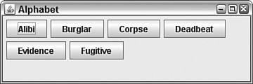
The application in Listing 11.1 displays six buttons arranged by the flow layout manager. Because the FlowLayout.LEFT class variable was used in the FlowLayout() constructor, the components are lined up along the left side of the application window.
Example 11.1. The Full Text of Alphabet.java
 1: import java.awt.*;
 2: import java.awt.event.*;
 3: import javax.swing.*;
 4:
 5: public class Alphabet extends JFrame {
 6:     JButton a = new JButton("Alibi");
 7:     JButton b = new JButton("Burglar");
 8:     JButton c = new JButton("Corpse");
 9:     JButton d = new JButton("Deadbeat");
10:     JButton e = new JButton("Evidence");
11:     JButton f = new JButton("Fugitive");
12:
13:     public Alphabet() {
14:         super("Alphabet");
15:         setSize(360, 120);
16:         setDefaultCloseOperation(JFrame.EXIT_ON_CLOSE);
17:         FlowLayout lm = new FlowLayout(FlowLayout.LEFT);
18:         setLayout(lm);
19:         add(a);
20:         add(b);
21:         add(c);
22:         add(d);
23:         add(e);
24:         add(f);
25:         setVisible(true);
26:     }
27:
28:     public static void main(String[] arguments) {
29:         Alphabet frame = new Alphabet();
30:     }
31: }
Figure 11.1 shows the application running.
In the Alphabet application, the flow layout manager uses the default gap of five pixels between each component on a row and a gap of five pixels between each row. You can change the horizontal and vertical gap between components with some extra arguments to the FlowLayout() constructor.
The FlowLayout(int, int, int) constructor takes the following three arguments, in order:
The alignment, which must be one of five class variables of
FlowLayout:CENTER,LEFT,RIGHT,LEADING, orTRAILINGThe horizontal gap between components, in pixels
The vertical gap, in pixels
The following constructor creates a flow layout manager with centered components, a horizontal gap of 30 pixels, and a vertical gap of 10:
FlowLayout flo = new FlowLayout(FlowLayout.CENTER, 30, 10);
The next layout manager can be used to stack components from top to bottom or from left to right. Box layout, managed by the BoxLayout class in the javax.swing package, improves on flow layout by making sure that components always line up vertically or horizontally—regardless of how their container is resized.
A box layout manager must be created with two arguments to its constructor: the container it will manage and a class variable that sets up vertical or horizontal alignment.
The alignment, specified with class variables of the BoxLayout class, can be X_AXIS for left-to-right horizontal alignment and Y_AXIS for top-to-bottom vertical alignment.
The following code sets up a panel to use vertical box layout:
JPanel optionPane = new JPanel();
BoxLayout box = new BoxLayout(optionPane,
    BoxLayout.Y_AXIS);
Components added to the container will line up on the specified axis and be displayed at their preferred sizes. In horizontal alignment, the box layout manager attempts to give each component the same height. In vertical alignment, it attempts to give each one the same width.
The Stacker application in Listing 11.2 contains a panel of buttons arranged with box layout.
Example 11.2. The Full Text of Stacker.java
 1: import java.awt.*;
 2: import javax.swing.*;
 3:
 4: public class Stacker extends JFrame {
 5:     public Stacker() {
 6:         super("Stacker");
 7:         setSize(430, 150);
 8:         setDefaultCloseOperation(JFrame.EXIT_ON_CLOSE);
 9:         // create top panel
10:         JPanel commandPane = new JPanel();
11:         BoxLayout horizontal = new BoxLayout(commandPane,
12:             BoxLayout.X_AXIS);
13:         commandPane.setLayout(horizontal);
14:         JButton subscribe = new JButton("Subscribe");
15:         JButton unsubscribe = new JButton("Unsubscribe");
16:         JButton refresh = new JButton("Refresh");
17:         JButton save = new JButton("Save");
18:         commandPane.add(subscribe);
19:         commandPane.add(unsubscribe);
20:         commandPane.add(refresh);
21:         commandPane.add(save);
22:         // create bottom panel
23:         JPanel textPane = new JPanel();
24:         JTextArea text = new JTextArea(4, 70);
25:         JScrollPane scrollPane = new JScrollPane(text);
26:         // put them together
27:         FlowLayout flow = new FlowLayout();
28:         setLayout(flow);
29:         add(commandPane);
30:         add(scrollPane);
31:         setVisible(true);
32:     }
33:
34:     public static void main(String[] arguments) {
35:         Stacker st = new Stacker();
36:     }
37: }
When the class is compiled and run, the output should resemble Figure 11.2.
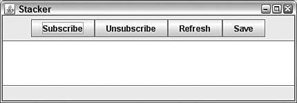
The panel of buttons along the top edge of the interface is stacked horizontally. If the second argument to the constructor in lines 11–12 was BoxLayout.Y_AXIS, the buttons would be arranged vertically instead.
The grid layout manager arranges components into a grid of rows and columns. Components are added first to the top row of the grid, beginning with the leftmost grid cell and continuing to the right. When all the cells in the top row are full, the next component is added to the leftmost cell in the second row of the grid—if there is a second row—and so on.
Grid layout managers are created with the GridLayout class, which belongs to the java.awt package. Two arguments are sent to the GridLayout constructor—the number of rows in the grid and the number of columns. The following statement creates a grid layout manager with 10 rows and 3 columns:
GridLayout gr = new GridLayout(10, 3);
As with flow layout, you can specify a vertical and a horizontal gap between components with two extra arguments. The following statement creates a grid layout with 10 rows and 3 columns, a horizontal gap of 5 pixels, and a vertical gap of 8 pixels:
GridLayout gr2 = new GridLayout(10, 3, 5, 8);
The default gap between components under a grid layout is 0 pixels in both vertical and horizontal directions.
Listing 11.3 contains an application that creates a grid with three rows, three columns, and a 10-pixel gap between components in both the vertical and horizontal directions.
Example 11.3. The Full Text of Bunch.java
 1: import java.awt.*;
 2: import java.awt.event.*;
 3: import javax.swing.*;
 4:
 5: public class Bunch extends JFrame {
 6:     JButton marcia = new JButton("Marcia");
 7:     JButton carol = new JButton("Carol");
 8:     JButton greg = new JButton("Greg");
 9:     JButton jan = new JButton("Jan");
10:     JButton alice = new JButton("Alice");
11:     JButton peter = new JButton("Peter");
12:     JButton cindy = new JButton("Cindy");
13:     JButton mike = new JButton("Mike");
14:     JButton bobby = new JButton("Bobby");
15:
16:     public Bunch() {
17:         super("Bunch");
18:         setSize(260, 260);
19:         setDefaultCloseOperation(JFrame.EXIT_ON_CLOSE);
20:         JPanel pane = new JPanel();
21:         GridLayout family = new GridLayout(3, 3, 10, 10);
22:         pane.setLayout(family);
23:         pane.add(marcia);
24:         pane.add(carol);
25:         pane.add(greg);
26:         pane.add(jan);
27:         pane.add(alice);
28:         pane.add(peter);
29:         pane.add(cindy);
30:         pane.add(mike);
31:         pane.add(bobby);
32:         add(pane);
33:         setVisible(true);
34:     }
35:
36:     public static void main(String[] arguments) {
37:         Bunch frame = new Bunch();
38:     }
39: }
Figure 11.3 shows this application.
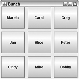
One thing to note about the buttons in Figure 11.3 is that they expanded to fill the space available to them in each cell. This is an important difference between grid layout and some of the other layout managers, which display components at a much smaller size.
Border layouts, which are created by using the BorderLayout class in java.awt, divide a container into five sections: north, south, east, west, and center. The five areas of Figure 11.4 show how these sections are arranged.

Under border layout, the components in the four compass points take up as much space as they need—the center gets whatever space is left over. Ordinarily, this results in an arrangement with a large central component and four thin components around it.
A border layout is created with either the BorderLayout () or BorderLayout(int, int) constructors. The first constructor creates a border layout with no gap between any of the components. The second constructor specifies the horizontal gap and vertical gap, respectively.
After you create a border layout and set it up as a container’s layout manager, components are added using a call to the add() method that’s different from what you have seen previously:
add(Component, String)The first argument is the component that should be added to the container.
The second argument is a BorderLayout class variable that indicates to which part of the border layout to assign the component. The variables NORTH, SOUTH, EAST, WEST, and CENTER can be used.
The second argument to this method is the component that should be added to the container.
The following statement adds a button called quitButton to the north portion of a border layout:
add(quitButton, BorderLayout.NORTH);
Listing 11.4 contains the application used to produce Figure 11.4.
Example 11.4. The Full Text of Border.java
 1: import java.awt.*;
 2: import java.awt.event.*;
 3: import javax.swing.*;
 4:
 5: public class Border extends JFrame {
 6:     JButton nButton = new JButton("North");
 7:     JButton sButton = new JButton("South");
 8:     JButton eButton = new JButton("East");
 9:     JButton wButton = new JButton("West");
10:     JButton cButton = new JButton("Center");
11:
12:     public Border() {
13:         super("Border");
14:         setSize(240, 280);
15:         setDefaultCloseOperation(JFrame.EXIT_ON_CLOSE);
16:         setLayout(new BorderLayout());
17:         add(nButton, BorderLayout.NORTH);
18:         add(sButton, BorderLayout.SOUTH);
19:         add(eButton, BorderLayout.EAST);
20:         add(wButton, BorderLayout.WEST);
21:         add(cButton, BorderLayout.CENTER);
22:     }
23:
24:     public static void main(String[] arguments) {
25:         Border frame = new Border();
26:         frame.setVisible(true);
27:     }
28: }At this point, you might be wondering how Java’s layout managers can be useful for the graphical user interfaces you want to design. Choosing a layout manager is an experience akin to Goldilocks checking out the home of the three bears—”This one is too square! This one is too disorganized! This one is too strange!”
To find the layout that is just right, you often have to combine more than one manager on the same interface.
This is done by putting several containers inside a larger container (such as a frame) and giving each smaller container its own layout manager.
The container to use for these smaller containers is the panel, which is created from the JPanel class. Panels are containers used to group components together. There are two things to keep in mind when working with panels:
The panel is filled with components before it is put into a larger container.
The panel has its own layout manager.
Panels are created with a simple call to the constructor of the JPanel class, as shown in the following example:
JPanel pane = new JPanel();
The layout method is set for a panel by calling the setLayout() method on that panel.
The following statements create a layout manager and apply it to a JPanel object called pane:
FlowLayout flo = new FlowLayout();
pane.setLayout(flo);
Components are added to a panel by calling the panel’s add() method, which works the same for panels as it does for some other containers.
The following statements create a text field and add it to a JPanel object called pane:
JTextField nameField = new JTextField(80);
pane.add(nameField);
You’ll see several examples of panel use in the rest of today’s sample programs.
Card layouts differ from the other layouts because they hide some components from view. A card layout is a group of containers or components displayed one at a time, in the same way that a blackjack dealer reveals one card at a time from a deck. Each container in the group is called a card.
If you have used a wizard in an installation program, you have worked with a program that uses card layout.
The most common way to use a card layout is to use a panel for each card. Components are added to the panels first, and then the panels are added to the container that is set to use card layout.
A card layout is created from the CardLayout class (in the java.awt package) with a simple constructor:
CardLayout cc = new CardLayout();
The setLayout() method is used to make this the layout manager for the container, as in the following statement:
setLayout(cc);
After you set a container to use the card layout manager, you must use a slightly different add() method call to add cards to the layout.
The method to use is add(Component, String). The first argument specifies the container or component that serves as a card. If it is a container, all components must have been added to it before the card is added.
The second argument to the add() method is a string that represents the name of the card. This can be anything you want to call the card. You might want to number the cards in some way and use the number in the name, as in "Card 1", "Card 2", "Card 3", and so on.
The following statement adds a panel object named options to a container and gives this card the name "Options Card":
add(options, "Options Card");
When a container using card layout is displayed for the first time, the visible card will be the first card added to the container.
Subsequent cards can be displayed by calling the show() method of the layout manager, which takes two arguments:
The container holding all the cards
The name of the card
The following statement calls the show() method of a card layout manager called cc:
cc.show(this, "Fact Card");
The this keyword would be used in a frame or window governed by card layout—it refers to the object inside which the cc.show() statement appears. "Fact Card" is the name of the card to reveal. When a card is shown, the previously displayed card will be obscured. Only one card in a card layout can be viewed at a time
In a program that uses the card layout manager, a card change will usually be triggered by a user’s action. For example, in a program that displays mailing addresses on different cards, the user could select a card for display by selecting an item in a scrolling list.
Today’s next project demonstrates. both card layout and the use of different layout managers within the same graphical user interface.
The SurveyWizard class is a panel that implements a wizard interface: a series of simple questions accompanied by a Next button that is used to see the next question. The last question has a Finish button instead.
Figure 11.5 shows this panel.

The easiest way to implement a card-based layout is to use panels. The project uses panels heavily:
The
SurveyWizardclass is a panel that holds all the cards.The
SurveyPanelhelper class is a panel that holds one card.Each
SurveyPanelobject contains three panels stacked on top of each other.
The SurveyWizard and SurveyPanel classes are both panels because that’s the easiest component to use when working with card layout. Each card is created as a panel and added to a containing panel that will be used to show them in sequence.
This takes place in the SurveyWizard constructor, using two instance variables, a card layout manager, and an array of three SurveyPanel objects:
SurveyPanel[] ask = new SurveyPanel[3];
CardLayout cards = new CardLayout();
The constructor sets the class to use the layout manager, creates each SurveyPanel object, and then adds it to the class:
setLayout(cards);
String question1 = "What is your gender?";
String[] responses1 = { "female", "male", "not telling" };
ask[0] = new SurveyPanel(question1, responses1, 2);
add(ask[0], "Card 0");
Each SurveyPanel object is created with. three arguments to the constructor: the text of the question, an array of possible responses, and the element number of the default answer.
In the preceding code, the question “What is your gender?” has the responses “female,” “male,” or “not telling.” The response at position 2, “not telling,” is the default.
The SurveyPanel constructor uses a label component to hold the question and an array of radio buttons to hold the responses:
SurveyPanel(String ques, String[] resp, int def) {
    question = new JLabel(ques);
    response = new JRadioButton[resp.length];
    // more to come
}
The class uses grid layout to arrange its components into a grid with three vertical rows and one horizontal column. Each component placed in the grid is a panel.
First, a panel is created to hold the question label:
JPanel sub1 = new JPanel();
JLabel quesLabel = new JLabel(ques);
sub1.add(quesLabel);
The default layout for panels, flow layout with centered alignment, determines the placement of the label on the panel.
Next, a panel is created to hold the possible responses. A for loop iterates through the string array that holds the text of each response. This text is used to create a radio button. The second argument of the JRadioButton constructor determines whether it is selected. This is implemented with the following code:
JPanel sub2 = new JPanel();
for (int i = 0; i < resp.length; i++) {
    if (def == i) {
        response[i] = new JRadioButton(resp[i], true);
    } else {
        response[i] = new JRadioButton(resp[i], false);
    }
    group.add(response[i]);
    sub2.add(response[i]);
}
The last panel holds the Next and Finish buttons:
JPanel sub3 = new JPanel();
nextButton.setEnabled(true);
sub3.add(nextButton);
finalButton.setEnabled(false);
sub3.add(finalButton);
Now that the three panels have been fully. set up, they are added to the SurveyPanel interface, which completes the work of the constructor method:
GridLayout grid = new GridLayout(3, 1);
setLayout(grid);
add(sub1);
add(sub2);
add(sub3);
There’s one extra wrinkle in the SurveyPanel class—a method that enables the Finish button and disables the Next button when the last question has been reached:
void setFinalQuestion(boolean finalQuestion) {
   if (finalQuestion) {
       nextButton.setEnabled(false);
       finalButton.setEnabled(true);
   }
}
In a user interface that uses card. layout, the display of each card usually takes place in response to an action by the user.
These actions are called events, and they are covered on Day 12, “Responding to User Input.”
A brief introduction demonstrates how the SurveyPanel class is equipped to handle button clicks.
The class implements ActionListener, an interface in the java.awt.event package:
public class SurveyWizard extends JPanel implements ActionListener {
    // more to come
}
This interface indicates that the class can respond to action events, which represent button clicks, menu choices, and similar user input.
Next, each button’s addActionListener(Object) method is called:
ask[0].nextButton.addActionListener(this);
ask[0].finalButton.addActionListener(this);
Listeners are classes that monitor specific. kinds of user input. The argument to addActionListener() is the class that’s looking for action events. Using this as the argument indicates that the SurveyPanel class handles this job.
The ActionListener interface includes only one method:
public void actionPerformed(Action evt) {
    // more to come
}
This method is called when a component being listened to generates an action event. In the SurveyPanel class, this happens whenever a button is clicked.
In SurveyPanel, this method uses an instance variable that keeps track of which card to display:
int currentCard = 0;
Every time a button is clicked and actionPerformed() is called, this variable is incremented, and the card layout manager’s show(Container, String) method is called to display a new card. If the last card has been displayed, the Finish button is disabled.
Here’s the complete method:
public void actionPerformed(ActionEvent evt) {
    currentCard++;
    if (currentCard >= ask.length) {
        ask[2].finalButton.setEnabled(false);
    }
    cards.show(this, "Card " + currentCard);
}
Listing 11.5 shows the full SurveyWizard class.
Example 11.5. The Full Text of SurveyWizard.java
 1: import java.awt.*;
 2: import java.awt.event.*;
 3: import javax.swing.*;
 4:
 5: public class SurveyWizard extends JPanel implements ActionListener {
 6:     int currentCard = 0;
 7:     CardLayout cards = new CardLayout();
 8:     SurveyPanel[] ask = new SurveyPanel[3];
 9:
10:     public SurveyWizard() {
11:         super();
12:         setSize(240, 140);
13:         setLayout(cards);
14:         // set up survey
15:         String question1 = "What is your gender?";
16:         String[] responses1 = { "female", "male", "not telling" };
17:         ask[0] = new SurveyPanel(question1, responses1, 2);
18:         String question2 = "What is your age?";
19:         String[] responses2 = { "Under 25", "25-34", "35-54",
20:             "Over 54" };
21:         ask[1] = new SurveyPanel(question2, responses2, 1);
22:         String question3 = "How often do you exercise each week?";
23:         String[] responses3 = { "Never", "1-3 times", "More than 3" };
24:         ask[2] = new SurveyPanel(question3, responses3, 1);
25:         ask[2].setFinalQuestion(true);
26:         for (int i = 0; i < ask.length; i++) {
27:             ask[i].nextButton.addActionListener(this);
28:             ask[i].finalButton.addActionListener(this);
29:             add(ask[i], "Card " + i); .
30:         }
31:     }
32:
33:     public void actionPerformed(ActionEvent evt) {
34:         currentCard++;
35:         if (currentCard >= ask.length) {
36:             System.exit(0);
37:         }
38:         cards.show(this, "Card " + currentCard);
39:     }
40: }
41:
42: class SurveyPanel extends JPanel {
43:     JLabel question;
44:     JRadioButton[] response;
45:     JButton nextButton = new JButton("Next");
46:     JButton finalButton = new JButton("Finish");
47:
48:     SurveyPanel(String ques, String[] resp, int def) {
49:         super();
50:         setSize(160, 110);
51:         question = new JLabel(ques);
52:         response = new JRadioButton[resp.length];
53:         JPanel sub1 = new JPanel();
54:         ButtonGroup group = new ButtonGroup();
55:         JLabel quesLabel = new JLabel(ques);
56:         sub1.add(quesLabel);
57:         JPanel sub2 = new JPanel();
58:         for (int i = 0; i < resp.length; i++) {
59:             if (def == i) {
60:                 response[i] = new JRadioButton(resp[i], true);
61:             } else {
62:                 response[i] = new JRadioButton(resp[i], false);
63:             }
64:             group.add(response[i]); .
65:             sub2.add(response[i]);
66:         }
67:         JPanel sub3 = new JPanel();
68:         nextButton.setEnabled(true);
69:         sub3.add(nextButton);
70:         finalButton.setEnabled(false);
71:         sub3.add(finalButton);
72:         GridLayout grid = new GridLayout(3, 1);
73:         setLayout(grid);
74:         add(sub1);
75:         add(sub2);
76:         add(sub3);
77:     }
78:
79:     void setFinalQuestion(boolean finalQuestion) {
80:         if (finalQuestion) {
81:             nextButton.setEnabled(false);
82:             finalButton.setEnabled(true);
83:         }
84:     }
85: }
After the SurveyWizard class has been compiled, it can be added to any Swing user interface.
Listing 11.6 contains a simple frame . application that displays a survey panel.
Example 11.6. The Full Text of SurveyFrame.java
 1: import java.awt.*;
 2: import javax.swing.*;
 3:
 4: public class SurveyFrame extends JFrame {
 5:     public SurveyFrame() {
 6:         super("Survey");
 7:         setSize(290, 140);
 8:         setDefaultCloseOperation(JFrame.EXIT_ON_CLOSE);
 9:         SurveyWizard wiz = new SurveyWizard();
10:         add(wiz);
11:         setVisible(true);
12:      }
13:
14:     public static void main(String[] arguments) {
15:         SurveyFrame surv = new SurveyFrame();
16:      }
17: }
The running application was shown earlier in Figure 11.5.
The last of the layout managers available through Java is grid bag layout, a complex extension of the grid layout manager. A grid bag layout differs from grid layout in the following ways:
A component can take up more than one cell in the grid.
The proportions between different rows and columns do not have to be equal.
A component does not have to fill the entire cell (or cells) that it occupies.
A component can be aligned along any edge of a cell.
A grid bag layout requires the GridBagLayout and GridBagConstraints classes, which both are part of the java.awt package. GridBagLayout is the layout manager, and GridBagConstraints defines the placement of components in the grid.
The constructor for the grid bag layout manager takes no arguments and can be applied to a container like any other manager. The following statements could be used in a frame or window’s constructor method to use grid bag layout in that container:
Container pane = getContentPane();
GridBagLayout bag = new GridBagLayout();
pane.setLayout(bag);
In a grid bag layout, each component uses a GridBagConstraints object to dictate the cell or cells that it occupies in the grid, its size, and other aspects of its presentation.
A GridBagConstraints object has 11 instance variables that determine component placement:
gridx—. The x position of the cell that holds the component (if it spans several cells, the x position of the upper-left portion of the component)gridy—. The y position of the cell or its upper-left portiongridwidth—. The number of cells the component occupies in a horizontal directiongridheight—. The number of cells the component occupies in a vertical directionweightx—. A value that indicates the component’s size relative to other components on the same row of the gridweighty—. A value that indicates its size relative to components on the same grid columnanchor—. A value that determines where the component is displayed within its cell (if it doesn’t fill the entire cell)fill—. A value that determines whether the component expands horizontally or vertically to fill its cellinsets. —AnInsetsobject that sets the whitespace around the component inside its cellipadx—. The amount to expand the component’s width beyond its minimum sizeipady—. The amount to expand the component’s height
With the exception of insets, all these can hold integer values. The easiest way to use this class is to create a constraints object with no arguments and set its variables individually. Variables not explicitly set use their default values.
The following code creates a grid bag layout and a constraints object used to place components in the grid:
Container pane = getContentPane();
GridBagLayout gridbag = new GridBagLayout();
GridBagConstraints constraints = new GridBagConstraints();
pane.setLayout(gridbag);
The constraints object can be configured with a set of assignment statements:
constraints.gridx = 0;
constraints.gridy = 0;
constraints.gridwidth = 2;
constraints.gridheight = 1;
constraints.weightx = 100;
constraints.weighty = 100;
constraints.fill = GridBagConstraints.NONE;
constraints.anchor = GridBagConstraints.CENTER;
This code sets up a constraint that can be used to put a component at grid position (0,0) that is two cells wide and one cell tall.
The component’s size within its cell and position are set with class variables of GridBagConstraints. The component will be centered in its cell (an anchor value of CENTER) and does not expand to fill the entire cell (a fill value of NONE).
The weightx and weighty values only make sense in relation to the same values for other components, as described in detail later in this section.
A component is added to a grid bag layout in two steps:
The layout manager’s
setConstraints(Component,GridBagConstraints)method is called with the component and constraints objects as arguments.The component is added to a container that uses that manager.
The following statements continue the preceding example, adding a button to the layout:
JButton okButton = new JButton("OK");
gridbag.setConstraints(okButton, constraints);
pane.add(okButton);
A constraints object must be set before the placement of each component in the grid.
Because grid bag layout is complex, it helps to do some preparatory work before using it—either by sketching out the desired user interface on graph paper or making notes in some other form.
Figure 11.6 shows a sketch on graph paper for the layout of a panel in an email program’s user interface.

The panel drawn in Figure 11.6 contains a group of labels and text fields that will be filled out when sending a message.
A grid bag layout suits this interface because it contains components of different widths. All the labels have the same width, but the To and Subject text fields are larger than the CC and BCC fields. In grid bag layout, each component must have its own cell and cannot share it with any other components. A component can take up more than one cell.
The sketch in Figure 11.6 does not indicate individual cells, but it does mark off values from 0 to 100 to indicate the width of components. These are intended as percentage values rather than exact sizes, which is a convenient way to calculate weightx and weighty values.
Note
At this point, you might be wondering why there aren’t percentage values from 0 to 100 running vertically alongside the sketch. The email interface doesn’t need them—all the components will have the same height (and, thus, the same weighty value).
After the user interface has been sketched to show the relative sizes of components, the cell position and size of each component can be determined.
The width of each component in the email interface was set to multiples of 10, making it easy to use a grid with 10 columns.
Like grid layout, cells begin with (0,0) in the upper-left corner. The x coordinate is the column, and the y coordinate is the row. They increase as you move to the left and downward, respectively.
Figure 11.7 shows the (x,y) position and the width of each component, in cells.

With a well-planned sketch on graph paper, you can write the code necessary to implement the user interface.
The following statements in the email panel’s constructor set it to use grid bag layout and add a To label and text field to the panel:
public MessagePanel() {
    GridBagLayout gridbag = new GridBagLayout();
    setLayout(gridbag);
    // add the label
    JLabel toLabel = new JLabel("To: ");
    GridBagConstraints constraints = new GridBagConstraints();
    constraints.gridx = 0;
    constraints.gridy = 0;
    constraints.gridwidth = 1;
    constraints.gridheight = 1;
    constraints.weightx = 10;
    constraints.weighty = 100;
    constraints.fill = GridBagConstraints.NONE;
    constraints.anchor = GridBagConstraints.EAST;
    gridbag.setConstraints(toLabel, constraints);
    add(toLabel);
    // add the text field
    JTextField to = new JTextField();
    constraints = new GridBagConstraints();
    constraints.gridx = 1;
    constraints.gridy = 0;
    constraints.gridwidth = 9;
    constraints.gridheight = 1;
    constraints.weightx = 90;
    constraints.weighty = 100;
    constraints.fill = GridBagConstraints.HORIZONTAL;
    constraints.anchor = GridBagConstraints.WEST;
    gridbag.setConstraints(to, constraints);
    add(to);
}
The label and text fields each use their own constraints object (reusing the constraints variable). Their gridx and gridy values put the label at position (0,0) and the text field at position (0,1). The gridwidth values make the label one cell wide and the text field nine cells wide.
They use the fill value differently: The label has NONE, so it does not expand in either direction, and the text field has HORIZONTAL, so it expands horizontally only. (The other possible values are VERTICAL or BOTH.)
They also use anchor differently. The label is aligned along the right edge of the cell through the EAST class variable. The text field aligns to the left edge through WEST.
Each of the compass directions and CENTER can be used: NORTH, NORTHEAST, EAST, SOUTHEAST, SOUTH, SOUTHWEST, WEST, and NORTHWEST.
The most complex aspect of grid bag constraints are the weightx and weighty values. These variables hold arbitrary integer (or double) values that indicate how big components should be in relation to each other.
The To label has a weightx of 10, and the adjacent text field has a weightx of 90, using the same scale as the sketch in Figure 11.5. These values make the text field nine times as large as the label. The values are arbitrary: If the label were 3 and the text field were 27, the field would still be nine times as large.
When you don’t need to give components different weights, use the same value throughout a row or column. For instance, the To label and field both have weighty values of 100, so they have the same height as any other components below them in the same column.
Setting up grid bag constraints requires a lot of repetitive code. To save some typing, the email panel’s class has a method to set a component’s constraints and add it to the panel:
private void addComponent(Component component, int gridx, int gridy,
    int gridwidth, int gridheight, int weightx, int weighty, int fill,
    int anchor) {

    GridBagConstraints constraints = new GridBagConstraints();
    constraints.gridx = gridx;
    constraints.gridy = gridy;
    constraints.gridwidth = gridwidth;
    constraints.gridheight = gridheight;
    constraints.weightx = weightx;
    constraints.weighty = weighty;
    constraints.fill = fill;
    constraints.anchor = anchor;
    gridbag.setConstraints(component, constraints);
    add(component);
}
This method could be used in any panel class that uses a GridBagLayout manager stored in an instance variable named gridbag. It doesn’t use the insets, ipadx, and ipady variables of the GridBagConstraints class, so they retain their default values.
The following statements call this addComponent() method to add a Subject label and text field to the panel:
JLabel subjectLabel = new JLabel("Subject: ");
addComponent(subjectLabel, 0, 1, 1, 1, 10, 100, GridBagConstraints.NONE,
    GridBagConstraints.EAST);
JTextField subject = new JTextField();
addComponent(subject, 1, 1, 9, 1, 90, 100, GridBagConstraints.HORIZONTAL,
    GridBagConstraints.WEST);
The panel is completed with statements to add CC and BCC labels and fields:
// add a CC label at (0,2) 1 cell wide
JLabel ccLabel = new JLabel("CC: ");
addComponent(ccLabel, 0, 2, 1, 1, 10, 100, GridBagConstraints.NONE,
    GridBagConstraints.EAST);
// add a CC text field at (1,2) 4 cells wide
JTextField cc = new JTextField();
addComponent(cc, 1, 2, 4, 1, 40, 100, GridBagConstraints.HORIZONTAL,
    GridBagConstraints.WEST);
// add a BCC label at (5,2) 4 cells wide
JLabel bccLabel = new JLabel("BCC: ");
addComponent(bccLabel, 5, 2, 1, 1, 10, 100, GridBagConstraints.NONE,
    GridBagConstraints.EAST);
// add a BCC text field at (6,2) 4 cells wide
JTextField bcc = new JTextField();
addComponent(bcc, 6, 2, 4, 1, 40, 100, GridBagConstraints.HORIZONTAL,
    GridBagConstraints.WEST);
These four components share the same row, which makes their weightx values important. The labels are set to 10 each, and the text fields are set to 40 each, as noted in the initial sketch.
Listing 11.7 shows the full source code of the email panel class, MessagePanel.
Example 11.7. The Full Text of MessagePanel.java
 1: import java.awt.*;
 2: import javax.swing.*;
 3:
 4: public class MessagePanel extends JPanel {
 5:     GridBagLayout gridbag = new GridBagLayout();
 6:
 7:     public MessagePanel() {
 8:         super();
 9:         GridBagConstraints constraints;
10:         setLayout(gridbag);
11:
12:         JLabel toLabel = new JLabel("To: ");
13:         JTextField to = new JTextField();
14:         JLabel subjectLabel = new JLabel("Subject: ");
15:         JTextField subject = new JTextField();
16:         JLabel ccLabel = new JLabel("CC: ");
17:         JTextField cc = new JTextField();
18:         JLabel bccLabel = new JLabel("BCC: ");
19:         JTextField bcc = new JTextField();
20:
21:         addComponent(toLabel, 0, 0, 1, 1, 10, 100,
22:             GridBagConstraints.NONE, GridBagConstraints.EAST);
23:         addComponent(to, 1, 0, 9, 1, 90, 100,
24:             GridBagConstraints.HORIZONTAL, GridBagConstraints.WEST);
25:         addComponent(subjectLabel, 0, 1, 1, 1, 10, 100,
26:             GridBagConstraints.NONE, GridBagConstraints.EAST);
27:         addComponent(subject, 1, 1, 9, 1, 90, 100,
28:             GridBagConstraints.HORIZONTAL, GridBagConstraints.WEST);
29:         addComponent(ccLabel, 0, 2, 1, 1, 10, 100,
30:             GridBagConstraints.NONE, GridBagConstraints.EAST);
31:         addComponent(cc, 1, 2, 4, 1, 40, 100,
32:             GridBagConstraints.HORIZONTAL, GridBagConstraints.WEST);
33:         addComponent(bccLabel, 5, 2, 1, 1, 10, 100,
34:             GridBagConstraints.NONE, GridBagConstraints.EAST);
35:         addComponent(bcc, 6, 2, 4, 1, 40, 100,
36:             GridBagConstraints.HORIZONTAL, GridBagConstraints.WEST);
37:     }
38:
39:     private void addComponent(Component component, int gridx, int gridy,
40:         int gridwidth, int gridheight, int weightx, int weighty, int fill,
41:         int anchor) {
42:
43:         GridBagConstraints constraints = new GridBagConstraints();
44:         constraints.gridx = gridx;
45:         constraints.gridy = gridy;
46:         constraints.gridwidth = gridwidth;
47:         constraints.gridheight = gridheight;
48:         constraints.weightx = weightx;
49:         constraints.weighty = weighty;
50:         constraints.fill = fill;
51:         constraints.anchor = anchor;
52:         gridbag.setConstraints(component, constraints);
53:         add(component);
54:     }
55: }
After the panel has been compiled, it can be used in any graphical user interface (presumably this panel would be incorporated into an email program’s interface for writing messages).
Figure 11.8 shows how it looks when added to a simple frame 320 pixels wide by 120 pixels tall.
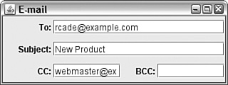
Because the panel does not stipulate its own size, the frame’s dimensions determine the height and width of the panel. This fluidity demonstrates a strength of Swing’s grid and grid bag layouts—they enable components to adapt to the space available to them in an interface.
The email panel example doesn’t use three GridBagConstraints variables: insets, ipadx, and ipady. The ipadx and ipady constraints control padding, the extra space around an individual component. By default, no components have extra space around them (which is easiest to see in components that fill their cells). The ipadx variable adds space to either side of the component, and ipady adds it above and below.
The horizontal and vertical gaps that appear when you create a new layout manager (or use ipadx and ipady in grid bag layouts) are used to determine the amount of space between components in a panel. Insets, however, are used to determine the amount of space around the panel itself. The Insets class includes values for the top, bottom, left, and right insets, which are then used when the panel itself is drawn.
Insets determine the amount of space between the edges of a panel and that panel’s components.
The following statement creates an Insets object that specifies 20 pixels of insets above and below and 13 pixels to the left and right:
Insets whitespace = new Insets(20, 13, 20, 13);
Insets can be established in any container by overriding its getInsets() method and returning an Insets object, as in this example:
public Insets getInsets() {
    return new Insets(10, 30, 10, 30);
}Abstract expressionism goes only so far, as you have seen today. Layout managers require some adjustment for people who are used to more precise control over the place that components appear on an interface.
You now know how to use the five different layout managers and panels. As you work with the Abstract Windowing Toolkit, you’ll find that it can approximate any kind of interface through the use of nested containers and different layout managers.
After you master the development of a user interface in Java, your programs can offer something that most other visual programming languages can’t: an interface that works on multiple platforms without modification.
I really dislike working with layout managers; they’re either too simplistic or too complicated (the grid bag layout, for example). Even with a lot of tinkering, I can never get my user interface to look like I want it to. All I want to do is define the sizes of my components and put them at an x,y position on the screen. Can I do this? | |
It’s possible but problematic. Java was designed in such a way that a program’s graphical user interface could run equally well on different platforms and with different screen resolutions, fonts, screen sizes, and the like. Relying on pixel coordinates can cause a program that looks good on one platform to be unusable on others, where layout disasters such as components overlapping each other or getting cut off by the edge of a container may result. Layout managers, by dynamically placing elements on the screen, get around these problems. Although there might be some differences among the end results on different platforms, the differences are less likely to be catastrophic. If none of that is persuasive, here’s how to ignore my advice: Set the content pane’s layout manager with The following application displays a 300-by-300 pixel frame with a Click Me button at the (x,y) position 10, 10 that is 120 pixels wide by 30 pixels tall: import java.awt.*;
import javax.swing.*;
public class Absolute extends JFrame {
public Absolute() {
super("Example");
setSize(300, 300);
Container pane = getContentPane();
pane.setLayout(null);
JButton myButton = new JButton("Click Me");
myButton.setBounds(new Rectangle(10, 10, 120, 30));
pane.add(myButton);
setContentPane(pane);
setVisible(true);
}
public static void main(String[] arguments) {
Absolute ex = new Absolute();
}
}You can find out more about |
Review today’s material by taking this three-question quiz.
The following question is the kind of thing you could expect to be asked on a Java programming certification test. Answer it without looking at today’s material or using the Java compiler to test the code.
Given:
import java.awt.*;
import javax.swing.*;

public class ThreeButtons extends JFrame {
    public ThreeButtons() {
        super("Program");
        setSize(350, 225);
        setDefaultCloseOperation(JFrame.EXIT_ON_CLOSE);
        JButton alpha = new JButton("Alpha");
        JButton beta = new JButton("Beta");
        JButton gamma = new JButton("Gamma");
        JPanel content = new JPanel();
        // answer goes here
        content.add(alpha);
        content.add(beta);
        content.add(gamma);
        add(content);
        pack();
        setVisible(true);
    }

    public static void main(String[] arguments) {
        ThreeButtons b3 = new ThreeButtons();
    }
}The answer is available on the book’s website at http://www.java21days.com. Visit the Day 11 page and click the Certification Practice link.
To extend your knowledge of the subjects covered today, try the following exercises:
Create a user interface that displays a calendar for a single month, including headings for the seven days of the week and a title of the month across the top.
Create an interface that incorporates more than one layout manager.
Where applicable, exercise solutions are offered on the book’s website at http://www.java21days.com.