Chapter 6. Type Magic
Text on the printed page — and all around us in our daily life — is a prime means of communicating. And type — how text is presented — directly affects its message, just as a suit of clothes identifies its wearer. Graphics can grab our attention and perhaps rouse our emotions, but when we really want to find out about a subject, we want to read the text. Text is the stream of characters that fills the text frames in the Adobe Creative Suite 2 applications — InDesign CS2, Illustrator CS2, and Photoshop CS2 — and are incorporated in the web pages created by GoLive CS2. Each of these applications give you a range of tools for creating, importing, and editing text, manipulating text frames, checking spelling, and so on.
The Creative Suite applications don’t just work with text like a word-processing application. They also let you format the text in powerful ways, and add the typographic refinements that can make it compelling. One of the ways they do this is by giving you access to all of the features of fonts, which are one of the building blocks of graphic design.
In this chapter, we’ll show you how Adobe has continued a tradition of high-quality type in Adobe Creative Suite 2, begun when Adobe first developed PostScript, a page-description language that is a cornerstone of digital publishing. Here are some of the text and type features we’ll cover:
• Tools for choosing and applying fonts. By providing useful information about your fonts, the CS2 applications assist you in preventing problems like duplicate fonts, which can cause unexpected type display or text reflow.
• OpenType. The CS2 applications support all font formats, but they make it possible to use a powerful new font format called OpenType to create the highest-quality typography. The OpenType format can really open up the magic in working with type.
• Tools for setting fine type. Adobe InDesign has pioneered innovations in page-layout features that make it the leader in setting fine type. It offers new ways of composing type, handling text and tables, and creating fancier type effects.
• Many of the sophisticated type features from InDesign have now been incorporated in Adobe Illustrator and Adobe Photoshop as well, and we’ll tell you when to create type in these applications. You’ll also learn how to handle “legacy” type in Illustrator (from earlier versions) and how to save Photoshop type to use it in another application.
In this chapter we’ll be focusing on the text and type features of Adobe InDesign, Illustrator, and Photoshop. See “Cascading Style Sheets” in Chapter 8, “Working with Style,” for information about working with type and cascading style sheets in GoLive CS2.
Using Fonts in Adobe Creative Suite
If words are the basic building blocks of a writer, fonts are the foundation elements for a graphic designer when working with text. The words carry the message of the writer about the subject, but the skillful choice of a font for displaying the text enhances the message, and can dramatize it and make it come alive. The fonts shouldn’t call attention to themselves, but should be in the background, setting the stage and tone for the message.
One of the first choices a designer makes is what basic typefaces that will be used in a printed piece — whether it be a single brochure, a magazine, a book, or any other publication. The Adobe Creative Suite 2 applications have features that make this process easy.
Font Formats
The Adobe Creative Suite 2 applications support the three primary font formats used in electronic publishing:
• PostScript Type 1. This is the font format developed originally by Adobe as a proprietary format. PostScript Type 1 fonts are stored as two files: The scalable outlines are stored in one, and fixed-size bitmaps for the screen and metric information in the other. This format is most widely used by graphics professionals and is available from all font developers.
• TrueType. This font format is most popular with general computer users and is also available from all font makers. The font outlines and metrics are stored in a single file. In the early days, these fonts could cause problems for PostScript RIPs, but these days they can be used interchangeably with PostScript Type 1 fonts.
• OpenType. This is the newest font format, which overcomes some of the limitations of PostScript and TrueType fonts. Adobe and Microsoft developed this format originally, but OpenType fonts are now being released by most font vendors.
Choosing Fonts
Within CS2 applications, you can choose the fonts for your document either from a menu or a palette. In InDesign or Illustrator, you can choose Type > Font, or you can choose the Font menu in either the Control or Character palette. In Photoshop, you must first create an editable type layer by clicking on your image with the Type tool. Then you can choose a font from the Font menu that appears on the Options bar, or from the Font menu of the Character palette (click the Toggle The Character And Paragraph Palettes button on the Options bar to make this visible).
All of the CS2 applications now display a WYSIWYG (What You See is What You Get) font menu (Figure 6-1). You can identify OpenType fonts by the “O” icon beside their name. PostScript Type 1 fonts show the red “a” icon, and TrueType fonts show the blue “TT.” In each application, you can choose the size of the font preview by going to the Type Preferences, or you can turn the preview off by unchecking Font Preview Size.
Figure 6-1. In CS2 applications, you can view samples of the fonts you currently have open.

You may understandably be confused by the ordering of font names in the menus of CS2 applications. They don’t match the font ordering in other applications. Here’s how CS2 applications build their menus:
• In general, the fonts are alphabetized. However, Adobe CS2 applications ignore certain prefixes for the alphabetization. In Figure 6-1, notice how the words Adobe, ITC, and Stempel are ignored so that all of the Garamond fonts are grouped together. Adobe feels you are more likely to want to see those fonts in a group than to scroll through a long menu looking for variations of Garamond.
• The Adobe CS2 applications then try to group fonts by the font family primary script (main language group supported). This makes it easier to find the fonts for Western languages in a group rather than wade through Japanese, Korean, Arabic, and Chinese fonts which have names that may be meaningless to English speakers. Kozuka Gothic Pro, for example, will probably be found at the bottom of the menu with other Japanese fonts. However, this rule is not always followed strictly, since many OpenType fonts support multiple language groups. All Adobe Pro OpenType fonts support at least Western languages (MacRoman/WinANSI) plus a set of Central European languages.
• If you upgrade from previous versions of the Adobe Creative Suite applications, you may find that the font menus have been rearranged. Creative Suite 2 fixes some issues in determining a primary script.
When Good Fonts Go Bad
Most experienced creative professionals would probably agree that working with fonts can be one of the most problematic issues in working with graphics applications. There are several reasons for this:
• It’s common to have multiple fonts with similar names, which can get mixed up or be open simultaneously. (Fonts are open when they are installed in an operating system location that makes them available to your applications, or when they’re “turned on” by a font manager application.) If you choose the wrong font, type can reflow, or an incorrect character can appear.
• Fonts can get corrupted if they are open when computers crash. In turn, a corrupt font is one of the most common causes of application crashes. Diagnosing which font is causing the problem requires great patience.
• Until the advent of OpenType, the file formats and character sets of Macintosh and Windows fonts differed. This would cause problems if you wanted to share your file with someone working on the other platform.
The CS2 applications can help you deal with these problems to some degree. (However, many font problems are due to poor font management and organization, and the applications can’t clean up your mess for you!) They can let you know when a font isn’t available when you open up a document, such as the dialog box InDesign displays (see Figure 6-2).
Figure 6-2. In InDesign CS2, the Missing Fonts dialog box tells you about missing fonts when you open a document.

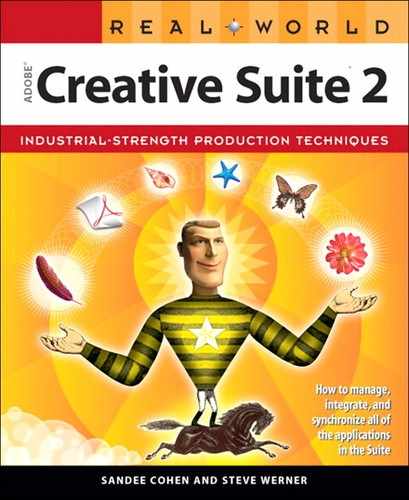
InDesign and Illustrator also provide dialog boxes to help you identify which fonts are open or missing in a document (Type > Find Font) — see Figure 6-3. You can identify the font type, and if more than one font of the same name is open, they’ll show them both separately. You can use the dialog box to get more information about where the font is located in the document, and you can replace it with a different font if necessary. When you click a font name, be sure to click the More Info button to see all the information.
Figure 6-3. InDesign CS2’s Find Font dialog box provides valuable font information—its PostScript name and where it’s located in the document—to help you deal with font problems. This information is shown when you click the More Info button.
OpenType Fonts — A Format for the New Millennium
PostScript Type 1 and TrueType fonts have several limitations: They have different formats for each computer platform, and the character sets for each platform differ. This makes it difficult to share documents easily. Both formats contain fewer than 256 glyphs in a font, which limits both the ability to work with some languages and access to the special characters used in fine typography.
At the end of the “font wars” (see the preceding sidebar, “A Short History of Fonts”), Adobe and Microsoft began developing a new format that encompasses the best features of the other two formats and goes beyond them. Introduced in 1996, OpenType has truly become the font format for the new millennium.
The Advantages of OpenType
OpenType fonts have several advantages over PostScript and TrueType fonts:
• OpenType fonts can contain thousands of characters, many more than the earlier font formats. They support an international standard for character encoding called Unicode. This gives them the ability to process, display, and print text using the diverse languages of the modern world.
• All font information is stored in a single file, rather than in the separate screen and printer-font files used by PostScript fonts. The same file format works equally well on Macintosh and Windows operating systems.
• Even better for creative professionals, many OpenType fonts available from Adobe and other font vendors come with extended character sets that can include additional language support and features like fractions, ligatures, and other typographic effects.
Unified OpenType Support
Adobe Creative Suite 2 provides unified support for OpenType font features. InDesign CS2, Illustrator CS2, and Photoshop CS2 now support all the glyphs in any OpenType font. All three applications provide ways to apply OpenType features easily.
When you install the Suite, you’ll find more than 160 OpenType fonts installed for use with your CS2 applications. You can purchase additional OpenType fonts from Adobe or other font vendors. Adobe has made its entire type library available in the OpenType format. Today, there are around 9,000 fonts available as OpenType.
Tip: Locating the Adobe Creative Suite 2 OpenType Fonts.
It’s not immediately obvious where Adobe Creative Suite 2 puts the OpenType fonts that it installs. On a Macintosh, these fonts are installed in this path: Library > Application Support > Adobe > Fonts. In Windows, these are found in this path: Program Files > Common Files > Adobe > Fonts. If you like, you can remove these fonts and put them in another font location for your operating system, or for use by your font-management software. Just be sure to leave the Reqrd folder in that Fonts folder to avoid trouble opening some of your CS2 applications.
InDesign
OpenType features are available in InDesign CS2 from the Control or Character palette, by including them in a paragraph or character style, or when using the Find/Change command. For example, if you have an OpenType font that supports fractions, you can select text that contains a fraction, and choose OpenType > Fractions from the Control or Character palette menu to call out fractions built into the font or (in some OpenType fonts) to arbitrarily build a true fraction (see Figure 6-5).
Figure 6-5. In InDesign CS2, apply a typographic effect like true-built fractions from the OpenType menu of the Control or Character palette.

Illustrator and Photoshop
In Illustrator CS2, you can call out OpenType features from the OpenType palette (Window > Type > OpenType). Here you can select available OpenType features by clicking a button or choosing from the menu. You can also include them in character and paragraph styles. In Photoshop CS2, OpenType features are available from the Character palette menu.
You also have access to OpenType fonts from the Glyphs palette in InDesign and Illustrator (see the next section).
OpenType Magic
Now that you know that you already have some OpenType fonts, how can you tell which of your fonts are OpenType? In Adobe Creative Suite 2 applications, it’s easy. You can look in the font menu and recognize the OpenType fonts by the “O” icon. But not all OpenType fonts have extra glyphs or features. Use the Glyphs palette (described in the “Picking Glyphs” section that follows) to see which characters are found in the font.
Some OpenType fonts (for example, those installed by newer versions of Windows or Microsoft Office software) are merely a repackaging of old TrueType fonts in an OpenType “wrapper.” They don’t actually contain any extra glyphs or special features. Adobe indicates that an OpenType font has extra features by how it names the font: Most fonts that have “Std” appended to their name contain extra glyphs and features available. Those that have “Pro” appended have some additional language support as well as extra glyphs and features.
OpenType’s Extra Typographic Effects
The actual typographic features built into an OpenType font vary by font. In the OpenType submenu in InDesign CS2, features that are in square brackets are not available. Features that are selected have a check mark next to them. In the OpenType palette in Illustrator CS2, the buttons for unavailable features are grayed.
Here are some examples of the magic of working with OpenType fonts:
• When an OpenType font contains small caps, you can apply the small caps feature to change lowercase text to small capital letters. This creates small caps whose weight matches the upper and lowercase letters, as opposed to using fake small caps by scaling down the caps, which will be thinner than the letters around them. Note that InDesign will still use fake small caps when real ones are unavailable.
• If a font contains swash glyphs, ordinary glyphs are substituted with a more stylized alternative. Sometimes these are contextual, which means they only occur in specified situations, such as between two particular letters or at the beginning or end of a word.
• Ligatures are letters that are combined together — for example, fi or fl. Adobe OpenType Pro fonts usually include additional ligatures like ffi, ffl, and ff. Sometimes there may also be a discretionary ligature feature, which includes more rarely used discretionary and historical ligatures.
Figure 6-6. OpenType fonts contain extra typographic effects. The table compares how type looks with and without the OpenType features for small caps, swashes, and ligatures.

InDesign CS2 expands its support to new OpenType features: It now supports slashed zero and stylistic sets. If you select the Slashed Zero option in the OpenType submenu of the Control or Character palette menu, InDesign displays the number 0 with a slash through it. In some fonts the number 0 and the letter O can be difficult to distinguish.
A stylistic set is a group of glyph alternates that can be applied one character at a time or to a range of text. If you select the Stylistic Set option, the glyphs defined in the set are used instead of the font’s default glyphs. You can see the glyphs for each set using the Glyphs palette (see the next section).
Tip: Download the OpenType User Guide
To get more information about the features of your OpenType fonts and how to use them, refer to Adobe’s excellent OpenType User Guide. You can download it from http://store.adobe.com/type/opentype/.
Picking Glyphs
InDesign CS2 and Illustrator CS2 both have a Glyphs palette (Type > Glyphs). This palette (Figure 6-7) allows you to see all the glyphs in any font — PostScript, TrueType and OpenType — and easily add them to text. Use the Zoom-in and Zoom-out buttons to control your view. Double-clicking a glyph in the palette either inserts it in text or replaces a selected character.
Figure 6-7. In Illustrator CS2 and InDesign CS2, the Glyphs palette gives you access to all the glyphs of any font. In an OpenType font, you can click and hold the small triangle next to a character to see alternate glyphs.

Another quick way to see what features are in a particular OpenType font is to use the Show pop-up menu in the Glyphs palette. Choose an available category from the menu — for example, Standard Ligatures. Only the glyphs for that feature will appear in the palette. Choose Entire Font to see all the glyphs displayed.
Click and hold the small triangle next to any character to see the alternate glyphs available for that character.
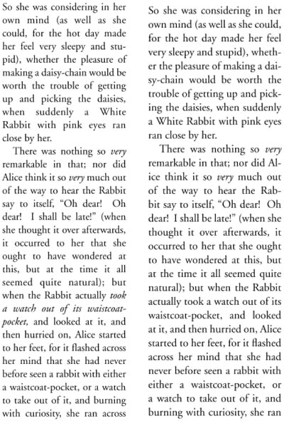
Font Features in CS2 Applications
Table 6-1 summarizes some of the font features in the CS2 applications.
Table 6-1. Font Features of the CS2 Applications

Breaking New Ground in Text and Typography
When we first saw Adobe InDesign 1.0 in 1999, Sandee and Steve immediately fell in love with the quality of the type that it could set. Steve had set type on traditional typesetting machines like those made by Compugraphic. Sandee had worked in an advertising agency where art directors would hand-kern their text by cutting out spaces with a razor blade. While the advent of desktop publishing empowered graphic designers, the quality of type from the earliest page-layout applications — PageMaker and QuarkXPress — didn’t match that of the traditional typesetters. As desktop publishing became more and more accepted, certain time-honored typography nuances were forgotten by older designers, or, worse, never learned by students.
Adobe InDesign changed all that: It offered much higher quality composition (rules used to decide how type is fit onto a line). It provided new ways of kerning and handling the margins of type. Later versions of InDesign have introduced text, table, and typography features that continue to break new ground. In this section, we’ll focus on some of InDesign’s type features that set it above other applications in its field. Some of these features are also now available, in somewhat modified form, in Illustrator and Photoshop.
Fine Typography
The factor that has the greatest effect on the appearance of type is also one of the subtlest to describe. This is composition, the complex process of fitting words into lines by weighing the hyphenation and justification settings and the break-points specified in hyphenation dictionaries.
When Aldus (later Adobe) PageMaker, the first page-layout application for desktop computers, and QuarkXPress, which dominated the page-layout market in the 1990s, were developed, computer microprocessors were much less powerful than they are today. The developers of these applications took shortcuts to be able to fit lines of type, losing some of the quality of the earlier dedicated typesetting systems. Justified type didn’t look as good any more, so more type was set flush left (ragged right) to compensate.
Single Line Versus Paragraph Composers
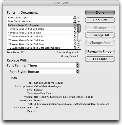
QuarkXPress and PageMaker use a single-line composer, which sets only one line of type at a time, ignoring lines above and below. The result of this process is that, while many lines look fine, some lines in a paragraph will be much looser or tighter than the others, giving an overall unevenness to the “color” of justified type. This is the equivalent of the Adobe Single-line Composer in InDesign CS2.
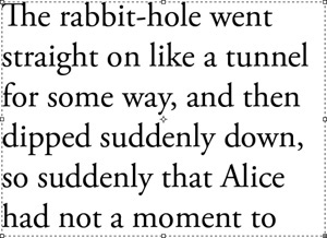
The default setting for text in InDesign CS2 is to use the Adobe Paragraph Composer. This has a more complex job. While it uses the same rules as a single-line composer, it looks through all the words of the paragraph in deciding how lines are to end. It moves words around until the best overall appearance is reached (Figure 6-8). You can see the process while you’re typing in InDesign. As you type, words you have already typed are shifted up and down, or hyphenated.
Figure 6-8. Type was set justified in 12-point Adobe Garamond with 14-point leading. When set with the Single-line Composer in InDesign CS2 (left), the text has poorer line breaks and more gaps between words than when set with the default Paragraph Composer (right).
Choose the Adobe Paragraph Composer or the Adobe Single-line Composer from the InDesign Paragraph palette menu. The Paragraph Composer provides more even spacing between words. The Single-line Composer takes up slightly more space, but may be the better choice if you’re trying to match the copyfitting of a legacy QuarkXPress or PageMaker document.
Illustrator CS2 and Photoshop CS2 use a different composition engine than InDesign CS2. These applications are not designed for the complexities of multipage composition found in InDesign. Each of them offers a choice of two composers — Adobe Single-line Composer and Adobe Every-line Composer. You may think of the Every-line Composer as the same as InDesign’s Paragraph Composer. Good thought, but not true! The composers in Illustrator and Photoshop set type somewhat differently than in InDesign because they lack some of its sophisticated text controls. These choices are also found on the Paragraph palette menu of each application. These applications also compose more slowly, and the default for each is the Single-line Composer.
Hyphenation and Justification
Hyphenation and justification (which we like to call H&J) are the controls (along with the hyphenation break-points in the application’s dictionary) that determine how much text to fit on a line. InDesign, Illustrator, and Photoshop each use two separate features to control H&J — Justification and Hyphenation — which are found on the Paragraph palette menus and on InDesign’s Control palette menu.
The Hyphenation setting (Figure 6-9) provides the rules the application uses to apply hyphenation. Most of the Hyphenation controls in these applications mirror the settings you find in other layout applications. But InDesign and Illustrator have one special control: the Hyphenation Penalty Slider, affectionately known at Adobe as “Nigel.” If you move the slider to the left toward Better Spacing, the composer relies more on hyphenation and less on adjusting spacing. If you drag the slider to the right toward Fewer Hyphens, it makes more adjustments with spacing, and uses fewer hyphenation break points. Be sure to turn on the Preview check box so you can see the effect on selected paragraphs.
Figure 6-9. The Penalty Slider provides great control over how much hyphenation is allowed.

The second set of controls for H&J — Justification — is also found in the Paragraph palette menu of each application and in the Control palette menu in InDesign (Figure 6-10). Justification controls the spacing of letters and words across the text column by setting a range of acceptable spacing that the composition engine can use.
Figure 6-10. InDesign CS2’s Justification Settings includes a control for scaling glyphs.

Here again, the controls match what you would usually expect, but with one difference: InDesign, Illustrator, and Photoshop have a new way to adjust the spacing. The Glyph Scaling feature allows you to subtly change the width (horizontal scaling) of the characters. Steve believes that if you set a modest Glyph Scaling value — like Minimum 98% and Maximum 102% — the difference in letterform shapes probably won’t be distinguishable. Sandee is a typographic purist, and she tries to avoid distorting letterforms whenever possible.
Dictionaries
Each of the CS2 applications uses language dictionaries to check hyphenation and spelling. The language assigned to the selected text determines the dictionary that is used. You can assign a language by selecting the text and choosing a language from the Control or Character palette in InDesign CS2 and Illustrator CS2, and from the Character palette in Photoshop CS2. InDesign now provides 28 language dictionaries; Illustrator and Photoshop offer 23 dictionaries.
InDesign CS2 also offers a new feature to improve the hyphenation of text. It supports using more than one dictionary in multiple locations, and setting a dictionary priority. This feature lets a workgroup share a common dictionary on a server while also using a local dictionary. It’s also easier to import and export word lists for these dictionaries (choose Edit > Spelling > Dictionary and use the Import and Export buttons) than it was in earlier versions of InDesign. Managing dictionaries is controlled in InDesign’s Dictionary Preferences.
Tip: Using a Network Dictionary
When a user dictionary is stored on a server, the first user to load the dictionary locks the file. Other users can use the dictionary, but not write to it. You can also use the operating system to lock a dictionary.
Hanging Punctuation
Those of us who love well-set type are always concerned about the “look” of type. One high-quality look that disappeared during the first decade of desktop publishing is having even edges along the side of each column of text. Normally, when some punctuation marks (periods, commas, dashes, and quotation marks) and the edges of some letters (like a capital A) touch the left or right edge of a text frame, they appear very slightly indented from the edge. Hanging punctuation subtly adjusts the position of these characters, moving them slightly outside the frame, and making the column appear straighter and cleaner.
InDesign introduced optical margin alignment as an attribute of a story and a solution to the conundrum of hanging punctuation. (A story is the text in a text frame or any linked series of text frames.) You’ll find the controls in the Story palette (Type > Story) in InDesign CS2 (Figure 6-11). Settings for optical margin alignment apply to all the linked frames of a story.
Figure 6-11. In InDesign CS2, optical margin alignment turned on and turned off (right).

Tip: Adjusting Optical Margin Alignment in InDesign
Use the font size menu in the Story palette to adjust the amount of the hang. Your type usually looks best when you set it to match the size of the font you’re using.
Illustrator CS2 also has an Optical Margin command on the Type menu. However, it’s much slower and less controlled than its counterpart in InDesign. Illustrator also has a Roman Hanging Punctuation command (called Hanging Punctuation in earlier versions, and renamed Roman Hanging Punctuation because it does not work on Japanese and other non-Western fonts). Turn on Roman Hanging Punctuation using the Paragraph palette menu. Optical Margin Alignment affects the edges of letters; Roman Hanging Punctuation does not. The latter command moves certain punctuation marks 50% of the width of the character outside the margin.
Optical Kerning
Kerning is the space between two characters. To create high-quality type, certain character pairs must be brought closer together so they look better. Most applications let you apply kerning manually using commands, or they use the built-in kerning values in most fonts. Of course, you can choose these options in CS2 applications as well. In InDesign, Illustrator, and Photoshop, you would choose these options in the Character palette of each application or in the Control palette in InDesign. Most of the OpenType fonts that are installed with the Suite are well kerned, and their spacing doesn’t require much tweaking.
However, not all fonts are well kerned, and manually kerning can be a pain. The CS2 applications also offer optical kerning. This option calculates the kerning values based on the visual appearance of the character shapes. Optical kerning can be particularly useful when working with a poorly kerned font, or when you’re mixing sizes or styles (Figure 6-12). The following illustration shows kerning set three ways in Illustrator CS2; the middle setting of Auto is called Metrics in InDesign and Photoshop.
Figure 6-12. Examples of three kerning settings in Illustrator CS2: 0—no kerning (top); Auto (middle), and Optical (bottom).

Typography Features in CS2 Applications
Table 6-2 summarizes some of the fine typography features in the CS2 applications.
Table 6-2. Typography Features of the CS2 Applications
Text Handling in InDesign CS2
Typically, InDesign is used more for text than either Illustrator or Photoshop. InDesign is designed for long, complex formatting that can be applied to dozens or hundreds of pages. It has powerful text-styling features that we discuss in Chapter 8, “Working with Style.” It also has some innovative text-handling features that make it a natural for managing complex text. These features are not found in Illustrator or Photoshop because these applications normally work with smaller amounts of simpler text.
Story Editor
In addition to the Layout window that is the InDesign default, at any time you can open a second view of your current story in the Story Editor. This shows a simple text-editor view familiar to PageMaker users. You can open a Story Editor window by choosing Edit > Edit In Story Editor, or by pressing Command/Ctrl-Y (Figure 6-13).
Figure 6-13. The Story Editor (left) and Layout (right) windows in InDesign CS2 are compared side-by-side. When you edit text in one view, the changes are immediately reflected in the other.

The Story Editor window can be customized in several ways. By default, it shows the paragraph styles applied to the text and a column depth viewer — marked in the current ruler units. These items can be toggled by choosing View > Story Editor and showing or hiding a setting. Footnotes in a story can be collapsed or expanded. You can change the appearance of the text display in the Story Editor Display Preferences.
The Story Editor has many uses. You can type as fast as you can and see the changes reflected in the layout view. Using the Story Editor works well when the type in the layout is small or hard to read. A single window displays text that may flow from frame to frame across several pages in layout. The Story Editor also displays a marker to indicate overset text (text that doesn’t fit in a frame).
Tip: Displaying Hidden Objects
Use the Story Editor to view and select objects that are hard to see in layout view — for example, anchored or inline objects, or hyperlink sources or anchors.
Pasting Text
InDesign has always supported cutting and pasting text; InDesign CS2 gives you more control over the process. When you paste text from another application, you can determine whether InDesign preserves formatting and style attributes. To preserve formatting and styles, in Type Preferences choose All Information in the When Pasting Text And Tables From Other Applications section. This “preservation” option is helpful, for example, when copying short sections of already-formatted text from Microsoft Word. If you want to strip out all formatting, choose Text Only. This is extremely helpful if you need to paste text from an email document or web page and don’t want all the HTML formatting to come in with the text. (For pasting text between CS2 applications, see the “Moving Type Between CS2 Applications” section below.)
If you want to copy text from one InDesign frame to another, you can also paste using the Paste command, of course. Normally, this will paste all the formatting from the original frame. If you want to strip out this formatting, choose the new Paste Without Formatting command from the Edit menu.
Tip: Use the Place Command Instead of Pasting Text
You’ll get more control selectively importing styles and local overrides from a Word document if you use the Place command. We discuss this in the “Importing Styles from Word” section in Chapter 8, “Working with Style.” InDesign CS2 is also more intelligent about the way it pastes text than earlier versions. When you cut a word or a sentence and paste it in another location, InDesign can pay attention to the context. It can either remove extra spaces or add spaces as necessary to make complete words and sentences. This feature, Select Spacing Automatically When Cutting And Pasting Words, is turned on by default in Type Preferences.
Dragging and Dropping Text
Whenever page designers discuss the ability to drag and drop text, there’s bound to be strong feelings: Some people find drag-and-drop annoying, while others can’t do without it. If you’d like to use this feature, InDesign CS2 now supports dragging and dropping text within InDesign and also from other applications, and it can do it in a very smart way. To control this feature, use the Type Preferences and choose the options to Enable In Layout View and Enable In Story Editor. The latter is turned on by default.
To drag and drop in either a Layout or Story Editor window, simply drag to select the words you want to move. Then, keeping the mouse down, drag where you want the words inserted, and release. When dragging, a small “T” icon appears next to the cursor, and an I-beam cursor shows where the words will go when you release the mouse (Figure 6-14).
Figure 6-14. The “T” icon indicates you’re performing a drag-and-drop function, and the I-beam cursor shows where the text will drop.

You can add some special tricks to the drag-and-drop functionality in InDesign CS2:
• To copy, rather than move, text, hold down Option/Alt after you start dragging.
• To create a new text frame, hold down Command/Ctrl after you start dragging, and then release the key. (Or use Option/Alt-Command/Ctrl to copy text to a new frame.)
• Drag text between layout and Story Editor windows, or even drag into some dialog boxes, such as Find/Change.
If you want spaces appropriately deleted or added when dragging words and sentences, the Select Spacing Automatically preference described above works with drag-and-drop text as well.
Tip: Dragging from Other Applications
You can also drag text from Microsoft Word, text editors like TextEdit, and some web browsers into InDesign. This copies, rather than cuts, the text.
Calling Out Special Characters
When Steve worked in older page-layout applications, he had to keep a crib sheet taped next to his computer to remember the keystrokes required to produce a special character (like a section mark) that he hadn’t memorized. When he moved to Adobe InDesign, he threw the crib sheet away.
Adobe InDesign provides three special-character submenus under the Type menu — Insert Special Character, Insert White Space, and Insert Break Character. You can also get to these submenus by Control/right-clicking to bring up a context menu. Even better, you can use the Keyboard Shortcut controls to add your own keyboard shortcuts to the characters that don’t have keyboard shortcuts. This is very helpful for Windows users who have to use numbered codes to insert characters in other programs.
Creating Bulleted and Numbered Lists
One of the most common feature requests for working with text in page-layout applications is the ability to automatically create bulleted and numbered lists. InDesign CS2 features the built-in capability of creating and editing bulleted and numbered lists, although without some of the finer points that Microsoft Word or Adobe FrameMaker users may be familiar with.
The easiest way to create a bulleted or numbered list is to type the list of items, select the list with the Type tool, and click the Bulleted List or Numbered List button on the Control palette. Turning on and off these buttons turns on or off the list feature. You can also include bulleted and numbered lists in a paragraph style (see “InDesign’s Paragraph Styles” in Chapter 8, “Working with Style”).
The bullet or number that gets added isn’t a character. It’s an effect that appears onscreen and when printed — much like making a choice from the Effects menu in Illustrator (see the “Applying Filters and Effects” section in Chapter 4, “Pixels and Raster File Formats”). It can’t be searched for in the Find/Change dialog box and it won’t appear in the Story Editor window.
The properties of a bulleted or numbered list are created and dynamically edited in the Bullets And Numbering dialog box (Figure 6-15). You can open this dialog box at any time by choosing Bullets And Numbering from the Control palette menu, or by Option/Alt-clicking the Bulleted List or Numbered List button.
Figure 6-15. The InDesign CS2 Bullets And Numbering dialog box provides the controls for bulleted or numbered lists, including choosing bullet characters from a different font.

By default, bullets and numbering take on the attributes of the first character of the paragraph that they’re in. This can be changed in the Bullets And Numbering dialog box. Bullets can be assigned from a different font, and you can choose whether the font is remembered. You can choose a bullet’s font family, font style, size, and color. With numbering, you can set the numbering style, separator, starting number, and font attributes. For both bullets and numbering, you can choose either a hanging indent or a tab position.
One of the biggest limitations of the numbering feature is that it allows only one level of lists; thus, this feature can’t easily be used to create an outline format. Only sequential paragraphs can be numbered; if you want to insert non-numbered paragraphs in between, you must manually start the renumbering using the Start At option in the Bullets And Numbering dialog box. Also, numbers must always be flush left; they cannot be flush right or align to a decimal. This is the reason Sandee and Steve did not use the numbered list option when creating this book. We didn’t want to be limited to lists less than ten.
At any time, bullets and numbering can be turned into real characters by selecting the text containing them and choosing Convert Bullets To Text or Convert Numbering To Text from the context menu or the Paragraph palette menu. This is the equivalent of choosing an Illustrator effect and applying the Expand command. The list loses the “liveness” and editability of the effect.
Fancy Type
InDesign, Illustrator, and Photoshop all have ways of applying “fancy” effects to type to give it a special appearance. These include creating type on a path, skewing or adding a stroke to it, and adding underlining or strikethrough type styles. The CS2 applications differ somewhat in the way these effects are applied.
Type on a Path
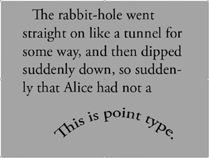
Path type has been part of illustration programs for a long time. (Sandee calls this roller-coaster text, as it can move along a path as it curves up and down.) With Adobe Creative Suite 2, you can now create path type in almost identical ways in InDesign, Illustrator, and Photoshop. First, create a path using the Pen tool. Then, in either InDesign or Illustrator, select the Type On A Path tool found under the Type tool; in Photoshop, select the Type tool. In all applications, click the path to create an insertion point, and begin typing. In InDesign, you can also drag along the path to more precisely set the position of the text.
Editing path type is a snap. Switch to either the Selection or Direct Selection tool to adjust the position of the type on a path. Side handles (and in InDesign and Illustrator, center handles) appear, which you can drag (Figure 6-16). To turn the type upside down, just drag it across the path. InDesign and Illustrator also give you additional controls (Type > Type On A Path > Options). You can choose between five path type effects — Rainbow, Skew, 3D Ribbon, Stair Step, and Gravity — and you can set alignment and spacing options.
Figure 6-16. Use the Selection or Direct Selection tool to reposition path type in InDesign, Illustrator, or Photoshop, using the handles.

Styling Type
In older page-layout applications like PageMaker and QuarkXPress, it’s easy to select a font and apply a type style (like Bold or Italic) that doesn’t actually exist in the font. Onscreen, the font may be made bolder or slanted, but if the printer font doesn’t contain the actual bold or italic style, it will print incorrectly to a PostScript printer. By contrast, the font menus of CS2 applications list only the type styles that exist in the font; it’s not possible to pick a non-existing style.
So what if you’ve chosen a typeface that doesn’t have italics? InDesign CS2 lets you apply the Skew type style that lets you create a false italic effect in a font that lacks that feature. You can apply this type style from the Control or Character palette or as part of a paragraph or character style. In addition, in InDesign, you can apply a stroke to type that can create the effect of emboldening it, while still keeping it editable. InDesign is very smart in the way it does this: By default, it applies the stroke weight around the outside of the characters, preserving their shape.
Illustrator CS2 has no feature for skewing individual letters or words. You can skew the entire text frame, but not certain words within it. Illustrator CS2 lets you add a stroke to type, but in a different way than InDesign: Create your type as usual, and then select it as a type object with the Selection tool. In the Appearance palette menu, select Add New Stroke. Use the Control or Stroke palette to set a stroke weight. By default, the stroke will be applied above the characters; this will deform the shapes of the letters. In the Appearance palette, drag Stroke below Characters to put it behind them (Figure 6-17).
Figure 6-17. Apply a stroke to type in Illustrator CS2 using the Appearance palette.

In Photoshop CS2, because it shares the same core type technology as other CS2 applications, you can select only an available font family and font style. However, Photoshop’s primary medium is images, with type (and graphics) secondary. Its images may be just as likely used on the web as in print. So Photoshop CS2 also adds the option of creating Faux Bold and Faux Italic (faux meaning false) for selected type. These options are useful for web designers who don’t need to worry about their fonts printing correctly. You can choose these options from the Character palette buttons or menu. Just don’t use faux bold or italic if you’re printing vector type to a PostScript printer.
Underlining and strikethrough type styles are also available in InDesign, Illustrator, and Photoshop. (This is a new feature in Illustrator CS2.) Illustrator and Photoshop just apply a default effect for each style, with no options. InDesign CS2 gives you the most control: You can select Underline Options or Strikethrough Options from the Control or Character palette menu or as part of a style. Here you can set the weight, offset, color, line style, overprinting, and other attributes.
Tip: Customizing Underlines and Strikethroughs in InDesign
Underlines and strikethroughs in InDesign can be overprinted to produce a colored line without registration problems on press. You can create special effects like a “highlighter” pen with a custom strikethrough style.
Fancy Type Features in CS2 Applications
Table 6-3 shows some of the fancy type features in Adobe CS2 applications.
Table 6-3. Fancy Type Features of the CS2 Applications

Tables in InDesign CS2
Tabular material and tables have long been a way of communicating structured information. You can, of course, create tabbed data in either InDesign or Illustrator with the Tabs palette. However, InDesign CS2 has a powerful table feature that is one of the best in any application.
Creating a table has several advantages over using tabs:
• A table cell can have more than one line of text. This allows fitting several lines of text inside a thin column of information, which is impossible with tabs.
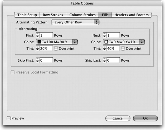
• The Alternating Fills option (Table > Table Options > Alternating Fills) permits you to format alternating row or column colors. These alternating colors adjust if you add or delete rows or columns in the table. There are similar options to create alternating column or row strokes.
• In a table, header and footer rows are inserted automatically in repeating text frames.
• A table allows more precise alignment and spacing of text.
• Editing a table is much easier than editing tabular material. For instance, if you need to format all the text in a single row, you can easily select the row and apply the formatting. This is not as simple using tabular data.
Creating Tables
Often the information for a table already exists in another source — a database, a spreadsheet, or a text file. Fortunately, InDesign CS2 makes it easy to import tabular information so that it doesn’t have to be recreated. InDesign supports placing tables from Microsoft Word, from Excel spreadsheets, or from tabbed text (most databases can easily export tabbed text). Choose File > Place, and select Show Import Options for the most control. For Excel spreadsheets, choose a cell range to import, and either import the Excel formatting or strip it out. For Word tables, either remove or preserve styles and formatting (we discuss these options more in “Importing Styles from Word” in Chapter 8, “Working with Style”).
You can also create a table from scratch in InDesign CS2. First, create a text frame (in InDesign, a table is always an inline item in a text frame). Then select Table > Insert Table. You’ll be given the option of setting the initial number of rows and columns, as well as any header and footer rows that will appear (Figure 6-18). These attributes can of course be changed as you’re editing and formatting the table.
Figure 6-18. You must be in a text frame to create a table; choose Table > Insert Table to set its initial dimensions.
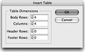
Table Features
InDesign CS2 has many more table features than we can cover here; refer to Real World InDesign CS2 or InDesign CS2 Visual Quickstart Guide from Peachpit Press for a deeper discussion. When working with tables, be sure to use the Type tool to select the cells, rows, or columns you want to work with. All the commands for working with tables are found in the Table menu. The most common table commands are also found in the Control palette, the Table palette, or in context menus.
Here are a few of the features that make InDesign’s tables so powerful:
• Tables can flow from frame to frame and from page to page. To continue a table from one frame to another, you simply thread the text frames together. Each table row acts like a line of text, so the table always breaks between rows.
• Header and footer rows can appear at any time. These are special rows that will automatically appear at the top (or bottom) of each text frame you choose. You control how often they repeat.
• A table’s rows or columns can have repeating patterns of fills and strokes. When the table is edited, the table automatically reformats to the pattern you define. For example, when you want to set alternating fills, you use the dialog box shown in Figure 6-19.
Figure 6-19. The powerful Table Options dialog box allows you to easily create complex formatting such as alternating patterns of row fills.
Illustrator’s New Text Engine
A text engine is the software that controls how type is composed onscreen and for print. Almost 20 years old, Illustrator boasts a new type engine as of Illustrator CS — the very same engine used in Photoshop, Adobe Premiere, and Adobe After Effects and modeled after, but different from, the powerful engine of InDesign.
Starting over from scratch with a text engine was the only solution for Illustrator’s product managers and engineers. As computer applications go, Illustrator is pretty old; it was first released as Illustrator 1.1 in 1987. Its type engine was originally designed for simple (one-line) point type for illustrations, and over the years, more and more functions were piled onto it. By Illustrator 10, the text engine had been in use for over 10 years, and it was showing its age. Compared to those in InDesign — which was designed from the ground up to produce beautiful type — the type controls in Illustrator were lagging badly. They were too fragile to fix; doing so would cause text to reflow upon opening a file.
First the Good News
There’s good news and bad news regarding Illustrator’s new text engine. Let’s start with the good news. The new text engine in Illustrator CS meant that a major advance could be made in Illustrator’s type capabilities. Some of these we described earlier in this chapter:
• The text engine brings full OpenType and Unicode support. In addition to the features we described in the “OpenType Magic” section above, it means that text is handled better when copied between platforms and between languages.
• For the first time, Illustrator supports paragraph and character styles (see “Illustrator Paragraph and Character Styles” in Chapter 8, “Working with Style”).
• Text-threading is now handled as in InDesign. Text can flow from frame to frame or even between path type objects.
• Type can be wrapped around objects using a dialog box instead of by manually creating a wrap object. The object will carry the wrap with it as the object is moved, as in InDesign.
• Also added in Illustrator are Optical Kerning, Optical Margin Alignment, the Adobe Every-line Composer, improved Rows and Columns controls, tab leaders, improved hyphenation, spell checking, enhanced Type on a Path, and many more type features.
All of these features continue to work in Illustrator CS2, and they’ve been improved. Rather than focusing on adding new type features, the engineers this time improved text-engine performance and fixed bugs. The addition of underline and strikethrough type styles is the only new features added in Illustrator CS2.
The bottom line is that the text engine is much improved in Illustrator CS2. It’s also much easier to move between Adobe applications because there is much more consistency in how type is handled between the CS2 applications.
Now the Bad: Legacy Type Issues
The bad news is that you may experience some pain if you’re upgrading from an earlier version of Illustrator. Opening a file from a previous version that contains text prompts you to convert the type because the new text engine will handle it differently, and the text may reflow. Saving backwards from Illustrator CS or CS2 to a previous version brings up similar issues. These “pain points” are an inevitable part of the process of getting these new features and type stability.
Maintaining Position When Opening a Legacy File
In Illustrator terminology, type produced in an earlier version is called legacy type. By default, when you open a legacy file, Illustrator CS2 maintains the position of all type in the document until you approve the change. For example, when you open up a previous Illustrator file with type, you’ll see the dialog box shown in Figure 6-20. There are three choices: OK (the default) delays updating the text. (However, as you’ll see shortly, this option also offers the most control over your text.) Update changes all the type using the new text engine; in many cases, type will reflow. Cancel, as you might guess, cancels the process of opening the file.
Figure 6-20. Opening a file from an earlier version of Illustrator gives you three choices for handling legacy text. Choosing to update text may cause the type to reflow.

Most of the changes will happen if you’re opening a file created in Illustrator 10 or earlier. If you’re in Illustrator CS2 and you open an Illustrator CS file, you may see the dialog box, but it’s much less likely. Any time a bug is fixed, there is the potential for reflow, but, in any case, you’ll have the control over when an update takes place.
When to Update a Legacy File
When to update a legacy file depends on your workflow. Consider two workflows: First, if you or your workgroup wants to use the new type features of Illustrator CS2, you’ll definitely need to update the text, but you don’t have to update all the text in the document in one fell swoop. It’s better to update the text one frame at a time. If you choose not to update the type when opening the file, you can update later when working in the document. Legacy text appears with an X across it when it’s selected with the Selection or Direct Selection tool. Double-clicking this frame of legacy text displays another alert (Figure 6-21), warning that you’re about to update the text frame, and the type may reflow. Click the Update button to updates the text, but be aware that it may not be obvious where changes have occurred. Click the Copy Text Object option to see a before-and-after comparison of the type objects. The original type is put on a separate locked layer and set to an opacity of 40%. It’s like a template layer that shows the effect of any reflow. This is our favorite option when working with text that we inherit from outside clients. It gives us a good idea of what changes have happened to the text.
Figure 6-21. If you double-click a text frame with legacy text in Illustrator CS2, you see an alert that text may reflow.

However, Steve has a lot of experience working with print service providers. They may need to open up a customer’s legacy file in Illustrator CS2 in order to print the document. In that case, they should never choose to update text. Never, never, ever! As long as the text has not been updated, it can be previewed and printed, and it will appear and print exactly as it did in the earlier version of Illustrator.
Saving to Legacy Formats
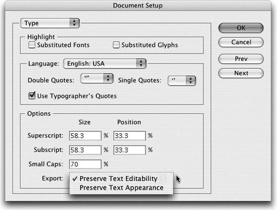
You may encounter similar pain if you need to share your Illustrator CS2 files with someone using Illustrator 10 or earlier. You have to choose how changes in text formatting (which may be inevitable) are going to be handled. You make this choice in a strange place: the Type panel in File > Document Setup (Figure 6-22). Here you can choose between Preserve Text Editability and Preserve Text Appearance. Text Editability breaks type into “chunks,” with words broken into individual letters, much like what you see when opening a PDF file in Illustrator. Text Appearance turns type into outlines, which cannot be edited.
Figure 6-22. Before saving in a legacy format, choose how type will be preserved with the option in the Document Setup dialog box.
In Illustrator CS2, you save legacy formats by choosing File > Save As and selecting either Illustrator or Illustrator EPS format. (Note that this is different than Illustrator CS, which required that you choose File > Export.) In the Illustrator Options or EPS Options dialog box, select the version of Illustrator to which you’d like to save.
You can recombine text that has been broken into “chunks.” Select all of the pieces of type you want to combine with the Selection tool, and copy them to the Clipboard. Then select the Type tool and drag out a text frame. With that tool still selected, choose Edit > Paste. The pasted fragments will be recombined in the new text frame. You may need to check word spaces where the chunks have been combined.
Photoshop: Keeping Type As Vector
Photoshop didn’t enter the world with many type features. For many versions, its type controls were decidedly rudimentary, and we avoided using its Type tool whenever possible. But things change, and gradually it began to improve. With version CS2, Photoshop now shares a text engine with Illustrator, Adobe After Effects, and Adobe Premiere, and it has many sophisticated type controls. For example, in addition to some of the type features we discussed above, you can now spell-check and find and replace text in Photoshop.
Point or Text Frame Type
Originally, Photoshop only supported point type. You create point type as you do in Illustrator, by choosing the Type tool, clicking an insertion point, and typing. Type created in this way is designed for one line at a time, and you have to manually hit Return/Enter to start a new line. This can be a painful procedure if you need to edit the text again and want the lines to reflow.
Many users of previous Photoshop versions may not realize that you can now also create text frames, just as you can in InDesign and Illustrator. Use the Type tool, but click and drag out a frame. You’ll see a dotted line indicating the frame’s bounding box (Figure 6-23). You can also Option/Alt-click with the Type tool to specify a text frame’s dimensions. Once created, the frame can be resized by dragging the corner or side handles, or rotated by dragging a rotation handle (move to the corner to get a rotation icon). If not all the type fits in the frame, a subtle + sign appears in the lower right corner handle to indicate overflow.
Figure 6-23. In Photoshop, drag with the Type tool to create a text frame.
Creating type of any kind — point, text frame, or path type — always creates a new type layer in Photoshop CS2. After editing the type, you have to commit it to come out of editing mode. You can do this by clicking the check box in the Options bar, by pressing the Return/Enter key, or by choosing another tool, like the Move tool.
How do you edit the type again? Just double-click the type layer’s thumbnail (the “T” icon) which selects all the type, or click an insertion point with the Type tool when you’re over type.
Vector vs. Bitmapped Type
The trick for succeeding with type in Photoshop is maintaining it as vector for as long as possible. Photoshop is a program for working with bitmaps, and there are innumerable ways of having the crispness of your type rasterized — turned into a bitmap — at the resolution of the file in which the type resides. You want to keep type vector because that keeps it editable, and maintains it at the highest possible quality.
Staying Vector
Type can stay vector while you do any of the following effects:
• Apply any of the character or paragraph attributes shown on the Options bar or the Character or Paragraph palettes. These controls usually work identically to those on the Character palette and Paragraph palette in InDesign or Illustrator.
• Apply a warp distortion to the type by clicking the Create Warp Text button on the Options bar, or a context menu, to open the Warp Text dialog box. Here you can choose from a list of warp distortion effects.
• Apply a layer style.
• Transform the type layer with the Free Transform command by entering values for transformations (such as scaling or rotation) on the Options bar, or using the commands on the Edit > Transform submenu.
Getting Pixelated
You must rasterize (convert to pixels) a type layer when you want to apply any kind of filter to it, or if you need to use any kind of painting tool with that layer. If you select a filter with a type layer selected, you’ll get the message, “This type layer must be rasterized before proceeding,” with an option to rasterize the type. (You can also choose Layer > Rasterize > Type before applying the filter.) If you select a painting tool, you’ll see the international “No” symbol over the layer. Clicking the layer displays a similar warning.
Type will also be rasterized whenever you merge a type layer with another layer. When rasterized or printed, the type will be converted into pixels at the current resolution of the file. Once rasterized, the type can no longer be edited.
When to Do Type in Photoshop
You should use the Type tool selectively in Photoshop. Type — especially multiple paragraphs of text frames — is processed slowly in Photoshop. You also have to be very careful about the format in which to save your type if you want to use it in another application (see the next section).
Here are some situations in which you might want to create type in Photoshop:
• When the type is highly integrated with the Photoshop layout.
• When the type needs to be have a filter or texture effect applied. (You can, however, turn type to outlines and use either InDesign or Illustrator to mask a photograph.)
• When you’re creating a relatively small amount of type.
If you need to apply an effect to type like opacity, a blending mode, a drop shadow, or feathering, it’s usually better to do this in InDesign or Illustrator. The type can be edited at the last minute, and the flattening can take place just as the file is being printed or exported to PDF or EPS (for more information, see Chapter 11, “Transparency”).
How to Successfully Save Your Vectors
If you want to integrate your Photoshop vector type into InDesign or Illustrator, you must save your file carefully. Most of the formats in which Photoshop saves will not retain vector type for placement in another application. Even formats like Photoshop PSD and TIFF, which retain vector type so that it can be reopened in Photoshop, will turn type into a bitmap when placed in InDesign or Illustrator.
There are only two formats that save the Photoshop type as vectors: Photoshop EPS and Photoshop PDF. Each format has issues that you should be aware of:
• If you choose to save as Photoshop EPS, you must check the Include Vector Data option. The type is turned into outlines in the process, so if there is much type, it will slow down printing. Most important, the vector data will be rasterized if you reopen the Photoshop EPS file in Photoshop.
• If you want to reopen the file with the type layer intact, you should save the file as Photoshop PDF. Type is retained as scalable vectors. The only downside in placing the Photoshop PDF file into InDesign is that you must turn on High Quality Display to see the high-resolution preview (Figure 6-24). You can do this by Control/right-clicking on the graphic and choosing High Quality Display from the Display Performance context menu.
Figure 6-24. Type from Photoshop CS2 was saved as Photoshop PDF and placed in InDesign CS2. To see the preview, the High Quality Display feature was chosen in InDesign CS2.
We discuss file formats for saving out of Photoshop more in the “Saving Pixels” section of Chapter 4, “Pixels and Raster File Formats.”
Moving Type Between CS2 Applications
As we mentioned earlier in the chapter, Photoshop CS2 and Illustrator CS2 share the same text engine. This makes it possible to easily move type between these two applications. Moving type between Illustrator and InDesign can be a bit more difficult.
Between Illustrator and Photoshop
To copy type from Illustrator to Photoshop, select the type with the Type tool and copy it. To paste it, select the Type tool, click an insertion point, and then paste. The character and paragraph formatting can be copied from point type, text frames, or path type. It also can be copied back from Photoshop to Illustrator when the Type tool is chosen in each application.
In most cases, editable type is also retained when Illustrator layers are saved in the Photoshop PSD format and opened in Photoshop CS2, and when a Photoshop file with type layers is opened in Illustrator CS2. (For details on layer handling, see the “Moving Layers Between Photoshop and Illustrator” section in Chapter 12, “The Flexibility of Layers”.) In Illustrator CS2, type in grouped objects is retained as editable type when opened in Photoshop.
Tip: Using Glyphs in Photoshop
Photoshop CS2 doesn’t have a Glyphs palette. While you can apply OpenType features in Photoshop, you can’t select all the glyphs in a font. As a workaround, you can create the type (including any glyphs you need) in Illustrator CS2 and copy it into Photoshop where the glyphs are visible and editable.
Between Illustrator and InDesign
Even though the text engine used in Illustrator and Photoshop is based on the one in InDesign, they are not the same. You can copy simple vector objects from Illustrator to InDesign, as we describe in the “Moving Paths Between Applications” section of Chapter 5, “Getting to the Point of Vector Graphics.” However, if you use that copy/paste method, it’s not possible to copy formatted text between Illustrator and InDesign. If you copy and paste text from Illustrator into InDesign, the text is turned into an embedded PDF object, not editable, selectable text. The text will preview and print at high resolution, but you can’t edit it.
If you need to copy type between the two applications, you can only copy unformatted text. Select it with the Type tool in Illustrator or InDesign and copy it to the Clipboard. In the other application, make a new text frame, click an insertion point, and paste. Any type formatting must be reapplied.
Handling Type Gracefully
In this chapter we’ve covered working with type from the mundane (dealing with font problems) to the magical. The Adobe Creative Suite applications, and particularly InDesign CS2, provide the tools to make your text and type look their best. The rich set of type controls in the CS2 applications are like the controls in a well-designed sports car. They let you gracefully adapt your type for any kind of layout you may create, and for any kind of output.
We also cover type extensively in Chapter 8, “Working with Style.” There we’ll teach you how to create paragraph, character, nested, and object styles that let you apply these powerful type features with a single click. They’ll get you on the road in record time.