3
Visualizing Financial Time Series
The old adage a picture is worth a thousand words is very much applicable in the data science field. We can use different kinds of plots to not only explore data but also tell data-based stories.
While working with financial time series data, quickly plotting the series can already lead to many valuable insights, such as:
- Is the series continuous?
- Are there any unexpected missing values?
- Do some values look like outliers?
- Are there any patterns we can quickly see and use for further analyses?
Naturally, these are only some of the potential questions that aim to help us with our analyses. The main goal of visualization at the very beginning of any project is to familiarize yourself with the data and get to know it a bit better. And only then can we move on to conducting proper statistical analysis and building machine learning models that aim to predict the future values of the series.
Regarding data visualization, Python offers a variety of libraries that can get the job done, with various levels of required complexity (including the learning curve) and slightly different quality of the outputs. Some of the most popular libraries used for visualization include:
matplotlibseabornplotlyaltairplotnine—This library is based on R’sggplot, so might be especially interesting for those who are also familiar with Rbokeh
In this chapter, we will use quite a few of the libraries mentioned above. We believe that it makes sense to use the best tool for the job, so if it takes a one-liner to create a certain plot in one library while it takes 20 lines in another one, then the choice is quite clear. You can most likely create all the visualizations shown in this chapter using any of the mentioned libraries.
If you need to create a very custom plot that is not provided out-of-the-box in one of the most popular libraries, then matplotlib should be your choice, as you can create pretty much anything using it.
In this chapter, we will cover the following recipes:
- Basic visualization of time series data
- Visualizing seasonal patterns
- Creating interactive visualizations
- Creating a candlestick chart
Basic visualization of time series data
The most common starting point of visualizing time series data is a simple line plot, that is, a line connecting the values of the time series (y-axis) over time (x-axis). We can use this plot to quickly identify potential issues with the data and see if there are any prevailing patterns.
In this recipe, we will show the easiest way to create a line plot. To do so, we will download Microsoft’s stock prices from 2020.
How to do it…
Execute the following steps to download, preprocess, and plot Microsoft’s stock prices and returns series:
- Import the libraries:
import pandas as pd import numpy as np import yfinance as yf - Download Microsoft’s stock prices from 2020 and calculate simple returns:
df = yf.download("MSFT",
                 start="2020-01-01",
                 end="2020-12-31",
                 auto_adjust=False,
                 progress=False)
df["simple_rtn"] = df["Adj Close"].pct_change()
df = df.dropna()
We dropped the
NaNs introduced by calculating the percentage change. This only affects the first row.
- Plot the adjusted close prices:
df["Adj Close"].plot(title="MSFT stock in 2020")Executing the one-liner above generates the following plot:

Figure 3.1: Microsoft’s adjusted stock price in 2020
Plot the adjusted close prices and simple returns in one plot:
(
    df[["Adj Close", "simple_rtn"]]
    .plot(subplots=True, sharex=True,
          title="MSFT stock in 2020")
)

Figure 3.2: Microsoft’s adjusted stock price and simple returns in 2020
In Figure 3.2, we can clearly see that the dip in early 2020—caused by the start of the COVID-19 pandemic—resulted in increased volatility (variability) of returns. We will get more familiar with volatility in the next chapters.
How it works…
After importing the libraries, we downloaded Microsoft stock prices from 2020 and calculated simple returns using the adjusted close price.
Then, we used the plot method of a pandas DataFrame to quickly create a line plot. The only argument we specified was the plot’s title. Something to keep in mind is that we used the plot method only after subsetting a single column from the DataFrame (which is effectively a pd.Series object) and the dates were automatically picked up for the x-axis as they were the index of the DataFrame/Series.
We could have also used a more explicit notation to create the very same plot:
df.plot.line(y="Adj Close", title="MSFT stock in 2020")
The plot method is by no means restricted to creating line charts (which are the default). We can also create histograms, bar charts, scatterplots, pie charts, and so on. To select those, we need to specify the kind argument with a corresponding type of plot. Please bear in mind that for some kinds of plots (like the scatterplot), we might need to explicitly provide the values for both axes.
In Step 4, we created a plot consisting of two subplots. We first selected the columns of interest (prices and returns) and then used the plot method while specifying that we want to create subplots and that they should share the x-axis.
There’s more…
There are many more interesting things worth mentioning about creating line plots, however, we will only cover the following two, as they might be the most useful in practice.
First, we can create a similar plot to the previous one using matplotlib's object-oriented interface:
fig, ax = plt.subplots(2, 1, sharex=True)
df["Adj Close"].plot(ax=ax[0])
ax[0].set(title="MSFT time series",
          ylabel="Stock price ($)")

df["simple_rtn"].plot(ax=ax[1])
ax[1].set(ylabel="Return (%)")
plt.show()
Running the code generates the following plot:

Figure 3.3: Microsoft’s adjusted stock price and simple returns in 2020
While it is very similar to the previous plot, we have included some more details on it, such as y-axis labels.
One thing that is quite important here, and which will also be useful later on, is the object-oriented interface of matplotlib. While calling plt.subplots, we indicated we want to create two subplots in a single column, and we also specified that they will be sharing the x-axis. But what is really crucial is the output of the function, that is:
- An instance of the
Figureclass calledfig. We can think of it as the container for our plots. - An instance of the
Axesclass calledax(not to be confused with the plot’s x- and y-axes). These are all the requested subplots. In our case, we have two of them.
Figure 3.4 illustrates the relationship between a figure and the axes:

Figure 3.4: The relationship between matplotlib’s figure and axes
With any figure, we can have an arbitrary number of subplots arranged in some form of a matrix. We can also create more complex configurations, in which the top row might be a single wide subplot, while the bottom row might be composed of two smaller subplots, each half the size of the large one.
While building the plot above, we have still used the plot method of a pandas DataFrame. The difference is that we have explicitly specified where in the figure we would like to place the subplots. We have done that by providing the ax argument. Naturally, we could have also used matplotlib's functions for creating the plot, but we wanted to save a few lines of code.
The second thing worth mentioning is that we can change the plotting backend of pandas to some other libraries, like plotly. We can do so using the following snippet:
df["Adj Close"].plot(title="MSFT stock in 2020", backend="plotly")
Running the code generates the following interactive plot:

Figure 3.5: Microsoft’s adjusted stock price in 2020, visualized using plotly
Unfortunately, the advantages of using the plotly backend are not visible in print. In the notebook, you can hover over the plot to see the exact values (and any other information we include in the tooltip), zoom in on particular periods, filter the lines (if there are multiple), and much more. Please see the accompanying notebook (available on GitHub) to test out the interactive features of the visualization.
While changing the backend of the plot method, we should be aware of two things:
- We need to have the corresponding libraries installed.
- Some backends have issues with certain functionalities of the
plotmethod, most notably thesubplotsargument.
To generate the previous plot, we specified the plotting backend while creating the plot. That means the next plot we create without specifying it explicitly will be created using the default backend (matplotlib). We can use the following snippet to change the plotting backend for our entire session/notebook: pd.options.plotting.backend = "plotly".
See also
https://matplotlib.org/stable/index.html—matplotlib's documentation is a treasure trove of information about the library. Most notably, it contains useful tutorials and hints on how to create custom visualizations.
Visualizing seasonal patterns
As we will learn in Chapter 6, Time Series Analysis and Forecasting, seasonality plays a very important role in time series analysis. By seasonality, we mean the presence of patterns that occur at regular intervals (shorter than a year). For example, imagine the sales of ice cream, which most likely experience a peak in the summer months, while the sales decrease in winter. And such patterns can be seen year over year. We show how to use the line plot with a slight twist to efficiently investigate such patterns.
In this recipe, we will visually investigate seasonal patterns in the US unemployment rate from the years 2014-2019.
How to do it…
Execute the following steps to create a line plot showing seasonal patterns:
- Import the libraries and authenticate:
import pandas as pd import nasdaqdatalink import seaborn as sns nasdaqdatalink.ApiConfig.api_key = "YOUR_KEY_HERE" - Download and display unemployment data from Nasdaq Data Link:
df = (
    nasdaqdatalink.get(dataset="FRED/UNRATENSA",
                       start_date="2014-01-01",
                       end_date="2019-12-31")
    .rename(columns={"Value": "unemp_rate"})
)
df.plot(title="Unemployment rate in years 2014-2019")
Running the code generates the following plot:

Figure 3.6: Unemployment rate (US) in the years 2014 to 2019
The unemployment rate expresses the number of unemployed as a percentage of the labor force. The values are not adjusted for seasonality, so we can try to spot some patterns.
In Figure 3.6, we can already spot some seasonal (repeating) patterns, for example, each year unemployment seems to be highest in January.
- Create new columns with
yearandmonth:df["year"] = df.index.year df["month"] = df.index.strftime("%b") - Create the seasonal plot:
sns.lineplot(data=df,
             x="month",
             y="unemp_rate",
             hue="year",
             style="year",
             legend="full",
             palette="colorblind")
plt.title("Unemployment rate - Seasonal plot")
plt.legend(bbox_to_anchor=(1.05, 1), loc=2)
Running the code results in the following plot:

Figure 3.7: Seasonal plot of the unemployment rate
By displaying each year’s unemployment rate over the months, we can clearly see some seasonal patterns. For example, the highest unemployment can be observed in January, while the lowest is in December. Also, there seems to be a consistent increase in unemployment over the summer months.
How it works…
In the first step, we imported the libraries and authenticated with Nasdaq Data Link. In the second step, we downloaded the unemployment data from the years 2014-2019. For convenience, we renamed the Value column to unemp_rate.
In Step 3, we created two new columns, in which we extracted the year and the name of the month from the index (encoded as DatetimeIndex).
In the last step, we used the sns.lineplot function to create the seasonal line plot. We specified that we want to use the months on the x-axis and that we will plot each year as a separate line (using the hue argument).
We can create such plots using other libraries as well. We used seaborn (which is a wrapper around matplotlib) to showcase the library. In general, it is recommended to use seaborn when you would like to include some statistical information on the plot as well, for example, to plot the line of best fit on a scatterplot.
There’s more…
We have already investigated the simplest way to investigate seasonality on a plot. In this part, we will also go over some alternative visualizations that can reveal additional information about seasonal patterns.
- Import the libraries:
from statsmodels.graphics.tsaplots import month_plot, quarter_plot import plotly.express as px - Create a month plot:
month_plot(df["unemp_rate"], ylabel="Unemployment rate (%)")
plt.title("Unemployment rate - Month plot")
Running the code produces the following plot:

Figure 3.8: The month plot of the unemployment rate
A month plot is a simple yet informative visualization. For each month, it plots a separate line showing how the unemployment rate changed over time (while not showing the time points explicitly). Additionally, the red horizontal lines show the average values in those months.
We can draw some conclusions from analyzing Figure 3.8:
- By looking at the average values, we can see the pattern we have described before – the highest values are observed in January, then the unemployment rate decreases, only to bounce back over the summer months and then continue decreasing until the end of the year.
- Over the years, the unemployment rate decreased; however, in 2019, the decrease seems to be smaller than in the previous years. We can see this by looking at the different angles of the lines in July and August.
- Create a quarter plot:
quarter_plot(df["unemp_rate"].resample("Q").mean(),
             ylabel="Unemployment rate (%)")
plt.title("Unemployment rate - Quarter plot")
Running the code produces the following figure:

Figure 3.9: The quarter plot of the unemployment rate
The quarter plot is very similar to the month plot, the only difference being that we use quarters instead of months on the x-axis. To arrive at this plot, we had to resample the monthly unemployment rate by taking each quarter’s average value. We could have taken the last value as well.
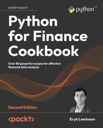
- Create a polar seasonal plot using
plotly.express:fig = px.line_polar( df, r="unemp_rate", theta="month", color="year", line_close=True, title="Unemployment rate - Polar seasonal plot", width=600, height=500, range_r=[3, 7] ) fig.show()Running the code produces the following interactive plot:
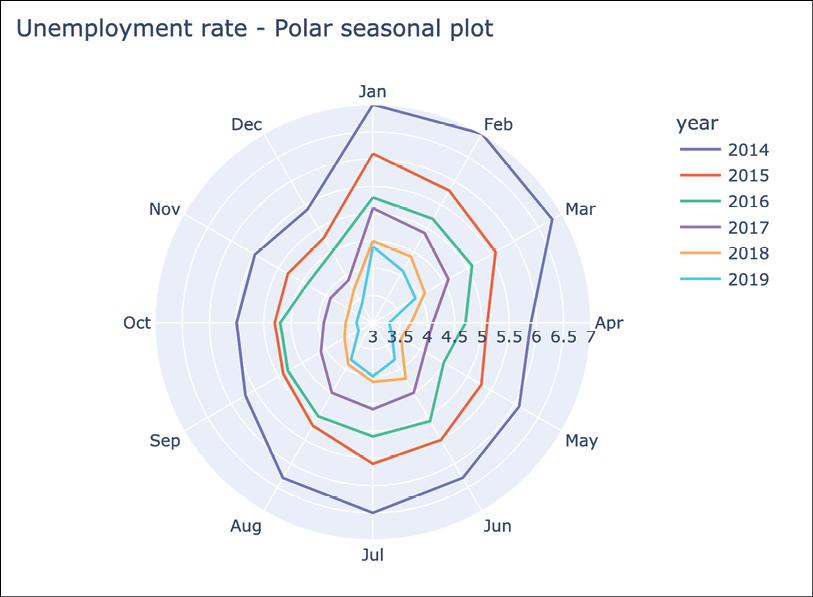
Figure 3.10: Polar seasonal plot of the unemployment rate
Lastly, we created a variation of the seasonal plot in which we plotted the lines on the polar coordinate plane. It means that the polar chart visualizes the data along radial and angular axes. We have manually capped the radial range by setting range_r=[3, 7]. Otherwise, the plot would have started at 0 and it would be harder to see any difference between the lines.
The conclusions we can draw are similar to those from a normal seasonal plot, however, it might take a while to get used to this representation. For example, by looking at the year 2014, we immediately see that unemployment is highest in the first quarter of the year.
Creating interactive visualizations
In the first recipe, we gave a short preview of creating interactive visualizations in Python. In this recipe, we will show how to create interactive line plots using three different libraries: cufflinks, plotly, and bokeh. Naturally, these are not the only available libraries for interactive visualizations. Another popular one you might want to investigate further is altair.
The plotly library is built on top of d3.js (a JavaScript library used for creating interactive visualizations in web browsers) and is known for creating high-quality plots with a significant degree of interactivity (inspecting values of observations, viewing tooltips of a given point, zooming in, and so on). Plotly is also the company responsible for developing this library and it provides hosting for our visualizations. We can create an infinite number of offline visualizations and a few free ones to share online (with a limited number of views per day).
cufflinks is a wrapper library built on top of plotly. It was released before plotly.express was introduced as part of the plotly framework. The main advantages of cufflinks are:
- It makes the plotting much easier than pure
plotly. - It enables us to create the
plotlyvisualizations directly on top ofpandasDataFrames. - It contains a selection of interesting specialized visualizations, including a special class for quantitative finance (which we will cover in the next recipe).
Lastly, bokeh is another library for creating interactive visualizations, aiming particularly for modern web browsers. Using bokeh, we can create beautiful interactive graphics, from simple line plots to complex interactive dashboards with streaming datasets. The visualizations of bokeh are powered by JavaScript, but actual knowledge of JavaScript is not explicitly required for creating the visualizations.
In this recipe, we will create a few interactive line plots using Microsoft’s stock price from 2020.
How to do it…
Execute the following steps to download Microsoft’s stock prices and create interactive visualizations:
- Import the libraries and initialize the notebook display:
import pandas as pd import yfinance as yf import cufflinks as cf from plotly.offline import iplot, init_notebook_mode import plotly.express as px import pandas_bokeh cf.go_offline() pandas_bokeh.output_notebook() - Download Microsoft’s stock prices from 2020 and calculate simple returns:
df = yf.download("MSFT", start="2020-01-01", end="2020-12-31", auto_adjust=False, progress=False) df["simple_rtn"] = df["Adj Close"].pct_change() df = df.loc[:, ["Adj Close", "simple_rtn"]].dropna() df = df.dropna() - Create the plot using
cufflinks:df.iplot(subplots=True, shape=(2,1), shared_xaxes=True, title="MSFT time series")Running the code creates the following plot:
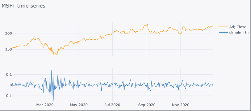
Figure 3.11: Example of time series visualization using cufflinks
With the plots generated using
cufflinksandplotly, we can hover over the line to see the tooltip containing the date of the observation and the exact value (or any other available information). We can also select a part of the plot that we would like to zoom in on for easier analysis.
- Create the plot using
bokeh:df["Adj Close"].plot_bokeh(kind="line", rangetool=True, title="MSFT time series")Executing the code generates the following plot:
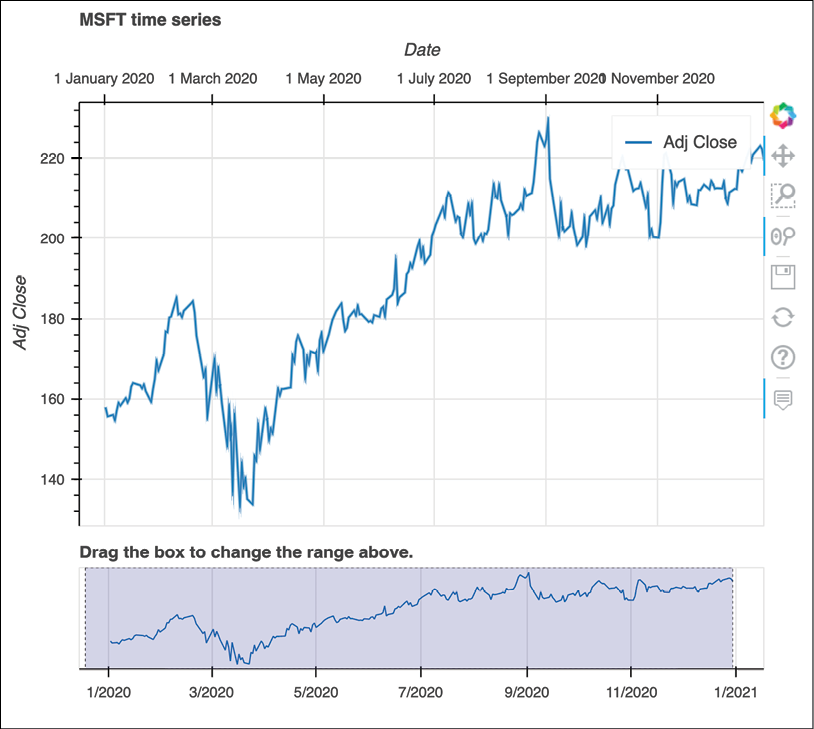
Figure 3.12: Microsoft’s adjusted stock prices visualized using Bokeh
By default, the
bokehplot comes not only with the tooltip and zooming functionalities, but also the range slider. We can use it to easily narrow down the range of dates that we would like to see in the plot.
- Create the plot using
plotly.express:fig = px.line(data_frame=df, y="Adj Close", title="MSFT time series") fig.show()Running the code results in the following visualization:

Figure 3.13: Example of time series visualization using plotly
In Figure 3.13, you can see an example of the interactive tooltip, which is useful for identifying particular observations within the analyzed time series.
How it works…
In the first step, we imported the libraries and initialized the notebook display for bokeh and the offline mode for cufflinks. Then, we downloaded Microsoft’s stock prices from 2020, calculated simple returns using the adjusted close price, and only kept those two columns for further plotting.
In the third step, we created the first interactive visualization using cufflinks. As mentioned in the introduction, thanks to cufflinks, we can use the iplot method directly on top of the pandas DataFrame. It works similarly to the original plot method. Here, we indicated that we wanted to create subplots in one column, sharing the x-axis. The library handled the rest and created a nice and interactive visualization.
In Step 4, we created a line plot using bokeh. We did not use the pure bokeh library, but an official wrapper around pandas—pandas_bokeh. Thanks to it, we could access the plot_bokeh method directly on top of the pandas DataFrame to simplify the process of creating the plot.
Lastly, we used the plotly.express framework, which is now officially part of the plotly library (it used to be a standalone library). Using the px.line function, we can easily create a simple, yet interactive line plot.
There’s more…
While using the visualizations to tell a story or presenting the outputs of our analyses to stakeholders or a non-technical audience, there are a few techniques that might improve the plot’s ability to convey a given message. Annotations are one of those techniques and we can easily add them to the plots generated with plotly (we can do so with other libraries as well).
We show the required steps below:
- Import the libraries:
from datetime import date - Define the annotations for the
plotlyplot:selected_date_1 = date(2020, 2, 19) selected_date_2 = date(2020, 3, 23) first_annotation = { "x": selected_date_1, "y": df.query(f"index == '{selected_date_1}'")["Adj Close"].squeeze(), "arrowhead": 5, "text": "COVID decline starting", "font": {"size": 15, "color": "red"}, } second_annotation = { "x": selected_date_2, "y": df.query(f"index == '{selected_date_2}'")["Adj Close"].squeeze(), "arrowhead": 5, "text": "COVID recovery starting", "font": {"size": 15, "color": "green"}, "ax": 150, "ay": 10 }The dictionaries contain a few elements that might be worthwhile to explain:
x/y—The location of the annotation on the x- and y-axes respectivelytext—The text of the annotationfont—The font’s formattingarrowhead—The shape of the arrowhead we want to useax/ay—The offset along the x- and y-axes from the indicated point
We frequently use the offset to make sure that the annotations are not overlapping with each other or with other elements of the plot.
After defining the annotations, we can simply add them to the plot.
- Update the layout of the plot and show it:
fig.update_layout(
    {"annotations": [first_annotation, second_annotation]}
)
fig.show()
Running the snippet generates the following plot:
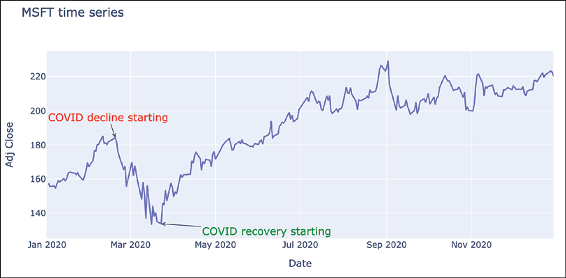
Figure 3.14: Time series visualization with added annotations
Using the annotations, we have marked the dates when the market started to decline due to the COVID-19 pandemic, as well as when it started to recover and rise again. The dates used for annotations were selected simply by viewing the plot.
See also
- https://bokeh.org/—For more information about
bokeh. - https://altair-viz.github.io/—You can also inspect
altair, another popular Python library for interactive visualizations. - https://plotly.com/python/—
plotly's Python documentation. The library is also available for other programming languages such as R, MATLAB, or Julia.
Creating a candlestick chart
A candlestick chart is a type of financial graph, used to describe a given security’s price movements. A single candlestick (typically corresponding to one day, but a different frequency is possible) combines the open, high, low, and close (OHLC) prices.
The elements of a bullish candlestick (where the close price in a given time period is higher than the open price) are presented in Figure 3.15:

Figure 3.15: Diagram of a bullish candlestick
For a bearish candlestick, we should swap the positions of the open and close prices. Typically, we would also change the candle’s color to red.
In comparison to the plots introduced in the previous recipes, candlestick charts convey much more information than a simple line plot of the adjusted close price. That is why they are often used in real trading platforms, and traders use them for identifying patterns and making trading decisions.
In this recipe, we also add moving average lines (which are one of the most basic technical indicators), as well as bar charts representing volume.
Getting ready
In this recipe, we will download Twitter’s (adjusted) stock prices for the year 2018. We will use Yahoo Finance to download the data, as described in Chapter 1, Acquiring Financial Data. Follow these steps to get the data for plotting:
- Import the libraries:
import pandas as pd import yfinance as yf - Download the adjusted prices:
df = yf.download("TWTR",
                 start="2018-01-01",
                 end="2018-12-31",
                 progress=False,
                 auto_adjust=True)
How to do it…
Execute the following steps to create an interactive candlestick chart:
- Import the libraries:
import cufflinks as cf from plotly.offline import iplot cf.go_offline() - Create the candlestick chart using Twitter’s stock prices:
qf = cf.QuantFig( df, title="Twitter's Stock Price", legend="top", name="Twitter's stock prices in 2018" ) - Add volume and moving averages to the figure:
qf.add_volume() qf.add_sma(periods=20, column="Close", color="red") qf.add_ema(periods=20, color="green") - Display the plot:
qf.iplot()We can observe the following plot (it is interactive in the notebook):

Figure 3.16: Candlestick plot of Twitter’s stock prices in 2018
In the plot, we can see that the exponential moving average (EMA) adapts to the changes in prices much faster than the simple moving average (SMA). Some discontinuities in the chart are caused by the fact that we are using daily data, and there is no data for weekends/bank holidays.
How it works…
In the first step, we imported the required libraries and indicated that we wanted to use the offline mode of cufflinks and plotly.
As an alternative to running cf.go_offline() every time, we can also modify the settings to always use the offline mode by running cf.set_config_file(offline=True). We can then view the settings using cf.get_config_file().
In Step 2, we created an instance of a QuantFig object by passing a DataFrame containing the input data, as well as some arguments for the title and legend’s position. We could have created a simple candlestick chart by running the iplot method of QuantFig immediately afterward.
In Step 3, we added two moving average lines by using the add_sma/add_ema methods. We decided to consider 20 periods (days, in this case). By default, the averages are calculated using the close column, however, we can change this by providing the column argument.
The difference between the two moving averages is that the exponential one puts more weight on recent prices. By doing so, it is more responsive to new information and reacts faster to any changes in the general trend.
Lastly, we displayed the plot using the iplot method.
There’s more…
As mentioned in the chapter’s introduction, there are often multiple ways we can do the same task in Python, often using different libraries. We will also show how to create candlestick charts using pure plotly (in case you do not want to use a wrapper library such as cufflinks) and mplfinance, a standalone expansion to matplotlib dedicated to plotting financial data:
- Import the libraries:
import plotly.graph_objects as go import mplfinance as mpf - Create a candlestick chart using pure
plotly:fig = go.Figure(data= go.Candlestick(x=df.index, open=df["Open"], high=df["High"], low=df["Low"], close=df["Close"]) ) fig.update_layout( title="Twitter's stock prices in 2018", yaxis_title="Price ($)" ) fig.show()Running the snippet results in the following plot:
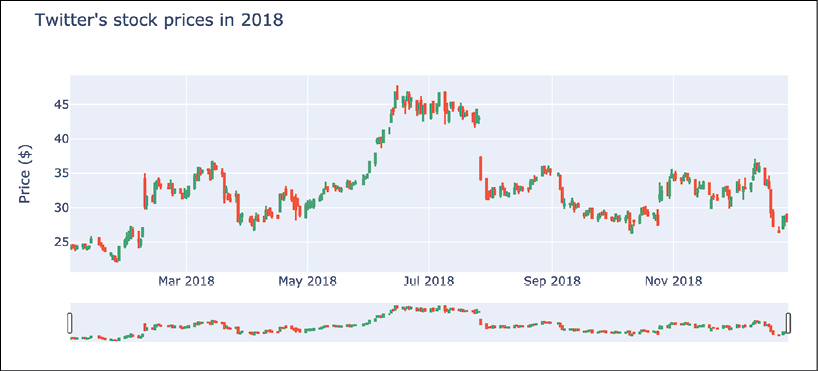
Figure 3.17: An example of a candlestick chart generated using plotly
The code is a bit lengthy, but in reality, it is quite straightforward. We needed to pass an object of class
go.Candlestickas thedataargument for the figure defined usinggo.Figure. Then, we just added the title and the label for the y-axis using theupdate_layoutmethod.What is convenient about the
plotlyimplementation of the candlestick chart is that it comes with a range slider, which we can use to interactively narrow down the displayed candlesticks to the period that we want to investigate in more detail.
- Create a candlestick chart using
mplfinance:mpf.plot(df, type="candle", mav=(10, 20), volume=True, style="yahoo", title="Twitter's stock prices in 2018", figsize=(8, 4))Running the code generated the following plot:

Figure 3.18: An example of a candlestick chart generated using mplfinance
We used the mav argument to indicate we wanted to create two moving averages, 10- and 20-day ones. Unfortunately, at this moment, it is not possible to add exponential variants. However, we can add additional plots to the figure using the mpf.make_addplot helper function. We also indicated that we wanted to use a style resembling the one used by Yahoo Finance.
You can use the command mpf.available_styles() to display all the available styles.
See also
Some useful references:
- https://github.com/santosjorge/cufflinks—The GitHub repository of
cufflinks - https://github.com/santosjorge/cufflinks/blob/master/cufflinks/quant_figure.py—The source code of
cufflinksmight be helpful for getting more information on the available methods (different indicators and settings) - https://github.com/matplotlib/mplfinance—The GitHub repository of
mplfinance - https://github.com/matplotlib/mplfinance/blob/master/examples/addplot.ipynb—A Notebook with examples of how to add extra information to plots generated with
mplfinance
Summary
In this chapter, we have covered various ways of visualizing financial (and not only) time series. Plotting the data is very helpful in getting familiar with the analyzed time series. We can identify some patterns (for example, trends or changepoints) that we might subsequently want to confirm with statistical tests. Visualizing data can also help to spot some outliers (extreme values) in our series. This brings us to the topic of the next chapter, that is, automatic pattern identification and outlier detection.