
Building a great user interface for a professional application is challenging given all of the competing priorities, such as presenting data, interaction models, network connectivity, security, managing background tasks, and localization. It's important to build a rich application on a solid architecture that helps the different pieces work together.
This chapter delves more deeply into user interface development with Silverlight, covering a wide-range of topics. It builds on previous chapters, but especially on Chapter 2, which covered Silverlight user interface development. This chapter extends the topic of user interface development to include how to architect an application with separation of concerns without sacrificing support for tooling or ease of development.
This chapter starts with an introduction of the most prevalent application architecture model in Silverlight development, Model-View-ViewModel (MVVM), which provides excellent support for well-designed user interfaces with separation of concerns.
Next up is a section on the Silverlight for Windows Phone 7 Toolkit, covering the additional controls and capabilities. The section following is on creating transitions and interactivity in Expression Blend. The final section is on the Microsoft Advertising SDK, which provides an excellent vehicle to monetize applications.
The Model-View-ViewModel (MVVM) architecture originated when the Microsoft Windows Presentation Foundation (WPF) team were building the first version of Expression Blend. WPF is Microsoft's desktop XAML development model, and Expression Blend is written in WPF. MVVM is similar to other separation of concerns architectures, like the tried-and-true Model-View-Controller (MVC) model; however, MVVM is optimized to take advantage of XAML's rich data binding, data templates, commands, and event routing capabilities. The next section covers the architecture in more detail.
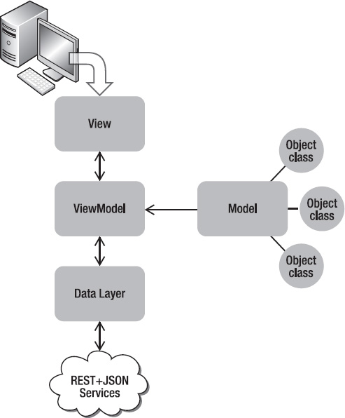
In this section, the MVVM pattern is defined to help you grasp how it works with XAML. If you are familiar with MVC, MVVM will look somewhat familiar to you – but it is much more than just MVC. MVVM relies heavily on XAML data binding capabilities to allow the UI to data bind to both data and commands. Figure 5-1 depicts the MVVM architecture.
In Chapter 4, there is a simple example that displays a list of fake Vendor data made available via JSON. The REST+JSON service project named, WcfRemoteServicesSimpleRestJSON, is added to the Chapter 5 solution. The BasicMVVM sample re-architects the AdventureWorksRestJSONPage.xaml page from the Chapter 4 CallingRemoteServices project to use MVVM in the Chapter 5 project named BasicMVVM.
The BasicMVVM and the WcfRemoteServicesSimpleRestJSON projects are configured as the startup project. Four folders are added to the project named Model, View, and ViewModel. The sections that follow cover the major components of MVVM in the BasicMVVM sample.
The Model contains the building blocks of the application. It consists of the underlying data objects that are populated via a data access layer. Examples of Model classes are Customer, Store, Product, etc. When you create a class to represent an object in an application, it most likely belongs as part of the Model. The Model sits behind the ViewModel. The View will data bind to lists of or individual objects based on classes in the Model.
To get started, copy over the Vendor class from the WcfRemoteServicesSimpleRestJSON services project to the BasicMVVMModels folder. The class implements the INotifyPropertyChanged interface to support data binding at the class level. The INotifyPropertyChanged interface ensures that changes to the underlying object are propagated to the UI and vice versa. See Listing 5-1 for the code.
Example 5.1. Vendor Model Class Code File
using System;
using System.ComponentModel;
using System.Runtime.Serialization;

namespace BasicMVVM.Model
{
  //Copied from services project
  [DataContract()]
  public class Vendor : INotifyPropertyChanged
  {
    private string AccountNumberField;
    private byte CreditRatingField;
    private string NameField;

    [DataMemberAttribute()]
    public string AccountNumber
    {
get
{
return this.AccountNumberField;
}
set
{
this.AccountNumberField = value;
NotifyPropertyChanged("AccountNumber");
}
}
[DataMemberAttribute()]
public byte CreditRating
{
get
{
return this.CreditRatingField;
}
set
{
this.CreditRatingField = value;
NotifyPropertyChanged("CreditRating");
}
}
[DataMemberAttribute()]
public string Name
{
get
{
return this.NameField;
}
set
{
this.NameField = value;
NotifyPropertyChanged("Name");
}
}
public event PropertyChangedEventHandler PropertyChanged;
private void NotifyPropertyChanged(String propertyName)
{
if (null != PropertyChanged)
{
PropertyChanged(this, new PropertyChangedEventArgs(propertyName));
}
}
}
}Mentioned above is the fact that the View or UI data binds to the ViewModel, suggesting that a ViewModel consists of the data containers for the application, which is correct. Lists of objects defined in the Model are created and managed by the ViewModel. In addition, the ViewModel consists of the majority of application logic as well.
Next create the VendorViewModel class. The VendorViewModel class in the BasicMVVM project supports the following four major features:
Vendors specific business logic
UI Databinding via
INotifyPropertyChangedDesign-time support
REST+JSON data loading
The Vendor-specific business logic is pretty straightforward. It consists of a read-only collection of Vendor objects from the Model and two event handlers to add and remove Vendor objects from the collection. For a professional application, additional methods and business logic would be present but the implementation is the same.
Note
While the VendorViewModel.Vendors collection is read-only – it has just a get property accessor – you can still add and remove Vendor objects in the collection. You just cannot assign a new collection to the property.
It is critical to implement INotifyPropertyChanged for data binding to work. Otherwise, changes are not propagated back to the UI, and vice versa. It is simple enough to do. Add an instance of the PropertyChangedEventHandler class named PropertyChanged and a method that takes a property name as a string and then fires the PropertyChanged event instance.
To detect design-time, the System.ComponentModel.DesignerProperties class has a static bool property named IsInDesignTool that indicates whether the code is running in a design-time tool. The VendorViewModel constructor checks if an instance of the class is running at design-time. If at design-time, the constructor calls LoadSampleData method. Otherwise, at run-time, it calls LoadData, which invokes a remote REST+JSON service.
The last major functionality for the VendorsViewModel class is making the remote service call, which is covered in detail in Chapter 4. The interesting change for this scenario is that the service call and asynchronous callback live in the VendorsViewModel class, so the code does not have direct access to the View and the View UI elements like in Chapter 4. The callback cannot have code like the following:
vendorsListbox.Dispatcher.BeginInvoke(...);
The solution is to make the call using this line of code instead:
Deployment.Current.Dispatcher.BeginInvoke(..);
This code ensures that the correct Dispatcher instance is used to notify the UI that data changes occurred. The next challenge is that the callback function needs to update the Vendors collection property. Remember that the Vendors collection is a read-only collection, because we do not want external classes to be able to assign a new collection to it. We want the data to only come from the remote services. The code instead assigns the collection to the underlying _vendors collection private member variable.
The final issue is that the code still needs to notify the UI that data changes occurred, i.e. that the Vendors collection is loaded. Since the _vendors collection is updated directly, NotifyPropertyChanged("Vendors") is called in the anonymous delegate by BeginInvoke. Again, the code could make Vendors read/write and have a set accessor function like this but maintaining data integrity is preferred so the set function is commented out, as in the following:
set
{
  _vendors = value;
  NotifyPropertyChanged("Vendors");
}
Listing 5-2 has the full source code for review.
Example 5.2. VendorViewModel Class Code File
using System;
using System.Collections.ObjectModel;
using System.ComponentModel;
using System.Linq;
using System.Net;
using System.Runtime.Serialization.Json;
using System.Windows;
using BasicMVVM.Model;

namespace BasicMVVM.ViewModel
{
  public class VendorViewModel : INotifyPropertyChanged
  {
    public VendorViewModel()
    {
      if (InDesignTime)
{
LoadSampleData();
}
else
{
LoadData();
}
}
#region Design-time support
private bool InDesignTime
{
get
{
return DesignerProperties.IsInDesignTool;
}
}
private void LoadSampleData()
{
_vendors = new ObservableCollection<Vendor>()
{
new Vendor(){AccountNumber="111111", CreditRating=65,
Name="DesignTime - Fabrikam Bikes" },
new Vendor(){AccountNumber="222222", CreditRating=40,
Name="Contoso Sports" },
new Vendor(){AccountNumber="333333", CreditRating=30,
Name="Duwamish Surfing Gear" },
new Vendor(){AccountNumber="444444", CreditRating=65,
Name="Contoso Bikes" },
new Vendor(){AccountNumber="555555", CreditRating=40,
Name="Fabrikam Sports" },
new Vendor(){AccountNumber="666666", CreditRating=30,
Name="Duwamish Golf" },
new Vendor(){AccountNumber="777777", CreditRating=65,
Name="Fabrikam Sun Sports" },
new Vendor(){AccountNumber="888888", CreditRating=40,
Name="Contoso Lacross" },
new Vendor(){AccountNumber="999999", CreditRating=30,
Name="Duwamish Team Sports" },
};
}
#endregion
#region Vendors Data Load
HttpWebRequest httpWebRequest;
private void LoadData()
{
httpWebRequest = HttpWebRequest.CreateHttp("http://localhost:9191 /AdventureWorksRestJSON.svc/Vendors");
httpWebRequest.BeginGetResponse(new AsyncCallback(GetVendors), null);
}
//add a reference to System.Servicemodel.web to get DataContractJsonSerializer
/AdventureWorksRestJSON.svc/Vendors");
httpWebRequest.BeginGetResponse(new AsyncCallback(GetVendors), null);
}
//add a reference to System.Servicemodel.web to get DataContractJsonSerializervoid GetVendors(IAsyncResult result)
{
HttpWebResponse response = httpWebRequest.EndGetResponse(result) as HttpWebResponse;
DataContractJsonSerializer ser = new DataContractJsonSerializer
(typeof(ObservableCollection<Vendor>));
_vendors = ser.ReadObject(response.GetResponseStream()) as ObservableCollection<Vendor>;
//Vendors is read-only so cannot set directly
//Must call NotifyPropertyChanged notifications on UI thread
//to update the UI and have data binding work properly
Deployment.Current.Dispatcher.BeginInvoke(() =>
{
NotifyPropertyChanged("Vendors");
});
}
#endregion
#region Vendors Business Logic
private ObservableCollection<Vendor> _vendors;
public ObservableCollection<Vendor> Vendors
{
get
{
return _vendors;
}
//set
//{
// _vendors = value;
// NotifyPropertyChanged("Vendors");
//}
}
public Vendor GetVendorByAccountNumber(string accountNumber)
{
var vendor = from v in _vendors
where v.AccountNumber == accountNumber
select v;
return vendor.First<Vendor>();
}
public void AddVendor()
{
Vendors.Add(new Vendor()
{
AccountNumber = "111111",
CreditRating = 65,
Name = "Fabrikam Bikes - Added"
});
}
public void RemoveVendor(object vendor)
{
if (null != vendor)
Vendors.Remove((Vendor)vendor);}
#endregion
#region INotifyPropertyChanged interface members
public event PropertyChangedEventHandler PropertyChanged;
public void NotifyPropertyChanged(String property)
{
if (PropertyChanged != null)
{
PropertyChanged(this, new PropertyChangedEventArgs(property));
}
}
#endregion
}
}The next section covers how to make the Model and ViewModel objects available to the UI.
The View is the actual XAML of an application. It is the mainpage.xaml file in a Silverlight project, and is what the user interacts with directly, presenting the underlying data and application logic. The View data binds to the ViewModel, which is covered in the previous section. The goal when building the view is to not have any code in the code-behind for the .xaml file, if possible. This means that all logic is in the ViewModel, which is non-visual, making it much more unit-testable. The other advantage of the separation of concerns here is that the design-team can focus on building out the View without interfering with business logic in event handlers. A View always has a reference to the ViewModel, because it data binds to it.
Remove the MainPage.xaml from the BasicMVVM project and add a new View (.xaml page) to the Views folder named VendorsView.xaml. Next, edit the WMAppManifest.xml file by changing the NavigationPage attribute to point to the new default task, as in the following:
<DefaultTask Name ="_default" NavigationPage="Views/CustomersView.xaml"/>.
Note
In general, the WMAppManifest.xml file should not be manually edited, but in this case it is required.
In Expression Blend, add a ListBox to VendorsView.xaml and configure the ItemsSource to data bind to the VendorViewModel.Vendors collection by clicking the Advanced Options button next to the ItemsSource property in the Expression Blend Properties window and selecting Data Binding... to bring up the Create Data Binding dialog. Click the +CLR Object button, select VendorViewModel, and then click OK.
Tip
If the VendorViewModel class – or any .NET CLR class that you want to data bind – does not show up in the dialog box, make sure to compile the application. Static collections will not show either.
This generates a new Data Source named VendorViewModelDataSource in the left pane. Select Vendors in the right pane and then click OK. This configuration updates the XAML in three places. It adds a new resource to the VendorsView page, as in the following:
<phone:PhoneApplicationPage.Resources>
  <BasicMVVM_ViewModels:VendorViewModel
  x:Key="VendorViewModelDataSource" d:IsDataSource="True"/>
</phone:PhoneApplicationPage.Resources>
It configures LayoutRootGrid's DataContext property to point to the VendorViewModel class:
DataContext="{Binding Source={StaticResource VendorViewModelDataSource}}"Finally, the work in Expression Blend configures the vendorsListBoxItemsSource property to data bind to the VendorViewModel.Vendors collection like so ItemsSource="{Binding Vendors}."
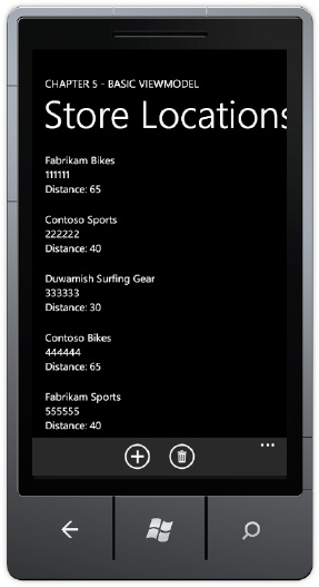
One of the goals of MVVM and separating concerns is to make the View as "thin" as possible. WPF and Silverlight 4 have support for separating concerns by allowing UI element events like Click to data bind to methods on the ViewModel via Commanding and the ICommand interface. This means that instead of having event handlers in the code-behind for the view, everything is instead configured via data binding in XAML. Figure 5-2 shows the UI.
Silverlight for Windows Phone 7, which is based on Silverlight 3 plus some additional Silverlight 4 features like the WebBrowser control and offline DRM, does not have full support for Commanding. For the BasicMVVM sample, the VendorsView has two code-behind events to support adding and removing a Vendor, as in the following:
private void insertVendorAppBarBtn_Click(object sender, EventArgs e)
{
  VendorViewModel vm = LayoutRoot.DataContext as VendorViewModel;
  vm.AddVendor();
}

private void RemoveVendorAppBarBtn_Click(object sender, EventArgs e)
{
  VendorViewModel vm = LayoutRoot.DataContext as VendorViewModel;
  vm.RemoveVendor(vendorsListBox.SelectedItem);
}
Notice that the path to the underlying ViewModel is still via the instance of the VendorViewModel class that is data bound to the LayoutRootGrid's DataContext property. It would be great to be able to avoid this type of code. Luckily, there are third-party, open-source frameworks that provide extensions to Silverlight that enable better support for MVVM, which we cover in the next section.
Because Silverlight for Windows Phone 7 is based on Silverlight 3, it falls short of the MVVM capabilities available in Silverlight 4 and WPF, such as full Commanding support. Luckily, there are quite a few third-party MVVM frameworks available to choose from that provide Commanding support and more. The following lists a few in no particular order:
Caliburn
nRoute
Composite Application Block/PRISM
SilverlightFX
GalaSoft's MVVM Light Toolkit
The major benefit that these frameworks have in varying degrees is increasing separation of concerns, unit testing support, and support for Commanding. You can find arguments for and against the available frameworks, so please investigate the available options. For this example, let's take MVVM Light Toolkit for a spin, as it is this author's opinion that MVVM Light provides a nice balance of power and simplicity that is a great fit for phone application development. Many others would suggest Caliburn instead for similar reasons. The most important thing is to pick a helper SDK, learn it, and use it.
For Windows Phone 7 development, my preference is GalaSoft's MVVM Light Toolkit. In my opinion it has the right combination of power and as the name says, lightness, for a mobile phone application.
Tip
The MVVM Light Toolkit works across WPF and desktop Silverlight as well, which greatly aids in porting code to another screen such as a Windows Slate application.
The MVVM Light Toolkit is up to version 3 SP1. It was originally developed to address the Commanding shortfalls in Silverlight 2 and Silverlight 3 that I highlighted in the previous section when covering the BasicMVVM sample project. The MVVM Light Toolkit also includes customized Visual Studio 2010 templates to help you get started right away. First, download the MVVM Light Toolkit and follow the instructions at this page:
http://galasoft.ch/mvvm/getstarted/
If you like the MVVM Light toolkit, I encourage you to click the Donate button at the bottom of the above page, which goes towards the cost of running the site and the rest goes to charity. The source code is available in CodePlex here:
http://mvvmlight.codeplex.com/
Once you have the toolkit downloaded and installed, you can run the MVVMLightSample available in Chapter 5 to see it in action. The entire range of features of the MVVM Light Toolkit are not described end-to-end in this book, but the next couple of sections cover the features of MVVM Light used to migrate the BasicMVVM to MVVM Light.
In Visual Studio 2010, you can select File
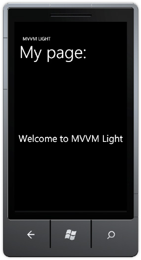
Once the project is created, run it and the screen in Figure 5-3 should appear, which indicates that all is configured correctly.
The page title, subtitle, and text are all data bound to the MainViewModel class. Let's go through the architecture of MVVM Light works so that you have a basis as we migrate the BasicMVVM app to MVVM Light. After creating a new project, the project includes the default App.xaml and MainPage.xaml as well as the other items expected in a Silverlight for Windows Phone 7 application but with a couple of additions. There is an empty Model folder that we populate shortly. There is also a ViewModel folder that contains two ViewModel classes named MainViewModel and ViewModelLocator. I cover these in the next section.
The ViewModelLocator class contains a reference to every ViewModel class in the project. This provides a centralized way to manage creation and allow XAML configuration via a single application resource. By default, in App.xaml a resource is added for the ViewModelLocator class. A namespace is added to the <Application> object that hosts the PhoneApplicationFrame that contains the XAML pages or View classes as they are navigated:
xmlns:vm="clr-namespace:MvvmLightSample.ViewModel"
The ViewModelLocator class is configured as an application level resource, as in the following:
<Application.Resources>
    <vm:ViewModelLocator x:Key="Locator"
                          d:IsDataSource="True" />
</Application.Resources>
This resource is available through the entire application, just like any other application-level resource, making the referenced ViewModel objects available now. Now we move on to explain how MainPage.xaml data binds to MainViewModel within this architecture. In the XAML, the <PhoneApplicationPage> element's DataContext property data binds to the Locator resource discussed above via this XAML code:
DataContext="{Binding Main, Source={StaticResource Locator}}"The Path property for the Binding object is configured with the value of Main using the default syntax (it can also be written as Path=Main). This configuration makes an instance of the MainViewModel available within MainPage.xaml and allows the page title, sub-title, and text to data bind to properties available on the MainViewModel. Here's an example of one of the Application Title Bindings:
<TextBlock x:Name="ApplicationTitle"
    Text="{Binding ApplicationTitle}"
    Style="{StaticResource PhoneTextNormalStyle}" />
Listing 5-3 shows the default ViewModelLocator class.
Example 5.3. Default ViewModelLocator Class Code File
namespace MvvmLightSample.ViewModel
{
  public class ViewModelLocator
  {
    private static MainViewModel _main;

    /// <summary>
    /// Initializes a new instance of the ViewModelLocator class.
    /// </summary>
    public ViewModelLocator()
    {
      //if (ViewModelBase.IsInDesignModeStatic)
      //{
      //    // Create design time view models
      //}
      //else
      //{
      //    // Create run time view models
      //}

      CreateMain();
    }

    /// <summary>
    /// Gets the Main property.
    /// </summary>
    public static MainViewModel MainStatic
    {
      get
      {
if (_main == null)
{
CreateMain();
}
return _main;
}
}
/// <summary>
/// Gets the Main property.
/// </summary>
[System.Diagnostics.CodeAnalysis.SuppressMessage("Microsoft.Performance",
"CA1822:MarkMembersAsStatic",
Justification =
"This non-static member is needed for data binding purposes.")]
public MainViewModel Main
{
get
{
return MainStatic;
}
}
/// <summary>
/// Provides a deterministic way to delete the Main property.
/// </summary>
public static void ClearMain()
{
_main.Cleanup();
_main = null;
}
/// <summary>
/// Provides a deterministic way to create the Main property.
/// </summary>
public static void CreateMain()
{
if (_main == null)
{
_main = new MainViewModel();
}
}
/// <summary>
/// Cleans up all the resources.
/// </summary>
public static void Cleanup()
{
ClearMain();
}
}
}Notice in Listing 5-3 how the MainViewModel is made available. It is created in the ViewModelLocator constructor via a call to the CreateMain() method. There is also a ClearMain() method to provide a garbage collection safe way to clear the resource from memory, which is important on Windows Phone 7 with the goal of keeping application memory usage under 90MB for best performance.
The MainViewModel is available via a static property, which makes it more straightforward to find ViewModel objects by simply typing ViewModelLocator.MainStatic. MainStatic contains the reference to the MainViewModel object but for data binding purposes it must be a non-static variable. A second non-static property is declared named Main that can be configured in data binding. The Main property simply returns the static instance under the covers.
To add additional ViewModel objects, manually edit the ViewModelLocator class to include two properties for the additional ViewModel objects. There is a code snippet available to automate this process. Type mvvmlocatorproperty and tap the Tab key twice to quickly add the property using Visual Studio 2010's code snippet template UI. Essentially, type new values for the default and click the Tab key to move through the template to quickly add the property combination in the correct format.
The model class Vendor is copied from the BasicMVVM class. Edit the namespace at the top to be MVVMLightSample.Models so it makes sense for this project. A reference is added to System.Runtime.Serialization assembly. That's all that's required to add it to the MVVM Light Toolkit version.
The VendorsViewModel class is copied over from the BasicMVVM project, and the namespaces are fixed up for the MvvmLightSample project. To take advantage of as much of the framework as possible, replace INotifyPropertyChanged interface with the ViewModelBase class instead. Add a using clause for GalaSoft.MvvmLight. Remove the INotifyPropertyChangedPropertyChanged event and method from VendorsViweModel since we get it for free by inheriting from ViewModelBase class. Change NotifyPropertyChanged("") calls to base.RaisePropertyChanged("") to fix up compile errors.
Add a reference to Sytem.ServiceModel.Web to make the DataContractJsonSerializer class available within the VendorsViewModel. Remove the InDesignTime property and replace it with a call to GalaSoft.MvvmLight.IsInDesignMode instead. At this point, the migration is complete for the ViewModel.
A new folder named View is added to the MVVMLightSample project, and the VendorsView.xaml page is copied from the BasicMVVM project to the MVVMLightSample view folder. Do a Find / Replace with BasicMVVM to replace it with MvvmLightSample with the "Look in" set to Current Project. That fixes up namespace references to compile the project successfully.
Next MainViewModel is modified to return a more appropriate page title and sub-title as well as string text for the Welcome message property, now configured to point to a StoreLocatorPage property. Clicking on that text will navigate you to the VendorsView.xaml page. Fix up the margins so that everything aligns at 24px on the left and then add a NavigateToPageAction behavior to the TextBlock containing the text Store Locator Page and configure it to point to the VendorsView page.
If you run the project, it works as before, but let's configure the VendorsView to take advantage of the MVVM Light toolkit capabilities. First, add a property combination to the ViewModelLocator via the mvvmlocatorproperty code snippet. By using the code snippet, it quickly generates this code for you in the ViewModelLocator class:
private static VendorViewModel _vendors;

/// <summary>
/// Gets the Vendors property.
/// </summary>
public static VendorViewModel VendorsStatic
{
  get
  {
    if (_vendors == null)
    {
      CreateVendors();
    }

    return _vendors;
  }
}

/// <summary>
/// Gets the Vendors property.
/// </summary>
[System.Diagnostics.CodeAnalysis.SuppressMessage("Microsoft.Performance",
    "CA1822:MarkMembersAsStatic",
    Justification = "This non-static member is needed for data binding purposes.")]
public VendorViewModel Vendors
{
  get
  {
    return VendorsStatic;
  }
}

/// <summary>
/// Provides a deterministic way to delete the Vendors property.
/// </summary>
public static void ClearVendors()
{
  _vendors.Cleanup();
  _vendors = null;
}

/// <summary>
/// Provides a deterministic way to create the Vendors property.
/// </summary>
public static void CreateVendors()
{
  if (_vendors == null)
  {
    _vendors = new VendorViewModel();
  }
}
As you can see, if you are not familiar with Visual Studio 2010 the code snippet is quite handy! One item to note is that the snippet adds another Cleanup() method so just copy ClearVendors() to the existing Cleanup() method and delete the one added.
Now that we have the VendorsView added to the ViewModelLocator, we can configure the VendorsView to data bind the MVVM Light Toolkit way using Expression Blend. First compile the project to make sure everything is up to date, and then remove the DataContext binding on the LayoutRootGrid. Also remove the VendorViewModelDataSource from the PhoneApplicationPage.Resources section in the VendorsView.xaml file.
In Expression Blend, select the PhoneApplicationPage root item in the Objects and Timeline tool window. Find the DataContext property, click the Advanced Options... button, and select Data Binding... to bring up the Create Data Binding Dialog Window. Select the Locator data source and then select Vendors, as shown in Figure 5-4.
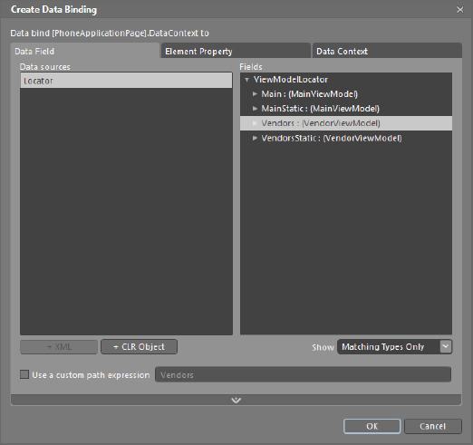
Be sure to select the non-static property so the data binding work correctly. Run the application and navigate to the VendorsView and it displays the data as before. We still have the event handlers in the code-behind. In the next subsection the event handlers are removed and instead the application takes advantage Commanding support provided by the MVVM Light toolkit.
The MVVM Light Toolkit supports Commanding, or data binding events to ViewModel methods, via the RelayCommand and RelayCommand<T> classes. In the VendorViewModel class, two RelayCommand instances are added in a region named Commanding, one that is parameter-less and one that takes a parameter. Here is the declaration:
#region Commanding
public RelayCommand AddAVendorCommand
{
  get;
  private set;
}

public RelayCommand<Vendor> RemoveAVendorCommand
{
  get;
  private set;
}
#endregion
The commands are instantiated in the VendorViewModel() constructor in this code:
//Instantiate Commands
AddAVendorCommand = new RelayCommand(
  () => AddVendor());

RemoveAVendorCommand = new RelayCommand<Vendor>(
  param => RemoveVendor(param));
The RelayCommand objects bridge between the ViewModel methods and the UI events. RelayCommand has support for one parameter only so you need to pass more info, consider encapsulating into an object. Now it's time to data bind the commands in the UI. Currently the application uses the application bar to execute Add and Remove. Unfortunately the ApplicationBarIconButton class does not inherit from FrameworkElement so the ButtonBaseExtension cannot be attached to a DependencyObject. You can still call the relay in code behind as before. Here is an example from the sample:
private void insertVendorAppBarBtn_Click(object sender, EventArgs e)
{
  var vm = DataContext as VendorViewModel;
  if (vm != null)
  {
    vm.AddAVendorCommand.Execute(null);
  }
}
For this sample, the two Buttons are added so that we can demonstrate the EventToCommand Expression Blend behavior, as well as via the code-behind for the application bar buttons. In Expression Blend, switch to the Assets tab and select Behaviors to filter the list. Drag the EventToCommand behavior on to the Button objects and configure the correct command on each button. For the Remove Button, data bind the EventToCommandCommand property to the RemoveAVendorCommand RelayCommand. Also data bind the CommandParameter for the RemoveEventToCommand object to the vendorsListBox.SelectedItem method, which returns a Vendor object. Here is the resulting markup for Remove:
<Button x:Name="RemoveButton" Content="Remove" HorizontalAlignment="Right" VerticalAlignment="Bottom" Margin="0,0,8,18">
<Custom:Interaction.Triggers>
    <Custom:EventTrigger EventName="Click">
      <GalaSoft_MvvmLight_Command:EventToCommand Command=
             "{Binding RemoveAVendorCommand, Mode=OneWay}"
        CommandParameter="{Binding SelectedItem, ElementName=vendorsListBox}"/>
    </Custom:EventTrigger>
  </Custom:Interaction.Triggers>
</Button>
The RelayCommand class also supports CanExecute and CanExecuteChanged members as well to determine whether or not to enable or disable the element, in this case a Button object. The CanExecute method can be passed in to the constructor as a second parameter. Here's an example:
AddAVendorCommand = new RelayCommand(
  () => AddVendor(), () => CheckEnabled);
We have now completely migrated the sample over to MVVM. Listing 5-4 shows the source code for the updated VendorViewModel class.
Example 5.4. Updated VendorViewModel Code File
using System;
using System.Collections.ObjectModel;
using System.Linq;
using System.Net;
using System.Runtime.Serialization.Json;
using System.Windows;
using GalaSoft.MvvmLight;
using GalaSoft.MvvmLight.Command;
using MvvmLightSample.Models;

namespace MvvmLightSample.ViewModel
{
  public class VendorViewModel : ViewModelBase
  {
    public VendorViewModel()
    {
      if (IsInDesignMode)
      {
        LoadSampleData();
      }
      else
      {
        LoadData();
      }

      //Instantiate Commands
      AddAVendorCommand = new RelayCommand(
        () => AddVendor());

      RemoveAVendorCommand = new RelayCommand<Vendor>(
        param => RemoveVendor(param));

    }
#region Design-time support
private void LoadSampleData()
{
_vendors = new ObservableCollection<Vendor>()
{
new Vendor(){AccountNumber="111111", CreditRating=65,
Name="DesignTime - Fabrikam Bikes" },
new Vendor(){AccountNumber="222222", CreditRating=40,
Name="Contoso Sports" },
new Vendor(){AccountNumber="333333", CreditRating=30,
Name="Duwamish Surfing Gear" },
new Vendor(){AccountNumber="444444", CreditRating=65,
Name="Contoso Bikes" },
new Vendor(){AccountNumber="555555", CreditRating=40,
Name="Fabrikam Sports" },
new Vendor(){AccountNumber="666666", CreditRating=30,
Name="Duwamish Golf" },
new Vendor(){AccountNumber="777777", CreditRating=65,
Name="Fabrikam Sun Sports" },
new Vendor(){AccountNumber="888888", CreditRating=40,
Name="Contoso Lacross" },
new Vendor(){AccountNumber="999999", CreditRating=30,
Name="Duwamish Team Sports" },
};
}
#endregion
#region Vendors Data Load
HttpWebRequest httpWebRequest;
private void LoadData()
{
httpWebRequest =
HttpWebRequest.CreateHttp("http://localhost:9191/AdventureWorksRestJSON.svc/Vendors");
httpWebRequest.BeginGetResponse(new AsyncCallback(GetVendors), null);
}
//add a reference to System.Servicemodel.web to get DataContractJsonSerializer
void GetVendors(IAsyncResult result)
{
HttpWebResponse response = httpWebRequest.EndGetResponse(result) as HttpWebResponse;
DataContractJsonSerializer ser = new
DataContractJsonSerializer(typeof(ObservableCollection<Vendor>));
_vendors = ser.ReadObject(response.GetResponseStream()) as ObservableCollection<Vendor>;
//Vendors is read-only so cannot set directly
//Must call NotifyPropertyChanged notifications on UI thread
//to update the UI and have data binding work properly
Deployment.Current.Dispatcher.BeginInvoke(() =>
{
base.RaisePropertyChanged("Vendors");
});
}
#endregion
#region Vendors Business Logicprivate ObservableCollection<Vendor> _vendors;
public ObservableCollection<Vendor> Vendors
{
get
{
return _vendors;
}
//set
//{
// _vendors = value;
// NotifyPropertyChanged("Vendors");
//}
}
public Vendor GetVendorByAccountNumber(string accountNumber)
{
var vendor = from v in _vendors
where v.AccountNumber == accountNumber
select v;
return vendor.First<Vendor>();
}
public void AddVendor()
{
Vendors.Add(new Vendor()
{
AccountNumber = "111111",
CreditRating = 65,
Name = "Fabrikam Bikes - Added"
});
}
public void RemoveVendor(object vendor)
{
if (null != vendor)
Vendors.Remove((Vendor)vendor);
}
#endregion
#region Commanding
public RelayCommand AddAVendorCommand
{
get;
private set;
}
public RelayCommand<Vendor> RemoveAVendorCommand
{
get;
private set;
}
#endregion
}
}In the next couple of sections, I cover additional features of the MVVM Light Toolkit.
The Messenger class provides a means to communicate within an application in a decoupled way. Classes can register to receive messages of different types. The message can be anything from simple values to complex objects. Likewise, messages can specify a target type that should receive the message for fined tuned control.
MVVM Light includes multiple message classes. The following is a list of possible messages from the docs:
MessageBase:A simple message class, carrying optional information about the message's sender.GenericMessage<T>:A simple message with a Content property of type T.NotificationMessage:Used to send a notification (as a string) to a recipient. For example, define notifications as constants in a Notifications class, and then send Notifications. Save to recipients.NotificationMessage<T>:Same as the previous, but with a generic Content property. It can be used to pass a parameter to the recipient together with the notification.NotificationMessageAction:Sends a notification to a recipient and allows the recipient to call the sender back.NotificationMessageAction<T>:Sends a notification to a recipient and allows the recipient to call the sender back with a generic parameter.DialogMessage:Used to request that a recipient (typically a View) displays a dialog, and passes the result back to the caller (using a callback). The recipient can choose how to display the dialog, either with a standard MessageBox, with a custom popup, or something similar.PropertyChangedMessage<T>:Used to broadcast that a property changed in the message sender. Fulfills the same purpose as the PropertyChanged event, but in a decoupled manner.
The Messenger class provides a powerful means to pass data and notifications between application layers and within ViewModels in a decoupled way.
The Silverlight Toolkit has been in existence for several years. The idea behind it is to be able to more frequently release control and other updates with full source code to developer's out-of-band from the normal product release cycle. The toolkit was extended to Windows Phone 7 with the initial release for phone in September 2010, with the latest update available as of this writing releasing mid-November 2010. It is available for download here:
http://silverlight.codeplex.com/
Installation is simply a matter of running the MSI and making the controls available in the Toolbox within Visual Studio 2010. Right-click on the Toolbox, select Choose Items..., and then put a check box next to controls you want to show up in the Toolbox. You can sort the controls alphabetically as well. The Silverlight for Windows Phone Toolkit includes several phone-specific controls that most developers will want to take advantage of to some degree listed in Table 5-1.
Table 5.1. Silverlight for Windows Phone 7 Toolkit Available Controls
Control Name | Description |
|---|---|
GestureService/GestureListener | Enables rich gesture support for Silverlight applications. |
| Enables a Tap-and-Hold action to bring up a Metro-style context menu. |
| A Metro-style |
| A Metro-style |
| A Metro-style Toggle-button control. |
| A phone-specific version of the Silverlight tried-and-true |
| A Metro-style auto-complete |
| A Metro-style |
| A turbo-charged |
PerformanceProgressBar | A custom progress bar control enhanced with better performance over the built-in progress bar. |
Page Transitions | Set of transitions and animations. Covered in the next section. |
The controls in Table 5-1 were frequently requested by developers during the beta-test phase of the Windows Phone Developer Tools. The product team created the toolkit to supplement the SDK to help match the built-in native UI controls look and feel.
Note
GestureService and GestureListener are covered in Chapter 3.
The best way to proceed is to dive right in and show you how to put the controls to work within a sample project. Luckily, the Silverlight for Windows Phone 7 Toolkit includes a very robust sample that is included with the source code download titled "Silverlight for Windows Phone Toolkit Source & Sample – Nov 2010.zip" available here:
http://silverlight.codeplex.com/releases/view/55034
There isn't any documentation beyond the sample application so this section provides an overview of the available additional controls available in the toolkit. There is one additional sample project in the Chapter 5 solution that demonstrates how to data bind the WrapPanel control.
When you first run the sample app that ships with the source code available for download at the link I just gave you, it launches into a menu shown in Figure 5-5.
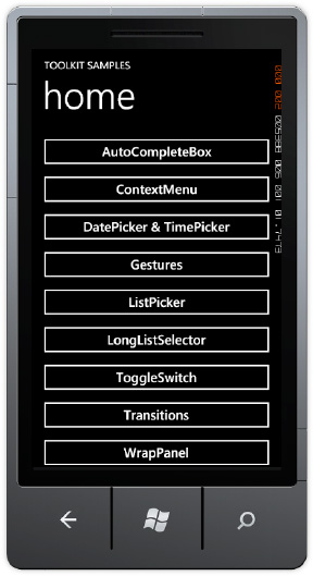
Each control is covered in the sections that follow.
The AutoCompleteBox control allows a user to type letters, which brings up matches from the data source resource configured on the ItemSource attribute. Here is an example:
<toolkit:AutoCompleteBox VerticalAlignment="Top" ItemsSource="{StaticResource words}"
 Margin="0,12"/>
Figure 5-6 shows the AutoCompleteBox in action. The top AutoCompleteBox is configured with the above XAML.
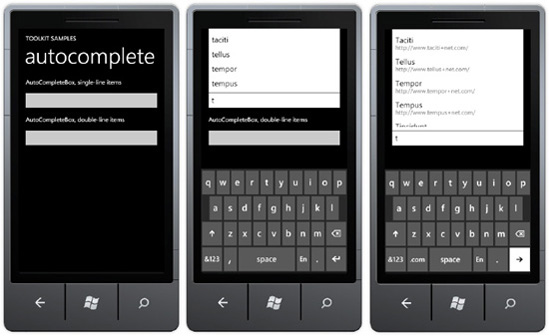
The bottom AutoCompleteBox is configured with an ItemTemplate to display two lines of text:
<toolkit:AutoCompleteBox
    InputScope="Url"
    ItemsSource="{StaticResource websites}"
    Margin="0,12"
    ValueMemberPath="Item1">
    <toolkit:AutoCompleteBox.ItemTemplate>
        <DataTemplate>
            <StackPanel Margin="0,7">
                <TextBlock
                    Margin="8,0"
                    Text="{Binding Item1}"/>
<TextBlock
FontSize="{StaticResource PhoneFontSizeNormal}"
Foreground="#ff666666"
Margin="8,-6,8,2"
Text="{Binding Item2}"/>
</StackPanel>
</DataTemplate>
</toolkit:AutoCompleteBox.ItemTemplate>
</toolkit:AutoCompleteBox>The words come from these resources configured in PhoneApplicationPage.Resources section:
<phone:PhoneApplicationPage.Resources>
    <data:LoremIpsum x:Key="words"/>
    <data:LoremIpsumWebsites x:Key="websites"/>
</phone:PhoneApplicationPage.Resources>
In the Data folder of the toolkit sample solution PhoneToolkitSample project, there are two classes, LoremIpsum.cs and LoremIpsumWebsites.cs, which generate a random collection of words in an IEnumerable collection. You can data bind to any collection of strings and display the values as the user types.
The AutoCompleteBox provides a great way to improve UI by populating text fields with most likely values, saving users from having to type.
The ContextMenu control provides a user interaction unique to Windows Phone 7 with the tap-and-hold gesture. Figure 5-7 shows the test page within text hints on functionality, as well as results after tap-and-hold actions.
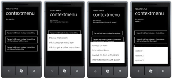
The ContextMenu control is bindable to ICommand objects, so it can work quite nicely with GalaSoft's MVVM support for Commanding allowing context menu items to invoke methods on the data bound ViewModel class.
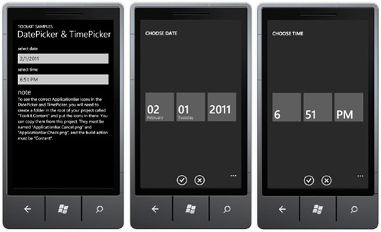
The DatePicker and TimePicker controls make it easy for users to pick date and time within a Windows Phone 7 application. Figure 5-8 shows the controls in action.
You can attach an event hander to the Click event and assign commands to the Command property. Here is example XAML for ICommand support:
<toolkit:ContextMenuService.ContextMenu>
    <toolkit:ContextMenu>
        <toolkit:MenuItem
        Header="Always-on item"
        Command="{Binding AlwaysCommand}"/>
        <toolkit:MenuItem
        Header="Intermittent item"
        Command="{Binding IntermittentCommand}"/>
        <toolkit:MenuItem
        Header="Always-on item with param"
Command="{Binding AlwaysCommand}"
CommandParameter="param1"/>
<toolkit:MenuItem
Header="Intermittent item with param"
Command="{Binding IntermittentCommand}"
CommandParameter="param2"/>
</toolkit:ContextMenu>
</toolkit:ContextMenuService.ContextMenu>The controls are dependent on having the correct application bar icons in a folder named Toolkit.Content. The icons are ApplicationBar.Cancel.png and ApplicationBar.Check.png and their build action must be set to Content.
The ListPicker control provides a full-page, touch-friendly drop-down scrollable list to select an item. Figure 5-9 shows the example.
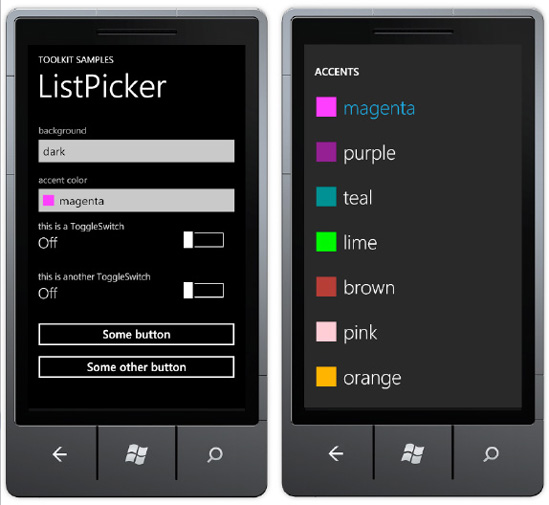
The ListPicker control can display a set of inline strings like this:
<toolkit:ListPicker Header="background">
    <sys:String>dark</sys:String>
    <sys:String>light</sys:String>
    <sys:String>dazzle</sys:String>
</toolkit:ListPicker>
The ListPicker control also has ItemSource and ItemTemplate attributes to support data binding and full customization of how items are displayed. Here is example XAML:
<toolkit:ListPicker ItemsSource="{Binding}" Header="accent color"
                  FullModeHeader="ACCENTS" CacheMode="BitmapCache">
    <toolkit:ListPicker.ItemTemplate>
        <DataTemplate>
            <StackPanel Orientation="Horizontal">
                <Rectangle Fill="{Binding}" Width="24" Height="24"/>
                <TextBlock Text="{Binding}" Margin="12 0 0 0"/>
            </StackPanel>
        </DataTemplate>
    </toolkit:ListPicker.ItemTemplate>
    <toolkit:ListPicker.FullModeItemTemplate>
        <DataTemplate>
            <StackPanel Orientation="Horizontal" Margin="16 21 0 20">
                <Rectangle Fill="{Binding}" Width="43" Height="43"/>
                <TextBlock Text="{Binding}" Margin="16 0 0 0" FontSize="43"
                           FontFamily="{StaticResource PhoneFontFamilyLight}"/>
            </StackPanel>
        </DataTemplate>
    </toolkit:ListPicker.FullModeItemTemplate
</toolkit:ListPicker>The ToggleSwitch control configures a boolean value as On or Off. It can take a simple Header attribute for a text value to display across the top above the switch and current status as shown in the first two ToggleSwitch controls in Figure 5-10.

The last ToggleSwitch control is much more customized than the first two. It includes a ToggleSwitch.HeaderTemplate to adjust the Font for the header. The ToggleSwitch.ContentTemplate customizes the ToggleSwitch status info on the left with additional detail. Simply embed a <ContentControl Content="{Binding}"/> control inside of the ToggleSwitch.ContentTemplate to have the On/Off status display correctly, as in the following:
<toolkit:ToggleSwitch Header="5:45 AM">
    <toolkit:ToggleSwitch.HeaderTemplate>
        <DataTemplate>
            <ContentControl FontSize="{StaticResource PhoneFontSizeLarge}"
                  Foreground="{StaticResource PhoneForegroundBrush}" Content="{Binding}"/>
        </DataTemplate>
    </toolkit:ToggleSwitch.HeaderTemplate>
    <toolkit:ToggleSwitch.ContentTemplate>
        <DataTemplate>
            <StackPanel>
                <StackPanel Orientation="Horizontal">
                    <TextBlock Text="Alarm: " FontSize="{StaticResource PhoneFontSizeSmall}"/>
                    <ContentControl HorizontalAlignment="Left"
FontSize="{StaticResource PhoneFontSizeSmall}" Content="{Binding}"/>
</StackPanel>
<TextBlock Text="every schoolday"
FontSize="{StaticResource PhoneFontSizeSmall}"
Foreground="{StaticResource PhoneSubtleBrush}"/>
</StackPanel>
</DataTemplate>
</toolkit:ToggleSwitch.ContentTemplate>
</toolkit:ToggleSwitch>The WrapPanel control works very similarly to the same named control available in the desktop Silverlight toolkit. It arranges child items left to right, row by row or top to bottom, column by column. Figure 5-11 shows the UI.
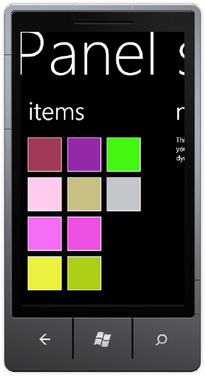
The WrapPanel control has a Children collection that allows you to add child items to the control via code, which is how the toolkit sample adds items. There may be situations in which you prefer to data bind to an ItemSource property and an ItemTemplate, like you can in the ListBox control. The WrapPanelDataBinding project sample in the Chapter 5 solution demonstrates how to do this.
You can use an ItemsControl to provide this functionality by changing the ItemsControl.ItemsPanel to a WrapPanel. Otherwise, data binding works just like with a ListBox. Here is the XAML markup:
<ItemsControl ItemsSource="{Binding Strings}">
  <ItemsControl.ItemsPanel>
    <ItemsPanelTemplate>
      <toolkit:WrapPanel ItemWidth="69"/>
    </ItemsPanelTemplate>
  </ItemsControl.ItemsPanel>
  <ItemsControl.ItemTemplate>
    <DataTemplate>
      <Grid Width="60" Height="60" Margin="4">
        <Rectangle Fill="#FF2A2AC8" Stroke="Black"/>
        <TextBlock
          Text="{Binding Text}" TextWrapping="Wrap"/>
      </Grid>
    </DataTemplate>
  </ItemsControl.ItemTemplate>
</ItemsControl>
The WrapPanelDataBinding project has a sample data source generated in Expression Blend to display random text over rectangles. The ItemsControl.ItemsSource points to the Strings collection in the sample data source. Figure 5-12 shows the output.
A control that we won't dive into here is the PerformanceProgressBar control, which was added to the toolkit in February 2011. Using the control is pretty straightforward, as it models the functionality of the built-in Progressbar control. I mention it because you will want to use the toolkit PerformanceProgressBar to improve rendering performance in your Silverlight or Windows Phone applications.
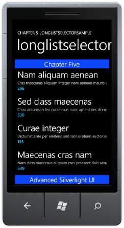
The LongListSelector control is the uber-ListBox control available for Windows Phone 7. It supports flat lists (like in a ListBox), but it can provide better performance than the standard ListBox control. Try it for your scenario. The LongListSelector control also supports grouped list, inline "more like these" buttons, and jump list UI.
Given the complexity and power of this control, the next couple sections describe its visual capabilities, key properties and methods, and coding approaches.
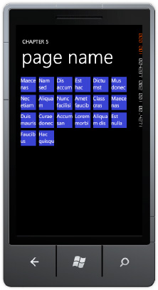
The quickest way to take advantage of the LongListSelector control's potential performance and list virtualization advantages is to replace existing ListBox controls with LongListSelector controls and set the attribute IsFlatList to True. When in IsFlatList=true mode, the UI looks just like a ListBox control though you can provide a header and footer to the list via the ListHeaderTemplate and ListFooterTemplate properties, as shown in Figure 5-13.
Listing 5-5 shows the XAML for the control and the three templates that are configured.
<phone:PhoneApplicationPage
Example 5.5. LongListSelector XAML Markup File
x:Class="LongListSelectorSample.pages.LongListSelectorPage2" ...<!—removed standard namespaces for claritySupportedOrientations="Portrait" Orientation="Portrait" mc:Ignorable="d" d:DesignHeight="768" d:DesignWidth="480" shell:SystemTray.IsVisible="True" Loaded="PhoneApplicationPage_Loaded" xmlns:toolkit="clr-namespace:Microsoft.Phone.Controls;assembly=Microsoft.Phone.Controls.Toolkit"> <phone:PhoneApplicationPage.Resources> <DataTemplate x:Key="ItemTemplate"> <StackPanel Margin="0,0,0,20"> <TextBlock Text="{Binding Name}" Style="{StaticResource PhoneTextExtraLargeStyle}"/> <TextBlock Text="{Binding Description}" Style="{StaticResource PhoneTextSmallStyle}"/> <TextBlock Text="{Binding Quantity}" Style="{StaticResource PhoneTextAccentStyle}"/> </StackPanel> </DataTemplate> <DataTemplate x:Key="HeaderDataTemplate"> <Border Background="#FF0027FF"> <TextBlock TextWrapping="Wrap" Text="Chapter Five" HorizontalAlignment="Center" VerticalAlignment="Center" Style="{StaticResource PhoneTextLargeStyle}"/> </Border> </DataTemplate> <DataTemplate x:Key="FooterDataTemplate"> <Border Background="#FF0027FF"> <TextBlock TextWrapping="Wrap" Text="Advanced Silverlight UI" HorizontalAlignment="Center" VerticalAlignment="Center" Style="{StaticResource PhoneTextLargeStyle}"/> </Border> </DataTemplate> </phone:PhoneApplicationPage.Resources> <!--LayoutRoot is the root grid where all page content is placed--> <Grid x:Name="LayoutRoot" Background="Transparent" DataContext="{Binding Source={StaticResource longlistDataSource}}"> <Grid.RowDefinitions><RowDefinition Height="Auto"/> <RowDefinition Height="*"/></Grid.RowDefinitions> <!--TitlePanel contains the name of the application and page title--> <StackPanel x:Name="TitlePanel" Grid.Row="0" Margin="12,17,0,28"> <TextBlock x:Name="ApplicationTitle" Text="Chapter 5-LONGLISTSELECTORSAMPLE" Style="{StaticResource PhoneTextNormalStyle}"/> <TextBlock x:Name="PageTitle" Text="longlistselector" Margin="9,-7,0,0" Style="{StaticResource PhoneTextTitle1Style}"/> </StackPanel> <!--ContentPanel - place additional content here--> <Grid x:Name="ContentPanel" Grid.Row="1" Margin="12,0,12,0"> <toolkit:LongListSelector IsFlatList="True"
ItemTemplate="{StaticResource ItemTemplate}"
        ItemsSource="{Binding Collection}"
        ListHeaderTemplate="{StaticResource HeaderDataTemplate}"
        ListFooterTemplate="{StaticResource FooterDataTemplate}"/>
    </Grid>
  </Grid>
</phone:PhoneApplicationPage>
If you forget to set IsFlatList equal to True, it will generate an error when data bound to a flat list. This is because by default the LongListSelector control expects a data structure with a grouped set of items that permits the control to display the long list of content segmented by available groups.
The PhoneToolkit Sample Solution downloaded from CodePlex when you install the toolkit includes a page named LongListSelectorSample.xaml. This page demonstrates several ways a developer can implement grouping with the LongListSelector control. The UI for the LongListSelectorSample.xaml is a Pivot control with three PivotItem pages titled linq, code, and buddies. The LongListSelector implementation for the PivitItem titled linq has the following XAML:
<toolkit:LongListSelector x:Name="linqMovies" Background="Transparent"
    ListHeaderTemplate="{StaticResource movieListHeader}"
    GroupHeaderTemplate="{StaticResource movieGroupHeader}"
    GroupItemTemplate="{StaticResource groupItemHeader}"
    ItemTemplate="{StaticResource movieItemTemplate}">
</toolkit:LongListSelector>
Note that it does not implement a GroupFooterTemplate. The PivotItem page titled linq displays movie data via Category using LINQ to demonstrate how to group items in the correct format using LINQ. The item that is displayed in the LongListSelector for both the linq and code PivotItem pages is a Movie class that has fields like Title, Description, Year, etc. The movies are grouped by either Category, which is of type string. In the code-behind file, the LoadLinqMovies method creates a flat collection of movies with random data and then builds a LINQ to Object query to group the movies by category.
The LINQ query is dazzlingly simple, taking advantage of the built-in group by support in LINQ that is based on the IGrouping Interface. Here is the LoadLinqMovies method:
private void LoadLinqMovies()
{
    List<Movie> movies = new List<Movie>();

    for (int i = 0; i < 50; ++i)
    {
        movies.Add(Movie.CreateRandom());
    }

    var moviesByCategory = from movie in movies
                            group movie by movie.Category into c
                            orderby c.Key
                            select new PublicGrouping<string, Movie>(c);

    linqMovies.ItemsSource = moviesByCategory;
}
The class PublicGrouping implements the IGrouping Interface, which has this definition from metadata:
namespace System.Linq
{
  // Summary:
  //     Represents a collection of objects that have a common key.
  //
  // Type parameters:
  //   TKey:
  //     The type of the key of the System.Linq.IGrouping<TKey,TElement>.
  //
  //   TElement:
  //     The type of the values in the System.Linq.IGrouping<TKey,TElement>.
  public interface IGrouping<TKey, TElement> : IEnumerable<TElement>, IEnumerable
  {
    // Summary:
    //     Gets the key of the System.Linq.IGrouping<TKey,TElement>.
    //
    // Returns:
    //     The key of the System.Linq.IGrouping<TKey,TElement>.
    TKey Key { get; }
  }
}
An IEnumerable collection of PublicGrouping items is the output from the previous LINQ query:
var moviesByCategory = from movie in movies
                        group movie by movie.Category into c
                        orderby c.Key
                        select new PublicGrouping<string, Movie>(c);
The PublicGrouping class is generic: Here is the class declaration and constructor:
public class PublicGrouping<TKey, TElement> : IGrouping<TKey, TElement>
...
public PublicGrouping(IGrouping<TKey, TElement> internalGrouping)
{
    _internalGrouping = internalGrouping;
}
The LINQ query obtains the Enumerator from the LINQ Query, in this case the 'c' variable, which is defined as Category. Use the PublicGrouping class as a basis for your usage of the LongListSelector control.
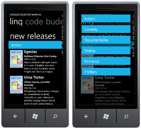
Given the correctly formatted data structure, the LongListSelector class renders the UI in a grouped format. If you click on a group item, it displays a menu of available groups. Figure 5-14 shows the linq PivotItem in action, with the screenshot on the right showing the results of clicking the group item. Select a new group item like Comedy to jump to the portion of the list containing the Comedy movies.
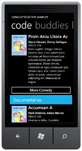
The code PivotItem in the PhoneToolkit project LongListSelectorSample.xaml page implements an additional feature with the LongListSelector control. The GroupFooterTemplate is modified to include a Button to display "more" of a particular category. Here is the XAML for the code PivotItem LongListSelector control:
<toolkit:LongListSelector x:Name="codeMovies" Background="Transparent"
            ItemsSource="{StaticResource movies}"
            ListHeaderTemplate="{StaticResource movieListHeader}"
            GroupHeaderTemplate="{StaticResource movieGroupHeader}"
            GroupItemTemplate="{StaticResource groupItemHeader}"
            ItemTemplate="{StaticResource movieItemTemplate}">
  <toolkit:LongListSelector.GroupFooterTemplate>
    <DataTemplate>
      <local:CommandButton DataContext="{Binding}" Content="{Binding GetMore}"
        Command="{StaticResource moreCommand}" CommandParameter="{Binding}"/>
    </DataTemplate>
  </toolkit:LongListSelector.GroupFooterTemplate>
</toolkit:LongListSelector>
Notice that the GroupFooterTemplate includes a DataTemplate with a CommandButton class instance, which is included in the sample code. The LongListSelector implementation on the code PivotItem does not use LINQ to generate the grouped item list. It binds to a StaticResource defined on the page named moreCommand, which is a class located in the MoviesByCategory.cs class file in the Data folder. More on that in a bit.
Also notice that ItemsSource data binds to a StaticResource named movies, which points to a class named MoviesByCategory located in the Data folder. The MoviesByCategory class is fairly simple. It obtains the Categories, and then randomly generates a set of fake objects for each Category using the MoviesInCategory class. It demonstrates how to create properly formatted groups in code and can provide a useful starter example.
The MoreCommand class implements the ICommand interface. The ICommand.Execute method adds additional random objects to the currently selected group that is passed in via a parameter. For a real implementation, some tracking is necessary to identify which records are already displayed so that the correct next set of records is retrieved, if present. Figure 5-15 shows the UI with the More Command button.
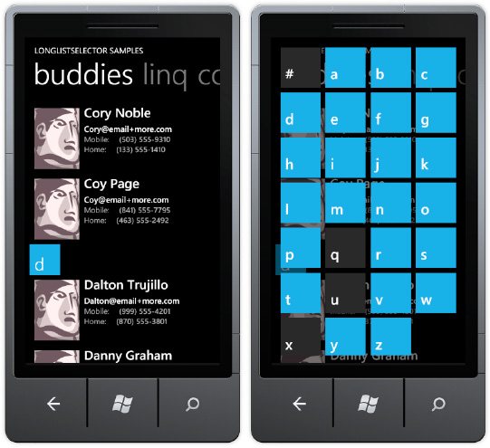
The last PivotItem, named buddies, also generates a collection in code. It randomly generates a list of people names via the AllPeople class, sorts, them, and then generates groups by the alphabet and related group of names starting with each letter in the PeopleByFirstName class. The GroupItemTemplate in this case is the alphabet as shown in Figure 5-16.
In this section, we performed an in-depth review of the LongListSelector control, because it provides rich and very much needed functionality for Windows Phone 7 applications that display lists of data. This section concludes the review of the Silverlight for Windows Phone 7 toolkit except for the transition animations, which we cover as part of the next section.
In previous sections, we used the NavigateToPageAction behavior to navigate from one page to another. In this section, I focus on how to create more interactivity with Expression Blend for page transitions, status changes, and orientation changes. We start with investigating how to add interactivity using the Silverlight for Windows Phone 7 Toolkit. We next focus on the Visual State Manager to create animations and transitions using a state-based management system.
The Silverlight for Windows Phone 7 toolkit enables transitions that match the built-in native transitions available in Windows Phone 7, allowing your application to have the same look and feel without a lot of work. It is very simple to make the transitions available within an application, which is demonstrated in the Chapter 5 project named ToolkitTransitions.
The ToolkitTransitions project has three XAML pages. MainPage.xaml navigates to TestTransitionsPage.xaml, which data binds to a collection of sample data. The sample data is present to make the transitions more obvious than with just a mostly blank screen. When an item is selected in the TestTransitionsPage.xaml's sampleDataListBox, the code in the sampleDataListBox_SelectionChanged event appends the index of the selected item to a query string and then navigates to TestTransitionsPage2.xaml. The TestTransitionsPage2.xaml page displays the full details of the selected item.
An extra page is added to the project beyond MainPage.xaml because transitions from the Silverlight for Windows Phone 7 toolkit do not override the standard application loading and exiting page transitions so we need another page to fully demonstrate the transitions. The page in the middle, TestTransitionsPage.xaml, will have the transitions configured on it to demonstrate the full navigating to and from page transition capabilities because it is not the default item or main page for the application.
To get started, first add a project reference to the Microsoft.Phone.Controls.Toolkit assembly. Next open the App.xaml.cs file and change this line of code in the InitializePhoneApplication() method:
RootFrame = new PhoneApplicationFrame();
to this line of code:
RootFrame = new Microsoft.Phone.Controls.TransitionFrame();
Next, add a second page named toolkittransitionpage.xaml to a pages folder. A TextBlock is added to MainPage.xaml and the NavigateToPageAction behavior is applied to the TextBlock, so that when it is touched, the toolkittransitionpage.xaml is displayed. Run the project and check to make sure the navigation from MainPage to the toolkittranstiionpage.xaml is working. It is working, but it still does not have a nice transition to the second page. Now you can add any transition within the application.
There isn't any Expression Blend support for visually applying transitions via behaviors. You edit the XAML to apply transitions. For each page, you can define four types of transitions:
NavigationInTransition:Applies when navigating to the current page, either via a forward navigation to the page or via clicking the Back button to navigate back to the page.NavigationOutTransition:Applies when the current page is navigating out to another page, either via forward navigation to another page or when clicking the Back button on the current page.DatePickerPage:Applies when the current page is navigating to aDatePickercontrol page.TimePickerPage:Applies when the current page is navigating to aTimePickercontrol page.
To add a transition in XAML, add a namespace reference to the toolkit:
xmlns:toolkit="clr-namespace:Microsoft.Phone.Controls;assembly=Microsoft.Phone.Controls.Toolkit"
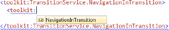
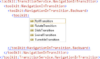
Next type <toolkit:TransitionService to bring up IntelliSense to show the four available transition types. Select NavigationInTransition and then close the tag to generate the ending element </toolkit:TransitionService.NavigationInTransition>. A warning appears "Property 'NavigationInTransition' does not have a value." and blue squiggly lines appear as shown in Figure 5-17.
The only option that displays is toolkit:Navigation:InTransition. Within that element you can add the following two additional elements:
NavigationInTransition.BackwardNavigationInTransition.Forward
Within the .Backward and .Forward transitions, you can configure one of four options, as shown in Figure 5-18.
We discuss the four possible transitions in detail in the next subsection. NavigationOutTransition also has a .Backward and .Forward option. Figure 5-19 describes the relationship for all four configurations.

In Figure 5-19, all four transitions are configured on the middle page and have independent behavior depending on the relative navigation to the middle page. This is the same configuration as in the ToolkitTransitions sample project's TestTransitionsPage.xaml page where all four options are configured. Here is the XAML for the ToolkitTransitions sample transitions:
<toolkit:TransitionService.NavigationInTransition>
  <toolkit:NavigationInTransition>
    <toolkit:NavigationInTransition.Backward>
      <toolkit:RollTransition />
    </toolkit:NavigationInTransition.Backward>
    <toolkit:NavigationInTransition.Forward>
      <toolkit:RotateTransition  />
    </toolkit:NavigationInTransition.Forward>
  </toolkit:NavigationInTransition>
</toolkit:TransitionService.NavigationInTransition>
<toolkit:TransitionService.NavigationOutTransition>
  <toolkit:NavigationOutTransition>
    <toolkit:NavigationOutTransition.Backward>
  <toolkit:TurnstileTransition Mode="BackwardOut" />
  </toolkit:NavigationOutTransition.Backward>
    <toolkit:NavigationOutTransition.Forward>
      <toolkit:TurnstileTransition Mode="ForwardOut" />
    </toolkit:NavigationOutTransition.Forward>
  </toolkit:NavigationOutTransition>
</toolkit:TransitionService.NavigationOutTransition>
To help further explain, let's configure transitions on the page right. Since it is a "leaf" page without any additional forward navigation actions, only two transitions need to be configured. One for when the page is being navigated to and the other when on the page and the back button is touched and the page is navigated from. The two transitions are the forward "in" transition, NavigationInTransition.Forward, and the backward "out" transition, NavigationOutTransition.Backward. Here is the XAML:
<toolkit:TransitionService.NavigationInTransition>
  <toolkit:NavigationInTransition>
    <toolkit:NavigationInTransition.Forward>
      <toolkit:RotateTransition  />
    </toolkit:NavigationInTransition.Forward>
  </toolkit:NavigationInTransition>
</toolkit:TransitionService.NavigationInTransition>
<toolkit:TransitionService.NavigationOutTransition>
  <toolkit:NavigationOutTransition>
    <toolkit:NavigationOutTransition.Backward>
      <toolkit:TurnstileTransition Mode="BackwardOut" />
    </toolkit:NavigationOutTransition.Backward>
  </toolkit:NavigationOutTransition>
</toolkit:TransitionService.NavigationOutTransition>
Run the project in the emulator or, better yet, on a device where the transitions are more apparent. You will see that the transitions are "chained," meaning that the NavigationOutTranstion.Forward for page TestTransitionsPage.xaml does not override the NavigationIn.Forward for page TestTransitionsPage2.xaml. Instead, the transitions are chained. Again, this is more visible on a real device than in the emulator.
We briefly mentioned above the four possible types of transitions that can be applied in any configuration, i.e., "in," "out," Forward, or Backward:
RollTransitionRotateTransitionSlideTransitionSwivelTransitionTurnstileTransition
All of the transitions except the RollTransition take a Mode property that can have these values:
BackwardInBackwardOutForwardInForwardOut
The Mode attribute allows you to tell the transition how it should appear based on whether it is a Forward "in" transition, and so on, so that it matches the native transitions correctly.
In addition to the Backward and Forward properties, the NavigationInTransition and NavigationOutTransition objects also have two events:
BeginTransitionEndTransition
These events allow you to hook into the transition at the Begin and End portion to perform actions such as data loading, unloading, and the like. Because these are events, you can use the MVVM Light Toolkit EventToCommand Behavior to bind the transition events to Commands declared in the ViewModel for your application.
Transitions can be applied to any UI Element object. In the ToolkitTransitions project, click on the apply transition to rectangleTextBlock in MainPage.Xaml to load the corresponding page and click on the single application bar button. The Rectangle object will side down and fade in. The Rectangle is named targetRectangle and its Opacity is set to 0 in XAML:
private void ApplyTransitionAppBarBtn_Click(object sender, EventArgs e)
{
  RotateTransition rotateTransition =
    new RotateTransition { Mode = RotateTransitionMode.In180Clockwise};

  ITransition transition = rotateTransition.GetTransition(targetRectangle);

  transition.Completed +=
    (s, eventarg) => { transition.Stop(); targetRectangle.Opacity = 1; };

  transition.Begin();
}
You can of course simply create a Storyboard using Expression Blend and apply it to the Rectangle as well but this section demonstrates how to leverage the pre-existing animations available in the Silverlight for Windows Phone 7 toolkit. The next section describes how to create a transition based on a custom Storyboard object.
In this section I describe how to create a new transition class that leverages a custom Storyboard object. The steps are to implement the ITransition Interface with a custom class and implement another class that inherits from the TransitionElement base class. In the Chapter 5 Solution ToolkitTransitions project's MainPage.xaml, there is a TextBlock titled "custom transition that navigates to the CustomTransitionPage.xaml page. This page demonstrates a custom Transition.
The first step is to create a custom Storyboard animation that applies to the entire page named CustomPageTransitionStoryboard in Expression Blend. The CustomPageTransitionStoryboard uses translation to move the Page content from off-screen lower left sliding diagonally into place. The Storyboard is moved into the App.Resources section of App.xaml to make it globally available throughout the application.
Next create a class named TheTransition that implements ITransition, as shown in Listing 5-6
Example 5.6. TheTransition Class
public class TheTransition : ITransition
{
  private Storyboard _storyboard;

  public TheTransition(Storyboard storyBoard)
  {
_storyboard = storyBoard;
}
public void Begin()
{
_storyboard.Begin();
}
public event EventHandler Completed;
public ClockState GetCurrentState()
{
return _storyboard.GetCurrentState();
}
public TimeSpan GetCurrentTime()
{
return _storyboard.GetCurrentTime();
}
public void Pause()
{
_storyboard.Pause();
}
public void Resume()
{
_storyboard.Resume();
}
public void Seek(TimeSpan offset)
{
_storyboard.Seek(offset);
}
public void SeekAlignedToLastTick(TimeSpan offset)
{
_storyboard.SeekAlignedToLastTick(offset);
}
public void SkipToFill()
{
_storyboard.SkipToFill();
}
public void Stop()
{
_storyboard.Stop();
}
}It is a pretty simple class that essentially wraps the Storyboard object. The class that is actually added in Xaml is named MyTransition, and is shown in Listing 5-7.
Example 5.7. MyTransition Class
public class MyTransition : TransitionElement
{
  public override ITransition GetTransition(UIElement element)
  {
    Storyboard myStoryboard = App.Current.Resources["CustomPageTransitionStoryboard"] as Storyboard;

    Storyboard.SetTarget(myStoryboard, element);

    return new TheTransition(myStoryboard);
  }
Notice how the MyTransition class obtains the Storyboard via the App.Current.Resources collection. In the CustomTransitionPage.xaml, a namespace named thisPage is added as is the custom transition:
xmlns:thisPage="clr-namespace:ToolkitTransitions.pages"
...
<toolkit:TransitionService.NavigationInTransition>
  <toolkit:NavigationInTransition>
    <toolkit:NavigationInTransition.Forward>
      <thisPage:MyTransition/>
    </toolkit:NavigationInTransition.Forward>
  </toolkit:NavigationInTransition>
</toolkit:TransitionService.NavigationInTransition>
Run the toolkitTransitions project to see the custom transition in action. It would make sense to add a Mode parameter to the MyTransitions class and then apply a custom Storyboard, depending on whether it is Backward, Forward, "in," or "out," but this sample demonstrates how to get started if you wish to create a custom transition.
This concludes coverage of the Silverlight for Windows Phone 7 Toolkit and how to create interactivity for page transitions. The next section demonstrates how to use the Visual State Manager to provide interactivity within a page.
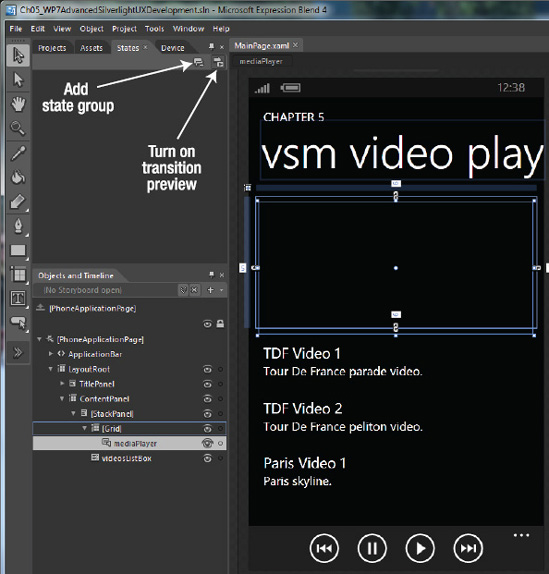
The Visual State Manager (VSM) is a tool available within Expression Blend. It allows the developer / designer to visually define Visual State Groups that represent UI state for controls in that state, represented as a Storyboard. The best way to learn how to work with the VSM is by demonstration, most of which will be in Expression Blend.
This section demonstrates how to create an Orientation-aware application using the VSM. A new project named VSMVideoPlayer is added to the Chapter 5 solution based on the MVVMLight (WP7 Application project template. The project is customized to be a basic video player that can play a list of videos from a recent vacation – videos without ownership rights issues that I can use for this sample.
A Grid containing a MediaElement control named mediaPlayer is added to the ContentPanel Grid. Below the Grid containing the MediaElement, a ListBox named videosListBox is added and the Application Bar is enabled. The Application Bar is wired up to provide video controls for the mediaPlayer MediaElement.
A Model named Video is added to the Model folder and a collection of Video objects is added to the MainViewModel class. Finally three videos are added to a folder named Content and added to the project. Figure 5-20 shows the VSMVideoPlayer project in Expression Blend with the states tab opened.
The videosListBox is data bound to the Videos collection on the MainViewModel. The Grid containing the MediaElement is data bound to the SelectedItem of the videosListBox. The Source property for the mediaPlayerMediaElement is data bound to the Url property of the SelectedItem Video object. Run the project and when you select a video in the videosListBox it plays in the MediaElement. Listing 5-8 shows the XAML for the Content Grid and Application Bar from MainPage.xaml.
Example 5.8. Content Grid and Application Bar Code
<Grid x:Name="ContentPanel" Grid.Row="1" Margin="12,0,12,0">
    <StackPanel d:LayoutOverrides="Width">
<Grid Height="213" DataContext="{Binding SelectedItem, ElementName=videosListBox}">
<MediaElement Source="{Binding Url}" Margin="5,9,7,-9" Name="mediaPlayer" MediaFailed="mediaPlayer_MediaFailed" Stretch="UniformToFill" />
</Grid>
<ListBox x:Name="videosListBox" ItemsSource="{Binding Main.Videos}"
Margin="12,24,0,0" ItemTemplate="{StaticResource VideoDataTemplate}" />
</StackPanel>
</Grid>
</Grid>
<phone:PhoneApplicationPage.ApplicationBar>
<shell:ApplicationBar IsVisible="True" IsMenuEnabled="True">
<shell:ApplicationBarIconButton x:Name="rewindAppBarBtn"
IconUri="/icons/appbar.transport.rew.rest.jpg" Text="rewind"
Click="rewindAppBarBtn_Click"/>
<shell:ApplicationBarIconButton x:Name="stopAppBarBtn"
IconUri="/icons/appbar.transport.pause.rest.jpg" Text="pause"
Click="stopAppBarBtn_Click"/>
<shell:ApplicationBarIconButton x:Name="playAppBarBtn"
IconUri="/icons/appbar.transport.play.rest.jpg" Text="play"
Click="playAppBarBtn_Click"/>
<shell:ApplicationBarIconButton x:Name="ffAppBarBtn"
IconUri="/icons/appbar.transport.ff.rest.jpg" Text="fastforward"
Click="ffAppBarBtn_Click"/>
</shell:ApplicationBar>
</phone:PhoneApplicationPage.ApplicationBar>Listing 5-9 shows the MainPage.xaml.cs code-behind file where the event handlers control the mediaPlayer MediaElement.
Example 5.9. MainPage.xaml.cs Code File
using Microsoft.Phone.Controls;
using System;
using System.Windows;

namespace VSMVideoPlayer
{
  public partial class MainPage : PhoneApplicationPage
  {
    // Constructor
    public MainPage()
    {
      InitializeComponent();
    }

    private void rewindAppBarBtn_Click(object sender, System.EventArgs e)
    {
      if (mediaPlayer.CanSeek)
      {
        mediaPlayer.Position = mediaPlayer.Position - new TimeSpan(0, 0, 5);
        mediaPlayer.Play();
      }
    }
private void stopAppBarBtn_Click(object sender, System.EventArgs e)
{
mediaPlayer.Pause();
}
private void playAppBarBtn_Click(object sender, System.EventArgs e)
{
mediaPlayer.Play();
}
private void ffAppBarBtn_Click(object sender, System.EventArgs e)
{
if (mediaPlayer.CanSeek)
{
mediaPlayer.Position = mediaPlayer.Position + new TimeSpan(0, 0, 5);
mediaPlayer.Play();
}
}
private void mediaPlayer_MediaFailed(object sender,
System.Windows.ExceptionRoutedEventArgs e)
{
MessageBox.Show("Media Failed: " + e.ErrorException.Message);
}
}
}The last item to highlight is that the SupportedOrientations attribute on the PhoneApplicationPage element in XAML is changed from Portrait to PortraitOrLandscape. This allows the page to respond to orientation changes via the PhoneApplicationPage.OrientationChanged event.
Now that everything is configured properly, let's configure the project to support a full-screen mode for video playback in Expression Blend. With the States tab opened in Expression Blend, the Add state group button creates a Visual State Group that can contain one or more Visual States. The Turn on transition preview button dynamically shows the changes when different states are selected at design time.
Click the Add state group button and name the Visual State Group "Orientations." Next, create an "Add state" button to create a Visual State for PortraitUp. Create another state named LandscapeRight. The VSM should look like Figure 5-21.

Figure 5-21 also defines the UI available in the VSM to create states as well as customize the transitions. EasingFunctions provide for a more realistic animation flow. EasingFunctions are literally functions like quadratic, cubic, bounce, elastic, and so on. In general, EasingFunctions are available in Storyboards. Developers can create custom EasingFunctions as well. Think of an EasingFunction as altering the animation speed from a straight line to a curve, where sharp bends represent an increase in speed so that animations appear to better model real world movement with acceleration and bounce. Figure 5-22 shows the EasingFunction selector.
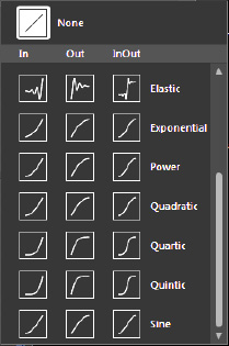
The other buttons shown in Figure 5-22 are transition duration, which represents how long the animation should take in real time, regardless of EasingFunction, and a button to turn on FluidLayout. FluidLayout provides an engine that takes a look at the start state, the end state, and then creates a smooth animation between the states based on the selected EasingFunction. FluidLayout can help make animations created by non-designers look great. Now that we have the Blend functionality covered, let's create our states based on current orientation for the sample project.
Look at Figure 5-21, and you see a state at the top called "Base." When working in Blend previously, you may not have been aware, but this is the visual state that you were working in. "Base" represents the default or initial state. All other state modifications are referenced to the Base state.
Tip
Be sure to select the Base state if you want to make modifications that apply across all states.
In Expression Blend, switch to Landscape in the Device tab and then switch back to the States tab. With the LandscapeRight Visual State selected, select the TitlePanel Grid and set Visibility to Collapsed and set Visibility to Collapsed for the videosListBox as well. For the Grid that contains the mediaPlayer MediaElement set the Height property on the Grid to 480px. The Objects and Timeline window indicates the changes visually in the timeline keyframe editor as shown in Figure 5-23.
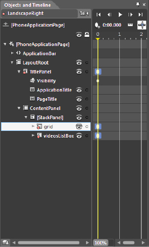
When you run the application, it works as expected when flipped to LandscapeRight, as shown in Figure 5-24.

If you switch the Emulator to LandscapeLeft, the UI remains as the Portrait layout, as shown in Figure 5-25.

You could build another state manually, but an easier option is to right-click on the LandscapeRight state, select Copy State To, and then select New State. Rename it LandscapeLeft, and that is all that's required to have both Landscape Orientation values display correctly.
The Visual State Manager provides a powerful tool to customize transitions and animations via a state-based mechanism. The next section covers the Microsoft Advertising SDK, which supports advertising revenue for both Silverlight and XNA Framework applications.
The Microsoft Advertising SDK provides mobile advertising support for Windows Phone 7. You are not required to use Microsoft's advertising SDK and associated advertising network. If you have an existing advertising network or an in-house creative and sales force, you can continue to use those resources for advertising revenue.
If you are new to mobile applications or simply want a fast and easy mobile advertising solution, the Microsoft Advertising SDK can get you up and running in about 20 minutes and about 50 lines of code. This is explained next.
While Windows Phone 7 is a new platform, Microsoft's advertising solution is not. With the world's first real-time bidding Mobile Ad Exchange with targeted advertising, multiple purchase models and leading resellers including Microsoft's sales force and large-scale adCenter marketplace you can tap into an existing advertising by simply downloading the Microsoft Advertising SDK here:
http://advertising.microsoft.com/publisher
or the direct link:
http://go.microsoft.com/fwlink/?LinkId=198440
Once you have the SDK installed, register on pubCenter at https://pubcenter.microsoft.com link as well to set up your advertising account. You create a software property where ads are displayed, create a mobile ad unit, and set up a targeting category. After registering in pubCenter, you will have an application ID and an Ad unit ID that you can use to request ads from the Microsoft Advertising Servers.
You can also try out the mobile advertising control without signing up to receive test ads, but you will soon want to take advantage of Microsoft's contextual advertising platform with over 20,000 advertisers and resellers to get paid.
You can add the Advertising Control to the Visual Studio Toolbox by right-clicking the Toolbox window and selecting the Choose Items... option and clicking Browse... to this directory:
C:Program Files (x86)Microsoft Advertising SDK for Windows Phone 7
Select the Microsoft.Advertising.Mobile.UI.dll assembly and click OK. You can now drag the control onto your Silverlight UI to add advertising to a page. You can receive test ads using the test Application ID and test Ad Unit ID to get a feel for how the advertising works. There are three types of ads you can receive in your application summarized in Table 5-2.
Even though there is support for a 300 × 50 ad size, it is recommended to always set the size of the AdControl instance to 480px wide by 80px height. For the X-Large Image Banner, the control will automatically size to display the full 300 × 50, centered at the center of the AdControl instance.
The AdControl also has a Location property to receive targeted ads by supplying a Latitude and Longitude value as a Location type. You can use a GeoCoordinateWatcher instance to collect location data as shown in Chapter 3 on input. The AdControl class supports the following events:
AdControlError:Fires when there is a problem receiving or displaying an advertisement.AdEngaged:Fires when the user clicks the ad and the action dialog appears.AdDisengaged:Fires when the user clicks any button in the action dialog to dismiss the dialog.NewAd: Fires when a new advertisement is displayed. Can use to animate theAdControlto catch the user's attention.
In this section, the AdControl is leveraged in a sample project named AdvertisingSLSample. For the Silverlight sample project, start with the Windows Phone Data bound Application project template so that you have some data to display. Next simply drag and drop the control at the bottom of the MainPage.xaml page, adjusting its settings so it just fits across the bottom of the screen.
It is recommended to place the AdControl at the top or bottom of a page. For the Panorama or Pivot controls, you can place the AdControl instance inside or over top of the Panorama or Pivot control. If placed inside either control, the ad will only display in a single pane. You can choose to have a unique ad on each pane if desired. To have the AdControl always visible, even when scrolling, place the instance outside of the Panorama control on top.
Tip
It is not recommended to change the parent control of an AdControl instance at run time.
As you can see, the control is simple to configure. Here is the XAML for the configured ad control in the Silverlight AdvertisingSample project:
<my:AdControl  Height="80" HorizontalAlignment="Left" Margin="-12,527,0,0"
Name="adControl1" VerticalAlignment="Top" Width="480"
AdModel="Contextual" ApplicationId="test_client" AdUnitId="Image480_80" />
Figure 5-26 shows the control in action, using the test configuration in the previous XAML.

We want to grab the user's attention when a new ad is available. One possible way to do that is to create an animation that indicates something happened, such as to make the control increase in size slightly and then return to its original size via a Storyboard animation.
In Expression Blend, create the AnimateAdControlStoryboard resource by clicking the New button in the Objects and Timeline window. Add a keyframe at zero time and then slide the yellow timeline over to 100 milliseconds. Click on the Transform section in the Properties window for the AdControl and switch to the Scale transform tab. Change X and Y to 1.1 from 1. Slide the yellow timeline bar to 200 miliseconds, right-click the first keyframe at zero seconds and then right-click and select paste.
Switch back to Visual Studio and create an event handler for the NewAd event on the adControl1 instance and then add this code:
AnimateAdControl.Begin();
For a multi-page application, it is recommended to unload the control when a page is unloaded to minimize resource consumption. This can be done in the PhoneApplicationPage.Unloaded event handler. Simply set the AdControl instance to null.
Although this chapter is focused on Silverlight UX, the next subsection covers how to add advertising support to a Windows Phone 7 XNA Framework-based game.
Adding support for the AdControl in a Windows Phone 7 XNA Framework application is just as easy. Start by adding a reference to the Microsoft.Advertising.Mobile.Xna.dll assembly located in the C:Program Files (x86)Microsoft Advertising SDK for Windows Phone 7 directory in the Chapter 5 Solution AdvertisingXNASample project.
Next add a using Microsoft.Advertising.Mobile.Xna; statement to game1.cs. Next add an AdManager and Ad object are added as private members of the Game1 class:
AdManager adManager;
Ad bannerAd;
In the constructor for the Game1 class, instantiate the adManager and add it as a component to the Game.Components collection:
adManager = new AdManager(this, "test_client");
adManager.TestMode = true;
Components.Add(adManager);
Notice that the same application Id, test_client, is used as before for the testing functionality. Finally, we want to load an ad, which is done in the LoadContent() method where all game assets are generally loaded for most games.
bannerAd = adManager.CreateAd("Image300_50",
  new Rectangle(10, 390, GraphicsDevice.Viewport.Bounds.Width, 120),
  RotationMode.Manual, false);
That is all that is required to ad advertising to a Windows Phone 7 XNA Framework game. Figure 5-27 shows the results.
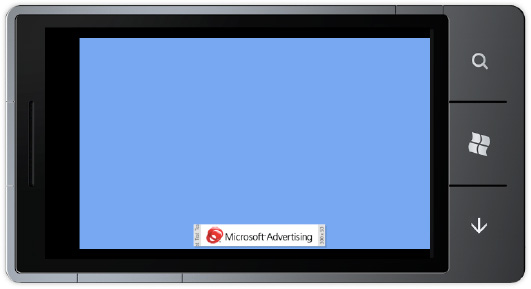
As you can see from this section, adding support for Advertising revenue to your applications is very straight-forward. For a free or trial application, advertising revenue is a great way to get paid for your hard work.
This chapter began with an overview of the Model-View-ViewModel pattern, which is the architecture to use in XAML based applications. We next moved on to covering one of the third-party MVVM frameworks that improve upon the built in support for MVVM when building property architected applications.
This was followed by a discussion of the Silverlight for Windows Phone toolkit, including coverage on all of the major controls including detailed coverage on the LongListSelector control as well as on page transitions. We then explained how to use the Visual State Manager in your applications to greatly simplify UI development.
The coverage on advertising concludes Chapter 5 on advanced user interface development. The next chapter covers advanced programming model topics that allow you to more deeply integrate with Windows Phone 7, leverage media, as well as other topics.