
When working with CSS, there are fundamental concepts that the developers should be aware of and understand intimately, but that tend to be overlooked or even ignored. Knowing these concepts in depth will mean that the CSS created will be better planned, bugs will be easier to avoid, and style sheets will be, in general, simpler, cleaner, and easier to maintain.
CSS is usually regarded as a relatively simple language to understand (its syntax is intuitive and easy to follow, even for someone who has never written a single line of CSS). But CSS authors need some experience to code complex CSS layouts that won't break in less-compliant browsers and at the same time keep their style sheets clean and flexible.
In an ideal world, all the visitors to our websites would use the latest browser, and we wouldn't need to litter our CSS documents with hacks, conditional comments, and workarounds: everything would work everywhere. We don't live in an ideal world, and because we have to deal with all sorts of browser inconsistencies, our CSS documents end up looking far from how we would like them to. A result of dealing with high-traffic websites is that our visitors will be using a wide range of browsers, from the latest beta releases of obscure browsers to the older versions of IE.
Note
The more traffic you have, the greater the likelihood of visits from more obscure devices. Your company should discuss internally which you support and which you don't, but it is important to understand that (for example) if only 0.5 percent of your users use IE 5 and your site was receiving 20 million hits per day, your site would be receiving 100,000 hits per day from users using IE 5! This is not an insignificant figure and should be considered carefully.
It is important to put into practice guidelines that cover how to best deal with these situations and also make sure that the members of the team are familiar with how CSS works fundamentally. Taking this step may mean a longer adaptation period for new staff, but you should recognize that guidelines will never cover all possible situations or browser bugs, and coders will be faced daily with making decisions that will influence the effectiveness and performance of your website(s). This extra training and knowledge within your team can only be a positive thing that empowers the team to better understand CSS and write good code, and it will be shared outward in a halo effect.
In this chapter, you will:
Learn about important CSS concepts such as the cascade, importance, inheritance, and specificity
Understand the importance of encoding and how to implement localization
Learn about the best way of dealing with hacks
Discover whether server-side user agent detection is a good idea
Look at examples of browser inconsistencies and how to best deal with them
Knowing how the cascade works is fundamental to building flexible and robust style sheets. By disregarding these basic notions or by just adding rules ad hoc as the need arises without considering how they will affect each other, you would complicate your websites' CSS exponentially with each addition. You would be producing larger files, increasing redundancy, and making them more difficult for developers to understand or to further augment. Having a solid understanding of the underlying theory of the workings of CSS will empower you and your team to make the best decisions possible in order to keep style sheets simpler to maintain.
The notion of "cascading" is at the very heart of CSS. It is the process that determines which CSS rules will affect which elements, giving each rule a specific weight and priority. When everything is taken into account, rules with more weight will take precedence over those with less weight in cases where more than one rule applies to a particular element.
In order to attribute a weight to the rules, the cascade relies on three aspects: importance, inheritance, and specificity. If two or more rules that target the same element end up having the same weight, the one that comes last will win out over those previous. The same applies to properties that are repeated within the same rule (the property value that is defined last is the one that is applied).
In this section, we will be covering origin, importance, and inheritance; whereas specificity is complex enough to have its own separate section afterward.
Style sheets from three different origins can affect a Web page:
User agent style sheets (see Figure 3-1) are those present by default in the user agent (the device the user is using to access our code, typically the web browser). Even though when we open an HTML file with no CSS files linked to it, it appears to be unstyled; in fact, it is styled by the user agent style sheet. This is the style sheet that adds the typical blue to unvisited links, purple to visited links, different font sizes for different types of headings, and so on.
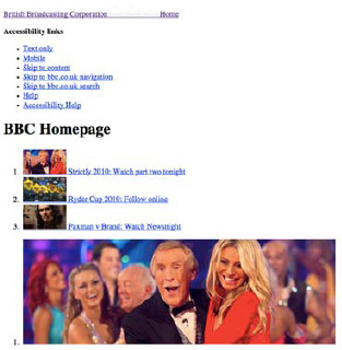
Figure 3-1. The homepage of bbc.co.uk with only the user agent style sheet applied (that of Firefox, in this instance).
User style sheets (see Figure 3-2) can be, for example, style sheets applied to a page based on the user's browser preferences, such as a larger font or a specific font family, for easier reading.

Figure 3-2. The front page of Wikipedia with a user style sheet applied: in this case, the user style sheet ensures that the text on any website is never smaller than 18px.
User style sheets can also be CSS files created by the user that the browser will read in order to change the design or details of a specific site. In this case, the external files are usually stored on the user's machine and referenced by the browser.
By default, author style sheets override user style sheets, which in turn override user agent style sheets. There is a way, however, to make user style sheets have more weight and override author declarations. This can be achieved using the !important declaration, which ensures that, no matter what, the user will always have the final say on how the pages will be displayed.
The !important declaration is used on a property-by-property basis, and it can be applied to inline, embedded, or external style sheets:
p {
   color: black !important;
}
p {
   color: red;
}
In the preceding example, because we are using the !important declaration, the first rule will be the one applied to the p element, even though the second rule comes later and has the same specificity (see the next section for more details on how to calculate a selector's specificity).[14]
!important should be used with care in author style sheets and avoided if possible since it will interfere with the specificity of the rules and make way for overly specific and complicated CSS.
Let's look at the following example, where the user hides an advertisement bar on a website:
#myfavoritesite .advertbanner {
   display: none !important;
}
User style sheets with the !important declaration will always override style sheets from any other origin, so in this case the user can be sure that the advertisement bar won't be displayed.
In order to make it easier for users to inject their own CSS rules into specific websites, some developers add an ID to the body element of their pages, or even go further than that by adding both site-wide IDs and page-by-page classes, so that users can easily point to specific pages if needed.
Author style sheets are those created by CSS authors, provided in the actual page returned by the server. They can be inline within the markup (using the HTML style attribute), embedded on the page (using the HTML style tag), or linked externally (using the HTML link tag or @import rules).
After adding !important to the mix, we are left with the following different types of declarations, from most to least important:
User declarations marked as important
Author declarations marked as important
Author declarations
User declarations
User agent declarations
The W3C definition of inheritance states that "Inheritance is a way of propagating property values from parent elements to their children" (www.w3.org/TR/css3-cascade/).
This means that some CSS properties are by default (or can be forced to be) inheritable by child elements.
Let's take a look at a typical scenario:
body {
   color: #111111;
   padding: 20px;
}
In the preceding example, the color property will be inherited by the elements that are children of the body element, so headings, paragraphs, lists, and other pieces of text will be dark grey ("#111111"). The padding property, however, will not be inherited; if we place a div or a paragraph inside the body element, they will not inherit a padding of 20 pixels.
These are examples of how inheritance works. In the first case, color, it makes sense that it affects the parent element's children; besides producing much larger files, it would be tiresome and inefficient to have to declare the color of every single element inside the parent. On the other hand, it would also be tiresome to override the 20 pixels of padding were they inherited by its children.
The W3C has a list of all CSS2.1 properties on its website, www.w3.org/TR/CSS21/propidx.html, which states whether they are inherited by default or not, initial (default) and possible values, and other characteristics.
Inheritance makes sense for the elements that do inherit by default, but it can also be forced for elements that don't by using the "inherit" value.
Let's say you wanted the section elements inside the aside parent to inherit its margin value:
aside {
   margin: 10px;
}
aside section {
   margin: inherit;
}
Using this CSS, every section element inside the aside element will now have 10 pixels of margin.
The way the user agent processes inheritance is explained in the W3C specification:
"The final value of a property is the result of a four-step calculation: the value is determined through specification (the 'specified value'), then resolved into a value that is used for inheritance (the 'computed value'), then converted into an absolute value if necessary (the 'used value'), and finally transformed according to the limitations of the local environment (the 'actual value')" (www.w3.org/TR/CSS2/cascade.html#value-stages).
According to the specification, these are the four values that the cascade looks for, in this order, to determine the final value of a property:
Specified value: The user agent determines whether the value of the property comes from a style sheet, is inherited, or should take its initial value (which is the value stated in the property specification).
Computed value: The specified value is resolved into a computed value and exists even when a property doesn't apply. The document doesn't have to be outlined at this stage.
Used value: The used value takes the computed value and resolves any dependencies that can only be calculated after the document has been drawn (for example, percentages).
Actual value: This is the value used for the final rendering, after any approximations have been applied (for example, rounding a decimal value to an integer).
The value used when calculating inheritance is the computed value. This value exists even if the property hasn't been declared in the CSS, making it possible to force inheritance even if the parent element doesn't specify the property.
Let's take a look at the following example:
HTML:
<body>
   <p>To find what you are looking for visit <a href="http://google.com">Google</a>.</p>
</body>
CSS:
body {
   font-family: Arial, sans-serif;
   font-size: 12px;
}
a:link {
   color: inherit;
}
If we hadn't specified a color for our link element ("a"), we would have been presented with the default blue from the browser (user agent) style sheet. Although we haven't specified a text color for the body element, when using the "inherit" value for the color property of the unvisited link selector ("a:link"), it will use the parent's computed value. In this case that is the initial value, which for the color property depends on the user agent (as stated in the W3C's property specification), but tends to be #000000 (black).
The "inherit" value is not commonly used, but it can be helpful in situations like the example above, when the child's properties are dependent on the parent's in such a way that it is easier to create a dependency than explicitly stating a value.
One of the reasons that the "inherit" value is so rarely used in practice is that it is not supported by versions of IE prior to version 8, except for the "direction" and "visibility" properties. It should be employed when the advantages of using it (for example, when it adds greater flexibility, making updates to the CSS quicker to do and less prone to mistakes) supersede any rendering differences that may occur in using it.
The opposite of the "inherit" keyword is the "initial" keyword, introduced in CSS3. This value allows you to cancel inheritance by specifying the initial value of that property (as stated in the property's specification) instead of the inherited one. This property is only supported, however, by Firefox (using the -moz-initial keyword) and WebKit.
The universal selector ("*") matches any single element in the document tree (notice the use of the word single here, as it will not match a combination of two or more elements, or zero elements). When used imprudently, it can break inheritance and easily transform a style sheet into an inheritance and specificity nightmare.
Take the following example:
HTML:
<section>
   <header>
      <hgroup>
         <h1>Main title</h1>
         <h2>Secondary <i>title</i></h2>
      </hgroup>
   </header>
        ...
</section>
CSS:
section header * {
   color: red;
}
section header h2 {
   color: black;
}
The first CSS rule, which includes the universal selector, targets any and every element inside the header element, be it a direct child, grandchild, or deeper. With the second CSS rule, the expected behavior would be that any element inside the h2 should be black. But what happens if we have another element within h2 is that, because the initial rule is targeting any element within header, it will be the same as stating the following:
section header h2 i {
   color: red;
}
Because this selector is more specific than "section header h2", the final result will render the word "Secondary" in black, but "title" in red (see Figure 3-3).

Although, at first, using the CSS universal selector in this scenario might have seemed like the safest option to make sure every element had the desired color, saving precious lines of code, this is not an example of robust CSS. It is instead an example of how breaking inheritance can lead to unnecessarily complicated, unpredictable, and verbose style sheets—exactly what we want to avoid in a high-traffic website where many individuals may be working on many files.
Specificity needs to be carefully considered and planned for when working with CSS, and this is even truer when dealing with large CSS files that have frequently overridden and imported style sheets, as tends to happen in high-traffic websites.
It is a good rule of thumb to start developing a CSS file using more generic selectors, increasing specificity as you go where appropriate. Working the other way around is a lot harder and will invariably lead to overly specific selectors that cannot be reused and to unnecessarily long and inflexible style sheets.
Relying on the order of selectors makes the style sheets you create more fragile (this subject is further expanded upon in Chapter 4) and can lead to unnecessary redundancy. When you need to override a rule, you will create a new one later in the file, and this will happen several times until you've repeated the same thing over and over again. If for some reason the order is changed, the properties you wanted to be applied to the element (the ones that used to come last) won't be applied anymore because they were dependent on the order of the selectors. Relying on specificity rather than on the order of selectors will make style sheets easier to edit, maintain, and potentially refactor, as well as more robust.
Specificity of selectors can also have an impact on a website's performance, as parts of selectors are unintuitively evaluated from right-to-left and more specific/complex selectors incur greater hits when querying the DOM (Document Object Model). You can read more about this in Chapter 8.
It is ultimately your decision and a byproduct of how modular and flexible you need your CSS to be whether you need to, at a deeper level, use highly specific rules or not, but specificity should be a fundamental concern in the way your team plans its style sheets.
When assigning a weight to a CSS rule, the cascade will first sort them according to their importance and origin (as seen in the previous section). If rules have the same importance and origin, they will then be prioritized by their specificity: a more specific selector will override a less specific selector. Finally, if two selectors have the same origin, importance, and specificity, the one that comes later in the style sheet will take priority over the preceding one. This also applies to single properties, so if in the same rule the same property is declared more than once, the last declaration will override those previous to it.
Because imported style sheets (using the @import declaration) have to be specified before the other rules, when there are other nonimported rules with the same weight in the rest of the CSS file, the imported ones will be overridden (their precedence is lesser because of the order of the selectors).
To calculate specificity, according to the W3C specification (www.w3.org/TR/css3-selectors/#specificity), we use four representations of numbers (a, b, c, and d) of descending importance, where
a equals 1 if the declaration is within a style attribute; 0 if not
b equals the number of ID selectors
c equals the number of attribute selectors, classes, and pseudo-classes
d equals the number of element names and pseudo-elements
Non-CSS presentational markup, such as the font attribute, will be attributed a specificity of 0.
Based on this list, the following selector has a specificity of 1,0,0,0 (a=1, b=0, c=0, d=0):
<section style="padding-bottom: 10px;">
Because it is inline CSS, "a" equals 1, and the rest of the numbers equal 0. Bear in mind that even if a rule that was linked to rather than inline had 10 ID selectors within it (thus having a specificity of 0,10,0,0), it would still have less precedence than the selector above—specificity doesn't use a base ten (or decimal) system in its calculations, but rather base infinite: if "a" equals 1, the rule will always take precedence over those where it equals 0.
This more complicated selector will have a specificity of 0,0,1,3 (a=0, b=0, c=1, d=3):
article section h1.title {
   ...
}
Since it's not inline, "a" equals 0, "b" equals 0 because there are no IDs, "c" equals 1 because it has one class selector, and "d" equals 3 because it has three element selectors.
Calculating specificity based on the list provided may seem daunting, but the truth is that, with some experience, it is fairly easy to look at a selector and tell whether it is more or less specific than another one (perhaps it has one or two ID selectors or another obvious hint like that). While writing CSS, you should be careful not to create highly specific selectors where they aren't necessary and whenever a trickier situation arises, tools like Firebug or Safari Web Inspector will be there to help you understand how specificity is being applied by showing you the rules in order of specificity (with the more specific rules at the top) and striking through the properties that have been overridden by more specific rules. You can read more about these in Chapter 10. There are two important things to remember, though: inline CSS has higher priority than embedded or linked CSS, and one ID selector will win out over any number of class, attribute, or element selectors.
Using the !important declaration on shorthand properties is the same as redeclaring each subproperty as important (even if that means they are reverted to their initial (default) value).
For example, suppose that we have the following selector:
h1 {
   font-family: Georgia, serif;
   font-size: 18px;
   font-style: italic;
}
And later in the style sheet we declare the following:
h1 {
   font: 18px Arial, sans-serif !important;
}
The result will be the same as having the following:
h1 {
   font-style: normal !important;
   font-variant: normal !important;
   font-weight: normal !important;
   font-size: 18px !important;
line-height: normal !important; font-family: Arial, sans-serif !important; }
This happens because the properties that are not specifically defined within the !important declaration (in this case, font-style, font-variant, font-weight, and line-height) are reverted to their initial values (indicated in the property's specification), even if they had been declared in a less specific rule (like font-style: italic in this instance).
There are situations where highly specific selectors are necessary. For example, when creating widgets or code snippets that are to be used across a wide range of pages, subsites, minisites, or even third-party sites, it is common practice to namespace that part of the code, which in CSS means basically to isolate it using a specific class, ID, or prefix to class or ID (we covered namespacing in more detail in Chapter 2). It is also common to namespace an entire page in order to style it differently; in this case, we would add an ID or a class to the body element, such as:
<body class="home">
It is important to acknowledge, though, that while this is a common and easy way of creating different styles for different pages or sections on a page, it will influence specificity. When targeting these pages or code snippets within our CSS, we will have to introduce a class or an ID to the rule, increasing its specificity and thus making it harder to be overridden. For example, to make the h2 headings in the page that we had attributed the class "home" bigger than in the rest of the site, we could have the following set of rules:
h2 {
   font-size: 24px;
}
.home h2 {
   font-size: 36px;
}
In the previous example, the rule would be applied even without the class since the rule would have the same specificity but would be declared later. This, however, would be relying on order, which is counterproductive since it will fail if the order of the rules is changed (you can read more about this in Chapter 4).
If for some reason we need to override this setting again, within the homepage, we will need to, for example, add a class to a specific heading and create a more specific rule:
.home h2.highlight {
   font-size: 30px;
}
This can create a snowball of overly specific rules that will invariably lead to unnecessarily complicated CSS. The trick here is to plan carefully for these situations, which happen more frequently as more variations of certain elements and designs are needed throughout the website(s) and can be aggravated when there isn't a design library in place, or there is one but it is not frequently updated (you can read more about design libraries and maintaining design consistency in Chapter 5). You should have an adaptable style sheet in place and a set of guidelines on how specific developers should be for particular cases—constant overriding of highly specific selectors is not conducive to creating flexible CSS, but avoiding classes and IDs when they are the more efficient and robust solution is also not an option for high-traffic websites.
Using tools such as Firebug (see Figure 3-4) or Safari's Web Inspector (see Figure 3-5) makes it easier to understand which properties are taking precedence and overriding others. These tools can also show user agent style sheets and computed values, even if they haven't been declared on the CSS.

This doesn't mean it is not important to understand how the cascade works, but it makes the process of debugging less painful. You can read more about this in Chapter 10.
Although rarely an issue with CSS, it is worth mentioning that character encoding can cause issues with CSS files (and others), and when the issues do occur they can be a very real problem and potentially difficult to isolate. Typically, files will be saved on your machine in the default locale encoding, which is ISO-8859-1 for Western countries using Latin character sets. This character set does not support many characters such as accented characters or unusual symbols. There are really only three places that this could cause a problem:
Using pseudo-selectors that add content such as
:afteror:beforeReferencing images or files with unusual characters in their paths
Comments that may include unusual characters
Although there are (very small) increased file size implications in using Unicode character sets, sticking to UTF-8 can avoid painful compatibility problems, help keep your documents more readable, and avoid issues with localization and escaping characters. If you are likely to be escaping many characters, this will actually save on characters and file size. Refer to www.w3.org/International/questions/qa-escapes for more information on why you should avoid escapes.
Consider this carefully, and include it in your CSS formatting guide. If there is any chance you will be using characters not included in your default character set, we recommend using UTF-8.
If your site needs to work within an array of different countries, localization is likely to become an issue. For dynamic content generated by a Content Management System (CMS) or other means, your text may be of an unpredictable size. German and Mandarin in particular are very verbose languages. There are two ways to deal with this.
Firstly, you can build every container to be fluid and change size dependant on its content. This may be achievable in some instances, but in many it can become impractical.
Secondly, you can give your CSS some kind of hook particular to certain country and language combinations. You could use server-side code to include an extra style sheet for those particular countries and languages after your primary style sheets so that you can implement overrides for them, something like this:
<link rel="stylesheet" href="css/en-gb/overrides.css" />In this instance we have used a subfolder with a particular naming convention. We've used the ISO 639-1 standard for language codes—"en"—(http://en.wikipedia.org/wiki/ISO_639-1), which is simple and succinct; then a hyphen; and finally the ISO 3166-1 alpha-2 standard for country codes (http://en.wikipedia.org/wiki/ISO_3166-1_alpha-2)—"gb".[15]
This method incurs a performance hit, since there is an extra request, but it also ensures we do not try to cater for all countries and languages in a single file which would be inefficient. Another downside is that our rules are disparate, and we would have to maintain many files; when amending CSS for our primary language we might forget to amend the corresponding rule for the other countries and languages.
Another way to target these languages is to add classes to the html or body tags, like so:
<html class="en-gb">
This makes it easy to target pages in this language specifically, and keep all of our CSS in one place, but has the downside of making for very verbose and inefficient CSS, since we might be serving a great deal of code to users that will never use it. For this reason, we recommend the first method, and using comments in the primary style sheets to remind our developers that other files contain references to the same rules.
Another localization consideration is that some languages flow from right-to-left (RTL) rather than left-to-right (LTR). For these, you will almost certainly need to use a different template so that your markup is in the correct order, and then you can use the methods detailed above in tandem with this to ensure everything looks and reads as it should.
Tip
Using the accept-language HTTP header, you can often detect the language of the user's device and return their content in the correct language, which is a nice touch that they will appreciate. You can also detect their location based on their IP address, but this is often inaccurate. The geolocation API in HTML5 (http://dev.w3.org/geo/api/spec-source.html) is much more accurate, but not yet well supported.
As mentioned before, sticking to UTF-8 for your CSS and markup files will save you many headaches, but you may need to implement other character sets for particular countries depending on your requirements.
Working on large-scale and high-traffic websites is usually synonymous with having to cater for a wide array of browsers. Not everyone will be using the latest version of the most modern browsers, and it is often the decision that users should not be punished for a handicap that is probably not their fault.
Depending on which browsers the organization chooses to support (see more on graded browser support in Chapter 6), there will almost always be the need to target specific CSS at browsers that are not fully compliant, such as IE 7 or below.
There are various ways in which this can be implemented. Depending on the level of support that is necessary for such browsers and on the website design itself, the differences between the main CSS file and browser-specific ones may vary from a few adjustments on a couple of properties to many selectors that could deserve their own separate CSS file.
Opinions are divided. Advocates of separate style sheets present the argument that this will help keep the main file valid and free from hacks, making it also easier to later remove the browser-specific files. Others will say that it is not practical to update two or more different style sheets and that validation should only be a tool, not a goal. Some will even argue that because when we are dealing with browser specific CSS we are very often resorting to hacks—and hacks are "ugly"—these "stains" on our style sheets shouldn't be quarantined, but rather obvious and easy to spot. Having more CSS files has implications for performance that you can read about in Chapter 8. It is up to your company to decide which stance to take, as both have their own benefits.
Where you have a small amount of specific fixes for (for example) IE 6 and 7, it is typically most efficient to include hacks for these browsers alongside the default property declarations with comments explaining their use. Keeping the properties and their hack counterparts side by side makes it obvious that when updating one, you should update the other. Using external style sheets to apply small changes (even for a minority) incurs large performance hits for the users of those browsers and is rarely the most performant way to address this. However, if a large number of hacks need to be used, and the traffic to your site from the browsers you are targeting is minimal or unimportant to the purpose of your site, penalizing these users in order to give your main demographic a better experience may be preferable.
You should pay close attention to the reporting tools you have available for your site(s) and be very aware of the browsers and devices that are most relevant to you. With these figures in mind, you should measure HTTP performance with the hacks in your usual CSS as well as in separate style sheets to get a good idea of the pros and cons of each approach. Some people advocate placing very small hacks inline in the page within conditional comments, but we do not recommend this approach as it encourages disparate code (similar code in many different places) and removes the control over caching that you would have with individual files.
If the number of hacks in a CSS file accounts for more than 20 percent of the total code (after minification, concatenation, and so on) or greater than 50 KB, it would probably be practical to move the code into an external file, both for performance and considerations of bandwidth. If using separate style sheets it is very important that these be concatenated so that users are served as few extra files as possible.
As we have stated many times before, the most important thing is that a conversation takes place, a decision is made, and the decision is implemented consistently. There are other methods of targeting CSS at specific browsers and devices, though, as discussed in the following text.
There are several ways to make CSS properties and selectors only visible to one (or more) browser(s) and also to hide them from certain browsers.
We will not list these techniques extensively, but we will mention some of the most commonly used ones so you can have an idea of what they look like and what they achieve. There are several resources online, starting with Wikipedia (http://en.wikipedia.org/wiki/CSS_filter), that feature complete catalogs of these hacks since they are now well known and thoroughly documented.
Generally accepted as the first-ever CSS hack, the box model hack is used to serve different measures to IE 5 and 5.5, due to their broken box model (hence the name). We explain the IE box model further on in this chapter. Because of a browser parsing bug, only the first width (from the following example) is processed. Compliant browsers will understand both width values, overriding the first with the second one:
.box {
   width: 600px;
   voice-family: ""}"";
   voice-family: inherit;
   width: 560px;
}
html>body .box {
width: 560px;
}The voice-family property is used so it doesn't affect screen style sheets. A browser that doesn't have the parsing error will read the first voice-family value as "}", while one that has the parsing error will instead interpret that the whole rule ends with the closing brace that is included in the voice-family value, ignoring everything that follows. The second voice-family property is there so that in the unlikely event that a file named "}" actually exists, that value that can be overridden. The second rule exists for browsers that also experience the parsing bug, but that have a correct box model. IE 5 and 5.5 ignore it since these browsers don't understand the child selector (represented by ">").
We can feed version 6 of IE and below with different property values by prepending an underscore to the property name, as such:
#logo {
   background-image: url(logo.png);
   _background-image: url(logo.gif);
}
Because beginning a property with an unescaped underscore is invalid CSS, other browsers will ignore the second property. IE 6 (and lower) on the other hand, deals with the underscore by ignoring it and parsing the property as normal, replacing the first value with the second.
The star hack targets IE 7 and below. It turns out that IE 6 treats an asterisk in exactly the same way as it treats an underscore. Because the faulty treatment of the underscore gained so much attention, in IE 7 Microsoft made the browser treat the underscore correctly. However, it didn't fix the asterisk. By prefixing the property name with an asterisk, it will be ignored by all other browsers, working almost in the same way as the previous hack (the underscore hack):
section {
   width: 860px;
   *width: 960px;
}
This inconsistency makes it possible to target IE6 and IE7 separately like so:
section {
   width: 860px; /* all browsers */
   *width: 960px; / IE7 and below */
   _width: 1060px; / IE6 and below */
}
Because the last rule always takes precedence, for browsers that interpret properties beginning with an underscore (IE 6 and below) the previous property is overridden.
Because IE 4 to 6 incorrectly include an invisible mystery element in the DOM before the root html element, by using the star html ("* html") hack, you can target these specific browsers in a rule:
* html h1 { background-image: url(logo.gif); }Since no elements exist before the html element in any other browser, all other browsers will ignore this entire selector and all of its properties.
IE 6 and older versions do not understand the child selector (represented by ">"). We can therefore use it to hide rules from those browsers. For example, the second rule in the following block of code, where we apply a transparent PNG background to a div (unsupported by IE 6), will not be read by IE 6, making it use the plain background color stated previously:
div {
 background-color: #dd4814;
}
body> div {
 background-image: url(orange.png) no-repeat;
}IE for Mac has its own idiosyncrasies (although it is no longer in common usage). This browser chose to (against the spec) let you escape asterisks within comments with a backslash. We can take advantage of this fact in that this browser doesn't understand that a comment is closed if written in a certain way, thus not reading the CSS that is placed between the escaped character and the normal comment:
/* IE for Mac doesn't understand this comment is closed */
(anything between the comments won't be read by IE for Mac)
/* IE for Mac will continue reading the CSS file after this comment */
The last IE for Mac's release dates back to 2003, and Microsoft dropped support for this browser in 2005, so traffic from this browser is unlikely to be a concern.
Although we don't like to encourage the use of these so-called "filters," we understand that they may be useful in certain situations, and that using them instead of spending hours trying to work around the problem's origin may be a necessity due to time or budget constraints. Another way of separating browser-specific CSS is by using conditional comments, usually regarded as a cleaner solution. We cover conditional comments later in this chapter.
CSS expressions (or dynamic properties) were introduced in IE 5 and are supported up until version 7 (or 8 and 9, when rendering in compatibility mode). By placing JavaScript within an expression, we can return different results depending on environment or other factors.
A simple CSS expression (bear in mind that this is JavaScript, and as such the syntax is not in scope for this book) to concatenate two strings is as follows:
aside {
   width: expression("320"+ "px");
}
This is the same as having the following:
aside {
   width: 320px;
}
In the following example, the expression checks whether the body width is narrower than 1200 pixels; if that's true, the width is set to "1200px", if not, it is set to "auto":
#container{
   width: expression((document.body.clientWidth > 1200) ? "1200px" : "auto");
}
CSS expressions are resource-intensive and can seriously hamper the performance of a website. Yahoo!, on its High Performance Web Sites Rules series, lists rule 7 as "Avoid CSS Expressions," arguing that "Not only are they evaluated when the page is rendered and resized, but also when the page is scrolled and even when the user moves the mouse over the page." (http://developer.yahoo.net/blog/archives/2007/07/high_performanc_6.html).
Some expressions can have a stronger performance hit than others, so performance testing is always recommended (as with all JavaScript), as there may be a case where using one CSS expression is the fastest and most efficient solution for dealing with browser inconsistencies.
Another downside of CSS expressions is the fact that they are reliant on JavaScript to work, which is far from ideal since we are actually dealing with CSS, and the user may have JavaScript disabled. Seeing that we are creating a JavaScript dependency, our advice is to move these to JavaScript, keeping the CSS free from CSS expressions and avoiding the toll on performance that comes with them.
There are few cross-browser cases that actually require JavaScript to resolve, and an event-driven solution like CSS expressions is as subtle a solution as a brick wall on a motorway. Unless you have a really strong case for using them and it is a final resort, we would recommend against it.
Browser-specific CSS doesn't just mean handling deficient IE renderings and working around its quirks. It may also include having vendor-specific properties to create more advanced effects that are in line with the latest CSS developments or not yet part of any specification.
For example, the syntax to create CSS border-radius needs to be written for browsers that have implemented the property in an experimental (and often incomplete) fashion, using its vendor-specific versions along with the official specification:
.box {
   -moz-border-radius:  4px
   -webkit-border-radius: 4px;
   border-radius: 4px;
}
In this example, we are basically stating the same thing three times in order to cater for the widest range of browsers possible. We have included the property as it is mentioned in the specification last, so when all browsers eventually implement it, it will still work, and the correct standards-compliant implementation will override the vendor-specific version.[16]
This results in a non-valid CSS file, since vendor-specific extensions are still parsed as errors by CSS validators (although some voices have risen to have this behavior changed). Bear in mind, though, that the use of these vendor-specific extensions by browser manufacturers is standard practice, anticipated in the W3C specification, where it is stated that "property names beginning with '-' or '_' are reserved for vendor-specific extensions" and that they are "guaranteed never to be used in a property or keyword by any current or future level of CSS" (www.w3.org/TR/CSS21/syndata.html#vendor-keywords). There should be no conflicts between vendors since it is very unlikely that two of them will choose the same prefix. It is possible (and not unlikely), however, that the implementation of these experimental properties may change while they're still in this "testing" phase—keeping up to date with the latest news from the W3C CSS Working Group is a good idea if you don't want to be caught by surprise.
Here is a list of the most commonly used vendor-specific prefixes:
-mozo

-webkito
-appleo
-mso
-oo
-khtmlo
Notwithstanding that these properties are non-valid, vendor-specific CSS, they can't be qualified as hacks or workarounds, and they work as support for properties that are likely to be part of final specifications. Confining them to their own separate style sheet could prove a misstep in the search for efficiency: when one of the properties needs to be changed, all the others also need updating—the back and forth can be daunting. Also, again, the more individual CSS files there are (and therefore HTTP requests), the greater the performance hit.
Other solutions, such as relegating these vendor-specific properties to a separate section within the main CSS file, making them easier to find (and therefore, easier to delete if the need arises) might be a better labor-saving solution, although it results in duplicated selectors that are less efficient and can be more difficult to manage.
Rather than using hacks or other methods to only serve particular CSS to certain browsers, we are encouraged to use capability detection since this is a future-proof and sane method of targeting that is not dependent on bugs or easily overridden and spoofed properties. Media queries allow the creation of CSS that is dependent on the capabilities or features of the device that is being used to view the website. For example, you can write CSS that is only to be displayed on devices with monochrome screens, or a small viewport, printers, or even a combination of two or more features. Media queries don't target specific browsers, but rather the capabilities of the device that the website is being displayed on.
Media queries can be applied in three different ways:
Here is an example of a media query embedded directly in the style sheet, alongside the rest of the CSS:
@media screen and (max-width: 320px) {
   aside {
      float: none;
   }
}
You can import a different file from the style sheet using the @import rule:
@import url(320.css) screen and (max-width: 320px);
And finally, a media query inserted in the link tag within the head of an HTML document:
<link rel="stylesheet" media="screen and (max-width: 320px)" href="320.css" />
Media queries are often cited when creating mobile versions of websites, but there are other factors apart from pure design that you should consider. Using media queries doesn't necessarily prevent images from being downloaded.[18] In fact, when using the link tag style sheets will be downloaded regardless of the media attribute, although they may not be applied. While media queries can be applied to create quick mobile versions of a website, when dealing with high-traffic websites, performance and accessibility considerations (a great deal of mobile devices still don't support media queries) will probably (and should) be at the top of the list and may invalidate the use of them for the most part. We talk about media queries in great detail in Chapter 7.
Conditional comments were introduced in IE 5 and are specially formatted HTML comments that allow targeting of specific versions of the Microsoft browser. They can be wrapped around another block of HTML and will effectively hide it from the browsers that are not being targeted.
A conditional comment can be used to target one specific version of IE:
<!--[if IE 8]>
        <link rel="stylesheet" href="ie8.css" />
<![endif]-->
In this case, the ie8.css file will only be requested by IE 8.
It can be used to target versions lower or greater than a particular version number:
<!--[if lt IE 7]>
        <link rel="stylesheet" href="ie6.css" />
<![endif]-->

<!--[if gt IE 7]>
        <link rel="stylesheet" href="ie8.css" />
<![endif]-->
In the first example, we are targeting IE versions from 5 to 6 (lt stands for "less than"). In the second example, we are targeting versions above but not including 7 (at the time of writing, that would include IE 8 and 9), using the gt operator ("greater than").
It can also be used to target versions lower or greater than a particular version, but including the one specified, like so:
<!--[if lte IE 6]>
        <link rel="stylesheet" href="ie6.css" />
<![endif]-->

<!--[if gte IE 7]>
        <link rel="stylesheet" href="ie7.css" />
<![endif]-->
The first example targets IE versions from 5 to 6, using the lte operator ("less than or equal to"). The second targets all versions above and including IE 7 (gte stands for "greater than or equal to").
It is also possible to use the NOT operator ("!", as used in many programming languages) in order to hide the comment from one or more browser versions. The following conditional comment will be ignored by IE 5, but not by other versions of IE:
<!--[if !(IE 5)]>
        <link rel="stylesheet" href="advanced.css" />
<![endif]-->
Although it is not common practice, conditional comments can become somewhat more complicated with the use of expressions, like the AND operator ("&"). Here is an example:
<!--[if (gte IE 5)&(lt IE 8)]>
        <link rel="stylesheet" href="hacks.css" />
<![endif]-->
Here we are targeting IE versions greater than and including IE 5 and lower than IE 8, so versions 5 through 7 inclusive. We can also use the OR operator ("|") in these expressions.
Conditional comments are sometimes listed among other hacks, but, unlike them, they do not rely on a browser bug to work, which makes them safer to use and more future-proof. They provide a cleaner way of separating browser-specific CSS from the base or more advanced style sheets, making it easier to remove these style sheets if and when support for older browsers is dropped.
In order to reduce HTTP requests, the CSS included in files that would be linked within conditional comments can be embedded directly on the head of the HTML document, as such:
<!--[if lte IE 6]>
        <style>
           li {
              display: inline;
                }
        </style>
<![endif]-->
This can be more advantageous than linking to external files for each browser that requires a separate style sheet, especially in situations when only a couple of rules are needed. This practice may hamper the maintainability of this snippet of code, but if the advantages in page performance are greater, it is a solution to consider and one that some high-traffic websites are employing already. Each request has a very real performance implication.
Conditional comments cannot be used within text nodes or attributes. For example, this won't work:
<style>
   li {
      display: block;
   }
        <!--[if IE 6]>
           li {
              display: inline;
                }
        <![endif]-->
</style>
And neither will this:
<div class="<!--[if IE 6]>ie6<![endif]-->">
   ...
</div>
To target browsers other than IE, i.e. hide contents from all IE browsers, it is necessary to use a "downlevel-revealed comment" so that the conditional comment is still read by IE, but does not comment content out in other browsers. This looks like this:
<!--[if !(IE)]><!-->
        <style>
                ...
        </style>
<!--<![endif]-->
This includes complete comments around the entire of the two parts of the conditional comment. Using this methodology allows us to create markup that will still validate.
Having separate style sheets for each browser can affect the maintainability of the CSS and also make debugging less straightforward (you may not immediately realize that a specific property or selector is affecting the buggy element if they are not in the main style sheet). Placing the CSS directly in a style tag in the page may save on HTTP requests, but it causes a problem with "separation of concerns" (http://en.wikipedia.org/wiki/Separation_of_concerns)—our presentational logic (CSS) should ideally not live within our content (HTML). With this in mind, front-end developer Paul Irish came up with a very simple but practical solution that uses conditional comments and the html (or body) element of the page.
Using this method, we conditionally add a class to the html tag, depending on which browser is being used to view the page:
<!--[if lt IE 7 ]><html class="ie6"><![endif]-->
<!--[if IE 7 ]><html class="ie7"><![endif]-->
<!--[if IE 8 ]><html class="ie8"><![endif]-->
<!--[if IE 9 ]><html class="ie9"><![endif]-->
<!--[if (gt IE 9)|!(IE)]><!--><html><!--<![endif]-->
With these conditional comments applied, we can then use the classes in our CSS to create selectors that will target that specific browser, as such:
#logo {
   background-image: url(logo.png);
}
.ie6 #logo {
   background-image: url(logo.gif);
}
Two (or more) style sheets will always be more difficult to manage than just one, and this simple technique can help minimize the need for various browser-specific CSS files (http://paulirish.com/2008/conditional-stylesheets-vs-css-hacks-answer-neither/).
A CSS hack relies on browser bugs to address rendering issues. This means that it is basically relying on a bug to fix another bug, which is far from ideal.
Hacks are to be avoided. What happens when we use a hack to deal with a rendering problem is that we are not dealing with the fundamental issue in itself but rather applying a patch to cover up the damage.
Even though these patches feel like a good quick solution at first, what happens if the browser gets updated and the bugs fixed? (Remember, we are usually relying on two bugs when using a hack.) The consequences will be unpredictable.
The problem that may come with bugs being fixed in new browser releases doesn't relate to older browsers that are unlikely to see any kind of updates in the future. Browsers such as IE 5.5 or 6 have long lists of documented and well-known bugs. Some of these bugs can be avoided with careful CSS; other bugs will always be there, and yet other bugs are more temperamental and show up in an unpredictable and inconsistent fashion.
Because these older browsers aren't being actively developed any more (you should only expect any updates in the case of a very serious security issue needing to be fixed, and even then, CSS rendering probably will not be affected), using CSS hacks on them tends to be considered safe practice. Our opinion is that even in these cases, hacks have to be used in moderation. It is important to understand the risks involved in using them. Since they work due to inconsistencies or badly implemented CSS parsing and edge cases, it is possible that future browser versions may also be affected by them, although it is unlikely.
As an example of a safe hack to employ, let's take a look at the @import hack, commonly used to hide CSS files from versions 4 of browsers like IE or Netscape. Since these versions don't understand the @import directive, any style sheets referenced therein will not be requested. This hack (or filter) was publicized by Tantek Çelik. It can be used in the head of an HTML file, in conjunction with the style tag:
<style>
        @import "advanced.css";
</style>
It can also be located at the top of the actual CSS document:
@import "advanced.css";
In this particular case, though, be aware that using the @import declaration will result in extra HTTP requests and will affect the performance of the website. It is common practice to use no more than two @import declarations in a CSS file in order to avoid these issues. (We further discuss how the @import declaration can affect downloading speeds in Chapter 8.)
Modern browsers that conform to the latest web standards shouldn't have the need for any type of hack in order to render a CSS layout correctly. This, of course, will not produce a pixel-perfect copy of the original design across every available browser in the market, but that is something that is implied in the medium we are working with. If your company demands exactly identical rendering between every browser, it is worth demonstrating the costs in time versus lost features and even user testing to prove that users just don't notice that level of detail. If this is still unacceptable, you will just have to do the best you can with what you have. Choose your battles wisely.[19]
When faced with a situation where a hack is needed, the ideal scenario would be to revisit the markup and the CSS and see if there is a clean solution that is valid and not browser-specific, so that we can avoid the problem in the first place.
Another good option is to consider whether the bug is relevant enough to be fixed. For example, if the layout isn't broken, and we are dealing with almost unnoticeable pixel differences between browsers, is there really a need to waste time and man-hours fixing it? Weighing up the cost in time, and the lost potential features and development that could have occurred in that time, the answer is almost always no.
Although the best solution is always to write markup and CSS that avoid the need for hacks, issues are inevitable and employing hacks is necessary. Sometimes it is impossible to have access to the HTML, the existing CSS cannot be edited, or maybe the cost in time that it would take to deal with the problem in this manner is not acceptable.
In these situations, whenever possible, browser-specific hacks should be either relegated to a browser-specific style sheet or to a section in the CSS file where all the hacks are stored, making it easier to remove them when they are no longer necessary. As an alternative, specific comments could be used on the lines of the hacks, making them easy to locate later. The most common example is TODO, which is understood and implemented by many integrated development environments (IDEs) and could be employed like so:
/*
   TODO : Remove this when we drop support for IE6
*/ _float:left;
Labeling comments in this way makes it easy to search for and locate them later in the development process.[20] You could even use custom comments, with delimiters that are easy to locate and parse, such as the following:
/* HACK_IE7 */ *float:right;
/* HACK_IE6 */ _float:left;
If you are using CSSDOC-type comments, the @todo tag can be used within file and section comments. (CSSDOC is explained in more detail in Chapter 2.)
As with every aspect of CSS authoring within a team or organization, it is important that there is a set of guidelines in place as to which hacks are acceptable and which aren't. A safe approach to this matter is to allow CSS authors to freely apply only hacks from a predefined list of those that are well-known and documented and only for browsers that aren't being actively developed any more. Ideally, the developers would also know in which situations it is necessary that rendering is perfect or almost perfect and which situations browser inconsistencies can be overlooked. For example, the guidelines can mention that for measurements that break the layout of the page, hacks need to be employed for nonconforming browsers; for more decorative measurements, there is no need for hacks.
We have other methods for serving specific content to different devices, other than in the browser or device itself. Sometimes we only want to present the necessary content, rather than all the files and logic necessary to differentiate between the devices. This saves on the amount the user has to download, but it impedes caching and can have server-side performance implications.
With every request to the server, various extra pieces of information are sent in headers: extra information associated with the request. Some examples are the referrer (the site the user came from to get to this address), the language the user's device is using, acceptable character sets, and so on.
Note
In the initial proposal for the referrer to be added to the HTTP specification, Phillip Hallam-Baker misspelled it as referer. It has since then been spelled and implemented inconsistently, but the correct spelling is referrer.
One of these headers is called user-agent, which is a string of text representing various pieces of information about the user's device and environment. Here are some examples:
Mozilla/5.0 (Macintosh; U; Intel Mac OS X 10.6; en-US; rv:1.9.2.9) Gecko/20100824 Firefox/3.6.9Mozilla/5.0 (Windows; U; Windows NT 5.1; en-US) AppleWebKit/525.13 (KHTML, like Gecko) Chrome/0.2.149.29 Safari/525.13Mozilla/5.0 (Macintosh; U; PPC Mac OS X; en) AppleWebKit/125.2 (KHTML, like Gecko) Safari/125.8Mozilla/4.0 (compatible; MSIE 5.5; Windows 98; Win 9 × 4.90)
Using some simple string manipulation and conditional logic, it is pedestrian to use this data to infer and classify the browser that is being used to access a website. We are not encouraging you to use this methodology; but it is worth mentioning a few things here. The first is that it is very easy to replace request headers with anything you like, and it is therefore simple for users to impersonate devices other than those they are actually using.[21]
The second is that (as mentioned earlier) current thinking discourages us from detecting a browser and presenting to it in a particular way. We should be detecting capability, not device. However, this is not always an appropriate way to behave or the best solution, so it is good to understand the options we have.
Finally, you may be tempted to use these techniques to present different data to (for example) the spiders from Google or Yahoo! that are hopefully indexing your site. Although it is easy to do this, it is considered a black hat technique and if a search engine realizes that you are presenting different content for them than for your users, you may be penalized and your search result positioning negatively affected.
There are instances where detecting the user agent is the correct thing to do. If you are serving something to a specific device regardless of its capability, it is completely sensible to use the user agent. For example, "We've noticed you are using an iPhone! You can download our app here" is an appropriate scenario.
Here are a few rough examples of code snippets that work with the user agent with some common server-side languages:
PHP[22]
<?php
   function detectBrowser() {
      $ua = $_SERVER['HTTP_USER_AGENT'];
      if(strchr($ua,"MSIE")) return 'IE';
      if(strchr($ua,"Firefox")) return 'FIREFOX';
      if(strchr($ua,"Opera")) return 'Opera';
   }

   echo detectBrowser();
?>
ASP.NET (VB)
<script language="VB" runat="server">
  Sub Page_Load(sender as Object, e as EventArgs)
   dim browserType = Request.Browser.Type
   dim browserPlatform = Request.Browser.Platform
   dim browserVersion = Request.Browser.Version
   dim browserMajorVersion = Request.Browser.MajorVersion
   dim browserMinorVersion = Request.Browser.MinorVersion

    envDetails.Text = browserType & ", " & browserPlatform & ", Version: " & browserVersion &
", Major Version" & browserMajorVersion & ", Minor Version" & browserMinorVersion
  End Sub
</script>

Your environment: <asp:literal id="envDetails" runat="server" />
JSP
<%
String ua = request.getHeader("user-agent");
out.print ("USER AGENT IS " +userAgent);
%>
Ruby
user_agent = request.user_agent.downcase
As you can see, the method for accessing the user agent is very similar from language to language. Again, we would like to reiterate that we do not recommend this technique, but it is important to be pragmatic in your implementations and we mention it here since you may find that this method solves a particular problem you may be having, and we aim to be pragmatists over purists.
We all know that different browsers render the same markup and CSS differently. Whether because of a bug or not, this is something CSS authors have to deal with every day. With experience, exposure to the most common differences is inevitable and this, ideally, will lead to a better knowledge of how to avoid or fix these problems.
While in smaller websites small percentages of visitors using older browsers mean only a few dozen people, the same does not apply to high-traffic websites, where even less than 1 percent of users can mean tens of thousands. This means that you should be familiar with at least the most common and destructive quirks that some browsers pose, in order to avoid any accessibility issues that might impede a considerable number of users to access content and navigate the pages of your website(s) or that might be diluting or even cramping the image of your organization.
In this section, we will list some of the most common browser differences, and give you some tips on how to plan for them or the most common ways on how to fix them. They are differences that can influence the design at different levels, from simple pixel variations to bugs that can break your layouts; while the larger problems will probably need to be fixed in most cases, whether or not you need to cater for the smaller ones should be defined on a team or organization level (preferably in a CSS style guide).
Older websites were developed relying on the deficient rendering of CSS by older browsers that were either following an unfinished or incomplete specification or simply chose not to implement some aspects of the documentation as stated by the W3C. With new browser releases that were more conformant with the standards, there was the problem of these older websites, developed around bugs and inconsistencies, being broken. In order to keep websites backward compatible (and not "break the Web"), modern browsers can often display pages in quirks mode, which mimics the behavior of older browsers.
A browser will decide which rendering mode to trigger usually based on the document type declaration of the page (this is called doctype switching). A complete doctype will trigger standards mode (without the need for the page to be actually valid), while an incomplete, invalid, or absent doctype will trigger quirks mode. IE 6 will also trigger quirks mode if the doctype is preceded by an XML prolog[23] while any IE version will trigger quirks mode when the doctype is preceded by a comment.[24]
Sooner or later, you will be faced with a browser rending difference that you can blame on the page being rendered in quirks mode. If editing the markup so that the correct doctype is applied or to remove any other portion of code that might be triggering quirks mode is not an option, the solution will have to rely on the CSS part of the equation.
Different browsers implement different quirks, but here are some of the most common ones that might influence your layouts in a more evident way.
One of the main differences between standards and quirks mode rendering has to do with the box model, and IE's interpretation of it. Because this issue can have a bigger impact on the overall rendering of your websites, we've dedicated the following separate section to it.
One small but important difference that can influence the layout is the margin: auto property/value. If you apply margin: auto to an element with a set width it is possible to center it inside its parent unless the page is rendered in quirks mode on IE. However, by adding the property text-align: center to the parent, IE versions up to 7 will incorrectly center its block level children although achieving the desired effect, even in standards mode.
Font Properties Inheritance in Tables
Some older browsers broke the inheritance of font properties (font-size, font-style, font-variant, and font-weight) in tables, meaning that if, for example, you had set a font-size for the body element, it wouldn't be inherited by the text within the tables, showing the user agent's default instead. Quirks mode will emulate this behavior.
Overflow
If overflow is set to visible, rather than keeping the dimensions of the container intact and simply overflowing the content, the browser in quirks mode will stretch the size of the container to accommodate the content. IE 6 has this bug whether or not it is rendering in quirks mode.
Class Names are Case-Insensitive
There's not much to be added to the title of this particular section. In quirks mode, browsers will interpret class="error" the same way as class="ERROR" or class="Error".
Color Values
Color values without the pound symbol (#) are accepted in quirks mode.
The almost standards mode, triggered by some DOCTYPES, is basically standards mode with a tweak that makes the rendering of images inside table cells behave differently. Firefox, Safari, IE 8, and Opera (7.5+) have this mode.
The difference between this mode and standards mode is the implementation of vertical sizing in table cells, which follows the CSS2 specification. The specification states that images are inline elements, which are aligned to the text baseline and should, therefore, reserve some space for descenders (lowercase characters such as p or q have descenders). We all know, however, that images do not have descenders. Almost standards mode (and quirks mode too, for that matter) will render images inside table cells without that gap, eliminating that inconvenient bottom space. This is especially useful on websites that have been created following the "slicing up images and placing them inside table cells" technique—if there is a white space below the images, the layout will be broken.
The recommendation here is that if you are using transitional markup, you should not use a doctype that triggers standards mode, but almost standard mode instead, avoiding any issues with decorative images.
When a document is laid out on visual media, CSS will represent each element as a rectangular box. These boxes can be placed after one another or nested. CSS3 defines three types of boxes:
Block-level boxes; for example, a paragraph
Line boxes: for example; a line of text
Inline-level boxes; for example, words inside a line
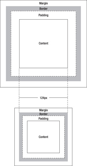
Each box is composed of the actual content area and can optionally have a border, padding, and margins. The W3C defines that the border, padding, and margins should be added to the initial width and height of the element box, so if a div has the following CSS applied to it, according to the W3C specification, the div should have 124 pixels width and height (100px + 2*10px + 2*2px) with a 20-pixel margin on all sides:
div {
   width: 100px;
   height: 100px;
   padding: 10px;
   border: 2px solid #333333;
   margin: 20px;
}
However, IE 5 interprets things in a different way: For this browser, the padding and border of a box are to be subtracted from the specified width and height (in this case, 124px), as you can see in the bottom image in Figure 3-6.
Despite this interpretation being more logical, it is incorrect, and that is why this behavior was corrected with the release of IE 6. IE 6 and above will, however, render using its incorrect box model if quirks mode (explained previously) is triggered.
This bug can have disastrous implications if you don't plan for it and do the necessary testing since it will influence the dimensions of the boxes in your layouts and will render them with completely different sizes.
Imagine a simple scenario: an outer container that has 940px width and 10px padding with two inner boxes of 470px width, floated side by side. If IE renders in quirks mode, the actual available space inside the outer container will not be 940px but rather 920px (since the padding is subtracted from 940px, and not added, as it should be). This means that the boxes will not be placed side by side, but one above the other, since they don't fit on the same line. This is just a very simple example of how a layout can be broken by the wrong interpretation of the box model, which will lead to unnecessary time and resources spent debugging that could have been avoided.
There are three ways of dealing with this bug:
Always use the correct document type so that quirks mode is not triggered.
Do not specify both dimensions and padding/border on the same element (recommended).
Rely on the IE box model and use CSS3
box-sizingfor newer browsers.
By specifying only the dimensions on the parent element and then, separately, padding and borders on its child elements, you will be circumventing the problem without having to rely on whether or not the correct document type is being applied. This is one of the oldest tricks that CSS authors use to avoid broken layouts in IE 6. In the case that there is a child element to achieve this, this is a convenient and simple solution. However, if no child element exists, we recommend you use an alternative method to target IE6 specifically, rather than add unnecessary markup solely for one outdated browser.
Another option is to use the CSS3 property box-sizing, which is supported by all the modern browsers, including IE 8 (Firefox requires the -moz-box-sizing vendor-specific property, while Webkit-based browsers require the -webkit- prefix). The box-sizing property accepts one of two values: content-box or border-box. The content-box value will apply to that element the box model as specified by CSS2.1, where the padding and border are added to the given dimensions of the element. The border-box value will make the padding and border be subtracted from the specified width and height of the element, mimicking the IE box model.
One of the downsides of using this property is that it has to be added on an element-by-element basis. It can also be added to every element by using the universal selector (*) or by adding it to the elements that will most likely need it, like sectioning elements.
All in all, the box model issue is one that—although it may produce tragic outcomes when not catered for—can be easily avoided. The ideal solution would be to ensure that IE renders in standards-compliant mode; this solves many of the issues, and is really what we should be working toward as browsers modernize and move forward. We recommend that as part of your defensive CSS strategy (you can read more about this in Chapter 4) you avoid the problem altogether by not specifying dimensions and padding/border on the same element.
No matter which solution your team decides is best, it should be included in the internal CSS style guide.
The hasLayout concept is a Microsoft creation and applies only to IE; it "determines how elements draw and bound their content, interact with and relate to other elements, and react on and transmit application/user events" (www.satzansatz.de/cssd/onhavinglayout.html#def).
An element's hasLayout property can be either true or false. When it is true, the element "has layout." Some elements have layout by default, while you can trigger the property via CSS for others. This is not done via a specific hasLayout property but through other CSS properties.
According to Microsoft, the following elements have layout:
html (in standards mode), body
img
table, tr, th, td
hr
input, button, select, textarea, fieldset, legend
marquee
frameset, frame
iframe, embed, object, applet
absolutely positioned elements
floated elements
inline-block elements
filters (Microsoft proprietary; for example, rotations and drop shadows)
And the following property/value pairs will trigger hasLayout to be true for an element:
position: absolute
float: left/right
display: inline-block
width: a value other than auto
zoom: a value other than normal
writing-mode: tb-rl
overflow: hidden/scroll/auto (IE 7)
overflow-x/y: hidden/scroll/ auto (IE 7)
Tip
Since it is rare that CSS authors use the zoom property, often adding zoom:1; is an easy and safe way to quickly give an element layout and potentially fix numerous IE bugs. As mentioned earlier, it is important to separate or comment these specific fixes so they do not get mixed up with the rest of our CSS.
Many of IE's rendering bugs can be fixed by giving the concerned element layout. A few of the most exasperating rendering issues triggered by elements that have (or don't have) layout are:
Self-clearing floats: Rather than sticking out of its parent container when its content is too long, a float will be self-cleared, so its parent will expand in order to fit. In a compliant browser, you would have to manually clear the float for this behavior to happen.
List elements: A quick, frustrating example: when dealing with ordered lists in which one or more
lielements have layout, those that do will have their counters reset to 1 (or the first representation of whichever style you have chosen to apply to the bullets).Absolutely positioned elements: The nearest positioned ancestor of absolutely positioned elements should be given layout; otherwise, they will end up in unexpected places.
There is a lot to be said about hasLayout that would be outside the scope of this book. Although not the most exciting subject in the world, it is easy to understand how important it is to be aware of it and know how best to handle it when faced with a problem. Problems triggered because of the hasLayout property are frequent and often affect the design of the pages in a way that can't just be ignored. We recommend that you read the comprehensive "On having layout" at www.satzansatz.de/cssd/onhavinglayout.html for more in-depth information.
Note
Microsoft has fixed most of the problems that were caused by hasLayout in IE 8 and 9, but the property is still present.
CSS keeps evolving, the specification changes, and browser vendors experiment. And as with any other experiment, things keep changing as they are being perfected over time. What this means in practice for CSS authors is that, as much as we would like to be able to use properties such as border-radius or box-shadow comfortable in the knowledge that they will behave immutably and cross-browser, in reality browsers interpret them differently. The differences might not be great and will probably lead to its eventual homogenizing, but they exist.
This should not be a discouragement from using experimental CSS; quite the opposite. It is by wide implementation of new properties by CSS authors that browser vendors gather the knowledge of how they should operate in a way that is practical and in tune with the real necessities of developers, which will, in turn, reflect on the drafting of future specifications (since they are based on implementations and examples rather than on idealisms).
When working on high-traffic and high-profile websites, one will need to be more careful and mindful of which properties are safe to use and which not. Following the developments of the CSS working group and being up-to-date with new browser releases is fundamental. Participating in the working group, too, is a great way to keep on top of changes, making your voice heard and being a part of the movement. Although, ideally, every member of the team that has to deal with CSS would be interested in keeping abreast of the latest updates, it might be a good idea to appoint one member of the team to be responsible for following the latest news and keeping the rest of the team informed. Setting up an internal mailing list that could be subscribed to by all interested in the matter with links to relevant articles would benefit the front-end team immensely.
The main objective of this chapter was to introduce some of the fundamental concepts that are inherent to CSS but that many developers tend to overlook. There is no doubt that CSS is easy to grasp, but crafting well-coded style sheets that will not break when the website is rendered in IE (or that will only present minimal issues) while, at the same time, keeping them efficient and maintainable is something that requires years of experience and a deeper knowledge of the theories behind CSS.
While it is not necessary to know by heart the list of rendering differences between a browser in standards and quirks mode (and it's okay to search the Web for the best solution to our hasLayout problem) it makes a difference to understand why these problems arise and the terms to use when describing them and locating their fixes. By understanding, we can prevent, which will save precious resources for our company in terms of man-hours and money. By being aware, at the very least, you'll know what to search for on Google.
In the next chapter we will look at some of the most popular frameworks, how and why they can be useful (or not) and what we can learn from them. We will also look at some tips on how to make your CSS more robust.
[14] In this example, we included a space before !important to make it easier to read. The space is unnecessary, which is something you might need to know if minifying files or when writing your CSS formatting guide.
[15] Although ISO 3166-1 has everything in upper case, we've put everything in lower case to aid compression and keep everything simple.
[16] The latest releases of browsers such as Safari or upcoming IE 9 support border-radius without the need for a vendor prefix, so including the default property is an important step that should never be forgotten.
[17] As WebKit was originally a forked version of KHTML, it used the -khtml- extension for CSS properties, while the -apple- extension was used for Apple-specific features. These were eventually merged into the -webkit- extension, although there are still some properties that are Safari-only and use the -apple- extension (for example, -apple-line-clamp). The Konqueror browser still uses the -khtml- extension.
[18] WebKit downloads images set to display:none; Firefox and Opera don't. This applies to desktop and mobile. It works better with media queries, in that background images aren't downloaded if the media query applies, but not if the media query is overriding another background image that has been applied in the generic style sheet—in this case both are downloaded. Basically, be aware that hiding things via CSS doesn't mean that the browser won't download them.
[19] Despite many who claim otherwise, it is a fact that due to font-rendering differences, browser chrome, implementation—and even color profile rendering in images—it is simply impossible for a website to look exactly the same in every browser.
[20] You can read more about comment tags at http://en.wikipedia.org/wiki/Comment_(computer_programming)#Tags.
[21] This is not necessarily something for us to worry about. Particularly in the realm of CSS, there are no real security issues implied by this, but plugins, browser extensions, caching servers or even malware may modify this header, and it is important to know that it is possible.
[22] Chris Chuld has a comprehensive PHP user agent detection library at http://chrisschuld.com/projects/browser-php-detecting-a-users-browser-from-php/.
[23] This is the correct spelling. The XML Prolog can state which version and encoding format is being used in the XML. Here is an example: <?xml version="1.0" encoding="iso-8859-1"?>.
[24] Wikipedia provides a comprehensive list of how different document types trigger different modes at http://en.wikipedia.org/wiki/Quirks_mode#Comparison_of_document_types.