
With high-traffic websites, unusual devices make up a much higher number of visitors than they would otherwise. Depending upon the demographics that your site is targeting, and the results of your reporting tools, you may need to consider these devices seriously. When we discuss devices from a CSS perspective, really we are just talking about browsers with different capabilities. Whether our CSS is being served to a mobile phone, a laptop, or a search engine spider, in essence it's just another web browser, with a different resolution and different abilities to process our CSS.
With each of these devices come different considerations; when using a printer we need to care about page breaks and clarity in grayscale, as well as avoiding printing unnecessary content. For mobile devices, we need to be concerned with unusual screen sizes and resolutions, as well as slow processors or poor CSS support. Screen readers, too, can be considered devices, but we have discussed these in some detail in the previous chapter.
In this chapter, you will learn about
The more traffic your website receives, the higher the likelihood of it being accessed by unlikely or unusual devices. Whereas smaller websites can afford to ignore or neglect particular devices and/or web browsers, for larger websites they may make up a large enough number to require consideration as an important user group. Larger companies take great care of their brand and their customer experience, and at the very least you should be showing anyone interested enough to visit your website a reasonable experience regardless of what they are using to view it. To that end, you need to implement various methods to detect their platform and serve the most appropriate content.
The media attribute in the link tag we use to reference external style sheets is intended to identify the kind of device the style sheet is aimed at. Where devices/browsers support this, they will ignore irrelevant or unknown style sheet media types, and not include the contents of the file. It is worth noting that most modern browsers will still download the file, even where they do not intend to parse the contents.[52] This means this method is not of use from a performance perspective—it actually incurs more HTTP requests than not using it—but is only of use for targeting specific browsers or devices.
You can actually target media via three methods. The first is within the link tags, like so:
<link rel="stylesheet" href="style.css" media="screen" />The second is via the @import directive:
@import url(style.css) screen;@import commands must always precede any other rules in a style sheet (except for other @import commands). Again, most modern browsers download the file, even though they will not parse the contents of the file. Regardless, we don't recommend you use @import rules because they block the parsing of the rest of the file.
The final method is the @media directive, which allows us to use only certain parts of files with certain media types. Here's an example:
@media screen {
   body {
      font-family: arial;
   }
}
This would only target browsers and devices that report support for the screen media type.
For all three of these methods, you can comma-separate the media value to target multiple types, like so:
<link rel="stylesheet" href="style.css" media="screen, print" /> @import url(style.css)screen, print; @mediascreen, print{ body { font-family: arial; } }
In these instances, if the browser or device supports only one of the media types, the file/rules will still be parsed.
For each media type, there are certain factors it is important to take into account. These are referred to as media groups.
Paged media (media that consists of pages—like a printed document—rather than one long document like a web page presented on a screen) supports some extra properties that continuous media does not[53] Grid media (as opposed to bitmap media) considers fixed-width characters to be of importance. For example, braille media needs characters to be of a predictable and consistent width for users to be able to understand it. We can group by static, interactive, or both, indicating whether the target is read-only or can be interacted with. Media can also be grouped as visual, audio, speech (for screen readers) or tactile (for devices that communicate with touch; braille, for example).
Let's take a look at the media types defined in the CSS2 specification.
Although not really a media type as such, all applies to all of the below media types and therefore all media groups. If you don't specify the media type, this is the default behavior.
Braille is a tactile method of conveying characters, used primarily by the blind. Braille tactile feedback devices vary in their capability. The specification describes this media type as continuous rather than paged (a braille printer that can output paged media is considered within the embossed media type), tactile, grid, and both interactive and static.
The embossed media type is similar to the braille type, but is intended for output via a braille printer. For that reason it is considered paged (rather than continuous) and static. Other than that, it is exactly the same as the braille type.
The handheld type is intended for targeting handheld devices such as mobile phones. These devices will normally have slower connections and smaller screens, so need to be treated differently from others. Since handheld devices vary so much in capability, they are considered to be a part of every media group except tactile.[54]
Handheld devices vary from poor to powerful performance, and everything in between, and offer many different browsers. Since they change so quickly, we would suggest using media queries (described later in this chapter) to target them, rather than relying on just the media type. Remember though, that you cannot rely on media types or media queries to control what is downloaded; the browser or device may choose to download everything regardless so there is no performance benefit.
Since current handheld devices, such as smartphones and tablets, do their best to present the Web, and not a cut-down version of it, most of them would actually be targeted with the "screen" media type. WebKit (Mobile Safari and Android) and Firefox Mobile ignore this media type completely. Opera Mini and Opera Mobile will respect it if the user switches to "handheld mode" in the settings, or the document has a known mobile doctype.
The print media type applies specifically to printed media output, and as such is considered to be paged, visual, grid, and static. We will discuss print and paged media in detail later in this chapter.
The projection media type is intended for projected output, typically projectors. Since this kind of output would usually be from an unmanned terminal, it is considered to be paged, visual, and bitmap. The specification lists it as interactive only, which we assume to be a mistake. Opera respects this media type in full-screen presentation mode (Opera Show). We do not know of any other browser or device that implements this.
The screen media type is undoubtedly the most common type. Primarily intended for computer screens (both desktop and laptop), this is the media type you are most likely to use, alongside all. Almost all devices use this media type, regardless of whether it is intended for them or not, because most of these devices intend to represent the Internet as it is in a web browser, rather than a cut-down version. Screen is considered to be continuous, bitmap, both interactive and static, and both visual and audio.
The speech media type is intended for any device or application that will audibly read the contents of the page, such as a screen reader or other assistive technology. In older specs, it was referred to as aural (which is now deprecated), so it is safest to target both media types simultaneously, like so:
<link rel="stylesheet" href="style.css" media="speech, aural" />This media type is considered to be continuous, speech, and both interactive and static. Grid or bitmap media groups are inapplicable in this instance. You can read more about this specific type of style sheet at http://www.w3.org/TR/CSS2/aural.html.
This media type (which is short for "teletype") is intended for media that uses a "fixed-pitch character grid" (meaning a grid of characters that are all identical in width). Since there is no concept of pixel sizes for characters for this media type, authors should not supply them. There are very few devices currently available of this type, and fewer still that support the Internet, so support for—and use of—this media type is very rare. This media type is considered to be continuous, visual, grid, and both interactive and static.
This media type is intended for television sets. Although the specification lists these devices as "low resolution, color, limited-scrollability screens, sound available", television sets vary greatly in their capability and this description will often be incorrect. Current large televisions often provide a higher resolution screen than their monitor counterparts, and sometimes even include web browsing software and the ability to scroll. Due to these inconsistencies in their capability, the tv media type is considered to be both continuous and paged, visual, audio, bitmap, and both interactive and static.
Tip
Although screen and print are by far the most commonly used media types in the wild, we are aware of devices that use all of the media types except tty. Media types were added to the spec, but not necessarily implemented by device manufacturers, often because of the sparse developer implementation.
Other devices may support media types not defined in this list, but we would advise against using them. You can read more about media types at http://www.w3.org/TR/CSS2/media.html. Since the media type is now rarely adequate to describe the capability of a device or browser, CSS3 introduced media queries, which provide us with the tools necessary to target a device by its features and capability instead of (or in tandem with) its media type. Most current mobile devices (including tablets) support media queries, and we recommend using them if you intend to target these devices.
Media types can give us the ability to target some of the devices we might expect to be browsing our sites, but their implementation in the devices is patchy. New devices are more predictable in their support, particularly those that your high-traffic websites are likely to see considerable visitors from. Again, these devices are likely to form a small fraction of your total traffic, but a large amount of people nonetheless. Media queries give us much better control over the devices and browsers we're targeting.
A media query is made up of two parts: a media type and zero or more queries that will be checked against the media features. When the media type matches the one of the device and all the queries are true, the media query is applied. If more than one media query is listed (using a comma-separated list), only one of the media queries needs to be true.
Here's a quick example:
<link rel="stylesheet" href="style.css" media="screen and (min-width:800px) and (max-
width:1500px)" />
As well as targeting browsers and devices that support the "screen" media type, we are also stating that the width of the viewport of the device must be at least 800 and at most 1,500 pixels. The features we are naming in the brackets above are known as "media features". You can comma separate media queries (exactly as with media types) as shorthand, like so:
<link rel="stylesheet" href="style.css" media="tv, projection, screen and (min-width:800px) and (max-
width:1500px)" />
In this instance, each comma-separated valued is evaluated in its entirety, (the parts following the "and" only apply to the media type immediately preceding them). The preceding media query is the same as the following:
<link rel="stylesheet" href="style.css" media="tv" />
<link rel="stylesheet" href="style.css" media="projection" />
<link rel="stylesheet" href="style.css" media="screen and (min-width:800px) and (max-
width:1500px)" />
You can use multiple "and" clauses in each list. You can also use "not" to negate an entire media query. However, you cannot negate individual parts of the query. The following will work:
<link rel="stylesheet" href="style.css" media="not screen and (min-width:800px) and (max-
width:1500px)" />
This will parse style.css for only any browser or device that would fail the query without the "not" keyword applied (the media type screen is unsupported, or the width of the viewport is less than 800 pixels, or the width of the viewport is greater than 1500 pixels). The following (and other variants to attempt the same) does not work:
<link rel="stylesheet" href="style.css" media="screen and (min-width:800px) and not (max-
width:1500px)" />
This lack of granularity can be frustrating for any developer used to basic conditional logic. To target multiple feature sets in this manner, it is necessary to first apply the default behavior to all devices then override this behavior for each device, like this:
/* Applied to every device and browser */
body {
   color: black;
}

@media screen and (min-width:800px) {
   /* Only applied to screen devices with a viewport width of at least 800 pixels */
body {
   color: red;
   }
}
Whenever a media query is not understood by the user agent (browser or device), it is considered to be "not all"—that is, it will not apply the contents of the linked style sheet or query.
The "only" keyword can be used to ensure that only CSS3-compliant browsers will apply the style sheet.
<link rel="stylesheet" href="style.css" media="only screen" />
Using the "only" keyword in the beginning of a media query will hide the media query from older browsers that don't support them (since they will think "only" is the name of a media type), while conforming browsers will ignore the "only" keyword and check for the media query that follows it.
As well as in the link tag, media queries can be used in the other two ways in your CSS files, exactly as media types alone can be used:
@import url(style.css) screen and (min-width:800px) and (max-width:1500px);

@media screen and (min-width:800px) and (max-width:1500px) {
   body {
      font-family: arial;
   }
}
Note
Browsers will download linked files, even if they will not be applied to the document in question.
When a media feature will evaluate to a value other than zero (regardless of unit), you do not need to provide a value. For example:
<link rel="stylesheet" href="style.css" media="all and (width)" />
This style sheet would always be applied because the width of the viewport will always be greater than zero (except perhaps for primarily audible devices). You wouldn't use this method; we just include it as an example.
Before we get too deep into the media features available, it's worth spending a moment discussing the viewport itself. The viewport is the available rendering size on the device, not including any browser chrome.
With the introduction of Mobile Safari, Apple also introduced the viewport meta tag[55].
The viewport meta tag gives you some control over the size and behavior of the viewport. Although this is HTML, it is important to cover to understand some of the concepts we will deal with in this chapter. Here's a simple example:
<meta name="viewport" content="width=device-width" />
The name "viewport" identifies this meta tag. The content attribute contains the values we want to pass. The properties are key/value pairs divided with an equals sign; you can comma-separate them to have as many as you like. There are two important constants we can use:
device-width: The actual pixel width (in landscape) of the device
device-height: The actual pixel height (in landscape) of the device
There are also six important properties we can use:
width: The initial width of the viewport (in landscape) in pixels. This value can also be either of the two constants. The default (on Mobile Safari) is 980 pixels.
height: The initial height of the viewport (in landscape) in pixels. This value can also be either of the two constants. The default is set automatically depending on the width and the aspect ratio of the device.
initial-scale: The scale is a multiplier used to calculate the size of the viewport. For example, if we set the viewport width to 400px and the scale to 1.5, the viewport would actually be 600px and extend 200px horizontally outside of the visible area. This property sets the initial scale value. By default, it would typically be automatically set to a value that fits the entire web page in the visible area. The user can zoom the device to adjust this value.
minimum-scale: This sets the minimum scale the user can zoom to.
maximum-scale: This sets the maximum scale the user can zoom to.
user-scalable: This sets whether users can adjust the size of the viewport whether they can zoom. Potential values are yes or no. The default is yes.
Tip
Opera has proposed a method for achieving the same thing in CSS, rather than in HTML, which is more appropriate. Sadly, there is no real support for this yet, but you can read the specification at http://dev.w3.org/csswg/css-device-adapt/.
The vital thing to take away from this is that the viewport may exceed the visible area, but will never be less than the visible area. This is important because we use viewport in media features. There are many media features defined in the CSS3 specifications. We'll list these in the following sections.
The width media feature applies to the width of the viewport (for continuous media) or of the "page box" (for paged media).[56] Where there is a virtual viewport (i.e. the scale is greater than one) this applies to the width of the entire viewport, not just the renderable screen space.
It accepts numbers greater than zero (any less than that will render the query invalid). You can (as with many media features) prefix width with min- and max- as in our examples above. These effectively act the same as greater than or equal to, and less than or equal to respectively.[57]
Any units can be used, but where relative sized units are used those will be relative to the root element of the document (i.e. the html tag).
The height media feature behaves exactly as its "width" counterpart, but applies to the height of the viewport instead.
The device-width media feature describes the width of the entire rendering surface (i.e. displayable area) of the device. For screens, this is the width of the screen. For paged media this is the width of the page. Again, you can use max- and min- as prefixes, and any value less than zero will result in an invalid media query. This uses the actual screen width, and not the virtual viewport you may have set with the viewport meta tag, or the virtual viewport the user may have amended by zooming the page on his device.
The orientation media feature has two possible values: landscape and portrait. If the width viewport is greater than the height, the orientation is landscape. Otherwise it is portrait. If using this media feature in a query, you should always pass it a value. Using orientation without a value results in the browser or device not applying the CSS.
Note
There is no "square" value for orientation. If the width and height values are exactly equal, the orientation is considered to be portrait.
The aspect-ratio media feature is the ratio of the width of the viewport to the height, separated with a forward slash. Here's a quick example of it in use:
@media screen and (aspect-ratio: 4/3) {
   ...
}The device-aspect-ratio media feature describes the ratio of the width of the entire renderable area of the device to the height, separated with a forward slash.
The color media feature describes the amount of bits per color component of the device. If, for example, the device used four bits each for red, green, and blue, this value would be four. If, for some reason, a different number of bits were used for each component, the smallest number would be the value. If the device is not color, or is not visual, this number will be zero. You can use min- and max- with the color media feature.
The color-index feature is used to query the amount of colors a device can display at once. This is often more intuitive to use than the color media feature. Devices typically support 16; 256; 65,536; or 16,777,215 colors. You can use min- and max- with color-index, and devices that are not color or not visual will present this value as zero.
The monochrome media feature describes the amount of bits the device supports for the display of monochromatic colors (in effect, the higher the number, the more grays between white and black can be displayed). You can use min- and max- with this media feature, and if a device is color or has no display, the value would be zero.
The resolution media feature describes the density of the pixels on the device in dots per inch (DPI) or dots per centimeter (DPCM); you should use these units (DPI and DPCM, respectively) in your media query. This media feature supports the min- and max- prefixes. If using a device with non-square pixels and min-resolution, the least dense dimension (the one with the lesser DPI) will be used. When using max-resolution, the densest dimension will be compared. If using "resolution" (for an exact match) with non-square pixels, the style sheet will never be applied. This media feature applies only to bitmap-based media—applying it to grid media will result in the entire media query being treated as "not all."
The scan media feature applies specifically to televisions (and thus the tv media type). The applicable values are "progressive" and "scan". If the device is not a television, this value will evaluate to zero.
The grid media feature describes whether a device is grid- or bitmap-based. For grid output devices, this value is 1; otherwise, it is 0.
Tip
Media queries will be evaluated on the fly. That is, if you have set a media query to apply to devices with a viewport of less than 900 pixels and you are using a device with a resizable viewport, then resizing the window will cause the query to be applied or unapplied immediately.
You can read more about media queries at http://www.w3.org/TR/css3-mediaqueries/.
Since the introduction of CSS transformations, transitions, and animations in WebKit, the basic media features defined in the specification have clearly been inadequate to target just the browsers that support them. To that end, WebKit has defined four proprietary media features, discussed in the following sections:
The transform-2d media feature describes the availability of CSS transforms across two dimensions. This value will evaluate to 1 if available and 0 if not.
This media feature describes the availability of CSS transforms across three dimensions. This value will evaluate to 1 if available and 0 if not. Since support for CSS transforms across two dimensions is necessary for this feature to be available, you can safely infer from this feature's value being 1 that transform-2d also evaluates to 1.
The transition media feature describes the availability of CSS transitions. This value will evaluate to 1 if available and 0 if not.
The animation media feature describes the availability of CSS transitions. This value will evaluate to 1 if available and 0 if not.
Note
Sadly, you cannot target devices that do not support these media features with something like "not (-webkit-animation)." Any unknown feature in a media query will immediately make the media query equivalent to "not all". For these devices, you will need to set default behavior and then override it, as we demonstrated previously.
Although all four of these media features are described and documented at http://webkit.org/specs/MediaQueriesExtensions.html and at http://developer.apple.com/library/safari/#documentation/appleapplications/reference/SafariCSSRef/Articles/OtherStandardCSS3Features.html, in truth they cannot (at the time of writing) be used in practice. They all require the vendor-specific WebKit prefix in order for them to work properly. Here is a complete list of the working media features:
Using media queries can be frustrating, but it is important to remember that the specification is always evolving. For now, here are four points that might save you confusion when developing and using media queries:
The "not" keyword negates the entire query. You cannot negate individual elements of the media query.
There is no "or" operator to use within media queries (although you can comma-separate entire media queries).
Externally referenced files will be downloaded regardless of the media query. Do not assume that applying media types to separate files will give you any kind of HTTP performance benefit. On the contrary, it will in fact result in more file requests.
Modernizr (http://www.modernizr.com/), created by developers Faruk Ateş, Paul Irish, and Alex Sexton, is a JavaScript library that detects and exposes browser functionality. It works by adding classes to the html element of a page; these classes indicate whether or not a particular feature (HTML5 and CSS3 features, to be exact) is present in the browser. Modernizr does not enable the functionality in the browser; it merely states whether it is available or not. It also adds support for styling the new HTML5 elements in less-capable browsers like Internet Explorer.
To use Modernizr, you just need to link to it in the head of your HTML document, like so:
<script src="js/modernizr-1.6.min.js"></script>
Second, you need to add a class of "no-js" to your html tag. This will be the default state of the page. If JavaScript is off, Modernizr will not work, and you will be able to detect this and provide a non-JavaScript version of the page to your users:
<html class="no-js">
If JavaScript is enabled, various classes, similar to the following, will replace this class:
<html class="js canvas canvastext geolocation rgba hsla multiplebgs borderimage borderradius boxshadow opacity no-cssanimations csscolumns no-cssgradients no-cssreflections csstransforms no-csstransforms3d no-csstransitions video audio cufon-active fontface cufon-ready">
In the preceding example, we can see that the browser in question (Firefox 3.6, in this case) does not support CSS animations, CSS gradients, CSS reflections, CSS transforms in 3D, or CSS transitions (from the classes "no-cssanimations," "no-cssgradients," "no-cssreflections," "no-csstransform3d," and "no-csstransitions," respectively). It does support the other features, like canvas and geolocation.
With this knowledge, we can now write CSS accordingly. Let's imagine we want to add multiple backgrounds to the body element of a page. We can first specify the default style for all browsers and then override that style with a more specific one that will only target browsers that support the feature, as such:
body {
        background: url(simple.png) top left repeat-x;
}
.multiplebgs body {
background: url(multiple-top.png) top left repeat-x,
url(multiple-bottom.png) bottom left repeat-x;
}In the case of the html element shown previously, Firefox 3.6 would understand and show the multiple backgrounds. Internet Explorer 8, for example, would only display the "simple.jpg" background image, as the class it would use would be "no-multiplebgs" instead.
It is also important to notice that in the preceding example, Firefox 3.6 would actually download both images because both rules could be applied (even though the less specific rule is overridden), so even though we are making sure to cater for users that can and can't see the features, we're penalizing those who can by making them download a completely unnecessary file. We could have avoided this by using ".no-multiplebgs body" in our first rule, rather than just "body."
Although a simple and useful solution, before you consider using it, remember that Modernizr will make for very verbose CSS that is downloaded by all users and not necessarily applied, and add a JavaScript dependency to your CSS, which is far from ideal.
Print style sheets need to be considered as a special case. Users will often want to print pages from your site, and you can cater to their needs in a way that's different from how you would cater to typical users. Users printing your content are engaged users, and frustrating them with unnecessary content or pages that won't fit well on their media will reduce their goodwill toward your site and your company. On the other hand, providing them with just the information they need in a legible and friendly format shows attention to detail and consideration to their needs. Making a basic print style sheet is very easy, and if your markup and CSS is well thought out, often it will be very concise and work well across your entire site.
Including a print style sheet is easy. We'll reiterate how best to achieve that here:
<link rel="stylesheet" href="print.css" media="print" />
You could use the @import command to achieve the same thing, but this would not work for very old browsers. You could also use the @media command to target print devices specifically, but again this would exclude older browsers. There are several things you need to consider including in this style sheet for users who are printing your content.
The user wants the content in the page, not the navigation or other superfluous elements (such as forms and other interactive elements that are useless in a static medium, as well as advertising unless you are specifically contracted to display them when printed which is unlikely). Consider a class like "noprint" on these elements so that it is easy to hide them with
display:none;. Alternatively, you could use a class such as "print" for just those elements you want outputted to the printer.Think about whether you want to extend your screen style sheet (by using a media type of
allfor that style sheet) to maintain existing branding or replace it entirely (by using a media type ofscreenfor that style sheet). Replacing it entirely often gives good results, and avoids unpredictable pitfalls, which are common when you have a great number of pages to consider.Serif fonts are easier to read on printed media (the converse is true of information presented on screen mediums). Consider an alternative serif font-stack.
Avoid changing the font size in the print style sheet. The browser default is usually appropriate.
If you do change the font size, set it in points (
pt). 12 points is usually fine.Make any containers the width of the page (
100%) and remove their margins. This will ensure they fill the space of the removed elements, as well as the printable area. This also helps make sure that they don't spill onto a second horizontal page, which makes for a poor printing experience. You should also add a small margin to the printed page with the @page rule, which we'll discuss later in this section. This will make for comfortable reading, particularly on printers that are capable of borderless printing.Don't float your containers. This can have unpredictable results.
Background images and colors are usually disabled for printing by default, so ensure you specify dark (or black) font colors that are legible with a white background.
In case background images or colors are printed, set the background to white. This avoids blurry or unclear content, can save on ink and will make pages print faster.
Remove backgrounds (set them to transparent) on elements that don't need them for the same reasons stated previously.
Links are not obvious on printed media, and there is no hover state. Underline your links so it is clear that they are links. We'll talk about other clever ways you can deal with links later in this section.
Use units that are appropriate for the medium, such as points (
pt), inches (in), and centimeters (cm).
Note
Print style sheets block rendering in Internet Explorer. Because of this, you might like to consider deferring loading of these with JavaScript.
In his excellent article on A List Apart (http://www.alistapart.com/articles/goingtoprint/), Eric Meyer suggests using the :after pseudo-element to append the URLs linked to after their link text. This makes perfect sense; without the URL, the link text is effectively useless when printed. Here is a simplified version of the code he uses to achieve this:
a:after {
        content: " (" attr(href) ") ";
}
He goes on to say that this method will not work well with links relative to the root of the site, and offers a solution for this:
a[href^="/"]:after {
        content: " (http://www.alistapart.com" attr(href) ") ";
}
These solutions are not perfect. URLs that are relative to the current document will still not display their full path, and links at the end of a sentence will display a space after the closing bracket and before the period, but it is a great improvement on the alternative.
Here's an example of a printed A List Apart page:
Print and other paged media support several extra rules and properties to continuous media. The page itself can be targeted with @page for applying margins at the global level, like so:
@page {
   margin: 2cm 3cm;
}
You could apply the margin to the body element instead, but then you wouldn't get the margin at the bottom of each page.
There are also pseudo-classes for left and right pages. When printing double-sided documents, the second page is a "left" page, the third a "right" page, the fourth a "left," and so on. It is common to consider a larger gutter area between the pages in case the user staples or binds these pages together. This is easy to achieve:
@page:left {
   margin-right: 4cm;
}

@page:right {
   margin-left: 4cm;
}
You can also target the first page specifically, with the :first pseudo-class. The first page is neither considered left nor right:
@page:first{
   margin: 10cm;
}Several properties exist with the intent of giving us more control over where our pages are broken. The first three are page-break specific:
page-break-beforepage-break-afterpage-break-inside
page-break-before and page-break-after accept five possible values (six if you include "inherit", which is their default):
autoThis will have no effect on the printed output. Pages will be split wherever the printer (or paged device) runs out of space.
alwaysA page break will always be forced before (or after, as appropriate) the element.
avoidThe device will attempt to avoid page breaks before (or after, as appropriate) the element.
leftThe device will insert page breaks before (or after, as appropriate) so that the next page will be a "left" page (and can therefore be targeted with the
:leftpseudo-class).
rightThe device will insert page breaks before (or after, as appropriate) so that the next page will be a "right" page (and can therefore be targeted with the
:rightpseudo-class).
page-break-inside only supports "auto" and "avoid" from this list.
Tip
If you use thead, tbody, and tfoot tags within your tables, the header and footers will repeat on every page making the tables easier to read. Table rows may still be split, which can be avoided with the following CSS in your print style sheet:
tr {
  page-break-inside: avoid;
}
You can read more about print behavior for tables at http://www.w3.org/TR/CSS2/tables.html.
Building print style sheets is an easy and worthwhile thing to do, from an accessibility and a usability point of view. Big websites don't always cater for printers, and as such give their users a poor experience; taking this step can help separate your site from the rest. Again, for a high-traffic website, more and more of your users are going to want to print your pages, perhaps because they don't have mobile Internet-enabled devices. There are examples of real-life print style sheets in Figures 7-2, 7-3 and 7-4.
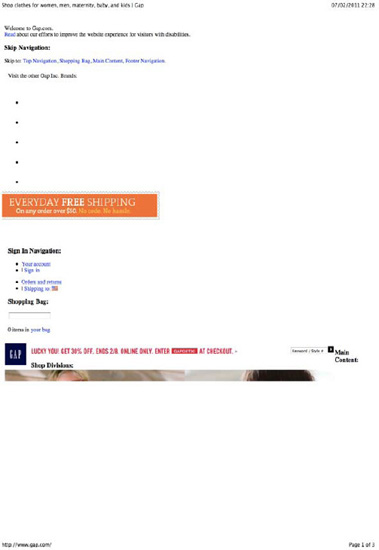
Figure 7-2. Gap doesn't hide unnecessary elements or set its text to a dark color—as a result, much of the text is invisible, and the first printed page has no useful content.
As always, the browser implementation is inconsistent, and you still need to test your code. You can check the results of your work quickly in print previews rather than killing trees. You can also quickly switch the media type of your link tag (or @import or @media rules) to "all", but be aware that browsers may apply different styles by default to print style sheets than they do to screen ones. You can read the CSS 2.1 specification for paged media at http://www.w3.org/TR/2009/CR-CSS2-20090908/page.html#page-box. CSS3 adds more features to allow you to control page number counters, widowed lines (lines left at the top of the page) and orphaned lines (lines left at the bottom of the page). Although support is patchy now, it doesn't hurt to implement these. Read more about them at http://dev.w3.org/csswg/css3-page/.
The methods your users have of accessing your website are growing dramatically all the time. Many of your typical users are likely to now have several means of reaching the Internet: home computer, work computer, perhaps a set-top box of some kind, and cellular telephone. The cell phone has come a long way from the brick-shaped kilo of the 1980s, and many are now capable computers in their own right. They can access your data via many different technologies including WiFi, GPRS, 2G, and 3G, and faster standards are emerging all the time. For high-traffic websites, the likelihood of serving your data to mobile devices is very high, and your users will expect a lot from you. In fact, users in developing countries may bypass computers altogether and only own a mobile device. Tablets are also rapidly gaining in popularity and can be considered mobile devices.
There are some things in particular you need to consider when serving websites to mobile devices:
Latency: The primary thorn in the side of the mobile web developer, latency is an unavoidable and inevitable concern. No matter how fast mobile Internet connections get, latency is likely to always be a problem. This means having fewer HTTP requests is more important than ever.
Small screen sizes: Mobile devices are likely to have much smaller screens than those you are used to developing for.
Pixel density: Some screens on mobile devices now have high enough pixel density (or are big enough, in the case of tablets) for your media queries to easily mistake them for desktop screens.
Orientation: Many mobile devices now support switching from landscape to portrait, and vice versa. Your media queries should take advantage of this.[58]
Lesser processing power: Your clever methods of offloading rendering to the GPU, and all of the transitions and transforms you've implemented aren't going to impress anyone at three frames per second.
Battery life: Hitting the network and doing anything CPU-intensive will drain the user's battery at a higher rate than normal.
Cost: Some users may be paying for their bandwidth. They won't appreciate unnecessary network access or unoptimized images.
Features: Some features (notably
:focus,:hoverandposition:fixed) may not be available on these devices.
You have several solutions for catering to your mobile users.
The optimum solution is to provide different sites to mobile users. Redirecting your users based on server-side user agent detection (for example, to http://m.facebook.com or http://touch.facebook.com) allows you to build a complete experience for them based upon their likely resolutions and their latent and slow network speeds. Unfortunately, for all but the most popular devices, this is a hard thing to achieve. For one thing, the manufacturers of the browsers on that device (be it something proprietary, Opera Mini, Mobile Safari, Firefox Mobile, or otherwise) have gone to a lot of effort to ensure that users of those browsers can enjoy a decent experience, even on a small screen. Secondly, the user agents available are changing all the time with new ones crawling out of the woodwork every day.[59]
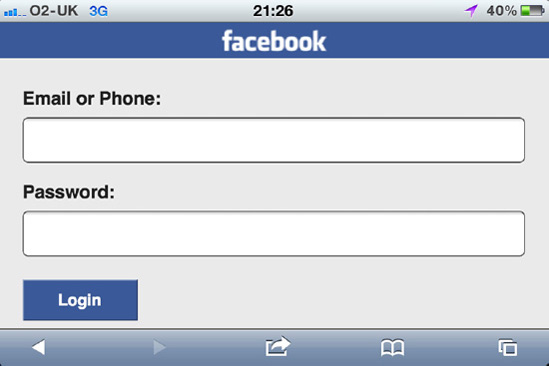
Facebook redirects you to a touch version of the full site when accessed via an iPhone (see Figure 7-5). It is also clever enough to use the accept-language HTTP header to present the correct language (the language the device is using) to the user.

You can only realistically target the most common of these. You can use media queries to provide a link to the mobile site in a prominent position for devices with small heights and widths, but then remember that some of the newest devices have very high pixel densities and can easily have a higher resolution screen than a desktop machine. If you do provide a separate website, there are a few things you should do:
Provide a link to the mobile website, in case you fail to detect and redirect the user correctly.
Provide a link to the regular website, too. If the user follows it, remember his preference.
Provide your images as CSS sprites as much as possible. Those HTTP requests are going to really hurt for mobile browsers.
Consider text links instead of images.
Consider a single column layout.
Aim toward vertical scrolling rather than horizontal.
Increase the
font-sizevalue.Avoid relying on any interactions that depend upon a mouse, such as
:hover.Avoid relying on any interactions that depend upon a keyboard, such as
:focus.Use
:activestates for touch screen devices and:focusstates for devices with buttons.Avoid floated elements.
Remember that users may change orientation, and cater for both landscape and portrait. Using percentages and a fluid layout rather than fixed pixel sizes will help you with this.
Use HTML5 input types like "tel" and "email" to give the device hints on how to help the user enter information. Devices that don't support these types will gracefully degrade to text.
Avoid CPU-intensive operations such as offloading to the GPU (read about this in Chapter 8), transforms, transitions, and animations.
Although using the
accept-languageheader to detect language is clever—and the geolocation API to detect location—avoid trying to detect location with IP addresses. This is notoriously unreliable.
The downside of this technique is it requires you to maintain two websites. If you can use the same content and a templating system to do this, it may make it less painful to achieve. This will give your users the best experience.
Pizza Express delivers a cut-down version of its website to mobile devices, with extra functionality such as detecting your location, and allowing you to dial that restaurant from within the browser. This is a good example of how you should be thinking about the mobile devices: not just ticking a box, but giving the best solution you can to everyone regardless of device.


You could also choose to use media queries to target these devices. Be aware though, that the performance implications of this method are considerable. Not only will your mobile users be penalized by downloading all the style sheets you link to, regardless of the ones that are applied (and often, many of the images you override, too), but your existing user base will also be forced to download the style sheets intended for mobile devices. This has the added cost of bandwidth from your company's side, with many files being served for no purpose.
Older devices that don't support media queries will ignore them or fail to parse the files. This leaves them to use their default behavior, which is often adequate (or has, at least, been designed to be).
Andy Clarke provides a series of media queries to target various mobile devices at http://www.stuffandnonsense.co.uk/blog/about/hardboiled_css3_media_queries/, which you may find useful. However, don't rely on them to target only the devices listed. New devices exist and are appearing every day, which may or may not meet the requirements for those queries. Also, don't use all these queries at the same time; that will result in a large amount of extra HTTP requests, which is even more damaging to the mobile device experience. If you have a genuine reason to target a single specific device rather than all devices of particular capabilities—for example, to point iOS users at an app you have developed for their platform—consider this one of the only valid uses to use server-side user agent detection. You should avoid UA detection wherever there is an alternative.
Note
You can make telephone numbers clickable from within your websites with the tel: protocol, like so:
<a href="tel:12345678901">(123) 456-7890</a>
This is a genuinely useful piece of functionality for someone who is already using a cellular phone to browse your site. Remember to use an international number and start the number in the href with the country code.
You can also opt to build an app directly for the device you intend to support. While, again, this limits your audience somewhat, you can take advantage of device-specific capabilities and APIs that you could not otherwise. You can also test your website in a very locked-down environment and be a lot more confident in your results. Another option would be to display your website in a browser within the app, potentially tying it into more features as well as keeping it available as a website directly and only maintaining it in one place.
An equivalent of this is native web apps, which are gathering momentum as a plausible method of making cross-platform apps, with potentially the same codebase as the website but access to native APIs. PhoneGap (http://www.phonegap.com/) wraps your code and makes it into a native app for all the major mobile device manufacturers. Wholesale Applications Community (WAC http://www.wacapps.net) and the Device APIs and Policy Working Group (DAP http://www.w3.org/2009/dap/) are both immature, but worth keeping an eye on.
There are other devices you should consider, which you may or may not be able to target. Set-top boxes with built-in web browsers, games consoles, native browsers in Smart TVs, Google TV, and so on. Each of these will have its own capabilities and features. We recommend testing on everything you can.
Search engine spiders (programs that scan your website by "crawling" all of the links they can find and sending the results back to the search engine) can be considered devices in their own right. They have their own unique user agents, and their own unique capabilities. Search engine optimization (SEO) is the practice of ensuring that these spiders have the best chance of reaching all your content and that it is as appropriate as possible when they do reach it. SEO is of huge importance to big companies since it can be a driver of vast amounts of traffic, and thus vast amounts of sales (or whatever the goal of your website is). SEO, like accessibility, needs to be considered from the outset, and implemented in a consistent and sane manner.
To discuss SEO techniques in any great detail would warrant its own book, but we will mention some high-level points here. First we'll talk about the differences between white, gray, and black hat techniques:
White hat: These techniques are done with good and altruistic intent. With SEO in mind, this typically just means writing good content and linking to it as appropriate. Search engines love this kind of content; it helps them ensure that the search results are appropriate to the search terms, which is exactly what their users want too.
Gray hat: These techniques could be considered attempts to cheat the system, but again are employed with good intent when no other good option is available. An example is using
text-indent:-9999px;to hide text from browsers but not screen readers (as discussed in the previous chapter). This technique could also easily be used to stuff the page with keywords to the author of the site wants to rank for, but hide them from the user. Search engines typically accept this method without penalizing the site in question (since, at the moment, it is one of the best methods we have for maintaining accessibility), but do not give extra weight to words affected by it.Black hat: These techniques are out and out attempts to cheat the system. Examples are loading a page stuffed with the keywords you want to rank and then redirecting with JavaScript (doorway pages), using server-side user agent detection to present a completely different page to the search engine than to your users (cloaking), placing keywords in white text on a white background (invisible text), and so on. Using these techniques will result in your site being penalized and showing up later in the search engine results than it might do otherwise. In extreme examples, it could result in your site being banned from the results altogether.
Many people think they have found new and clever ways to cheat the search engines. In reality, all they are doing is wasting their time, giving their users a worse experience, wasting time that would be better spent improving their website, and delaying the inevitable. The search engines will figure out what you are doing in the long run, and they will penalize you for it. The truth is that the only one who knows exactly what will rank well against the search engine's algorithms is the search engine. Even then, your request could get directed to one of many servers with different versions of the algorithm, and the algorithm is likely to change often. Some general guidelines exist, however. To get good search engine ranking, it is important to
Have good quality content.
Ensure that your content is semantic and valid.
Ensure that you have good site performance.
Really, this is just in line with making good quality websites, which we hope you are aiming to do anyway. Having good content is what the search engines appreciate the most. Making your content semantic and valid (including using microformats, and common class names and IDs) helps the search engines understand the content and your intent, and present it in a more comprehensive and attractive fashion on their search results page.
Depending on the search engine, the spiders have different capabilities as devices. Some parse JavaScript, some don't; some parse CSS, some don't. On the whole, search engines do now understand and apply CSS to the page. Typically, if they understand text to be invisible for whatever (gray hat) reason, they will not rank your page for this content or the words within it. If you are using JavaScript to show and hide pieces of information (for example, in a tabbed box), this means the tabs that are not active at page load will not have their content indexed. If the search engine supports JavaScript, then when crawling the links on the page, if a particular link makes content visible the search engine may choose to spider that content, although it is likely to consider it less important than text that showed initially.
For (at least) this reason, you should aim for your website to display in a sensible manner with JavaScript disabled. For a tabbed box, it would make sense to show each tab in the markup as a heading with the contents of the tab directly beneath. When the page loads,[60] your JavaScript can rearrange the page as need be, and attach the classes necessary to set up the tabs properly. As we mentioned before, this is a good approach for accessibility, too; if you make your site semantic and accessible, you get some SEO thrown in for free.
Note
Search engines will (almost) never submit forms.
Another thing search engines are valuing more and more is the performance of your website. If your site downloads fast and validates, you can get an easy boost in your rankings. If you have been following the guidelines laid out in this book, hopefully your CSS is small and fast and you don't have too many HTTP requests on the page. Using a content delivery network (CDN—see Chapter 8) can also give you a speed improvement, which the search engines will appreciate.
This chapter aimed to teach you about some of the devices you can expect your users to be using, and how best to target them. Media types and media queries are often useful, but they are not the panacea some of us might wish they were. Trying to keep your site easy to read and browse from the word go will pay dividends in these scenarios.
The next chapter is concerned with the performance of your CSS, and intends to teach you about how HTTP requests and responses work, caching strategies, and how to get the best out of both.
[52] This is so that their contents can still be accessed via the CSS Object Model (CSSOM), as well as being listed in document.styleSheets, which can be accessed via JavaScript to give details of all the style sheets attached to the document.
[53] We will mention them later in this chapter.
[54] Actually, Nokia has been making inroads toward an experimental braille reader on its handsets since September 2009.
[55] You can read about the viewport meta tag at http://developer.apple.com/library/safari/#documentation/AppleApplications/Reference/SafariHTMLRef/Articles/MetaTags.html and the viewport specifically at http://developer.apple.com/library/safari/#documentation/AppleApplications/Reference/SafariWebContent/UsingtheViewport/UsingtheViewport.html.
[56] As defined in the CSS 2.1 specification at www.w3.org/TR/2009/CR-CSS2-20090908/page.html#page-box.
[57] It was decided to avoid the <and> characters, since those could conflict with the characters in HTML.
[58] A specification for Geolocation 2 also introduces DeviceOrientation Events that you can hook into with JavaScript when browsers start supporting them. Read more about this at http://dev.w3.org/geo/api/spec-source-orientation.html.
[59] Opera actually masqueraded as IE for many years to avoid server-side user agent detection blocking the browser from content. Version 8.02 changed this behavior.
[60] JavaScript can hook into a "DOM-ready" event, which fires before the images load but after the DOM has loaded. Making changes to the document at this point (rather than at the "load" event, which fires after everything on the document has been downloaded) will avoid a Flash of Unstyled Content (FOUC), which can be very unsettling.