
Chapter 2: Getting Started with Predictive Modeling
2.2 Opening SAS Enterprise Miner 12.1
2.3 Creating a New Project in SAS Enterprise Miner 12.1
2.4 The SAS Enterpriser Miner Window
2.5 Creating a SAS Data Source
2.6 Creating a Process Flow Diagram
2.8 Tools for Initial Data Exploration
2.8.4 Variable Clustering Node
2.9 Tools for Data Modification
2.9.4 Interactive Binning Node
2.9.5 Principal Components Node
2.9.6 Transform Variables Node
2.11.1 The Type, the Measurement Scale, and the Number of Levels of a Variable
2.11.2 Eigenvalues, Eigenvectors, and Principal Components
2.11.4 Calculation of Chi-Square Statistic and Cramer’s V for a Continuous Input
2.1 Introduction
This chapter introduces you to SAS Enterprise Miner 12.1 and some of the preprocessing and data cleaning tools (nodes) needed for data mining and predictive modeling projects. SAS Enterprise Miner’s modeling tools are not included in this chapter as they are covered extensively in Chapters 4, 5, and 6.
2.2 Opening SAS Enterprise Miner 12.1
To start SAS Enterprise Miner 12.1, click the SAS Enterprise Miner icon on your desktop.1 If you have a Workstation configuration, the Welcome to Enterprise Miner window opens, as shown in Display 2.1.
Display 2.1

2.3 Creating a New Project in SAS Enterprise Miner 12.1
When you select New Project in the Enterprise Miner window, the Create New Project window opens.
In this window, enter the name of the project and the directory where you want to save the project. This example uses Chapter2 and C:TheBookEM12.1EMProjects (the directory where the project will be stored). Click Next. A new window opens, which shows the New Project Information.
Display 2.2

Click Finish. The new project is created, and the SAS Enterprise Miner 12.1 interface window opens, showing the new project.
2.4 The SAS Enterprise Miner Window
This is the window where you create the process flow diagram for your data mining project. The numbers in Display 2.3 correspond to the descriptions below the display.
Display 2.3

① Menu bar
② Tools bar: This contains the Enterprise Miner node (tool) icons. The icons displayed on the toolbar change according to the tab you select in the area indicated by ③.
③ Node (Tool) group tabs: These tabs are for selecting different groups of nodes. The toolbar ② changes according to the node group selected. If you select the Sample tab on this line, you will see the icons for Append, Data Partition, File Import, Filter, Input Data, Merge, Sample, and Time Series in ②. If you select the Explore tab, you will see the icons for Association, Cluster, DMDB, Graph Explore, Market Basket, Multiplot, Path Analysis, SOM/Kohonen, StatExplore, Variable Clustering, and Variable Selection in ②.
④ Project Panel: This is for viewing, creating, deleting, and modifying the Data Sources, Diagrams, and Model Packages. For example, if you want to create a data source (tell SAS Enterprise Miner where your data is and give information about the variables, etc.), you click Data Sources and proceed. For creating a new diagram, you right-click Diagrams and proceed. To open an existing diagram, double-click on the diagram you want.
⑤ Properties Panel: In this panel, you would see properties of Project, Data Sources, Diagrams, Nodes, and Model Packages by selecting them. In this example, the nodes are not yet created; hence, you do not see them in Display 2.3. You can view and edit the properties of any object selected. If you want to specify or change any options in a node such as Decision Tree or Neural Network, you must use the Properties panel.
⑥ Help Panel: This displays a description of the property that you select in the Properties panel.
⑦ Status Bar: This indicates the execution status of the SAS Enterprise Miner task.
⑧ Toolbar Shortcut Buttons: These are shortcut buttons for Create Data Source, Create Diagram, Run, etc. To display the text name of these buttons, position the mouse pointer over the button.
⑨ Diagram Workspace: This is used for building and running the process flow diagram for the project with various nodes (tools) of SAS Enterprise Miner.
Project Start Code
For any SAS Enterprise Miner Project, you must specify the directory where the data sets required for the project are located. Open the Enterprise Miner window and click ![]() located in the value column of Project Start Code row in the Properties panel (see Display 2.3). A window opens where you can type the path of the library where your data sets for the project are located. The Project Start Code window is shown in Display 2.4.
located in the value column of Project Start Code row in the Properties panel (see Display 2.3). A window opens where you can type the path of the library where your data sets for the project are located. The Project Start Code window is shown in Display 2.4.
Display 2.4

The data for this project is located in the folder C:TheBookEM12.1DataChapter2. This is indicated by the libref TheBook. When you click Run Now, the library reference to the path is created. You can check whether the library is successfully created by opening the log window by clicking the Log tab.
2.5 Creating a SAS Data Source
You must create a data source before you start working on your SAS Enterprise Miner Project. After the data source is created, it contains all the information associated with your data—the directory path to the file that contains the data, the name of the data file, the names and measurement scales of the variables in the data set, and the cost and decision matrices and target profiles you specify. Profit matrix is also known as decision weights in SAS Enterprise Miner 12.1, which is used in decisions such as assigning a target class to an observation and assessing the models. This section shows how a data source is created, covering the essential steps. For additional capabilities and features of data source creation, refer to the Help menu in SAS Enterprise Miner. SAS Enterprise Miner saves all of this information, or metadata, as different data sets in a folder called Data Sources in the project directory.
To create a data source, click on the toolbar shortcut button or right-click Data Sources in the Project panel, as shown in Display 2.5.
Display 2.5

When you click Create Data Source, the Data Source Wizard window opens, and SAS Enterprise Miner prompts you to enter the data source.
If you are using a SAS data set in your project, use the default value SAS Table in the Source box and click Next. Then another window opens, prompting you to give the location of the SAS data set.
When you click Browse, a window opens that shows the list of library references. This window is shown in Display 2.6.
Display 2.6

Since the data for this project is in the library Thebook, double-click on Thebook. The window opens with a list of all the data sets in that library. This window is shown in Display 2.7.
Display 2.7

Select the data set named NN_RESP_DATA, and click OK. The Data Source Wizard window opens, as shown in Display 2.8.
Display 2.8
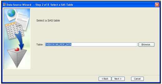
This display shows the libref and the data set name. Click Next. Another window opens displaying the Table Properties. This is shown in Display 2.9.
Display 2.9

Click Next to show the Metadata Advisor Options. This is shown in Display 2.10.
Display 2.10
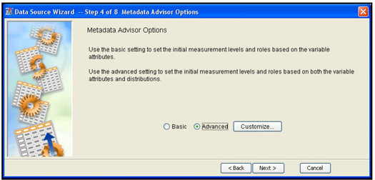
Use the Metadata Advisor Options window to define the metadata. Metadata is data about data sets. It specifies how each variable is used in the modeling process. The metadata contains information about the role of each variable, its measurement scale,2 etc.
If you select the Basic option, the initial measurement scales and roles are based on the variable attributes. It means that if a variable is numeric, its measurement scale is designated to be interval, irrespective of how many distinct values the variable may have. For example, a numeric binary variable will also be initially given the interval scale. If your target variable is binary in numeric form, it will be treated as an interval-scaled variable, and it will be treated as such in the subsequent nodes. If the subsequent node is a Regression node, SAS Enterprise Miner automatically uses ordinary least squares regression, instead of the logistic regression, which is usually appropriate with a binary target variable.
With the Basic option, all character variables are assigned the measurement scale of nominal, and all numeric variables are assigned the measurement scale of interval.
If you select Advanced, SAS Enterprise Miner applies a bit more logic as it automatically sets the variable roles and measurement scales. If a variable is numeric and has more than 20 distinct values, SAS Enterprise Miner sets its measurement scale (level) to interval. In addition, if you select the Advanced option, you can customize the measurement scales. For example, by default the Advanced option sets the measurement scale of any numeric variable to nominal if it takes 20 or fewer unique values, but you can change this number by clicking Customize and setting the Class Levels Count Threshold property (See Display 2.11) to a number other than the default value of 20.
For example, consider a numeric variable such as X, where X may be the number of times a credit card holder was more than 60 days past due in payment in the last 24 months. In the modeling data set, X takes the values 0, 1, 2, 3, 4, and 5 only. With the Advanced Advisor option, SAS Enterprise Miner will assign the measurement scale of X to Nominal by default. But, if you change the Class Levels Count Threshold property from 20 to 3, 4, or 5, SAS Enterprise Miner will set the measurement scale of X to interval. A detailed discussion of the measurement scale assigned when you select the Basic Advanced Advisor Options with default values of the properties, and Advanced Advisor Options with customized properties is given later in this chapter.
Display 2.11 shows the default settings for the Advanced Advisor Options.
Display 2.11

One advantage of selecting the Advanced option is that SAS Enterprise Miner automatically sets the role of each unary variable to Rejected. If any of the settings are not appropriate, you can change them later in the window shown in Display 2.12.
In this example, the Class Levels Count Threshold property is changed to 10. I closed the Advanced Advisor Options window by clicking OK, and then I clicked Next. This opens the window shown in Display 2.12.
Display 2.12
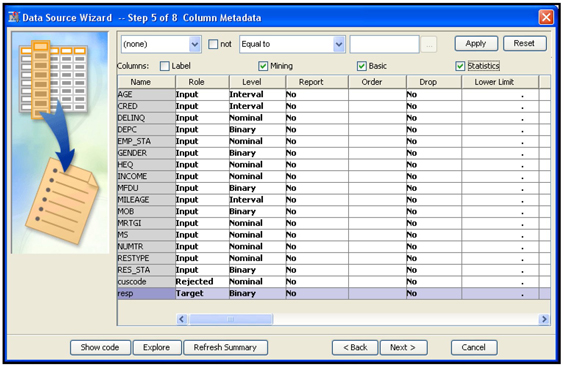
This window shows the Variable List table with the variable names, model roles, and measurement levels of the variables in the data set. This example specifies the model role of the variable resp as the target.
If you check the box Statistics at the top of the Variable List table, the Advanced Option function of the Data Source Wizard calculates important statistics such as the number of levels, percent missing, minimum, maximum, mean, standard deviation, skewness, and kurtosis for each variable. If you check the Basic box, the Variable List table also shows what type (character or numeric) each variable belongs. Display 2.13 shows a partial view of these additional statistics and variable types.
Display 2.13

If the target is categorical, when you click Next, another window opens with the question “Do you want to build models based on the values of the decisions?”
If you are using a profit matrix (decision weights), cost variables, and posterior probabilities, select Yes, and click Next to enter these values (you can also enter or modify these matrices later). The window shown in Display 2.14 opens.
Display 2.14
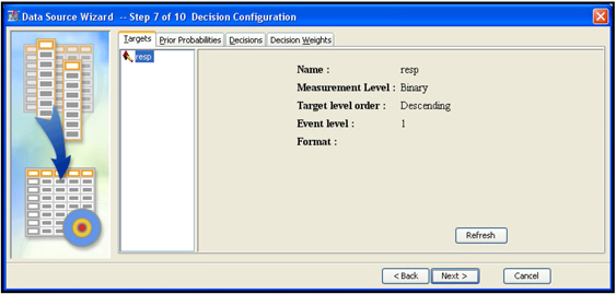
The Targets tab displays the name of the target variable and its measurement level. It also gives the target levels of interest. In this example, the variable resp is the target and is binary, which means that it has two levels: response, indicated by 1, and non-response, indicated by 0. The event of interest is response. That is, the model is set up to estimate the probability of response. If the target has more than two levels, this window will show all of its levels. (In later chapters, I model an ordinal target that has more than two levels, each level indicating frequency of losses or accidents, with 0 indicating no accidents, 1 indicating one accident, and 2 indicating four accidents, and so on.)
Display 2.15 shows the Prior Probabilities tab.
Display 2.15
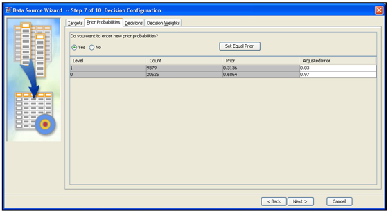
This tab shows (in the column labeled Prior) the probabilities of response and non-response calculated by SAS Enterprise Miner for the sample used for model development. In the modeling sample I used in this example, the responders are over-represented. In the sample, there are 31.36% responders and 68.64% non-responders, shown under the column “Prior.” So the models developed from the modeling sample at hand will be biased unless a correction is made for the bias caused by over-representation of the responders. In the entire population, there are 3% responders and 97% non responders. These are the true prior probabilities. If you enter these true prior probabilities in the Adjusted Prior column as I have done, SAS Enterprise Miner will correct the models for the bias and produce unbiased predictions. To enter these adjusted prior probabilities, select Yes in response to the question Do you want to enter new prior probabilities? Then enter the probabilities that are calculated for the entire population (0.03 and 0.97 in my example).
To enter a profit matrix, click the Decision Weights tab, shown in Display 2.16.
Display 2.16
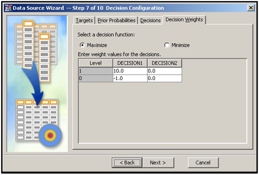
The columns of this matrix refer to the different decisions that need to be made based on the model’s predictions. In this example, DECISION1 means classifying or labeling a customer as a responder, while DECISION2 means classifying a customer as a non-responder. The entries in the matrix indicate the profit or loss associated with a correct or incorrect assignment (decision), so the matrix in this example implies that if a customer is classified as a responder, and he is in fact a responder, then the profit is $10. If a customer is classified as a responder, but she is in fact a non-responder, then there will be a loss of $1. Other cells of the matrix can be interpreted similarly.
In developing predictive models, SAS Enterprise Miner assigns target levels to the records in a data set. In the case of a response model, assigning target levels to the records means classifying each customer as a responder or non- responder. In a latter step of any modeling project, SAS Enterprise Miner also compares different models, on the basis of a user-supplied criterion, to select the best model. In order to have SAS Enterprise Miner use the criterion of profit maximization when assigning target levels to the records in a data set and when choosing among competing models, select Maximize for the option Select a decision function. The values in the matrix shown here are arbitrary and given only for illustration.
Display 2.17 shows the window for cost variables, which you can open by clicking the Decisions tab.
Display 2.17
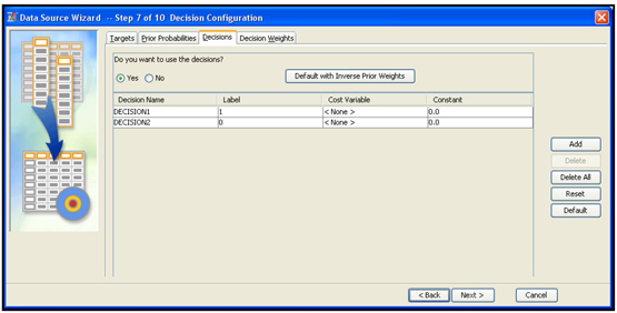
If you want to maximize profit instead of minimizing cost, then there is no need to enter cost variables. Costs are already taken into account in profits. Therefore, in this example, cost variables are not entered.
When you click Next, another window opens with the question “Do you wish to create a sample data set?” Since I want to use the entire data for this project, I chose No, and click Next. A window opens that shows the data set and its role, shown in Display 2.18. In this example, the data set NN_RESP_DATA is assigned the role Raw.
Diagram 2.18
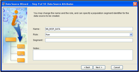
Other options for Role are Train, Validate, Test, Score, Document, and Transaction. Since I plan to create the Train, Validate, and Test data sets from the sample data set, I leave its role as Raw. When I click Next, the metadata summary window opens. Click Finish. The Data Source Wizard closes, and the Enterprise Miner Project window opens, as shown in Display 2.19.
Display 2.19

In order to see the properties of the data set, expand Data Sources in the project panel. Select the data set NN_RESP_DATA; the Properties panel shows the properties of the data source as shown in Display 2.19.
You can view and edit the properties. Open the variables table (shown in Display 2.20) by clicking ![]() located on the right of the Variables property in the Value column.
located on the right of the Variables property in the Value column.
Display 2.20
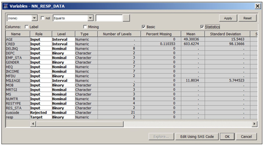
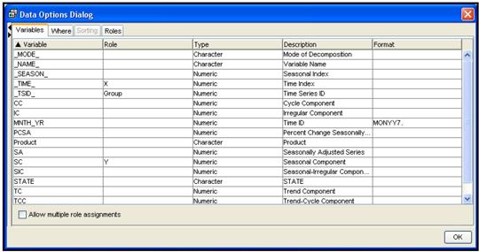
This variable table shows the name, role, measurement scale, etc., for each variable in the data set. You can change the role of any variable, change its measurement scale, or drop a variable from the data set. If you drop a variable from the data set, it will not be available in the next node.
By checking the “Basic” box located above the columns, you can see the variable type and length. By checking the “Statistics” box you can see statistics such as mean standard deviation etc. for interval scaled variables as shown in Display 2.20.
Note that the variable Income is numeric (see under the column Type) but its level (measurement scale) is set to Nominal because income has only 7 levels (unique values) in the sample. When you select the advanced advisor options in creating the data source, by default the measurement scale of a numeric variable is set to nominal if it has less than 20 unique values. See display 2.11, where you see that the class level count threshold is 20 by default. Although we changed this threshold to 10, the measurement scale of Income is still nominal since it has only 7 levels (less than 10).
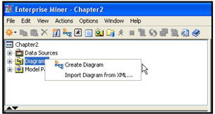
2.6 Creating a Process Flow Diagram
To create a process flow diagram, right-click Diagrams in the project panel (shown in Display 2.19), and click Create Diagram. You are prompted to enter the name of the diagram in a text box labeled Diagram Name. After entering a name for your diagram, click OK. A blank workspace opens, as shown in Display 2.21, where you create your process flow diagram.
Display 2.21

To create a process flow diagram drag and connect the nodes (tools) you need for your task. The following sections show some examples of how to use the nodes available in SAS Enterprise Miner.
2.7 Sample Nodes
If you open the Sample tab, the tool bar is populated with the icons for the following nodes: Append, Data Partition, File Import, Filter, Input Data, Merge, Sample, and Time Series. In this section, I provide an overview of some of these nodes, starting with the Input Data node.
2.7.1 Input Data Node
This is the first node in any diagram (unless you start with the SAS Code node). In this node, you specify the data set that you want to use in the diagram. You might have already created several data sources for this project, as discussed in Section 2.5. From these sources, you need to select one for this diagram. A data set can be assigned to an input in one of two ways:
• When you expand Data Sources in the project panel by clicking the + on the left of Data Sources, all the data sources appear. Then click on the icon to the left of the data set you want, and drag it to the Diagram Workspace. This creates the Input Data node with the desired data set assigned to it.
• Alternatively, first drag the Input Data node from the toolbar into the Diagram Workspace. Then set the Data Source property of the Input Data node to the name of the data set. To do this, select the Input Data node, then click ![]() located to the right of the Data Source property as shown in Display 2.22. The Select Data Source window opens. Click on the data set you want to use in the diagram. Then click OK.
located to the right of the Data Source property as shown in Display 2.22. The Select Data Source window opens. Click on the data set you want to use in the diagram. Then click OK.
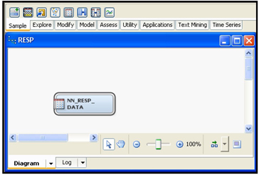
When you follow either procedure, the Input Data node is created as shown in Display 2.23.
Display 2.22

Display 2.23
2.7.2 Data Partition Node
In developing predictive models, you must partition the sample into Training, Validation, and Test. The Training data is used for developing the model using tools such as Regression, Decision Tree, and Neural Network. During the training process, these tools generate a number of models. The Validation data set is used to evaluate these models, and then to select the best one. The process of selecting the best model is often referred to as fine tuning. The Test data set is used for an independent assessment of the selected model.
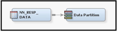
From the Tools bar, drag the Data Partition node into the Diagram Workspace, connect it to the Input Data node and select it, so that the Property panel shows the properties of the Data Partition node, as shown in Display 2.25.
The Data Partition node is shown in Display 2.24, and its Property panel is shown in Display 2.25.
Display 2.24
Display 2.25
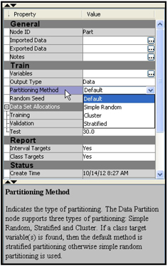
In the Data Partition node, you can specify the method of partitioning by setting the Partitioning Method property to one of four values: Default, Simple random, Cluster, or Stratified. In the case of a binary target such as response, the stratified sampling method results in uniform proportions of responders in each of the partitioned data sets. Hence, I set the Partitioning Method property to Stratified, which is the default for binary targets. The default proportion of records allocated to these three data sets are 40%, 30%, and 30%, respectively. You can change these proportions by resetting the Training, Validation, and Test properties under the Data Set Allocations property.
2.7.3 Filter Node
The Filter node can be used for eliminating observations with extreme values (outliers) in the variables.
You should not use this node routinely to eliminate outliers. While it may be reasonable to eliminate some outliers for very large data sets for predictive models, the outliers often have interesting information that leads to insights about the data and customer behavior.
Before using this node, you should first find out the source of extreme value. If the extreme value is due to an error, the error should be corrected. If there is no error, you can truncate the value so that the extreme value does not have an undue influence on the model.
Display 2.26 shows the flow diagram with the Filter node. The Filter node follows the Data Partition node. Alternatively, you can use the Filter node before the Data Partition node.
Display 2.26

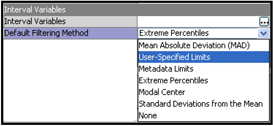
To use the Filter node, select it, and set the Default Filtering Method property for Interval Variables to one of the values, as shown in Display 2.27. (Different values are available for Class variables.)
Display 2.27
Display 2.28 shows the Properties panel of the Filter node.
Display 2.28
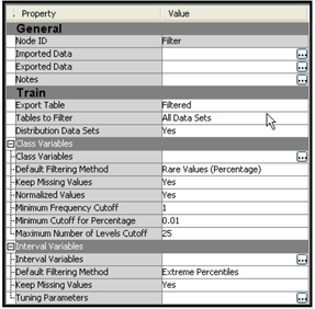
I set the Tables to Filter property to All Data Sets so that outliers are filtered in all three data sets—Training, Validation, and Test—and then ran the Filter node.
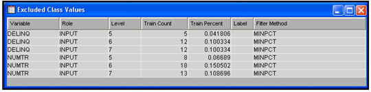
The Results window shows the number of observations eliminated due to outliers of the variables. Output 2.1 (from the output of the Results window) shows the number of records excluded from the Train, Validate, and Test data sets due to outliers.
Output 2.1

The number of records exported to the next node is 11557 from the Train data set, 8658 records from the Validate data set and 8673 records from the Test data set. Displays 2.29 and 2.30 show the criteria used for filtering the observations.
Display 2.29

Display 2.30
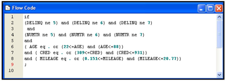
To see the SAS code that is used to perform the filters, click View→SAS Results→Flow Code. The SAS code is shown in Display 2.31.
Display 2.31
Instead of using the default filtering method for all variables, you can specify different filtering methods to individual variables. Do this by opening the Variables window. To open the Variable window for interval variables, click ![]() located to the right of the Interval Variables property. The Interactive Interval Filter window opens, as shown in Display 2.32.
located to the right of the Interval Variables property. The Interactive Interval Filter window opens, as shown in Display 2.32.
Display 2.32

For example, if you want to change the filtering method for the variable CRED(stands for Credit Score) , select the row for the variable CRED as shown in Display 2.32 and click in the Filtering Method column corresponding to CRED. A drop-down menu of all the filtering methods available appears. You can then select the method you want.
You can also interactively set the limits for filtering out extreme values by sliding the handles that appear above the chart in Display 2.32. Let me illustrate this by manually setting the filtering limits for the variable CREDIT.
Display 2.32 shows that some customers have a credit rating of 1000 or above. In general the maximum credit rating is around 950, so a rating above this value is almost certainly erroneous. So I set the lower and upper limits for the CREDIT variable at around 301 and 950 respectively. I set these limits by sliding the handles located at the top of the graph to the desired limits and clicking Apply Filter, as shown in Display 2.33. Click OK to close the window.
Display 2.33

After running the Filter node and opening the Results window, you can see that the limits I set for the credit variable have been applied in filtering out the extreme values, as shown in Display 2.34.
Display 2.34

2.7.4 File Import Node
The File Import node enables you to create a data source directly from an external file such as a Microsoft Excel file. Display 2.35 shows the types of files that can be converted directly into data sources format in SAS Enterprise Miner.
Display 2.35

I will illustrate the File Import node by importing an Excel file. You can pass the imported data to any other node. I demonstrate this by connecting the File Import node to the StatExplore node.
To use the File Import node, first create a diagram in the current project by right-clicking Diagrams in the project panel, as shown in Display 2.36
Display 2.36
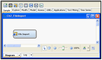
Type a diagram name in the text box in the Create Diagram dialog box, and click OK. A blank workspace is created. Drag the File Import tool from the Sample tab, as shown in Display 2.37.
Display 2.37
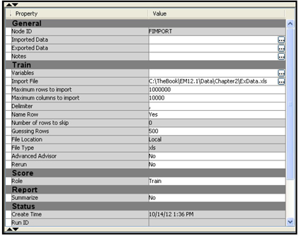
The Properties panel of the File Import node is shown in Display 2.38.
Display 2.38

In order to configure the metadata, click ![]() to the right of Import File property in the Properties panel (see Display 2.38). The File Import dialog box appears.
to the right of Import File property in the Properties panel (see Display 2.38). The File Import dialog box appears.
Since the Excel file I want to import is on my C drive, I select the My Computer radio button, and type the directory path, including the file name, in the File Import dialog box. Now I can preview my data in the Excel sheet by clicking the Preview button, or I can complete the file import task by clicking OK. I chose to click OK.
The imported Excel file is now shown in the value of the Import File property in the Properties panel, as shown in Display 2.39.
Display 2.39
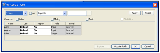
Next we have to assign the Metadata Information such as variable roles and measurement scales. To do this click ![]() located to the right of Variables property. The Variables window opens. In the Variables window, you can change the role of a variable by clicking on the column Role. I have changed the role of the variable Sales to Target, as shown in Display 2.40.
located to the right of Variables property. The Variables window opens. In the Variables window, you can change the role of a variable by clicking on the column Role. I have changed the role of the variable Sales to Target, as shown in Display 2.40.
Display 2.40

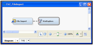
Click OK, and the data set is ready for use in the project. It can be passed to the next node. I have connected the StatExplore node to the File Import node in order to verify that the data can be used, as shown in Display 2.41.
Display 2.41
Display 2.42 shows the table that is passed from the File Import node to the StatExplore node.
Display 2.42
You can now run the StatExplore node. I successfully ran StatExplore node shown in Display 2.41. I discuss the results later in this chapter.
2.7.5 Time Series Node
Converting transactions data to time series
The Time Series node in SAS Enterprise Miner 12.1 can be used to condense transactional data to time series form, which is suitable for analyzing trends and seasonal variations in customer transactions. Both the transactional data and the time series data are time stamped. But the observations in transactional data may not occur at any particular frequency, whereas the observations in time series data pertain to consecutive time periods of a specific frequency, such as annual, quarterly, monthly, weekly or daily.
In order to introduce the reader to the Time Series node, I present an example of a transactional data set that shows the sales of two products (termed A and B) over a 60-month period by a hypothetical company. The company sells these products in 3 states—Connecticut, New Jersey, and New York. The sales occur in different weeks within each month. Display 2.43 shows a partial view of this transactions data.
Display 2.43

Note that, in January 2005, customers purchased product A during the weeks 1, 2, and 4, and they purchased Product B during the weeks 2, 3 and 4. In February 2005, customers purchased product A during the weeks 1, 2 and 4, and they purchased B in weeks 3 and 4. If you view the entire data set, you will find that there are sales of both products in all 60 months (Jan 2005 through Dec 2009), but there may not be sales during every week of every month. No data was entered for weeks when there were no sales, hence there is no observation in the data set for the weeks during which no purchases were made. In general, in a transaction data set, an observation is recorded only when a transaction takes place.
In order to analyze the data for trends, or seasonal or cyclical factors, you have to convert the transactional data into weekly or monthly time series. Converting to weekly data entails entering zeroes for the weeks that had missing observations to represent no sales. In this example, we convert the transaction data set to a monthly time series.
Display 2.44 shows monthly sales of product A, and Display 2.45 shows monthly sales of product B in Connecticut. Time series of this type are used by the Time Series node for analyzing trends and seasonal factors.
Display 2.44

Display 2.45

In order to perform an analysis on monthly time series derived from the transactions data shown in Display 2.43, you need to specify the time ID (month_yr in this example), and the cross ID variables (State and Product) and the target variable (Sales) in the Time Series node. The steps described in the following sections illustrate how to identify seasonal factors in the sales of products A and B (from the transactions data discussed earlier) using the Time Series node. You can use the Time Series node to find trend and cyclical factors in the sales also, but here I show only the seasonal decomposition of the sales.
First open SAS Enterprise Miner, create a project, and then create a data source for the transaction data. The first two steps are the same as described earlier, but creating a data source from transaction data is slightly different.
Creating a Data Source for the Transaction data
To create the data source, open an existing project. Right-click Data Sources in the Project panel and select Create Data Source (as shown earlier in Display 2.5 when we created a new SAS data source). The Data Source Wizard opens. For this example, use the default value of SAS Table for the Source field. Click Next.
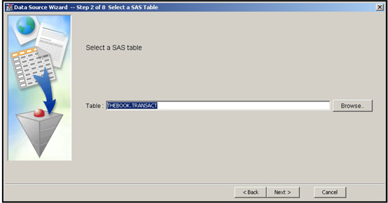
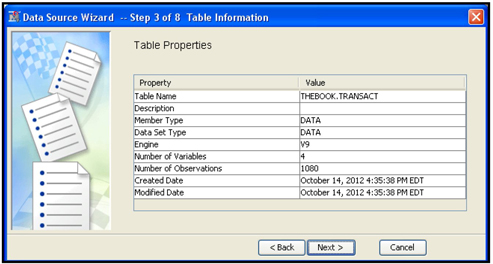
For step 3, enter the name of the transactions data set (called TRANSACT in this example), and click Next. The Table Properties table opens, as shown in Display 2.46A.
In the “Source” text box type in the data type. Since the transactions data is a SAS data set in this example, I entered “SAS Table”. By clicking on the “Next” button, the Wizard takes you to Step 2. In Step2 enter the name of the transaction data set (THEBOOK.TRANSACT) as shown in Display 2.46.
Display 2.46
By clicking “Next” the Wizard takes you to Step 3.
Display 2.46A
Click Next to move to step 4 of the Wizard. Select the Advanced option and click Next.
In step 5, names, roles, measurement levels, etc. of the variables in your data set are displayed.
Display 2.47
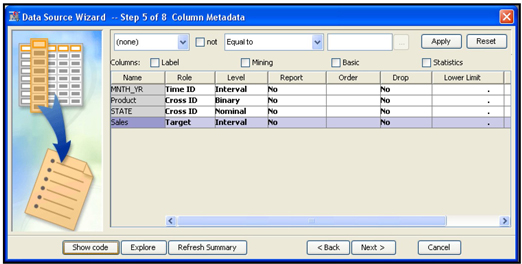
I changed the role of the variable Month_Yr to Time ID and its measurement level to Interval, the roles of the variables Product and State to Cross ID, and the role of Sales to Target. These changes result in the use of monthly time series of sales for analysis. Since there are three states and two products, six time series will be analyzed when I run the Time Series node.
Click Next. In step 6, the Wizard asks if you want to create a sample data set. I selected No, as shown in Display 2.48.
Display 2.48

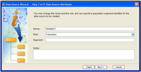
Click Next. In step 7, assign Transaction as the Role for the data source (shown in Display 2.49), and click Next.
Display 2.49
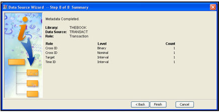
Step 8 shows a summary of the metadata created. When you click Finish, the Project window opens.
Display 2.50
Creating a Process Flow Diagram for Time Series Analysis
To create a process flow diagram, right-click Diagram in the Project panel and click Create Diagram. The Create New Diagram window opens. Enter the diagram name (Ch2_TS), and click OK.
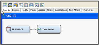
From the Data Sources folder, click on the icon to the left of the Transact data source and drag it into the Diagram Workspace. In the same way, drag the Time Series node from the Sample tab into the Diagram Workspace and connect it to the Input Data node, as shown in Display 2.51.
Display 2.51
Analyzing Time Series: Seasonal Decomposition
By clicking the Time Series node in the Diagram Workspace (Display 2.51), the Properties panel of the Time Series node appears, as shown in Display 2.52.
Display 2.52

I have set the Select an Analysis property to Seasonal Decomposition since I am interested in getting the monthly seasonal factors for sales of the two products for the three states included in the data set. Then I ran the Time Series node and opened the Results window. In the Decomposition window, I selected the Seasonal Component graph. This graph in Display 2.53 shows the seasonal effects for the six monthly time series created by the Time Series node.
Display 2.53
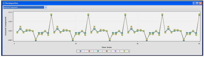
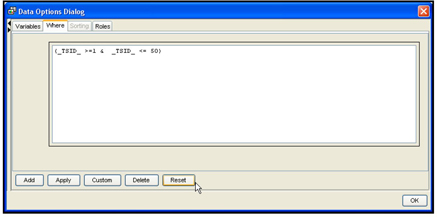
Display 2.53 shows that there are seasonal factors for the months of July and December. You can view the seasonal factors of any individual time series by right-clicking on the graph area to open the Data Options dialog box, shown in Display 2.54.
Display 2.54
To see the seasonal factors in the sales for given product in a given state, click the Where tab. The window for making the selection of a time series opens, as shown in Display 2.55.
Display 2.55
Click Reset. A Data Options dialog box opens as shown in Display 2.56.
Display 2.56

In the Column name box, select the variable name State. Enter CT in the Value field, and click Add. A new area appears, as shown in Display 2.57.
Display 2.57
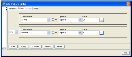
Select Product in the Column name box, and select the value A. Click Apply and OK. The seasonal component graph for Sales of Product A in the state of Connecticut appears, as shown in Display 2.58.
Display 2.58
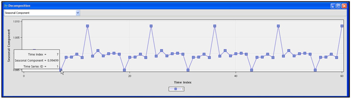
By hovering over any point on the graph, you can see the seasonal components for that month. As Display 2.58 shows, the seasonal component (factor) is 0.9949 for the month of July 2005. Since the component is below 1, it means that the sales were slightly 1% below normal. Similarly, you can see that the seasonal factors account for a slightly higher sales during the month of December.
To learn how to estimate the seasonal components of a time series, refer to:
• Dagum, E. B. (1980), The X-11-ARIMA Seasonal Adjustment Method, Statistics Canada.
• Dagum, E. B. (1983), The X-11-ARIMA Seasonal Adjustment Method, Technical Report 12-564E, Statistics Canada.
• Ladiray, D. and Quenneville, B. (2001), Seasonal Adjustment with the X-11 Method, New York: Springer-Verlag.
The example presented here is very simple. The full benefit of the Time Series node becomes clear when you use more complex data than that presented here.
Output Data Sets
To see a list of output data sets that are created by the Time Series node, click ![]() located in the Value column of the Exported Data property of the Properties panel, as shown in Display 2.59. Display 2.60 shows a list of the output data sets.
located in the Value column of the Exported Data property of the Properties panel, as shown in Display 2.59. Display 2.60 shows a list of the output data sets.
Display 2.59

Display 2.60

The seasonal decomposition data is saved as a data set with the name time_decomp. On my computer, this table is saved as C:TheBookEM12.1EMProjectsChapter2WorkspacesEMWS4 ime_decomp.sas7bdat. Chapter2 is the name of the project, and it is a sub-directory in C:TheBookEM12.1EMProjects.
You can also print selected columns of the data set time_decomp.sas7bdat from the SAS code node using the code shown in Display 2.61.
Display 2.61
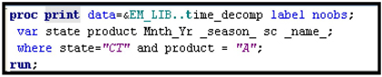
Partial output generated by this code is shown in Output 2.2.
Output 2.2

2.7.6 Merge Node
The Merge node can be used to combine different data sets within a SAS Enterprise Miner project. Occasionally you may need to combine the outputs generated by two or more nodes in the process flow. For example, you may want to test two different types of transformations of interval inputs together, where each type of transformation is generated by different instances of the Transform Variables node. To do this you can attach two Transform Variables nodes, as shown in Display 2.62. You can set the properties of the first Transform Variables node such that it applies a particular type of transformation to all interval inputs. You can set the properties of the second Transform Variables node to perform a different type of transformation on the same interval variables. Then, using the Merge node, you can combine the output data sets created by these two Transform Variables nodes. The resulting merged data set can be used in a Regression node to test which variables and transformations are the best for your purposes.
Display 2.62

To make this example more concrete, I have generated a small data set for a hypothetical bank with two interval inputs and an interval target. The two inputs are: (1) interest rate differential (SPREAD) between the interest rate offered by the bank and the rate offered by its competitors, and (2) amount spent by the bank on advertisements (AdExp) to attract new customers and/or induce current customers to increase their savings balances. The target variable is the month-to-month change in the savings balance (DBAL) of each customer for each of a series of months, which is a continuous variable.
The details of different transformations and how to set the properties of the Transform Variables node to generate the desired transformations are discussed later in this chapter and also in Chapter 4. Here it is sufficient to know that the two Transform Variables nodes shown in Display 2.62 will each produce an output data set, and the Merge node merges these two output data sets into a single combined data set.
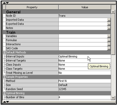
In the upper Transform Variables node, all interval inputs are transformed using the “optimal binning” method. (See Chapter 4 for more detail.) The optimal binning method creates a categorical variable from each continuous variable; the categories are the input ranges (or class intervals or bins). In order for all continuous and interval scaled inputs to be transformed by the Optimal Binning method, I set the Interval Inputs property in the Default Methods group to Optimal Binning, as shown in Display 2.63.
Display 2.63
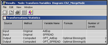
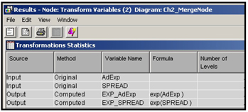
After running the Transform Variables node, you can open the Results window to see the transformed variables created, as shown in Display 2.64. The transformed variables are: OPT_AdExp and OPT_SPREAD.
Display 2.64
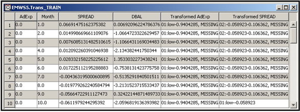
You can view the output data set by clicking ![]() located to the right of the Exported Data row in the Property table in Display 2.63. A partial view of the output data set created by the upper Transform Variables node is shown in Display 2.65.
located to the right of the Exported Data row in the Property table in Display 2.63. A partial view of the output data set created by the upper Transform Variables node is shown in Display 2.65.
Display 2.65
To generate a second set of transformations, click on the second (lower) Transform Variables node and set the Interval Inputs property in the Default Methods group to Exponential so that all the interval inputs are transformed using the exponential funtion. Display 2.66 shows the new variables created by the second Transform Variables node.
Display 2.66
The two Transform Variables nodes are then connected to the Merge node, as shown in Display 2.62. I have used the default properties of the Merge node.
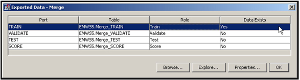
After running the Merge node, click on it and click ![]() located to the right of Exported Data in the Properties panel. Then, select the exported data set, as shown in Display 2.67.
located to the right of Exported Data in the Properties panel. Then, select the exported data set, as shown in Display 2.67.
Display 2.67
Click Explore to see the Sample Properties, Sample Statistics, and a view of the merged data set.
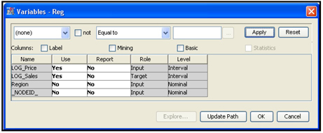
The next step is to connect a Regression node to the Merge node, then click Update Path. The variables exported to the Regression node are shown in Display 2.68.
Display 2.68

Display 2.68 shows that the transformed variables created by the Optimal Binning method are nominal and those created by the second Transform Variables node are interval scaled. You can now run the Regression node and test all the transformations together and make a selection. Since we have not covered the Regression node, I have not run it here. But you can try.
2.7.7 Append Node
The Append node can be used to combine data sets created by different paths of a process flow in a SAS Enterprise Miner project. The way the Append node combines the data sets is similar to the way a SET statement in a SAS program stacks the data sets. This is different from the side-by-side combination that is done by the Merge node.
Display 2.69 shows an example in which the Append node is used.
Display 2.69

In Display 2.69 two data sources are used. The first data source is created by a data set called Data1, which contains data on Sales and Price in Region A at different points of time (months). The second data source is created from the data set Data2, which contains data on Sales and Price for Region B.
To illustrate the Append node, I have used two instances of the Transform Variables node. In both instances, the Transform Variables node makes a logarithmic transformation of the variables Sales and Price, creates data sets with transformed variables, and exports them to the Append node.
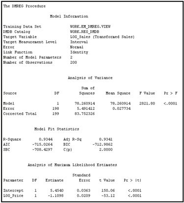
The output data sets produced by the two instances of the Transform Variables node are then combined by the Append node3 and passed to the Regression node, where you can estimate the price elasticity of sales using the combined data set and the following specification of the demand equation:
log_sales = α + βlog_ price or
Sales = A Priceβ
where A = eα
In an equation of this form, β measures the price elasticity of demand;
in this example it is -1.1098
The first data set (Data1) has 100 observations and four columns (variables)—Price, Sales, Month, and Region. The second data set (Data2) also has 100 observations with the four columns Price, Sales, Month, and Region. The combined data set contains 200 observations.
The first instance of Transform Variables node creates new variables log_sales and log_Price from Data1, stores the transformed variables in a new data set, and exports it to the Append node. The data set exported by the first instance of the Transform Variables node has 100 observations.
The second instance of the Transform Variables node performs the same transformations done by the first instance, creates a new data set with the transformed variables, and exports it to the Append node. The data set exported by the second instance also has 100 observations.
The Append node creates a new data set by stacking the two data sets generated by the two instances of the Transform Variables node. Because of stacking (as opposed to side-by-side merging) the new data set has 200 observations. The data set exported to the Regression node has four variables, as shown in Display 2.70, and 200 observations shown in Output 2.3.
Display 2.70
Output 2.3
Display 2.71 shows the property settings of the Append node for the example presented here.
Display 2.71
This type of appending is useful in pooling the price and sales data for two regions and estimating a common equation. Here my intention is only to demonstrate how the Append node can be used for pooling the data sets for estimating a pooled regression and not to suggest or recommend pooling. Whether you pool depends on statistical and business considerations.
2.8 Tools for Initial Data Exploration
In this section I introduce the StatExplore, MultiPlot, GraphExplore, Variable Clustering, Cluster and Variable Selection nodes, which are useful in predictive modeling projects.
I will use two example data sets in demonstrating the use of StatExplore, MultiPlot, and GraphExplore. The first data set shows the response of a sample of customers to solicitation by a hypothetical auto insurance company. The data set consists of an indicator of response to the solicitation and several input variables that measure various characteristics of the customers who were approached by the insurance company. Based on the results from this sample, the insurance company wants to predict the probability of response based on customer’s characteristics. Hence the target variable is the response indicator variable. It is a binary variable taking only two values, namely 0 and 1, where 1 represents response and 0 represents non-response. The actual development of predictive models is illustrated in detail in subsequent chapters, but here I provide an initial look into various tools of SAS Enterprise Miner that can be used for data exploration and discovery of important predictor variables in the data set.
The second data set used for illustration consists of month-to-month change in the savings balances of all customers (DBAL) of a bank, interest rate differential (Spread) between the interest rate offered by the bank and its competitors, and amount spent by the bank on advertisements to attract new customers and/or induce current customers to increase their savings balances.
The bank wants to predict the change in customer balances in response to change in the interest differential and the amount of advertising dollars spent. In this example, the target variable is change in the savings balances, which is a continuous variable.
Click the Explore tab located above the Diagram Workspace so that the data exploration tools appear on the tool bar. Drag the Stat Explore, MultiPlot, and Graph Explore nodes and connect them to the Input Data Source node, as shown in Display 2.72
Display 2.72

2.8.1 Stat Explore Node
Stat Explore Node: Binary Target (Response)
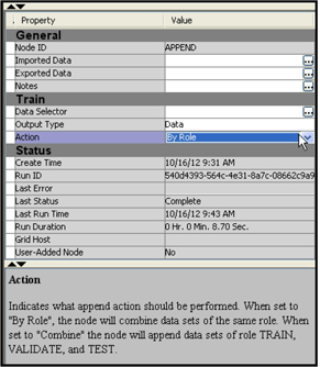
Select the Stat Explore node in the Diagram Workspace to see the properties of the StatExplore node in the Properties panel, shown in Display 2.73.
Display 2.73

If you set the Chi-Square property to Yes, a Chi-Square statistic is calculated and displayed for each variable. The Chi-Square statistic shows the strength of the relationship between the target variable (Response, in this example) and each categorical input variable. The appendix to this chapter shows how the Chi-Square statistic is computed.
In order to calculate Chi-Square statistics for continuous variables such as age and income, you have to first create categorical variables from them. Derivation of categorical variables from continuous variables is done by partitioning the ranges of continuous scaled variables into intervals. These intervals constitute different categories or levels of the newly derived categorical variables. A Chi-Square statistic can then be calculated to measure the strength of association between the categorical variables derived from the continuous variables and the target variable. The process of deriving categorical variables from continuous variables is called binning. If you want the StatExplore node to calculate the Chi-Square statistic for interval scaled variables, you must set the Interval Variables property to Yes, and you must also specify the number of bins into which you want the interval variables to be partitioned. To do this, set the Number of Bins property to the desired number of bins. The default value of the Number of Bins property is 5. For example, the interval scaled variable AGE is grouped to five bins, which are 18–32.4, 32.4-46.8, 46.8-61.2, 61.2-75.6, and 75.6-90.
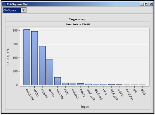
When you run the StatExplore node and open the Results window, you see a Chi-Square plot, Variable Worth plot and an Output window. The Chi-Square plot shows the Chi-Square value of each categorical variable and binned variable paired with the target variable, as shown in Display 2.74. The plot shows the strength of relationship of each categorical or binned variable with the target variable.
Display 2.74
The results window also displays, in a separate panel, the worth of each input. The worth is calculated from the p-value corresponding to the calculated Chi-Square test statistic. The p-value corresponding to the calculated chi-square statistic is calculated as
P(χ2 ≥ calculated chi - Square statistic) = p
Worth of the input is - 2log(p).
The Variable Worth plot is shown in Display 2.75.
Display 2.75

Both the Chi-Square plot and the Variable Worth plot show that the variable RESTYPE (the type of residence) is the most important variable since it has the highest Chi-Square value (Display 2.74) and also the highest worth (Display 2.75). Next in importance is MFDU (an indicator of multifamily dwelling unit). From the StatExplore node you can make a preliminary assessment of the importance of the variables.
An alternative measure of calculating the worth of an input, called impurity reduction, is discussed in the context of decision trees in Chapter 4. In that chapter, I discuss how impurity measures can be applied to calculate the worth of categorical inputs one at a time.
In addition to the Chi-Square statistic, you can display the Cramer’s V for categorical and binned interval inputs in the Chi-Square Plot window. Select Cramer’s V from the drop-down list, as shown in Display 2.76, in order to open the plot.
Display 2.76
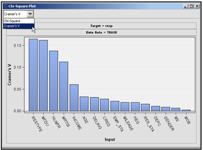
You can get the formulae for Chi-Square statistic and Cramer’s V from the Help tab of SAS Enterprise Miner. The calculation of the Chi-Square statistic and Cramer’s V are illustrated step-by-step in the appendix to this chapter.
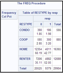
The Output window shows the mode of the input variable for each target class. For the input RESTYPE, the modal values are shown Output 2.4.
Output 2.4

This output arranges the modal values of the inputs by the target levels. In this example, the target has two levels: 0 and 1. The columns labeled Mode Percentage and Mode2 Percentage exhibit the first modal value and the second modal value, respectively. The first row of the output is labeled _OVERALL_. The _OVERALL_ row values for Mode and Mode Percent indicate that the most predominant category in the sample is homeowners, indicated by HOME. The second row indicates the modal values for non-responders. Similarly, you can read the modal values for the responders from the third row. The first modal value for the responders is RENTER, suggesting that the renters in general are more likely to respond than home owners in this marketing campaign. These numbers can be verified by running PROC FREQ from the Program Editor, as shown in Display 2.77.
Display 2.77
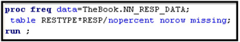
The results of PROC FREQ are shown in Output 2.5.
Output 2.5
StatExplore Node: Continuous/Interval scaled Target (DBAL: Change in Balances)
In order to demonstrate how you can use the StatExplore node with a continuous target, I have constructed a small data set for a hypothetical bank. As mentioned earlier, this data set consists of only three variables: (1) month-to-month change in the savings balances of all customers (DBAL), (2) interest rate differential (Spread) between the interest rate offered by the bank and its competitors, and (3) amount spent by the bank on advertisements (AdExp) to attract new customers and/or induce current customers to increase their savings balances. This small data set is used for illustration, although in practice you can use the StatExplore node to explore much larger data sets consisting of hundreds of variables.
Display 2.78 shows the process flow diagram for this example. The process flow diagram is identical to the one shown for a binary target, except that the input data source is different.
Display 2.78

The property settings for the StatExplore node for this example are the same as those shown in Display 2.73, with the following exceptions: the Interval Variables property (in the Chi-Square Statistics group) is set to No and the Correlations, Pearson Correlations and Spearman Correlations properties are all set to Yes.
After we run the Stat Explore node, we get the correlation plot, which shows the Pearson correlation between the target variable and the interval scaled inputs. This plot is shown in Display 2.79.
Display 2.79

Both the SPREAD and Advertisement Expenditure (AdExp) are positively correlated with Changes in Balances (DBAL), although the correlation between AdExp and DBAL is lower than the correlation between the spread and DBAL.
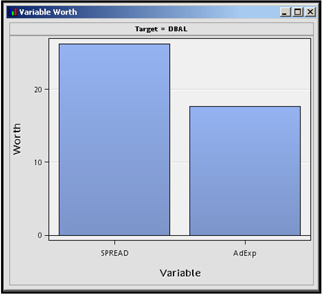
Display 2.80 shows a comparison of the worth of the two inputs advertisement expenditure and interest rate differential (spread).
Display 2.80
2.8.2 MultiPlot Node
MultiPlot Node: Binary Target (Response)
After you run the MultiPlot node, the results window shows plots of all inputs against the target variable. If an input is a categorical variable, then the plot shows the input categories (levels) on the horizontal axis and the percentage distribution of the target classes on the vertical axis, as shown in Display 2.81.
Display 2.81

The variable RESTYPE is a categorical variable, along with categories CONDO, COOP, HOME, and RENTER. The categories refer to the type of residence the customer lives. The plot above shows that the percentage of responders (indicated by 1) among the renters is higher than among the home owners.
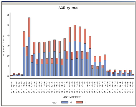
When the input is continuous, the distribution of responders and non-responders is given for different intervals of the input, as shown in Display 2.82. The midpoint of each interval is shown on the horizontal axis, and the distribution of target class (response and non-response) is shown on the vertical axis.
Display 2.82
MultiPlot Node: Continuous/Interval scaled Target (DBAL: Change in Balances)
If you run the MultiPlot node in the Process Flow shown in Display 2.78 and open the Results window, you see a number of charts that show the relation between each input and the target variable. One such chart shows how the change in balances is related to interest rate differential (SPREAD), as shown in Display 2.83. The MultiPlot node shows the mean of target variable in different intervals of continuous inputs.
Display 2.83
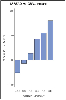
In Display 2.83, the continuous variable SPREAD is divided into six intervals and the midpoint of each interval is shown on the horizontal axis. The mean of the target variable in each interval is shown along the vertical axis. As expected, the chart shows that the larger the spread, the higher the increase in balances is.
2.8.3 Graph Explore Node
Graph Explore Node: Binary Target (Response)
If you run the Graph Explore node and open the results window, you see a plot of the distribution of the target variable, as shown in Display 2.84. Right-click in the plot area, and select Data Options.
Display 2.84

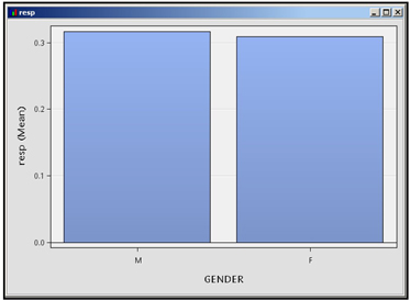
In the Data Options dialog box, shown in the Display 2.85, select the variables you want to plot and their roles.
Display 2.85
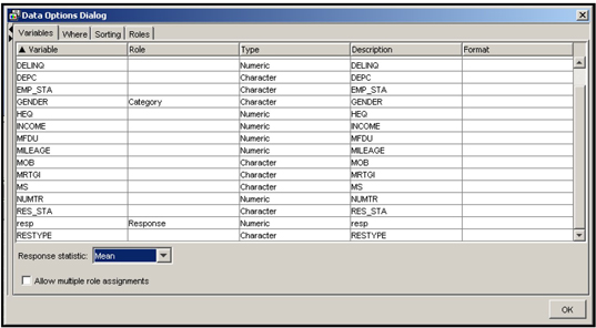
I assigned the role category to GENDER and the role Response to the target variable resp. I selected the response statistic to be the Mean and clicked OK. The result is shown in Display 2.86, which shows the Gender category on the horizontal axis and the mean of the response variable for each gender category on the vertical axis. The response rate for males is slightly higher than that for females.
Display 2.86
If you explore the Graph Explore node further, you will find there are many types of charts available.
Graph Explore Node: Continuous/Interval Scaled Target (DBAL: Change in Balances)
Run the Graph Explore node and open the results window. Click View on the menu bar, and select Plot. The Select a Chart Type dialog box opens, as shown in Display 2.87.
Display 2.87
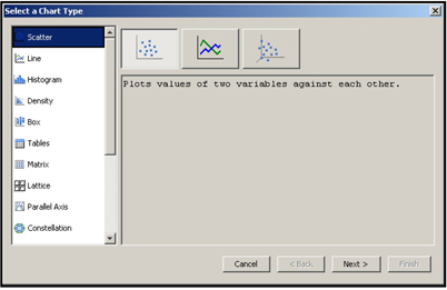
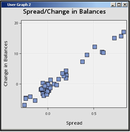
I selected the Scatter chart and clicked Next. Then I selected the roles of the variables SPREAD and DBAL, designating SPREAD to be the X variable and DBAL to be the Y variable, as shown in Display 2.88.
Display 2.88

I clicked Next twice. In the Chart Titles dialog box, I filled in the text boxes with Title, and X and Y axis labels as shown in Display 2.89 and clicked Next.
Display 2.89

In the last dialog box, I clicked Finish, which resulted in the plot shown in Display 2.90.
Display 2.90
To change the marker size, right-click in the chart area and select Graph Properties. The properties window opens, shown in Display 2.91.
Display 2.91

Clear the Autosize Markers check box, and slide the scale to the left until you see that the Size is set to 3. Click Apply and OK. These settings result in a scatter chart with smaller markers, as shown in Display 2.92.
Display 2.92
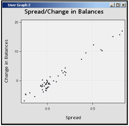
The scatter chart shows that there is direct relation between SPREAD and Change in Balances.
2.8.4 Variable Clustering Node
The Variable Cluster node divides the inputs (variables) in a predictive modeling data set into disjoint clusters or groups. Disjoint means that if an input is included in one cluster, it does not appear in any other cluster. The inputs included in a cluster are strongly inter-correlated, and the inputs included in any one cluster are not strongly correlated with the inputs in any other cluster.
If you estimate a predictive model by including only one variable from each cluster or a linear combination of all the variables in that cluster, you not only reduce the severity of collinearity to a great extent, you also have fewer variables to deal with in developing the predictive model.
In order to learn how to use the Variable Clustering node and interpret the results correctly, you must understand how the Variable Clustering node clusters (groups) variables.
The Variable Clustering algorithm is both divisive and iterative. The algorithm starts with all variables in one single cluster and successively divides it into smaller and smaller clusters. The splitting is binary in the sense that at each point in the process, a cluster is split into two sub-clusters or child clusters, provided certain criteria are met. The process of splitting can be described as follows:4
1. Initially there is a single cluster with all variables in the data set included in it.
2. Eigenvalues are extracted from the correlation (or covariance) matrix of the variables included in the cluster. The largest eigenvalue and the next largest eigenvalue are used for calculating the eigenvectors and creating cluster components. If you arrange the eigenvalues in descending order of magnitude, then the first eigenvalue is the largest and the second eigenvalue is the next largest.
3. Eigenvectors corresponding to the first two (the largest and the next largest) eigenvalues are calculated. We can call them first and second eigenvectors.
4. Perform an oblique rotation on the eigenvectors and calculate “rotated” components.
5. Cluster components (principal components), which are linear combinations of all the variables included in the cluster, are calculated from the first and second eigenvectors. A linear combination can be thought of as a weighted sum of the variables with the elements of a rotated eigenvector as weights. Two cluster components are created – one corresponding to the first eigenvalue and the other corresponding to the second eigenvalue. We can call these first and second cluster components or first and second principal components since they correspond to the first and second eigenvalues as described in 2 above.
6. If the criterion for splitting is met (as described in 8 below), then the cluster is split into two child clusters by assigning each variable to the cluster component with which it has the highest squared multiple correlation.
7. Reassign variables iteratively until the explained variance is maximized
8. Steps 6 and 7 are performed only if one of the following conditions occur: the second eigenvalue is larger than the threshold value specified by the Maximum Eigenvalue property (the default threshold value is 1), the variance explained by the first principal component (cluster component) is below a specified threshold value specified by the Variation Proportion property, or the number of clusters is smaller than the value to which the Maximum Clusters property is set.
After the initial cluster is split into two child-clusters as described above, the algorithm selects one of the child-clusters for further splitting. The selected cluster has either the smallest percentage of variation explained by its first cluster component or the largest eigenvalue associated with the second cluster component.
9. The selected cluster is split into two child-clusters in the same way as described in 2-7.
10. At any point in the splitting process, there may be more than two candidate clusters that can be considered for splitting. The cluster that is selected from this set has either the smallest percentage of variation explained by its first cluster component or the largest eigenvalue associated with the second cluster component.
11. Steps 2 – 7 are repeated until no cluster is eligible for further splitting.
When all the clusters meet the stopping criterion, the splitting stops.
The stopping criterion is met when at least one of the following is true: (a) The second eigenvalue in all the clusters is smaller than the threshold value specified by the Maximum Eigenvalue property; (b) The proportion of variance explained by the first principal component in all the clusters is above the threshold value specified by the Variation Proportion property; (c) the number of clusters is equal to the value set for the Maximum Clusters property.
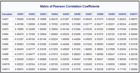
To demonstrate the Variable Cluster node, I have created a small data set with 11 variables. Display 2.93 shows the correlation matrix of variables.
Display 2.93
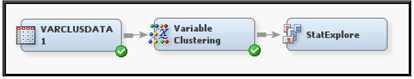
Display 2.94 shows the process flow diagram for clustering the variables in the data set.
Display 2.94
The properties of the Variable Clustering node are shown in Display 2.95.
Display 2.95
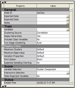
In this example, I set the Clustering Source property to Correlation. I have chosen to use the correlation matrix as the source for clustering, so the eigenvalues are calculated from the correlation matrix. From each eigenvalue, the algorithm calculates an eigenvector. The method of calculating eigenvalues and corresponding eigenvectors can be found in any linear algebra textbook or any multivariate statistics book such as “Applied Multivariate Statistical Analysis” by Richard A. Johnson and Dean W. Wichern.
In principle, if the number of variables in a cluster is k, you can extract k eigenvalues for that cluster of variables. But if the variables in the cluster are closely related to each other, you may find only a few eigenvalues larger than 1, and it may be more useful to group the closely related variables together in sub-clusters.
In our example, at the very beginning of the splitting process k = 11 since the very first cluster includes all the variables in the data set. But as the splitting process continues, the number of variables (k) in each resulting cluster will be less than 11.
bLet the largest eigenvalue of the correlation matrix be represented by λ1 and the next largest eigenvalue by λ2. A cluster is not split if
Calculation of Cluster Components
The eigenvalues of the correlation (or covariance) matrix and the corresponding eigenvectors are needed to calculate the cluster components. From the first eigenvalue
The algorithm then calculates two new variables called cluster components from the original variables using the elements of
the second cluster component is:
The cluster membership of a variable is unique if its weight in one cluster component is zero while its weight in the other cluster component is nonzero. Although the rotation takes us in this direction, it does not always result in a clear-cut assignment of variables to the clusters. In other words, it does not result in a variable having zero weight in one component and a nonzero weight in another component.
Assignment of variables to clusters
In order to achieve this uniqueness of membership (or non-overlapping of clusters), the algorithm compares the squared multiple correlations of each variable in the cluster with the two components
The algorithm goes further by iteratively re-assigning the variables to different clusters in order to maximize the variance accounted for by the cluster components. You can request that the hierarchical structure developed earlier in the process not be destroyed during this iterative re-assignment process by setting the KeepHierarchies property to Yes (see Diagram 2.96).
After the iteration process is completed, the cluster components are recomputed for each cluster, and they are exported to the next node.
Proportion of variance explained by a cluster component
One of the criterion used in determining whether to split a cluster is based on the proportion of variance explained by the first cluster component (or first principal component) of the cluster. This proportion of variance explained by the first cluster component is the ratio:
To get a general idea of how to calculate the proportion of variance explained by a principal component in terms of the eigenvalues, refer to “Applied Multivariate Statistical Analysis” by Richard A. Johnson and Dean W. Wichern. The exact calculation of the proportion of variance explained by the first cluster component by the Variable Clustering node in SAS Enterprise Miner may be different from the calculations shown in the book cited above.
Variable clustering using the example data set
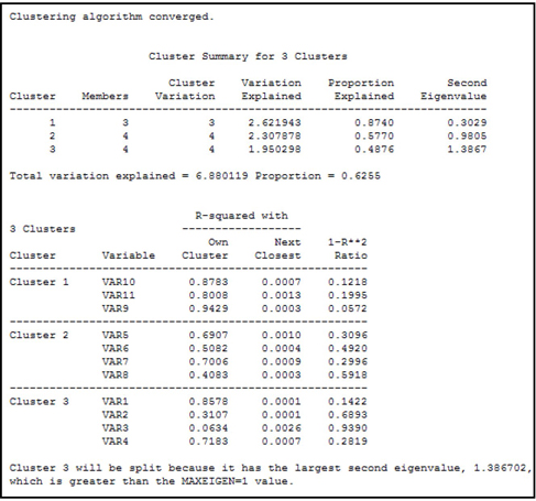
I ran the Variable Clustering node shown in Display 2.94. The output in the Results window is reproduced in output 2.6.
Output 2.6

Output 2.6 (cont’d)

Output 2.6 (cont’d)
Output 2.6 (cont’d)

As a way of reducing the number of inputs (dimension reduction), you can select one representative variable from each cluster. A representative variable of a cluster can be defined as the one with the lowest 1-R**2 Ratio. This ratio is calculated as:
An alternative way of achieving dimension reduction is to replace the original variables with cluster components.
Display 2.96 shows the cluster plot.
Display 2.96
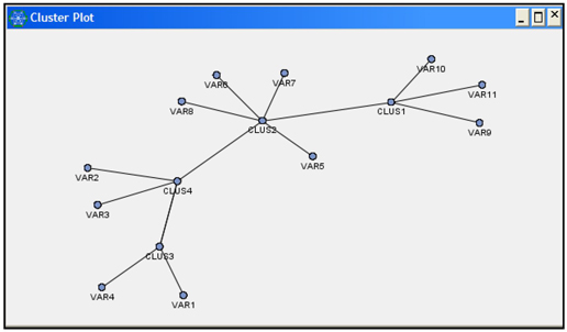
The variables exported to the next node are shown in Display 2.97.
Display 2.97

The 11 original variables and the 4 new variables (Clus1, Clus2, Clus3, and Clus4) are exported to the next node. You could develop a predictive model using only the four newly constructed variables Clus1, Clus2, Clus3, and Clus4 instead of the original 11 variables. Thus, the Variable Clustering node helps in reducing the inputs and reducing the danger of collinearity.
An alternative to using the constructed variables Clus1, Clus2, Clus3, and Clus4 is to select one input variable from each of the four clusters presented in Output 2.6. The best input variable to select from each cluster can be determined on the basis of the correlation of the input to the cluster component or its correlation with the target variable.
Note that I have not included a target variable in the example data set I used to demonstrate the Variable Clustering node. If you include another variable with the role of TARGET, then the Variable Clustering node excludes it from creating clusters. This becomes clear in Chapter 3 where I demonstrate how the Variable Clustering node is used for variable selection.
2.8.5 Cluster Node
The Cluster node can be used to create clusters of customers (observations) with similar characteristics. An examination of these clusters enables you to discover patterns in your data and also helps identify the inputs and input combinations that are potentially good predictors of the target variable. Cluster analysis is an unsupervised learning technique in the sense that it creates the clusters from the input variables alone, without reference to any target variable. Cluster analysis by itself does not tell you how the inputs are related to the target. Additional analysis is needed to find out the relationship of the clusters to the target variable. This sort of clustering can be used, for example, to segment your customers, without reference to any particular target variable, just to see if your customers (observations) naturally fall into different groups or clusters. Customers who end up in the same cluster are similar in some way, while customers in different clusters are relatively dissimilar.
In order to demonstrate the properties and the results of the Cluster node, I have used a data set of 5,000 credit card customers of a hypothetical bank. These customers were observed during an interval of 6 months, which is referred to as the performance window. During this performance window, some of the customers cancelled their credit cards and some retained them. I created an indicator variable, called Cancel, which takes the value 1 if the customer cancelled his credit card during the performance window and 0 if he did not. In addition, data was appended to each customer’s record showing his demographic characteristics and other information relating to the customer’s behavior prior to the time interval specified by the performance window. Some examples of customer behavior are: the number of credit card delinquencies, the number of purchases, and the amount of his/her credit card balance – all for the period prior to the performance window.
We use only the input variables to create the clusters, and we pass the cluster labels and cluster numbers created by the Cluster node to other nodes such as the Regression node for further analysis. The cluster labels or numbers can be used as nominal inputs in the Regression node. Display 2.98 shows the process flow for demonstrating the Cluster node.
Display 2.98
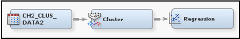
A Regression node is attached to the Cluster node to show how the variables created by the Cluster node are passed to the next node. Instead of the Regression node, you could use the Stat Explore or Graph Explore node to compare the profiles of the clusters.
Display 2.99 shows the Properties window for the Cluster node.
Display 2.99
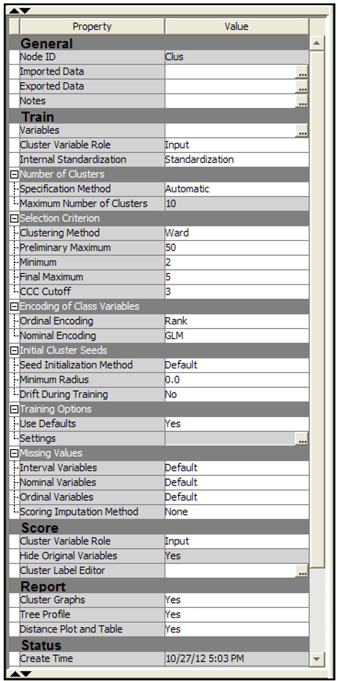
In the Train group I set the Cluster Variable Role to Input. After the cluster node creates the clusters, it creates a nominal variable called _Segment_, which takes the value 1, 2, 3, etc., showing the cluster to which an observation belongs. When you set the value of the Cluster Variable Role property to Input, the variable _segment_ is assigned the role of Input and passed to the next node. Another nominal variable called _Segment _Label_ takes the values Cluster1, Cluster2, Cluster3, etc., showing the label of the cluster. The variable _Segment_ can be used as a nominal input in the next node. Alternatively, you can set the value of the Cluster Variable Role property to Segment resulting in a segment variable with the model role of Segment. This can be used for by-group processing in the next node.
The settings in the Number of Clusters group and in the Selection Criterion cause the Cluster node to perform clustering in two steps. In the first step, it creates a number of clusters not exceeding 50 (as specified by the Preliminary Maximum property), and in the second step it reduces the number of clusters by combining clusters, subject to two conditions specified in the properties: (1) The number of clusters must be greater than 2 (as specified by the value of the Minimum property), and (2) the value of the Cubic Clustering Criterion (CCC) statistic is greater than or equal to the Cutoff, which is 3. The Ward method is used to determine the final maximum number of clusters.
I then ran the Cluster node and opened the results window. A partial list of the Mean Statistics by cluster is shown in Display 2.100
Display 2.100
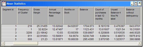
Display 2.100 shows how the mean of the inputs differs from cluster to cluster. Cluster 2 (segment id =2) has only one observation. SAS Enterprise Miner created a separate cluster for this observation because it has some outliers in the inputs. The customer in cluster 2 generates the highest average gross margin (32.8) for the company. (Gross margin is revenue less cost of service.) The customer in cluster 2 differs from customers in other clusters in other ways: although she makes 13.6 purchases per year with an average daily balance of $1123.43, this customer has an unpaid balance of $1321.54 with four months past due, and an average balance of 10.31 without delinquency. While cluster 1 ranks highest in average gross margin (a measure of customer profitability), Clusters 3 ranks highest in total profits (gross margins) earned by the company since it contains the largest number of customers (3206). Cluster analysis can often give important insights into customer behavior as it did in this example.
To illustrate how the output of the Cluster node is exported to the subsequent nodes in the process flow, I attached a Regression node to the Cluster node. The variables passed to the Regression node are shown in Display 2.101.
Display 2.101
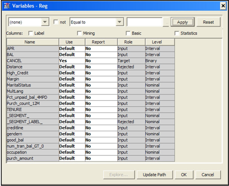
Since I set the value of the Cluster Variable Role property to Input, the variable _SEGMENT_ is assigned the role of Input by the Cluster node and is passed on to the Regression node as a nominal variable.
You can use this nominal variable as an input in the regression. Alternatively, if I had selected Segment as the value for the Cluster Variable Role property, then the Cluster node would have assigned the role of Segment to the variable _SEGMENT_, in which case it could be used for by-group processing.
2.8.6 Variable Selection Node
The Variable Selection node can be used for variable selection for predictive modeling. There are number of alternative methods with various options for selecting variables. The methods of variable selection depend on the measurement scales of inputs and the targets.
These options are discussed in detail in Chapter 3. In this chapter, I present a brief review of the techniques used by the Variable Selection node for different types of targets, and I show how to set the properties of the Variable Selection node for choosing an appropriate technique.
There are two basic techniques used by the Variable Selection node. They are the R-Square selection method and the Chi-Square selection method. Both these techniques select variables based on the strength of their relationship with the target variable. For interval targets, only the R-Square selection method is available. For binary targets both the R-Square and Chi-Square selection methods are available.
2.8.6.1 R-Square Selection Method
To use the R-Square selection method, you must set the Target Model property of the Variable Selection node to R-Square, as shown in the Display 2.102.
Display 2.102
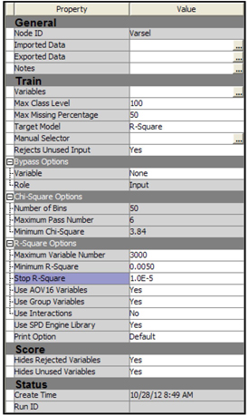
When the R-Square selection method is used, the variable selection is done in two steps. In Step 1, the Variable Selection node computes an R-Square value (the squared correlation coefficient) with the target for each variable, and then assigns the Rejected role to those variables that have a value less than the minimum R-square. The default minimum R-square cut-off is set to 0.005. You can change the value of the minimum R-square by setting the Minimum R-Square property to a value other than the default.
The R-square value (or the squared correlation coefficient) is the proportion of variation in the target variable explained by a single input variable, ignoring the effect of other input variables.
In Step 2, the Variable Selection node performs a forward stepwise regression to evaluate the variables chosen in the first step. Those variables that have a stepwise R-square improvement less than the cut-off criterion have the role of rejected. The default cut-off for R-square improvement is set to 0.0005. You can change this value by setting the Stop R-Square property to a different value.
For interval variables, R-square is calculated directly by means of a linear regression of the target variable on the interval variable, assessing only the linear relation between the interval variable and the target.
To detect non-linear relations, the Variable Selection node creates binned variables from each interval variable. The binned variables are called AOV16 variables. Each AOV16 variable has a maximum of 16 intervals of equal width. The AOV16 variable is treated as a class variable. A one-way analysis of variance is performed to calculate the R-Square between an AOV16 variable and the target. These AOV16 variables are included in Step 1 and Step 2 of the selection process.
Some of the interval variables may be selected both in their original form, as well as in their binned (AOV16) form. If you set the Use AOV16 Variables property to Yes, then the AOV16 variables are passed to the next node. For variable selection, the number of categories of a nominal categorical variable can be reduced by combining categories that have similar distribution of the target levels. To use this option, set the Use Group Variables property to Yes.
2.8.6.2 Chi-Square Selection Method
When you select the Chi-Square selection method, the Variable Selection node creates a tree based on Chi-square maximization. The Variable Selection node first bins interval variables, and uses the binned variable rather than the original inputs in building the tree. The default number of bins is 50, but you can change the number by setting the Number of Bins property to a different value. Any split with Chi-square below the specified threshold is rejected. The default value for the Chi-square threshold is 3.84. You can change this value by setting the Minimum Chi-Square property to the desired level. The inputs that give the best splits are included in the final tree, and passed to the next node with the role of Input. All other inputs are given the role of Rejected.
2.8.6.3 Variable Selection Node: An Example with R-Square Selection
I use a data set that consists of 17,880 observations but only nine inputs and a binary target in order to show the results produced by different settings of the properties of the Variable Selection node. The flow diagram for this demonstration is shown in Display 2.103.
Display 2.103
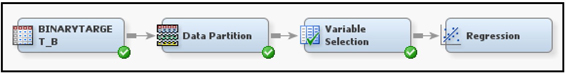
Display 2.104 shows the Variables window of the Input Data node. The data set is partitioned such that 50% is allocated to Training, 30% to Validation, and 20% to Test.
Display 2.104
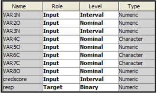
Since the target variable is binary in this example, I could use any of the options available for the Target Model property (see Display 2.102). I chose the R-Square selection method.
Next, I select the threshold values for the Minimum R-Square and Stop R-Square properties. The Minimum R-Square property is used in Step 1 and the Stop R-Square property is used in Step 2. In this example, the Minimum R-Square property is set to the default value, and the Stop R-Square property to 0.00001. The Stop R-Square property is deliberately set at a very low level so that most of the variables selected in the first step will also be selected in the second step. In other words, I effectively by-passed the second step so that all or most of the variables selected in Step 1 are passed to the Decision Tree node or Regression node that follows. I did this because both the Decision Tree and Regression nodes make their own selection of variables, and I wanted the second step of variable selection to be done in these nodes rather than in the Variable Selection node.
Display 2.105
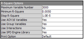
From Display 2.105, you can see that I set the Use AOV16 Variables property to Yes. If I chose No, the Variable Selection node (i.e., the underlying PROC DMINE) would still create the AOV16 variables and include them in Step 1, but not in Step 2. In addition, if you select No, they will not be passed to the next node.
When you set the Use Group Variables property to Yes, the categories of the class variables are combined, and new variables with the prefix of G_ are created. (This is explained in more detail in the next chapter.)
With these settings, I ran the Variable Selection node. After the run was completed, I opened the Results window by right-clicking on the Variable Selection node and selecting Results. Display 2.106 shows the results.
Display 2.106

The bar chart in the top left quadrant of Display 2.106 shows the variables selected in Step 2. The bottom left quadrant shows a histogram of the R-Square values computed in Step 1. The table in the top right quadrant shows the variables selected in Step 2 and passed to the next node, along with their assigned roles. The output pane in the bottom right quadrant of the Results window shows the variables selected in Step 1. These are shown in Output 2.7.
Output 2.7
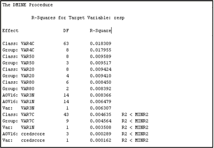
Scrolling down further in the output pane, you can see the variables selected in Step 2. These are shown in Output 2.8.
Output 2.8
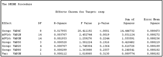
The variables shown in Output 2.8 were selected in both Step 1 and Step 2.
The next node in the process flow is the Regression node. By opening the Variables window of the Regression node, you can see the variables passed to it by the Variable Selection node. These variables are shown in Display 2.107.
Display 2.107

In output 2.7 and output 2.8, you see that VAR1N is rejected in Step 1, but AOV16_VAR1N is selected in both Step 1 and Step 2, indicting a non-linear relationship between VAR1N and the target.
The definitions of the AOV16 variables and the grouped class variables (G variables) are included in the SAS code generated by the Variable Selection node. You can access this code by right-clicking on the Variable Selection node and clicking Results → View → Scoring → SAS Code. Display 2.108 shows a segment of the SAS code.
Display 2.108
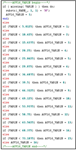
Display 2.108 (continued)
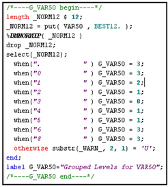
2.8.6.4 Variable Selection Node: An Example with Chi-Square Selection
To perform variable selection using the Chi-square criterion, set the Target Model property to Chi-Square. SAS Enterprise Miner constructs a CHAID type of tree, and the variables used in the tree become the selected variables. The relative importance of the variables is shown in Display 2.109.
Display 2.109

Display 2.110 shows the variables selected by Chi-square selection process.
Display 2.110

2.8.6.5 Saving the SAS Code Generated by the Variable Selection Node
If the Target Model property is set to R-Square, the Use AOV16 Variables property is set to Yes, and the Use Group Variables property is set to Yes, then the Variable Selection node generates SAS code with definitions ofAOV16 and Group variables. Right-click the Variable Selection node and then click Results to open the Results window. Click View → Scoring →SAS Code in the Results window in order to view the SAS code. Save the SAS code by clicking File →Save as and giving a name to the file where the SAS code is being saved and pointing to the directory where the file is being saved.
2.8.6.6 The Procedures behind the Variable Selection Node
If you set the Target Model property to R-Square and run the Variable Selection node, SAS Enterprise Miner uses PROC DMINE in variable selection. Prior to running this procedure, it creates a data mining database (DMDB) and a data mining database catalog (DMDBCAT) using PROC DMDB.
When you set the Target Model property to Chi-Square, the Variable Selection node uses PROC DMSPLIT and PROC SPLIT for selecting variables and for assessing the variable importance.
To see the syntax of these procedures, open the Results window, click View on the menu bar, and click SAS Results→ Log.
Display 2.111 shows the log from PROC DMBD.
Display 2.111
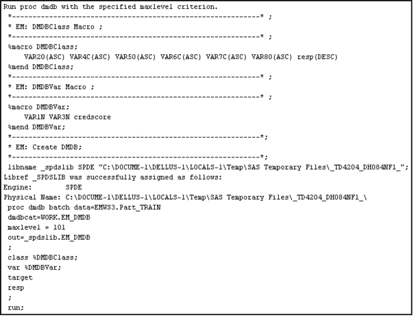
Display 2.112 shows the log from PROC DMINE.
Display 2.112
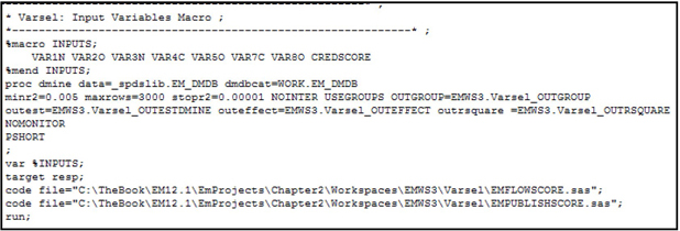
2.9 Tools for Data Modification
2.9.1 Drop Node
The Drop node can be used for dropping variables from the data set or metadata. The Drop node can be used to drop variables from a data set created by the predecessor node. For example, suppose I used the StatExplore node to examine the data from the BinaryTarget_B and the exploratory analysis led me to believe that the variable VAR6C is not needed in my project. So I used the Drop node to drop the variable VAR6C from the data set. Display 2.113 shows the process flow diagram I used for performing this task.
Display 2.113

You can drop any irrelevant variable by setting the Drop from Tables property to Yes. This setting drops the selected variables from the table that is exported to the next node.
To select the variables to be dropped, click ![]() , located to the right of Variables property of the Drop node. If you want to drop any variable, click in the Drop column in the variable and select Yes, as shown in Display 2.114.
, located to the right of Variables property of the Drop node. If you want to drop any variable, click in the Drop column in the variable and select Yes, as shown in Display 2.114.
Display 2.114
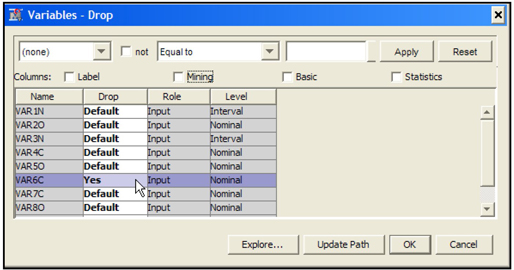
Click OK and run the Drop node. You can open the Exported Data set and verify that the variable VAR6C is dropped from the Exported Data.
2.9.2 Replacement Node
In contrast to the Filter node discussed in Section 2.7.3, the Replacement node can be used to filter out extreme values in a variable without losing any observations. The Replacement node can also be used to change the distribution of any variable in the sample, if it is appropriate to do so. If the variable has either a bi-modal or extremely skewed distribution, you can use the Replacement node to make its distribution more centralized or symmetric.
In this section I use the Replacement node to eliminate certain implausible values that some of the variables have in the modeling data set. This process is also called filtering, but it is filtering without loss of observations.
The data set used in this illustration has 5000 observations and 17 variables, including the target variable.
To use the Replacement node to filter (clean up) the data, I create the process flow diagram shown in Display 2.115.
Display 2.115
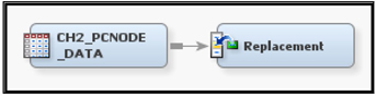
There are a number of default methods available of filtering. A description of these methods can be found in the online help. You can choose default method by setting the Default Limits Method property to one of the values shown in Display 2.116.
Display 2.116

Specify the cut-off values for the selected method by setting the Cutoff Values property, as shown in Display 2.117.
Display 2.117
Run the Replacement node and click OK.
The next example demonstrates how to use the Replacement Editor to access the interval variable table, and then enter the cut-off values either manually or by using movable sliding line.
I set the Default Limits Method property to User-Specified Limits.
Next, I open the Replacement Editor window by clicking ![]() to the right of the Replacement Editor property under the Interval Variables group. The Interactive Replacement Interval Filter window, showing a list of all the interval variables, opens as shown in Display 2.118.
to the right of the Replacement Editor property under the Interval Variables group. The Interactive Replacement Interval Filter window, showing a list of all the interval variables, opens as shown in Display 2.118.
Display 2.118
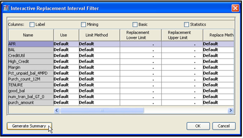
I select the variable APR (Annual Percentage Rate) and click Generate Summary. The Summary Table dialog box opens with the prompt “Summary statistics have not yet been calculated. Would you like to do this now?” I click Yes. Then a chart opens in the Interactive Replacement Interval Filter window.
By moving the reference line above the chart and clicking Apply Filter, I changed the Replacement Lower Limit to 3.56115, as shown in Display 2.119.
Display 2.119

I changed the lower cut-off value for the variable purch_amount to 0 by clicking on the variable purch_amount, typing 0 in the column Replacement Lower Limit, and clicking Apply Filter.
I then clicked Refresh Summary. After the summary table refreshed, I clicked OK, and the Interactive Replacement Interval Filter window closed. I ran the Replacement node and opened the results window. Display 2.120 shows the cut-off values I specified for the variables APR and purch_amount.
Display 2.120

2.9.3 Impute Node
The Impute node is used for imputing missing values of inputs. The icon of this node, along with other icons of the Modify group, appears on the toolbar when you select the Modify tab of the SAS Enterprise Miner window (Display 2.3).
Display 2.121 shows the Impute node selected in a process flow diagram.
Display 2.121

The Impute node has a number of techniques for imputation. To select a particular technique, you must first select the Impute node on the Diagram Workspace and set the Default Input Method property to the desired technique. For interval variables, the options available are Mean, Maximum, Minimum, Median, Mid-Range, Distribution, Tree, Tree Surrogate, Mid-Minimum Space, Tukey’s Biweight, Huber, Andrew’s Wave, Default Constant Value, and None. For class variables, the options are Count, Default Constant Value, Distribution, Tree, Tree Surrogate, and None.
You can select an imputation technique that is different from the default technique for any variable by opening the variables window. Click ![]() located in the Value column on the Variables property in the Impute node’s Properties panel. After the Variables window opens, you can select a method from the method column correponding to the variable you are interested in imputing by a particular method of your choice.
located in the Value column on the Variables property in the Impute node’s Properties panel. After the Variables window opens, you can select a method from the method column correponding to the variable you are interested in imputing by a particular method of your choice.
2.9.4 Interactive Binning Node
I will demonstrate the Interactive Binning node using a data set for a hypothetical bank. There is a binary target variable that takes the value 1 if the customer cancelled her account during a certain time interval called the performance window. In addition to the target variable, the data set has 15 inputs, some of which are interval-scaled and some of which are nominal variables, which capture the demographic characteristics and customer behavior of each customer prior to the performance window.
Binning helps in uncovering complex non-linear relationships between the inputs and the target variable in a modeling data set.
Display 2.122 shows the process flow diagram used for demonstrating the Interactive Binning node.
Display 2.122

Display 2.123 shows the properties of the Interactive Binning node.
Display 2.123
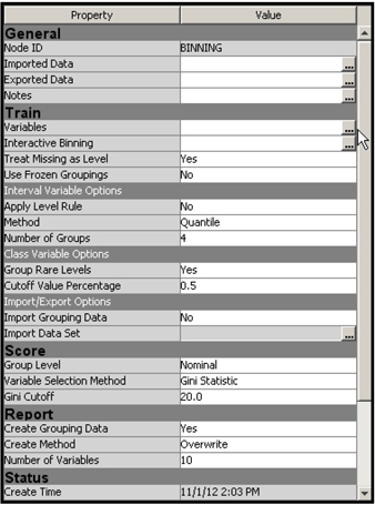
If you run the Interactive Binning node using these property settings, each interval-scaled variable will first be “binned” into four bins (groups). Binning is a method for converting an interval-scaled variable, with its infinite range of possible numerical values, into a categorical variable, which takes on a limited number of values, corresponding to the classes into which the observations may fall. Binning involves grouping the observations by sorting them into bins or buckets corresponding to more or less narrow ranges of the values that the original interval-scaled variable takes on. Each of these bins becomes one of the classes of the resulting categorical variable. Since I set the Method property in the Interval Options property group to Quantile, the ranges of values assigned to each bin are defined such that each interval5 contains an approximately equal number of observations. With the settings as shown in Display 2.123, for example, the interval-scaled variable APR is divided into four intervals, namely, values less than 11.88, values from 11.88 to 13.62, values from 13.62 to 15.52, and values 15.52 and above. In addition, a separate bin is created for missing values, since I set the Treat Missing as Level property to Yes.
For nominal variables, the bin is defined as a category. For example, the input “occupation” has 19 levels. So initially each level is treated as a bin. An additional bin is assigned to the missing category.
After the bins are formed, the Gini statistic is computed for each input. If the Gini statistic for a variable has a value above the minimum cut-off specified by the Gini Cutoff property, the variable is assigned the role of “input”; otherwise, it is designated as “rejected.”
Display 2.124 shows the output statistics from results window after I ran the Interactive Binning node with the properties specified in Display 2.123.
Display 2.124

You can see that all but four variables are rejected on the basis of the minimum cut-off value of 20, which is set by the Gini-Cutoff property.
Splitting a Group (Bin)
Using the variable TENURE from our example, this example shows how you can interactively change the split points or bins. Display 2.124 shows that the variable TENURE is rejected because it has a Gini coefficient of 18.631, which is below the minimum cut-off value of 20. By judiciously changing the split points of the bins, we may be able to improve the Gini statistic of this variable. To start the process, click ![]() located to the right of the Interactive Binning property as shown in Display 2.123.
located to the right of the Interactive Binning property as shown in Display 2.123.
The Interactive Binning window opens, as shown in Display 2.125.
Display 2.125

Because I am interested in re-defining the bins for the TENURE variable, I selected TENURE from the variable list by clicking Select and then clicking the Groupings tab. The details of the bins of the TENURE variable are shown in display 2.126.
Display 2.126

I right-click on Group 3 and select Split Bin. A text box opens, prompting me for a new cutoff value. I enter the new cut-off value (24) and click OK. Display 2.127 shows the new bins that were created.
Display 2.127

The original group 3 is split into two groups, but the same Group number is assigned to both of the newly created bins. To change this, right-click on the row corresponding to any of the newly constructed groups and select New Group, as shown in Display 2.127. As a result, we get a new definition of the bins, as shown in Display 2.128. Now the Gini value is 20.890.
Display 2.128
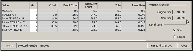
To save the changes, click Close, and then click Yes in the Save Changes dialog box.
You can open the Results window and view the Output Variables table. Display 2.129 shows the output variables from the Results window.
Display 2.129
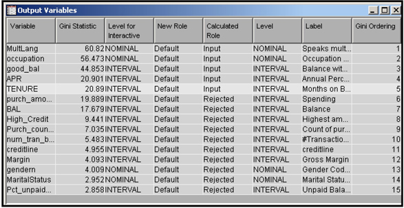
The Gini Statistic for TENURE is 20.89 after we interactively created new bins. The role of the variable TENURE changed from Rejected to Input after the split.
Display 2.128 shows that the newly created bin consisting of customers with tenure between 24 and 33 months has an event (cancellation) rate of 54.9%—far above the overall average rate of 15.02%. Thus the splitting has highlighted the fact that a customer is most vulnerable after two years of being with the company. But since this newly formed group has only 164 customers, we should investigate this phenomenon further with a larger sample.
The variables that are passed to the node following the Interactive Binning node, and their roles, are shown in Display 2.130.
Display 2.130

Combine Groups
Now I will show how to combine groups using the Interactive Binning node. We will use the variable OCCUPATION for this illustration.
As before, launch the interactive binning process by clicking ![]() located to the right of the Interactive Binning property. Then, in the Interactive Binning window, select the variable occupation from the Variables tab, as shown in Display 2.131.
located to the right of the Interactive Binning property. Then, in the Interactive Binning window, select the variable occupation from the Variables tab, as shown in Display 2.131.
Display 2.131

Click the Groupings tab, and select the Coarse Detail Level, as shown in Display 2.132. In the initial run, occupation groups 11, 12, 13, 20, 23, 51, 52, 61, 62, and 80 are combined into Group 11 (Bin 11).
Display 2.132
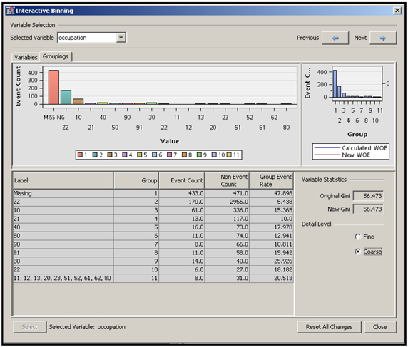
Now, to demonstrate the interactive binning process, let’s combine Groups 10 and 11 by opening the Fine Detail table, as shown in Display 2.133.
Display 2.133
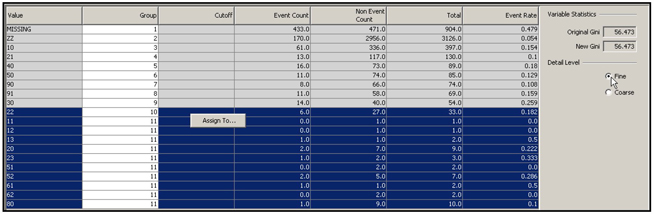
Select all occupation levels in groups 10 and 11 in the Fine Detail table, right-click, and select Assign To. In the Group Selection dialog box, select 10 and click OK.
We now have combined group 10 with group 11 and named the new group number 10, as seen in Display 2.134.
Display 2.134

Due to the combining of groups 10 and 11, there is a slight deterioration in the Gini coefficient.
If you go back to the Course Detail table, you can see the combined groups.
To save the changes, click Close, and then click Yes in the Save Changes dialog box.
2.9.5 Principal Components Node
Principal components are new variables constructed from a set of variables. They are linear combinations of the original variables. In predictive modeling and exploratory analysis, principal components are derived from the inputs in a given modeling data set. In general, a small number of principal components can capture most of the information contained in all the original inputs, where the information is measured in terms of the total variance. For example, if you have 100 inputs in your data set, you can construct 100 principal components, provided there are no linear dependencies among the inputs. However, most of the information contained in the 100 inputs can generally be captured by far fewer than 100 principal components.
The principal components can be constructed from the eigenvectors of the variance covariance matrix of the variables. The procedure for calculating the eigenvalues, eigenvectors, and the principal components is described in section 2.11.2 of the Appendix to Chapter 2.
The principal components are mutually orthogonal. Therefore, when you use them instead of the original inputs in developing models, you do not face the problem of collinearity. You can also use principal components analysis for detecting multidimensional outliers in a data set.
In this section, I demonstrate how you can use the Principal Components node for dimension reduction.
Display 2.135 shows the process flow diagram with an Input Data node and Principal Components node. The Regression node is also attached at the end in order to show how the principal components generated by the Principal Components node can be used as inputs into a logistic regression
Display 2.135
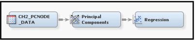
The list of variables included in the Input Data node is shown in Display 2.136.
Display 2.136

Since the role of the variable CANCEL is Target, it is not included in constructing the principal components.
Display 2.137 shows the property settings I use in this demonstration.
Display 2.137

In the Properties panel, the Eigenvalue Source property is set to Correlation. Therefore, the Principal Components node will use the correlation matrix of the inputs shown in display 2.136.
Run the Principal Components node. Display 2.138 shows that the weights used for calculating the first principal component.
Display 2.138
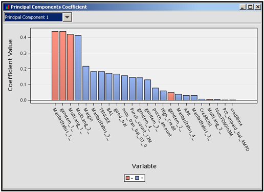
The principal components are calculated for each observation as weighted sums of the original variables (inputs), where the weights are the principal component coefficients that are shown in Display 2.138. The nominal variable MultLang has three levels: M (missing), N (no), and Y (yes). The Principal Components node has converted this categorical variable into three dummy variables: MultLang_1_, MultLang_2_, and MultLang_3_. Similarly, dummy variables are created for the other nominal variables, gender and MaritalStatus. Since these dummy variables are numeric, they could be used in the calculation of the correlation matrix.
As previously mentioned, the principal components are weighted sums (linear combinations), where the weights are the principal components coefficients. These coefficients are the eigenvalues of the correlation matrix of the inputs. (For a more detailed explanation, see Section 2.11.2 of the Appendix to Chapter 2)
The Principal Components node has created 20 principal components. Output 2.9shows the eigenvalues, the proportion of variance explained by each component, and the cumulative proportion of variation at each component. Since the Cumulative proportion eigenvalue cutoff of 0.95 (set by the EigenValue Cutoff Cumulative property) reached at the 17th principal component, the number of selected principal components is equal to 17. Display 2.139 shows the eigenvalue plot.
Output 2.9
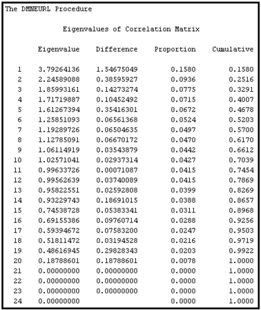
Display 2.139

Select the first 10 principal components interactively by opening the Interactive Principal Components window. Click ![]() next to the Interactive Selection property in the Properties panel (see Display 2.137). To select the first 10 principal components, change the number in the Number of Principal Components to be exported box to 10 as shown in Display 2.140, and click OK. Now, only 10 principal components will be exported to the successor node.
next to the Interactive Selection property in the Properties panel (see Display 2.137). To select the first 10 principal components, change the number in the Number of Principal Components to be exported box to 10 as shown in Display 2.140, and click OK. Now, only 10 principal components will be exported to the successor node.
Display 2.140

Display 2.141 shows the weights or principal components coefficients that will be used for calculating the principal components at each observation.
Display 2.141
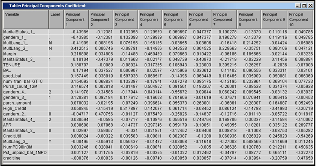
There are 16 original inputs (24 inputs including the dummy variables). The Principal Components node has created 10 new variables from the original variables using the weights (principal component coefficients) shown in Display 2.141. Output 2.9 shows that the proportion of variation explained by these 10 principal components is 0.7039.
Although we reduced the number of inputs from 24 to 10, we did sacrifice some information. Output 2.9 shows that the first 10 principal components explain only 70.39% of the total variance of all the inputs. But, in cases where the original inputs are highly intercorrelated, you may be able to capture a larger percentage of information from a few principal components.
I have attached a Regression node to the Principal Components node, as shown in the process flow diagram in Display 2.135. To see which variables are exported to the Regression node, select the Regression node in the process flow diagram. Click ![]() to the right of the Variables property. The Variables window appears, as shown in Display 2.142.
to the right of the Variables property. The Variables window appears, as shown in Display 2.142.
Display 2.142
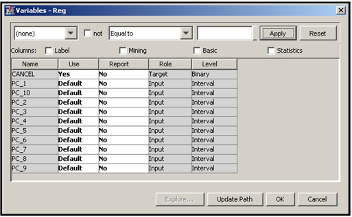
The Variable table contains the target variable and the selected principal components. I ran the Regression node. The estimated equation is shown in output 2.10.
Output 2.10
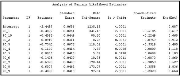
2.9.6 Transform Variables Node
Sections 2.9.6.1 and 2.9.6.2 describe the different transformation methods available in the Transform Variables node. Sections 2.9.6.5 and 2.9.6.6 show an example of how to make the transformations, save the code, and pass the transformed variables to the next node.
2.9.6.1 Transformations for Interval Inputs
Best
If you set the Interval Inputs property to Best, the Transform Variables node selects the transformation that yields the best Chi-squared value for the target.
Multiple
If you set the Interval Inputs property to Multiple, the Transform Variables node makes several transformations for each input and passes them to the successor node. By connecting the Regression node to the Transform Variables node, you can use the stepwise selection method to select the best transformations and the best variables.
Simple Transformations
The simple transformations are Log, Log10, Square Root, Inverse, Square, Exponential, Range, Centering, and Standardize. They can be applied to any interval-scaled input. When a log or inverse transformation is done, the node automatically adds an Offset value (a constant) to the variable if the minimum value of the input is less than or equal to zero. A logarithm of zero or less does not exist, so SAS produces a missing value when we take the logarithm of zero or a negative number. By adding an offset value, we avoid generating missing values. You can set the Offset Value property to a number to avoid taking a logarithm of a negative number. The simple transformations can be used irrespective of whether the target is categorical or continuous.
For input, the simple transformations are:
Standardize (
Binning Transformations
In SAS Enterprise Miner, there are three ways of binning an interval-scaled variable. To use these as default transformations, select the Transform Variables node, and set the value of Interval Inputs property to Bucket, Quantile, or Optimal under Default Methods.
Bucket
The Bucket option creates buckets by dividing the input into
Quantile
This option groups the observations into quintiles (bins) with an equal number of observations in each. If there are 20 quintiles, then each quintile consists of 5% of the observations.
Optimal Binning to Maximize the Relationship to the Target
This transformation is available for binary targets only. The input is split into a number of bins, and the splits are placed so as to make the distribution of the target levels (for example, response and non-response) in each bin significantly different from the distribution in the other bins. To help you understand optimal binning on the basis of relationship to target, consider two possible ways of binning. The first method involves binning the input variable recursively. Suppose you have an interval input
0 ≤ X < 5, 5 ≤ X < 10,.....,310 ≤ X < 315, 315 ≤ X ≤ 320
The values the new variable can take are 5, 10, 15... 315, which can be called splitting values. I can split the data into two parts at each splitting value and determine the Chi-square value from a contingency table, with columns representing the splitting value of the input
| Target level | ||
| 1 | ||
| 0 |
In the contingency table,
The computation of the Chi-Square statistic is detailed in Chapter 4.
The splitting value that gives the maximum Chi-Square determines the first split of the data into two parts. Then each part is split further into two parts using the same procedure, resulting in two more splitting values and four partitions. The process continues until no more partitioning is possible. That is, there is no splitting value that gives a Chi-Square above the specified threshold. At the end of the process, the splitting values chosen define the optimal bins. This is illustrated in Display 2.143.
Display 2.143
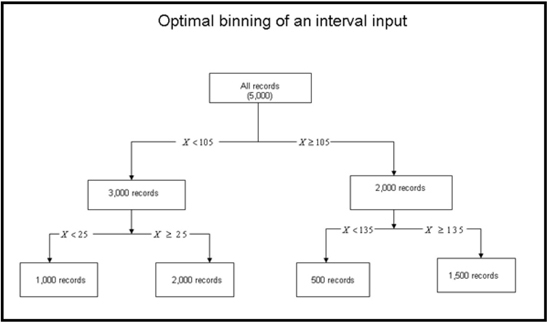
In Display 2.143, the optimal bins created for the input
Four optimal bins are created from the initial 64 bins of equal size. The optimal bins are defined by selecting the best split value at each partition.
The second method involves starting with the 64 or so initial bins and collapsing them to a smaller number of bins by combining adjacent bins that have similar distribution of the target levels. SAS Enterprise Miner does not follow the steps outlined above exactly, but its method of finding optimal bins is essentially what is described in the second method above. There are other ways of finding the optimal bins. Note that in Transform Variables node, the optimal bins are created for a one interval-scaled variable at a time, in contrast to the Decision Tree node where the bins are created with many inputs of different measurement scales, interval as well as categorical.
Maximum Normal
The node selects the transformation that maximizes normality from
To find the transformation that maximizes normality, sample quantiles from each of the transformations listed above are compared with the theoretical quantiles of a normal distribution. The transformation that yields quantiles that are closest to the normal distribution is chosen.
Suppose
Maximum Correlation
This is available only for continuous targets. The transformation that yields the highest linear correlation with the target is chosen.
Equalize Spread with Target Levels Power Transformation
This method requires a class target. The method first calculates variance of a given transformed variable within each target class. Then it calculates the variances of the variances of target classes. It chooses the transformation that yields the smallest variance of the variances.
Optimal Maximum Equalize Spread with Target Level
This method requires a class target. It chooses the method that equalizes spread with the target.
2.9.6.2 Transformations of Class Inputs
For class inputs, two types of transformations are available: Group Rare Levels and Dummy Indicators.
The Group Rare Levels transformation combines the rare levels into a separate group, _OTHER_. To define a rare level, you define a cutoff value using the Cutoff Value property.
The Dummy Indicators transformation creates a dummy indicator variable (0 or 1) for each level of the class variable.
To choose one of these available transformations, select the Transform Variables node and set the value of the Class Inputs property to the desired transformation.
By setting the Class Inputs property to Dummy Indicators Transformation, you get a dummy variable for each category of the class input. You can test the significance of these dummy variables using the Regression node. The groups that correspond to the dummy variables, which are not statistically significant, can be combined or omitted from the regression. If they are omitted from the regression, it implies their effects are captured in the intercept term.
2.9.6.3 Transformations of Targets
In SAS Enterprise Miner 12.1, the target variables can also be transformed by setting the Interval Targets and Class Targets properties. Click the Value column for either of these properties to select the desired property.
2.9.6.4 Selecting Default Methods
To select a default method for the interval inputs, select the Transform Variables node in the Diagram Workspace, and set the Interval Inputs property (under Default Methods section in the Properties panel) to one of the transformations described in Section 2.9.6.1. The selected method will be applied to all interval variables. Similarly, set the Class Inputs property to one of the methods described in Section 2.9.6.2. SAS Enterprise Miner applies the chosen default method to all inputs of the same type.
2.9.6.5 Overriding the Default Methods
Display 2.144 shows the flow diagram.
Display 2.144

If you do not want to use the default method of transformation for an input, you can override it by right-clicking ![]() located on the right side of Variables property of the Transform Variables node, as shown in Display 2.145. This opens the Variables window.
located on the right side of Variables property of the Transform Variables node, as shown in Display 2.145. This opens the Variables window.
Display 2.145

In the Variables window, click the Method column in the variable VAR1N, and select Optimal Binning. Similarly, select the log transformation for the variable credscore (credit score). Transformations are not done for other variables since the default methods are set to NONE in the Properties panel (see Display 2.146).
Display 2.146
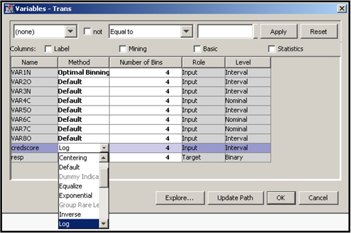
After you finish selecting the transformations, click OK and run the TransformVariables node.
2.9.6.6 Saving the SAS Code Generated by the Transform Variables Node
Right-click on the Transform Variables node and run it. Then click Results. In the Results window, click View→Scoring →SAS Code to see the SAS code, as shown in Display 2.147.
Display 2.147
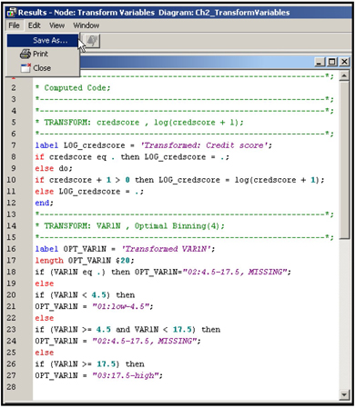
You can save this code by clicking File→Save As and typing in the path of the file and the filename.
If you want to pass both the original and transformed variables to the next node, you must change the Hide and Reject properties to No in the Score area in the Properties panel, and then run the Transform Variables node. If you open the Variables property in the next node, which is the Regression node in this case, you see both the original and transformed variables passed to it from the Transform Variables node, as shown in Display 2.148.
Display 2.148
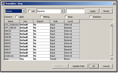
2.10 Utility Nodes
The following nodes are under the Utility tab: Control Point, End Groups, Ext Demo, Metadata, Reporter, SAS Code, Score Code Export, and Start Groups.
Since the SAS Code node is the most frequently used, I will focus on this node.
2.10.1 SAS Code Node
The SAS Code node is used to incorporate SAS procedures and external SAS code into the process flow of a project. You can also perform DATA step programming in this node. The SAS Code node is the starting point for creating custom nodes and extending the functionality of SAS Enterprise Miner 12.1.
The SAS Code node can be used at any position in the sequence of nodes in the process flow. For example, in Chapters 6 and 7, custom programming is done in the SAS Code node to create special lift charts.
We will explore the SAS Code node so you can become familiar with the SAS Code Editor window and with the macro variables and macros created by the SAS Code node. The macro variables refer to imported and exported data sets, libraries, etc. The macros are routines that can be used in the SAS code you write.
We will examine some of these macro variables and macros and write simple code and run it. For the purpose of this demonstration, I created a simple process flow that includes the Input Data node, the Transform Variables node, the SAS Code node, and the Regression node. This process flow diagram is shown in Display 2.149.
Display 2.149

The Input Data node imports the data from the directory that you entered in your project start-up code.
The SAS data set we use is called BinaryTarget_B and is located in the directory path specified by the libref, which we included in the project start-up code. On my computer, the data set is located in the directory C:TheBookEM12.1DataChapter2. The Input Data node exports a data view of this data to the next node, which is the Transform Variables node. The exported data view is referred to as EMWS11.IDS_Data, where EMWS11 is a libref assigned by SAS Enterprise Miner and IDS stands for Input Data Source. Click ![]() located to the right of the Exported Data property of the Input Data node, and then click Properties. You can see the properties of the data view that are exported by the Input Data node, shown in Display 2.150.
located to the right of the Exported Data property of the Input Data node, and then click Properties. You can see the properties of the data view that are exported by the Input Data node, shown in Display 2.150.
Display 2.150

The libref EMWS11 can be different for different diagrams. As you will see later in the SAS Code node’s Code Editor, a macro name &EM_LIB is given to this libref. In Display 2.149, the Transform Variables Node follows the Input Data node. The data imported into the Transform Variables node is EMWS11.Ids_DATA, and the file exported by the Transform Variables node to the following node (SAS Code node) is EMWS11.Trans_TRAIN, where Trans denotes that the data set or view is created by the Transform Variables node.
In this example, I transformed two variables using the Transform Variables node: VAR1N and credscore. Both variables are interval scaled. VAR1N is transformed to a categorical (nominal) variable and named OPT_VAR1N. OPT_VAR1N is obtained by binning the original variable VAR1N using the Optimal Binning method discussed earlier in Section 2.9.6.1 (Transformation for Interval Inputs). The second transformed variable is the natural logarithm of the variable credscore, and it is named LOG_credscore. Both the transformed and original variables are included in the data set exported by the Transform Variables node.
We can verify that the data set that is exported by the Transform Variables node to the SAS code node is EMWS11.Trans_TRAIN by first updating the path (to update the path, right click the SAS Code node and click “Update”) and then clicking ![]() located on the right of the the Imported Data property of the SAS Code node Properties panel.
located on the right of the the Imported Data property of the SAS Code node Properties panel.
Display 2.151 shows data set imported by the SAS Code node.
Display 2.151

Display 2.152 shows the variables in the data set that are imported into to the SAS Code node.
Display 2.152
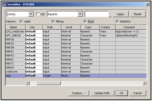
Now we will open the SAS Code node’s Code Editor window and become familiar with its components. Click ![]() located to the right of the Code Editor property in the Properties panel of the SAS Code node, as shown in Diplay 2.153.
located to the right of the Code Editor property in the Properties panel of the SAS Code node, as shown in Diplay 2.153.
Display 2.153

The Code Editor window opens, as shown in Display 2.154.
Display 2.154
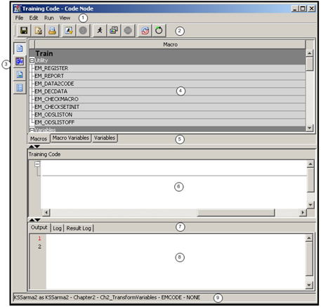
A detailed description of each component of the Code Editor user interface can be found in the Reference Help. The following descriptions of the components refer to the numbers in Display 2.154.
① Menu bar
② Tool Bar: For a complete description of all the buttons, refer to the SAS Enterprise 12.1 Reference Help.
There are two buttons on toolbar that I use to write and execute some simple programs in the SAS Code Editor. Press the Run Code button shown in Display 2.155 to execute the code you enter in the code window (indicated by ⑥ in Display 2.154).
Display 2.155
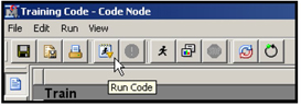
When you press the Run Node button shown in Display 2.156, the predecessor nodes also run if they were not executed before, along with the SAS Code node. If you create data sets in the SAS Code node and export them to the successor nodes, you should use the Run Node button.
Display 2.156

Refer to the Reference help for the use of all other buttons in the tool bar.
③ Use these four buttons to display the Training Code, the Score Code, the Report Code, or the Property Settings of the SAS Code node.
④ In this pane, you can display the list of macros, macro variables, or variables by clicking one of the tabs shown in ⑤.
⑤ Use these tabs to display the list of macros, macro variables, and variables.
Macros Tab: Under this tab there are two types of macros: (1) Utilities macros, which can be used in performing tasks such as preparing reports, registering data sets, etc. (2) Variables macros, which can be used to insert various strings into your SAS code. To illustrate this, I clicked on EM_INTERVAL_INPUT and dragged it into the Training Code pane indicated by ⑥. As a result, the string % EM_INTERVAL_INPUT is written into the SAS Code pane ⑥. I added “%put” in front of this string and a semi-colon at the end, and then clicked the Run Code button. I clicked the Log tab in ⑦. The log of the executed program appeared in the bottom window, as shown in Display 2.157. The interval inputs in the imported data set are Log_creditscore, VAR1N, and creditscore.
Display 2.157

The example shown here is trivial, but it does show how you can use the macros. For more complex examples, see the Reference Help.
Macro Variables Tab: Use this tab, shown in ⑤, to display and access the names of the data sets, libraries, etc. To illustrate this, I entered the code Proc means data= in the Training Code pane. Then I clicked the Macro Variables tab, selected the macro variable name EM_IMPORT_DATA, dragged it next to data=, and then added a semicolon in the data. Next, I typed the statement var, opened the Macros tab, and selected EM_INTERVAL_INPUT. I dragged that into the Training Code pane, placed it next to var in my SAS code, and clicked the Run Code button. Then I clicked the Output tab in in order to see the output that was generated by the SAS code that I entered in the Training Code pane. Display 2.158 shows the SAS code and the output.
Display 2.158

2.11 Appendix to Chapter 2
2.11.1 The Type, the Measurement Scale, and the Number of Levels of a Variable
In Section 2.5 we discussed how to create a SAS data source. In Step 4 of that process, we selected a Metadata Advisor. The options were Basic or Advanced. If you selected Advanced, there were additional customization steps. In this section, I illustrate how the metadata options you select determine the measurement level (scale) of a variable.
The type of a variable indicates whether it is a character or numeric variable. The measurement scale, which is also referred to as the measurement level, indicates how SAS Enterprise Miner treats the variables. If the measurement scale is interval, then the variable is treated as a continuous variable. If the measurement scale is nominal, then the variable is treated as a categorical variable. The “Number of Levels” of a variable refers to the number of unique values that a nominal variable can take on. Display 2.159 shows the “Level” (sometimes called measurement scale) of a variable, “Number of Levels” of a nominal variable and the “Type” of each variable,
2.11.1.1 Basic Option
All numeric variables are assigned the measurement scale of interval and all character variables are assigned the measurement scale of nominal. The measurement scales are shown in the Level column in Display 2.159, the type of the variable is shown in the Type column, and the number of levels of a variable is shown in the Number of Levels column. The number of levels is shown only if the measurement scale is nominal. The number of levels is the number of unique values that a nominal variable can take on.
In Display 2.159, the variable DEPC is a nominal variable that takes the values N and Y, where N indicates that the customer does not own a department store credit card, and Y indicates that he does. Hence we say that the variable DEPC has two levels.
For another example, the variable DELINQ is numeric (see the Type column), and its measurement scale (see the Level column) is designated to be Interval. Since DELINQ has been assigned an Interval measurement scale, the Number of Levels column shows missing values for this variable. In general, the number of levels (unique values) of an interval scaled variable is not shown in this table.
Display 2.159
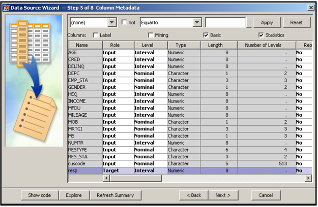
2.11.1.2 Advanced Option with default values
Here we select the Advanced advisor options and set the Class Levels Count Threshold property of the Advanced advisor option (see Display 2.11) to the default value of 20. Display 2.160 shows what measurement scale each variable is assigned. As mentioned before, with this setting, interval variables with less than 20 unique values (levels) are assigned the measurement scale of nominal.
For example, the variable DELINQ is a numberic variable indicating the number of delinquencies (late payments) by a customer. Since this variable has eight unique values (<20), it is assigned the measurement scale of Nominal, as shown in Display 2.160.
Display 2.160

2.11.1.3 Advanced Option with Customize Option
In this case, I selected the Advanced option, clicked Customize, and set the Class Levels Count Threshold property to 8. Display 2.161 shows how SAS Enterprise Miner assigns the measurement scales with this setting. For example, since the numeric variable DELINQ has eight unique values, it is now given the measurement scale of Inteval rather than Nominal because only those numeric variables that have fewer than eight unique variables are given the measurement scale of Nominal.
Display 2.161
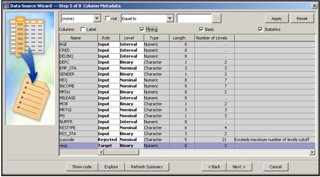
Two models built using the same variables are in general be different when different measurement scales are assigned to their variables. Hence it is important to be careful in assigning measurement scales. However, you can easily override the initial measurement scales assigned by SAS Enterprise Miner and manually assign different measurement scales to specific variables at a later stage in an Enterprise Miner Project, if necessary.
2.11.2 Eigenvalues, Eigenvectors, and Principal Components
In this section, I show how principal components are estimated from the eigenvectors of the variance- covariance matrix of a set of inputs. To clarify the concepts, I have created a small data set with 100 observations on three inputs. The inputs are X1, X2, and X3. The first 10 records of the input file are shown in Display 2.162.
Display 2.162

The mean vector of the inputs is (249.7654 39.9048 52.1560).
By subtracting the means from the raw inputs, we get the adjusted inputs, which are shown in Display 2.163.
Display 2.163

Variance-Covariance Matrix
Extraction of Eigenvalues
We extract the eigenvalues by solving this equation:
When you expand equation (2.1) you will get a polynomial of the third degree in
Total Variance of All Inputs
The total variance of the inputs X1, X2, and X3 is therefore =
This can be easily verified by directly calculating the total variance of the inputs as the sum of the diagonal elements of
Computation of Eigenvectors
The eigenvectors6 are obtained from the eigenvalues by solving this equation:
The solution of (2.2) is not unique. Therefore, one of the elements of
In our example, the eigenvalue-eigenvector pairs are:
Computation of Principal Components
The principal components of the set of adjusted inputs are calculated as the weighted sums of the inputs using the elements of the eigenvectors as weights.
The first principal component for the
PC1j = 0.8211X̃1j + 0.3557X̃2j − 0.4465X̃3j
where
X̃1j = X̃1j − X̅1,
X̃2j = X̃2j − X̅2,
X̃3j = X3j − X̅3 and
X̅1, X̅2 and X̅3 are the means of the variables X1,X2 and X3
The second principal component is calculated as:
PC2j = 0.3953X̃1j + 0.2099X̃2j + 0.8942X̃3j
The third principal component is calculated as:
PC3j = -0.4118X̃1j + 0.9107X̃2j -0.0317X̃3j
Display 2.1647 shows the principal components for the first ten observations.
Display 2.164

Proportion of Variance Explained by the Principal Components
Earlier I showed that the total variance in the inputs =
2.11.3 Cramer’s V
Cramer’s V measures the strength of relationship between two categorical variables. Suppose you have a categorical target
| ........ | Row Total | ||||
| ........ | |||||
| ........ | |||||
| .. | |||||
| ........ | |||||
| Column Total | ........ |
To calculate Cramer’s V, you must first calculate the Chi-Square Statistics under the null hypothesis that there is no association between
Cramer’s V =
Suppose that Y is a binary variable with two levels, and X is a 16-level categorical variable. Then Cramer’s V =
2.11.4 Calculation of Chi-Square Statistic and Cramer’s V for a Continuous Input
The AGE variable is divided into five groups (bins). Table 2.1 shows the number of responders (RESP=1) and non-responders (RESP=0).
Table 2.1

Table 2.2 shows the first step in calculating the Chi-Square value. It shows the expected number of observations in each cell under the null hypothesis of independence between rows and columns.
Table 2.2

The expected number of observations is obtained by applying the overall response rate to each row total given in Table 2.1.
The Chi-Square for each cell is calculated as
Table 2.3
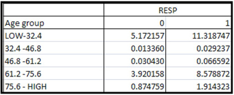
By summing the cell Chi-Squares shown in Table 2.3, you get the overall Chi-Square (
You can calculate these cell frequencies using the StatExplore node, as shown in Display 2.165.
Display 2.165
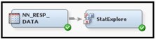
In order to calculate Chi-Square statistic and Cramer’s V for an interval variable such as Age, you have to bin it first. If you set the Chi-Square and the Interval Variables properties (in the Chi-Square Statistics properties group of the StatExplore node) to Yes, interval variables are binned and the Chi-Square statistic and Cramer’s V are calculated.
After running the StatExplore node, the cell-specific Chi-Square values can be retrieved from the Results window by clicking View→Summary Statistics→Cell Chi_Square in the menu bar. These cell-specific Chi-Square values are shown in Display 2.166.
Display 2.166

By selecting the Chi-Square Plot (or clicking in it), and then selecting the Table in the Results window, you can see the Chi-Square and Cramer’s V for all variables. A partial view of this table is shown in Display 2.167.
Display 2.167

Note that the Cramer’s V and the Chi-Square values for the variable AGE shown in Displays 2.166 and 2.167 are virtually identical to those we manually calculated and presented in Tables 2.1, 2.2, and 2.3.
2.12 Exercises
1. Create a Project Called CreditCards.
2. Create a data source using the SAS data set Ch2_Clus_Data2.
a. Select Basic for the Metadata Advisor Options.
b. Change the role of the variable Cancel to Target.
c. How many inputs have the Measurement Level of Interval?
d. How many inputs have the Measurement Level of Nominal?
e. Rename the data source as Option1.
3. Create a data source using the SAS data set Ch2_Clus_Data2.
a. Select Advanced for the Metadata Advisor Options.
b. Change the role of the variable Cancel to Target.
c. Select No to the question Do You want to build models based on the values of the decisions?
d. How many inputs have the Measurement Level of Interval?
e. How many inputs have the Measurement Level of Nominal?
f. Rename the data scource as Option 2.
4. Create a data source using the SAS data set Ch2_Clus_Data2.
a. Select Advanced for the Metadata Advisor Options and click Customize.
b. Change the Class Levels Count Threshold property to 3 and click OK.
a. Change the role of the variable Cancel to Target
b. Select No to the question Do You want to build models based on the values of the decisions?
c. How many inputs have the Measurement Level of Interval?
d. How many inputs have the Measurement Level of Nominal?
e. Rename the data source as Option 3.
5. Create a diagram and name it Explore.
a. The first node in the diagram is Input Data (use the data source Option 2), and the second node is StatExplore.
b. Select the StatExplore node. In the Interval Variable group, set the Interval Variable property to Yes
c. Run the StatExplore node and open the results window.
d. What are the top five variables that are most closely related to the target variable?
6. Create a diagram and name it VarSel1.
a. The first node in the diagram is Input Data (use the data source Option 2), and the second node is Variable Selection.
b. Select the Variable Selection node and set the Target Model property to R-Square.
c. Set the Use Aov16 Variables property to Yes.
d. Run the Variable Selection node.
e. Based on this analysis, what are the best five inputs?
7. Create a diagram and name it VarSel2.
a. The first node in the diagram is Input Data (use the data source Option 2), and the second node is Variable Selection.
b. Select the Variable Selection node and set the Target Model property to Chi-Square.
c. Set the Use Aov16 Variables property to Yes.
d. Run the Variable Selection node.
e. Based on this analysis, what are the best five inputs?
8. Create a diagram and name it VarSel3.
a. The first node in the diagram is Input Data (use the data source Option 2), and the second node is Variable Selection.
b. Select the Variable Selection node and set the Target Model property to R and Chi-Square.
c. Set the Use Aov16 Variables property to Yes.
d. Run the Variable Selection node.
e. What are the top five variables that are most closely related to the target variable?
Notes
1. All the illustrations presented here are from sessions in which SAS Enterprise Miner 12.1 is installed on a personal computer.
2. I use the terms “measurement scale” and “measurement level” interchangeably.
3. Alternatively I could have first appended the data set Data2 to the data set Data1 using the Append node. Then I could have passed the combined data set to the Transform Variables node for making the transformations in the combined data set. Since my intention is to highlight the fact that the Append node can be used at any point in the process flow, I made the transformations by connecting the Transform Variables node separately to each data set first. Then I combined the resulting output data sets using the Append node as shown in Display 2.69. These two sequences produce identical results.
4. The steps outlined here are not exact representation of the algorithm used by SAS Enterprise Miner to do variable clustering.
5. The terms “class interval,” “bucket,” “group,” and “bin” are used synonymously.
6. For examples of how to calculate eigenvalues and eigenvectors, see Anton, Howard, “Elementary Linear Algebra,” Wiley 2010, pages 295-301.
7. Due to rounding, the Principal Components presented here may differ slightly from those you get by using the formulas presented.