
Understanding color management
Embedding color profiles in images
Color calibrating devices
Configuring color management in Photoshop
Hard and soft proofing images for different devices
Using color management to print accurate colors
Adding crop marks when printing images
Color is one of the most important aspects in digital images. In fact, the look of most images is completely dependent upon the color composition. Unfortunately, color is not consistent as you move from device to device, so it is difficult to guarantee that the color corrections you make on one computer will match what you see on another or when the image is printed out.
Color management solves these problems by assigning color profiles that describe the colors in a device and then using those profiles to convert the image data as it is transferred from device to device. This chapter discusses color management and how Photoshop uses it to ensure the colors in your images are consistent as they are transferred to other devices and printed.
Few things are more frustrating that spending hours editing an image only to find out that the finished product looks terrible when you print it. Differences in monitor quality and even just the age difference between two monitors can result in severe variations in color in images. Additionally, differences in printers, ink, and paper also result in a high variance of color output. A good color management workflow helps you overcome these problems and gives you the best chance of matching the edited color with the final results when the image is outputted.
The following list describes a good color management workflow that helps you ensure accuracy when editing, distributing, and outputting image:
Calibrate your monitor using either a software application or a hardware calibration device.
Because the pixels in your monitor fade with age, you may need to calibrate your monitor monthly or at least at the start of any big projects.
Add color profiles that describe how color will appear on the output devices you are using.
Output devices can be specific monitors, portable devices, or printers.
Set up color management in the Adobe software.
Photoshop provides proofing options to preview the way that images will appear when they are outputted.
Save the color management data with the edited document.
This ensures that the edited document will contain the information you expect to use to output the image.
Color profiles mathematically define the way that a device interprets the level values that define color in an image. ICC (International Color Consortium) color profiles define the gamut (range) of colors that a device is capable of reproducing, because not all devices can produce the same color ranges.
Color Management Modules (CMMs), also called Color Matching Modules, like Apple's ColorSync and Microsoft's Windows Color System (WCS), utilize the ICC color profiles to match or convert the color levels between input and output sources. CMMs work by utilizing the source ICC color profile provided along with the original file and the destination ICC color profile for the output device to convert the colors in the original file to the appropriate values that will give the most consistent color result in the output.
ICC profiles are typically provided by hardware manufacturers of the monitors, printers, and other devices. Although these files are typically good enough for most needs, you also may want to develop your own profiles that take into account factors such as ambient lighting in your workspace, age of the monitor, and other variable conditions. Many high-end printing facilities provide profiles that allow you to accurately preview the final output from Photoshop before delivering the finished documents.
ICC profiles can be embedded into most of the common image file types, such as PSD, JPEG, EPS, TIFF, and PSB. Embedding the color profiles inside the actual document ensures that the images are displayed correctly when they are transferred between different devices.
To embed a color profile in an image, simply select the ICC Profile option, shown in Figure 29.1, when you use the File
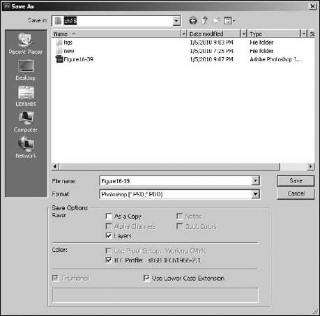
Figure 29.1. Embedding a color profile in an image is done by selecting the ICC Profile option in the Save As dialog box.
You also can embed a color profile in an image when you are using the File
A problem can occur with CMMs using the ICC color profiles: The RGB and CYMK colors can vary between different devices. That means you can get inaccurate translation between the two color modes.
To solve that problem, the Commission Internationale d'Elairage developed a set of device-independent color models. The CIE XYZ and CIE LAB color spaces are two of those device-independent color models. These color spaces are used as interim spaces when converting between the different color models.
The most important step in color management is to calibrate the monitor on the computer where you are editing images. Without the monitor calibrated, you could end up spending hours to get the perfect color tones in the image only to find that your monitor was off and the colors don't really look that good elsewhere.
Two methods are used for calibrating a monitor. The simplest, although least accurate, is to use software to manually adjust the gamma, brightness, contrast, and color that the system uses for the display. On Windows 7 systems, you can calibrate the monitor by selecting Start
The most accurate method of calibrating a monitor is to attach a device called a calorimeter flat to the display surface. The calorimeter and display must be shielded from all ambient light. Then calibration software that comes with the calorimeter sends a series of color signals to the display and compares the values seen by the calorimeter with known expected values. This establishes the current offsets in the color display, and ICC profiles can be created and the display's brightness, contrast, and RGB settings can be adjusted.

Figure 29.2. Calibrating color on the display in Windows is a process of adjusting the gamma, brightness, contrast, and colors.
Because ink and paper quality affect printer output so much, you cannot adjust the settings on a printer to calibrate color output. Instead, printers use ICC profiles that are created by printing a test sample with known output gamma, brightness, contrast, and color outputs. The sample test print is then analyzed by a photometer (sometimes called a spectrophotometer) to determine the actual output with known CYMK colors. Software that comes with the photometer then uses the difference between the two to create the ICC profile. Although the cost of the photometer and software is expensive, you can typically find an ICC profile for your printer/ink combination on the Internet for reasonable prices (usually about $20–$30).
Now that we have discussed the theory of color profiles, you are ready to configure and use the color management settings in Photoshop. The following sections discuss how to configure the color management settings in Photoshop, assign color profiles to images, and proof images using different color profiles.
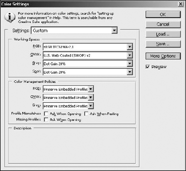
The color settings in Photoshop are configured using the Color Settings utility, shown in Figure 29.3. Launch the color settings dialog box by pressing Ctrl/
Tip
If you save your color settings as a preset file, you can use that preset in Adobe Bridge's Suite Color Settings dialog box (launched by pressing Ctrl/
The Settings menu option offers a list of preset color configurations that set the color options for the workspace and management policies for general purposes. If you really don't want to take the time to set up your own custom color configuration, you can use one of these presets. The presets list contains presets for North America, Europe, and Japan that fall into the following categories:
Monitor Color: Use this setting if you plan to use the images in a video or onscreen presentation. This setting uses the Monitor RGB option, which uses the current monitor's color space and in effect acts like color management is turned off in Photoshop.
General Purpose: Use this setting if you need to use the image for both print and onscreen viewing. This setting uses the sRGB color profile that best supports most monitors as well as the U.S. Web Coated (SWOP) v2 color profile for CYMK that works well for printing.
Newspaper: Use this setting for images that are intended for output to newspaper. The CYMK workspace is set to U.S. Newsprint, and the Gray and Spot colors are set to use a 25 percent Dot Grain that works well for printing to newspaper-type material.
Prepress: Use this setting for images that are intended for output to a printer. The RGB workspace is set to Adobe RGB, which provides a good range of colors for printing; the CYMK workspace is set to U.S. Web Coated (SWOP) v2, which works generally well for printing.
Web/Internet: Use this setting for images that are intended to be displayed on the Web. This option sets the RGB workspace to sRGB, which is the best for supporting a variety of computer monitors; the Gray workspace is set to Gray Gamma 2.2, which works best for displaying grayscale images on a variety of monitors.
You also can save any custom configuration that you define using the Save button and then load it later, even on another computer, by hitting the Load button.
The Working Spaces settings allow you to configure the ICC color profiles that the RGB, CYMK, Grayscale, and Duotone models use to display the images on your display while you are editing them. Using the appropriate color model helps you edit and adjust your images so they look as good as possible when they are viewed on the output medium.
The following list describes some of the profiles available in each of the workspaces:
RGB: Although there are many RGB color profiles, you likely will work with only two or three. The most common ones are the Adobe RGB and the sRGB IEC61966-2.1 (sRGB). The difference between the two is that the sRGB has reduced the gamut of colors it allows around the outer edges. This reduces the number of colors that can exist in the image so the colors are supported on the widest range of computer displays possible. That way, the image looks exactly the same on all displays.
Another RGB color profile you may end up using is the Monitor RGB. It sets the RGB working space to the current monitor space, which causes Photoshop to behave as if color management was turned off. This is actually handy if you are outputting the images to a medium that doesn't support color management, such as a video or a presentation application.
CYMK: The CYMK color model is typically used for printed images. Therefore, each of the available CYMK color profiles actually corresponds to a specific ink and paper combination. When you convert an image from RBG to CYMK using the Image

The most common profile you will use is U.S. Web Coated (SWOP) v2. Other color profiles may be provided by your printing press or by a printer manufacturer.
Gray: The Gray color profiles define the dot grain used to display images converted into grayscale using the Image
Spot: This specifies the dot grain to use when displaying spot color channels and duotones.
The Color Management Policies section of the Color Settings dialog box provides control over how Photoshop manages the RGB, CYMK, and grayscale images that are opened. Many images already contain ICC color profiles embedded in them, and the settings in this panel allow you to define how Photoshop uses those files in relation to the color profiles defined in the Working Spaces section.
For each of the three color modes, you can set the following options:
Off: When Off is selected, color management is disabled in images that you open or create. If you open an image with an embedded color profile, the color profile is ignored. You should be careful if you use this option while copying and pasting from one image to another, because although the color data is preserved, the colors may look different.
Preserve Embedded Profiles: This is the default option and is the best option to ensure the most consistent colors between images that are edited on different computers. When this option is selected, Photoshop maintains the embedded color profile information.
Convert to Working Profile: When this option is selected, Photoshop uses the color profile in the image to convert the data in the image to use the working color profile. The working color profile is then embedded in the image when it is saved.
The Color Management Policies also provide check boxes that allow you to turn on dialog boxes that pop up if you open or paste data into an image that has a color profile embedded that mismatches the working profile or is missing. The dialog box warns you and allows you to determine at that time how to handle color management for that image, as shown in Figure 29.4.

Figure 29.4. Enabling the Ask When Opening and Ask When Pasting options in the Color Settings dialog box presents notifications that allow you to handle images that either do not have an embedded color profile or have a color profile that does not match the current working color space.
Note
Photoshop allows you to open multiple images that use different color profiles. This can be useful if you are working on projects with images that are destined for different outputting. However, you should be careful if you need to share pixels between images—for example, cutting and pasting or selecting colors from one image that you want to be used in another image or sharing channels.
Photoshop also provides control over conversion between color profiles when you click the More Options button in the Color Settings dialog box. Figure 29.5 shows the Conversion Options and the Advanced Controls settings.

Figure 29.5. The More Options button extends the Color Settings dialog box and allows you to configure conversion and advanced controls for color management.
In the Conversion Options section, you can configure the following options:
Engine: This allows you to specify the CMM that will be used to manage conversion between color profiles. Typically, you have two options: Adobe ACE is provided by Adobe and is available on both Windows and Apple; the other option is the default CMM that is provided with your operating system—for example, Microsoft ICM on Windows or Apple CMM on Apple.
Intent: This option allows you to select one of the following options that determine how the CMM interprets colors between color spaces:
Perceptual: When this option is selected, all colors in the source color profile are compressed to fit in the destination color profile's gamut. Neighboring pixels are taken into consideration so the colors are adjusted proportionally. This provides a better perceptual translation because the relationship between the pixel and its neighbors is more important than finding the closest matching color.
Saturation: When this option is selected, colors in the source color profile that do not exist in the destination color profile's gamut are changed to the closest color value in the destination color profile without considering neighboring pixel values. This can result in a color shift that increases saturation in the image. Typically, this option is used only for images with lots of solid colors and not for photographs.
Relative Colorimetric: When this option is selected, colors are translated between profiles by mapping white in the source color profile with white in the destination color profile and then using that mapping to adjust the rest of the colors. This option usually works very well; however, if you are converting a smaller color space to a larger color space (CYMK to RGB, for example), a banding and dithering effect can result in the darker areas of the image.
Absolute Colorimetric: When this option is selected, Photoshop maps the colors between the two spaces by mapping between the absolute lab coordinates in each color profile. This option is used for hard proofing and simulating output on a specific printer.
Use Black Point Compensation: This simulates the entire dynamic range of the printer to ensure that the shadow details in the image are preserved. This option should be selected if you plan on using black point compensation when printing the image.
Use Dither: When this option is selected, Photoshop mixes colors in the destination color profile to simulate colors in the source color profile. This helps reduce blocky and banding artifacts that can otherwise occur.
Compensate for Scene-referred Profiles: This compares the video contrast when converting from scene to output color profiles, similar to color management in After Effects. This option is specific to working with video files in Photoshop.
In addition to the Conversion Options described in the previous section, Photoshop provides more Advanced Controls options when the More Options button is clicked. In the Advanced Controls section, you can configure the following options:
Desaturate Monitor Colors By: This specifies a percentage to desaturate colors when they are displayed on the monitor. Selecting this option helps you visualize the full range of color spaces with a similar gamut of the monitor. However, this can result in color mismatches between monitor display and output. Deselecting this option can result in two distinct colors appearing as the same color on the monitor.
Blend RGB Colors Using Gamma: This controls how RGB colors in the image are blended together to produce composite data, such as blending layers or painting. Selecting this option blends the RGB colors in the color space based on the gamma setting specified. A gamma of 1.00 is considered "colorimetrically correct" and likely provides the fewest edge artifacts.
Note
When you use Blend RGB Colors Using Gamma, layered documents look different when viewed in other applications than they appear in Photoshop.
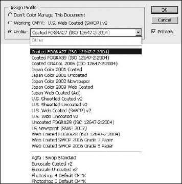
Photoshop allows you to assign color profiles to images. If the image already contains an embedded color profile, that color profile is replaced with the newly assigned color profile, but the level values in the image do not change.
To assign a color profile to an image, open the image in Photoshop and select Edit
Warning
Because layer adjustments, filters, and blending modes are based on the original colors, assigning a color profile to the image may alter the appearance of the layers. You should always assign a color profile to the image before you begin editing it if possible.
Don't Color Manage This Document: This removes any color profiles from the document that currently exist, and Photoshop displays the image according to the current working color space.
Working [Color Model] [Color Profile]: This adds the current working color profile to the image and uses that profile to display it while editing.
Profile: This allows you to select a color profile from a drop-down list that is embedded in the image. Which color profile is used to display the image depends on the color management settings described earlier.
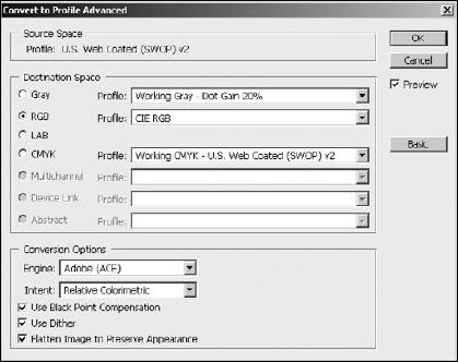
Photoshop allows you to convert images from one color profile to another. If the image already contains an embedded color profile, you likely want to keep the colors intact when moving from one profile to the next. Converting color profiles uses the color profile in the image to convert the color levels to match a new color profile and then embeds the new color profile in the image.
To convert an image from one color profile to another, open the image in Photoshop and select Edit
Source Space: This displays the source color space that was already embedded in the image.
Destination Space: In the basic dialog box, this option allows you to select the ICC profile to convert the image. In the Advanced dialog box, this option allows you to select the color mode and color profile to use when converting the image. This option often is a better method to change the color mode because it gives you direct control over both the color mode and color profile.
Conversion Options: The Engine, Intent, Use Black Point Compensation, and Use Dither options were discussed earlier in this chapter. The Flatten Image to Preserve Appearance option is provided to overcome the problem of blending layers. The problem with blending layers is that converting the layers individually and then flattening results in a different pixel color than flattening first and then converting. This can be a tough choice if you are relying on using the layers later.
In addition to embedding color profiles in images and setting the working color management settings, Photoshop provides quick proofing of images to see how they will appear in some of the common color profiles. This process is known as soft proofing.
To set up the proofing color space, select View
Device to Simulate: This allows you to select the color or device profile to use when proofing the colors in the image.
Preserve RGB/CYMK Numbers: When this option is selected, the colors appear without being converted to the color space of the specified output device.
Rendering Intent: See the Color Settings section earlier in this chapter for a description.
Black Point Compensation: See the Black Point Compensation section earlier in this chapter for a description.
Simulate Paper Color: If you select a CYMK-based device profile, this option simulates the slightly off-white property of actual paper according to the settings in the color profile.
Simulate Black Ink: If you select a CYMK-based device profile, this option simulates the dark gray that the color profile specifies represents solid black.
Load/Save: The Load and Save buttons allow you to load and save the custom proof settings.

Figure 29.8. Configuring custom proof condition allows you to proof images in some of the common color profiles.
After you have set up the proofing profile, you can proof the current image by selecting View
A useful aspect of Photoshop's proofing option is the ability to preview items using the Color Blindness options from the View
Printing Images from Photoshop can be as simple as pressing Ctrl/
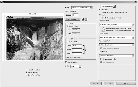
Figure 29.9. When printing in Photoshop using the Print dialog box, you can set print size and orientation and use color management to ensure that the colors printed match those you saw when editing the image.
The Print dialog box has the following general printing options that allow you to control the orientation, size, and location of the printed image, as well as the printer settings:
Preview: The preview window displays the image and its general location on the printed sheet of paper. The size of the paper also is displayed above the preview. The size of the paper is controlled by the printer settings dialog box.
Printer: This allows you to select the printer from the list of installed system printers. This option also displays a notification that the printer needs calibration if it has not been calibrated already. You should calibrate the printer before printing from Photoshop so the output provides the best results.
Print Settings: This launches the settings dialog box for the print driver. The settings dialog box for the printer likely gives you even more control over things such as paper size, paper type, print quality, and so on.
Orientation: The orientation buttons allow you to switch between landscape and portrait layout when printing the image.
Position: Using the Center Image option centers the image in the printable area on the printer. If the Center Image option is not selected, the Top and Left fields specify the relative position of the top-left corner of the image to the top-left corner of the printable area of the paper.
Scaled Print Size: This option allows you to scale the size of the image so it fits on the printed area perfectly. The scale specifies the size percentage where 100% is the original size. The Height and Width specify the height and width of the printed image. Selecting the Scale to Fit Media option disables the Scale, Height, and Width options, and the image is sized automatically to the same size as the printable area.
Bounding Box: When this is selected, a black box is added around the edges of the image.
Units: This sets the units used for the Position and Scaled Print Size options.
The most important aspect of color management is the ability to keep the output colors consistent with the colors seen when editing the image. Therefore, printing with color management is an extremely important part of Photoshop. Two options are available to use color management when printing from Photoshop: Let Photoshop manage the colors, or let the printer manage the colors.
Warning
When you use Photoshop for color management, you need to disable color management in the printer driver. This varies from driver to driver, so you need to look in the printer manual to find out how to do this. Conversely, if you are using the printer to manage color profiles, you must enable color management in the printer driver. If either of these steps is ignored, the printer will print the wrong set of colors.
Using Photoshop to manage the colors means that Photoshop sends the color data to the printer already converted to the appropriate device color profile gamut. For accurate results, this requires a good ICC profile that defines the color space for the printer.
Using the printer to manage colors means that Photoshop sends the printer the necessary color profile information for the current values in the image and the printer converts the image data to the appropriate gamut.
To print an image using color management, make sure the color management settings have been configured properly and press Ctrl/
Document: This uses the embedded color profile in the document or the working color profile configured in the Color Settings if no profile is present.
Proof: If this option is selected instead of the Document option, Photoshop emulates output from a different device than the current printer. This is known as a hard proof. Hard proofs are useful to test the output on less expensive devices before sending the output to a high-quality printer. You need to set up proofing using View
Color Handling: This allows you to select either Printer Manages Colors to use the printer for color management, Photoshop Manages Colors to use Photoshop for color management, or Color Separations (if the color model of the image is CYMK) to print a set of color separations or spot plates using the actual color values.
Printer Profile: This specifies the ICC color profile to use for the destination device. When you select the Photoshop Manages Colors option, this setting defines the color profile that Photoshop uses as the destination color profile when preparing the image to print.
Rendering Intent: This specifies how Photoshop converts colors from the document's gamut to the printer's gamut. When printing photos, you likely want to use Perceptual or Relative Colorimetric. See the conversion options section earlier in this chapter for more details on the available options.
Proof Setup: This allows you to select either the current working color profile or the custom profile defined by View
Simulate Paper Color: If you select a CYMK-based device profile, this option simulates the slightly off-white property of actual paper according to the settings in the color profile.
Simulate Black Ink: If you select a CYMK-based device profile, this option simulates the dark gray that the color profile specifies represents solid black.
Match Print Colors: This causes the print preview to show the colors as they will actually print. This is available only if Photoshop is used for color management.
Gamut Warning: When Match Print Colors is enabled, colors that are out of gamut in the image are highlighted in the preview option. This is extremely useful for determining the amount of color translation that must take place to print the image using the printer color profile. This is available only if Photoshop is used for color management and Match Print Colors is selected.
Show Paper White: This displays the paper portion of the print preview to the color of white specified by the printer color profile. This gives you the most real-life preview of the printed area because paper is really off-white and can change the color cast of the image. This is available only if Photoshop is used for color management.
Photoshop allows you to print additional information with your images, such as calibration bars, crop marks, and registration marks. To control the additional output options when printing the image, select the Output option in the upper-right corner of the Print dialog box shown in Figure 29.10 and then configure the following options:
Calibration Bars: This option adds an 11-step grayscale transition bar that can be used to determine the printer calibration. If you are printing color separations, a gradient tint bar is printed on the left and a color bar is printed on the right.
Registration Marks: This option adds registration marks on the corners of the image. Registration marks are usually used only to align color separations.
Corner Crop Marks: This option adds corner crop marks to the printed images so you can easily trim the printed document.
Center Crop Marks: This option adds center crop marks to the printed image to aid in trimming the edges from the paper.
Description: This option prints the description contained in the file. You can add a description by selecting File
Labels: This option prints the filename above the image. When printing color separations, the separation name is printed as part of the label.
Emulsion Down: This option prints the image backward so text is readable when the emulsion is down—in other words, when the printed side of the paper is facing away from you. Typically, this is used only for printing images on film.
Negative: This option prints a color negative of the image, including all masks and background colors. This is a bit different that using Image
Interpolation: This option is used when printing low-res images. Interpolation reduces the jagged edges in the low-res image.
Print Vector Data: If you are printing an image with vector data, such as shapes or text, select this option to send the vector data to a PostScript printer rather than the raster data. This enables the printer to print much crisper images.
Background: This option allows you to specify the background color to be printed in the printable area outside of the image. For most images, the background color should be white or possibly black.
Border: This option launches a dialog box that allows you to set the size of a black border that is printed around the image. The default size is 0, which means no border.
Bleed: This option launches a dialog box that allows you to set the position of the crop marks in relation to the actual edge of the printed image. This has the effect of allowing space for ink to bleed into the paper without losing full quality around the edges.

This chapter discussed using color management to keep colors consistent in your images from device to device. Color is one of the most important aspects in digital images and one of the most difficult things to get right when transferring images between systems or printing them.
Color management provides a means to keep colors consistent between devices by using profiles that define the color gamut in each device. These color profiles are then used to convert the color values in an image as it is transferred from device to device.
In this chapter, you learned the following:
ICC color profiles define the color gamut of a device and can be used to accurately convert color data in images between devices.
Color profiles can be embedded in images when you save them in Photoshop.
Calibrating your monitor can ensure that the colors you see in Photoshop are consistent.
How to configure color management in Photoshop.
How to convert and image from one color profile to another without losing color consistency.
How to proof images for different devices in Photoshop.
Additional output such as crop marks and calibration bars can easily be added to images.
Sending vector data to the printer results in crisper print of vector shapes and text.
Using color management when printing images from Photoshop helps you ensure consistency of color in the printed image.