
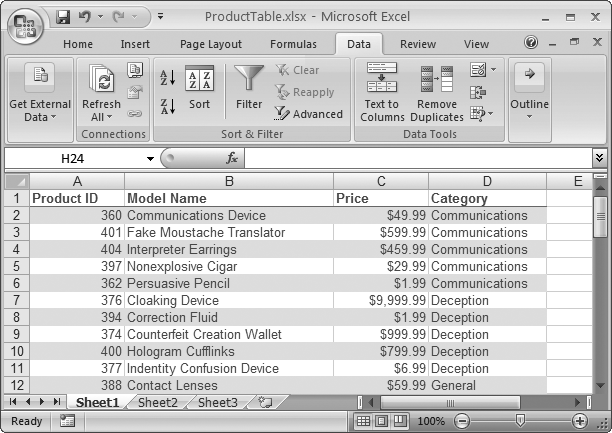
Excel’s grid-like main window gives you lots of freedom to organize your information. As you’ve seen in the chapters so far, tables of data can assume a variety of shapes and sizes-from a simple list of dishes your guests are bringing to a potluck dinner, to complex worksheets that track expenses.
Some tables are quite sophisticated, with multiple levels, subtotals, and summary information. But in many cases, your table consists of nothing more than a long list of data, with a single row at the top that provides descriptive column headings. These types of tables are so common that Excel provides a set of features designed exclusively for managing them. These tools let you control your tables in style-sorting, searching, and filtering your information with just a couple of mouse clicks.
Another handy way to organize-and analyze-data is with a chart. Charts depict data visually, so you can quickly spot overall trends. They’re a fabulous way to help you find the meaning hidden in large amounts of data. You can create many different types of charts in Excel, including pie charts that present polling results, line charts that plot rising or declining assets over time, and three-dimensional area charts that show relationships between environmental conditions in a scientific experiment.
Note
This chapter gives you just a taste of what you can do with Excel’s charting features. For the full story on charts, check out Excel 2007: The Missing Manual.
In this chapter, you’ll learn about tables, how to create them, and how to make use of all their features. You’ll also learn the basics of chart creation.
An Excel table is really nothing more than a way to store a bunch of information about a group of items. Each item occupies a separate row, and different kinds of information about the item reside side by side in adjacent columns. In database terminology, the rows are records, and the columns of information are fields. For example, the records could represent customers, and the fields could contain things like name, address, purchase history, and so on.
Note
In previous versions of Excel, the tables feature was called lists. It’s still the same feature, but Microsoft developers were so pleased with the improvements they added in Excel 2007 that they decided it deserved a whole new name.
Excel tables have a number of advantages over ordinary worksheet data:
They grow and shrink dynamically. As you fill data into adjacent rows and columns, the table grows to include the new cells. And as a table changes size, any formulas that use the table adjust themselves accordingly. In other words, if you have a formula that calculates the sum of a column in a table, the range that the SUM( ) function uses expands when you add a new record to the table.
They have built-in smarts. You can quickly select rows and columns, apply a custom sort order, and search for important records.
They excel (ahem) at dealing with large amounts of information. If you need to manage vast amounts of information, you may find ordinary worksheet data a little cumbersome. If you put the same information in a table, you can simply apply custom filtering, which means you see only the records that interest you.
Creating a table is easy. Here’s how:
Choose the row where you want your table to start.
If you’re creating a new table, the worksheet’s first row is a good place to begin. (You can always shift the table down later by putting your cursor in the top row, and then choosing Home → Cells → Insert → Insert Sheet Rows.) This first row is where you enter any column titles you want to use, as explained in the next step.
Note
Be careful when placing content in the cells directly beneath your table. If your table expands too far down, you’ll run up against these filled-up cells. Although you can use commands like Home → Cells → Insert → Insert Sheet Rows to add some extra space when things get crowded, it’s always better to start off with plenty of breathing room.
Enter the column titles for your table, one column title for each category you want to create.
To create the perfect table, you need to divide your data into categories. For example, if you’re building a table of names and addresses, you probably want your columns to hold the standard info you see on every form ever created: First Name, Last Name, Street, City, and so on. The columns you create are the basis for all the searching, sorting, and filtering you do. For instance, if you have First Name and City columns, you can sort your contacts by first name or by city.
If you want, you can start to add entries underneath the column headings now (in the row directly below the column titles). Or just jump straight to the next step to create the table.
Make sure you’re currently positioned somewhere inside the table (anywhere in the column title row works well), and then choose Insert → Tables → Table.
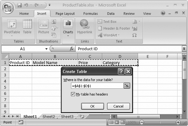
Excel scans the nearby cells, and then selects all the cells that it thinks are part of your table. Once Excel determines the bounds of your table, the Create Table dialog box appears, as shown in Figure 16-1.
Figure 16-1. The Create Table dialog box displays the cell references for the currently selected range. In this example, the selection includes only the headings (there’s no data yet). You can change the range by typing in new information or by clicking the mini worksheet icon at the right end of the cell range box, which lets you select the range by dragging on the appropriate cells in the worksheet.
Make sure the “My table has headers” checkbox is turned on. This option tells Excel you’re using the first row just for column headers. Then click OK.
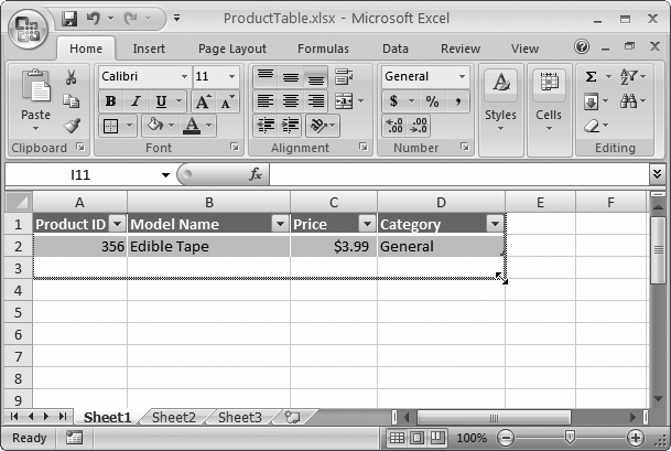
Excel transforms your cells into a table, like the one shown in Figure 16-2. You can tell that your ordinary range of cells has become a genuine table by the presence of a few telltale signs. First, tables start out with automatic formatting that gives each row a shaded background (alternating between blue and gray).
Figure 16-2. To quickly resize your table, look for the tiny triangle icon at the bottom-right corner (under the two-headed arrow in this figure), and then drag it to encompass more (or fewer) rows and columns.
Second, the column headings appear in bold white letters on a dark background, and each one includes a drop-down arrow that you can use for quick filtering (a feature you’ll explore on Filtering with the List of Values).
If you create a table from a group of cells that don’t include column titles, don’t turn on the “My table has headers” checkbox. When you create the table, Excel adds a row of columns at the top with generic names like Column1, Column2, and so on. You can click these cells, and then edit the column titles, to be more descriptive.
Keep in mind that tables consist of exactly two elements: column headers (Figure 16-3) and rows. Tables don’t support row headers (although there’s no reason why you can’t create a separate column and use that as a row title). Tables also have a fixed structure, which means that every row has exactly the same number of columns. You can create multiple tables on the same worksheet, but you’re often better off placing them on separate worksheets so you can more easily manage them.
Every table starts out with some basic formatting, and you can use the ribbon and the Format Cells dialog box (as discussed in Chapter 13) to further change its appearance. However, Excel gives you an even better option—you can use table styles.
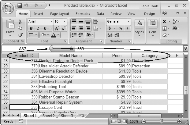
Figure 16-3. Here’s one unsung frill in every table. When you can’t see the column headers any longer because you’ve scrolled down the page), the column buttons atop the worksheet grid change from letters (like A, B, C) to your custom headers (like Product ID, Model Name, and Price). This way, you never forget what column you’re in.
A table style is a collection of formatting settings that apply to an entire table. The nice part about table styles is that Excel remembers your style settings. If you add new rows to a table, Excel automatically adds the right cell formatting. Or, if you delete a row, Excel adjusts the formatting of all the cells underneath to make sure the banding (the alternating pattern of cell shading that makes each row easier to read) stays consistent.
When you first create a table, you start out with a fairly ordinary set of colors: a gray–blue combination that makes your table stand out from the rest of the worksheet. By choosing another table style, you can apply a different set of colors and borders to your table.
Note
Excel’s standard table styles don’t change the fonts in a table. To change fonts, select some cells, and then, from the ribbon’s Home → Font section, pick the font you want.
To choose a new table style, head to the ribbon’s Table Tools | Design → Table Styles section. You’ll see a gallery of options as shown in Figure 16-4. As you move over a table style, Excel uses its live preview feature to change the table, giving you a sneak peak at how your table would look with that style.
Table styles let you standardize and reuse formatting. They include a whole package of settings that tell Excel how to format different portions of the table, including the headers, first and last columns, the summary row, and so on.
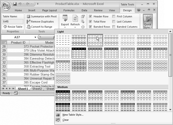
Figure 16-4. Depending on your Excel window’s width, in the ribbon, you may see the table style gallery. Or, if there’s not enough room available, you see a Quick Styles button that you need to click to display a drop-down style gallery (as shown here).
Note
You can’t edit the built-in table styles. However, you can change the table styles you create. In the table gallery, just right-click a style, and then choose Modify.
You’ll notice that the built-in table styles have a limited set of colors. Excel limits them because table styles use colors from the current theme, which ensures that your table meshes well with the rest of your worksheet (assuming you’ve been sticking to theme colors elsewhere). To get different colors for your tables, you can change the theme by choosing from the Page Layout → Themes → Themes gallery. Excel 2007: The Missing Manual has more about themes.
Along with the table style and theme settings, you have a few more options to fine-tune your table’s appearance. Head over to the ribbon’s Table Tools | Design → Table Style Options section, where you see a group of checkboxes, each of which lets you toggle on or off different table elements:
Header Row lets you show or hide the row with column titles at the top of the table. You’ll rarely want to remove this option. Not only are the column headers informative, but they also include drop-down lists for quick filtering (Filtering with the List of Values).
Total Row lets you show or hide the row with summary calculations at the bottom of your table.
First Column applies different formatting to the first column in your table, if it’s defined in the table style.
Last Column applies different formatting to the last column in your table, if it’s defined in the table style.
Banded Rows applies different formatting to each second row, if it’s defined in the table style. Usually, the banded row appears with a background fill. Large-table lovers like to use banding because it makes it easier to scan a full row from right to left without losing your place.
Banded Columns applies different formating to each second column, if it’s defined in the table style. Folks use banded columns less than banded rows, because people usually read tables from side to side (not top to bottom).
Once you’ve created a table, there are three basic editing tasks you can perform:
Edit a record. This part’s easy. Just modify cell values as you would in any ordinary worksheet.
Delete a record. First, go to the row you want to delete (you can be in any column). Then, choose Home → Cells → Delete → Delete Table Rows. Excel removes the row and shrinks the table automatically. For faster access that bypasses the ribbon altogether, just right-click a cell in the appropriate row, and then choose Delete → Table Rows.
Add a new record. To add a record, head to the bottom of the table, and then type a new set of values just underneath the last row in the table. Once you finish typing the first value, Excel expands the table automatically, as shown in Figure 16-5. If you want to insert a row but don’t want it to be at the bottom of the table, you can head to your chosen spot, and then choose Home → Cells → Insert → Insert Table Rows Above (or right-click and choose Insert → Table Rows Above). Excel inserts a new blank row immediately above the current row.
Note
Notice that when you insert or remove rows, you’re inserting or removing table rows, not worksheet rows. The operation affects only the cells in that table. For example, if you have a table with three columns and you delete a row, Excel removes three cells, and then shifts up any table row underneath. Any information in the same row that exists outside the table is unaffected.
You may also decide to change the structure of your table by adding or removing columns. Once again, you’ll find this task is like inserting or removing columns in an ordinary worksheet. (The big difference, as shown in Figure 16-6, is that any rows or columns outside your table remain unaffected when you add new rows or columns.)

Figure 16-5. Top: Here, a new record is being added just under the current table. Bottom: Once you enter at least one column of information and move to another cell, Excel adds the new row to the table and formats it.
To add a column to the left of a column you’re currently in, select Home → Cells → Insert → Insert Table Columns to the Left. Excel automatically assigns a generic column title, like Column1, which you can then edit. If you want to add a column to the right side of the table, just start typing in the blank column immediately to the right of the table. When you’ve finished your entry, Excel automatically merges that column into the table, in the same way that it expands to include new rows.
To delete a column, move to one of its cells, and then choose Home → Cells → Delete → Delete Table Column.
Finally, you can always convert your snazzy table back to an ordinary collection of cells. Just click anywhere in the table, and then choose Table Tools | Design → Tools → Convert to Range. But then, of course, you don’t get to play with your table toys anymore.
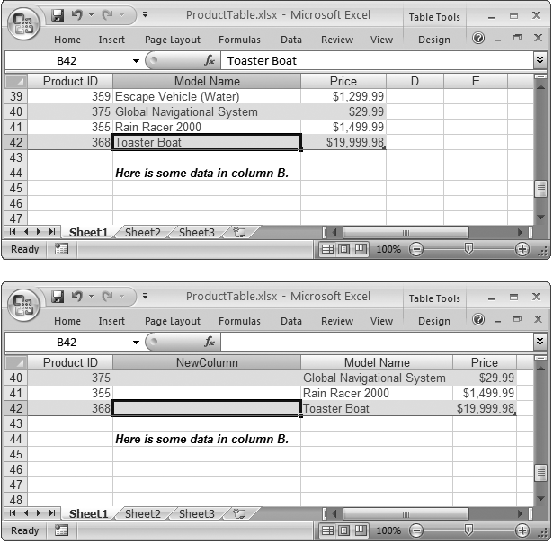
Figure 16-6. Excel makes an effort to leave the rest of your worksheet alone when you change your table’s structure. For example, when expanding a table vertically or horizontally, Excel moves cells out of the way only when it absolutely needs more space. The example here demonstrates the point. Compare the before (top) and after (bottom) pictures: Even though the table in the bottom figure has a new column, it hasn’t affected the data underneath the table, which still occupies the same column. The same holds true when deleting columns.
Once you’ve created a table, Excel provides you with some nice timesaving tools. For example, Excel makes it easy to select a portion of a table, like an individual row or column. Here’s how it works:
To select a column, position your mouse cursor over the column header. When it changes to a down-pointing arrow, click once to select all the values in the column. Click a second time to select all the values plus the column header.
To select a row, position your mouse cursor over the left edge of the row until it turns to a right-pointing arrow; then click once.
To select the entire table, position your mouse at the top-left corner until it turns into an arrow that points down and to the right. Click once to select all the values in the table, and click twice to select all the values plus the column headers.
Figure 16-7shows an example.
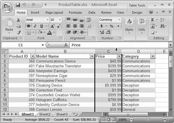
Figure 16-7. You can easily select an entire column in a table. Just position the mouse as shown here, and click once.
Once you’ve selected a row, column, or the entire table, you can apply extra formatting or create a chart. However, changing a part of a table isn’t exactly like changing a bunch of cells. For example, if you give 10 cells a hot-pink background fill, that’s all you get—10 hot-pink cells. But if you give a column a hot-pink background fill, your formatting change may initially affect 10 cells, but every time you add a new value in that column, it also gets the hot-pink background. This behavior, in which Excel recognizes that you’re changing parts of a table, and applies your change to new rows and columns automatically, is called stickiness.
As you’ve seen, Excel tables make it easier to enter, edit, and manage large collections of information. Now it’s time to meet two of the most useful table features:
Sorting lets you order the items in your table alphabetically or numerically according to the information in a column. By using the correct criteria, you can make sure the information you’re interested in appears at the top of the column, and you can make it easier to find an item anywhere in your table.
Filtering lets you display only certain records in your table based on specific criteria you enter. Filtering lets you work with part of your data and temporarily hide the information you aren’t interested in.
You can quickly apply sorting and filtering using the drop-down column headers that Excel adds to every table.
Note
Don’t see a drop-down list at the top of your columns? A wrong ribbon click can inadvertently hide them. If you just see ordinary column headings (and you know you have a bona fide table), choose Data → Sort & Filter → Filter to get the drop-down lists back.
Before you can sort your data, you need to choose a sorting key—the piece of information Excel uses to order your records. For example, if you want to sort a table of products so the cheapest (or most expensive) products appear at the top of the table, the Price column would be the sorting key to use.
In addition to choosing a sorting key, you also need to decide whether you want to use ascending or descending order. Ascending order, which is most common, organizes numbers from smallest to largest, dates from oldest to most recent, and text in alphabetical order. (If you have more than one type of data in the same column—which is rarely a good idea—text appears first, followed by numbers and dates, then true or false values, and finally error values.) In descending order, the order is reversed.
To apply a new sort order, choose the column you want to use for your sort key. Click the drop-down box at the right side of the column header, and then choose one of the menu commands that starts with the word “Sort.” The exact wording depends on the type of data in the column, as follows:
If your column contains numbers, you see “Sort Smallest to Largest” and “Sort Largest to Smallest”.
If your column contains text, you see “Sort A to Z” and “Sort Z to A” (see Figure 16-8).
If your column contains dates, you see “Sort Oldest to Newest” and “Sort Newest to Oldest”.
When you choose an option, Excel immediately reorders the records, and then places a tiny arrow in the column header to indicate that you used this column for your sort. However, Excel doesn’t keep re-sorting your data when you make changes or add new records (after all, it would be pretty distracting to have your records jump around unexpectedly). If you make some changes and want to reapply the sort, just go to the column header menu and choose the same sort option again.
If you click a second column, and then choose Sort Ascending or Sort Descending, the new sort order replaces your previous sort order. In other words, the column headers let you sort your records quickly, but you can’t sort by more than one column at a time.
Simple table sorting runs into trouble when you have duplicate values. Take the product table sorted by category in Figure 16-8, for example. All the products in the Communications category appear first, followed by products in the Deception category, and so on. However, Excel doesn’t make any effort to sort products that are in the same category. For example, if you have a bunch of products in the Communications category, then they appear in whatever order they were in on your worksheet, which may not be what you want. In this case, you’re better off using multiple sort criteria.
With multiple sort criteria, Excel orders the table using more than one sorting key. The second sorting key springs into action only if there are duplicate values in the first sorting key. For example, if you sort by Category and Model Name, Excel first separates the records into alphabetically ordered category groups. It then sorts the products in each category in order of their model name.
To use multiple sort criteria, follow these steps:
Move to any one of the cells inside your table, and then choose Home → Editing → Sort & Filter → Custom Sort.
Excel selects all the data in your table, and then displays the Sort dialog box (see Figure 16-9) where you can specify the sorting keys you want to use.
Figure 16-9. To define a sorting key, you need to fill in the column you want to use (in this example, Category). Next, pick the information you want to use from that column, which is almost always the actual cell values (Values). Finally, choose the order for arranging values, which depends on the type of data. For text values, as in this example, you can pick A to Z, Z to A, or Custom List (Filtering with the List of Values).
Fill in the information for the first sort key in the Column, Sort On, and Order columns.
Figure 16-9 shows how it works.
If you want to add another level of sorting, click Add Level, and then follow the instructions in step 2 to configure it.
You can repeat this step to add as many sorting levels as you want (Figure 16-10). Remember, it makes sense to add more levels of sorting only if there’s a possibility of duplicate value in the levels you’ve added so far. For example, if you’ve sorted a bunch of names by last name, you want to sort by first name, because some people may share the same last name. However, it’s probably not worth it to add a third sort on the middle initial, because very few people share the same first and last name.
Optionally, click the Options button to configure a few finer points about how your data is sorted.
For example, you can turn on case-sensitive sorting, which is ordinarily switched off. If you switch it on, travel appears before Travel.
Click OK.
Excel sorts your entire table based on the criteria you’ve so carefully specified (Figure 16-11).
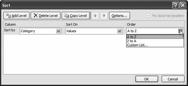

Figure 16-10. This example shows two sorting keys: the Category column and the Model Name column. The Category column may contain duplicate entries, which Excel sorts in turn according to the text in the Model Name column. When you’re adding multiple sort keys, make sure they’re in the right order. If you need to rearrange your sorting, select a sort key, and then click the arrow buttons to move it up the list (so it’s applied first) or down the list (so it’s applied later).
Sorting is great for ordering your data, but it may not be enough to tame large piles of data. You can try another useful technique, filtering, which lets you limit the table so it displays only the data that you want to see. Filtering may seem like a small convenience, but if your table contains hundreds or thousands of rows, filtering is vital for your day-to-day worksheet sanity. Here are some situations where filtering becomes especially useful:
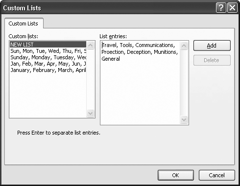
Figure 16-12. Using a custom list for your sort order, you can arrange your categories so that Travel always appears at the top, as shown here. Once you’ve finished entering a custom list, click Add to store the list for future use.
To pluck out important information, like the number of accounts that currently have a balance due. Filtering lets you see just the information you need, saving you hours of headaches.
To print a report that shows only the customers who live in a specific city.
To calculate information like sums and averages for products in a specific group.
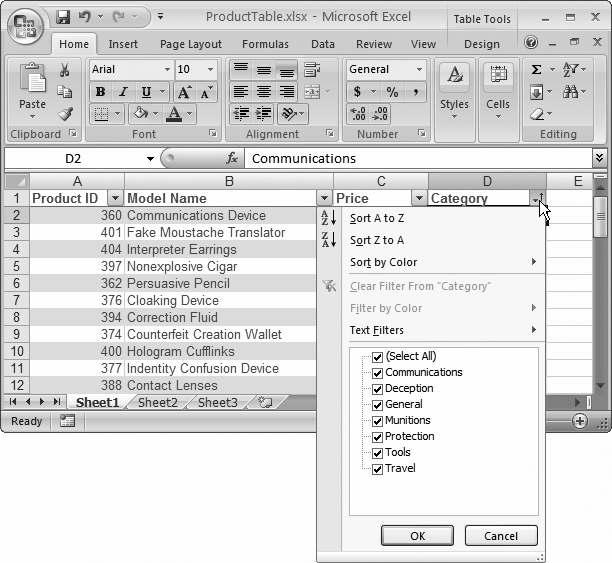
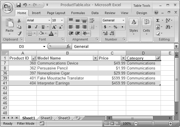
Automatic filtering, like sorting, uses the drop-down column headings. When you click the drop-down arrow, Excel shows a list of all the distinct values in that column. Figure 16-13 and Figure 16-14 show how filtering works on the Category column.
To remove a filter, open the drop-down column menu, and choose Clear Filter.
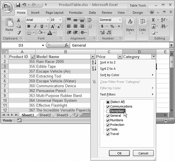
Figure 16-13. Initially, each value has a checkmark next to it. Clear the checkmark to hide rows with that value. (In this example, products in the Deception category won’t appear in the table.) Or, if you want to home in on just a few items, clear the Select All checkmark to remove all the checkmarks, and then choose just the ones you want to see in your table, as shown in Figure 16-14.
The drop-down column lists give you an easy way to filter out specific rows. However, in many situations you’ll want a little more intelligence in your filtering. For example, imagine you’re filtering a list of products to focus on all those that top $100. You could scroll through the list of values, and remove the checkmark next to every price that’s lower than $100. What a pain in the neck that would be.
Thankfully, Excel has more filtering features that can really help you out here. Based on the type of data in your column (text, a number, or date values), Excel adds a wide range of useful filter options to the drop-down column lists. You’ll see how this all works in the following sections.
You can filter dates that fall before or after another date, or you can use preset periods like last week, last month, next month, year-to-date, and so on.
To use date filtering, open the drop-down column list, and choose Date Filters. Figure 16-15 shows what you see.

For numbers, you can filter values that match exactly, numbers that are smaller or larger than a specified number, or numbers that are above or below average.
To use number filtering, open the drop-down column list, choose Number Filters, and then pick one of the filter options. For example, imagine you’re trying to limit the product list to show expensive products. You can accomplish this quite quickly with a number filter. Just open the drop-down column list for the Price column, and then choose Number Filters → Greater Than Or Equal To. A dialog box appears where you can supply the $100 minimum (Figure 16-16).
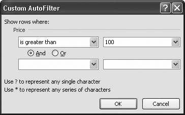
Figure 16-16. This dialog box lets you complete the Greater Than Or Equal To filter. It matches all products that are $100 or more. You can use the bottom portion of the window (left blank in this example) to supply a second filter condition that either further restricts (choose And) or supplements your matches (choose Or).
For text, you can filter values that match exactly, or values that contain a piece of text. To apply text filtering, open the drop-down column list, and then choose Text Filters.
If you’re performing filtering with text fields, you can gain even more precise control using wildcards. The asterisk (*) matches any series of characters, while the question mark (?) matches a single character. So the filter expression Category equals T* matches any category that starts with the letter T. The filter expression Category equals T???? matches any five-letter category that starts with T.
Excel provides a dizzying number of different chart types, but they all share a few things. In this section, you’ll learn about basic Excel charting concepts that apply to almost all types of charts; you’ll also create a few basic charts.
Note
All charts are not created equal. Depending on the chart type you use, the scale you choose, and the data you include, your chart may suggest different conclusions. The true chart artist knows how to craft a chart to draw out the most important information. As you become more skilled with charts, you’ll acquire these instincts, too.
To create a chart, Excel needs to translate your numbers into a graphical representation. The process of drawing numbers on a graph is called plotting. Before you plot your information on a chart, you should make sure your data’s laid out properly. Here are some tips:
Structure your data in a simple grid of rows and columns.
Don’t include blank cells between rows or columns.
Include titles, if you’d like them to appear in your chart. You can use category titles for each column of data (placed in the first row, atop each column) and an overall chart title (placed just above the category-title row).
Tip
You can also label each row by placing titles in the far-left column, if it makes sense. If you’re comparing the sales numbers for different products, list the name of each product in the first column on the left, with the sales figures in the following columns.
If you follow these guidelines, you can expect to create the sort of chart shown in Figure 16-17.
To create the chart shown in Figure 16-17, Excel performs a few straightforward steps. First, it extracts the text for the chart title from cell A1. Next, it examines the range of data (from $14,000 to $64,000) and uses it to set the value—or Y-axis—scale. You’ll notice that the scale starts at $0, and stretches up to $80,000 in order to give your data a little room to breathe. (You could configure these numbers manually, but Excel automatically makes common-sense guesses like these by looking at the data you’re asking it to chart.) After setting the vertical scale, Excel adds the labels along the bottom axis (also known as the X-axis or category axis), and draws the columns of appropriate height.
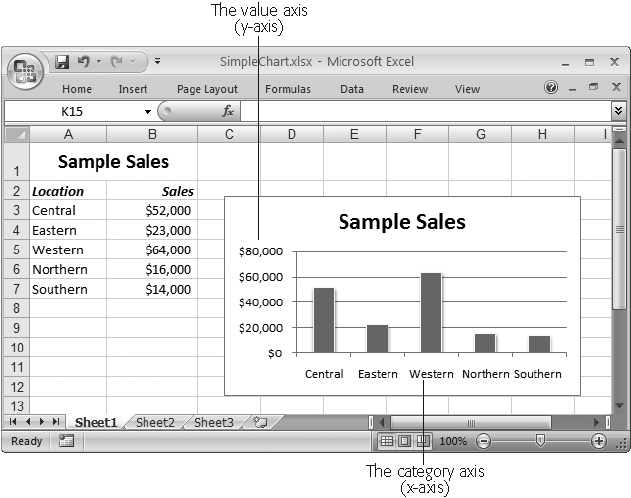
Figure 16-17. This worksheet shows a table of data and a simple column chart based on Excel’s standard chart settings. Nothing fancy, but it gets the job done.
The chart in Figure 16-17 is an embedded chart. Embedded charts appear in a worksheet, in a floating box alongside your data. You can move the chart by dragging the box around your worksheet, although depending on where you put it, you may obscure some of your data.
Your other option is to create a standalone chart, which looks the same but occupies an entire worksheet. That means that your chart data and your chart are placed on separate worksheets. Excel 2007: The Missing Manual teaches you how to create standalone charts.
Usually, you’ll use an embedded chart if you want to create printouts that combine both your worksheet data and one or more charts. On the other hand, if you want to print the charts separately, it’s more convenient to use standalone charts. That way, you can print an entire workbook at once and have the charts and the data on separate pages.
So how do you create a chart like the one shown in Figure 16-17? Easy—all it takes is a couple of clicks in the ribbon. Here’s how it works:
Select the range of cells that includes the data you want to chart, including the column and row headings and any chart title.
If you were using the data shown in Figure 16-17, you’d select cells A1 to B7.
For speedier chart building, just position your cursor somewhere inside the data you want to chart. Excel then automatically selects the range of cells that it thinks you want. Of course, it never hurts to remove the possibility for error by explicitly selecting what you want to use before you get started.
Tip
And for even easier charting, start by creating an Excel table—as described earlier in this chapter—to hold the data you want to chart. Then, if you position yourself somewhere inside the table and create a new chart, Excel automatically selects all the data. It also automatically updates the chart if you add new rows or remove existing data.
Head to the ribbon’s Insert → Charts section. You’ll see a separate button for each type of chart (including column charts, line charts, pie charts, and so on). Click the type you want.
When you choose a chart type, you get a drop-down list of subtypes (Figure 16-18).
Figure 16-18. Under each chart choice are yet more subtypes, which add to the fun. If you select the Column type (shown here), you’ll get subtypes for two- and three-dimensional column charts, and variants that use cone and pyramid shapes. If you hover over one of these subtypes, a box appears with a brief description of the chart.
The different chart types are explained in more detail in Excel 2007: The Missing Manual. For now, it’s best to stick to some of the more easily understood choices, like Bar, Column, or Pie. Remember, the chart choices are just the starting point, as you’ll still be able to configure a wide range of details that control things like the titles, colors, and overall organization of your chart.
Click the subtype you want.
Excel inserts a new embedded chart alongside your data, using the standard options (which you can fine-tune later).

When you select a chart, Excel adds three new tabs to the ribbon under the Chart Tools heading. These tabs let you control the details of your charts:
Design. This tab lets you change the chart type and the linked data that the chart uses.
Layout. This tab lets you configure individual parts of the chart. You can add shapes, pictures, and text labels, and you can configure the chart’s gridlines, axes, and background.
Format. This tab lets you format individual chart elements, so you can transform ordinary items into eye candy. You can adjust the font, fill, and borders uses for chart titles and shapes, among other things.
In this chapter, you’ll spend most of your time using the Chart Tools | Design tab.
How you print a chart depends on the type of chart you’ve created. In this chapter, you’ve learned how to create embedded charts. You can print embedded charts either with worksheet data or on their own. (Standalone charts, which occupy separate worksheets, always print on separate pages.)
You can print embedded charts in two ways. The first approach is to print your worksheet exactly as it appears on the screen, with a mix of data and floating charts. In this case, you’ll need to take special care to make sure your charts aren’t positioned over any data you need to read in the printout. To double-check, use Page Layout view (choose View → Workbook Views → Page Layout View).
You could also print out the embedded chart on a separate page, which is surprisingly easy. Just click the chart to select it, and then choose Office Button → Print (or Office Button → Print → Print Preview to see what it’ll look like). When you do so, Excel’s standard choice is to print your chart using landscape orientation, so that the long edge of the page is along the bottom, and the chart’s wider than it is tall. Landscape is usually the best way to align a chart, especially if it holds a large amount of data, so Excel automatically uses landscape orientation no matter what page orientation you’ve configured for your worksheet. If you want to change the chart orientation, select the chart, then choose Page Layout → Page Setup → Orientation → Portrait. Now your chart uses upright alignment, just as you may see in a portrait-style painting.
Note
If you select an orientation from the Page Layout → Page Setup → Orientation list while your chart is selected, you don’t end up configuring the orientation for the worksheet itself. Instead you configure the embedded chart’s orientation when you print it out on a separate page. If you want to configure the orientation for the whole worksheet, make sure nothing else is selected when you choose an orientation.
Excel also includes some page setup options that are specific to charts. To see these options, head to the Page Layout → Page Setup section, click the dialog launcher in the bottom-right corner to show the Page Setup dialog box, and then choose the Chart tab (which appears only when you’ve got a chart currently selected). You’ll see an option to print a chart using lower print quality (“Draft quality”), and in black and white instead of color (“Print in black and white”).