
3. Working with Group Cards

In this chapter, you discover how to group content—such as pictures and videos—on a single card. Specific topics in this chapter include the following:
Now that you’re familiar with how basic Sway cards work, it’s time to move on to more complex card types. Group cards enable you to display multiple items on the same card—individually on your Sway canvas or in a slideshow or stack for a special effect. Grouping helps you present similar content in context and with some added professional polish.
Creating Group Cards
Sway offers five types of group cards:
• Automatic (standard group)
• Stack
• Comparison
• Slideshow
• Grid
Click the Cards tab to view these options on the All Cards pane along with a preview of what each option looks like.
Some cards are designed to work just with pictures, such as the Stack Card, Slideshow Card, or Comparison Card. The Grid Card enables you to display pictures or videos. The Automatic Card is the most flexible. You can use it to group pictures, videos, tweets, and more.
Add an Automatic Card
The Automatic Card displays your content in rows separated by white space. In this example, you add a group with four YouTube videos. You can also use this card to group other content, such as pictures or tweets.
1. Click the Cards tab.
2. Drag the Automatic Card to the storyline.

3. Click Add Content.

4. In the Add Content pane, click the down arrow to select a source. In this case, select YouTube.

5. Enter a keyword and click the Search button. In this example, you search for Que Publishing.
6. Drag the videos to the card.
7. Click Close (x) to close the pane.

8. Sway displays the Automatic Card on the storyline.
9. Click Preview.

10. Sway displays a preview of your group on the canvas.

Why Does My Content Look Like That?
The appearance of your content is controlled by the design you select. For example, your content could display as shown in step 10, or your videos could have a white border, or your picture could display tiled. See Chapter 7, “Modifying a Sway,” to learn more about applying designs.
Add a Stack Card
The Stack Card displays a series of pictures in a pile that viewers can click to scroll through each picture. In this example, you add a stack with five pictures from PicHit.Me.
1. Click the Cards tab.
2. Drag the Stack Card to the storyline.

3. Click Add a Picture.

4. In the Add Content pane, click the down arrow to select a source. In this case, select PicHit.

5. Enter a keyword and click the Search button. In this example, you search for nature.
6. Drag the pictures to the card.
7. Click Close (x) to close the pane.

8. Select the Stack Card.
9. Click Options.
Where’s the Option Button?
If you have a pane open on the left side of the screen, the Options button might display as an icon without text.
10. Select your preferred picture size: Subtle (the default), Moderate, or Intense.
11. Click Preview.


12. Sway displays a preview of your stack on the canvas. Click it to cycle through the pictures.

Add a Comparison Card
The Comparison Card enables you to compare two pictures side by side. This card works best if you want to compare a before and after or two different options. In this example, you compare two pictures stored on OneDrive.
1. Click the Cards tab.
2. Drag the Comparison Card to the storyline.

3. Click Add a Picture.

4. In the Add Content pane, click the down arrow to select a source. In this case, select OneDrive.

5. Drag the pictures to the card.
6. Click Close (x) to close the pane.

7. Select the Comparison Card.
8. Click Options.
9. Select your preferred picture size: Subtle (the default), Moderate, or Intense.
10. Click Preview.

11. Sway displays a preview of your comparison.
12. Drag the slider to view either version of the picture.

Add a Slideshow Card
The Slideshow Card enables you to create a slideshow with a series of pictures. Viewers can click the arrows on the show to scroll through each picture. In this example, you create a slideshow showcasing Lake Tahoe using four Creative Commons pictures found through Bing Image Search.
1. Click the Cards tab.
2. Drag the Slideshow Card to the storyline.

3. Click Add a Picture.

4. In the Add Content pane, click the down arrow to select a source. In this case, select Bing.

5. Enter a keyword and click the Search button. In this example, you search for Lake Tahoe.
6. Sway displays pictures tagged with a Creative Commons license (see Chapter 6, “Inserting Media Content,” for more details about this license and its implications).
7. Drag the pictures to the card.
8. Click Close (x) to close the pane.

9. Select the Slideshow Card.
10. Click Options.
11. Select your preferred picture size: Subtle (the default), Moderate, or Intense.

12. Select the type of slideshow you want to create: Single (the default), Thumbnail Images, or Continuous.
13. Click Preview.

14. Sway displays a preview of your slideshow on the canvas.
15. Click the arrows to scroll through the show.


Add a Grid Card
The Grid Card displays your content in rows. This card is similar to the Automatic Card, but there is no white space separating the content. In this example, you add four pictures from a OneNote notebook.
1. Click the Cards tab.
2. Drag the Grid Card to the storyline.

3. Click Add Content.

4. In the Add Content pane, click the down arrow to select a source. In this case, select OneNote.

5. Drag the pictures to the card.
6. Click Close (x) to close the pane.

7. Select the Grid Card.
8. Click Options.
9. Select your preferred picture size: Subtle (the default), Moderate, or Intense.
10. Click Preview.

11. Sway displays a preview of the grid on the canvas.

Managing Group Cards
If your group card doesn’t turn out as expected, you can change its group type, ungroup it, or delete individual cards or the entire group.
Collapse a Group
By default, Sway displays each component of a group separately in an expanded format. For example, if you have four pictures in a group, they display individually. Optionally, you can collapse a group so its content displays in rows instead. If you have a lot of content in a group, or a lot of cards on your storyline, this can make it easier to view and manage your Sway.
1. Click the Collapse Group icon on the group card you want to collapse.

2. The group is collapsed.
3. Click the Expand Group icon to expand the group again.

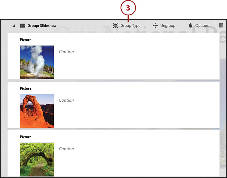
Change the Group Type
If you don’t like the way a particular group card looks, you can change to a different group type without adding content again.
Change Your Design
Another way to change the appearance of your group—without switching to a new card type—is to change your design (click the Design tab to do this). A different design can have a dramatic effect on the appearance of your group, particularly with the Automatic Card. See Chapter 7 for more information.
1. Select the card whose group type you want to change.
2. Click Group Type.

Where’s the Group Type Button?
If you have a pane open on the left side of the screen, the Group Type button might display as an icon without text.

3. Select a new group type.
Available Options
Depending on the content in your group, not all group types are available. For example, if you have an Automatic Card with videos, your only option for change is to the Grid Card. If you have a Slideshow with four pictures, you can change to Automatic, Stack, or Grid Cards, but not the Comparison Card, which requires only two pictures.
4. Click Close (x) to close the pane.

Modify Content in a Group
After you add content to a group, you might want to modify it. For example, you can:
• Add captions to individual pictures or videos and format this text by emphasizing it, accenting it, or adding bulleted or numbered lists.
• Change the order of the group content.
• Add more content to the group in a specific location, such as additional pictures or videos or related text.
• Showcase one or more pictures in the group.
• Specify a picture’s focus point.
• Delete an item in the group.
1. Select the group card with content you want to modify.
2. If the group card isn’t already expanded, click the Expand Group icon to expand it.

3. Sway displays the group content on individual cards.
4. Select the content you want to modify.
5. Type a caption in the text box.
6. Format selected text using buttons on the toolbar: Emphasize, Accent, Bullets, Numbers, or Link.

Formatting Options
See “Formatting Text and Pictures” in Chapter 2, “Planning and Creating a Sway,” for a reminder about how these formatting options work.
Formatting Limitations
Be aware that the formatting you apply might not display with all group types. For example, you can add captions to pictures using the Automatic Card, but these captions are hidden if you switch to a slideshow or stack. Also, not all formatting options are available with all group types.
7. Click the Insert Content icon to insert content in the location you specify.
8. Click Options to specify a showcase size.
9. Click Focus Points to specify focus points for a picture.

10. Click Delete (trash can icon) to delete a group item.
11. Click and drag an item to move it to a new location in the group.

12. Sway repositions the content.
13. Click the Collapse Group icon to consolidate the group content again.

Ungroup a Group
If you decide you want to display each group item separately on the storyline, you can ungroup.
1. Select the card you want to ungroup.
2. Click Ungroup.

Where’s the Ungroup Button?
If you have a pane open on the left side of the screen, the Ungroup button might display as an icon without text.

3. Sway displays each piece of the group content on a separate card.

Delete a Group
If your group doesn’t work out as planned, you can delete it from the storyline.
1. Select the group you want to delete.
2. Click Delete (trash can icon).

Delete a Card Within a Group
Remember that you can also delete a single card within a group by clicking its Delete icon.
