CHAPTER 12
User Interface (UI): Making It Clear
Introduction to UI
The concept of the user interface (UI) originated in the field of industrial design and refers to the space where the user interacts with the machine. UI easily extends to the field of computer systems and analytic tools. The term dashboard, typically referring to a control panel in an automobile, is widely used in a business reporting context to indicate the UI for visual charts and reports that managers use to monitor the performance of their business.
Unfortunately, the success of the dashboard concept may have become its own enemy. Report designers often take the concept too literally and present results in the form of gauges, dials, and other objects suitable to the analog of the mechanical world of a car control panel but completely irrelevant in the digital information world.
The borrowed concept of a control panel dashboard not only interferes with developing efficient presentation of visual information, it also limits understanding of richness in display of visual analytics. A car dashboard is primarily a passive display of key control metrics—fuel level, engine temperature, speed; an information dashboard provides the opportunity to interact with the information—to slice and dice, to journey through the analysis to follow results to root cause with a few mouse-clicks.
When our car dashboard signals a problem, most of us get out of our car and open the hood, then stand by the side of the road scratching our head until a mechanic can be summoned to tell us what went wrong.
With Guided Analytics the analyst can build expert knowledge into the visual charts and information flow to enable the manager to find out what is going wrong when a poor performance signal activates, or even better, how performance can be improved.
In this chapter, we take you through the techniques to build good UI into your analytical solutions and introduce the fundamental principles that make these techniques effective.
The Visual Palette
Let's work on unleashing the powerful insights in our control chart (see Figure 11.9) from the previous chapter that are getting drowned out by poor UI. As we make over the chart, we introduce fundamental concepts of UI that can guide you in building clear and impactful charts.
Similar to a painter who faces a blank canvas when beginning a new work, analysts face a similar two-dimensional area of white space when setting out to create charts, tables, and dashboards. Incorporating essential principles of visual design makes the difference between a dashboard that presents a smorgasbord of graphs and data and a well-designed presentation of information guiding the user to important elements quickly and efficiently.
We think of the space, objects, and attributes that we use to build a visual object as our visual palette. Four elements of visual design form the foundation of our visual palette:
- Color
- Form
- Size
- Placement
We apply design principles from a number of seemingly unrelated fields of research to these elements, including the fields of psychology, design, and photography among others to help us understand how we process information visually and how we can use these principles to make our work more powerful. Applying these principles to the visual presentation of our analytic results greatly improves impact and effectiveness. We introduce these concepts as we work through building a Guided Analytics dashboard.
Key design principles we cover include:
- Data–Ink Ratio, an information efficiency concept first introduced by information visualization pioneer Edward Tufte
- Pre-attentive processing, a visual perception concept from the field of vision research
- Gestalt principles of pattern perception from the field of psychology
- Z-pattern of scanning, an information reading concept from the field of typography
- Rule of thirds, a visual ordering concept from the field of photography
Less Is More
As analysts, we rarely encounter a data point we don't love. However, there is discipline taught in writing and editing to cut and cut again that applies very well to Guided Analytics. Let's apply that principle to our control chart from the previous chapter and see what we can do to remove distracting elements.
First, we observe that we have two graphs (Figure 12.1) that communicate similar information but in different contexts. While the lower moving range chart highlights the statistical signals more clearly, the upper control chart does a better job of presenting context and trend. So let's remove the lower chart from our dashboard view (Figure 12.2). But we don't need to fear losing useful information; we can make it available in a detail sheet for those who want to know more.

Figure 12.1 Original Control Chart

Figure 12.2 Simplified Control Chart
The labels on Figure 12.2 control chart “reference lines” also get in the way and distract attention. Users who have had Lean/Six Sigma training will already know the meaning of the lines. Those without such training can intuitively determine that the lines represent some upper, lower, and middle limit. We can place a discrete footnote or tooltip on the dashboard to provide more specific explanatory information.
We also have labels that aren't adding new information to the chart (Figure 12.3). The axis title “complaints” is hard to read vertically and repeated needlessly when we look at more than one component, so we place it at the top of the axis. In addition, the lines are the valuable part of the chart encoding the information we want to present but they are also a bit overwhelming. If your chart is in color, primary colors such as black, blue, red, and green pack a lot of punch and therefore should be used sparingly, principally when we want to attract attention. If everything is shouting “Look at me!,” it is difficult to focus on any one thing in particular. Size also communicates information when one thing is bigger than another, so let's try reducing the width of the lines and choose a less impactful color (Figure 12.4). That will give us room later in the process to use color to call attention to interesting parts the story.

Figure 12.3 Remove Reference Line Labels

Figure 12.4 Reposition Axis Labels and Modify Line Width
The horizontal gridlines are useful for identifying a specific value on the line, but we are more concerned about highlighting patterns and signals and not communicating an exact number. Since the chart may be displayed on a screen, perhaps even as small as a cellphone, few users will actually take a ruler to the screen to determine the value of a specific point. We can use the popup window feature in our visual tool to communicate the value when they hover.
Due to the potential for seasonality, the vertical gridlines for the years aid in the interpretation of the chart, helping the user to clearly see annual segments, so they can stay as shown in Figure 12.5, our made-over chart.
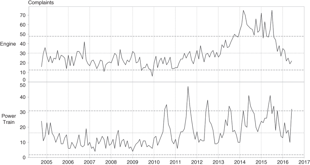
Figure 12.5 Remove Horizontal Gridlines
Data–Ink Ratio
Why do we perceive this chart to be so much easier to grasp at a glance? We employ the power of the data–ink ratio, a concept introduced by Edward Tufte in his seminal work, The Visual Display of Quantitative Information. Tufte defines data–ink as “the non-erasable core of a graphic” and the data–ink ratio as the “proportion of a graphic's ink devoted to the non-redundant display of data-information.” Tufte's point is that a good visual graphic maximizes the data–ink ratio so that as much of the graphic's ink is devoted to communicating useful information as possible. Stephen Few later extended the concept to include the data–pixel ratio when applied to computer dashboards.
Less Is More—Until It Isn't
Gridlines are easy candidates for removal when working to increase the data–ink ratio, but our example illustrates a situation where careful thought must be applied to determine if the chart element is communicating information. In this case (Figure 12.6), the vertical gridlines guide the user in assessing annual cycles and therefore contribute to communicating information, illustrating the counter-principle famously articulated by Albert Einstein, “Everything should be made as simple as possible, but not simpler.”

Figure 12.6 Remove Vertical Gridlines
With Just One Look
Our made-over chart is definitely easier on the eyes but it doesn't pop. If there is a message here, it is doing a good job of hiding.
Now we turn to how we can use visual principles to guide our users to focus on the story the data wants to tell. Color is the most powerful visual tool we have at our disposal. As such, it is often misused, drawing attention to points that have no business being center stage or assaulting our senses with a cacophony of poorly chosen, overpowering colors, shouting at us, causing our visual perception to shut down. When used purposefully and sparingly, well-regulated and carefully chosen color can work for us to make our point. We should always approach color with fear and respect.
Figure 12.7 illustrates how color can be used sparingly to deliver impact.

Figure 12.7 Use Color Sparingly
By adding a small circle shape to indicate a data point and coloring it differently when it is out of range, we allow our users to quickly focus on periods when there is a potential problem. They can easily tell if it is a persistent problem or a repeating problem. They can tell if the problem was building, as in the engine problems in 2014, or if they suddenly occurred, as with the power train issues starting in 2010. And all we did was add a splash of color.
Let's discuss briefly why color used in this manner works for us.
Pre-attentive Processing
Color is one of the most powerful of the visual properties that are processed pre-attentively. As the term implies, these features are processed by our visual memory before we consciously comprehend the object. Pre-attentive processing occurs in the first few fractions of a second that we observe an object, allowing us to quickly assess an object visually. Even before our mind grasps that we are looking at an orange ball, we have already processed that we are seeing something orange and round.
The features of an object that are pre-attentively processed are
- Color
- Form
- Spatial placement
- Motion
In Figure 1 of Figure 12.8, you can quickly grasp that there are two differently colored objects even though the form is different. It requires more time to determine that there are 3 circles, 2 diamonds, and 4 squares.

Figure 12.8 Pre-attentive Processing
Figures 2 and 3 of Figure 12.8 illustrate that while we can distinguish size and placement pre-attentively, the impact of these features pales in comparison to color even when viewed in shades of gray or full color.
However, effective pre-attentive processing requires a difference between the target and the non-targets and that the non-targets should be similar. Figure 4 within Figure 12.8 illustrates that when all features are different, nothing in particular stands out.
Gestalt Principles of Pattern Perception
The other powerful set of principles of visual perception that we can put to work for us are the Gestalt principles of pattern perception. These principles, first introduced in 1923, have become the bedrock for principles of visual design. There are numerous resources available to explore these concepts further, including Colin Ware's and Stephen Few's books referenced earlier.
You may be familiar with the statement, “The whole is greater than the sum of the parts.” Kurt Koffka, the noted Gestalt psychologist, makes a key counterpoint:
Koffka's point is that Gestalt principles of perception are not based on addition; rather the perceived whole has an identity independent of the parts perceived individually. This idea has important implications for visual analysis in that a business insight drawn from studying a carefully constructed sequence of charts can arise independent of any of the components.
Figures 12.9, 12.10, and 12.11 provide a brief summary of the primary Gestalt principles of pattern perception that lead to the visual perception of a group of objects as a visual whole. In addition, the Gestalt psychologists also identified the Law of Good Gestalt, also known as the law of Pragnanz, a German word relating to simplicity and conciseness. This law expresses the idea that elements of an object will be perceived holistically if they form patterns that are regular, simple, and orderly. This overarching principle is important to keep in mind when designing charts based on complex data or analysis.

Figure 12.9 Proximity

Figure 12.10 Similarity

Figure 12.11 Closure
Putting It All Together
Let's revisit our original dashboard (Figure 11.1) to do a makeover applying what we have learned about the visual principles of perception.
Color
While it may be less apparent in a grayscale version, too many colors are being used. Let's use a standard color palette based on light gray for background elements and a darker shade of color for elements we wish to pull to the foreground to call attention. In an environment where the dashboard will be presented in color you could choose orange or blue for the foreground color. In cases where the dashboard may be presented in grayscale, a darker shade of gray will work nicely.
Showing total complaints by competitor doesn't really communicate useful information since larger manufacturers will have more complaints simply due to their size. We can index by market share and highlight manufacturers that have a share of complaints greater than their share of the market (Figure 12.12).

Figure 12.12 Complaints by Competitor
The only place where color is adding new information is the map where it indicates more or fewer complaints. Our analysis has already given us the insight that seasonal patterns of weather or temperature could play a role in performance. However, the seasons are always changing and many states have wide temperature variations between hot and cold so the volume complaints relative to the temperature change in some cases could be due to correlation, not causation.
Users of this dashboard are mainly interested in complaints that stand out and have a strong relationship to regional location. After creating an index to adjust for market share and applying results from data mining for significance, we can create an alert to highlight the states with complaints greater than what would normally be expected (Figure 12.13).

Figure 12.13 States with Greater-than-Expected Complaints
We replace the original complaint trend with our new control charts and decide to add some menu controls to zoom in by date and filter by manufacturer, model, and component (Figure 12.14).

Figure 12.14 Menu Controls
Looking at the distribution of complaints, there is simply too much fragmentation to produce a meaningful chart suitable for a dashboard. Let's create a word cloud highlighting complaint components that we can use to filter the dashboard and navigate to a more detailed view (Figure 12.15).

Figure 12.15 Word Cloud
Elements of the Visual Palette
Let's revisit the changes we made in the context of the four elements of the visual palette.
Color
We used color to draw attention to the aspects of the analysis that we want our users to focus on.
Form
We also addressed issues of form, which is the principle that determines the shapes we will use to present our analysis, for example, determining when it is best to use line or bar charts to present certain types of information. We converted a highly fragmented bar chart to a word cloud that effectively draws attention to the primary components causing issues and can serve as a launch-pad to more detail on demand.
Here the adage from architectural design, “form follows function,” becomes relevant. Comparison and distribution analysis are best represented by bar charts. Time series and change analysis are better represented with line charts. Key results and KPIs work well with simple text charts. Word clouds are not very effective for communicating quantitative information but do a good job of capturing attention.
Size
Size communicates quantity effectively but too much use of different sizes to communicate information can become confusing and hard to interpret. Similar to our use of color, we employed size selectively in places where we wanted to emphasize a point.
Placement
Having reworked our chart elements, we turn our attention to where we will place the objects on the dashboard. Placement of objects in visual space is as critical to effective communication as the objects individually.
Let's talk about a few design principles used in advertising and newspaper design layouts, photography, and film. You may find it curious that we are bringing in principles from fields that on the surface do not seem related to analytics. The discipline of visual and guided analytics is highly multidisciplinary because it engages our sense of sight and visual perception as well as our sense of logic and analysis. Guided Analytics is a holistic practice that draws from the whole person, the right and left brain.
The first principle is Z-pattern of scanning, a principle based on observations about how we read. Since we write from left to right, we similarly read from left to right across the top of the page; once having reached the end of the line, we scan back from right to left to the next few lines down and then back from left to right, tracing a Z-shaped pattern. If the page we are viewing is more image based than text based, the Z-shaped pattern is an even easier process to use to comprehend the material before us. Therefore, the most valuable places on a dashboard are the Z pivot points in the upper left at the beginning of the pattern, the upper-right corner, the middle of the diagonal, the lower-left corner, and the lower-right corner at the end of the pattern. These five points are golden points that have important consequences for decisions about where to place information on the dashboard.
Because the reader starts in the upper left, introductory and scoping information should be placed here. This helps the reader to establish a context for the following information. The upper right is a stopping point before moving down the action-packed diagonal of the Z, so supporting information is better placed here. Information such as dates and logos are good candidates. Such information helps to orient the reader before moving on to consuming the main story the analysis is trying to tell, the focal point of the dashboard. The most impactful information, therefore, should be placed in the center section of the dashboard. The bottom of the Z, essentially the finish line of the reader's scan, is the place for closure, conclusions, supporting information, and calls to action.
Another important principle used in film and photography is the rule of thirds. This concept divides the visual area into a 3 × 3 matrix (Figure 12.16). Strategies are developed for placing visual objects in the thirds, the top or bottom third, the left or right third, as well as the center third. Objectives to create visual interest and emphasis determine where visual objects are placed on the grid.

Figure 12.16 Rule of Thirds
Good Gestalt—Less Is More
Figure 12.17 is our made-over dashboard incorporating the principles we have just reviewed. While these principles from the literary and visual arts play an important role in our work in visual analytics, discretion when to adhere and when to deviate is an important skill based on education and experience.

Figure 12.17 Edison Motors Customer Complaints Dashboard
Summary
Comparing the made-over dashboard to our starting point, the power of the Good Gestalt is driven home. We improve the dashboard by reduction rather than addition. Color is one of the most powerful principles of visual perception and we use it to great advantage not by using a lot of it, but by using it selectively to draw attention and create focus.
Through understanding key principles of visual perception, we are able to place our analytic objects such that they align with the typical flow a reader will follow to absorb the information.
But the job is not finished. We also must create an effortless experience for our users, an experience that guides them through the complex analytic process we labored through in a way that shares the gain but not the pain. We are firm believers in the view that “analytics is a journey” and the value is not in the destination, but rather in the steps taken to get there. If we don't guide our users through the logical processes used to arrive at conclusions or insights, they will lack confidence in the solution that leads them to make the right business decision.
In the next chapter, we discuss how to build a user experience to guide our audience through the analytics in an effortless manner to help them build understanding and confidence in the information.