
Objective group 4
Manage advanced charts and tables
Objective 4.1: Create and modify advanced charts
This topic shows you several methods for creating advanced charts, including how to configure a chart with a second value axis and how to use Excel’s advanced chart types.
Exam Strategy
The information in this book assumes that you know basic Excel chart techniques, including how to create a chart, how to work with chart types, and how to select and format chart elements. If you need a refresher, see MOS Study Guide for Microsoft Excel Exam MO-200 by Joan Lambert (Microsoft Press, 2020).
Create dual-axis charts
If you show two or more data series in a single chart, you can change the chart type for one or more series and create a combination chart. By using different chart types, you can make it easier for your readers to distinguish different categories of data shown in the same chart. For example, you can create a combination chart that shows the number of homes sold as a line chart and the average sales price as a column chart.
However, when you plot two different types of data in the same chart, the range of values can vary wildly. For example, the values for homes sold might be measured in the tens of units, whereas the values for the average sales price might be measured in the hundreds of thousands. How can you combine these two disparate data sources so that you can see both series properly? The trick is to add another vertical axis—called the secondary axis—and have Excel plot one of the series by using that axis. This will make it easier for the reader to see values for the associated series. In the example, you could plot average sales prices on one vertical axis and the number of homes sold on the other vertical axis.

A chart of home sales with units sold on the main (left) vertical axis and average price on the secondary (right) vertical axis.
To change a selected chart to a dual-axis chart
Click the chart to select it.
On the Chart Design tab, in the Type group, click Change Chart Type to open the Change Chart Type dialog box.
On the All Charts tab, in the category list, click Combo.
For each series, in the Chart Type list, select the chart type you want to apply.
For one of the series, select the Secondary Axis check box.

Creating a dual-axis chart.
Click OK to close the Change Chart Type dialog box and return to the worksheet.
Create advanced chart types
To analyze data visually, most users turn to one of Excel’s standard chart types, such as Column, Line, Pie, Bar, Area, X Y (Scatter), or Stock. These are useful chart types that get the job done most of the time, but for more technical or sophisticated scenarios, you might need to go beyond these standard types and consider one of Excel’s advanced chart types:
Box & Whisker
Combo (see the previous section)
Funnel
Histogram
Map
Sunburst
Treemap
Waterfall
A Box & Whisker chart creates a display of your data that is designed to enable you to quickly visualize a variety of useful statistical details, including the mean, the median, and the percentile groupings.

An example of a Box & Whisker chart.
A typical Box & Whisker chart has three main elements:
Box The colored rectangle, which visually represents four statistical properties of the data:
The bottom edge of the box represents the 25th percentile, which means that the bottom 25 percent of the values lie between the local minimum and the bottom edge of the box.
The top edge of the box represents the 75th percentile, which means that the top 25 percent of the values lie between the top edge of the box and the local maximum.
The horizontal line inside the box represents the median value (also known as the 50th percentile), which means that half the values lie below this line and half the values lie above it.
The X inside the box represents the mean (that is, the arithmetic average of the values).
Whiskers The lines that extend below and above the box, which visually represent two statistical properties of the data:
The horizontal line at the bottom of the lower whisker is the local minimum, meaning it’s the lowest value in the dataset barring any outliers.
The horizontal line at the top of the upper whisker is the local maximum, meaning it’s the highest value in the dataset barring any outliers.
Outliers Any dots you see either above the local maximum or below the local minimum are known as outliers, which means they are exceptionally high or low values compared to the rest of the data set.
To create a Box & Whisker chart
Select the range of data you want to chart.
On the Insert tab, in the Charts group, click Insert Statistic Chart.
Click Box & Whisker.
A Funnel chart helps you visualize how a particular value changes over multiple stages of a process. For example, in a first-year university course, the number of students originally enrolled in the course dwindles over time, with some students dropping the course after a class or two, others after the first quiz, the first assignment, the mid-term, and so on. As the “funnel” metaphor implies, this chart type is ideally suited for visualizing values that decline over time.

An example of a Funnel chart.
To create a Funnel chart
Select the range of data you want to chart.
On the Insert tab, in the Charts group, click Insert Waterfall, Funnel, Stock, Surface, or Radar Chart.
Click Funnel.
A Histogram is a chart of a frequency distribution, which organizes a large amount of data into numeric ranges called bins and then tells you the number of observations that fall within each bin. For example, when analyzing student grades, you might want to know the number of students who received grades between 90 and 100, between 80 and 89, between 70 and 79, and so on.

An example of a Histogram chart.
A variation on the Histogram chart is the Pareto chart, which displays the columns sorted in descending order (which is why this chart type is also known as a sorted histogram chart) as well as a line that shows the cumulative percentage of the columns.
To create a Histogram or Pareto chart
Select the range of data you want to chart.
On the Insert tab, in the Charts group, click Insert Statistic Chart.
Click Histogram. If you want to create a Pareto chart instead, click Pareto.
Tip
To adjust the size of the bins in a histogram, double-click the horizontal axis to open the Format Axis pane. Under Axis Options, select the Bin Width radio button and then enter the bin size you want to use.
A Map chart visualizes geographic data by showing comparative values across regions such as countries, states, counties, or postal codes. The default Map chart is the Filled Map, so named because it applies a fill color to each map region, where the intensity of the color gives a visual indication of the relative value associated with that region (for example, the higher the value, the more intense the color).

An example of a Filled Map chart.
For a Map chart to work, your data must use the Geography data type. You can convert your data to this type by selecting the data and then, on the Data tab, clicking Geography in the Data Types group.
To create a Map chart
Select the range of data you want to chart.
On the Insert tab, in the Charts group, click Maps.
Click Filled Map.
A Sunburst chart helps you visualize hierarchical data using a series of concentric
circles, where the innermost circle represents the data on the top level of the hierarchy, the next circle represents the second level, and so on. Each circle has the following characteristics:
The values in that level of the hierarchy are given segment sizes that are relative to the total of all the values in that level. For example, if a value is 50 percent of the level total, then that value’s segment takes up half the circle.
The values in the next level down are adjacent to their parent value, which enables you to easily visualize the contribution of each child value to its parent.
For example, a worksheet of technical books sales might have a number of categories, including Certification, Hardware, and Internet. Each of these categories would have one or more subcategories. For example, the Hardware category might have subcategories such as Gadgets, Macs, and PCs. Some of those subcategories might also have one or more sub-subcategories. For example, the Gadgets subcategory might have sub-subcategories such as Smartphones, Tablets, and E-readers. A Sunburst chart for this data would have three levels: the categories would form the top level (the innermost circle), the subcategories would form the second level, and the sub-subcategories would form the third level.

An example of a Sunburst chart.
To create a Sunburst chart
Select the range of data you want to chart.
On the Insert tab, in the Charts group, click Insert Hierarchy Chart.
Click Sunburst.
A Treemap chart is similar to a Sunburst chart in that it enables you to visualize hierarchical data. However, instead of organizing the hierarchy levels in concentric circles, like a Sunburst chart, a Treemap chart organizes the data using rectangles:
The chart’s largest rectangles represent the top-level hierarchical items and the rectangle sizes are relative to the total of all the values in that level. For example, if a top-level item is 25 percent of the total, then that value’s rectangle takes up a quarter of the chart. This enables you to quickly visualize the contribution of each top-level item to the overall total.
Within each top-level rectangle, the child values are shown as sub-rectangles, where the size of each sub-rectangle corresponds to the value of the child item relative to the parent value. This enables you to easily visualize the contribution of each child value to its parent.

An example of a Treemap chart.
To create a Treemap chart
Select the range of data you want to chart.
On the Insert tab, in the Charts group, click Insert Hierarchy Chart.
Click Treemap.
A Waterfall chart enables you to visualize the cumulative effect of a series of positive and negative values. For example, a financial summary might show multiple revenue items and multiple expense items, with the bottom line being a net income value that is essentially the sum of all the revenues minus the sum of all the expenses. Along the way, the statement usually shows multiple intermediate “steps” such as net revenue, gross income, and operating income. The effect of the items that contribute to each step can be hard to visualize, but a Waterfall chart shows how each item affects the ongoing calculation.

An example of a Waterfall chart.
To create a Waterfall chart
Select the range of data you want to chart.
On the Insert tab, in the Charts group, click Insert Waterfall, Funnel, Stock, Surface, or Radar Chart.
Click Waterfall.
Objective 4.1 practice tasks
The practice file for these tasks is located in the MOSExcelExpert2019Objective4 practice file folder. The folder also contains a result file that you can use to check your work.
➤ Open the ExcelExpert_4-1 workbook and do the following:
❑ On the Box & Whisker worksheet, create a Box & Whisker chart for the data in the Values column.
❑ On the Funnel worksheet, create a Funnel chart for the data in the Students column.
❑ On the Histogram worksheet, create a Histogram chart for the data in the Grade column.
❑ On the Map worksheet, convert the data in the Country column to the Geography data type, then create a Filled Map chart for the data in the Country and Total columns.
❑ On the Sunburst worksheet, create a Sunburst chart for the data in the Category, Subcategory, Sub-subcategory, and Sales columns.
❑ On the Treemap worksheet, create a Treemap chart for the data in the Category, Subcategory, Sub-subcategory, and Sales columns.
❑ On the Waterfall worksheet, create a Waterfall chart for the data in the range A3:B15.
➤ Save the workbook.
➤ Open the ExcelExpert_4-1_results workbook. Compare the two workbooks to check your work. Then close the open workbooks.
Objective 4.2: Create and modify PivotTables
As mentioned at the beginning of this chapter, Excel comes with some powerful tools that can help you analyze the hundreds—or perhaps thousands—of records that can be contained in a table or external database. One of the most powerful of these data analysis tools is the PivotTable. You can use this tool to summarize hundreds of records in a concise tabular format. You can then manipulate the layout of the table to see different views of your data.
In the simplest case, PivotTables work by summarizing the data in one field (called a data field) and breaking it down according to the data in another field. The unique values in the second field (called the row field) become the row headings. For example, consider a workbook that has a table of sales by sales representatives that also includes columns for the region and quarter. With a PivotTable, you can summarize the numbers in the Sales field (the data field) and break them down by Region (the row field). In the resulting PivotTable (on a second worksheet), Excel uses the unique items in the Region field (for example, East, Midwest, South, and West) as row headings.

A PivotTable summarizes the data from the original table by showing total sales broken down by region.
Create PivotTables
PivotTables look complex to build, but creating a basic PivotTable takes just a few steps. You can also build fancier PivotTables; Excel offers a wide range of options, styles, and features.
The most common source for a PivotTable is an Excel table, although you can also use data that’s set up as a regular range. You can use just about any table or range to build a PivotTable, but the best candidates for PivotTables exhibit two main characteristics:
At least one of the fields contains groupable data. That is, the field contains data with a limited number of distinct text, numeric, or date values. In the Sales worksheet example, the Region field is perfect for a PivotTable because, despite having dozens of items, it has only four distinct values: East, West, Midwest, and South.
Each field in the list must have a heading.
Excel can also put together a PivotTable even if your source data exists in an external database (for example, a Microsoft Access or SQL Server database). If you have existing data connections on your system, you can use one of them as the data source. Otherwise, you can create a new connection as needed.

Create a PivotTable by using options in the Create PivotTable dialog box.
You build a PivotTable visually by using the PivotTable Fields pane, which displays the available fields and offers four regions to which you can add one or more fields:
Rows In this area, you specify the PivotTable’s row field, which displays vertically the unique values from the field.
Columns In this area, you specify the PivotTable’s column field, which displays horizontally the unique values from the field.
Values In this area, you specify the PivotTable’s data field, which displays the results of the calculation that Excel applies to the field’s numeric data.
Filters In this area, you specify the PivotTable’s filter field, which displays a list that contains the unique values from the field. When you select a value from the list, Excel filters the PivotTable results to include only the records that match the selected value.

In the PivotTable Fields pane, you drag fields into some or all of the four areas: Rows, Columns, Values, and Filters.
To create a PivotTable from an Excel table or range
Click inside the table or range.
On the Insert tab, in the Tables group, click PivotTable to open the Create PivotTable dialog box.
Click Select a table or range. The table name or the range address should already appear in the Table/Range box. If it does not, enter or select the table name or range address.
Below Choose where you want the PivotTable report to be placed, do either of the following:
Select New Worksheet (the default) to have Excel create a new worksheet for the PivotTable.
Select Existing Worksheet and then, in the Location box, enter or select the cell where you want to anchor the upper-left corner of the PivotTable.
Click OK. Excel displays the PivotTable Fields pane and two PivotTable Tools tabs: Analyze and Design.
Add fields to the PivotTable by doing either of the following:
In the Choose fields to add to report list, select the check box beside each field you want to add. Excel adds numeric fields to the Values area and text fields to the Rows area.
Drag each field and drop it inside the area where you want the field to appear.
Tip
If you’re using an exceptionally large data source, it might take Excel a long time to update the PivotTable as you add each field. If this is the case, select the Defer Layout Update check box, which tells Excel not to update the PivotTable as you add each field. When you’re ready to see the current PivotTable layout, click Update.
To create a PivotTable from an external data source
On the Insert tab, in the Tables group, click PivotTable to open the Create PivotTable dialog box.
Select Use an external data source, and then click Choose Connection.
If the connection you want to use is listed, click it, then click Open. Otherwise, do the following:
Click Browse for More to open the Select Data Source dialog box.
Click New Source to start the Data Connection Wizard.
Click the type of data source you want, then click Next.
Specify the data source. (The method depends on the type of data source. For SQL Server, you specify the server name and sign-in credentials; for an ODBC data source, such as an Access database, you specify the database file.)
Select the database and table you want to use, then click Next.
Click Finish to complete the Data Connection Wizard.
Below Choose where you want the PivotTable report to be placed, select New Worksheet or Existing Worksheet.
Click OK to close the dialog box and go to the PivotTable.
Add fields to the PivotTable as described in the procedure “To create a PivotTable from an Excel table or range” earlier in this topic.
Modify PivotTable field selections and options
A PivotTable is a powerful data analysis tool because it can take hundreds or even thousands of records and summarize them into a compact, comprehensible report. But its usefulness goes beyond simple consolidation; unlike most of the other data-analysis features in Excel, a PivotTable is not a static collection of worksheet cells. Instead, you can move the fields to different parts of the PivotTable; sort the row, column, or data field; and filter the data to show only the items you want to view.
You can move a PivotTable’s fields from one area of the PivotTable to another. By doing so, you can view your data from different perspectives, which can greatly enhance the analysis of the data. Moving a field within a PivotTable is called pivoting the data.
The most common way to pivot the data is to move fields between the row and column areas. If your PivotTable contains just a single nondata field, moving the field between the row and column areas changes the orientation of the PivotTable between horizontal (column area) and vertical (row area). If your PivotTable contains fields in both the row and column areas, pivoting one of those fields to the other area creates multiple fields in that area. For example, pivoting a field from the column area to the row area creates two fields in the row area.
When you create a PivotTable, Excel sorts the data in ascending order based on the items in the row and column fields. For example, if the row area contains the Product field, the vertical sort order of the PivotTable is ascending according to the items in the Product field. You can change this default sort order to one that suits your needs. Excel gives you two choices: you can switch between ascending and descending, or you can sort based on a data field instead of a row or column field.
Sorting the PivotTable based on the values in a data field is useful when you want to rank the results. For example, if your PivotTable shows the sum of sales for each product, an ascending or descending sort of the product name enables you to easily find a particular product. However, if you are more interested in finding which products sold the most (or the least), you need to sort the PivotTable on the data field.

Clicking the arrow in a row or column field’s header opens a menu of sort and filter options.

Right-clicking a data field displays a menu from which you can sort the results.
By default, each PivotTable displays a summary for all the records in your source data. This is usually what you want to see. However, there might be situations in which you need to focus more closely on some aspect of the data. You can focus on a specific item from one of the source data fields by taking advantage of the PivotTable’s filter field.
For example, suppose you are dealing with a PivotTable that summarizes data from thousands of customer invoices over some period of time. A basic PivotTable might tell you the total amount sold for each product that you carry. That is interesting, but what if you want to see the total amount sold for each product in a specific country/region? If the Product field is in the PivotTable’s row area, you can add the Country/Region field to the column area. However, there might be dozens of countries/regions, so that is not an efficient solution. Instead, you can add the Country/Region field to the PivotTable filter. You can then have Excel display the total sold for each product for the specific country/region that you are interested in.

Clicking the arrow in the filter field header displays possible filter values.
You can also filter a PivotTable by using a row or column field. In this case, Excel filters the PivotTable data to show only the row or column items that you add to the filter.

Clicking the arrow in the row or column field header displays possible filter values.
To move a field to a different area
➜ In the PivotTable Fields pane, drag the field you want to move from its current area to the new area.
To sort a PivotTable by using a row or column field
In the field header for the row or column field you want to use for sorting, click the arrow.
Click the sort order you want to use, such as Sort Z to A.
To sort a PivotTable by using a data field
Right-click any cell in the data field.
In the menu, point to Sort, then click the sort order you want to use, such as Sort Largest to Smallest.
To filter PivotTable data by using the filter field
In the field header for the PivotTable’s filter field, click the arrow.
Do either of the following, and then click OK to return to the PivotTable:
Click the item you want to use as the filter.
To apply multiple filters, select the Select Multiple Items check box, and then click each item you want to include in the filter.
To filter PivotTable data by using a row or column field
In the field header for the PivotTable’s row or column field, click the arrow.
Clear the check box beside each item you do not want to view, then click OK.
Create slicers
So far in this chapter, you have learned how to filter a PivotTable either by using the filter field, which applies to the entire PivotTable, or by using row or column items, which apply only to that field. In both cases, the filter is usable only with the PivotTable in which it is defined. However, it is not unusual to require the same filter in multiple PivotTables. For example, if you are a sales manager responsible for sales in a particular set of countries/regions, you might often need to filter a PivotTable to show data from just those countries/regions. Similarly, if you work with a subset of your company’s product line, you might often have to filter PivotTables to show the results from just those products.
Applying these kinds of filters to one or two PivotTables is not difficult or time consuming, but if you have to apply the same filter over and over again, the process becomes frustrating and inefficient. To combat this, Excel offers a PivotTable feature called the slicer. A slicer is very similar to a filter field, except that it is independent of any PivotTable. This means that you can apply the same slicer to multiple PivotTables.

A slicer that applies a filter to any PivotTable that includes a Country/Region field.
If your PivotTable includes one or more fields with dates, you can also create a timeline slicer, which displays a sliding timeline that you can use to select specific days, months, or years. Excel then filters the PivotTable to show the data only for the selected time value.

An example of a timeline slicer.
To create and apply a slicer
Click a cell in a PivotTable that contains the field for which you want to create a slicer.
On the PivotTable Analyze tab, in the Filter group, click Insert Slicer to open the Insert Slicers dialog box.
Select the check box beside each field for which you want to create the slicer, then click OK. Excel displays one slicer for each field you selected.
In the slicer, click a field item that you want to include in your filter. If you want to include multiple items in your filter, hold down Ctrl while you click each item. Excel filters the PivotTable based on the field items you select in each slicer.
To create and apply a timeline slicer
Click a cell in a PivotTable that contains the field for which you want to create a slicer.
On the PivotTable Analyze tab, in the Filter group, click Insert Timeline to open the Insert Timelines dialog box.
Select the check box beside each field for which you want to create a timeline slicer, then click OK. Excel displays one timeline for each field you selected.
In the timeline’s list, select a time unit: Years, Quarters, Months, or Days.
Click the time period you want to view. Excel filters the PivotTable based on the time period you select in each timeline.
Group PivotTable data
Most PivotTables have just a few items in the row and column fields, which makes the PivotTable easy to read and analyze. However, it is not unusual to have row or column fields that consist of dozens of items, which makes the PivotTable much more unwieldy. To make a PivotTable with a large number of row or column items easier to work with, you can group the items together. For example, you could group months into quarters, thus reducing the number of items from 12 to 4. Similarly, a PivotTable that lists dozens of countries/regions could group those countries/regions by continent, thus reducing the number of items to four or five, depending on where the countries/regions are located. Finally, if you use a numeric field in the row or column area, you might have hundreds of items, one for each numeric value. You can improve the PivotTable by creating just a few numeric ranges. In Excel, you can group three types of data: numeric, date and time, and text.
Grouping numeric values is useful when you use a numeric source for a row or column field. In Excel, you can specify numeric ranges into which the field items are grouped. For example, suppose you have a PivotTable of invoice data that shows the extended price (the row field) and the salesperson (the column field). It would be useful to group the extended prices into ranges and then count the number of invoices each salesperson processed in each range.
Important
The ranges that Excel creates after you apply the grouping to a numeric field are not themselves numeric values; they are, instead, text values. Unfortunately, this means it is not possible to use the AutoSort feature in Excel to switch the ranges from ascending order to descending order, because Excel sorts the items as text, not as numbers.

A PivotTable grouped in ranges of 1,000 according to the numeric values in the row field.
If your PivotTable includes a field with date or time data, you can use the grouping feature in Excel to consolidate that data into more manageable or useful groups. For example, a PivotTable based on a list of invoice data might show the total dollar amount, which is the Sum Of Extended Price in the data area, of the orders placed on each day, which is the Date field in the row area. Tracking daily sales is useful, but a manager might need a PivotTable that shows the bigger picture. In that case, you can use the Grouping feature to consolidate the dates into weeks, months, or even quarters. You can even choose multiple date groupings. For example, if you have several years’ worth of invoice data, you could group the data into years, the years into quarters, and the quarters into months.

A PivotTable grouped by quarters, and then by months, according to the date values in the row field.
You can also group time data. For example, suppose you have data that shows the time of day that an assembly line completes each operation. If you want to analyze how the time of day affects productivity, you could set up a PivotTable that groups the data into minutes—for example, 30-minute intervals—or hours.
Finally, you can use the PivotTable Grouping feature to create custom groups from the text items in a row or column field. One common problem that arises when you work with PivotTables is that you often need to consolidate items but you have no corresponding field in the data. For example, the data might have a Country/Region field, but what if you need to consolidate the PivotTable results by continent? It is unlikely that your source data includes a Continent field. Similarly, your source data might include employee names, but you might need to consolidate the employees according to the people they report to. What do you do if your source data does not include a Supervisor field?
The solution in both cases is to use the Grouping feature to create custom groups. For the country/region data, you could create custom groups named North America, South America, Europe, and so on. For the employees, you could create a custom group for each supervisor. You select the items that you want to include in a particular group, create the custom group, and then change the new group name to reflect its content.

A PivotTable grouped by continent according to the country/region names in the row field.
To group numeric data in a PivotTable
Click any item in the numeric field you want to group.
On the PivotTable Analyze tab, in the Group section, click Group Field to open the Grouping dialog box.
Enter the starting and ending numeric values by doing one of the following:
In the Starting at box, enter the starting numeric value, and in the Ending at box, enter the ending numeric value.
Select either or both of the Starting at and Ending at check boxes to have Excel extract the minimum value and the maximum value, respectively, of the numeric items, and to place that value in the corresponding box.
In the By text box, enter the size you want to use for each grouping, then click OK to return to the PivotTable.

In this version of the Grouping dialog box, you can set up your numeric groupings.
To group date and time data in a PivotTable
Click any item in the date or time field you want to group, and open the Grouping dialog box.
Enter the starting and ending date or time values by doing one of the following:
In the Starting at box, enter the starting date or time value, and in the Ending at box, enter the ending date or time value.
Select either or both of the Starting at and Ending at check boxes to have Excel extract the minimum value and the maximum value, respectively, of the date or time items, and to place that value in the corresponding box.
In the By list, click the type of grouping you want. To use multiple groupings, click each type of grouping you want to use.
If you clicked only Days in step 3, in the Number of days box, specify the number of days to use as the group interval.

In this version of the Grouping dialog box, you can set up your date or time groupings.
Click OK to return to the PivotTable.
To group text data in a PivotTable
Select the items that you want to include in the group.
On the Analyze tab, in the Group section, click Group Selection. Excel creates a new group named Groupn (where n means this is the nth group you have created) and restructures the PivotTable.
Click the group label, enter a new name for the group, and then press Enter. Excel renames the group.
Repeat steps 1 through 3 for the other items in the field until you have created all the groups you want.
Add calculated fields
By default, Excel uses a Sum function for calculating the data field summaries. Although Sum is the most common summary function used in PivotTables, it’s not the only one. Excel offers the 11 summary functions outlined in the following table.
Function |
Description |
Sum |
Adds the values for the underlying data |
Count |
Displays the total number of values in the underlying data |
Average |
Calculates the average of the values for the underlying data |
Max |
Returns the largest value for the underlying data |
Min |
Returns the smallest value for the underlying data |
Product |
Calculates the product of the values for the underlying data |
Count Numbers |
Displays the total number of numeric values in the underlying data |
StdDev |
Calculates the standard deviation of the values for the underlying data, treated as a sample |
StdDevp |
Calculates the standard deviation of the values for the underlying data, treated as a population |
Var |
Calculates the variance of the values for the underlying data, treated as a sample |
Varp |
Calculates the variance of the values for the underlying data, treated as a population |
You can use summary functions to create powerful and useful PivotTables, but they don’t cover every data analysis possibility. For example, suppose you have a PivotTable that uses the Sum function to summarize invoice totals by sales representative. That’s useful, but you might also want to pay out a bonus to those representatives whose total sales exceed some threshold. You could use Excel’s GETPIVOTDATA worksheet function to create regular worksheet formulas to calculate whether bonuses should be paid and how much they should be (assuming each bonus is a percentage of the total sales).
Tip
To use the GETPIVOTDATA worksheet function, enter your formula up to the point where you want to insert the function, then click the PivotTable data field value you want to use. Excel inserts the GETPIVOTDATA function automatically.
However, this isn’t very convenient. If you add sales representatives, you need to add formulas; if you remove sales representatives, existing formulas generate errors. And, in any case, one of the points of generating a PivotTable is to perform fewer worksheet calculations, not more. The solution in this case is to take advantage of the calculated field feature. A calculated field is a new data field based on a custom formula. For example, if your invoice’s PivotTable has an Extended Price field and you want to award a 5-percent bonus to those representatives who did at least $75,000 worth of business, you’d create a calculated field based on the following formula:
=IF('Extended Price' >= 75000, 'Extended Price' * 0.05, 0)
Important
When you reference a field in your formula, Excel interprets this reference as the sum of that field’s values. For example, if you include the logical expression 'Extended Price' >= 75000 in a calculated field formula, Excel interprets this as Sum of 'Extended Price' >= 75000. That is, it adds the values in the Extended Price field together and then compares the result with 75000.
A slightly different PivotTable problem is when a field you’re using for the row or column labels doesn’t contain an item you need. For example, suppose your products are organized into various categories, such as Beverages, Condiments, Confections, and Dairy Products. Suppose further that these categories are grouped into several divisions—for example, Beverages and Condiments in Division A, and Confections and Dairy Products in Division B. If the source data doesn’t have a Division field, how do you see PivotTable results that apply to the divisions?
One solution is to create groups for each division, as described earlier in this objective. That works, but Excel gives you a second solution: use calculated items. A calculated item is a new item in a row or column where the item’s values are generated by a custom formula. For example, you could create a new item named Division A that is based on the following formula:
=Beverages + Condiments
To change the data field summary calculation
Do either of the following:
Right-click any cell inside the data field, then point to Summarize Values By to display a partial list of the available summary calculations. If you see the calculation you want, click it; otherwise, click More Options to open the Value Field Settings dialog box.
Click any cell in the data field. Then on the Analyze tab, in the Active Field group, click Field Settings to open the Value Field Settings dialog box.
In the Summarize value field by list, click the summary calculation you want to use. Then click OK to return to the worksheet.
To add a calculated field
Click any cell inside the data field.
On the PivotTable Analyze tab, in the Calculations group, click Fields, Items, & Sets and then click Calculated Field to open the Insert Calculated Field dialog box.
In the Name box, enter a name for the calculated field.
In the Formula box, enter the formula you want to use for the calculated field.
Tip
If you need to use a field name in the formula, position the cursor where you want the field name to appear, click the field name in the Fields list, and then click Insert Field.
Click Add, then click OK.
To add a calculated item
Click any cell inside the row or column field to which you want to add the item.
On the PivotTable Analyze tab, in the Calculations group, click Fields, Items, & Sets and then click Calculated Item to open the Insert Calculated Item In “Field” dialog box (where Field is the name of the field you’re working with).
In the Name box, enter a name for the calculated item.
In the Formula box, enter the formula you want to use for the calculated item.
Click Add, then click OK.
Format data
When you click any cell within a PivotTable, Excel displays the PivotTable Tools tool tabs, one of which is named Design. You can use the controls on the Design tool tab to perform six different PivotTable formatting tasks:
Configure subtotals If you group your PivotTable values, you can configure the group subtotals to appear either at the bottom or the top of the group, or you can turn off the subtotals altogether.
Configure grand totals You can set the PivotTable grand totals to appear for both rows and columns, for rows only, for columns only, or not at all.
Select a report layout If you display more than one field in an area of the PivotTable, you can change the order of those fields if you want a different view of your report. When you have multiple fields in the row area, Excel displays each field in its own column, the field and subfield items all begin on the same row, and gridlines appear around every cell. This is called the tabular layout and is the default PivotTable layout. Excel also comes with two other report layouts that you can use. The outline layout also displays each field in its own column. However, the subfield items for each field item begin one row below the field item, and no gridlines appear around the cells (except for a single gridline under each item in the outer field). The compact layout displays each field in a single column. The subfield items for each field item begin one row below the field item and are indented from the left. No gridlines appear around the cells (except for a single gridline under each item in the outer field).
Add or remove blank rows If you have multiple fields in the row or column area, you can elect to add a blank row between each item, which can often make the PivotTable easier to read.
Set PivotTable style options You can turn on or off the PivotTable row headers, column headers, banded rows, and banded columns.
Apply a PivotTable style A style is a collection of formatting options—fonts, borders, and background colors—that Excel defines for different areas of a PivotTable. For example, a style might use bold, white text on a black background for labels and grand totals, and white text on a dark blue background for items and data.
To format PivotTable data
Click any cell inside the PivotTable.
On the Design tab, in the Layout group, do any of the following:
Click Subtotals, then click one of the options in the list.
Click Grand Totals, then click one of the options in the list.
Click Report Layout, then click one of the options in the list.
Click Blank Rows, then click one of the options to add or remove blank rows.
In the PivotTable Style Options group, select or clear the check boxes to turn the Row Headers, Column Headers, Banded Rows, and Banded Columns features on or off.
In the PivotTable Styles group, in the gallery, click a predefined style to apply it to the PivotTable.
Objective 4.2 practice tasks
The practice file for these tasks is located in the MOSExcelExpert2019Objective4 practice file folder. The folder also contains a result file that you can use to check your work.
➤ Open the ExcelExpert_4-2 workbook.
➤ From the table on the Invoices worksheet, create a PivotTable, place it on a new worksheet, and do the following:
❑ Rename the worksheet ExtendedPrice by Salesperson.
❑ In the PivotTable, summarize the values in the ExtendedPrice field by Salesperson.
❑ Add a calculated field named Bonus that calculates a 5-percent bonus for the salespeople with sales of at least $75,000 and 0 for salespeople who sold less than that amount. (The field name will change after you create it to Sum of Bonus.)
➤ From the table on the Invoices worksheet, create a PivotTable, place it on a new worksheet, and do the following:
❑ Rename the worksheet Qty by Country_Region & Categ.
❑ In the PivotTable, summarize the values in the Quantity field by both the Country/Region field (as the row field) and the Category field (as the column field).
❑ Switch the row and column fields.
❑ Create a timeline slicer based on the OrderDate field.
➤ From the table on the Invoices worksheet, create a PivotTable, place it on a new worksheet, and do the following:
❑ Rename the worksheet Quantity by Unit Price.
❑ In the PivotTable, summarize the Quantity field by UnitPrice.
❑ Group the UnitPrice field in $10 increments from $0 to $270.
❑ In cell A1, enter Units sold in the lowest price range: in bold, and then, in cell D1, create a formula that returns the number of units sold in the 0-10 group.
➤ Save the ExcelExpert_4-2 workbook. Open the ExcelExpert_ 4-2_results workbook. Compare the two workbooks to check your work. Then close the open workbooks.
Objective 4.3: Create and modify PivotCharts
A PivotChart is a graphical representation of the values in a PivotTable. However, a PivotChart goes far beyond a regular chart, because a PivotChart has many of the same capabilities as a PivotTable. These capabilities include hiding items, filtering data by using the filter field, and refreshing the PivotChart to account for changes in the underlying data. Also, if you move fields from one area of the PivotTable to another, the PivotChart changes accordingly. You also have access to most of the regular charting capabilities in Excel, so PivotCharts are a powerful addition to your data-analysis toolkit.
Create PivotCharts
Excel offers three ways to create a PivotChart:
You can create a PivotChart directly from an existing PivotTable. This saves time because you do not have to configure the layout of the PivotChart or any other options. When you use this method, Excel uses the default chart type for the data and places the PivotChart on a new chart sheet.
You can create a PivotChart on the same worksheet as its associated PivotTable. That way you can easily compare the PivotTable and the PivotChart. This is called embedding the PivotChart on the worksheet.
If the data you want to summarize and visualize exists as an Excel table or range, you can build a PivotChart directly from that data. Note, however, that Excel does not allow you to create just a PivotChart on its own. Instead, Excel creates a PivotTable and an embedded PivotChart at the same time. If you want to analyze your data by using both a PivotTable and a PivotChart, this method will save you time because it does not require any extra steps to embed the PivotChart along with the PivotTable.

A PivotChart embedded on the same worksheet as its PivotTable.
To create a PivotChart of the default type on a new sheet from a PivotTable
➜ Click any cell in the PivotTable, then press F11.
To embed a PivotChart on the same worksheet as a PivotTable
Click any cell in the PivotTable.
Do either of the following to open the Insert Chart dialog box:
On the PivotTable Analyze tab, in the Tools group, click PivotChart.
On the Insert tab, in the Charts group, click the PivotChart button (not the arrow).
In the category list, click the chart type you want.
Important
You can’t use charts in the XY (Scatter), Stock, Treemap, Sunburst, Histogram, Box & Whisker, Waterfall, or Funnel categories to create a PivotChart from a PivotTable.
On the chart category page, click the chart subtype you want. Then click OK to close the dialog box and return to the worksheet.
To create a PivotChart from an Excel table or range
Click inside the table or range.
On the Insert tab, in the Charts group, click PivotChart to open the Create PivotChart dialog box.
Click Select a table or range. The table name or the range address should already appear in the Table/Range box. If it does not, enter or select the table name or range address.
Do either of the following:
Select New Worksheet (the default) to have Excel create a new worksheet for the PivotChart.
Select Existing Worksheet and then, in the Location box, enter or select the cell where you want to anchor the upper-left corner of the PivotChart.
Click OK. Excel creates the PivotTable and PivotChart skeletons and displays the PivotTable Fields pane and three PivotChart Tools tabs: Analyze, Design, and Format.
Add the fields you want to the PivotTable. As you add each field, Excel updates both the PivotTable and the PivotChart.
Manipulate options in existing PivotCharts
By default, each PivotChart displays a summary for all the records in your source data. This is usually what you want to see. However, there might be situations where you need to focus more closely on some aspect of the data. You can do this by changing the PivotChart’s row, column, and filter options:
Click the row field button in the lower-left corner to sort the row items, apply a filter to the row items, or hide one or more row items.
Click the column field button just above the chart legend to sort the column items, apply a filter to the column items, or hide one or more column items.
Click the filter field button in the upper-left corner to apply one or more filters to the entire PivotChart.
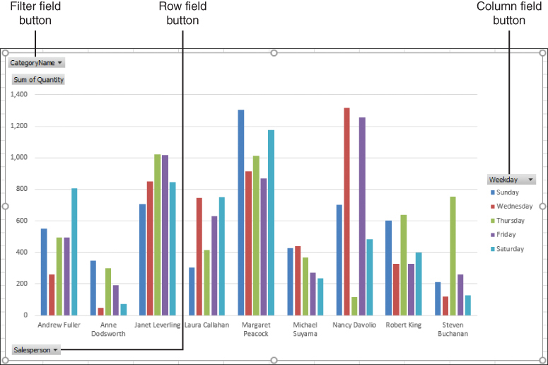
A PivotChart’s row, column, and filter field headers.
To change the row, column, or filter options in a PivotChart
➜ Click either the row field, column field, or report field button, then select the options you want to apply to the PivotChart.
Apply styles to PivotCharts
When you select a PivotChart, the PivotChart tool tabs appear. The Design tool tab includes several options for changing the PivotChart style:
Adding chart elements You can modify the chart by adding elements such as a chart title, axis titles, data labels, a data table, and gridlines.
Applying a predefined chart layout Excel offers 11 preset chart layouts that you can use to quickly display titles, gridlines, and other chart elements.
Changing the chart colors You can change the color scheme that Excel applies to the chart data markers.
Applying a chart style Excel offers a number of predefined styles that control the chart’s colors and effects.
Changing the chart data You can switch the rows and columns, and you can change the PivotTable data source.
Changing the chart type You can change the current chart type to any type that supports PivotCharts.
Moving the chart You can move the PivotChart to a new sheet, or you can embed the PivotChart in a different worksheet.
To apply styles to a PivotChart
Select the PivotChart.
On the Design tab, do any of the following:
In the Chart Layouts group, in the Add Chart Element list, add one or more elements to the PivotChart.
In the Chart Layouts group, in the Quick Layout list, apply a predefined chart layout.
In the Chart Styles group, in the Chart Styles gallery, apply a predefined style to the PivotChart.
In the Data group, click Switch Row/Column to switch the PivotChart’s row and column fields.
In the Data group, click Select Data to choose a different PivotTable as the PivotChart’s data source.
In the Type group, click Change Chart Type to apply a new chart type to the PivotChart.
In the Location group, click Move Chart to move the PivotChart either to a new sheet or to an existing worksheet, as an embedded object.
Drill down into PivotChart details
By definition, both a PivotTable and a PivotChart are summaries of the underlying data. This means that each data point is the highest level in a hierarchy that can include many different levels. For example, you might have a PivotChart that summarizes invoice data by showing the total quantity sold for each product category. The category is the highest level of the hierarchy. One level down in the hierarchy might be the individual products that make up each category. An example of a multilevel hierarchy would be to break down the categories into the countries/regions in which the sales occurred, then the states/provinces, and then the cities. Excel also offers the Collapse command, which you can use to move up the hierarchy to display fewer details.
To drill down into a PivotChart’s details
Right-click the data point you want to drill down into.
Do one of the following:
Click Expand to expand down a single level.
Click Expand Entire Field to expand down all the details and see all the levels of the hierarchy.
Click Expand to “Field” to expand all the details down to the field name specified by Field.
To collapse a PivotChart’s details
Right-click the data point you want to collapse, then click Expand/Collapse.
Do one of the following:
Click Collapse to collapse a single level.
Click Collapse Entire Field to collapse all the details and see only the top level of the hierarchy.
Click Collapse to “Field” to collapse all the details up to the field name specified by Field.
Objective 4.3 practice tasks
The practice file for these tasks is located in the MOSExcelExpert2019Objective4 practice file folder. The folder also contains a result file that you can use to check your work.
➤ Open the ExcelExpert_4-3 workbook and do the following:
❑ From the PivotTable on the Sales by Weekday worksheet, create a PivotChart of the default type on a new chart sheet. Rename the chart sheet Sales by Weekday PivotChart.
❑ From the PivotTable on the Shippers by Location worksheet, create a clustered column PivotChart and embed it on the same worksheet.
➤ From the table on the Invoices worksheet, create a PivotTable and embedded PivotChart on a new worksheet, and do the following:
❑ Rename the worksheet Quantity Sold.
❑ Set up the PivotTable to summarize the Quantity sold by Country/Region (row) and Category (column).
❑ To the PivotChart, add the chart title Quantity Sold by Category and Country/Region.
❑ In the PivotChart, select the data point where the Country/Region is United States and the Category is Seafood, then expand this data point to drill down to the State/Province field.
➤ Save the workbook.
➤ Open the ExcelExpert_4-3_results workbook. Compare the two workbooks to check your work. Then close the open workbooks.