Chapter Contents
Bivariate Distributions
Previous chapters covered how the distribution of a response can vary depending on factors and groupings. This chapter returns to explore distributions as simple unstructured batches of data. However, instead of a single variable, the focus is on the joint distribution of two or more responses.
Density Estimation
As with univariate distributions, a central question is where are the data? What regions of the space are dense with data and what areas are relatively vacant? The histogram forms a simple estimate of the density of a univariate distribution. If you want a smoother estimate of the density, JMP has an option that takes a weighted count of a sliding neighborhood of points to produce a smooth curve. This idea can be extended to several variables.
One of the most classic multivariate data sets in statistics contains the measurements of iris flowers that R. A. Fisher analyzed. Fisher’s iris data are in the sample data table called Iris.jmp, with variables Sepal length, Sepal width, Petal length, and Petal width. First, look at the variables one at a time.
Notice in Figure 16.1 that Petal length has an unusual distribution with two modes with no values between 2 and 3, which implies that there might be two distinct distributions.
Note: The bimodal distribution of Petal length could be explored using Continuous Fit > Normal Mixtures > Normal 2 Mixture, from the red triangle menu on the Petal length title bar. But for now, we are interested in looking at the way multiple variables behave together.
Figure 16.1 Univariate Distribution with Smoothing Curve

Bivariate Density Estimation
JMP has an implementation of a smoother that works with two variables to show their bivariate densities. The goal is to draw lines around areas that are dense with points. Continue with the iris data and look at Petal length and Sepal length together:
The result, shown in Figure 16.2, is a contour graph, where the various contour lines show paths of equal density. The density is estimated for each point on a grid by taking a weighted average of the points in the neighborhood, where the weights decline with distance. Estimates done in this way are called kernel smoothers.
Figure 16.2 Bivariate Density Estimation Curves

The Nonparametric Bivariate Density table beneath the plot has slider controls available to control the vertical and horizontal width of the smoothing distribution.
The density contours form a map showing where the data are most dense. The contours are calculated according to quantiles, where a certain percent of the data lie outside each contour curve. These quantile density contours show where each 5% and 10% of the data are. The innermost narrow contour line encloses the densest 5% of the data. The heavy line just outside surrounds the densest 10% of the data. It is colored as the 0.9 contour because 90% of the data lie outside it. Half the data distribution is inside the solid green lines, the 50% contours. Only about 5% of the data is outside the outermost 5% contour.
One of the features of the iris petal and sepal length data is that there seem to be several local peaks in the density. There are two ‘islands’ of data, one in the lower-left and one in the upper-right of the scatterplot.
These groups of locally dense data are called clusters, and the peaks of the density are called modes.
This produces a 3-D surface of the density, as shown here.
Mixtures, Modes, and Clusters
Multimodal data often comes from a mixture of several groups. Examining the data closely reveals that it is actually a collection of three species of iris: Virginica, Versicolor, and Setosa.
Conducting a bivariate density for each group results in the density plots in Figure 16.3. These plots have their axes adjusted to show the same scales.
Figure 16.3 Bivariate Density Curves

Another way to examine these groupings, on the same plot, is with the Graph Builder.
Figure 16.4 Graph Builder Contour Densities

You can again see that the three species fall in different regions for Petal length, while Virginica and Versicolor have some overlap of Sepal length.
Note: To classify an observation (an iris) into one of these three groups, a natural procedure is to compare the density estimates corresponding to the petal and sepal length of a specimen over the three groups, and assign it to the group where its point is enclosed by the highest density curve. This type of statistical method is also used in discriminant analysis and Cluster analysis, shown later in this chapter.
The Elliptical Contours of the Normal Distribution
Notice that the contours of the distributions on each species are elliptical in shape. It turns out that ellipses are the characteristic shape for a bivariate Normal distribution. The Fit Y by X platform can show a graph of these Normal contours.
When the scatterplot appears,
The result of these steps is shown in Figure 16.5. When there is a grouping variable in effect, there is a separate estimate of the bivariate Normal density (or any fit you select) for each group. The Normal density ellipse for each group encloses the densest 50% of the estimated distribution.
Figure 16.5 Density Ellipses for Species Grouping Variable

Notice that the two ellipses toward the top of the plot are diagonally oriented, while the one at the bottom is not. The reports beneath the plot show the means, standard deviations, and correlation of Sepal length and Petal length for the distribution of each species. Note that the correlation is low for Setosa, and high for Versicolor and Virginica. The diagonal flattening of the elliptical contours is a sign of strong correlation. If variables are uncorrelated their Normal density contours appear to have a more non-diagonal and rounder shape.
One of the main uses of correlation is to see if variables are related. You want to know if the distribution of one variable is a function of the other (that is, if you know the value of one variable can you predict the value of the other). When the variables are Normally distributed and uncorrelated, then the univariate distribution of one variable is the same no matter what the value of the other variable is. When the density contours have no diagonal aspect, then the density across any slice is the same no matter where you take that slice (after you Normalize the slice to have an area of one so it becomes a univariate density).
The Density Ellipse command in the Fit Y by X platform gives the correlation, which is a measure, on a scale of -1 to 1, of how close two variables are to being linearly related. A significance test on the correlation shows the p-value for the hypothesis that there is no correlation. A low p-value indicates that there is a significant correlation.
The next sections covers uses simulations to cover the bivariate Normal distribution in more detail.
Note: Density ellipses can also be shown using the Graph Builder.
Correlations and the Bivariate Normal
Describing Normally distributed bivariate data is easy because you need only the means, standard deviations, and the correlation of the two variables to completely characterize the joint distribution. If the individual distributions are not Normal, you might need a good deal more information describe the bivariate relationship.
Correlation is a measure of the linear association between two variables. If you can draw a straight line through all the points of a scatterplot, then there is a perfect correlation. Perfectly correlated variables measure the same thing. The sign of the correlation reflects the slope of the regression line—a perfect positive correlation has a value of 1, and a perfect negative correlation has value –1.
Simulating Bivariate Correlations
As we saw in earlier chapters, using simulated data created with formulas provides a reference point when you move on to analyze real data.
This table has no rows, but contains formulas to generate correlated data.
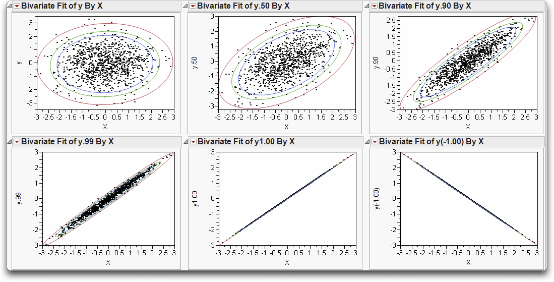
The formulas evaluate to give simulated correlations (Figure 16.6). There are two independent standard Normal random columns, labeled X and y. The remaining columns (y.50, y.90, y.99, and y.1.00) have formulas constructed to produce the level of correlation indicated in the column names (0.5, 0.9, 0.99, and 1.00). For example, the column formula to produce the correlation of 1 is: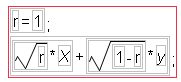
Figure 16.6 Partial Listing of Simulated Values

You can use the Fit Y by X platform to examine the correlations:
Holding down the Control (or ⌘) key applies the command to all the open plots in the Fit Y by X window simultaneously.
These steps make Normal density ellipses (Figure 16.7) containing 90%, 95%, and 99% of the bivariate Normal density, using the means, standard deviations, and correlation from the data.
As an exercise, create the same plot for generated data with a correlation of -1, which is the last plot shown in Figure 16.7. To do this:

Hint: Open the Formula Editor window for the variable called Y1.00. Select its formula and drag it to the Formula Editor window for the new column you are creating. To place a minus sign in front of the formula, select the whole formula and click the unary sign (the +/-) button on the Formula Editor keypad.
Note in Figure 16.7 that as the correlation grows from 0 to 1, the relationship between the variables gets stronger and stronger. The Normal density contours are circular at correlation 0 (if the axes are scaled by the standard deviations) and collapse to the line at correlation 1.
Figure 16.7 Density Ellipses for Various Correlation Coefficients
Correlations Across Many Variables
The next example involves six variables. To characterize the distribution of a six-variate Normal distribution, the means, the standard deviations, and the bivariate correlations of all the pairs of variables are needed.
In a chemistry study, the solubility of 72 chemical compounds was measured with respect to six solvents (Koehler and Dunn, 1988). One purpose of the study was to see if any of the solvents were correlated—that is, to identify any pairs of solvents that acted on the chemical compounds in a similar way.
Note that the tag icon appears beside the Label column in the Columns panel to signify that JMP uses the values in this column to label points in plots.
You see a correlations table and a scatterplot matrix like the one shown in Figure 16.8. Each small scatterplot is identified by the name cells of its row and column.
Figure 16.8 Scatterplot Matrix for Six Variables
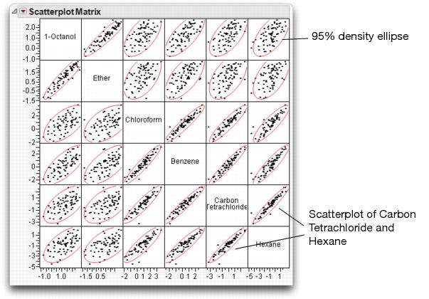
1-Octanol and Ether are highly correlated, but have weak correlations with other variables. The other four variables have strong correlations with one another. For example, note the correlation between Carbon Tetrachloride and Hexane.
You can resize the whole matrix by resizing any one of its small scatterplots.
Also, you can change the row and column location of a variable in the matrix by dragging its name on the diagonal.
Keep this report open to use again later in this chapter.
Bivariate Outliers
Let’s switch platforms to get a closer look at the relationship between Carbon Tetrachloride and Hexane using a set of density contours.
Under the assumption that the data are distributed bivariate Normal, the inside ellipse contains half the points, the next ellipse 90%, then 95%, and the outside ellipse contains 99% of the points.
Note that there are two points that are outside even the 99% ellipse. To make your plot look like the one below,
The labeled points are potential outliers. A point can be considered an outlier if its bivariate Normal density contour is associated with a very low probability.
Figure 16.9 Bivariate Plot With Ellipses and Outliers
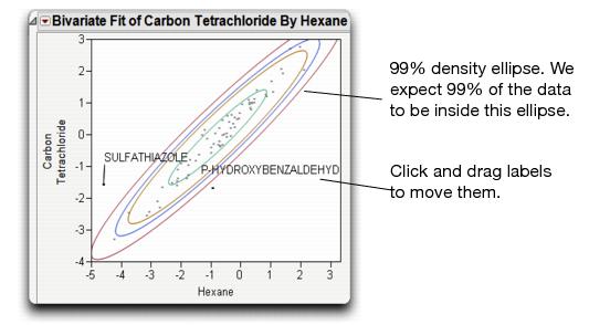
Note that “P-hydroxybenzaldehyde” is not an outlier for either variable individually (i.e. in a univariate sense). In the scatterplot it is near the middle of the Hexane distribution, and is barely outside the 50% limit for the Carbon Tetrachloride distribution. However, it is a bivariate outlier because it falls outside the correlation pattern, which shows most of the points in a narrow diagonal elliptical area.
A common method for identifying outliers is the Mahalanobis distance. The Mahalanobis distance is computed with respect to the correlations as well as the means and standard deviations of both variables.
This command gives the Mahalanobis Distance outlier plot shown in Figure 16.10.
Figure 16.10 Outlier Analysis with Mahalanobis Outlier Distance Plot

The reference line is drawn using an F-quantile and shows the estimated distance that contains 95% of the points. In agreement with the ellipses in the Bivariate plot, ‘Sulfathiazole’ and ‘P-hydroxybenzaldehyde’ show as prominent outliers (along with three other solvents). To explore these two outliers,
Outliers in Three and More Dimensions
In the previous section we looked at two variables at a time—bivariate correlations for several pairs of variables.
To consider three variables at a time, look at three chemical variables, 1-Octanol, Ether and Carbon Tetrachloride. You can see the distribution of points with a 3-D scatterplot:
The orientation in Figure 16.11 shows four points that appear to be outlying from the rest of the points with respect to the ellipsoid-shaped distribution.
Figure 16.11 Outliers as Seen in Scatterplot 3D

The Fit Y by X and the Scatterplot 3D platforms revealed extreme values in two and three dimensions. How do we measure outliers in six dimensions? All outliers, from two dimensions to six dimensions (and beyond), should show up on the Mahalanobis Distances outlier plot shown earlier. This plot measures distance with respect to all six variables.
If you closed the scatterplot window, choose Analyze > Multivariate Methods > Multivariate with all six responses as Y variables, and then select Outlier Analysis > Mahalanobis Distances from the top red triangle menu.
Potential outliers across all six variables are labeled in Figure 16.12.
Figure 16.12 Outlier Distance Plot for Six Variables

There is a refinement to the outlier distance that can help to further isolate outliers. When you estimate the means, standard deviations, and correlations, all points—including outliers—are included in the calculations and affect these estimates, causing an outlier to disguise itself.
Suppose that as you measure the outlier distance for a point, you exclude that point from all mean, standard deviation, and correlation estimates.
This technique is called jackknifing. The jackknifed distances often make outliers stand out better.
Identify Variation with Principal Components Analysis
Lets return to the 3-D scatterplot. As you rotate the plot, points in one direction in the space show a lot more variation than points in other directions. This is true in two dimensions when variables are highly correlated. The long axis of the Normal ellipse shows more variance; the short axis shows the least (as shown in the illustration below). 
Now, in three dimensions, there are three axes with a three-dimensional ellipsoid for the trivariate Normal (shown below). The solubility data seem to have the ellipsoidal contours characteristic of Normal densities, except for a few outliers (as noted earlier).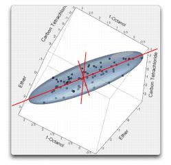
The directions of the axes of the Normal ellipsoids are called the principal components. They were mentioned in the Galton example in Why It’s Called Regression of Chapter 10, “Fitting Curves through Points: Regression”.
The first principal component is defined as the direction of the linear combination of the variables that has maximum variance. In a 3D scatterplot, it is easy to rotate the plot and see which direction this is.
The second principal component is defined as the direction of the linear combination of the variables that has maximum variance, subject to it being at a right angle (orthogonal) to the first principal component. Higher principal components are defined in the same way. There are as many principal components as there are variables. The last principal component has little or no variance if there is substantial correlation among the variables. This means that there is a direction for which the Normal density hyper-ellipsoid is very thin.
The Scatterplot 3D platform can show principal components.

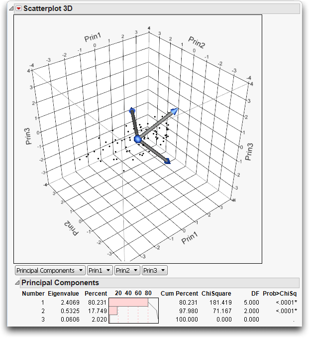
This adds three principal components to the variables list and creates a biplot with three rays corresponding to each of the variables, as shown in Figure 16.13.
The directions of the principal components are shown as rays from the origin of the point cloud. As you rotate the plot, you see that the principal component rays correspond to the directions in the data in decreasing order of variance. You can also see that the principal components form right angles in three-dimensional space.
The Principal Components report in Figure 16.13 shows what portion of the variance among the variables is explained by each principal component. In this example, 80% of the variance is carried by the first principal component, 18% by the second, and 2% by the third. It is the correlations in the data that make the principal components interesting and useful. If the variables are not correlated, then the principal components all carry the same variance.
Figure 16.13 Biplot and Report of Principal Components
Principal Components are also available from the Principal Components platform. Lets repeat this analysis using this platform:
JMP displays the principal components and three plots, as shown in Figure 16.14
Figure 16.14 Principal Components for Three Variables

The Pareto Plot (left) shows the percent of the variation accounted for by each principal component. As we saw earlier, the first principal component explains 80% of the variation in the data, while the second component accounts for 18%.
The middle Score Plot shows a scatterplot of the first two principal components. The first principal component accounts for far more variation (spread in the data) than the second component.
The Loading Plot (right) shows the correlations between the variables and the principal components. Carbon Tetrachloride is plotted by itself, while the other two variables are plotted together, indicating that they are correlated with one another. (We’ll talk more about this in the next section.)
Principal Components for Six Variables
Now let’s move up to more dimensions than humans can visualize. We return to the Solubility.jmp data, but this time we look at principal components for all six variables in the data table.
Figure 16.15 Principal Components for Six Variables

Examine the pareto plot in Figure 16.15. Note that the first two principal components work together to account for 95.5% of the variation in six dimensions.
Note the very narrow angle between rays for 1-Octanol and Ether in the Loading Plot (on the left). These two rays are at near right angles to the other four rays, which are clustered together. Narrow angles between principal component rays are a sign of correlation. Principal components try to squish the data from six dimensions down to two dimensions. To represent the points most accurately in this squish, the rays for correlated variables are close together because they represent most of the same information. Thus, the Loading Plot shows the correlation structure of high-dimensional data.
Recall the scatterplot matrix for all six variables (shown below). This plot confirms the fact that Ether and 1-Octanol are highly correlated, and the other four variables are also highly correlated with one another. However, there is little correlation between these two sets of variables.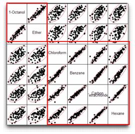
How Many Principal Components?
In the solubility example, more than 95% of the variability in the data is explained by two principal components. In most cases, only two or three principal components are needed to explain the majority (80-90%) of the variation in the data.
A Scree Plot can offer some guidance in determining the number of principal components required. Screen is a term for the rubble that accumulates at the bottom of steep cliffs, which this plot resembles. The place where the Scree Plot changes from a sharp downward slope to a more level slope (which is not always obvious) is an indication of the number of principal components to include.
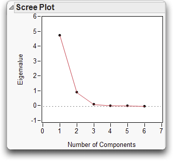
In the plot above, we can see that the plot levels out slightly after the second component, and is flat from the third component on.
Once you decide on the number of principal components needed, you can save the principal components to the data table.
This creates a new column in the data table, which might be useful in subsequent analyses and graphs.
Note: You might also consider a simple form of factor analysis, in which the components are rotated to positions so that they point in directions that correspond to clusters of variables. In JMP, Factor Analysis is an option in the Principal Components platform.
Discriminant Analysis
Both discriminant analysis and cluster analysis classify observations into groups. The difference is that discriminant analysis has known groups to predict, whereas cluster analysis forms groups of points that are close together but there is no known grouping of the points.
Discriminant analysis is appropriate for situations where you want to classify a categorical variable based on values of continuous variables. For example, you may be interested in the voting preferences (Democrat, Republican, or Other) of people of various ages and income levels. Or, you may want to classify animals into different species based on physical measurements of the animal.
There is a strong similarity between discriminant analysis and logistic regression.
• In logistic regression, the classification variable is random and predicted by the continuous variables,
• In discriminant analysis the classifications are fixed, and the continuous factors are random variables.
However, in both cases, a categorical value is predicted by continuous variables.
Discriminant analysis is most effective when there are large differences among the mean values of the different groups. Larger separations of the means make it easier to determine the classifications.
The group classification is done by assigning a point to the group whose multivariate mean (centroid) is the closest, where closeness is with respect to the within-group covariance.
The example in this section deals with a trace chemical analysis of cherts. Cherts are rocks formed mainly of silicon, and are useful to archaeologists in determining the history of a region. By determining the original location of cherts, inferences can be drawn about the peoples that used them in tool making. Klawiter (2000) was interested in finding a model that predicted the location of a chert sample based on a trace element analysis. A subset of his data is found in the data table Cherts.jmp.
In the launch dialog that appears,
The discriminant analysis report consists of two basic parts, the canonical plot and scores output.
Note: The default discriminant method is Linear, which assumes a common covariance structure for all groups. Two other methods, Quadratic and Regularized, are also available. Refer to the book Modeling and Multivariate Methods under the Help menu for details.
Canonical Plot
The Canonical Plot in Figure 16.16 shows the points and multivariate means in the two dimensions that best separate the groups. The term canonical refers to functions that discriminate between groupings. The first function, Canonical1, provides the most discrimination or separation between groups, and Conanical2 provides the second most separation.
Note that the biplot rays, which show the directions of the original variables in the canonical space, have been moved to better show the canonical graph. Click in the center of the biplot rays and drag them to move them around the report.
Figure 16.16 Canonical Plot of the Cherts Data

Each multivariate mean is enclosed in a 95% confidence ellipse, which appears circular in canonical space. In this example, the multivariate means for Shakopee, Gran Grae, and Rushford are more separated from the cluster of locations near the center of the graph.
Discriminant Scores
The scores report shows how well each point is classified. A portion of the discriminant scores for this example are shown in Figure 16.17. The report provides the actual classification, the distance to the mean of that classification, and the probability that the observation is in the actual classification. The histogram shows –log(prob), the loss in log-likelihood when a point is predicted poorly. When the histogram bar is large, the point is being poorly predicted. The last columns show the predicted group and the associated probability.
Figure 16.17 Portion of Discriminant Scores Report
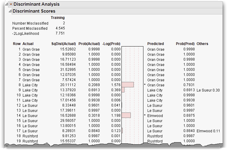
The predictions for rows 8 and 14 are incorrect, notated by an asterisk to the right of the bar plot. To see why these rows were misclassified examine them in the canonical plot.
The result of this selection is shown in Figure 16.18.
Figure 16.18 Misclassified Rows

Row 8, although actually from Lake City, is very close to Gran Grae in canonical space. This closeness is the likely reason it was misclassified. Row 14, on the other hand, is close to Le Sueur, its actual value. It was misclassified because it was closer to another center, though this is not apparent in this2-dimensional projection of a 7-dimensional space.
Another quick way to examine misclassifications is to look at the Counts report (Figure 16.19) found below the discrimination scores. Zeros on the non-diagonal entries indicate perfect classification. The misclassified rows 8 and 14 are represented by the 1’s in the non-diagonal entries.
Figure 16.19 Counts Report

Stepwise Discriminant Variable Selection
In discriminant analysis we are building a model to predict which group a row belongs in. But, all variables in the data set might not aid in classification. Stepwise variable selection determines which variables are useful, and allows us to build a model including only those variables.
JMP provides forward and backward variable selection, as shown below:
• In forward selection (Step Forward), each variable is reviewed to determine which one provides the most discrimination between the groups. The variable with the lowest p-value is added to the model. The model-building process continues step-by-step, until you choose to stop.
• In backward selection (Step Backward), all variables are added to the model, and variables that contribute the least to discrimination are removed one at a time.
For the model you choose (click Apply this Model), the discriminant analysis is performed and misclassification rates can be compared to the full model.
The stepwise option is available from the Discriminant launch dialog, or from the red triangle menu in the Discriminant report.
Cluster Analysis
Cluster analysis is the process of dividing a set of observations into a number of groups where points inside each group are close to each other. JMP provides several methods of clustering, but here, we show only hierarchical clustering. Grouping observations into clusters is based on some measure of distance. JMP measures distance in the simple Euclidean way. There are many ways of measuring of the proximity of observations, but the essential purpose is to identify observations that are ‘close’ to each other and place them into the same group. Each clustering method has the objective of minimizing within-cluster variation and maximizing between-cluster variation.
Hierarchical clustering work: How Does it Work?
Hierarchical clustering works like this.
• Start with each point in its own cluster.
• Find the two clusters that are closest together in multivariate space.
• Combine these two clusters into a single group centered at their combined mean.
• Repeat this process until all clusters are combined into one group.
This process is illustrated in Figure 16.20.
Figure 16.20 Illustration of Clustering Process

As a simple example, open the SimulatedClusters.jmp data table.
The results are shown in Figure 16.21.
Figure 16.21 Scatterplot of Simulated Data

In this example, data clearly clump together into three clusters. In reality, clusters are rarely this clearly defined. We’ll see a real life example of clustering later.
Let’s see how the Cluster platform handles clustering with this simulated data.
The report appears as in Figure 16.22.
Figure 16.22 Dedrogram and Distance Plot

The top portion of the report shows a dendrogram, a visual tree-like representation of the clustering process. Branches that merge on the left join together iteratively to form larger and larger clusters, until there is a single cluster on the right.
Note the small diamonds at the bottom and the top of the dendrogram. These draggable diamonds adjust the number of clusters in the model.
The Distance Plot, shown beneath the dendrogram is similar to the Scree Plot in principal components. This plot offers some guidance regarding the number of clusters to include. The place where the Distance Plot changes from a level slope to a sharp slope is an indication of the number of clusters to include. In this example the Distance Plot is very flat up to the point of three simulated clusters, where it rises steeply.
To better see the clusters,
This assigns a special color and marker to each observation, which changes dynamically as you change the number of clusters in the model. To see this,
The scatterplot for nine, six, and three clusters should look similar to the ones in Figure 16.23.
Figure 16.23 Nine, Six and Three Clusters

Once you decide that you have an appropriate number of clusters, you can save a column in the data table that holds the cluster number for each point.
The cluster numbers are often useful in subsequent analyses and graphs, as we’ll see in the example to follow.
A Real-World Example
The data set Cereal.jmp contains nutritional information on a number of popular breakfast cereals. A cluster analysis can show which of these cereals are similar in nutritional content and which are different.
When the dendrogram appears,
By default, eight clusters display. The Distance Plot (bottom of Figure 16.24) does not show a clear number of clusters for the model. However, there seems to be some change in the steepness at around six clusters.
Figure 16.24 Dendrogram of Cereal Data

Examine the cereals classified in each cluster. Some conclusions based on these clusters are as follows:
• The all bran cereals and shredded-wheat cereals form the top two clusters.
• Oat-based cereals, for the most part, form the third cluster.
• Cereals with raisins and nuts fall in the fourth cluster.
• Sugary cereals and light, puffed cereals form the last two clusters.
Cluster numbers can be saved to a column in the data table help us gain insights into variables driving the clustering.
The Graph Builder is a handy tool graphically explore the clustering (from Graph > Graph Builder). For example, in Figure 16.25 we can see that cereals in Cluster 1 tend to be low in calories and high in fiber. However, cereals in Cluster 5 tend to be low in both calories and fiber.
Figure 16.25 Exploring Clusters Using Graph Builder

Some Final Thoughts
When you have more than three variables, the relationships among them can get very complicated. Many things can be easily found in one, two, or three dimensions, but it is hard to visualize a space of more than three dimensions.
The histogram provides a good one-dimensional look at the distribution, with a smooth curve option for estimating the density. The scatterplot provides a good two-dimensional look at the distribution, with Normal ellipses or bivariate smoothers to study it. In three dimensions, Scatterplot 3D provides the third dimension. To look at more than three dimensions, you must be creative and imaginative.
One good basic strategy for high-dimensional exploration is to take advantage of correlations and reduce the number of dimensions. The technique for this is principal components, and the aim is to reduce a large number of variables to a smaller more manageable set that still contains most of the information content in the data.
Discriminant analysis and cluster analysis are exploratory tools for classifying observations into groups. Discriminant analysis predicts classifications based on known groups, whereas cluster analysis forms groups of points that are close together.
You can also use highlighting tools to brush across one distribution and see how the points highlight in another view.
The hope is that you either find patterns that help you understand the data, or points that don’t fit patterns. In both cases you can make valuable discoveries.
Exercises
1. In the data table Crime.jmp, data are given for each of the 50 U.S. states concerning crime rates per 100,000 people for seven classes of crimes.
(a) Use the Multivariate platform to produce a scatterplot matrix of all seven variables. What pattern do you see in the correlations?
(b) Conduct an outlier analysis (using Mahalanobis distance) of the seven variables, and note the states that seem to be outliers. Do the outliers seem to be states with similar crime characteristics?
(c) Conduct a principal components analysis on the correlations of these variables. Which crimes seem to group together?
(d) Using the eigenvalues from the principal components report, how many dimensions would you retain to accurately summarize these crime statistics?
2. The data in Socioeconomic.jmp (SAS Institute 1988) consists of five socioeconomic variables for twelve census tracts in the Los Angeles Standard Metropolitan Statistical Area.
(a) Use the Multivariate platform to produce a scatterplot matrix of all five variables.
(b) Conduct a principal components analysis (on the correlations) of all five variables. How many principal components would you retain for subsequent analysis?
(c) Using the Loading Plot, determine which variables load on each principal component.
3. A classic example of discriminant analysis uses Fisher’s Iris data, stored in the data table Iris.jmp. Three species of irises (setosa, virginica, and versicolor) were measured on four variables (sepal length, sepal width, petal length, and petal width). Use the discriminant analysis platform to make a model that classifies the flowers into their respective species using the four measurements
4. The data set World Demographics.jmp contains mortality (i.e. birth and death) rates for several countries. Use the cluster analysis platform to determine which countries share similar mortality characteristics. What do you notice that is similar among the countries that group together?
Save the clusters, then use the Graph Builder to explore the clustering. Summarize what you observe.
..................Content has been hidden....................
You can't read the all page of ebook, please click here login for view all page.