
Chapter 14
Security Ranking, Selection, Rules, and Guidelines
It is not uncommon for investors to believe that the more information they have, the better their chance at choosing good investments. Financial websites offer alerts on stocks, the economy, and just about anything you think you might need. The sad part is that the investor thinks every iota of information is important and tries to draw a conclusion from it. The conclusion may turn out to be correct, but it is usually not. The investor is trying to tie each item of news to the movement of a stock, which generally never seems to work; just a few minutes watching the financial media should tell you that it doesn’t work. Human emotions make the investor feel good about having news that supports their beliefs, but rarely do those emotions contribute to investment success. I find it amazing how many times I go into an office and find the financial television playing, sometimes muted, but probably only when they see me coming. Too much information can lead to a total disarray of investment ideas and decisions. Keep it simple, turn off the outside noise, and use a technical approach to determine which issues to buy and sell. You’ll be healthier.
Ranking Measures
Ranking measures are the technical indicators used to determine which issues to buy based on their trendiness. They can be assigned as mandatory or tie-breaker ranking measures. The mandatory ones are the ranking measures that have to meet certain requirements before an issue can be bought. The tie-breaker ranking measures are there to assist in issue selection but are not mandatory.
Ranking measures can be used with individual stocks, Exchange Traded Funds (ETFs), mutual funds, and bonds; however, there must be a process for selecting them if for any other reason than to reduce the number down to a useable amount. For example in an exchange-traded fund (ETF)-only strategy, consider that there are nearly 1,400 ETFs and a fully invested portfolio might only have positions in 20 ETFs. Ranking measures are indicators, mainly of price or price relationships that assist in the determination of whether an issue is in an uptrend.
Throughout this section, the charts show the exchange-traded fund SPY in the top plot whenever possible, the ranking measure in the bottom plot, and the ranking measure’s binary overlaid on the SPY in the top plot. Some exceptions to using SPY are when volume is needed for the ranking measure, in which case another broad-based ETF will be used. A discussion of the parameters that can be used for each ranking measure is also included. I do not go into excruciating analysis on each chart as the concept is really simple. The binary is the signal line and it only represents the ranking measure’s signals exactly. Not all ranking measures have a binary signal as they are used for confirmation of a trend direction. The discussion for each ranking measure is varied as some are fairly simple to understand and won’t involve a detailed discussion. I certainly am not the type that discusses each wiggle and waggle of the indicator.
Trend
Trend is the name given to a derivative of an indicator originally created by Jim Ritter of Stratagem Software. He wrote about it in the December 1992 (V. 12:12, 534–534) issue of Stocks & Commodities magazine, in an article, “Create a Hybrid Indicator.” Trend is a simple concept, yet powerful combination of two overbought oversold indicators: Stochastics (%K) and Relative Strength Index (RSI). The indicator uses 50 percent of each one in combination and while both are range-bound between zero and 100, the combination is also range-bound between zero and 100. Stochastics, normally much quicker to react to price changes, is dampened by the usually slower to react RSI. In combination you have an indicator that shows strong trend measurements whenever it is above a predetermined threshold.
Parameters
The Stochastic needs to be much longer than when used by itself while RSI can be used close to its original value. The Stochastic range of 20 to 30 should work well with the final value determined by the length trend you want to follow. The RSI range can vary but you don’t want to make it too long as it is already a slower reacting measure. Finally, the threshold used for Trend should be in the 50 to 60 range, again dependent on how soon you want the signal, remembering that early signals will also give more whipsaws.
The examples of Trend in Figure 14.1 have the threshold drawn at 50, which is a good all-around value. The concept is simply that whenever Trend is above 50, the ETF is in an uptrend, and whenever Trend is below 50, it is not in an uptrend. The binary is overlaid on the price plot (top) so you can see the signals better. Notice that when prices are in an uptrend, the binary is usually at the top, and when prices are not, it is at the bottom. Notice in the middle of the plot there were a number of quick signals in succession; this is why one should not rely on a single indicator for analysis.

FIGURE 14.1 Trend
Source: Chart courtesy of MetaStock.
Trend Rate of Change (ROC)
This is merely the five-day rate of change of Trend. Why would you use that? When viewing a lot of data on a spreadsheet that does not contain any charts, and you see the value for Trend is 65, you also need to know if it is rising through 65 or declining through it. A snapshot of the data can be dangerous if you don’t also look at the direction the indicator is moving. Figure 14.2 is a chart of the five-day rate of change of Trend. You can see that while Trend is still slightly positive (above the 50 line) it is declining (see Figure 14.1). Then when you compare it with the Trend ROC in Figure 14.2, it is showing significant weakness. Of course, showing the five-day rate of change of an indicator without showing the indicator itself is foolish; it was done here so that you could see the measure being discussed.

FIGURE 14.2 Trend Rate of Change
Source: Chart courtesy of MetaStock.
Parameters
This can be almost any value you desire based on what you are using it for. I used it here to see the short-term trend of an indicator so five days is just about right. If you were using rate of change as an indicator for measuring the strength of an ETF or an index, then a longer period would probably be more appropriate. I use 21 days when I use ROC by itself.
Figure 14.3 shows the Trend with the five-day rate of change of Trend overlaid (lighter). This is the way that all the mandatory ranking measures and some of the tie-breakers measures are shown. You can see from this that the Trend is above 50, but the five-day rate of change is deteriorating and is well below zero (negative).

FIGURE 14.3 Trend with Trend Rate of Change
Source: Chart courtesy of MetaStock.
Trend Diffusion
This is also known as Detrend, which is a technique where you subtract the value of an indicator’s moving average from the value of the indicator. It is a simple concept, actually, and not unlike the difference between two moving averages with one average being equal to 1, or MACD for that matter. Technical analysis is ripe with simple diversions from concepts and often with someone’s name attached to the front if it—don’t get me started on that one. Figure 14.4 is the same Trend as previously discussed except that it is the 15-day Detrend of Trend, or Trend Diffusion. The middle plot is the Trend with the lighter line being a 15 day simple moving average of the Trend. The bottom plot is the Trend Diffusion, which is simply the difference between the Trend and its own 15-day moving average. You can see this when the Trend moves above its moving average, the Trend Diffusion moves above the zero line. Similarly, whenever the Trend moves below its 15-day moving average in the middle plot, the Trend Diffusion moves below the zero line in the bottom plot. The information from the 15-day Trend Diffusion is absolutely no different that the information in the middle plot showing the Trend and its 15-day moving average, just easier to visualize.

FIGURE 14.4 Trend and Trend Diffusion
Source: Chart courtesy of MetaStock.
Parameters
The example in Figure 14.4 uses 15 days, which is three weeks. Parameters need to be chosen based on the time frame for your analysis. A range from 10 to 30 is probably adequate for Trend Diffusion.
Price Momentum
This indicator looks back at the price today compared to X days ago. It is created by calculating the difference between the sum of all recent gains and the sum of all recent losses and then dividing the results by the sum of all price movement over the period being analyzed. This oscillator is similar to other momentum indicators such as RSI and Stochastics because it is range bound, in this case from −100 to +100.
Parameters
Price Momentum is very close to being the same as rate of change; generally the only difference between the two is the scaling of the data. Momentum oscillates above and below zero and yields absolute values, while the Rate of Change moves between zero and 100 and yields relative values. The shape of the line, however, is similar. With momentum, the threshold is shown at 50 but could be higher if requiring more stringent ranking requirements.
Figure 14.5 shows the Price Momentum ranking measure (dark line) and its five-day rate of change (lighter line). You can see that the Price Momentum is weak and the ROC is negative and declining.

FIGURE 14.5 Price Momentum and Momentum Rate of Change
Source: Chart courtesy of MetaStock.
Price Performance
This indicator shows the recent performance based on its actual rate of change for multiple periods, added together, and then divided by the number of rates of change used. In this example I used three rates of change of 5, 10, and 21 days, which equates to 1 week, 2 weeks, and 1 month. Simply calculate each rate of change, add them together, and then divide by three. This gives an equal weighting to rates of change over various days.
Parameters
Like many indicators the parameters used are totally dependent on what you are trying to accomplish. Here I am trying only to identify ETFs that are in an uptrend.
Figure 14.6 shows the Price Performance measure using the three rates of change mentioned above. There is no need to show the typical five-day rate of change of this indicator since it is in itself a rate of change indicator.

FIGURE 14.6 Price Performance
Source: Chart courtesy of MetaStock.
Relationship to Stop
This is the percentage that price is below its previous 21-day highest close. This is an extremely important ranking measure and here’s why. If you are using a system that always uses stop loss placement (hopefully you are), then you certainly would not want to buy an ETF that was already close to its stop. This is the case when using trailing stops, if using portfolio stops, or stops based on the purchase price, this measure does not come into play. I like to use stops during periods of low risk of 5 percent below where the closing price had reached its highest value over the past 21 days. If you think about this, this means that as prices decline from a new high, then the stop baseline is set at that point and the percentage decline is measured from there.
Parameters
In most cases this is a variable parameter determined by the risk that you have assessed in the market or in the holding. I prefer very tight stops in the early stages of an uptrend because I know there are going to be times when it does not work, and when those times happen, I want out. The setting of stop loss levels is entirely too subjective, but I would say that as risk lessens, the stops should become looser allowing for more daily volatility in the price action.
Figure 14.7 shows the 5 percent trailing stop using the highest closing price over the past 21 days. The two lines are drawn at zero and −5 percent. When this measure is at zero, it means that the price is at its highest level in the past 21 days. The line then continuously shows where the price is relative to the moving 21-day highest closing price. When it drops below the −5 percent line, then the stop has been hit and the holding should be sold. Please notice that I did not beat around the bush on that last sentence. When a stop is hit, sell the holding. Like Forrest Gump, that is all I’m going to say about that.
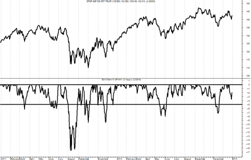
FIGURE 14.7 Relation to Stop
Source: Chart courtesy of MetaStock.
Relative Performance
This indicator shows the recent performance of an ETF relative to that of the S&P 500. Often there is a tendency to show the performance relative to the total return version of the S&P 500. This is only advisable if you are actually measuring and using the total return version of an ETF. In addition, most measurements are of a time frame where the total return does not come into play. However, purists may want one over the other, and the results will be satisfactory if used consistently. Usually the data analyzed is price-based; therefore, the relative performance should be using the price only S&P 500 Index. Also when comparing an ETF to an index, one must be careful when comparing say the SPY with the S&P 500 Index, two issues that should track relatively close to each other. The mathematics can blow up on you, so just be cognizant of this situation. Hence, the example in the chart below has switched from using SPY to using the EFA exchange-traded fund. Finally, you cannot simply divide the ETF by the index and plot it, or you will have a lot of noise with no clear indication as to the relative performance. I like to normalize the ratio of the two over a time period that is appropriate for my work, in this case over 65 days. This can further be expanded, similar to the Price Performance measure covered previously, and also use another normalization period, say 21 days, then average them. Additionally, you can then smooth the results to help remove some noise. Remember you are only trying to assess relative performance here.
Parameters
This, like many ranking measures, is based totally on personal preference and also on the time frame you are using for analysis. In this example, I normalized the ratio with 65 and 21 days, then smoothed the result with the difference between their 15 and 50 day exponential average.
Figure 14.8 shows EFA relative to the S&P 500 Index. Whenever it is above the horizontal zero line, then EFA is outperforming the S&P 500. This would be considered an alpha-generating ranking measure if your benchmark is the S&P 500.
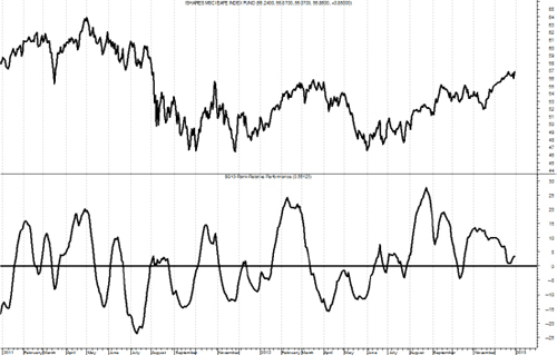
FIGURE 14.8 Relative Performance
Source: Chart courtesy of MetaStock.
Power Score
This is a combination indicator that takes four indicators into account to get a composite score. They are Trend, Price Momentum, Price Performance, and Relationship to Stop. Additionally, the PowerScore also factors in the five-day rates of change of the Price Momentum and Trend measures.
Parameters
There are not really any parameters to discuss with PowerScore because it is created by using four of the mandatory ranking measures. The concept here can be as broad or as narrow as needed. Using only the mandatory ranking measures seems reasonable; however, the PowerScore is unlimited in what components can be used.
Figure 14.9 shows the PowerScore with a horizontal line at the value of 100. Based on the calculations of the components for this indicator, whenever PowerScore is above 100, then it is saying that the components are collectively saying the ETF is in an uptrend. This could be considered a composite measure, but unlike the ones referred to in the weight of the evidence components, this one uses all components.

FIGURE 14.9 PowerScore
Source: Chart courtesy of MetaStock.
Efficiency Ratio
This ratio shows how much price movement in the past 21 days was essentially noise. It is a measure of the smoothness of the 21-day rate of change. It was created years ago by Perry Kaufman. This is an excellent ranking measure but you need to know that it is an absolute measure of how an ETF gets from point A to point B, in this case from 21 days ago until today. Figure 14.10 is an example of how to think about this. If you were interested in two funds, fund 1 (solid line) and fund B (thicker dashed line), measuring their price movements of the same period of time, then which of the two would you prefer? The one that smoothly rose from point A to point B, or the one that had erratic movements up and down but ended up at the same place? I think everyone agrees that the smoother ride, or the solid line, is preferable.

FIGURE 14.10 Efficiency Ratio Explanation
Parameters
I use 15 or 21 days, but as always, this is more dependent on your trading style and time frame of reference. The value should closely mirror what the minimum length trend you are trying to identify, independent of direction.
Figure 14.11 shows the 21-day efficiency ratio for SPY. You can see that whenever the ETF is trending, the Efficiency Ratio rises, and when the ETF is range-bound and moving sideways, the Efficiency Ratio remains low. In other words, a high efficiency ratio means the ride is more comfortable. It is moving efficiently.

FIGURE 14.11 Efficiency Ratio
Source: Chart courtesy of MetaStock.
Average Drawdown
If you read the section in this book on Drawdown Analysis (Chapter 11), then you know exactly what this ranking measure accomplishes. The concept of average Drawdown for analysis and using it for a ranking measure are considerably different. To utilize average drawdown as a ranking measure you need to use a moving average drawdown, such as over the past year. This is because an issue that has been in a state of drawdown for a number of years will not give you the ranking data that is needed for a frame of reference over the past few months. A moving average of drawdown will help reset the drawdown as time moves forward.
Parameters
I like to see the average drawdown over the past year, which is on average 252 market days. This is enough time for a measurement, but short enough to get a feel for how long it remains in a state of drawdown.
Figure 14.12 shows the average drawdown over the past 252 days. The horizontal line is drawn at −5 percent as a reference. The lower plot is the cumulative drawdown with the horizontal line being the long-term average.
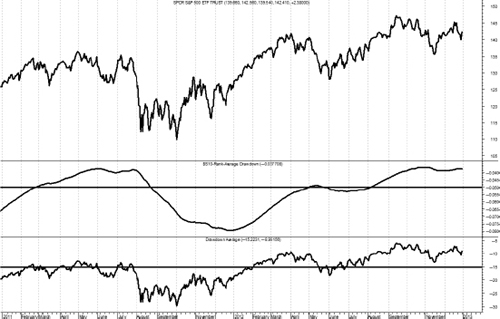
FIGURE 14.12 Average Drawdown
Source: Chart courtesy of MetaStock.
Relative Average Drawdown
Figure 14.13 shows the difference between the average drawdown of the issue compared to that of the S&P 500 Index. This is shown here only as an example of another type of ranking measure, and certainly would never qualify as a mandatory ranking measure.

FIGURE 14.13 Relative Average Drawdown
Source: Chart courtesy of MetaStock.
Price × Volume
Figure 14.14 shows the 21-day simple average of the volume times the close price. The purpose here is to show if the issue has enough liquidity to be traded. The ranking measures should always give a quick view on a variety of indicators and this one might show you immediately if there is enough trading volume to give you the liquidity you would need to trade it. Of course, the ideal solution is to have a good relationship with the trading desk that you will be using as they can give you up-to-date information on what volume you can trade.

FIGURE 14.14 Price × Volume
Source: Chart courtesy of MetaStock.
Adaptive Trend
Adaptive Trend is an intermediate trend measure that changes based on the volatility of the price movements. The Adaptive Trend measure incorporates the most recent 21 days of market data to compute volatility based on a true range methodology. This process always considers the previous day’s close price in the current day’s high–low range to ensure we are using days that gap either up or down to their fullest benefit. When the price is trading above the Adaptive Trend a positive signal is generated and when below a negative signal is in place. The chart in Figure 14.15 shows the Adaptive Trend as an oscillator above and below zero so that when it is above zero it means the price is above the Adaptive Trend and when below zero, price is below the Adaptive Trend. The top plot shows the Adaptive Trend binary. If you prefer, the horizontal line at zero is the adaptive trend, similar to the Trend Diffusion discussed earlier.
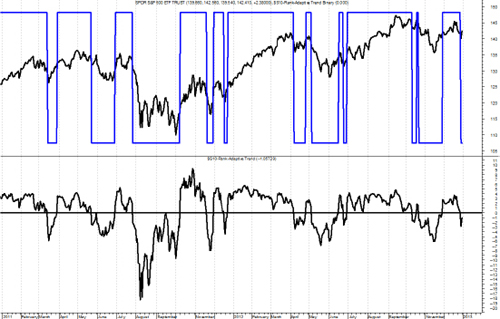
FIGURE 14.15 Adaptive Trend
Source: Chart courtesy of MetaStock.
Weighted Performance
Figure 14.16 is a weighted average of the 1-, 3-, 5-, 10-, and 21-day rates of change. One can argue that it is difficult to decide which exact period to measure for performance and I would not disagree. The method takes a number of periods into consideration and averages them for a single result. One could carry this concept further and weight each of the measurements and have a double-weighted performance measure. You should, however, try to keep things simple, as complexity has a greater tendency to fail.

FIGURE 14.16 Weighted Performance
Source: Chart courtesy of MetaStock.
Slow Trend
This measure, shown in Figure 14.17, is similar to Trend, but uses a longer period for its calculation. This concept can be used on many of the ranking measures as a second line of defense or confirmation. The faster version is good for initial selection, and the slower version is good for adding to positions (trading up).

FIGURE 14.17 Slow Trend
Source: Chart courtesy of MetaStock.
Ulcer Index
The Ulcer Index (Figure 14.18) takes into account only the downward volatility for an issue plus uses price crossover technique with a 21-period average. This concept was first written about by Peter Martin in The Investor’s Guide to Fidelity Funds, in 1989. (B37)

FIGURE 14.18 Ulcer Index
Source: Chart courtesy of MetaStock.
Sortino Ratio
Figure 14.19 shows the downside risk after the return of the issue falls below that of the 13-week T-bill yield. It is a risk-adjusted return like the Sharpe Ratio, but only penalizes downward volatility whereas the Sharpe Ratio uses sigma (standard deviation). This is also similar to the Treynor ratio, which uses beta as the denominator and expected return for the numerator.

FIGURE 14.19 Sortino Ratio
Source: Chart courtesy of MetaStock.
Beta
Figure 14.20 is the issue’s beta based on the past 126 days (6 months). The same issue exists here as with the Relative Performance earlier. You cannot measure beta unless it is measured against something, in this case the S&P 500. Therefore, be careful when comparing a large cap ETF to a large cap benchmark, small cap ETF to a small cap benchmark, and so on.
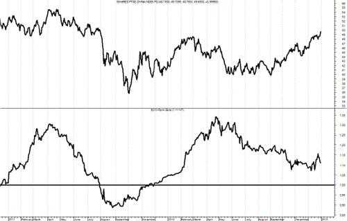
FIGURE 14.20 Beta
Source: Chart courtesy of MetaStock.
Relationship to Moving Average
Figure 14.21 shows the percent above or below the simple 65-day exponential moving average. This is similar to detrend or diffusion. I think here the value is that one should always pick a moving average period to use and stick with it so that you get a feel for its action during certain market movements. In other words, you become accustomed to how this moving average works over time. I equate this to using only one wedge in golf instead of multiple ones. Most of us cannot devote the time to practice with multiple wedges, so learn one and stick with it.

FIGURE 14.21 Relationship to Moving Average
Source: Chart courtesy of MetaStock.
Correlation
Correlation is an attempt to find a close relationship with an index such as the S&P 500. This is another one of those ranking measures you need to be careful not to compare a like ETF to a similar index. For example, the mathematics of correlation would blow up if you tried to compare the ETF SPY with the S&P 500 Index. In Figure 14.22 whenever the line is near the top of the plot, then it is saying the correlation of the top plot is correlated to the benchmark being used. When the market is advancing, you want highly correlated holdings. When the market is declining, or you see it begin to roll over in a topping manner, you want to move into less correlated holdings. You must keep in mind that you are still a momentum player and even though you want less correlation to the market, they still must be advancing on an individual basis.
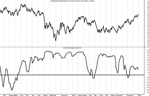
FIGURE 14.22 Correlation
Source: Chart courtesy of MetaStock.
Pullback Rally Analysis
The Pullback Rally Analysis is not a ranking measure but a technique for determining the relative strength of issues by looking at the most recent rally from a previous pullback. Measure the amount of the pullback in percent, then measure the current rally up to the current date in percent. The concept is fairly simple, those issues that dropped the least in the pullback, will probably outperform in the following rally. This concept measures the percentage move during the pullback, the percentage to date of the current rally, and the percentage to date from the beginning of the pullback. This is a great method to see strength outside of the snapshot of the ranking measures. Figure 14.23 shows an example on how to determine the dates for the beginning and end of the pullback. From the chart you can see a peak at point A with a pullback down to point B. The rally is then measured from point B to the current date.
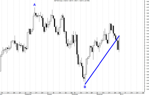
FIGURE 14.23 Pullback Rally Period Example
Source: Chart courtesy of MetaStock.
A ratio of the percentage move of the current rally to the percentage move of the previous pullback is calculated. Another calculation is percentage the current price is from the beginning of the pullback (previous high). This data, when ranked, will help you determine strength in the rally as compared to the previous pullback. Often the stronger issues in a pullback are the leaders during the rally.
Table 14.1 shows the data for the Pullback Rally Analysis. You can see from Table 14.1, even a quick glance shows that the international ETFs are outperforming, not only in the rally phase (% Rally) but also are now almost all above where the previous high (beginning of pullback) began (% Prev. High). The iShares FTSE China 25 Index Fund also performed well during the pullback phase with the only international ETF with a gain for that period of 2.95 percent, while the others were losses. The Ratio column shows the ratio of the percent of rally compared to the percent of pullback. The pullback is completed so only the extent of the rally is unknown. This ratio will show ETFs that performed in a couple of ways. One is that if the ETF did not decline much during the pullback and rises quickly in the rally, it will have a large ratio. For example, in the Broad category, the SPDR S&P MidCap 400 ETF Trust (MDY) has a ratio of 1.40, highest in that category. This is because it was the best performer (least decline) in the pullback phase and ranked third in performance in the rally phase. This would indicate that MDY is a strong performer and a candidate to consider for buying. The last column, % Previous High will also show you which ETFs are making new highs from the beginning of the pullback. This method of selection shows which issues are strong on a relative basis. In fact, it will also tell you which sectors and styles are strongest if you use ETFs that are tied to those strategies.


TABLE 14.1 Pullback Rally Analysis
To access an online version of this table, please visit www.wiley.com/go/morrisinvestingebook.
Pair Analysis
I remember following Martin Zweig years ago and in fact used one of the techniques he described in his book, Winning on Wall Street, in the mid-1980s. In it he described a really simple technique using his unweighted index (ZUPI) and on a weekly basis trading it whenever it moved 4 percent or more. If it moved up 4 percent in a week, he bought, if it moved down 4 percent in one week, he sold. Positions were held until the next opposing signal—just that simple. The problem I had back then was not only not following it but trying to tweak it into something better. Eventually experience told me that he had already been down that road and I was the beneficiary of the results. Anyway, I took this concept and used it on Index/ETF pairs, actually calculating the ratio of Index/ETF pairs and using the weekly movement of 4 percent to swap between the numerator and the denominator. It really works well with asset classes that are not correlated, such as equity versus fixed income or equity versus gold, and so on. Figure 14.24 shows an example of this pair strategy the S&P 600 small cap index (IJR) versus the BarCap 7–10 Year Treasury index (IEF). The ratio line is the typical price line with the binary signal line overlaid while the lower plot is the percent up and down moves for each weekly data point. Remember, this is a weekly chart. Whenever the ratio line moves by 4 percent in a week as shown by the lower plot moving above or below the horizontal lines shown as +4 percent and −4 percent, the binary line overlaid on the price ratio changes direction. Repeated moves in the same direction are ignored.

FIGURE 14.24 IJR/IEF Pair Ratio with 4 Percent Weekly Change
Source: Chart courtesy of MetaStock.
The ratio significantly outperformed each of the individual components (IJR and IEF) and the S&P 500. Figure 14.25 shows the performance of the ratio with the numerator and denominator swapped whenever there was a move of 4 percent or greater, the performance of the individual components that make up the ratio, and the S&P 500.

FIGURE 14.25 Pair and Individual Components
Table 14.2 shows the annualized performance statistics from 01/02/1998 until 12/28/2012 (weekly data). The Sharpe Ratio is slightly modified in that the return is used as the numerator without a reduction for risk-free return. The Ratio rotation strategy outperformed in annualized return, and when compared to the equity component it reduced the Drawdown (DD) considerably, improved the Sharpe Ratio, and lowered the Ulcer Index.
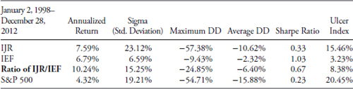
TABLE 14.2 IJR/IEF Pair Performance Statistics
To access an online version of this table, please visit www.wiley.com/go/morrisinvestingebook.
I also found that smoothing the ratio with just a two-period moving average greatly enhanced the performance because it reduced the number of trades. Trying different percentages other than Zweig’s 4 percent worked well occasionally, but overall, the 4 percent on weekly data yielded the most robust results time and time again. The real advantage for a pair rotation strategy is when it is used as a core holding situation. In other words, if a strategy required a core holding percentage but that core could be actively managed, this would give an actively managed core holding that would have much lower drawdowns than a buy-and-hold core, and with considerably better returns. Table 14.3 shows the pairs used with an equal allocation of 25 percent each given to the four pairs. This adds up to an allocation of 100 percent, but in this example it means 100 percent of the core and the core percentage of total allocation is determined by the strategy, often 50 percent.

TABLE 14.3 Core Rotation Pairs
Figure 14.26 shows the results using the four different pairs in a core rotation strategy compared to buy and hold of the S&P 500. The drawdown in 2008 was limited to only 14 percent, and other than that was a nice ride. The average drawdown (see Table 14.4) is only 20 percent of the maximum drawdown. I was curious about the lack of performance in 2012 and found it was the fact that in the Gold/20-Year Treasury pair gold was the holding the entire period.

FIGURE 14.26 Pair Analysis versus S&P 500
| CRS S&P | 500 | |
|---|---|---|
| Return | 13.43% | 4.33% |
| Standard Deviation | 11.65% | 19.19% |
| Sharpe Ratio | 1.15 | 0.23 |
| Maximum Drawdown | −14.43% | −54.71% |
| Average Drawdown | −3.39% | −15.88% |
TABLE 14.4 Performance Comparison between Core Rotation Strategy and S&P 500
Table 14.4 shows the performance statistics for the Core Rotation Strategy (CRS) compared to the S&P 500. In this rotation strategy example each of the pairs were smoothed by their two-period average prior to measuring the 4 percent rate of change. This process removes many of the signals and while not affecting the results that much, reduces the number of trades significantly.
Figure 14.27 is the drawdown of the core rotation strategy compared to the S&P 500. You can see that the cumulative drawdown for the rotation strategy is considerably less than the drawdown of the index. The average drawdown for the rotation strategy was −3.39 percent, while the average drawdown for the S&P 500 was −15.88 percent. This would make for a very comfortable core considering the exceptional returns and reduced risk statistics from just holding the index in a buy-and-hold situation. This core rotation strategy still meets the requirement of an always invested core while actively switching between four pairs of equity, gold, and fixed income ratios.

FIGURE 14.27 Core Rotation Strategy and S&P 500 with Drawdowns
Ranking and Selection
Ranking and Selection is another critical component to a rules-based model. Once you have measured the market, you need to determine what to buy. This is the technical process of determining securities that meet the rules when the time to buy arrives.
Mandatory Measures
Once you have your collection of ranking measures, you need to determine which are to be used along with the rules and guidelines as mandatory ranking measures. This means that you predefine the value range that they must be in before you can purchase that ETF. This is necessary to keep the subjectivity out of the process.
Tie-Breaker Measures
Once you have determined your mandatory ranking measures, the remaining ranking measures are considered tie-breaker ranking measures. These are used to help in the selection process, especially when there are hundreds of issues that qualify based on the mandatory measures. You can further reduce these into categories if desired, such as frontline tie-breakers, those you use more often than the others.
Ranking Measures Worksheet
Table 14.5 is a partial view of the ranking measures worksheet. It only shows the top 50 to 60 issues as an example since there are more than 1,400 ETFs in the full listing. One really important concept to grasp when looking at technical values in a spreadsheet is that you are only seeing a snapshot in time. Here is an example, let’s say that the Trend value is of primary importance and you have two ETFs, one with a Trend of 60 and one with a trend of 70, which would you choose? Well, the quick answer is probably 70 as that is a stronger trend measure than 60. However, don’t you also need to know which direction the trend indicator is heading? If the trend that was at 60 was in an uptrend, while the one with the trend measure at 70 was in a downtrend, a completely different picture is presented. This is why all of the mandatory ranking measures also show their individual five-day rate of change, so that you can glean from the spreadsheet not only the absolute value of the ranking measure, but also the direction it is headed. It should be noted that any short-term period for rate of change will work.


TABLE 14.5 Ranking Measures Worksheet
To access an online version of this table, please visit www.wiley.com/go/morrisinvestingebook.
Ranking Measures Are All About Momentum
Throughout this chapter it should be obvious that the ranking and selection process is centered on the concept known as momentum. Simply said, I want to buy an ETF that exhibits an upward trend that is determined by a number of different technical measures.
A final thought on momentum is that every day, in almost every newspaper’s business section there is an excellent list of stocks to buy. It is called the 52-week new high list, or often stocks making new highs. If you were to only use this readily available tool, along with a simple stop-loss strategy, you would probably do much better at investing in the market. Sadly, many investors think about buying stocks like they think about buying something at Walmart, they look for bargains. Although this is a valid method also known as value investing, it is very difficult to put into action and seems better in theory. When you buy a stock, you buy it simply because you think you can sell it later at a higher price, I think momentum will work much better in that regard.
Rules and Guidelines
Rules and guidelines are a critical element to a good trend-following model. Once you have the weight of the evidence measure telling you what the market is currently doing, the rules and guidelines provide the necessary process on how to invest based on that measure. If there was a simple answer as to why they are necessary, it is to invoke an objective approach, one that does as much as possible to remove the frail human element in the model. Rules are mandatory, while guidelines are not. That being said, if a guideline is to be ignored, one needs to ensure there is ample supporting evidence to allow it. Basically, the strategy I use is one of a conservative buyer and an aggressive seller. After many decades in aviation and the always increasing use of checklists, the rules and guidelines are no different for maintaining a nondiscretionary strategy than a checklist is for a pilot. In aviation, checklists grew in length over time because as accidents or incidents happened a checklist item was created to help prevent it in the future. There is an old axiom about checklists that said behind every item on a checklist, there is a story. Same philosophy goes for rules and guidelines in an investment strategy. A checklist (rules) ensures portfolio managers follow all procedures precisely and unfailingly. This overcomes the problem with experienced managers thinking they can accomplish the task and do not need any assistance. That attitude is costly.
Buy Rules
- B1—If asset commitment calls for an amount greater than 50 percent, then only 50 percent will be committed, with remainder the next day, ensuring objectives remain aligned. Forty percent can be the maximum per day if necessary for Guideline G6. This rule keeps the asset purchases to a maximum for any single day. It would not be prudent to go into the market at 100 percent on one day.
- B2—No Buy Days are (1) FOMC announcement day, (2) First/Last day of calendar quarter, (3) days in which the market has reduced hours. FOMC announcement days are typically high-volatility days and the end/beginning of a quarter involves a lot of window dressing. Leave the noise alone.
- B3—No buying unless 50 (this can also be a percentage) tradable ETFs (not counting noncorrelated) have:
Weight of the Evidence: Weak: Trend > 60, Intermediate: Trend > 55, Strong: Trend > 50
- I call this the “soup on the shelf” rule. If you have been to a large grocery store lately and strolled down the aisle that has soup, you probably noticed there are thousands of cans of soup with hundreds of blends, styles, and so on to choose from. Now imagine your spouse has sent you to the store to buy soup. When you turn down the soup aisle, you notice they are essentially empty except for two cans of rhubarb turnip barley in cream sauce. You probably aren’t going to buy any soup that day. The market is similar, especially during the early stages of an uptrend, there just isn’t much to choose from. In addition, the early stages have stricter buying requirements so the number of issues to pick from could be very small, if any. Because you never violate the rules, a rule to protect you during this period was created, hence rule B3.
- B4—No buying on days when stops on current holdings are hit and assets sold. This is usually the first hint that the ensuing uptrend is faltering. It just doesn’t make sense as a trend follower to be buying on the same day as you are selling something that has hit its stop. The argument that one holding might not be correlated is weak in this example as with proper trading up, weak holdings should have been previously traded.
- B5—No buying on days when the Nasdaq or S&P 500 is down greater than 1.0 percent (the indices used need to be tied you what you are using in the trend measures). Simply, this means that if the market as determined by the S&P 500 and/or Nasdaq Composite is down more than 1 percent during the day, something is wrong with the uptrend and it is better to not buy that day. An argument from bargain hunters or value investors would be that one would get a better price on that day if the uptrend resumed. I can’t argue with that but I’m not a value investor or a bargain hunter. It seems many investors want to buy stocks at bargain prices and I can understand that. However, we are not buying soap at a discount store; we are buying a tradable investment vehicle whose price is determined by buyers and sellers. Moreover, you only want to buy what is going up.
Sell Rules
- S1—If stops are hit with End of Day data and still in place at 30 minutes (this time period is based solely on your comfort level) after the open the next day, a sell is initiated; if not in place at the 30-minute point, the issue falls under intraday monitoring (see S2).
- S2—Intraday monitoring of Price and Trend between the hours of 30 minutes after the open until 60 minutes before the close, will invoke a Sell order sent to brokers for execution. Once an issue hits its stop, then a 30-minute period is allowed before it is sold. With the constant barrage of Internet and financial media trying to be first with breaking news, often the story is presented incorrectly, and it can have an effect on a large stock, an industry, or even a sector and cause a big sell-off. Usually, if the story was reported in error or incorrectly, and then reported correctly, the issue quickly recovers. Most of this happens in a very short period of time. The 30-minute rule will help avoid most of these short-term sell-off with quick recoveries.
- S3—In a broad-based sell-off and stops are hit, holdings hitting stops can begin liquidating before the 30-minute limit.
- S4—If a holding has experienced a sharp run-up in price, once it reaches a 20 percent gain, sell 50 percent of the holding and invest in another holding or a new holding. This is just a prudent way of locking in exceptional gains.
- S5—Any holding that is still being held after experiencing S4, once a gap open (above previous day’s high) occurs, a further reduction in the holding is warranted. Additionally, this can also anticipate a blow-off move or island reversal while protecting most gains but still allowing for more upside, although limited exposure. This is not a good process when trading only one issue, but is prudent when trading many issues with the ability to always find something else to trade.
Trade Up Rules
- T1—With Weight of the Evidence strong: If stops are hit, but limited to single sector/industry/style, replace next day as long as the Initial Trend Measures are all indicating an uptrend.
- T2—With Weight of the Evidence strong: If stops are hit on more than one sector/industry/style, reenter when Initial Trend Measures are all indicating an uptrend or Initial Trend Measures are improving, as long as there is no deterioration in the weight of the evidence.
- T3—With Weight of the Evidence at an intermediate level: If stops are hit, but limited to single sector/industry group, replace next day as long as Initial Trend Measures are all indicating an uptrend.
- T4—With Weight of the Evidence at an intermediate level: If stops are hit on more than a single sector/industry/style, the normal Buy rules apply.
- T5—There is no trading up when weight of the evidence or initial trend measures are deteriorating. Clearly in this situation there is something not good about the uptrend and it is not a time to trade up.
Guidelines
Note: Guidelines are used as reminders and offer the opportunity to be ignored but only after considerable deliberation and examining all other possibilities. The absolute most important guideline is the first one, G1.
- G1—In the event a situation arises in which there is not a rule or guideline, a conservative solution will be decided on and implemented based on immediate needs. A new guideline or rule will be developed only after the event/conflict has totally passed. This is a critically important guideline to ensure the “heat of the moment” is not used to create or change a rule. The absolute worst time to create or change a rule is when you are emotionally concerned about something that just seems to not be working correctly. In the 1970s, the Navy F-4J Phantom jet had analog instruments and compared to today’s electronic technology, was antiquated. We had to memorize what we called initial action items for emergency procedures; these were designed to handle the quick and necessary steps to shut down an engine because of fire, no oil pressure, and so on. During simulator (talk about antiquated compared to now) many would pull the wrong lever or shut off the wrong switch during the emotional surge that comes with bright red flashing lights and loud horns. I was not excluded from that group, but found that when something happened that required immediate action, winding the clock (they weren’t electric back then) for a few seconds to rid yourself of the adrenalin rush would allow you to perform better during the procedure. Beside the reasons given for S1 previously, this falls in line with that thinking.
- G2—Try to adhere to this if possible: Weak Weight of the Evidence: SPY, MDY, DIA (ensure liquidity), Intermediate Weight of the Evidence: Styles and Sectors, Strong Weight of the Evidence: Wide Open (a pilot term meaning full throttle). The mandatory ranking measures will dominate this guideline.
- G3—European ETFs need to be monitored closely after 1 pm to ensure adequate execution time. This is because when the Europe markets close, liquidity in those issues becomes a problem.
- G4—Every day when invested, trading up needs to be evaluated. Often this involves selling the poor performing holding and buying additional amounts of current holdings.
- G5—All buy candidates should be determined by:
- –Rising mandatory ranking components using a chart of the Ranking Measures.
- –An awareness of the issue’s price support and resistance levels.
- G6—Always be aware of the Prudent Man concept. This is sort of a catch all to make one think about an action that has not been adequately covered with rules or guidelines. If deciding to do something as far as asset commitment or ETF selection, one needs to be prepared to stand in front of the boss and explain it.
There are a host of additional rules and guidelines that can be created. I would caution you on trying to develop a rule for every inconsistency or disappointment that surfaces while trading with a model. There is probably a good equilibrium about the depth and number of rules is best. I strongly suggest adding rules rationally and unemotionally.
Asset Commitment Tables
In addition to measuring what the market is doing (weight of the evidence) and a set of rules and guidelines to tell you how to invest based on what the market is doing, you then need a set of tables for each strategy to show you the asset commitment (equity exposure goal) levels to be invested to for each Weight of the Evidence scenario. Table 14.6 is an example table showing the Initial Trend Measure Level (ITM), Weight of the Evidence (WoEv), the Points assigned to each level, and the Asset Commitment Level Percentage (Asset Commitment percent). This is merely a sample and should be based on your risk preferences and objectives. As you can see even with the Weight of the Evidence at its lowest level as long as the much shorter term trend measures (ITM) are all saying there is an uptrend, one can commit equity to the market.

TABLE 14.6 Asset Commitment Table
An alternative and more conservative asset commitment table is shown in Table 14.7. It is easier and a more simple process to divide the Weight of the Evidence into only three levels, with the middle or intermediate level being the transition zone.

TABLE 14.7 Alternative Asset Commitment Table
The rules and guidelines offer a few exceptions to the above table of asset commitment, but only based on fairly rare events. Following the rules and commitment levels will lead to an objective process, which is the ultimate goal.
This chapter contains many measures one can use to determine which holdings should be bought. Many are only valuable in assisting in the selection process. If you consider the fact that you might only need to purchase a few holdings and there are more than 1,400 available, you need a strong set of technical measures to help you reduce the number of issues into a more manageable number. There are some that were identified as mandatory measures, which means these are the ones that have the best track record at identifying early when a holding is in an uptrend. I am positive there are many momentum indicators that are not in this chapter, but these are the ones that I have used for many years. Just keep in mind what the goal of this is: to remove human input into the selection process.