
Chapter 7
Market Facts: Bull and Bear Markets
The farther backward you can look, the farther forward you are likely to see.
Winston Churchill
Calendar versus Market Math
There are 365 calendar days per year (365.25 for leap year consideration). There are five market days per week, so five-sevenths of 365 = 260.7 market days per year. Of course, to include leap year using the same methodology, five-sevenths of 365.25 = 260.9 market days per year. Hence, either 260.7 or 260.9 will round to 261 days per year. Next we need to adjust for market holidays, 261 days – 9 holidays = 252 market days per year. Market holidays (Table 7.1) were obtained from the New York Stock Exchange website.
| New Year’s Day | January 2 |
| Martin Luther King Jr. Day | January 16 |
| Washington’s Birthday | February 20 |
| Good Friday | April 6 |
| Memorial Day | May 28 |
| Independence Day | July 4 |
| Labor Day | September 3 |
| Thanksgiving Day | November 22 |
| Christmas Day | December 25 |
TABLE 7.1 Market Holidays (2012)
Stock Exchange Holidays
So now we know that there are 252 market days per year. If we divide that by the number of months per year (12), 252/12 = 21 market days per month. Hence, dividing market days by 12 will yield calendar months.
With this knowledge, we can then determine moving average, ratio, or rates of change values such as:
- 1 month = 21 market days (for a month you would use 21, not the normal 30/31 days in a month).
- 3 months = 63 days.
- 9 months = 189 days (close to the ubiquitous 200 days).
Understanding the Past
Although the old saying goes, the present [market] rarely is the same as the past, but it often rhymes. This is why we study the past so that when similar events unfold in the market, we just might be able to recognize them and know what can possibly happen. Remember, markets constantly change, but people rarely do.
Bull Markets
A bull market has many definitions. Usually the one that makes the most sense (cents) is the one that mirrors the definition of a bear market—a move of 20 percent or greater without an opposite move of −20 percent. Table 7.2 shows all bull markets in the S&P 500 Index of greater than 20 percent since 1931 ranked by duration in days. It should be clear that bull markets come in all sizes and durations. The current bull market (as of 12/31/2012) is number 8 in duration.
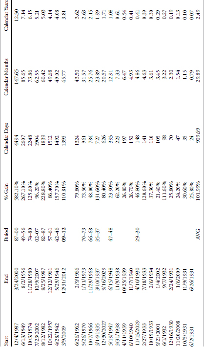
TABLE 7.2 S&P 500 Bull Markets
To access an online version of this table, please visit www.wiley.com/go/morrisinvestingebook.
Figure 7.1 shows the data in Table 7.2 with Percent Gain versus Months duration. The 2009 to 2012 bull market is identified by the square and the average of all bull markets is denoted by the dot. The 2009 to 2012 bull is below the least squares line, which means that for its duration it has not performed as well as the average. However, the 1987 to 2000 bull market could be considered an outlier and if removed (see Figure 7.2), then the 2009 to 2012 bull is closer to average. Although this is foolish, it does show how data can be manipulated, or as Charles Barkley says, “If my aunt were a man, she’d be my uncle.”
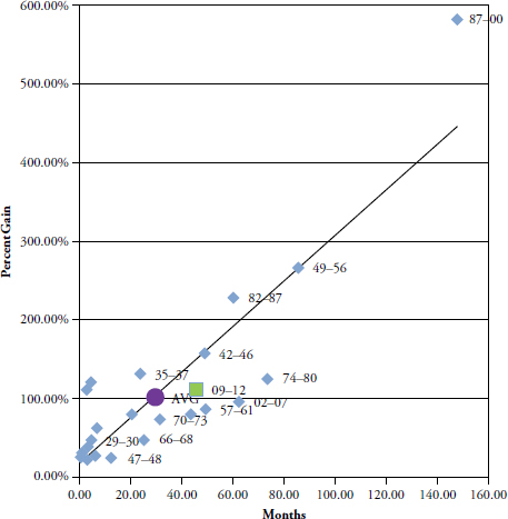
FIGURE 7.1 Bull Markets Gain versus Duration

FIGURE 7.2 Bull Markets Gain versus Duration without 1987–2000
Bull markets are when investors become genius and overconfidence flourishes. They are the times when capital grows and times are good. Often bull markets are mixed with what appears to be really bad news, whether it is economic, political, or other. An old saying is that bull markets climb a wall of worry. A bull market can cause exceptional complacency and when they begin to roll over into a bear market, most will be in denial and ride much of the bear market down. We won’t spend much time on bull markets because the underlying theme of this book is risk avoidance so the focus is on bear markets and all things associated with them.
Bear Markets
Figure 7.3 shows the Dow Industrial Average back to 1885 using a semi-log scale in the top plot. The lower plot is a line that zigzags back and forth, known as a filtered wave. That lower line only changes direction after a move of at least 20 percent has occurred in the opposite direction. It shows only moves of 20 percent or more. The last move is not valid as it only shows where the last price was from the last move of 20 percent or greater. Most are surprised at the frequency of up and down moves of that magnitude that have occurred in the past 127 years. Notice the three highlighted periods where there were very few up and down moves of greater than 20 percent.
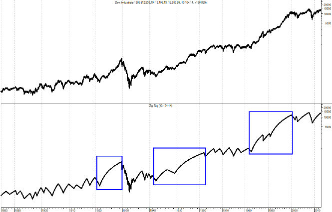
FIGURE 7.3 Twenty Percent Moves in Dow Industrial Average—Long Term
Source: Chart from MetaStock.
Figure 7.4 is the same as the one above except that it only shows data since 1969 so that you can better see the moves of greater than 20 percent. Notice that there are periods (first half of chart) where there were many up and down moves of greater than 20 percent. These types of moves have also happened on the right edge of the chart since 2000. The period of time between 1982 and 2000 saw relatively few moves in comparison. As will be thoroughly reviewed later, these periods are driven by long-term swings in valuations.

FIGURE 7.4 Twenty Percent Moves in Dow Industrial Average—Medium Term
Source: Chart from MetaStock.
It has long been assumed that moves downward of 20 percent or greater are called bear markets. Although this is a subjective call, it is widely accepted and won’t be challenged here. Any move downward from a market high is called a drawdown and is measured in percentages. Therefore a drawdown of 20 percent or more is also a bear market. Drawdowns are discussed in more detail in Chapter 11. Table 7.3 shows the bear markets in the Dow Industrials since 1885. At the bottom of the table are some statistics to assist you in getting a feel for the averages, and so on.

TABLE 7.3 Bear Markets in Dow Jones Industrials from 2/17/1885 to 12/31/2012
To access an online version of this table, please visit www.wiley.com/go/morrisinvestingebook.
- Average. The same as the mean in statistics, add all values and then divide by the number of items.
- Avg Ex 29. This is the Average with the 1929 bear removed as it skews the data somewhat.
- Minimum. The minimum value in that column.
- Maximum. The maximum value in that column.
- Std. Dev. This is standard deviation or sigma, which is a measure of the dispersion of the values in the column. About 65 percent of the values will fall within one standard deviation of the mean, and 95 percent will fall within two standard deviations of the mean.
- Median. If the data is widely dispersed or has asymptotic outlier data, this is usually a better measure for central tendency than Average.
From Table 7.3 you can see that there were 15 declines of greater than 20 percent in the past 127 years in the Dow Jones Industrial Average. Here are some statistics from the table:
- The average decline percentage was −41.79 percent.
- The average duration of the decline was 32.26 months.
- The average duration of the recovery was 70.62 months.
- Therefore, the average bear market from its beginning peak until it had fully returned to that peak lasted 102.89 months or over 8.5 years.
- The average percentage gain for the recovery to get back to even was 71.78 percent.
Table 7.4 shows the Bear Markets in the S&P 500 Index since 1927.

TABLE 7.4 Bear Markets in the S&P 500 from 12/30/1927 to 12/31/2012
To access an online version of this table, please visit www.wiley.com/go/morrisinvestingebook.
From Table 7.4 you can see that there were 10 declines greater than 20 percent in the past 85 years in the S&P 500 Index. Here are some statistics from the table:
- The average decline percentage was −40.88%.
- The average duration of the decline was 17.07 months.
- The average duration of the recovery was 51.23 months.
- Therefore, the average bear market from its beginning peak until it had fully returned to that peak lasted 68.3 months or over 5.5 years.
- The average percentage gain for the recovery to get back to even was 69.14 percent.
Although the numbers are a little different between the two tables, the Dow Industrials also had 42 more years of data. The message is the same, however, drawdowns of greater than 20 percent (bear markets) can be painful and it takes a long time to recover from them. There will be more detailed coverage of these tables in Chapter 11, Drawdown Analysis.
Just How Bad Can a Bear Market Be?
In an attempt to show how bad some bear markets can be in not only magnitude but duration, Figure 7.5 shows the S&P 500 beginning in 2000, the Dow Industrials overlaid from 1929, and the Japanese Nikkei 225 overlaid from 1989. All three begin at 0 percent on the left scale. These are inflation adjusted so that you can see the full effect of holding over time. Although we do not know the future, studying the past clearly shows that really bad bear markets can last a very long time.

FIGURE 7.5 Comparison of Mega-Bear Markets
Source: Chart courtesy of dshort.com.
Bear Markets and Withdrawals
Table 7.5 shows the last bear market, which began on October 9, 2007, using the S&P 500 Index price and a typical buy and hold retirement account making periodic withdrawals. As of 12/31/2012 the bear market had recovered almost all of its losses but not quite; therefore, a buy-and-hold investor is almost back to breakeven after 5.5 years. However, if one is retired, it generally means one has set up a withdrawal schedule for income during retirement. In Table 7.5 it is assumed that the retirement account is withdrawing 6 percent per year adjusted quarterly for 3 percent annualized inflation. The column labeled Retirement Account shows the account without any withdrawals. The column labeled Account w/Distributions shows the value of the account with the withdrawals. The last column shows the percent return to get back to the initial $100,000 that was in the account when the bear market began. You can see that in order to return the account to its original $100,000 it would take a return of more than 99 percent, in other words, one must double his or her money. So when you are confronted with advice to buy and hold because all bear markets eventually recover, consider this example.


TABLE 7.5 Monthly Returns During a Bear Market While Withdrawing from Account
To access an online version of this table, please visit www.wiley.com/go/morrisinvestingebook.
Figure 7.6 shows the devastating results of being retired during a bear market while withdrawing money for current income. While the buy and hold strategy eventually begins to recover, the periodic withdrawals from an ever smaller account reach a state of deteriorating equilibrium. Even buy and hope fails miserably in this environment and when coupled with periodic withdrawals it can be a life changing event.
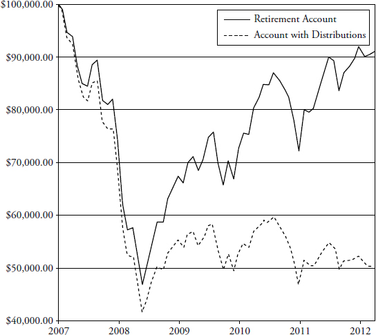
FIGURE 7.6 Withdrawals during a Bear Market Can Be Devastating
Market Volatility
Another shock to people who have not studied market history is the volatility that exists at times. Figure 7.7 shows the S&P 500 real price (real means it does not reflect inflation’s affect) and adjusted for dividends. The plot at the bottom shows the 20-year annualized real rate of return. I think it is fairly obvious that returns are not guaranteed over any time period. With the assumption that most investors have about 20 years to really put money away for retirement, a lot has to do with things totally out of your control—like when you were born. Clearly, there are better times to invest than others, usually only known in hindsight.

FIGURE 7.7 S&P 500 Real Price and 20-Year Rolling Total Returns
Source: Chart courtesy of dshort.com.
There are many ways to measure volatility in the market. The world of finance wants you to believe that volatility is risk, and that risk is measured by standard deviation. This would be fine if investors were rational, the markets were efficient, prices were random, and normally distributed. But they aren’t.
Figure 7.8 shows price volatility using some of my favorite indicators of volatility. The top plot is the S&P 500 Index from 2008 to December 31, 2012. There are three plots below that show three variations of price volatility.

FIGURE 7.8 Volatility Measured Three Ways
Source: Chart courtesy of MetaStock.
The second plot from the top shows the volatility of price changes using a technique called average true range. This is a preferable method as it takes into account any gaps in price from one day to the next that occur in price histories. The next plot is simply looking at the percentage price changes each day. The bottom plot shows the volatility of price similar to the one above, only it converts the data to absolute values. All three volatility plots have been smoothed over a 21-day period. I like to use 21 days because that represents the number of market days per month (see beginning of this chapter on Calendar Math).
You can see that during market downturns (see top plot) there is a tendency for volatility to increase. The more extended the down move, the greater the volatility. Volatility is a great measure of investor fear, probably better than most other sentiment indicators, because it is a direct measurement of indecision.
For a long-term perspective, Figure 7.9 shows the 63 day (3 months) absolute percentage change each day for the Dow Industrials back to 1885. The volatility is in the lower plot with a horizontal line at 1.5 percent for reference.
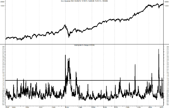
FIGURE 7.9 Dow Industrial Average Absolute Three-Month Percent Change
Source: Chart courtesy of MetaStock.
Another way to view volatility is to compare the monthly volatility relative to the yearly volatility. This is shown in Figure 7.10 with the S&P 500 Index in the upper plot, the monthly volatility in the lower plot with the smoother annual volatility overlaid. This method removes the absolute measurement and shows when the shorter-term volatility is greater than its longer term value. For most who want to use a volatility measure on a single issue, this is my preferable method.

FIGURE 7.10 Monthly Volatility and Yearly Volatility
Source: Chart courtesy of MetaStock.
Figure 7.11 shows the S&P 500 with the Volatility Index (VIX). VIX is a Chicago Board Options Exchange (CBOE) tradable instrument designed to represent the sentiment of option traders and shows their expectation of 30-day volatility. It is constructed using the implied volatilities of a wide range of S&P 500 Index options. This volatility is meant to be forward looking and is calculated from both calls and puts.

FIGURE 7.11 S&P 500 and VIX
Source: Chart courtesy of MetaStock.
You can see from Figure 7.11 (S&P 500 on top and VIX on bottom) that whenever the VIX gets above 35 (horizontal line) the market is experiencing large volatility. Notice that there are significant periods without much volatility.
A concept that has surfaced in the past few years is measuring the volatility of volatility. I think this is a valid concept if one measures the volatility of something that is tradable like the VIX shown in Figure 7.11. Figure 7.12 shows the S&P 500 Index in the top plot, the VIX in the middle plot (exactly the same as in Figure 7.11) with the Average True Range version of volatility over 21 days shown in the bottom plot.

FIGURE 7.12 S&P 500, VIX, and VIX Volatility
Source: Chart courtesy of MetaStock.
The VIX was originally launched in 1993, with a slightly different calculation than the one that is currently employed. The original VIX (which is now VXO) differs from the current VIX in two main respects: It is based on the S&P 100 (OEX) instead of the S&P 500, and it targets at the money options instead of the broad range of strikes utilized by the VIX. The current VIX was reformulated on September 22, 2003, at which time the original VIX was assigned the VXO ticker. VIX futures began trading on March 26, 2004; VIX options followed on February 24, 2006; and two VIX exchange traded notes (VXX and VXZ) were added to the mix on January 30, 2009.
Highly Volatile Periods
Figure 7.13 shows 18 periods since 1900 in the Dow Industrial Average that were similar in their measure of volatility. I created this because when we get into a volatile period, the usual question asked by many is whether this will be how the markets will be forever. Once again I am reminded of the late Peter Bernstein who said that an investor’s biggest mistake is extrapolation—assuming the recent past will also be how the future will be. In Figure 7.13 I used a 5 percent filtered wave, then measured the frequency of the waves within a confined period. The concept of filtered waves is defined in Chapter 1, and again in more detail in Chapter 10.

FIGURE 7.13 Dow Industrials Highly Volatile Periods since 1900
Source: Chart courtesy of MetaStock.
Dispersion of Prices
The following concept is from Ed Easterling of Crestmont Research. Although the compounded average annual change in the stock market is about 5 percent over the past 112 years, the range of dispersion in annual returns is dramatic. Table 7.6 presents the distribution of yearly index changes within the range of – 5 percent to +5 percent increments during the past century overall (112 years) and during the secular bull (54 years) and bear (58 years) cycles. It becomes clear that moves of +/– 5 percent and to some extent moves of +/– 10 percent on an annual basis are similar across both bull and bear markets, with the bulk (67 percent) of the +10 percent years in secular bull while the secular bears are fairly evenly distributed across the range. When the analysis of dispersion expands to annual moves of +/– 15 percent a year, the message is even more pronounced. The secular bulls show no occurrences of – 15 percent, with the remaining segments evenly distributed. The secular bears have the largest percentage (48 percent) of their annual returns contained within the +/– 15 percent range. Once you get to the +/– 20 percent dispersions, which are tied to the moves associated with bull-and-bear cyclical markets, the dispersion is fairly consistent for the remaining data. It should be interesting to also note that there were more years deemed as within secular bear markets than in secular bull markets. (B16) (B17)
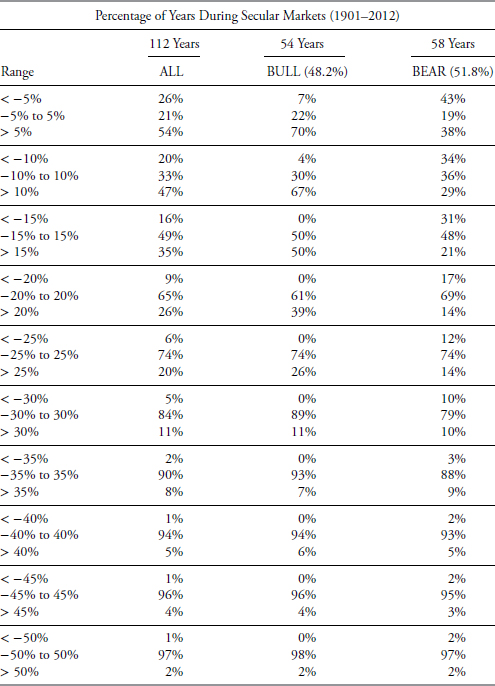
TABLE 7.6 Dispersion of Annual Dow Jones Industrial Prices
Secular Markets
For years (decades) analysts referred to long-term market cycles as generational markets. Ed Easterling from Crestmont Research has now defined them for us using a derivative methodology. Previously, most just looked at the price action and when it rose, called it a bull market, and when it declined or was flat, called it a bear market. I’m going to stick with Easterling’s process as it comes with a lot of sound analysis and that removes the subjectivity.
Secular market cycles are long term and have averaged about 25 years over the past 112 years. Secular bear markets average about 11.25 years in length over this period. Keep in mind, however, there are many cyclical bull and bear markets within the longer-term secular bear markets. Because I follow the analysis of Ed Easterling of Crestmont Research, here is my review of his latest book, Probable Outcomes, published in 2011. This book, and his previous book, Unexpected Returns, are a must-read to understand how long-term markets work.
Ed Easterling has done it again; provided a big picture approach to the market using time-tested historical data and sound principles. Ed’s first book, Unexpected Returns, was the first time I had heard of the way secular markets were defined—by valuations. Probable Outcomes expands and updates the first book. Easterling builds a methodology that is robust and clearly void of preconceived notions about the future; a refreshing approach rarely seen in books about the stock market.
The first part of the book is a lesson in market finance and economics from a practitioner view and not the usual financial academic approach—again quite informative and refreshing. Every concept is supported by data and colorful charts, which make learning and understanding the process enjoyable. He spends a great deal of time and effort to ensure that his explanations are easily understood and succinct. Secular markets are driven by long-term trends in Price Earnings ratios (PE), which, in turn, are driven by inflation/deflation. This removes the scale of time from the secular cycle definition and only uses the trends and cycles of PE and inflation as the identification of secular bear, and bear market cycle beginnings and endings. Simply, a secular bear begins when valuations peak and reverse because of a trend back toward low inflation, then continue to decline throughout the secular period. Once sufficiently low, usually single digit PE, a new secular bull period can begin.
The book wraps up with a thorough evaluation of how the current decade (2010–2019) could possibly play out (currently in a secular bear), using a large number of different EPS, PE, and Inflation combination scenarios. The message is clear, there are times (secular bears) that one needs to change their perspective on investing and seek an approach that at a minimum preserves capital so that when the next secular bull market begins, time is not spent trying to recover from the past secular bear. It is sad that most people spend a large part of their investing time trying to recover from previous losses. Understanding the secular approach and making the switch in your investing style (rowing vs. sailing) can lead to a long retirement accompanied by dignity and comfort.
I did have one question for Ed that somewhat bothered me. He was gracious enough to provide an excellent response.
My Question: With the average secular cycle being about 25 years and the total database being 112 years, do you feel there is enough data to be totally confident with your secular market analysis?
Ed’s Answer: Absolutely. But let’s step back for a moment to consider the two types of cycles. You have asked a great question because its answer reveals a lot about secular stock market cycles.
There are two types of cycles: technical cycles and fundamental cycles. Technical cycles generally reflect patterns or levels that have a high propensity to repeat. Technical cycles gain their credibility and validity from a high degree of repeating incidences. The four full secular stock market cycles would hardly be considered high repetition. But secular stock market cycles are not technical cycles.
Secular stock market cycles are fundamentally driven cycles. By fundamentally driven, I mean that economic and inflation factors cause the cycles to occur. Secular stock market cycles are more than patterns, they are reactions to hard drivers. Secular bulls and secular bears are driven by the trend and level of the inflation rate. Secular cycles are the adjustments to financial value that are caused by changes in the inflation rate. Since increases and decreases in the inflation rate change the expected rate of return, stocks and bonds increase or decrease in overall value and thereby add or detract from total return.
Look at the secular bear market of the 1960s and 1970s. Rising inflation caused the valuation of stocks to decline. The market’s price/earnings ratio declined from more than 20 to less than 10 over 16 years. Earnings grew and investors received dividends, but the decline in valuation caused returns to be well-below average. Then as the inflation rate turned and declined, the 1980s and 1990s secular bull experienced the benefit of rising valuations as well as earnings growth and dividends.
Okay, one last comment about secular cycles. There is another factor other than inflation that impacts them. The second factor is cash flow. The secular bear of 1929 was caused by deflation. Deflation causes the nominal cash flows from earnings and dividends to decline in amount. So even though the discount rate remains low as inflation neared zero and fell into deflation, the expected future decline in reported cash flows due to deflation caused the present value of the market to decline. P/E fell from more than 20 to less than 10. This is potentially instructive about the future because recent trends in economic growth suggest that it may be slowing from the historical rate averaging 3 percent annual real growth. If economic growth slows, then future earnings growth will slow, too. As a result, the slower growth of cash flows will drive a lower valuation for the market. Growth rate affects the level of P/E.
So we have fundamental principles related to the concepts of cash flow and present value. Then we have four full-cycle examples that are consistent with the well-accepted academic and industry principles. Is four full cycles enough to be confident about the concept of secular stock market cycles? Absolutely!
Thanks Ed.
Easterling points out that these secular periods are not random as they follow each other; he actually calls them cycles. The driver of these cycles is the inflation rate as it moves toward and away from price stability. Trends of rising inflation and deflation drive the market valuation lower and result in low returns. As prices stabilize from either deflation or high inflation, valuations are driven upward and the result is high returns. Keep in mind that this is a process whereby moves away from price stability simultaneously cause PE to decline and low or no returns result. Moves toward price stability simultaneously cause PE to rise and result in high returns.
Furthermore, the relationship among inflation, earnings, and prices is neatly tied together. The S&P 500 is an index of capitalization weighted prices of 500 large cap, blue chip stocks. Inflation is the annual rate of change of the consumer price index, which is a measure of various prices for goods and services. Valuations (earnings) are measured relative to price with the price to earnings ratio (PE). Once again, technical analysis arises because all three measures used to define secular markets are ultimately based on price.
Figure 7.14 shows the monthly S&P 500 back to 1900 along with the 12-month rate of change of the Consumer Price Index (Inflation) and the S&P 500 PE Ratio at the bottom; both the prices and the PE ratio are adjusted for inflation (known as real). This makes the PE swings more readily identifiable. You can clearly see from this chart the significant moves in PE (bottom plot) and compare to the moves in the S&P 500 (top plot). The upward moves in the PE Ratio are the secular bulls and the downward moves are the secular bears. The middle plot of inflation shows how it affects valuations over time. Although the specific changes in inflation are not aligned with the peaks and troughs of price or valuation, it is reasonable to assume it leads them. It does appear that when inflation is within the +2.5% and −1% range (small horizontal lines) its affect is not as great or as timely, and is usually during the Secular Bull markets. I think from this chart, the fact that secular markets are defined by long-term swings in valuations, which are ultimately affected by inflation, bears (sic) out.

FIGURE 7.14 S&P 500, Inflation (CPI), and Price Earnings Ratio (PE)
Source: Chart courtesy of MetaStock.
Figure 7.15 shows the exact same data as the previous but over a shorter time period so you can see the changes better. This chart shows the data since World War II. The clarity of the secular bull markets and bear markets in the top plot is obvious. The changes in overall inflation in the middle plot, while not as well defined, still exist, and the bottom plot shows the rise and fall of the price earnings ratio in conjunction with the other two.
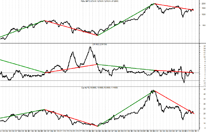
FIGURE 7.15 Recent S&P 500, Inflation, and PE
Source: Chart courtesy of MetaStock.
Secular Bull Markets
Do not confuse brains with a bull market.
Don’t mistake a bull market for investment skill.
Martin Pring (strategist for Pring Turner Business Cycle ETF [DBIZ]) describes them as:
Primary trend changes in secular (and cyclical) bull markets are usually short and shallow and each peak is higher than its predecessor. Investors are routinely assisted from their bad investment decisions by the bull market. Investors’ confidence grows significantly during these times and eventually becomes excessive with the period from 1998 to 1999, known as the dot.com bubble, a classic example. There are geniuses everywhere, and they are paraded hourly on financial television. Investment decisions that are considered irresponsible and careless at the beginning of secular bulls are hailed as perfectly routine as the secular bull matures. The lessons learned in the previous bear market are long forgotten and often you hear “this time is different.” When the majority of the above become common, the end of the secular bull is probably near, despite prognostications that it will go much, much higher.
These prognostications are given with extreme determination and confidence. In a secular bull, one can buy and hold, invest in index funds, dollar cost average, just about anything. Here is the problem: most will not realize they are in a secular bull market until it is almost over.
Secular Bull Markets since 1900
Figure 7.16 shows the four secular bull markets since 1900. It should be clear that a secular bull is a time when caution goes out the window. Unfortunately, most will not realize it until toward the end.
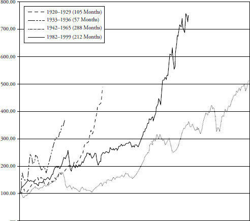
FIGURE 7.16 Secular Bull Markets since 1900
Secular Bull Data
In Table 7.7 notice that all of the Secular Bull markets started when PE was between 5 and 11, and ended when PE was between 19 and 42. There are charts in Chapter 8 that show the secular changes in valuation.
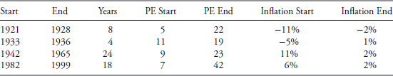
TABLE 7.7 Secular Bull Data
Source: CrestmontResearch.com.
Secular Bull Market Composite
The secular bull composite is shown in Figure 7.17. Secular bull markets, if and when you know you are in one, can easily justify some of the investment strategies that this book considers as bad strategies for most investors. Of course, most will not realize they are in a secular bull until it is well developed.

FIGURE 7.17 Secular Bull Market Composite
Secular Bear Markets
Martin Pring says,
The secular bears are essentially the opposite of the bulls as in general the peaks are lower and the troughs are lower, exhibiting a downward trend. However, keep in mind that they are not always down-trending, and there is sometimes a new high in the middle. The key characteristics are declining price earnings ratio (PE) and low or no returns. Just like the secular bull, every lesson learned is quickly forgotten. Just like a recession cleanses the economy, the secular bear resets everything and removes all the excesses. Most secular bulls end and secular bears begin without there being a condition of excess. The high valuation of the market is the rational result of low inflation. Certainly there are moments of excess, just as normal market volatility creates short periods of excess and the opposite of excess. My key point is that secular tops and bottoms are the result of fundamental conditions rather than irrational emotions. The bearish prognosticators are once again the daily media darlings. And once again, just like in the secular bull, the forecasts are for total gloom and doom. The determination and confidence of these forecasters is convincing, yet eventually wrong. Here is something that is important to remember: Secular bear markets account for over 50% of the total time. In fact, as of 2012, there were actually more years in secular bears than in secular bulls since 1900. The previous two points are true but keep in mind that the period being observed has a secular bear at both ends. Since bears are not necessarily longer than bulls, and vice versa, it’s reasonable to say that they are about the same in length on average, but the range of terms varies significantly. Secular bear markets cause investors to seek alternative investments or unconstrained investments that protect them from downside losses. However, just like the secular bull, most will be in denial and not participate in the secular bear properly until sustained losses, and then it will probably be about over.
The next section shows graphics of the various secular bear markets. They were created with monthly data for the S&P 500 from Robert Shiller’s database. If yearly data had been used the message would be essentially the same.
Secular Bear Markets since 1900
Figure 7.18 shows all four of the previous inflation adjusted secular bear markets along with the current one from their starting point on the left side of the graph. Two of the secular bears were shorter and two were longer than the one that began in 2000. One cannot make an investment decision with this information, only an awareness that we are currently in a secular bear market (as of 12/31/2012) and it could last much longer.

FIGURE 7.18 Secular Bear Markets since 1900
Secular Bear Data
Ed Easterling says that secular markets are determined by long-term swings in valuations that are driven by inflation. From Table 7.8 you can see that the great depression secular bear did not involve a rise in inflation, but it also only lasted three years. As of this writing, the secular bear that began in 2000 is still in progress.

TABLE 7.8 Secular Bear Data
Source: CrestmontResearch.com.
Notice that the Secular Bear markets started when their PE was between 18 and 42, and ended when their PE was between 5 and 12. The starting PE for the first four Secular Bears was between 18 and 28. The Secular Bear that began in 2000 started at 42, which is an outlier for a starting PE. Chapter 8 shows charts similar to the secular charts displaying the changes in valuations over the various secular cycles.
Secular Bear Market Composite
Figure 7.19 shows the current secular bear (bold) with the average of the previous secular bears. Again, this information is just for awareness and understanding, you cannot make investment decisions with this type of observation.

FIGURE 7.19 Secular Bear Market Composite
The Last Secular Bear Market (1966–1982)
Figure 7.20 shows that the last secular bear from 1966 to 1982 went sideways with a number of large cyclical bull markets and bear markets. The message is simple, buy and hold or index investing did not go anywhere for 16 years. That’s a long time to not make any money in the market especially when you are in your “retirement wealth accumulation” years. However, if you had a simple trend-following process where you could capture some of the good up moves and avoid most of the big down moves, you would have come out in 1982 significantly better off than buy and hold or index investing.
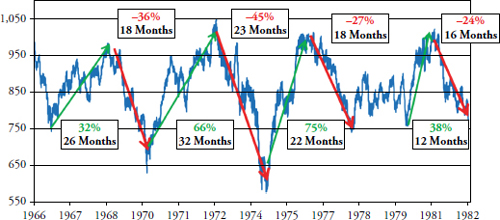
FIGURE 7.20 Secular Bear Market (1966–1982)
Notice the percentage moves and the amount of time that each took. When one shows 16 years of data sometimes the compressed data can make it look like the frequency of up and down moves is much higher than it actually is. The up moves (cyclical bulls) averaged 23 months in length with an average gain of over 52 percent. The down moves (cyclical bears) averaged almost 19 months with an average decline of – 33 percent. Clearly, this falls in line with common knowledge that bull markets last longer than bear markets, even if they are contained in an overall secular bear market.
The next chapter is essentially a continuation of this chapter, delving into market valuations, market sectors, asset classes, various methods to observe returns, and the distribution of those returns.