
Chapter 13
Measuring the Market
Weight of the Evidence Measures
I have been fond of a weight of the evidence approach for more than 30 years. The concept of “weight of the evidence” came from Stan Weinstein who published the newsletter, The Professional Tape Reader, and author of Secrets for Profiting in Bull and Bear Markets. Back in the early 1980s, most analysis was done manually. We did not have computers, Internet, or e-mail. Our data came from subscriptions or newspapers. I was a religious user of the Barron’s Market Laboratory pages. I was working with Norm North of N-Squared Computing then, designing technical analysis software (yes, it was DOS-based and ran on 5.25′ floppies). Norm had started a database of about 130 items from the market lab pages and each Saturday, I would go to the nearby hotel, buy a copy of Barron’s, update the database then upload it to CompuServe so our clients could download it—all at the lightning fast speed of 300 baud. I’m somewhat of a packrat, and have many ring binders full of charts and notes; Figure 13.1 is the weight of the evidence approach I used back then. Wish I could print like that now.

FIGURE 13.1 Greg Morris? Weight of the Evidence Worksheet from Mid-1980s
I have totally stopped using the sentiment measures because I think the data collection process is not reliable. If you have ever taken a survey, especially an unsolicited survey, you can probably guess where I’m coming from. However, that does not mean the data isn’t worthwhile, just not for me. There is, however, an excellent service provided by Jason Goepfert called Sentiment Trader at www.sentimentrader.com. Jason provided an example of a sentiment indicator that can be used in trend analysis. Figure 13.2 is the put/call ratio, which tends to trend along with the market. We see a higher average range during bear markets and a lower average range during bull markets. That has changed a little bit over the past decade, as there has been a structural shift to higher put/call ratios—more hedging from nervous investors who have been whacked with two big bear markets. But you can still see the trend in the ratio from a bull market to the next bear market.

FIGURE 13.2 Jason Goepfert?s Equity Put/Call Ratio Analysis
Source: Chart courtesy of MetaStock.
I also no longer use any of the NYSE member/specialist data or odd-lot data as most doesn’t seem as valid today as then. Now, the technical trend-following measures that make up the weight of the evidence consist of price, breadth, and relative strength indicators.
A Note on Optimization
When evaluating indicators to be considered for trend following, you cannot optimize over long-term periods and then just pick the best performing indicator. That is a guarantee of failure and probably quite soon. Optimization is a great process in which to discover areas to avoid, but a poor process to actually determine parameters. If you do try to optimize then please read some good book on the downfalls of doing so. Optimization in the wrong hands is extremely dangerous. One area of value is to plot all of parameter’s performance and look for plateaus (box) where the parameter performed steadily over a range of similar values. Picking a spike (circle) is the worst thing you can do as the parameter surrounding the spike are probably closer to where you will see the actual results. See Figure 13.3.
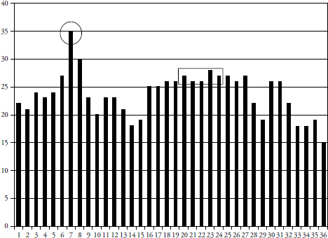
FIGURE 13.3 Optimized Results Showing Good and Bad Areas
Indicator Evaluation Periods
Indicators need to be evaluated over cyclical bull and bear markets, secular markets, periods covering calendar-based times, randomly selected periods, and almost any other period selection process you want to try. Remember, the goal is to find parameters that meet the needs of the model you are trying to create. You want indicators whose statistics over various times provide the safety and return that you expect of them. Ideally, you want to test the indicators with a certain portion of your data, get the parameters that work well, and then check it on the remaining portion of your data. This is known as in sample and out of sample testing. If the indicator continues to perform on the previously unused data, then you probably have something.
Figure 13.4 shows the Nasdaq Composite Average and the S&P 500 Index. The vertical lines are placed at each low and high that can be used to determine the evaluation periods. You must be careful with this and include the significant peaks and troughs when viewed over the long term. In fact, using a weekly price chart is probably better for this than using a daily price chart.
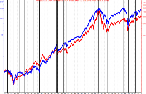
FIGURE 13.4 Indicator Evaluation Periods
Source: Chart courtesy of MetaStock.
The remainder of this section covers many of the weight of the evidence indicators (measures) that are good for trend following. These can be separated into three broad categories: price, breadth, and relative strength.
Price-Based Indicators
Price-based means that the indicator is measuring movement in price instruments; whether it be from an index such as the Nasdaq Composite Average, the S&P 500, or from an individual security, such as an ETF, a stock, a mutual fund, and so on. I use the Nasdaq Composite for my price guide because it is a high beta index that contains small caps, mid-caps, large caps, technology, just about everything except financials, and also has some dogs. If you are going to be a trend follower, then you want to follow a price-based index that moves; it doesn’t matter if it is up or down, it just needs to do so in a big way, and the Nasdaq Composite fills the bill.
Price Short Term
The short version of price is more for shorter-term assessment of trendiness. It is simply looking at the price relationship in the 5 to 21 day range. If you were using multiple price measures on the same index, then this is the one that would turn on first and also turn off first; it is the quickest to respond to changes in price direction. Many times a short-term measure is not actually used in the weight of the evidence calculation, but serves a weight of the evidence model well with an advance warning of things to come.
Price Medium Term
This is another price trend measure that uses a different analytical technique and different look-back period than the Trend Capturing component. This Price Medium measure is basically looking at the price relationships over a three- to four-week period. If the short-term price measure isn’t used, then this is the one that will lead the changed in direction of the index being followed.
Price Long Term
This price trend measure is similar to Price Medium but looking at the price relationship over a four- to eight-week period. Generally the Price Medium indicator will turn on first and if the trend is sustained the Price Long measure will turn on thus providing confirmation of the trend and further building the point total of the cumulative weight of the evidence.
Figure 13.5 is an example of the Price Long measure. Although this is almost too much data on one chart, you can focus on the binary overlay on the top plot and can see that it does a good job of tagging the uptrends, which is all we want it to do.
FIGURE 13.5 Price Long Term (1998–2012)
Source: Chart courtesy of MetaStock.
Figure 13.6 shows the same price measure as the one above, just a smaller time frame. It becomes much clearer that the binary line overlaid on the top price data moves in conjunction with the indicator in the bottom plot, the price long measure. Whenever the price long indicator moves above the horizontal line, the binary moves to the top, and whenever the price long drops below the horizontal line, the binary drops back to the bottom. You can then see that whenever the binary is at the top, it is signaling an uptrend and whenever it is at the bottom it is signaling no uptrend (down trend or sideways). This concept is quite valuable since it allows you to view only the binary to know what the indicator is doing. So is this indicator perfect? Of course not, you can see there was a whipsaw signal (short and wrong, but also quickly reversed) near the right center of the chart where the binary was at the top for only a very short period of time. As I have said before and will no doubt say again, I know these measures will be wrong at times, but they are not going to stay wrong because they react to the market. Because these indicators are all trend following, they will reverse a wrong direction almost as fast as they identify it in the first place. That is exactly what you want them to do and it is also why I use a weight of the evidence approach, which means I rely on a basket of technical measures. Sort of a democratic approach, if you will.

FIGURE 13.6 Price Long Term (2009–2012)
Source: Chart courtesy of MetaStock.
Table 13.1 is an example of the detailed research behind each of the various indicators used in the weight of the evidence. This example is over the period from 1980 to 2012, however, it should be run over many different periods (see Figure 13.4) to find consistency.
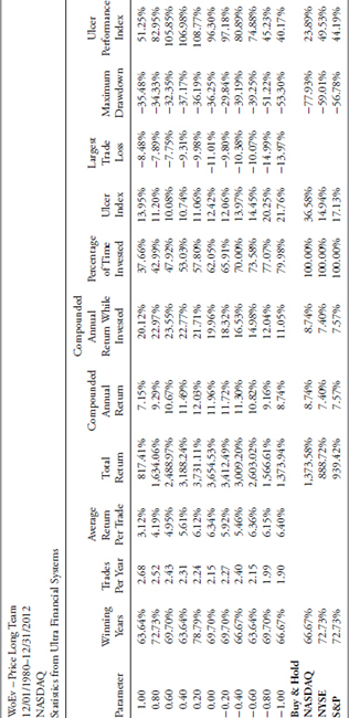
TABLE 13.1 Price Long-Term Performance Statistics
To access an online version of this table, please visit www.wiley.com/go/morrisinvestingebook.
Here is an explanation of the various parameters in Table 13.1:
- Parameter. These are the variable parameters used to test the indicator’s usefulness in identifying trends. They can be discovered by optimization, or just a visual analysis of the indicator. They are then spread about to cover a wide range of analysis for the indicator.
- Winning years. The percentage of years that the trading ended higher than the close from the previous year.
- Trades per year. This is the number of closed trades per year.
- Average return per year. Determined by looking at the total return for the entire run, and then dividing it by the number of years.
- Total return. The total return from the system using the selected parameter.
- Compounded annual return. The gain each year that would be required in order to achieve the total gain for the analysis period.
- Compounded annual return while invested. The annual gain that would be required to achieve the total gain, excluding cash positions, over the period being analyzed.
- Percentage of time invested. The percentage of time that actual trades were placed and not in cash.
- Ulcer index. A measure of downside volatility also covered in the ranking measure section of this book.
- Largest trade loss. A single trade that resulted in the largest loss.
- Maximum drawdown. The maximum decline of the system measured from the highest level that the system had reached. Keep in mind this is a one-time isolated event.
- Ulcer performance index. The compounded annual return divided by the Ulcer index, this is a performance measure similar to the Sharp ratio, the Sortino ratio, and the Treynor ratio. All are risk-adjusted measures of performance.
Although the calculation of all the various measures of an indicator’s ability to work over a vast number of trials and time segments, one still has to determine “Where’s the beef?” Of all that data generated, shouldn’t you list the categories from best to worst inasmuch as their contribution to what you looking for? I think so, definitely so. One method and the one I use is to ask some sharp folks who are deeply familiar with the indicator and the output to give me their input as to the order in which the parameter analysis should be viewed. And to keep this as a robust process, it is done each year. Often there isn’t much change, but sometimes someone gets a more involved feeling after working with these almost every day as to which is more important than another. Sometimes the overall relative ranking of these gets changed.
Table 13.2 shows that each column of data is ranked based on its relative importance as determined by the individuals involved in the portfolio management process. This relative input is then weighted based on the level it has reached in the vetting process. There is an old forecasting axiom that says the average of all estimates is probably going to work better than trying to select the single best guess.
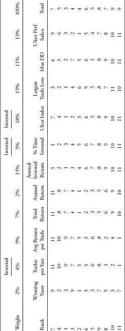
TABLE 13.2 Price Long-Term Performance Statistics Ranking
To access an online version of this table, please visit www.wiley.com/go/morrisinvestingebook.
Note: The columns with Inverted at the top mean that the smaller the value, the better it is performing.
The relative ranking is then placed alongside the parameter output to see where the current parameter being used and followed immediately by the ranking of the output components shown in the first column of Table 13.2. This process allows you to see how the parameters change over time compared to the one currently in use. Note that the parameters in the first column of Table 13.1 are in numerical order, so while this is a change in the relative ranking, if the change in the parameter is small then generally no changes will be made to the parameter in this weight of the evidence indicator. However, it will be watched over time and if there is an obvious drift away from the parameter being used, a change will be considered.
The above performance statistical information provided for the price long weight of the evidence will not be included in all of the indicators that are used as this section would get overly long. However, when something stands out that will provide additional insight into this process; the information will definitely be shown. However, do not fear; a chart or two will be shown for each measure.
Risk Price Trend
The risk price trend is in the lower plot of Figure 13.7, while the top plot is the Nasdaq Composite and the risk price trend binary. This measure uses the MACD concept with considerably longer parameters for both the short- and long components. You can see from the binary that it does a relatively good job of picking out the trends of the market.

FIGURE 13.7 Risk Price Trend
Source: Chart courtesy of MetaStock.
Adaptive Trend
The adaptive trend measure incorporates the most recent 21 days of market data to compute volatility based on an average true range methodology. This process always considers the previous day’s close price in the current day’s high low range to ensure we are using days that gap either up or down to their fullest benefit. When the price is trading above the adaptive trend, a positive signal is generated; and when below, a negative signal is in place. This is clearly shown in Figure 13.8 with the adaptive trend binary overlaid on the price chart at top. Whenever the binary is at the top, it is showing an uptrend, and when at the bottom, a downtrend.
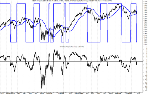
FIGURE 13.8 Adaptive Trend
Source: Chart courtesy of MetaStock.
Breadth-Based Indicators
Breadth contributes significantly to trend analysis and is thoroughly described in this chapter and the Appendix. Breadth-based indicators offer an unweighted view of market action, a valuable view that is often obscured by price or capitalization weighted indices.
Advances/Declines
The advance/decline component measures the relationship of advancing issues to declining issues. Advancing issues outnumbering declining issues is a positive event as more participation is taking place in the equity markets. However, an inverse relationship (decliners outnumber advancers) would be a clear sign of weakness to a price movement. There is a recent example of the clear divergence in the price movement and market internal movement during much of 2007 and particularly in the fourth quarter of 2007. From early October 2007 to late October 2007 we saw a distinct positive price trend while the advance decline measure was rapidly declining. By late October the markets were reaching all time new highs. What you were reading and hearing in the news was all positive, “The market reached an all-time new high.” According to the price movement things couldn’t have looked better. However, the advance/decline measure was telling us a very different story as declining issues continued to outnumber advancing issues. This forewarning was signaling increased risk as the upward price movement was not being supported by broad participation. At that time, the advance/decline component was negative; hence, it was not contributing to the weight of the evidence total. Divergences can cue us to be prepared in the event the price action reverses rapidly. In fact, that is exactly what happened and it was the beginning of the 2007 to 2009 bear market.
Figure 13.9 shows the deterioration in the advance decline measure in 2007. You can see that while the market was reaching new highs, the advance decline measure never even got back up to its horizontal signal line. Breadth does this time and time again. It almost always leaves the party early and is a great tool to have in your arsenal as a trend follower.

FIGURE 13.9 Advance Decline Measure—2007
Source: Chart courtesy of MetaStock.
Figure 13.10 is the same indicator but plotted with the same data used throughout this section so cross reference is easier.
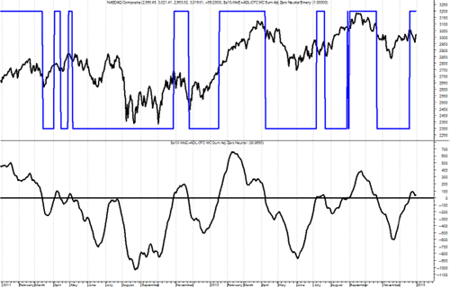
FIGURE 13.10 Advance Decline Measure
Source: Chart courtesy of MetaStock.
Up Volume/Down Volume
This Breadth measure gives us an internal look at the volume behind the price action by looking at the relationship of the volume in advancing issues versus the volume in declining issues. Again, by removing the capitalization weighting of the price movement that can drive the index price, this measure gives us an internal view of what is going on behind a price movement. Generally, if there is strong up volume relative to down volume it is a positive sign that the positive price movement is being supported. However, if there is positive price movement, but down volume is greater than up volume it is a sign that the price movement lacks participating volume. In this case the up volume/down volume measure would not contribute to the weight of the evidence leading to a lower total level signaling increased risk. Figure 13.11 is the up volume/down volume weight of the evidence measure. You might notice that the signal line (horizontal line) is not at zero like many use, but in this case it is at +400. The parameter analysis identified that this was a significantly better signal level. You can see that the up and down volume has been quite weak since and before the peak in prices, which occurred in the middle of the time period shown.

FIGURE 13.11 Up Volume/Down Volume Measure
Source: Chart courtesy of MetaStock.
New Highs/New Lows
The High/Low Breadth measure looks at the relationship between issues reaching new 52-week new high values to issues hitting new 52-week new low values. Generally, when the number of issues reaching new 52-week highs are outpacing the number reaching new 52-week lows there is a positive indication in support of positive price action. The flip side of more new lows to new highs is a negative indication, and this lets us know that there is potential risk that the price action and prices could possibly turn quickly in the other direction. When this indicator is on we have internal support for positive price movement and it adds to the point value of the weight of the evidence.
Note: See Appendix C for High Low Validation Measure for expanded information.
This weight of the evidence measure is a little different than the previous ones in that signals are generated by the crossing of the indicator’s moving average shown in Figure 13.12 the bottom plot as the dotted line. You can see the binary in the top plot makes seeing these crossings quite easy.

FIGURE 13.12 New Highs/New Lows Measure
Source: Chart courtesy of MetaStock.
Breadth Combination Measure
The combination breadth measure (Figure 13.13) uses advancing and declining issues as well as advancing volume and declining volume by weighting the significant volume days inside of the indicator. This component serves to underweight insignificant price movements if the volume is weak while weighting the more significant price movements when volume is significant. This measure was created out of concern for days such as the Friday that follows Thanksgiving, a partial day of trading, and always with very low volume. The downside of using breadth is that it does not matter if the day is shortened or the trading is light, you will always end up with a full complement of breadth data. Remember, breadth does not measure magnitude directly, only direction. In this measure, when the up volume is below a predetermined moving average, then only the advances are used. If the up volume is above this average, then the product of advances and up volume is used. The same concept is applied to the declines and the down volume.
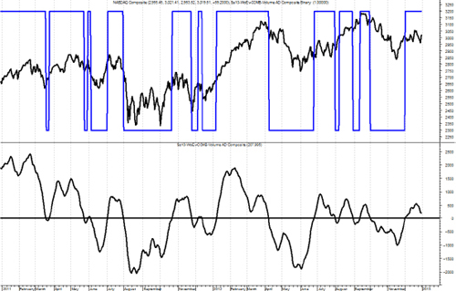
FIGURE 13.13 Breadth Combination Measure
Source: Chart courtesy of MetaStock.
Breadth Is Not Always Internal Data
There are a number of breadth-based measures that do not use internal market data such as advances, declines, up volume, down volume, new highs, or new lows. A concept known as the Percent Participation Index is used by many analysts. The concept is simple yet revealing, it measures the number of stocks in an index as to where they are relative to their moving average. For example, many use a 200-day Participation Index, which shows the percent of stocks that make up the index that are above their own 200-day moving average. Figure 13.14 shows the Nasdaq Composite in the top plot with its 200-day simple moving average. The bottom plot is the 200-day participation index, which shows the percentage of all Nasdaq Composite stocks that are above their respective 200-day simple moving averages.

FIGURE 13.14 Nasdaq Percent of Issues Above Their 200-Day Moving Average
Source: Chart courtesy of MetaStock.
Figure 13.15 is similar to the previous one except that it shows the 50-day participation index.
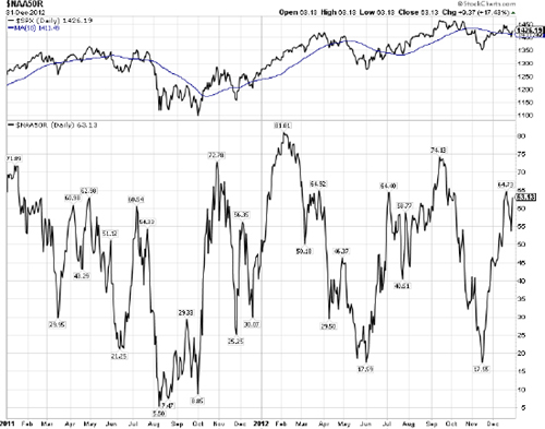
FIGURE 13.15 Nasdaq Percent of Issues above Their 50-Day Moving Average
Source: Chart courtesy of MetaStock.
Slope of Moving Average
A longer-term big picture measure of market movements can be accomplished by calculating the slope of a moving average, in this case the 252-day moving average. This is the type of market measure that can be used as a filter for parameter changes. For example, whenever the histogram in the lower plot of Figure 13.16 is above the zero line, the stops can be looser, the buying requirements can be looser, and even other market measure parameters could be lengthened. If it is below the horizontal line, then revert back to the tighter set of parameters.

FIGURE 13.16 Slope of Moving Average
Source: Chart courtesy of MetaStock.
World Market Climate
This is a breadth measure that uses a basket of international indices and their respective moving average relationship. For this example, this measure uses a basket of international stock market indices and their 50-day exponential average. The measure is bounded between zero and 100 because all that is being done is determining the percentage of the basket of indices that are above their 50-day exponential average. Complementarily, this will also tell you the percent below their 50-day moving average. Figure 13.17 has the World Market Climate shown in the top plot with lines drawn at 80 percent, 50 percent, and 30 percent. The bottom plot is the MSCI EAFE Index, which is a broad-based international index using markets from Europe, Australasia, and the Far East. Australasia is Australia, New Guinea, New Zealand, and their neighboring islands. Clearly the goal of EAFE is to include a broad international exposure outside North America. The EAFE in the bottom plot is shown with a 200-day exponential moving average just for reference.

FIGURE 13.17 World Market Climate
Source: Chart courtesy of MetaStock.
Cyclical Market Measure
This measure looks for longer-term price trends to identify cyclical bull or bear environments. For this example, I use the basket of international markets discussed in the previous measure. The concept is unique yet simple; it measures the direction of longer term averages and uses a filter of 0.05 percent before a reversal of the average is identified. Figure 13.18 shows the Cyclical Market Measure in the top plot with a horizontal line at 50 percent and the MSCI EAFE Index in the bottom plot with a 126-day simple moving average. One could use any values for the length of the moving average, both for the smoothing of the EAFE in the lower plot to the calculation of trending percentage that makes up the Cyclical Market Measure.
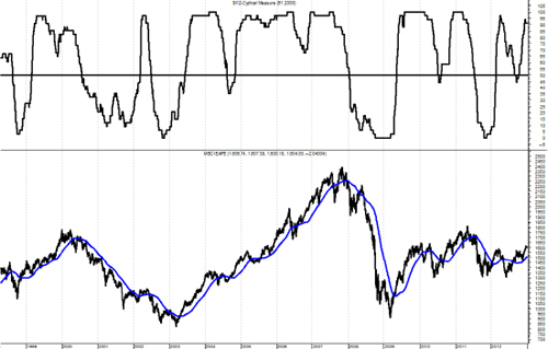
FIGURE 13.18 Cyclical Market Measure
Source: Chart courtesy of MetaStock.
Relative Strength
Back in the 1970s we used to have an indicator that looked at the volume on the American Stock Exchange (AMEX), also known as the curb, and the volume on the New York Stock Exchange (NYSE) known as the big board. It was called The Speculation Index. The AMEX consisted of small, relatively illiquid issues, generally all that could not make the listing requirements of the NYSE. The ratio of AMEX volume to NYSE volume was thought to represent excessive optimism when it reached a certain level. In perfect hindsight I think if we had used it as a trend indicator it would have been more valuable. Identify the rising path of speculation and as the volume of the AMEX increased relative to that of the NYSE, you would be in a good uptrend.
Note: In 2008, the AMEX was acquired by the NYSE Euronext, which announced that the exchange would be renamed the NYSE Alternext US. The latter was renamed NYSE Amex Equities in March 2009. These changes have made stand-alone AMEX trading volumes difficult to source and track, as a result of which the speculation index has lost much of its relevance as a measure of speculative activity.
Small Cap versus Large Cap Component
Small cap participation is critical for sustained uptrends in the market because small caps reflect speculation and speculation is a requirement for uptrends. For small capitalization issues the Russell 2000 Index is used and for large capitalization issues the venerable S&P 500 Index is used. The math is simply to create the ratio of the small to large, then use technical analysis to provide a normalized trend measure. In Figure 13.19 the typical Nasdaq Composite is in the top plot along with the small cap large cap binary. The middle plot is just the ratio of the small to large issues, and the lower plot is the small cap large cap weight of the evidence measure. In this example you can see that small caps dominated the up move near the center of the chart, but have been relatively weak since. If you think about it, small caps also more closely relate to breadth.
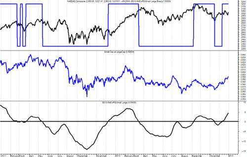
FIGURE 13.19 Small Cap versus Large Cap Measure
Source: Chart courtesy of MetaStock.
Growth versus Value Component
This component of relative strength measures the difference between growth stocks and value stocks. Now this will shock most folks who have studied the markets, but I use small cap issues for both the growth and value components. I was initially concerned that small cap value was almost an oxymoron, but the data has proved time and time again that it is perfectly valid. Figure 13.20 shows the growth value ratio in the middle with the growth value weight of the evidence measure in the bottom plot and its binary overlaid in the top plot.
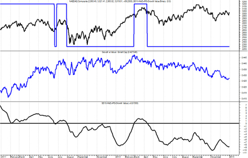
FIGURE 13.20 Growth versus Value Measure
Source: Chart courtesy of MetaStock.
Breadth versus Price Component
There is only one more relative strength measure to view, the relationship between breadth and price. For breadth, a relationship between the advancing issues and the declining issues is used, while the Nasdaq Composite is used for price. The middle plot in Figure 13.21 shows the raw ratio of those two, with the price to breadth weight of the evidence measure in the lower plot and its binary in the top plot. This is an excellent example of how technical manipulation of the data can turn that noisy middle plot into something like the bottom plot, and a good trend measure.
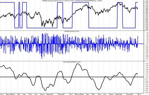
FIGURE 13.21 Breadth versus Price Measure
Source: Chart courtesy of MetaStock.
Relative Strength Compound Measure
This compound measure (see Chapter 12) is designed to measure market sentiment. Are investors actively taking investment risk? Or are they behaving much more bearishly? Again, there are three indicators that drive this component and are shown above. These indicators look at the relationship between small cap issues versus large cap issues, growth-oriented issues versus value issues, and breadth measurements versus price measurements. For example, when small caps are dominant (small caps outperforming large caps) it is generally a sign of more speculation taking place in the markets as investors are willing to accept more risk. This is generally a good sign and it is during these environments that the markets generally perform well historically. When large caps are dominant it is usually the result of a flight to quality as investors are taking risk off the table. This type of investor sentiment usually results in less favorable market conditions. A similar relationship exists between growth and value. When growth issues are outperforming it is generally because the market is pricing in favorable growth estimates, and conversely, when value issues are dominating it is because the market is no longer pricing in such optimistic positive growth estimates. The breadth versus price measurement is similar to an equal weighted measurement versus a capitalization weighted measurement. Again, we are using three indicators in this component for confirmation purposes. When this relative strength component is on it is adding value to the weight of the evidence of the model by letting me know that the sentiment in the markets is favorable and is viewed more as a trend confirmation measure versus a trend identification measure. Figure 13.22 is a chart showing lots of data but includes all three components of the relative strength measure. The top plot is the Nasdaq Composite with the compound binary measure overlaid. The binary measure for each of the components is also shows overlaid on their respective plots.
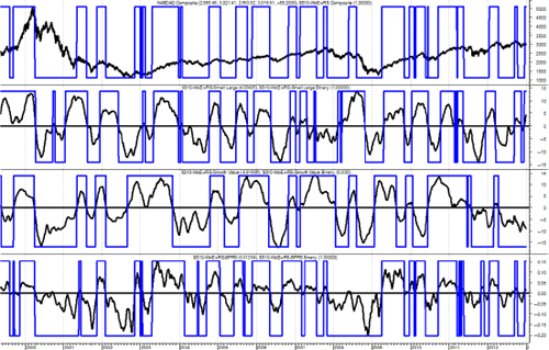
FIGURE 13.22 Relative Strength Compound Measure (1999–2012)
Source: Chart courtesy of MetaStock.
Figure 13.23 is the same as the preceding figure, but with less data displayed.
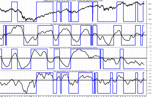
FIGURE 13.23 Relative Strength Compound Measure (2008–2012)
Source: Chart courtesy of MetaStock.
Dominant Index
A concept known as the Dominant Index measures the relative strength between the Nasdaq Composite and the New York Stock Exchange (NYSE) Composite. The Nasdaq is generally dominated by small capitalization issues and the NYSE is dominated by large capitalization issues. Therefore, a measure that shows which is outperforming is also showing whether small cap issues are outperforming large cap issues or vice versa. Figure 13.24 shows the Nasdaq Composite and the NYSE Composite in the top plot with the relationship between the two displayed in the bottom plot. Whenever the line is above the horizontal line, it means the Nasdaq is performing better than the NYSE. In the last decade the Nasdaq has grown considerably with many more large cap issues, which somewhat hampers this measure.
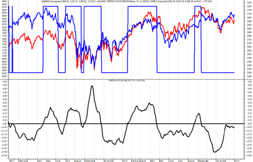
FIGURE 13.24 Dominate Index Concept
Source: Chart courtesy of MetaStock.
Trend Capturing Measure
This is a truly important compound measure, which can drive the weight of the evidence or hold it back. The trend capturing measure, like many compound measures consists of three independent indicators of trend, and in this case two are based on breadth and one on price. Any two measures saying there is an uptrend will work.
Advance Decline Component
The advance decline component of the trend capturing measure uses the advances and declines difference and then mathematically puts that difference into a relationship similar to MACD. (See Figure 13.25.) The signals are given by the crossing of that formula with its shorter term (10–18 periods) exponential moving average.
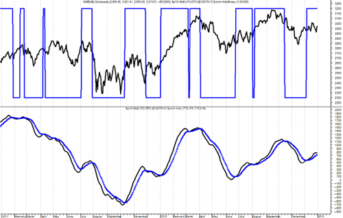
FIGURE 13.25 Advance Decline Component of Trend Capturing Measure
Source: Chart courtesy of MetaStock.
Up Volume/Down Volume Component
The up volume/down volume component of the trend capturing measure (see Figure 13.26) uses the up volume and the down volume in a similar manner as the advance and decline measure in Figure 13.25. One could assume that these would be very similar as they are tied to the same price movement, one by daily changes, and one by the amount of volume behind those changes. However, in the up volume/down volume, the parameters used are somewhat longer than in the advance decline component.

FIGURE 13.26 Up Volume/Down Volume Component of Trend Capturing Measure
Source: Chart courtesy of MetaStock.
Price Component
The price component of the trend capturing measure (Figure 13.27), like the other two components uses a similar relationship, but this one uses parameters that are longer than the other two.
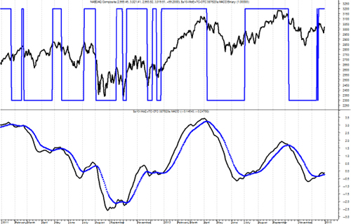
FIGURE 13.27 Price Component of Trend Capturing Measure
Source: Chart courtesy of MetaStock.
Trend Capturing Compound Measure
This is a major component of my model because it ties directly with the investment philosophy of identifying positive market trends that have a high probability of continuing into the future. I never predict; I only have an expectation that the identified trend will continue. This component is a composite of three technical measurements. One is a price measure, and the other two are breadth measures, one of which uses up and down volume, and the other uses advancing and declining issues (see Figures 13.26 and 13.27). I use multiple indicators for confirmation purposes. For instance, when the first of these three indicators turns positive it is telling us there is a positive price trend developing. When the second of these indicators turns positive it provides confirmation of the trend, and if the third turns positive as well I know I have a very solid trend in place. See Figure 13.28.

FIGURE 13.28 Trend Capturing Measure (2012)
Source: Chart courtesy of MetaStock.
LTM—Long-Term Measure
Sometimes a good way to dampen things is to utilize a longer-term overlay measure such as this Long-Term Measure (LTM). There are multiple ways to smooth out the noise in data, one, the moving average, we have discussed at length. The other, using weekly data often does the same thing, and sometimes even better. The long-term measure uses only weekly data. It has many components such as weekly advances and declines, weekly new high/new low data, weekly up volume and down volume data, plus a price component that measures the relationship among many market indices and tracks their position relative to their long-term moving average. All of that data is calculated and then put together in a fairly complex manner to give the binary indicator shown in the top plot of Figure 13.29. It has an intermediate level, sort of a transition zone so that as the long term components go from being on to off, they pause in the transition zone to ensure there is follow through. This is a fairly slow moving measure and is best used to identify cyclical moves in the market. The best place to find weekly breadth data is from Dow Jones and Company, in either Barron’s or the Wall Street Journal. See the Appendix on breadth to understand why you cannot combine the daily breadth to get the weekly data.
FIGURE 13.29 Long-Term Measure (1994–2012)
Source: Chart courtesy of MetaStock.
Figure 13.30 shows the long-term measure over a shorter time frame so you can better see the action of each measure.

FIGURE 13.30 Long-Term Measure (2011–2012)
Source: Chart courtesy of MetaStock.
Bull Market Confirmation Measure
The Bull Market Confirmation Measure is about as simple as it can get. (See Figure 13.31.) It just uses a 50 moving average and a filter to identify bull moves. It is calculated on the average price of the high, low, and close ((H + L + C) / 3). The difference between the average price and its 50 period simple moving average is then adjusted to identifying only times when it is outside of the −5 percent and −10 percent range. As the average price drops below the −5 percent value it is a sell signal and when it rises above the − 10 percent it is the buy signal. These crossover percentages are determined based on the price series you are using. They will probably be different for each one.
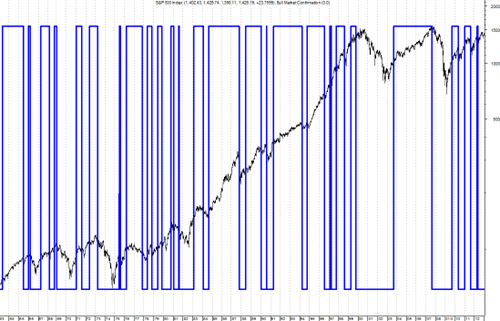
FIGURE 13.31 Bull Market Confirmation Measure (1964–2012)
Source: Chart courtesy of MetaStock.
Figures 13.31 and 13.32 is the Bull Market Confirmation measure with less data so you can see the turning points easier.

FIGURE 13.32 Bull Market Confirmation Measure (1999–2012)
Source: Chart courtesy of MetaStock.
Initial Trend Measures (ITM)
A significant enhancement to a trend following model is an early warning set of indicators. I call them Initial Trend Measures, or Early Trend Measures. They are designed to measure trends just like the weight of the evidence measure does, but use shorter term parameters in an attempt to pick up or identify the trend at an earlier stage in its development. You can use as many short-term trend measures as you need, but usually 3 is more than enough, if you have them in different categories of trend measurement, such as price, breadth, and relative strength.
Figure 13.33 is one of the Initial Trend Measures that utilizes up volume compared to down volume. It can be either the Nasdaq data or the NYSE data. The top plot is the Nasdaq bar chart with the indicator’s binary wave overlaid on the price bars. Recall that the binary is at the top when the indicator is above its moving average and at the bottom when it is below its moving average.
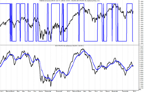
FIGURE 13.33 Up Volume/Down Volume Initial Trend Measure
Source: Chart courtesy of MetaStock.
Figure 13.34 shows the Initial Trend Measure, which uses the advance decline data. Just like the other weight of the evidence measures this uses an MACD approach.

FIGURE 13.34 Advance Decline Initial Trend Measure
Source: Chart courtesy of MetaStock.
Figure 13.35 is another ITM, this one uses price, and in this case it is the Nasdaq Composite Index that is used. This measure is similar to the trend measure mentioned earlier but uses short-term parameters.

FIGURE 13.35 Price Initial Trend Measure
Source: Chart courtesy of MetaStock.
Figure 13.36 is a similar initial trend measure, but this one uses the NYSE Composite Index for price.
FIGURE 13.36 NYSE Price Initial Trend Measure
Source: Chart courtesy of MetaStock.
The Initial Trend Measures provide an alert mechanism for the weight of the evidence. You will also see their use in Chapter 14 when used along with the trade up rules.
Trend Gauge
A concept that was introduced to me by my friend Ted Wong (TTSWong Advisory) is the use of multiple market indices and measuring their relationship to their moving average. Trend Gauge is comprised of Mega Trend Plus and Trend Strength. A concept that attempts to identify overall trendiness in the market is always going to be a valuable tool for a trend follower. For purposes of this example I selected the ubiquitous 200-day exponential average and then smoothed the results with a three-day arithmetic average. There are a number of modifications one could do with this concept, including optimizing the moving average lengths for each of the market indices. I say that with this warning, optimization must be done properly to avoid curve fitting and was discussed earlier in this chapter. I would start with moving average lengths that are closely tied to the trend lengths I want to focus on and then use a short-term noise reduction smoothing like I did in this example.
Mega Trend Plus
Mega Trend Plus is constructed by selecting 11 major indexes with the longest historical database. One could easily make the case for more or less indices and which indices are to be included. I would suggest using enough indices to give you broad coverage over how you plan to make investments. The Mega Trend Plus is also used in the Long-Term Measure (LTM), but in that case it uses weekly data. Clearly if you are going to have a focus on international securities, you would want to include international indices. The list of indices used in this example is:
- Nasdaq Composite
- S&P 500
- S&P 100
- Russell 2000
- Russell 2000 Growth
- Russell 2000 Value
- New York Composite
- Dow Jones Industrials
- Dow Jones Transports
- Dow Jones Utilities
- Value Line Geometric
When the index is greater than its exponential moving average (EMA), it receives a +1, below its EMA, it receives a −1. Then the scores from all 11 indexes are summed and then normalized so the composite will have a range between 0 percent and 100 percent. An uptrending market is called when the composite is greater than or equal to 85 percent. A downtrending market is when the composite is less than or equal to 15 percent. Once a threshold is crossed, the market stance stays until the opposite threshold is penetrated. Hence Mega Trend Plus is a digital meter: either bull or bear. Figure 13.37 shows the S&P 500 in the top plot, Mega Trend Plus in the lower plot, and the Mega Trend Plus binary overlaid on the S&P 500. The binary is at +1 whenever Mega Trend Plus is greater than or equal to 85, at −1 whenever Mega Trend Plus is less than or equal to 15, and at zero when it is between 15 and 85. You can see that is does a reasonable job of trend identification. This is a weight of the evidence approach that is totally related to the concepts in this book.

FIGURE 13.37 Mega Trend Plus
Source: Chart courtesy of MetaStock.
Trend Strength
Trend Strength is a different composite, which is the sum of 11 ratios. For each market index, a ratio is calculated with this formula: (price/EMA−1) × 100 percent. The EMA lengths are identical to those used in Mega Trend Plus. The ratio depicts how far away (up or down) the index is positioned relative to its EMA. Hence Trend Strength is an oscillating analog meter that measures the momentum of each of the 11 market indexes (see Figure 13.38).
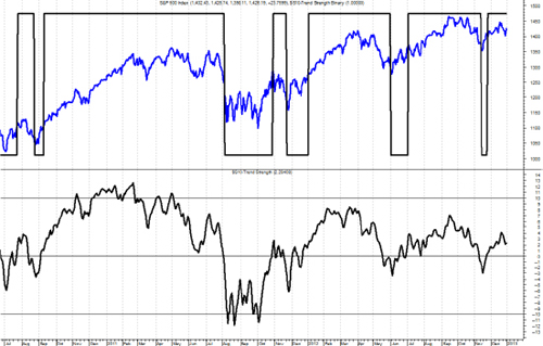
FIGURE 13.38 Trend Strength
Source: Chart courtesy of MetaStock.
Trend Gauge combines the readings from both the digital and analog meters (Mega Trend Plus and Trend Strength). It represents a weight of evidence approach in determining both the direction (digital) and the strength (analog) of the overall market trend. Figure 13.39 shows the S&P 500 in the top plot and Trend Gauge in the lower plot. Whenever the Trend Gauge is at +1 it has identified an uptrend, when at −1 it has identified a downtrend, and when at 0, there is neither an up- or downtrend (neutral).
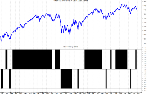
FIGURE 13.39 Trend Gauge
Source: Chart courtesy of MetaStock.
Figure 13.40 is the same data as in Figure 13.39, just over a much longer time frame. The beginning date in Figure 13.40 is 1992.
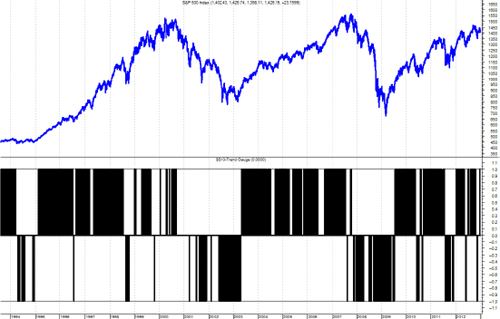
FIGURE 13.40 Trend Gauge Over Longer Time Frame
Source: Chart courtesy of MetaStock.
Measuring the market is a significant component to a good trend following, rules-based model. This chapter has introduced many measures that can be used individually or in groups to assist in trend identification. Clearly there were many measures introduced and hopefully you can find a few that will fit your needs. Also, hopefully you will not use all of them as many are similar with minor deviations in their concept.