CHAPTER 4
MODEL ADEQUACY CHECKING
4.1 INTRODUCTION
The major assumptions that we have made thus far in our study of regression analysis are as follows:
- The relationship between the response y and the regressors is linear, at least approximately.
- The error term ε has zero mean.
- The error term ε has constant variance σ2.
- The errors are uncorrelated.
- The errors are normally distributed.
Taken together, assumptions 4 and 5 imply that the errors are independent random variables. Assumption 5 is required for hypothesis testing and interval estimation.
We should always consider the validity of these assumptions to be doubtful and conduct analyses to examine the adequacy of the model we have tentatively entertained. The types of model inadequacies discussed here have potentially serious consequences. Gross violations of the assumptions may yield an unstable model in the sense that a different sample could lead to a totally different model with opposite conclusions. We usually cannot detect departures from the underlying assumptions by examination of the standard summary statistics, such as the t or F statistics, or R2. These are “global” model properties, and as such they do not ensure model adequacy.
In this chapter we present several methods useful for diagnosing violations of the basic regression assumptions. These diagnostic methods are primarily based on study of the model residuals. Methods for dealing with model inadequacies, as well as additional, more sophisticated diagnostics, are discussed in Chapters 5 and 6.
4.2 RESIDUAL ANALYSIS
4.2.1 Definition of Residuals
We have previously defined the residuals as
where yi is an observation and ŷi is the corresponding fitted value. Since a residual may be viewed as the deviation between the data and the fit, it is also a measure of the variability in the response variable not explained by the regression model. It is also convenient to think of the residuals as the realized or observed values of the model errors. Thus, any departures from the assumptions on the errors should show up in the residuals. Analysis of the residuals is an effective way to discover several types of model inadequacies. As we will see, plotting residuals is a very effective way to investigate how well the regression model fits the data and to check the assumptions listed in Section 4.1.
The residuals have several important properties. They have zero mean, and their approximate average variance is estimated by

The residuals are not independent, however, as the n residuals have only n – p degrees of freedom associated with them. This nonindependence of the residuals has little effect on their use for model adequacy checking as long as n is not small relative to the number of parameters p.
4.2.2 Methods for Scaling Residuals
Sometimes it is useful to work with scaled residuals. In this section we introduce four popular methods for scaling residuals. These scaled residuals are helpful in finding observations that are outliers, or extreme values, that is, observations that are separated in some fashion from the rest of the data. See Figures 2.6–2.8 for examples of outliers and extreme values.
Standardized Residuals Since the approximate average variance of a residual is estimated by MSRes, a logical scaling for the residuals would be the standardized residuals
The standardized residuals have mean zero and approximately unit variance. Consequently, a large standardized residual (di > 3, say) potentially indicates an outlier.
Studentized Residuals Using MSRes as the variance of the ith residual, ei is only an approximation. We can improve the residual scaling by dividing ei by the exact standard deviation of the ith residual. Recall from Eq. (3.15b) that we may write the vector of residuals as
where H = X(X′X)−1X′ is the hat matrix. The hat matrix has several useful properties. It is symmetric (H′ = H) and idempotent (HH = H). Similarly the matrix I – H is symmetric and idempotent. Substituting y = Xβ + ε into Eq. (4.3) yields
Thus, the residuals are the same linear transformation of the observations y and the errors ε.
The covariance matrix of the residuals is
since Var(ε) = σ 2I and I — H is symmetric and idempotent. The matrix I – H is generally not diagonal, so the residuals have different variances and they are correlated.
The variance of the ith residual is
where hii is the ith diagonal element of the hat matrix H. The covariance between residuals ei and ei is
where hij is the ijth element of the hat matrix. Now since 0 ≤ hii ≤ 1, using the residual mean square MSRes to estimate the variance of the residuals actually overestimates Var(ei). Furthermore, since hii is a measure of the location of the ith point in x space (recall the discussion of hidden extrapolation in Section 3.7), the variance of ei depends on where the point xi lies. Generally points near the center of the x space have larger variance (poorer least-squares fit) than residuals at more remote locations. Violations of model assumptions are more likely at remote points, and these violations may be hard to detect from inspection of the ordinary residuals ei (or the standardized residuals di) because their residuals will usually be smaller.
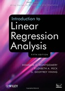
Most students find it very counter-intuitive that the residuals for data points remote in terms of the xs are small, and in fact go to 0 as the remote points get further away from the center of the other points. Figures 4.1 and 4.2 help to illustrate this point. The only difference between these two plots occurs at x = 25. In Figure 4.1, the value of the response is 25, and in Figure 4.2, the value is 2. Figure 4.1 is a typical scatter plot for a pure leverage point. Such a point is remote in terms of the specific values of the regressors, but the observed value for the response is consistent with the prediction based on the other data values. The data point with x = 25 is an example of a pure leverage point. The line drawn on the figure is the actual ordinary least squares fit to the entire data set. Figure 4.2 is a typical scatter plot for an influential point. Such a data value is not only remote in terms of the specific values for the regressors, but the observed response is not consistent with the values that would be predicted based on only the other data points. Once again, the line drawn is the actual ordinary least squares fit to the entire data set. One can clearly see that the influential point draws the prediction equation to itself.

Figure 4.1 Example of a pure leverage point.
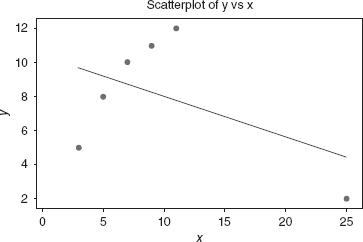
Figure 4.2 Example of an influential point.
A little mathematics provides more insight into this situation. Let yn be the observed response for the nth data point, let xn be the specific values for the regressors for this data point, let ![]() be the predicted value for the response based on the other n - 1 data points, and let
be the predicted value for the response based on the other n - 1 data points, and let ![]() be the difference between the actually observed value for this response compared to the predicted value based on the other values. Please note that
be the difference between the actually observed value for this response compared to the predicted value based on the other values. Please note that ![]() . If a data point is remote in terms of the regressor values and |δ| is large, then we have an influential point. In Figures 4.1 and 4.2, consider x = 25. Let yn be 2, the value from Figure 4.2, The actual predicted value for the that response based on the other four data values is 25, which is the point illustrated in Figure 4.1. In this case, δ= –23, and we see that it is a very influential point. Finally, let ŷn be the predicted value for the nth response using all the data. It can be shown that
. If a data point is remote in terms of the regressor values and |δ| is large, then we have an influential point. In Figures 4.1 and 4.2, consider x = 25. Let yn be 2, the value from Figure 4.2, The actual predicted value for the that response based on the other four data values is 25, which is the point illustrated in Figure 4.1. In this case, δ= –23, and we see that it is a very influential point. Finally, let ŷn be the predicted value for the nth response using all the data. It can be shown that
![]()
where hnn is the nth diagonal element of the hat matrix. If the nth data point is remote in terms of the space defined by the data values for the regressors, then hnn approaches 1, and ŷn approaches yn. The remote data value “drags” the prediction to itself.
This point is easier to see within a simple linear regression example. Let ![]() * be the average value for the other n – 1 regressors. It can be shown that
* be the average value for the other n – 1 regressors. It can be shown that
![]()
Clearly, for even a moderate sample size, as the data point becomes more remote in terms of the regressors (as xn moves further away from ![]() *, then the ordinary least squares estimate of yn appraoches the actually observed value for yn).
*, then the ordinary least squares estimate of yn appraoches the actually observed value for yn).
The bottom line is two-fold. As we discussed in Sections 2.4 and 3.4, the prediction variance for data points that are remote in terms of the regressors is large. However, these data points do draw the prediction equation to themselves. As a result, the variance of the residuals for these points is small. This combination presents complications for doing proper residual analysis.
A logical procedure, then, is to examine the studentized residuals
instead of ei (or di). The studentized residuals have constant variance Var(ri) = 1 regardless of the location of xi when the form of the model is correct. In many situations the variance of the residuals stabilizes, particularly for large data sets. In these cases there may be little difference between the standardized and studentized residuals. Thus, standardized and studentized residuals often convey equivalent information. However, since any point with a large residual and a large hii is potentially highly influential on the least-squares fit, examination of the studentized residuals is generally recommended.
Some of these points are very easy to see by examining the studentized residuals for a simple linear regression model. If there is only one regressor, it is easy to show that the studentized residuals are

Notice that when the observation xi is close to the midpoint of the x data, xi – ![]() will be small, and the estimated standard deviation of ei [the denominator of Eq. (4.9)] will be large. Conversely, when xi is near the extreme ends of the range of the x data, xi –
will be small, and the estimated standard deviation of ei [the denominator of Eq. (4.9)] will be large. Conversely, when xi is near the extreme ends of the range of the x data, xi – ![]() will be large, and the estimated standard deviation of ei will be small. Also, when the sample size n is really large, the effect of (xi –
will be large, and the estimated standard deviation of ei will be small. Also, when the sample size n is really large, the effect of (xi – ![]() )2 will be relatively small, so in big data sets, studentized residuals may not differ dramatically from standardized residuals.
)2 will be relatively small, so in big data sets, studentized residuals may not differ dramatically from standardized residuals.
PRESS Residuals The standardized and studentized residuals are effective in detecting outliers. Another approach to making residuals useful in finding outliers is to examine the quantity that is computed from yi – ŷ(i), where ŷ(i) is the fitted value of the ith response based on all observations except the ith one. The logic behind this is that if the ith observation yi is really unusual, the regression model based on all observations may be overly influenced by this observation. This could produce a fitted value ŷi that is very similar to the observed value yi, and consequently, the ordinary residual ei will be small. Therefore, it will be hard to detect the outlier. However, if the ith observation is deleted, then ŷ(i) cannot be influenced by that observation, so the resulting residual should be likely to indicate the presence of the outlier.
If we delete the ith observation, fit the regression model to the remaining n – 1 observations, and calculate the predicted value of yi corresponding to the deleted observation, the corresponding prediction error is
This prediction error calculation is repeated for each observation i = 1, 2,…, n. These prediction errors are usually called PRESS residuals (because of their use in computing the prediction error sum of squares, discussed in Section 4.3). Some authors call the ei deleted residuals.
It would initially seem that calculating the PRESS residuals requires fitting n different regressions. However, it is possible to calculate PRESS residuals from the results of a single least-squares fit to all n observations. We show in Appendix C.7 how this is accomplished. It turns out that the ith PRESS residual is
From Eq. (4.11) it is easy to see that the PRESS residual is just the ordinary residual weighted according to the diagonal elements of the hat matrix hii. Residuals associated with points for which hii is large will have large PRESS residuals. These points will generally be high influence points. Generally, a large difference between the ordinary residual and the PRESS residual will indicate a point where the model fits the data well, but a model built without that point predicts poorly. In Chapter 6, we discuss some other measures of influential observations.
Finally, the variance of the ith PRESS residual is
![]()
so that a standardized PRESS residual is
![]()
which, if we use MSRes to estimate σ2, is just the studentized residual discussed previously.
R-Student The studentized residual ri discussed above is often considered an outlier diagnostic. It is customary to use MSRes as an estimate of σ2 in computing ri. This is referred to as internal scaling of the residual because MSRes is an internally generated estimate of σ2 obtained from fitting the model to all n observations. Another approach would be to use an estimate of σ2 based on a data set with the ith observation removed. Denote the estimate of σ2 so obtained by ![]() . We can show (see Appendix C.8) that
. We can show (see Appendix C.8) that
The estimate of σ2 in Eq. (4.12) is used instead of MSRes to produce an externally studentized residual, usually called R-student, given by
In many situations ti will differ little from the studentized residual ri. However, if the ith observation is influential, then ![]() can differ significantly from MSRes, and thus the R-student statistic will be more sensitive to this point.
can differ significantly from MSRes, and thus the R-student statistic will be more sensitive to this point.
It turns out that under the usual regression assumptions, ti will follow the tn–p–1 distribution. Appendix C.9 establishes a formal hypothesis-testing procedure for outlier detection based on R-student. One could use a Bonferroni-type approach and compare all n values of |ti| to t(α/2n)n–p–1 to provide guidance regarding outliers. However, it is our view that a formal approach is usually not necessary and that only relatively crude cutoff values need be considered. In general, a diagnostic view as opposed to a strict statistical hypothesis-testing view is best. Furthermore, detection of outliers often needs to be considered simultaneously with detection of influential observations, as discussed in Chapter 6.
Example 4.1 The Delivery Time Data
Table 4.1 presents the scaled residuals discussed in this section using the model for the soft drink delivery time data developed in Example 3.1. Examining column 1 of Table 4.1 (the ordinary residuals, originally calculated in Table 3.3) we note that one residual, e9 = 7.4197, seems suspiciously large. Column 2 shows that the standardized residual is ![]() . All other standardized residuals are inside the ±2 limits. Column 3 of Table 4.1 shows the studentized residuals. The studentized residual at point 9 is
. All other standardized residuals are inside the ±2 limits. Column 3 of Table 4.1 shows the studentized residuals. The studentized residual at point 9 is ![]() , which is substantially larger than the standardized residual. As we noted in Example 3.13, point 9 has the largest value of x1 (30 cases) and x2 (1460 feet). If we take the remote location of point 9 into account when scaling its residual, we conclude that the model does not fit this point well. The diagonal elements of the hat matrix, which are used extensively in computing scaled residuals, are shown in column 4.
, which is substantially larger than the standardized residual. As we noted in Example 3.13, point 9 has the largest value of x1 (30 cases) and x2 (1460 feet). If we take the remote location of point 9 into account when scaling its residual, we conclude that the model does not fit this point well. The diagonal elements of the hat matrix, which are used extensively in computing scaled residuals, are shown in column 4.
Column 5 of Table 4.1 contains the PRESS residuals. The PRESS residuals for points 9 and 22 are substantially larger than the corresponding ordinary residuals, indicating that these are likely to be points where the model fits reasonably well but does not provide good predictions of fresh data. As we have observed in Example 3.13, these points are remote from the rest of the sample.
Column 6 displays the values of R-student. Only one value, t9, is unusually large. Note that t9 is larger than the corresponding studentized residual r9, indicating that when run 9 is set aside, ![]() is smaller than MSRes, so clearly this run is influential. Note that
is smaller than MSRes, so clearly this run is influential. Note that ![]() is calculated from Eq. (4.12) as follows:
is calculated from Eq. (4.12) as follows:

4.2.3 Residual Plots
As mentioned previously, graphical analysis of residuals is a very effective way to investigate the adequacy of the fit of a regression model and to check the underlying assumptions. In this section, we introduce and illustrate the basic residual plots. These plots are typically generated by regression computer software packages. They should be examined routinely in all regression modeling problems. We often plot externally studentized residuals because they have constant variance.
Normal Probability Plot Small departures from the normality assumption do not affect the model greatly, but gross nonnormality is potentially more serious as the t or F statistics and confidence and prediction intervals depend on the normality assumption. Furthermore, if the errors come from a distribution with thicker or heavier tails than the normal, the least-squares fit may be sensitive to a small subset of the data. Heavy-tailed error distributions often generate outlier that “pull” the least-squares fit too much in their direction. In these cases other estimation techniques (such as the robust regression methods in Section 15.1 should be considered.
A very simple method of checking the normality assumption is to construct a normal probability plot of the residuals. This is a graph designed so that the cumulative normal distribution will plot as a straight line. Let t[1] < t[2] < … < t[n] be the externally studentized residuals ranked in increasing order. If we plot t[i] against the cumulative probability, Pi = (i–½)/n, i = 1, 2, …, n, on the normal probability plot, the resulting points should lie approximately on a straight line. The straight line is usually determined visually, with emphasis on the central values (e.g., the 0.33 and 0.67 cumulative probability points) rather than the extremes. Substantial departures from a straight line indicate that the distribution is not normal. Sometimes normal probability plots are constructed by plotting the ranked residual t[i] against the “expected normal value” Φ−1[(i–½)/n], where Φ denotes the standard normal cumulative distribution. This follows from the fact that E(t[i] ≃ Φ−1[(i–½)/n]).
TABLE 4.1 Scaled Residuals for Example 4.1

Figure 4.3a displays an “idealized” normal probability plot. Notice that the points lie approximately along a straight line. Panels b–e present other typical problems. Panel b shows a sharp upward and downward curve at both extremes, indicating that the tails of this distribution are too light for it to be considered normal. Conversely, panel c shows flattening at the extremes, which is a pattern typical of samples from a distribution with heavier tails than the normal. Panels d and e exhibit patterns associated with positive and negative skew, respectively.†
Because samples taken from a normal distribution will not plot exactly as a straight line, some experience is required to interpret normal probability plots. Daniel and Wood [1980] present normal probability plots for sample sizes 8–384. Study of these plots is helpful in acquiring a feel for how much deviation from the straight line is acceptable. Small sample sizes (n ≤ 16) often produce normal probability plots that deviate substantially from linearity. For larger sample sizes (n ≥ 32) the plots are much better behaved. Usually about 20 points are required to produce normal probability plots that are stable enough to be easily interpreted.

Figure 4.3 Normal probability plots: (a) ideal; (b) light-tailed distribution; (c) heavy-tailed distribution; (d) positive skew; (e) negative skew.
Andrews [1979] and Gnanadesikan [1977] note that normal probability plots often exhibit no unusual behavior even if the errors εi are not normally distributed. This problem occurs because the residuals are not a simple random sample; they are the remnants of a parameter estimation process. The residuals are actually linear combinations of the model errors (the εi). Thus, fitting the parameters tends to destroy the evidence of nonnormality in the residuals, and consequently we cannot always rely on the normal probability plot to detect departures from normality.
A common defect that shows up on the normal probability plot is the occurrence of one or two large residuals. Sometimes this is an indication that the corresponding observations are outliers. For additional discussion of outliers, refer to Section 4.4.
Example 4.2 The Delivery Time Data
Figure 4.4 presents a normal probability plot of the externally studentized residuals from the regression model for the delivery time data from Example 3.1. The residuals are shown in columns 1 and 2 of Table 4.1.
The residuals do not lie exactly along a straight line, indicating that there may be some problems with the normality assumption, or that there may be one or more outliers in the data. From Example 4.1, we know that the studentized residual for observation 9 is moderately large (r9 = 3.2138), as is the R-student residual (t9 = 4.3108). However, there is no indication of a severe problem in the delivery time data.
Plot of Residuals against the Fitted Values ŷi A plot of the (preferrably the externally studentized residuals, ti) versus the corresponding fitted values ŷi is useful for detecting several common types of model inadequacies.† If this plot resembles Figure 4.5a, which indicates that the residuals can be contained in a horizontal band, then there are no obvious model defects. Plots of ti versus ŷi that resemble any of the patterns in panels b–d are symptomatic of model deficiencies.
The patterns in panels b and c indicate that the variance of the errors is not constant. The outward-opening funnel pattern in panel b implies that the variance is an increasing function of y [an inward-opening funnel is also possible, indicating that Var(ε) increases as y decreases]. The double-bow pattern in panel c often occurs when y is a proportion between zero and 1. The variance of a binomial proportion near 0.5 is greater than one near zero or 1. The usual approach for dealing with inequality of variance is to apply a suitable transformation to either the regressor or the response variable (see Sections 5.2 and 5.3) or to use the method of weighted least squares (Section 5.5). In practice, transformations on the response are generally employed to stabilize variance.
A curved plot such as in panel d indicates nonlinearity. This could mean that other regressor variables are needed in the model. For example, a squared term may be necessary. Transformations on the regressor and/or the response variable may also be helpful in these cases.
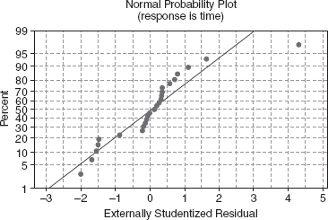
Figure 4.4 Normal probability plot of the externally studentized residuals for the delivery time data.
Figure 4.5 Patterns for residual plots: (a) satisfactory; (b) funnel; (c) double bow; (d) nonlinear.
A plot of the residuals against ŷi may also reveal one or more unusually large residuals. These points are, of course, potential outliers. Large residuals that occur at the extreme ŷi values could also indicate that either the variance is not constant or the true relationship between y and x is not linear. These possibilities should be investigated before the points are considered outliers.
Example 4.3 The Delivery Time Data
Figure 4.6 presents the plot of the externally studentized residuals versus the fitted values of delivery time. The plot does not exhibit any strong unusual pattern, although the large residual t9 shows up clearly. There does seem to be a slight tendency for the model to underpredict short delivery times and overpredict long delivery times.
Plot of Residuals against the Regressor Plotting the residuals against the corresponding values of each regressor variable can also be helpful. These plots often exhibit patterns such as those in Figure 4.5, except that the horizontal scale is xij for the jth regressor rather than ŷi. Once again an impression of a horizontal band containing the residuals is desirable. The funnel and double-bow patterns in panels b and c indicate nonconstant variance. The curved band in panel d or a nonlinear pattern in general implies that the assumed relationship between y and the regressor xj is not correct. Thus, either higher order terms in xj (such as x2j) or a transformation should be considered.
In the simple linear regressor case, it is not necessary to plot residuals versus both ŷi and the regressor variable. The reason is that the fitted values ŷi are linear combinations of the regressor values xi, so the plots would only differ in the scale for the abscissa.
Example 4.4 The Delivery Time Data
Figure 4.7 presents the plots of the externally studentized residuals ti from the delivery time problem in Example 3.1 versus both regressors. Panel a plots residuals versus cases and panel b plots residuals versus distance. Neither of these plots reveals any clear indication of a problem with either misspecification of the regressor (implying the need for either a transformation on the regressor or higher order terms in cases and/or distance) or inequality of variance, although the moderately large residual associated with point 9 is apparent on both plots.

Figure 4.6 Plot of externally studentized residuals versus predicted for the delivery time data.
It is also helpful to plot residuals against regressor variables that are not currently in the model but which could potentially be included. Any structure in the plot of residuals versus an omitted variable indicates that incorporation of that variable could improve the model.
Plotting residuals versus a regressor is not always the most effective way to reveal whether a curvature effect (or a transformation) is required for that variable in the model. In Section 4.2.4 we describe two additional residual plots that are more effective in investigating the relationship between the response variable and the regressors.
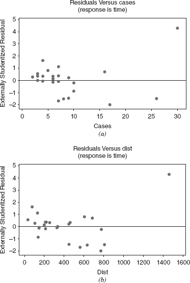
Figure 4.7 Plot of externally studentized residuals versus the regressors for the delivery time data: (a) residuals versus cases; (b) residuals versus distance.
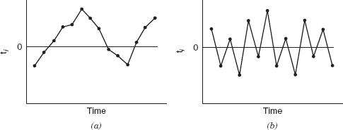
Figure 4.8 Prototype residual plots against time displaying autocorrelation in the errors: (a) positive autocorrelation; (b) negative autocorrelation.
Plot of Residuals in Time Sequence If the time sequence in which the data were collected is known, it is a good idea to plot the residuals against time order. Ideally, this plot will resemble Figure 4.5a; that is, a horizontal band will enclose all of the residuals, and the residuals will fluctuate in a more or less random fashion within this band. However, if this plot resembles the patterns in Figures 4.5b–d, this may indicate that the variance is changing with time or that linear or quadratic terms in time should be added to the model.
The time sequence plot of residuals may indicate that the errors at one time period are correlated with those at other time periods. The correlation between model errors at different time periods is called autocorrelation. A plot such as Figure 4.8a indicates positive autocorrelation, while Figure 4.8b is typical of negative autocorrelation. The presence of autocorrelation is a potentially serious violation of the basic regression assumptions. More discussion about methods for detecting autocorrelation and remedial measures are discussed in Chapter 14.
4.2.4 Partial Regression and Partial Residual Plots
We noted in Section 4.2.3 that a plot of residuals versus a regressor variable is useful in determining whether a curvature effect for that regressor is needed in the model. A limitation of these plots is that they may not completely show the correct or complete marginal effect of a regressor, given the other regressors in the model. A partial regression plot is a variation of the plot of residuals versus the predictor that is an enhanced way to study the marginal relationship of a regressor given the other variables that are in the model. This plot can be very useful in evaluating whether we have specified the relationship between the response and the regressor variables correctly. Sometimes the partial residual plot is called the added-variable plot or the adjusted-variable plot. Partial regression plots can also be used to provide information about the marginal usefulness of a variable that is not currently in the model.
Partial regression plots consider the marginal role of the regressor xj given other regressors that are already in the model. In this plot, the response variable y and the regressor xj are both regressed against the other regressors in the model and the residuals obtained for each regression. The plot of these residuals against each other provides information about the nature of the marginal relationship for regressor xj under consideration.
To illustrate, suppose we are considering a first-order multiple regression model with two regressors variables, that is, y =β0 + β1x1 + β2x2 + ε. We are concerned about the nature of the marginal relationship for regressor x1—in other words, is the relationship between y and x1 correctly specified First we would regress y on x2 and obtain the fitted values and residuals:
Now regress x1 on x2 and calculate the residuals:
The partial regression plot for regressor variable x1 is obtained by plotting the y residuals ei(y|x2) against the x1 residuals ei(x1|x2). If the regressor x1 enters the model linearly, then the partial regression plot should show a linear relationship, that is, the partial residuals will fall along a straight line with a nonzero slope. The slope of this line will be the regression coefficient of x1 in the multiple linear regression model. If the partial regression plot shows a curvilinear band, then higher order terms in x1 or a transformation (such as replacing x1 with 1/x1) may be helpful. When x1 is a candidate variable being considered for inclusion in the model, a horizontal band on the partial regression plot indicates that there is no additional useful information in x1 for predicting y.
Example 4.5 The Delivery Time Data
Figure 4.9 presents the partial regression plots for the delivery time data, with the plot for x1 shown in Figure 4.9a and the plot for x2 shown in Figure 4.9b. The linear relationship between both cases and distance is clearly evident in both of these plots, although, once again, observation 9 falls somewhat off the straight line that apparently well-describes the rest of the data. This is another indication that point 9 bears further investigation.
Some Comments on Partial Regression Plots
- Partial regression plots need to be used with caution as they only suggest possible relationships between the regressor and the response. These plots may not give information about the proper form of the relationship if several variables already in the model are incorrectly specified. It will usually be necessary to investigate several alternate forms for the relationship between the regressor and y or several transformations. Residual plots for these subsequent models should be examined to identify the best relationship or transformation.
- Partial regression plots will not, in general, detect interaction effects among the regressors.
Figure 4.9 Partial regression plots for the delivery time data.
- The presence of strong multicollinearity (refer to Section 3.9 and Chapter 9) can cause partial regression plots to give incorrect information about the relationship between the response and the regressor variables.
- It is fairly easy to give a general development of the partial regression plotting concept that shows clearly why the slope of the plot should be the regression coefficient for the variable of interest, say xj.

The partial regression plot is a plot of residuals from which the linear dependence of y on all regressors other than xj has been removed against regressor xj with its linear dependence on other regressors removed. In matrix form, we may write these quantities as e[y|X(j)] and e[xj|X(j)], respectively, where X(j) is the original X matrix with the jth regressor (xj) removed. To show how these quantities are defined, consider the model
Premultiply Eq. (4.16) by I − H(j) to give
![]()
and note that (I − H(j))X(j) = 0, so that
![]()
or
![]()
where ε* = (I – H(j))ε. This suggests that a partial regression plot should have slope βj. Thus, if xj enters the regression in a linear fashion, the partial regression plot should show a linear relationship passing through the origin. Many computer programs (such as SAS and Minitab) will generate partial regression plots.
Partial Residual Plots A residual plot closely related to the partial regression plot is the partial residual plot. It is also designed to show the relationship between the response variable and the regressors. Suppose that the model contains the regressors x1, x2, …, xk. The partial residuals for regressor xj are defined as
![]()
where the ei are the residuals from the model with all k regressors included. When the partial residuals are plotted against xij, the resulting display has slope ![]() , the regression coefficient associated with xj in the model. The interpretation of the partial residual plot is very similar to that of the partial regression plot. See Larsen and McCeary [1972], Daniel and Wood [1980], Wood [1973], Mallows [1986], Mansfield and Conerly [1987], and Cook [1993] for more details and examples.
, the regression coefficient associated with xj in the model. The interpretation of the partial residual plot is very similar to that of the partial regression plot. See Larsen and McCeary [1972], Daniel and Wood [1980], Wood [1973], Mallows [1986], Mansfield and Conerly [1987], and Cook [1993] for more details and examples.
4.2.5 Using Minitab®, SAS, and R for Residual Analysis
It is easy to generate the residual plots in Minitab. Select the “graphs” box. Once it is opened, select the “deleted” option to get the studentized residuals. You then select the residual plots you want.
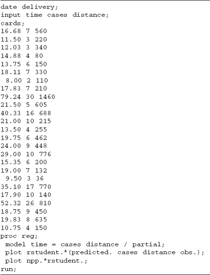
Table 4.2 gives the SAS source code for SAS version 9 to do residual analysis for the delivery time data. The partial option provides the partial regression plots. A common complaint about SAS is the quality of many of the plots generated by its procedures. These partial regression plots are prime examples. Version 9, however, upgrades some of the more important graphics plots for PROC REG. The first plot statement generates the studentized residuals versus predicted values, the studentized residuals versus the regressors, and the studentized residuals by time plots (assuming that the order in which the data are given is the actual time order). The second plot statement gives the normal probability plot of the studentized residuals.
As we noted, over the years the basic plots generated by SAS have been improved. Table 4.3 gives appropriate source code for earlier versions of SAS that produce “nice” residual plots. This code is important when we discuss plots from other SAS procedures that still do not generate nice plots. Basically this code uses the OUTPUT command to create a new data set that includes all of the previous delivery information plus the predicted values and the studentized residuals. It then uses the SASGRAPH features of SAS to generate the residual plots. The code uses PROC CAPABILITY to generate the normal probability plot. Unfortunately, PROC CAPABILITY by default produces a lot of noninteresting information in the output file.
TABLE 4.2 SAS Code for Residual Analysis of Delivery Time Data
We next illustrate how to use R to create appropriate residual plots. Once again, consider the delivery data. The first step is to create a space delimited file named delivery.txt. The names of the columns should be time, cases, and distance.
The R code to do the basic analysis and to create the appropriate residual plots based on the externally studentized residuals is:
deliver <- read.table(<delivery.txt=, header=TRUE, sep=< =)
deliver.model <- lm(time−cases+distance, data=deliver)
summary(deliver.model)
yhat <- deliver.model$fit
t <- rstudent(deliver.model)
qqnorm(t)
plot(yhat,t)
plot(deliver$x1,t)
plot(deliver$x2,t)
TABLE 4.3 Older SAS Code for Residual Analysis of Delivery Time Data

Generally, the graphics in R require a great deal of work in order to be of suitable quality. The commands
deliver2 <- cbind(deliver, yhat, t)
write.table(deliver2,<delivery_output.txt=)
create a file “delivery_output.txt” which the user than can import into his/her favorite package for doing graphics.
4.2.6 Other Residual Plotting and Analysis Methods
In addition to the basic residual plots discussed in Sections 4.2.3 and 4.2.4, there are several others that are occasionally useful. For example, it may be very useful to construct a scatterplot of regressor xi against regressor xj. This plot may be useful in studying the relationship between regressor variables and the disposition of the data in x space. Consider the plot of xi versus xj in Figure 4.10. This display indicates that xi and xj are highly positively correlated. Consequently, it may not be necessary to include both regressors in the model. If two or more regressors are highly correlated, it is possible that multicollinearity is present in the data. As observed in Chapter 3 (Section 3.10), multicollinearity can seriously disturb the least-squares fit and in some situations render the regression model almost useless. Plots of xi versus xj may also be useful in discovering points that are remote from the rest of the data and that potentially influence key model properties. Anscombe [1973] presents several other types of plots between regressors. Cook and Weisberg [1994] give a very modern treatment of regression graphics, including many advanced techniques not considered in this book.
Figure 4.11 is a scatterplot of x1 (cases) versus x2 (distance) for delivery time data from Example 3.1 (Table 3.2). Comparing Figure 4.11 with Figure 4.10, we see that cases and distance are positively correlated. In fact, the simple correlation between x1 and x2 is r12 = 0.82. While highly correlated regressors can cause a number of serious problems in regression, there is no strong indication in this example that any problems have occurred. The scatterplot clearly reveals that observation 9 is unusual with respect to both cases and distance (x1 = 30, x2 = 1460); in fact, it is rather remote in x space from the rest of the data. Observation 22 (x1 = 26, x2 = 810) is also quite far from the rest of the data. Points remote in x space can potentially control some of the properties of the regression model. Other formal methods for studying this are discussed in Chapter 6.

Figure 4.10 Plot of xi versus xj.

Figure 4.11 Plot of regressor x1 (cases) versus regressor x2 (distance for the delivery time data in Table 3.2.
The problem situation often suggests other types of residual plots. For example, consider the delivery time data in Example 3.1. The 25 observations in Table 3.2 were collected on truck routes in four different cities. Observations 1–7 were collected in San Diego, observations 8–17 in Boston, observations 18–23 in Austin, and observations 24 and 25 in Minneapolis. We might suspect that there is a difference in delivery operations from city to city due to such factors as different types of equipment, different levels of crew training and experience, or motivational factors influenced by management policies. These factors could result in a “site” effect that is not incorporated in the present equation. To investigate this, we plot the residuals by site in Figure 4.12. We see from this plot that there is some imbalance in the distribution of positive and negative residuals at each site. Specifically, there is an apparent tendency for the model to overpredict delivery times in Austin and underpredict delivery times in Boston. This could happen because of the site-dependent factors mentioned above or because one or more important regressors have been omitted from the model.
Statistical Tests on Residuals We may apply statistical tests to the residuals to obtain quantitative measures of some of the model inadequacies discussed above. For example, see Anscombe [1961, 1967], Anscombe and Tukey [1963], Andrews [1971], Looney and Gulledge [1985], Levine [1960], and Cook and Weisberg [1983]. Several formal statistical testing procedures for residuals are discussed in Draper and Smith [1998] and Neter, Kutner, Nachtsheim, and Wasserman [1996].
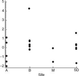
Figure 4.12 Plot of externally studentized residuals by site (city) for the delivery time data in Table 3.2.
In our experience, statistical tests on regression model residuals are not widely used. In most practical situations the residual plots are more informative than the corresponding tests. However, since residual plots do require skill and experience to interpret, the statistical tests may occasionally prove useful. For a good example of the use of statistical tests in conjunction with plots see Feder [1974].
4.3 PRESS STATISTIC
In Section 4.2.2 we defined the PRESS residuals as e(i) = yi – ŷ(i), where ŷ(i) is the predicted value of the ith observed response based on a model fit to the remaining n – 1 sample points. We noted that large PRESS residuals are potentially useful in identifying observations where the model does not fit the data well or observations for which the model is likely to provide poor future predictions.
Allen [1971, 1974] has suggested using the prediction error sum of squares (or the PRESS statistic), defined as the sum of the squared PRESS residuals, as a measure of model quality. The PRESS statistic is

PRESS is generally regarded as a measure of how well a regression model will perform in predicting new data. A model with a small value of PRESS is desired.
Example 4.6 The Delivery Time Data
Column 5 of Table 4.1 shows the calculations of the PRESS residuals for the delivery time data of Example 3.1. Column 7 of Table 4.1 contains the squared PRESS residuals, and the PRESS statistic is shown at the foot of this column. The value of PRESS = 457.4000 is nearly twice as large as the residual sum of squares for this model, SSRes = 233.7260. Notice that almost half of the PRESS statistic is contributed by point 9, a relatively remote point in x space with a moderately large residual. This indicates that the model will not likely predict new observations with large case volumes and long distances particularly well.
R2 for Prediction Based on PRESS The PRESS statistic can be used to compute an R2-like statistic for prediction, say
This statistic gives some indication of the predictive capability of the regression model. For the soft drink delivery time model we find
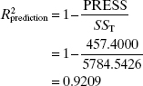
Therefore, we could expect this model to “explain” about 92.09% of the variability in predicting new observations, as compared to the approximately 95.96% of the variability in the original data explained by the least-squares fit. The predictive capability of the model seems satisfactory, overall. However, recall that the individual PRESS residuals indicated that observations that are similar to point 9 may not be predicted well.
Using PRESS to Compare Models One very important use of the PRESS statistic is in comparing regression models. Generally, a model with a small value of PRESS is preferable to one where PRESS is large. For example, when we added x2 = distance to the regression model for the delivery time data containing x1 = cases, the value of PRESS decreased from 733.55 to 457.40. This is an indication that the two-regressor model is likely to be a better predictor than the model containing only x1 = cases.
4.4 DETECTION AND TREATMENT OF OUTLIERS
An outlier is an extreme observation; one that is considerably different from the majority of the data. Residuals that are considerably larger in absolute value than the others, say three or four standard deviations from the mean, indicate potential y space outliers. Outliers are data points that are not typical of the rest of the data. Depending on their location in x space, outliers can have moderate to severe effects on the regression model (e.g., see Figures 2.6–2.8). Residual plots against ŷi and the normal probability plot are helpful in identifying outliers. Examining scaled residuals, such as the studentized and R-student residuals, is an excellent way to identify potential outliers. An excellent general treatment of the outlier problems is in Barnett and Lewis [1994]. Also see Myers [1990] for a good discussion.
Outliers should be carefully investigated to see if a reason for their unusual behavior can be found. Sometimes outliers are “bad” values, occurring as a result of unusual but explainable events. Examples include faulty measurement or analysis, incorrect recording of data, and failure of a measuring instrument. If this is the case, then the outlier should be corrected (if possible) or deleted from the data set. Clearly discarding bad values is desirable because least squares pulls the fitted equation toward the outlier as it minimizes the residual sum of squares. However, we emphasize that there should be strong nonstatistical evidence that the outlier is a bad value before it is discarded.
Sometimes we find that the outlier is an unusual but perfectly plausible observation. Deleting these points to “improve the fit of the equation” can be dangerous, as it can give the user a false sense of precision in estimation or prediction. Occasionally we find that the outlier is more important than the rest of the data because it may control many key model properties. Outliers may also point out inadequacies in the model, such as failure to fit the data well in a certain region of x space. If the outlier is a point of particularly desirable response (e.g., low cost, high yield), knowledge of the regressor values when that response was observed may be extremely valuable. Identification and follow-up analyses of outliers often result in process improvement or new knowledge concerning factors whose effect on the response was previously unknown.
Various statistical tests have been proposed for detecting and rejecting outliers. For example, see Barnett and Lewis [1994]. Stefansky [1971, 1972] has proposed an approximate test for identifying outliers based on the maximum normed residual ![]() that is particularly easy to apply. Examples of this test and other related references are in Cook and Prescott [1981], Daniel [1976], and Williams [1973]. See also Appendix C.9. While these tests may be useful for identifying outliers, they should not be interpreted to imply that the points so discovered should be automatically rejected. As we have noted, these points may be important clues containing valuable information.
that is particularly easy to apply. Examples of this test and other related references are in Cook and Prescott [1981], Daniel [1976], and Williams [1973]. See also Appendix C.9. While these tests may be useful for identifying outliers, they should not be interpreted to imply that the points so discovered should be automatically rejected. As we have noted, these points may be important clues containing valuable information.
The effect of outliers on the regression model may be easily checked by dropping these points and refitting the regression equation. We may find that the values of the regression coefficients or the summary statistics such as the t or F statistic, R2, and the residual mean square may be very sensitive to the outliers. Situations in which a relatively small percentage of the data has a significant impact on the model may not be acceptable to the user of the regression equation. Generally we are happier about assuming that a regression equation is valid if it is not overly sensitive to a few observations. We would like the regression relationship to be embedded in all of the observations and not merely an artifice of a few points.
Example 4.7 The Rocket Propellant Data
Figure 4.13 presents the normal probability plot of the externally studentized residuals and the plot of the externally studentized residuals versus the predicted ŷi for the rocket propellant data introduced in Example 2.1. We note that there are two large negative residuals that lie quite far from the rest (observations 5 and 6 in Table 2.1). These points are potential outliers. These two points tend to give the normal probability plot the appearance of one for skewed data. Note that observation 5 occurs at a relatively low value of age (5.5 weeks) and observation 6 occurs at a relatively high value of age (19 weeks). Thus, these two points are widely separated in x space and occur near the extreme values of x, and they may be influential in determining model properties. Although neither residual is excessively large, the overall impression from the residual plots (Figure 4.13) is that these two observations are distinctly from the others.
To investigate the influence of these two points on the model, a new regression equation is obtained with observations 5 and 6 deleted. A comparison of the summary statistics from the two models is given below.

Figure 4.13 Externally studentized residual plots for the rocket propellant data: (a) the normal probability plot; (b) residuals versus predicted ŷi.
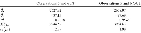
Deleting points 5 and 6 has almost no effect on the estimates of the regression coefficients. There has, however, been a dramatic reduction in the residual mean square, a moderate increase in R2, and approximately a one-third reduction in the standard error of ![]()
Since the estimates of the parameters have not changed dramatically, we conclude that points 5 and 6 are not overly influential. They lie somewhat off the line passing through the other 18 points, but they do not control the slope and intercept. However, these two residuals make up approximately 56% of the residual sum of squares. Thus, if these points are truly bad values and should be deleted, the precision of the parameter estimates would be improved and the widths of confidence and prediction intervals could be substantially decreased.
Figure 4.14 shows the normal probability plot of the externally studentized residuals and the plot of the externally studentized residuals versus ŷi for the model with points 5 and 6 deleted. These plots do not indicate any serious departures from assumptions.
Further examination of points 5 and 6 fails to reveal any reason for the unusually low propellant shear strengths obtained. Therefore, we should not discard these two points. However, we feel relatively confident that including them does not seriously limit the use of the model.

Figure 4.14 Residual plots for the rocket propellant data with observations 5 and 6 removed: (a) the normal probability plot; (b) residuals versus predicted ŷi.
4.5 LACK OF FIT OF THE REGRESSION MODEL
A famous quote attributed to George Box is “All models are wrong; some models are useful.” This comment goes to heart of why tests for lack-of-fit are important. In basic English, lack-of-fit is “the terms that we could have fit to the model but chose not to fit.” For example, only two distinct points are required to fit a straight line. If we have three distinct points, then we could fit a parabola (a second-order model). If we choose to fit only the straight line, then we note that in general the straight line does not go through all three points. We typically assume that this phenomenon is due to error. On the other hand, the true underlying mechanism could really be quadratic. In the process, what we claim to be random error is actually a systematic departure as the result of not fitting enough terms. In the simple linear regression context, if we have n distinct data points, we can always fit a polynomial of order up to n – 1. When we choose to fit a straight line, we give up n – 2 degrees of freedom to estimate the error term when we could have chosen to fit these other higher-order terms.
4.5.1 A Formal Test for Lack of Fit
The formal statistical test for the lack of fit of a regression model assumes that the normality, independence, and constant-variance requirements are met and that only the first-order or straight-line character of the relationship is in doubt. For example, consider the data in Figure 4.15. There is some indication that the straight-line fit is not very satisfactory. Perhaps, a quadratic term (x2) should be added, or perhaps another regressor should be added. It would be helpful to have a test procedure to determine if systematic lack of fit is present.
The lack-of-fit test requires that we have replicate observations on the response y for at least one level of x. We emphasize that these should be true replications, not just duplicate readings or measurements of y. For example, suppose that y is product viscosity and x is temperature. True replication consists of running ni separate experiments at x = xi and observing viscosity, not just running a single experiment at xi and measuring viscosity ni times. The readings obtained from the latter procedure provide information only on the variability of the method of measuring viscosity. The error variance σ2 includes this measurement error and the variability associated with reaching and maintaining the same temperature level in different experiments. These replicated observations are used to obtain a model-independent estimate of σ2.
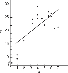
Figure 4.15 Data illustrating lack of fit of the straight-line model.
Suppose that we have ni observations on the response at the ith level of the regressor xi, i = 1, 2, …, m. Let yij denote the jth observation on the response at xi, i = 1, 2, …, m and j = 1, 2, …, ni. There are total observations. The test procedure involves partitioning the residual sum of squares into two components, say
![]()
where SSPE is the sum of squares due to pure error and SSLOF is the sum of squares due to lack of fit.
To develop this partitioning of SSRes, note that the (ij)th residual is
where ![]() i is the average of the ni observations at xi. Squaring both sides of Eq. (4.19) and summing over i and j yields
i is the average of the ni observations at xi. Squaring both sides of Eq. (4.19) and summing over i and j yields
since the cross-product term equals zero.
The left-hand side of Eq. (4.20) is the usual residual sum of squares. The two components on the right-hand side measure pure error and lack of fit. We see that the pure-error sum of squares
is obtained by computing the corrected sum of squares of the repeat observations at each level of x and then pooling over the m levels of x. If the assumption of constant variance is satisfied, this is a model-independent measure of pure error since only the variability of the y's at each x level is used to compute SSPE. Since there are ni – 1 degrees of freedom for pure error at each level xi, the total number of degrees of freedom associated with the pure-error sum of squares is
The sum of squares for lack of fit
is a weighted sum of squared deviations between the mean response ![]() i at each x level and the corresponding fitted value. If the fitted values ŷi are close to the corresponding average responses
i at each x level and the corresponding fitted value. If the fitted values ŷi are close to the corresponding average responses ![]() i, then there is a strong indication that the regression function is linear. If the ŷi deviate greatly from the
i, then there is a strong indication that the regression function is linear. If the ŷi deviate greatly from the ![]() i, then it is likely that the regression function is not linear. There are m – 2 degrees of freedom associated with SSLOF, since there are m levels of x and two degrees of freedom are lost because two parameters must be estimated to obtain the
i, then it is likely that the regression function is not linear. There are m – 2 degrees of freedom associated with SSLOF, since there are m levels of x and two degrees of freedom are lost because two parameters must be estimated to obtain the ![]() i. Computationally we usually obtain SSLOF by subtracting SSPE from SSRes.
i. Computationally we usually obtain SSLOF by subtracting SSPE from SSRes.
The test statistic for lack of fit is
The expected value of MSPE is σ2, and the expected value of MSLOF is
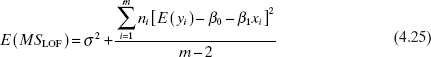
If the true regression function is linear, then E(yi) = β0 + β1xi, and the second term of Eq. (4.25) is zero, resniting in E(MSLOF) = σ2. However, if the true regression function is not linear, then E(yi) ≠ β0 + β1x, and E(MSLOF) > σ2. Furthermore, if the true regression function is linear, then the statistic F0 follows the Fm–2,n–m distribution. Therefore, to test for lack of fit, we would compute the test statistic F0 and conclude that the regression function is not linear if F0 > Fα, m–2,n–m.
This test procedure may be easily introduced into the analysis of variance conducted for significance of regression. If we conclude that the regression function is not linear, then the tentative model must be abandoned and attempts made to find a more appropriate equation. Alternatively, if F0 does not exceed Fα, m–2,n–m, there is no strong evidence of lack of fit, and MSPE and MSLOF are often combined to estimate σ2.
Ideally, we find that the F ratio for lack of fit is not significant, and the hypothesis of significance of regression (H0: β1 = 0) is rejected. Unfortunately, this does not guarantee that the model will be satisfactory as a prediction equation. Unless the variation of the predicted values is large relative to the random error, the model is not estimated with sufficient precision to yield satisfactory predictions. That is, the model may have been fitted to the errors only. Some analytical work has been done on developing criteria for judging the adequacy of the regression model from a prediction point of view. See Box and Wetz [1973], Ellerton [1978], Gunst and Mason [1979], Hill, Judge, and Fomby [1978], and Suich and Derringer [1977]. The Box and Wetz work suggests that the observed F ratio must be at least four or five times the critical value from the F table if the regression model is to be useful as a predictor, that is, if the spread of predicted values is to be large relative to the noise.
A relatively simple measure of potential prediction performance is found by comparing the range of the fitted values ŷi (i.e., ŷmax – ŷmin) to their average standard error. It can be shown that, regardless of the form of the model, the average variance of the fitted values is
where p is the number of parameters in the model. In general, the model is not likely to be a satisfactory predictor unless the range of the fitted values ŷi is large relative to their average estimated standard error ![]() , where
, where ![]() is a model-independent estimate of the error variance.
is a model-independent estimate of the error variance.
Example 4.8 Testing for Lack of Fit
The data from Figure 4.15 are shown below:
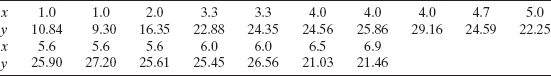
The straight-line fit is ŷi=13.301+2.108x, with SST = 487.6126, SSR = 234.7087, and SSRes = 252.9039. Note that there are 10 distinct levels of x, with repeat points at x = 1.0, x = 3.3, x = 4.0, x = 5.6, and x = 6.0. The pure-error sum of squares is computed using the repeat points as follows:

The lack-of-fit sum of squares is found by subtraction as
![]()
with m − 2 = 10 − 2 = 8 degrees of freedom. The analysis of variance incorporating the lack-of-fit test is shown in Table 4.4. The lack-of-fit test statistic is F0 = 13.34, and since the P value is very small, we reject the hypothesis that the tentative model adequately describes the data.
TABLE 4.4 Analysis of Variance for Example 4.8

Example 4.9 Testing for Lack of Fit in JMP
Some software packages will perform the lack of fit test automatically if there are replicate observations in the data. In the patient satisfaction data of Appendix Table B.17 there are replicate observations in the severity predictor (they occur at 30, 31, 38, 42, 28, and 50). Figure 4.16 is a portion of the JMP output that results from fitting a simple linear regression model to these data. The F-test for lack of fit in Equation 4.24 is shown in the output. The P-value is 0.0874, so there is some mild indication of lack of fit. Recall from Section 3.6 that when we added the second predictor (age) to this model the quality of the overall fit improved considerably. As this example illustrates, sometimes lack of fit is caused by missing regressors; it isn't always necessary to add higher-order terms to the model.
4.5.2 Estimation of Pure Error from Near Neighbors
In Section 4.5.1 we described a test for lack of fit for the linear regression model. The procedure involved partitioning the error or residual sum of squares into a component due to “pure” error and a component due to lack of fit:
![]()
The pure-error sum of squares SSPE is computed using responses at repeat observations at the same level of x. This is a model-independent estimate of σ2.
This general procedure can in principle be applied to any regression model. The calculation of SSPE requires repeat observations on the response y at the same set of levels on the regressor variables x1, x2, …, xk. That is, some of the rows of the X matrix must be the same. However, repeat observations do not often occur in multiple regression, and the procedure described in Section 4.5.1 is not often useful.
Daniel and Wood [1980] and Joglekar, Schuenemeyer, and La Riccia [1989] have investigated methods for obtaining a model-independent estimate of error when there are no exact repeat points. These procedures search for points in x space that are near neighbors, that is, sets of observations that have been taken with nearly identical levels of x1, x2, …, xk. The responses yi from such near neighbors can be considered as repeat points and used to obtain an estimate of pure error. As a measure of the distance between any two points, for example, xi1, xi2, …, xik and xi′1, xi′2, …, xi′k, we will use the weighted sum of squared distance (WSSD)

Figure 4.16 JMP output for the simple linear regression model relating satisfaction to severity.
Pairs of points that have small values of ![]() are “near neighbors,” that is, they are relatively close together in x space. Pairs of points for which
are “near neighbors,” that is, they are relatively close together in x space. Pairs of points for which ![]() is large (e.g.,
is large (e.g., ![]() »1) are widely separated in x space. The residuals at two points with a small value of
»1) are widely separated in x space. The residuals at two points with a small value of ![]() can be used to obtain an estimate of pure error. The estimate is obtained from the range of the residuals at the points i and i′, say
can be used to obtain an estimate of pure error. The estimate is obtained from the range of the residuals at the points i and i′, say
There is a relationship between the range of a sample from a normal population and the population standard deviation. For samples of size 2, this relationship is
![]()
The quantity ![]() so obtained is an estimate of the standard deviation of pure error.
so obtained is an estimate of the standard deviation of pure error.
An efficient algorithm may be used to compute this estimate. A computer program for this algorithm is given in Montgomery, Martin, and Peck [1980]. First arrange the data points xi1, xi2, …, xik in order of increasing ŷi. Note that points with very different values of ŷi cannot be near neighbors, but those with similar values of ŷi could be neighbors (or they could be near the same contour of constant ŷi but far apart in some x coordinates). Then:
- Compute the values of
 for all n – 1 pairs of points with adjacent values of ŷ. Repeat this calculation for the pairs of points separated by one, two, and three intermediate ŷ values. This will produce 4n – 10 values of .
 - Arrange the 4n – 10 values of found in 1 above in ascending order. Let Eu, u = 1, 2, …, 4n – 10, be the range of the residuals at these points.
- For the first m values of Eu, calculate an estimate of the standard deviation of pure error as
Note that
 is based on the average range of the residuals associated with the m smallest values of ; m must be chosen after inspecting the values of . One should not include values of Eu in the calculations for which the weighted sum of squared distance is too large.
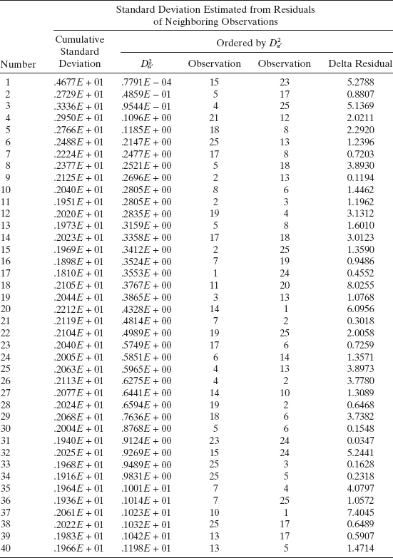
Example 4.10 The Delivery Time Data
We use the procedure described above to calculate an estimate of the standard deviation of pure error for the soft drink delivery time data from Example 3.1. Table 4.5 displays the calculation of ![]() for pairs of points that, in terms of ŷ, are adjacent, one apart, two apart, and three apart. The R columns in this table identify the 15 smallest values of
for pairs of points that, in terms of ŷ, are adjacent, one apart, two apart, and three apart. The R columns in this table identify the 15 smallest values of ![]() . The residuals at these 15 pairs of points are used to estimate σ. These calculations yield
. The residuals at these 15 pairs of points are used to estimate σ. These calculations yield ![]() = 1.969 and are summarized in Table 4.6. From Table 3.4, we find that
= 1.969 and are summarized in Table 4.6. From Table 3.4, we find that ![]() Now if there is no appreciable lack of fit, we would expect to find that
Now if there is no appreciable lack of fit, we would expect to find that ![]() . In this case
. In this case ![]() is about 65% larger than
is about 65% larger than ![]() , indicating some lack of fit. This could be due to the effects of regressors not presently in the model or the presence of one or more outliers.
, indicating some lack of fit. This could be due to the effects of regressors not presently in the model or the presence of one or more outliers.
TABLE 4.5 Calculation of ![]() for Example 4.10
for Example 4.10
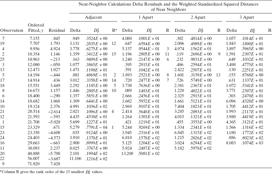
TABLE 4.6 Calculation of ![]() for Example 4.10
for Example 4.10
PROBLEMS
4.1 Consider the simple regression model fit to the National Football League team performance data in Problem 2.1.
- Construct a normal probability plot of the residuals. Does there seem to be any problem with the normality assumption?
- Construct and interpret a plot of the residuals versus the predicted response.
- Plot the residuals versus the team passing yardage, x2. Does this plot indicate that the model will be improved by adding x2 to the model?
4.2 Consider the multiple regression model fit to the National Football League team performance data in Problem 3.1.
- Construct a normal probability plot of the residuals. Does there seem to be any problem with the normality assumption?
- Construct and interpret a plot of the residuals versus the predicted response.
- Construct plots of the residuals versus each of the regressor variables. Do these plots imply that the regressor is correctly specified?
- Construct the partial regression plots for this model. Compare the plots with the plots of residuals versus regressors from part c above. Discuss the type of information provided by these plots.
- Compute the studentized residuals and the R-student residuals for this model. What information is conveyed by these scaled residuals?
4.3 Consider the simple linear regression model fit to the solar energy data in Problem 2.3.
- Construct a normal probability plot of the residuals. Does there seem to be any problem with the normality assumption?
- Construct and interpret a plot of the residuals versus the predicted response.
4.4 Consider the multiple regression model fit to the gasoline mileage data in Problem 3.5.
- Construct a normal probability plot of the residuals. Does there seem to be any problem with the normality assumption?
- Construct and interpret a plot of the residuals versus the predicted response.
- Construct and interpret the partial regression plots for this model.
- Compute the studentized residuals and the R-student residuals for this model. What information is conveyed by these scaled residuals?
4.5 Consider the multiple regression model fit to the house price data in Problem 3.7.
- Construct a normal probability plot of the residuals. Does there seem to be any problem with the normality assumption?
- Construct and interpret a plot of the residuals versus the predicted response.
- Construct the partial regression plots for this model. Does it seem that some variables currently in the model are not necessary?
- Compute the studentized residuals and the R-student residuals for this model. What information is conveyed by these scaled residuals?
4.6 Consider the simple linear regression model fit to the oxygen purity data in Problem 2.7.
- Construct a normal probability plot of the residuals. Does there seem to be any problem with the normality assumption?
- Construct and interpret a plot of the residuals versus the predicted response.
4.7 Consider the simple linear regression model fit to the weight and blood pressure data in Problem 2.10.
- Construct a normal probability plot of the residuals. Does there seem to be any problem with the normality assumption?
- Construct and interpret a plot of the residuals versus the predicted response.
- Suppose that the data were collected in the order shown in the table. Plot the residuals versus time order and comment on the plot.
4.8 Consider the simple linear regression model fit to the steam plant data in Problem 2.12.
- Construct a normal probability plot of the residuals. Does there seem to be any problem with the normality assumption?
- Construct and interpret a plot of the residuals versus the predicted response.
- Suppose that the data were collected in the order shown in the table. Plot the residuals versus time order and comment on the plot.
4.9 Consider the simple linear regression model fit to the ozone data in Problem 2.13.
- Construct a normal probability plot of the residuals. Does there seem to be any problem with the normality assumption?
- Construct and interpret a plot of the residuals versus the predicted response.
- Plot the residuals versus time order and comment on the plot.
4.10 Consider the simple linear regression model fit to the copolyester viscosity data in Problem 2.14.
- Construct a normal probability plot of the unscaled residuals. Does there seem to be any problem with the normality assumption?
- Repeat part a using the studentized residuals. Is there any substantial difference in the two plots?
- Construct and interpret a plot of the residuals versus the predicted response.
4.11 Consider the simple linear regression model fit to the toluene–tetralin viscosity data in Problem 2.15.
- Construct a normal probability plot of the residuals. Does there seem to be any problem with the normality assumption?
- Construct and interpret a plot of the residuals versus the predicted response.
4.12 Consider the simple linear regression model fit to the tank pressure and volume data in Problem 2.16.
- Construct a normal probability plot of the residuals. Does there seem to be any problem with the normality assumption?
- Construct and interpret a plot of the residuals versus the predicted response.
- Suppose that the data were collected in the order shown in the table. Plot the residuals versus time order and comment on the plot.
4.13 Problem 3.8 asked you to fit two different models to the chemical process data in Table B.5. Perform appropriate residual analyses for both models. Discuss the results of these analyses. Calculate the PRESS statistic for both models. Do the residual plots and PRESS provide any insight regarding the best choice of model for the data?
4.14 Problems 2.4 and 3.5 asked you to fit two different models to the gasoline mileage data in Table B.3. Calculate the PRESS statistic for these two models. Based on this statistic, which model is most likely to provide better predictions of new data?
4.15 In Problem 3.9, you were asked to fit a model to the tube-flow reactor data in Table B.6.
- Construct a normal probability plot of the residuals. Does there seem to be any problem with the normality assumption?
- Construct and interpret a plot of the residuals versus the predicted response.
- Construct the partial regression plots for this model. Does it seem that some variables currently in the model are not necessary?
4.16 In Problem 3.12, you were asked to fit a model to the clathrate formation data in Table B.8.
- Construct a normality plot of the residuals from the full model. Does there seem to be any problem with the normality assumption?
- Construct and interpret a plot of the residuals versus the predicted response.
- In Problem 3.12, you were asked to fit a second model. Compute the PRESS statistic for both models. Based on this statistic, which model is most likely to provide better predictions of new data?
4.17 In Problem 3.14, you were asked to fit a model to the kinematic viscosity data in Table B.10.
- Construct a normality plot of the residuals from the full model. Does there seem to be any problem with the normality assumption?
- Construct and interpret a plot of the residuals versus the predicted response.
- In Problem 3.14, you were asked to fit a second model. Compute the PRESS statistic for both models. Based on this statistic, which model is most likely to provide better predictions of new data?
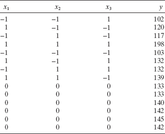
4.18 Coteron, Sanchez, Martinez, and Aracil (“Optimization of the Synthesis of an Analogue of Jojoba Oil Using a Fully Central Composite Design,” Canadian Journal of Chemical Engineering, 1993) studied the relationship of reaction temperature x1, initial amount of catalyst x2, and pressure x3 on the yield of a synthetic analogue to jojoba oil. The following table summarizes the experimental results.
- Perform a thorough analysis of the results including residual plots.
- Perform the appropriate test for lack of fit.
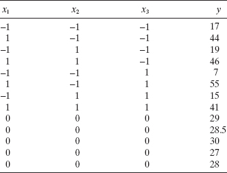
4.19 Derringer and Suich (“Simultaneous Optimization of Several Response Variables,” Journal of Quality Technology, 1980) studied the relationship of an abrasion index for a tire tread compound in terms of three factors: x1, hydrated silica level; x2, silane coupling agent level; and x3, sulfur level. The following table gives the actual results.
- Perform a thorough analysis of the results including residual plots.
- Perform the appropriate test for lack of fit.
4.20 Myers Montgomery and Anderson-Cook (Response Surface Methodology 3rd edition, Wiley, New York, 2009) discuss an experiment to determine the influence of five factors:
- x1—acid bath temperature
- x2—cascade acid concentration
- x3—water temperature
- x4—sulfide concentration
- x5—amount of chlorine bleach
on an appropriate measure of the whiteness of rayon (y). The engineers conducting this experiment wish to minimize this measure. The experimental results follow.

- Perform a thorough analysis of the results including residual plots.
- Perform the appropriate test for lack of fit.
4.21 Consider the test for lack of fit. Find E(MSPE) and E(MSLOF).
4.22 Table B.14 contains data on the transient points of an electronic inverter. Using only the regressors x1, …, x4, fit a multiple regression model to these data.
- Investigate the adequacy of the model.
- Suppose that observation 2 was recorded incorrectly. Delete this observation, refit the model, and perform a thorough residual analysis. Comment on the difference in results that you observe.
4.23 Consider the advertising data given in Problem 2.18.
- Construct a normal probability plot of the residuals from the full model. Does there seem to be any problem with the normality assumption?
- Construct and interpret a plot of the residuals versus the predicted response.
4.24 Consider the air pollution and mortality data given in Problem 3.15 and Table B.15.
- Construct a normal probability plot of the residuals from the full model. Does there seem to be any problem with normality assumption?
- Construct and interpret a plot of the residuals versus the predicted response.
4.25 Consider the life expectancy data given in Problem 3.16 and Table B.16.
- For each model construct a normal probability plot of the residuals from the full model. Does there seem to be any problem with the normality assumption?
- For each model construct and interpret a plot of the residuals versus the predicted response.
4.26 Consider the multiple regression model for the patient satisfaction data in Section 3.6. Analyse the residuals from this model and comment on model adequacy.
4.27 Consider the fuel consumption data in Table B.18. For the purposes of this exercise, ignore regressor x1. Perform a thorough residual analysis of these data. What conclusions do you draw from this analysis?
4.28 Consider the wine quality of young red wines data in Table B.19. For the purposes of this exercise, ignore regressor x1. Perform a thorough residual analysis of these data. What conclusions do you draw from this analysis?
4.29 Consider the methanol oxidation data in Table B.20. Perform a thorough analysis of these data. What conclusions do you draw from this residual analysis?
† These interpretations assume that the ranked residuals are plotted on the horizontal axis. If the residuals are plotted on the vertical axis, as some computer systems do, the interpretation is reversed.
† The residuals should be plotted versus the fitted values ŷi and not the observed values yi because the ei and the ŷi are uncorrelated while the ei and the yi are usually correlated. The proof of this statement in Appendix C.10.