
Chapter 11: User Interface Design
Everything that is shown on the screen and transmits through the speakers of a computer is forms of communication. In previous chapters, we used three-dimensional models to let the user know that they are in a base in the middle of the mountains, and we reinforced that idea with the appropriate sound and music. But for our game, we need to communicate other information, such as the amount of life the user has left, the current score, and so on, and sometimes, it is difficult to express these things using the in-game graphics (there are some successful cases that manage to do this, such as Dead Space, but let's keep things simple). In order to transmit this information, we will add another layer of graphics on top of our scene, which is usually called the User Interface (UI) or Heads-Up Display (HUD).
This will contain different visual elements, such as text fields, bars, and buttons, to prepare the user to take an informed decision based on things such as fleeing to a safe place when their life is low:

Figure 11.1 – Character creation UI displays info about the character stats with numbers
In this chapter, we will examine the following UI concepts:
- Understanding Canvas and RectTransform
- Canvas object types
- Creating a responsive UI
By the end of this chapter, you will be able to use the Unity UI system to create interfaces capable of informing the user about the state of the game and allowing them to take action by pressing buttons. Let's start discussing one of the basic concepts of the Unity UI system—RectTransform.
Understanding Canvas and RectTransform
Currently, there are three UI systems available in Unity for different purposes:
- UI Elements: A system to extend the Unity Editor with custom windows and tools. This uses several web concepts, such as stylesheets and XML-based language, to lay out your UI. In the future, it will be available to use in-game.
- Unity UI: A GameObject-based UI only applicable for in-game UIs (not editor extensions). You create it using GameObjects and components like any other object we have edited so far.
- IMGUI: A legacy code-based UI created entirely by using scripting. A long time ago, this was the only UI system used in both the editor and the in-game UI. Nowadays, it is only used to extend the editor and will soon be completely replaced by UI Elements.
In this chapter, we are only going to focus on in-game UI to communicate different information to the player regarding the state of the game, so we are going to use Unity UI. At the time of writing this book, there are plans to replace Unity UI with UI Elements, but there's no estimated date as to when this will happen. Anyway, even if Unity releases UI Elements as an in-game UI system soon, Unity UI will still be there for a while and is perfectly capable of handling all types of UI that you need to create.
If you are going to work with Unity UI, you first need to understand its two main concepts—Canvas and RectTransform. Canvas is the master object that will contain and render our UI and RectTransform is the feature in charge of positioning and adapting each UI element on our screen.
In this section, we will examine the following Unity UI concepts:
- Creating a UI with Canvas
- Positioning elements with RectTransform
Let's start using the Canvas component to create our UI.
Creating a UI with Canvas
In Unity UI, each image, text, and element you see in the UI is a GameObject with a set of proper components, but in order for them to work, they must be a child of a master GameObject with the Canvas component. This component is responsible for triggering the UI generation and drawing iterations over each child object. We can configure this component to specify exactly how that process works and adapt it to different possible requirements.
To start, you can simply create a canvas with the GameObject | UI | Canvas option. After doing that, you will see a rectangle in the scene, which represents the user screen, so you can put elements inside it and preview where they will be located relative to the user's monitor. You can see an example of this rectangle in the following screenshot:

Figure 11.2 – Canvas screen rectangle
You are probably wondering two things here. First, "why is the rectangle is in the middle of the scene? I want it to always be on the screen!". Don't worry because that will exactly be the case. When you edit the UI, you will see it as part of the level, as an object inside it, but when you play the game, it will be always projected over the screen, on top of every object. Also, you may be wondering why the rectangle is huge, and that's because one pixel of the screen maps to one meter on the scene. So again, don't worry about that; you will see all your UI elements in their proper size and position on the user's screen when you see the game in Game view.
Before adding elements to our UI, it's worth noting that when you created the UI, a second object is created alongside the canvas, called Event System. This object is not necessary to render a UI, but is necessary if you want the UI to be interactable, which means including actions such as clicking buttons, introducing text in fields, or navigating the UI with the joystick. The EventSystem component is responsible for sampling the user input, such as with a keyboard, mouse, or joystick, and sending that data to the UI to react accordingly. We can change the exact buttons to interact with the UI, but the defaults are OK for now, so just know that you need this object if you want to interact with the UI. If for some reason you delete the object, you can recreate it again in GameObject | UI | Event System.
Now that we have the base objects to create our UI, let's add elements to it.
Positioning elements with RectTransform
In Unity UI, each image, text, and element you see in the UI is a GameObject with a set of proper components according to its usage, but you will see that most of them have one component in common—RectTransform. Each piece of the UI is essentially a rectangle filled with text or images and has different behavior, so it is important to understand how the RectTransform component works and how to edit it.
In order to experiment with this component, let's create and edit the position of a simple white rectangle element for the UI by doing the following:
- Go to GameObject | UI | Image. After that, you will see that a new GameObject is created within the Canvas element. Unity will take care of setting any new UI element as a child of Canvas; outside it, the element will not be visible:

Figure 11.3 – A default image UI element—a white box
- Click on the 2D button in the top bar of the Scene view. This will just change the perspective of the Scene view to one that is better suited to edit the UI (and also two-dimensional games):

Figure 11.4 – The 2D button location
- Double-click on the canvas in the Hierarchy window to make the UI fit entirely in the Scene view. This will allow us to edit the UI clearly. You can also navigate the UI using the mouse scroll wheel to zoom, and click and drag the scroll wheel to pan the camera:

Figure 11.5 – The Scene view in 2D edit mode
- Disable the PPVolume object to disable postprocessing. The final UI won't have postprocessing, but the editor view still applies it. Remember to re-enable it later:

Figure 11.6 – Disabling a game object—in this case, the postprocessing volume
- Enable (if it is not already enabled) the RectTrasform tool, which is the fifth button in the top-left part of the Unity Editor (or press the T key). That will enable the rectangle gizmo, which allows you to move, rotate, and scale two-dimensional elements. You can use the usual transform, rotate, and scale gizmos, which were the ones we used in 3D mode, but the rectangle gizmo causes less trouble, especially with scaling:
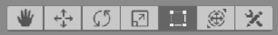
Figure 11.7 – The rectangle gizmo button
- Using the rectangle gizmo, drag the object to move it, use the blue dots to change its size, or locate the mouse in a tricky position near the blue dots to rotate it. Consider that resizing the object using this gizmo is not the same as scaling the object, but more on that in a moment:

Figure 11.8 – The rectangle gizmo for editing two-dimensional elements
- In the Inspector window, notice that after changing the size of the UI element, the Rect Transform setting's Scale property is still at (1, 1, 1), but you can see how the Width and Height properties changed. Rect Transform is essentially a classic transform but with Width and Height added (among other properties to explore later). You can set the exact values you want here expressed in pixels:

Figure 11.9 – The Rect Transform properties
Now that we know the very basics of how to position any UI object, let's explore the different types of elements you can add to Canvas.
Canvas objects types
So far, we have used the simplest Canvas object type—a white box—but there are plenty of other object types we can use, such as images, buttons, text, and much more. All of them use RectTransform to define their display area, but each one has its own concepts and configurations to understand.
In this section, we will explore the following Canvas object concepts:
- Integrating assets for the UI
- Creating UI controls
Let's first start exploring how we can integrate images and fonts to use in our canvas so that we can integrate them in our UI using the Images and Text UI object types.
Integrating assets for the UI
Before making our UI use nice graphics assets, we need, as always, to integrate them properly into Unity. In the following screenshot, you will find the UI design we proposed in Chapter 1, Designing a Game From Scratch:

Figure 11.10 – Chapter 1's UI design
On top of that, we will add a Pause menu, which will be activated when the user presses Esc. It will look as in the following screenshot:

Figure 11.11 – The Pause menu design
Based on these designs, we can determine that we will need the following assets:
- The hero's avatar image
- A health bar image
- A Pause menu background image
- A Pause menu buttons image
- Font for the text
As always, we can find the required assets on the internet or on Asset Store. In my case, I will use a mixture of both. Let's start with the simplest one—the avatar. Take the following steps:
- Download the avatar you want from the internet:

Figure 11.12 – Downloaded avatar asset
- Add it into your project, either by dragging it to the Project window or by using the Assets | Import New Asset option. Add it to a Sprites folder.
- Select the texture and in the Inspector window, set the Texture Type setting to Sprite (2D and UI). All textures are prepared to be used in 3D by default. This option prepares everything to be used in 2D.
For the bars, buttons, and the window background, I will use Asset Store to look for a UI pack. In my case, I found the package in the following screenshot a good one to start my UI. As usual, remember that this exact package might not be available right now. In that case remember to look for another similar package, or pick the Sprites from the GitHub repo:

Figure 11.13 – Selected UI pack
At first, the pack contains lots of images configured the same way, as sprites, but we can further modify the import settings to achieve advanced behavior, as we will need for the buttons. The button asset comes with a fixed size, but what happens if you need a bigger button? One option is to use other button assets with different sizes, but this will lead to a lot of repetitions of the buttons and other assets, such as different-sized backgrounds for different windows, which will consume unnecessary RAM. Another option is to use the nine slices method, which consists of splitting an image so that the corners are separated from the other parts. This allows Unity to stretch the middle parts of the image to fit different sizes, keeping the corners at their original size, which, when combined with a clever image, can be used to create almost any size you need. In the following diagram, you can see a shape with nine slices in the bottom-left corner, and at the bottom-right corner of the same diagram, you can see the shape is stretched but keeps its corners at their original size. The top-right corner shows the shape stretched without slices. You can see that the non-sliced version is distorted, while the sliced version is not:

Figure 11.14 – Sliced versus non-sliced image stretching
In this case, we can apply the nine-slices to the button and the panel background images to use them in different parts of our game. In order to do this, do the following:
- Open Package Manager using the Window | Package Manager option.
- Verify that Package Manager is showing all the packages by setting the dropdown to the right of the + button in the top-left part of the window to Unity Registry:

Figure 11.15 – Showing all packages in Package Manager
- Install the 2D Sprite package to enable the sprite editing tools (if it is not already installed):

Figure 11.16 – The 2D Sprite package in Package Manager
- Select the button sprite in the Project window and click on the Sprite Editor button in the Inspector window:
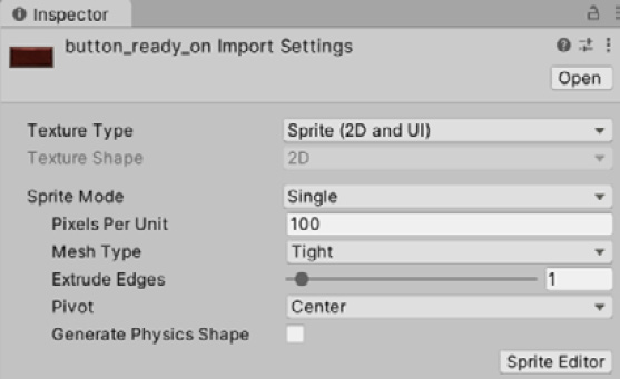
Figure 11.17 – The Sprite Editor button in the Inspector window
- In the Sprite Editor window, locate and drag the green dots at the edges of the image to move the slice rulers. Try to ensure that the slices are not located in the middle of the edges of the button. One thing to notice is that in our case, we will work with three slices instead of nine because our button won't be stretched vertically.
- Click on the Apply button in the top-right corner of the window and close it:

Figure 11.18 – Nine slices in the Sprite Editor window
- Repeat the same steps for the Background panel. In my case, you can see in the following screenshot that this background is not prepared with nine slices in mind because all the middle areas of the image can be made smaller, and if the nine-slicing method is used to stretch them, they will look the same. So, we can edit it with any image editing tool or just work with it as it is for now:

Figure 11.19 – Nine slices in the Sprite Editor window
Now that we have prepared our sprites, we can find a font, which is a pretty easy task. Just download any font in the .ttf or .otf formats and import it to Unity, and that's all—no further configuration required. You can find lots of good, free font websites on the internet. I am used to working with the classic DaFont.com site, but there's plenty of other sites that you can use. In my case, I will work with the following font:

Figure 11.20 – My chosen font from DaFont.com to use in the project
If the zipped file contains several font files, you can just drag them all into Unity and then use the one that you like the most. Also, as usual, try to put the font inside a folder called Fonts.
Now that we have all the required assets to create our UI, let's explore the different types of components to create all the required UI elements.
Creating UI controls
Almost every single part of the UI will be a combination of images and texts configured cleverly. In this section, we will explore the following components:
- Image
- Text
- Button
Let's start exploring Image. Actually, we have already an image in our UI—the white rectangle we created previously in this chapter. If you select it and look at the Inspector window, you will notice that it has an Image component, like the one in the following screenshot:
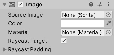
Figure 11.21 – The Image component's Inspector window
Let's start exploring the different settings of this component, starting with our hero's avatar. Take the following steps:
- Using the rectangle gizmo, locate the white rectangle at the top-left part of the UI:

Figure 11.22 – The white rectangle located at the top-left part of the UI
- In the Inspector window, click on the circle to the right of the Source Image property and pick the downloaded hero avatar sprite:

Figure 11.23 – Setting the sprite of our Image component
- We need to correct the aspect ratio of the image to prevent distortion. One way to do this is to click the Set Native Size button at the bottom of the Image component to make the image use the same size as the original sprite. However, by doing this, the image can become too big, so you can reduce the image size by pressing Shift to modify both the Width and Height values. Another option is to check the Preserve Aspect checkbox to make sure the image fits the rectangle without stretching. In my case, I will use both:
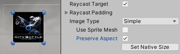
Figure 11.24 – The Preserve Aspect and Set Native Size image options
Now, let's create the life bars by doing the following:
- Create another Image component using the GameObject | UI | Image option.
- Set the Source Image property to the life bar image you downloaded:
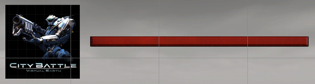
Figure 11.25 – The avatar and life bar
- Set the Image Type property to Filled.
- Set the Fill Method property to Horizontal.
- Drag the Fill Amount slider to see how the bar is cut according to the value of the slider. We will change that value via scripting when we code the life system in Part 3 of the book, where we will be code out own scripts:

Figure 11.26 – The Fill Amount slider, cutting the image width by 73% of its size
- In my case, the bar image also comes with a bar frame, so I will create another image, set the sprite, and position it on top of the life bar to frame it. Bear in mind that the order the objects are in in the Hierarchy window determines the order in which they will be drawn. So, in my case, I need to be sure the frame GameObject is below the health bar image:

Figure 11.27 – Putting one image on top of the other to create a frame effect
- Repeat steps 1 to 6 to create the base bar at the bottom, or just copy and paste the bar and the frame and locate it at the bottom of the screen:

Figure 11.28 – Two bars
- Click on the + button in the Project window and select the Sprites | Square option. This will create a simple squared sprite. This is the same as downloading a 4 x 4 resolution full-white image and importing it into Unity.
- Set the sprite as the base bar instead of the downloaded bar sprite. This time, we will be using a plain-white image for the bar because in my case, the original one is red, and changing the color of a red image to green is not possible. However, a white image can be easily tinted. Take into account the detail of the original bar—for example, the little shadow in my original bar won't be present here, but if you want to preserve it, you should get a white bar with that detail.
- Select the base health bar and set the Color property to green:

Figure 11.29 – A bar with a squared sprite and green tint
- One optional step would be to convert the bar frame image into a nine-slices image to allow us to change the original width to fit the screen.
Now, let's add the text fields for the Score, Bullets, Remaining Waves, and Remaining Enemies labels by doing the following:
- Create a text label using the GameObject | UI | Text option. This will be the Score label.
- Position the label at the top-right part of the screen.
- In the Inspector window, set the Text property to Score: 0.
- Set the Font Size property to 20.
- Apply the downloaded font by clicking on the circle to the right of the Font property and selecting the desired font.
- Check the horizontal alignment option (the one on the far right) for the Alignment property and the central option for the vertical options:

Figure 11.30 – The settings for a text label
- Repeat steps 1 to 6 to create the other three labels (or just copy and paste the score three times). For the Remaining Waves label, you can use the left alignment option to better match the original design:

Figure 11.31 – All the labels for our UI
- Set the color of all the labels to white as our scene will be mainly dark.
Now that we have completed the original UI design, let's create the Pause menu by doing the following:
- Create an Image component for the menu's background (GameObject | UI | Image).
- Set the Background panel sprite with the nine slices we made earlier.
- Set the Image Type property to Sliced if it is not already. This mode will apply the nine-slices method to prevent the corners from stretching.
- There's a chance that the image will stretch the corners anyway, which happens because sometimes the corners are quite big compared to the RectTransform setting's Size property that you are using, so Unity has no option other than to do that. In this scenario, the correct solution is to have an artist that creates assets tailored to your game, but sometimes we don't have that option. This time, we can just increase the Pixels Per Unit value of the sprite, which will reduce the scale of the original image while preserving its resolution.
In the following two screenshots, you can see the background image with a Pixels Per Unit value of 100 and again with 700. Remember to only do this for the nine-slices or tiled-image types, or if you don't have an artist to adjust it for you:

Figure 11.32 – On top, a large nine-slices image in a small RectTransform component, small enough to shrink the corners, on the bottom, the same image with Pixels Per Unit set to 700
- Create a Text field, position it where you want the Pause label to be in your diagram, set it to display the Pause text, and set the font. Remember that you can change the text color with the Color property.
- Drag the text field onto the background image. The parenting system in Canvas works the same—if you move the parent, the children will move with it. The idea is that if we disable the panel, it will also disable the buttons and all its content:

Figure 11.33 – The Pause label
- Create two Buttons by going to GameObject | UI | Button. Position them where you want them on the background image.
- Set them as children of the Pause background image by dragging them in the Hierarchy window.
- Select the buttons and set the Source Image property of their Image components to use the button sprite that we downloaded earlier. Remember our Pixels Per Unit fix from earlier if you have the same problem as before.
- You will notice that the button is essentially an image with a child Text object. Change the text of both buttons to Resume and Quit, respectively:
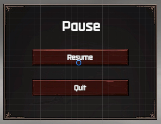
Figure 11.34 – The Pause menu implementation
- Remember that you can hide the panel by unchecking the checkbox to the right of the name of the object in the top part of the Inspector window:

Figure 11.35 – Disabling a GameObject
As you can see, you can create almost any kind of UI just by using Image and Text components. Of course, there are more advanced components that enable you to create buttons, text fields, checkboxes, lists, and so on, but let's stick to the basics one. One thing to notice is that we have created buttons, but they do nothing so far. Later, in Part 3 of the book, we will see how to script them to have a function.
In this section, we discussed how to import images and fonts to be integrated through the Image, Text, and Button components to create a rich and informative UI. Having done that, let's discuss how to make them adapt to different devices.
Creating a responsive UI
Nowadays, it is almost impossible to design a UI in a single resolution, and our target audience display devices can vary a lot. A PC has a variety of different kinds of monitors with different resolutions (such as 1080p, 4k, and so on) and aspect ratios (such as 16:9, 16:10, ultra-wide, and so one), and the same goes for mobile devices. We need to prepare our UI to adapt to the most common displays, and Unity UI has the tools needed to do so.
In this section, we will explore the following UI responsiveness concepts:
- Adapting objects' positions
- Adapting objects' sizes
We are going to explore how the UI elements can adapt their position and size to different screen sizes using advanced features of the Canvas and RectTransform components, such as Anchors and Scalers.
Adapting objects' positions
Right now, if we play our game, we will see how the UI fits nicely onto our screen. But if for some reason we change the Game view size, we will see how objects start to disappear from the screen. In the following screenshots, you can see different sized game windows and how the UI looks nice in one but bad in the others:
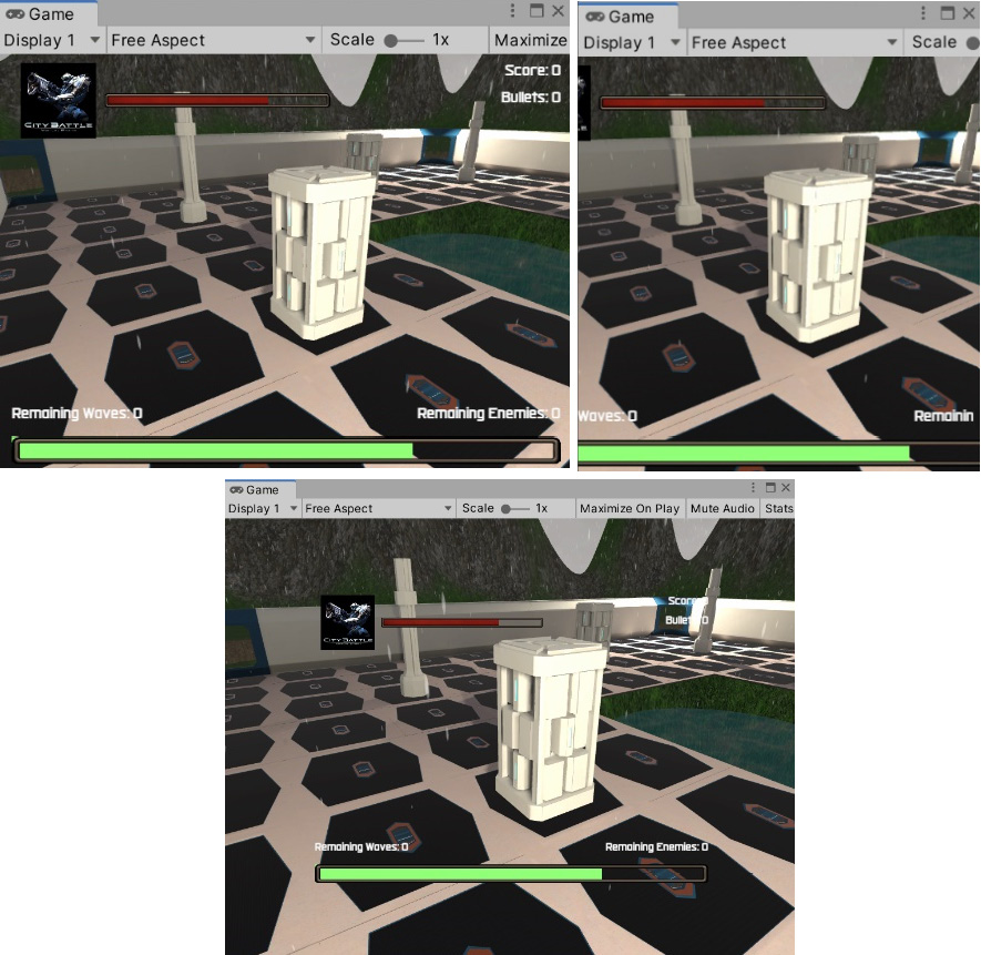
Figure 11.36 – The same UI but on different screen sizes
The problem is that we created the UI using whatever resolution we had in the editor, but as soon as we change it slightly, the UI keeps its design for the previous resolution. Also, if you look closely, you will notice that the UI is always centered, such as in the middle image, where the UI is cropped at its sides, or the third image, where extra space is visible along the borders of the screen. This happens because every single element in the UI has its own Anchor, a little cross you can see when you select an object, such as the one in the following screenshot:

Figure 11.37 – An Anchor cross at the bottom-right part of the screen belonging to the hero avatar in the top-left part of the screen
The X and Y position of the object is measured as a distance to that Anchor, and the Anchor has a position relative to the screen, with its default position being at the center of the screen. This means that on an 800 x 600 screen, the Anchor will be placed at the 400 x 300 position, and on a 1920 x 1080 screen, the Anchor will be located at the 960 x 540 position. If the X and Y position of the element (the one in RectTransform) is 0, the object will always be at a distance of 0 from the center. In the middle screenshot of the previous three examples, the hero avatar falls outside of the screen because its distance from the center is greater than half the screen, and the current distance was calculated based on the previous, bigger screen size. So, what we can do about that? Move the Anchor!
By setting a relative position, we can position the Anchor at different parts of our screen and make that part of the screen our reference position. In the case of our hero avatar, we can place the Anchor at the top-left corner of the screen to guarantee that our avatar will be at a fixed distance from that corner. We can do that by doing the following:
- Select your hero avatar.
- Drag the Anchor cross with your mouse to the top-left part of the screen. If for some reason the Anchor breaks into pieces when you drag it, undo the change (press Ctrl + Z, or Command + Z on macOS) and try to drag it by clicking in the center. We will break the Anchor later:

Figure 11.38 – An image with an Anchor at the top-left part of the screen
- Put the Anchor of the Health Bar object and its frame in the same position. We want the bar to always be at the same distance from that corner so that it will move alongside the hero avatar if the screen size changes.
- For the Boss Bar object, place the Anchor at the bottom-center part of the screen so that it will always be centered. Later, we will deal with adjusting its size.
- Put the Remaining Waves label at the bottom-left corner and Remaining Enemies in the bottom-right corner:

Figure 11.39 – The Anchors for the life bar and the labels
- Put the Score and Bullets Anchors at the top-right corner:

Figure 11.40 – The Anchors for the Score and Bullets labels
- Select any element and drag the sides of the Canvas rectangle with your mouse to preview how the elements will adapt to their positions. Take into account that you must select any object that is a direct child of Canvas; the text within the buttons won't have that option:
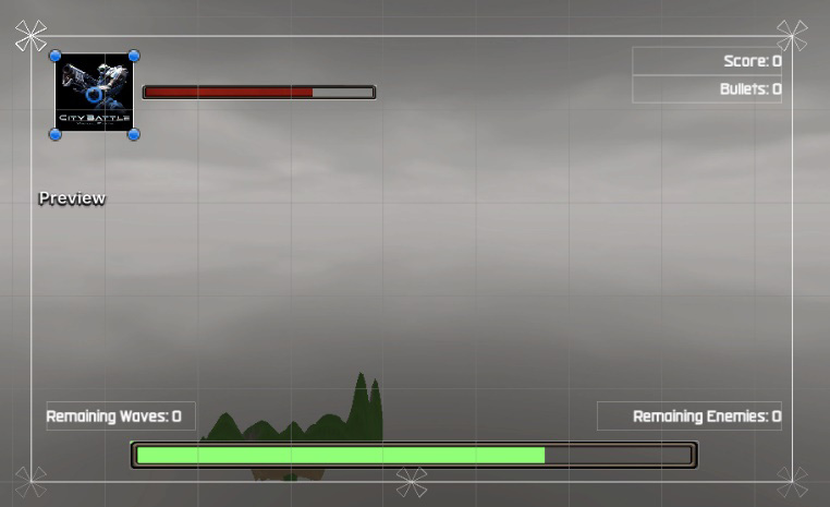
Figure 11.41 – Previewing canvas resizing
Now that our UI elements have adapted to their positions, let's consider scenarios where the object size must adapt as well.
Adapting objects' sizes
The first thing to consider when dealing with different aspect ratios is that our screen elements may not only move from their original design position (which we fixed in the previous section) but also they may not fit into the original design. In our UI, we have the case of the health bar, where the bar clearly doesn't adapt to the screen width when we previewed it on a wider screen. We can fix this by breaking our Anchors.
When we break our Anchors, the position and size of our object are calculated as a distance relative to the different Anchor parts. If we split the Anchor horizontally, instead of having an X and Width property, we will have a Left and Right property, representing the distance to the left and right Anchor. We can use this in the following way:
- Select the health bar and drag the left part of the anchor all the way to the left part of the screen, and the right part to the right part of the screen.
- Do the same for the health bar frame:

Figure 11.42 – The splitter Anchor in the health bar
- Check the Rect Transform setting's Left and Right properties in the Inspector window, which represent the current distance to their respective Anchors. If you want, you can add a specific value, especially if your health bars are displaying outside the screen:

Figure 11.43 – The Left and Right properties of a split anchor
This way, the object will always be at a fixed distance of a relative position to the screen—in this case, the sides of the screen. If you are working with a child object, as is the case of the Text and Image components of the buttons, the Anchors are relative to the parent. If you pay attention to the Anchors of the text, they are not only split horizontally but also vertically. This allows the text to adapt its position to the size of the button, so you won't have to change it manually:

Figure 11.44 – The split Anchors of the text of the button
Now, this solution is not suitable for all scenarios. Let's consider a case where the hero avatar is displayed in higher resolution than what it was designed for. Even if the avatar is correctly placed, it will be displayed smaller because the screen has more pixels per inch that the other resolution. You consider using split Anchors, but the width and height Anchors could be scaled differently in different aspect ratio screens, so the original image becomes distorted. Instead, we can use the Canvas Scaler component.
The Canvas Scaler component defines what 1 pixel means in our scenario. If our UI design resolution is 1080p, but we see it in a 4k display (which is twice the resolution of 1080p), we can scale the UI so that a pixel becomes 2, adapting its size to keep the same proportional size as the original design. Basically, the idea is that if the screen is bigger, our elements should also be bigger.
We can use this component by doing the following:
- Select the Canvas object and locate the Canvas Scaler component in the Inspector window.
- Set the UI Scale Mode property to Scale with Screen Size.
- This isn't the case for us, but if in the future you are working with an artist, set the reference resolution to the resolution in which the artist created the UI, keeping in mind that it must be the highest target device resolution. In our case, we are not sure which resolution the artist of the downloaded assets had in mind, so we can put 1920 x 1080, which is the full HD resolution size and is very common nowadays.
- Set the Match property to Height. The idea of this property is that it sets which side of the resolution will be considered when carrying out the scaling calculation. In our case, if we are playing the game in 1080 resolution, 1 UI pixel equals 1 real screen pixel. However, if we are playing in 720p resolution, 1 UI pixel will be 0.6 real pixels, so the elements will be smaller on smaller resolution screens, keeping its correct size. We didn't choose a Width value in this case because we can have extreme widths in screens, such as ultra-wide, and if we picked that option, those screens would scale the UI unnecessarily. Another option is to set this value to 0.5 to consider the two values, but on a PC, this doesn't make too much sense. On a mobile device, you should choose this based on the orientation of the game, setting the height for landscape mode and the width for portrait mode. Try previewing a wider and higher screen and see how this setting works:

Figure 11.45 – Canvas Scaler with the correct settings for standard PC games
You will find that your UI will be smaller than your original design, which is because we should have set these properties before. Right now, the only fix is to resize everything again. Take this into account the next time you try this exercise; we only followed this order for learning purposes.
Before moving on, remember to reactivate the postprocessing volume object to show those effects again. You will notice that the UI is not affected by them in the Game view.
Important note:
If you want your UI to be affected by postprocessing effects, you can set Canvas Render Mode to Screen Space – Camera. Drag the main camera to the Render Camera property and set Plane Distance to 5. This will put the UI in the world with the rest of the objects, aligned to the camera view with a distance of 5 meters.

Figure 11.46 – Canvas Render Mode set to Camera mode to receive postprocessing effects
With this knowledge, you are now ready to start creating your firsts UIs by yourself.
Summary
In this chapter, we introduced the basics of UI, understanding the Canvas and RectTransform components to locate objects onscreen and create a UI layout. We also covered different kinds of UI elements, mainly Image and Text, to give life to our UI layout and make it appealing to the user. Finally, we discussed how to adapt UI objects to different resolutions and aspect ratios to make our UI adapt to different screen sizes, even though we cannot predict the exact monitor our user will be playing the game on.
In the next chapter, we will start seeing how to add animated characters to our game.