Chapter 1
Controlling Color
“Some colors reconcile themselves to one another. Others just clash.”
—Edvard Munch

If you have time to focus on improving only one thing in your charts, go after color. Most software can’t intuit a good use of color for your context. It can’t know how you want to group variables—which are primary and which are secondary, which are complementary and which are contrasting. Thus software tends to give every variable its own, somewhat randomly assigned color. Taken to an illogical extreme, your first output may be a mess of a rainbow like the above chart.
That’s no good. Our eyes’ ability to differentiate and remember colors flags after, say, five, or maybe seven. Most charts start with too much color. Your job is to identify the colors you need and then use only those.
You don’t need to be a professional designer who knows color theory to make good charts with good colors. Just follow a few guidelines:
1 |
Use less. Stick to the minimum number of colors necessary to convey your idea. This is similar to reducing a fraction: sometimes we show 10/15 when it could be expressed as 2/3. Likewise, we may use eight colors when we need only four, or two. Look for ways to group items with the same color. |
2 |
Use gray. Gray is your friend. It contrasts less with a white background, giving the sense of being “background information” behind the higher-contrast colors. It doesn’t draw the eye the way stronger colors do. In many charts you can use gray for marks that the software automatically assigned a dominant color. |
3 |
Complement or contrast. When variables are inherently similar, use similar or complementary colors. When they are in opposition, use contrasting colors. The audience will make the simple connection: Things that are alike go together; things that aren’t don’t. It sounds almost too obvious, but remember that the software doesn’t understand this. If our eight variables all concern men and women of various ages, software will just assign eight distinct colors. I see an opportunity to use complementary colors for variables within each gender and contrasting colors between genders—say, four shades of green and four shades of orange. Two color families. Much cleaner. |
4 |
Stick to the variables. Text, labels, and other marks that aren’t part of the marks that are conveying the data information are best left black or gray (or white on a black background), with a few exceptions. Sometimes, connecting a label to line by matching the color will help, but be judicious. In general, using color for text decoration is distracting. |
5 |
Think how, not which. Your impulse might be to think about which colors you want to use. But that’s far less important than how you use color. Understanding background versus primary information, complementary and contrasting variables, and how to vary degrees of color saturation will lead to better decisions than just picking colors you like or your brand managers want you to use. |
6 |
Bonus pro tip: Consider the color-blind. The power of a good chart can be lost if your audience includes people with various forms of color-vision deficiency—and it probably does. Up to 10% of men carry red-green color blindness, and 1% to 5% carry other forms. A color-blind person may see two colors as virtually the same. Good news: tools such as Coblis* and Color Oracle make it easier than ever to see how your charts will look to those with some form of color blindness. In my haste I often forget to check for color-blind-safe color schemes, but I’m trying to do better. Every chart in this book that wasn’t deliberately designed poorly was checked for color-blind safety. |
If you consider these guidelines, and understand your context, you can transform chromatic chaos into colorful coherence:
The following challenges are designed to help you develop color sense. Focus mostly on improving how you use color, following the prompts with each chart. For these challenges, don’t worry about forms, and think about labels, value ranges, standard conventions, and other considerations only as they relate to the use of color.
1. In a bar chart, you want to show comparisons between older and younger men and between older and younger women. Which color scheme do you use?

2. In a scatter plot, you want to show the distribution of performance for four sales teams, but your goal is to highlight the performance of the European sales force against all others. Which color scheme do you use?

3. You want to compare before-noon sales to after-noon sales. Create a color scheme for the stacked bars.

4. You want to show answers from a Likert-type scale that ranges from “strongly agree” to “strongly disagree.” Match each survey question below to the color scheme that would be best used to describe the results of that question.
1. Please rate your feeling about the following statement: I’m ready for the challenge of transforming this company.
2. Please rate your feeling about the following statement: Our leaders are ready for the challenge of transforming this company.
3. Please rate your feeling about the following statement: I believe in the company’s strategy.

5. In a line chart, you’re comparing four price trends with an average trend. You want your audience to see the two lines that show below-average price trends. What’s a good color to make the average trend line?
A A color similar to the ones used for the below-average trend lines, to show that they are what we want to compare with the average
B A color that contrasts with the below-average trend lines so that those two lines stand out
C Black so that it’s neutral compared with the four trend lines
D Gray so that it’s visible enough to use as a comparison but not dominant
6. In a chart about car makers, you have many variables. Group them to reduce the number of colors used and assign a color scheme. Find a grouping that requires only two colors.

7. Find four places to remove color from this plot.

8. Create an alternative color scheme for the stacked bars in the previous question that will help the audience focus on important factors for buying a drone.
9. Find a logical way to reduce the amount of color in this stacked area graph.

10. What’s wrong with this use of color, and how might you fix it?

Discussion
Remember, what follows isn’t always the right answer; it’s just an answer. You may have come up with other ways to improve the use of color in these warm-ups, but these discussion points will reinforce good use of color in your charts.
1. Answer: B. The context focuses on a binary comparison—young versus old—so we shrink each gender into only two groups, under 40 and over 40. We give the two groups of men similar hues, and likewise for the women. Eight variables become four—fewer bars—and only two colors are in play. A obviously uses too much color, which would overwhelm the bar chart. The light-to-dark scheme of C maintains four distinctions per gender when we need only two. The gradient saturation also suggests different degrees of something. That could work for age, with younger people being less saturated, but it’s not entirely intuitive.
2. Answer: C. Europe versus all others means we want the eye to go right to Europe. The other variables exist to be compared with Europe, and distinctions among them don’t matter. Giving any other region a dominant color overemphasizes it, eliminating D (four distinct colors fighting for attention) and A (two distinct color groups, though the groupings don’t mean much). B wouldn’t be a bad choice, but making three variables yellow would draw attention to that cluster, which would presumably have more marks on the page than Europe does, since it’s three variables combined. By making the “other” group gray—and possibly not even labeling them separately but only as one variable called “other regions”—we leave no doubt: Look at Europe.
3. Simple, but we’re following the context: We need to compare only before noon and after noon. The white hairlines between bar pieces enable us to see the subsections within the color groups. Other approaches that might work: lighter hues on the extremes to create a sense of “middle of the day” versus “early morning” and “late evening,” or gray on the extremes, if “before noon” and “after noon” actually mean during waking hours only.

4. A: 3. If you want to show strong feelings in two directions, opposing colors on the extremes and lighter shades heading into the middle works well. Here lightness reflects ambivalence, and the hues reflect positive versus negative.
B: 1. If you want to show degrees of a positive feeling (readiness), try a desaturated-to-saturated scale using a single color. Here the darkness of the pink reflects respondents’ degree of readiness.
C: 2. If you want to show degrees of a negative feeling (skepticism), simply flip the previous convention and move from saturated to desaturated. Here a darker blue reflects a deeper skepticism.
The distinction between answer B and answer C is subtle. No harm if you reversed your answers for those two.
5. Answer: C. Or possibly D. The below-average trend lines should get dominant colors, because that’s where we want people to focus. At the same time, what matters is those lines’ performance against average, so we don’t want to overwhelm the average line. Gray might be too faint; a dark gray would probably work. If we chose A or B, we’d confuse the audience. In either case, it would appear to be another variable in the set, not an average line describing something about that set.
6. I created two groupings, one with three variables and one with two. Colors contrast in the grouping of three, since each represents a different region and I wanted to easily distinguish among them. The second grouping uses a dominant color and gray, because cars no longer in production are, in a sense, inactive (like the color gray).

7. 1. The headline. Using color here doesn’t help increase the focus on the crucial idea of what’s important when buying a drone. Also, using the same color for the headline and the “not at all important” value seems confusing and contradictory.
2. The category labels. This rainbow is unnecessary decoration, and the colors don’t connect to anything else in the visualization.
3. The key. Sometimes making the words in a key the same color as what they represent works. Here we’re already using color blocks in the key. If we keep the blocks, the words can be black.
4. The x-axis labels. Associating these percentages with the variables’ colors is confusing. After all, 80% of people would not vote “not at all important.” In general, labels don’t need color—especially color that’s been assigned to something else.
8. Since the variables represent descending importance—that is, less and less of one thing—we can use less and less of one color to show that, making the least important group the least saturated. We still see all three groups, but we also quickly grasp decreasing importance in a way that’s clearer than in the original.

9. The stacked rainbow is fun to look at (I bet you saw it before you got to question 9), but it’s extremely hard to use. Everything is fighting for attention. Any number of logical groupings could be created here: The top three categories as a group versus everything else—two colors. The top three categories each with its own color, and everything else as a fourth. The top half of the area as a group versus everything else in gray. Any of these would be a fine clustering, given the open-ended challenge. I chose to make three groups of four variables, with the largest group getting a dominant color and the others getting less attention-grabbing gray and tan. This creates clear distinctions without overwhelming the eye, and it draws the eye to the large swath of most-common machine learning techniques.

10. While the simplicity of this chart is to be applauded, it looks like the first chart below to a red-green color-blind person. The easiest solution is to label the bars. But just to be sure, we can add cross-hatching to the two pieces to create a geometric distinction in case the colors are blending.


Charts with many variables, each with its own dominant color, inevitably create a rainbow effect. Software will assign each variable its own color without regard for context. Rainbows are pretty, but in charts they’re usually a detriment. Keeping track of what each color represents is difficult, and all the colors beg equally for attention. A second stacked bar with the same fruity palette makes this chart classic eye candy: captivating, but lacking “nutrition.” It’s hard to get meaning from it because it’s hard to use. Let’s work on it.
- 1. Find up to three places you can remove color regardless of context.
- 2. Find a way to group the variables using fewer colors but maintaining useful distinctions.
- 3. You want to discuss leisure time with your audience. Create a color scheme for this context.
- 4. Find a way to maintain seven colors without creating an overwhelming rainbow effect.
Discussion
Because the bars measure the same variables and are placed side by side, viewers assume that they’re meant to make comparisons here. The best thing to do, then, is to restrict color to those places you want comparisons made.
1. The three places you can remove color regardless of context are the headline, the bar labels (Millionaires; General Population), and the variable labels.
The data is colorful enough. Nothing is gained by adding color to the text. In fact, here it makes the headline fade into the visual. Giving the bar labels a background color is a design choice that adds confusion, not value. It makes the labels blend in, not stand out. They could almost be confused for another data category. Finally, matching the variable labels to their bars may seem like a good idea, but in a visual that already includes so much color, it’s probably better to practice restraint.
Here is the same chart with the color removed from those three places:

It’s remarkable how much those three adjustments calm this chart down. It’s still colorful, but it feels more manageable. Black on white, the highest contrast, makes the headline and labels pop. (Bonus non-color-related tip: Placing the labels between the bars would improve this even more, because they’d be adjacent to both visuals.)
2. To find a logical grouping, I had to consider how the variables are related. They fall into three groups: leisure, work, and survival, plus an “other” that I made gray, because “other” is often a small category of leftover data you don’t want the audience to focus on. Which colors are used here is less important than making sure none of the categories use similar colors, because they’re distinct. Making work and leisure two shades of red, for example, would suggest that they are alike in some way, whereas they’re opposites. Finally, notice that “necessities” and “phone and computer” were swapped in order to group the variables. Because software automatically arranges charts according to how the data was entered, it’s easy to forget this possibility. Remember that when sketching: just because the software does it a certain way doesn’t mean you have to.

3. In the following crisp view, leisure is the focus so it gets color to draw the eye. Sometimes, to create focus, I’ll make every variable gray and then start adding back color, variable by variable, until I feel I have enough to make my point. Here not only do we see leisure right away, but a natural dichotomy is created by removing color from the rest of the chart. Instead of seven variables, we see two: leisure and everything else. Additionally, since the top two activities are types of leisure, two hues of the same color will show that they’re complementary, not contrasting. Passive leisure gets a lighter hue because it feels softer (less active), but that’s carrying the metaphor to an extreme. If it were darker but both forms of leisure were blue, that would be fine. Color coding the keyword in the label was a flourish; it’s unnecessary, but in the absence of other color here, it doesn’t fight for attention.

4. This is a difficult challenge; I struggled to find a good solution. No matter how hard you try, giving seven colors equal billing risks creating that rainbow effect. To make each variable discrete but not overwhelming, I created white space and colored only the borders. I added color to the values and the labels to reinforce the connection. But I don’t think it’s terribly successful. For one thing, it adds emphasis to the numbers and labels and removes focus from the bars. If the numbers and labels are what I want you to see, why not just make a table? The value of the visual is diminished to the point of near uselessness. Am I comparing sizes or just reading the numbers? Also, some of these colors are difficult to read on a white background because of the low contrast.
I included this version to show that sometimes what you want to do isn’t practicable. You must change course or make compromises. In this case, color manipulation alone probably can’t maintain the distinction among the seven variables without overwhelming the eye with color. You need to attack something else, such as the form itself—and you will in later challenges.


First, a word about pie charts. They are not evil. You will not be sent to charter’s prison for making one. But pie charts are best for simple proportions with two to four pieces. They’re most effective when one proportion is dominant—a half or three-quarters. More than a few wedges of more than a few colors creates a sameness among wedges that makes it hard to compare values. Because pies are simple, we often spend more time trying to design them up; after all, they don’t have many pieces to manipulate, as compared with, say, a scatter plot. Here’s an attempt at limiting color and the number of wedges in a pie that still doesn’t hold up. Let’s work on it.
- 1. Identify two problems with the colors used in this pie chart.
- 2. Remake the chart with a new color scheme.
- 3. You want your audience to see the proportion of people who have a positive interest in drones. Create a color scheme for this new goal.
- 4. You want to discuss only the interest in drones of respondents under 30. Remake the chart with a new color scheme to focus on that group, using the following data:
| UNDER 30 | OVER 30 | |
| Very interested | 34% | 14% |
| Somewhat interested | 14 | 7 |
| Not very interested | 5 | 11 |
| Not at all interested | 2 | 13 |
Discussion
The color scheme here, though easy on the eye, doesn’t make much sense. It feels arbitrary. It doesn’t highlight any particular grouping or idea. Sometimes color schemes like this result when marketing departments foist corporate colors on a presentation, or when someone tries to make an artificial association. If this were a chart about bananas, for example, the yellow might have been an attempt at cleverness. The best thing to do is to think about groups and use color based on that.
1. The colors are not grouped logically. I count two groups of variables: interest and lack of interest. But here darker yellows are assigned to “very interested” and “not very interested” and brighter yellows to “not at all interested” and “somewhat interested.” Lightness and darkness aren’t used logically.
The colors do not proceed logically. Another way to think of the four variables is as a spectrum, from lots of interest to none. But the pie slices jump around that spectrum. If I assign numbers from 1 to 4 representing very interested to not at all interested, then reading clockwise (the way we usually look at pies) you see 1, 4, 2, 3.
2. Interested and not-interested groups are contrasting, so I use unlike colors. Within each group, though, the variables are complementary, so I use different shades of the same color, with richer hues for more-extreme feelings and less saturated ones for milder feelings within each group.

Now the problem with logical progression becomes immediately obvious. I want to compare interested with not interested, and that’s difficult when those groups are broken up. So I rearrange the wedges:

3. Removing information from your visualization can make a point more immediate, because it prevents viewers from focusing on the wrong information. Giving the not-interested group here a secondary gray and removing the labels signals to the audience to focus on interest in drones. One can intuit what the other wedges represent, but it doesn’t matter; the idea is that two-thirds of people are interested.

4. Initially you might try to do the simplest thing, which is to divvy up the pie with the demographic data. You don’t want to introduce new colors or shades, because that will create eight distinct pieces and colors. The first attempt used simple dividing lines and labels. But although that allows us to see the under-30 interest in drones, it doesn’t focus on that data. The user must go looking for it.

So again you can turn to gray to de-emphasize the over-30 respondents. That requires moving some of the wedges to make the under-30 pieces adjacent. The added subtitle ensures that viewers know who the focused wedges represent; without it, the colors would be confusing and the audience would wonder what the gray wedges represent.

I’m fond of the way this chart puts the wedges in opposition, creating a real sense of this versus that. I quickly see the overwhelming interest.
What I don’t see well is the proportion of all respondents who are under 30, because the gray wedges separate the under-30 data. (I have to mentally slide those green wedges to be adjacent to the pink ones, which is difficult to do.) I could change that if it were important in my context.
This is another fine approach if the total proportion of under-30 respondents is important. As a comparative tool, I still prefer the previous—but as always, context will dictate which to use.


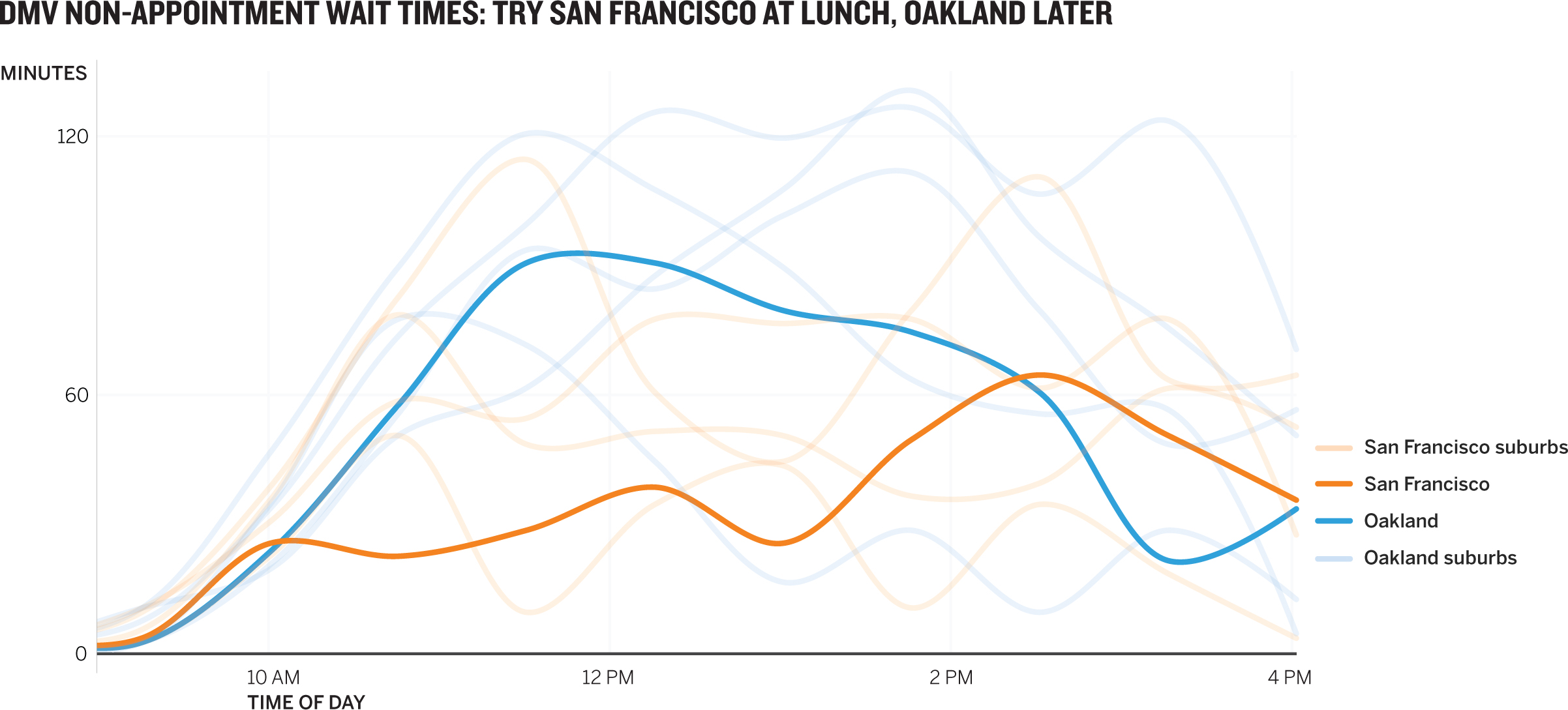
Line charts present different challenges with color, because the variables converge, cross, and generally tangle together. Those color ganglia create a busyness that makes it hard to do what we want to do with trend lines: follow the trends. To test this, try to follow the San Francisco trend in the above chart. Let’s work on it.
- 1. Create a logical grouping of variables and a color scheme for the grouping.
- 2. Create a color scheme that helps your audience focus on Canadian housing prices.
- 3. Create two more versions of this chart that use color to focus on trends in the data.
Discussion
The interaction of so many colors shifts our perception from six distinct trends to one general trend and then to the deviations from it, such as the two lines below the bubble. If we’re meant to compare trend lines, it’s nearly impossible here without some work. We need to find the trends we want people to see and think about foreground and background information and colors.
1. The most obvious (but not the only) grouping here is by country, which would reduce six colors to two. The difference in our ability to see the trend lines here compared with in the original is stark. We immediately notice those bold Canadian lines rising steadily past the U.S. cohort (and the changed headline reflects this). Notice, too, that the key has been eliminated and the labels are adjacent to their trend lines. This removes that small cluster of color in the corner, reducing eye travel. Now we don’t have to dart between key and line to match colors to the cities they represent. I could have colored the city labels, but that feels extraneous here. If the lines were closer together, forcing the labels to be tightly packed together, color might have helped; but here there’s plenty of space.

2. Could the pink-versus-blue chart above satisfy this new context? Probably. But the blue does create an alternate point of focus. It’s asking to be considered. Making the U.S. data the background context easily solves this: Background information becomes gray. The audience’s eyes will go to the color. This time the labels are color coded, though I don’t feel strongly about that. The most important idea is that we have one color to focus on. A green axis line at 300 calls attention to just how high Canadian prices have risen: above bubble prices! Your impulse might be to use a caption to do this—writing a sentence and using a pointer to explain what’s going on. Usually a marker and good color use can achieve the same result. Overall, this chart has been rigged so that it’s impossible for an audience to miss the point: It’s time to talk about Canadian housing prices as a potential bubble.

3. Even in this simple line chart, any number of trends can be highlighted. You could compare eastern to western cities, or coastal to landlocked, with two colors. You could highlight the most volatile and the least volatile markets. The two I chose to work on relate to the bubble.
First, I compared two cities that experienced similar bubbles but different recoveries. The humps match up, but a huge gap in value exists today. It’s a comparison of different places, so I used different colors. I could make a case for removing the other cities altogether here. By keeping them, I’ve stumbled on an insight I didn’t see before: Las Vegas is the real outlier, whereas San Francisco’s growth commingles with that of other cities.

Second, I decided to use the same technique as in the Canada chart on the previous page to show that San Francisco prices are “bubbly” again. That simple color mark connecting 2016’s level with the bubble makes the trend clear. Everything else is background information, downplayed with gray.
